White Rose Research Online URL for this paper: http://eprints.whiterose.ac.uk/89361/
Monograph:
Rae, A.J. (2015) Mapping the American Commute: from mega-regions to mega commutes. Working Paper. Department of Urban Studies & Planning, University of Sheffield
(Unpublished)
[email protected] https://eprints.whiterose.ac.uk/
Reuse
Unless indicated otherwise, fulltext items are protected by copyright with all rights reserved. The copyright exception in section 29 of the Copyright, Designs and Patents Act 1988 allows the making of a single copy solely for the purpose of non-commercial research or private study within the limits of fair dealing. The publisher or other rights-holder may allow further reproduction and re-use of this version - refer to the White Rose Research Online record for this item. Where records identify the publisher as the copyright holder, users can verify any specific terms of use on the publisher’s website.
Takedown
If you consider content in White Rose Research Online to be in breach of UK law, please notify us by
1
Mapping the American Commute:
from mega-regions to mega commutes
Alasdair Rae
Department of Urban Studies and Planning, University of Sheffield
Abstract
This working paper examines the geography of commuting in the contiguous United States, using a very large dataset produced by the US Census Bureau’s American Community Survey (ACS). The objective of the study is to map spatial patterns of commuting in the lower 48 states and to show how individual towns and cities connect. It draws upon an emerging literature on ‘mega-regions’ and also more established literature on mapping spatial interactions and functional urban polycentricity. A second objective of the study is to identify areas of ‘mega-commuting’, characterized by very long distance commutes. Recent evidence from the US Census Bureau suggests such journeys are on the rise. The paper also examines the possibility of ‘super-commuters’ before exploring the validity of using the underlying data at the micro-scale. A final objective is to demonstrate the utility of open data and open source software in handling large spatial interaction datasets. Based on the evidence presented in a series of national and regional commuting maps, the paper describes an intricately-connected web of interactions associated with the American commute; a key contributor to economic growth.
1. Introduction
The movement of people and goods has been a focus of scientific enquiry for well over a century (e.g.Minard, 1869; Ravenstein, 1885), and in an increasingly connected world it remains an important topic. Understanding how places connect, the nature of such interactions, and their spatial configuration, has been studied by human geographers in particular, with seminal contributions from Kern and Ruston (1969), Wittick (1976), Tobler (1976, 1987) and Dorling (1991). More recently, Rae (2009, 2011) attempted to understand spatial structures of migration and commuting in a geographic information systems (GIS) context, and Ratti et al. (2010) explored billions of individual human interactions as an alternative way of delineating space in a visually compelling way for Great Britain.
This paper therefore builds upon previous work in the field of spatial interaction data
analysis and geovisualization by exploring patterns of commuting in the United States using a large, highly detailed journey to work dataset produced by the 2006-2010 five-year American Community Survey. There are three main goals here. First, I wish to provide a national picture of how individual cities and towns across the United States connect together in a functional way, in contrast to the formal political geography of cities, counties and states. This builds upon a tradition of studying polycentric urban regions (e.g. Parr, 2004; Hall and Pain, 2006), ‘functional urban areas’ (Antikainen, 2005) and the concept of Gottman’s ‘megalopolis’ more generally (Gottman, 1957). It also reinforces the ‘mega-region’ view of several US metropolitan areas proposed by Florida et al. (2008) in their study of global agglomerations.
2 exploratory spatial data approach to flow data
analysis can yield important results and help identify unusual artefacts in a way that non-spatial approaches cannot (Haining et al. 1998). A relevant example here would be the kinds of mega-commutes identified by Rapino and Fields (2013) in their study of long-distance and long-duration journeys to work in the United States. The third goal is to demonstrate the power of open source GIS in the spatial analysis and geovisualization of very large data matrices.
The data and methods deployed in the study are described in detail in the next section. This section also provides specific details on the software and data formats used, in order to facilitate replication by other interested researchers. The results of the analysis are then presented in relation to patterns of commuting in the contiguous United States,
with a subsequent focus on major
metropolitan areas on each coast. I then examine the concepts of mega-commuting,
super-commuting and the underlying
uncertainty inherent in the data. The paper ends by reflecting on the benefits of taking a spatial approach to flow data analysis and suggests avenues for future research in this area.
2. Data and methods: big data, big problems?
The single greatest contributor to the field of mapping spatial interaction over the past half century has been Waldo Tobler, whose famous ‘First Law of Geography’ posited that ‘everything is relate do everything else, but near things are more related than distant things’ (Tobler, 1970, p. 236). In the field of spatial interaction, such a ‘law’ seems entirely plausible but as Tobler himself noted many years later, the reality is often more complex in the social sciences (2004). However, this serves as a useful maxim here since the results
show that near things are more related but also that like all good laws, there are exceptions. But more on the mega-commuters later on in the paper. First, it is necessary to describe the data and methods used.
Up until 2000, the Long Form of the decennial US census was a useful source of commuting data. It asked questions relating to mode of travel to work ‘last week’, how many minutes it usually took people to get to work, what time they left for work, and a range of other detailed commuting-related questions. After 2000 the Long Form of the US census was replaced by the American Community Survey (ACS), which is now
conducted annually. The ACS asks
respondents how they usually got to work ‘last week’ with mode of travel indicated for the longest part of the journey by distance. The ACS also asks respondents in the workforce how long it takes them to get to work and when they leave, just like previous Censuses.
The ACS is a large, continuous survey of around 3.5 million addresses per year and data are available in one, three or five year estimate periods. The latter is based on 60 months of data and reflects the characteristics of an area over the entire period. It is the only element of the ACS available at the census tract level and therefore the only one which provides the spatial resolution necessary to explore commuting patterns at a fine spatial resolution. Census tracts are a small US Census statistical subdivision of counties and typically contain between 1,200 and 8,000 people, with a median population of 3,993 at the time of the 2010 Census.
3 released and this release included tract-to-tract
flows. However, this is where data volume problems first arise (one of the three Vs of ‘big data’). There were 74,134 census tracts in United States in 2010. These tracts produce a potential interaction matrix of 5,495,849,956 cells but, unsurprisingly, most cells contain zeros and the actual number of connected census tracts is 4,156,426. However, dealing with this volume of data is far from trivial so
the Federal Highway Administration
provides a very useful tutorial for users on how to explore and analyse the data using Microsoft Access (FHA, 2015). The dataset contains the following columns:
ACS tract-to-tract commuting data 1. Residence state FIPS code* 2. Residence county FIPS code 3. Residence tract FIPS code 4. Workplace state FIPS code
5. Workplace county FIPS code
6. Workplace tract FIPS code
7. Estimated commuters
8. Margin of error
*This is a unique Federal Information Processing Standard code for each geographic unit in the United States and territories. These individual codes can then be used to create a unique identifier for each census tract.
For the ACS 2006-2010 tract-to-tract product used herein, there is no data on different modes of travel, though this could be a very fruitful area of research in future if such data were available. The total dataset of just over 4.1 million records and 8 fields was approximately 150MB in size; well within the margin of usability on a powerful desktop computer. The next stage of the analysis involved joining the x and y coordinates of each census tract to each origin-destination record in the ACS dataset. For this purpose, I used the latitude and longitude of the center of population for each census tract, rather than the geographic centroid. This dataset is
available from the United States Census Bureau and also contains population data from the 2010 Census for each tract. The workflow from original dataset to United States tract-to-tract commuter flow map is described below. There are an almost endless number of potential workflows but this approach was simple and effective on a Dell Precision M6800 workstation with 32GB of RAM and i7 processor running 64-bit Windows 7.
Flow map workflow from original database to shapefile
1. Open the original tract-to-tract
database file in Microsoft Access and then export to Dbase format.
2. Import the Dbase file into QGIS 2.8 (open source geographic information system software). Concatenate the state, county and tract FIPS code to create a unique state-county-tract FIPS code for each origin and destination.
3. Import data file containing the latitude and longitude of census tract centers of population. Concatenate the state, county and tract FIPS code to create a new state-county-tract FIPS code for each point.
4. Perform two joins, each based on the unique FIPS code for each census tract. These joins result in a dataset
which contains all necessary
information in order to be able to produce a flow map of travel to work in the United States.
4 previously by Rae (2014). It should be
noted that all but the most powerful computers will struggle to handle this volume of data.
6. Once the flow lines appear on screen in QGIS they are then saved in the ESRI shapefile format and mapped and filtered in a variety of ways in QGIS. The results are shown and described below.
To my knowledge, this is the first study to provide a national map of commuting for the United States using this dataset. Caliper Corporation, a GIS and transportation software firm, produce a number of enhanced proprietary transportation planning products based on the five-year ACS tabulations used here but these are specialised products not in the public domain. Thus, part of the intended contribution here is to make the data more visible through the use of geovisualization. The series of maps in the next section therefore constitute the bulk of this paper.
3. The American commute visualised
The late American economist Kenneth Boulding famously stated that ‘knowledge is always gained by the orderly loss of information (Boulding, 1970, p. 2) and in the context of attempting to decipher spatial patterns associated with the journey to work, this maxim serves as a useful piece of advice. In the context of flow data analysis, it was developed further by Rae (2009) into four
‘principles for the orderly loss of
information’, whereby all data elements are included at the outset (i ‘expansive inclusion’), individual elements are then stripped away iteratively in order to identify patterns (ii
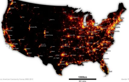
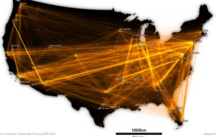
‘iterative loss’), the skill of the analyst then comes to the fore in order to derive (iii ‘simplicity from complexity’. The final result, as with any spatial statistical process, should be a kind of (iv) ‘optimal compromise’. Mapping the American commute has been based on these principles. The first map below therefore displays journeys to work of 160km or less (about 100 miles) for the contiguous United States. This covers 97.3% of all tract-to-tract flows and 98.7% of commuting in the contiguous United States. A selection of major towns and cities across the country have been labelled in order to aid interpretation, and state borders are shown to provide context. Major employment centers appear in a yellow ‘glow’ in this view, with less dense flow lines displayed in darker shades of red.
5 Figure 1 – The American Commute (journeys of 160km or less)
High resolution images: https://goo.gl/kJoULQ
Mapping the ‘mega-regions’ of the west and east coast
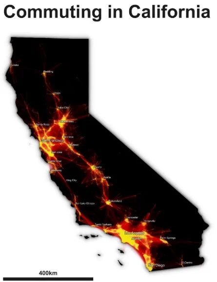
In this section I look more closely at areas on the west and east coasts of the United States. In the first example I present commuter flow patterns in California, which is characterised by an extensive urban region in the south (centred on Los Angeles) and a large, distinctly polycentric urban region in the north (centred on San Francisco).
The polycentric nature of commuting in San Francisco Bay area has been the subject of several earlier studies (e.g. Cervero and Wu, 1997; 1998) and more recently the concept of the mega-region has gained currency in the urban planning literature (e.g. Dewar and Epstein, 2007; Nelson and Lang, 2011) so this study attempts to provide additional evidence
in relation to the extent of the functional connectivity of these large urban regions. The second example looks more closely at
Gottman’s famous Boston-Washington
‘megalopolis’, said now to be second largest urban mega-region in the world after the Hong Kong-Shenhzen-Guangzhou region in China (Florida et al., 2008).
The physical geography of California, although not shown in Figure 2, clearly plays a role in shaping journey to work flows in the state. This is evident in the geography of commuting flows in the Central Valley, with a clear string of interconnected commuting relationships visible from Redding in the
north, through the state capital in
6 the United States map, Figure 2 is unfiltered
by commuting distance, but the colour scheme remains the same (yellows for shorter commutes, reds for longer journeys).
There is some evidence of commuting interactions between Bakersfield and the wider Los Angeles metropolitan area, but in general the latter forms the core of a southern California mega-region stretching from Santa Barbara in the North to San Diego in the South, with a range of smaller connected urban areas, such as Palm Springs and Lancaster. If the urban area of Southern California exhibits some characteristics of polycentricity, then the San Francisco Bay area might be considered an exemplar, with multiple connected cores including San Francisco, San Jose, Oakland (not labelled) and Berkeley.
The commuting interactions depicted in Figure 2 constitute 563,902 individual lines, with a total of 16,049,327 individual commuters. These figures account for 13.6% of tract-to-tract flows in the United States and 12.3% of all commuting in the ACS dataset. This closely matches Bureau of Labor Statistics data on the number of people in employment in California, with a December 2010 employment figure of 16,106,822 (Bureau of Labor Statistics, 2015).
So, despite any inaccuracy at the individual flow level, the ACS data appear to be a good representation of the total size of the California labor market at an aggregate level. These spatial patterns also match previous visions of California mega-regions identified by the Regional Plan Association’s ‘America
2050’ project (RPA, 2015) and Florida et al. (2008).
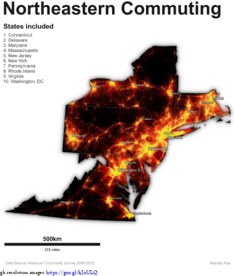
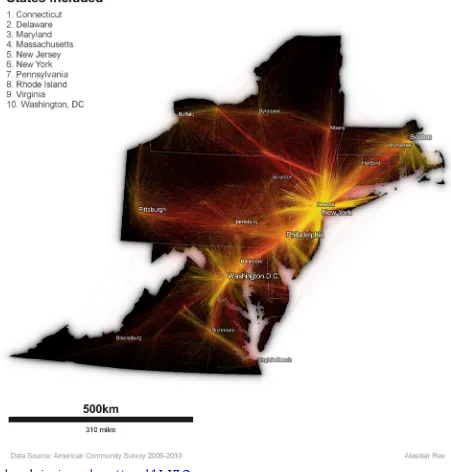
The nature of urban agglomeration on the east coast is rather different. Unlike
California’s Nor-Cal/So-Cal mega-region
divide, the so-called Bos-Wash urban corridor looks very much like a continuous, interconnected urban area. This is depicted in Figure 3, with the map including all states that the Bos-Wash area runs through. From Boston, Worcester and Hartford in the north,
through New York, Newark and
Philadelphia in the mid-region, to Baltimore and Washington in the south, this mega-regional nexus of journeys to work is an order of magnitude larger than its west coast equivalent. It also connects more widely to Richmond and Virginia Beach in the south and upstate New York cities such as Albany and Syracuse. Including all commuting flows in the Bos-Wash states, Figure 3 accounts for 1,104,524 tract-to-tract commuter links (26.6% of the US total) and 30,292,966 individual commutes (23.3%).
7 Figure 2 – Commuting in California
8 Figure 3 – Commuting in the Northeastern United States
High resolution images: https://goo.gl/kJoULQ
From mega-regions to mega-commutes
Although there is no time variable in the ACS tract-to-tract commuting dataset, I have
explored commuting patterns in the
northeastern United States for individual commutes of 50 miles or more. In this
9 individual flow lines and over 30 million
individual commutes, 38,900 connections (3.5%) and 523,273 journeys (1.7%) are for more than 50 miles from point to point.
These patterns are shown in Figure 4, where longer commutes are again displayed in red and shorter commutes in yellow. Within the Bos-Wash corridor, New York dominates mega-commuting patterns, as we might expect, but Washington DC and Boston also stand out. Further south, Richmond also appears to attract a number of ‘mega-commuters’.
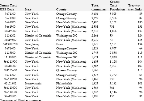
In order to provide a little more detail on the volume of mega-commuting flows to individual census tracts, Table 1 highlights the top 20 tracts, by in-commuting volume, for mega-commuting in the northeastern United States. Unsurprisingly, this is dominated by New York City and Washington.
I have also added in 2010 Census tract population in order to provide some local context, in addition to the absolute number of individual tract-to-tract links for these
destination census tracts. Perhaps
surprisingly, two census tracts in Orange County in the state’s Mid-Hudson region top the list.
However, 12 of the top 20 mega-commuting destination census tracts are in New York City, in either Manhattan or Queens. Given its important national role, and its position
within the wider east coast urban
[image:10.595.61.527.431.760.2]agglomeration, it is not surprising that Washington, DC appears in the list three times. However, such commutes are by no means the longest in the United States so the final part of the analysis looks at the rather more extreme commutes which are picked up by the ACS tract-to-tract commuting file.
Table 1 – Top 20 ‘mega-commuter’ census tracts in the northeastern US* Census Tract
FIPS Code State County
Total commuters
Census Tract Population
Tract-to-tract links
10 Figure 4 – Mega-commuting in the Northeastern United States
High resolution images: https://goo.gl/kJoULQ
Mapping super-commuting, or mapping
uncertainty?
With any small area survey dataset, it is wise to remain circumspect about the accuracy of individual data elements. For this reason, I
11 studies, and the aggregate values closely match
official labour markets statistics, but they draw on much more fine-grained data. In this final empirical section, I therefore consider two related issues. First, are there, as the ACS tract-to-tract data suggest, a small cohort of US ‘super-commuters’ who regularly travel thousands of miles for work? Related to this, I comment on the quality of the estimates at the tract level, using the margin of error statistic provided for each flow in the dataset in order to calculate the coefficient of variation for each of the 4.1 million tract-to-tract estimates.
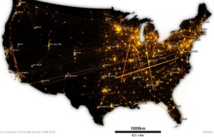
In the process of collating, analysing and visualising the ACS tract-to-tract dataset, it became clear that there were a number of extremely long distance flows which appeared anomalous. This is one of the major benefits of geovisualization of large spatial data matrices. These flows have been filtered out of the US map in Figure 1, since that focuses on commutes of 160km or less, so I return now to look at commutes of more than 800km (c. 500 miles) and more than 10 individuals. These accounted for 29,982 individual tract-to-tract connections in the 2006-2010 ACS dataset and a total of 565,150 flows.
The geography of these ‘super-commuters’ is rather different from the patterns in previous maps since the places connected are a mix of large cities, medium sized cities and US military installations. These can be observed in Figure 5. For example, there is a strong connection between tracts in the vicinity of Charlottesville, VA and Fort Smith, AR. The former is the location for the National Ground Intelligence Center (INSCOM) of the US Army, whereas the latter is adjacent to Fort Chaffee Maneuver Training Center, an Army National Guard installation. Similarly, the Phoenix, AZ metropolitan area is home to Luke Air Force base and has several
long-distance connections with other cities in the
United States. Beyond the military
explanations, there are major connections between several of the United States’ largest cities, including New York and Miami, Chicago and Atlanta, Seattle and San Francisco and Denver and Dallas. These relationships are consistent with recent research on ‘the emergence of the super-commuter’ carried out by NYU’s Rudin Center for Transportation Policy and Management (Moss and Qing, 2012).
The final question I examined in my research was the question of data validity, and in particular the reliability of tract-to-tract flows. The United States Census Bureau publishes the tract-to-tract data with margin of error (MOE) figures for each commuter flow. These are based on a 90% confidence level and were used in the study to calculate a coefficient of variation (CV) value for each tract-to-tract link. This was performed in QGIS using the field calculator and the following formulae:
((MOE/1.645)/Commuting Estimate) x 100.
12 Figure 5 – American Super-Commuters?
High resolution images: https://goo.gl/kJoULQ
However, before presenting the results it is worth repeating the words of the US Census Bureau in Appendix 3 of their ACS data guidance document (US Census Bureau, 2009):
“While it is true that estimates with high CVs have important limitations, they can still be valuable as building blocks to develop estimates for higher levels of aggregation. Combining estimates across geographic areas or collapsing characteristic detail can improve the reliability of those estimates as evidenced by reductions in the CVs.”
In this paper, then, I have taken a ‘geographical building block’ approach to presenting the results of the ACS tract-to-tract commuting dataset rather than attempt to draw substantive conclusions from
individual flows. Nonetheless, the geographic patterns observed above do align with previously published academic research. When we take only those individual flows which meet the ESRI ‘medium reliability’ criteria, or better, 221,036 of all tract-to-tract connections (5.3% of the total) and 36,831,569 of all commutes (28.5% of the total) are accounted for. These figures are rather low, and highlight the fact that users should, in general, approach individual tract-to-tract flows with caution.
13 remain, which provides strong evidence to
suggest that the estimates for these extremely long journeys to work are relatively reliable. The vast majority of individual commuter
flow estimates, however, are highly
unreliable, as noted by Spielman and Folch (2015). For this reason, I have not symbolised or weighted individual flows according to their estimates but instead simply used their origin and destination coordinates to plot connections. The ACS does not offer any estimates of the reliability of individual census
[image:14.595.92.517.362.634.2]tract-to-tract connections, only the margin of error for the magnitude of individual links but, as noted in the California example above, the aggregate values derived from the ACS tract-to-tract data closely match official labor market figures. In the absence of more reliable small area commuting estimates, mapping these connections at an aggregate level would seem the most appropriate approach.
Figure 6 – Mapping the coefficient of variation in the ACS
High resolution images: https://goo.gl/kJoULQ
4. Conclusions
Despite the cautionary note in the previous section, it is clear that the ACS tract-to-tract dataset is a valuable part of the US spatial data infrastructure. Its shortcomings at the
14 not seem to be true for individual
tract-to-tract connections. Overall, then, it would appear that Tobler’s ‘First Law’ mostly holds but it is violated by a select group of US super-commuters.
Reflecting upon Rae’s four ‘principles for the orderly loss of information’, it is worth re-emphasising here that any study of this kind
can, at best, represent an ‘optimal
compromise’ and not the absolute truth. This may be a rather obvious thing to say but in the quest to derive simplicity from complexity an analytical filtering process must take place. Therefore, I have attempted to look at the big picture here in an attempt to understand the functional economic relationships between towns and cities in the world’s largest economy. The results corroborate with previous research and indicate that there is great value in the ACS data used herein.
The final point to emphasise here is that the availability of large open datasets and open source software makes it easier than ever to interrogate very large datasets in new and innovative ways, as a means to answer longstanding research and policy questions.
How, exactly, does the Bos-Wash
‘megalopolis’ of Gottman (1957) connect together, and what is the nature of San Francisco-style polycentricity? Where do America’s ‘mega-commutes’ take place, and is the level of ‘super-commuting’ sustainable? With new open data, open source software and enhanced computing capabilities, the answers to such questions are within reach. The difficulty, as ever, is to know how we should respond. This paper represents a tentative first step towards a greater understanding of the American commute and, by extension, of the geography of the nation’s mega-regions.
5. References
Antikainen, J. (2005). The concept of functional urban area. Findings of the Espon project, 1(1).
Boulding K, 1970 Economics as a Science (McGraw-Hill, New York)
Bureau of Labor Statistics (2015) Economy at a Glance: California, historic data available at
http://www.bls.gov/eag/eag.ca.htm accessed 29 June 2015.
Cervero, R., & Wu, K. (1997). Polycentrism, commuting, and residential location in the San Francisco Bay area. Environment and Planning A, 29(5), 865-886.
Cervero, R., & Wu, K. (1998). Sub-centring and commuting: evidence from the San Francisco Bay area, 1980-90. Urban studies, 35(7), 1059-1076.
Dewar, M., & Epstein, D. (2007). Planning for “megaregions” in the United States. Journal of Planning Literature, 22(2), 108-124.
Dorling D, 1991 The Visualization of Spatial
Structure PhD thesis, Department of
Geography, University of Newcastle upon Tyne
ESRI (2014) The American Community
Survey: An ESRI White Paper, ESRI, Redlands, CA.
FHA (2015) Census Transportation Planning Products, CTPP 2006-2010 Census Tract Flows Query Tutorial, available at
http://www.fhwa.dot.gov/planning/census_i
ssues/ctpp/data_products/2006-2010_tract_flows/index.cfm, accessed 27 June 2015.
15 Cambridge Journal of Regions, Economy and
Society, 1(3), 459-476.
Gottmann, J. (1957). Megalopolis or the urbanization of the northeastern seaboard. Economic geography, 189-200.
Hall, P. G., & Pain, K. (2006). The polycentric metropolis: learning from mega-city regions in Europe. Routledge.
Kern R, Ruston G, 1969, "MAPIT: a computer program for the production of flow maps, dot maps, and graduated symbol maps" The Cartographic Journal 2 131 – 136
Moss, M. and Qing, C. (2012) The Emergence of the “Super-Commuter”, Rudin Center for Transportation, NYU Wagner School of Public Service.
Nelson, A. C., & Lang, R. E. (2011). Megapolitan America. American Planning Association, Washington DC.
Minard C, 1869, "Carte figurative des pertes successives en hommes de l'Armée Française dans la campagne de Russie 1821 – 1813"
Parr, J. (2004). The polycentric urban region: a closer inspection. Regional studies, 38(3), 231-240.
Rae, A. (2009). From spatial interaction data
to spatial interaction information?
Geovisualisation and spatial structures of migration from the 2001 UK census. Computers, Environment and Urban Systems, 33(3), 161-178.
Rae, A. (2011). Flow-data analysis with geographical information systems: a visual approach. Environment and Planning-Part B, 38(5), 776.
Rae, A. (2014) Flow mapping with QGIS,
available at
http://www.undertheraedar.com/2014/10/fl ow-mapping-with-qgis.html, accessed 27 June 2015.
Rapino, M. A., & Fields, A. K. (2013). Mega Commuters in the US: Time and Distance in Defining the Long Commute using the American Community Survey.
Ratti, C., Sobolevsky, S., Calabrese, F., Andris, C., Reades, J., Martino, M., et al. (2010). Redrawing the map of Great Britain from a network of human interactions. PloS one, 5(12), e14248.
Ravenstein, E. G. (1885). The laws of migration. Journal of the Statistical Society of London, 167-235.
Regional Plan Association (2015) Megaregions,
available at
http://www.america2050.org/megaregions.ht ml, accessed 29 June 2015.
Spielman, S. and Folch, D. (2015) ‘Reducing Uncertainty in the American Community
Survey through Data-Driven
Regionalization’, PLOS ONE, 1-21.
Tobler, W. R. (1970). A computer movie simulating urban growth in the Detroit region. Economic geography, 234-240.
Tobler W, 1976 WINDS: A Computer Program for the Analysis of Geographical Interactions Cartography Laboratory Report 13, University of Michigan, Ann Arbor, MI
Tobler W, 1987, "Experiments in migration mapping by computer" The American
Cartographer 14(2) 155 – 163,
doi:10.1559/152304087783875273
16 US Census Bureau (2009) A Compass for
Understanding and Using American
Community Survey Data: What State and Local Governments Need to Know, US Census Bureau, Washington, DC.
Wittick R, 1976, "A computer system for
mapping and analyzing transportation