The Spec UI framework
Johan Fabry and Stéphane Ducasse
The contents of this book are protected under the Creative Commons Attribution-ShareAlike 3.0 Unported license.
You arefree:
• toShare: to copy, distribute and transmit the work, • toRemix: to adapt the work,
Under the following conditions:
Attribution. You must attribute the work in the manner specified by the author or licensor (but not in any way that suggests that they endorse you or your use of the work).
Share Alike. If you alter, transform, or build upon this work, you may distribute the resulting work only under the same, similar or a compatible license.
For any reuse or distribution, you must make clear to others the license terms of this work. The best way to do this is with a link to this web page:
http://creativecommons.org/licenses/by-sa/3.0/
Any of the above conditions can be waived if you get permission from the copyright holder. Nothing in this license impairs or restricts the author’s moral rights.
Your fair dealing and other rights are in no way affected by the above. This is a human-readable summary of the Legal Code (the full license):
http://creativecommons.org/licenses/by-sa/3.0/legalcode
[&]
Published by Square Bracket Associates, Switzerland. http://squarebracketassociates.orgISBN 978-1-326-92746-2 First Edition, January 2017.
Layout and typography based on thesbabookLATEX class by Damien Pollet. The source
Contents
Illustrations iii
1 Introduction 1
2 First Contact With Examples 3
2.1 A customer satisfaction UI. . . 3
2.2 Fun with Lists . . . 7
2.3 Conclusion. . . 9
3 Reusing and composing elements 11 3.1 First requirements. . . 11
3.2 Creating a basic UI to be reused as a widget . . . 12
3.3 Combining two basic widgets into a reusable UI . . . 14
3.4 Managing three widgets and their interactions . . . 15
3.5 Changing the layout of a reused widget . . . 17
3.6 Considerations about a public configuration API . . . 19
3.7 Conclusion. . . 19
4 The fundamentals of Spec 21 4.1 User interface building: a composition . . . 21
4.2 TheinitializeWidgetsmethod. . . 22
4.3 Defining UI Layouts . . . 23
4.4 TheinitializePresentermethod . . . 26
4.5 Conclusion. . . 26
5 Layout Construction 27 5.1 About layouts . . . 27
5.2 Row and column layouts . . . 28
5.3 Combining rows and columns . . . 30
5.4 Setting row and column size. . . 32
5.5 Layouts without rows or columns . . . 35
5.6 Conclusion. . . 38
6 Managing windows 39 6.1 Opening a window or a dialog box . . . 40
6.2 Modal windows and the closing of windows . . . 41
6.4 The final details: title, icon and about text. . . 44
6.5 Conclusion. . . 45
7 Advanced Widgets 47 7.1 TextModel . . . 47
7.2 RadioButtonModel . . . 49
7.3 TabModel . . . 52
7.4 Toolbars and Pop-up Menus. . . 54
7.5 Conclusion. . . 58
8 Dynamic Spec 59 8.1 Dynamically changing an already opened UI . . . 59
8.2 Dynamically populating a UI with widgets . . . 64
8.3 Hacking together a UI in the Playground . . . 67
8.4 Conclusion. . . 69
9 Tips and Tricks 71 9.1 Integrating the different UI frameworks . . . 71
9.2 Lists, trees and tables . . . 73
9.3 Using the underlying widget library . . . 76
Illustrations
2-1 A screen shot of the customer satisfaction UI. . . 3
2-2 Screen shot of the list with modified background colors . . . 7
2-3 Screen shot of the list of Icons. . . 8
3-1 Screen shot of the ProtocolBrowser. . . 12
3-2 Screen shot of the WidgetClassList. . . 13
3-3 Screen shot of the ProtocolMethodList. . . 15
3-4 Render of the ProtocolViewer.. . . 17
4-1 Screen shot of the UI with buttons placed horizontally . . . 25
4-2 Screen shot of the UI with buttons placed vertically. . . 26
5-1 Screen shot of a row of widgets.. . . 28
5-2 Screen shot of a column of widgets.. . . 29
5-3 Screen shot of two rows. . . 30
5-4 Screen shot of multiply-nested rows and columns. . . 31
5-5 Screen shot of multiply-nested rows. . . 31
5-6 Screen shot of a row of 30 pixels high. . . 33
5-7 Screen shot of a column of 50 pixels wide. . . 33
5-8 Screen shot of a use of proportional rows and columns. . . 35
5-9 Screen shot of an absolutely placed button . . . 36
5-10 Screen shot of an always centered button . . . 37
7-1 Screen shot of the washing machine control panel. . . 50
7-2 Screen shot of the washer-dryer machine control panel. . . 52
8-1 The multi-data viewer when just opened. . . 60
8-2 The multi-data viewer in vertical layout, with a Form selected. . . 61
8-3 The extended multi-data viewer showing the contents of an array. . . 65
C H A P T E R
1
Introduction
Spec is a framework in Pharo for describing user interfaces. It allows for the construction of a wide variety of UIs; from small windows with a few buttons up to complex tools like a debugger. Indeed multiple tools in Pharo are writ-ten in Spec, e.g., the Watchpoint window, Komitter, Change Sorter, Critics Browser, and the Pharo 3 debugger.
The fundamental principle behind Spec is reuse of user interface logic and visual composition. User interfaces are built by reusing and composing ex-isting user interfaces, configuring them as needed. This principle starts from the most primitive elements of the UI: widgets such as buttons and labels are in themselves complete UIs that can be reused, configured, and opened in their own window. These elements can be combined to form more complex UIs that again can be reused as part of a bigger UI, and so on. This is some-what similar to how the different tiles on the cover of this book are com-bined. Smaller tiles configured with different colors or patterns join to form bigger rectangular shapes that are a part of an even bigger floor design.
To allow such reuse, Spec is influenced by VisualWorks and Dolphin Smalltalks’ Model View Presenter (MVP) pattern. Spec recognizes the need for a Presen-ter or ApplicationModel class (in Spec called ComposableModel) that man-ages the logic and the link between widgets and domain objects. Fundamen-tally, when writing Spec code, the developer doesnotcome into contact with UI widgets, instead a ComposableModel is programmed that holds the UI logic. When the UI is opened this model will then instantiate the appropri-ate widgets. This being said, for the programmer this distinction is not really apparent and it feels as if the widgets are being programmed directly.
Squeak (the ancestor of Pharo). Morphic provides standard UI widgets, and as such is used by Spec to render UI’s, but can also be used to build any kind of graphical shape and allows for their direct manipulation. Spec is more re-stricted than Morphic in that it only allows one to build user interfaces for applications that have typical GUI widgets such as buttons, lists et cetera. The GT tools are more restrictive than Spec since they target the domain of development tools. The GT Tools therefore restrict and simplify UI construc-tion to layouts and workflows typical to development environments. Spec does not have these restrictions, which can make UI construction more intri-cate but allows for a wider variety of UIs to be built.
A significant drawback of Spec until now is that it did not have good qual-ity documentation. Documentation was scattered, sometimes hard to derstand and overall not user friendly. We believe that this has caused un-needed barriers to adoption and have therefore written this book to adress this issue. While the contents of this book is based on existing Spec docu-mentation, almost all text has been completely rewritten in order to provide better quality documentation. We hope that this book will be of use to devel-opers that need to write UI’s in Pharo by significantly easing the UI develop-ment experience with Spec.
Note While Spec comes as standard in Pharo 3 and above, this book fo-cuses on Pharo 5 and 6. Earlier and later versions of Pharo may have im-plementations of Spec that differ, causing some example code here to not work. Nonetheless, the fundamental principles of UI development in Spec will hold and example code changes will therefore be minor.
C H A P T E R
2
First Contact With Examples
To start this booklet we use a couple of examples to explain the use of Spec. We will first construct a small but complete user interface, and then show some more examples of how existing widgets can be configured. This will already allow you to build basic user interfaces.
After completing this chapter you should at least read the following chap-ter about reuse of Spec widgets, which is the key reason behind the power of Spec. With these two chapters read you should be able to construct Spec user interfaces as intended. You could use the rest of this booklet just as ref-erence material, but nonetheless we recommend you to at least give a brief look at the other chapters as well.
2.1
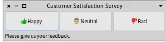
A customer satisfaction UI
[image:9.450.150.312.525.566.2]In this first example of a Spec UI we will construct a simple customer satis-faction UI, which will allow a user to give feedback about a service by click-ing on one of three buttons. (This feedback should be recorded and pro-cessed, but this is outside of the scope of this text). We show a screenshot of the UI in Figure 2-1.
Create the class of the UI and variable accessors
All user interfaces in Spec are subclasses ofComposableModel, so the first step in creating the UI is creating a subclass:
ComposableModel subclass: #CustomerSatisfaction
instanceVariableNames: 'buttonHappy buttonNeutral buttonBad screen' classVariableNames: ''
package: 'Spec-BuildUIWithSpec'
The instance variables of the class hold the widgets that the UI contains. In this case we have three buttons and a text screen. Accessors for these in-stance variables also need to be defined, the Spec interpreter will use them in the UI construction process.
Note Always remember to generate the accessors for the instance vari-ables of the widgets of the UI.
The methods of the class provide their initialization and configuration, e.g. labels and actions, as well as the logic of their interaction. The basic design of our GUI, i.e. how the widgets are laid out, is defined by a method at class side.
Instantiate and configure subwidgets
A subclass ofComposableModelhas the responsibility to define the ini-tializeWidgetsmethod, which instantiates and configures the widgets used in the user interface. We now discuss it piece by piece.
First we show widget instantiation:
CustomerSatisfaction >> initializeWidgets "widget instantiation"
screen := self newLabel. buttonHappy := self newButton. buttonNeutral := self newButton. buttonBad := self newButton.
ComposableModeldefines messages for the creation of the standard widgets:
newButton,newCheckBox,newDropList, ... All of these are defined in the
widgetsprotocol.
Note Do notcallnewto instantiate a widget that is part of your UI. Note An alternative way to instantiate widgets is by using the message
2.1 A customer satisfaction UI
Second, we configure the buttons of our UI. The messagelabel:defines their label and the messageicon:specifies the icon that will be displayed near the label. The code below is for Pharo 6, for this to work in Pharo 5 re-placeself iconNamed:withSmalltalk ui icons iconNamed:.
[ ... continued ... ] "widget configuration"
screen label: 'Please give us your feedback.'. buttonHappy
label: 'Happy';
icon: (self iconNamed: #thumbsUp). buttonNeutral
label: 'Neutral';
icon: (self iconNamed: #user). buttonBad
label: 'Bad';
icon: (self iconNamed: #thumbsDown).
Third and last, it is a good practice to define the focus order, which is useful for keyboard navigation.
[ ... continued ... ]
"specification of order of focus" self focusOrder
add: buttonHappy; add: buttonNeutral; add: buttonBad
AComposableModelsubclass may also define aninitializePresenter
method. The purpose of this method is to configure the interactions between the different widgets.
CustomerSatisfaction >> initializePresenter
buttonHappy action: [ screen label: buttonHappy label ]. buttonNeutral action: [ screen label: buttonNeutral label ]. buttonBad action: [ screen label: buttonBad label ].
We use the messageaction:to specify the action that is performed when the buttons are clicked. In this case, we change the content of what is shown on the screen, to provide feedback that the choice has been registered. Note that the messageaction:is part of the button API. In other situations, you will specify that when a given event occurs, another message should be sent to a widget subpart.
Note To summarize: the configuration of a widget ‘on its own’ goes in
initializeWidgetsand the configuration of a widget ‘in cooperation with others’ goes ininitializePresenter.
the UI has not yet been specified. This is the role of the class side method
defaultSpec.
CustomerSatisfaction class >> defaultSpec ^ SpecLayout composed
newRow: [ :row |
row add: #buttonHappy; add: #buttonNeutral; add: #buttonBad ] origin: 0 @ 0 corner: 1 @ 0.7;
newRow: [ :row | row add: #screen ] origin: 0 @ 0.7 corner: 1 @ 1; yourself
In this layout, we add two rows to the UI, one with the buttons and one with the screen of text. Defining widget layout is a complex process with many different possible requirements, hence in this chapter we do not talk in de-tail about layout specification. Instead for more information we refer to Chapter 5.
Note The argument of theadd:messages are the symbols for the ac-cessors. This is because the Spec interpreter will call these methods to retrieve the widgets when performing the layout.
Define a title and window size, open and close the UI
To set the window title and the initial size, two more methods need to be defined:
CustomerSatisfaction >> title ^ 'Customer Satisfaction Survey'. CustomerSatisfaction >> extent
^ 400@100
Thetitlemethod returns a string that will be used as a title, and the ex-tentmethod returns a point that specifies the size of the window.
To open a UI, an instance of the class needs to be created and it needs to be sent theopenWithSpecmessage. This will open a window and return an in-stance ofWindowModel, which allows the window to be closed from code.
| ui |
ui := CustomerSatisfaction new openWithSpec.
[ ... do a lot of stuff until the UI needs to be closed ...] ui close.
More information about managing windows: e.g., opening dialog boxes or setting the about text is present in Chapter 6.
2.2 Fun with Lists
Figure 2-2 Screen shot of the list with modified background colors
2.2
Fun with Lists
As an illustration of how widgets can be configured, we now show two exam-ples of lists: a list using different background colors and a list that also shows icons.
These examples show two important features of Spec:
1. All widgets can be opened as a window. This is because there is no fun-damental difference between a complex UI as shown above and the standard widgets.
2. All widgets can be configured, and their configuration methods are classified inapiprotocols.
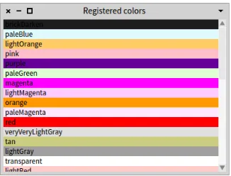
Registered colors as item background
We start with an example of aListModelwhere the elements have different background colors, shown in Figure 2-2. The items held in the list are the names of different colors, and the list shows them using a background of that color.
The following code shows how this is done:
| registeredColorsList |
registeredColorsList := ListModel new. registeredColorsList
items: Color registeredColorNames;
backgroundColorBlock: [ :item | Color named: item ]; title: 'Registered colors'.
registeredColorsList openWithSpec
Figure 2-3 Screen shot of the list of Icons
• The messagebackgroundColorBlock:specifies a block that is exe-cuted to determine the background color of the current element. It takes a block with a single parameter: the list item.
• The messagetitle:sets the title of the window containing the list.
List of icons
The second example shows a list containing the icons of the current theme and their respective selector in anIconListModel. The list items are associ-ations of the icon names and the icons themselves, the text that is shown in the list is the icon name, and the icon shown in the list is the icon itself. We also sort the items in the list alphabetically according to their name.
| iconList |
iconList := IconListModel new. iconList
items: Smalltalk ui icons icons associations; displayBlock: [ :assoc | assoc key];
sortingBlock: [ :assocA :assocB | assocA key < assocB key ]; icons: [ :assoc | assoc value ];
title: 'Availiable icons for the current theme.'. iconList openWithSpec
The following messages of theListModelAPI are noteworthy:
• The messagedisplayBlock:takes a block that receives a domain spe-cific item and should return something that can be displayed in a list, like a String.
2.3 Conclusion
2.3
Conclusion
In this chapter we have given you a first contact with Spec user interfaces. We have first shown you what the different steps are to build a user interface with Spec, and then shown you two examples of how to configure existing Spec widgets.
More examples of Spec user interfaces are found in the Pharo Image itself. Since all Spec user interfaces are subclasses ofComposableModel, they are easy to find and each of them may serve as an example. Furthermore, exper-imentation with widgets and user interfaces is made easy because all widgets can be opened as standalone windows, and their configuration methods are classified in theapiprotocol.
C H A P T E R
3
Reusing and composing
elements
A key design goal of Spec is to enable the seamless reuse of user interfaces as widgets for the user interface you are building. The reason for this is that it results in a significant productivity boost when creating user interfaces.
This focus on reuse was actually already visible in the previous chapter, where we have seen that basic widgets can be used as if they were a com-plete user interface. In this section we focus on the reuse and composition of widgets, showing that it basically comes for free. The only requirement when building a UI is to consider how the user interface should be parameterized when it is being reused, and there is only one concrete rule that needs to be followed in that respect.
In this chapter, you will learn how we can build a new UI by reusing already defined elements.
3.1
First requirements
To show how Spec enables the composition and reuse of user interfaces, in this chapter we build the user interface shown in Figure 3-1 as a composition of four parts:
1. TheWidgetClassList: a widget containing aListModelspecifically for displaying the subclasses ofAbstractWidgetModel.
2. TheProtocolMethodList: a widget composed of aListModeland a
Figure 3-1 Screen shot of the ProtocolBrowser.
3. TheProtocolViewer: a composition of oneWidgetClassListand two
ProtocolMethodList, it will browse the methods in the protocolsapi
andapi-eventsof all subclasses ofAbstractWidgetModel.
4. TheProtocolBrowser: reuses aProtocolViewer, changes its layout and adds aTextModelto see the source code of the methods.
3.2
Creating a basic UI to be reused as a widget
The first custom UI we build should display a list of all subclasses of Ab-stractWidgetModel. This UI will later be reused as a widget for a more com-plete UI. The code is as follows (we do not include code for accessors):
First we create a subclass ofComposableModelwith one instance variable
listwhich will hold an instance ofListModel. ComposableModel subclass: #WidgetClassList
instanceVariableNames: 'list' classVariableNames: ''
package: 'Spec-BuildUIWithSpec
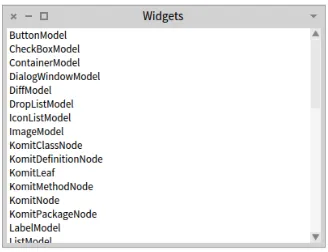
In the methodinitializeWidgets, we create the list and populate it with the required classes, in alphabetical order. We also add a title for the win-dow.
WidgetClassList >> initializeWidgets list := self newList.
3.2 Creating a basic UI to be reused as a widget
Figure 3-2 Screen shot of the WidgetClassList.
WidgetClassList >> title ^'Widgets'
The layout contains only the list:
WidgetClassList class >> defaultSpec ^ SpecLayout composed
add: #list; yourself
The resulting UI is shown in Figure 3-2.
Since this UI will later be used together with other widgets to provide a more complete user interface, some actions will need to occur when a list item is clicked. However, we cannot know beforehand what all these possible ac-tions will be everywhere that it will be reused. The best solution therefore is to place this responsibility on the reuser of the widget. Every time this UI is reused as a widget, it will be configured by the reuser. To allow this, we add a configuration method namdwhenSelectedItemChanged:, in theapi
protocol:
WidgetClassList >> whenSelectedItemChanged: aBlock list whenSelectedItemChanged: aBlock
Now, whoever reuses this widget can parameterize it with a block that will be executed whenever the selected item is changed.
3.3
Combining two basic widgets into a reusable UI
The UI we build now will show a list of all methods of a given protocol, and it combines two widgets: a list and a label. Considering reuse, there is no dif-ference with the previous UI. This is because the reuse of a UI as a widget is
not impacted at allby the number of widgets it contains (nor by their posi-tion). Large and complex UIs are reused in the same way as simple widgets.
ComposableModel subclass: #ProtocolMethodList instanceVariableNames: 'label methods' classVariableNames: ''
package: 'Spec-BuildUIWithSpec'
TheinitializeWidgetsmethod for this UI is quite straightforward. We specify the default label text as ’protocol’, which will be changed when the widget is reused. We also give this UI a title.
ProtocolMethodList >> initializeWidgets methods := self newList.
methods displayBlock: [ :m | m selector ]. label := self newLabel.
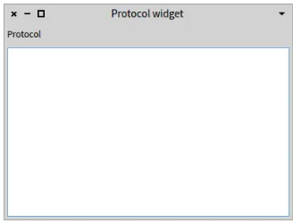
label label: 'Protocol'. self focusOrder add: methods. ProtocolMethodList >> title
^ 'Protocol widget'
The layout code builds a column with the fixed-height label on top and the list taking all the space that remains. (See Chapter 5 for more on layouts.)
ProtocolMethodList class >> defaultSpec ^ SpecColumnLayout composed
add: #label height: self toolbarHeight; add: #methods;
yourself
This UI can be seen by evaluatingProtocolMethodList new openWith-Spec. As shown in Figure 3-3 the list is empty. This is normal since we did not set any items.
Our protocol method list will need to be configured when it is used, for ex-ample to fill the list of methods and to specify what the name is of the pro-tocol. To allow this, we add a number of configuration methods in theapi
protocol:
ProtocolMethodList >> items: aCollection methods items: aCollection
ProtocolMethodList >> label: aText label label: aText
3.4 Managing three widgets and their interactions
Figure 3-3 Screen shot of the ProtocolMethodList.
ProtocolMethodList >> whenSelectedItemChanged: aBlock methods whenSelectedItemChanged: aBlock
Note An alternative to adding these methods is simply to do nothing: since both the methods and the label are accessible (through their acces-sors), a reuser of this widget may simply obtain them and configure them directly. These two alternatives reflect a design decision that we will dis-cuss in Section 3.6.
3.4
Managing three widgets and their interactions
The third user interface we build is a composition of the two previous user interfaces. We will see that there is no difference between configuring cus-tom UIs and configuring system widgets: both kinds of widgets are config-ured by calling methods of theapiprotocol.
This UI is composed of aWidgetClassListand twoProtocolMethodList
and specifies that when a model class is selected in theWidgetClassList, the methods in the protocolsapiandapi-eventswill be shown in the two
ProtocolMethodListwidgets.
ComposableModel subclass: #ProtocolViewer instanceVariableNames: 'models api events' classVariableNames: ''
package: 'Spec-BuildUIWithSpec'
TheinitializeWidgetsmethod shows the use ofinstantiate:to instan-tiate widgets, and some of the different parametrization methods of the Pro-tocolMethodListclass.
ProtocolViewer >> initializeWidgets
api label: 'api'.
events label: 'api-events'.
self focusOrder add: models; add: api; add: events. ProtocolViewer >> title
^ 'Protocol viewer'
To describe the interactions between the different widgets we define the
initializePresentermethod. It specifies that when a class is selected, the selections in the method lists are reset and both method lists are populated. Additionally, when a method is selected in one method list, the selection in the other list is reset.
ProtocolViewer >> initializePresenter models whenSelectedItemChanged: [ :class |
api resetSelection. events resetSelection. class
ifNil: [ api items: #(). events items: #() ] ifNotNil: [
api items: (self methodsIn: class for: 'api').
events items: (self methodsIn: class for: 'api-events') ] ]. api whenSelectedItemChanged: [ :method |
method ifNotNil: [ events resetSelection ] ]. events whenSelectedItemChanged: [ :method |
method ifNotNil: [ api resetSelection ] ]. ProtocolViewer >> methodsIn: class for: protocol
^ (class methodsInProtocol: protocol) sorted: [ :a :b | a selector < b selector ].
Lastly, the layout puts the sub widgets in one column, with all sub widgets taking the same amount of space.
ProtocolViewer class >> defaultSpec ^ SpecColumnLayout composed
add: #models; add: #api; add: #events; yourself
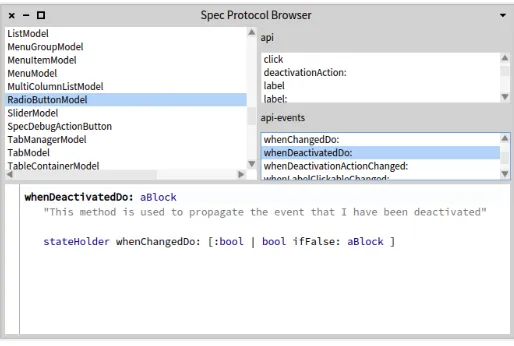
As previously, the result can be seen by executing the following snippet of code:ProtocolViewer new openWithSpec, and the result is shown in Fig-ure 3-4. This user interface is functional, clicking on a class will show the methods of theapiand theapi-eventsprotocols of that class.
3.5 Changing the layout of a reused widget
Figure 3-4 Render of the ProtocolViewer.
ProtocolViewer >> whenClassChanged: aBlock models whenSelectedItemChanged: aBlock ProtocolViewer >> whenEventChanged: aBlock
events whenSelectedItemChanged: aBlock ProtocolViewer >> whenAPIChanged: aBlock
api whenSelectedItemChanged: aBlock
Note Compared to the public configuration API methods we have seen before, these methods add semantic information to the configuration API. They state that they configure what to do when a class,apior api-eventslist item has been changed. This arguably communicates the cus-tomization API more clearly than just having the subwidgets accessible.
3.5
Changing the layout of a reused widget
Sometimes, when you want to reuse an existing UI as a widget, the layout of that UI is not appropriate to your needs. Spec allows you to nonetheless reuse such a UI by overriding the layout of its widgets, and we show this here.
Our last user interface reuses theProtocolViewerwith a different layout and adds a text zone to edit the source code of the selected method. ComposableModel subclass: #ProtocolBrowser
instanceVariableNames: 'text viewer' classVariableNames: ''
package: 'Spec-BuildUIWithSpec' ProtocolBrowser >> initializeWidgets
text := self instantiate: TextModel. viewer := self instantiate: ProtocolViewer. text
isCodeCompletionAllowed: true. self focusOrder
add: viewer; add: text.
ProtocolBrowser >> title ^'Spec Protocol Browser'
The text field is configured to show source code:
• aboutToStyle: trueenables syntax highlighting.
• isCodeCompletionAllowed: trueenables code completion. TheinitalizePresentermethod is used to make the text zone react to a selection in the lists. When a method is selected, the text zone updates its contents to show the source code of the selected method.
ProtocolBrowser >> initializePresenter
viewer whenClassChanged: [ :class | text behavior: class ]. viewer whenAPIChanged: [ :item |
item
ifNotNil: [ text text: item sourceCode ] ]. viewer whenEventChanged: [ :item |
item
ifNotNil: [ text text: item sourceCode ] ]
The last piece of the puzzle is the layout of the different widgets that we are reusing. We combine columns and rows in this UI. The first row is special because we reuse the internal widgets of theviewerwidget in a different layout. To do this, we specify the sequence of accessor messages that need to be sent (as an array of symbols): for example, for the list of classes first the
viewermessage and then themodelsmessage. ProtocolBrowser class >> defaultSpec
^ SpecLayout composed newColumn: [:col | col newRow: [ :row |
row add: #(viewer models); newColumn: [ :col2 |
col2 add: #(viewer api); add: #(viewer events) ] ]; add: #text];
yourself
Note To layout internal widgets of a widget you are reusing (instead of the widget in its entirety), give an array of symbols: it states the sequence of accessors that need to be sent to get to the internal widget.
3.6 Considerations about a public configuration API
3.6
Considerations about a public configuration API
In this chapter we have seen several definitions of methods in the public con-figuration API of the widget being built. The implementation of our config-uration methods here simply delegated to internal widgets, but a configu-ration can of course be more complex than that, depending on the internal logic of the UI.
For methods that simply delegate to the internal widgets, the question is whether it makes sense to define these as methods in theapiprotocols at all. This fundamentally is a design decision to be made by the programmer. Not having such methods makes the implementation of the widget more lightweight but comes at a cost of a less clear intent and of breaking encap-sulation.
For the former cost, we have seen an example in the protocol method list of Section 3.3. The presence of the three methods defined there communicates to the user that we care about what to do when a class,apiorapi-events
list item has been changed. The same fundamentally also holds for the other examples in this chapter: each method in anapiprotocol communicates an intent to the reuser: this is how we expect that this widget will be config-ured. Without such declared methods, it is less clear to the reuser what can to be done to be able to effectively reuse this widget.
For the latter cost, expecting reusers of the widget to directly send messages to internal objects (in instance variables) means breaking encapsulation. As a consequence, we are no longer free to change the internals of the UI, e.g., by renaming the instance variables to a better name or changing the kind of widget used. Such changes may break reusers of the widget and hence severely limits how we can evolve this widget in the future. In the end, it is safer to define a public API and ensure in future versions of the widget that the functionality of this API remains the same.
So in the end it is important to consider future reusers of your UI and future evolution of your UI. You need to make a tradeoff of writing extra methods versus possibly making reuse of the UI harder as well as possibly making fu-ture evolution of the UI harder.
3.7
Conclusion
In this chapter we have discussed a key point of Spec: the ability to seam-lessly reuse existing UIs as widgets. This ability comes with no significant cost to the creator of a UI. The only thing that needs to be taken into account is how a UI can (or should) be customized, and public customization methods should be placed in aapiprotocol.
C H A P T E R
4
The fundamentals of Spec
In this chapter we revisit the key aspects of Spec and put the important cus-tomization points of its building process in perspective.
4.1
User interface building: a composition
A key aspect of Spec is that all user interfaces are constructed through the reuse and composition of existing user interfaces. To allow this, defining a user interface consists of defining themodelof the user interface, andnotthe user interface elements that will be shown on screen. These UI elements are instantiated by Spec, taking into account the underlying UI framework.
In the end, it is the composition of the model and the UI elements that makes up the resulting user interface that is shown. This also explains the name of the root component of Spec: since all UIs are constructed through composi-tionof other UI’s, and it is sufficient to define themodelto define the UI, the root class of all UIs is namedComposableModel. Consequently, to define a new user interface, a subclass ofComposableModelneeds to be created. Considering the construction and orchestration of the different widgets in a user interface, Spec is inspired by the Model-View-Presenter pattern. The model that is defined in Spec corresponds to a presenter in the MVP triad. Note that because of this, future versions of Spec may rename the Compos-ableModelintoComposablePresenterfor naming consistency.
Fundamentally, it is built around three concerns that materialize themselves as the following three methods inComposableModel:
• initializeWidgetstreats the widgets themselves
• defaultSpectreats the layout of the widgets
These methods are hence typically found in the model for each user inter-face. In this chapter we describe the finer points of each method and how these three work together to build the overall UI.
4.2
The
initializeWidgets
method
The methodinitializeWidgetsinstantiates, saves in instance variables, and partially configures the different widgets that will be part of the UI. In-stantiation of the models will cause the inIn-stantiation and initialization of the different lower-level user interface components, constructing the UI that is shown to the user. A first part of the configuration of each widget is specified here as well, which is why this method is calledinitializeWidgets. This focus in this method is to specify what the widgets will look like and what their self-contained behavior is. The behavior to update model state, e.g., when pressing aSavebutton, is described in this method as well. It is explic-itlynotthe responsibility of this method to define the interactionsbetween the widgets.
In general theinitializeWidgetsmethod should follow the pattern: • widget instantiation
• widget configuration specification
• specification of focus order
The last step is not mandatory buthighlyrecommended. Indeed, without this final step keyboard navigation will not work reliably.
Note Specifying the methodinitializeWidgetsis mandatory, as without it the UI would have no widgets.
Widget instantiation
The instantiation of the model for a widget can be done in two ways: through the use of a creation method or through the use of theinstantiate:method.
• Considering the first option, the framework provides unary messages for the creation of all basic widgets. The format of these messages is
new[Widget], for examplenewButtoncreates a button widget, and
newListcreates a list widget. The complete list of available widget creation methods can be found in the classComposableModelin the protocolwidgets.
4.3 Defining UI Layouts
reuse aMessageBrowserwidget, the code isself instantiate: MessageBrowser.
4.3
Defining UI Layouts
Widget layout is defined by specifying methods that state how the different widgets that compose a UI are placed. In addition, it also specifies how a wid-get reacts when the window is resized. As we will see later, these methods can have different names and are subject to a specific lookup process.
A layout method is placed at the class side because it typically returns a value that is the same for all the instances. Put differently, typically all the in-stances of the same user interface have the same layout and hence this can be considered as being a class-side accessor for a class variable.
Note Specifying a layout method is mandatory, as without it the UI would show no widgets to the user.
Having multiple layouts for a widget
For the same UI, multiple layouts can be described, and when the UI is built the use of a specific layout can be indicated. To do this, instead of calling
openWithSpec(as we have done until now), use theopenWithSpec:message with the name of the layout method as argument. For example, consider the following artificial example of a two button UI that has two different layout methods:
ComposableModel subclass: #TwoButtons instanceVariableNames: 'button1 button2' classVariableNames: ''
package: 'Spec-BuildUIWithSpec' TwoButtons >> initializeWidgets
button1 := self newButton. button2 := self newButton. button1 label: '1'. button2 label: '2'. self focusOrder
add: button1; add: button2
TwoButtons class >> buttonRow <spec: #default>
^SpecRowLayout composed
TwoButtons class >> buttonCol ^SpecColumnLayout composed
add: #button1; add: #button2; yourself
This UI can be opened in multiple ways:
• TwoButtons new openWithSpec: #buttonRowplaces the buttons in a row.
• TwoButtons new openWithSpec: #buttonColplaces them in a col-umn.
Note that thebuttonRowlayout method has a<spec: #default>pragma. As a result, thebuttonRowlayout will be used when executingTwoButtons new openWithSpec, as we explain next.
TheopenWithSpecmethod uses the following lookup mechanism to obtain the layout method:
1. Search on class side, throughout the whole class hierarchy, for a method with the pragma<spec: #default>.
2. If multiple such methods exist, the first one that is found is used.
3. If no such methods exist and if there is exactly one method with the pragma<spec>, this method is used.
4. Otherwise the class-sidedefaultSpecmethod will be called, which will raisesubclassResponsibilityif it is not overriden.
Note If there is a method with the<spec: #default>or<spec>
pragma in a superclass of the UI you are building, this one will be used instead of adefaultSpecmethod implemented in your class.
For example, subclasses ofTwoButtonscannot usedefaultSpecmethods since there is a method with the<spec: #default>pragma.
Specifying a layout when reusing a widget
Having multiple layouts for a widget implies that there is a way to specify the layout to use when a widget is reused.
Until now, we have used theadd:message to add a widget to a layout. This uses the mechanism ofopenWithSpecto determine the layout of the widget that is being reused. To use an alternative layout for the widget that is be-ing reused, use theadd:withSpec:message. It takes as extra argument the name of the layout method to use, as we show below:
4.3 Defining UI Layouts
Figure 4-1 Screen shot of the UI with buttons placed horizontally
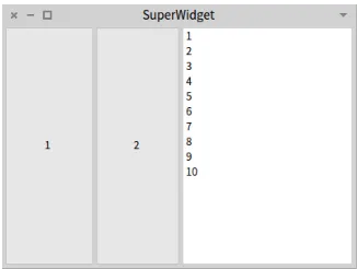
package: 'Spec-BuildUIWithSpec' TBAndListH >> initializeWidgets
buttons := self instantiate: TwoButtons. list := self newList.
list items: (1 to: 10).
self focusOrder add: buttons; add: list. TBAndListH >> title
^'SuperWidget'
TBAndListH class >> defaultSpec ^ SpecRowLayout composed
add: #buttons; add: #list; yourself
ThisTBAndListHclass results in aSuperWidgetwindow as shown in Figure 4-1. It reuses theTwoButtonwidget, and places all three widgets in a hori-zontal order because theTwoButtonwidget will use thebuttonRowlayout method.
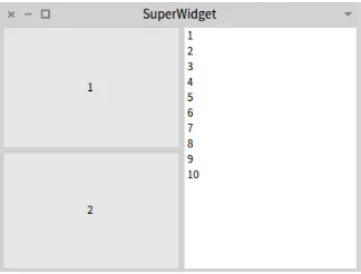
Alternatively, we can createTBAndListVclass as a subclass ofTBAndListH
and only change thedefaultSpecmethod as below. It specifies that the reusedbuttonswidget should use thebuttonCollayout method, and hence results in the window shown in Figure 4-2.
TBAndListH subclass: #TBAndListV instanceVariableNames: '' classVariableNames: ''
package: 'Spec-BuildUIWithSpec' TBAndListV class >> defaultSpec
^ SpecRowLayout composed
Figure 4-2 Screen shot of the UI with buttons placed vertically
4.4
The
initializePresenter
method
The methodinitializePresenterdefines the interactions between the different widgets. By connecting the behaviors of the different widgets it specifies the overall presentation, i.e., how the overall UI responds to inter-actions by the user. Usually this method consists of specifications of inter-actions to perform when a certain event is received by a widget. The whole interac-tion flow of the UI then emerges from the propagainterac-tion of those events.
Note The methodinitializePresenteris the only optional method for a Spec UI.
In Spec, the different UI models are contained in value holders, and the event mechanism relies on the announcements of these value holders to manage the interactions between widgets. Value holders provide the method when-ChangedDo:that is used to register a block to perform on change and the methodwhenChangedSend: aSelector to: aReceiverto send a meessage to a given object. In addition to these primitive methods, the basic widgets provide more specific hooks, e.g., when an item in a list is selected.
4.5
Conclusion
In this chapter we have given a more detailed description of how the three fundamental methods of Spec:initializeWidgets,defaultSpecand ini-tializePresenterare each responsible for a different aspect of the user interface building process. We also discussed in detail the ability to use dif-ferent layout methods and how the lookup of layout methods is performed.
C H A P T E R
5
Layout Construction
Placing and describing the behavior of widgets on resizing of their container is an important yet complex issue. In this chapter we present the different ways to express layouts with Spec.
5.1
About layouts
Layout of widgets in a window or in their reusing UI is a nontrivial problem. This is because there are many factors at play in determining where a widget should be placed in its container (the container can be a window or another widget).
A straightforward solution is to place widgets at absolute coordinates of the enclosing container, but this breaks when the container is resized: widgets do not grow or shrink together with the container. However, if the window is never resized this is not really an issue either, and absolute positioning allows for pixel-perfect placing of every widget.
Since there are multiple usage scenarios, multiple ways for widgets to be laid out need to be provided. Spec provides various options to perform layouts and these are visible as methods in theSpecLayoutclass, in thecommands
protocols. Up until now, as layouts go we have only seen the use of rows and columns, and the adding of a single widget to the container. Furthermore, in all of these results, a row, column or a single widget always took up all available space in its container, which is the default behavior.
speci-Figure 5-1 Screen shot of a row of widgets.
fying rows and columns, and second the diverse ways in which widgets can be laid out freely. Each of them has their advantages and disadvantages de-pending on the kind of UI that is being constructed so it is best to know all of them well enough to be able to make the tradeoff.
A working example
To illustrate these layouts, we use an example class that has two buttons, a list and a text field, the non-layout code of which is below:
ComposableModel subclass: #LayoutExample
instanceVariableNames: 'list button button2 text' classVariableNames: ''
package: 'Spec-BuildUIWithSpec' LayoutExample >> initializeWidgets
button := self newButton. button2 := self newButton. list := self newList. text := self newText.
button label: 'i am a button'. button label: 'me too!'.
5.2
Row and column layouts
A straightforward and often used kind of layout to have more than one wid-get is to have the widwid-gets aligned in rows or columns. Spec provides for an easy way to specify such layouts through the use of thenewRow:and new-Column:messages on theSpecLayoutclass. They create, respectively, a row or a column in which the space given to the widgets is evenly distributed.
[image:34.450.138.299.62.183.2]5.2 Row and column layouts
Figure 5-2 Screen shot of a column of widgets.
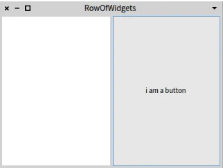
LayoutExample >> oneRow ^ SpecLayout composed
newRow: [ :row | row add: #list; add: #button ]; yourself
This code is a layout method that builds a row of widgets using thenewRow:
message. The argument of the message is a one-argument block, and the block argument will contain an instance of aSpecRowLayout. The widgets are then added to this layout object, which aligns them all in a row.
The code below opens the example with this layout specification, resulting in the UI shown in Figure 5-1. Thetitle:message is self-explanatory.
| le |
le := LayoutExample new. le title: 'RowOfWidgets'. le openWithSpec: #oneRow
Having the widgets rendered as a column is similar, the only real difference being that instead of thenewRow:message, anewColumnmessage is used. This message also takes a one-argument block, and the block argument will contain an instance of aSpecColumnLayout.
LayoutExample >> oneColumn ^ SpecLayout composed
newColumn: [ :col | col add: #list; add: #button ]; yourself
The code below opens this example, resulting in Figure 5-2. Note that for brevity, in the remainder of this chapter we will not include any more UI opening code as it is straightforward.
| le |
Figure 5-3 Screen shot of two rows.
Spec also allows for using theSpecRowLayoutandSpecColumnLayout di-rectly instead of using aSpecLayout. This makes the above code for the
oneRowandoneColumnlayout methods more concise: LayoutExample >> oneRowConcise
^ SpecRowLayout composed add: #list; add: #button; yourself.
LayoutExample >> oneColumnConcise ^ SpecColumnLayout composed
add: #list; add: #button; yourself
5.3
Combining rows and columns
Rows and columns can be combined to build more complex layouts, by send-ing both thenewRow:andnewColumn:messages in different combinations. We show some examples here to illustrate the possibilities.
The first example shows how we can have two rows of widgets: we create a column and twice callnewRow:. The result is shown in Figure 5-3.
LayoutExample >> twoRows ^ SpecColumnLayout composed
newRow: [ :row | row add: #text ];
newRow: [ :row | row add: #button; add: #button2 ]; yourself
Note To have multiple rows, these need to be added to a SpecColumn-Layout, and to have multiple columns, these need to be added to a
5.3 Combining rows and columns
[image:37.450.151.313.227.349.2]Figure 5-4 Screen shot of multiply-nested rows and columns.
Figure 5-5 Screen shot of multiply-nested rows.
Rows and columns can of course also be multiply-nested, for example here we add the two buttons in a row that is nested in a column that is nested in a
SpecRowLayout. The resulting UI is shown in Figure 5-4. LayoutExample >> nesting1
^ SpecRowLayout composed
newColumn: [ :col | col add: #list]; newColumn: [ :col |
col
add: #text; newRow: [ :row |
row
add: #button; add: #button2] ];
yourself
widget to be uniformly halved, as shown in Figure 5-5
LayoutExample >> nesting2 ^ SpecColumnLayout composed
newRow: [ :row | row add: #list]; newRow: [ :row |
row
add: #text; newRow: [ :inRow |
inRow
add: #button; add: #button2] ];
yourself
5.4
Setting row and column size
By default, rows and columns take up all available space, and the space in a row (and in a column) is evenly distributed across all elements of that row (or column). In this section we show three different ways in which the size of rows and columns can be changed. The first is by letting the user resize them and the two last are two different ways in which their size can be specified.
Adding UI splitters so the user can resize
A simple resizing option is to allow the user to resize widgets horizontally (for rows) and vertically (for columns). This is done by adding an addSplit-termessage between theadd:messages for the widgets of that row or col-umn. For example, the code below makes the horizontal line between the list and the button draggable up or down. Visually the result is the same as in Figure 5-2.
LayoutExample >> oneColumnWithSplitter ^ SpecColumnLayout composed
add: #list; addSplitter; add: #button; yourself
Size in pixels
Programmatically it is possible to explicitly specify the absolute size of a row or column in pixels by using thenewRow:height:andnewColumn:width:
5.4 Setting row and column size
Figure 5-6 Screen shot of a row of 30 pixels high.
Figure 5-7 Screen shot of a column of 50 pixels wide.
We show two simple examples of the use of absolute size below, the first leading to the UI of Figure 5-6 and the second to the UI of Figure 5-7.
LayoutExample >> rowOf30 ^ SpecLayout composed
newRow: [ :row | row add: #list; add: #button] height: 30; yourself
LayoutExample >> columnOf50 ^ SpecLayout composed
newColumn: [ :col | col add: #list; add: #button] width: 50; yourself
Alternatively, inside of a column layout and a row layout,add:height:, re-spectivelyadd:width:, can also be used to state the height, respectively the width, of that specific widget.
[image:39.450.149.314.223.350.2]alleviate this,ComposableModel classprovides accessors for practical sizes in itsdefaultsprotocol.
An example of the use of accessors that compute height istoolbarHeight, which we used in the protocol method browser, shown in Figure 3-3. This accessor depends on the font size and is also useful for sizing button rows.
Proportional layout
A last option is to specify the percentage of the container, e.g., the window, that a row or column should occupy. This is performed using the messages
newRow:top:bottom:andnewColumn:left:right:. In contrast with spec-ifying size in pixels, the use of these messages will cause the row or column size to change accordingly when the container is resized.
Both the above messages take two numbers as extra arguments. These should be between 0 and 1: they are a percentage that states how fartowards the other edgethe element should begin, resp. end. For example, a column that starts at the left end of the window and takes 30 percent of the width is a
newColumn: [:c| ...] left: 0 right: 0.7because 30 percent of the width is 70 percent away from the right edge.
Note Both these numbers indicate a percentage that is towards ’the other end’ of the container,nota percentage from top to bottom or from left to right.
A more complex example is the code below, an arguably artificial variant on Figure 5-5 that makes the buttons proportionally smaller. (The example is artificial because, e.g., for the row height of the buttons it would make more sense to use sizes in pixels.) It states that the top row takes the first 80 per-cent of the space (sincetop: 0 bottom: 0.2) and the second row the last 20 percent (sincetop: 0.8 bottom: 0). Furthermore, in the bottom row, the text field takes up the first 55 percent of the space (left: 0 right: 0.45) and the two buttons the last 45 percent (left: 0.55 right:0). The result of this code can be seen in Figure 5-8.
nestingTB
^ SpecColumnLayout composed
newRow: [ :row | row add: #list] top: 0 bottom: 0.2 ; newRow: [ :row |
row
newColumn: [:c | c add: #text] left: 0 right: 0.45; newColumn: [ :c |
c newRow: [ :inRow | inRow
add: #button;
5.5 Layouts without rows or columns
Figure 5-8 Screen shot of a use of proportional rows and columns.
yourself
5.5
Layouts without rows or columns
Rows and columns are of course not the only way in which a user interface can be laid out. Spec also allows widgets to be placed more freely. This can be done either using absolute positions of the enclosing container or using relative positioning, which takes into account window resizing. We show here how these different placement options can be used.
Absolute widget positions
A first manner in which widgets can be laid out, is by giving them absolute positions in their enclosing container. To do this, theSpecLayoutmethod
add:top:bottom:left:right:is used. It takes four extra arguments, each representing a distance as a number of pixels. The number of pixels should be positive, as it indicates a distance from the given edge towards the oppo-site edge.
For example, below we perform a layout of a button at 10 pixels from the top, 200 pixels from the bottom, 10 from the left and 10 from the right, and the result is shown in Figure 5-9.
LayoutExample >> oneButtonAbsolute ^ SpecLayout composed
add: #button top: 10 bottom: 200 left: 10 right: 10; yourself
Note The underlying logic of the arguments is the same as in
Figure 5-9 Screen shot of an absolutely placed button
Note Obviously, the use of absolute widget positions breaks completely if a window is resized. It is therefore best to use this only in combination with windows that cannot be resized.
Relative widget positions
Relative widget positions cause the widget to be resized according to how its container is resized. The methodadd: origin: corner:ofSpecLayout
specifies such relative layout of a widget, percentage-wise from the origin point to the corner point. These two points represent respectively the top left corner and the bottom right corner of the widget. Since the arguments express a percentage of the container, they must be between 0@0 and 1@1.
For example, below we place one button that is half the container size in the center of the container, which can be seen in Figure 5-10.
LayoutExample >> oneButtonSmaller ^ SpecLayout composed
add: #button origin: (0.25 @ 0.25) corner: (0.75 @ 0.75); yourself
Alternatively, the methodadd:top:bottom:left:right:can also be used with percentage arguments, i.e., between 0 and 1, to produce a relative lay-out with percentages computed from the opposite edge. For example, the code below produces exactly the same result as the code above. We how-ever discourage this use of theadd:top:bottom:left:right:method for two reasons. Firstly there may be confusion between relative and absolute: should you interpret a value of 0 or 1 as a percentage or as a number of pix-els? Secondly it does not support the use of offsets, which we discuss next.
LayoutExample >> oneButtonSmallerAlternative ^ SpecLayout composed
5.5 Layouts without rows or columns
Figure 5-10 Screen shot of an always centered button
Relative with offsets
Widget relative positions have the advantage that they resize widgets as their container grows and shrinks, but have the disadvantage that widgets are always placed right next to each other or next to the container border. Placing a widget at, e.g., five percent of a container border, can make the border of the correct thickness for a specific window size but then too big or too small when the window is resized. Actually, what is needed is for a way in which we can place widgets relatively, but specify absolute offsets in addition, so that the gaps between widgets will always be the same. This is possible with theadd: origin: corner: offsetOrigin: offsetCorner:
method ofSpecLayout. Theorigin: corner:arguments are the same as in theadd: origin: corner:method and both offset arguments take a point as argument. These points express the number of pixels from the cor-responding corner, in the classical computer graphics coordinate system where the origin is in the top left corner. Consequently, thexory compo-nent can be negative representing an offset towards the left, respectively the top.
For example, the code below lays out two buttons on top of each other. Each of them takes half the space of the window, minus the window border of 10 pixels and a the space between them of 10 pixels.
LayoutExample >> twoButtonsRelativeOffset ^ SpecLayout composed
add: #button origin: (0 @ 0) corner: (1 @ 0.5)
offsetOrigin: (10 @ 10) offsetCorner: (-10 @ -5); add: #button2 origin: (0 @ 0.5 ) corner: (1 @ 1)
Relative widget positions for rows and columns
Lastly, for easy composition of rows and columns with other widgets, both rows and columns can be placed relatively as well as relatively with an off-set. The methodsnewRow:andnewColumn:have their variants with suffix
origin: corner:andorigin: corner: offsetOrigin: offsetCorner:. These add the relative layout options we have seen for widgets to rows and columns.
One example of the use of this placement was in the very first chapter, in the customer satisfaction example. The layout code for this example is below, and the result can be seen in Figure 2-1.
CustomerSatisfaction class >> defaultSpec ^ SpecLayout composed
newRow: [ :row |
row add: #buttonHappy; add: #buttonNeutral; add: #buttonBad ] origin: 0 @ 0 corner: 1 @ 0.7;
newRow: [ :row | row add: #screen ]
origin: 0 @ 0.7 corner: 1 @ 1; yourself
5.6
Conclusion
C H A P T E R
6
Managing windows
In this book so far we have talked about reuse ofComposableModels, dis-cussed the fundamental functioning of Spec and presented how to layout the widgets of a user interface. Yet what is still missing for a working user interface is showing all these widgets inside of a window. In our examples until now we have only shown a few of the features of Spec for managing windows, basically restricting ourself to opening a window.
In this chapter we provide a more complete overview of how Spec allows for the managing of windows. We show opening and closing, the built-in dialog box facility, sizing of windows and all kinds of window decoration.
A working example
To illustrate the window configuration options that are available, we use a simpleWindowExampleclass that has two buttons placed side by side. These buttons do not have any behavior associated yet, this will be added in an ex-ample further down this chapter.
ComposableModel subclass: #WindowExample instanceVariableNames: 'button1 button2' classVariableNames: ''
package: 'Spec-BuildUIWithSpec' WindowExample >> initializeWidgets
button1 := self newButton. button2 := self newButton.
button1 label: '+'. button2 label: '-'. WindowExample class >>defaultSpec
^ SpecRowLayout composed
6.1
Opening a window or a dialog box
A user interface can be opened as a normal window, or opened as a dialog box, i.e. without decoration and withOkandCancelbuttons. We show here how this is done, including the configuration options specific to dialog boxes. (See also Section 6.3 for more information about window decoration.)
Opening a window
As we have shown in previous sections, to open a user interface you need to instantiate theComposableModelfor that interface and send it the open-WithSpecmessage. This creates an instance ofWindowModelcontaining the user interface and shows it in a window on screen.
We have also seen theopenWithSpec:method, notably in Chapter 5, that takes the name of a layout message as argument. Instead of using the default layout (whose lookup is described in Section 4.3), the opened UI will use the layout returned by that method. A second variant isopenWithSpecLayout:
that takes aSpecLayoutinstance (or an instance of its subclasses). For example, below we show the three ways we can open a window for our
WindowExample. It will open three identical windows. | we |
we := WindowExample new. we openWithSpec.
we openWithSpec: #defaultSpec.
we openWithSpecLayout: we defaultSpec.
Opening a dialog box and its configuration options
Spec provides for an easy way to open a UI as a simple dialog box withOkand Cancelbuttons (that has no icons for resizing, closing or the window menu). To do this, send the messageopenDialogWithSpecas below:
| we diag |
we := WindowExample new. diag := we openDialogWithSpec.
The result of this (e.g. assigned to thediagvariable above) is an instance of theDialogWindowModelclass (a subclass ofWindowModel). For conve-nience,openDialogWithSpechas the same variants as openWindowWith-Specthat take a specific layout as argument, either as a message name or as aSpecLayoutinstance.
6.2 Modal windows and the closing of windows
(if it returns anything else it will be closed). This closing logic allows for the validation of the contents of the dialog box, only allowing it to be closed if validation succeeds. Complimentarily, theOKbutton can be grayed out by sending theokButtonEnabled: falsemessage, and enabled again with a
trueargument.
Also, the messagecancelledwill returntrueif the box was closed by click-ing on theCancelbutton.
Taking over the entire screen
Lastly, it is also possible to open a UI such that it takes over the entire Pharo screen. There are no other windows, the UI is full screen without any resiz-ing or closresiz-ing boxes, nor a title bar. The Pharo window is your UI’s window.
To take over the entire Pharo screen, send the messageopenWorldWithSpec: WindowExample new openWorldWithSpec.
Note Via the halos the UI can still be closed, but any other windows that were open before will have disappeared.
6.2
Modal windows and the closing of windows
Windows are not alone on the screen, and they probably will not live forever. Here we talk about gaining full control of the entire user interface, and how to hook into the window closing logic.
Modal windows
A modal window is a window that takes control of the entire Pharo user in-terface, making it impossible for the user to select another window while it is open. This is especially useful for dialog boxes, but may also be needed for other kinds of windows.
Spec allows any window to be made modal by sending the message modal-RelativeTo: Worldto theWindowModelthat corresponds to the opened
ComposableModel. To get a handle on theWidowModel, send thewindow
message (after the UI has been opened withopenWithSpec). | we |
we := WindowExample new. we openWithSpec.
we window modalRelativeTo: World
Preventing window close
Spec provides for the possibility to check if a window can effectively be closed when the user clicks on the close box. To use it, this feature must first be turned on, by sendingaskOkToClose: trueto theComposableModel. This can be done for example by changing ourWindowExampleas follows: WindowExample >> initializeWidgets
button1 := self newButton. button2 := self newButton. button1 label: '+'. button2 label: '-'. self askOkToClose: true.
The behavior of the close button however is still not changed, closing a win-dow is still possible. This is because we have not defined the implementation of what to check on window close. This is most easily done by overriding the
okToChangemethod ofComposableModel, for example as below: WindowExample >> okToChange
^false
Because this method returnsfalse, clicking on the close button of an open
WindowExamplewindow will not have any effect. We have effectively created an unclosable window! To be able to close this window, we should change the implementation of the above method to returntrue(or simply remove it). Of course the exampleokToChangemethod above is extremely simplistic and not very useful. It instead should define application-dependent logic of what to check on window close. Note that there are many examples of
okToChangemethods in the system that can be used as inspiration.
Acting on window close
It is also possible to perform an action whenever a window is closed, by send-ing thewhenClosedDo:message to the UI’sWindowModel. For example, be-low we specify a goodbye message to deliver when our example UI is closed.
| we |
we := WindowExample new. we openWithSpec.
we window whenClosedDo: [ UIManager default inform: 'Bye bye!' ].
6.3
Window size and decoration
6.3 Window size and decoration
Setting initial size and changing size
To set the initial size of a window when it opens, either override theextent
method of the correspondingComposableModelso that it returns a Point, or send the instance theextent:message before opening, for example like this:
| we |
we := WindowExample new. we extent: 300@80. we openWithSpec
After a window is opened, it can also be resized by sending theextent: mes-sage to the window of the UI. For example, we can change our examples’
initializeWidgetsmethod so that the window resizes itself depending on what button is clicked.
WindowExample >> initializeWidgets button1 := self newButton. button2 := self newButton. button1 label: '+'. button2 label: '-'.
button1 action: [ self window extent: 500@200]. button2 action: [ self window extent: 200@100].
Fixed size
The size of a window can be made fixed, so that the user cannot resize it by dragging the sides or corners. To configure this we however need to talk to the underlying widget library (Morphicin Pharo 5). We get theMorphic win-dow of our example (via itsWindowModel) and instruct it to be unresizable as follows:
| wewin |
wewin := WindowExample new openWithSpec. wewin window beUnresizeable
Removing window decoration
Sometimes it makes sense to have a window without decoration, i.e. without control widgets. Currently this configuration cannot be performed on the
ComposableModelof that window, but the underlying widget library may allow it. Below we show how to get theMorphicwindow of our example and instruct it to remove the different control widgets:
| wewin |
wewin := WindowExample new openWithSpec. wewin window
removeCloseBox; removeMenuBox
Note This window is still closable using the halo menus or by calling
closeon theWindowModelinstance (wewinin the example above).
6.4
The final details: title, icon and about text
You can provide some textual information about the widow by providing a title and a text for the window’s about dialog, as we show here.
Setting and changing the title
By default, the title of a new window is’Untitled window’. This can be changed by overriding thetitlemethod (ofComposableModel) and returning a string that will be used as a title. For example, we can title our example user interface as follows:
WindowExample >> title
^ 'Click to grow or shrink.'
In addition, you can set the title of any UI after it has been opened (even if it specifies atitlemethod) by sending thetitle:message with the new title as argument to the window of the UI. An example is below:
| we |
we := WindowExample new. we openWithSpec.
we window title: 'I am different!'
Setting the icon
At the bottom of the main Pharo window there is a window taskbar, allowing the user to switch between windows by clicking on the buttons that repre-sent each window. These buttons also have an icon that is ment to reprerepre-sent the windows’ kind. This icon can also be configured through Spec, in two dif-ferent ways.
Firstly, sending thewindowIcon:message to theComposableModelallows an icon to be set per window, as below. Note that it does not matter if the message is sent before or after the window is opened.
| wm1 wm2 |
wm1 := WindowExample new. wm1 openWithSpec.
wm1 windowIcon: (Smalltalk ui icons iconNamed: #thumbsDown). wm2 := WindowExample new.
6.5 Conclusion
Secondly, the icon can be changed by overriding thewindowIconmessage, as below. (The code below is for Pharo 6, for this to work in Pharo 5 replace
self iconNamed:withSmalltalk ui icons iconNamed:.) WindowExample >> windowIcon
^ self iconNamed: #thumbsUp
Note Changing thewindowIconmethod will affect all open windows, as the taskbar is periodically refreshed. This refreshing is also why window-Icon:can be sent before or after the window has been opened.
Setting the about text
To set the about text of a window, either override theaboutTextmethod of the correspondingComposableModelso that it returns the new about text, or send the instance theaboutText:message before opening, for example like below.
| we |
we := WindowExample new.
we aboutText: 'Click + to grow, - to shrink.'. we openWithSpec
6.5
Conclusion
C H A P T E R
7
Advanced Widgets
Some Spec user interface elements provide more advanced functionalities and therefore are more complex to configure than, e.g. a button or a label. In this chapter we show four such advanced widgets and present how they can be used and configured. We first discuss text input widgets, then treat radio buttons and tabs, and finish with toolbars and pop-up menus.
7.1
TextModel
In Spec, the input of text by the user or the showing of multiline text is done using aTextModel. We now discuss some typical configurations of this model, as well as the extras provided by the one-lineTextInputFieldModel.
Non-editable text field
The text field ofTextModelis editable by default, but sometimes it is useful for a UI to show multiple lines of text that are non-editable. To achieve this, simply senddisableto the model, for example as follows.
| cm |
cm := TextModel new. cm text: Object comment. cm disable.
cm openWithSpec.
Remove the yellow triangle, perfor