Mapping of NO
2
concentrations in
Bergen (2012-2014)
Bruce Rolstad DenbyPhoto: Michael Gauss
MET
report
No. 12/15 ISSN 2387-4201
Air quality
Abstract
The Norwegian Meteorological institute (MET) has been requested to make air quality maps of NO2 for the municipality of Bergen (Bergen kommune). These maps are to be used to assess the spatial extent of NO2 concentrations and will be used for planning and reporting of air quality in Bergen. This report documents the methodology, and its development, for making these maps. The methodology makes use of 32 passive sampler sites where monthly measurements of NO2 have been made in the period 2012 – 2014. These measurements are interpolated in space using other available spatial ‘proxy’ data sources. A number of data sources were tested for their relevance including traffic network data, population density, elevation data, 1 km air quality model data and shipping emissions. Ensemble based multiple linear regression is applied to determine the suitability of these data and two suitable proxy data sources are applied, vehicle kilometres driven and shipping emissions, to produce NO2 concentration maps along with their uncertainty. Together these two data sources explain 74% of the variability seen in the measurement data. Annual and winter mean concentration maps, uncertainty maps, probability of exceedance maps and air quality zone maps (T1520) are produced at a resolution of 25 x 25 m2 for the municipality of Bergen. From these maps the number of inhabitants exposed to NO2 concentrations above the legislated limit value of 40 µg/m3 is estimated to be between 1000 – 2000 inhabitants.
Table of contents
1 Introduction 8
2 Mapping methodology 9
2.1 Overview 9
2.2 Creation of proxy data from ancillary data sources 11
2.3 Multiple linear regression of proxy data 12
2.4 Uncertainty assessment 13
3 Data sources 14
3.1 NO2 observational data 15
3.2 Traffic data 17
3.3 Population data 20
3.4 Terrain height data 21
3.5 Air quality model data 22
3.6 Shipping emission data 23
4 Development of the regression model 25
4.1 Selection of predictor variables 25
4.2 Ensemble calculations and uncertainty estimation 29
5 Mapping 32
5.1 Maps of annual mean concentrations and uncertainty 33
5.2 Maps of air quality zones (T1520) 37
5.3 Maps of probability of exceedance 39
5.4 Comparison with 2010 and 2006 maps 39
6 Population exposure 41
7 Conclusion and recommendations 42
7.1 Conclusions 42
7.2 Recommendations for further mapping 43
7.3 Additional maps provided 43
Acknowledgements 44
References 45
List of figures
Figure 1. Passive sampler positions placed on terrain map for the study region. 15 Figure 2. Scatter plots comparing the passive samplers with fixed monitoring data at Danmarksplass and Rådhuset. Left is the direct comparison and right is the error with fitted polynomial error function. This function is used to correct all passive sampler data. 17
Figure 3. Maps showing the gridded ADT. L (left) and proxy dispersion ADT.L (right) data from traffic at 25 m resolution. Scale is logarithmic to the base 10. Lower level cut off of the data is at 0.1% of the maximum value. 19
Figure 4. Maps showing the gridded population weighted road length (left) and proxy dispersion population weighted road length (right) data at 25 m resolution. Scale is logarithmic to the base 10. Lower level cut off of the data is at 0.1% of the maximum value. 19
Figure 5. Maps showing the gridded road length (left) and proxy dispersion road length (right) data at 25 m resolution. Scale is logarithmic to the base 10. Lower level cut off of the data is at 0.1% of the maximum value. 20
Figure 6. Maps showing the population density (left) and proxy dispersion population density (right) data at 500 m resolution. Scale is logarithmic to the base 10. Lower level cut off of the data is at 0.1% of the maximum value. 21
Figure 7. Map showing the terrain height data at 50 m resolution for Bergen kommune. 22 Figure 8. Winter mean NO2 concentrations as calculated for the Better City Air (Bedre Byluft) air
quality forecast for Bergen 2013-2014 season. 23
Figure 9. January 2015 total NOx emissions from shipping, converted to ton/year. Left are the
emissions and right the proxy dispersion for shipping. 24
Figure 10. Scatter plots of observed NO2 (vertical axis) verses proxy data source. Seven
different proxy data sets are shown and these are listed in Table 3. 26
Figure 11. Scatter plots comparing the observed NO2 concentrations with the regression model
calculations for both annual (left) and winter (right) means. 28
Figure 12. Probability density functions (PDFs) showing the ensemble contribution to the observed mean concentrations from the offset (background), the ADT.L predictor variable and shipping predictor variable. ‘x’ axis is in µg/m3. 5000 ensemble members are used. 29
Figure 13. As in Figure 12 but with the offset fixed at 3 µg/m3. 30
Figure 14. Maps of calculated NO2 annual mean concentrations (left) and uncertainty (right) for
Figure 15. Maps of calculated NO2 annual mean concentrations (left) and uncertainty (right) for
Bergen centrum region. 34
Figure 16. Maps of calculated NO2 annual mean concentrations (left) and uncertainty (right) for
the Åsane region. 35
Figure 17. Maps of calculated NO2 annual mean concentrations (left) and uncertainty (right) for
the Loddefjord region. 35
Figure 18. Maps of calculated NO2 annual mean concentrations (left) and uncertainty (right) for
the Lagunen region. 36
Figure 19. Maps of calculated NO2 annual mean concentrations (left) and uncertainty (right) for
the Nesttun region. 36
Figure 20. Maps of air quality zones based on the T1520 requirements. Left for Bergen kommune and right for Bergen centrum. 37
Figure 21. Maps of air quality zones based on the T1520 requirements. Left for the Åsane region and right for the Lagunen region. 38
Figure 22. Maps of air quality zones based on the T1520 requirements. Left for the Loddefjord region and right for the Nesttun region. 38
Figure 23. Maps showing the probability of exceeding annual (left) and winter (right) mean concentrations of 40 µg/m3. 39
Figure 24. Comparison of air quality maps made for Bergen in 2014 in this study (left), and previous maps from 2010 and 2006 (right). Contour levels in both maps are in 10 µg/m3 intervals but colour coding is different. 40
List of tables
Table 1. Summary of data used and their origin. 14
Table 2. Overview information concerning the passive sampler measurement sites. 16 Table 3. Predictor variables used in the multiple linear regression analysis. 25
Table 4. Correlation (r) matrix for the seven predictor variables and the observed
concentrations. Predictors with high inter-correlation are marked with orange and yellow. 27 Table 5. Stepwise assessment of the predictor variables in the multiple linear regression. The final selection of predictors is shaded in green. 27
Table 6. Summary of the ensemble uncertainty calculations (5000 ensemble members) and the relative uncertainty in the resulting regression parameters. Only the calculation for the annual mean is shown here. 30
Table 7. Final ensemble mean regression coefficients where b1 is the ADT.L predictor
coefficient and b2 is the shipping emissions predictor coefficient. Uncertainty of these
coefficients is indicated as ±σ. Units indicate the conversion from the proxy data unit to the concentration unit. 31
Table 8. Overview of the maps produced showing the format used. All maps produced as ‘png’ files are shown in this report. 33
Table 9. Exposure table showing the number of inhabitants exposed above a defined annual mean NO2 limit value in all of Bergen kommune. The range is based on the ensemble
regression calculations given by the standard deviation of the ensemble (±σ). Also shown is the mean and range of the population weighted annual mean NO2 concentration. 41
1 Introduction
Air quality maps are a necessary requirement for both reporting and planning purposes in regard to air quality legislation. For several years the Municipality of Bergen (Bergen kommune) has been producing air quality maps of NO2 concentrations based on passive sampler measurements. Until now these maps have been drawn subjectively based on t measurement data, road network data and general meteorological information.
The Norwegian Meteorological Institute (MET) has been asked to produce NO2 maps for Bergen for the years 2012 - 2014 based on observational data from these years. In contrast to previous maps a new methodology has been developed and implemented by MET based on ensemble regression methods. The method makes use of spatially varying ‘ancillary’ data, such as road networks and population, as possible sources of pollutants. These data are then spatially redistributed to represent the dispersion process as ‘proxy’ data that can be fitted, using ensemble based multiple linear regression, to the observations. Using the regression coefficients, maps are made using the spatially distributed proxy data. This makes the method objective and reproducible and has the additional benefit that it can provide uncertainty estimates of the concentration maps. This report documents the methodology and presents the major results of the mapping.
2 Mapping methodology
2.1 Overview
Air quality maps can be made using two major data sources. The first employs air quality dispersion models that utilise emissions, atmospheric chemistry and
meteorology, and the second method is based on air quality measurements. Air quality maps may be created in a number of ways using a combination of these data sources. In general the methods commonly used are:
• Dispersion modelling
• Spatial statistical interpolation of measurements (no additional data)
• Spatial interpolation of measurements (using ancillary or proxy data) Dispersion modelling
Air quality dispersion models transport and disperse emitted pollutants. Knowledge of the emissions and the meteorology is essential for this method to be successfully implemented. This method provides good spatial coverage but may not provide exact ‘measured’ concentrations. In general this method is recommended, especially when few measurements are available. An example of such air quality maps, for Stavanger and region, is given in Denby et al. (2014). For Bergen air quality modelling is carried out every winter season as part of the ‘Better City Air’ (Bedre Byluft) forecast system. However, these maps provide concentrations at a resolution of 1 x 1 km2 and are not appropriate for detailed mapping that resolves the road network (Bedre Byluft, 2014). Spatial statistical interpolation
Given a substantial number of measurements distributed in space then it is possible to reconstruct maps from these. Spatial interpolation methods such as inverse distance weighting and Kriging are often used to interpolate measurements in space. However, these methods require high sampling densities and assume there is no underlying unresolved structure in the concentration field. This is clearly not the case for NO2
concentrations in a city since these are closely linked to the emissions, e.g. traffic network.
Spatial interpolation using ancillary data
An often used methodology to overcome the problems with statistical spatial
interpolation is to make use of other ‘ancillary’ or ‘proxy’ data that are related in some way to the spatial distribution of the concentration fields that are to be mapped. This methodology is most often known as ‘land use regression’ (LUR) where spatial information concerning traffic, population, parks, etc. is used to represent the concentration fields in some way. Multiple linear regression is then used to fit the ‘proxy’ data to the observed concentrations. The ‘proxy’ data is referred to as
‘predictor’ variables in the regression. This methodology is often used in health studies and recent examples can be found in Beelen et al. (2013).
Though predictor variables for LUR are usually chosen on some physical principle they can often lead to unphysical results, depending on the manner in which they are
employed. They can also lead to unwanted ‘over fitting’ or ‘noise fitting’ when too many predictor variables are available for optimising the regression. A description concerning this can be found in Denby (2014).
Spatial interpolation applied in this application
The methodology employed here for creating air quality maps also makes use of multiple linear regression , as in LUR, but the proxy data provided to the regression model is based on more physical principles, where the physical dispersion process of emissions is ‘emulated’ by a spatial algorithm rather than a dispersion model.
The following steps are required to create the air quality maps. 1. Selection and acquisition of ancillary spatial data
2. Conversion of the ancillary data to appropriate proxy data 3. Extraction of proxy data at measurement sites
4. Development of a regression model using the observational and proxy data 5. Assessment of the uncertainty in the regression model using ensemble methods 6. Creation of maps using the proxy data and regression model coefficients In this section we describe generally the conversion of ancillary data to the appropriate proxy data, the multiple linear regression methodology and the uncertainty assessment. In Section 3 the ancillary data sources and the actual conversions to proxy data are presented.
2.2 Creation of proxy data from ancillary data sources
Known emission sources, such as traffic and shipping, can be used as ancillary data for spatial mapping. However some interpretation is required in order to distribute the influence of an emission source in space. In land use regression (LUR) typical
predictors used include ‘distance to nearest road’, ‘road lengths within a 500 m radius’, ‘traffic volume on the nearest road’, etc.. In LUR each one of these would be classified as a separate predictor variable.
In a previous study (Denby, 2014) a method for distributing the ancillary data in space was developed and tested against dispersion modelling in the city of Rotterdam. Basically the method mimics the dispersion of pollutants (pseudo dispersion) and uses the parameter ‘ADT.L’ (Average daily traffic multiplied by road length) to represent emissions. Indeed given an emission factor for the traffic then this parameter would be equivalent to total emission.
To implement the method the parameter of ADT.L is determined in grid cells of the required resolution, in this case the maps are to be made on 25 x 25 m2 grids. This is done by aggregating all road link lengths, and their ADT, into this fine grid. The gridded ancillary data E(i,j), with x and y grid indices i and j, are then dispersed to the proxy grid P(i,j) using the following algorithm.
Equation (1) 𝑃(𝑖,𝑗) = � � 𝐸(𝑖′,𝑗′)∙ 𝑓𝑧(𝑖,𝑗,𝑖′,𝑗′)∙ 𝑓𝑥𝑥(𝑖,𝑗,𝑖′,𝑗′) 𝑛𝑦 𝑗′=1 𝑛𝑥 𝑖′=1
Here the function fxy is a function relating the inverse distance between the two grid points (i,j) and (i’,j’). This means that the influence of grid point (i’,j’) on the grid point (i,j) reduces with distance, as in dispersion modelling. In order to capture the influence of all the emissions then each grid point (i,j) must be summed over all other grid points (i’,j’). For practical reasons it is not necessary to sum over all grid points. We limit this sum to grids within a 5 km radius of the grid point (i,j).
The inverse distance function that emulates dispersion is described by Equation (2) 𝑓𝑥𝑥(𝑖,𝑗,𝑖′,𝑗′) =𝑎 1 𝑛𝑛𝑛𝑛�𝑎0+ 𝑙(𝑖,𝑗,𝑖′,𝑗′) 𝑎𝑔𝑛𝑖𝑔 � −𝑎1
where l(i,j,i’,j’) is the distance between the two grid points (i,j) and (i’,j’). agrid is the size of the grid (25 m) and anorm is a normalising parameter so that the integral of fxy = 1.
𝑎𝑛𝑛𝑛𝑛=(12𝜋𝑎− 𝑎0
1)�(1− 𝑎0
−𝑎1)−�𝑎0 (1−𝑎1)�
(2− 𝑎1)�
The two parameters a0 and a1 need to be set. In the previous study in Rotterdam (Denby, 2014) these parameters were set to match the dispersion model applied there and were given the values
a0 = 0.4
a1 = 1.5
Though a large number of sensitivity tests were carried out on the Bergen measurement dataset these tests did not give sufficient reason to change these parameters.
In addition to the horizontal dispersion it is also desirable to include changes in terrain height. This will mimic the reduction in concentration with an increase in height difference z(i’,j’)-z(i,j) resulting from suppression of up slope flow, typically due to stabile flow conditions such as inversions. fz is only valid when the height difference from the source grid E(i’,j’) to the proxy grid P(i,j) is positive.
Equation 3 𝑓𝑧(𝑖,𝑗,𝑖′,𝑗′) = exp�−�𝑧(𝑖 ′,𝑗′)− 𝑧(𝑖,𝑗)� ℎ𝑧 � 𝑓𝑓𝑓𝑧(𝑖 ′,𝑗′)− 𝑧(𝑖,𝑗) > 0 𝑓𝑧(𝑖,𝑗,𝑖′,𝑗′) = 1 𝑓𝑓𝑓𝑧(𝑖′,𝑗′)− 𝑧(𝑖,𝑗) ≤0
The parameter hz is set to 300 m, a typical average boundary layer height, meaning that the concentrations are reduced to roughly one third at this height. No further testing of this parameter has been carried out as there are not enough measurements available for assessing this properly. i.e. the optimal value of hz has not been determined.
2.3 Multiple linear regression of proxy data
Multiple linear regression is a common statistical method for determining the optimal contribution of ‘predictor’ variables to represent some ‘predicted’ variable, in this case NO2 concentrations. The multiple linear regression model is described as
Equation 4
𝑌(𝑥,𝑦) =𝑏0+� 𝑏𝑖∙ 𝑃𝑖(𝑥,𝑦) 𝑛
where Pi(x,y) are the predictor variables (proxy data) i = 1 to n, bi are the regression coefficients for the predictor variables and Y is the predicted regression field. In this case we describe the predictor and the predicted variable as spatial fields (x,y). In order to apply the above model then the coefficients bi must be determined. This is done my minimising the error (sum of the squared difference) between the predicted value and the observed value. If there are as many predictors as there are observations then a perfect fit can be made with any dataset so it is important not to ‘over fit’ the data. This method also works best when the predictor fields are not well correlated with each other.
The regression parameter b0, also called ‘intercept’ or ‘offset’, represents in our case the regional background concentration of NO2. This can be included in the regression model or can be pre-set, since some knowledge of this is available.
2.4 Uncertainty assessment
The methodology applied to create maps has a number of uncertainties associated with it and some of these can be quantified. Uncertainty in the regression model are related to
• the sampling uncertainty (too few measurements lead to higher uncertainty)
• the measurement uncertainty (the actual reliability of the measurement)
• the spatial representativeness of the measurements for the area being mapped (i.e. variability within a 25 x 25 m2 grid)
• the predictor variable input data (e.g. whether or not traffic volumes are realistic) To assess the uncertainty in the final regression model an ensemble methodology is used together with the multiple linear regression. This is done by resampling the available measurement data randomly, excluding some measurement sites whilst including some others multiple times. This is often referred to as ‘bootstrapping’ and has been previously applied for source apportionment studies (Denby, 2012). In addition to the random selection of stations the observations are also perturbed randomly by their estimated measurement and spatial representativeness uncertainty. This is done a large number of times (5000 ensemble members are used here) and a statistical assessment can be made of the ensemble, providing estimates of the standard deviation and of probabilities that a predicted concentration is above or below a
particular threshold concentration level. This information can also be transferred to the map and presented.
3 Data sources
A number of data sources are used in the mapping. The most important of these are the observed NO2 concentrations as these provide the basis for the air quality
concentrations. In addition ancillary data, that can be applied to spatially distribute the measured concentrations, are also used. These data include traffic data, population data, topographical data, ship emission data and air quality modelling data.
Most of the ancillary data is further processed to ‘proxy’ data, i.e. data that can be used to spatially represent air quality concentrations. The process of converting the spatial ancillary data to spatial proxy data is described in Section 2. An overview of the data used is provided in Table 1.
Table 1. Summary of data used and their origin.
Data Supplier Format received Resolution
applied in mapping
Dispersion proxy applied
NO2 passive
sampler measurements
Bergen Kommune Point measurements in excel Point measurements Traffic network Bergen Kommune and Statens Vegvesen
Road link data in ‘sosi’ format
25 x 25 m2 ADT x road length Road length
Population weighted road lengths Population Bergen kommune Home address
inhabitants in ‘shp’
500 x 500 m2 Yes
Terrain height Statens Kartverket 50 m resolution DEM file
50 x 50 m2 No
Air quality model
NILU Ascii files of gridded
hourly concentrations
1 x 1 km2 No
NOx shipping
emissions
Kystverket AIS position data in ‘csv’ format
3.1 NO2 observational data
Passive sampling of NO2 concentrations has been carried out in Bergen for many years and has been the basis of mapping previously. For this report passive sampling data from 2012, 2013 and 2014 are available on a monthly basis. In the first two years data from 24 – 25 stations are available. This is increased to 30 – 32 stations in 2014. In addition to passive sampling of NO2 two fixed monitoring sites also measure NO2 concentrations on an hourly basis.
The passive sampler stations are distributed at a number traffic and background sites. The positions are show, superimposed on the terrain data, in Figure 1. In Table 2 an overview is provided of these passive samplers.
Table 2. Overview information concerning the passive sampler measurement sites.
Number Name Elevation (m) Height above ground (m) Annual mean (2012-2014) Winter mean (2012-2014) Comments 1 Drosjeholdeplass Dnmpl. 11 2.25 44.6 50.4 2 Ny Krohnborg oppveksttun 21 2 17.6 20.3
3 Målebod Danmarksplass 16 1.5 38.2 42.3 Next to fixed site 33
4 Nesttunvegen 18 2 23.9 28.2
5 Midtun skole 36 2.5 15.8 18.0 Terrain 11m above road
6 Fanavegen sør 37 2.25 30.2 35.0
7 Grimseidvegen 46 1.5 20.5 25.8
8 Rådalslien skole 51 2.25 11.2 14.0
9 Kalgahaugen 44 1 25.3 29.9
10 Fanatorget 50 2.5 13.1 16.7
11 Mor Åses vei 64 2 7.7 10.3
12 Oasen 42 2.5 19.2 25.7
13 Vestkanten 7 2 38.7 47.6 Parking lot
14 Klasatjønnveien 47 2 13.6 18.4 15 Dokken 1 1 26.1 31.7 16 Strandkaien 1 2.25 34.3 34.5 17 Krohnengen skole 56 2.25 7.6 8.5 18 Skolten 1 2 28.0 34.1 19 Åsane senter 89 2 24.4 30.2 20 Haukedalen 150 2.5 5.1 5.7
21 Øyrane torg 2 2.25 17.5 21.8 Parking lot
22 Indre Arna barnehage 21 2.25 11.0 13.1
23 Nattlandsfjellet 251 2 5.0 5.0
24 Fanafjellet 234 1 5.4 5.6
25 Rådhuset 4 1 32.3 37.1 Next to fixed site 34
26 Danmarksplass Tannlege 15 2.25 65.2 65.8 Major road
27 Dannmarksplass Lege 15 6 45.5 37.5 Same as 26 but 3-4 m higher
28 Krohnsminde borettslag 14 20 22.9 24.8
29 Kristianborg barnehage 16 2.25 16.5 20.1
30 Landåstorget 77 2 15.6 16.2
31 Blindheimsdalen 70 ? 11.8 11.8
32 Gaupås 68 ? 11.7 11.7
33 Målebod Danmarksplass 25* 2.5 41.0 45.3 Fixed site
34 Målebod Rådhuset 25* 2.5 31.7 34.2 Fixed site
Mean 22.4 25.8
In order to better understand the uncertainties in the passive sampler measurements a comparison was made of the passive sampler measurements at the two fixed monitoring sites (Danmarksplass and Rådhuset). Scatter plots of all monthly data for both stations are shown in Figure 2 (left) along with the error, Fixed – Passive (right). These show a tendency for the passive samplers to overestimate for monthly mean concentrations > 40 µg/m3 and to underestimate for concentrations < 40 µg/m3. A polynomial is fitted to the error with the assumption that the error will approach 0 at 0 concentrations and the magnitude of the correction is never larger than 15 µg/m3. This correction is applied to all monthly mean passive sampler concentrations.
After correction we find a root mean square error of around 6.0 and 5.2 µg/m3 with average concentrations of 41.1 and 31.8 µg/m3 at Danmarksplass and Rådhuset
approximately 15%. If the errors are non-systematic and uncorrelated then this would reduce the 3 year average uncertainty to around 3%, given 36 samples. However this is not likely the case as errors can be systematic in the analysis. We thus estimate the instrumental uncertainty to be around 10% for the three year average.
Figure 2. Scatter plots comparing the passive samplers with fixed monitoring data at Danmarksplass and Rådhuset. Left is the direct comparison and right is the error with fitted polynomial error function. This function is used to correct all passive sampler data.
More important perhaps than the measurement uncertainty is the uncertainty in the spatial representativeness of the stations. Since 25 m grids are used in the mapping then concentrations can vary significantly within such a grid due to varying heights and building obstacles, particularly in a street canyon situation. In open flat terrain this uncertainty will be small but in complex terrain containing obstacles this can be large. It is difficult to estimate exactly how this may vary but in complex situations this can be up to 30 – 40%. When calculating the uncertainty maps we assume a spatial
representativeness uncertainty for the monitoring data of 25% everywhere.
3.2 Traffic data
Traffic data has been provided by Bergen kommune based on Statens Vegvesen’s traffic database (NVDB). In total 34631 road links are available for Bergen kommune. Of these road links 9174 have information concerning Average Daily Traffic (ADT) and percentage of long vehicles. Each road link is separated into sublinks that define the shape of the road link. The number of sublinks will depend on the curvature of the road link. In total 369602 sublinks were used, of which 79773 were assigned an ADT. Emissions from traffic are related to the number of vehicle kilometres driven so the most important traffic parameter is the ADT multiplied by the road length for each link (ADT.L). This traffic parameter is calculated for each of the road links and their sublinks. The fraction of long and short vehicles was assigned separately for each link.
Based on this vehicle length fraction proxy ADT.L data was allocated separately as heavy (long) and light (short) duty vehicles. Though the intention was to use these as separate predictor variables in the regression, as in Denby (2014), they were so highly correlated that they could not be distinguished from each other in the regression. Instead these were combined into a single ADT.L traffic proxy where the heavy duty fraction contributed by a factor of 10 times higher, reflecting the higher emissions of NOx from such vehicles.
Tunnels are important as emissions accumulate in the tunnels and are emitted at tunnel exits and entrances (ports). 57 tunnel links were found and their ports were identified in the datasets. The accumulated ADT.L from the tunnels was then distributed to both ends of the tunnel ports evenly. Since dispersion from tunnels behaves differently to normal traffic, due to deposition in the tunnel, exit velocities and possible positioning of ventilation, the total ADT.L at tunnel ports was reduced by 0.5. This reduction is uncertain and would require further assessment.
The remaining roads without ADT were aggregated into two separate data sources. The first being the total road lengths and the second a population weighted road length. Population weighting was carried out using the 500 x 500 m2 population grid (Section 3.3) where each road sublink length was weighted by the population density. This proxy was intended to indicate the higher use of roads in populated areas. Both road length proxies are intended to represent the ‘unknown’ contribution from roads without an available ADT.
These three datasets are aggregated into 25 x 25 m2 grids and their proxy dispersion values are calculated based on Equation 1 - 3. These are shown in Figure 3 to Figure 5. The proxy dispersion maps are interpolated to measurement sites in Section 4 to develop the regression model and are used for mapping in Section 5.
Figure 3. Maps showing the gridded ADT. L (left) and proxy dispersion ADT.L (right) data from traffic at 25 m resolution. Scale is logarithmic to the base 10. Lower level cut off of the data is at 0.1% of the maximum value.
Figure 4.Maps showing the gridded population weighted road length (left) and proxy dispersion population weighted road length (right) data at 25 m resolution. Scale is logarithmic to the base 10. Lower level cut off of the data is at 0.1% of the maximum value.
Figure 5.Maps showing the gridded road length (left) and proxy dispersion road length (right) data at 25 m resolution. Scale is logarithmic to the base 10. Lower level cut off of the data is at 0.1% of the maximum value.
3.3 Population data
Population data was provided by Bergen kommune as the number of inhabitants at individual home addresses. These data were aggregated into 500 x 500 m2 grids of population density (inhabs./km2). They are used to weight the road length data in Section 3.2 and are also used as their own individual proxy for the regression model, using Equations 1 - 3. Population as an emission proxy is more relevant for particle emissions related to domestic heating but they have been included in this analysis as well. Population density and its dispersion proxy are shown in Figure 6.
In addition to the use of population as a proxy data source for the regression, population data is also gridded to 25 x 25 m2 to calculate exposure based on the final concentration maps, Section 6.
Figure 6.Maps showing the population density (left) and proxy dispersion population density (right) data at 500 m resolution. Scale is logarithmic to the base 10. Lower level cut off of the data is at 0.1% of the maximum value.
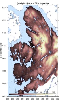
3.4 Terrain height data
Surface elevation terrain height has been downloaded from Kartverket’s web site (http://kartverket.no). The dataset used is the UTM33 DEM data at 50 m resolution for the region surrounding Bergen. These data were re-projected onto UTM32 using QGIS software. Terrain height is shown in Figure 7. These data are used in the proxy
dispersion calculations, Equation 3,and are also assessed as a possible predictor variable for the regression model in Section 4. As a predictor variable the natural log of the elevation is used, log(z/zref), with a reference height zref = 1000 m so that the predictor has a value of 0 at this height.
Figure 7.Map showing the terrain height data at 50 m resolution for Bergen kommune.
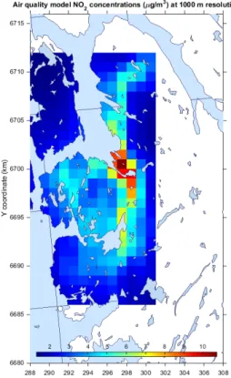
3.5 Air quality model data
Air quality modelling is carried out every winter season for Bergen as part of the Better City Air (Bedre Blyluft) forecast system (www.luftkvalitet.info , see Bedre Byluft, 2014). Hourly 1 x 1 km2 gridded data for NO2 have been provided by NILU for the winter season 2013 - 2014. These are averaged over time to get the spatial distribution of the data. The air quality model does not cover the entire mapping region and so cannot be used in the regression model development for a number of stations. When used in the regression model then the minimum value of the model (1.3 µg/m3) is subtracted as this is considered to be the ‘regional background’ level used by the model. The air quality model concentrations, after background subtraction, are shown in Figure 8.
Figure 8.Winter mean NO2 concentrations as calculated for the Better City Air (Bedre Byluft) air quality forecast for
Bergen 2013-2014 season.
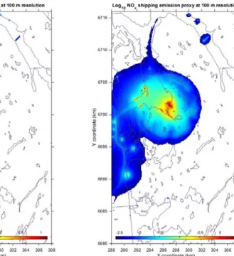
3.6 Shipping emission data
Shipping emission data are provided by Kystverket (http://www.kystverket.no/ ). These data are based on AIS (Automatic Identification System) data for individual ships providing information on both ship positions as well as engine characteristics and movements. Emissions of NOx, and other pollutants, are calculated based on ship type and activity and appropriate emission factors. The emission data provided by
Kystverket is for January 2015 and includes 413 000 georeferenced emission points corresponding to ship positions during this month. The data is aggregated into 100 x 100 m2 grids and converted to a yearly total emission of NOx in ton/year, Figure 9 (left). The same pseudo dispersion model calculation applied for traffic is also applied to determine the proxy for shipping emissions. It is likely that the proxy dispersion for shipping is different to that for traffic since emissions are released ‘at height’ however there was not enough observational data available near the high shipping emission areas to optimise the parameters used. The resulting proxy grid for shipping is shown in Figure 9 (right).
Figure 9.January 2015 total NOx emissions from shipping, converted to ton/year. Left are the emissions and right the
4 Development of the regression model
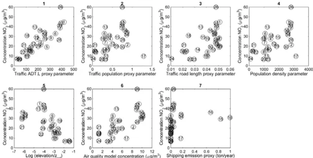
4.1 Selection of predictor variables
The data sources listed in Section 3 were interpolated to the NO2 passive sampler measurement positions. In Table 3 each of the predictor variables used in the analysis are listed.
Table 3. Predictor variables used in the multiple linear regression analysis.
Number Data Pseudo dispersion parameters
Grid
resolution (m) 1 Traffic volume multiplied by road length (ADT.L) a0 = 0.4, a1=1.5 25
2 Population weighted road length (PW.L) a0 = 0.4, a1=1.5 25
3 Road length (L) a0 = 0.4, a1=1.5 25
4 Population density (POP) a0 = 0.4, a1=1.5 500
5 Logarithmic elevation, reference at 1000 m (log(Z)) None 50
6 Air quality model (AQ Model) None 1000
7 Shipping emissions (Shipping) a0 = 0.4, a1=1.5 100
In Figure 10 all scatter plots are shown comparing the different predictor variables with the 2012-2014 mean concentration data. Visually it can be seen that the ADT.L traffic predictor is highly correlated with the measurements. All predictor variables show some correlation with the NO2 concentrations. Shipping shows the lowest since only three measurements are significantly influenced by the shipping emissions.
Figure 10. Scatter plots of observed NO2 (vertical axis) verses proxy data source. Seven different proxy data sets are
shown and these are listed in Table 3.
In order to further assess which predictor variables should be used in the regression model then it is useful to look at the correlation between the predictors and with the observations. The correlation matrix (Table 4) shows the correlation coefficient (r). From this matrix we see that the two road length predictors are highly correlated with each other and also with population
density. It is thus not necessary to apply more than one of these three predictors. In addition we see that the air quality model is well correlated with all predictors, which is perhaps not
surprising since many of these, with the exception of elevation, are sources of emissions used in the air quality model. Elevation is negatively correlated with concentration, meaning that concentrations reduce with increasing height.
Table 4. Correlation (r) matrix for the seven predictor variables and the observed concentrations. Predictors with high inter-correlation are marked with orange and yellow.
1 2 3 4 5 6 7 8
ADT x road length 1 1 0.50 0.73 0.61 -0.27 0.64 -0.06 0.81
Pop weighted road
length 2 0.50 1 0.65 0.97 -0.35 0.81 0.26 0.44
Road length 3 0.73 0.65 1 0.68 -0.17 0.57 -0.11 0.52
Population 4 0.61 0.97 0.68 1 -0.35 0.86 0.22 0.56
Elevation 5 -0.27 -0.35 -0.17 -0.35 1 -0.61 -0.64 -0.55
Air quality model 6 0.64 0.81 0.57 0.86 -0.61 1 0.54 0.69
Shipping emissions 7 -0.06 0.26 -0.11 0.22 -0.64 0.54 1 0.21
Observations 8 0.81 0.44 0.52 0.56 -0.55 0.69 0.21 1
The methodology used to select predictor variables involves a step wise procedure where the highest correlating predictor is first implemented. After this other predictors are applied and the change in the coefficient of determination (R2) is noted. If R2 increases significantly then the predictor is retained. During this process attention is given to whether or not the resulting regression parameters are realistic (i.e. no negative regression parameters for emission type predictors), that the predictor is not highly dependent on the sample selection of measurements (see the ensemble uncertainty estimate in the next section) and that the resulting maps are physically realistic. In general the smaller the number of predictor variables the better.
The process is presented in Table 5 where the various predictor variables are added to the multiple linear regression. Firstly ADT.L is applied, then shipping which gives the next largest increment in R2. After that all the other proxies available are applied. Several are rejected since they have unrealistic negative gradients and the height proxy is also rejected since it gives unphysical results, i.e. high concentrations at sea level far from emission sources. The AQ model did not significantly improve the results obtained using ADT.L and shipping.
Table 5. Stepwise assessment of the predictor variables in the multiple linear regression. The final selection of predictors is shaded in green.
Combination of predictor variables R2 Standard Error (SE) Comments
ADT.L 0.663 7.368 Highest R2
ADT.L + shipping 0.735 6.645 Highest additional R2
ADT.L + shipping + PW.L 0.737 6.725 negative gradient
ADT.L + shipping + L 0.743 6.655 negative gradient
ADT.L + shipping + POP 0.735 6.755 negative gradient
ADT.L + shipping + log(Z) 0.784 6.095 Non-physical
As a result the final predictor regression model is made up of two predictors, that of traffic volume multiplied by road length (ADT.L) and the shipping emission proxy. The resulting regression model has an R2=0.74. This means that 74% of the variability seen in the observations is explained by these two predictor variables. Scatter plots of the three year annual and winter mean concentrations are shown in Figure 11. The standard error of the regression model, at 6.6 µg/m3 (~27% of the mean concentration), is around twice the estimated error in the passive sampler measurements but close to the estimated spatial representative error.
Figure 11. Scatter plots comparing the observed NO2 concentrations with the regression model calculations for both
annual (left) and winter (right) means.
Within these scatter plots it is worth commenting on some of the points that are not well represented by the regression model:
• The regression model under predicts station 13. This sampler is placed in a shopping centre car park and is likely exposed to higher concentrations than are estimated using the ADT.L proxy.
• The regression model under predicts station 26. This is placed at 2 m height very close to a major road. It is worth noting that at the same site, but 3 m higher, station 27 is well predicted.
• The regression model under predicts station 21. This sampler is also placed next to a car park and near a petrol station.
• The regression model over predicts station 28. This is placed on a roof top at approximately 20 m above street level.
• The regression model over predicts station 5. This is placed in a complex terrain area where the major roads are ‘cut’ into the hillside and the monitoring site is effectively 11 m above the local emissions.
These deviations exist because the regression model does not have any information concerning parking activities and emissions from vehicles in these car parks. It also only predicts the concentrations at the height of the majority of sites, which is around 2.0 – 2.5 m above the ground. Monitors positioned above these heights will always provide lower concentrations.
4.2 Ensemble calculations and uncertainty estimation
For the two selected predictors the ensemble analysis is carried out. Four different cases are shown for the annual mean concentrations. In Figure 12 the probability density functions (PDFs) are shown for the case where the intercept (offset) of the regression is determined by the regression itself and in Figure 13 this is shown where the offset, which represents the regional background levels of NO2, is set at a fixed value of 3
µg/m3, which is the estimated regional background concentration.
Each figure contains two cases, one without added measurement uncertainty (left) and one with an added measurement uncertainty of 30% (right), representing both the passive sampler and the spatial representativeness uncertainty. The measurement uncertainty is added to the ensemble by randomly selecting from a normal Gaussian distribution with a normalised standard deviation σ=0.3. In all of the figures the ’x’ axis is the average concentration contribution of that predictor variable at all the
measurement sites. As such this analysis also serves as a form of source apportionment, which is what the analysis was originally intended for (Denby, 2012). For this analysis the two predictor regression coefficients should be positive and as such if the ensemble member regression coefficient is negative then this is set to 0 and the regression
recalculated.
Figure 12. Probability density functions (PDFs) showing the ensemble contribution to the observed mean concentrations from the offset (background), the ADT.L predictor variable and shipping predictor variable. ‘x’ axis is in µg/m3. 5000 ensemble members are used.
Figure 13. As in Figure 12 but with the offset fixed at 3 µg/m3.
In Table 6 these results are summarised in terms of the relative uncertainty in the regression coefficients and the resulting mean and standard deviation (σ) of R2. The contribution of the traffic source is fairly well defined in all cases however the
contribution from shipping is less well defined. This is mostly due to the fact that only three measurement sites are affected by the shipping. When these are randomly selected, or not selected, in the ensemble calculation then this leads to larger variability in their contribution. When measurement uncertainty is included this increases the uncertainty significantly for the shipping and reduces the mean R2 of the regression.
Table 6. Summary of the ensemble uncertainty calculations (5000 ensemble members) and the relative uncertainty in the resulting regression parameters. Only the calculation for the annual mean is shown here.
Intercept Measurement uncertainty Offset (σ/mean) ADT.L (σ/mean) Shipping (σ/mean) R2 (mean) R2 (σ) Free 0 43% 12% 33% 0.74 0.09 Free 30% 66% 20% 79% 0.53 0.12 Fixed 0 - 6% 30% 0.74 0.09 Fixed 30% - 8% 86% 0.56 0.11
Since the uncertainty in the regression coefficients is reduced using fixed background concentrations the final regression model is then made using the background levels of 3
µg/m3 for annual mean concentrations and 4 µg/m3 for the winter mean concentrations. No uncertainty is given to these background values though this could be included. In the final mapping (Section 5) a map is made for each of the ensemble members and this is analysed to provide the mean concentration maps, the uncertainty concentration maps (2σ) and the probability of exceedance maps.
The mean regression coefficients and their indicative uncertainty (±σ) are shown in Table 7 for the two predictor variables used. Both the annual and winter mean concentrations are shown.
Table 7. Final ensemble mean regression coefficients where b1 is the ADT.L predictor coefficient and b2 is the shipping
emissions predictor coefficient. Uncertainty of these coefficients is indicated as ±σ. Units indicate the conversion from the proxy data unit to the concentration unit.
Period b0 (µg/m3) b1 ([µg/m3]/[veh.km]) b2 ([µg/m3]/[ton/year])
Annual mean 3 0.097±0.008 14.9±9
5 Mapping
Maps of NO2 annual and winter mean concentrations (2012 – 2014) are produced for the Bergen kommune region as well as for a number of smaller areas. The maps are based on the ensemble regression model defined in Section 4 and for each area both the ensemble mean and the ensemble standard deviation (2σ) are shown. Within this uncertainty range (±σ) there is a 68% likelihood that the model correctly predicts the concentrations. For practical reasons the number of ensemble members is reduced from 5000 to 500 for the mapping. This has very little impact on the either the mean or the standard deviation results.
Additional maps are also produced showing the legislatively required (T1520) air quality zones (T-1520, 2015). These maps show red where the annual mean
concentration is > 40 µg/m3 and yellow where the winter mean (months November – April) is > 40 µg/m3.
For Bergen centrum probability of exceedance maps are shown for both the annual and winter mean concentrations. These maps use the ensemble uncertainty to indicate the likelihood that the limit value of 40 µg/m3 is exceeded. Because the exact position of the T1520 contours is not possible to define, due to uncertainty in the regression model calculations, then these probability of exceedance maps indicate the region of uncertainty around the T1520 contours. These maps could be further developed to indicate an uncertainty zone in the T1520 maps but this has not been done here. They do indicate though that the uncertainty in the zone contours can be from 25 – 200 m,
dependent on the concentration gradients near the limit value.
The maps are also produced in a number of formats. All maps are made in separate ‘pdf’ and ‘png’ files and the Bergen kommune map is also available as raster file ‘geotiff’ and as vector based ‘shp’ files for all maps. All maps are made at 25 m
resolution and shown in this report using filled colour contours. In Table 8 an overview is given of the maps produced. All maps produced as ‘png’ files are presented in this report.
Table 8. Overview of the maps produced showing the format used. All maps produced as ‘png’ files are shown in this report.
Region Annual mean Annual mean uncertainty
Probability of exceedance (40 µg/m3)
T1520
Bergen kommune* png, pdf, tiff, shp png, pdf, tiff, shp png, pdf, tiff, shp png, pdf, tiff, shp Bergun centrum png, pdf png, pdf png*, pdf * png, pdf Åsane png, pdf png, pdf png, pdf Loddefjord png, pdf png, pdf png, pdf Lagunen png, pdf png, pdf png, pdf Nesttun png, pdf png, pdf png, pdf
* Both annual and winter means are made for Bergen kommune
5.1 Maps of annual mean concentrations and uncertainty
In Figure 14 toFigure 19 maps of the annual mean concentration and its uncertainty are presented. For the maps covering smaller regions the measured concentrations are also shown, with the same colour coding as the contour plots, as circles with station number. Some stations overlap each other in the Bergen centrum region and so are not visible in the maps. We note the following points in regard to these maps:
• The tunnel ports are clearly visible as areas of high concentration since they represent the accumulated ADT.L within the tunnels. These concentrations also show the highest uncertainty. Measurements closer to these sources would help to reduce the uncertainty in these regions.
• Because the ADT.L proxy field is summed at discrete 25 m grid intervals this can lead to a ‘checked’ concentration pattern along the road networks when concentrations are close to the contour levels.
• The higher uncertainty related to the shipping emissions is clearly visible in the Bergen Centrum map (Figure 15), indicating that more measurements in this region would help to reduce this uncertainty.
• Exceedance of the 40 µg/m3 limit value for annual mean NO2 concentrations is found mostly in the Bergen Centrum region. However this limit is also exceeded in a number of other regions close to high density road traffic.
Figure 14. Maps of calculated NO2 annual mean concentrations (left) and uncertainty (right) for Bergen kommune.
Figure 16. Maps of calculated NO2 annual mean concentrations (left) and uncertainty (right) for the Åsane region.
Figure 18. Maps of calculated NO2 annual mean concentrations (left) and uncertainty (right) for the Lagunen region.
5.2 Maps of air quality zones (T1520)
Maps of the legislative required ‘air quality zones’ are shown for all regions in Figures Figure 20Figure 22. As previously described this map is a combination of both annual and winter concentrations. We note the following in regard to the maps
• Red zones, annual mean concentrations > 40 µg/m3, are limited in proximity to highly trafficked roads and tunnel ports. Exceedance of this limit value is not spatially extensive.
• Yellow zones, winter mean concentrations > 40 µg/m3, are also only found in close proximity to trafficked roads and tunnel ports. The observed winter mean for the years 2012-2014 is only 15% higher than the annual means so the T1520 show a fairly small ‘yellow’ zone.
Figure 20. Maps of air quality zones based on the T1520 requirements. Left for Bergen kommune and right for Bergen centrum.
Figure 21. Maps of air quality zones based on the T1520 requirements. Left for the Åsane region and right for the Lagunen region.
Figure 22. Maps of air quality zones based on the T1520 requirements. Left for the Loddefjord region and right for the Nesttun region.
5.3 Maps of probability of exceedance
The T1520 air quality zone maps do not allow for an interpretation of uncertainty. To address this we present maps showing the probability of exceeding the limit value of 40 µg/m3. Both the annual and the winter mean concentrations are shown for Bergen centrum in Figure 23. The maps indicate that the uncertainty in the zone contours can be from 25 – 200 m, dependent on the concentration gradients near the limit value.
Figure 23. Maps showing the probability of exceeding annual (left) and winter (right) mean concentrations of 40 µg/m3.
5.4 Comparison with 2010 and 2006 maps
A short comparison is made here between maps produced for Bergen centrum in 2010 and 2006 with the maps produced in this report for the years 2012-2014, Figure 24. Despite the different methodologies employed (the previous maps were drawn by hand based on passive sampler measurements and indicative information from the road network) the maps show quite a similar structure. The following points are noted.
• The region above the limit value of 40 µg/m3 is larger in previous maps. This is in part due to the fact that measured concentrations were also slightly higher in the two previous mapping periods but are also due to differences in the mapping methods. Uncertainty in the 2014 maps in this area are estimated to be 6-8
µg/m3, Figure 14 (right).
• Tunnel ports are not indicated as hotspots in the previous maps.
• The 10 µg/m3 contour level is below an elevation of 100 m in previous maps whereas this is closer to 200 - 300 m in the 2014 maps. This indicates that the subjective approach to the map making placed more emphasis on reduction of concentration with height than the current objective approach. However, there are not enough measurements with varying height to substantiate either.
• The measurement network was different in previous years and makes comparison of the maps less straightforward.
Figure 24. Comparison of air quality maps made for Bergen in 2014 in this study (left), and previous maps from 2010 and 2006 (right). Contour levels in both maps are in 10 µg/m3 intervals but colour coding is different.
6 Population exposure
Having calculated concentration maps it is possible to overlay these with the population data to determine the number of people exposed, at their home addresses, to specified thresholds of NO2 concentrations. Home address population data (Section 3.3) is aggregated on the same 25 x 25 m2 grid used for the concentration mapping and the resulting number of people in Bergen kommune exposed above a set of limit values is calculated and presented in Table 9. The uncertainty range, given as the standard deviation determined by the ensemble calculations (±σ), is also shown. In addition the population weighted concentration, which is the concentration an average citizen is exposed to at their home address, is presented.
These results show that roughly between 1000 – 2000 people in Bergen are exposed to NO2 concentrations above the legislative annual mean limit value of 40 µg/m3 during the years 2012 – 2014.
Table 9. Exposure table showing the number of inhabitants exposed above a defined annual mean NO2 limit value in all
of Bergen kommune. The range is based on the ensemble regression calculations given by the standard deviation of the ensemble (±σ). Also shown is the mean and range of the population weighted annual mean NO2 concentration.
Limit value (µg/m3) Mean Range (mean-σ) Range (mean+σ) > 0 274188 274188 274188 > 10 203479 195472 210734 > 20 46062 35716 57501 > 30 9502 6284 15325 > 40 1538 870 2136 > 50 225 138 449
Population weighted concentration (µg/m3)
7 Conclusion and recommendations
7.1 Conclusions
Maps of annual and winter mean NO2 concentrations in Bergen have been calculated using ensemble based multiple linear regression. Proxy data representing ‘pseudo dispersion’ from traffic and shipping sources have been used to create physically realistic spatial fields. These fields have been regressed with passive sampler measurements to determine regression coefficients and maps are produced based on these. The resulting maps are created on a 25 x 25 m2 resolution grid and show not only mean concentrations but also the uncertainty of these. Uncertainty is assessed by
including sampling uncertainty, using bootstrapping methods, as well as measurement uncertainty in the ensemble regression. The final regression model explains 74% of the variability seen in the measurements and is based on just two predictor variables. The method applied improves upon other similar ‘land use regression’ methods. Firstly it only uses data representing known emissions, traffic and shipping, and distributes these spatially in a similar fashion to real atmospheric dispersion. Secondly, the ensemble method takes account of the sampling and the measurement uncertainty to provide spatially distributed uncertainty estimates of the concentration fields.
Despite these advantages the mapping suffers from a lack of observational data. Only 32 data points are available and these were not ‘strategically’ placed for such a mapping exercise. A larger number of measurements placed to cover the range of concentrations would help reduce the uncertainty in the maps.
In addition to the lack of measurement data not all traffic data is available. Though most heavily trafficked roads are available with traffic volumes, very few of the smaller roads have such data available. These smaller roads without traffic volume were used
separately in the regression but without suitable traffic data they did not improve the resulting regression model. Filling in missing traffic data will improve the mapping.
The mapping method applied effectively replaces a dispersion model (that describes emissions, meteorology and atmospheric chemistry to predict concentrations) by a simple power law relationship. Using such a simple method implies homogenous wind fields, both in speed and direction, as well as homogenous dispersion conditions. It also does not account for near source height variations or obstacles or the chemical
transformations involving NO and ozone. This is clearly a simplification of reality. A more physically realistic method for making such maps would be to replace the proxy data with source specific dispersion model calculations. This could then be combined with the observed concentrations using the ensemble based regression method to produce optimal and more physically realistic concentration fields.
7.2 Recommendations for further mapping
The following recommendations are made for future mapping exercises
• Replace the traffic and shipping proxy fields with source specific dispersion model concentration fields
• Improve the coverage of traffic data. This will involve addition data, specifically for communal roads.
• Additional monitoring data will improve the assessment. Enhanced monitoring near shipping, near tunnel ports, at background sites and in a variety of
environments of varying concentrations will help to reduce the uncertainty in the regression modelling.
• Carry out short campaigns in small areas to assess the spatial variability on scales less than 50 m.
7.3 Additional maps provided
The region covered by the mapping was intended to provide similar mapping coverage to previous years and did not cover the entire Bergen kommune region. After
completion of the maps, and of this report, it was indicated that maps that covered the entire municipality of Bergen were desirable. The following maps were thus made at 25 x 25 m2 resolution for the entire municipality of Bergen and delivered as ‘shp’, ‘tiff’, ‘png’ and ‘pdf’ files to the municipality. An example of such a map, for annual mean concentration of NO2, is shown in the Appendix.
1. Concentrations (annual) 2. Uncertainty (annual) 3. Concentrations (winter) 4. Uncertainty (winter)
5. Probability of exceedance (annual > 40 µg/m3) 6. Probability of exceedance (winter > 40 µg/m3) 7. T1520
Acknowledgements
I would like to thank a number of people for providing data, free of charge, for this study. Firstly Endre Leivestad from Bergen commune for providing up to date traffic and population data and for his continuous accessibility during the project period. Shipping emission data was provided by Ola Brandt from Kystverket. Air quality modelling data was provided by Ingrid Sundvor from NILU. I would also like to thank Håvard Tveite from NMBU for providing advice on GIS tools and use of ‘sosi’ datasets.
References
Bedre Byluft (2014). Bruce Rolstad Denby, Anna Carlin Benedictow, Aslaug Skålevik Valved, Thomas Olsen, Arne Kristensen, Leiv Håvard Slørdal (NILU). Bedre byluft - Prognoser for meteorologi og luftkvalitet i norske byer vinteren 2013 – 2014. MET REPORT 17/2014
http://met.no/Forskning/Publikasjoner/MET_report/2014/?module=Files;action=File.get File;ID=6321
Beelen R, Hoek G, Vienneau D, Eeftens M, Dimakopoulou K, Pedeli X, Tsai M-Y, Kuenzli N, Schikowski T, Marcon A, Eriksen KT, Raaschou-Nielsen O, Stephanou E, Patelarou E, Lanki T, Yli-Toumi T, Declercq C, Falq G, Stempfelet M, Birk M, Cyrys J, von Klot S, Nador G, Varro MJ, Dedele A,Grazuleviciene R, Moelter A, Lindley S, Madsen C, Cesaroni G, Ranzi A, Badaloni C, Hoffmann B, Nonnemacher M, Kraemer U, Kuhlbusch T, Cirach M, de Nazelle A, Nieuwenhuijsen M, Bellander T, Korek M, Olsson D, Stromgren M, Dons E, Jerrett M, Fischer P, Wang M, Brunekreef B, de Hoogh K, (2013). Development of NO2 and NOx land use regression models for estimating air pollution exposure in 36 study areas in Europe - The ESCAPE project, Atmospheric Environment, Vol:72, ISSN:1352-2310, 10-23
Denby, B.R., Sundvor, I., Schneider, P., Thanh, D.V. (2014) Air quality maps of NO2 and PM10 for the region including Stavanger, Sandnes, Randaberg and Sola (Nord-Jæren). Documentation of methodology. Kjeller, NILU (NILU TR, 01/2014).
http://www.nilu.no/Default.aspx?tabid=62&ctl=PublicationDetails&mid=764&publicati onid=27493
Denby B.R. (2014) Transphorm Deliverable D2.2.4. Spatially distributed source contributions for health studies: comparison of dispersion and land use regression models
http://www.transphorm.eu/Portals/51/Documents/Deliverables/New%20Deliverables/D 2.2.4_v6.pdf
Denby B.R. (2012). Source apportionment of PM2.5 in urban areas using multiple linear regression as an inverse modelling technique. Int. J. Environ. Pollut., 47 (2011), 60-69. doi:10.1504/IJEO.2011.047326.
T-1520: Retningslinje for behandling av luftkvalitet i arealplanlegging. URL:
Appendix
After completion of this report new maps were made and delivered to Bergen kommune that covered the entire municipality. The annual mean concentration map is presented here as example.