Data Analytics and Visualization for Large Army
Testing Data
by Jerry Clarke, Kenneth Renard, and Brian Panneton
ARL-TR-6572 September 2013
NOTICES Disclaimers
The findings in this report are not to be construed as an official Department of the Army position unless so designated by other authorized documents.
Citation of manufacturer’s or trade names does not constitute an official endorsement or approval of the use thereof.
Army Research Laboratory
Aberdeen Proving Ground, MD 21005
ARL-TR-6572 September 2013
Data Analytics and Visualization for Large Army
Testing Data
Jerry Clarke and Kenneth Renard
Computational and Information Sciences Directorate, ARL
Brian Panneton
Dynamics Research Corporation
REPORT DOCUMENTATION PAGE Form Approved
OMB No. 0704-0188
Public reporting burden for this collection of information is estimated to average 1 hour per response, including the time for reviewing instructions, searching existing data sources, gathering and maintaining the data needed, and completing and reviewing the collection information. Send comments regarding this burden estimate or any other aspect of this collection of information, including suggestions for reducing the burden, to Department of Defense, Washington Headquarters Services, Directorate for Information Operations and Reports (0704-0188), 1215 Jefferson Davis Highway, Suite 1204, Arlington, VA 22202-4302. Respondents should be aware that notwithstanding any other provision of law, no person shall be subject to any penalty for failing to comply with a collection of information if it does not display a currently valid OMB control number.
PLEASE DO NOT RETURN YOUR FORM TO THE ABOVE ADDRESS.
1. REPORT DATE (DD-MM-YYYY)
September 2013
2. REPORT TYPE
Final
3. DATES COVERED (From - To)
1 October 2012–1 July 2013
4. TITLE AND SUBTITLE
Data Analytics and Visualization for Large Army Testing Data
5a. CONTRACT NUMBER
5b. GRANT NUMBER
5c. PROGRAM ELEMENT NUMBER
6. AUTHOR(S)
Jerry Clarke, Kenneth Renard, and Brian Panneton*
5d. PROJECT NUMBER
R.0007512.1
5e. TASK NUMBER
5f. WORK UNIT NUMBER
7. PERFORMING ORGANIZATION NAME(S) AND ADDRESS(ES)
U.S. Army Research Laboratory ATTN: RDRL-CIH-C
Aberdeen Proving Ground, MD 21005
8. PERFORMING ORGANIZATION REPORT NUMBER
ARL-TR-6572
9. SPONSORING/MONITORING AGENCY NAME(S) AND ADDRESS(ES) 10. SPONSOR/MONITOR’S ACRONYM(S)
11. SPONSOR/MONITOR'S REPORT NUMBER(S)
12. DISTRIBUTION/AVAILABILITY STATEMENT
Approved for public release; distribution is unlimited.
13. SUPPLEMENTARY NOTES
*Secure Mission Solutions, North Charleston, SC 29406
14. ABSTRACT
The testing of Army systems can generate enormous amounts of raw data daily. This data is used to generate predetermined metrics used to evaluate the effectiveness of the system(s) being tested. The authors have developed a unique parallel
framework that has not only drastically reduced the time necessary to generate these metrics, but is enabling insights into data trends and relationships via novel data analytics and visualization.
15. SUBJECT TERMS
data analytics, parallel processing, high-performance computing, visualization
16. SECURITY CLASSIFICATION OF:
17. LIMITATION OF ABSTRACT UU 18. NUMBER OF PAGES 14
19a. NAME OF RESPONSIBLE PERSON
Jerry Clarke a. REPORT Unclassified b. ABSTRACT Unclassified c. THIS PAGE Unclassified
19b. TELEPHONE NUMBER (Include area code)
410-278-9279
Standard Form 298 (Rev. 8/98)
iii
Contents
Contents iii
1. Introduction 1
2. Faster Metrics 1
3. Hash and Match 2
4. Data Analytics and Visualization 2
5. Conclusions and Future Direction 6
Bibliography 7
1. Introduction
The Army performs daily tests of a variety of systems at various stages of maturity. These tests can generate enormous amounts of data, which must be independently evaluated to determine if the system, and/or system-of-systems, is performing as desired. The testers and evaluators agree on a set of metrics that are either extracted directly, or derived, from the raw test data. The entire process—from planning, to test, evaluation, and final report—happens within a very challenging timeline. Significant time savings in any aspect of the process would allow for additional
activity—i.e., more tests, same day analysis, etc.
Additionally, due to strict time constraints for generation of the final evaluation report, searching the data for trends and correlations must be accomplished long after the test is completed.
Therefore, to assure that new desired metrics can be generated, the entire raw dataset is archived, which requires an enormous amount of network bandwidth and storage. The ability to quickly search for trends and correlations while the data is being processed might one day render archiving the entire test dataset less critical.
Based on this information, our goal is twofold. The first goal is to speed up the generation of the predefined metrics from the raw data by an order of magnitude or better. This is accomplished by exploiting the inherent parallelism in processing the data and exploiting High Performance Computing (HPC) assets, where possible. The second goal is to discover trends and relationships between different measured and derived metrics while the raw data is being processed. This is accomplished via a unique combination of data analytics and visualization.
2. Faster Metrics
Testing data for mobile radios was chosen as the first candidate for exploration. This type of testing can produce over a terabyte of packet data (per day) and requires several days to process and generate the necessary metrics. As we develop a faster method for producing the metrics, the results need to be verified against the current system so that the evaluation can proceed with confidence. For this reason, the current system was studied to identify an appropriate method for interfacing with existing evaluation tools. The data model—a predefined database of computed metrics—was determined to be the best common, verifiable output.
Packet data is particularly problematic because—for example, to produce lists of Internet Protocol (IP) conversations—one must search the entire dataset at once to find all matching collection events for each packet. The existing process populates a database with raw values and
2
then queries the database to generate the metrics. Fortunately, a sufficient amount of parallelism existed in this problem to exploit HPC. Still, the original raw dataset must be read from disk and distributed among the processors. This unavoidable I/O remains the bottleneck that creates speed limitations within the entire process.
3. Hash and Match
The entire process for generating the metrics from the raw data in parallel on HPC resources is detailed in depth in, Processing and Analysis of Large Data Sets from Digital Communications Experiments Using High Performance Computing.1 To summarize this work—the raw data
comes in the form of many Binary Large Object (BLOB) files and the individual files are read, in parallel, by the HPC system. The raw packet is reduced to an MD5 hash. This hash value, along with packet metadata and timing, are used to match packets across data collection points. Finally, metrics—such as latency, dropped packets, etc.—are generated and written to the database. Through eliminating the process of populating an intermediate database and matching packets in parallel—on hundreds or thousands of processors—the entire process is considerably faster. Using the database method requires about 55–60 hours (h) of processing a terabyte of raw data. Using the parallel HPC method, the same data is processed in less than 5 h. Both of these methods are rather data-dependent, which makes the times approximate. Full details are contained in the previously mentioned source.
4. Data Analytics and Visualization
For this particular set of mobile network test data, the evaluators use a pre-existing set of tools to generate two-dimensional (2-D) charts and graphs in order to make a determination of system and instrumentation readiness. Data analytics and visualization, however, can be used to further explore the data and potentially reveal the trends and correlations of metrics. In other words, they attempt to reveal “why” the evaluators are seeing certain results.
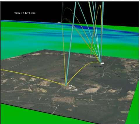
Initially, Global Positioning System (GPS) data from the raw data is used to visualize the conversations over the course of the test. Using polygonal vehicle models as glyphs, the glyphs are placed on a multiresolution terrain model of the test site that has been texture-mapped with orthoimagery. This is shown in figure 1.
1 Panneton, B.; Renard, K.; Reil, M.; Tauras, B. Processing and Analysis of Large Data Sets from Digital Communications
Experiements Using High Performance Computing. U.S. Army Research Laboratory: Aberdeen Proving Ground, MD.
Figure 1. Test data visualization depicting conversations between platforms.
Conversations between platforms are represented as three-dimensional (3-D) tubes. The
thickness of the tube is scaled to the number of bytes being transferred. The height of the arc is scaled to the amount of dropped packets, and the color represents conversation direction. Data for these conversations has been binned into 15-second (s) buckets, so that every frame of this animation sums up all of the conversations that have transpired during that 15-s interval. Naturally, different metrics can be mapped to tube color, thickness, and arc height in order to visually search for data trends.
While the test data and terrain are originally described in spherical coordinates (latitude, longitude, height), they are converted to Cartesian coordinates in order to map correctly to the imagery, tubes, and glyphs. The 2-D text is a unique ID of the platform and follows the vehicle glyph as it moves. When platforms are tightly clustered, as we see in this example, discerning individual entities can be difficult. For this reason, we attempt to view the testing data without the restriction of geographically located platforms.
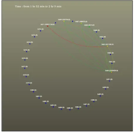
If we consider the test data as a time-dependent directed graph—with platforms being nodes, and conversations being edges—we can move the nodes to minimize the crossing of edges.
In figure 2, the nodes are arranged in a circle, the color of the node is scaled to the amount of bytes received, and edges are conversations (colored with the average latency). However, when animated in the same 15-s interval binning as the geographically placed visualization in figure 1, the blinking edges noticeably distract from the information being presented.
4
Figure 2. Graph visualization of testing data, using a circular layout strategy.
Borrowing from techniques typically employed in signal processing, a smoothing technique has been applied to alleviate this problem—as depicted in figure 3. A moving window of time slices is generated, gathering several minutes (min) of the average latency of the 15-s samples.
Figure 3. Convolution with Kaiser window.
The average latency window is convolved with a function known as a Kaiser window. The Kaiser window is defined as:2
, (1)
where, I0 is the modified zeroth-order Bessel function. The beta parameter affects the shape of
the curve with higher values, causing the curve to become more narrow and steep. With this smoothing, notice the much higher latency between conversations involving two nodes in figure 2. This is not as pronounced with the raw, unsmoothed visualization.
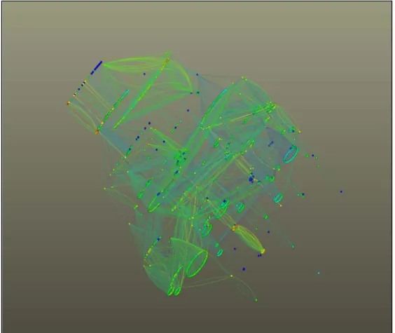
When many more nodes are involved in the test, other graph visualization layouts prove to be better suited to convey network topology information.
The test data in figure 3 contains over 900 nodes. The circular layout used previously does not allow for the exploitation of all three dimensions. In figure 4, a 3-D spanning tree algorithm is used to display 10 min worth of conversation data (IP address labels have been removed for clarity). As the visualization is rotated and zoomed, additional layers of detail and labels are added interactively. This allows the user to drill down into interesting parts of the conversation topology.
6
5. Conclusions and Future Direction
To date we have a working framework for generating the metrics data from the raw testing data in parallel. Emphasis has been placed on creating a fully functional framework that can produce exactly the same values as the existing database driven system. There is significant potential to enhance the performance of the framework, while maintaining the same object structure. This will allow for the development of filters to extract additional metrics from the raw data simultaneously with the development of a higher performance framework.
The framework—along with facilities to perform the data analytics and visualization—will be delivered to the analyst via a Scalable Multitier Architecture for Research Tools (SMART), developed at the U.S. Army Research Laboratory (ARL). Via a browser, users will access a middle tier of servers, which marshal the appropriate HPC assets and orchestrate the necessary task management, data transfer, and graphics delivery in a scalable fashion via an intuitive user interface.
We believe that the end system will not only speed the test and evaluation process for many types of testing data, but will also prove valuable in exposing trends and relationships in the data that would otherwise remain hidden.
Bibliography
1. Goodall, J. R.; Tesone, D. R. Visual Analytics for Network Flow Analysis, CATCH '09.
Cybersecurity Applications & Technology Homeland Security Conference, March 2009. 2. Zhou, C.; Summers, K. L.; Csudell, T. P. Graph Visualization for the Analysis of the
Structure and Dynamics of Extreme-Scale Supercomputers. Proceedings of the 2003 ACM Symposium on Software Visualization, 2003, pp 143–149.
3. Goodall, J. R.; Sowul, M. VIAssist: Visual Analytics for Cyber Defense, IEEE Conference on Technologies for Homeland Security, 2009, pp 143–150.
4. Schroeder, W.; Martin, K.; Lorensen, B. The Visualization Toolkit an Object-Oriented Approach To 3D Graphics, 4th ed.; ISBN 1-930934-19-X.
5. Beazley, D. M.; Lomdahl, P. S. Feeding a Large-Scale Physics Application to Python.
Proceedings of the 6th International Python Conference, San Jose, CA, October 1997; pp 21–29.
6. Clarke, J. A.; Namburu, R. R. A Distributed Computing Environment for Interdisciplinary Applications. Concurrency and Computation: Practice and Experience, Volume 14 No.13–15, November–December 2002, pp 1161–1174.
8
List of Symbols, Abbreviations, and Acronyms
ARL U.S. Army Research Laboratory
BLOB Binary Large Object
GPS Global Positioning System
h hours
HPC High Performance Computing
IP internet protocol
min minutes
s seconds
SMART Scalable Multitier Architecture for Research Tools
2-D two-dimensional
NO. OF COPIES ORGANIZATION 1 DEFENSE TECHNICAL (PDF) INFORMATION CTR DTIC OCA 1 DIRECTOR
(PDF) US ARMY RESEARCH LAB IMAL HRA
1 DIRECTOR
(PDF) US ARMY RESEARCH LAB RDRL CIO LL
1 GOVT PRINTG OFC
(PDF) A MALHOTRA
2 RDRL CIH C
(PDF) J CLARKE K RENARD