Visual Techniques for Analyzing Wireless
Communication Patterns
Kyle Gancarz, Kenneth Prole
Secure Decisions Division of Applied Visions, Inc. Northport, NY 11768 USA
{kyle.gancarz, ken.prole}@securedecisions.com
Abstract— New security concerns have emerged with the widespread availability of easy-to-integrate, affordable wireless networking technology. To meet the growing challenges of analyzing IEEE 802.11 wireless traffic and assessing security risks, a system of wireless network visualization components was created to provide defenders with tools to analyze vast amounts of “wardriving” data, i.e., wireless radio signals collected while moving about an area in a car or on foot. This paper describes the data processing and visualization techniques that are utilized by the WiFi Flows visualization within MeerCAT® to provide a comprehensive picture of the communication patterns in a wireless network, to network defenders and analysts. This paper also describes the applicability of this technology in defending wireless networks.
Keywords- wireless communication patterns; visual anaytics; information visualization; computer network security; wireless discovery; wireless security; MeerCAT
I. INTRODUCTION
When networking technology made the jump from a complex system of wires and switches to the air waves, network defenders were met with a new challenge. Traditional techniques for securing and analyzing wired computer networks are insufficient for preventing or detecting a compromise using a wireless vector, or for monitoring policy compliance. Not only can an uninvited guest connect to the network from across the street, they can also intercept any raw communications on the wireless network with just a wireless interface card and readily available tools such as Kismet [1]. Add to this the compromise of several widely adopted encryption techniques and the ability for any employee or guest to plug an unauthorized, unsecured wireless device into the network and a veritable problem is created for network administrators and defenders. It is their job to implement the convenience of wireless networks without compromising the security of their organization’s network. Analysts must find ways to derive valuable information about normal versus anomalous behavior by analyzing the behavioral
patterns of wireless access points (APs) and devices, including their location and communication patterns.
Soon after wireless networking devices became available Wireless Intrusion Detection Systems (WIDS) were designed and deployed to prevent unwanted client access and detection or blocking of rogue wireless access points. WIDS have an inherent limitation in that they must be deployed in a way that covers the entire range of the wireless network - a costly proposition for large areas such as military bases, large corporate campuses, airports, et cetera. We created the MeerCAT [2] software to allow analysis of data collected from wardriving activity of widely distributed wireless networks, giving network administrators and defenders powerful visual analytics [3] with the flexibility of deploying their own collection methods (using Kismet, Netstumbler [4], or the U.S. Department of Defense’s Flying Squirrel [5]). MeerCAT possesses a variety of visualizations including a geographic mapping of wireless assets, a device and detection run explorer, timeline history for devices, detailed information tables, and a WiFi Flows visualization which maps out the communication patterns of the devices, among others. Each of the visualizations is linked with all others and updates dynamically as the user interacts with items in the views. These multiple coordinated views allow the user to see dependencies and correlations by presenting multiple
perspectives on the data that has been collected [3]. This paper focuses on the WiFi Flows visualization
within MeerCAT and how raw wireless data is processed to present a clear view of how wireless devices are communicating with each other. While traditional techniques for monitoring wired network communication patterns in computer networks involve looking primarily at the network layer of the TCP/IP model [3], the nature of network services provided at the data link layer in IEEE 802.11 networks makes analysis of that communication imperative to gaining a full understanding of wireless This research and development effort was supported by DARPA
Strategic Technologies Office through a Small Business Innovation Research grant, under contract number W31P4Q-07-C-0022.
network operations. It requires analysts to take a closer look at point-to-point communication than would typically be necessary on a traditional, wired Ethernet network where the individual hops a packet takes on its way to its destination are often overlooked. The emphasis is on communication between hosts from the network layer up through the application layer.
A. What is Special about WiFi?
Wireless networking devices handle discovery, authentication, encryption, connection management, and other critical management functions on the data link layer [8]. While payload data can be encrypted, frame headers are unencrypted and visible to anybody within radio range. Since the exchange of information on the data link layer is so critical for wireless network operations and because higher level information encapsulated in the frames is supposed to be encrypted, it is imperative that any analysis takes note of the frame headers that are captured. When it comes to wired networks, the data link layer serves a similar purpose (carrying packets directly from device to device), however monitoring communication flows through this layer proves to be tedious and redundant. Security analysts are often more concerned about what is occurring on the network layer in order to understand which hosts are communicating with each other. The source and destination are the primary concern as opposed to the details of the steps taken on the journey to the destination.
Since data link layer frames are dropped from packets and replaced at every switch, it is impractical to associate a particular MAC address with an IP address unless data collection is happening directly on access switches. When we consider the typical topology of a wireless network, there are typically several wireless devices that may communicate with each other over the air but send all exterior communications to a single end point (the access point or its controller). There is typically a one-to-one relationship between an observed IP address and MAC address within a packet, with the exception of the access point which carries all traffic external to the wireless network.
Recognizing the significance of the data link layer to wireless security and communication monitoring, we found it essential to build a visualization that would recognize the attributes of both data link and network layer communications. To accomplish this, an algorithm was developed to process raw packet capture data into aggregated “WiFi Flows”, each of which corresponds to
traffic exchanged between two wireless devices. Link layer addresses provide the basis for these flows and any network layer information that can be deciphered from these packets is subsequently tacked onto the flow. Additionally, the flows are associated with independent abstractions of “wireless networks” and “wireless clients” that are used within other areas of MeerCAT. This allows the visualization to respond to interaction in other areas of MeerCAT as well as report any interaction within it to other views.
II. Technical Approach A. Data Processing
Before the communication patterns can be visualized, raw packet capture data must be processed and aggregated for efficiency. All of the information necessary to construct a “WiFi Flow” object is contained within the raw packet capture files. In addition, the data is aligned with other information that has already been processed by MeerCAT. This allows the visualization to be linked to the rest of the system and allows the user to select information from specific networks if they do not wish to only view a subset of the available data.
The data aggregation process is fairly simple, each packet is analyzed and any headers on the network or data link layers that can be deciphered are extracted. Similar packets are aggregated into a single WiFi flow object which carries aggregated information regarding how many packets were sent as well as their total size. Start time and elapsed time of each communication flow are noted as well to give analysts an idea of the period of time over which the communication took place. When network (IP) layer information can be deciphered, the source and destination MAC addresses, IP addresses, and ports are used to create a primary key that is used to aggregate packets which represent the same type of communication. When no network layer header is present or if it cannot be deciphered due to encryption, only the source and destination MAC addresses are combined to create the primary key.
Once the packet data has been aggregated, it is stored to a database for later retrieval. When a user starts the MeerCAT system, they can select any subset of data which they have imported and the WiFi Flows visualization will be populated with communication patterns associated with the user’s selection.
In situations that require analysis of large sets of raw data, information visualization techniques can be applied to present a user with an overall picture of the data. The typical goal is to provide the analyst with a visual representation that brings emphasis to critical areas of the data set. Information visualization may employ a wide range of visual characteristics such as color, borders, size, labels, and shapes.
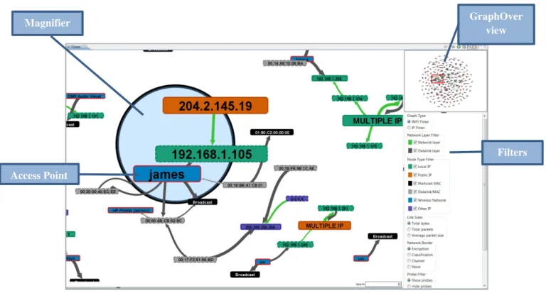
After packet data has been aggregated and retrieved from the database, the next step is to build the underlying structure of the visualization and assign visual attributes to the resulting elements. The user is allowed to manipulate several aspects of this process using a filter system. The basic data structure employed is a node-link graph as this best describes the logical structure of communication over a computer network. A sample graph is depicted in Fig. 1. The sample graph consists of a toolbar, the primary visualization canvas, a filter panel, and a graph overview which shows the graph in its entirety along with a red rectangle which outlines the area of the graph currently being represented in the primary canvas. Users also have the option of using an adjustable magnifier tool to enlarge specific items in the graph.
1) Graph Structure
The graph can be constructed using one of two different modes available to the user, which will either use data link (WiFi Flows) or network (IP Flows) layer information to form nodes. When a user selects the data they wish to display, each unique MAC or IP address becomes a node with the exception of broadcast and multicast addresses. In the case of broadcast and multicast addresses, a unique node is produced for each wireless network station. That way, if two disparate networks are each broadcasting to a non-unique MAC address such as FF:FF:FF:FF:FF:FF, two unique FF:FF:FF:FF:FF:FF nodes are produced (one per network), so that no links are improperly placed connecting the two disparate networks. Broadcast and multicast nodes may also be hidden from the graph using the filter, allowing the user to focus on actual wireless assets.
In WiFi Flows mode, each unique Basic Service Set ID (BSSID) or MAC address is given a node. Network (IP) layer information associated with the constructed nodes is then applied to the node by visual attributes such as color, size, labels, etc. Likewise, in IP Flows mode each unique IP address is given a node and any additional data link (MAC) layer information is appended by way of visual attributes. Directional links are placed connecting source and destination nodes from the collection of WiFi Flow objects.
Figure 1 Example WiFi Flows Graph.
GraphOver view
Filters Magnifier
Once all nodes and links are added to the graph, they are laid out using a force-directed algorithm. Nodes repel each other and links acts as springs. This causes disparate clusters of nodes to separate from each other while staying together locally.
2) Visual Attributes Labels
The visual representation of each node is dependent on what information is available for the specific node. By default, regular clients are labeled according to the highest layer address available (either IP or MAC). When multiple IP addresses are assigned to a node (typically representing a wired interface on a wireless access point, the next hop for traffic outside the wireless network) the label is changed to “MULTIPLE IP” and the node is enlarged. Wireless access points and ad-hoc networks are labeled by their SSID, if available, otherwise their BSSID. A DNS lookup can be issued for nodes with one or more IP addresses associated. Labels and tooltips change accordingly to reflect any DNS results tied to the particular IP address.
Node Fill Color
To help analysts quickly understand what type of network asset is being represented by a node, they are colored based on the highest layer address available as well. Nodes that have IP layer information associated with them are colored differently depending on whether they are local, public, or “other” (broadcast, multicast, other reserved) IP addresses. Wireless access points and ad-hoc networks are also given a specific color, as are broadcast and multicast MAC addresses.
Node Border Color
The border color of nodes which represent wireless access points and ad-hoc networks can either match the fill color or can be based on encryption, classification (rogue, trusted, or friendly), or radio frequency (channel).
Link Colors
Links can have one of two different colors depending on whether or not any network layer communication has been detected between the two end points.
Link Sizes
The relative thickness of a link between two nodes is indicative of the total number of bytes transferred in the
flows which it represents, the total number of packets, or the average size of packets.
3) Filters and Search
The filter and search mechanisms provide the user with the ability to narrow down a large field of results in order to look at very specific areas of the data set. The user can choose to only include data from wireless networks with specific encryption types, a particular classification such as rogue devices only, a specific radio type (802.11a/b/g/n), or a particular channel. Specific types of nodes (e.g. multicast, local IP, wireless network) can be hidden from the graph on the fly.
The search mechanism allows a user to type in a search term that the visualization uses to highlight nodes and links that match the query. The user can search across specific IP/MAC addresses, device manufacturers, ports, 802.11 frame type (such as control, management, data, probe, beacon, et cetera), encryption, and the SSID of the associated network. In addition to highlighting matching items in the graph, the user may also click on the status bar that gives them the total number of results. This creates a pop-up box that lists all matching items. The user can click into any of these matching items and the graph will zoom in on the result. As part of the filtering mechanism, a user may also choose to hide any nodes or links on the graph that do not match the search results.
III. Usage Scenarios
Now that the mechanisms behind building the WiFi Flows visualization have been described, this section will describe some of the scenarios in which the WiFi Flows visualization can be used to develop better awareness of what is happening on a wireless network.
A. Improper Broadcast Forwarding
In one real life scenario, during the initial development of MeerCAT we loaded some sample data collected from our own office in Northport, NY. An access point we had configured, shown in Fig. 2 as 00:18:F8:AA:F6:50, appeared as a cluster that had a few dozen machines associated with it. Since we are a small company and at the time had very few wireless devices on the network (this was before the advent of smart phones), this immediately drew a red flag. A closer look revealed that all of these machines were sending data to broadcast and multicast MAC addresses. When we investigated further, it was determined that the MAC addresses seen belonged to devices connected
to our wired network. This was an immediate cause for concern. While the device was encrypted and no critical payload information was being broadcast, the wireless access point was set up in such a way that it forwarded all broadcasts from the wired network into the air. This sort of configuration has several problems:
- The persistent broadcasts likely caused performance loss until they were halted.
- Exposing the MAC addresses of internal network machines may have given a hacker enough information to clone a MAC address that was set as trusted by internal access controls.
- It gave analysts monitoring the wireless network additional, unnecessary information to sift through. The problem was brought to the attention of our network administrator and was immediately corrected.
Figure 2. Broadcast Forwarding
B. Unencrypted Communication
A common problem on large networks that serve a large number of employees who may not treat cyber security as a fundamental concern is the installation of unencrypted, unsecured wireless access points on critical internal networks. The WiFi Flows visualization aids in the discovery of this infraction in a few ways. First, an analyst may use the Network Border filter to color the access point node border according to encryption (by default, no encryption is colored red). By filtering out any nodes that do not represent wireless networks, a picture quickly emerges showing the various encryption standards employed by each access point.
In addition to drawing nodes based on encryption, if the packet capture file hasn’t been decrypted there should be no network layer information available on the map whatsoever, since network headers and payload data are encrypted within the IEEE 802.11 frame. We can easily tell if there is network layer information based on whether “IP Flows”
mode shows any information or if filtering out data link and multicast/broadcast MAC results in anything but the disappearance of all non-access point nodes. When this information is unencrypted, it’s not only an indicator that there probably is a rogue or misconfigured access point, it can also give us information about what network addresses were accessed through this access point. This can allow analysts to assess whether this was simply somebody checking their email and reading the news or if an actual attacker was scouring through the internal network. This is dependent upon the scope of the data collected.
Once an unencrypted access point is detected, we can use the Geographic View in MeerCAT to find its proximity on a map, as depicted in Fig. 3.
Figure 3. Unencrypted Access Point and Geographic Location
C. IEEE 802.11 Attacks
In the cyber security field, hackers are the real security experts. Accordingly, as we are able to collect critical security information by wardriving and feed it into MeerCAT and other software products, there’s a good chance any hacker trying to get in through the wireless network may also want to do some wardriving on their own. A good indication that a device has been moving around probing access points is seeing probe response frames pointing to a single device from many access points.
There are two fast ways to identify probe responses. The first is to use the Probe Filter to hide any links that do not represent, at least partially, a probe response frame. If the user would like to identify the links which represent probe responses without hiding all of the other communication they can also simply type the word “probe” into the Search box, as the search also digs into the IEEE 802.11 frame type.
This mechanism is not only for identifying probe responses. Any type of control, management, or data frame can be highlighted using the same mechanism. For example, a hacker who is attempting to crack a WEP encryption key needs to be able to analyze several authentication exchanges. To speed up this process, they may attempt to fake de-authentication requests from clients that are connected to a particular access point, forcing the client to undergo additional authentication processes so that they can be analyzed to crack the key.
IV. Implementation
MeerCAT was developed on top of the Eclipse Rich Client Platform, an open source framework that is used to develop rich client applications with many coordinated views and a perspective layout that can be easily adjusted by the user.
The WiFi Flows visualization was built with the help of Prefuse [9], an open source visualization toolkit, as well as Alpacka [10],an open source extension of jpcap [11], maintained by the Secure Decisions Division of Applied Visions.
In its current implementation, the WiFi Flows
visualization supports roughly 3,000 nodes as an upper limit of what can be effectively visualized utilizing the power of a standard consumer-grade computer. This is primarily a performance limit, and the visualization will attempt to truncate the graph if too many nodes are present while alerting the user to focus on a smaller portion of the data set using the various filtering mechanisms.
V. Conclusions
Now that wireless networks are here to stay and are even starting to become the dominant form of connectivity, it is incredibly important to keep them secure. This paper outlines a mechanism for reading raw packet capture data from any source capable of generating the pcap (packet capture) format and using it to provide a visual representation of communication patterns across the wireless networks within range. While the potential for alternative visual representations is virtually endless, it is crucial to examine wireless communication patterns at the data link layer and not simply focus on network layer connections.
The major setback of monitoring wireless networks, especially by means of collecting data through wardriving, lies in the fact that it can quickly become costly to
continuously monitor all radio waves in range of network distributed over a vast area using commercial WIDS. One solution to help absorb the cost and to improve the frequency of monitoring is a newly developed extension to MeerCAT called WildCAT™ [12]. This WildCAT concept embeds wardriving hardware in security vehicles to perform collection automatically during existing patrol routes. Data is fed back to a central command center where analysts can evaluate it using MeerCAT. Aside from WildCAT, since MeerCAT supports data generated from the open source project Kismet, which supports hardware from many different vendors, users have the flexibility of assembling their own “do it yourself” collection strategy.
Moving forward with the visualization, expansion of the filtering criteria and enhancement of user interaction will be essential in giving analysts full power to delve into very specific communication types that are of concern. As a next level step, the ability to run analysis on the packet capture to then visually outline the occurrence of common attacks will be an important feature. This sort of automated analysis will help network defenders discover intrusions such as the infamous WEP encryption flaw [8] and the WiFi Protected Setup (WPS) attack that forced device manufacturers to advise their customers to disable the feature.
REFERENCES [1] Kismet, http://www.kismetwireless.net/.
[2] K. Prole, J. Goodall, A. D’Amico, and J. Kopylec, “Wireless Cyber Assets Discovery Visualization,” in Visualization for Computer Security, 2008, pp. 136–143.
[3] A. D. D'Amico, J. R. Goodall, D. R. Tesone, and J. K. Kopylec, "Visual Discovery in Computer Network Defense," IEEE Computer Graphics and Applications, vol. 27, pp. 20-27, 2007.
[4] NetStumbler, http://www.stumbler.net/.
[5] Flying Squirrel Wireless Discovery & Mapping Application, Naval Research Laboratory, http://www.nrl.navy.mil/flyingsquirrel/. [6] M. Q. Wang Baldonado, A. Woodruff, and A. Kuchinsky,
“Guidelines for using multiple views in information visualization,” in
Proceedings of the working conference on Advanced visual interfaces, New York, NY, USA, 2000, pp. 110–119.
[7] W. R. Stevens and G. R. Wright, TCP/IP Illustrated: The Protocols. Addison-Wesley Professional, 1994.
[8] M. Gast, 802.11 Wireless Networks: The Definitive Guide. O’Reilly Media, Inc., 2005.
[9] Heer, J., Card, S.K., Landay, J.A.: Prefuse: A Toolkit For Interactive Information Visualization. In: ACM Conference on Human Factors in Computing Systems (CHI), pp. 421-430. ACM Press, New York (2005).
[10] Alpacka Java Packet Capture Library, Applied Visions, Inc.,
http://code.google.com/p/alpacka.
[11] Jpcap, http://jpcap.sourceforge.net/.
[12] A. D’Amico, C. Verderosa, C. Horn, and T. Imhof, “Integrating physical and cyber security resources to detect wireless threats to critical infrastructure,” in 2011 IEEE International Conference on Technologies for Homeland Security (HST), 2011, pp. 494–500.