Universität Leipzig
Fakultät für Mathematik und Informatik Institut für Informatik
Algorithms for Map Generation and Spatial Data
Visualization in LIFE
MASTERARBEIT
Ying-Chi Lin Leipzig, March 2016
Supervisors:
Dr. Anika Groß Dr. Toralf Kirsten
Institut für Informatik Leipzig Research Center for Abteilung Datenbanken Civilization Diseases (LIFE) Prof. Dr. Erhard Rahm
Acknowledgements
This thesis could not be finished without the help, kindness and knowledge input from my su-pervisors Dr. Anika Groß and Dr. Toralf Kirsten. Their support and inspiration on shaping the structure of the LIFE Spatial Data Visualization System and during the implementation phase are really appreciated. Great ideas and valuable suggestions have helped me to improve the writing of the thesis. Thanks also go to the office mates, Mandy Vogel, Matthias Rühle, Alex Kiel, Jonas Wagner and Diana Pietzner, for their readiness to help others, at any time! I am very happy to know them and really enjoyed the time I was in the office. Last, but not least, my gratitude also goes to my lovely families and friends, both in Taiwan and Germany, for their never ending supports.
Abstract
The goal of this master thesis is to construct a software system, named the LIFE Spatial Data Visualization System (LIFE-SDVS), to automatically visualize the data obtained in the LIFE project spatially. LIFE stands for theLeipzig Research Centre for Civilization Diseases. It is part of the Medical Faculty of the University of Leipzig and conducts a large medical research project focusing on civilization diseases in the Leipzig population [86]. Currently, more than 20,000 participants have joined this population-based cohort study. The analy-ses in LIFE have been mostly limited to non-spatial aspects. To integrate geographical facet into the findings, a spatial visualization tool is necessary. Hence, LIFE-SDVS, an automatic map visualization tool wrapped in an interactive web interface, is constructed. LIFE-SDVS is conceptualized with a three-layered architecture: data source, functionalities and spatial visualization layers. The implementation of LIFE-SDVS was achieved by two software compo-nents: an independent, self-contained R package lifemapand the LIFE Shiny Application. The packagelifemapenables the automatic spatial visualization of statistics on the map of Leipzig and to the extent of the authors knowledge, is the first R package to achieve boundary labeling for maps. The package lifemapalso contains two self-developed algorithms. The Label Positioning Algorithm was constructed to find good positions within each region on a map for placing labels, statistical graphics and as starting points for boundary label leaders. The Label Alignment Algorithm solves the leader intersection problem of boundary labeling.
However, to use the plotting functions inlifemap, the users need to have basic knowl-edge of R and it is a tedious job to manually input the argument values whenever changes on the maps are necessary. An interactive Shiny web application, the LIFE Shiny Application, is therefore built to create a user friendly data exploration and map generation tool. LIFE Shiny Application is capable of obtaining experimental data directly from the LIFE database at runtime. Additionally, a data preprocessing unit can transform the raw data into the for-mat needed for spatial visualization. On the LIFE Shiny Application user interface, users can specify the data to display, including what data to be fetched from database and which part of the data shall be visualized, by using the filter functions provided. Many map features are also available to improve the aesthetic presentation of the maps. The resulting maps can also be downloaded for further usage in scientific publications or reports. Two use cases using LIFE hand grip strength and body mass index data demonstrate the functionalities of LIFE-SDVS. The current LIFE-SDVS sets a foundation for the spatial visualization of LIFE data. Suggestions on adding further functionalities into the future version are also provided.
Contents
1 Introduction 5
1.1 Data visualization . . . 5
1.2 Spatial data visualization in medical research . . . 6
1.3 Aims and outlines of this thesis . . . 7
2 Background and Related Work 9 2.1 The LIFE project . . . 9
2.2 Database and spatial data visualization in LIFE . . . 11
2.3 Age-standardization of the statistics . . . 12
2.4 Map labeling algorithms . . . 14
3 Architecture and Software Components 20 3.1 Architecture of LIFE-SDVS . . . 20
3.2 Software components of LIFE-SDVS . . . 21
4 Data Preprocessing 24 4.1 Data preprocessing of continuous data . . . 25
4.2 Data preprocessing of categorical data . . . 27
4.3 Standardization . . . 28
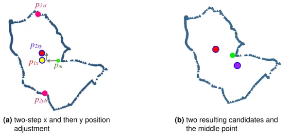
5 Visualization Packagelifemap 30 5.1 Label Positioning Algorithm . . . 30
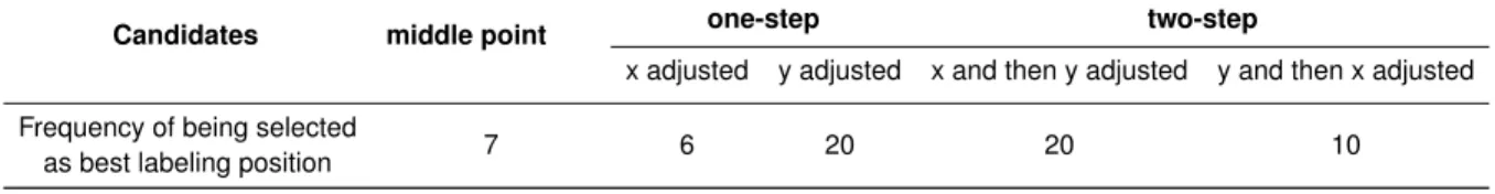
5.1.1 Five candidates of Label Positioning Algorithm . . . 32
5.1.2 Selection of the best candidate in Label Positioning Algorithm . . . 35
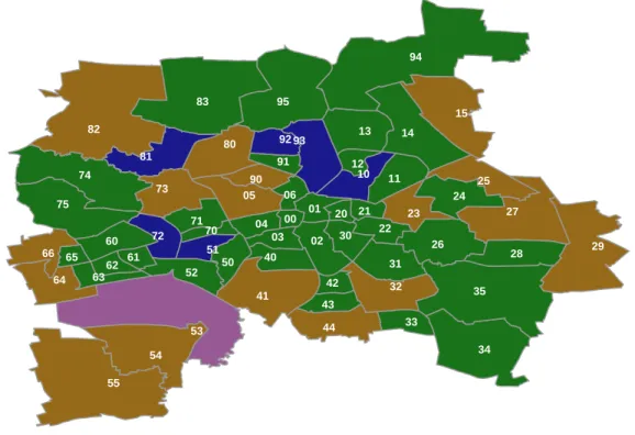
5.1.3 Application of LPA on Leipzig Ortsteile . . . 35
5.1.4 Locating border points for position adjustments . . . 37
5.2 Visualization of continuous data in LIFE-SDVS . . . 38
5.2.1 Realization of boundary labeling in LIFE-SDVS . . . 40
5.2.2 Label Alignment Algorithm . . . 41
5.3 Implementation of map labeling algorithms in R . . . 43
5.4 Visualization of categorical data in LIFE-SDVS . . . 44
6 LIFE Shiny Application 46 6.1 Software composition of LIFE Shiny Application . . . 46
CONTENTS
6.2 The LSA data access unit and tabData . . . 48
6.3 Functionalities on tabF ilter . . . 51
6.4 Map functionalities for continuous data . . . 52
6.5 Map functionalities for categorical data . . . 53
7 Use Cases and Analysis 55 7.1 Use case for continuous data: hand grip strength . . . 55
7.1.1 Visualization of hand grip strength data . . . 56
7.1.2 Age-standardization of hand grip strength data . . . 59
7.2 Use case for categorical data: body mass index . . . 61
8 Conclusions and future work 66 8.1 Future work on LIFE-SDVS . . . 68
A Appendix 69 B Appendix 71 List of Tables 73 List of Figures 74 References 76 4
1
|
Introduction
In this master thesis, a software system, named the LIFE Spatial Data Visualization System (LIFE-SDVS), is conceptualized and implemented. LIFE stands for the Leipzig Research Centre for Civilization Diseases. It is part of the Medical Faculty of the University of Leipzig and conducts a large medical research project focusing on civilization diseases in the Leipzig population [86]. LIFE-SDVS aims to automatically visualize the assessment results in the LIFE project on the map of Leipzig. The first part of the thesis (Chapter 2) introduces the objectives and scopes of the LIFE project and also the data collected. To visualize these data, the architecture of LIFE-SDVS is developed and the implementation of this software system is described in the second part of the thesis (Chapters 3 - 6). The last part of the thesis demonstrates some use cases of LIFE-SDVS (Chapter 7).
1.1
Data visualization
Vision is the most dominant sensory system in the human brain [24]. Roughly 20-30% of the total surface area of the cerebral cortex is involved in visual processing ([104], [132]). The human brain can grasp the meaning of many data points faster while displayed in charts or graphs rather than reading through long list of spreadsheets or pages of reports. Especially in this era where massive amount of data are produced every day, detecting patterns and finding meaningful information becomes very challenging. Using visualization tools can lead to greater insights in less time. Therefore, data visualization plays an important role in the big data analysis pipeline (e.g. [15], [116]).
Data visualization is the science of visual representation of data [60]. The main goal of data visualization is, according to Friedman, "to communicate information clearly and effec-tively through graphical means" [59]. Michael Friendly [60] further classifies data visualization into two main foci: (1) statistical graphics: applies to any domain in which graphical meth-ods are employed in the service of statistical analysis and (2) thematic cartography: primarily concerned with representation constrained to a spatial domain. The earliest visualization ex-amples arose in geometric diagrams, in tables of the positions of stars, and in the making of maps to aid in navigation and exploration [60].
1.2. SPATIAL DATA VISUALIZATION IN MEDICAL RESEARCH
1.2
Spatial data visualization in medical research
Medical geography orhealth geography is an area of medical research or a subdiscipline of geography that incorporates the application of geographical information to the study of health, disease, and health care ([70], [95]). The interlink between medical researches and geogra-phy can be found in the literature of several ancient civilizations, including China, Greece, and India [97]. In his book “On Air, Water and Places” [67], Hippocrates (ca. 460 – ca. 370 BC) is probably the first to describe the relationship between the inhabitant’s health and the geo-graphical characteristics of a place [55]. The termmedical geography was first used among French physicians in the 18th century [26]. The first disease map can be dated back to 1792, a manuscript map by German physician Leonhard Ludwig Finke [25].
Perhaps the most famous example of using cartographic applications as a tool in early medical science is the research of the English physician John Snow (1813 – 1858). In his book On the Mode of Communication of Cholera, Snow reported his research on cholera in London. He used statistics to demonstrate that the degree of contamination of the drinking water corresponded to the number of cholera deaths. He plotted the clusters of cholera cases around the public well pumps during the epidemic of 1854 (Figure 1.1). His map pinpointed the pump on Broad Street as the most likely source of the outbreak. The pump caused 500 cholera deaths within ten days after contamination with sewage from a nearby pipe. Snow persuaded the local council to remove the pump handle and afterwards the number of cholera patients reduced rapidly. Snow’s study is regarded as the founding event of the science of epidemiology and he is considered as one of the fathers of modern epidemiology.
Figure 1.1: Spot-map by John Snow showing the clusters of cholera cases in London outbreak in 1854. In the enlarged part, the location of the water pump on Broad Street is indicated. The map originates from [122].
1.3. AIMS AND OUTLINES OF THIS THESIS
With the advancing of computer technology, software systems such as geographical in-formation systems (GIS) transformed medical geography into a more analytic discipline during the latter half of the 20th Century [97]. One of the early notable medical GIS software is the Geographic Analysis Machine (GAM) [102]. Developed by Openshaw and his colleges in 1987, GAM was used to investigate the clustering effects of Leukemia and other cancers. The system contained not only a GIS for geographical display but also a spatial hypothesis generator and a significance assessment procedure. In addition to epidemiological appli-cations, GIS has been applied in health services sectors ([20], [43], [63], [94], [114]). The public health departments, research organizations of hospitals, medical centers, and health insurance organizations use the information provided by these spatial software systems, for example, to determine where and when to intervene, to improve the quality of care, or to in-crease accessibility of service ([100]). Beyond analyzing geographical relevant information, GIS enables policymakers to better assess potential risk factors and prevent diseases ([38]).
Health atlas helps to explore general patterns of diseases that can be used to generate aetiologic clues. These maps can also be used to identify specific locations where changes in health policy need to be made. TheU.S. Cancer Atlas helped the researchers to uncover the link between snuff dipping and oral cancer [139] and the relationship between shipyard asbestos exposure and lung cancer [34]. The Atlas of United States Mortality produced by the U.S. Center for Disease Control and Prevention (CDC), is the first to show all leading causes of death by race and sex in all regions of the U.S. at a higher resolution ([106], [107]). New mixed effects models and a weighted head-banging algorithm are used to improve the maps showing spatial trends more clearly. World Health Organization (WHO) also features similar health data for the world with itsGlobal Health Atlas[11]. The users can explore data about the distribution of diseases such as HIV/AIDS or influenza in different countries to find patterns of transmission. Community Health Map is a web application that allows users to interact with the visualized health care data at the county level in the U.S. [123]. In this paper, a detailed review on similar projects is given. The Institute for Health Metrics and Evaluation (IHME) at the University of Washington is an independent global health research center. Their webpages on data visualization and infographics also include a few heath atlas [12]. However, none of these systems has direct access to databases and therefore the actuality of the data displayed is not endorsed. Moreover, they focus mostly on presenting maps but not function as a map generation tool.
1.3
Aims and outlines of this thesis
Since the assessment programs in the LIFE project started in 2011, a large amount of data has been collected. The amount of the data collected is still increasing with the ongoing experiments and the follow up studies. To efficiently explore the patterns in these data and to gain further medical insights, the support of data visualization software systems is necessary. In this thesis, the spatial data visualization software system LIFE-SDVS is developed. By using LIFE-SDVS, spatial related questions in the scope of the LIFE study, e.g. which regions of Leipzig have a high prevalence of diabetes, can be answered. Furthermore, LIFE-SDVS
1.3. AIMS AND OUTLINES OF THIS THESIS
can also act as a foundation for the new research project, the Leipzig Health Atlas. This project is funded within the "Integrative Datensemantik in der Systemmedizin" (i:DSem) program of the German Federal Ministry of Education and Research (BMBF) [3]. The Leipzig Health Atlas intends to break the barrier that most of the medical research data are only used by scientists for publications but not for other purposes, e.g., as an information tool for the users in the clinics. To achieve this, the LIFE data will be integrated into an IT-platform and various applications for the analysis will be provided [9].
LIFE-SDVS is a spatial data visualization software system equipped with an automatic map visualization tool and wrapped in an interactive web interface. To cope with the large amount of data available in the LIFE project, LIFE-SDVS provides direct access to the LIFE database so that the users can freely choose the data to be visualized. The data is further processed by the automated data preprocessing unit. The automatic map visualization tool generates maps to present the LIFE results with a spatial aspect. LIFE-SDVS goes beyond the function of only showing the results for exploration, the software system is also an inter-active map generation tool. With just a few clicks and settings on the web interface, the LIFE scientists are able to produce customizable maps for research publications or public health reports.
The following chapter introduces more details of the LIFE project and some related work for building LIFE-SDVS. Chapter 3 presents the design of the architecture and the software components of LIFE-SDVS. Chapter 4 explains the data preprocessing unit. The automatic map visualization tool is presented in Chapter 5. Chapter 6 illustrates the interactive web application. Some use cases for LIFE-SDVS are demonstrated in Chapter 7. Conclusion and future works are stated in Chapter 8.
2
|
Background and Related Work
This chapter firstly introduces the LIFE project and its three main studies: the LIFE-Adult-Study, the LIFE-Child-Study and the LIFE-Heart-Study. Section 2.2 explains the data man-agement in LIFE, the potential data to be visualized spatially and the current situation of spatial data visualization in LIFE. While comparing the statistics among different regions of Leipzig, the underlying cofounder structures of different regions shall also be considered. Section 2.3 explains such so-called standardization methods. The last section (Section 2.4) of this chapter gives an overview on relevant map labeling research.
2.1
The LIFE project
The LIFE project is the first and largest population-based cohort study of this kind in an ur-ban population in the eastern part of Germany [86]. In population-based cohort studies, researchers take a sample or even the entirety of a defined population for longitudinal assess-ments [128]. Unlike randomized control trials (RCTs), which is considered as gold-standard for determining the efficacy of clinical interventions, population-based cohort studies play an important role in scientific discovery and for narrowing the scope for RCTs [124]. Population-based cohort studies often aim to search for exposure-outcome relations, e.g. to investigate the influence of genetic, environmental, social and lifestyle factors on health and diseases. The findings of population-based studies should not be limited to the individuals included in the study but be generalizable to the whole population addressed in the study hypothesis [85].
With initial fundings from the European Union (34.1 million Euro) and the Free State of Saxony (5.5 million Euro), LIFE is the largest scientific project of the Saxon excellence initiative [86]. LIFE is part of the Medical Faculty of the University of Leipzig. Additionally, researchers of the Max Planck Institute for Human Cognitive and Brain Sciences Leipzig and the Leipzig Heart Centre are also involved. The LIFE project includes three subset studies: the LIFE-Adult-Study, the LIFE-Child-Study and the LIFE-Heart-Study. All study participants are inhabitants of Leipzig, a city with population size of approximately 550,000, mostly of central European descent.
The objective of the LIFE-Adult-Study is to investigate prevalences, early onset markers, genetic predispositions, and the role of lifestyle factors on major civilization diseases, such as metabolic and vascular diseases, brain malfunction, depression, sleep disorders, retinal and
2.1. THE LIFE PROJECT
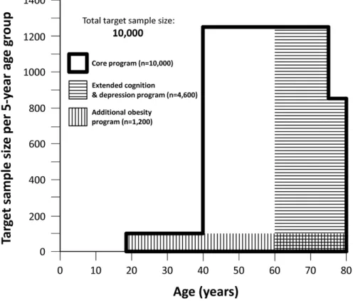
optic nerve degeneration, cognitive impairment, allergies and vigilance dysregulation [86]. Between August 2011 and November 2014, approximately 10,000 randomly selected partici-pants from Leipzig attended the baseline examination. The main age group was of 40 to 79 years. A subset of 400 participants aged 18 to 39 years were also recruited (Figure 2.1). All participants in the main age group accomplished an extensive core assessment program (5-6 h) including questionnaires, structured interviews, physical examinations, and biospec-imen collection. Two additional assessment programs (3-4 h each) including deeper cog-nitive testing, diagnostic interviews for depression, brain magnetic resonance imaging, and electroencephalography were taken by participants over 60 years. To investigate if body fat distribution is associated with functional traits of the brain and traits of eating behavior, a sub-cohort of 1200 participants aged 18-79 underwent abdominal and brain MRI-scans (magnetic resonance imaging, MRI) [86].
age limit to 74 years. We observed that participants aged ≥75 years had difficulties in completing the assess-ment programme within the set time limit despite high motivation. Furthermore, it became apparent that participation of women in this age group was markedly reduced (about 1/3 lower than men). The most fre-quently given reason was that women would not leave their diseased and care-needing partners alone at home on three study days. Therefore, as we stopped recruit-ment of participants ≥75 years, we extended the lower age limit for deep cognition and depression phenotyping to 60 years. This change was put in place in March 2013 after approval by the institutional ethics board.
In a subset of participants we investigated whether body fat distribution is associated with functional traits of the brain (magnetic resonance imaging, MRI) and traits of eating behaviour. To unravel this question a
subcohort of 1200 participants aged 18-79 underwent abdominal MRI-scans in addition to brain MRI-scans.
Disclosure of results and pathological findings to participants
Participants were offered to be informed about selected examination results. If they agreed, they received a letter within two weeks of the study visit comprising their la-boratory and anthropometric data, blood pressure, intima media thickness, ankle-brachial index, and the results of the skin prick test. Participants were informed about pathological findings according to a pre-defined protocol using four categories of severity (very high: acute life-threatening condition requiring immediate intervention, high: not acute life-threatening condition needing imme-diate medical clarification or treatment, medium: need for near-term medical clarification, low: recommendation of medical supervision, e.g. by a general practitioner).
Data management
We developed and set up a comprehensive dedicated IT infrastructure to support processes such as recruiting, appointment scheduling, assessment coordination, data entry, data integration, pre-processing, quality control, data curation and analysis. The infrastructure consists of several commercial and self-developed software systems running in a shared network. An ORACLE® database (Oracle Corporation, Redwood Shores, CA, USA) is used for storing administrative and most assessment data. A tailor-made participant management system was used to
Fig. 1Target sample sizes of the LIFE-Adult-Study
Table 1Major diseases and phenotypes investigated in the LIFE-Adult-Study
● Cardiovascular diseases (myocardial infarction, heart failure, atherosclerosis, cardiac arrhythmias)
● Metabolic diseases (obesity, type 2 diabetes)
● Cognition and brain functioning
● Depression (including minor depression)
● Sleep disorders and vigilance regulation
● Degenerative diseases of the retina
● Allergies and immune competence
Loeffleret al. BMC Public Health (2015) 15:691 Page 3 of 14
Figure 2.1:Target sample sizes of the LIFE-Adult-Study (adapted from [86]).
The aim of the LIFE-Child-Study is to assess how metabolic, environmental and genetic factors affect the health from fetal life to adulthood [109]. In addition to monitoring the nor-mal growth, development and health, the LIFE-Child-Study also focuses on diseases such as childhood obesity, atopy and mental health problems. The study includes a neonate sub-cohort, the LIFE Child BIRTH cohort. In this sub-cohort, extensive assessments are undertaken in pregnant women and their offspring from 24thweek of gestation to 12 month of age. After-wards the child is integrated into the LIFE Child HEALTH cohort, in which also other children and their families are recruited. The LIFE Child HEALTH cohort is a population-based cohort
2.2. DATABASE AND SPATIAL DATA VISUALIZATION IN LIFE
of children and adolescents in an age range from 3-18 years. Additional specific assessments are carried out for each of the focused groups: the LIFE Child OBESITY cohort, the LIFE Child DEPRESSION cohort and the LIFE Child ATOPY cohort [109]. The LIFE-Child-Study is de-signed as a longitudinal cohort study and the participants are followed annually over a period of ten years.
The scientists in the LIFE-Heart-Study aim to assess biochemical and molecular biomark-ers and their ability to evaluate the presence and severity of coronary artery disease (CAD) and to predict the future course of disease [31]. A biobank and database of patients with different stages of CAD are established for investigating the clinical, metabolic, cellular and genetic factors of cardiovascular diseases. The clinical cohort of approximately 7,000 heart patients consists of a sub-cohort with patients undergoing first-time diagnostic coronary an-giography and a sub-cohort of acute myocardial infarction survivors. The study is one of the largest fully genotyped studies worldwide with angiographically assessed coronary patients [86]. Moreover, follow-ups at 5-year intervals will provide information about major cardiac clinical events of the study participants.
Since 2014 the LIFE research centre has joined the German National Cohort (GNC) as one of the 18 regional study sites [64]. The recruiting of new participants has started and aims to set a nationwide cohort of 200,000 individuals aged 20–69 years. The objective of the GNC is to investigate the causes for the development of major chronic diseases such as cancer, diabetes, cardio-vascular diseases and psychiatric diseases. The duration of the GNC is planned for 25–30 years.
2.2
Database and spatial data visualization in LIFE
The data management in LIFE consists of several commercial and self-developed software systems running in a shared network [86]. Most of the assessment and administrative data are stored in an ORACLE® relational database (Oracle Corporation, Redwood Shores, CA, USA). Participant data such as their identity, pseudonymisation, and appointments are or-ganized separately from the scientific data in a dedicated participant management system. CryoLab, a self-developed laboratory information system (LIMS), manages the workflow of all biospecimen, such as their collection, labeling, processing, aliquoting, distribution and storage. Currently there are more than 700 assessments (i.e., investigations) including in-terviews, questionnaires, physical examinations, such as for anthropometry, EKG, MRT, and laboratory analyses of biospecimen applied in the different studies of LIFE. All the data of these assessments and their analysis results are integrated in a central research database. The ‘LIFE Investigation Ontology’ (LIO), developed by LIFE researchers Dr. T. Kirsten and A. Kiel, describes and classifies the entities in the research database and their relationships semantically [80]. A set of ontology-based tools is implemented to ease the data retrieval pro-cess in this large project [130]. The LIO is integrated into an ontological framework so that the scientists can utilize LIO to formulate queries over the scientific data. These ontology-based queries are transformed into SQL queries and the retrieved data are stored as project-specific
2.3. AGE-STANDARDIZATION OF THE STATISTICS
analysis views within the central research database. These views allow scientists to access the requested data using the database API and SQL or to export them as tabular reports for further analysis projects.
By 2015, the LIO consists of more than 700 assessments and ca.120 analysis views and in total more than 39,000 items (i.e., questions and measurements) [130]. Assessments are arranged as data tables in the research database and the items are the columns. All participants in LIFE-Adult-Study underwent a core assessment programme including theme areas such as anthropometry, physical activity, fitness, sleep patterns, lifestyle and diet, socio-economic status, heart function, depressive symptoms, neuroimaging and neurocognitive as-sessments, psychosocial aspects, life satisfaction, stressors and allergy test [86]. Participants aged 60-79 were invited to two additional assessment programs: cognition programme and depression programme. Appendix A lists the detailed assessment measurements taken in forms of computer-assisted personal interviews, computer- or paper-based self-administered questionnaires, psychometric tests (Table A.1), physical and medical examinations (Table A.2), and clinical chemistry from blood and urine samples (Table A.3). The LIFE-Child-Study assessments contain examinations such as anthropometry, clinical exam, biological sample collection, motor and cognitive development. Questionnaires, interviews and psychological tests were also carried out in five aspects: (1) environment: e.g. sociodemography, lifestyle, quality of life (2) physical health: e.g. health-related symptoms, allergies, sleep behaviour (3) family and school: e.g. performance at school (4) mental health and (5) personality. For detailed lists of the assessments in the LIFE-Child-Study please refer to [109].
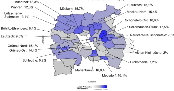
In December 2014 the LIFE-Adult-Study greeted its 10,000 participants and the analy-sis of the data from this large cohort started [7]. Among the many theme research areas, spatial data visualization was only done occasionally and manually. One example is Figure 2.2, the visualization of the percentage of probands with diabetes in the Ortsteile of Leipzig. The map was produced using programing language R and the labels and the leaders (the line segments connecting the Ortsteile with their boundary labels) were added manually. To pro-duce such a map was time consuming and if other data shall be displayed, the whole process has to be repeated again. Furthermore, the proportions of diabetes in each Ortsteil shown on the map was calculated from the participants attending in the LIFE project. These results are biased because the underlying population structures in different Ortsteile vary. Hence, standardization methods are needed. The following section describes these methods.
2.3
Age-standardization of the statistics
Many attribute measurements taken for clinical research or public health studies are gender-and/or age-dependent, i.e. the physical or mental traits differ between male and female and often hold a trend through aging. For example, hand grip strength of men is on average stronger than that of women. Furthermore, hand grip strength generally remains stable for man with age between 20 and 55 and starts to decrease from the age of 55 years ([93] Figure 1). A similar trend is seen in women of different age groups ([93] Figure 2), though the
2.3. AGE-STANDARDIZATION OF THE STATISTICS
Diabetes
Schönefeld-Ost: 18,6% Althen-Kleinpösna: 2% Schleußig: 6,2% Probstheida: 7,2% Neustadt-Neuschönefeld: 7,6% Sellerhausen-Stünz: 17,5% Marienbrunn: 16,8% Meusdorf: 16,1% Möckern: 15,7% Wahren: 12,8% Lützschena-Stahmeln: 13,4% Lindenthal: 13,3% Grünau-Ost: 14,4% Grünau-Nord: 15,1% Mockau-Nord: 15,4% Eutritzsch: 15,1% Böhlitz-Ehrenberg: 8,4% Leutzsch: 9,8%Anteil Probanden mit Diabetes in den Ortsteilen Leipzigs
Figure 2.2:An example showing early spatial data visualization in LIFE.
tude of decrease is not as large as that of the men (in men about 40% reduction, in women ca. 30%). Such statistics of attributes (e.g. arithmetic mean values, rates etc.) have to be statistically adjusted to remove the effect of population differences in age or gender structure when comparing between different study populations. Standardizationis the statistical adjust-ment technique used in such instances. The factors influencing the statistics, such as the age or gender structure, are calledcofounders [119].
There are two types of methods for the standardization: direct and indirect methods. For both method types, the standardized statistic is computed based on the statistic value of its stratum and a weight. Strata are subgroups to which individuals are aggregated by a certain attribute, for example, into three age groups (three strata). The calculation for the direct method is the following:
DIRECT METHOD sstandardized= k ∑ i=1 (w(iref)×s(istu)) (2.1) where
wi(ref)= number of individuals in stratumiof the
reference population total number of individuals inreference population
k is the total number of strata. The term wi(ref) is the weight for stratum iof the reference population. Values(istu)is the statistic in the study population for stratumi.
2.4. MAP LABELING ALGORITHMS
In the indirect method, the weight for stratumiis derived from the proportion of stratum
iin the study population and the statistic is obtained from the reference population: INDIRECT METHOD sexpected= k ∑ i=1 (w(istu)×s(iref)) (2.2) where
wi(stu)=number of individuals in stratumiof the
study population
total number of individuals instudy population (2.3)
The main conceptual difference between both methods is that in the direct method the statistic is obtained from the study population and the weight is from the reference population. On the other hand, in the indirect method study population provides the weight and the ref-erence population provides the statistic in focus [120]. The indirect method is used in cases where no specific measurement has been taken or in the instances where stratum-specific numbers are too small (such as populations in a single industrial plant or a small city) so that the stratum-specific estimates are too susceptible to random variability [120]. Both cases do not occur in the regions of Leipzig. In consequence, the direct standardization method is chosen for LIFE-SDVS.
2.4
Map labeling algorithms
Map labeling or label placement is a fundamental task in cartography. Labeling quality de-pends on many factors and reflects human visual perception and experience ([39], [75]). The cartographers Imhof ([71], [72]) and Yoeli [146] have studied extensively on map labeling and proposed some basic rules of a good labeling: i) no overlaps of a label with other labels or other objects, ii) each label can be easily identified with exactly one graphical feature iii) a label must be placed in the most preferred position. However, these rules are descriptive and it is difficult to quantify these characteristics and come up with an appropriate definition of an objective function [39]. The ACM Computational Geometry Task Force, a group of scientists, considered the automatic label placement problem as an important research area in their technical report "Applications challenges to computational geometry" [16].
Point-feature label placement
Imhof classified the label-placement in cartography into three categories ([71], [72]): point-feature labeling (e.g. cities or mountain peaks), line-point-feature labeling (e.g. rivers or roads) and area-feature labeling (e.g. lakes or countries). Point-feature label placement (PFLP) as defined by Christensen et al. is "the problem of placing text labels adjacent to point features on a map or diagram so as to maximize legibility" [39]. They further suggested the legibility of PFLP into an objective function considering following factors:
1. The amount of overlap between text labels and other labels or graphical features
2.4. MAP LABELING ALGORITHMS
2
determining the optimal placement of a label for an isolated line or area feature, the three placement tasks share a common combinatorial aspect when multiple features are present. The complexity arises because the placement of a label can have glo-bal consequences due to label-label overlaps. This combinatorial aspect of the label-placement task is independent of the nature of the features being labeled, and is the fundamental source of difficulty in automating label placement. We therefore concentrate on point-feature label placement (PFLP) without loss of generality; in Section 5 of the paper we describe how our results generalize to labeling tasks involving line and area features.
The PFLP problem can be thought of as a combinatorial optimization problem. Like all such problems, two aspects must be defined: asearch space and anobjective function.
Search space.An element of the search space can be thought of as a function from point features to label positions, which we will call alabeling. The set of potential label positions for each point feature therefore characterizes the PFLP search space. For most of the published algorithms, the potential label positions are taken, following cartographic standards, from an explic-itly enumerated set. Figure 1 shows a typical set of eight possible label positions for a point feature. Each box corresponds to a region in which the label may be placed. Alternatively, a continuous placement model may be used, for example by specifying a circle around the point feature that the label must touch without intersecting.
In certain variants of the PFLP problem, we allow a labeling to omit certain points and their labels (presumably those that are most problematic to label, or least significant to the labeling application). When this option is included, the PFLP problem is said to includepoint selection.2
Objective function.The function to be optimized, the objective function, should assign to each element of the search space (a potential labeling of the points) a value that corresponds to the relative quality of that labeling. The notion of labeling quality has been studied by cartographers, most notably by Imhof (1962; 1975). However, Imhof’s analysis is descriptive, not pre-scriptive; coming up with an appropriate definition of the objective function for a general label-placement problem (that is, one that includes point, line, and area features) is a difficult task. Labeling quality can depend on many factors, including detailed “world knowledge” and characteristics of human visual perception. Many of the label-placement algorithms reported in the literature therefore incorporate sophisticated objective functions. A popular approach has been to use a rule-based para-digm to encode the knowledge needed for the objective function (Ahn and Freeman, 1984; Freeman and Ahn, 1987; Jones, 1989; Cook and Jones, 1990; Doerschler and Freeman, 1992). For the PFLP problem, however, a relatively simple objective function suffices. Our formulation of the objective function is due to Yoeli (1972).3 In Yoeli’s scheme, the quality of a labeling
depends on the following factors:
• The amount of overlap between text labels and graphical features (including other text labels);
• A priori preferences among a canonical set of potential label positions (a standard ranking is shown in Figure 1); and • The number of point features left unlabeled. (This criterion is pertinent only when point selection is incorporated into
the PFLP problem.)
2In many types of production-quality maps, overplots are preferred to exercising point selection (Ebinger and Goulette, 1990).
3A recent study conducted by Wu and Buttenfield (1991) addresses the issue of placement preference for point-feature labels in more detail.
Figure 1: A set of potential label positions and their relative desirability. Lower values indicate more desirable positions.
1 2 3 4 5 7 6 8 (a)four potential label
positions
2
determining the optimal placement of a label for an isolated line or area feature, the three placement tasks share a common combinatorial aspect when multiple features are present. The complexity arises because the placement of a label can have glo-bal consequences due to label-label overlaps. This combinatorial aspect of the label-placement task is independent of the nature of the features being labeled, and is the fundamental source of difficulty in automating label placement. We therefore concentrate on point-feature label placement (PFLP) without loss of generality; in Section 5 of the paper we describe how our results generalize to labeling tasks involving line and area features.
The PFLP problem can be thought of as a combinatorial optimization problem. Like all such problems, two aspects must be defined: asearch space and anobjective function.
Search space.An element of the search space can be thought of as a function from point features to label positions, which we will call alabeling. The set of potential label positions for each point feature therefore characterizes the PFLP search space. For most of the published algorithms, the potential label positions are taken, following cartographic standards, from an explic-itly enumerated set. Figure 1 shows a typical set of eight possible label positions for a point feature. Each box corresponds to a region in which the label may be placed. Alternatively, a continuous placement model may be used, for example by specifying a circle around the point feature that the label must touch without intersecting.
In certain variants of the PFLP problem, we allow a labeling to omit certain points and their labels (presumably those that are most problematic to label, or least significant to the labeling application). When this option is included, the PFLP problem is said to includepoint selection.2
Objective function.The function to be optimized, the objective function, should assign to each element of the search space (a potential labeling of the points) a value that corresponds to the relative quality of that labeling. The notion of labeling quality has been studied by cartographers, most notably by Imhof (1962; 1975). However, Imhof’s analysis is descriptive, not pre-scriptive; coming up with an appropriate definition of the objective function for a general label-placement problem (that is, one that includes point, line, and area features) is a difficult task. Labeling quality can depend on many factors, including detailed “world knowledge” and characteristics of human visual perception. Many of the label-placement algorithms reported in the literature therefore incorporate sophisticated objective functions. A popular approach has been to use a rule-based para-digm to encode the knowledge needed for the objective function (Ahn and Freeman, 1984; Freeman and Ahn, 1987; Jones, 1989; Cook and Jones, 1990; Doerschler and Freeman, 1992). For the PFLP problem, however, a relatively simple objective function suffices. Our formulation of the objective function is due to Yoeli (1972).3 In Yoeli’s scheme, the quality of a labeling depends on the following factors:
• The amount of overlap between text labels and graphical features (including other text labels);
• A priori preferences among a canonical set of potential label positions (a standard ranking is shown in Figure 1); and • The number of point features left unlabeled. (This criterion is pertinent only when point selection is incorporated into
the PFLP problem.)
2In many types of production-quality maps, overplots are preferred to exercising point selection (Ebinger and Goulette, 1990).
3A recent study conducted by Wu and Buttenfield (1991) addresses the issue of placement preference for point-feature labels in more detail. Figure 1: A set of potential label positions and their relative desirability. Lower values indicate more desirable positions.
1 2 3 4 5 7 6 8
(b)eight potential label positions
Figure 2.3:The relative desirability of a set of potential label positions. Smaller values indicate more desirable positions. The figures are adapted from [39].
2. A pre-defined preferences among a canonical set of potential label positions (a standard ranking is shown in Figure 2.3)
3. The number of unlabeled point features left if point selection is incorporated into the PFLP problem
PFLP can be seen as a combinatorial optimization problem and has been proved as NP-hard even for very restricted labeling models ([54], [78], [90]). One example is when all text labels are rectangles of the same size, each text label has to be placed with one of its four corners at the point (as shown in Figure 2.3(a)) and all text labels have to be disjoint [54]. Therefore, for such problems the practical application of exact search algorithms is limited to problems with at most a few hundred points (ifP≠N P) ([44], [81], [126], [147]).
Various heuristic methods have been developed to tackle the PFLP. Christensen et al. [39] compared six heuristic algorithms including methods such as a greedy algorithm, an in-teger programming algorithm of Zoraster [147], a gradient-descent method by Hirsch [68] and a stochastic algorithm utilizing simulated annealing. The comparison shows that simulated annealing outperforms all other algorithms and is one of the easiest algorithms to implement. Different approaches of genetic algorithms (GA) have been proposed to solve the PFLP (e.g. [22], [110], [131], [134]). Algorithms applied on PFLP with the constraint that all point features must be labeled include a tabu search [144], a constructive genetic approach [51] and a fast algorithm for label placement [145]. Wagner et al. proposed a two phase algorithm for the situation that certain labels are allowed to be omitted and the objective is to place as many labels as possible with no overlaps [135]. Doddi et al. developed constant-factor polynomial-time approximation algorithms to solve the generalized map-labeling problem, i.e. labels are not limited to be rectangular but can also be elliptical, any restriction on their orientation is removed and allowing the point feature can be placed anywhere on the boundary of its label region [47]. An extensive Map-Labeling bibliography is maintained by Wolff and Strijk [141]. Line-feature label placement (Edge Label Placement)
Edge Label Placement (ELP) or line-feature labeling is the problem of assigning text labels to lines (edges) such that the association of the labels to their corresponding edges is unam-biguous [73]. In ELP, a label can touch the edge it is labeling but it should not overlap any other graphical feature in a drawing [74]. For example, labels like A, B and D in Figure 2.4 are preferable and a label like C, which overlaps its associated edge, can be acceptable with
2.4. MAP LABELING ALGORITHMS
some appropriate cost assigned to it. The ELP problem is proved to be NP-hard ([36], [73]).
15.2. THE LABELING PROBLEM
491
1
2
3
4
5
6
(b)
(a)
(c)
A B E L L D E UR V C 2 1 A B D CFigure 15.1
(
a
) Labeling space of a node. (
b
) Labeling space of an edge. (
c
) Labeling
space of an area. Figure taken from [KT03].
Source Source Target Source
(a)
Source Target(b)
Figure 15.2
(
a
) A good label assignment. (
b
) A misleading label assignment. Figure
taken from [KT03].
it belongs to, but it should not overlap any other graphical feature in a drawing. In Figure
15
.
1(
b
), where the graphical feature to be labeled is an edge, labels like
A
,
B
and
D
are
preferable but certainly a label like
C
, which overlaps its associated edge, can be acceptable
with some appropriate cost assigned to it. The accepted practice for placing a label
asso-ciated with an area is to have the label span the entire area and conform to its shape, as
shown in Figure 15
.
1(
c
). For more details on name placement rules for geographical maps,
see [FA87, Imh75, vR89, Yoe72].
When the graphical objects to be labeled belong to a technical map or drawing, then,
usually a di
ff
erent set of rules govern the preferred label positions. These rules depend on
the particular application, and must follow user specifications. For example, if the graphical
feature is an edge of a graph drawing, the user must be able to specify that the preferred
position for an edge label is closer to the source or destination node. For example, a label of
a single edge that is relevant to its source node must be placed close to the source node (see
Figure 15
.
2(
a
)) to avoid ambiguity (see Figure 15
.
2(
b
)). It is important to emphasize that
a user must be able to customize the rules of label quality to meet specific needs and/or
Figure 2.4:Labeling space of an edge. Figure adapted from [74].
Area-feature label placement
The general accepted practice of area-feature labeling in cartography are: i) the labels must be inside the boundaries of the area and ii) the labels must span the entire area and con-form to its shape ([19], [56], [57], [58], [72], [108], [133], [146]). Figure 2.5 shows a resulting map of an automatic area-feature labeling [19]. Since an area name should span the area, it is necessary to find a shape description or baseline of the area. It was firstly done by the so-called skeleton method [96] . To reduce the strong influence of minor boundary irregu-larities, Ramer [112] proposed a boundary-approximation algorithm to smooth the boundary first. Edmonson and Christensen [52] label areas by using random methods and their scoring function uses the centroid as an ideal position for the label text. Pinto and Freeman argued that [108] it did not seen possible to devise an algorithm to solve area-feature labeling prop-erly in every instance. Therefore, they developed a method that deploys a feedback approach consisting of two components: i) the Placement Generator generates a large set of potential text placements for a given region and ii) the Placement Evaluator evaluated these candi-dates. The evaluation criteria follows the main guidelines for spread-out area feature labeling such as longer, spread-out placement is preferred over a shorter one, a good placement shall conform to the shape of the area and larger clearance from the boundary is preferred.
Dörschlag et al. [50] proposed a vector-orientated algorithm for placing not only text but also objects such as diagrams in areas of a map without violating the boundary of the areas. A bounding box is a rectangle that outlines the label text or the object. The aim of the algorithm is to determine a point in the area of a map and the center point of the bounding box should be placed on this determined point. The algorithm includes the following three steps:
1. Erosion of an area: this step reduces the potential candidate area where the center point of the bounding box should ideally be placed. The candidate area is the original area subtracting an inward buffer (Figure 2.6). The buffer is obtained by moving the bounding box along the original area border. If the candidate area consists of several disjunct regions, one of these regions should be chosen heuristically.
2. Calculate the skeleton: this step reduces the candidate area to a 1-dimensional skele-ton. To choose candidate points on the skeleton, methods such as to choose the mid-points of the skeleton edges or to select the skeleton vertices with a degree of at least three are suggested. However, exact prescription is missing.
2.4. MAP LABELING ALGORITHMS A P R O G R A M FOR A U T O M A T I C NAME P L A C E M E NT 107
FIGURE 3. Example of automatic area-feature name placement.
the line section before it can be combined with the distance from the center of the line segment to determine the 'desirability' of the name position.
Post-Processing Editor
Although it is intended that the annotation system be completely automatic, it is clear that some provision must be included for interactive editing of the result. The purpose of such editing is to improve the appearance of the map, to correct data errors, and to correct possible mistakes made by the system.
C U R R E N T S T A T U S A N D D I S C U S S I O N
Currently, the area and point annotation algorithms have been implemented on a PRiME-750 computer with a program written in RATFOR, a FORTRAN
preproces-Figure 2.5: An example of automatic area-feature labeling result based on general accepted practice in cartography. The figure is adapted from [19].
3. Select final point: this step uses a heuristic with a scoring function to determine one point of the skeleton as the final point for placing the center point of the bounding box.
Boundary labeling
Boundary labeling, though commonly applied in practice, was first studied by Bekos et al. in 2004 [29] (later also published as [30]). In their boundary labeling model, the features are enclosed within a rectangle, each label is connected to its associated feature through a polygonal line called leader, and no two leaders intersect. The boundary labeling problem can be defined as follows. Given is a setP =p1, . . . , pnof points and an axis-parallel rectangle
R that containsP. Each point, or site,piis associated with an axis-parallel rectangular open label, where open means that the border of the label is not part of the label. The labels have to be placed and connected to their corresponding sites by leaders, such that i) no two labels intersect, ii) no two leaders intersect, iii) the labels lie outside R but touch R, and iv) each leader lies insideR.
Typically additional requirements or restrictions are made to the boundary labeling prob-lem. For example, only certain restricted types of leaders may be allowed (examples of leader
2.4. MAP LABELING ALGORITHMS
D. Dörschlag, I. Petzold and L. Plümer: Placing objects automatically in areas of maps 3/6 Figure 3 Demonstration for the skeleton solution
Obviously it has an advantage against the previous approach, the centroid of an area, it considers the shape of the area. Just as the centroid it does not guarantee the non-violation of the area border.
4. LABELLING WITH EROSION
Until now we presented different approaches and demonstrated their disadvantages. As we have seen in section 3.2 we have to consider not only the shape of the area, but also the dimension of the label. Therefore all necessary information to be considered will be, generally speaking, transferred to the area. This can be achieved by erosion of the area, which is presented in the next section. To incorporate the shape into the placement process it will be considered in the next step. Therefore the skeleton of the eroded area will be derived. This reduces the number of possible solutions. To gain one final solution a scoring function is used.
Figure 4 The result with the designed algorithm 4.1. Erosion of an area
The erosion process reduces the area in dependence of the horizontal and vertical dimension of the bounding box. This box is called erosion operator (Figure 5). The condensed description of the process is as follows:. Suppose the bounding box is a rectangular brush. If (the centroid of) the brush is moved along the border of the area, the painted region is a kind of buffer. Subtracting this painted region from the original area we obtain the eroded one. This process is shown in Figure 5.
Figure 5 Erosion step with a simple case result; (a) the origin and the erosion operator; (b) erosion process; (c) the result
Figure 2.6: Example of the erosion step of the algorithm by Dörschlag et al. [50] (a) the origin area and the bounding box (b) the erosion process (c) the result. The figure is adapted directly from the paper.
types see Figure 2.7). The number of line segments of each leader might be restricted and also the type the line segments might be restricted. Other requirements consider the length of the leaders, e.g. the total length of all leaders should be minimal or the total number of bends of all leaders should be minimal. There might also be a fixed point – called label port - on the side of the label that touchesRand where the corresponding leader has to be connect to the label, e.g. the middle point of the edge.
218 M.A. Bekos et al. / Computational Geometry 36 (2007) 215–236 2. Defining and modeling the problem
We consider the following problem. Given an axis-parallel rectangleR= [lR, rR]×[bR, tR]of widthW =rR−lR
and heightH=tR−bR, and a setP ⊂Rofnsitespi=(xi, yi), each associated with an axis-parallel rectangular
open labelliof widthwi and heighthi, our task is to find alegalor anoptimalleader-label placement. Our criteria
for a legal leader-label placement are the following: 1. Labels have to be disjoint.
2. Labels have to lie outsideR, close to the boundary ofR. 3. Leaderciconnects sitepiwith labellifor 1!i!n.
4. Intersections of leaders with other leaders, sites or labels are not allowed.
5. Theportswhere leaders touch labels may befixed(the center of a label edge, say) or may be arbitrary (sliding ports).
In this paper we present algorithms that compute legal leader-label placements (for brevity, simply referred to as
labelings) for various types of leaders defined below, but we also approach optimal placements according to the following two objective functions:
• short leaders (minimum total length) and
• simple leader layout (minimum number of bends).
These criteria have been adopted from the area of graph drawing since leaders do not play a significant role in the label-placement literature. In Zoraster’s work [26], the leader length is only indirectly minimized by ranking the above-mentioned 24 label positions such that positions closer to the site are favored. We will evaluate the two criteria under two models for drawing leaders. In the first model we require that each leader is rectilinear, i.e., a connected sequence of orthogonal line segments. In the second model each leader is drawn as a straight-line segment.
A rectilinear leader consists of a sequence of axis-parallel segments that connects a site with its label. These segments are either parallel (p) or orthogonal (o) to the side of the bounding rectangle R to which the label is attached. This notation yields a classification scheme for rectilinear leaders: let atypebe an alternating string over the alphabet{p, o}. Then a leader of typet=t1. . . tk consists of anx- andy-monotone connected sequence(e1, . . . , ek)
of segments from site to label, where each segmentei has the direction that the letterti prescribes. In this paper we
focus on leaders of the typespo(see Fig. 2) andopo(see Figs. 1(b) and 3). We consider type-oleaders to be of type
opoand of typepoas well. We extend this notation by referring to straight-line leaders as type-sleaders; see Fig. 4. For each type-opoleader we further insist that the central p-segment is immediately outside the bounding rec-tangleRand is routed in a so-calledtrack-routing area. We assume that the width of the track-routing area is fixed and large enough to accommodate all leaders with a sufficient distance. Due to this assumption the total length of the o-segments of all leaders is identical in all label-leader placements. Thus we are left with optimizing the length of thep-segments. Minimizing the width of the track-routing area for a given minimum leader distance is an interesting problem in itself, which is not the topic of this work.
We start with a negative result. Assume that the labels must be attached either to the right or to the left side of the rectangleRand that their heights are not equal. Furthermore, assume that the label heights sum up to twice the height ofR. Clearly, the task of assigning the labels to the two sides corresponds to the well known problem PARTITION, which is weakly NP-complete [11]. Because of the NP-completeness of the general problem, it is reasonable to study
Fig. 2. Type-poleaders. Fig. 3. Type-opoleaders. Fig. 4. Type-sleaders. Figure 2.7:Examples of leader types in boundary labeling. The figure is adapted from [30].
Many boundary labeling algorithms are proposed for different leader types and different sides of R. It was shown in [30] that the boundary labeling problem where each leader has only one line segment, i.e. the leader is a straight line, can be solved in time O(nlogn).
The same time bound holds also for the corresponding one-sided boundary labeling problem [30]. A recent overview on boundary labeling problems where leaders have more than one line-segment is in [28]. Nöllenburg et al. [99] considered the scenario of one-sided boundary labeling where the user can interactively select regions of interest by zooming and panning the map. Problem of two-sided boundary labeling with adjacent sides is dealt in [79]. Huang et al. [69] extended boundary labeling with flexible label positions so that labels do not necessarily form only one single stack and the two ends of label stacks can extend over the sides of the map. They showed that when using nonuniform-size labels, almost all of the total leader length minimization problems are NP-complete.
Map labeling requirements in LIFE-SDVS
The city map in LIFE-SDVS is based on the data set provided by the Leipzig city government. The data set contains coordinates of the border points of the administrative regions at two
2.4. MAP LABELING ALGORITHMS
els: Ortsteile and Stadtbezirke. These given regions are used to present the results obtained by the LIFE assessments. For the visual representation, short labels such as the Ortsteile IDs can be used to denote the regions. Furthermore, it is also desirable to show statistical graphics or symbols in each region of Leipzig. Inspired by Figure 2.2, the long label texts that can not be fitted into the regions can be placed outside of the map area. For such boundary labeling, the leaders connect a point in each region and extend to the margins of the map. Consequently, good positions within each region for placing the short labels, graphics and as starting point of leaders for the boundary labeling are necessary. These positions are called labeling positions in this thesis. To find such good labeling positions within regions is one of the tasks of the label placement problem in LIFE spatial data visualization.
The applicability of map labeling algorithms in LIFE-SDVS
Some fundamental differences restrict the application of the classical map labeling algorithms on the current stage of LIFE-SDVS. The point-feature label placement algorithms are de-signed to place text labels adjacent to a given set of point features while the LIFE data set contains given region border points and good positions for placing labels are yet to be found. The area-feature label placement algorithms generally aim to place label text along the base-line within the associated area but LIFE-SDVS does not limit to show text within each region but also graphics. The algorithm proposed by Dörschlag et al. [50] has similar objectives, i.e. to find a good labeling position of an area in map. However, the authors gave only the con-ceptual descriptions on how the algorithm was structured but not a detailed depiction. Thus, some missing information makes the application of the algorithm difficult. Furthermore, there is also no indication of how good the algorithm works. To solve the boundary labeling problem in LIFE-SDVS, a similar idea to that of Bekos et al. [30] is applied.
3
|
Architecture and Software
Com-ponents
This chapter explains the conceptual design of LIFE-SDVS. In the first section the architecture of LIFE-SDVS is introduced. The different software components and their relationship to the architecture are described in the second section.
3.1
Architecture of LIFE-SDVS
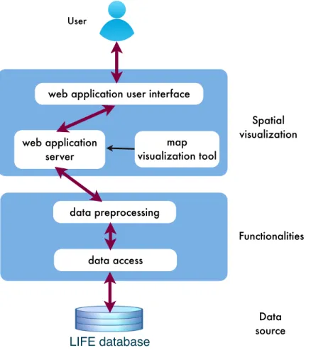
LIFE-SDVS comprises a three-layered architecture: data source, functionalities and spatial visualization (Figure 3.1). The data source is the LIFE research database containing the assessment results of the LIFE-Adult-Study and the LIFE-Child-Study. The functionalities consists of two main components: data access and data preprocessing. Data access is for accessing the LIFE database by SQL queries to obtain the raw data. The raw data is then preprocessed using functionalities including filters, statistical aggregation and standardiza-tion. The output statistics of data preprocessing are used for the spatial visualization layer. In this layer, the statistics can be displayed on the map of Leipzig. LIFE-SDVS is finally pre-sented as a web application user interface backed by a web application server. Within the server, an independent tool is responsible for the map visualization. Through this system, the users can obtain the data directly from the LIFE database and produce maps interactively. Additionally, the web application user interface can also function as a web presentation for displaying the LIFE research results in the different regions of Leipzig on a map.
The programming language R and the Shiny web application framework are chosen to build the LIFE Spatial Data Visualization System. LIFE-SDVS shall be capable of applying statistical analysis, plotting graphics, visualizing spatial data on maps and contains an inter-active web application. All these tasks can be implemented very well by using R and Shiny.
R is a free software environment for statistical computing and graphics [4]. It is one of the most comprehensive statistical analysis packages available [138]. Guy Harrison argued that while the commercial statistical software, e.g. SPSS or SAS, “price tags increased, while the focus on business intelligence did not always align with academic desires... R arguably repre-sents the most accessible and feature-rich set of statistical routines available” [66]. There are several other advantages of R. R is backed by the CRAN package repository which currently
3.2. SOFTWARE COMPONENTS OF LIFE-SDVS
data preprocessing map visualization tool web application user interface
User LIFE database web application server Functionalities Data source Spatial visualization data access
Figure 3.1:Three-layered architecture of LIFE Spatial Data Visualization System.
features 8093 available packages (17th March 2016) [10]. RStudio is a powerful and produc-tive IDE for R. It’s free, open source and works well on most major operating systems [14]. R, along with python, is the analytic language for big data. Furthermore, R is moving toward a comprehensive spatial data visualization software [37]. Some of cutting edge algorithms for spatial statistics are implemented in R before than in any other widely available software product [33].
The web application user interface and the web application server of LIFE-SDVS are implemented using Shiny. Shiny is a web application framework for R and is written in R [5]. The interactivity features of Shiny allow users of LIFE-SDVS to define the data to be visualized and to use it as a map generation tool.
3.2
Software components of LIFE-SDVS
The three-layered architecture of LIFE-SDVS is implemented with two software components: the visualization package namedlifemapand the LIFE Shiny Application (Figure 3.2). The visualization package lifemapis an independent, self-contained R package that produces the maps. The design of gathering all the map visualization functions as its own package
3.2. SOFTWARE COMPONENTS OF LIFE-SDVS
data preprocessing map visualization tool web application user interface
User
LIFE database web application
server
data access
LSA user interface
LSA server LSA data preprocessing unit LSA data access unit LIFE Shiny Application (LSA) Visualization package lifemap
Figure 3.2:The relationship of three-layered architecture and the software components of LIFE Spatial Data Visualization System. The map visualization tool in the spatial visualization layer is implemented in the R packagelifemap. The connectivity to the LIFE database, the data preprocessing layer and the web application are realized in the LIFE Shiny Application.
reduces the complexity of the LIFE Shiny Application and makes the software maintenance simpler. The LIFE Shiny Application builds the skeleton of LIFE-SDVS. It contains the data access and data preprocessing components in the functionalities layer and also the web ap-plication user interface and the web apap-plication server in the spatial visualization layer.
The packagelifemapturns the spatial data into maps of Leipzig and add additional fea-tures onto these maps. The main feafea-tures include displaying aggregated statistics on each region of Leipzig, placing labels in good positions within each region and providing customiz-able boundary labeling function. To realize these features, the lifemappackage supplies two plotting functions: plot_continuousandplot_categorical. The former visualizes the continuous data of the assessments in LIFE database and the later is for visualizing cat-egorical data. To enhance the aesthetics of the maps produced, the lifemap package is equipped with two self-developed labeling algorithms: the Label Positioning Algorithm (LPA) and the Label Alignment Algorithm (LAA). LPA aims to find good positions within each region on the map for placing labels or statistical graphics (see Section 5.1). The boundary labeling function places the labels of the regions outside of the map and uses leaders to connect the regions with their labels. These leaders might intersect with each other when the labels are
3.2. SOFTWARE COMPONENTS OF LIFE-SDVS
not placed in a proper order. The objective of LAA is to find a proper ordering of the boundary labels, i.e. to solve the intersection problem of the leaders (Section 5.2.2).
The second software component of LIFE-SDVS is the LIFE Shiny Application (LSA). The application acts as a web presentation platform for the maps and at the same time is also an interactive map generation tool itself (details see Chapter 6). The LSA server imports the
lifemappackage and uses its plotting functions to visualize the maps. The generated maps are then displayed on the LSA user interface. By interacting with the LSA user interface, the users can choose which data to be displayed on the map, use the filter functions to select only a subset of the data to visualize and to customize many map features to generate maps for publications or for reports. These functions involve the interactions of the LSA data access unit, the LSA data preprocessing unit and the spatial visualization in the LSA user interface and the LSA server (Figure 3.2).
The following chapter introduces what kind of data types in the LIFE research database are visualized and the functionalities of the LSA data preprocessing unit. Chapter 5 presents the map visualization packagelifemap, its plotting functions and the two labeling algorithms: LPA and LAA. Chapter 6 describes the structure of the LIFE Shiny Application, mainly focusing on the LSA data access unit, the LSA user interface and the LSA server.
4
|
Data Preprocessing
In this chapter, the LSA data preprocessing unit, a component of the functionalities layer of LIFE-SDVS is introduced (Figure 3.2). The main functionalities in this unit are filter, statistics and standardization. After the raw data has been obtained directly from the LIFE research database by SQL queries, users can use filters to specify which data subset to be visualized. Moreover, depending on the data types, different statistics can be applied for the visualization on map and for displaying in a data table on the LSA user interface. At the end of the chapter, the age structures of the reference population are determined for the age-standardization of different gender groups.
Data types to visualize
LIFE-SDVS aims to visualize two data types from the LIFE database: continuous data and categorical data. Continuous data are numeric values such as the number of sampled in-dividuals of an assessment, the age of a proband or the measurements of blood pressure. Categorical data are the data of categorical nature, e.g. the gender of probands, or the quan-titative data that have been converted into that form. For example, the body mass index (BMI) data in LIFE database are available both in continuous form (index values between 16 and 58) and in categorical form (category 1 to 4, 1 is underweight and 4 is obese). Users can select two region levels to show the statistics on the map: nine Stadtbezirke or 63 Ortsteile.
The two different data types are visualized differently on map of Leipzig. Various cogni-tive research recommend that choropleth map style is good for map showing patterns ([84], [89], [105], [107], [137]). Hence for the continuous data, choropleth map style is used to display different ranges of means, medians and absolute frequencies (number of sampled individuals) in different regions of Leipzig. Age-standardized means can also be displayed for three gender categories: both genders, male and female (Section 4.3). For the categorical data, pie charts or bar charts for each region display the absolute frequencies of different attribute categories.
Data preprocessing pipelines
To visualize different types of maps for the two data types, different data preprocessing pro-cesses are needed. Figure 4.1 shows the data preprocessing pipelines for continuous data and categorical data. The same filter functions are applicable for both data types. Different statistical approaches are applied to different data types. The details are described in Section 4.1 and Section 4.2 for continuous and categorical data, respectively. The age-standardization