INTRODUCTION
It is quite challenging to visualize winter wheat quantitative traits in one plot, especially if hundred or more genotypes are tested at once. Such data sets are gener-ally considered as multidimensional multivariate (mdmv) data sets, and they are not uncommon. Usually every data set including more than five dimensions is considered as mdmv data set. Wong and Bergeron (1997) explained that in the context of visualization, multidimensional data refers to the study of relationships among multiple parameters (variables). Mathematically, these parameters can be clas-sified into two categories: dependent and independent. A variable is said to be dependent if it is a function of another variable, the independent variable. Term multidimensional refers to the dimensionality of the independent variables, while the term multivariate refers to the dimensionality of the dependent variables.
Basic tool for data modelling and one of the most com-monly used visualization techniques for visualization of data
sets with lower number of variates is scatter plot diagram. Two-dimensional scatter plots can be enhanced by putting more plots into one display, creating a scatter plot matrix or by creating three-dimensional scatter plot, which allows the visualization of multivariate data of up to four dimensions. In the scatter plot matrix, plots are organized in a matrix of all pairwise combinations of the variables. Scatter plot matrix with ten or more correlated variables is not easily readable, and it’s not convenient for mdmv data sets. On the other hand, PCP can represent mdmv data sets and correlations between variables in those data sets on very apparent way and PCP are often used as a graphical alternative to conven-tional scatter plots (Wegman and Luo, 1997).
The goal of PCP’s is to visualize mvmd data set without loss of information. According to Inselberg
VISUALIZATION OF WINTER WHEAT QUANTITATIVE
TRAITS WITH PARALLEL COORDINATE PLOTS
Andrijana Eđed (1), Z. Lončarić (1), D. Horvat (1), K. Skala (2)Original scientific paper Izvorni znanstveni ~lanak
SUMMARY
Visualization of multivariate multidimensional data sets is a challenging task, espe-cially without use of adequate tools and methods. In the last few years, parallel coordinate plots became quite popular and accepted as a very efficient multivariate visualization technique.
The aim of this paper was to explore how parallel coordinates can be used in analy-sis of winter wheat quantitative traits. Data set is obtained from experiment set up by a completely randomized design with two treatments and four replicates. Ten variables (plant height, spike length, stem length, plant weight, spike weight, grain weight per spike, 1000 kernel weight, number of fertile and sterile spikelets per spike and total number of spikelets per spike) and fifty-five winter wheat genotypes were analysed in this paper.
In parallel coordinate plots observations are shown as series of unbroken lines, passing through parallel axes, where each axes represents a different variable. Advantage of parallel coordinates, compared to other visualization techniques, is that they can represent multivariate data in two dimensions. From such representa-tion, outliers and grouping among observations are easily detectable. Correlation among variables can also be easily detected from such representation. Although parallel coordinates cannot efficiently explore details, they are a good technique for visualization of multivariate data sets and they can be used for exploratory analysis of wheat quantitative traits.
Key-words: parallel coordinate plots, winter wheat, quantitative traits, visualization
(1) Andrijana E|ed, BSc (aeded@pfos.hr), Prof. DSc Zdenko Lon~ari}, Prof. DSc Dra`en Horvat – J.J. Strossmayer University of Osijek, Faculty of Agriculture in Osijek, Trg Sv. Trojstva 3 HR-31000 Osijek, Croatia, (2) Prof. DSc Karolj Skala – Ru|er Bo{kovi} Institute, Centre for Informatics and Computing, Bijeni~ka 54 HR-10000 Zagreb, Croatia
(1997), PCPs work for any number of variables (N) and all variables are treated uniformly. PCPs have properties to decrease representation complexity and the display easily conveys information on the properties of the N-dimensional object it represents (Inselberg, 1997).In PCP observations are represented as a series of unbro-ken lines, passing through parallel axes, each of which represents a different variable. Each line passes through an axis at a location that indicates the observation’s value relative to all other values. The ends of the axis represent the maximum and minimum values of the axis variable for all observations under consideration. The result is a visual representation of relationships among many variables and possibly unique, multivariate signature for each observa-tion (Edsall, 2003). The mathematical and geometric background of parallel coordinates is explained elsewhere (Wegman, 1990; Inselberg and Dimsdale, 1990).
There is no fundamental limit on data dimensional-ity (Heinrich and Weiskopf, 2009) in PCPs and it is one of advantages of this technique. However, classical parallel coordinates suffer from over-plotting of lines, especially for very large data sets.
Parallel coordinates were invented in 1885 by Maurice d’Ocagne, but their systematic development and popularization started in 1985 when Al Inselberg re-discovered them. Paper, entitled “Hyperdimensional Data Analysis Using Parallel Coordinates” published by Wegman (1990), marked off starting point for gen-eral acceptance of parallel coordinates, as useful tool for visualization of mdmv data sets. Collision Avoidance Algorithms for Air Traffic Control, Computer Vision and Process Control are based on parallel coordinates and they are some of the most important examples how PCPs can be used. Lately, parallel coordinates have become accepted as a tool for visualization by researchers from other areas too (Eurenius and Heldring, 2008; Edsall, 2003; Few, 2006). Adrienko and Adrienko (2001) gave an extensive list of tasks for which PCPs, as general purpose data visualization technique, can be used.
After detailed search of Internet and available lit-erature, publications related to application of parallel coordinates in agriculture, biotechnology or to analysis of data gathered from experiments conducted on plants, were not found. Regarding constant increase of sample size and complexity of data sets in agricultural research, methods for visualization of such data sets are required.
In this paper we presented how parallel coordinate plots can be used in visualization of wheat quantitative traits. Main intention was to show how mdmv data sets can be presented at one display and how patterns and possible grouping among observations and correlations among variables can be revealed from PCPs.
MATERIAL AND METHODS
The experiment was conducted in the growing season 2007/2008. Fifty-five winter wheat genotypes were grown in the field in plastic pots (pot diameter was 275 mm). Each pot contained eleven kilograms of soil, fertilized with 42.8 mg N/kg soil and 42.8 mg P2O5/kg soil. This corresponds with soil productivity and
stand-ard practice in wheat production (equally to 150 kg N/ ha and 150 kg P2O5/ha) since availability of phosphorus in soil was very low.
Sowing rate of 850 grains m-2 was achieved by sowing forty-one seeds of each genotype per pot and sowing depth was two centimetres. The experiment was set up according to completely randomized design, with two treatments and four replicates. Applied treat-ments were: control treatment (0 mg Cd/kg soil) and treatment1 (20 mg Cd/kg soil).
Harvest was performed at maturity stage. Ten plants from each pot were cut near the soil. Plant height (cm) and weight (g), stem length (cm), spike length (cm) and spike weight (g) were measured. Heads were removed from plants and sterile and fertile spikelets were counted. After threshing, number of grains and grain weight per spike (g) were determined and 1000 kernel weight (g) was calculated.
Plant height, stem length, spike length, plant weight, spike weight, grain weight per spike, 1000 kernel weight, number of spikelets per spike, number of fertile spikelets per spike and number of sterile spikelets per spike were analysed in this papers.
Statistical analyses were done in Microsoft Office Excel (2007) and SAS for Windows (SAS Institute Inc., Cary, NC, USA). Parallel coordinate plots were made in Excel according to instructions from http://peltiertech. com/Excel/Charts/ParallelCoord.html. Drop-down menu in Figure 1 was created in a way that effects of different treatments can be compared to same genotype. Order of variables in plot was set by the data set, and all paral-lel axes were equally spaced.
RESULTS AND DISCUSSION
Representation of mvmd data sets in one display
Figure 1 showing how ten variables measured on fifty-five genotypes, treated with two treatments (that is 1100 data points) can be represented in one plot. From the aspect of visualization, 1100 data points, can be considered as moderate size data set.
Genotype Katarina was picked from drop-down menu, and in Figure 1 it is shown that there is no visible difference in plant height (cm) and stem length (cm) between treatments for genotype Katarina. Spike length (cm), plant weight (g), spike weight (g), grain weight per spike (g), 1000 kernel weight (g) and number of fertile spikelets per spike had higher values for control treatment than for treatment 1, while treatment 1 had higher number of spikelets per spike and number of sterile spikelets per spike than the control treatment. All other genotypes from data set can be compared at the same way; by choosing them from drop-down menu.
It’s not obvious, from PCP, if there is statisti-cally significant differences between treatments for any variable, but general patterns of chosen observations are obvious. A display with this many data cannot be used to explore the details, but it can be used to search for predominant patterns and exceptions (Few, 2006). This representation can draw attention to variables and observations that differs from others and imply in which direction further statistical analysis should go on.
Figure 1. Representation of 1100 data points in parallel coordinate plot
Grafikon 1. Prikaz skupa koji broji 1100 vrijednosti u dijagramu paralelnih koordinata
Determination of grouping patterns among variables
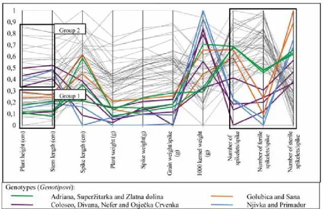
In Figure 2 is shown how observations can form groups after exclusion of minimal and maximal values from data set. In this figure only control treatment values are shown. Genotypes with highest and low-est values for plant height were deleted from the data set prior to graph drawing. As a result of that, two groups of observations occurred (Figure 2). Group of genotypes with lower plant height is on the bottom (Group 1) and have a lower range than second group (Group 2). Due to lower range of values in Group 1, observations (lines) are more dense and there is no indication of further grouping within this group. Range of data values in Group 2 is higher and it is possible that in this group secondary grouping would occur after data manipulation. Considering high correlation (r = 0.99) between plant height (cm) and stem length (cm), grouping pattern that occurred for plant height occurred for stem length too.
If we look at the number of spikelets per spike, number of fertile spikelets per spike and number of sterile spikelets per spike (Figure 2), it is easy to per-ceive that almost all observations (gray lines) follows a similar pattern. However, it is also perceivable that eleven observations are considerably different in their pattern compared to all other variables, but they differ from each other too.
Green lines represent genotypes Adriana, Superžitarka and Zlatna dolina having very similar number of spikelets per spike, number of fertile spike-lets per spike and number of sterile spikespike-lets per spike, creating a group on their own. Genotypes Golubica and Sana (orange lines), and genotypes Njivka and Primadur (blue lines) have similar paterns and slopes for these three variables, but similarity between Golubica and Sana (or between Njivka and Primadur) is higher than similarity between Njivka and Primadur (as one group), and Golubica and Sana (as the second group). Coloseo, Divana, Nefer and Osječka crvenka (purple lines) also have similar slopes and patterns which distinguished them from all other genotypes. After these eleven genotypes have been eliminated from PCP, no further grouping among remaining observations was noted (the figure is not shown).
Detection of correlation between variables
In Figure 3 horizontal lines between plant height (cm) and stem length (cm) represent strong correlation (r = 0.99) existing between these two variables. Strong correlation also exists between plant weight (g), spike weight (g) and grain weight per spike (Table 1). Lines between these variables (Figure 3) have slight slopes, and they are not strictly horizontal, but it is obvious that horizontal pattern prevails. Observations that don’t follow horizontal pattern are evident, and they can be
chosen for or excluded from further analysis, depending on the aim of analysis.
Lines between variables that are not strongly cor-related, like 1000 kernel weight and number of
spike-lets/spike (r=0.37), are crossed and there are no regular pattern between them. Direction of lines between variables cannot be predictor of direction of correlation between them.
Figure 2. Representation of grouping among observations in parallel coordinate plot
Grafikon 2. Prikaz grupiranja pojedinih opservacija u dijagramu paralelnih koordinata
Figure 3. Representation of correlation between variables in parallel coordinate plot
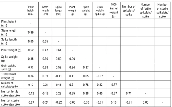
Table 1. Correlation coefficients (r) for ten variables (V1-Plant height (cm), V2-Stem length (cm), V3-Spike length (cm), V4-Plant weight (g), V5-Spike weight (g), V6-Grain weight/spike (g), V7-1000 kernel weight (g), V8-Number of spikelets/spike, V9-Number of fertile spikelets/spike, V10-Number of sterile spikelets/spike
Tablica 1. Korelacijski koeficijenti (r) za 10 varijabli (V1-Visina biljke (cm), V2-Duljina stabljike (cm), V3- Duljina klasa (cm), V4-Masa biljke (g), V5-Masa klasa, V6-Masa zrna/klasu (g), V7-Masa 1000 zrna(g), V8-Broj klasi}a/klasu, V9-Broj fertilnih klasi}a/klasu, V10-Broj sterilnih klasi}a/klasu)
Plant height (cm) Stem length (cm) Spike length (cm) Plant weight (g) Spike weight (g) Grain weight/ spike (g) 1000 kernel weight (g) Number of spikelets/ spike Number of fertile spikelets/ spike Number of sterile spikelets/ spike Plant height (cm) -Stem length (cm) 0.99 -Spike length (cm) 0.65 0.55 -Plant weight (g) 0.52 0.47 0.61 -Spike weight (g) 0.35 0.30 0.50 0.96 -Grain weight/ spike (g) 0.33 0.28 0.52 0.94 0.97 -1000 kernel weight (g) 0.34 0.39 -0.11 0.11 0.05 -0.02 -Number of spikelets/spike 0.10 0.05 0.43 0.71 0.76 0.82 -0.37 -Num.of fertile spikelets/spike -0.12 -0.18 0.29 0.35 0.38 0.45 -0.37 0.71 -Num.of sterile spikelets/spike -0.27 -0.24 -0.32 -0.65 -0.70 -0.71 0.15 -0.71 0.00
-In addition, the order the axes are lined up clearly influences the amount and quality of the insight gained from the representation (Edsall, 2003). It is difficult to figure out the relationships between variables in non-adjacent positions (Huh and Park, 2007), and order of axis is critical for finding features. Thus, many reorder-ings will be needed in typical data analysis.
In spite of that, importance of PCPs in visualization of mdmv data sets is considerable. Providing tools and methods to explore the multitude of possible relation-ships among variables visually may enable a researcher to discover important characteristics of the data set which would be difficult, if not impossible, to detect with only non visual statistical methods (Edsall, 2003).
Many visualization softwares (Parallax: Multidimensional Graphs, VisDB, Ggobi) that imple-mented parallel coordinates methodology are available on market today. PCPs can be done in Microsoft Office Excel, as we did in this paper, but available specialized software for visualization would make it much easier. To create PCPs in Microsoft Office Excel and obtain full scale insight in data set, lots of time consuming manual editing is required. Beside that, PCPs done in Excel, are static, non-interactive forms and some authors noticed that dynamic PCPs are more advantageous for data visualization. Available visualization softwares are
usu-ally easy to handle; they offer enhanced PCPs compared to classical PCP and lots of editing options which can broaden analysis and offer more comprehensive insight in analysed data set.
CONCLUSION
In this paper, we presented a simple visualization method - parallel coordinate plots - that can be used to explore complex relationships. Parallel coordinate plots are a two-dimensional presentation method for multi-dimensional data. It is easy to spot patterns and cor-relations among variables and observations in parallel coordinate plots. They can be used for visualization and analysis of multidimensional data sets. This research showed that parallel coordinate plots can be used for visualization of wheat quantitative traits. Although PCPs have some limitations, like overplotting with large data sets, they require lots of reordering of axes aiming to asses some insight; they are easy to use data explora-tory tool available in many data analysis softwares. ACKNOWLEDGEMENTS
The paper is a result of the research project „Soil conditioning impact on nutrients and heavy metals in soil-plant continuum” (079-0790462-0450) financed by The Ministry of Science, Education and Sports, Croatia.
REFERENCES
1. Andrienko, G., Andrienko, N. (2001): Constructing Parallel
Coordinates Plot for Problem Solving Constructing Parallel Coordinates Plot for Problem Solvin. Smart Graphics, Hawthorne, NY.
2. Edsall, M. R. (2003): The parallel coordinate plot in action: design and use for geographic visualization. Commputional Statistics & Data Analysis 43: 605-619.
3. Eurenius, O., Heldring, T. (2008): Coffe Flow Visualization,
viewed 19 December, 2009, <
http://www.oskareuren-ius.se/portfolio/09/coffee-flow-visualization.pdf>.
4. Few, S. (2006): Multivariate Analysis Using Parellel
Coordinates, viewed 14 January, 2010, <http://
www.perceptualedge.com/articles/b-eye/parallel_coor-dinates.pdf>.
5. Heinrich, J., Weiskopf, D. (2009): Continuous Parallel
Coordinates. IEEE Transactions on Visualization and Computer Graphics, 15:6:1531-1538.
6. Interactive Parallel Coordinates Chart 2009, Peltier Technical Services, viewed 28 December, 2009, < http:// peltiertech.com/Excel/Charts/ParallelCoord.html>.
7. Huh, M.H., Park D.Y. (2007): Enhancing parallel
coor-dinate plots. Journal of Korean Statistical Society 37: 129-133.
8. Inselberg, A. (1997): Multidimensional Detective. Proceedings of IEEE Information Visualization 1997, IEEE Computer Society, 100–107.
9. Inselberg, A., Dimsdale, B. (1990): Parallel coordi-nates: A tool for visilizing multi-dimensional geom-etry. Proceedings of the IEEE Visualization 1990, IEEE Computer Society, 361-370.
10. Klemz, R. B., Dunne, M. P. (2000): Exploratory Analysis using Parallel Coordinate Systems: Data Visualization in N-Dimensions. Marketing Letters, 11:4:323-333
11. SAS/STAT User’s Guide. (2002-2003) Version 9.1.3. Cary, NC. SAS Institute Inc.
12. Shannon, R., Holland, T., Quigley, A. (2008): Multivariate Graph Drawing using Parallel Coordinate Visualisations,
viewed 16 January, 2010, <http://www.csi.ucd.ie/files/
ucd-csi-2008-6.pdf>.
13. Siirtola, H., Räihä, K.J. (2006): Interacting with parallel coordinates. Interacting with Computers, 18:1278–1309. 14. Wegman, E.J. (1990): Hyperdimensional Data Analysis
Using Parallel Coordinates. Journal of the American Statistical Association, 85: 411: 664-675
15. Wegman, E.J., Luo, Q. (1997): High Dimensional Clustering Using Parallel Coordinates and the Grand Tour. Computing Science and Statistics, 28: 361-368. 16. Wong, P., Bergeron, D.R. (1997): 30 years of
multidimen-sional multivariate visualization. In Gregory Nielson, edi-tor, Scientific Visualization—Overviews, Methodologies, and Techniques, 1: 3–33. IEEE Computer Society Press, Los Alamitos.
VIZUALIZACIJA KVANTITATIVNIH SVOJSTAVA
OZIME P[ENICE DIJAGRAMOM PARALELNIH KOORDINATA
SA@ETAK
Grafički prikazati multivarijantno-multidimenzionalni skup podataka bez primjene odgovarajućih alata nije jednostavan posao. U posljednjih nekoliko godina porasla je popularnost paralelnih koordinata, koje su se pokazale kao vrlo učinkovita metoda za vizualizaciju. Cilj ovoga rada bio je istražiti mogućnosti primjene paralelnih koordinata pri ispitivanju kvantitativnih svojstava ozime pšenice. U radu su korišteni podaci iz pokusa postavljenoga po potpuno slučajnome planu, s dva tretmana u četiri ponavljanja. U radu je analizirano deset varijabli (visina biljke, duljina stabljike, duljina klasa, masa biljke, masa klasa, masa zrna po klasu, masa 1000 zrna, broj sterilnih i fertilnih klasića, i ukupan broj klasića po klasu) i pedeset pet genotipova ozime pšenice.
U dijagramu paralelnih koordinata opservacije su prikazane kao linije koje prolaze kroz paralelne osi, a svaka os predstavlja jednu varijablu. Prednost paralelnih koordinata, u odnosu na druge vizualizacijske metode, je u tome što multidimenzionalne probleme prikazuje u dvije dimenzije te se u takvome prikazu mogu lako uočiti odstupanja i grupiranja pojedinih opservacija te korelaciju među varijablama. Iako paralelne koordinate ne mogu otkriti i istražiti detalje promatranoga skupa, vrlo su korisne u vizualizaciji i eksploraciji multivarijantnih podataka, kao što su kvantitativna svojstva ozime pšenice.
Ključne riječi: paralelne koordinate, ozima pšenica, kvantitativna svojstva, vizualizacija
(Received on 13 October 2010; accepted on 05 November 2010 - Primljeno 13. listopada 2010.; prihva}eno 05. studenoga 2010.)