Geographical Treemaps
David Auber, Charles Huet, Antoine Lambert, Arnaud Sallaberry, Agnes Saulnier, and Benjamin Renoust
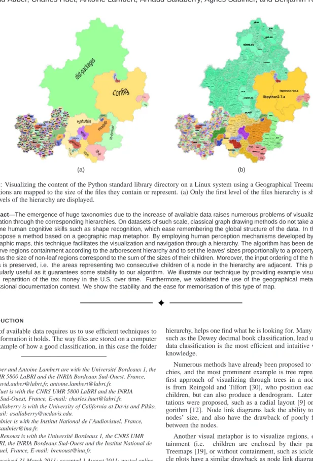
(a) (b)
Fig. 1: Visualizing the content of the Python standard library directory on a Linux system using a Geographical Treemap. Areas of regions are mapped to the size of the files they contain or represent. (a) Only the first level of the files hierarchy is shown. (b) All levels of the hierarchy are displayed.
Abstract—The emergence of huge taxonomies due to the increase of available data raises numerous problems of visualization and navigation through the corresponding hierarchies. On datasets of such scale, classical graph drawing methods do not take advantage of some human cognitive skills such as shape recognition, which ease remembering the global structure of the data. In this paper, we propose a method based on a geographic map metaphor. By employing human perception mechanisms developed by handling geographic maps, this technique facilitates the visualization and navigation through a hierarchy. The algorithm has been designed to preserve regions containment according to the arborescent hierarchy and to set the leaves’ sizes proportionally to a property, in a way such as the size of non-leaf regions correspond to the sum of the sizes of their children. Moreover, the input ordering of the hierarchy’s nodes is preserved, i.e. the areas representing two consecutive children of a node in the hierarchy are adjacent. This property is particularly useful as it guarantees some stability to our algorithm. We illustrate our technique by providing example visualizations of the repartition of the tax money in the U.S. over time. Furthermore, we validated the use of the geographical metaphor in a professional documentation context. We show the stability and the ease for memorisation of this type of map.
1 INTRODUCTION
The wealth of available data requires us to use efficient techniques to access the information it holds. The way files are stored on a computer is a prime example of how a good classification, in this case the folder
• David Auber and Antoine Lambert are with the Universit´e Bordeaux 1, the
CNRS UMR 5800 LaBRI and the INRIA Bordeaux Sud-Ouest, France, E-mail: [email protected], [email protected].
• Charles Huet is with the CNRS UMR 5800 LaBRI and the INRIA
Bordeaux Sud-Ouest, France, E-mail: [email protected].
• Arnaud Sallaberry is with the University of California at Davis and Pikko, USA, E-mail: [email protected].
• Agnes Saulnier is with the Institut National de l’Audiovisuel, France,
E-mail: [email protected].
• Benjamin Renoust is with the Universit´e Bordeaux 1, the CNRS UMR
5800 LaBRI, the INRIA Bordeaux Sud-Ouest and the Institut National de l’Audiovisuel, France, E-mail: [email protected].
Manuscript received 31 March 2011; accepted 1 August 2011; posted online 23 October 2011; mailed on 14 October 2011.
For information on obtaining reprints of this article, please send email to: [email protected].
hierarchy, helps one find what he is looking for. Many other examples, such as the Dewey decimal book classification, lead us to believe that data classification is the most efficient and intuitive way to organize knowledge.
Numerous methods have already been proposed to visualize hierar-chies, and the most prominent example is tree representations. The first approach of visualizing through trees in a node link diagram is from Reingold and Tilfort [30], who position each node over its children, but can also produce a dendrogram. Later more represen-tations were proposed, such as a radial layout [9] or bubble tree al-gorithm [12]. Node link diagrams lack the ability to easily map the nodes’ size, and also have the drawback of poorly filling the space between the nodes.
Another visual metaphor is to visualize regions, either with con-tainment (i.e. children are enclosed by their parents), such as Treemaps [19], or without containment, such as icicle plots [22]. Ici-cle plots have a similar drawback as node link diagrams, as they tend to leave lots of unused space. Furthermore, as demonstrated in [4] treemaps are not an intuitive representation because the hierarchical structure is not as clear as in a conventional tree drawing. We are proposing a new visual metaphor that tries to overcome these
short-comings.
The geographical map metaphor has been in use for a while, as it is a very intuitive way to represent information. There are many examples of uses of this metaphor, such as the map on temperance designed by W.M. Murrell [27] in 1846, the more recent map by the European Economic and Social Committee1or a recent XKCD cartoon2in a lighter tone.
That’s why we propose here a method based on the geographic map metaphor [32]. Our approach is motivated by Fabrikant and Skupin [10]. They claim that such an approach would appeal the cog-nitive skills developed by anyone who ever read a map. These skills include the recognition of region containment (e.g. North America contains the United States, which are decomposed in states, contain-ing counties; Europe contains Germany, which is decomposed in 16 L¨ander) and the pattern recognition of regions areas (for instance, one will easily identify and remember a country shaped like a boot). Ad-ditionally to the properties of geographical maps, we want our visu-alization to make explicit some properties of the tree. In order to achieve this, a region must have an area proportional to the sum of the area of its children. There is also a need to visualize the evolution of taxonomies, and stability of the layout is a prevalent feature when visualizing dynamic trees.
2 BACKGROUND ANDRELATEDWORKS
We will first focus on works related to the geographic map metaphor, and show existing methods do not fulfill all the previously specified requirements. We will then focus on visualization of trees as regions, and show their properties.
2.1 Geographical Maps Metaphor
Geographical maps as input. Redrawing geographical maps with additional constraints has already been well studied in the lit-erature. For instance, distortion techniques have been used to high-light a focused entity while preserving the context [31]. Cartograms represent geographic maps where the sizes of the regions depend on a given value, where regions are deformed to the desired sizes, and adjacency can be preserved [37, 20], or regions are represented as rectangles [29, 40] and adjacency is lost. These methods require pre-existent spatial data, which make them irrelevant for our problem.
From Self-Organizing Maps to Vorono¨ı Diagrams The self-organizing maps (SOM) [21] are based on an unsupervised learning algorithm that produces a two-dimensional map where similar objects are close to each other. Skupin [33] proposes a technique based on SOMs, Vorono¨ı diagrams, and clustering that produces images that look like country maps from texts and how related they are based on the common concepts they contain. We do not know of a method that could transform the input of our method to the format these methods use. Gansner et al. [15] displays graphs as geographic maps using a method based on graph drawing, Vorono¨ı diagrams, and clustering. We could transform our data to use this method, but it does not guar-antee the regions will be connected.
Representing data as landscapes. Another approach to gen-erate geographic-like maps consists in displaying data as landscape. Themescapes [47] are abstract, three-dimensional landscapes of in-formation. GraphSplatting [41] is a related technique that transforms a graph into a two-dimensional scalar field. The scalar field is ren-dered by a color coded map, a height dimension or a set of contours. While these methods produce nice landscapes-like maps, they can’t be adapted to trees without creating disconnected regions.
Dealing with fractals. Generating virtual maps based on fractal models is often used in movies and computer games [23]. So far, no solution has been proposed to adapt them in order to take structured data as input. Also based on the fractal principles, the idea of using space-filling curves in information visualization has been pointed out
1
http://www.eesc.europa.eu/?i=portal.en.self-and-co-regulation-cartography
2http://xkcd.com/802 large/
by Wattenberg [45]. A method based on this idea has been proposed by Muelder and Ma [26]. They first hierarchically cluster the nodes of a graph, then extract an ordering of the nodes of the graph according to a planar layout of the tree of clusters. Finally, they place the nodes according to the ordering on a space-filling curve such that the gap be-tween two nodes corresponds to their proximity in the hierarchy. Two consecutive nodes of the ordering will be closer to each other if they belong to the same cluster. Since this method is devoted to huge graph layout, the authors are neither interested in revealing the underlying clustering nor as making the visualization look like a geographic map. The method we propose here fills this gap by allowing to visualize a region’s containment and to make the map more geographic visually. 2.2 Trees visualized as regions
The visualization of trees as regions has been thoroughly discussed in the literature, and there are many variations on the subject, which all have different highlights. For a detailed comparison, please refer to [11]. In this paper, we will consider two main categories:
2.2.1 Adjacent regions
The earliest method of this kind we found is the Icicle plots [22], which consists of placing the children next to the parent, such as the depth is mapped on the X-axis, and the siblings are mapped on the Y-axis. Alternatively, the nodes can have radial coordinates, where the angle is mapped on the siblings, and the depth is mapped on the distance. This method was introduced as “information slices” [1]. Sunburst [34] is a variation of this method which uses the whole circle and shows a deeper hierarchy in a single image, but a node’s area is not proportional to the sum of the areas of its children.
The benefits of these methods are that labels can be placed inside each region without overlapping with the children regions and the depths of nodes are easily identifiable.
2.2.2 Region containment
The most common form of region containment visualization are treemaps, which divide the plan recursively by walking the tree from the top to the bottom. A detailed overview of treemaps by Ben Shnei-derman, and updated by Catherine Plaisant can be found here3. The first treemap method, “slice and dice” [19] consists in dividing recur-sively the plan alternatively horizontally and vertically. As a result we can have rectangle with a high aspect ratio (width/height). Some methods have improved on the original treemaps, such as the squari-fied treemap [7], which has an aspect ratio very close to 1, but does not take into account the order of the children which would make the layout more stable over time. Strip layout [5] is a compromise be-tween the squarified and the slice and dice: aspect ratio is not as close to 1 as with the squarified treemap but the order of the nodes is pre-served. Quantum treemaps [5] uses rectangles width and height that are multiples of a same fixed number, which eases size comparisons. The mixed treemap [43] uses the slice and dice for the upper level, and the squarified treemaps for the lower levels. Voronoi treemaps [3, 35] recursively splits the space as the aforementioned methods, and uses a Vorono¨ı tesselation to create convex polygons instead of rectangles. Finally, the City layout [46] uses a street map metaphor, where leaves are represented as buildings, located in districts, contained themselves in larger districts up to the root of the tree.
2.2.3 Properties
Upon the many properties of layouts that impact visibility of a tree, we chose some more pertaining to region-based maps : Region Con-tainment, i.e. whether or not children are placed inside their parents ; Aspect Ratio, i.e. width/height, where 1 is the ideal value so area comparison is easier ; Area Correlation, i.e. how correlated the area of leaves is to a given property, and the non-leaves are correlated to the sum of the value of their children ; Stability, i.e. how much a node moves on consecutive visualizations.
The following table sums up these properties for the aforemen-tioned methods. An X means the property is fully respected, a for-ward slash means it is partially respected, and an empty cell means the property is not respected. TM means treemap.
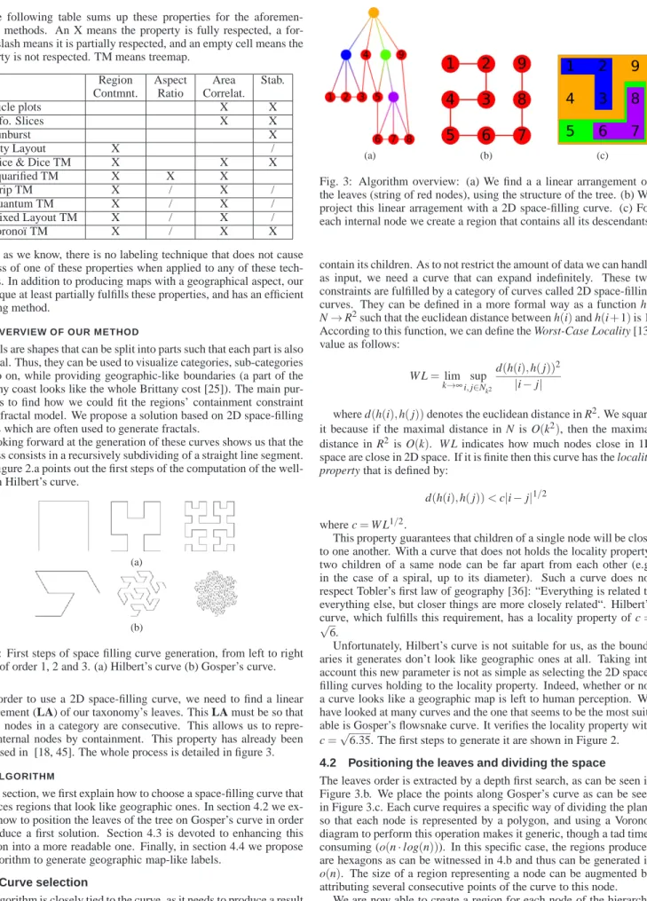
Region Aspect Area Stab.
Contmnt. Ratio Correlat.
Icicle plots X X
Info. Slices X X
Sunburst X
City Layout X /
Slice & Dice TM X X X
Squarified TM X X X
Strip TM X / X /
Quantum TM X / X /
Mixed Layout TM X / X /
Vorono¨ı TM X / X X
As far as we know, there is no labeling technique that does not cause the loss of one of these properties when applied to any of these tech-niques. In addition to producing maps with a geographical aspect, our technique at least partially fulfills these properties, and has an efficient labeling method.
3 OVERVIEW OF OUR METHOD
Fractals are shapes that can be split into parts such that each part is also a fractal. Thus, they can be used to visualize categories, sub-categories and so on, while providing geographic-like boundaries (a part of the Brittany coast looks like the whole Brittany cost [25]). The main pur-pose is to find how we could fit the regions’ containment constraint into a fractal model. We propose a solution based on 2D space-filling curves which are often used to generate fractals.
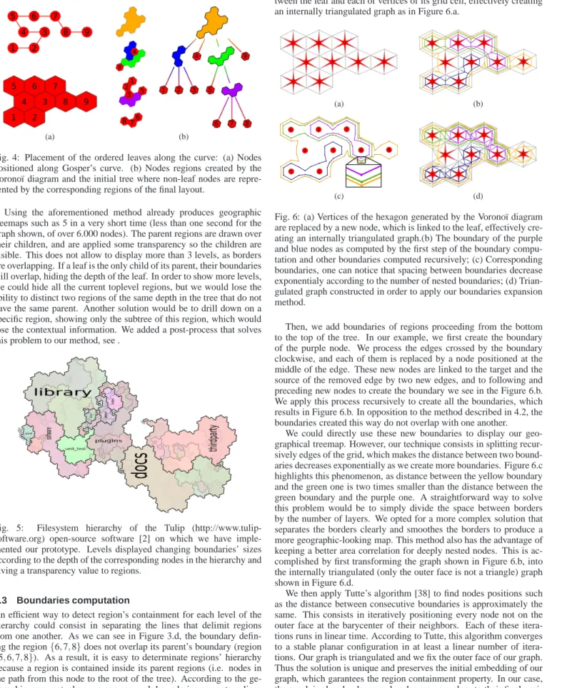
Looking forward at the generation of these curves shows us that the process consists in a recursively subdividing of a straight line segment. The Figure 2.a points out the first steps of the computation of the well-known Hilbert’s curve.
(a)
(b)
Fig. 2: First steps of space filling curve generation, from left to right curve of order 1, 2 and 3. (a) Hilbert’s curve (b) Gosper’s curve.
In order to use a 2D space-filling curve, we need to find a linear arrangement (LA) of our taxonomy’s leaves. This LA must be so that all the nodes in a category are consecutive. This allows us to repre-sent internal nodes by containment. This property has already been discussed in [18, 45]. The whole process is detailed in figure 3. 4 ALGORITHM
In this section, we first explain how to choose a space-filling curve that produces regions that look like geographic ones. In section 4.2 we ex-plain how to position the leaves of the tree on Gosper’s curve in order to produce a first solution. Section 4.3 is devoted to enhancing this solution into a more readable one. Finally, in section 4.4 we propose an algorithm to generate geographic map-like labels.
4.1 Curve selection
Our algorithm is closely tied to the curve, as it needs to produce a result that looks like a geographic map, while preserving the tree structure. The curve has to be simple (i.e. without crossings) for each region to
(a) (b) (c)
Fig. 3: Algorithm overview: (a) We find a a linear arrangement on the leaves (string of red nodes), using the structure of the tree. (b) We project this linear arragement with a 2D space-filling curve. (c) For each internal node we create a region that contains all its descendants.
contain its children. As to not restrict the amount of data we can handle as input, we need a curve that can expand indefinitely. These two constraints are fulfilled by a category of curves called 2D space-filling curves. They can be defined in a more formal way as a function h : N→R2such that the euclidean distance between h(i)and h(i+1)is 1. According to this function, we can define the Worst-Case Locality [13] value as follows:
W L=lim k→∞i,supj∈Nk2
d(h(i),h(j))2
|i−j|
where d(h(i),h(j))denotes the euclidean distance in R2. We square
it because if the maximal distance in N is O(k2), then the maximal distance in R2 is O(k). W L indicates how much nodes close in 1D space are close in 2D space. If it is finite then this curve has the locality property that is defined by:
d(h(i),h(j))<c|i−j|1/2 where c=W L1/2.
This property guarantees that children of a single node will be close to one another. With a curve that does not holds the locality property, two children of a same node can be far apart from each other (e.g. in the case of a spiral, up to its diameter). Such a curve does not respect Tobler’s first law of geography [36]: “Everything is related to everything else, but closer things are more closely related“. Hilbert’s curve, which fulfills this requirement, has a locality property of c= √
6.
Unfortunately, Hilbert’s curve is not suitable for us, as the bound-aries it generates don’t look like geographic ones at all. Taking into account this new parameter is not as simple as selecting the 2D space-filling curves holding to the locality property. Indeed, whether or not a curve looks like a geographic map is left to human perception. We have looked at many curves and the one that seems to be the most suit-able is Gosper’s flowsnake curve. It verifies the locality property with c=√6.35. The first steps to generate it are shown in Figure 2. 4.2 Positioning the leaves and dividing the space
The leaves order is extracted by a depth first search, as can be seen in Figure 3.b. We place the points along Gosper’s curve as can be seen in Figure 3.c. Each curve requires a specific way of dividing the plane so that each node is represented by a polygon, and using a Vorono¨ı diagram to perform this operation makes it generic, though a tad time-consuming (o(n·log(n))). In this specific case, the regions produced are hexagons as can be witnessed in 4.b and thus can be generated in o(n). The size of a region representing a node can be augmented by attributing several consecutive points of the curve to this node.
We are now able to create a region for each node of the hierarchy from the bottom to the top of the tree: a region of a node is obtained by merging the regions of its children as shown in Figure 4. Notice
that this method follows the region’s containment principle because Gosper’s curve is planar.
(a) (b)
Fig. 4: Placement of the ordered leaves along the curve: (a) Nodes positioned along Gosper’s curve. (b) Nodes regions created by the Vorono¨ı diagram and the initial tree where non-leaf nodes are repre-sented by the corresponding regions of the final layout.
Using the aforementioned method already produces geographic treemaps such as 5 in a very short time (less than one second for the graph shown, of over 6.000 nodes). The parent regions are drawn over their children, and are applied some transparency so the children are visible. This does not allow to display more than 3 levels, as borders are overlapping. If a leaf is the only child of its parent, their boundaries will overlap, hiding the depth of the leaf. In order to show more levels, we could hide all the current toplevel regions, but we would lose the ability to distinct two regions of the same depth in the tree that do not have the same parent. Another solution would be to drill down on a specific region, showing only the subtree of this region, which would lose the contextual information. We added a post-process that solves this problem to our method, see .
Fig. 5: Filesystem hierarchy of the Tulip (http://www.tulip-software.org) open-source software [2] on which we have imple-mented our prototype. Levels displayed changing boundaries’ sizes according to the depth of the corresponding nodes in the hierarchy and giving a transparency value to regions.
4.3 Boundaries computation
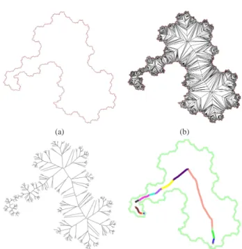
An efficient way to detect region’s containment for each level of the hierarchy could consist in separating the lines that delimit regions from one another. As we can see in Figure 3.d, the boundary defin-ing the region{6,7,8}does not overlap its parent’s boundary (region {5,6,7,8}). As a result, it is easy to determinate regions’ hierarchy because a region is contained inside its parent regions (i.e. nodes in the path from this node to the root of the tree). According to the ge-ographic map metaphor, we can see such boundaries as contour lines demarcating regions having the same altitude (i.e. the same level in the hierarchy).
We use the hexagonal grid created by the Vorono¨ı diagram, and re-place each vertex of each hexagon by a node. Then we add edges be-tween the leaf and each of vertices of its grid cell, effectively creating an internally triangulated graph as in Figure 6.a.
(a) (b)
(c) (d)
Fig. 6: (a) Vertices of the hexagon generated by the Vorono¨ı diagram are replaced by a new node, which is linked to the leaf, effectively cre-ating an internally triangulated graph.(b) The boundary of the purple and blue nodes as computed by the first step of the boundary compu-tation and other boundaries computed recursively; (c) Corresponding boundaries, one can notice that spacing between boundaries decrease exponentialy according to the number of nested boundaries; (d) Trian-gulated graph constructed in order to apply our boundaries expansion method.
Then, we add boundaries of regions proceeding from the bottom to the top of the tree. In our example, we first create the boundary of the purple node. We process the edges crossed by the boundary clockwise, and each of them is replaced by a node positioned at the middle of the edge. These new nodes are linked to the target and the source of the removed edge by two new edges, and to following and preceding new nodes to create the boundary we see in the Figure 6.b. We apply this process recursively to create all the boundaries, which results in Figure 6.b. In opposition to the method described in 4.2, the boundaries created this way do not overlap with one another.
We could directly use these new boundaries to display our geo-graphical treemap. However, our technique consists in splitting recur-sively edges of the grid, which makes the distance between two bound-aries decreases exponentially as we create more boundbound-aries. Figure 6.c highlights this phenomenon, as distance between the yellow boundary and the green one is two times smaller than the distance between the green boundary and the purple one. A straightforward way to solve this problem would be to simply divide the space between borders by the number of layers. We opted for a more complex solution that separates the borders clearly and smoothes the borders to produce a more geographic-looking map. This method also has the advantage of keeping a better area correlation for deeply nested nodes. This is ac-complished by first transforming the graph shown in Figure 6.b, into the internally triangulated (only the outer face is not a triangle) graph shown in Figure 6.d.
We then apply Tutte’s algorithm [38] to find nodes positions such as the distance between consecutive boundaries is approximately the same. This consists in iteratively positioning every node not on the outer face at the barycenter of their neighbors. Each of these itera-tions runs in linear time. According to Tutte, this algorithm converges to a stable planar configuration in at least a linear number of itera-tions. Our graph is triangulated and we fix the outer face of our graph. Thus the solution is unique and preserves the initial embedding of our graph, which garantees the region containment property. In our case, the graph is already planar and nodes are very close to their final posi-tions, shortening considerably the running time of this step. Thanks to an efficient and parallel implementation, this only takes a few seconds
on grids of over 100.000 nodes (with an Intel Core 2 Q9300 2.53Ghz). The Figure 7.a shows the graph positioned using this method and Fig-ure 7.b shows the same graph with nodes and edges that are not in the boundaries removed. Note that we can weight barycenters to allocate a greater area to the boundaries of regions representing upper nodes of the hierarchy.
(a) (b)
Fig. 7: (a) Applying Tutte’s algorithm to the Figure 6.d enables to transform the initial grid obtain by our method. It solves the exponen-tial problem on our boundaries shown in Figure 6.c and additionally smoothes the boundaries of regions creating a more visually appeal-ing visualization. (b) Results obtained after removappeal-ing all dummy ele-ments.
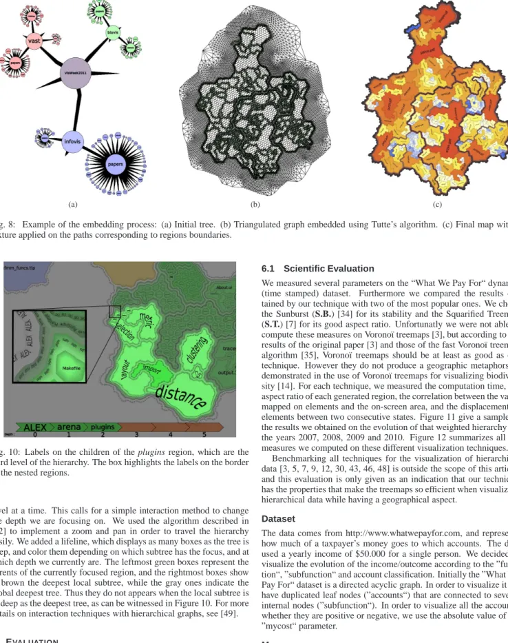
At the end of the boundaries computation, we obtain a smooth, non overlapping boundary for each internal node of the tree. Furthermore, for each internal node we also obtain a list of triangles that define a closed region (border region) in which nothing is displayed. We use the node boundary to draw a filled polygon, and the border region to draw a textured contour that enhance the region’s containment visu-alization. The Figure 8 shows the whole process on a file system of 200 nodes extracted from the VisWeek 2011 electronic proceedings. To enable visualization of the size of the files as well as the size of the directories, we add a number of dummy children to each leaf propor-tional to its size (i.e. file size in that example). Dummy nodes are then removed.
Now we have found a correct embedding of the nodes, we need to display labels to direct the user’s navigation. Displaying all the labels induces occlusion problems. The next section is devoted to an efficient method adapted to the layout.
4.4 Labeling
We will first show a method that shows the labels of all nodes at a certain depth, allowing a good overview of the data. Then we will show a method that repeats a region’s label along its border, allowing to identify regions even when they do not appear in full.
4.4.1 Labeling regions of a given depth
This methods aims at completing the geographic map metaphor by displaying labels inside of the regions. To achieve this, we display the label of every node at a given depth.
We experimented with rectangular labels inscribed in the regions, aligned along the horizontal or vertical axis 5.
However, the irregularity of the regions causes the rectangle’s size to be very small, whereas spreading the label over the region could make it bigger and more readable.
We tried to find a method that would generate labels that follow the region, such as the ones Skupin presnets in [6]. The main idea is to find a path included in a region on which it would be possible to draw a text. This technique’s principle is similar to the interaction of path text tools present in modern imaging software.
The regions in which we want to display labels are simple polygons (i.e. concave polygons without holes). For each polygon, we compute a Vorono¨ı diagram of its vertices and then we remove vertices of the Vorono¨ı diagram that are not included in the polygon. We then re-connect Vorono¨ı vertices to the closest polygon’s vertices (i.e. sources of their adjacents cells in the Vorono¨ı diagram). That operation cre-ates a tree structure that is close to a medial axis of our polygon [8]. Each path of that tree can be used to display a text that is at equal distance from each of the polygon’s border. Let n be the number of
vertices of a simple polygon, the complexity for the tree construction is o(n·log(n)).
The tricky part is to select one path in the set of possibles paths in the tree we have constructed. We first try to select the longuest path, as can be seen in figure 10. This technique has the drawback of curving the labels a lot, hindering readability. This effect is due to the number of points of inflection (see ”clustering“ in the figure 10). Furthermore, differences of size along the medialaxis make choosing a proper font size difficult (as can be seen in the figure 10 on ”import“ and ”distance“). The evaluation we obtained in a professional environ-ment (see sec. 6.2) using that kind of labelling shows that a tradeoff between the axis aligned labels and the curved labels is necessary.
The evaluation indicates that for the users, when it comes to the labels, readability primes over size. To try and satisfy better this con-straint, we devised a new approach, using the longest path in the tree we constructed. We selected the longest subpath that is of simmilar thickness (i.e. distance to the border of the polygon) all the way, and mostly straight. We find this path in o(n)[39], and selecting thickness with a threshold can also be done in o(n).
(a) (b)
(c) (d)
Fig. 9: Label placement overview:(a) The polygon in which we want to display a label. (b) We compute a Vorono¨ı diagram of the vertices of the polygon, we reconnect vertices to the cells they belong to, we then remove all vertices outside from the original poblygon. (c) Interior vertices form a free tree on which one can compute the longuest path in linear time [39]. (d) We select the best subpath of the longuest path according to the length of the label we want to display, the number of abrupt changes and the surface the label will have.
4.4.2 Labeling of the whole hierarchy
The second labeling method helps the user to keep the contextual in-formations while he is zoomed in. It consists in applying textures con-taining the labels along the regions’ boundaries, in a similar fashion as contour lines on geographical maps. An example of this technique is highlighted in Figure 10. The leaf Makefile is contained in the plugins region, itself contained in arena, child of the root node ALEX. It is clear that PluginSample is on the same level as plugins, and CVS on the same level as Makefile.
5 INTERACTION TECHNIQUES
Even though we provide a clear decomposition of the different levels of the hierarchy, we only display the label described in 4.4.1 on one
(a) (b) (c)
Fig. 8: Example of the embedding process: (a) Initial tree. (b) Triangulated graph embedded using Tutte’s algorithm. (c) Final map with a texture applied on the paths corresponding to regions boundaries.
Fig. 10: Labels on the children of the plugins region, which are the third level of the hierarchy. The box highlights the labels on the border of the nested regions.
level at a time. This calls for a simple interaction method to change the depth we are focusing on. We used the algorithm described in [42] to implement a zoom and pan in order to travel the hierarchy easily. We added a lifeline, which displays as many boxes as the tree is deep, and color them depending on which subtree has the focus, and at which depth we currently are. The leftmost green boxes represent the parents of the currently focused region, and the rightmost boxes show in brown the deepest local subtree, while the gray ones indicate the global deepest tree. Thus they do not appears when the local subtree is as deep as the deepest tree, as can be witnessed in Figure 10. For more details on interaction techniques with hierarchical graphs, see [49].
6 EVALUATION
To evaluate our Geographical Treemap (G.T.), we performed a sci-entific evaluation benchmark and a user evaluation in a professional environment. The objectives of these two evaluations are first to pro-vide a quantitative evaluation according to a set of measure and then to evaluate the accuracy of the geographical treemap methaphor for solving hierachy analysis tasks.
6.1 Scientific Evaluation
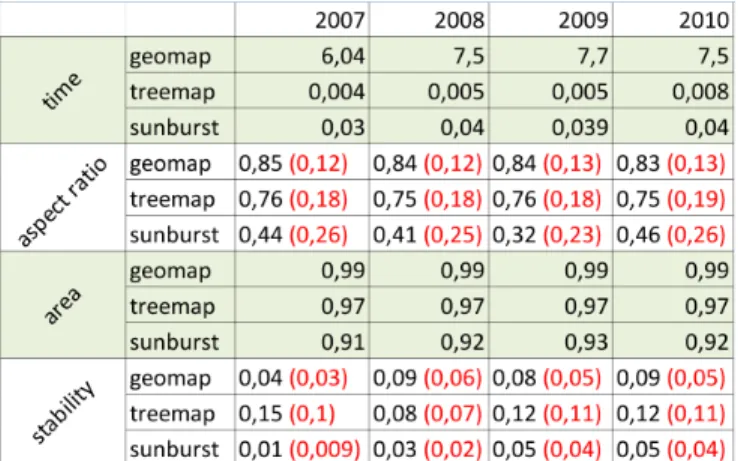
We measured several parameters on the “What We Pay For“ dynamic (time stamped) dataset. Furthermore we compared the results ob-tained by our technique with two of the most popular ones. We chose the Sunburst (S.B.) [34] for its stability and the Squarified Treemap (S.T.) [7] for its good aspect ratio. Unfortunatly we were not able to compute these measures on Vorono¨ı treemaps [3], but according to the results of the original paper [3] and those of the fast Vorono¨ı treemap algorithm [35], Vorono¨ı treemaps should be at least as good as our technique. However they do not produce a geographic metaphors as demonstrated in the use of Vorono¨ı treemaps for visualizing biodiver-sity [14]. For each technique, we measured the computation time, the aspect ratio of each generated region, the correlation between the value mapped on elements and the on-screen area, and the displacement of elements between two consecutive states. Figure 11 give a sample of the results we obtained on the evolution of that weighted hierarchy for the years 2007, 2008, 2009 and 2010. Figure 12 summarizes all the measures we computed on these different visualization techniques.
Benchmarking all techniques for the visualization of hierarchical data [3, 5, 7, 9, 12, 30, 43, 46, 48] is outside the scope of this article, and this evaluation is only given as an indication that our technique has the properties that make the treemaps so efficient when visualizing hierarchical data while having a geographical aspect.
Dataset
The data comes from http://www.whatwepayfor.com, and represents how much of a taxpayer’s money goes to which accounts. The data used a yearly income of $50.000 for a single person. We decided to visualize the evolution of the income/outcome according to the ”func-tion“, ”subfunction“ and account classification. Initially the ”What We Pay For“ dataset is a directed acyclic graph. In order to visualize it we have duplicated leaf nodes (”accounts“) that are connected to several internal nodes (”subfunction“). In order to visualize all the accounts, whether they are positive or negative, we use the absolute value of the ”mycost“ parameter.
Measures
Timing: In the Figure 12 one can see that the main drawback of our technique is its computational cost. S.B. and S.T. only needs to sort elements, contributing to their speed and easiness of implementation. Due to the generation of a Vorono¨ı diagram and to our boundaries computation phase, our technique requires to work with a grid signif-icantly larger than the input tree. Thus even if the algorithms we use
Fig. 11: Results on the “What We Pay For” dataset. Geographical Treemap : For each year, the surface of each region is correlated (0.99) with the “mycost” value of the data set. Looking at the “Commerce and Housing Credit” region, one can see that even if the “mycost” parameter evolves significantly year after year, this evolution is easy to follow. Furthermore one can notice that new elements are always inserted at the bottom left corner. Squarified Treemap : For each year, the surface of each region is correlated (0.97) with the “mycost” value of the data set. Looking at the “Commerce and Housing Credit” region, one can see that due to the ordering used by the algorithm, the “function” region moves significantly. Nodes with the higher weight are easy to find, thanks to the ordering of the Squarified Treemap. Sunburst : For each year, the surface of each region is correlated (0.92) with the “mycost” value of the data set. The evolutions of the “Commerce and Housing Credit“ region is easy to follow, thanks to the high stability of the technique. However since the surface used for displaying one ring is constant the addition of new elements (or small ones) is not always perceptible. That phenomenon can lead to evolutions being unnoticed.
Fig. 12: (time) Computation times in seconds, (aspect ratio) width/height ratio of generated regions, (area) the correlation be-tween the value mapped on elements and the area used on screen, (sta-bility) the standardized displacement of elements between two states. Standard deviations are noted in red
are reasonably fast (Vorono¨ı, barycenter, polygon merging) the size of our grid is the bottleneck. For instance, in Figure 11 we generate a grid of 33059 nodes and 88846 edges to obtain the final visualization. If we only use the thickness of boundaries (see Figure 5) to visualize our dataset, we spare ourselves the cost of generating the grid. Without the boundaries computation, our running time is of the same order of magnitude as the other techniques.
Aspect Ratio: Figure 12 summarizes the aspect ratio obtained for each visualization. We define the aspect ratio as the minimum of the width and height of a region divided by the maximum of the width and height of a region to obtain a value between 0 and 1. The aspect ratio of a visualization is the average of all the aspect ratio of regions used to represent internal nodes and leaves. Our measures show up that the G.T. surprisingly outperforms the S.T. in term of aspect ratio. Looking carefully at the S.T. results, one can see that when the size of elements vary significantly, the aspect ratio could be far from the expected one. The G.T. uses a Gosper curve, whose fractal nature induces an aspect ratio almost constant independently from the length of the curve or the position of the subpart. Curves smaller than the kernel (less than 8 elements in our case, as can be seen in Figure 2, at order 1) do not respect this property. The irregularity of the concave regions makes it harder to accurately compare areas, even though the aspect ratio is better.
Area correlation: Figure 12 summarizes the correlation between the area of regions and the value assigned to a node in the original tree. For each visualization we have computed the exact surface of each polygon induced by a region boundary. As one can see the three methods have a significant correlation between the desired surface and the measured surface. The S.B.’s low score is due to the fact that the algorithm ensures a correlation of 1 with the size of angular sectors, if we had used a variable radius for each level of the S.B. as in [1], we assume that we would have found similar results as the S.T. or G.T. layout.
Stability: Figure 12 summarizes the measure of displacement of elements when the weights of the tree’s elements are modified. In or-der to measure the displacements we have computed the center of the bounding box of each region. Then for each time stamp (from 2006 to 2010) we measured the standardized displacement between elements that are present in the two considered years (we used the 2006 lay-out, which is not given here, to compute the 2006-2007 measure). The standardization of the displacement is done using the diagonal of the bounding box of each layout (i.e. maximum possible displacement of an element). As expected, the S.B. technique has got the best result during our experimentation and the S.T. has the worst one. The S.T. result is due to the ordering of elements needed for the packing
algo-rithm that optimizes the aspect ratio. For the G.T. one can see that the stability of the algorithm is between those of the S.T. and the S.B.. Even if the G.T.’s algorithm does not change the order of the elements, changing the size of an element at the beginning of the Gosper curve can shift all the other nodes, and introduce lots of small displacements. It is not the case with S.B. since angular sectors are redistributed on a circle. However, as one can see by analyzing the small standard devia-tion of the G.T., which is almost similar to the S.B.’s, the displacement of the nodes should not affect the readability of our visualization. Discussion
The initial objective of that work was to create containment visualiza-tion that looks like geographical maps. During all the presentavisualiza-tions of that work to users, we only received positive feedback on that point. Due to the end user enthusiasm on such kind of visualization, we ran the measurements presented in subsection 6.1. Even if the geographic metaphor was our goal, all the measures show that using our tech-nique, we are able to obtain similar quality and even outperform other algorithms. This evaluation only allows us to claim that our technique respects the most important requirements of a treemap representation, not that it is better than other treemaps.
Application of our technique to timestamped datasets demonstrates that even if the number of displacement is higher than the S.B. algo-rithm it is straightforward to track evolution, since the displacement is small. For instance, in Figure 11, if we look at the ”Commerce and Housing Credit“ region, we can see that even if the ”mycost“ parame-ter evolves significantly over time, we can easily follow that evolution. We can conclude that G.T. can be used in tasks that require tracking the evolution of the data, simmilarly to the spatially ordered treemaps [48]. Furthermore, since we use complex shapes to represent our regions, we noticed that such a representation helps memorizing the produced map of the dataset. During our work on the ”What We Pay For“ dataset, we were speaking about part of the diagram by using geo-graphical terminology. For instance, to speak about the yellow region of Figure , we immediately used the term ”China“. Compared to S.T. where all regions have a similar shape (almost square), our technique seems to be able to use cognitive skills. To confirm that observation, we ran a user evaluation in a professional environement (see 6.2). 6.2 User Evaluation
We led a user study in a professional environment at the French National Institute for Audiovisual (Ina) whose mission is to archive French TV and radio. The user study is set on the visualization of the Ina thesaurus which is a hierarchy of keywords used for documents an-notation. We are testing in this evaluation the use of the geographical visualization of the thesaurus for annotation purposes.
Objectives
The evaluation of information visualization techniques is based in test-ing both visual representation and interaction mechanisms [24]. Ac-cording to the norm ISO 9241-11[16, 17] we analyse the usability of the system on its interactivity and visual features: effectiveness, effi-ciency, and user satisfaction [28, 44]. In addition, we are interested to test memorization and ease of learning. We also analyse the system according to the norm ISO 9241-12 on the information presentation, testing the graphic user interface.
Data and Hypothesis
The data is the Ina thesaurus consisting of 9420 terms represented as a hierarchy. Annotators use a set of terms to label a document in order to ease its retrieval. The team in charge of the thesaurus wants to make it more accessible for annotators and newcomers in order to maintain the high quality of the Ina archives. Currently, annotators can ask for the presence of a term in the thesaurus, but have do not have the possibility to see its context. The system features fits the users professional needs. The users should understand the visual metaphor between an actual geographical map and the geographical treemap.
Methodology
We set user tests based on professional tasks to meet the Ina users mo-tivations. Evaluating the system discovery and its adequacy with the users’ needs, the tests are measuring task completion only in terms of answers. Each answer quality is certified by another expert annotator. Users, 3 males and 3 females, have been chosen considering 3 groups based on their thesaurus knowledge:
- 2 experts: they are the managers of the Ina thesaurus and know it fully.
- 2 annotators: they have a partial knowledge of the thesaurus know-ing some keywords but not the structure linkknow-ing them.
- 2 researchers: they are experts in visualization prototypes but have no knowledge on the thesaurus.
Each test will take about 2 hours including a presentation of the system and the evaluation, some learning manipulations and 3 tasks achievements. Two additional questionnaires are completing the test. A first one related of the information readability and presentation. An-other one about the ease of use, performance and relevance of the sys-tem and user satisfaction.
Tasks
The tasks are set as ”high level“ tasks [28, 44] since they don’t aim at finding only one element in the tree but at effectively making an analysis using the map.
Task 1, the tree topology analysis: It is a task of readability and un-derstanding of the visualization. The user should compare and order the branches or nodes according to their size and their depth. Objec-tives are: to see if the tree is balanced; to find if there is a specific pattern; to order several terms by their level; for a given term, to find and observe its neighborhood, its level, and the level of its children.
Task 2, annotation (find a node by its context): We have chosen 5 web pages of news article containing an image. The user should navi-gate in and interact with the treemap in order to find the best keywords to annotate the image in the page. This means to navigate the map and choose a term checking at its level or under if there is or not a more specific word that could be a better match. The images have been chosen so the annotation should contain at least 3 terms from distinct branches of the thesaurus.
Task 3, ease of memorization: We are testing if the terms charac-teristics and location are easy to remember. We first asked the users to find the terms used in the previous tasks using the navigation system on a map with no label. Finally the users then have been asked to put back the first level labels (representing 10 nodes) on the blank map. Results
Observations: On Task 1, all users have been able to finish their tasks successfully without major errors but some approximations in their an-swers. The expert users are able to recognize the different elements of the thesaurus on the map right away. They could analyse easily the tree structure, recognize branches by their graphic attributes, and pick specific patterns. The representation allowed them a good global read-ability, while annotators found difficult to read the depth of a branch in the map (but easily with the lifeline). They found different depth perception depending on the colors used for boundaries and leaves. The depth-label representation gave the users difficulties to read map topology especially when the labels are too long. Depth and size per-ception for a specified node is approximate but good enough for this application.
On Task 2, all users succeeded achieving their tasks. It is interesting to notice that, despite some differences between the chosen sets of keywords, all the annotations were considered valid. The work load has been increased by the interaction because the users are able to see far neighbors on the map, want to reach them, but need to come back on the closest ancestor before getting to it. The visual metaphor is good enough that users want to navigate this map as they navigate a geographical map. There is also no possibility to jump back on a further ancestor than the node’s father.
On Task 3, every user was able to find a term the second time right away. Two main behaviors have been noticed, users remembering the
path to a specific node, and users remembering the actual location of a specific node in the map. Most users could remember the labels then place them exactly on the map, the others remembered their location after being given the labels.
Discussion
We checked all users have actually achieved their tasks, found all the elements needed to make an analysis based on the map, validating its interaction effectiveness. On the visual effectiveness, users have been able to read all the tree elements. The exact depth perception of the deepest elements is more confusing (maybe due to the choice of colors), but exploring them with the lifeline perfectly fills this lack. Instead of the usual number of direct children, the map shows in an eyesight the number of leaves under a tree node and its lineage, a use-ful parameter for the thesaurus manager to assess the tree balance.
Users found easily the context of any term while searching it, with-out any additional manipulation or getting lost in the thesaurus, vali-dating the efficiency of the system. The navigation is limited to those of a tree while the users having a geographic map to visualize, tend to navigate it as a map. The hierarchical representation allows the users to compare easily the size of areas of different shapes. The labels in their difference of sizes confuse the users, the biggest ones attracting them regardless of their node characteristics.
Most users have been really eager to use the system. They emit a lot of feedbacks, positive but also about potential improvements showing their immediate appropriation of the tool. They have expressed very concrete advises on the interaction and visual coding improvements. Moreover they want to push further the geographical metaphor (relief perception and navigation), and enrich the map with different types of information such as the occurrences of each term in the archive. The thesaurus also contains relationships between terms; users would like also to see if the layout can be constrained by these relationships (term 1 is near term 2 because they are share a relationship).
7 CONCLUSION ANDFUTURE WORKS
We have presented a method to visualize hierarchical data as geo-graphic map using 2D space-filling curves. The main contribution of this paper is to bring together various properties. Geographic metaphor, the generated visualization looks like a geographic map, which solicits the same cognitive skills as geographic maps. Region containment, the regions corresponding to a node are contained into the region associated to its parent. Area correlation, the size of a leaf region corresponds to a property, and the size of a non-leaf region cor-responds to the sum of the sizes of its children. Ordering, the order of the elements is preserved in the visualization. Stability, the algorithm can be used to display evolving datasets.
We have validated the use of the geographical metaphor in a pro-fessional documentation context. The restrictions expressed by the users concern only a few minor implementation aspects. Users even have proposed many useful improvements in both the interaction (of-fering a dual exploration tree-based and geographic-map based) and in the visualization (the relief effect may be improved by a better color choice, the layout could be constrained with terms relationships). We have shown the stability and the ease for memorisation of this type of map. Two qualities that should be very useful to identify right away any modification in a dynamic tree. Following the interest of profes-sional users for this visualization, a more complete implementation integrating the temporal evolution of the hierarchy is on the way. REFERENCES
[1] K. Andrews and H. Heidegger. Information slices: Visualising and ex-ploring large hierarchies using cascading, semi-circular discs. In
Pro-ceedings of the IEEE Symposium on Information Visualization (Info-Vis’98), pages 9–12, 1998.
[2] D. Auber. Tulip - a huge graph visualization framework. In P. Mutzel and M. Jnger, editors, Graph Drawing Software, Mathematics and Visualiza-tion Series. Springer Verlag, 2003.
[3] M. Balzer, O. Deussen, and C. Lewerentz. Voronoi treemaps for the vi-sualization of software metrics. In Proceedings of the 2005 ACM
sympo-sium on Software visualization (SoftVis’05), pages 165–172, 2005.
[4] T. Barlow and P. Neville. A comparison of 2-d visualizations of hierar-chies. In Proceedings of the IEEE Symposium on Information
Visualiza-tion (InfoVis’01), pages 131–138, 2001.
[5] B. B. Bederson, B. Shneiderman, and M. Wattenberg. Ordered and quan-tum treemaps: Making effective use of 2d space to display hierarchies.
ACM Transactions on Graphics (TOG), 21(4):833–854, 2002.
[6] K. B¨orner. Atlas of Science: Visualizing What We Know. MIT Press, 2010.
[7] M. Bruls, K. Huizing, and J. J. van Wijk. Squarified treemaps. In
Pro-ceedings Joint Eurographics/IEEE TVCG Symposium Visualization, Vis-Sym, pages 33–42, 2000.
[8] F. Y. L. Chin, J. Snoeyink, and C. A. Wang. Finding the medial axis of a simple polygon in linear time. Discrete & Computational Geometry, 21(3):405–420, 1999.
[9] P. Eades. Drawing free trees. Bulletin of the Institute for Combinatorics
and its Applications, 5:10–36, 1992.
[10] S. I. Fabrikant and A. Skupin. Cognitively plausible information visu-alization. In J. Dykes, A. M. MacEachren, and M.-J. Kraak, editors,
Exploring Geovisualization, pages 667–682. Elsevier ltd. edition, 2005.
[11] M. Graham and J. B. Kennedy. A survey of multiple tree visualisation.
Information Visualization (IVS), 9(4):235–252, 2010.
[12] S. Grivet, D. Auber, J.-P. Domenger, and G. Melancon. Bubble tree draw-ing algorithm. In S. Verlag, editor, International Conference on Computer
Vision and Graphics, pages 633–641, 2004.
[13] H. J. Haverkort and F. van Walderveen. Locality and bounding-box qual-ity of two-dimensional space-filling curves. Computational Geometry,
Theory and Applications, 43(2):131–147, 2010.
[14] M. Horn, M. Tobiasz, and C. Shen. Visualizing biodiversity with voronoi treemaps. In Proceedings of the International Symposium on Voronoi
Di-agrams in Science and Engineering (ISVD’09). IEEE Computer Society,
06 2009.
[15] Y. Hu, E. R. Gansner, and S. G. Kobourov. Visualizing graphs and clusters as maps. IEEE Computer Graphics and Applications, 30(6):54–66, 2010. [16] ISO/EIC. Guidance on usability. In Ergonomic requirements for office
work with visual display terminals (VDTs), pages 9241–11, 1998.
[17] ISO/EIC. Presentation of information. In Ergonomic requirements for
office work with visual display terminals (VDTs), pages 9241–12, 1998.
[18] T. Itoh, C. Muelder, K.-L. Ma, and J. Sese. A hybrid space-filling and force-directed layout method for visualizing multiple-category graphs. In
Proceedings of the 2009 IEEE Pacific Visualization Symposium (Paci-ficVis’09), pages 121–128, 2009.
[19] B. Johnson and B. Shneiderman. Tree maps: A space-filling approach to the visualization of hierarchical information structures. In IEEE
Visual-ization, pages 284–291, 1991.
[20] D. A. Keim, S. C. North, and C. Panse. Cartodraw: A fast algorithm for generating contiguous cartograms. IEEE Transactions on Visualization
and Computer Graphics, 10(1):95–110, 2004.
[21] T. Kohonen. Self-Organizing Maps. Springer-Verlag, 1995.
[22] J. B. Kruskal and J. M. Landwehr. Icicle plots: Better displays for hier-archical clustering. The American Statistician, 37(2):162–168, 1983. [23] I. Y. Liao, M. Petrou, and R. Zhao. A fractal-based relaxation algorithm
for shape from terrain image. Computer Vision Image Understanding, 109(3):227–243, 2008.
[24] P. Luzzardi, C. Freitas, R. Cava, G. Duarte, and M. Vasconcelos. An ex-tended set of ergonomic criteria for information visualization techniques. In Proceedings of the Seventh IASTED International Conference on
Com-puter Graphics And Imaging (CGIM 2004), pages 236–241, 2004.
[25] B. B. Mandelbrot. The Fractal Geometry of Nature. W. H. Freedman and Co., 1983.
[26] C. Muelder and K.-L. Ma. Rapid graph layout using space filling curves. IEEE Transactions on Visualization and Computer Graphics, 6(14):1301–1308, 2008.
[27] W. M. Murrell. Map on temperance. Howes Sheet Anchor Press, 1846. [28] C. Plaisant. The challenge of information visualization evaluation. In
Proceedings of the working conference on Advanced visual interfaces,
pages 109–116. ACM, 2004.
[29] E. Raisz. The rectangular statistical cartogram. Geographical Review, 24(2):292–296, 1934.
[30] E. M. Reingold and J. S. Tilford. Tidier drawings of trees. IEEE
Trans-actions on Software Engeneering, 7(2):223–228, 1981.
[31] M. Sarkar and M. H. Brown. Graphical fisheye views. Communication
ACM, 37(12):73–83, 1994.
[32] A. Skupin. From metaphor to method: Cartographic perspectives on in-formation visualization. In Proceedings of the IEEE Symposium on
In-formation Visualization (InfoVis’00), pages 91–98, 2000.
[33] A. Skupin. A cartographic approach to visualizing conference abstracts.
IEEE Computer Graphics and Applications (CGA), 22(1):50–58, 2002.
[34] J. T. Stasko and E. Zhang. Focus+context display and navigation tech-niques for enhancing radial, space-filling hierarchy visualizations. In
Proceedings of the IEEE Symposium on Information Visualization (In-foVis’00), pages 57–65, 2000.
[35] A. Sud, D. Fisher, and H.-P. Lee. Fast dynamic voronoi treemaps. In
Proceedings of the 2010 International Symposium on Voronoi Diagrams in Science and Engineering (ISVD’10), pages 85–94. IEEE Computer
Society, 2010.
[36] W. Tobler. Computer model simulating urban groth in the detroit region.
Economic Geography, 46(3):234–240, 1970.
[37] W. Tobler. Pseudo-cartograms. The American Cartographer, 13:43–50, 1986.
[38] W. T. Tutte. How to draw a graph. Proceedings of the London
Mathemat-ical Society, 13:743–768, 1963.
[39] R. Uehara and Y. Uno. Efficient algorithms for the longest path problem. In Proceedings of the 15th International Symposium on Algorithms and
Computation (ISAAC 2004), pages 871–883, 2004.
[40] M. J. van Kreveld and B. Speckmann. On rectangular cartograms.
Com-putational Geometry, Theory and Applications, 37(3):175–187, 2007.
[41] R. van Liere and W. C. de Leeuw. Graphsplatting: Visualizing graphs as continuous fields. IEEE Transactions on Visualization and Computer
Graphics, 9(2):206–212, 2003.
[42] J. J. van Wijk and W. A. A. Nuij. Smooth and efficient zooming and panning. In Proceedings of the IEEE Symposium on Information
Visual-ization (InfoVis’03), pages 15–23, 2003.
[43] R. Vliegen, J. J. van Wijk, , and E.-J. van der Linden. Visualizing business data with generalized treemaps. IEEE Transactions on Visualization and
Computer Graphics, 12(5):789–796, 2006.
[44] Y. Wang, S. Teoh, and K.-L. Ma. Evaluating the effectiveness of tree visualization systems for knowledge discovery. In Proceedings of
Eurographics/IEEE-VGTC Symposium on Visualization, pages 67–74,
2006.
[45] M. Wattenberg. A note on space-filling visualizations and space-filling curves. In Proceedings of the IEEE Symposium on Information
Visual-ization (InfoVis’05), page 24, 2005.
[46] R. Wettel and M. Lanza. Visualizing software systems as cities. In
Pro-ceedings of the 4th IEEE International Workshop on Visualizing Software For Understanding and Analysis (VisSoft’07), pages 92–99, 2007.
[47] J. A. Wise, J. J. Thomas, K. Pennock, D. Lantrip, M. Pottier, A. Schur, and V. Crow. Visualizing the non-visual: spatial analysis and interaction with information from text documents. In Proceedings of the IEEE
Sym-posium on Information Visualization (InfoVis’95), pages 51–58, 1995.
[48] J. Wood and J. Dykes. Spatially ordered treemaps. IEEE Transactions on
Visualization and Computer Graphics, 14:1348–1355, 2008.
[49] J. Yang, W. Peng, M. O. Ward, and E. A. Rundensteiner. Interactive hierarchical dimension ordering, spacing and filtering for exploration of high dimensional datasets. In Proceedings of the IEEE Symposium on