Department of Information Engineering and Computer
Science
MASTER’S DEGREE IN
Computer Science
FINAL DISSERTATION
Evaluating Usability of Communics Authoring Tool:
Comparing Synchronous with Asynchronous Remote
Evaluation when using Cognitive Walkthrough
SUPERVISOR (UniTrento)
Antonella de Angeli
STUDENT
Amaya Manzano Ibarra, 196640
Abstract
Usability Evaluation is essential for developing user-friendly interfaces that are welcomed by users. There are many types of evaluations, but Cognitive Walkthrough is a usability inspection method that is centred on evaluating the ease of learning of a program’s interface. This attribute was the precise one that needed to be examined in the recently designed Communics’ Authoring Tool; however no studies were found on the best way of how to conduct this method remotely.
Thus, this research had two main aims: The first one was to find the usability problems of the design and to re-design the interface according to the issues found. The second one was to compare the effects of carrying out a remote Cognitive Walkthrough synchronously or asynchronously and to conclude with some future recommendations for undertaking this method remotely. The comparisons made in the study were based on the number and severity of usability problems found, on the task performance and on the participant’s satisfaction. In the end it was found that both methods have their advantages and drawbacks and a recommendation for improving the remote technique was made by combining the good elements of both methods.
Acknowledgement
I wanted to give a special thanks to Massimo Zancanaro and Gianluca Schiavo from the FBK for all the support given during this project. In addition, I am very pleased with all of the participants of the evaluation that gave their best and dedicated me some of their spare time for carrying out the study. Moreover, I wanted to thank the EIT for giving me the opportunity to enter the program and learn about HCI.
Contents
Chapter 1. Introduction ...1
1.1 Context ... 1
1.2 Background ... 1
1.3 Motivation ... 2
1.4 Problem statement ... 2
1.5 Objectives ... 3
1.6 Methodology ... 3
1.7 Thesis Outline... 5
1.8 Definitions ... 5
Chapter 2. Extended Background ...7
2.1 Usability ... 7
2.2 Usability Evaluation ... 8
2.3 Inspection Methods ... 9
2.4 Cognitive Walkthrough ... 11
2.4.1 General procedure ... 12
2.4.2 Advantages ... 14
2.4.3 Disadvantages ... 14
2.5 Remote Evaluation ... 14
2.5.1 General Procedure ... 15
2.5.2 Synchronous Remote Evaluation ... 15
2.5.3 Asynchronous Evaluation ... 16
2.6 Related Work Difference ... 17
Chapter 3. Migrantech ...19
3.1 Overview ... 19
3.2 Communics ... 19
3.3 Authoring Tool ... 21
3.4 Architecture of the System ... 21
Chapter 4. Design Process ...23
4.1 Overview ... 23
4.2 Project Definition ... 23
4.3 First Pain Points... 23
4.4 Paper Prototype ... 24
4.4.1 Expert critique ... 25
4.5 First Digital Prototype ... 25
4.5.1 Expert Critique ... 28
4.6 New Architecture of the System... 28
4.7 Pain Points completed ... 29
4.8 Design Decisions for Functional Prototype ... 29
Chapter 5. Research Methodology ...41
5.1 Overview ... 41
5.2 Goal Definition ... 41
5.2.1 First Goal ... 41
5.2.2 Second Goal... 42
5.3 Metrics ... 42
CONTENTS
5.5 Task Definition for the Walkthrough ... 45
5.6 Selection of participants ... 46
5.7 Material and Equipment ... 46
5.8 Experimental Procedure ... 47
5.8.1 Synchronous Remote Evaluation ... 47
5.8.2 Asynchronous Remote Evaluation ... 49
Chapter 6. Analysis of Results ... 51
6.1 Findings ... 51
6.1.1 Usability Problems Discovered ... 51
6.1.2 Performance ... 54
6.1.3 Satisfaction ... 55
6.2 Discussion about the difference between methods ... 57
Chapter 7. Conclusions and Future Work... 59
7.1 Conclusions ... 59
7.1.1 Modifications to the Interface ... 59
7.1.2 Summary of Differences ... 65
7.1.3 Recommendation ... 65
7.2 Future Work... 65
Chapter 8. Bibliography ... 67
Appendix A – Consent Form for Synchronous Evaluation ... 71
Appendix B – Consent Form for Asynchronous Evaluation ... 72
Appendix C – Participant Survey ... 73
Appendix D – Script For Synchronous Evaluation ... 74
Appendix E – Document For Asynchronous Evaluation ... 78
Appendix D – Post Questionnaire about the Cognitive Walkthrough ... 140
Appendix E – Template for Usability Problem Report Sheet (Individual) ... 142
Appendix F – Template for Usability Problem Report Sheet (2 methods) ... 143
Appendix G – Template for Usability Problem Report Sheet (global) ... 144
Appendix H – Individual Usability Problem Report Sheet Completed ... 145
Figure Index
Figure 1: Methodology Timeline ... 4
Figure 2: Nielsen's Usability Attributes (Sippola, 2017) ... 7
Figure 3: Main Usability Methods developed over the past 30 years (Scholtz, 2004) ... 8
Figure 4: Usability Evaluation Methods ... 9
Figure 5: Synchronous remote evaluation setup ... 16
Figure 6: Asynchronous remote evaluation setup ... 17
Figure 7: Communics’ Session Manager ... 19
Figure 8: Communics’ Log-in page ... 20
Figure 9: Participant working with Communics ... 20
Figure 10: Communics’ interface ... 21
Figure 11: Diagram showing the Architecture of Communics project ... 22
Figure 12: Paper prototype (Part 1) ... 24
Figure 13: Paper prototype (Part 2) ... 24
Figure 14: First Digital Prototype (Part 1) ... 26
Figure 15: First Digital Prototype (Part 2) ... 27
Figure 16: Architecture of the system with the Authoring Tool ... 28
Figure 17: Windows Page layout (Windows, Page Layout) ... 30
Figure 18: Windows Master Detail View (Windows, Windown Master Detail View) ... 30
Figure 19: Navigation Panel inside the content (Windows, Page Layout) ... 31
Figure 20: Command Bar (Windows, Page Layout) ... 31
Figure 21: Principal View 1 ... 32
Figure 22: Duplication action ... 33
Figure 23: Principal View 2 ... 34
Figure 24: Download action ... 34
Figure 25: Statistics pane ... 35
Figure 26: Overview fields ... 35
Figure 27: Adding a character ... 36
Figure 28: Limit formats ... 36
Figure 29: Element Display 1... 37
Figure 30: Delete element confirmation ... 37
Figure 31: Element Display 2... 38
Figure 32: Saving action ... 38
Figure 33: Finish action ... 39
Figure 34: Common Experimental Procedure Timeline ... 47
Figure 35: Screen layout during the Skype ... 48
Figure 36: Synchronous Experimental Procedure Timeline ... 49
Figure 37: Asynchronous Experimental Procedure Timeline ... 49
Figure 38: Graph comparing the time spent on tasks for every evaluator (red synchronous, blue asynchronous) ... 55
Figure 39: Interface Change (1) ... 59
Figure 40: Interface Change (2) ... 59
FIGURE INDEX
Figure 46: Interface Change (8) ... 61
Figure 47: Interface Change (9) ... 61
Figure 48: Interface Change (10) ... 62
Figure 49: Interface Change (11) ... 62
Figure 50: Interface Change (12) ... 62
Figure 51: Interface Change (14) ... 63
Figure 52: Interface Change (15) ... 63
Figure 53: Interface Change (16) ... 63
Figure 54: Interface Change (17) ... 64
Figure 55: Interface Change (18) ... 64
Figure 56: Interface Change (19) ... 64
Figure 57: Interface Change (20) ... 64
Table Index
Table 1: Classification of analytical methods of evaluation (Dix, Finlay, Abowd, & Beale, 2004) 12 Table 2: Documents and Materials needed for a Cognitive Walkthrough (Wilson, Cognitive
Walkthrough, 2014) ... 13
Table 3: Aspects that help choosing an inspection method (Wilson, 2014) ... 43
Table 4: Participant Classification ... 46
Table 5: Usabillity problems classified by method ... 51
Table 6: General usability problems of Communics’ Authoring Tool ... 53
Table 7: Task completion percentage for every evaluator ... 54
Table 8: Time spent on tasks for every evaluator ... 54
Chapter 1.
I
NTRODUCTION
1.1
CONTEXT
This project is part of a bigger one called Migrantech, which was started by the Fondazione Bruno Kessler in Italy and University of Haifa in Israel. Migrantech aims to identify the effect of computer-mediated contact in the acceptance of immigrants in society. The reserch hypothesis was that, under certain condition, the joint elaboration of a common narrative may help reduce the stereotypes and hostile attitudes. The approach is based on social constructionst theory (Zancanaro, Stock , Eisikovits, Koren, & Weiss, 2012).
At the heart of Migrantech was the creation of a tool called Communics, which sought to support the creation of joint narratives by two persons that don’t speak the same language. With the use of Communics, two culturally different participants can create a narrative in the form of an illustrated story on the topic of the conflict. The illustrated story is created by taking turns when designing the vignettes with the aid of backgrounds, characters (with different expressions and body postures), objects and predefined language expressions (for translation purposes). As such, the tool seeks to foster interaction between any given pair of people with the objective of supporting collaborative storytelling in a multi-cultural and intergroup setting in order to facilitate reconciliation in social and ethnic conflicts.
At present, contributors to Migrantech have to upload content through a database that cannot be manipulated with ease by people with no technical skills. Contributors to Migrantech are demanding an interface to cover all possible needs that cultural mediators or intercultural practitioners with a background in Sociology, International Studies, and/or Counselling can have when uploading content. As such, to further the research accomplished by Migrantech to date, a tool (from hereon, the “Authoring Tool”) that would allow users with no programming skills to be able to easily upload content to Communics is needed.
Consequently, the design of this Authoring Tool was carried out during the internship period following all the requirements of the team spurring Migrantech. This will be briefly explained in Chapter 4 for explanatory purposes because it is linked to the task definition in the evaluation. The evaluation of the Authoring Tool and the further research on remote Cognitive Walkthrough corresponds to this master thesis.
1.2
BACKGROUND
Software development is an iterative process and evaluating it in different stages of the process is very important for the future success of the program. This is why interface evaluation is recognised as a fundamental aspect of quality control and assurance in today’s dynamic industry; having become subject of study by many scientific researchers of the Human-Computer Interaction (HCI) community.
INTRODUCTION have when performing certain tasks (Cockton, Lavery, & Woolrych, 2003). The Usability Inspection method encompasses three techniques: Heuristic Evaluation, Cognitive Walkthrough and Task Analysis. They can be applied separately or combined and are normally executed by two to three evaluators with usability expert knowledge (Chou & Mustafa, 2014).
The Cognitive Walkthrough, present as Usability Evaluation technique in this Master thesis, connects the interface walkthrough to a cognitive model. Basically, the actions and reactions of the interface are evaluated by the expert depending on the user’s objective using a series of predefined questions linked to the method’s cognitive model. This method not only meets the basic usability principles, but also targets at the specific user’s goals when operating certain tasks.
Finding experts that can evaluate the interface presents a number of difficulties. Hence, performing Cognitive Walkthrough remotely comes to the fore as a robust solution. Typically, remote evaluation is done to overcome the absence of end-users and a natural environment (Alghamdi, Alroobaea, Al-Badi, & Mayhew, 2013), but in this case it will be used to overcome the shortage of, and difficult access to, local experts. There are two main approaches to the implementation of remote methods: carrying out the evaluation synchronously (moderated by someone) or asynchronously (without moderator). Given the lack of research analysing the effectiveness of the two types of remote testing methods, this study will compare the differences between synchronous and asynchronous remote evaluation when using Cognitive Walkthrough.
1.3
MOTIVATION
On the one hand, the main purpose of this master thesis is to evaluate the usability of Communics’ Authoring Tool and to identify potential improvements. As mentioned, the Authoring Tool was prototyped during the internship period, but it was not tested. There is a need for testing the usability of the tool before programming it because it saves costs, not just financial costs but also time costs (Nielsen, Usability Engineering, 1993) and, given the tool is being developed for a profit-oriented institution; resource efficiency is a significant consideration. Furthermore, representatives from the University of Haifa specifically asked for the tool to be intuitive for a user so data entry would constitute a straight-forward, fast process that caused minimal user frustration and required little if any user training. In addition, the testing is motivated by the demand of minimizing iterations during the actual development in order to accelerate adoption (Salesforce, 2011).
On the other hand, the aim is to find differences between synchronous and asynchronous remote usability testing when performing a Cognitive Walkthrough. This was prompted by the fact that the testing had to be done remotely because of the distancing of the team members. In addition, in usability experts were available for contributing in the evaluation acting as participants for testing the tool and the main usability attribute to test was the learnability. So, joining these two conditions it was apparent that the best solution would be to carry out an Inspection Usability testing method, in particular a Cognitive Walkthrough. Later on, after reading different papers on remote testing and Cognitive Walkthrough that will be mentioned later on in Chapter 2 it was not clear if the best way to carry out the testing was to do it synchronously or asynchronously. As it will be seen in that chapter, studies noticed that in other types of testing (not Cognitive Walkthrough) there are advantages and disadvantages for both. So, as no study was found on comparing the differences between synchronous or asynchronous remote testing when undertaking a Cognitive Walkthrough, it was decided that the only way to find out was to find self-conclusions and in this way contribute to the scientific community.
of that research the usability problems that Communics Authoring Tool has will be discovered and some future recommendations will be made.
As the main goal of conducting usability studies is to find as many real and useful usability problems as the program has, it was decided to concentrate the problem statement on the things that most influence the effectiveness of the usability problems discovered. In this way we will find out which method (synchronous or asynchronous remote testing) is more effective for finding usability problems with Cognitive Walkthrough overall and/or to find out the particular differences depending on the metrics used. The best metrics according to most of the papers read are: Number and type of usability problems found, task performance and participant’s satisfaction (Andreasen M. , Nielsen, Schrøder, & Stage, 2007) (Brush, Ames, & Davis, 2004) (Thompson, Rozanski, & Haake, 2004) (Sauro & Kindlund, 2005). So, according to this, the research questions are going to be:
1. What kind of difference is there in the number and type of usability problems found between synchronous and asynchronous remote testing when using Cognitive Walkthrough as evaluation method?
2. How does synchronous and asynchronous remote testing vary when using Cognitive Walkthrough with regards to task performance (time spent on tasks and task completion rate)?
3. How does synchronous and asynchronous remote testing vary when using Cognitive Walkthrough
depending on participants’ satisfaction level?
1.5
OBJECTIVES
The objectives of this research are the following:
1. Review literature on usability methods for finding one that suits the whole project.
2. Design a methodology for comparing synchronous and asynchronous remote usability testing with each other with the help of the research questions.
3. Find out as many effective usability problems of the Authoring Tool as possible.
3. Choose the most important tasks that the Authoring Tool users will be doing for testing. 4. Refine the Authoring Tool Axure Prototype so that it fits the selected tasks.
5. Efficiently carry out the remote user tests.
6. Generate a list of future recommendations that will solve the usability problems found.
7. Make a list of differences between synchronous and asynchronous remote usability testing when undertaking Cognitive Walkthrough that can help people decide in the future.
8. Out of the lessons learnt, make a list of future recommendations when doing remote evaluation with Cognitive Walkthrough.
INTRODUCTION designer assess if there is enough information in the interface for the user to find out how to achieve a certain task. Particular scenarios are given to the evaluators so that they can use a set of guidelines for assessing the information existent in the interface (Virzi, 1997). This technique will be combined with remote testing because of dispersal reasons of the team, and this time will also be exploited to compare synchronous and asynchronous remote testing when undertaking the Cognitive Walkthrough technique.
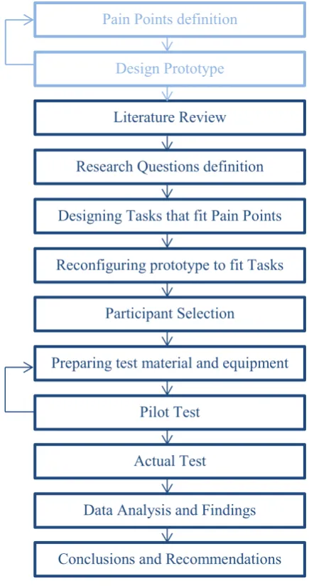
[image:16.595.148.366.231.645.2]The experimental methodology is described in Figure 1 and it was chosen as the most useful way for answering the research questions and carrying out the usability testing of Communics’ Authoring Tool. This study is more qualitative, but will have some basic quantitative analysis. The methodology process was mainly inspired by (Granollers & Lorés, 2006) and (Alghamdi, Alroobaea, Al-Badi, & Mayhew, 2013)
Figure 1: Methodology Timeline Pain Points definition
Design Prototype
Designing Tasks that fit Pain Points
Reconfiguring prototype to fit Tasks Literature Review
Participant Selection Research Questions definition
Preparing test material and equipment
Pilot Test
Actual Test
Data Analysis and Findings
1.7
THESIS OUTLINE
The report will be structured in the following way:
Chapter 1: Introduction. An introduction that summarises the project in order to give a general idea.
Chapter 2: Extended Background. Deep literature research of the techniques used in the methodology to do the Authoring Tool’s Usability Evaluation.
Chapter 3: Migrantech. Presentation of Communics Tool to understand its design and evaluation.
Chapter 4: Design Process. A summary of the design process in order to understand the task selection linked to the cognitive model.
Chapter 5: Research Methodology. Description of the steps carried out to accomplish the study.
Chapter 6: Analysis of Results. Transcribing the findings obtained and discussing them.
Chapter 7: Conclusions and Future Work. Reviewing the relevant research outcomes that are answers to the research questions and proposing future investigations on the subject.
1.8
DEFINITIONS
Authoring Tool: Software that aids non-programmer users to upload their own content to a multimedia application or system (BusinessDictionary, 2018).
Usability: According to ISO 9241-11, “Usability is the extent to which a product can be used by specified users to achieve specified goals with effectiveness, efficiency, and satisfaction in a specified context of use.” (ISO, 2018).
Usability inspection: The common name for a group of cost effective ways of evaluating user interfaces in order to find usability problems (Nielsen, 1994).
Cognitive Walkthrough: A usability inspection evaluation type that anticipates how easy it will be for users to learn to carry out particular tasks on a program (Blackmon, 2004). The evaluator, normally a usability expert, performs tasks that a typical interface user will do and evaluates the actions and responses of the system according to the user’s knowledge through responding to some questions related to the method’s cognitive model (Mahatody, Sagar, & Kolski, 2010).
Synchronous remote testing: A method of remote testing where the evaluator is not located in the same place as the participant but can see and interact in real time with him through video calls for example (Alghamdi, Alroobaea, Al-Badi, & Mayhew, 2013).
Chapter 2.
E
XTENDED
B
ACKGROUND
2.1
USABILITY
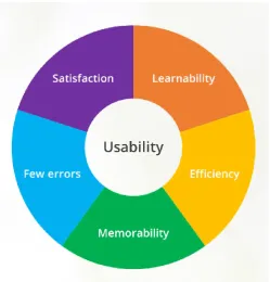
[image:19.595.188.438.294.555.2]According to the ISO 9241-11 standard, usability is the term used to describe that a product is utilised by its users to obtain certain objectives with effectiveness, efficiency, and satisfaction. Effectiveness refers to accomplish the user’s goals; efficiency regards the resources that the users need to achieve the goals (e.g. Effort and Time) and satisfaction has to do with their experience. But Nielsen’s and Mack’s usability definition, the one that has had a bigger impact on usability context, defines usability as: "usability is a fairly broad concept that basically refers to how easy it is for users to learn a system, how efficiently they can use it once they have learned it, and how pleasant it is to use" (Nielsen & Mack, 1994). In addition, they divide usability in five elements instead of three, he calls them usability attributes and are used to measure and specify usability objectives. They are: learnability, efficiency, memorability, errors and satisfaction, as seen in Figure 2. Based on the type of system, one attribute may be more important than other.
Figure 2: Nielsen's Usability Attributes (Sippola, 2017)
Learnability means that systems must be easy to learn as this influence the first impression that the user has with the software. Essentially this means that the user has to be able to interact with software as fast and effortless as possible; always taking into consideration the level of complication of the system and the user experience of the user.
EXTENDED BACKGROUND Errors must be prevented in the system as much as possible as it confuses the users. Errors are defined as functions done by the users that don’t finish with the expected result. A system with as less errors as possible is the best to have; having a proper list of instructions is always useful to aid this.
Satisfaction has to do with how pleasing a system is to use by the user. This is directly correlated with the user’s motivation and consequently the effectiveness of handling it, so it is quite important that the user is satisfied with the product when he is using it.
Poor usability of an interface can arouse errors that can bring about various types of risks (e.g. Achieving the wrong goal, having unexpected costs, inconvenience of spending too much time understanding the software…) (ISO, 2018). This is why over the years researchers have developed different usability evaluation techniques.
2.2
USABILITY EVALUATION
Usability Engineering in the field of study that presents controlled methods to accomplish usability in user interface design. Usability evaluation is a key component in this process that is composed by three basic stages: requirement analysis, design/testing/development and installation. Usability goals, sometimes also called pain points, are defined during the requirement analysis; iterative testing or inspection is carried out during the design, testing and development to compare the prototypes with the usability goals and in the end, installations are controlled with user feedback so that the functionality wanted is obtained. Usability Evaluations can be taken by end-users, usability experts or they can be model-based (Scholtz, 2004). The main objective of usability evaluation is to find usability problems in the interface by providing qualitative and/or quantitative data during the software development life cycle. Usability evaluation methods can be described as any method or procedure that attempts to do a usability evaluation of a user interface in order to find usability problems. Some usability methods categorise the usability issues according to their type, map problems to specific features of the program that cause it or recommend a different design solution (Hartson, Andre, & Williges, 2001). During the past 30 years different evaluation techniques have been created and studied to try to detect and solve usability problems; a timeline of them was provided by Scholtz in 2004 and can be appreciated in Figure 3.
Figure 3: Main Usability Methods developed over the past 30 years (Scholtz, 2004)
evaluating paper prototypes, initial screen designs, partial prototypes, non-functional prototypes, etc. Sometimes in further stages they even use logging software to capture the interaction design of the software. Furthermore, usability moderators often take note of incidents that happen throughout the evaluation and do a debriefing or a post-evaluation interview in order to clarify or expand some aspects of the evaluation. As evaluations need to be carried out quite often, they tend to focus on specific aspects of the design and use 2-3 participants.
Summative Evaluations tend to be more formal evaluations that are done to document the usability characteristics of software. The amount of participants needed for this type of evaluation varies between 5-7 per type of user group identified. This means that if for example a product is being designed for individuals and businesses, the product should be tested for both user groups. Effectiveness, efficacy and satisfaction are the metrics most commonly used and a properly planned experimental design is essential for the methodology. The tasks selected in the evaluation normally exemplify the main functionalities of the program, but sometimes new or improved functionalities are also included in the task definition. The requested level of usability has to be defined at the start of the usability engineering and the final results of the summative evaluation will be compared to that. If the results are negative sometimes the software release is postponed in order to do some modifications (Scholtz, 2004).
Apart from the formative and summative approaches, usability methods can also be divided into inspection and test approaches as illustrated in Figure 4 (Holzinger, 2005).
Figure 4: Usability Evaluation Methods
The test approach is part of the summative methods that depend on real users in order to discover usability problems that an interface has. The main element that characterises this approach is that real users normally retrieve more contextualised and defined feedback. The drawback of testing with real users is that, as not all answers from the users are reliable, the tests need a big number of participants for assuring the accuracy of the verdicts. This elevates the costs of the testing and could be the reason why the tendency of using the testing approach is decreasing according to the UPA Survey (UPA, 2009). However, they are methods that are very still used by professionals in projects that need a strong user feedback.
Usability inspection forms part of the formative techniques and is very alike to procedures they do in quality controls but they switch the product’s bugs with the potential interface problems. Heuristic Evaluation, Cognitive Walkthrough and Task Analysis are procedures for the Inspection Approach. These techniques can be practiced together or apart and are evaluated by two or three evaluators that have experience in usability. This means that usual procedures do not imply real users because professional’s opinion is enough for this approach (Chou & Mustafa, 2014). Inspection techniques are the chosen option in projects that have to reduce costs. As this project needs to use minimum resources, the methods that belong to the inspection approach will be detailed.
EXTENDED BACKGROUND Before the 90’s, usability inspections didn’t follow any specific criteria and only relied in the evaluator’s experience (Nielsen, 1994). So, as doing informal inspections was a bit controversial because every evaluator took as reference a different thing, academics and industrial researchers decided to start formalising the usability inspection approach by creating new techniques that followed specific procedures (Shneiderman, 1987). So, from 1990-93 all the researchers started developing new evaluation methods based on inspection that were inspired by existing ones (Dumas, 2007). From then onwards, the main three inspection methods that were created and that still remain in use are Heuristic Evaluation, Cognitive Walkthrough and Task Analysis. All of those are considered as expert-based evaluations that investigate the usability of an interface. Heuristic Evaluation is quite popular nowadays, it was first presented by Rolf Molich and Jakob Nielsen in 1990 (Nielsen & Molich, 1990). The procedure that they use is basically to evaluate the interface with the help of the heuristics usability principles and a small number of usability experts that note the importance of the usability problems found (Hollingsed & Novick, 2007). First tests done to heuristics evaluations showed that five to ten evaluators where needed to find out between 55% and 90% of the usability problems, so they concluded that it was a cheap and easy method for substituting user testing (Nielsen, 1992) (Nielsen & Phillips, 1993). Following these studies, others were made with diverse opinions. One said that heuristics can find many usability problems but not as relevant as empirical testing (Jeffries, Miller, Wharton, & Uyeda, 1991) and another study said that this was due to the differences in the evaluator’s expertise (Karat, Campbell, & Fiegel, 1992). Nielsen investigated this further and concluded that if they are using regular usability experts and not double usability experts then you would need more experts for the inspection. But heuristics also have disadvantages collected by Jeffries and Desurvire (Jeffries & Desurvire, 1992). They are the following: evaluators must be experts in usability with years of experience which are sometimes hard to find, good usability experts are costly and some issues may be false as they are suppositions that experts do and may not bother the user in real life.
Task Analysis investigates user’s actions when performing a task (Rogers, Sharp, & Preece, 2011). This is why it can also be called action analysis, in which the meaning of task is seen as a series of actions without inside structure (Holzinger, 2005). It was first developed for helping the labour force in occupational task performance, and later it was implemented in the Human-Computer Interaction field (Annett & Duncan, 1967). Task analysis divides the tasks in the lowest levels of action and experts analyse the sequence according to an objective and the type of user, as the same task can be done in two different ways depending on the user for example, and assemble the actions into the correct order. Task analysis can be supported by open-end interviews and questionnaires in order to gain more information about why people would perform the task in that way (Cooper, Reiman, & Cronin, 2007). End questionnaires can be face-to-face or a survey (Jonassen, Tessmer, & Hannum, 1999). All-in-all, Task Analysis just needs one experienced evaluator, but it is quite time consuming and very dependent on the evaluator’s skills. Furthermore, it is a quite limited approach as it cannot predict what users will do when they have to carry out difficult tasks (Rogers, Sharp, & Preece, 2011).
some evaluators get a bit bored sometimes and don’t pay lots of attention in the end of the inspections. As this is the selected method for the usability evaluation, more details about this technique will be given in the following section.
2.4
COGNITIVE WALKTHROUGH
Cognitive Walkthrough method was thought by Lewis, Polson, Wharton and Rieman in 1990 (Lewis, Polson, Wharton, & Rieman, 1990), however it has evolved into different variants. Nevertheless, the main principle of having a method that imitates the cognitive behaviour or a user by answering a series of questions related to the user’s cognitive model remains intact in all variants (Mahatody, Sagar, & Kolski, 2010). The model was constructed based on the exploratory learning theory, that had 3 pillars; learning component, problem solving component and execution component (Polson & Lewis, 1990). The model believes that a user chooses an action among the other possible ones based on the analogous between goals and the expected result of the action. Then, after doing the action, the user evaluates the system’s response according to their goal. If the aim was successful, the user memorises the steps taken by the system, but if it is not successful the problem-solving component appears in order to find the correct action. The execution component is the act of finding a general rule that matches the context.
In 1994 Wharton, Rieman, Lewis and Polson studied the history of this method (Wharton, Rieman, Lewis, & Polson, 1994). Meanwhile, the principal limitations that this method had were the repetitiveness of filling out forms and the limited number of problems found. Addressing these limitations, it was decided to use a small group of evaluators so that they could rotate the form within the group and to keep record of all problems found during the evaluation (Rieman, Franzke, & Redmiles, 1995). These new patches were described informally. Another inconvenient was that the method didn’t had clear guidelines when talking about what makes an action available to a user and what type of actions are considered by a big enough range of users (Wharton, Bradford, Jeffries, & Franzke, 1992). To fix this, the answer is to describe the user population to the evaluator at the start of the inspection. Novick and Chater tried this method in operating procedures and found that it was a very good way for receiving feedback and completing documentation (Novick & Chater, 1999). Spencer found some difficulties when applying the method in a big software project that had to do with the development team (Spencer, 2000). His conclusions were that the usability specialist has to avoid design discussion and to defend team members.
Essentially, since its appearance and with its modifications, Cognitive Walkthrough has been an effective inspection method that can be easily applied. Nonetheless, the selection of task scenarios can be challenging as if the scenario is not properly described, the evaluation can be less effective. Despite this fact, Cognitive Walkthrough is still used in the present for tourist online guides, pda-based games, management tools, etc. (Hovater, Krot, Kiskis, Holland, & Altman, 2002).
EXTENDED BACKGROUND Table 1: Classification of analytical methods of evaluation (Dix, Finlay, Abowd, & Beale, 2004)
During the Cognitive Walkthrough the evaluators check for potential usability problems in all of the steps that the user needs to do in the interface to complete a task. The principal focus is to stablish how easy to learn a system is through user exploration. Experience in the field shows that normally users prefer to learn by doing than by needing previous training, so the questions that are asked to the evaluator have to do with exploratory learning. The same questions are asked in every step taken to complete the task and they try to solve if the step to be taken is good for a new user.
2.4.1
G
ENERAL PROCEDURE2.4.1.1
Before the inspection
For carrying out a Cognitive Walkthrough you need four things before the inspection starts (Dix, Finlay, Abowd, & Beale, 2004):
1. A prototype complete or incomplete, but quite detailed, prototype of the system. Details like wording and using real examples can be very important.
2. A task description that the users will normally have to do in the system. Consider realistic tasks and no more than five tasks per walkthrough session. Always start with simple to complex tasks and consider tasks that involve the use of multiple features and that are very important for the user’s goals of using the program. Apart from these, Wilson’s chapter of Cognitive Walkthroughs in the book “User Interface Inspection Methods”, lists more factors to consider when choosing the tasks for the Cognitive Walkthrough (Wilson, Cognitive Walkthrough, 2014):
a. Client specific requests; b. Product Constraints;
c. Parts of the interface that the design team is uncertain of; d. Verify reputed problems;
e. Critical parts of the interface;
f. Parts of the interface that the user will constantly manage; g. Important pain points;
h. New features.
3. A list of actions that the user has to do on the system in order to complete the tasks.
4. A description of who are the users, what kind of experience they have with similar systems and knowledge the evaluators can assume.
if the designer is present he cannot defend the design during the walkthrough, participants are asked not to use bad language and the moderator can remind this rules during the test.
2. Select the evaluators, if they have experience in project with different backgrounds the better to get diverse opinions.
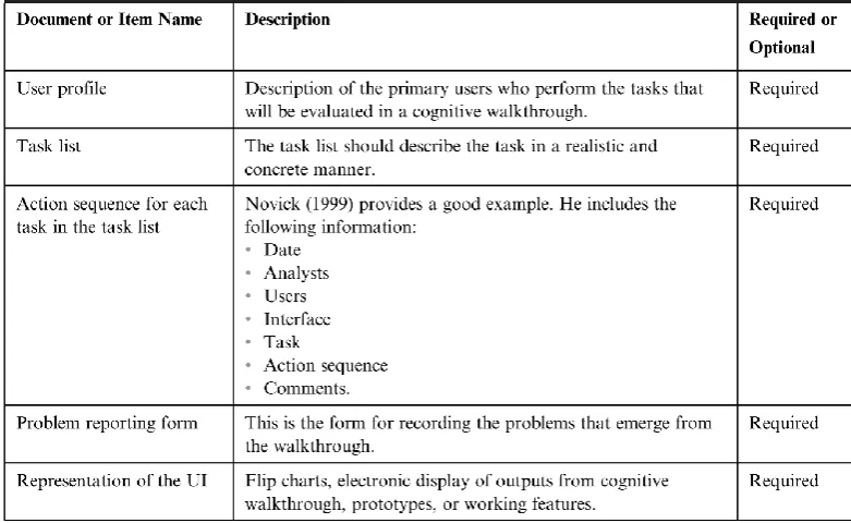
[image:25.595.131.522.202.442.2]In the same chapter, Wilson illustrates very clearly and summarised in Table 2 the documents and materials that are needed for the evaluation (Wilson, Cognitive Walkthrough, 2014).
Table 2: Documents and Materials needed for a Cognitive Walkthrough (Wilson, Cognitive Walkthrough, 2014)
2.4.1.2
During the inspection
When the evaluator receives all of the material they need, they will have to go over the entire list of actions with the modulator for the different tasks in order to judge the interface by answering the following four questions for each step taken:
1. Is the effect of the action the same as the user’s goal at that point? (e.g. if the consequence of the action is to save a document, is ‘save the document’ what the user wants to do?)
2. Will the user see that the action is available? For example, if they view in that moment the button they want to press.
3. Once the users have performed the action, will they know is the one they need? For example, they know they have to press that button and the effect it will have.
4. After the action has finished, will the users understand the feedback they get? For example, if the user has saved something he expects a confirmation that the document has been saved so that they know they have completed their goal.
EXTENDED BACKGROUND problem is local or global. This last report helps designers easily prioritise the problems identified for future corrections.
Finally, it is recommended to record any design suggestion, problems that were not found as a direct output of the walkthrough, user assumptions, task comments and any other information that may be useful for a future design. In addition, as this form of evaluation is quite tedious, it is recommended to record more in deep only the actions that have or may have a problem, to use a data sheet that is easily recognisable and to select the most important tasks to inspect.
2.4.1.3
After the inspection
After the Walkthrough has taken place the person analysing the results should: 1. Classify all the repetitive usability problems found by different evaluators. 2. Give priority to the most urgent problems.
3. Discuss potential solutions with the designers.
4. Evaluate the problems that could have occurred during the walkthrough and see it there are any improvements that could be done for next time.
5. Give priority to learnability problems that are based in skill gaps that prevent a user to complete a task successfully.
6. Design suggestions should be kept in a different report.
2.4.2
A
DVANTAGESThe advantages for carrying out a Cognitive Walkthrough as an interface evaluation method are: It does not require a totally working product.
It does not require real end-users for testing.
It can be applied in any phase of development that has enough information that describes what the system does.
It provides detailed information to every problem found so it is easier to find a solution.
It has a properly defined procedure that is task-based and focuses on the learnability attribute of usability.
You avoid evaluating the system with users that are not into cooperating with the project and don’t describe the reason for the actions they are taking properly.
2.4.3
D
ISADVANTAGESThe disadvantages of carrying out a Cognitive Walkthrough are:
Cognitive Walkthrough focuses too much on the learning and leaves apart some other usability metrics that other evaluations methods consider.
The method is quite tedious and slow and can influence in the participant’s way of answering the questions.
The method is limited to the tasks proposed by the one ideating the inspection method.
It does not work very well for very complex tools that have two or more different paths to reach a goal.
1996). The word ‘remote’ illustrates the distance that exists between the participant of the test and the evaluator (Castillo, 1997). Remote usability testing can be synchronous (moderator present in real-time during the test) or asynchronous (moderator is not present during the test in real-time).
Lots of usability studies are carried out in a laboratory setting in which the participant is carrying out a task and the evaluator is looking at him from the distance. Taking the participant to the lab makes him move from his comfort zone to a lab, this implies costs for the lab and wasting the participant’s time. However, remote testing avoids these issues; making the test more economic it the participant has the resources in order to take the test remotely. Moreover, sometimes you cannot find software specialists or users with the profile that you are looking for in your city or country and the costs of paying the travel to the participants does not make up for the test results that can be obtained, so in these cases remote testing is a very good solution. In addition, remote testing can provide data for tests in which a big number of participants are needed (Ratner, 2002). Finally, sometimes depending on the system tested, it is positive for the testing that the participant remains in his usual place in order to get more realistic results. As opposed to all of these positive opinions about remote testing, there are others that suggest that remote testing makes the interpretation of results more difficult to the evaluator as they may miss some contextual information of a facial expression that can be determinant.
2.5.1
G
ENERALP
ROCEDUREAn article in Nielsen Norman Group’s web page explains the steps that have to be done before, during and after remote testing (Moran & Pernice, 2018):
Planning the study:
1. Decide what tool you are going to use to communicate with the participant. (e.g. Skype, Facetime, TeamViewer, Join.me, email, phone…) This must be decided according to the requirements of the test.
2. Plan how to explain the tasks to the participant. Use screen sharing, send the documents separately… 3. If it is possible, schedule a practice session to test the technology or make the participant connect a
bit before the test time. Day before the session:
1. Confirm/remind the assistance or day maximum for sending the test results. During the session or after you received the test results
1. Start by thanking the participant and by signing the consent form 2. Run the session
3. Finish the session by thanking the user.
2.5.2
S
YNCHRONOUSR
EMOTEE
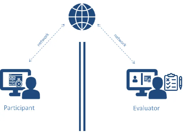
VALUATIONEXTENDED BACKGROUND This evaluation allows the evaluator to study the behaviour of the participant in a natural condition by using a laptop. So that the evaluation can be done in real-time there has to be internet connectivity in the evaluator’s and participant’s space. For this method video calls, screen sharing applications and/or a speaker and a microphone are needed so that the evaluator can view how the user is doing with the tasks. Figure 5 shows a simplified version of the setup of a synchronous remote test.
[image:28.595.128.444.258.495.2]Benefits of this type of testing come from the possibility of obtaining data of users in their normal habitat, reducing the inconvenience to the participant to move to a lab and the possibility of interacting with the participant in real-life even you are not in the same space. In addition, the situation of having a modulator seams more natural than talking to one self. The main drawback is that you depend on technology for doing this, not all people may have a good computer or a good internet connectivity to undertake a proper test.
Figure 5: Synchronous remote evaluation setup
2.5.3
A
SYNCHRONOUSE
VALUATIONAsynchronous remote evaluation is a way of remote testing in which the evaluator and the participant are in a different space and cannot interact with each other at the time that the test is taking place, meaning that the participant and the evaluator are not just separated by space by also by time. Most of these tests are carried out using an interactive program with a virtual moderator or in a survey form (Lima, Winckler, & Freitas, 2000) (Nielsen, Schroder, Stage, & Andreasen, 2007).
true results will appear. As disadvantages, the evaluator needs to take more time preparing the questions of the test as no question can be improvised, so various pilot tests are recommended. Furthermore, observational data is not received directly by the evaluator so is a problem or something occurs there is no way of correcting it. Moreover, some participants don’t pay a lot of attention to surveys as they get tired of them or they don’t want to write the answers down so the validity of the test may be controversial (Bastien, 2008). Finally, there is a big chance that the participants get distracted by something and don’t pay full attention to the test.
Figure 6: Asynchronous remote evaluation setup
2.6
RELATED WORK DIFFERENCE
Chapter 3.
M
IGRANTECH
3.1
OVERVIEW
Migrantech is a project started by the Fondazione Bruno Kessler in Italy and University of Haifa in Israel that aims at identifying the effect of computer-mediated contact in the acceptance of immigrants in society. Migrantech’s research hypothesis is that Joint Narratives can reduce stereotypes and hostile attitudes; this is based on the social constructionist theory (Zancanaro M. , et al., 2008). This theory says that intergroup dialogue is vital for the participant’s transformative process through which participants deal with disputes using self-expression and listening to others. Digital software backing intergroup dialogue have shown positive effects, as well as cooperative tasks lead to more positive results than some meetings. Concerning this, using narrations to promote reconciliation is a recognised method that needs further research in the area of solving a violent conflict. This is why the principal part of the project is the creation of a tool called Communics which supports the creation of joint narratives by two persons that don’t speak the same language in order to solve conflicts (Zancanaro, Stock , Eisikovits, Koren, & Weiss, 2012).
3.2
COMMUNICS
MIGRANTECH
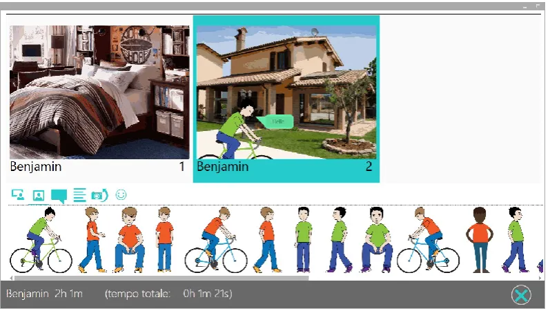
When the participants are logged in they can start creating a short story with the resources they are given. Typically those resources will correspond to a certain topic in which the two participants may find some possible controversial disagreements. The resources are specially selected by a cultural mediator or intercultural practitioner with a background in Sociology, International Studies, and/or Counselling and are uploaded to the system with the aid of an Authoring Tool (the system designed and tested in this project). Participants take turns for creating one vignette with all the resources they want to put, this resources include: backgrounds, emotions, characters, objects and speech bubbles with text in the appropriate language of the participant. A participant cannot create 2 vignettes in the same turn; he has to wait for the other participant to contribute first. As the two participants are connected remotely through the internet, the desktop application always shows the same content to both participants. Figure 9 shows a demonstration of a participant creating a story with another that is situated in another computer.
vignette. Once the story is finished the participants indicate it by pressing the button marked with an X in the bottom right corner.
Communics’ main component, still in development and testing phase, is an automated mediator that is in charge of monitoring the progress of the story and of fostering participants to escalate or de-escalate their contributions to solve the points of conflicts. By using this, the participants can reach an agreement on a satisfactory joint narrative that is acceptable to both participants, reflecting their identities and points of view. Last research done by the FBK was in this specific component of the tool and they found out that an automated mediator was as useful as a human mediator.
3.3
AUTHORING TOOL
Currently there is no software that a non-technical person could use to upload resources to Communics’ data base. Up until now the content has been uploaded directly using an excel file and a data base, and this is not understandable by people with no technical background. So, for the FBK and the University of Haifa to continue developing Communics and testing new approaches they need an Authoring Tool for non-programmer users to be able to easily upload all the necessary content to Communics in order to help them with the project.
The Authoring Tool will be software that basically provides the non-programmer user a visual interface in order to upload content into the system. It will also be a tool for them to view and check all the content they have uploaded and that other profession colleagues have uploaded. They could also start creating a new set of resources by using as a base an older set of resources or even create a new resource joining the resources of two existing ones. Later more detailed information about the main feature of the system will be described in the design section.
[image:33.595.114.513.116.343.2]3.4
ARCHITECTURE OF THE SYSTEM
MIGRANTECH
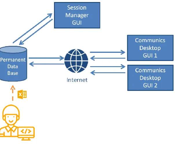
Figure 11: Diagram showing the Architecture of Communics project
Chapter 4.
D
ESIGN
P
ROCESS
4.1
OVERVIEW
As mentioned before, this section was the one developed during the internship at the FBK. It is important to summarise the design process of the Authoring tool in order to understand properly the tasks selected in the usability evaluation, to identify false usability problems found that may be ‘intentional’ because of technical reasons and to make future improvements on the design after the Cognitive Walkthrough. The design process was supervised by Massimo Zancanaro, Gianluca Schiavo and Alessandro Cappelletti throughout a series of meetings in different stages of the design. In this chapter the design process will be summarised and explained in chronological order, starting from the information received in the first meeting until the final functional prototype developed in Axure.
4.2
PROJECT DEFINITION
In order to define the functionalities that the new Authoring Tool needed to work as desired, it was decided to meet a couple of times with the team that had been working on the project previously. First meetings were about the context of the Migrantech project. Later, Communics desktop application was presented and the functionalities and features of the program were described. In addition, the type of resources that had to be managed were given to the designer as an example. Having seen all of this, the instructions were to design an interface that allowed a person with no technical background administrate the resources that the participants of Communics will have to use in order to create a story.
In the beginning it was not very clear if the Authoring tool had to work online and offline or just offline, and if could aloe instant collaboration as for example Google Drive. It was decided to treat these questions further on, as the important thing was to create a first version of the software to continue investigating, and this type of features can always be implemented in the future if the first design allows it. In addition, examples of different Authoring Tools and Content Managers were searched on the internet in order to see what the common main features that these tools have.
4.3
FIRST PAIN POINTS
The first pain points were created more or less at the same time as the first fast paper prototype in order to help thinking about the actions that a person does when administrating some content. They were also created according to the type of content that had to be managed based on the resources that Communics’ team members had supplied. Moreover, they were created for the interface to be as simple as possible for a non-technical person and contained the basics. They were thought specially in order to solve the problems of the previous method of having to use a data base and an Excel sheet. They were as follows:
1. It is difficult to know what the format of the elements uploaded has to be. It varies depending on the type of resource.
2. It takes time to know what types of elements are allowed to be uploaded. 3. It is not possible to have a general view of all the resources.
DESIGN PROCESS
4.4
PAPER PROTOTYPE
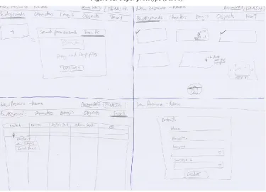
[image:36.595.90.465.165.430.2]The purpose of the paper prototype was to help think about the pain points and to have something to show and to work on in the following meeting in order to elaborate on the functionalities. The paper prototype had the appearance shown in Figure 12 and Figure 13.
[image:36.595.86.462.453.724.2]Summarising the macro decisions, they were the following at this point:
1. When selecting the elements to upload, if some are not compatible with the type of element, an error message will be shown.
2. There is a menu bar in the top always indicating the type of resources that exist and showing in which one you are working on.
3. There will be a list of all the resources with some basic information displayed in some cards.
4. The elements inside a type of element (e.g. images of the backgrounds) will be displayed as if they were on a folder from a computer and will be displayed in small and if you click on them in big. The text will be treated as a table.
5. There will be a button that allows edit the resources.
6. It will be allowed to delete resources and elements inside resources.
4.4.1
E
XPERT CRITIQUEAfter showing the paper prototype some of the recommendations/things to think about told by an expert in design were the following:
A ‘New’ button cannot be repeated all over the program, it is not consistent.
Careful with the vocabulary used, if a button says ‘Finish’, does it mean that the resource is completed? Or that you are saving? You have to define what functionality it has.
Thing about hoe to difference resources that are completed from the ones you are still working on. It needs some overview statistics for the creator to evaluate how is he doing because if not there is no sense of classifying the sentiments individually.
Think about the first thing the user needs to do when creating a resource and try to guide him in a coherent order on how to fill the content.
In the text there has to be an area in which the text is always in English for everyone to understand the other languages.
For adding a new row in the table it is not consistent that you have to right click if for the backgrounds there was a specific button for this.
What if the person is working on the resource and the program crashes?
When deleting for example, add some confirmation in case a button is pressed by error.
4.5
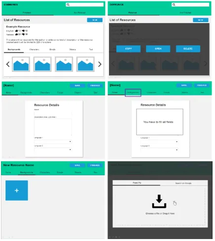
FIRST DIGITAL PROTOTYPE
The first prototype done with the computer was done using PowerPoint. This was because the aesthetics of the interface was not yet decided, so a fast an easy tool was chosen. As there were no indications in the start as of what style to follow, the first prototype was inspired by google design guidelines. The purpose of it was to explain add/change some macro decisions of the design in order to correct the last paper prototype and to start focussing more on the micro decisions.
The macro decisions that changed of that were added where the following:
3. There will be a list of all the resources with some basic information displayed in the cards. This information includes as summary of the positive/negative sentiments for each resource.
7. The list of resources will be divided into resources that are completed (‘Finished’) and the ones that still need to be completed (‘not finished’).
DESIGN PROCESS
As it can be observed, some micro decisions are more visible with this prototype: The flipping of the cards in order to do an action on that card.
Adding a new column for categorising the texts. Adding a new column for the description of text.
DESIGN PROCESS Integrating the details of the resource in the top menu of the type of elements and putting it in first place so that the details are filled first
Adding an error message if the user tries to upload content before putting a name to the resource. Add another button of ‘save’ so that the resources are added to the not finished section.
4.5.1
E
XPERTC
RITIQUEAfter making a presentation of the new functionalities and how to present them, an expert critique formed by the head of Intelligent Interfaces and Interaction research unit at FBK and a psychologist and user experience researcher in the FBK made the following suggestions:
It is better to put things that the user can directly see than him to discover the new things by putting the mouse over.
Try to maintain all the buttons and elements that have the same function in the same area of the screen.
Design some command bars for common actions.
Inside a category there can be more subcategories, think about how this can be solved in a table creation.
The appearance of the program has to follow the Universal Design Windows Guidelines (Windows, Design Universal Windows Guidelines), because other programs of the suite use that and the coding was done with UWP apps.
Try to think about how to implement this in the architecture of the whole system.
Deleting a resource has to be hard for the user because it is not a normal action and you have to see if it is compatible with a possible future collaboration and offline working system
Try to show as less number of errors as possible, instead try to block the actions the user cannot do.
4.6
NEW ARCHITECTURE OF THE SYSTEM
Tool is opened the temporary data base will be updated by the permanent data base in search of new finished resources, which will also be charged on the graphical interface of the Authoring Tool. Whenever the user saves a resource for continue working another day, it will be saved on the temporary data base so that the other users don’t have access yet to it as it is not yet completed. The not finished resources will be charged into the graphical interface from the temporary data base that will be backing up the work every 1 minute. In case the Authoring Tool crashes, all the content will appear again in the graphical interface as the modifications were saved, even if the user didn’t have internet.
4.7
PAIN POINTS COMPLETED
After some meetings to put together the functionalities of the interface, to make the interface fit with the other graphical user interfaces already implemented in the other applications and to know how to integrate the functionalities with the actual architecture of the system, some pain points were redefined and new ones appeared:
1. It is difficult to know what the format of the elements uploaded has to be. It varies depending on the type of resource.
2. It takes time to know what types of elements are allowed to be uploaded. 3. It is not possible to have a general view of all the resources.
4. It is not possible to inspect the elements inside the type of elements in each resource. 5. It is difficult to edit a resource you are working on.
6. It is difficult to select what element you want to delete inside a resource without a general view. 7. It is difficult to know how edit and create tables of text with categories and subcategories.
8. There is no way to have a detailed summary of the sum of all the positive and negative elements in a resource uploaded.
9. There is confusion about the minimum number of types of elements that a resource can have. 10. It is not possible to distinguish if a resource is finished and ready to use or not.
4.8
DESIGN DECISIONS FOR FUNCTIONAL PROTOTYPE
DESIGN PROCESS
Figure 17: Windows Page layout (Windows, Page Layout)
As you can observe, the page layout is divided in:
A navigation pane in which the list of resources will be displayed according to the category they follow. This panel can be expanded and collapsed.
A content pane in which the content will be displayed according to the resource pressed in the navigation pane. The union of this two will form a Master Detail View in which both panes are fixed and have vertical scrolling. The scheme of a Master Detail View is recommended for lists that contain images and text (Windows, Windown Master Detail View) as it can be seen in Figure 18.
Figure 18: Windows Master Detail View (Windows, Windown Master Detail View)
Figure 19: Navigation Panel inside the content (Windows, Page Layout)
A command bar for the general actions that can be done to the selected resource. If the commands are a lot you can also add an overflow menu as seen in Figure 20.
Figure 20: Command Bar (Windows, Page Layout)
This was the type of layout selected because it is a well-known layout by anyone that receives emails, so the interface will be easier to learn as they will find similitudes with email softwares. In addition, it was a god solution for the user to receive the most information at a glance without having to navigate a lot in the interface, as the main cognitive task for the user is to view the content available.
DESIGN PROCESS
Figure 21: Principal View 1
Figure 22: Duplication action
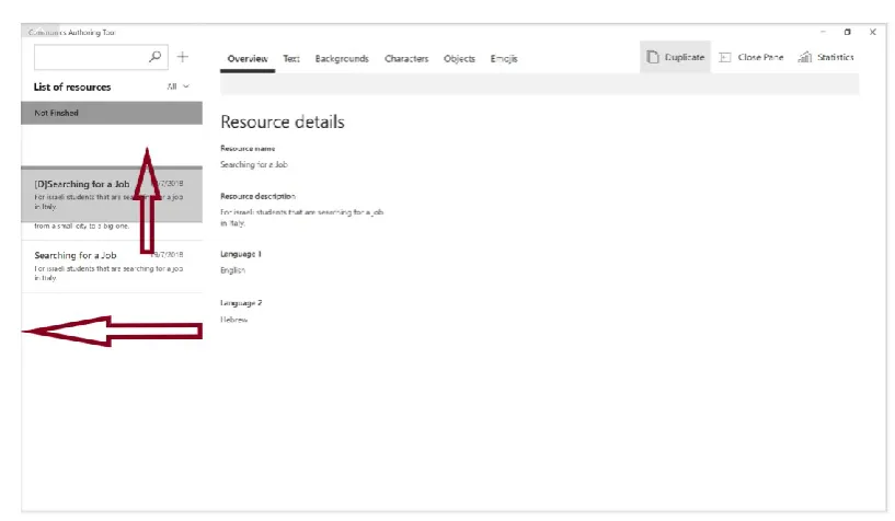
When selecting a not finished resource from the navigation pane (Figure 23) the same things will happen as with the finished one with the exception of two things. The content displayed in the content pane will appear as if it was in edit mode but the fields were blocked. This was done so that the users recognise they can still edit the information. The other difference is that the Command Bar contains an extra button to edit the resource. This is basically because a resource that hasn’t been finished has to be able to allow continue working on it. The finished resources cannot be edited as they are already in the main data base and can be in use by other sessions. The only way someone can ‘edit’ a finished resource is to duplicate it and then edit it by changing the name and the other elements. This was done so that users don’t have to waste time uploading the same content for modifying small details.
DESIGN PROCESS
Figure 23: Principal View 2
Figure 24: Download action
[image:46.595.86.480.317.565.2]Figure 25: Statistics pane
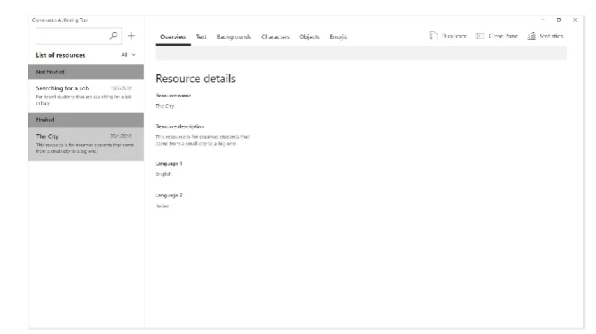
When creating a new resource the tabs on top of the content will be blocked until the user has inserted all the required fields to document the resource (Figure 26). This is done so that the resources are well documented to avoid the user from forgetting this important step before completely finishing the resource (avoid error messages). When all the fields are filled, then the top pivots de-block. It happens the same with the ‘Finished’ and ‘Save’ buttons as you cannot save a resource with no content and you cannot finish a resource without the minimum elements added. For the saving button to de-block the user just has to fill in all the fields in the overview and for the finished button the user has to add at least one text and one background.
[image:47.595.102.515.436.680.2]DESIGN PROCESS
Figure 27: Adding a character
When the elements are loaded into the system they are displayed like in Figure 28. Each card has its image and then the corresponding fields to be filled in (Name, language 1 sentiment and language 2 sentiment). In addition it has a checkbox that if selected, it de-blocks the delete and download buttons in the command bar corresponding to the type of element. All the checkboxes in the type of element can be selected at the same time by using the select all button. The filter tab helps users to display the elements according to their sentiment preferences in case they want to have a more detailed view of the elements when having big amounts of data. This interface is the same for all tabs except for the text.
Figure 28: Limit formats
[image:48.595.82.482.438.669.2]Figure 29: Element Display 1
If you want to delete an element a confirmation dialogue will appear in order to confirm you action, as this is an important in order to not loose information (Figure 30).
Figure 30: Delete element confirmation
[image:49.595.111.510.377.604.2]DESIGN PROCESS
Figure 31: Element Display 2
When the user wants to stop working and continue working the next day he can click ‘Save’ (Figure 31). The action for showing the user that his file has been saved properly will not only be to show him a message but also to open the navigation pane and physically show him the new resource appearing in the not finished section (Figure 32).
Figure 32: Saving action
[image:50.595.80.484.398.634.2]