A study about how public users
experience (perceive) the user interface
of the OneHealth game
_________________________________
Evaluation of user interface design
B. Alink
Bachelor Thesis Health, Psychology and Technology
Bram Alink s1126075
Abstract
Background: Nowadays, it is essential to detect a possible onset of an epidemic outbreak in an
early stage and take appropriate measures to mitigate the consequences for the society. The
purpose of this study was to evaluate an eLearning game that is implemented in the OneHealth
platform. The main goal of this game is to enhance shared decision making & risk
communication between professionals. Therefore, this research aimed to elaborate on how
public users experience (perceive) the user interface of the OneHealth game.
Method: The study employed a qualitative empirical research design to evaluate the usability
and user-friendly design of the OneHealth game. Data of six Dutch participants were gathered
via eye tracking, post interviews and use of the thinking aloud protocol.
Results: The results indicated that overall, the participants thought that the game had a
well-organized layout, whereby the participants mainly focused on the game elements ‘story’,
‘dilemma’ and ‘characters’. The order to move through the game as instructed by the researcher
was mostly followed by all participants in all dilemmas. The in-game feedback was overall not
often perceived by participants as they found that the visibility of the feedback was of low
quality. In contrast, the feedback screen was often understood by participants. Lastly,
suggestions were made by participants to make the in-game feedback more notable and to
highlight elements to know where to look first.
Conclusion: Concluded can be that a first impression is created of how users perceived and
experienced the user interface of the OneHealth game. Overall the user experience was good,
and participants labelled the lay-out as well-organized. In the first minute the participants
encountered the game overlay, their focus mostly laid on the text-heavy story and the dilemma.
Furthermore, the participants generally executed the navigation through the game like the
developer intended. However, the game element ‘in-game feedback’ was not perceived often
and could be made more visible, relocated and/or better explained in an improved version of
the game. Further research is recommended to see if comparable results can be achieved and to
test with a more advanced version of the OneHealth game, which has an instruction
implemented within the game. At last, the SeGUE tool makes the coding process more
structured, so that research in the field of serious games can be done more effectively in the
Table of contents
1. Introduction ... 3
1.1 Zoonosis ... 3
1.2 Interdisciplinary cooperation ... 3
1.3 Importance of eHealth ... 4
1.4 Development platform and serious gaming ... 6
1.5 Usability testing of OneHealth game ... 8
1.6 Summary and research questions ... 10
2. Methods ... 11
2.1 Design ... 11
2.2 Participants ... 11
2.3 Procedure ... 12
2.4 Material ... 12
2.5 Data-analysis ... 13
3. Results ... 17
3.1 The general user experience ... 17
3.2 The first minute of playing... 19
3.3 Exploring the game ... 21
3.4 Perception of the in-game feedback ... 22
3.5 Perception of the feedback screen ... 23
3.6 Suggestions to improve the OneHealth game ... 24
4. Discussion ... 26
4.1 Game persuasion ... 26
4.2 Reversed Gutenberg Diagram ... 27
5. Strong points and study limitations ... 29
6. Recommendations ... 31
7. Future research ... 32
8. Conclusion ... 33
References ... 34
1. Introduction
1.1 Zoonosis
Diseases that are transferable from animals to humans (zoonoses) carry substantial economic
and public health burdens that could grow exponentially in the future as antimicrobial resistance
grows worldwide and possible new mutating zoonotic diseases emerge (Holmstrup & Klausen,
2018). Between 2007 and 2011, there was a big epidemic in the Netherlands of Q-fever with
4107 reported cases of infected patients. Of those 4107 patients, at least 95 patients were
certainly or almost certainly deceased since the outbreak according to Q-fever experts of the
hospitals UMCU, Jeroen Bosch, and Radboudumc (RIVM, 2019a). Along those dangerous
health consequences for the citizens, there are also severe costs for the society which have been
estimated around EUR 161 and 336 million (Tempelman, Prins, & Koopmans, 2011).
Therefore, it is essential that a possible onset of an epidemic outbreak is detected at an early
stage, and appropriate measures are taken to mitigate the consequences for the society.
There are different ways to get infected by zoonosis; a) direct contact between human
and animals, b) indirect through germs that spread in the environment, and c) indirect through
a vector like a sting of a mosquito (RIVM, 2019b). A zoonosis that is strongly contagious is the
bird flu, which could cause serious illness and be potentially killing for poultry (Wageningen
University & Research, n.d.). Moreover, this flu can be in some types of the virus
communicable to people and is therefore also a potential hazard for the public health
(Wageningen University & Research, n.d.). To protect human- and animal health along with
enhancing the early detection of zoonosis, it is important that there is a proper risk management-
and communication between the various actors that are involved (Van der Giessen, van de
Giessen, & Braks, 2010).
1.2 Interdisciplinary cooperation
The Dutch government acknowledges the importance of collaborating between different
disciplines (veterinary, medical, and public health). The ministries that are particularly involved
in the control of zoonoses are the Ministry of Agriculture, Nature and Food Quality (LNV) and
Furthermore, the study of Van Woezik, Braakman-Jansen, Kulyk, Tjin-Kam-Jet-Siemons, and
van Gemert-Pijnen (2016) identified 73 stakeholders in the three sectors of interest (veterinary,
human, and public health). The National Institute for Public Health and the Environment was
considered as the definite stakeholder. Moreover, in this study was also described that infection
prevention can be a ‘wicked public health problem’.
Rittel and Webber (1973) describe a ‘wicked problem’ as a) troublesome to clearly
define in contrast to the ‘tame problems’, b) influenced by complex social and political factors,
and c) a problem that cannot be solved. Despite the difficulties of wicked problems, it is crucial
according to the WHO that there is an interdisciplinary collaboration between contrasting
sectors involved (veterinary, human, and public health). Such collaboration is significant due
to prevention and outbreak control of zoonoses (World Health Organization, 2004). Currently,
risk communication strategies in the Netherlands are hampered by a) a lack of cooperation
between disciplines, b) uncertainties about their respective tasks and responsibilities, and c)
poor knowledge of the general public about zoonoses (Van Woezik et al., 2016).
1.3 Importance of eHealth
Since many stakeholders are involved it is a challenge to cooperate and communicate together
at once. Moreover, those stakeholders often have different or competing interests when a
complex problem arises, and that requires close collaboration and flexible arrangements to
agree on a plan of action (Van Woezik et al., 2016). Therefore, eHealth can be a possible
solution to mitigate between different disciplines that lack cooperation in the area of zoonoses.
eHealth is a generic term for using (mainly) the internet for adopting information and
communication technologies. For instance, this can refer to informative websites, interactive
health applications (e.g. online communities, online decision-making, and tailored educational
programs), or online health portals (Van Gemert-Pijnen, Nijland, van Limburg, Ossebaard,
Kelders, & Eysenbach, 2011). Especially interactive health applications can be interesting for
training stakeholders in the area of zoonoses, since stakeholders are not located in the
neighbourhood to be in contact with each other. Besides, a health application on the internet is
claims that in some cases, computer persuaders are better at influencing attitudes and behaviour
than humans. He sums up the following advantages of computer persuasion; 1) technology is
more persistent than human beings, 2) it offers greater anonymity, 3) it can manage huge
volumes of data, 4) it uses many modalities to influence, and 5) it is scalable. However, there
are important factors to consider achieving a successful implementation of persuasive
technology. Namely, it is important to have a narrow cooperation with end-users and other
stakeholders (e.g. policy makers, providers of finance) that are involved to build an effective
system (Beerlage-de Jong, van Gemert-Pijnen, Wentzel, Hendrix, & Siemons, 2017).
Therefore, it is convenient to use a framework where the user is included in the process of
developing, improving and evaluating new eHealth technologies. An example of this which has
a user centred design principle is the CehRes Roadmap. The CehRes roadmap is developed by
the Centre of eHealth and Wellbeing Research. It has a holistic framework, which means that
every aspect of stakeholders and context of use is considered in the process of designing a
prototype (Van Gemert-Pijnen et al., 2011).
Van Gemert-Pijnen et al. (2011) describe the five steps of the CehRes Roadmap in their
article. The first step of the Roadmap is the ‘contextual inquiry’. This step investigates the
problem, such as identifying or analysing actors and describing the context of the problem.
Consequently, they outline that the second step is referring to ‘value specification’. This step
determines the values and interests of users or stakeholders in the context of zoonoses. The third
step is the ‘design phase’ in which research is done on how to stimulate the stakeholders to
cooperate better and which persuasive eHealth technology can potentially fit within this
context. Moreover, the design phase also involves usability and user experience testing (UX)
to adjust the concept design. The fourth step of the CehRes roadmap is the ‘operationalization
phase’, which consist of the actions and planning one must make to introduce, disseminate and
adopt the new technology to the context it is intended for. The fifth step is referring to the
‘summative evaluation’, which focuses on evaluating the impact of the technology on the
content and stakeholders in terms of clinical, organizational, and behavioural terms. Also, it
evaluates to what extent the new technology is adopted by the predetermined users. Lastly,
formative evaluations are conducted between the different steps of the CehRes Roadmap to
constantly improve and adjust the design to comply with requirements of users (Van
1.4 Development platform and serious gaming
When interdisciplinary collaboration and communication between stakeholders is established,
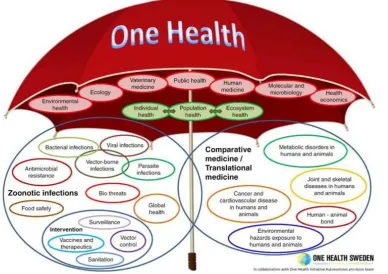
it fits the definition of the so called ‘One Health’ concept. In figure 1 this approach is illustrated,
and one can see that a lot of communication and cooperation is necessary between different
‘health’ fields (from environmental health to health economics). To achieve this ‘One Health’
concept, it is essential to re-structure the current infrastructure and how stakeholders are
currently in contact with each other. Therefore, in order to enhance the risk communication,
awareness, and communication about zoonoses between health professionals in the
Netherlands, an interactive online platform is created with the CehRes roadmap. This platform
is called ‘OneHealth Hub’ and it is mainly an information- and datahub which consists of a
Q&A system that targets the general public and professionals. The main goal of this hub is to
stimulate the cooperation between human health care- and veterinary professionals to prevent
or contain an outbreak of zoonoses (Ter Horst, Köhle, Braakman-Jansen, Beerlage-de Jong,
Snoep, & Van Gemert Pijnen, 2018). Moreover, this platform will also contain a serious game
to educate and train professionals for a joint approach on communication and collaboration with
[image:7.595.72.461.443.717.2]The concept of a serious game is defined by Growth Engineering (n.d.) as: “A game designed
for a primary purpose other than pure entertainment”. Characteristics of these games often
include; 1) a system of goals to motivate a user, 2) a narrative context that keeps the user
attentive, 3) a certain path to follow (rules), 4) learning content that supports the narrative plot,
and 5) interactive cues to provide in-game feedback on the playing style (Dondlinger, 2007).
Moreover, serious games can be engaging as the learning content is presented to the user in a
game-based graphical environment. Besides, game mechanics can provide an element of
interactivity to keep the user active and engaged during play (e.g. time limit or simulated
emotions). Likewise, users can have a better intrinsic motivation when they are more enjoyed
as it could be more appealing to play a game than to read material from a non-interactive website
or paper. Moreover, this can possibly evoke positive affective responses which can contribute
to the user’s final adherence to keep learning from the eHealth technology (Van Gemert-Pijnen,
Kelders, Kip, & Sanderman, 2018).
Currently, a prototype of the OneHealth game is developed in cooperation with
stakeholders. This game simulates a potential outbreak of the bird flu and stakeholders get
acquainted with standpoints of other relevant stakeholders while playing the game. Users must
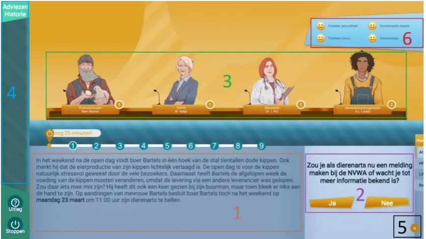
make decisions about nine different dilemmas (yes or no) to finish the game. Figure 2 shows
an impression of the user interface (UI) and structure of the OneHealth game. The intention of
this game is to make users more aware of the different perspectives of multiple stakeholders
and to get insight into what the consequences of interventions are in regard to different domains
(public health, economic impact, public concern, and animal welfare). When users are finished
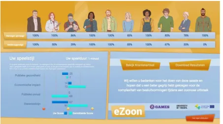
with deciding on all nine dilemmas, the game shows them a feedback screen with statistics
concerning their playing style (figure 3). The overview displays how frequently users consulted
the various characters and followed their advices, plus it indicates on how they decided relating
to various domains.
Figure 2. User interface and structure of the OneHealth game.
Figure 3. Feedback screen of the OneHealth game with statistics regarding how users played.
[image:9.595.70.524.359.611.2]specified users to achieve specified goals with effectiveness, efficiency and satisfaction in a
specified context of use”. This definition accommodates certain variables which can be used to
measure the usability for different software products. However, it is more complex to evaluate
the usability of a serious game as this is a very specific type of software, which has an additional
objective for users to let them learn by means of knowledge discovery through exploratory
learning (Moreno-Ger, Torrente, Hsieh, & Lester, 2012). In addition, the audience is also very
broad as non-gamers engage in playing as well and therefore it can occur that the target audience
‘does not get games’, which can result in a bad experience (Moreno-Ger et al., 2012). This is
important to note, because usability is also referred to as ‘easiness of use’ and is seen as one of
the predictors of a users’ intention to accept a technology and result in actual usage in the future
(Venkatesh, Tong, & Xu, 2012).
Van Gemert-Pijnen et al. (2018) explained that a game can be assessed by a heuristic
evaluation when a game is in early prototype stage, which tests where usability guidelines are
not being followed (e.g. inconsistency, incomplete navigation, opportunity, poor interaction
choices). Besides, this testing can be done with a low-fidelity prototype and mostly involves
experts on the area of human computer interaction. Nielsen (1994) is the founding father of
usability testing and provides the following usability heuristics to test a low-fidelity prototype;
1) visibility of system status, 2) match between system and the real world, 3) user control and
freedom, 4) consistency and standards, 5) error prevention, 6) recognition rather than recall, 7)
flexibility and efficiency of use, 8) aesthetic and minimalist design, 9) help users recognize,
diagnose and recover from errors, and 10) help and documentation. These principles of Nielsen
can still be taken into consideration when the usability testing is conducted. However, the
current version of the OneHealth game is already a high-fidelity prototype, which already
provides user interaction with the software. Therefore, it is chosen to test this current prototype
with users instead of experts in order to get an idea of how users navigate, how they complete
tasks, their path efficiency, potential flaws or issues in the game, and to record qualitative user
reactions about experiences, learnability and discoverability of the game (Tullis & Albert,
2008).
According to Pinelle, Wong and Stach (2008) is the concept of usability in serious
gaming most associated with the degree which a user can learn, control and understand a
game. The techniques one can use for assessing usability in serious games are heuristics,
think-aloud user testing and observational methods. Other alternative methods include
questionnaires, interviews, attendance rates, and measurement of time-on-task (Steiner et al.,
be a suitable method to assess serious games, since it measures cognitive processes. From
these data it can be inferred among other things how users cope with certain elements in a
game. Since in interactive games can happen much things at a fast rate after each other and
this can be obtrusive for users. However, eye movements cannot be always easy and clearly
be interpreted. If a person is focussing on a certain point it can have different meanings. For
instance, either a) the area is interesting, or b) the area is difficult to interpret. Therefore, it is
important that multiple methods are used along with eye tracking to have supplement data to
make more sense of the information that is gained (Olsen et al., 2010).The present study
made use of the methods eye tracking, think aloud user testing and interviews. It was tested
whether participants get lost in the game or stay focused and follow the instructed order.
Furthermore, it tested which elements are most perceived at in the game and whether
participants noticed the in-game feedback. Lastly, participants were asked whether they
understood the feedback screen and had possible suggestions to improve the game further. All
the information that followed from this data were moulded in an advice for the game
designers to improve their game.
1.6 Summary and research questions
The aim of the study is to gain more insights about how public users experience (perceive) the
user interface of the OneHealth game. This study especially zooms in on evaluating the user
friendliness and user interface of the game. The results of this formative evaluation can help to
improve the OneHealth game and therefore the game could potentially have a greater usability
and learning effect for the target group (health professionals that are associated with zoonoses).
Regarding the aim of the research, the following six research questions were formulated:
1. What is the general experience of users with the OneHealth game?
2. Which elements do participants encounter first when exploring the game overlay in the
first minute of playing?
3. How do participants explore the game and does this order change while progressing
2. Methods
2.1 Design
A qualitative empirical study is conducted to evaluate the usability and user-friendliness design
of the OneHealth game by means of eye tracking. The participants were briefly instructed how
to play the game. Onwards, they got the task to play the game and meanwhile the participants
were asked to think-aloud what they experienced. Along with eye-tracking data, which eye
movement patterns could be derived, and a post-interview the data was used to evaluate the
user experience and interface design of the OneHealth game.
2.2 Participants
All participants were selected from the general public and were gathered via the researcher’s
own network. They were approached via personal contact or via the medium Whatsapp. It was
chosen that the prospective end-users would not participate in this research, because of difficult
availability of those users and the limited time that was allocated to this study. The inclusion
criteria to be able to participate in the study were the age of participants (they had to be between
18 and 67 years old), agreement with the consent form (appendix D, in Dutch) and ability to
speak and read Dutch.
In total, five female participants (n=5) and one male participant (n=1) were selected for
testing the OneHealth game. All the participants (n=6) had the Dutch nationality and their mean
age was 35,7 years (SD=14.94). Their occupation was either student or teacher. No eye tracking
data is available for two participants (n=2), since difficulties arose with the eye tracking device
on the day the data collection took place. The quality of the gaze samples of the eye tracking
were sufficient in three cases (n=3) to be useful for this study (97%, 98%, and 98%). The eye
tracking data of one participant (n=1) needed to be excluded, since this gaze sample was only
81% due to partially failed calibration and therefore not satisfactory for analysing. All six
participants (n=6) thought aloud while playing the OneHealth game and every participant
2.3 Procedure
Before starting with the data collection there was a request submitted to the BMS ethics
committee (EC), who approved to execute the research about the OneHealth game. The whole
research was conducted in the Dutch language for all participants. There was no maximum
duration for participants clicking through the various dilemmas, although the maximal time
limit for playing the game was 25 minutes. Every participant was tested individually, and each
session started with the researcher verbally explaining what the purpose of the research was to
the participants and also what kind of data collection methods were used to gather all the data
needed for research (appendix A, in Dutch). When participants understand and agreed to these
terms of the experiment, together with signing the consent form (see appendix B), the research
could begin. First, the participant got an information sheet with an explanation on how the game
works (see appendix C, in Dutch). Subsequently, the researcher assigned a previously
determined condition to them (human, public, or veterinary health) to ensure an equivalent
distribution of conditions along the six participants. Then, the researcher started the calibration
procedure of the eye tracking glasses for the participant. They had to look at the cross of the
back of a tablet to calibrate their eyes to the eye tracking equipment. After calibrating the
glasses, the researcher started the game along with the audio recording. Besides, the researcher
was constantly present with the participant while the procedure was recorded in the room by
means of video and audio. At the same time of playing the game, the participant had to think
aloud, and the researcher could stimulate them if they were too silent with a sentence like; ‘what
are you thinking or doing right now?’. After finishing the game a post-interview was conducted
(appendix D) to log their experiences and comments. One example question of the interview
was: ‘What was your impression of the feedback screen?’
2.4 Material
The room that was used during this study was flex room 4 of the Design lab at the University
of Twente. In this room there was a desktop computer running operating system Windows 10
and the OneHealth game installed on it. Furthermore, the eye tracking equipment (Tobii Pro
Glasses has two cameras per eye to determine the reflection of the light source on the cornea
(glint) and in the pupil. Hereby fixations and saccades are measured in milliseconds in
combination with a video recording of what the participant is looking at, with a camera on the
front of the device. Kiili, Ketamo & Kickmeier (2014) state that fixations are: ‘processing of
attended information with stationary eyes’ and saccades are: ‘quick eye movements occurring
between fixations without information processing’. They also state that fixations usually last
for approximately 200-500 milliseconds depending on the task.
All post-interviews were semi-structured based on an interview schedule (appendix D).
Questions were asked according to the following consecutive themes: general impression,
knowledge gained, in-game feedback indicator, feedback screen, game rating (1-10),
suggestions, and possible remarks of the study. The post-interview consisted of mainly open
questions and the participant was verbally encouraged (‘yes’, ‘ok’, ‘hmm’) by the interviewer
to gather as much information as possible. Also, the participant was motivated by the
interviewer to explain their answer in detail to clarify their opinion (‘Can you specify this answer?’, ‘Could you tell me more about that?’, ‘Can you name an example of that’?). Lastly,
general demographics were noted (age, gender, occupation).
2.5 Data-analysis
All analysis of eye fixations was done with the software Tobii Pro Lab (x64). Eye tracking data
which had above 15% of missing gaze samples was excluded of the analysis. Heatmaps and
gaze plot patterns were extracted of the eye tracking data and those are visualizations that can
communicate important aspects of visual behavior (Tobii Pro, 2019a). Gaze plots show the
location, order and time spent looking at specific elements on the stimulus and the diameter of
the fixation circles indicates the attention time (larger circle if looking longer) (Tobii Pro,
2019a). Heat maps indicate how one’s looking is distributed over the stimulus and it does not
say something about the order of looking or focus on individual fixations (Tobii Pro, 2019a).
However, it does say something about the amount of times that an eye points to a pixel. If one
is fixating more often to a pixel it shows a ‘hotter’ colour on the heatmap (Farnsworth, 2016).
Thus, an element is stronger perceived if red, less perceived if yellow till green and not
considered if there is no colour visible on the heat map. The gaze filter that was used for
analysing the data was: Tobii- I-VT (Attention).
The analysing of textual data was done inductively, and overarching themes were
aloud data, post-interviews and summaries of feedback screen were analysed by one coder. The
eye tracking- and thinking aloud data of dilemma 1, 5, and 9 were used for analysis. These
different dilemmas were marked out in the software Tobii Pro Lab (x64) for each participant
independently. The participant’s thinking aloud of dilemma 1, 5 and 9 plus the post-interviews
were anonymously transcribed verbatim (appendix E). Besides, a summary was made out of
points that participants thought aloud during the feedback screen (appendix E). Lastly, the
post-interview provided relevant quotes of individual participants attributed to categories. When
participants had similar quotes, it was maintained and reported in the results sections. In
summary, the six research questions were answered with the following data:
1. “What is the general experience of users with the OneHealth game?”
Interview questions 2, 3 and 7 were used to answer this question (appendix d). Experiences of
participants were inductively coded from the data and ordered thematically by positive and
negative experiences. Lastly, quotes from the data were used to clarify the experiences.
2. “Whichelements do participants encounter first when exploring the game overlay in the first
minute of playing?”
Figure 4 displays the distinctive elements that participants could encounter during the game.
All thinking aloud data of dilemma 1 is used to answer this question.Also, the eye tracking data
of the first sixty seconds of dilemma 1 was analysed to answer this question. These sixty
seconds started after the participant clicked the condition (human, public, or veterinary health)
and ‘ga verder’ on the update screen. From these first sixty seconds of dilemma 1, gaze plots
were created independently of participants. The fixations within this gaze plot indicated
numbers in a subsequent order of where a participant looked first and thereafter. Furthermore,
a heat map with all participants’ eye tracking data combined was constructed. The heat map
indicated with spots of red, orange, green or no colour visible where participants in general
Figure 4. The elements of the game. Legend: 1=story, 2=dilemma, 3=characters, 4=opinions history, 5=extra information tab, 6=in-game feedback.
3. “How do participants explore the game and does this order change while progressing
through the 9 dilemmas?”
Gaze plots of participants were independently constructed of dilemma 1, 5 and 9. It was
analysed whether participants followed the instructed pattern of the elements; story (1),
dilemma (2), and consulting characters (3) (figure 2). It was descriptively written down which
patterns participants followed by looking at the gaze plot numbers. The researcher looked at the
sequence of numbers and if fixations were positioned in elements (figure 2). Consequently, it
was determined by the sequence of numbers, which elements first were perceived by
participants. Besides, if an irregular pattern was noted from the participant, then the first fifteen
seconds are shown in a figure to give an example of the incorrect pattern. Lastly, all thinking
aloud data of dilemma 1,5 and 9 was used to answer this question.
4. “To what extent is the in-game feedback perceived by the participants in dilemma 1, 5 and 9
and what do participants think of the in-game feedback?”
The eye tracking data of dilemma 1, 5, and 9 was analysed to answer this question. From these
dilemmas a gaze plot was created for each dilemma- and participant separately to analyse if
there was any fixation on the in-game feedback. If there was a fixation circle (or more) in the
element of in-game feedback, then it was looked at by pointing on the circle how many
of a participant were added up and if all fixations were > 0.300 ms, it counted as in-game
element perceived for that dilemma. Additionally, the thinking aloud data was used of dilemma
1,5 and 9 to note if participants mentioned the in-game feedback verbally. Lastly, interview
question 5; ‘‘wat vond u van de tussentijdse indicatoren van de verschillende domeinen?’’ is
used to get information about what people thought of in-game feedback. During this question
was the basic screen attachment shown to them to indicate what was meant by the in-game
feedback (appendix c). Remarks of participants were inductively coded from the data and
ordered thematically. Quotes from the data were used to clarify the themes.
5. “To what extent do participants perceive the feedback screen?”
The summaries of the thinking aloud data during the feedback screen and interview question 6;
“wat vond u van het feedback scherm?” was used for answering this question. During this
question was the feedback screen attachment shown to them to indicate what was meant by the
feedback screen (appendix c). Furthermore, positive and negative remarks about their
experiences were inductively coded from the data and ordered thematically. Lastly, quotes from
the data were used to clarify the themes.
6. “What suggestions do participants provide in order to improve the OneHealth game?”
Interview question 8; ‘‘Heeft u suggesties om de game te verbeteren?’’ is used to answer this
question. Suggestions of participants were inductively coded from the data and ordered
3. Results
3.1 The general user experience
The first research question was “What is the general experience of users with the OneHealth
game?” The general impression of the game is good, since the mean grade was an 8 (SD=0.32).
One participant indicated that the game was very colourful, cosy and easy to use. Moreover,
one felt excitement by the surprise effect while playing the game:
“Ik vond het leuk dat je van tevoren niet weet wat voor wending het krijgt. Dus ik vind het een
verrassingseffect hebben. Dat je niet weet welke kant het op gaat.”
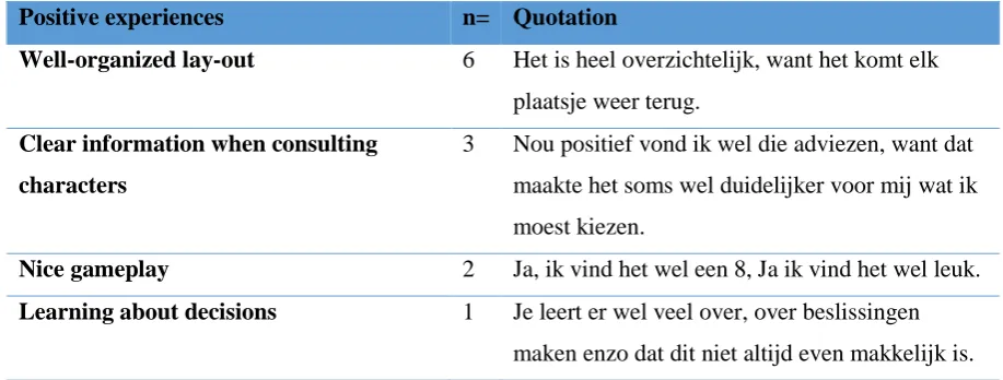
Table 1 shows the positive remarks made by the participants. All participants (n=6) mentioned
that they liked the organized lay-out. For example, they found the lay out beautiful, easy to use,
or often was mentioned that they found the structure/storyline clear to them. Furthermore, half
of the participants (n=3) liked the clear and added value of information in the text when
consulting the opinions of the characters. In addition, two participants (n=2) liked playing the
game. One participant (n=1) learned much about making decisions. Lastly, one participant
(n=1) found the dilemmas clear and understandable:
[image:18.595.68.527.562.736.2]“Ik vond de uitleg van het dilemma wel duidelijk en kort, bondig.”
Table 1
Positive experiences of the game
Positive experiences n= Quotation
Well-organized lay-out 6 Het is heel overzichtelijk, want het komt elk plaatsje weer terug.
Clear information when consulting
characters
3 Nou positief vond ik wel die adviezen, want dat maakte het soms wel duidelijker voor mij wat ik moest kiezen.
Nice gameplay 2 Ja, ik vind het wel een 8, Ja ik vind het wel leuk.
Table 2 shows negative experiences of participants. One negative point was mentioned by three
participants (n=3) and this was about the in-game feedback which was barely noticed by half
of the participants and was difficult to comprehend. Second, two participants (n=2) had
difficulties with the characters’ legibility of the text, since the font of the text is relatively small
with not much space in between. Also, two participants (n=2) mentioned that there were some
spelling mistakes in words or dilemmas. In addition, one participant (n=1) was not immediately
understanding the extra information tab and found it a little bit unclear to use. Lastly, one
participant (n=1) found it strange that during playing it was needed to decide as a veterinary
doctor while playing the game from the perspective of the public health:
“Als ik kijk naar het spel is het wel raar dat ik als dierenarts moet beslissen, terwijl ik eigenlijk
[image:19.595.65.525.363.635.2]een huisarts ben.”
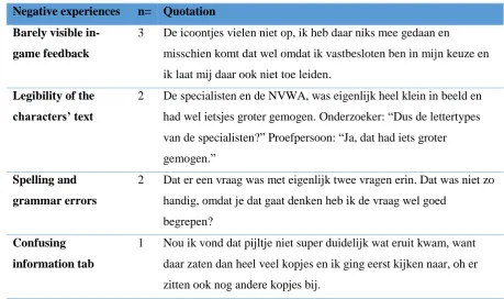
Table 2
Negative experiences of the game
Negative experiences n= Quotation
Barely visible
in-game feedback
3 De icoontjes vielen niet op, ik heb daar niks mee gedaan en
misschien komt dat wel omdat ik vastbesloten ben in mijn keuze en ik laat mij daar ook niet toe leiden.
Legibility of the
characters’ text
2 De specialisten en de NVWA, was eigenlijk heel klein in beeld en had wel ietsjes groter gemogen. Onderzoeker: “Dus de lettertypes van de specialisten?” Proefpersoon: “Ja, dat had iets groter gemogen.”
Spelling and
grammar errors
2 Dat er een vraag was met eigenlijk twee vragen erin. Dat was niet zo handig, omdat je dat gaat denken heb ik de vraag wel goed
begrepen?
Confusing
information tab
3.2 The first minute of playing
The second research question was “Which elements do participants encounter first when
exploring the game overlay in the first minute of playing?” Almost all participants (n=5)
generally viewed within the first sixty seconds the introduction story of the game and thereafter
reading the dilemma, before potentially asking for advice from the characters. This becomes
clear of the thinking aloud data of dilemma 1 (appendix E), since the first thing that participants
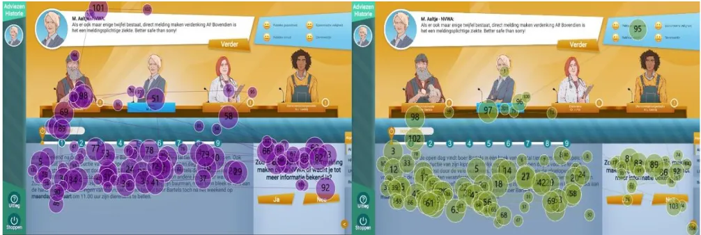
said while thinking out loud is that they started with reading the story. Also, the gaze plot data
of two participants (n=2), supported this pattern (figure 5). These two participants start first
reading the story and thereafter reading the dilemma and then consulting the characters.
However, one participant (n=1) first focused on the story and after this on the characters in the
first minute of playing (see figure 6). In the interview it is explained by the participant that one
thought that this was actually the order that needed to be followed.
“Het was wel echt een duidelijke structuur van je keek echt automatisch al eerst naar het
verhaal, vervolgens naar de meningen en dan naar de dingen, het staat allemaal wel op
[image:20.595.69.572.427.596.2]volgorde.”
Figure 6. Participant focusing on the story and then characters in the first sixty seconds of dilemma 1.
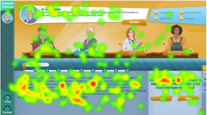
Furthermore, the heatmap of the first minute also underpins that the focus of the participants
laid on the story and dilemma, since red spots are visible here (figure 5). On the element of
“characters” is fixated at by participants, but not too long (yellow/green), and the two characters
on the left side were focused more on (characters have more green dots) then the two persons
on the right side (figure 7). Moreover, it becomes clear from figure 5 that the elements of
‘opinions history’ and ‘in-game feedback’ are barely seen by the participants during the first
minute of playing the game and these elements were also not mentioned during thinking aloud.
Lastly, the tab with the extra information about definitions was according to the eye tracking
[image:21.595.70.431.547.748.2]3.3 Exploring the game
The third research question was “How do participants explore the game and does this order
change while progressing through the 9 dilemmas?” Two of the participants (n=2) without eye
tracking data have followed during dilemmas 1, 5 and 9 the pattern as instructed. In all
dilemma’s (1, 5, and 9) they started with reading the story (a), then the dilemma (b), and after
this they asked for advice from the characters (c). One participant (n=1) without eye tracking
data did not follow always this specific element order as no characters were consulted at all
during dilemma 1 and 5 (a-b).
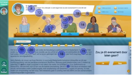
Moreover, it appeared from the eye tracking data that one participant (n=1) had a
different pattern in dilemma 1 than others with eye tracking data. Namely, the participant started
with the story and sequentially with consulting the characters, before reading the dilemma
(a-c-b). Another participant first started to scan the characters of dilemma 9, before starting to read
the story (c-a-b) (figure 8). Concluding, no other significant abnormalities were noticed about
the order that participants took during the game. Table 3 summarizes all patterns and overall
[image:22.595.68.532.435.531.2]the instructed pattern (a-b-c) was the most obeyed by participants (n=14).
Table 3
Summary of element order of the game during different dilemmas.
Order Dilemma 1 Dilemma 5 Dilemma 9 Total
a-b-c n=4 n=5 n=5 n=14
a-b n=1 n=1 n=0 n=2
a-c-b n=1 n=0 n=0 n=1
c-a-b n=0 n=0 n=1 n=1
Instructed pattern by researcher; a) reading story, b) reading dilemma, c) consulting characters.
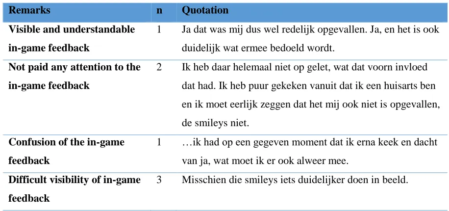
[image:22.595.72.352.563.722.2]3.4 Perception of the in-game feedback
The fourth research question is “To what extent is the in-game feedback perceived by the
participants in dilemma 1, 5 and 9 and what do participants think of the in-game feedback?”
From the thinking aloud data it showed that no one of the six participants (n=6) is mentioning
anything verbally about the in-game feedback while playing through dilemma 1, 5 and 9.
However, eye tracking data indicates that the in-game feedback was perceived a couple times.
During dilemma 1, there is one participant (n=1) who fixates for a total of 800 milliseconds on
the element in-game feedback (two fixation points). Moreover, during dilemma 5 is the in-game
feedback shortly perceived by two participants (n=2) for respectively 520 and 400 milliseconds
(both had two fixation points). In dilemma 9 is the in-game feedback perceived by one
participant (n-1) for a total of 1339 milliseconds (two fixation points). All outcomes per
dilemma are summarized in table 4 and it shows that there was in total more no fixation on
in-game feedback (n=5), than fixation on in-in-game feedback (n=4). Lastly, one participant (n=1)
[image:23.595.68.476.416.551.2]did not perceive the in-game feedback at all in dilemmas 1, 5 and 9.
Table 4
Perception of in-game feedback in dilemma 1, 5 and 9 according to eye tracking data (n=3)
Dilemma Fixation on in-game feedback No fixation on in-game feedback
1 n=1 n=2
5 n=2 n=1
9 n=1 n=2
Total n=4 n=5
Table 5 shows the opinions of the in-game feedback that came forward during the interview
(n=6). On the one hand, there was one positive remark on this element about the visibility and
understanding of the in-game feedback. On the other hand, two participants (n=2) did not pay
any attention to the indicators while playing. Moreover, another participant (n=1) did not really
Table 5
Remarks of the in-game feedback
Remarks n Quotation
Visible and understandable
in-game feedback
1 Ja dat was mij dus wel redelijk opgevallen. Ja, en het is ook duidelijk wat ermee bedoeld wordt.
Not paid any attention to the
in-game feedback
2 Ik heb daar helemaal niet op gelet, wat dat voorn invloed dat had. Ik heb puur gekeken vanuit dat ik een huisarts ben en ik moet eerlijk zeggen dat het mij ook niet is opgevallen, de smileys niet.
Confusion of the in-game
feedback
1 …ik had op een gegeven moment dat ik erna keek en dacht van ja, wat moet ik er ook alweer mee.
Difficult visibility of in-game
feedback
3 Misschien die smileys iets duidelijker doen in beeld.
3.5 Perception of the feedback screen
The fifth research question is “To what extent do participants perceive the feedback screen?”
Table 6 shows that for five participants (n=5) it was clear what was meant with the feedback
screen. However, half of all participants (n=3) needed time to interpret the table since they
found it unclear. One participant (n=1) mentioned that there was ambiguity whether the average
score was referring to the general practitioner (the condition that one had to play) or to
everybody that plays this game. Moreover, four participants (n=4) mentioned that they missed
the names of the characters at the top of the feedback screen as they could not remember
anymore who which person was. Furthermore, four participants (n=4) did not saw directly the
emoticons in the feedback table. They first had to look very precise to discover that there were
emoticons in the lower level of the table. Lastly, two participants (n=2) found it interesting that
Table 6
Experiences of the feedback screen
Experiences n Quotation
Understanding feedback
table
5 Deze was wel duidelijk, je hebt wel snel door wat jouw score is en wat de gemiddelde score is.
Difficulties interpreting
feedback table
3 …Ik vond deze tabel sowieso niet heel duidelijk met die balkjes. …want nu is het een beetje raar in het begin en moest ik even goed kijken hoe ik het moest interpreteren.
Ambiguity of the feedback
screen considering averages
1 Is dit een gemiddelde score van een huisarts of van iedereen?
Identity of characters was
unclear as nametags were
lacking
4 Ja, ik wist op een gegeven moment niet meer de personages, het stond er niet meer bij wie wat was en dat had ik niet zo snel onthouden.
Difficult visible emoticons at
the feedback table
4 Onderzoeker: “En het tabelletje eventueel, snap je dat?” Proefpersoon: Nee, want ik zit te kijken naar de min en toen ik beter ging kijken zag ik wel de gezichtjes.
Great value of feedback 2 Ja, euh het is zo dat je uw score en de gemiddelde score met elkaar gaat vergelijken en dan is het wel interessant om daarover door te praten wat dan gemiddeld is.
3.6 Suggestions to improve the OneHealth game
Finally, the sixth question was asked for participants to give suggestions what could be
improved on this first prototype game: “What suggestions do participants provide in order to
improve the OneHealth game?”. Four participants (n=4) mentioned that the indicators of the
in-game feedback could be made more notable, for instance with a pop-up window. Moreover,
two participants (n=2) are mentioning that it could be convenient to highlight various elements
so that it is clearer where to look. Furthermore, one participant (n=1) is suggesting that all text
of characters should be put in one text block to prevent missing some information. In addition,
one participant (n=1) recommends adding the professions of the characters to the feedback
Table 7
Suggestions for improving OneHealth game
Theme n Quotation
Make in-game feedback more notable 4 Ja mag iets meer opvallen en zeker als er iets verandert ofzo, en dat je dan een flitsmelding krijgt ofzo.
Highlight elements to know where to
look first
2 …misschien dan dat het deel waar je eerst naar moet kijken het verhaal eerst oplicht en vervolgens de stelling oplicht en daarna de personen.
One whole text block when characters
give advice
1 Ja, ik zou als ze wat zeggen dat in één tekstblokje doen in plaats van twee.
Adding professions of characters at
feedback screen
1 … maar op dat laatste scherm wel die “beroepen” erbij.
Make difficult words bold in the text
for clarification, if they can be looked
up
1 ’Maar misschien is het ook handiger om de moeilijke woorden of de woorden die je dan kan opzoeken dik te drukken ofzo, want nu zie je soms van die woorden en dan weet je niet of ze erin staan…
Deleting the element ‘opinions
history’ in the user interface
4. Discussion
The goal of this study was to gain more insight in the user-friendliness and usability of the
OneHealth prototype game. Alongside, the focus was on how participants would perceive
certain elements of the game and their experience while playing the game. It turned out that the
focus of all participants was lying especially on reading the story and the dilemma. Besides, it
became clear that the instructed sequence of the game was followed consistently by most of the
participants (first reading the story, then the dilemma, and finally consulting characters before
deciding on the dilemma). Furthermore, the participants generally mentioned that they
perceived the game as well playable with a nice lay-out and rated the game high. However,
there were still some improvements suggested by participants to further improve the game. The
most necessary suggestions to implement are: 1) highlight elements in the game to let users
know where to look first, 2) make the in-game feedback more notable, 3) add nametags of
characters’ profession at the feedback screen, and 4) integrate the definitions at the information
tab within the text.
4.1 Game persuasion
When reflecting on the outcomes of this study it can be concluded that this game can be made
more persuasive. Participants suggested to implement possible highlighting or blinking for
certain elements. This blinking falls under the principle that Nielsen (1994) calls the ‘visibility
of system status’. This refers to how the systems conveys its users what its state is. In this case,
the highlighting of an element would suggest that it needs attention and that the user must focus
on that specific part. Kukkonen and Harjumaa (2009) suggested a framework called persuasive
systems design (PSD) to evaluate persuasive systems and to describe the functionality of
software. They list 28 design principles that are categorized into primary task, dialogue, system
credibility and social support. The blinking of elements can be categorized under the primary
task support, respectively the principle of ‘reduction’ (Kukkonen & Harjumaa, 2009).
immediately present a text block pop-up with the meaning of the term. Sailer, Hence, Mandl,
and Klevers (2014) mention that it is likely that players get more motivated when a feeling of
flow is provided by direct feedback. Thus, giving immediate feedback can make the user
interface easier (user friendly) and this can get the player more motivated to get emerged in the
game.
In addition, the principle of ‘tunneling’ in the category primary task support is also
applied here, since the highlighting of elements could possibly guide users through the game
faster. Therefore, users are more engaged, instead of being constantly attentive and looking for
where to navigate (Kukkonen & Harjumaa, 2009). Moreover, the highlighting of elements
could persuade users to be more concentrated on the content, especially when content is
personalized to the discipline that they work in (Kukkonen & Harjumaa, 2009). For instance, if
users play the game from the public health perspective and the game presents their perspective
in bold and more apparent, it can possibly be more motivating to engage in the game. This
example is in line with the principle of ‘similarity’ and falls under the category of dialogue
support. Another principle that falls under this category is ‘praise’ and this principle can make
users more open to persuasion (Kukkonen & Harjumaa, 2009). An example of ‘praise’ could
be that when a character is consulted by a user, it first gives an audio fragment wherein the
character cheers the user for asking them for advice.
4.2 Reversed Gutenberg Diagram
The results indicated that overall users play the game in the right sequence (story, dilemma, and
then consulting characters). However, it is remarkable that the elements of ‘opinions history’,
‘in-game feedback’, and ‘extra information tab’ are not at all or hardly perceived by
participants. A first argument for why these elements are not perceived is that they do not
represent a core-element of the game and all attention is going to other elements that are text
heavy (story and characters’ advices) or are important to make progress in the game (dilemma).
A second argument for why these elements are not perceived is because of The Gutenberg
Diagram (figure 9). A Gutenberg pattern is often applied to text-heavy content as the OneHealth
game has. A Gutenberg diagram divides a page or screen into four quadrants. In the top left
corner, the primary optical area is located. Subsequently, in the top right the strong fallow area
is located. In the bottom left the weak fallow area is located, and lastly in the bottom right the
terminal area is located (Bradley, 2011). The theory is that the upper right quadrant ‘strong
screen from the left edge to the right edge. Simultaneously, it constantly moves a bit down from
the primary area to the terminal area, which is called ‘reading gravity’ (Bradley, 2011). Because
of the reading gravity the theory states that strong and weak fallow areas fall outside the gravity
path and therefore get less attention unless they are emphasized visually.
In the OneHealth game this pattern of Gutenberg is seen reversed as the user must start
to read in the left corner. This is therefore the primary optical area in the game and the terminal
area is the opposite. In this case, that is where the in-game feedback is located. The strong
fallow area is where the dilemma and ‘extra information tab’ is placed and the weak fallow area
is where the ‘opinions history’ is placed. From this information one can argue that the ‘opinions history’ is not perceived, since it is in the weak fallow area and not accentuated. The element
in the information tab is in the strong fallow area, and gets a bit more attention, since a crucial
element ‘dilemma’ is also placed there and is needed to progress in the game. However, it seems
that participants almost never finish the Gutenberg diagram in the OneHealth game, since the
in-game feedback is not often perceived or not perceived long. A possibility of this outcome is
that users are getting distracted in the middle of the diagram when consulting characters and
confuse this area as the terminal area, because of the level of interactivity that takes place
between the user and the game. To get more attention of users to the in-game feedback, it is
important that it is placed or that it is popping-up along the reading gravity path (Bradley, 2011).
Another possibility could be to delete the element of ‘opinions history’ as participants
completely ignored this element while playing the game. Therefore, more space is available to
redesign the game and to place the in-game screen feedback more in the picture and not in the
[image:29.595.72.251.546.726.2]5. Strong points and study limitations
The strong points of this study were that the eye tracking device was accurately measuring the
movements of the participants’ eyes and the calibrated software displayed the gaze data clearly.
These gaze plots and heatmaps made it easy to interpret the eye tracking data. Furthermore, the
participants were native speakers and therefore could fully understand the game. Also, much
input was collected from the participants to make recommendations to the game creator for
further improving the OneHealth game.Another positive point is that it was a qualitative study
with interviews that were mainly posing open questions, instead of using a quantitative method
such as a questionnaire with a Likert scale. This open stance towards freedom of giving answers
resulted in richer data to work with.
However, there were some limitations of the research that was conducted. During the
research, the purpose was that participants needed to say everything out loud that they were
thinking while playing the game. Despite all the effort, it appeared from reality that participants
were constantly focused on reading the text heavy game and found it difficult to constantly
think aloud at the same time. The researcher tried to motivate the participant and interrupt the
participants with questions of ‘what are you doing right now?’. Although, this did not work
very well and therefore the thinking aloud data during dilemma 1, 5 and 9 is very minimal and
potential opinions or feelings are missed. This could mean for the conclusion that usability
flaws are missed and unreported. Moreover, the participants were not cognitively focused on
only the eye tracking task, which could cause that the eye tracking data is biased. For example,
while thinking aloud one could gaze or focus more to one point or look upwards when thinking
about what to say out loud. To make the eye tracking data more valid and reliable it is important
that thinking aloud is done retrospectively and not during the task itself.
Secondly, this game was still a pilot version. The instruction of the game was given on
paper and not integrated with a tutorial in the game itself. This has biased the conclusion, since
one person did not understand the explanation of the game correctly and has mistaken how to
follow the order of the elements. Since it was a small sample of participants, this has
implications on the conclusion as this person stood out as an exception of the other participants.
Thirdly, the sample was small (n=6) and eye tracking data was only available for three
participants (n=3). This meant for the heatmaps that the data was limited (n=3) to infer reliable
patterns. Of the other three persons without eye tracking data it could be only decided which
path of elements they took by using the thinking aloud data.
Lastly, the researcher knew the participants personally and was unexperienced with
usability research. It turned out while transcribing the thinking aloud data and post-interviews,
that the researcher had sometimes directed the participants too much towards a certain response
or action. For example, it was mentioned to a participant that one also could consult characters
after clicking instantly through dilemma 1. This biased the eye tracking data of one participant,
since one would otherwise maybe feel no obligation to consult any character at all during other
dilemmas. In this case the participants’ behaviour could be perhaps provoked by a lead of the
researcher. Thus, the results of this participant are not fully authentic and therefore the
6. Recommendations
In the first place, the purpose of this game was to enhance the communication between the
different stakeholders. Although, some aspects are not yet fully optimal to accomplish this goal,
it is recommended that the indicators (emoticons) of the in-game feedback are designed larger
in order to make it clearer and less likely that users miss important information. In the second
place, an instruction of the in-game feedback can be implemented into the game that explains
what it tries to communicate and explain the domains more clearly to the user. In this manner
participants could perhaps be more attracted to the in-game feedback and be more aware of the
consequences their decisions have on certain domains. Furthermore, the user interface design
of the feedback screen can be made more user friendly by making the emoticons in the table
more visible and a re-design of the table as participants now struggled to interpret the results.
Similarly, on the top of the feedback screen it is also often unclear which party or character one
has asked for advice. Therefore, it is recommended that nametags of characters’ profession are
added at the feedback screen, so that users are more aware of the parties they have supported
7. Future research
To develop the game further it is important that another usability testing is done with the
instruction implemented in the game and with more participants to check whether there are
differences in results. Future research can investigate whether users are more inclined to look
up concepts wherein the definitions are integrated in the text in comparison with the current
version of the ‘extra information tab’. In addition, future studies should use the Serious Game
Usability Evaluator (SeGUE) to code their collected data (Moreno-Ger et al., 2012). This tool
is especially designed for evaluating serious games and to differentiate between two dimensions
(system- and user related events). The system related events are addressing six different event
categories; game design (1. Functionality and 2. Game flow), game interface and
implementation (3. Layout/UI, 4. Content, 5. Technical errors), and 6. A nonapplicable category
for events that are not directly related to the system. The user related events are addressing ten
different categories; negative emotions (1. Frustrated, 2. Confused, 3. Annoyed, 4. Unable to
continue), positive emotions (5. Learning, 6. Reflecting, 7. Satisfied/excited, 8. Pleasantly
frustrated) or neutral (9. Nonapplicable and 10. Suggestion/comment) (Moreno-Ger et al.,
2012).
Next, three examples are given to apply this tool in future research on the OneHealth
game. First, on the area of ‘functionality’, it can be questioned in an interview with end-users if they attach value to the ‘history opinions’ element in the OneHealth game. If they would
perceive this element as unnecessary, it can be considered to delete it as health technology
must be according to step two ‘value specification’ of the CehRes Roadmap tailored to the
values and interests of users (Van Gemert-Pijnen et al., 2011). Second, on the area of
Layout/UI, it can be quantitatively examined by means of eye tracking whether the faces of
the characters take up lots of processing time. This could be measured by the metric ‘areas of interest’ (AOI), to count how many fixations were counted on certain elements. Also, this
metric shows how much time was spent by the participants at the region and how much time
passed from stimulus onset until they see the element for the first time. These quantitative
8. Conclusion
Concluded can be that a first impression is created of how users perceived and experienced the
user interface of the OneHealth game. Overall the user experience was good, and participants
labelled the lay-out as well-organized. In the first minute the participants encountered the game
overlay, their focus mostly laid on the text-heavy story and the dilemma. Furthermore, the
participants generally executed the navigation through the game like the developer intended.
However, the game element ‘in-game feedback’ was not perceived often and could be made
more visible, relocated and/or better explained in an improved version of the game.
Furthermore, the participants did understand the feedback screen and gave multiple suggestions
for making improvements to the user interface. Further research is recommended to see if
comparable results can be achieved and to test with a more advanced version of the OneHealth
game, which has an instruction implemented within the game. At last, the SeGUE tool makes
the coding process more structured, so that research in the field of serious games can be done
References
Atlasinfectieziekten. (n.d). Q-koorts. Retrieved from: www.atlasinfectieziekten.nl/q-koorts
Beerlage-de Jong, Köhle, N., Braakman-Jansen, L.M.A., Siemons, L., Van Gemert Pijnen,
J.E.W.C. (2017). Van ‘vreemde vogels’ en vogelgriep. Retrieved from:
https://www.rivm.nl/van-vreemde-vogels-en-vogelgriep
Beerlage-de Jong, N., van Gemert-Pijnen, J. E. W. C., Wentzel, M. J., Hendrix, R., & Tjin-
Kam-Jet-Siemons, L. (2017). Technology to support integrated Antimicrobial
Stewardship Programs: a user centered and stakeholder driven development approach.
Infectious disease reports, 9(1), 36-41. doi:10.4081/idr.2017.6829
Bradley, S. (2011). 3 design layouts: Gutenberg Diagram, Z-pattern, and F-pattern. Retrieved
from: https://3.7designs.co/blog/2009/01/the-gutenburg-diagram-in-design/
Dondlinger M (2007) Educational video game design: A review of the literature. Journal of
Applied Educational Technology, 4(1): 21–31. Retrieved from:
https://www.researchgate.net/publication/238444705_Educational_Video_Game_Desi
gn_A_Review_of_the_Literature
Farnsworth, B. (2016). How to analyze and interpret heatmaps. Retrieved from:
https://imotions.com/blog/analyze-heat-maps/
Fogg, B. J. (2002). Persuasive technology: using computers to change what we think and do.
Ubiquity, 2002(December), 5.
Fogg, B. J. (2003). Persuasive technology: using computers to change what we think
and do. Boston: Morgan Kaufmann Publishers.
Gee, J. P. (2007). Good video games and good learning. New York: Lang.
Gibbs, E. P. J. (2014). The evolution of One Health: a decade of progress and challenges for
the future. Veterinary Record, 174(4),85–91. doi:10.1136/vr.g143
Growth Engineering (n.d.). What are serious games? Retrieved from:
https://www.growthengineering.co.uk/what-are-serious-games/
Holmstrup, P., Klausen, B. (2018).The growing problem of antimicrobial diseases. Oral
Olsen, A., Smolentzov, L., & Strandvall, T. (2010). Comparing different eye tracking cues
when using the retrospective think aloud method in usability testing. In Proceedings of
the 24th BCS Interaction Specialist Group Conference. 45-53.
Kukkonen, H.O., & Harjumaa, M. (2009) Persuasive systems design: key issues,
process model, and system features. Communications of the Association for
Information Systems, 24. 28. Retrieved from: https://aisel.aisnet.org
Nielson, J. (1994). Usability engineering. San Francisco, CA: Morgan Kaufmann.
Pinelle, D., Wong, N., & Stach, T. (2008). Heuristic evaluation of games: Usability principles
for video game design. In Proceedings of CHI 2008. 1453-1462.
Rittel, H.W.J., Webber, M.M. (1973). Dilemmas in a general theory of planning. Policy
Sciences, 4, 155–169. doi:10.1007/BF01405730
RIVM. (2019a). Q-koorts. Retrieved from: https://www.rivm.nl/q-koorts
RIVM. (2019b). Ziek door dier. Retrieved from https://www.rivm.nl/ziek-door-dier
RIVM. (2019c). Zoonotic diseases. Retrieved from: https://www.rivm.nl/en/zoonotic-diseases
Sailer, M., Hense, J., Mandl, J., & Klevers, M. (2014). Psychological perspectives on
motivation through gamification. Interaction Design and Architecture Journal, 19,
28-37.
Steiner, C., Hollins, P., Kluijfhout, E., Dascalu, M., Albert, D., Westera, W., & Nussbaumer,
A. (2015). Evaluation of serious games: a holistic approach. In ICERI2015: 8th annual
International Conference of Education, Research and Innovation. 4334-4342.
Ter Horst, M.F., Köhle, N., Braakman-Jansen, L.M.A., Beerlage-de Jong, N., Snoep, A., Van
Gemert Pijnen, J.E.W.C. (2018). OneHealth Hub. Infectieziekten Bulletin, 29(11).
Retrieved from: https://magazines.rivm.nl/2018/04/infectieziekten-bulletin-
0/oneHealth-hub
Moreno-Ger, P., Torrente, J., Hsieh, Y. G., & Lester, W. T. (2012). Usability testing for
serious games: Making informed design decisions with user data. Advances in
Human-Computer Interaction, vol. 2012, doi:10.1155/2012/369637.
Tempelman, C., Prins, J., & Koopmans, C. (2011). Economische gevolgen van de uitbraak
van Q- koorts. Retrieved from: http://www.seo.nl/uploads/media/2011-
15_Economische_gevolgen_van_de_uitbraak_van_Q-koorts.pdf
Tobii Pro. (2019a). How do Tobii Eye trackers work? Retrieved from:
https://www.tobiipro.com/learn-and-support/learn/eye-tracking-essentials/how-do-