We are taught that user feedback should be collected and utilized throughout the system’s development lifecycle of any application, however, this is not always done in practice. This was the case for UNC’s official mobile application CarolinaGo. As project manager of CarolinaGo, I am not aware of any previous such internal attempts to have users evaluate the application. I decided this would be an excellent opportunity to apply my knowledge of usability studies with the goal of producing actionable recommendations for the improvement of the app. I recruited ten students as participants to complete this task-based think-aloud usability study which also included a System’s Usability Scale questionnaire and a post-task interview. After analysis of their likes, dislikes, errors, frustrations, and suggestions I have come up with several
recommendations that I think would greatly increase the usability and utility of the application.
Headings:
Usability Testing
A USABILITY STUDY OF THE CAROLINAGO MOBILE APPLICATION
by
James Councill Leak
A Master’s paper submitted to the faculty of the School of Information and Library Science of the University of North Carolina at Chapel Hill
in partial fulfillment of the requirements for the degree of Master of Science in
Information Science.
Chapel Hill, North Carolina April 2018
Approved by:
Table of Contents
Table of Contents ... 1
Introduction ... 3
Literature Review ... 5
Background on Usability Studies ... 5
Study Goals and Task Selection ... 7
Think-aloud Methodology ... 8
Post-Questionnaire ...11
Post-Interview ...12
Methods ...14
Participant Selection ...14
Task Selection ...16
Recording Setup ...17
Basic Information Collection ...18
Think-Aloud Protocol ...18
Post Questionnaire ...19
Semi-Structured Interview ...19
Full Schedule for Study Timeslot ...20
Results ...21
About CarolinaGo ...21
Task Results ...23
SUS Questionnaire Results...34
Post-Interview Results ...34
Discussion ...38
Areas for improvement in CarolinaGo...38
New Features...40
Limitations ...42
Conclusion ...44
A. Recruitment Flyer...47
B. Informed Consent ...48
C. Pre-Task Questions...49
D. Tasks ...49
E. Post Task Question ...49
F. Systems Usability Scale ...50
G. Interview Questions ...51
H. Moderator Guide ...51
I. Data ...53
1. Participant demographics ...53
2. Task 1 Quantitative Data ...53
3. Task 2 Quantitative Data ...54
4. Task 3 Quantitative Data ...54
4. Task 4 Quantitative Data ...55
J. Testing Room Setup ...56
Introduction
User-centered design is championed in the IS field, as well as by companies looking to gain customers or improve the quality of their services. However, I think many people who claim they want to utilize this methodology have never actually gone through a process of systematically collecting user feedback and utilized it to improve their services. This was an area that I was personally lacking in experience, and I saw an opportunity to integrate this desire with my work, which is why I chose to do a usability study of CarolinaGo for my master’s project.
CarolinaGo is the official mobile application for The University of North Carolina at Chapel Hill and runs on iOS and Android devices. This app acts as a general resource for students to find information they need to know around campus while on the go. Some popular features include live bus tracking, dining hall menus, gym class schedules, and exclusive access to ConnectCarolina mobile. With over 6,000 monthly active users, the app is an important information resource for the UNC student body. However, many students are still not aware of the app, which means it was in a good position to be tested for initial learnability as well how well it satisfies experienced users.
Technology Services organization. Also, I had the support of my organization to recruit participants and take action on the results.
Some goals of this study were to learn:
• How easy is the system to navigate for new users?
• What do the users like about the current version of the app that should not be changed?
• What are common errors made when completing popular tasks?
• What could be improved about the interface?
• What new features would users like to see implemented?
I hope the insights I gained while addressing these questions will help my team
Literature Review
Background on Usability Studies
Usability tests are well-established tools used to find common issues in a system and are utilized by many in the user experience industry. They are unique in their ability to find the most common and important problems within an interface with a relatively small number of participants. Nielsen claims that just five participants can uncover 80 percent of a platform's usability problems (Nielson, 2000). There are some who dispute this, (Spool, 2001) but once you get into the realm of 10 participants there is a consensus that you will uncover most of the major usability problems with a platform. This makes usability studies a valuable tool for organizations of all sizes and explains why it is emphasized in several stages of the user-centered design process.
What exactly is a usability test? As defined by Rubin in the Handbook of Usability Testing, it is “a process that employs people as testing participants who are representative of the target audience to evaluate the degree to which a product meets specific usability criteria.” (Rubin, 2008). This is just one of the many ways that usability testing professionals evaluate a product.
When should you conduct a usability test? Rubin (2008) lays out three different subcategories of usability tests: exploratory tests, assessment tests, and validation tests, which are conducted during different phases of the product lifecycle.
features. This usually involves rudimentary paper prototypes or wireframes and is aimed at getting overall impressions from the users and does not specify tasks to be completed. Even very low fidelity products can return productive information about the proposed system (Romano Bergtrom, 2011).
Next, during the design phase, an assessment test can be conducted. This involves a nearly complete and functioning prototype, and usually, tasks are given to the
participant to be completed. The goals for this test are to evaluate the major problems that still exist within the system as well as evaluate what the users like. The results from assessment tests are still mostly qualitative in nature.
Lastly, during the product testing and launch phase, a final validation test can be conducted on the product. This involves setting specific benchmarks, such as the time to complete a comparable task on the old system, and test to see if the new system is better or worse for these tasks. For this test, participants need to be trained to proficiency on the new and old systems so that the quantitative measures can be compared. This type of testing generally needs more participants so that statistical significance can be achieved when comparing measures to the benchmark (Rubin, 2008).
Usability tests are not the only tool at user experience professionals’ disposal. Others include heuristic evaluations, cognitive walkthroughs, field studies, surveys, and focus groups. (Goodman, 2012) However, usability studies are often the most
comprehensive, and I think this was the best approach for addressing the needs of CarolinaGo. Some of these types of evaluations can be completed by user experience professionals without the need for user participation and are good at picking out glaring issues with a system, but I agree with Loranger that “UX (User Experience) without user research is not UX” (Loranger, 2014).
Study Goals and Task Selection
Nayebi (2012) defines three general usability goals: efficiency, learnability, and satisfaction. These are all certainly goals for the CarolinaGo app. In order to test how well CarolinaGo meets these goals, I recruited both new and experienced users so I could get at the learnability and initial impression of the system as well as how efficient and satisfying it is for users who have experience with the app.
factors that make CarolinaGo usable (or not), but quantitative measures such as time to complete tasks and number of errors were also gathered.
Goodman recommends that a usability study select tasks that are used often, new, highly publicized, considered troublesome from previous feedback, or potentially
hazardous to the user if done incorrectly (Goodman, 2012). I used Google Analytics1
data to identify popular features of the app and formulated some tasks based on those. Conversely, I also selected one task based on seeing low usage from the Google
Analytics data. With this task I was hoping to find out why it is not being used as much as we expected. Finally, I also selected a task based on common frustrations I have heard voiced from users during my time as Project Manager.
Think-aloud Methodology
The method I used during the usability test is a concurrent think-aloud
methodology (CTA), which involves the user speaking what is in their thought process while going through tasks. “The CTA method was originally based on the theoretical framework developed by cognitive psychologists Ericsson and Simon (1980), and was introduced to the field of usability testing by Lewis and Rieman in 1982 (cited in Lewis and Rieman, 1993)” (Alhadreti, 2017). This method is useful because there is no direct way of observing a user’s thoughts, so we must take this as a proxy. It is also regarded as “the best way to facilitate identifying usability issues during an in-person study” (Albert and Tullis, 2013, p. 102).
Think-aloud protocols are one of the most often used evaluation methods in the user experience field. (McDonald, 2012) Due to this, they have been rigorously tested by
researchers such as Alhadreti whose work To Intervene or Not to Intervene: An
Investigation of Three Think-Aloud Protocols in Usability Testing was very informative about this subject.
Information gathered from these studies can help researchers identify the most important problems with the system. However, these types of tests also have their
downsides, such as making task completion feel unnatural (Nielsen, 1993), slowing down performance, and participants not communicating some of the most important thought processes during times of uncertainty (Cooke, 2010). Ultimately, to maximize the validity of a usability test the researcher wants to make the environment as natural as possible to match how a normal user would be conducting the task. Obviously, most people are not constantly speaking their thoughts aloud, so this method is often questioned for how it impacts how users complete a task. However, most researchers agree that the information collected is more valuable than negative effects of the decrease in realism since there is no other way of observing what is in the user’s short-term memory (Ericsson and Simon, 1993). Another downside is that due to the unnatural situation of think-aloud studies there can be problems gathering quantitative data about task-completion time, error rate, and the number of clicks.
but this is mostly impacted by Wi-Fi or cellular signal strength and is mostly out of my control and could lead to negative bias. Also, the noisy and crowded atmosphere would make it difficult to collect data from each user. For reasons similar to these, most usability tests are conducted in a controlled lab environment.
An important thing to note about individual implementations of think-aloud protocols is how much the moderator interacts with the participant as they are completing a task. Some suggest that interaction be kept to a minimum during the task, while others will probe the participant along the way to get more information concerning participants’ decisions while they are fresh in their mind.
Ericsson and Simon (1996), the pioneers of the think-aloud method, only allow for the most basic of prompts such as “Keep talking” to make sure that the participant continues to verbalize what they are doing. This is believed to not disrupt the
participant’s chain of thought and has been found to not significantly impact task completion time, error rate, or satisfaction (Olmsted-Hawala, 2010).
Others think that it is worthwhile to interrupt the chain of thought of participants with questions such as “Why did you click that link?” during the middle of a task, however, this can affect how the participant completes the rest of the task because they have been taken out of their train of thought. These types of questions have been shown to actually imporove the task performance in terms of error rates because of confounding effects like testing bias. (Wright, 1992) Being asked about an action makes users question if that was right and might tip them off that they just made a critical error, whereas
Another problem with think-aloud testing in general is that researchers often do not explicitly state how much interaction the moderator is having with the participant which can greatly bias the results of a study (Boren, 2000). In large studies it is common to have multiple moderators conducting tests concurrently, this introduces the possibility for skewed results between groups of participants who received different moderators. In my study, I was the only moderator and I tried to keep my interjections to a minimum to preserve the realism of completing each task.
Post-Questionnaire
It is common for studies using a think-aloud protocol to use other methods of obtaining qualitative data as well (Wildemuth, 2009, p. 183). One of which I will be utilizing is the post-questionnaire. There are many questionnaires that have been stringently developed to assess the usability of a system. One advantage of using these predefined questionnaires is that they have been researched to prove the validity of the wording of the questions and the scales of the responses. Also, they can be used to compare your system to others that have been evaluated on the same measure.
systems. Also, the results from this test are now available to compare future iterations of the platform.
Several studies have been conducted to test the reliability of this metric across hundreds of different platforms, (Tullis, 2008) (Bangor, 2009) and the results followed roughly a normal distribution with a median of 70. With this data, Tullis recommends the following interpretation of the score: less than 50 is not acceptable, 50-70 is marginal, and greater than 70 is acceptable. (Albert and Tullis, 2013, p. 138) This gave me a clear generalized target to aim for with this usability study.
Other questionnaires I considered include the Questionnaire for User Interface Satisfaction (Norman, 1989), USE (Lund, 2001), and the After-Scenario Questionnaire (Lewis, 1991). However, I found that these questionnaires were either overly complicated or had questions that were irrelevant to my test. Also, they do not all have a way of computing an easily comparable score like the SUS does. Ultimately the generality, brevity, and popularity were the reasons that I chose to utilize the SUS questionnaire.
Post-Interview
Methods
This usability study was conducted in the Digital Media Lab of Manning Hall in March of 2018. The study utilized a between-subjects design; all the participants
completed the same tasks and were asked the same questions. I used three different protocols to collect qualitative data about the app’s usability: think-aloud task analysis, post questionnaire, and semi-structured interviews. I also collected quantitative data including time to complete task, number of errors, and perceived difficulty. The study was organized in the following way, first I had the participants sign an informed consent form and asked them some basic demographic questions. Next, they completed a series of tasks using a think-aloud method. Between each task I asked the participants to rate the difficulty of that task. After the tasks were completed, I conducted a SUS questionnaire and a semi-structured interview to get more information about how they felt about the system as a whole and what they felt could be done to improve it.
Participant Selection
In order to be eligible for this study participants had to be currently enrolled UNC students and at least 18 years of age, the participants were also required to own a
smartphone and bring it to the session in order to complete the tasks. In return for participating in this study, the participants were awarded $10 at the end of the session.
wanted to avoid was recruiting from specific major list serves and having too
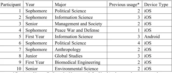
homogenous of a group. Participants were selected on a first-come-first-serve basis. The demographics of the recruited participants is shown in Table 1.
Table 1: Participant Demographics
Participant Year Major Previous usage* Device Type
1 Sophomore Political Science 2 iOS
2 Sophomore Information Science 3 iOS
3 Senior Management and Society 2 iOS
4 Sophomore Peace War and Defense 1 iOS
5 First Year Information Science 3 Android
6 Sophomore Political Science 4 iOS
7 Sophomore Anthropology 2 iOS
8 Junior Global Studies 3 iOS
9 First Year Biomedical Engineering 2 iOS
10 Senior Environmental Science 2 iOS
*Previous Usage Coding: 1 - Never used, 2 - Used in the past, but not recently, 3 – Occasional (Less than 1x per week), 4 – Frequent (More than 1x per week)
The intention of this recruitment method was also to get students of varied experience levels with the app. I value the opinions of experienced users that use the app every day as well as those who have never heard of it.
Task Selection
I selected tasks to be completed that ranged from easy to advanced. The good thing about this system being general-purpose is that there are a wide variety of potential tasks that can be studied. Many of the tasks that the app is meant to help people with are simple information retrieval tasks, such as finding a dining hall menu, learning when the next bus to a certain location arrives, discovering what libraries are currently open, and learning what events a user could attend on campus today. The first three tasks had exact answers that could be found within the app. The final task was more open-ended and was intended to see how users explore the app. There was not one set correct answer. The exact task wordings were as follows:
Task 1: Finding a fitness class to attend
Try and find a fitness class that is scheduled for tomorrow afternoon. Let me know the name of the class, its time, and location when you are complete.
Task 2: Bus route information
You are trying to get back to your dorm on south campus on a rainy day. Find out when the next U bus is arriving at the Student Stores stop. Report to me how many minutes away the next bus is when you are finished.
You have an assignment due in 15 mins. Find the closest working printer to our current location so that you can get the assignment turned in on time. Report to me the printer’s location when you are done.”
Task 4: Decide on a new place to eat dinner tonight
You have gotten tired of only eating at the usual spots on campus. (Lenoir Hall, Chase, Student Union) Try and find a new place to eat on campus, and then use the app to figure out how to get to that new location.
Recording Setup
Figure 1
Screenshot from video recording
Audio was also recorded separately on my laptop during the sessions both to have a backup in case of video recording malfunction, but also as a way to prevent the camera from running out of disk space. Once the task portion of the study was completed, the video recording was stopped, but I continued to record audio of the interview for later analysis.
Basic Information Collection
Before the start of the task portion, I asked the participants some basic questions including what year in school they are, what is their major, if they have used the app before, and how often they use it.
Think-Aloud Protocol
a user faces when completing a task. I was particularly interested in the first impressions of the system to new users, which is why I chose to use this protocol.
I used the classic model of concurrent think-aloud methodology that was
proposed by Ericsson and Simon, which minimizes interruptions from the moderator to simple prompts to keep talking if the participant starts to fade off. I believe that this is the least intrusive way of moderating and avoids bias from being introduced.
The downside to this protocol is that it can inhibit task completion time, which is why I decided not to focus as much on these measures. In order to get them talking initially, I had the participants read the task aloud before starting. Each task was printed on a separate sheet of paper and laid upside down so that the participant would not read ahead to upcoming tasks.
Post Questionnaire
Immediately after the tasks were completed, I gave the participants a System Usability Scale questionnaire to complete. This is a standardized questionnaire of ten questions graded on a five-point Likert Scale which allows me to compare this system to other similar systems, as well as serve as a baseline for future iterations of CarolinaGo to compare against. This questionnaire was completed on paper with pencil provided. An exact copy of the SUS questionnaire used can be found in Appendix F.
Semi-Structured Interview
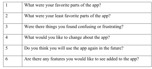
Table 2: Interview questions
1 What were your favorite parts of the app? 2 What were your least favorite parts of the app?
3 Were there things you found confusing or frustrating? 4 What would you like to change about the app?
5 Do you think you will use the app again in the future?
6 Are there any features you would like to see added to the app?
Full Schedule for Study Timeslot
Introduction to study and explaining the procedure: 5 minutes Task completion: 10 minutes
System Usability Scale completion: 2.5 mins Semi-structured interview: 10 minutes
Results
About CarolinaGo
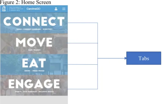
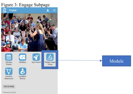
To understand the results and discussion it is import for the reader to know a little about the application itself and my terminology. The main screen is organized into 4 sections: “Connect”, “Move”, “Eat”, and “Engage” (see Figure 2). Each of these sections has short descriptions underneath the name about what can be found in that section. During my analysis, I will refer to the home screen categories as “Tabs”. Clicking a tab brings you to a subpage which links to individual features of the app such as CCI Printing Map, Fitness schedules, and dining hall menus. For example, clicking the “Engage” tab will bring the user to the page shown in Figure 3. I will refer to the individual features which can be accessed from a subpage or from the “Hamburger menu” (Figure 4) as “Modules”.
Figure 2: Home Screen
Figure 3: Engage Subpage
Clicking “Engage” on the Home Screen (Figure 2) brings you to this page.
Figure 4: Hamburger Menu view
View of the “Hamburger menu” these are direct links to modules. This menu can be accessed from any page.
Module
Task Results
Complete tables containing all quantitative data collected for each participant can be found in Appendix I.
Task 1: Finding a Fitness Class Summary Statistics:
Completion Rate: 100% *Slow load times caused two participants to say they would’ve given up
Table 3: Task 1 Results
Time (Sec) # of Errors Rated Difficulty
Average 85.1 0.9 2
Max 168 6 3
Min 31 0 1
This was the first task, so I was particularly interested to hear about the user’s initial impression of the home screen. Many users immediately noted that they liked the simplicity of the home screen and that the design was visually appealing. This task had no failures, but two of the participants had a hard time finding the right tab to click on. Seven of the participants were able to complete this task error free. One error was that a participant clicked on the hamburger menu and mistook the “Athletics” item to mean fitness classes when it actually leads to information about the division one sports teams at UNC. Another participant erroneously clicked on the “Eat” tab but quickly fixed their mistake. Although they didn’t make an error one participant noted: "I don’t think of going to the gym as engaging." I repeatedly observed this trend of users stating they liked the simplicity of the design, but also that it resulted in items being unnaturally forced into the same category when they did not necessarily belong together.
responses that the participant would have given up if they were completing the task in the real world. The average time to completion for the first four tests was 142 seconds mostly due to this technical problem, the median time to complete this task was 61 seconds. On the next day of testing, loading times were improved, resulting in average completion time of 46 seconds for the last six tests. However, even on this day four out of six of the participants noted frustration with the time to load the fitness class time page.
One usability issue a participant noted was that the font was too small on the calendar, which I agreed with. Also, two participants noticed that the calendar does not always start on Sunday, which they found unintuitive. The current day is always shown leftmost, as can be seen in Figure 5, which does not follow the standard convention of starting the days on Sunday.
Figure 5: Fitness Calendar view
Note that this screenshot was taken on 4/6, I highlighted this date to point out that the calendar starts on Friday rather than Sunday.
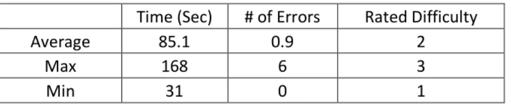
Task 2: Bus Route Information Summary Statistics:
Completion Rate: 100% Table 4: Task 2 Results
Time (Sec) # of Errors Rated Difficulty
Average 64 0.7 2.3
Max 94 3 4
Min 27 0 1
This second task was more difficult to complete because it took more steps, the optimal path requiring six clicks instead of three, and it requires some contextual
lower overall than the first task, four participants ended up making errors, compared to two on the previous task.
When looking at the home screen, users did not have trouble identifying that transit would be under the “Move” tab. The bus icon was also quickly identified on the move subpage. Next, the user had to select the U option from a list of 16 different bus routes, which took a little more time. The difficult part was that users then had to pick a direction: “To Bowles Drive” or “To East Franklin”. I got comments from 6 of the participants that they were unsure about what direction to pick. This was where most of the errors during this task occurred. One participant said, "I don't think the direction should matter". This is because the U route is a loop and they thought that all the stops would be shown for either direction, but this was not true. Also, one of the more experienced participants picked the wrong direction with confidence and was very confused when they were unable to find the information.
Once the user clicked the correct direction they could either use a map to zoom in and find the student stores stop, or they could click on the list and scroll through until they found that stop listed. The usage of these two features was about 50/50. Once they clicked on this stop all of the routes that service that stop would be shown. One user did not like this stating “Not sure why it is showing me all these other bus routes when I picked the U.” This can be seen in Figure 6.
There were several comments during this task suggesting that the participants thought there should be a more efficient way of finding this information. Another
clicking on each link. Also, one user stated they would rather use a third-party app like NextBus2 to accomplish this task.
Overall, each participant completed the task and found the correct information. I could have made this task more difficult by not providing the route name and stop in the prompt and instead asked each participant to find the fastest route to a south campus dorm from our current location. However, this would have produced different results based on time of day. Also, I already know that CarolinaGo is not a good resource for discovering bus routes. That type of search task is better handled by Google Maps.3 What
CarolinaGo does offer over Google Maps is the feature of live bus tracking, so the optimal way to use this module is to discover what bus you want to get on and at what stop using Google Maps, then you can use CarolinaGo to find the most up-to-date information about when the next bus is arriving. This is because Google Maps only utilizes static bus time tables so if the bus is running behind this will not be reflected by Google Maps. CarolinaGo on the other hand has access to a data feed that is constantly being updated by sensors on the individual buses. This is how it knows where the bus currently is and can estimate more precisely when the next one will be arriving at a certain stop. This is the reason I designed the task with the user already knowing information about what route to get on and at what stop, assuming they got that information from experience or a source like Google Maps. CarolinaGo would like to add functionality of searching for bus routes in the future, and that is being actively investigated by my organization.
Figure 6: Bus Stop Information
Note that information about all routes servicing this stop are shown although the user selected only the “U” route in a previous step.
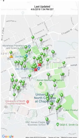
Task 3: Find a Printer Summary Statistics: Completion Rate: 90% Table 5: Task 3 Results
Time (Sec) # of Errors Rated Difficulty
Average 59.2 1.3 2.9
Max 102 7 5
Min 27 0 1
optimally only 3 clicks. However, this module is not directly mentioned in the description under the “Connect” tab in which it resides. The “Connect” tab is named after
ConnectCarolina which is the student self-service administrative tool that allows UNC students to sign up for classes and complete other academic tasks. This tab is used to house academic related modules. This caused a lot of uncertainty, with 7/10 participants noting that they were not sure where to begin. This is where several errors occurred; this task had the highest average error rate so far. One user picked the libraries module from the hamburger menu stating “Printers are usually in libraries, so I’ll try there.” Another selected the “Move” tab and tried searching the campus map, which was not helpful. One selected “Engage”. So, each tab had a participant erroneously navigate there before picking the correct one. Even participants who did not make an error stated things like “I was able to use the process of elimination to determine it was in the connect tab” and “You don’t immediately associate Connect with printing, but I just guessed because it had other academic stuff involved.”
clicking on the small pins. One user complained that the map was slow to load, and another had the app crash when they zooming in on their location.
Some positive comments include, “I was pleasantly surprised by the location feature” and that they were surprised this feature existed. Two participants noted that they will definitely use this feature again in the future. This was another hint that the printing page needs to be directly mentioned on the home screen. One constructive suggestion was that the page should add different icons indicating if the printer is black and white or color. However, as can be seen quantitatively in the uptick in errors and rated difficulty, this feature needs to be tweaked in order to be more usable.
Figure 7: Find a Printer Map
Green pins represent printer locations, clicking them gives specific room number details.
Completion Rate: 30%*
* The completion criteria were that users should use the Eat tab to find a dining option then find how to get there using the “Move” tab.
Table 6: Task 4 Results
Time (Sec) # of Errors* Rated Difficulty
Average 160.5 NA 3.8
Max 315 NA 5
Min 95 NA 2
* I did not report errors because there was not one optimal route to completing this open-ended task.
I intentionally included a more difficult and open-ended final task to see how users would approach a multi-faceted problem. There was not one correct path to
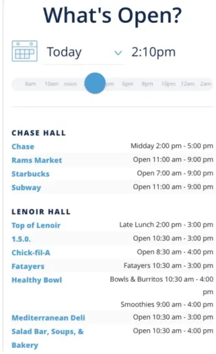
complete this, but I was hoping that users would first use the “What’s open now” module in the “Eat” tab to explore different options. After identifying somewhere to eat that they had not previously been, I wanted them to use the “Move” tab to find the best way to get there. Some participants were more aware of campus, so I asked them to pretend that they did not know how to get to that location.
Unfortunately, this task did not go as intended for most participants, with only three meeting the completion criteria. The first part of the task went well. Every
participant was able to identify that they should go to the “Eat” tab to find a new dining option. Then they all correctly went to the “What’s open now” module (Figure 8). There were several comments about how easy it was to filter the restaurants based on time, and that the list was visually appealing.
However, many participants had a lot of trouble figuring out where these
locations actually were. Four of the participants did not think to leave this page and tried to click on the links to each item. However, the dining options that are not run by
For example, two students selected Chick-fil-A™ and by clicking that link they were kicked out of the app and brought to www.chick-fil-a.com where they tried to use the company’s “find a location” tool. This was very unsatisfying and users did not like that they were taken off the app. Another choice that caused problems was the link to Einstein Bros. Bagels™, which downloaded a pdf of their menu, which users were not expecting.
Users who did go back to the “Move” tab encountered many problems of their own. Most turned to the walking directions module and had trouble searching for locations. This module has a static list of buildings that can be searched and was not flexible enough to return results for some of the participant’s queries. For example, queries like “Einstein Bros” or “Business School” or “Kenan Flagler” all did not return results. To actually be routed to the correct building users would have had to search for “McColl” which is the official name of the building that houses the Kenan-Flagler Business School café where Einstein Bros. Bagels™ resides. The other option for navigating around campus is the campus map module, which has more in-depth
information. This method also produced errors when users tried to search for these less popular dining locations. Quite a few participants stated that they would have turned to a different map app like Google Maps to try and find the locations.
SUS Questionnaire Results
After the last task was completed, I instructed the participants to fill out the SUS questionnaire. The average score was 59.75, with a range of 32.5-82.5 and a standard deviation of 17.2. As can be seen in Figure 8, this puts CarolinaGo in the range of Ok-Good and low-marginal acceptability according to Bangor’s scales.
Figure 9: SUS Scores Interpretations
Figure 9. Adapted from “Determining What Individual SUS Scores Mean: Adding an Adjective Rating Scale,” by A. Bangor, P. Kortum, and J. Miller, 2009, Journal of Usability Studies, 4(3), p. 121. I have plotted the measured SUS score of CarolinaGo to the figure from this study to help the reader interpret what that numeric score means.
Unfortunately, this score put us under the median found by Tullis of 70. (Tullis, 2008) This is still in the marginal acceptability range, but clearly, we should strive for a better score in the future. I will note that this could have been biased by the last task that I asked the participants to complete that intentionally was a difficult task to complete with the current version of the app.
Post-Interview Results
Q1 Favorite parts of the app.
The most common response to this question was the simplicity of the home screen. Participants generally liked that the app was broken into several sections which reduces clutter on the home screen. Similarly, someone said that the icons made it easy to quickly locate what they were looking for. Another common compliment was about the color scheme and visual design of the app. Users found it appealing to the eye, one stating it looked “Modern” and another saying “You can immediately tell it’s a UNC app.”
Additionally, I received responses about how they thought certain modules were particularly useful such as the fitness class times and finding a printer. The participants stated that they planning on using the app more now that they know about these features.
Q2 Least Favorite features
The most common complaint had to do with difficulty searching the map
modules. The participants were surprised that these modules were unable to handle some of their basic searches, which caused a lot of frustration. Also, performance was another major complaint, specifically from the users on the first day of testing. One user noticed that a lot of the pages in the app are simply mobile web pages and suggested the backend framework be changed to speed it up. Also, someone noted that the menus didn’t follow Apple’s design standards.
a pdf of the menu. Also, it was noted that sometimes task took too many steps to be completed.
Q3 Confusion or Frustrations
With this question, I tried to ask the participant to elaborate on something that I noticed they had a particularly tough time doing with the app. This lead to the reiteration of many of the points from the last question, but other complaints included uncertainty about choosing the correct tab for features not directly listed in the tab’s description. Some users suggested that there be more tabs added to more logically group some features together. Another stated that they would have liked to have a search bar on the home screen to more easily find features.
Q4 What would you like to change?
The most popular suggestion came from four participants and it was to add more categories to the home screen and to be more specific with the descriptions under each tab. It was particularly noted that the “Engage” tab seemed to have items lumped together that were not necessarily related. Other suggestions included speeding up the
performance, making transit easier to navigate, and adding search to the home screen.
Q5 Will you use the app again in the future?
Table 7: Question 5 Responses
Yes 5
Maybe 3
No 1 Q6 New Features
Discussion
This usability study was a valuable tool for confirming some of my prior
assumptions as well as discovering new problems within the app. Recently, my team has been evaluating options for completely redesigning the app, so one useful thing that I did was to explicitly ask users what they did like about the current design. I find that often usability studies focus on what is wrong with a system, but I did not want to go too far when addressing these issues and end up steamrolling some of the things people are pleased with.
Areas for improvement in CarolinaGo
commented that they think all the modules within a tab should be indicated in the description. This is an easy change that could greatly add to the usability of CarolinaGo.
Another more difficult change that clearly needs to be addressed is improving the search interface on the map modules. Nearly every user who interacted with either the campus map or walking directions showed noticeable frustration or commented that they thought the search feature was inadequate. The problem with these modules was that the terms that users wanted to search on were not the same as how the feature is indexed. The walking directions map requires you to type the specific name on the building that you want to navigate to, as well as provide the starting point. This was unintuitive for users because they are used to other applications such as Google Maps that will automatically route the user from their current location and is much more liberal in the way they are searchable. Colloquial terms such as “Business School” or “Kenan-Flagler” need to be a part of the index. This follows the heuristic of matching how users talk. (Nielsen, 1995)
to Chapel Hill, focusing on the most common routes that students on campus would take, such as the “U” and “NU” routes.
Another aspect that needs to be addressed is the performance of certain features. Notably, the fitness class calendar was unacceptably slow to load, especially on the first day of testing. This is not that much in CarolinaGo’s control currently because the app links to the Student Rec Centers website for this feature. But, I propose that it would be worthwhile to develop a lower weight page that utilizes the same data source for this feature. Other pages need performance improvements as well. For instance, the find a printer page received several complaints about slow scrolling, and this page caused one participant’s app to crash. To address this, I think that the CarolinaGo team should perform an audit of these features to make sure they are up-to-date and optimized. This could include things like making sure the most efficient and minified versions of JavaScript libraries and other plugins are being used, as well as making sure that visual elements such as pictures are stored in efficient web-friendly formats. Decreasing the size of pages would help load times, which is exceptionally crucial on mobile where data rates are often slow.
New Features
Another question that I am glad I specifically asked about was what new features participants would like to see in the app. I found these insights to be useful, and not as outlandish as one might expect.
fast-paced society, people often do not plan ahead or commit to events beforehand, instead people want to evaluate what is happening right now when they do have some free time. This is why I think it would be a great idea to have a campus event calendar built into the app. The challenge with this is that there would need to be a workflow developed that could verify that only legitimate organizations, such as clubs and campus organizations, could submit events to this calendar. I think this could be done in conjunction with, or possibly completely outsourced to, an organization such as Student Life. Student Life is the organization that helps manage all the student run clubs on campus. This would be a valuable tool and add another reason for users to keep returning to the app on a regular basis, thus improving usage statistics.
Another suggestion was for CarolinaGo to include an overarching login for UNC student services such as Connect Carolina and Sakai. Right now, the app requires users to type in their passwords each time they want to login, which puts us at a significant
An interesting thing to note about what was not requested by users was social media integration. Management in my organization has suggested that I integrate UNC’s social media accounts somehow within the app, but this is not something that students are directly asking for. I think it would be wise to do a focus group when considering adding this feature to make sure it does not degrade the current experience within the app.
Limitations
When designing the tasks for this study, I intentionally selected items that would require the participants to go to all the tabs on the home screen. However, they did not need to interact with every module, so the usability issues reported focus on the six modules that the users did interact with. I am sure there are more usability issues hidden within the other modules, but I think that lessons learned from this study could be applied to improve those modules as well.
Also, I only recruited one first time user for the study, and I think it would be interesting to observe more first impressions of the app. Because there is a new student class every year, the app constantly has an influx of first time users, making that
experience important to consider. Additionally, since this study was conducted with full-time students enrolled in at least their second semester, every participant had a basic understanding of UNC’s campus. The app strives to help completely new students learn about campus when they are first introduced to UNC, and because of the timing of this study I did not capture any of those experiences.
think-aloud protocol are not representative of how users interact with the app in the real world, and the nature of giving users tasks to complete leads to different performance than how someone would naturally do something. However, social observation in this context would be very difficult to do. I imagine you could wait at a bus stop all day and try and watch people’s actions on their phone to see how they search for bus information, but this would be inefficient and an intrusion on people’s privacy. Also, as is human nature, I noticed that some participants seemed motivated to speed through the process as fast as possible, which lead to some non-insightful interview comments.
If I were run this study again, I would have rephrased the wording of the final task to hint that the user would need to use the “Eat” and “Move” tabs to complete that task. There is a fine line to walk while deciding what information to give users within a task description, but I found too many of the participants did not get to the areas I was hoping, resulting in missed opportunities for observing their action.
Lastly, I am curious if my task selection impacted the results of the SUS questionnaire. It would be interesting to research if increased task complexity is
Conclusion
I conducted a usability study of the CarolinaGo mobile app, with the specific goal of evaluating tasks that I believe students would be likely to complete during their day to day lives on campus.
These were the chosen tasks:
• Select a fitness class to attend
• Find bus route information
• Find the closest printer
• Find a new place to eat on campus and how to get there
These tasks were completed using a think-aloud methodology by ten UNC
students of varying ages and backgrounds in a lab setting. The participants also answered post-task questions, completed a System’s Usability Scale (SUS) questionnaire, and a post-test interview.
These comments were supported by the average SUS score of 60 which according to Bangor’s interpretation corresponds to a rating of “Low Marginal accessibility” or between “OK” and “Good” on his adjective rating scale interpretation of SUS scores. (Bangor, 2009) So, there is clearly room for improvement, but also the app is not a total failure. This score can now be used as a baseline to compare future versions of the app.
Based on analysis of errors, frustrations, comments, and suggestions I devised some key goals that could greatly increase the app’s usability and utility. Some of these can be quickly implemented to immediately enhance the experience for current users. Others are more ambitious goals that will require more effort but could lead to greater adoption from members of the UNC Campus community. This is why I broke my recommendations for improvement into two separate categories.
Short-Term Goals
• Reorganize modules into more intuitive sections
• Add descriptions of every module contained within a tab to the home screen
• Improve the map search function to including more dining locations and colloquial terms for certain locations
• Audit performance and make optimizations to decrease load times
• Creating a guide to the Chapel Hill Bus routes most frequented by UNC Students
• Add legend as well as icons differentiating black and white vs color printers to the printing map
Long-Term Goals
• Create a platform for UNC organizations to market events
• Create a secure way to manage One Card, Connect Carolina, and Onyen related services through biometrics
• Explore native frameworks to rebuild the app for more fluid and less web-like experiences
Appendices
B. Informed Consent
CarolinaGo Usability Study
Informed Consent Form About This Study
• You are being asked to participate in a usability study conducted by Councill Leak as a Master’s Project connected to the School of Information and Library Science.
• The usability study focuses on the CarolinaGo Mobile App.
• I will take video and audio recordings for the duration of the usability study in order to best review your interactions with the website.
• IRB Number: 17-3295
• Faculty Advisor: Dr. Stephanie Haas
About Your Participation
• Your participation is voluntary and you may elect to not participate or end your participation in this study at any time.
• You will receive $15 upon completion of this study.
• If you agree to participate in this study you will be asked to answer a few background questions related to prior experience with CarolinaGo, then be asked to complete four tasks within the app, and finally you be asked follow-up questions about your experience.
• Your participating process will be recorded.
About Your Privacy and Data Security
• The researcher will make every attempt to keep your information anonymized and confidential throughout this study.
• All recordings and responses will be stored on an encrypted computer.
• Data will only be stored with anonymous identification numbers.
• All data will be destroyed after the final completion of this study.
Who is sponsoring this study?
This research is supported by UNC-Chapel Hill. In addition, Councill Leak, the principal investigator on this study, is a graduate student in theSchool of Information and Library Science and doing this research in his role as a student. Mr. Leak is also an employee atUNC Information Technology Services which uses the product being
evaluated in this study. Only final results will be shared with UNC Information
Technology Services and it will be after the results have been made publically available.
If you would like more information, please ask the researchers listed below.
Primary Investigator: Councill Leak, [email protected] Faculty Advisor: Stephanie Haas, [email protected]
Print Name: _______________________________________
C. Pre-Task Questions
1. What year in school are you? 2. What is your major?
3. Describe your previous usage with the app.
D. Tasks
Task 1: Finding a fitness class to attend
Try and find a fitness class that is scheduled for tomorrow afternoon. Let me know the name of the class, its time, and location when you are complete.
Task 2: Bus route information
You are trying to get back to your dorm on south campus on a rainy day. Find out when the next U bus is arriving at the Student Stores stop. Report to me how many minutes away the next bus is when you are finished.
Task 3: Find the closest printer to our current location
You have an assignment due in 15 mins. Find the closest working printer to our current location so that you can get the assignment turned in on time. Report to me the printer’s location when you are done.”
Task 4: Decide on a new place to eat dinner tonight
You have gotten tired of only eating at the usual spots on campus. (Lenoir Hall, Chase, Student Union) Try and find a new place to eat on campus, and then use the app to figure out how to get to that new location.
E. Post Task Question
G. Interview Questions
• What were your favorite parts of the system?
• What were your least favorite parts of the system?
• Did you find anything confusing or frustrating?
• What about the app would you like to change?
• Do you think you will use this app again to solve similar problems?
• Are there any features that you would like to see incorporated into the app?
H. Moderator Guide
Participant #:
Administering the Test
• Start Audio Recording
• Read introduction
Hello, my name is Councill Leak, thank you for agreeing to help evaluate the CarolinaGo mobile app. I will be moderating this session and I am here to help you if you need it at any point. Please excuse me for reading from a script, I am doing so to ensure that every participant has an equal experience.
Today we are evaluating some features of CarolinaGo that we believe would possibly be completed on a mobile device. We are interested in hearing what you like and dislike about the system. Also, we would like to emphasize that we are testing the system, not you. It is alright if you have difficulty with some aspects of this test and should not be taken personally.
First, we will give you a brief pre-test questionnaire to find out what experience you have with the system. Next, you will be given a set of tasks to complete. You will be asked to think aloud your thought process while you are completing these tasks. This may seem awkward at first, but it will allow us to better analyze what is going through your mind as you complete a task, and thus identify sources of confusion or other problems. After you complete the tasks there will be another short questionnaire followed by a brief interview. While you are interacting with the site please be honest with your feedback, we are looking for ways to improve the app, so your critical feedback is welcome, and it is essential for us to provide useful recommendations of how to improve the site for the student body.
• Administer informed consent
• Pre-test questions
• What year are you?
• How would you describe your previous interaction with the app?
o Answer:
o If not much, ask about what they think it should do
• Ask participant to put their phone on Do Not Disturb mode to prevent distracting notifications
• Start video recording
• Task 1 Notes
• Difficulty:
• Task 2 Notes
• Difficulty:
• Task 3 Notes
• Difficulty:
• Task 4 Notes
• Difficulty:
• Remind them to hold the device under the camera at all times.
• Prompt them to keep talking if they go quiet.
• Cut off if any task goes for more than 5 mins
• Stop video recording
• Administer the SUS
• Ask post-interview questions Post Interview Questions.
• If applicable: Ask about how the app differed from their expectations
• What were your favorite parts of the system?
• What were your least favorite parts of the system?
• Did you find anything confusing or frustrating?
• If there was a particular task they failed or had great trouble completing specifically ask them to elaborate on that.
• What about the app would you like to change?
• Do you think you will use this app again to solve similar problems?
• Are there any features that you would like to see incorporated into the app? Wrap Up and Thanks
Thank you for participating in our study today. We appreciate your time and effort into evaluating the UNC Student Stores mobile website.
• Pay participant, show them out
• Check audio and video recordings
• prepare room for next participant.
I. Data
1. Participant demographics
Participant Year Major Previous usage Device Type
1 Sophomore Political Science 2 iOS
2 Sophomore Information Science 3 iOS
3 Senior Management and Society 2 iOS
4 Sophomore Peace War and Defense 1 iOS
5 First Year Information Science 3 Android
6 Sophomore Political Science 4 iOS
7 Sophomore Anthropology 2 iOS
8 Junior Global Studies 3 iOS
9 First Year Biomedical Engineering 2 iOS
10 Senior Environmental Science 2 iOS
Usage Coding
1 Never used
2 Used in the past but not recently 3 Occasional use
4 Frequent use (At least 1x week)
2. Task 1 Quantitative Data
Participant Time (sec) # of Errors Rated Difficulty Completion
1 162 6 2 Full
2 168 0 3 Full (almost gave up)
3 91 0 2 Full
4 150 0 2 Full
5 41 0 1 Full
6 31 0 3 Full
7 60 0 1 Full
8 33 3 1 Full
9 62 0 2 Full
10 53 0 3 Full (almost gave up)
3. Task 2 Quantitative Data
Participant Time (sec)
# of
Errors Rated Difficulty Completion
1 78 0 1 Full
2 56 0 2 Full
3 75 1 3 Full
4 94 1 2 Full
5 90 3 2 Full
6 27 0 3 Full
7 47 0 2 Full
8 61 2 3 Full
9 44 0 1 full
10 68 0 4 Full
Averages 64 0.7 2.3 100%
4. Task 3 Quantitative Data
Participant Time (sec) # of Errors Rated Difficulty Completion
1 47 0 2 Full
2 59 0 1 Full
3 49 0 5 Full
4 27 0 2 Full
5 69 1 1 Full
6 45 1 4 Full
7 32 0 2 Full
8 59 1 4 Full
9 85 3 3 Full
10 120 7 5 Fail
4. Task 4 Quantitative Data
Participant Time (sec) # of Errors Rated Difficulty Completion
1 315 3 3 Fail
2 126 5 4 Fail
3 139 0 4 Full
4 154 0 3 Fail
5 137 1 2 Full
6 105 3 5 Fail
7 240 8 5 Fail
8 105 3 4 Fail
9 95 3 3 Full
10 189 7 5 Fail
Averages 160.5 NA 3.8 30%
J. Testing Room Setup
Participant sat in the purple chair, moderator sat in the green chair, camera was placed facing down on the tripod.
References
Albert, W., & Tullis, T. (2013). Measuring the user experience: collecting, analyzing, and presenting usability metrics. Newnes.
Alhadreti, O., & Mayhew, P. (2017). To Intervene or Not to Intervene: An Investigation of Three Think-Aloud Protocols in Usability Testing. Journal of Usability Studies, 12(3).
Bangor, A., Kortum, P., & Miller, J. A. (2009). Determining what individual SUS scores mean: adding an adjective rating scale. Journal of Usability Studies, 4, 3.
Bastien, J. C. (2010). Usability testing: a review of some methodological and technical aspects of the method. International journal of medical informatics, 79(4), e18-e23.
Boren, T., and Ramey, J. Thinking aloud: Reconciling theory and practice. IEEE Transactions on Professional Communication 43, 3 (2000), 261-278. Brooke, J. (1996). SUS-A quick and dirty usability scale. Usability evaluation in
industry, 189(194), 4-7.
Brooke, J. (2013). SUS: a retrospective. Journal of usability studies, 8(2), 29-40. Cooke, L. (2010). Assessing concurrent TA protocol as a usability test method: A
technical communication approach. IEEE Transactions on Professional Communication, 53 (3), 202–215.
Ericsson, K. A., & Simon, H. A. (1980). Verbal reports as data. Psychological Review, 87(3), 215.
Ericsson, K. A., & Simon, H. A. (1993). Protocol analysis: Verbal reports as data (revised ed.) Cambridge, MA: MIT Press.
Ericsson, K.A. and Simon, H.A. Protocol Analysis: Verbal Reports As Data. (Revised ed.) MIT Press, Cambridge, MA, USA, 1996.
Goodman, E., Kuniavsky, M., & Moed, A. (2012). Observing the user experience : a practitioner's guide to user research. Retrieved from https://ebookcentral-proquest-com.libproxy.lib.unc.edu
Lewis, J. R. (1991). Psychometric evaluation of an after-scenario questionnaire for computer usability studies: the ASQ. ACM Sigchi Bulletin, 23(1), 78-81. Lewis, C., & Rieman, J. (1993). Task-centered user interface design. A Practical
Introduction. Available at http://www.hcibib.org/tcuid/
Loranger, H. (2014, August 10). UX Without User Research is Not UX. Retrieved October 12, 2017, from https://www.nngroup.com/articles/ux-without-user-research/
Lund, A. M. (2001). Measuring Usability with the USE Questionnaire12. Usability interface, 8(2), 3-6.
McDonald, S., Edwards, H., & Zhao, T. (2012). Exploring TAs in usability testing: An international survey. IEEE Transactions on Professional Communication, 55(1), 1–17.
Miner, G. (2012). Practical text mining and statistical analysis for non-structured text data applications. Academic Press.
Nayebi, F., Desharnais, J. M., & Abran, A. (2012, April). The state of the art of mobile application usability evaluation. In Electrical & Computer Engineering (CCECE), 2012 25th IEEE Canadian Conference on (pp. 1-4). IEEE.
Nielsen, J. (1995). 10 usability heuristics for user interface design. Nielsen Norman Group, 1(1).
Nielsen, J. (2000, March 19). Why You Only Need to Test with 5 Users. Retrieved October 04, 2017, from https://www.nngroup.com/articles/why-you-only-need-to-test-with-5-users/
Nielsen, J. (1993). Usability engineering. San Francisco, CA: Morgan Kaufmann Publishers Inc. ISBN: 0-12-518406-9.
Norman, K. L., Shneiderman, B., Harper, B. D., & Slaughter, L. A. (1989). Questionnaire for user interaction satisfaction. HCI Lab, College Park, University of Maryland. Olmsted-Hawala, E. L., Murphy, E. D., Hawala, S., & Ashenfelter, K. T. (2010). TA
protocols: A comparison of three TA protocols for use in testing
data-dissemination web sites for usability. Proceedings of the SIGCHI conference on human factors in computing systems (pp. 2381–2390). New York, NY: ACM. Romano Bergstrom, J. C., Olmsted-Hawala, E. L., Chen, J. M., & Murphy, E. D. (2011).
Rubin, J., & Chisnell, D. (2008). Handbook of usability testing : how to plan, design, and conduct effective tests. Retrieved from
https://ebookcentral-proquest-com.libproxy.lib.unc.edu
Spool J, Schroeder W. Testing Web sites: five users is nowhere near enough. In: Proceedings of the Conference extended abstracts on Human Factors in Computing
Systems, CHI 2001. New York: ACM Press; 2001.
Thomas, D. R. (2006). A general inductive approach for analyzing qualitative evaluation data. American journal of evaluation, 27(2), 237-246.
Tullis, T. S. (2008). SUS scores from 129 conditions in 50 studies.
Wildemuth, B. M. (2009). Applications of social research methods to questions in information and library science. Westport, Conn.: Libraries Unlimited. Wright, R., and Converse, S. Method bias and concurrent verbal protocol in software
usability testing. Proc Human Factors Society 36th Annual Meeting, (1992), 1220-1224.