Rachel D. Walton. Looking for Answers: A Usability Study of Online Finding Aid Navigation. A Master’s Paper for the M.S. in L.S degree. April, 2015. 76 pages. Advisor: Helen Tibbo
In an effort to move towards a practical and user-centered model for online finding aid navigation, this usability study asks -- what kind of navigational features are effective, efficient, and user-valued components within an academic archive's online finding aid? Using Princeton University's Finding Aid website as a prototype, the researcher
collected quantitative as well as qualitative data from ten relatively inexperienced online finding aid users as they interacted with and reacted to the finding aid interface in question. The results of the study suggest major navigational difficulties experienced by users included ambiguous and/or unintuitive labeling, unclear relationships between tabs, and insufficient visual cues for certain navigational features. In contrast, user-valued navigation aids included centralized hyperlinked content, nested and hierarchical content tabs, and a collection-level search bar. The paper concludes with ten pragmatic guidelines for archival professionals trying to solve the ongoing puzzle of online archival finding aid usability.
Headings:
Finding aids -- Archival resources
Universities and Colleges – Archives
Websites – Use studies
User interfaces -- Human-computer interaction
Information retrieval – Electronic information resource searching
LOOKING FOR ANSWERS: A USABILITY STUDY OF ONLINE FINDING AID NAVIGATION
by
Rachel D. Walton
A Master’s paper submitted to the faculty of the School of Information and Library Science of the University of North Carolina at Chapel Hill
in partial fulfillment of the requirements for the degree of Master of Science in
Library Science.
Chapel Hill, North Carolina
April 2015
Approved by
_______________________________________
Table of Contents
Table of Contents ... 1
Introduction ... 2
Literature Review ... 6
1.1 Online Finding Aids: The Good, the Bad, and the Ugly ... 6
1.2 Online Finding Aid Users: Who Are They and What Do They Want? ... 12
Study Methodology ... 17
1.3 Test Participants ... 19
1.4 Study Overview ... 21
1.5 Questionnaire Data ... 22
1.6 Usability Testing Data ... 24
Results ... 28
1.7 Survey Results ... 29
1.8 Usability Results ... 32
1.9 User Feedback ... 37
Conclusion: The Model ... 43
Bibliography ... 46
Appendix 1 ... 51
Appendix 2 ... 54
Appendix 3 ... 55
Appendix 4 ... 59
Introduction
“With a significant number of finding aids now online, we need to assess the various formats that have been employed and how effective they are for search and retrieval of information.”
– Christina J. Hostetter, “Online Finding Aids: Are they Practical?” Journal of Archival Organization 2, no. 1-2 (2004): 127.
The traditional archival finding aid was a physical document, crafted by an
archivist, intended to represent the structure and content of a collection of materials
which users could access within the controlled environment of a supervised reading
room. However, in the last few decades the archival finding aid has transitioned from
stagnant document to online interface. Online archival description represents a
groundbreaking step forward in that it facilitates enhanced discovery through remote
interaction with collection content and allows for wider and easier access to previously
sequestered archival materials.
In the last decade or so, the professional literature has dealt deeply with archival
description in the context of the World Wide Web. Since its emergence in the
mid-1990s, there have been more than 30 articles dealing with online finding aids and
Encoded Archival Description (EAD) in the American Archivist journal alone, and
dozens more have been published in other major journals like the Journal of Archival
Organization, Technical Services Quarterly, Archives and Manuscripts, and The
Journal of the Society of Archivists. This professional discourse reveals that while the
that there remains significant room for improvement for online finding aids, especially
in the realm usability, navigation, and user interface design.2
The uniqueness and diversity of archival collections, their complicated history
and context, and their hierarchical structure all make effective presentation of archival
information on the web a challenge. In the past, archivists have been accused of
developing and implementing online archival description without consideration of user
needs.3 To date, there have been a dozen or so usability studies focused on online
archival interfaces, and while most of these were relatively small in scope and scale,4 a
few have been of a more sizable measure.5 Taken together, these studies have pointed to
several potentially addressable usability issues. For example, well-recognized problems
with online finding aids include confusing profession-specific jargon, lengthy blocks of
text, long lists of folders and subfolders, and numerous links embedded within extensive
descriptive hierarchies.6 Suggested solutions to these challenges have included
simplified labeling terminologies,7 advanced keyword search options,8 and “quick
links” for topical searching.9 Despite the fact that several finding aid usability studies
have been conducted and written about within the professional literature, there has yet
to be a consensus about what an ideal user interface might look like for online archival
content, and certainly no model for finding aid navigation has been proposed.
Today, Christina Hostetter’s call for assessment of online finding aid interfaces
through usability testing resonates as loudly as it ever did.10 On whole, relatively few
academic archives have considered the added value that efficient and effective
navigational features could offer online finding aids users. In response to this lacuna,
What kinds of navigational features are effective, efficient, and user-valued
components within an academic archive’s online finding aid interface?
Answering this question will require, not just understanding the needs and
expectations of users and testing navigational models, but also the marrying of two
distinct literatures which, for the most part, have previously been siloed in their
respective fields – (1) archival description standards and best practices (2) and user
interface and website usability evaluation techniques. The following literature review
will synthesize these corpora and contextualize the usability issues faced by online
finding aid users.
1 A. J. Gilliland-Swetland, “Popularizing the Finding Aid: Exploiting EAD to Enhance Online Discovery and Retrieval in Archival Information Systems by Diverse User Groups,” Journal of Internet
Cataloging 4, no. 3/4 (2001): 199-225; L. A. Morris, “Developing a Cooperative Intra-Institutional Approach to EAD Implementation: The Harvard/Radcliffe Digital Finding Aids Project,” American Archivist 60, no. 4 (1997): 388-407; Janice E. Ruth, “Encoded Archival Description: A Structural Overview,” American Archivist 60, no. 3 (1997): 310-329; Steven J. DeRose, “Navigation, Access, and Control Using Structured Information,” American Archivist 60, no. 3 (1997): 298-309.
2 Wendy Duff and Penka Stoyanova, “Transforming the Crazy Quilt: Archival Displays from a Users' Point of View,” Archivaria 45, (1998): 44-79; Elizabeth Yakel, “Encoded Archival Description: Are Finding Aids Boundary Spanners or Barriers for Users?” Journal of Archival Organization 2, no. 1-2 (2004): 63-77; Jihyun Kim, “EAD Encoding and Display: A Content Analysis,” Journal of Archival Organization 2, no. 3 (2004): 41-55; Rosalie Lack, “The Importance of User-Centered Design: Exploring Findings and Methods,” Journal of Archival Organization 4, no. 1-2 (2007): 69-86; Xiaomu Zhou, “Examining Search Functions of EAD Finding Aids Web Sites,” Journal of Archival Organization 4, no. 3-4 (2007): 99-118; Cory Nimer and J. G. Daines, “What do You Mean it Doesn't make Sense?
Redesigning Finding Aids from the User's Perspective,” Journal of Archival Organization 6, no. 4 (2008): 216-232; J. G. Daines and Cory L. Nimer, “Re-Imagining Archival Display: Creating User-Friendly Finding Aids,” Journal of Archival Organization 9, no. 1 (2011): 4-31; Morgan G. Daniels and Elizabeth Yakel, “Seek and You May Find: Successful Search in Online Finding Aid Systems,” The American Archivist 73, no. 2 (2010): 535-568; Joyce Celeste Chapman, “Observing Users: An Empirical Analysis of User Interaction with Online Finding Aids,” Journal of Archival Organization 8, no. 1 (2010): 4-30.
3 Richard J. Cox, “Revisiting the Archival Finding Aid,” Journal of Archival Organization 5, no. 4 (2008): 5-32.
Technologies,” Journal of the Society of Archivists 25, no. 1 (2004): 33-49; Wendy Scheir, “First Entry: Report on a Qualitative Exploratory Study of Novice User Experience with Online Finding
Aids,” Journal of Archival Organization 3, no. 4 (2006): 49-85; Lack, “The Importance of User-Centered Design,” 68-86; Nimer and Daines, “What do You Mean it Doesn't make Sense” 216-232; Chapman, “Observing Users,” 4-30; Rita D. Johnston “A Qualitative Study of the Experiences of Novice
Undergraduate Students with Online Finding Aids” (MLIS, University of North Carolina at Chapel Hill, 2008).
5 Christopher J. Prom, “User Interactions with Electronic Finding Aids in a Controlled Setting,” The
American Archivist 67, no. 2 (2004): 234- 268; Dawne E. Howard, “The Finding Aid Container List Optimization Survey: Recommendations for Web Usability” (MLIS, University of North Carolina at Chapel Hill, 2006).
6 Thomas J. Frusciano, “Online Finding Aids, Catalog Records, and Access? Revisited.” Journal of
Archival Organization 9, no. 1 (2011): 1-3.
7 Danielle L.Fasig, “Usability Evaluation of Finding Aids for Archives” (MLIS, University of North Carolina at Chapel Hill, 2013).
8 Altman and Nemmers, “The Usability of Online Archival Resources,” 121-131. 9 Chapman, “Observing Users,” 4-30.
Literature Review
“EAD and its related standards have initialized the realization of an information future in which serious scholars and the casually curious alike will easily find the cultural treasures they seek. In this emerging future, information seekers will follow clearly marked paths from catalogs to finding aids, and from finding aids to a wealth of information in a multitude of digital and traditional formats….
In this way archives will be able to better serve those we have traditionally served, but we will also for the first time, have the means to make our
collections accessible to educators and students of all levels and to the general public….”
– Daniel V. Pitti, “Encoded Archival Description: The Development of an Encoding Standard for Archival Finding Aids,” American Archivist 60, no. 3 (1997): 283.
1.1
Online Finding Aids: The Good, the Bad, and the Ugly
Now nearly two decades old, online finding aids have had a complicated history
within the archives profession. The first and most prominent champion of the online
finding aid was Encoded Archival Description (EAD) creator, Daniel Pitti. As the
principal investigator of the famous Berkeley Project (1993-1997), where the idea of
machine readable finding aids began, Pitti saw standardized computer based data
structures as a way of moving toward universal intellectual access and setting the stage
for remote viewing of actual archival materials.11 After a long, thorough, iterative, and
community driven process – involving the Library Congress, the Society of American
Archivists, and multiple leading universities throughout the country – EAD1 was
feedback and commentary from practitioners, additional changes were made to the EAD
schema to meet the needs of XML and related technologies, and EAD2 appeared on the
scene in 2002. Today at the dawning of EAD3 (scheduled for release winter of 2015) it
seems clear that the standard is here to stay and Pitti’s goal has arguably been realized.12
When EAD and online finding aids were new to the scene, they received a
wealth of scholarly support and attention. The entire fall and summer editions of the
1997 American Archivist journal were dedicated to a discussion of EAD and its
implementation. In these issues EAD was heralded as a potentially groundbreaking
technology that should be supported and contributed to by the archival community.
Proponents of EAD were confident in the schema’s features, optimistic about its
incorporation into professional practices, and even went so far as to imply that EAD
finding aids were the logical next step for archival description.
In these early moments for online finding aids, Kris Kiesling argued that the
EAD schema had a great deal of potential as a description standard because it offered a
widely adaptable data structure and fostered common practices amongst diverse
institutions in terms of online data content.13 Likewise, Janice Ruth, a part of Pitti’s
original Berkeley team, explained that EAD was vetted and thorough as it was
constructed by “continued input and assistance from the entire archival community” and
had undergone an “extensive fine-tuning” process.14 Several articles within the 1997
American Archivist issues noted the specific technical advantages that EAD finding aids
offered. For example, Steven J. DeRose applauded the more recent XML-compatible
version of EAD, as a “semantically simple” language that archivists could wield with
the archivist to “encode rich, hierarchical descriptions,” and repeat descriptive elements
at each level of that hierarchy, including value-added “linking, display, and search term
elements.”16 Overall, there was a sense that it was never too soon to begin adopting
EAD and putting archival content online, at any institution. Elizabeth Dow, as a lone
arranger at University of Vermont, took it upon herself to implement EAD at her
institution during those early years. She felt that EAD was “quickly becoming
fundamental to the web presence of small and micro-repositories,” like local historical
societies and cultural heritage institutions.17 On the other end of the institutional
spectrum, Leslie Morris supported the implementation of EAD for Harvard’s online
finding aids, claiming that for large institutions interested in inter- or intra-repository
collaboration, EAD was a logical and strong choice.18
While EAD’s reception was undeniably positive, one would be remiss in not
mentioning any of the cautionary tales found in these same issues of the American
Archivist. For example, Dennis Meissner warned that finding aids needed substantial
amounts of reengineering in terms of look, feel, and structure before they could be made
into effective online collection descriptions.19 He stressed that “it is important to create
finding aids that contain sufficient wayfinding tools to enable users to understand them
and the materials they describe without the mediation of archivists” in the content of the
virtual environment.20 On whole, the professional community seemed to be embracing
Daniel Pitti’s idea of standardized online archival description, without concerns about
usability and interface. However, online archival description and its EAD schema
began to question the functionality, display, and effectiveness of EAD finding aids in
the context of the World Wide Web and its users.
The first to critically consider the content and format of online displays in archival
information systems were Wendy Duff and Penka Stoyanova. Just a year after the
release of EAD1 these academics were asking users what information about archival
materials they would like to see online and how would they prefer it to be displayed.21
The first usability study of its kind for online archival content, these researchers used
focus group feedback to critique existing finding aid interfaces. Their results indicated
that users had trouble with abbreviations and specialized terminology like “linear
extent” and “fonds,” and preferred archival information presented on the page according
to bibliographic display guidelines and not current archival practice.22 While
recognizing that more research was still needed on multi-level description, the authors
made the following suggestions to archivists: 1) use current research on system designs
to provide a better interface for their users, and 2) conduct more usability studies to
better understand archive users’ needs.23 Luckily, their call for more usability testing
was heard by several members of the profession in the following decade.
In 2001, Burt Altman and John Nemmers evaluated the usability of archival finding
aids and their searching functions for the Pepper OnLine Archival Retrieval and
Information System (POLARIS) at Florida State University. Their research revealed
that navigation was a central concern for finding aid functionality because, given the
hierarchical nature of archival description, users needed to be aware of “where they are”
in the collection at all times.24 They also discovered that there was a need for both basic
collection. Finally, study participants also showed a preference for item level rather than
folder level description when searching for content.25
Elizabeth Yakel’s usability study from a few years later revealed similar findings.
Her research showed that subjects had trouble understanding archival terminology and
how to best search for information within archival websites.26 To add to this, the
structure of the finding aid also proved difficult for study participants. Many
participants stated that they had “gotten lost” within the descriptive hierarchy.27 Yakel
suggested a navigation menu and improved online reference as potential solutions but
did not elaborate on these. Rather, she pushed archivists to begin incorporating
established design principles from the field of human-computer interaction into EAD
interfaces to improve the user’s experience.
Another study by Jihyun Kim focused on data elements and labeling within EAD
finding aids as well as the searching, browsing, and other navigational functions that
some repository websites provided. Kim found that there were significant element
inconsistencies across institutions making it difficult for users to understand the
meaning of labels when moving from one website to another.28 In addition, it appeared
that data elements in the EAD tag library were not being sufficiently utilized and,
therefore, finding aids did not provide diverse enough access points for users.
Importantly, Kim determined that EAD finding aids tended to contain narrative forms
of information and long container lists without appropriate navigational elements,
thereby making it very difficult for users to effectively identify information and
collection was proven to be a time consuming and inefficient activity that did not assist
in information retrieval.29
Responding to Kim’s note that “search functions are a growing necessity on EAD
sites,”30 Xiaomu Zhou offered analysis of fifty-eight EAD websites and their searching
capabilities. Zhou’s results showed that a disappointingly low number of EAD finding
aids were aided by searching functions, and those that did allow searching did not
arrange search results for users in a structured way.31 Zhou lamented that “the
advantages of EAD finding aids for hierarchical searching has not yet been fully
realized […] It is unfortunate that archivists’ focus has been on the issue of encoding
finding aids rather than the subsequent process of delivery of archival information via a
web interface.”32 Even archivists that had once ardently supported EAD finding aids
were becoming severe detractors of EAD standardized online description. For example,
by 2009, Elizabeth Dow, having once been an optimistic supporter of EAD when the
technology was in its infancy, called it a “halfway technology,” explaining that the
descriptive standard was not successfully connecting researchers to materials in the way
Pitti and his colleagues had originally intended. She indicated that the profession should
begin looking for a fuller technology to replace it.33
It seems that after a decade of practice with EAD, there was a growing consensus
within the community of archival professionals that unresolved interface issues –
particularly usability and navigation functionality – represented significant barriers to
user access and were the result of serious design flaws in the implementation of EAD.
In 2008, all of the above concerns about online archival description were reflected upon
Brigham Young University.34 Summing up the literature and taking into account their
own professional experiences, Daines and Nimer cited four major problems with EAD
online finding aids to date: (1) unintuitive, profession-specific jargon and
inconsistently implemented labeling practices; (2) long narratives, big blocks of text,
and difficult-to-browse container lists (3) poor access to item level content due to
ineffective or nonexistent search functionalities (4) confusing hierarchical organization
and display of content that result in users feeling “lost.”35
Richard Cox declared that despite the fact that we have entered the “golden age of
archival description, [...] EAD’s goal of easy access has been more dream than
realization.”36 Cox even went further with his critique, stating that archivists have been
creating their online description “in violation of system analysis […] and carrying out
their descriptive work apart from and with little knowledge of how researchers find and
use archival sources.”37 This statement implies ignorance on the part of archivists
engaging in online description and calls for a greater understanding of who archival
users are and what information needs they bring to an online finding aid interface.
1.2
Online Finding Aid Users: Who Are They and What Do They
Want?
Despite Cox’s accusation, since the advent of EAD several researchers
employing usability and other types of studies have made a conscious and deliberate
effort to understand who the target audience is for online archival content and, beyond
this, what their information needs might be.
In 2004, at the University College London, Anna Sexton and the other members
online description?” in an effort to inform developers about user requirements for new
online services. In their study, the LEADERS team recognized various types of
end-users of online archival content including “personal leisure” end-users, “individuals using
archives as part of their professional occupation,” and “those using archives to support
an educational or training program.”38 These types of users would be confirmed by
other authors and usually grouped into “advanced” and “novice” categories in later
writings about online finding aids. In addition to these findings, Sexton’s team also
determined that a majority of archive users approach online finding aids through “an
interest of individuals, families, or organizations,” and the remainder of searchers tend
to frame their research topically.39 Nearly all users represented in the study were
interested in limiting their search to a certain time period. Most users also enter the
online archival content already knowing what they are looking for and with some kind
of knowledge of the subject area of research. However, less than half of users surveyed
claimed to be familiar with using archival material on the internet.40 These statistics can
help predict what kind of search functions online finding aid users might need in order
to successfully retrieve the information they are looking for.
Around the same time as the LEADERS project, Rosalie Lack of the California
Digital Library (CDL) used focus, groups, questionnaires, interviews, and usability
testing at her institution to determine what user wanted from online finding aids via the
CDL. Lack discovered that, for most novice users, the concept of finding aids was
extremely difficult to comprehend – there was no immediate understanding of the
usefulness of a list of physical objects they had no direct access to via the digital
expect finding aids to include digitized material and not just serve as a guide to
collections.42 Wendy Scheir has also written about novice user experiences with online
finding aids, confirming that online finding aids were sometimes “confounding and
frustrating for novice users” as they are unfamiliar with key terms, subject content, and
the inherent structure of archival description.43
Gretchen Gueguen at East Carolina University investigated the typical users of
digitized special collection materials in an attempt to support multiple access interfaces
and suit the needs of two distinct user groups - undergraduate students and humanities
researchers. Her results indicated that humanities scholars prefer to first search more
broadly across archival materials, and, therefore, benefit from browsing a large and
diverse set or resources.44 Their searches often involve retrieving large sets of results,
and then sifting through the items until they find one of interest. Gueguen goes on to
explain that “this technique allows scholars to serendipitously retrieve records that meet
their specific - though perhaps unarticulated - needs, while keeping the possibilities
open for potentially overlooked or unconventional sources.45 In contrast, undergraduate
students, even while having a relatively high knowledge of online library tools such as
catalogs and databases, had little to no familiarity with how to use online finding aids.
Therefore, the finding aid interface was not an effective searching platform for
undergraduate students at ECU. Rather, students preferred to engage with an online
exhibit interface especially designed to direct focus and provide item level descriptions
for already digitized materials.46
J. Gordon Daines and Cory Nimer (already mentioned above), after completing
was a clear difference between user groups accessing their online archival content and
that these groups were reacting in very different ways to the interface they had
designed. The primary user group - college students and casual researchers - reacted
positively to the item-level display feature of the new interface and were able to find the
information that they wanted more quickly.47 However, the site’s secondary audience -
advanced researchers - tended to select the expandable tree menu feature of the new
interface, due to their belief that it provided greater context for the materials being
displayed.48 Wendy Duff and Catherine Johnson also confirmed that historians
represented a separate, distinct, and advanced group of archive users. They explained
that while historians’ research methods may seem “haphazard” and their discovery path
almost “accidental,” in actuality “historians are systematic and purposeful in the way
they go about building contextual knowledge” and this process requires “broad searches
through vast amounts of archival material.”49
In summation, most studies see at most three categories of users (casual
researchers, college students, and professional researchers) and at least two levels of
users (advanced and novice) for online archival content. In most cases, casual
researchers and college students are classified as novice researchers with strong
computer skills but little experience with online finding aids. In contrast, professional
researchers are typically classified as advanced users who have far more expertise in
using archival materials. Although these categories are somewhat problematic as they
make assumptions about large populations of users and their skillsets, one can say that
these groups represent divergent information needs and use different searching
remember when evaluating the effectiveness of faceted navigation for EAD finding
aids.
11 Daniel V. Pitti, “Encoded Archival Description: The Development of an Encoding Standard for Archival Finding Aids,” American Archivist 60, no. 3 (1997): 268-283.
12 Technical Subcommittee on Encoded Archival Description. “EAD Revision.” Society of American Archivists, 2014.
13 Kris Kiesling, “EAD as an Archival Descriptive Standard,” The American Archivist 60, no. 3 (1997): 344-354.
14 Ruth, “Encoded Archival Description,” 310-329. 15 DeRose, “Navigation, Access, and Control…,” 298-309. 16 Ruth, “Encoded Archival Description,” 329.
17 Elizabeth H. Dow, “EAD and the Small Repository,” American Archivist 60, no. 4 (1997): 455. 18 Morris, “Developing a Cooperative Intra-Institutional Approach…,” 388-407.
19 Dennis Meissner, “First Things First: Reengineering Finding Aids for Implementation of EAD,” The
American Archivist 60, no. 4, Special Issue on Encoded Archival Description: Part 2-Case Studies (1997): 372-387.
20 Ibid., 387.
21 Duff and Stoyanova, “Transforming the Crazy Quilt” 44-79. 22 Ibid., 65.
23 Ibid., 66.
24 Altman and Nemmers, “The Usability of Online Archival Resources,” 126-127. 25 Ibid.
26 Yakel, “Encoded Archival Description,” 63-77. 27 Ibid., 75.
28 Kim, “EAD Encoding and Display,” 41-55. 29 Ibid.
30 Ibid., 54.
31 Zhou, “Examining Search Functions…,” 99-118. 32 Ibid., 117.
33 Elizabeth Dow, “Encoded Archival Description as a Halfway Technology,” Journal of Archival
Organization 7, no. 3 (2009): 110).
34 Nimer and Daines, “What do You Mean it Doesn't make Sense” 216-232. 35 Ibid.
36 Cox, “Revisiting the Archival Finding Aid,” 9-10. 37 Ibid., 5.
38 Sexton, Turner, Yeo, and Hockey, “Understanding Users,” 43. 39 Ibid., 44.
40 Ibid.
41 Lack, “The Importance of User-Centered Design,” 68-86.
42 Prom, “User Interactions with Electronic Finding Aids…,” 234- 268 43 Scheir, “First Entry,” 71.
44 Gretchen Gueguen, “Digitized Special Collections and Multiple User Groups,” Journal of Archival
Organization 8, no. 2 (2010): 96-109. 45 Ibid., 97.
46 Ibid.
47 Nimer and Daines, “What do You Mean it Doesn't make Sense,” 216-232. 48 Ibid.
Study Methodology
The specific goal of this usability study is to determine which kinds of
navigational features are effective, efficient, and user-valued components in the context
of an academic archive’s online finding aid interface. To accomplish this, the researcher
has chosen to focus exclusively on Princeton University’s Finding Aid website.50
Screenshots of Princeton University’s Finding Aid website are available in Appendix 1.
This particular website was chosen for the following reasons:
1) The finding aids in this website can be navigated and searched in several distinct
ways:
a. The tree-like menu of contents on the left can be browsed through by
clicking on the nested tabs under “Contents and Arrangement”
b. The contents of a collection can be viewed at the item-level by clicking
on the hyperlinks for each series, subseries, or item in the center of the
page
c. The collection in question can be searched through for a specific term or
phrase by using the search bar at the top of the page
d. The contents of a collection can be reordered by date or title using
column header buttons
2) The finding aids on this website are offered in three different formats:
a. A multi-page view with labels, hyperlinks to items, nested menu
b. A single text-based HTML document with a full DACS description51 and
a comprehensive container list
c. A print-friendly text-based PDF document with a clickable table of
contents
3) Unique Web 2.0 features provided throughout the interface in two places:
a. A “Comments” section allows user to leave notes as a “guest” or through
existing networks including blog providers and social media accounts
(e.g.: IntenseDebate, WordPress, Twitter, Facebook)
b. A discrete “Site Feedback” button in the top right portion of the webpage
that allows site users to leave comments “of a general nature” as well as
those that only pertain to particular page being viewed
4) The following three “help” features provide guidance on how to navigate
collections or let confused patrons ask questions about particular collections:
a. A button for “Search Tips” provides instructions on how to do effective
searching and narrow search results further
b. A “How to Browse this Collection” button explains various features and
labels found on the website and provides a four minute video tutorial on
how best to use Princeton University Library Finding Aids
c. The “Ask a Question” button lets patrons contact the rare books and
special collections staff about a(ny) collection(s)
5) The logic, purpose, and process behind the creation of Princeton library’s
finding aid interface is well documented and articulated in an article by Shaun
Library) and Maureen Callahan (the Public Policy Papers Project Archivist at
Princeton’s Mudd Library), “Prototyping as a Process for Improved User
Experience with Library and Archives Websites.”52 In addition, further context
was provided by opening the lines of communication between the researcher and
the team that built the website.
1.3
Test Participants
A website usability study represents an effort to evaluate a website’s interface
by testing it with a group of representative users53 – in this case, the group of users
chosen was undergraduate students at a large, state university. While this population of
participants could be considered the result of convenience sampling – due to that fact
that on college campus students are easy to contact and plentiful in numbers –
undergraduate students also represent a critical population of users that archives and
archivists attempt to reach with online archival finding aids, and therefore testing the
usability of finding aid interfaces with this particular population was both appropriate
and essential.
Ten volunteer participants were recruited through the university’s undergraduate
student listserv after proper IRB approval had been obtained.54 All participants were
registered undergraduate students at the university who confirmed to be native English
speakers with no vision, speaking, or motor impairments. Participant compensation was
a $20 Amazon gift card for each student who volunteered a full hour of their time in the
School of Information and Library Science Usability Lab with the researcher. The
support graduate research in the field of information and library science. All
communication with study participants took place in the form of preformatted email
templates to assure that the terms of participation were clear and all interested parties
received the same study information. Study data was anonymized and stored securely in
an effort to protect participant identities. See the study’s recruitment letter and IRB
issued consent form in Appendices 2 and 3 of this paper.
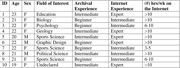
The demographics of this user group can be seen in below in Table 1. All
participants were between the ages of 19 and 23 years old. Seventy percent of the
participants self-identified as female with the remaining thirty percent self-identifying
as male. These students expressed interests in a variety of different fields including
social sciences, natural sciences, visual arts, and medical sciences. While the level of
archival experience was split between beginner and intermediate competencies, all
participants were either intermediate level or expert users of the Internet; ninety percent
of participants reported spending more than five hours a week using the Internet and
more than half claimed to spend at least double that time online.
TABLE 1: Participant Demographics
ID Age Sex Field of Interest Archival Experience
Internet Experience
(#) hrs/wk on the Internet
1 23 F Education Intermediate Expert >10
2 21 F Biology Beginner Intermediate >10
3 22 F Psychology Beginner Intermediate 6-10
4 22 F Geology Intermediate Expert >10
5 20 M Sports Science Intermediate Expert >10
6 22 M Graphic Design Beginner Expert >10
7 22 F Sports Science Beginner Intermediate 3-5
8 21 M Political Science Intermediate Intermediate >10
9 21 F Sports Science Beginner Intermediate 6-10
1.4
Study Overview
Like most usability studies, this finding aid usability study asked participants, in
addition to answering demographic questions about themselves and their experiences, to
complete typical tasks often attempted by finding aid users employing the existing
navigation features on the Princeton University Library’s website.55 Each participant
was given the same set of ten common tasks, with guiding questions corresponding to
each, to be completed within the confines of the website in question within a period of
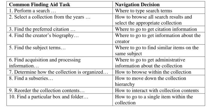
thirty minutes. Table 2 below shows the generic (not collection specific) version of each
task asked of test participants and explains what navigational decision that task required
users to make in order to be successful.
TABLE 2: Mapping Finding Aid Tasks to Navigation Decisions Made by User
Common Finding Aid Task Navigation Decision
1. Perform a search … Where to type search terms
2. Select a collection from the years … How to browse all search results and select the appropriate collection
3. Find the preferred citation … Where to go to get citation information 4. Find the creator’s biography… Where to go to get information about the
creator
5. Find the subject terms… Where to go to find similar items on the same subject
6. Find acquisition and processing information…
Where to go to get administrative information about the collection 7. Determine how the collection is organized… How to browse within the collection
8. Find a subseries… How to move down the collection
hierarchy
9. Reorder the collection contents… How to interact with collection contents 10. Find a particular box and folder… How to go to a single item within the
collection
As the above table reveals, each task required participants to make a decision
usability metrics were derived based on each participant’s ability to complete each task.
In addition to these tasks, the researcher also asked participants to comment on their
experience with the finding aid interface in a pre- and post-test survey, a brief reflective
interview, and finally in a Likert-scale user satisfaction survey called the System
Usability Scale (SUS).56
Therefore, this research study is informed by two sets of data:
1) Questionnaire Data: Qualitative and quantitative survey data collected from
participants during different portions of each testing session
2) Usability Testing Data: Qualitative and quantitative user data collected by
usability testing software and stimulated recall interviews using think-aloud
protocols that focused on participants’ interactions with the aforementioned
website
Below is an explanation of what each of these data sets measure and why they
are important to the research in question. All survey questions and tasks issued to
participants can be found in the research study’s testing materials located in Appendix 4
of this paper.
1.5
Questionnaire Data
Questionnaire Data was collected in the form of:
1. A demographic questionnaire
2. A pre-test questionnaire
3. A post-test questionnaire
Survey data was collected in the form of multiple questionnaires, some of which
generated quantitative data and some of which generated qualitative data. The initial
demographic survey collected information about the participants’ affiliation with the
institution, their age, their primary field of work/study, and their relative experience
with computers, the Internet, and archival finding aids. This questionnaire provided
descriptive statistics about the overall population of test participants and these statistics
can be viewed in Table 1 above.57
The pre-test and post-test questionnaires asked open ended questions about each
participant’s experience with the finding aid interface. The pre-test aimed to get at the
participant’s first impressions of the website, while the post-test questionnaire
attempted to capture the participant’s formal preferences for certain site features. Open
ended, free response style questions are useful for gaining insight into the subject’s
experiences with the system and can be useful for understanding the reasons behind
particular attitudes and behaviors.58 In the case of this usability study, the pre-test and
post-test questionnaires allowed participants an opportunity to respond to a three-part
question about the website’s interface at two points in the testing session: (1) after an
initial 2 minutes of site exploration, and (2) then again after the task-oriented portion of
the testing was complete. In addition to getting immediate and pertinent responses from
participants, the pre-test and post-test questionnaires were also designed to help
participants articulate and organize their thoughts about the online finding aid before
talking directly to the researcher about their experiences in the form of a brief reflective
However, because qualitative data is difficult to measure and sometimes does
not directly correspond to user satisfaction, participants were also issued a System
Usability Scale (SUS) survey as their final exit questionnaire. This survey is a simple
and quick-to complete form that helps to generate quantitative data about the relative
success of the system’s usability from the users’ perspective.59 In this way it avoids the
potential impact of testing fatigue that is sometimes experienced at the end of testing
sessions by participants, and also gives the researcher a statistical measure of whether
the interface is meeting user’s needs and expectations. The SUS survey consists of 10
statements for which participants rate their level of agreement on a 5 point scale. Then,
the ordinal values for each question are summed and multiplied by a constant in order to
produce an overall rating for the success of the system in question, with 100
representing a perfect score.60
1.6
Usability Testing Data
Usability Testing Data was measured in the following ways:
1. “Time on task” averages for the participant group as a whole
2. Success measures based on average time benchmarks per task
3. Number of “clicks” used to complete each task
4. Stimulated recall think-aloud style interview
All task-related usability data, both screen-capture and audio, was recorded
using the Morae Observer software provided by the SILS Usability Lab.61 The ISO
standard 9241, which provides guidance on designing World Wide Web user interfaces,
The data collected from usability testing in this research study speaks to the former two
components, while the questionnaires mentioned above and the data from the
participant interviews can gauge the degree of satisfaction felt by users.
First, the amount of time each participant needs to successfully complete a given
task was recorded and all participant times were combined to determine the group
average “time on task.” Then, in order to gauge the effectiveness of the website’s
navigational components, the researcher calculated a success value for each task using
the average time for each task as a benchmark. Participants’ task completion times that
fell at or below this benchmark were coded as “Completed with Ease,” and times that
fell at or below twice the benchmark were coded “Completed with Difficulty.” Times
that exceeded this second benchmark or tasks that were never accomplished were coded
“Incomplete.” Time benchmarks can help to show varying degrees of task success
across the entire population of testing participants and indicate the overall percentage of
participants who effectively completed each task.63
The efficiency of the website’s navigation was calculated by the number of
mouse clicks used to complete a given task compared to the optimal number of mouse
clicks required. For the former measure – mouse clicks – both left clicks, right clicks,
and double clicks were included so as to consider all possible action steps users took
when working towards a particular goal. The average number of mouse clicks for each
task was calculated based on the results of the entire participant group. This value was
then compared to the optimal number of mouse clicks, representing the ideal and most
efficient number of steps to needed to complete that goal.64 Such a comparison can
navigational inefficiencies.65 If a task shows a large discrepancy between the optimal
and average number of mouse clicks, it could be an indication that the finding aid
website’s navigation features are not understood or noticed by end-users, and therefore
are not utilized effectively or efficiently. In general, for efficiency data, the researcher
used basic descriptive statistics to interpret usability results, focusing on measures of
central tendency (mean, median, mode) as well as measures of dispersion (range,
variance, and standard deviation).
After the user completed the task performance portion of the testing, and
completed the pre- and post-test questionnaire, the researcher asked the testing subjects
to – in the form of a stimulated recall think-aloud style interview – articulate their
thinking and decision making processes at various stages in their exploration and test
completion process.66 This method is called “retrospective think-aloud protocol” and it
is a way to try and understand the user’s state of mind and rationale; these are aspects of
the user experience which are not well recorded by other types of quantitative data.67
The Morae Observer usability software records and allows transcriptions of each
interview session. These recordings and transcriptions were frequently consulted by the
researcher during the data analysis stage of the project in order to try and explain why
participants made certain decisions and how they related to the website’s navigation
features. The result of these interviews are elaborated on in the following chapter,
wherein the researcher explains the results of the study.
51 DACS (Describing Archives: A Content Standard) is the standard set of rules recognized the Society of American Archivists (SAA) for describing personal papers and manuscript in collections in archival finding aids.
52 Shaun Ellis and Maureen Callahan, “Prototyping as a Process for Improved User Experience with Library and Archives Websites,” Code4lib Journal 18 (2012): http://journal.code4lib.org/articles/7394. 53 “Usability Testing,” last modified November 13, 2013,
http://www.usability.gov/how-to-and-tools/methods/usability-testing.html#.
54 In a 2012 article, Jakob Nielsen argued that for qualitative usability studies, more than five testing participants did not result in appreciably more usability insights. The researcher of this study chose to be conservative and double that number in recruiting her own testing participants, with the support of Carnegie Foundation funding, so that any statistical results would have better confidence. See Jakob Nielsen, “How Many Test Users in a Usability Study?” Nielsen Norman Group: Evidenced-Based User Experience Research, Training, and Consulting (June 4, 2012). http://www.nngroup.com/articles/how-many-test-users/.
55 “Usability Testing,” http://www.usability.gov/how-to-and-tools/methods/usability-testing.html#. 56 Each part of the testing session mentioned here, is explained in further detail in the following sections of the paper.
57 Diane Kelly, Methods for Evaluating Interactive Information Retrieval Systems with Users (Hanover, MA: now Publishers, 2009), 97.
58 Ibid.
59 Tom Tullis, and Bill (William) Albert. Measuring the User Experience: Collecting, Analyzing, and
Presenting Usability Metrics (Boston: Elsevier/Morgan Kaufmann, 2008), 147. 60 Ibid.
61 To learn more about this software see http://www.techsmith.com/morae-features.html.
62 International Standards Organization, “ISO 9241-151:2008 - Ergonomics of Human-System Interaction - Part 151: Guidance on World Wide Web User Interfaces,”
http://www.iso.org/iso/home/store/catalogue_tc/catalogue_detail.htm?csnumber=37031.
63 Jeffrey Rubin and Dana Chisnell, Handbook of Usability Testing: How to Plan, Design, and Conduct
Effective Tests (Indianapolis: Wiley, 2008), 250-251.
64 The optimal number of mouse clicks for each task was calculated by determining the shortest possible pathway to in the desired search result and then counting the number of mouse clicks that specific pathway required.
65 Tullis and Albert, Measuring the User Experience, 87-88. 66 Kelly, Methods for Evaluating…, 88.
Results
At this point in the paper the researcher will explain the results of the usability
study in three parts. First, by reviewing participant responses to the pre- and post-test
questionnaires and looking at the System Usability Scale (SUS) survey results, the
researcher will reveal (1) what participants generally liked about the website interface;
(2) what they disliked; (3) how they felt about its design and organization; (4) what, if
anything, about the interface was confusing to them; and (5) how successful the finding
aid website was as a whole. Second, the researcher will present a range of usability data
related to the effectiveness and efficiency of the finding aid website’s navigational
components including (1) the average amount of time spent on each task; (2) the overall
task completion rate for the group of test participants; (3) mouse click efficiency for
each task – that is, how the average number of clicks compares to the optimal number
clicks. Finally, the researcher will relay trends in user feedback collected from the
stimulated recall think-aloud style interviews with study participants. After the results
of the study have been thoroughly reviewed, the researcher will end by discussing the
implications of these outcomes, not just for the particular finding aid website in
question, but also for the broader community of archival institutions with online
1.7
Survey Results
Before being asked to complete tasks within a specific collection on Princeton’s
Finding Aid website, participants were given two minutes to explore the website on
their own. Starting the browser at a simple and small collection’s finding aid, the
researcher explained what was on the screen and encouraged the participant to navigate
around the collection and the website however he or she wished. Afterwards, the
participant was asked to write about the experience for a full five minutes with
particular attention to good features, bad features, aesthetics, and obfuscations. [Go to
Appendix 5 to see the researcher’s study procedures and script]. Table 3 below
collocates and synthesizes participants’ initial responses to the website.
TABLE 3: Pre-Test Questionnaire Results (the number of participants who commented on a topic is given in parentheses)
Initial Likes Initial Dislikes Initial
Impressions of Aesthetics
Initial Points of Confusion
Concise text (9) Contents not immediately
viewable in summary (3)
Uncluttered layout (9)
The point of the comments section is unclear (5)
Easy-to-find search bar for the collection (4)
Must take several steps in order to view an individual item (3)
Nice color scheme (6)
Faceted sorting by subject was not always successful (2)
Citation information given (3)
Not enough pictures or icons used (4)
Breadcrumb menu and content
hyperlinks available in central contents box (3)
Orange highlight on current tab is helpful (3)
After participants were asked to complete a series of tasks within a specific
collection on the finding aid website, they were one again given a full five minutes to
respond about their experiences. Table 4 below shows additional comments provided by
participants once they had become more familiar with the website and its functions.
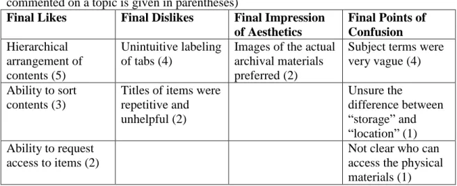
TABLE 4: Post-test Questionnaire Results (with the number of participants who commented on a topic is given in parentheses)
Final Likes Final Dislikes Final Impression of Aesthetics
Final Points of Confusion Hierarchical
arrangement of contents (5)
Unintuitive labeling of tabs (4)
Images of the actual archival materials preferred (2)
Subject terms were very vague (4)
Ability to sort contents (3)
Titles of items were repetitive and unhelpful (2) Unsure the difference between “storage” and “location” (1) Ability to request
access to items (2)
Not clear who can access the physical materials (1)
As the above tables make clear, half or more of study participants enjoyed the
conciseness of the website’s text, its simple and uncluttered layout, and the color
scheme used in its display. In addition, the same number of participants praised the
site’s hierarchical arrangement of archival content, stressing that such organization
afforded easy “drilling down” through the collection’s various “layers.” However, equal
numbers of respondents indicated that the Comments box at the bottom of every page
was confusing and they were unsure how they should interact with it. Furthermore,
nearly half of all participants expressed appreciation for an easy to find search box that
allows collection level keyword searching. Yet, the same numbers of participants were
found the labels attached to the left-hand tabs – “Summary,” “Description,” “Collection
History,” “Access and Use,” and “Find More” – unintuitive and the subject terms
applied to each collection were reported to be overly vague. Details about participants’
verbal feedback will be revealed later in this chapter in the discussion about the data
collected from stimulated recall think-aloud style interviews with study participants, but
the comments mentioned above are good indicators of major interface strengths and
weaknesses.
While some of the above questionnaire comments are undeniably negative in
nature, a look at the results of the SUS survey in Figure 1, on whole, reveals a high
level of successful interaction with the website. Since a combined SUS score of over 70
is considered to be above average,68 it seems that all participants rated the website
“above average” in terms of usability. The lowest score assigned was 70, the highest
score was perfect (100), and the group average was determined to 84.5. All of these
scores seem to imply, despite the above comments about undesirable site features or
points of confusion in the interface, that users are generally satisfied with the current
FIGURE 1:
While this average SUS score is a good indication that participants were able to
successfully complete their tasks within the given finding aid interface, a closer look at
participants’ individual and average task completion rates can yield more fruitful data
about how users navigated the archival description presented to them on Princeton’s
Finding Aid website. Therefore, this chapter will now transition to a discussion of
task-specific effectiveness and efficiency measures collected by the researcher using
specialized usability software.
1.8
Usability Results
One of the most basic ways of determining which tasks might be more difficult
to navigate than others is considering “time on task” data; that is, the amount of time a
participant needs to successfully complete a given task. The average “time on task” data 0
10 20 30 40 50 60 70 80 90 100
SUS Scores
for each of the 10 tasks presented to participants in this study is shown in the Figure 2
below. These averages indicate that while tasks 8 and 9 were the most time consuming
for participants – each requiring an average of almost one full minute to complete –
tasks 2, 3, 6, and 7 were typically accomplished more quickly; that is, they were
completed, on average, in less than 30 seconds. Such statistics help to give an indication
of what kinds of tasks are easier to navigate on the website (and therefore faster to
accomplish) than others.
FIGURE 2:
Another way to help determine the level of success for each task is to compare
each participant’s completion time to a set of benchmark completion times. In this case
the benchmarks selected by the researcher were (1) the larger group’s average
completion time for each task, and (2) twice that value. Any participant who completed
a task at or before the first benchmark is classified in the below chart in Figure 3 as 00:00.0
00:08.6 00:17.3 00:25.9 00:34.6 00:43.2 00:51.8 01:00.5 01:09.1
1 2 3 4 5 6 7 8 9 10
Average Time on Task
completing that task “with ease.” Similarly, any participant who took longer to
complete their task than the first benchmark, but was successful at or before the second
benchmark is classified in the below chart at completing that task “with difficultly.”
Any participant who took longer to complete the task than the second benchmark was
not considered successful in that task.
FIGURE 3:
By classifying the data in this way we can see that at least 50% of participants
were able to complete all tasks “with ease,” and in most cases, only 1 in 10 participants
were not able to complete a given task (at least not within the required about of time to
be classified that way); this data, on whole, represents an overwhelming positive group
success rate. However, there are also less than ideal results presented here. Half of the
10 tasks issued to participants – Tasks 3, 4, 8, 9, and 10 – were not completed “with
ease” by a large percentage (40-50%) of participants. The navigation decisions relating 0% 10% 20% 30% 40% 50% 60% 70% 80% 90% 100%
1 2 3 4 5 6 7 8 9 10
Task Completion Rate
% of participants that completed the task WITH DIFFICULTY
to each of these include: where to find citation information, where to locate the creator’s
biographical information, how to find a subseries in the collection hierarchy, how to
reorder collection contents, and how to find a single item within the collection. The fact
that a large percentage of participants only completed these tasks “with difficulty”
forces the researcher to consider why these tasks were typically more time consuming
and difficult than the others, and whether or not navigational inefficiencies are to blame.
Efficiency measures like the total number of mouse clicks per task can be helpful
indicators for whether or not participants typically made more navigational errors
during the above mentioned tasks.
FIGURE 4:
The above chart presented in Figure 4 shows two sets of data: (1) the optimal
number of mouse clicks for each task – that is, the number of necessary mouse clicks
need to complete a task in the most efficient possible way – and (2) the average number 0
1 2 3 4 5 6 7 8
1 2 3 4 5 6 7 8 9 10
Mouse Click Efficiency
Difference between the Average and Optimal # of Mouse Clicks Per Task
of mouse clicks used by all participants for each task in the study. These data are
overlaid here to show the difference between the two values in an effort to communicate
which tasks were performed most efficiently by the participant group and which
typically were performed inefficiently, that is with far more than the necessary mouse
clicks. These results indicate that the least efficiently executed task, by far, was Task 4
– finding the creator’s biography within the collection’s finding aid. Users seemed to
make navigational errors frequently when trying to complete this task, and this could be
an indication to the researcher that the preferred or intended navigational path to the
creator’s biography is confusing, unintuitive, or simply unapparent to end-users. Other
tasks that revealed high inefficiencies (those that averaged double or greater mouse
clicks than optimal) included Tasks 1, 5, 8, 9, and 10. These tasks included the
following navigational choices: performing a global search across all collections,
looking for similar items on the same subject as the current collection using subject
terms, finding subseries information within the collection hierarchy, determining how to
reorder collection contents, and finding a single item of interest within the collection. In
the context of Princeton’s Finding Aid website, navigation choices related to these tasks
tended to result in “extra” mouse clicks by task-oriented users. This is critical
information because it implies that the most efficient pathway for completing common
tasks on the website is not apparent to end-users. Click inefficiencies can be the result
of “lostness” on the part of the user – this is when a user makes navigation errors by
going down inefficient paths during their task-oriented movements because they are
1.9
User Feedback
During the stimulated recall think-aloud interviews with participants, the
researcher also collected verbally-issued information about how “lost” or confused the
user felt during their experience with the website. In addition, participants were asked
which kind of navigational features they preferred to use to complete their tasks and
why. The following data from Table 5 and Table 6 represent common responses from
the participant group during these brief stimulated recall think-aloud style interviews.
Interestingly, participant feedback was consistent across both beginner and intermediate
level archival finding aid users from the study.
TABLE 5: Participant Feedback about Navigation Difficulties Navigation Feature Failures Participant Comments
Ambiguous and/or unintuitive labeling “Some of the major tabs are labeled ambiguously… for example, Collection History, Description, and Access and Use.”
“More descriptive titles on each of the tabs would have made it easier for me to
navigate.”
“It was confusing to me that the Collection Creator Biography was in the description tab… I didn’t feel that was intuitive.” Unclear relationship between “Contents
and Arrangement” tab and series tabs below
“I think that the connection between the Contents and Arrangement tab and the lower series level tabs would be clearer if the series list were hidden, and then revealed only when the Contents and Arrangement tab was selected.”
Insufficient cues for using sorting feature “It took me a long time to figure out how to sort items by date because I didn’t couldn’t see the arrow that was a clue for the feature…It was hidden.”
“Clicking on the column header to reorder the items was tricky…It seems like you’d have to know about the button already in order to use it in that way.”
The usability results and survey responses previously reviewed in this chapter
seemed to correlate with some of the navigational breakdowns (in Table 5) expressed
by participants during the interview portion of testing. For example, four participants
specifically mentioned labeling as a “dislike” in their post-test questionnaire and the
issue came up again as a major navigational failure during the think-aloud interview
protocol. Furthermore, Task 4, wherein users had to locate the Content Creator’s
Biography within the interface by finding the correct label, was found to be the least
efficiently executed task of out any. Similarly, the task completion rate for Task 4, as
well as Task 3, which required users to locate the preferred citation for the collection
using tab labels, showed that 50% of users could not complete the task “with ease.” The
user comments in the first row of Table 5 imply that these statistics can be explained by
the fact that users did not understand or anticipate why the desired information would
be located in that particular tab. In other words, the label obfuscated rather than clarified
the proper navigation path for end-users.
One potential solution to this vocabulary dilemma is to keep label titles as they
are and just provide guidance and context for them by inserting hover captions over
each label which would pop-up anytime the mouse moved over them. These hover
housed and therefore prevent confusion. Joyce Chapman’s usability experiment with
hover captions at the University of North Carolina’s Southern Historical Collection was
met with positive results from test participants, most of whom agreed that the hover
captions were a useful and unobtrusive way to present important navigation
information.70
The other navigation failure expressed by many study participants was that the
series level tabs located in the left hand menu bar under Contents and Arrangement
were not clearly related to that tab in any visual way except by proximity. This
confusion may help to explain why 50% of users did not complete tasks which required
interacting with collection contents – Tasks 9 and 10 – “with ease”, and why these same
tasks were characterized by high levels of click inefficiency. Finally, as the last few
comments from Table 5 hint, the task which required users to interact with the
collection contents by reordering items – Task 8 – showed equally high levels of click
inefficiency and was also only completed with ease by half of all study participants.
According to the participant feedback given in the think-aloud interviews, these
navigation failures were not the result of inappropriate navigational components, but
rather the product of a lack of user-friendly visual cues. The re-orderable item columns
show no visual indication of “clickability” until a mouse scrolled over the column
header. In the same way, the Contents and Arrangement tab and lower level series tabs
shared no visual indicators that might signal to users that they relate to the same
content.
Connecting users to specific interface features, especially inexperienced or