Information Visualization and
Visual Data Mining
Daniel A. Keim
Abstract— Never before in history data has been generatedat such high volumes as it is today. Exploring and analyzing the vast volumes of data becomes increasingly difficult. In-formation visualization and visual data mining can help to deal with the flood of information. The advantage of visual data exploration is that the user is directly involved in the data mining process. There is a large number of information visualization techniques which have been developed over the last decade to support the exploration of large data sets. In this paper, we propose a classification of information visu-alization and visual data mining techniques which is based on thedata type to be visualized, the visualization techniqueand theinteraction and distortion technique. We exemplify the clas-sification using a few examples, most of them referring to techniques and systems presented in this special issue.
Keywords— Information Visualization, Visual Data Min-ing, Visual Data Exploration, Classification
I. Introduction
The progress made in hardware technology allows to-day’s computer systems to store very large amounts of data. Researchers from the University of Berkeley estimate that every year about 1 Exabyte (= 1 Million Terabyte) of data are generated, of which a large portion is available in dig-ital form. This means that in the next three years more data will be generated than in all of human history before. The data is often automatically recorded via sensors and monitoring systems. Even simple transactions of every day life, such as paying by credit card or using the telephone, are typically recorded by computers. Usually, many pa-rameters are recorded, resulting in multidimensional data with a high dimensionality. The data of all mentioned ar-eas is collected because people believe that it is a potential source of valuable information, providing a competitive ad-vantage (at some point). Finding the valuable information hidden in them, however, is a difficult task. With today’s data management systems, it is only possible to view quite small portions of the data. If the data is presented textu-ally, the amount of data which can be displayed is in the range of some one hundred data items, but this is like a drop in the ocean when dealing with data sets containing millions of data items. Having no possibility to adequately explore the large amounts of data which have been collected because of their potential usefulness, the data becomes use-less and the databases become data ‘dumps’.
Daniel A. Keim is currently with AT&T Shannon Research Labs, Florham Park, NJ, USA and the University of Constance, Germany. E-mail: [email protected].
This is an extended version of [6], portions of which are copyrighted by ACM.
Benefits of Visual Data Exploration
For data mining to be effective, it is important to include the human in the data exploration process and combine the flexibility, creativity, and general knowledge of the human with the enormous storage capacity and the computational power of today’s computers. Visual data exploration aims at integrating the human in the data exploration process, applying its perceptual abilities to the large data sets avail-able in today’s computer systems. The basic idea of visual data exploration is to present the data in some visual form, allowing the human to get insight into the data, draw con-clusions, and directly interact with the data. Visual data mining techniques have proven to be of high value in ex-ploratory data analysis and they also have a high potential for exploring large databases. Visual data exploration is especially useful when little is known about the data and the exploration goals are vague. Since the user is directly involved in the exploration process, shifting and adjusting the exploration goals is automatically done if necessary.
The visual data exploration process can be seen a hy-pothesis generation process: The visualizations of the data allow the user to gain insight into the data and come up with new hypotheses. The verification of the hypotheses can also be done via visual data exploration but it may also be accomplished by automatic techniques from statistics or machine learning. In addition to the direct involvement of the user, the main advantages of visual data exploration over automatic data mining techniques from statistics or machine learning are:
• visual data exploration can easily deal with highly
inho-mogeneous and noisy data
• visual data exploration is intuitive and requires no under-standing of complex mathematical or statistical algorithms or parameters.
As a result, visual data exploration usually allows a faster data exploration and often provides better results, especially in cases where automatic algorithms fail. In ad-dition, visual data exploration techniques provide a much higher degree of confidence in the findings of the explo-ration. This fact leads to a high demand for visual ex-ploration techniques and makes them indispensable in con-junction with automatic exploration techniques.
Visual Exploration Paradigm
Visual Data Exploration usually follows a three step pro-cess: Overview first, zoom and filter, and then details-on-demand (which has been called the Information Seeking Mantra [1]). First, the user needs to get an overview of the data. In the overview, the user identifies interesting
patterns and focuses on one or more of them. For analyz-ing the patterns, the user needs to drill-down and access details of the data. Visualization technology may be used for all three steps of the data exploration process: Visual-ization techniques are useful for showing an overview of the data, allowing the user to identify interesting subsets. In this step, it is important to keep the overview visualization while focusing on the subset using an other visualization technique. An alternative is to distort the overview visu-alization in order to focus on the interesting subsets. To further explore the interesting subsets, the user needs a drill-down capability in order to get the details about the data. Note that visualization technology does not only pro-vide the base visualization techniques for all three steps but also bridges the gaps between the steps.
II. Classification of Visual Data Mining Techniques
Information visualization focuses on data sets lacking in-herent 2D or 3D semantics and therefore also lacking a standard mapping of the abstract data onto the physical screen space. There are a number of well known tech-niques for visualizing such data sets such as x-y plots, line plots, and histograms. These techniques are useful for data exploration but are limited to relatively small and low-dimensional data sets. In the last decade, a large num-ber of novel information visualization techniques have been developed, allowing visualizations of multidimensional data sets without inherent two- or three-dimensional semantics. Nice overviews of the approaches can be found in a number of recent books [2] [3] [4] [5]. The techniques can be classi-fied based on three criteria (see figure 1) [6]: The data to be visualized, the visualization technique, and the interaction and distortion technique used.
Thedata type to be visualized[1] may be
• One-dimensional data, such as temporal data as used in ThemeRiver (see figure 2 in [7])
• Two-dimensional data, such as geographical maps as
used in Polaris (see figure 3(c) in [8]) and MGV (see figure 9 in [9])
• Multidimensional data, such as relational tables as used
in Polaris (see figure 6 in [8]) and the Scalable Framework (see figure 1 in [10])
• Text and hypertext, such as news articles and Web doc-uments as used in ThemeRiver (see figure 2 in [7])
• Hierarchies and graphs, such as telephone calls and Web
documents as used in MGV (see figure 13 in [9]) and the Scalable Framework (see figure 7 in [10])
• Algorithms and software, such as debugging operations as used in Polaris (see figure 7 in [8])
Thevisualization techniqueused may be classified into
• Standard 2D/3D displays, such as bar charts and x-y plots as used in Polaris (see figure 1 in [8])
• Geometrically transformed displays, such as landscapes
and parallel coordinates as used in Scalable Framework (see figures 2 and 12 in [10])
Fig. 1. Classification of Information Visualization Techniques
• Icon-based displays, such as needle icons and star icons as used in MGV (see figures 5 and 6 in [9])
• Dense pixel displays, such as the recursive pattern and
circle segments techniques (see figures 3 and 4) [11] and the graph scetches as used in MGV (see figure 4 in [9])
• Stacked displays, such as treemaps [12] [13] or dimen-sional stacking [14]
The third dimension of the classification is the interac-tion and distorinterac-tion technique used. Interaction and distortion techniques allow users to directly interact with the visualizations. They may be classified into
• Interactive Projection as used in the GrandTour system
[15]
• Interactive Filtering as used in Polaris (see figure 6 in [8])
• Interactive Zooming as used in MGV and the Scalable
Framework (see figure 8 in [10])
• Interactive Distortion as used in the Scalable Framework (see figure 7 in [10])
• Interactive Linking and Brushing as used in Polaris (see
figure 7 in [8]) and the Scalable Framework (see figures 12 and 14 in [10])
Note that the three dimensions of our classification -data type to be visualized, visualization technique, and in-teraction & distortion technique - can be assumed to be orthogonal. Orthogonality means that any of the visual-ization techniques may be used in conjunction with any of the interaction techniques as well as any of the distortion techniques for any data type. Note also that a specific sys-tem may be designed to support different data types and that it may use a combination of multiple visualization and interaction techniques.
III. Data Type to be Visualized
In information visualization, the data usually consists of a large number of records each consisting of a num-ber of variables or dimensions. Each record corresponds to an observation, measurement, transaction, etc. Exam-ples are customer properties, e-commerce transactions, and physical experiments. The number of attributes can dif-fer from data set to data set: One particular physical ex-periment, for example, can be described by five variables,
while an other may need hundreds of variables. We call the number of variables the dimensionality of the data set. Data sets may be one-dimensional, two-dimensional, mul-tidimensional or may have more complex data types such as text/hypertext or hierarchies/graphs. Sometimes, a dis-tiction is made between dense (or grid) dimensions and the dimensions which may have arbitrary values. Depend-ing on the number of dimensions with arbitrary values the data is sometimes also called univariate, bivariate, etc.
One-dimensional data
One-dimensional data usually has one dense dimension. A typical example of one-dimensional data is temporal data. Note that with each point of time, one or multi-ple data values may be associated. An exammulti-ple are time series of stock prices (see figure 3 and figure 4 for an exam-ple) or the time series of news data used in the ThemeRiver examples (see figures 2-5 in [7]).
Two-dimensional data
Two-dimensional data has two distinct dimensions. A typical example is geographical data where the two distinct dimensions are longitude and latitude. X-Y-plots are a typ-ical method for showing two-dimensional data and maps are a special type of x-y-plots for showing two-dimensional geographical data. Examples are the geographical maps used in Polaris (see figure 3(c) in [8]) and in MGV (see fig-ure 9 in [9]). Although it seems easy to deal with temporal or geographic data, caution is advised. If the number of records to be visualized is large, temporal axes and maps get quickly glutted - and may not help to understand the data.
Multi-dimensional data
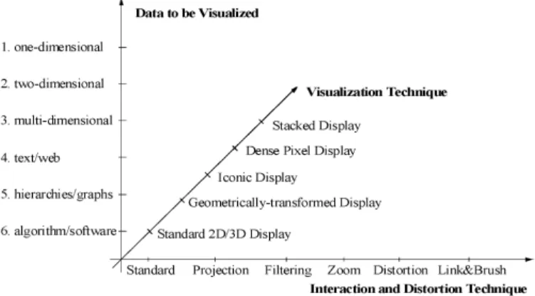
Many data sets consists of more than three attributes and therefore, they do not allow a simple visualization as 2-dimensional or 3-dimensional plots. Examples of multidi-mensional (or multivariate) data are tables from relational databases, which often have tens to hundreds of columns (or attributes). Since there is no simple mapping of the at-tributes to the two dimensions of the screen, more sophis-ticated visualization techniques are needed. An example of a technique which allows the visualization of multidimen-sional data is the Parallel Coordinate Technique [16] (see figure 2, which is also used in the Scalable Framework (see figure 12 in [10]). Parallel Coordinates display each multi-dimensional data item as a polygonal line which intersects the horizontal dimension axes at the position correspond-ing to the data value for the correspondcorrespond-ing dimension.
Text & Hypertext
Not all data types can be described in terms of dimen-sionality. In the age of the world wide web, one important data type is text and hypertext as well as multimedia web page contents. These data types differ in that they can not be easily described by numbers and therefore, most of the standard visualization techniques can not be applied. In
Fig. 2. Parallel Coordinate Visualization cIEEE
most cases, first a transformation of the data into descrip-tion vectors is necessary before visualizadescrip-tion techniques can be used. An example for a simple transformation is word counting (see ThemeRiver [7]) which is often combined with a principal component analysis or multidimensional scaling (for example, see [17]).
Hierarchies & Graphs
Data records often have some relationship to other pieces of information. Graphs are widely used to represent such interdependencies. A graph consists of set of objects, called nodes, and connections between these objects, called edges. Examples are the e-mail interrelationships among people, their shopping behavior, the file structure of the hard disk or the hyperlinks in the world wide web. There are a num-ber of specific visualization techniques that deal with hier-archical and graphical data. A nice overview of hierachical information visualization techniques can be found in [18], an overview of web visualization techniques at [19] and an overview book on all aspects related to graph drawing is [20].
Algorithms & Software
Another class of data are algorithms & software. Coping with large software projects is a challenge. The goal of vi-sualization is to support software development by helping to understand algorithms, e.g. by showing the flow of in-formation in a program, to enhance the understanding of written code, e.g. by representing the structure of thou-sands of source code lines as graphs, and to support the programmer in debugging the code, i.e. by visualizing er-rors. There are a large number of tools and systems which support these tasks. An nice overview can be found at [21].
IV. Visualization Techniques
There is a large number of visualization techniques which can be used for visualizing the data. In addition to standard 2D/3D-techniques such as x-y (x-y-z) plots, bar charts, line graphs, etc., there are a number of more sophis-ticated visualization techniques. The classes correspond to basic visualization principles which may be combined in order to implement a specific visualization system.
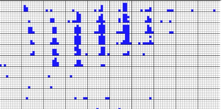
Fig. 3. Dense Pixel Displays: Recursive Pattern Technique cIEEE
Geometrically-Transformed Displays
Geometrically transformed display techniques aim at finding “interesting” transformations of multidimensional data sets. The class of geometric display techniques in-cludes techniques from exploratory statistics such as scat-terplot matrices [22] [23] and techniques which can be sub-sumed under the term “projection pursuit” [24]. Other geometric projection techniques include Prosection Views [25] [26], Hyperslice [27], and the well-known Parallel Co-ordinates visualization technique [16]. The parallel coordi-nate technique maps the k-dimensional space onto the two display dimensions by using k equidistant axes which are parallel to one of the display axes. The axes corespond to the dimensions and are linearly scaled from the minimum to the maximum value of the corresponding dimension. Each data item is presented as a polygonal line, intersecting each of the axes at that point which corresponds to the value of the considered dimensions (see figure 2).
Iconic Displays
Another class of visual data exploration techniques are the iconic display techniques. The idea is to map the at-tribute values of a multi-dimensional data item to the fea-tures of an icon. Icons can be arbitraily defined: They may be little faces [28], needle icons as used in MGV (see figure 5 in [9]), star icons [14], stick figure icons [29], color icons [30],[31], and TileBars [32]. The visualization is generated by mapping the attribute values of each data record to the features of the icons. In case of the stick figure technique, for example, two dimensions are mapped to the display dimensions and the remaining dimensions are mapped to the angles and/or limb length of the stick figure icon. If the data items are relatively dense with respect to the two display dimensions, the resulting visualization presents tex-ture patterns that vary according to the characteristics of the data and are therefore detectable by preattentive per-ception.
Fig. 4. Dense Pixel Displays: Circle Segments Technique cIEEE
Dense Pixel Displays
The basic idea of dense pixel techniques is to map each dimension value to a colored pixel and group the pixels be-longing to each dimension into adjacent areas [11]. Since in general dense pixel displays use one pixel per data value, the techniques allow the visualization of the largest amount of data possible on current displays (up to about 1.000.000 data values). If each data value is represented by one pixel, the main question is how to arrange the pixels on the screen. Dense pixel techniques use different arrang-ments for different purposes. By arranging the pixels in an appropriate way, the resulting visualization provides de-tailed information on local correlations, dependencies, and hot spots.
Well-known examples are the recursive pattern technique [33] und the circle segments technique [34]. Therecursive pattern techniqueis based on a generic recursive back-and-forth arrangement of the pixels and is particular aimed at representing datasets with a natural order according to one attribute (e.g. time series data). The user may specify pa-rameters for each recursion level, and thereby controls the arrangement of the pixels to form semantically meaningful substructures. The base element on each recursion level is a pattern of heighthi und width wi as specified by the user. First, the elements correspond to single pixels which are arranged within a rectangle of heighth1 and widthw1 from left to right, then below backwards from right to left, then again forward from left to right, and so on. The same basic arrangement is done on all recursion levels with the only difference that the basic elements which are arranged on level i are the pattern resulting from the level (i−1) arrangements. In figure 3, an example recursive pattern visualization of financial data is shown. The visualization shows twenty years (January 1974 - April 1995) of daily prices of the 100 stocks contained in the Frankfurt Stock Index (FAZ). The idea of thecircle segments technique[34] is to represent the data in a circle which is divided into seg-ments, one for each attribute. Within the segments each attribute value is again visualized by a single colored pixel.
Fig. 5. Dimensional Stacking Visualization of Oil Mining Data
(used by permission of M. Ward, Worchester PolytechniccIEEE)
The arrangment of the pixels starts at the center of the circle and continues to the outside by plotting on a line orthogonal to the segment halving line in a back and forth manner. The rational of this approach is that close to the center all attributes are close to each other enhancing the visual comparison of their values. Figure 4 shows an exam-ple circle segment visualization of the same data (50 stocks) as shown in figure 3.
Stacked Displays
Stacked display techniques are tailored to present data partitioned in a hierarchical fashion. In case of multi-dimensional data, the data dimensions to be used for par-titioning the data and building the hierarchy have to be selected appropriately. An example of a stacked display technique is Dimensional Stacking [35]. The basic idea is to embed one coordinate systems inside an other coordi-nate system, i.e. two attributes form the outer coordicoordi-nate system, two other attributes are embedded into the outer coordinate system, and so on. The display is generated by dividing the outmost level coordinate systems into rect-angular cells and within the cells the next two attributes are used to span the second level coordinate system. This process may be repeated one more time. The usefulness of the resulting visualization largely depends on the data distribution of the outer coordinates and therefore the di-mensions which are used for defining the outer coordinate system have to be selected carefully. A rule of thumb is to choose the most important dimensions first. A dimensional stacking visualization of oil mining data with longitude and latitude mapped to the outer x and y axes, as well as ore grade and depth mapped to the inner x and y axes is shown in figure 5. Other examples of stacked display techniques include Worlds-within-Worlds [36], Treemap [12] [13], and Cone Trees [37].
V. Interaction and Distortion Techniques In addition to the visualization technique, for an effec-tive data exploration it is necessary to use some interaction and distortion techniques. Interaction techniquesallow the data analyst to directly interact with the visualizations and dynamically change the visualizations according to the ex-ploration objectives, and they also make it possible to
re-late and combine multiple independent visualizations. Dis-tortion techniqueshelp in the data exploration process by providing means for focusing on details while preserving an overview of the data. The basic idea of distortion tech-niques is to show portions of the data with a high level of detail while others are shown with a lower level of detail. We distinguish between the termsdynamicandinteractive
depending on whether the changes to the visualizations are made automatically or manually (by direct user interac-tion).
Dynamic Projections
The basic idea of dynamic projections is to dynami-cally change the projections in order to explore a multi-dimensional data set. A classic example is the Grand-Tour system [15] which tries to show all interesting two-dimensional projections of a multi-two-dimensional data set as a series of scatter plots. Note that the number of possible projections is exponential in the number of dimensions, i.e. it is intractable for a large dimensionality. The sequence of projections shown can be random, manual, precomputed, or data driven. Systems supporting dynamic projection techniques are XGobi [38] [39], XLispStat [40], and Ex-plorN [41].
Interactive Filtering
In exploring large data sets, it is important to interac-tively partition the data set into segements and focus on interesting subsets. This can be done by a direct selec-tion of the desired subset (browsing) or by a specification of properties of the desired subset(querying). Browsing is very difficult for very large data sets and querying often does not produce the desired results. Therefore a number of interaction techniques have been developed to improve interactive filtering in data exploration. An example of an interactive tool which can be used for an interactive filter-ing are Magic Lenses [42] [43]. The basic idea of Magic Lenses is to use a tool like a magnifying glasses to support filtering the data directly in the visualization. The data under the magnifying glass is processed by the filter, and the result is displayed differently than the remaining data set. Magic Lenses show a modified view of the selected re-gion, while the rest of the visualization remains unaffected. Note that several lenses with different filters may be used; if the filter overlap, all filters are combined. Other examples of interactive filtering techniques and tools are InfoCrystal [44], Dynamic Queries [45] [46] [47], and Polaris [8] (see figure 6 in [8] for an example).
Interactive Zooming
Zooming is a well-known technique which is widely used in a number of applications. In dealing with large amounts of data, it is important to present the data in a highly com-pressed form to provide an overview of the data but at the same time allow a variable display of the data on different resolutions. Zooming does not only mean to display the data objects larger but it also means that the data repre-sentation automatically changes to present more details on
Fig. 6. Table Lenses(used by permission of R. Rao, Xerox PARC
c ACM)
higher zoom levels. The objects may, for example, be rep-resented as single pixels on a low zoom level, as icons on an intermediate zoom level, and as labeled objects on a high resolution. An interesting example applying the zooming idea to large tabular data sets is the TableLens approach [48]. Getting an overview of large tabular data sets is dif-ficult if the data is displayed in textual form. The basic idea of TableLens is to represent each numerical value by a small bar. All bars have a one-pixel height and the lengths are determined by the attribute values. This means that the number of rows on the display can be nearly as high as the vertical resolution and the number of columns depends on the maximum width of the bars for each attribute. The initial view allows the user to detect patterns, correlations, and outliers in the data set. In order to explore a region of interest the user can zoom in, with the result that the affected rows (or columns) are displayed in more detail, possibly even in textual form. Figure 6 shows an exam-ple of a baseball database with a few rows being selected in full detail. Other examples of techniques and systems which use interactive zooming include PAD++ [49] [50] [51], IVEE/Spotfire [52], and DataSpace [53]. A compari-son of fisheye and zooming techniques can be found in [54].
Interactive Distortion
Interactive distortion techniques support the data explo-ration process by preserving an overview of the data during drill-down operations. The basic idea is to show portions of the data with a high level of detail while others are shown with a lower level of detail. Popular distortion techniques are hyperbolic and spherical distortions which are often used on hierarchies or graphs but may be also applied to any other visualization technique. An example of spherical distortions is provided in the Scalable Framework paper (see figure 5 in [10]). An overview of distortion techniques is provided in [55] and [56]. Examples of distortion tech-niques include Bifocal Displays [57], Perspective Wall [58], Graphical Fisheye Views [59] [60], Hyperbolic Visualization [61] [62], and Hyperbox [63].
Interactive Linking and Brushing
There are many possibilities to visualize multi-dimensional data but all of them have some strength and some weaknesses. The idea of linking and brushing is to combine different visualization methods to overcome the shortcomings of single techniques. Scatterplots of different projections, for example, may be combined by coloring and linking subsets of points in all projections. In a similar fash-ion, linking and brushing can be applied to visualizations generated by all visualization techniques described above. As a result, the brushed points are highlighted in all visu-alizations, making it possible to detect dependencies and correlations. Interactive changes made in one visualiza-tion are automatically reflected in the other visualizavisualiza-tions. Note that connecting multiple visualizations through inter-active linking and brushing provides more information than considering the component visualizations independently.
Typical examples of visualization techniques which are combined by linking and brushing are multiple scatterplots, bar charts, parallel coordinates, pixel displays, and maps. Most interactive data exploration systems allow some form of linking and brushing. Examples are Polaris (see figure 7 in [8]) and the Scalable Framework (see figures 12 and 14 in [10]). Other tools and systems include S Plus [64], XGobi [38] [65], Xmdv [14], and DataDesk [66] [67].
VI. Conclusion
The exploration of large data sets is an important but dif-ficult problem. Information visualization techniques may help to solve the problem. Visual data exploration has a high potential and many applications such as fraud de-tection and data mining will use information visualization technology for an improved data analysis.
Future work will involve the tight integration of visu-alization techniques with traditional techniques from such disciplines as statistics, maschine learning, operations re-search, and simulation. Integration of visualization tech-niques and these more established methods would com-bine fast automatic data mining algorithms with the in-tuitive power of the human mind, improving the quality and speed of the visual data mining process. Viusal data mining techniques also need to be tightly integrated with the systems used to manage the vast amounts of relational and semistructured information, including database man-agement and data warehouse systems. The ultimate goal is to bring the power of visualization technology to every desktop to allow a better, faster and more intuitive explo-ration of very large data resources. This will not only be valuable in an economic sense but will also stimulate and delight the user.
References
[1] B. Shneiderman, “The eye have it: A task by data type taxon-omy for information visualizations,” inVisual Languages, 1996. [2] S. Card, J. Mackinlay, and B. Shneiderman, Readings in
Infor-mation Visualization, Morgan Kaufmann, 1999.
[3] C. Ware, Information Visualization: Perception for Design, Morgen Kaufman, 2000.
[4] B. Spence, Information Visualization, Pearson Education Higher Education publishers, UK, 2000.
[5] H. Schumann and W. M¨uller, Visualisierung: Grundlagen und allgemeine Methoden, Springer, 2000.
[6] D. Keim, “Visual exploration of large databases,” Communica-tions of the ACM, vol. 44, no. 8, pp. 38–44, 2001.
[7] L. Nowell S. Havre, B. Hetzler and P. Whitney, “Themeriver: Visualizing thematic changes in large document collections,”
Transactions on Visualization and Computer Graphics, 2001. [8] D. Tang C. Stolte and P. Hanrahan, “Polaris: A system
for query, analysis and visualization of multi-dimensional rela-tional databases,”Transactions on Visualization and Computer Graphics, 2001.
[9] J. Abello and J. Korn, “Mgv: A system for visualizing massive multi-digraphs,” Transactions on Visualization and Computer Graphics, 2001.
[10] N. Lopez M. Kreuseler and H. Schumann, “A scalable framework for information visualization,” Transactions on Visualization and Computer Graphics, 2001.
[11] D. Keim, “Designing pixel-oriented visualization techniques: Theory and applications,” Transactions on Visualization and Computer Graphics, vol. 6, no. 1, pp. 59–78, Jan–Mar 2000. [12] B. Shneiderman, “Tree visualization with treemaps: A 2D
space-filling approach,” ACM Transactions on Graphics, vol. 11, no. 1, pp. 92–99, 1992.
[13] B. Johnson and B. Shneiderman, “Treemaps: A space-filling approach to the visualization of hierarchical information,” in
Proc. Visualization ’91 Conf, 1991, pp. 284–291.
[14] M. O. Ward, “Xmdvtool: Integrating multiple methods for vi-sualizing multivariate data,” inProc. Visualization 94, Wash-ington, DC, 1994, pp. 326–336.
[15] D. Asimov, “The grand tour: A tool for viewing multidimen-sional data,” SIAM Journal of Science & Stat. Comp., vol. 6, pp. 128–143, 1985.
[16] A. Inselberg and B. Dimsdale, “Parallel coordinates: A tool for visualizing multi-dimensional geometry,” inProc. Visualization 90, San Francisco, CA, 1990, pp. 361–370.
[17] J. A. Wise, J. J. Thomas, K. Pennock, D. Lantrip, M. Pot-tier, Schur A., and V. Crow, “Visualizing the non-visual: Spa-tial analysis and interaction with information from text docu-ments,” inProc. Symp. on Information Visualization, Atlanta, GA, 1995, pp. 51–58.
[18] C. Chen, Information Visualisation and Virtual Environments, Springer-Verlag, London, 1999.
[19] M. Dodge, “Web visualization,” http://www.geog.ucl.ac.uk/ casa/martin/geography of cyberspace.html, oct 2001.
[20] G. D. Battista, P. Eades, R. Tamassia, and I. G. Tollis, Graph Drawing, Prentice Hall, 1999.
[21] J. Trilk, “Software visualization,” http://wwwbroy. informatik.tu-muenchen.de/˜trilk/sv.html, Oct 2001.
[22] D. F. Andrews, “Plots of high-dimensional data,” Biometrics, vol. 29, pp. 125–136, 1972.
[23] W. S. Cleveland, Visualizing Data, AT&T Bell Laboratories, Murray Hill, NJ, Hobart Press, Summit NJ, 1993.
[24] P. J. Huber, “The annals of statistics,”Projection Pursuit, vol. 13, no. 2, pp. 435–474, 1985.
[25] G. W. Furnas and A. Buja, “Prosections views: Dimensional inference through sections and projections,” Journal of Com-putational and Graphical Statistics, vol. 3, no. 4, pp. 323–353, 1994.
[26] R. Spence, L. Tweedie, H. Dawkes, and H. Su, “Visualization for functional design,” inProc. Int. Symp. on Information Vi-sualization (InfoVis ’95), 1995, pp. 4–10.
[27] J. J. van Wijk and R.. D. van Liere, “Hyperslice,” in Proc. Visualization ’93, San Jose, CA, 1993, pp. 119–125.
[28] H. Chernoff, “The use of faces to represent points in k-dimensional space graphically,”Journal Amer. Statistical Asso-ciation, vol. 68, pp. 361–368, 1973.
[29] R. M. Pickett and G. G. Grinstein, “Iconographic displays for visualizing multidimensional data,” inProc. IEEE Conf. on Systems, Man and Cybernetics, IEEE Press, Piscataway, NJ, 1988, pp. 514–519.
[30] H. Levkowitz, “Color icons: Merging color and texture per-ception for integrated visualization of multiple parameters,” in
Proc. Visualization 91, San Diego, CA, 1991, pp. 22–25. [31] D. A. Keim and H.-P. Kriegel, “Visdb: Database exploration
using multidimensional visualization,” Computer Graphics & Applications, vol. 6, pp. 40–49, Sept. 1994.
[32] M. Hearst, “Tilebars: Visualization of term distribution
infor-mation in full text inforinfor-mation access,” inProc. of ACM Human Factors in Computing Systems Conf. (CHI’95), 1995, pp. 59–66. [33] D. A. Keim, H.-P. Kriegel, and M. Ankerst, “Recursive pattern: A technique for visualizing very large amounts of data,” inProc. Visualization 95, Atlanta, GA, 1995, pp. 279–286.
[34] M. Ankerst, D. A. Keim, and H.-P. Kriegel, “Circle segments: A technique for visually exploring large multidimensional data sets,” inProc. Visualization 96, Hot Topic Session, San Fran-cisco, CA, 1996.
[35] J. LeBlanc, M. O. Ward, and N. Wittels, “Exploring n-dimensional databases,” inProc. Visualization ’90, San Fran-cisco, CA, 1990, pp. 230–239.
[36] S. Feiner and C. Beshers, “Visualizing n-dimensional virtual worlds with n-vision,” Computer Graphics, vol. 24, no. 2, pp. 37–38, 1990.
[37] G. G. Robertson, J. D. Mackinlay, and S. K. Card, “Cone trees: Animated 3D visualizations of hierarchical information,” inProc. Human Factors in Computing Systems CHI 91 Conf., New Orleans, LA, 1991, pp. 189–194.
[38] D. F. Swayne, D. Cook, and A. Buja,User’s Manual for XGobi: A Dynamic Graphics Program for Data Analysis, Bellcore Tech-nical Memorandum, 1992.
[39] A. Buja, D. F. Swayne, and D. Cook, “Interactive high-dimensional data visualization,” Journal of Computational and Graphical Statistics, vol. 5, no. 1, pp. 78–99, 1996.
[40] L. Tierney, “Lispstat: An object-orientated environment for statistical computing and dynamic graphics,” in Wiley, New York, NY, 1991.
[41] D. B. Carr, E. J. Wegman, and Q. Luo, “Explorn: Design con-siderations past and present,” inTechnical Report, No. 129, Center for Computational Statistics, George Mason University, 1996.
[42] E. A. Bier, M. C. Stone, K. Pier, W. Buxton, and T. DeRose, “Toolglass and magic lenses: The see-through interface,” in
Proc. SIGGRAPH ’93, Anaheim, CA, 1993, pp. 73–80. [43] K. Fishkin and M. C. Stone, “Enhanced dynamic queries via
movable filters,” inProc. Human Factors in Computing Systems CHI ’95 Conf., Denver, CO, 1995, pp. 415–420.
[44] A. Spoerri, “Infocrystal: A visual tool for information retrieval,” inProc. Visualization ’93, San Jose, CA, 1993, pp. 150–157. [45] C. Ahlberg and B. Shneiderman, “Visual information seeking:
Tight coupling of dynamic query filters with starfield displays,” inProc. Human Factors in Computing Systems CHI ’94 Conf., Boston, MA, 1994, pp. 313–317.
[46] S. G. Eick, “Data visualization sliders,” inProc. ACM UIST, 1994, pp. 119–120.
[47] J. Goldstein and S. F. Roth, “Using aggregation and dynamic queries for exploring large data sets,” inProc. Human Factors in Computing Systems CHI ’94 Conf., Boston, MA, 1994, pp. 23–29.
[48] R. Rao and S. K. Card, “The table lens: Merging graphical and symbolic representation in an interactive focus+context vi-sualization for tabular information,” in Proc. Human Factors in Computing Systems CHI 94 Conf., Boston, MA, 1994, pp. 318–322.
[49] K. Perlin and D. Fox, “Pad: An alternative approach to the computer interface,” inProc. SIGGRAPH, Anaheim, CA, 1993, pp. 57–64.
[50] B. Bederson, “Pad++: Advances in multiscale interfaces,” in
Proc. Human Factors in Computing Systems CHI ’94 Conf., Boston, MA, 1994, p. 315.
[51] B. B. Bederson and J. D. Hollan, “Pad++: A zooming graphi-cal interface for exploring alternate interface physics,” inProc. UIST, 1994, pp. 17–26.
[52] C. Ahlberg and E. Wistrand, “Ivee: An information visual-ization and exploration environment,” inProc. Int. Symp. on Information Visualization, Atlanta, GA, 1995, pp. 66–73. [53] V. Anupam, S. Dar, T. Leibfried, and E. Petajan, “Dataspace:
3D visualization of large databases,” inProc. Int. Symp. on Information Visualization, Atlanta, GA, 1995, pp. 82–88. [54] Schaffer, Doug, Zuo, Zhengping, Bartram, Lyn, Dill, John,
Dubs, Shelli, Greenberg, Saul, and Roseman, “Comparing fish-eye and full-zoom techniques for navigation of hierarchically clustered networks,” in Proc. Graphics Interface (GI ’93), Toronto, Ontario, 1993, in: Canadian Information Processing Soc., Toronto, Ontario, Graphics Press, Cheshire, CT, 1993, pp. 87–96.
distortion-oriented presentation techniques,” in Proc. Human Factors in Computing Systems CHI ’94 Conf., Boston, MA, 1994, pp. 126–160.
[56] M. S. T. Carpendale, D. J. Cowperthwaite, and F. D. Fracchia, “Ieee computer graphics and applications, special issue on infor-mation visualization,” IEEE Journal Press, vol. 17, no. 4, pp. 42–51, July 1997.
[57] R. Spence and M. Apperley, “Data base navigation: An office environment for the professional,” Behaviour and Information Technology, vol. 1, no. 1, pp. 43–54, 1982.
[58] J. D. Mackinlay, G. G. Robertson, and S. K. Card, “The per-spective wall: Detail and context smoothly integrated,” inProc. Human Factors in Computing Systems CHI ’91 Conf., New Or-leans, LA, 1991, pp. 173–179.
[59] G. Furnas, “Generalized fisheye views,” inProc. Human Factors in Computing Systems CHI 86 Conf., Boston, MA, 1986, pp. 18–23.
[60] M. Sarkar and M. Brown, “Graphical fisheye views,” Commu-nications of the ACM, vol. 37, no. 12, pp. 73–84, 1994. [61] J. Lamping, Rao R., and P. Pirolli, “A focus + context technique
based on hyperbolic geometry for visualizing large hierarchies,” inProc. Human Factors in Computing Systems CHI 95 Conf., 1995, pp. 401–408.
[62] T. Munzner and P. Burchard, “Visualizing the structure of the world wide web in 3D hyperbolic space,” in Proc. VRML ’95 Symp, San Diego, CA, 1995, pp. 33–38.
[63] B. Alpern and L. Carter, “Hyperbox,” inProc. Visualization ’91, San Diego, CA, 1991, pp. 133–139.
[64] R. Becker, J. M. Chambers, and A. R. Wilks, “The new s lan-guage, wadsworth & brooks/cole advanced books and software,”
Pacific Grove, CA, 1988.
[65] R. A. Becker, W. S. Cleveland, and M.-J. Shyu, “The visual design and control of trellis display,” Journal of Computational and Graphical Statistics, vol. 5, no. 2, pp. 123–155, 1996. [66] P. F Velleman, Data Desk 4.2: Data Description, Data Desk,
Ithaca, NY, 1992, 1992.
[67] A. Wilhelm, A.R. Unwin, and M. Theus, “Software for inter-active statistical graphics - a review,” inProc. Int. Softstat 95 Conf., Heidelberg, Germany, 1995.
Biography
DANIEL A. KEIMis working in the area of information visualization and data mining. In the field of information visualization, he developed several novel techniques which use visualization technology for the purpose of exploring large databases. He has published extensively on informa-tion visualizainforma-tion and data mining; he has given tutori-als on related issues at several large conferences including Visualization, SIGMOD, VLDB, and KDD; he has been program co-chair of the IEEE Information Visualization Symposia in 1999 and 2000; he is program co-chair of the ACM SIGKDD conference in 2002; and he is an editor of TVCG and the Information Visualization Journal.
Daniel Keim received his diploma (equivalent to an MS degree) in Computer Science from the University of Dort-mund in 1990 and his Ph.D. in Computer Science from the
University of Munich in 1994. He has been assistant pro-fessor at the CS department of the University of Munich, associate professor at the CS department of the Martin-Luther-University Halle, and full professor at the CS de-partment of the University of Constance. Currently, he is on leave from the University of Constance, working at AT&T Shannon Research Labs, Florham Park, NJ, USA.