Contents lists available at www.innovativejournal.in
Asian Journal of Computer Science And Information Technology
Journal Homepage: http://innovativejournal.in/ajcsit/index.php/ajcsit
GRAPHICAL USER INTERFACE - MODEL FOR E-COMMERCE APPLICATION
Sidharth Lahoti, Nand Kumar
Computer Science Department, BITS Pilani, Dubai Campus
ARTICLE INFO ABSTRACT
Corresponding Author: Sidharth Lahoti
Computer Science Department, BITS Pilani, Dubai Campus
DOI:http://dx.doi.org/10.15520
/ajcsit.v6i8.51
This paper will address the general ideas appropriate to successful graphical UI configuration; investigate significant subtle elements of GUIs and introduce imperative cases of representation techniques. Studying the relativeness of graphic user interface design in electronic commerce will provide guidelines to address the global market. The paper summaries recent work graphic user interface design issues in all sorts’ system environments, on a global level. This paper illustrates to attempts to illustrate the basic, key principles & requirements for successful GUI, for the e-commerce market. This paper also discusses the gap identified in the mental model for GUI in e-commerce market currently in use and vital points for success of the same.
©2016, AJCSIT, All Right Reserved. INTRODUCTION
By definition, a GUI is a sort of UI which permits individuals to associate with a PC or PC controlled gadgets that utilize graphical symbols, visual markers or extraordinary graphical components.
A successful GUI incorporates content to unmistakably exhibit the data and activities accessible to a human. The activities are normally performed through direct control of the graphical components. The usefulness of an application can be modified , yet in the event that the GUI is difficult to decipher or irritating to utilize, then the program at last will be a disappointment and the end people will probably pick something less demanding or more advantageous. Making a basic, simple to utilize GUI is indispensable to the achievement of a product.
e-Commerce services related data and information can be mind boggling to comprehend and impart; in this way, how the information is represented and interpreted is positively a standout amongst the most basic parts of an all around planned application. Showing the data in a manner that effectively and thoroughly conveys basic truths between e-commerce suppliers and patients is a test for the most experienced GUI designer. People must have the capacity to decipher the information with restricted or no help and an assortment of aptitude levels must be suited. The procedure for creating helpful GUIs incorporates a few key strides
That will be portrayed in this paper; including: A. Understanding the Key Elements in GUI Design B. Planning Screen Layout and User Interaction C. Adequately Presenting the Data
F. Investigating and Verifying the Design
A key part of the Design and Development Plan (DDP) is the delineation of tasks and activities, the assignment to responsible parties and the means of communication between the parties.
It is vital that the arrangement likewise be a reported procedure with its own arrangement of audits and
endorsements. GUI plan ought to be an essential part of the general Design and Development Plan. Incorporate into the arrangement sufficient time and assets to extensively cover the means important to finish a careful plan. This ought to incorporate a plan stage that blueprints the goal of every GUI and consolidates the utilization of "story boards" and models that can be checked on by the venture group preceding starting the coding period of the venture.
III. HISTORY
Scientists at the Xerox Palo Alto Research Center planned the primary application with a GUI, the Xerox Star, in 1977. The Xerox Star was extraordinary on the grounds that the scientists painstakingly composed the PC human interface before they started planning the interior workings of the application. Sadly, the Xerox Star was too moderate, and it was not financially effective.
In any case, Steve Jobs went to the Palo Alto Research Center and saw Xerox Star. He came back to Apple Computer and hence contracted a few of the first creators of Xerox Star. They initially created the Apple Lisa. Like the Xerox Star, the Apple Lisa was not economically fruitful. In 1984, they built up the industrially effective Apple Macintosh. In the broadest terms, the Macintosh's GUI characterized the look and feel of all GUIs today.
True Standards
The Apple Macintosh, the IBM SAA, and X-Windowing System are the ideal models for all cutting edge GUI. On account of their impact in the institutionalization of today's GUI plan, a brief portrayal of the significant elements of every standard is important.
Apple Macintosh
that restricted the people to relevant right replies. For instance, once the people made a choice by means of a menu, the menu constrained the people's resulting activities. The people could no longer pick something good for nothing. The Macintosh's GUI has every one of the three noteworthy parts of a GUI, which are the windowing framework, an imaging model, and an API.
IBM SAA
Dissimilar to the Apple Macintosh, the IBM-SAA is more than only a GUI. It is an entire arrangement of interfaces that can traverse machines from individual to centralized server PCs. Accordingly, it incorporates many capacities that most GUIs do, excluding a suite of systems administration and database devices. The SAA's GUI divide has every one of the three GUI segments. Another extraordinary thing of the SAA is that the people do not require a mouse to associate with the application. All activities can be executed from the console, usefulness not accessible in the Macintosh GUI. The most widely recognized SAA-sort GUIs are Windows 3.11 for DOS and the Program Manger for OS/2.
MIT X-Windows System
In spite of the fact that a different GUI standard, numerous X-Window based GUI, for example, Motif and TCL/TK, have duplicated the look and feel of the IBM SAA. X-Windows is still the hidden library for these GUI. The X-Windowing System is the most mainstream GUI for UNIX frameworks. This is on account that any X-Windows programming can utilize the X-Windows library, which gives it awesome compactness and institutionalization crosswise over stages. KEY ELEMENTS IN GUI DESIGN
Visual Acuity
Visual acuity is the ability of the eye to resolve detail. The retina of eye can only focus on about on a very small portion of a computer screen, or anything for that matter, at any one time [1]. This is on account of, at a separation more prominent than 2.5 degrees from the purpose of obsession, visual keenness diminishes considerably. In this manner, a hover of range 2.5 degrees around the purpose of obsession is the thing that the people can see unmistakably.
In the GUI world, this is the Rule of 1.7 [2]. At a normal viewing distance of 19 inches, 5 degrees translates into about 1.7 inches. Assuming a standard screen format, 1.7 inches is an area about 14 characters wide and about 7 lines high [3]. This is the measure of data that a people can take in at any one time, and it confines the viable size of symbols, menus, discoursed boxes, and so on. In the event that the people should always move his eyes over the screen to plainly center, the GUI configuration is creating a great deal of pointless and tiring eye development.
Information Limits
Once the user has a desired fixation point, there is a limit to the amount of information that the person can process at one time. A GUI design rule of thumb is that range of options or choices should never be more than five or six [4] Making the GUI Design must be a joint assignment between planners, engineers and agent people.
Both unpracticed people and power people ought to be spoken to. There are various standards that ought to be remembered when planning a UI. These incorporate the accompanying:
Gestalt Principle
The Gestalt Principle states that people use a top-down approach to organizing data [3][1]
Legitimate gathering brings about an important repetition of choice of data that guides the people. For instance, if the people knows where one thing in a gathering is on a screen, they will anticipate that other like things will be there moreover
GUI Design Considerations
Using the Gestalt Principle, one can group like items together using factors like color to add more informational dimensions. Too many colors, however destroy the global visual grouping of the items. The user then begins to concentrates on the GUI.
The amount of information to present is the most basic of GUI design considerations.
H.E. Dunsomore [5][3][6] showed that making screens less crowded improves screen clarity and readability.
In that capacity, GUI originators for the most part take after the direction that the interface ought to show just what the people need to play out the present operation. Empirical researchers show that limiting the information to that necessary for the user reduces errors and time to perform tasks.
System Interaction – Model
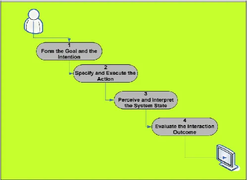
One of the easiest ways to deal with displaying intuitive frameworks is to portray the phases of activities People experience when confronted with the undertaking of utilizing a framework. As showed in the accompanying figure , there are four fundamental strides for a typical interaction system : shaping the objective and the expectation, indicating and executing the activity, see and decipher the framework state, lastly semantically assessing the association result.
Figure: Steps for Modeling Systems Interaction
Screen Layout
Compared to randomly placed screen, a well-designed screen can reduce time needed to perform a task by as much as 40%[3][7].
User’s Memory Load
The power of the computer interface should help users from having to remember information while using the computer, use the following techniques to reduce memory load, when designing the GUI for e-commerce :
1. Relieve short-term memory (remember) 2. Rely on recognition, not recall (recognition) 3. Provide visual cues (inform)
4. Provide defaults, undo, and redo (forgiving) 5. Use real-world metaphors (transfer) 6. User progressive disclosure (context)
Fleeting memory keeps data accessible so you can recover it in a brief timeframe. People for the most part do numerous things without a moment's delay, so PC interfaces shouldn't constrain them to attempt to keep data in their own transient memory while they are exchanging undertakings.
Recognition
UIs haul memory recovery by giving clients with things to them to perceive instead of recalling data. It is less demanding to peruse a rundown to choose a thing as opposed to attempting to keep in mind the right thing to sort into a clear section field.
Visual Cues
A fundamental part of any graphical UI (and obviously, a question arranged UI) is that clients must know where they are, what they are doing, and what they can do next.
Defaults, Undo, and Redo
With the power to change the interface, you must also give users the ability to reset choices and preferences to system or program defaults . While altering and controlling information, for example, composing content or making representation, undo and redo are extremely vital to GUI.
Provide Interface Shortcuts
In addition to defining both keyboard and mouse techniques for interface actions, determine ways to shorten the number of keystrokes or mouse actions users need to perform common actions. Shortcut key sequences reduce users’ memory load and quickly become automatic.
A commonplace window menu bar arrangement indicates standard mental helpers—F for Record, E for Edit, V for View, and H for Help. The following level of menus, drawdowns, each has their own set of mental aides for things in the menu.
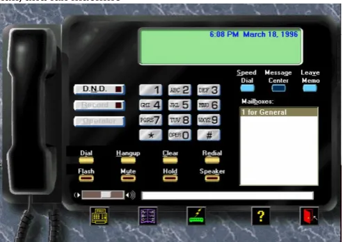
Use real-world metaphors
Genuine similitudes permit clients to exchange information about how things ought to look and function. Today's home PC comes outfitted with a completely useful phone, voice-mail, and fax machine
Figure : Real-World Metaphors in the User Interface Progressive Disclosure
The best way to teach and guide users is to show them what they need, when they need it, and where they want it. This is the concept of progressive disclosure.
New interface advancements, for example, wizards and colleagues utilize dynamic divulgence to guide people through basic undertakings. Wizards step people through errands in a dynamic way where every progression is straight forward and important for even easygoing people. Fundamentals to consider when designing screen layout for e-commerce include:
A. Appropriate use of abbreviations B. Avoid unnecessary detail
C. Use concise wording D. Use familiar data formats
E. Use tabular formats with column headings
A decent GUI goes past putting lovely design on a screen and organizing them in a satisfying way. The screen format directs the modal encounter and ought to advance ease of use and be natural.
Inadequately planned screen design will baffle people and likely prompt to mistakes and also disappointment. The GUI designer ought to work intimately with the People to address their issues, wishes what's more, objectives through screen outline. Essentials to consider when outlining screen design include (for E-Commerce Application) :
The "Home" screen ought to be the point of convergence of the application and encourage natural route to different screens for the e-commerce application.
Keep the windows design basic; don't show windows in odd territories of the screen where Peoplemay miss vital data, such as the price, date, etc.
Group content in classifications important to the people and guarantee includes that are utilized habitually are promptly accessible. An excessive number of screens will bring about perplexity so restrain the quantity of discrete/progressive screens to a base. However great outline is an adjust; engineers ought to stay away from the allurement to put everything on the primary screen or load the toolbar with infrequently utilized elements.
Use legitimate symbols to depict usefulness.People will relate a symbol quicker than perusing content to portray the usefulness.
Choose proper control plan. Controls are visual components that encourage human association.
Cases are menu bars, pull-down menu, falling menu, fly up menu, push-catch menu, check box, radio catch, list box, drop-down rundown box and slider. Picking the proper control for every one’s undertaking will bring about higher profitability, bring down blunder rates, and higher by and large people fulfillment.
Text ought to be clear, succinct and in the person's dialect. A standout amongst the most widely recognized content issues is depicting errors in wording just a software engineer can get it. For instance, "Error 00001: novel requirement (DATA_REPORT_HEADERS_L1) abused." Use words a people will see, for example, "You can't plan two occasions for a similar time."
Make the responsiveness/execution of the application sufficiently quick with the goal that it does not meddle with the people's work pace.
Design for clarity and consistency
Peoplemost of the time complain that specific terms are not clear or steady. For instance; one screen may state "Information" while the following screen says "Results" and a third says "Test Data" when each of the three terms speak to a similar thing. Another normal issue is conflictingly applying "alright", "Wipe out", "Close" or "Exit".
This absence of consistency at last prompts to disarray and disappointment for People.
PRESENTING THE DATA
1. Ensure beyond any doubt the information presentation is straightforward, legitimately sorted out and all around marked. Abstain from messing the screen with information that is superfluous to the people.
2. While fitting present data info graphically, for example, with diagrams, reference charts or moving shows, as opposed to alpha-numerically. Suitably apply "top-down" to extend the information back to numeric qualities for extra data. Clearly line up numeric qualities and dependably indicate clear marks with units.
3. All Capitalized to be avoided and a basic textual style to be followed.
4. Group related things. Adaptable gathering and sorting alternatives to bolster master People.
RAMIFICATIONS
Training costs are usually one to three times the cost of the actual software and hardware [5][8] . A good GUI design reduces required training time to 20-30 hours for a user to learn an application[9]. For businesses, this means that a good GUI saves money and time. Additionally, a good GUI improves the user's perception of the application. The user's first 15 minutes of usage formulates the lasting impression of an application[10].
VERIFICATION OF GUI
The last stride in outlining GUIs is survey and confirmation from Users Groups. Particularly select both learner and master level. Permit the person to explore the GUI without help and record the ranges that block communication. Likewise give the person a standard convention of activities keeping in mind the end goal to make certain all ranges of basic usefulness are secured. Audit input from people and also the person's "profitability" and usability. Indeed, even the most experienced of GUI architects will gain from watching people explore the application.
MAPPING OF GUI WITH MENTAL MODEL AND BEHAVIORAL PATTERN OF END USER FOR E-COMMERCE
Ten tasks are composed in view of various web based business forms for assignment based client testing
1. Open the website – Website Landing Page 2. Check for Language localization
3. Familiarity with the website and ease of search for the product
4. Filtering products with price range, similar products and viewing reviews
5. Use of cart
6. Registration and Re- Login with the e-Commerce Application
7. Payment, Tracking and Cancellation 8. Help with the GUI
9. Product Feedback
Gap identified in GUI of Existing E-commerce shopping site
Language
Dialect choice is absent. On the off chance that client is not acquainted with English he/she can't ready to get to site adequately
Information overload
For amateurs and intermediates it is troublesome for comprehension landing page in view of data over-burden. This is a direct result of ads of extraordinary offers.
Vertical Scrolling
An excess of vertical looking for landing page and item inventory pages. For learners andintermediates it is hard to keep persistence and consideration while looking over the page.
Catalogue
More number of attributes to be added to refine product list .
Comparison
Compare feature to be available on all products.
Listing of similar products and recommended products
On selected product page listing of similar products as well as recommended products based on various criteria should be done.
Cart Design
“Remove” label should be in bold so beginners can remove product easily which is added by mistake. List box with limit based on availability of products should be available so user can select required number of items according to availability.
Login & Registration Protocol
Users can't recall password for every shopping site so for login user would enter portable Mobile number and demand for confirmation code and thus client will continue for login.
Mode of Payment
All modes to be recorded legitimately in their full name with terms and conditions with appended notes.
Confirmation of Purchase
Simple layout for confirmation for beginner user.
Tracking, return or Cancellation
Connections to this subtasks ought to be at top of the landing page. In some current sites on affirmation of procurement page "my requests" connection is given which is further connected to landing page by mark "track arrange", which shall be complicated for users.
Product Feedback
Importance and advantage of feedback to be clearly mentioned on the review page.
Navigation
At times Link name did not coordinate with the substance of goal page. And additionally connections are not arranged in a conspicuous area on a page so clients couldn't remember it.
Date of Last Modification
There ought to be date of last alteration so clients can monitor when there is change in cost.
CONCLUSION
The essential objective of a GUI is to permit the people to focus on the job that needs to be done. To do this, the GUI must make the interface between the human and the PC consistent. Present day GUIs hold fast to one of three accepted benchmarks, which are the Apple Macintosh, the IBM SAA, and the MIT X-Windowing System. These gauges are not impeccable, but rather they are sufficient to block real deviation. Using key mental elements, GUI originators can accomplish a consistent PC human interface.
The three essential human variables that specifically influence GUI configuration are visual keenness, the breaking points of outright memory, and the gathering of data.. Gathering of data in light of the Gestalt rule seems to help in data preparing.
One needs to group data on the screen to encourage the people. The most essential data needs to go before the lesser imperative data. Every now and again used data or orders should be in the most unmistakable area
The implication of good GUI configuration brings about decreased preparing time and enhanced execution. Lessened preparing time implies bring down expenses and enhanced client recognitions. Awful GUI configuration keeps the client from focusing on the essential subjective assignment.
A decent shopping basket configuration must be went with easy to understand shopping basket application rationale. It ought to be advantageous for the user to see the substance of their cart and to have the capacity to expel or add things to their truck. The shopping basket application depicted in this venture gives various components that are intended to make the user more agreeable.
When presenting data for e-Commerce applications, it is a challenge to make the information easy to review and analyze. Keeping the presentation simple and graphical, with a clear and concise view will increase user satisfaction. Finally, soliciting feedback from users who represent a variety of system interaction skill levels is a necessary step. Overall the usability and quality of the GUIs can make or break a project’s success.
The hypertext incline permits the people to move specifically from information and ideas in one application to comparative information and ideas in other application. These patterns will additionally evacuate the GUI as an obstruction between the people and the undertaking.
REFERENCES
[1] Wickens, Christopher D. Engineering Psychology and Human Performance. 2d ed. Harpers: New York: 1992. p. 24-109, and 116-160.
[2] Sarna, David E. and George J. Febish. What Makes a GUI Work? Datamation Vol. 4. (July 15 1994):29f.
[3] Helander, Martin ed. Handbook of Human-Computer Interaction. New York: 1988.
[4] iller, George A. The Magical Number Seven, Plus or Minus Two: Some Limits on Our Capacity for Processing Information. Psychological Review. Vol.101. No.2:343- 352. [5] Bakewell, Catherine J. How to Choose a Usable System for General Practice. Journal of Management in Medicine. Vol. 7. No. 1:12-21.
[6] : Reiterer, Harald. The Development of Design Aid Tools for a Human Factor Based User Interface Design. Systems, Man, and Cybernetics, 1993 International Conference:361-366.
[7] Lin, Yi_Bing and Dan Daly. A Flexible Graphical User
Interface for Performance Modeling. MASCOTS 1994:
Modeling, Analysis, and Simulation International Workshop:193-199.
[8] Boeri, Roberts J. And Martin Hensel. Human Factors in Business CD-ROM Titles. CD-ROM Professional. Vol. 8. No. 2:107-108.
[9] Comaford, Christine. Graphical User Interfaces: Keep Them Sleek and Simple. Computerworld. Vol. 25. No. 16:37-40.