1 School of Education, Faculty of Arts, Education and Human Development
Victoria University
2 This research thesis, Do you Like My Pics, investigates perceived value in art through the recreation of well-known paintings. Using photography and photo-manipulation the content of the image has been recreated in another medium in order to dissociate the tangible, actual image from the aura of the artist who created it. Recreating the paintings entailed a highly detailed visual analysis of:
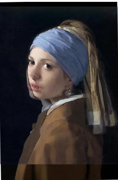
Girl with a Pearl Earring, Vermeer, c 1667
Self Portrait attributed to Rembrandt Studio, c 1660’s (NGV Collection)
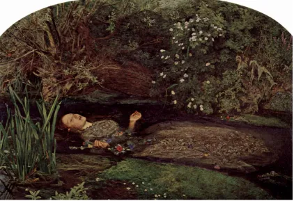
Ophelia, John Millais, 1851-1852
Various works by Howard Arkley, 1990s
The Melbourne Gate, Jeffery Smart, 2002
Untitled, Mark Rothko, 1958
The Treachery of Images, Rene Magritte, 1928-1929
Hendrickje Bathing, Rembrandt Van Rijn, 1654
Conclusions arising from the theoretical and creative research include that:
Our perceptions of art are very strongly influenced by our knowledge of the status of the artist who created the work.
Analysis of Vermeer’s Girl with a Pearl Earring supports the hypothesis that he used optical devices--probably projection (Camera Obscura), to produce this painting.
Analysis of the painting known as “Self Portrait, attributed to Rembrandt”, or simply “Rembrandt”, in the National Gallery of Victoria, supports the hypothesis that this painting was not painted by Rembrandt.
Analysis of Rembrandt’s Hendrickje Bathing suggests that Rembrandt did not use optical devices.
A number of errors were found with the identification of flowers in Millais’ Ophelia. A more complete list of species depicted in the painting and their symbolic meanings is included in an appendix.
The research methodology was practice-based and undertaken creatively, resulting in: 1. An exhibition of eight artworks, comprising approximately 66% of the content of the
thesis.
3 “I, Mark Boyle, declare that the Master by Research exegesis entitled Do You Like My Pics is no more than 18,000 words in length including quotes and exclusive of tables, figures, appendices, bibliography, references and footnotes. This exegesis contains no material that has been submitted previously, in whole or in part, for the award of any other academic degree or diploma. Except where otherwise indicated, this exegesis is my own work”.
Signature:
4 This project owes a substantial debt to the enthusiasm and hard work of Lowana O’Shea, a costume designer and maker who trades as Vanyanis. She constructed the costumes and acted as assistant in all of the works that feature people, and cheered me up when it was all too hard. I would like to thank Marnie Cooper, Jessica Illichmann (aka Madeline, Mad Dame) and Sarah Groenewoud who modelled for the photographs for very little compensation, and were patient and understanding with my process and the indignities I subjected them to. Thanks also to Sidney Thickett for her makeup and hairstyling skills, and to Alex Welch for his assistance with the Ophelia shoot.
Tarquam McKenna, my supervisor, put up with my indecision and anxiety, and encouraged me through times of despair. Thanks also to Loy Lichtman, who got me started on this whole affair.
Last but not least to my friends and family for their encouragement, support and listening to endless discussions about the contents of this project. Dr Ken Sharpe deserves special mention for acting as a sounding-board and for his advice on the interpretation of scientific studies and statistics. Dr Andrew Sharpe not only helped me identify some of the species of plants in Ophelia but also proof read and made some excellent points. Yvonne Pecujac also proof read to a fine level and helped me clarify some ideas.
This project would not have reached conclusion without the unflagging support of my wife Robin Barden, who helped shape my ideas by acting as devil’s advocate, who was badgered mercilessly with my arguments, who read and reread the writing, provided a second pair of eyes for the images and who provided the financial and emotional support for our family. I cannot thank you enough.
5
ABSTRACT ... 2
DECLARATION OF AUTHORSHIP ... 3
List of Figures ... 6
Introduction ... 10
Production Timeline... 17
My Girl with a Pearl Earring ... 18
My Self Portrait as a Rembrandt Self Portrait ... 30
Reflections on Ophelia ... 35
My Howard Arkley ... 42
A Day Out With Jeffrey Smart ... 48
My Rothko ... 51
This is not a Magritte ... 57
Hendrickje ... 60
Conclusion ... 66
Appendix One: Ophelia’s Flowers ... 70
Appendix Two: A Discussion of Method ... 75
Appendix Three: Costume ... 78
Bibliography ... 80
6 Figure 1 Using a truth table we can see that the main factor in valuing an artwork is the provenance or the perception that a particular work was made by an “important” artist, not
any intrinsic qualities that the work may have. ... 10
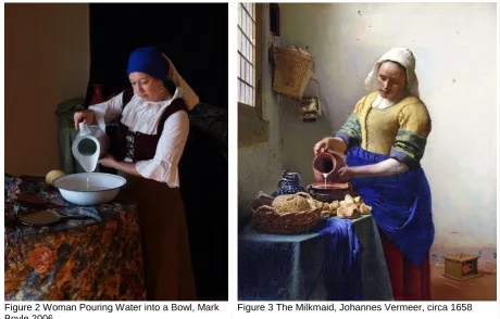
Figure 2 Woman Pouring Water into a Bowl, Mark Boyle 2006 ... 12
Figure 3 The Milkmaid, Johannes Vermeer, circa 1658 ... 12
Figure 4 Production Timeline ... 17
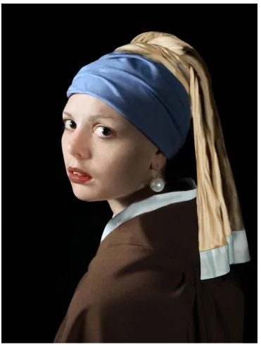
Figure 5 Girl with a Pearl Earring, Mark Boyle, 2007-2009 ... 18
Figure 6 Mad Dame folio shot. Kimothy Photography... 19
Figure 7 Mad Dame folio shot ... 19
Figure 8 Vermeer’s original Girl with a Pearl Earring ... 19
Figure 9 The work in progress ... 19
Figure 10 This section of the image is slightly unfocused, as might be expected if Vermeer used a lens. ... 20
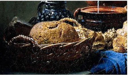
Figure 11 Van Meegeren’s forgery The disciples at Emmaus. The “pointille” on the bread is similar to that on the bread in Vermeer’s Milkmaid, however, this part of the image would have been in focus if a camera obscura had been used. ... 21
Figure 12 The difference between the best pose Madeline could achieve and the original Vermeer (black outline). ... 22
Figure 13 The distortion applied in Photoshop was of a “perspectival” or “keystone” kind that may be consistent with Vermeer’s canvas being out of plane. ... 22
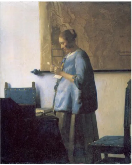
Figure 14 Woman Reading a Letter, Vermeer, 1663-1664 ... 27
Figure 15 Self Portrait as Rembrandt, Mark Boyle, 2010 ... 30
Figure 16 Self Portrait attributed to Rembrandt, NGV collection, 1665(?) ... 32
Figure 17 Ear visible when face is directly facing viewer. ... 33
Figure 18 Slight turning of head to match the painting is enough to obscure the ear. ... 33
Figure 19 Rembrandt Self Portrait,1658 ... 34
Figure 20 Rembrandt Self Portrait, c. 1641 ... 34
Figure 21 Rembrandt Self Portrait with Two Circles, c. 1665.1669 ... 34
Figure 22 Self Portrait with Beret and Two Gold Chains, c. 1642-1643 ... 34
Figure 23 Ophelia, Mark Boyle, 2010-2012 ... 35
Figure 24 Ophelia, Sir John Everett Millais, 1851-1852 ... 35
Figure 25 Eye tracking when looking at images. Images on left untrained observers, images on right trained artists. ... 36
7 Figure 27 Arkley’s perspective, as he was working from photographs, is generally very accurate. As most architectural photography uses wide-angle lens, the perspective is slightly exaggerated. For a photographer, these images look “right”. This was one of the reasons I
felt I could recreate an Arkley image. ... 43
Figure 28 Howard Arkley, Actual Fractual (1994) ... 44
Figure 29 Architecturally similar to Actual Fractal, house in Box Hill ... 44
Figure 30 Howard Arkley, Family Home: Suburban Exterior (1993) ... 44
Figure 31, Architecturally similar to "Family Home", a triple hipped tile roof, house in Clayton ... 44
Figure 32 Howard Arkley, Stucco home 1991 ... 44
Figure 33 Architecturally similar, concrete driveway with curved path, house in Burwood ... 44
Figure 34 Test using Poster Edges and Posterization ... 45
Figure 35 Test using digital repainting technique ... 45
Figure 36 Test using Cut Out, Posterization ... 45
Figure 37 Test using a complex recursive series of filters, Saturation, Blur, Poster Edges .. 45
Figure 38 Test using another recursive set of operations, Median Noise... 45
Figure 39 Test using recursive Gaussian Blur, Saturation, Median Noise ... 45
Figure 40 Exploring the ability of machine image transformation ... 47
Figure 41 The computer does not distinguish edges like human vision ... 47
Figure 42 Howard Arkley, Actual Fractal 1994 ... 47
Figure 43 3D luminosity histogram of Actual Fractal. While there are equivalencies in luminosity for colours in the painting, the equally luminant colours are not adjacent, hence the scintillation is not due this effect. ... 47
Figure 44 3D surface plot of Actual Fractal demonstrates even more clearly that adjacent colours are not equiluminant. ... 47
Figure 45 The RGB colour plot does clearly demonstrate that Arkley uses highly saturated colours. (colours closer to the edge are more saturated) ... 47
Figure 46 House with Native Tree 1996 Howard Arkley ... 47
Figure 47 RGB colour plot of House with Native Tree. Once again the colours are highly saturated. ... 47
Figure 48 After Smart, Mark Boyle, 2011 ... 48
Figure 49 Jeffrey Smart, Cahill Expressway, 1962. This was not an option because the road has been remodelled... 49
8 Figure 51 Jeffrey Smart, Morning, Yarragon Siding. Research on the VicSig rail enthusiast’s site revealed that this painting was impossible to reproduce. There is no siding at Yarragon.
... 49
Figure 52 Jeffrey Smart, Factory and Staff Erehwyna, 1972. This image was very appealing but I have no idea where it was painted and there are too many people ... 49
Figure 53 Jeffery Smart, The Melbourne Gate, 2002 ... 50
Figure 54 The view looking towards the Melbourne Gate ... 50
Figure 55 Mark Boyle, Rothko4real, 2011 ... 51
Figure 56 Mark Rothko Untitled, 1953 ... 52
Figure 57 Rothko’s paintings remind me of seascapes. This is the view at sunset over Port Phillip bay from Elwood. I took a series of these photos to develop my Rothko. ... 53
Figure 58 The same view but taken as a “swipe”. I used a long exposure (15 seconds) and panned the camera left and right on a tripod to smooth out the waves and clouds. ... 53
Figure 59 Mark Boyle, Rothkoesque, 2011. ... 54
Figure 60 Mark Boyle, This is not a Magritte, 2011 ... 57
Figure 61 René Magritte, The Treachery of Images, 1928-29 ... 57
Figure 62 Bogart’s.com.au are out of stock with the Medico Select Dublin Bent... 59
Figure 63 eBay Item number: 200648399578, Bent Smooth Billiard ... 59
Figure 64 Setting up to recreate the Magritte image. ... 59
Figure 65 Hendrickje Bathing, Mark Boyle, 2012 ... 60
Figure 66 Hendrickje Bathing, Rembrandt, 1654 ... 61
Figure 67 . Image from a “Victoria’s Secret” catalogue. ... 64
Figure 68 Hendrickje Bathing, Rembrandt, 1654 ... 64
Figure 69 Crow flowers in the foreground look similar to buttercups and symbolise ingratitude or childishness. ... 70
Figure 70 The weeping willow tree leaning over Ophelia is a symbol of forsaken love. ... 70
Figure 71 The daisies floating near her right hand represent innocence. Ophelia also mentions 'There's a daisy' in act 4, scene 5. ... 70
Figure 72 The purple loosestrife on the upper right hand corner of the painting, near the edge of the frame, alludes to 'long purples' in the play. Shakespeare actually meant the purple orchid. ... 70
10 When I started this project of reproducing painted artworks as photographs my purpose was to disengage the actual, tangible image from the aura--the seemingly magical reputation, of the artist who had created it. I wanted to investigate why a painting by Van Gogh (such as Head of a Man, 1886) was worth $20 million, when the same painting, later having been revealed to be by an unknown painter “after the style of Van Gogh” was worth $5000 (ABC News Online, 2006). I also wanted to investigate why it was that some artists “make it big” and command huge prices, while other, equally talented artists languish in obscurity, making only small sales (Figure 1).
Actually made by an “important” artist
Yes No
Thought to be made by an “important” artist. (provenance or perception)
Yes High Value High Value
No Low Value Low Value
Figure 1 Using a truth table we can see that the main factor in valuing an artwork is the provenance or the perception that a particular work was made by an “important” artist, not any intrinsic qualities that the work may have.
The way into this topic seemed to be through the investigation of fakes and forgeries, and I thought that I would recreate the works of famous artists as photographs for a number of reasons.
11 as the document of the real on the other, was healing. The two are now equally “real” or “imaginary” (see Appendix Two for a more expanded version of this discussion).
Second, it seemed that using a different medium would cast into high relief the actual tangible qualities of the image as a separate thing from any qualities of “genius” the painter might bring to the making of the object that is the painting. Rather than simply repaint a reproduction or forgery of a great painting, and enter into arguments about my skills (or lack of) as opposed to the skills of the great ones, I could use photography to distance the content of the image from the hand of the painter. I wanted the viewer to experience a disjunction, to have a double-take, as they viewed the artwork. I hoped the audience would recognise the painting and then realise it was in fact a photograph--“That’s Vermeer’s painting, Girl with a Pearl Earring, or whatever it’s called. No, wait, hang on, is that a photograph?”
12
Figure 2 Woman Pouring Water into a Bowl, Mark Boyle 2006
Figure 3 The Milkmaid, Johannes Vermeer, circa 1658
Like many photographers, I paid homage to one of my favourite artists. It was a simple piece “in the style of” without bothering too much with an accurate recreation.*
*Throughout the main body of this text the researcher’s Personal Reflections are included in a separate text box in italic to distinguish these particularly first person responses from the main body of the Exegesis.
What I didn’t know at the time, and what has become apparent through this process, is that I would reveal flaws in the great works that usually only become apparent after a work has been deemed a fake. It is easy in hindsight to see the works of the great forger Van Meegeren as inferior to the greatness of Vermeer, but at the time Van Meegeren deceived some of the foremost Vermeer connoisseurs and experts, and was able to sell his
13 the one and only masterwork created by the hand of the master themselves. This is where the aura comes in; the magical “hand of the great”, the literal touch of “genius”.
There are two different narratives presented in this Exegesis. My first task is to describe the process that I went through in creating the images. I have done this for each of the images, presented as a chapter for each one, in more or less chronological order. The second narrative comprises what I discovered about the images and the perception of art in general and is, I think, more profound and important than I anticipated. This story developed over the time that I was working and researching on the project and I have presented these findings in the relevant context of the discussion about those artworks.
My process has entailed extremely close scrutiny of the original paintings. The necessity of first recreating the image, finding a model with the right look, having a costume made and finding a location that is as close as possible, then shoehorning that image over the original artwork in Photoshop, spending sometimes months and even years poring over the minute details in a painting, has meant that I have become extremely familiar with the details of the paintings I have chosen to work on. It may be that I have examined these paintings in a unique and forensic way that has revealed hitherto undiscovered aspects of the paintings, allowing me to have unique insights and contributions to make to the scholarship
surrounding Ophelia, Vermeer and the disputed Rembrandt self-portrait in the National Gallery of Victoria.
14 This topic was in its infancy when I began it in 2006/2007. Some research had been done on fakes and forgeries (Beckett, 1995), and there were some attempts to understand great hoaxes and scandals, such as the Van Meegeren Vermeers (Wynne, 2006), while the case of the missing Mona Lisa was noteworthy (Leader, 2002). There were some studies from social psychology looking at the notion of “contagion” (a key feature of magical thinking that was at the centre of my original thesis) from the perspective of nurses working with AIDS patients (Rozin, Markwith, & Nemeroff, 1992), and the reaction of children to having their special toy “duplicated” and their perceived value of spoons that supposedly had been touched by the Queen (Hood & Bloom, 2007). These references are discussed in detail in my literature review. As I have been quietly working away creating these fake photographs (Figure 4) public and academic interest has grown. The BBC produced a TV series “Fake or Fortune?” (Bruce, Mould, & Grosvenor, 2011), and in the same year there was an fMRI brain scan investigation of exactly this topic: “Human cortical activity evoked by the assignment of authenticity when viewing works of art”. The 2011 study confirmed the hypothesis I have been investigating through a different route, i.e. “Using functional magnetic resonance imaging, viewing of artworks assigned as “copy,” rather than “authentic,” evoked stronger responses in frontopolarcorex (FPC), and right precuneus, regardless of whether the portrait was actually genuine.” (Huang, Bridge, Kemp, & Parker, 2011)
Oxford University art historian Professor Martin J Kemp, one of the authors of that study, said in a radio interview (Kemp, 2012) that “part of this is good news, because it means the way people look at things can be steered…”1
I am not quite as sanguine about this as
Professor Kemp. I have some doubts as to whether we can be confident that the great works are so great and whether the works of unknown artists are necessarily inferior if our
responses to them are so dependent on our preconceived notions of who the creator is. In my darker moments I sometimes think that the greatest work of some artists is the creation of themselves in the public imagination as artists of great and important stature.
I chose the paintings to copy based on a number of factors. First they had to be famous, or at least well known to the viewers. Second, they had to be reproducible as photographs. This meant, in the main, representational works in the Western post-Renaissance tradition and I was especially drawn to Vermeer and Rembrandt. Unfortunately a number of paintings that were famous, such as Botticelli’s Birth of Venus (1486), could not be successfully reproduced using this method. I did, however, tackle a Rothko because it seemed to me that the borders between colour fields are essentially horizon lines. Probably the most
15 worked from photographs, I felt his work could be approached by my method. However, Arkley reduces his subjects to flat colour fields with an outline, which turned out to be impossible for a computer to produce.
The Hockney-Falco hypothesis (Falco, 2012) proposes that the sudden explosion in
accurate representation of perspective and tone in the Renaissance was the result of artists working with optical devices such as mirrors and lenses (Hockney, 2006). My work has some contributions to make in that regard and I find the hypothesis compelling. It also means that representational art was, at least initially, constructed in ways that resemble photography--using lenses to create 2D images, which should make them amenable to re-creation as photographs.
It was also, I believe, a substantial contributing factor to the aura of the artist.. In other fields such as sports and music, the skill of the performer is a substantial part of the joy watching the performance. We admire the skills and recognise the work and dedication that goes into building such expertise (Dutton, 2009). In popular culture the term “guitar god” or “guitar hero” refers to a performer whose dazzling skills seem so far removed from the weekend player’s abilities as to seem supernatural. In the popular imagination such people are referred to as “gifted”, with the implication that a gift is given from the gods (or sometimes the Devil in the case of blues musician Robert Johnson). Studies of expertise have revealed that there is no substitute for dedicated, deliberate practise and some researchers have even postulated a 10,000 hour or 10-year rule for developing world class performance (Simon & Chase, 1973). Nevertheless, the magical aura of talent and genius adheres to high-level performers.
For 400 years from the Renaissance to the birth of photography this was the case with painters in the West. A painter was admired and lauded for their ability to reproduce the visible world, and painting was held to be one of the High or Fine Arts for its ability create simulated worlds. Painting has, however, declined in importance in the last 20 years if the content of courses such as one Melbourne university’s Art School Painting department is any guide. Please note that as I am writing this the program is under review. From that Fine Art Painting webpage February 2012 (XXXX, 2012):
“Within the painting area, students are encouraged and inspired to research the full range of contemporary art practice, to be critically aware and experiment in accord with their individual strengths and direction.
The Painting area is studio-based and provides an appropriate skill base,
16 range of areas related to creative expression. While the early stages are project based, innovation and experimentation is always encouraged particularly in the context of new-media and its relationship to contemporary painting practice. In the later stages, students are assisted to develop their own formal conceptual and methodological interests and direction in particular aspects of contemporary painting practice.”
There is no explicit reference to painting, but instead the emphasis is on conceptual and methodological processes and “new-media”. Students can graduate from one of Melbourne’s most highly regarded Fine Art Painting courses without ever having done anything that Rembrandt would have recognised as a painting.
The program changes from March from the website state:
“The program is currently separated into nine specific studio areas, supported by studies in Art History and Theory;
Ceramics, Drawing, Fine Art Photography, Gold & Silversmithing, Media Arts, Painting, Printmaking, Sculpture, Sound
The proposed new studio areas (currently without names) will include the following combinations;
Ceramics and Gold & Silversmithing Drawing, Media Arts and Painting Fine Art Photography and Printmaking Sculpture and Sound”(XXXX, 2012)
This illustrates the de-emphasis on the traditional set of skills that pertain to representational painting. While the aura of the artist as a creator of fantastic products still adheres to
17
Figure 4 Production Timeline Verme
er
Remb rand
t Sel f-Por trait Milla is Arkle y Roth ko Jeffr ey Sma
rt
Remb rand
t Hen diek
18
Figure 5 Girl with a Pearl Earring, Mark Boyle, 2007-2009
19 months to find a room with the right light, finally settling on a room above a down-at-heel hotel in Lilydale. The unwashed windows filtering the northern winter sun, the plain white walls, high ceilings, and worn bare floorboards created a sympathetic atmosphere. I arranged a table, bowl and fabrics, hired a costume and model, and created my own Vermeer photographically. At the time I wrote to a friend that I was doing what Vermeer might have done if he had a digital camera. It was only later that I learned that Vermeer may indeed have used a camera.
The novel “Girl with a Pearl Earring” by Tracy Chevalier gave me the first hint that Vermeer may have used a camera. To someone who had studied painting and was now using
photography as a medium, the mention of a camera obscura was tantalising. It might help to explain the godlike skills of the artist in rendering light and form, something that seems beyond the skills of even the best painters today without the aid of photography and projection devices, and certainly beyond my scope, despite having studied drawing and painting for more than five years at college. Melbourne University had purchased two of my drawings, and yet, I knew I could never match the level of fidelity achieved by Vermeer. Creating the costume was a challenge; see Appendix Three for details. Finding a model was a different matter. I needed someone with a particular look, particularly a narrow chin. I browsed online portfolios on modelling sites such as ModelMayhem.com, StarNow.com and OzModel.com.au. Madeline turned out to be ideal (Figure 6, Figure 7). Being a young artist herself, she knew and loved the Vermeer painting and was delighted to be involved.
Figure 6 Mad Dame folio shot. Kimothy
Photography
Figure 7 Mad Dame folio shot
Figure 8 Vermeer’s original Girl with a Pearl Earring
Figure 9 The work in progress
20 Philip Steadman makes a convincing case (Steadman, 2001) for Vermeer using an optical device, such as some kind of camera obscura. David Hockney continues the theme (Hockney, 2006). Vermeer’s use of optical effects, such as bokeh, misattributed by earlier critics as “pointille”, indicates the soft focus effect of a lens (Figure 10). Briefly, every lens has a distance at which it can sharply focus or resolve an image. Parts of a scene that are closer to or further away from this point decrease in sharpness and appear out of focus. Vermeer is one of a number of painters from this period in history whose paintings exhibit this effect; the central subject is sharply resolved while objects closer or further away appear to have a softer focus. (Hockney, 2006) Pointille, on the other hand, is simply a patterning of dots for decorative effect. The Vermeer forger Van Meegeren made the mistake of using pointille at a part of an image that would have been in sharp focus in the original painting (Figure 11).
21
Figure 11 Van Meegeren’s forgery The disciples at Emmaus. The “pointille” on the bread is similar to that on the bread in Vermeer’s Milkmaid, however, this part of the image would have been in focus if a camera obscura had been used.
While Madeline’s facial structure is very similar to Vermeer’s model, we found it almost impossible to pose her correctly. The position of her shoulders required her to turn to an uncomfortable degree to face the camera. While I was able to position Madeline and the camera so that her eyes were correctly aligned along the axis of the original, this meant her chin was in the wrong position. I had to distort the image in Photoshop to achieve the required profile (Figure 13).
22
Figure 12 The difference between the best pose Madeline could achieve and the original Vermeer (black outline).
Figure 13 The distortion applied in Photoshop was of a “perspectival” or “keystone” kind that may be consistent with Vermeer’s canvas being out of plane.
It was very difficult to arrange the drapery exactly as it fell in the original Vermeer painting. It may be that modern fabrics behave differently to 16th century ones or that I have used
inappropriate fabrics. Indeed, Vermeer may have taken liberties with this part of the image or simply have “averaged” the image from several sittings. I cut and paste the image in
Photoshop to more closely resemble the original (Figure 5).
23 The subject of attention is central here. In a famous experiment conducted at Cornell
University, New York, less than half the subjects noticed that a person asking them for directions was substituted by another person when two people carrying a door passed in front of them (Simons & Levin, 1998). In other words we often don’t notice even the most obvious things unless they are drawn to our attention. In the same way that I did not notice the absence of eyebrows in Girl with a Pearl Earring, I wonder how attentive Vermeer was in the first place. Could he simply not have noticed their absence? Was his “camera” unable to resolve them?
We will probably never know the answers to these speculations. What is apparent is that Madeline is a brunette with dark eyebrows and this presents a problem for me. Do I remove the eyebrows completely, which looks very peculiar, do I “bleach” them in Photoshop? Or do I leave them alone and rely on the audience’s inattention? I tried a number of approaches, none of which were particularly successful. In the end I painstakingly lightened each hair, pixel by pixel.
Johannes Vermeer was born in Holland in 1632 and very little is actually known about him, although a number of scholars (Montias, 1991) (Swillens, 1950) have attempted to create a biography for him from the little documentary evidence that remains. What is certain is that he lived during a prosperous time in Delft, a city that had until recently been the centre of Dutch resistance during three centuries of revolt against the Spanish Hapsburgs (Montias, 1991). The town’s income derived mainly from ceramic Delftware, silk and tapestry weaving and brewing. At the time Holland was experiencing an economic boom and was, in 1650, the pre-eminent nation in the lucrative African slave trade.
Vermeer became a headman of Saint Luke's Guild, the craft guild of his city, twice and was in that role, called upon to appraise the authenticity of works of art claimed to be by
Michelangelo, Titian, Holbein and Tintoretto, amongst others. Counterfeiting works of art was evidently of concern even then.
24 The Mauritshuis Museum treats the Girl with a Pearl Earring as its star attraction. The
Museums website features the painting on its home page, and as a background image throughout the site (Mauritshuis, 2012). It has a page devoted to the painting and the description is rapturous:
“Why is the Girl with the pearl earring Vermeer’s best-loved painting? It must have something to do with the fact that the girl looks over her shoulder, as though hoping to see who is standing behind her. This draws the viewer into the picture, suggesting that he is the one who has made the girl turn her head.
Equally important, though, are Vermeer’s fresh colours, virtuoso technique and subtle rendering of light effects. The turban is enlivened, for example, with the small
highlights that are Vermeer’s trademark. The pearl, too, is very special, consisting of little more than two brushstrokes: a bright accent at its upper left and the soft
reflection of the white collar on its underside.
Then there is the girl herself, who gazes at us, wide-eyed, her sensual mouth parted. She makes an uninhibited, somewhat expectant impression that cannot help exciting our interest, even though we have no idea who she is.”
The provenance of Girl with a Pearl Earring is uncertain. There is speculation among scholars as to whether it was part of a minor collection of Vermeer’s paintings belonging to the sculptor John (Johan) Larson that sold at auction in 1664 (Steadman, 2001). A Vermeer “tronie2”, or character study, was mentioned in the catalogue of that sale and was reported to have sold for 10 guilders (about 10 days’ pay for a cloth worker at the time). Other scholars associate it with a much larger estate auctioned on the 16th of May 1696. The estate of Jacob Dissius contained 21 Vermeers, three of which may have been Girl with a Pearl Earring; two tronies, one of which sold for 36 guilders and another for 17, and one “pendant”3
25 We take perspective and detail for granted in the age of photography. In the 17th century, however, a highly detailed “perspective” of Delft might well have been much more highly esteemed than a smallish tronie of a girl on a plain black background painted in a rather loose style. The quest for realism was a major preoccupation from the Renaissance until the invention of photography. It seems that art (painting) with an allegorical, or a morally
educational element was highly prized as well. While we esteem the simplicity and beauty of the “Dutch Mona Lisa”, it is not obviously allegorical or moral except, perhaps for a vague notion of innocence or chasteness, and so might not have been among those works considered valuable at the time. For the next two centuries (C18th and C19th) Vermeer was not counted amongst the great painters and, when referred to at all, was considered a “pupil or imitator” of either Gabriel Metsu or Pieter De Hooch (Wynne, 2006).
Vermeer’s rise to fame in the modern era was a result of a number of factors coinciding. Théophile Thoré, the radical French art critic, had a strongly political take on art. He “lauded Dutch 17th century naturalism… Its direct appeal to simple human virtues, he declared made it an art for the people.” (Sorenson, 2012) Vermeer, according to Thoré, was the epitome of this direct approach with none of the trappings of allegory or “history painting”. Thoré called Vermeer the “Sphinx of Delft” because of the lack of knowledge about him4. Arthur Wheelock (cited in Dolnick 2008, Ch 20) describes the rise of a kind of “Holland mania” in America at the beginning of the 20th century. The United States and Holland in the “Golden Era” of the 17th century were supposedly “spiritual kin.” The democratic values of America, in this myth, were derived not from Britain but Holland; the values of “common sense based on a
libertarian view of our world and of its prospects for prosperity”. The Dutch revolt against the Hapsburgs was seen as a corollary of the American revolt against England, and Holland’s Golden Age “foretold America’s just-dawning golden future” (Dolnick, 2008).
America’s “Robber Barons”5, the wealthy industrialists and monopolists of the late 19th and early 20th Centuries embraced art as a way of improving their image and demonstrating their wealth and status; the more expensive, the better. It became something of a competitive sport with various billionaires vying to outdo each other. The great art dealers of the day ransacked Europe for treasures to feed the seemingly endless appetite for collectables. The banker J.P. Morgan acquired two Gutenberg Bibles; while newspaper tycoon William
26 after they were. The price he quoted was $100,000 (about $2 million today). Morgan simply replied: “I’ll take it.” (Dolnick, 2008)
Many of these paintings were donated or lent to public galleries. A masterpiece housed in your private collection might impress your peers and demonstrate your aesthetic
sensibilities, but one donated to a museum does all that and displays your civic largesse as well.
No account of Vermeer would be complete without reference to Dutch forger Han van Meegeren. Whatever else he might have been he was a skilled artisan trained in the traditional techniques of oil painting, including grinding his own pigments. Van Meegeren was a forger with a difference. Instead of copying extant Vermeers he created “missing” Vermeers that played to the avarice of collectors and the ambitions of connoisseurs alike (Figure 11). Bitter at an art world that he felt had rejected his traditional style in favour of a modern art that paid little heed to technique, Van Meegeren set out to humiliate the critics of his time, in particular Walter Bredius. Fuelled by resentment and a sense of entitlement, he researched the methods used by scientific evaluators of authenticity and succeeded in developing a technique, using Bakelite on 17th century canvas and stretchers that did, indeed, fool the connoisseurs.
He was only caught by the efforts of a zealous policeman, Joop Pillar, who was not
investigating art fraud but Nazi collaborators, in the weeks following the liberation of Holland in 1945.
Finally Dolnick, in his 2008 book, The Forger’s Spell, frames the question that concerns us here;
“Van Meegeren posed it in its starkest form. ‘Yesterday this picture was worth millions of guilders, and experts and art lovers would come from all over the world to see it,’ he declared at his trial. ‘Today, it is worth nothing, and nobody would cross the street to see it for free. But the picture has not changed. What has?’”
Dolnick continues, “the picture had lost its glamour. Why? Because the ‘experts and art lovers’ were as fake as it was. The world was full of people who thought of themselves as art lovers but were in fact merely snobs.” He then tries to mount a defence against this
argument. He quotes the philosopher Alfred Lessing:
27 history and the development of art.’ To create something new is an achievement. Einstein was the first to see that e = mc2. Afterward any actor could don a fuzzy wig and scribble the identical formula on a blackboard. That wouldn’t make him Einstein.”
Dolnick then invokes Denis Dutton.
“When we praise a work of art, we have in mind not only the finished product but the way the product was made...imagine listening to a recording of a pianist and admiring her dexterity. If we learned that later an engineer had sped up the tape ... we would feel cheated. In a similar way, a forger’s achievement is less than it seems,
regardless of its beauty, because the forger has the advantage of working from someone else’s model.”
I want to take issue with Dolnick’s defence. First, just how original was Vermeer? One of the great problems of Vermeer scholarship was already apparent with Thoré. Only 21 works were actually signed by the painter, and some of those signatures are not considered genuine. Over the years many paintings had been attributed to other more well-known and more valuable names. Indeed “Woman Reading a Letter” (Figure 14) has been attributed to Rembrandt, and then to Pieter de Hooch, before being attributed to Vermeer. (Wynne, 2006)
28 Another problem is Vermeer’s style of painting.
“The range of Vermeer’s style and his technique is extraordinary. The relatively thick impastos of the View of Delft and the Milkmaid contrast sharply with the thinly applied glazes of the Woman in Blue Reading a Letter or the Girl with a Wineglass. And the highly blended contours of the Woman Holding a Balance and the Girl with the Pearl Earring contra pose the flat, relatively unblended tonal shapes of the Lacemaker. Moreover, Vermeer’s themes have a desultory aspect, jumping from landscapes to tronies, from letter writers and readers to musical theatre. Further, the Delft Master appears to have dated only one of his paintings (the Procuress in 1656) while using a variety of signature formats.” (Boone, 2012)
Currently there are 34 or 35 paintings that scholars are in agreement about attributing to Vermeer. As many as 73 paintings were at some time attributed to Vermeer and these attributions have been the subject of some heated debate over the years.
One could be forgiven for being a little sceptical about any claims that Vermeer was
particularly original, given that connoisseurs and scholars have trouble deciding just what is and what is not his work. What Dolnick is avoiding here, particularly with that subtle little gliss away to Einstein, is that the success of any forgery is the same as any magic trick. We see what the magician intends us to see because they have directed our attention away from their sleight of hand.
Furthermore, the comparison to Einstein is seductive but deceptive. Scientists and artists work in diametrically opposed ways. Scientists are engaged in an ongoing debate about the nature of truth. While a good scientist knows that all theories are only an approximation to the truth, nevertheless the project of science is to try to move closer to the truth. Theories are tested and openly discussed. Einstein’s work and methods were widely published and have been subjected to test after test. Artists, on the other hand, are concerned with creating illusions. Painters, after all, create the illusion of depth on a two-dimensional surface. But more profoundly, as Hockney suggests, artists are secretive about their methods and techniques. They are not so much interested in the project or progress of their field but with demonstrating their skills, keeping up with the latest fashions, while simultaneously marking out their own brand or style distinct from their peers or competitors. The history of painting is not so much a progress as a succession of artists trying to be new and/or better or different than those before (Hockney, 2006).
29 themselves. When we see a great work of art we are often taking on faith the attribution that it is the work of a master, and is a great work. Taking something on faith without reference to cause and effect is a workable definition of magical thinking. To be absolutely clear, there is no provenance for any Vermeer paintings. While there have been great efforts to attribute paintings to Vermeer, and there are some good circumstantial documents from auction catalogues, there are simply no “chain of custody” records for any Vermeer painting. Girl with a Pearl Earring is particularly enigmatic. There are no descriptions in catalogues from the time that describe any paintings definitively as that painting. There are vague references to tronies “painted in Turkish Fashion”, a reference to the turban or headscarf, but no
30
31 Rembrandt Studios made many self portraits, quite a few of which are of contested
attribution. Looking at his self portraits (or portraits of him) it occurred to me that we have similar noses. It seemed that I might be a good model, if I could find a self portrait he did in which I could pass for a similar age. I finally decided on the NGV self portrait (Figure 16). This was my first exposure to Rembrandt. I remember as a young person spending a good deal of time poring over this work, admiring the technique, the light and the emotional tone captured by the artist. The Rembrandt name was redolent with associations. Every nuance of brush and palette seemed to eloquently convey a mood of deep introspection, clear eyes examining and weighing the soul with brutal honesty. Such clarity, such economy, this painting seemed to embody the myth of the great man, the sage, and showcase the sublime technique. Some years later it was reattributed. It is now described dryly by the appellation “Manner of Rembrandt, Portrait of Rembrandt (date unknown).” Was I taken in? Is it a fake? Could it still be such a good painting? Why does its reattribution matter? Why has the value plummeted? If I was to come to that painting now, never having seen it before, and without the Rembrandt attribution, would I be so humbled by it? Was my admiration of the painting false? Did my eyes deceive me?
Given that my experience was not so much different to others who see this painting we can deduce a number of logical possibilities.
1. This painting is as good as I thought it was. There is at least one other (unknown) painter who is as good as Rembrandt, hence we over-rate some artists and under-rate others. 2. This painting is not as good as I thought it was. There is some mechanism by which my appreciation of this painting was influenced by the myth that surrounds Rembrandt, such that I was influenced to over-value it.
This gives us two hypotheses.
1. We over-value some artists at the expense of others.
2. We over-value some artworks because of who they are attributed to.
The Self Portrait (Figure 16) in the National Gallery of Victoria was my first Rembrandt. It had all the qualities I was primed to expect of the great master; soulful, clear-eyed
introspection, masterful, painterly technique. I first encountered it sometime in the late ‘70s or early ‘80s. I was studying painting at the time and it seemed to me to be a wonderful work. I reverently admired it for long periods of time. Imagine my surprise when, in 1984, it was declared a fake. Now, some two decades later, it has been revised yet again. Analysis of the canvas and stretchers indicate that it is painted on a piece of linen that could well have come from the Rembrandt studio while the stretcher is the same type, timber and age as
32
Figure 16 Self Portrait attributed to Rembrandt, NGV collection, 1665(?)
I decided to do the piece as a self-portrait (Figure 15), because of my strong emotional ties to this painting and because Rembrandt and I have a similar nose (Figure 17). Furthermore, Rembrandt is considered a genius, and I, patently, am not! This little irony appealed to me because it plays into the myth of genius, the hand of the master, which is part of my exploration of magical thinking. Disappointingly, I look less like Rembrandt than I at first thought. Although we have the same nose, that is about where the resemblance begins and ends.
33 There is an anatomical impossibility involved in this painting that is not immediately
apparent. If you compare the image above of the painting with the photographs below, Figure 17 and Figure 18 you will see that the ear on the viewer’s left (subject’s right ear) cannot be visible given the angle to which the face is turned. There is some conjecture about how much Rembrandt relied on optical devices, however, Rembrandt doesn’t normally make this error. It should be possible for any careful draughtsman to avoid this error, by relying on observation alone.
Figure 17 Ear visible when face is directly facing viewer.
Figure 18 Slight turning of head to match the painting is enough to obscure the ear.
Furthermore, the light is not “Rembrandt Lighting” (Figure 16), a term used by photographers to describe a specific portrait lighting style. In this style the “key light” is a little higher than the subject, at about 45°, so that an upside-down triangle of light illuminates the shadow side cheekbone (Figure 19 to Figure 22). To be more precise, if there is Rembrandt lighting in this painting, it is too big and clumsy, extending almost to the shadow-side ear.
The light-side cheek (our left, sitter’s right) is also clumsily executed, being virtually straight down and not curving slightly, as all the following self portraits do, as well as the
photographs.
34
Figure 19 Rembrandt Self Portrait,1658 Figure 20 Rembrandt Self Portrait, c. 1641
Figure 21 Rembrandt Self Portrait with Two Circles, c. 1665.1669
Figure 22 Self Portrait with Beret and Two Gold Chains, c. 1642-1643
All of the above Rembrandt self portraits exhibit “Rembrandt lighting”
35
Figure 23 Ophelia, Mark Boyle, 2010-2012
36 One of the things that strikes me as I engage in this process is how anatomically impossible the “Ophelia” is (Figure 24). When I first studied the image in order to replicate it I did not notice so many things about it. I am reminded about how little we, in fact, do see.
The process of human vision is completely different from how a camera sees. When we look at an image our eyes scan the significant details and the image is built up and held in the memory (Vogt & Magnussen, 2007).
Figure 25 Eye tracking when looking at images. Images on left untrained observers, images on right trained artists.
37 2002, p. 24). Humans did not evolve eyes to marvel at the aesthetic beauty of the world around us. That is a happy by-product of a sensory system that evolved to distinguish significant objects in the world around us, specifically food and threats, faces, potential mates, etc. You will notice, however, that even trained eyes do not scan the image as a whole (Figure 25). To focus attention on every small detail involves work and energy, much of which is redundant unless we have a reason to examine the minutiae of every passage in an image, such as trying to make two images match. Our eyes, or more precisely our visual system, work very differently to a camera. Having studied both drawing and photography, I am struck by the difference in approach. When we make a drawing we (usually) start with a blank surface and build in the details as we go, starting with the most relevant parts of the image, and the relationship between the parts. It is easy just to leave out the bits we don't want or don't even see. We simply don't put them in. With a camera, the approach is the opposite. Everything in the scene will be recorded by default. Often the photographer's job is to try to see all that is there in order to deliberately excise them from the scene. The work is in simplifying the scene. This is why photographers working in commercial applications such as product and portrait will use a studio or backdrop. The idea is to start with a blank
environment and then introduce only those elements that are required.
In my work with these “recreated images”, matching carefully conceived and constructed photographic images to pre-existing paintings, I came upon this fact repeatedly. No matter how hard I and others helping me examine the paintings while planning the images, details escaped my attention, I overlooked some small detail in the photograph that seemed fine during the shoot but later seemed completely wrong.
With Ophelia, the arms are in an impossible position and I had to “amputate” (cut and paste), Marnie's arms into the position they were in the painting; the hands are also completely wrong and I had to composite them from three or four individual shots. The face is a peculiar shape with the jaw being bigger than what seems feasible. The violets that form the necklace are ridiculously small. And the near shoulder! That really irritates me. Marnie has a beautiful, graceful neck. Millais has the shoulder up so high that Ophelia has a shortened neck.
When I say wrong (above), I mean anatomically impossible. The contrast with Vermeer's Girl with a Pearl Earring is obvious. Vermeer's face was distorted (perspective shift), but
38 They [the Pre-Raphaelites] painted directly from nature itself, as truthfully as possible and with incredible attention to detail. They were inspired by the advice of John Ruskin, the English critic and art theorist in Modern Painters (1843-60). He encouraged artists to “go to Nature in all singleness of heart, rejecting nothing, selecting nothing, and scorning nothing.”
The Pre-Raphaelites developed techniques to exploit the luminosity of pure colour and define forms in their quest for achieving “truth to nature”. They strongly believed that respectable divine art could only be achieved if the artist focused on the truth and what was real in the natural world. (Curnow, Anderson, Hackney, & Virag) Yet compared to the photographic image, the number of anatomical errors is astonishing. I feel that, in some fundamental and important way, we fail to see what is in front of us. The artist commits these errors of perception and the observer fails to notice them. It makes me question just how much of the world around us we really see. And, more important, just how much quality is in these highly regarded artworks; how much of our perception of greatness in art is shaped by the reputation of the artist and the reverence we bring to the work.
“A fame as great as that of Leonardo's Mona Lisa is not an unmixed blessing for a work of art. We become so used to seeing it on picture postcards, and even
advertisements, that we find it difficult to see it with fresh eyes as the painting by a real man portraying a real woman of flesh and blood ... [it would be good to] forget what we know, or believe we know, about the picture, and to look at it as if we were the first people ever to set eyes on it.” (Gombrich, 1995)
This is a very appealing plea. Unfortunately it is wrong on at least two counts. First, trivially for our purposes here, but amusing nevertheless, it appears that the model for Mona Lisa may in fact have been Leonardo himself (Shwartz, 1986). More salient for our purposes is the fact that it is extremely difficult, if not impossible, to disengage the painting from its aura. So much so that when the painting was stolen from the Louvre on August 21, 1911,
“Thousands lined up to see the blank square on the wall; people left flowers and notes. It was like Diana’s death without ‘Candle in the Wind’ ” (Garner, 2009). This case shows how powerfully the aura of a painting is embedded in people's minds. The very idea of the Mona Lisa is hereby demonstrated to be more important than the artefact itself. Given what we know of the biology of vision, we don't even see the painting in full.
39 Bridge, Kemp, & Parker, 2011); “Declaring an artwork to be a forgery completely changes the reception of a picture by the viewer; suddenly, “we can see its every flaw” (Wynne, 2006).”
The process of trying to match a photograph, a machine- made image, which is, by definition, anatomically correct and correct in terms of the scale of the various parts, to a painting, which is the product of an artist’s perception and hand has revealed all the flaws in the painting. Far from being a sudden apprehension of all the flaws, this has been a slow unravelling as I discover that various parts don’t fit. Not only have I discovered things that are apparent on close scrutiny, I have discovered inconsistencies that are only apparent upon painstakingly trying to fit one image to another. The photographic rendering of the painting makes some of these more easily seen. For example in Ophelia, the painting seems right, but in the photographic version Ophelia’s head seems a little too big and too far out of the water, even though it is in exactly the same position and scale. I have made a short video documenting my process recreating Ophelia, which is submitted with this exegesis.
Flower symbolism was important not only to Shakespeare, but to Millais’ society, Victorian England. There are a number of websites devoted to Victorian flower symbolism that claim that knowledge and symbolic meanings of flowers was a popular trope in society, in much the same way as astrology is in our time.
From Wikipedia (Wikipedia, Unknown):
“The language of flowers, sometimes called floriography, was a Victorian-era means of communication in which various flowers and floral arrangements were used to send coded messages, allowing individuals to express feelings which otherwise could not be spoken.”
Some of the flowers mentioned in Ophelia’s Speech (Shakespeare’s Hamlet) do feature in Millais’ painting and quite a few others. It may well be that Millais included popular flower symbolism in the painting to make references that his audience would have recognised or could at least look up in books such as “The Flowers Personified; Being a Translation of Grandville’s “Les Fleurs Animées.” (Cleaveland, 1847)
What is certain is that Millais has illustrated the scene described in Queen Gertrude’s speech (W. Shakespeare, Act IV SCENE VII. Another room in the castle.)
“QUEEN GERTRUDE:
40 That shows his hoar leaves in the glassy stream;
There with fantastic garlands did she come Of crow-flowers, nettles, daisies, and long purples That liberal shepherds give a grosser name,
But our cold maids do dead men's fingers call them: There, on the pendent boughs her coronet weeds Clambering to hang, an envious sliver broke; When down her weedy trophies and herself
Fell in the weeping brook. Her clothes spread wide; And, mermaid-like, awhile they bore her up:
Which time she chanted snatches of old tunes; As one incapable of her own distress,
Or like a creature native and indued Unto that element: but long it could not be Till that her garments, heavy with their drink, Pull'd the poor wretch from her melodious lay To muddy death.
I had a great deal of trouble finding the foliage represented in Ophelia. The Tate website (Curnow, Anderson, Hackney, & Virag) was obviously my first point of reference, but I found that some of the flowers were misnamed and many were missing. The problem was further compounded by the fact that many of the flowers are not available in Australia or not in bloom at a time when I needed them. I set up the model and took that shot in my studio. I was able to construct the willow from locally available specimens from a small creek in Lilydale and a tributary of the Yarra river in Wesburn. For the forget-me-nots I had
specimens in my garden. I first encountered problems with the weeds that appear around the model in the water. Ranunculus fluitans (aquatilis) does not grow in Australian
41 Furthermore there are some errors in the description of this painting on the Tate Gallery website. Errors as elementary as these make me question the quality of scholarship
42
Figure 26 Arkley House, Mark Boyle, 2011
I had known Howard Arkley for a long time before he “made it big”. Dad and I began making frames for his paintings while he was teaching at Moorabbin TAFE in about 1986. This relationship was a working relationship which grew over time. Just before the end of his life I was making the 3 dimensional shapes for his sculptural works. We made some unauthorised frames, which were delivered to a confidential address. Howard was making copies of his works for a grey market unknown to his gallery and dealer for a bit of quick cash. I don’t know the status of these works, but they may present some interesting issues for provenance in future. I was also often making deliveries to his studio and had an insider’s view of his working methods. I was annoyed and angry at the popular
43 Howard Arkley’s most popular images are his suburban houses. Working from real estate advertising images he created large and medium-sized works that generally feature flat colour or patterned planes usually outlined using a simple outline.
Figure 27 Arkley’s perspective, as he was working from photographs, is generally very accurate. As most architectural photography uses wide-angle lens, the perspective is slightly exaggerated. For a photographer, these images look “right”. This was one of the reasons I felt I could recreate an Arkley image.
Arkley painted generic suburban homes (Figure 27 to Figure 32). It might be possible to find some of the actual homes he used. It is possible that his source material (real estate
44
Figure 28 Howard Arkley, Actual Fractual (1994)
Figure 29 Architecturally similar to Actual Fractal, house in Box Hill
Figure 30 Howard Arkley, Family Home: Suburban Exterior (1993)
Figure 31, Architecturally similar to "Family Home", a triple hipped tile roof, house in Clayton
Figure 32 Howard Arkley, Stucco home 1991
Figure 33 Architecturally similar, concrete driveway with curved path, house in Burwood
A number of architectural features are common in Arkley paintings—concrete paths and driveways, neat garden beds, metal frame windows, multiple fronted hip and gable rooves, crazy paving, wrought ironwork, lawns, awning blinds.
45
Figure 34 Test using Poster Edges and Posterization
Figure 35 Test using digital repainting technique
Figure 36 Test using Cut Out, Posterization Figure 37 Test using a complex recursive series of filters, Saturation, Blur, Poster Edges
Figure 38 Test using another recursive set of operations, Median Noise
46 Short of repainting in Photoshop (Figure 35), I could find no combination of filters and effects that did what Howard did. After some further thought and investigation I came to the
conclusion that, powerful as they are, the tools represented in Photoshop could not see the image as humans do. What Howard has done is elementary for human vision; he has simplified the image into regular shapes and flat planes with straight lines at certain angles creating boundaries. The edges of these planes are what suggest depth in the paintings through perspective. While it is a fundamental part of how we perceive the world, machine vision is completely different. Machine vision is an ongoing struggle for scientists and engineers at the moment (Davies, 2012). The image presented by a camera is a continuous tone image. Interpreting edges is a matter of finding discontinuities in the gradation of tone. But the problem is that the tone of a continuous object is unlikely to be of the same value at various parts of the image.
Looking at Figure 40 and Figure 41 reveals that simplifying the tones is not enough to find the edges in the same way that humans do. Assigning boundaries to discontinuities in tone would result in lines being drawn in the sky, in the middle of the roof planes, across the garage door (not at the edges) and in the middle of the lawn. Furthermore no distinction is made between the fence pillar and the concrete driveway. A look at the chimney in Figure 41 is particularly illuminating. While the computer algorithms are able to distinguish the edges of the bricks, the simple rectangular shape of the chimney itself is lost as the machine
interprets some of the tones to be the same as the sky. I considered for a few days repainting the image as in Figure 35, but this intervention was deemed to be taking the image outside the scope of this project. My purpose was the recreate the paintings as photographs, not to re-paint them.
47
Figure 40 Exploring the ability of machine image transformation
Figure 41 The computer does not distinguish edges like human vision
Figure 42 Howard Arkley, Actual Fractal 1994
Figure 43 3D luminosity histogram of Actual Fractal. While there are equivalencies in luminosity for colours in the painting, the equally luminant colours are not adjacent, hence the scintillation is not due this effect.
Figure 44 3D surface plot of Actual Fractal
demonstrates even more clearly that adjacent colours are not equiluminant.
Figure 45 The RGB colour plot does clearly
demonstrate that Arkley uses highly saturated colours. (colours closer to the edge are more saturated)
48
Figure 48 After Smart, Mark Boyle, 2011
When we look at a Jeffrey Smart work (Figure 49 to Figure 53) we generally think of him as being very realistic. His paintings have a quality of stillness but are very concerned with representing urban or industrial scenes. Usually light and shadow feature prominently and first impressions are of an almost photographic quality. Further examination reveals this not to be the case.
“For Smart the structure of the composition is as important as the subject matter, an extension of his lifelong passion for architecture. This can [be] seen in his multiple studies for works which enable him to balance the elements within the picture and create complex compositions with such equilibrium as to appear simple, their structural geometry underpinning the meticulous detail of his work.” (Australian Galleries: Jeffrey Smart)
49 I further narrowed the options by choosing scenes with a limited number of people (Figure 49 to Figure 52).
Figure 49 Jeffrey Smart, Cahill Expressway, 1962. This was not an option because the road has been remodelled.
Figure 50 Jeffrey Smart, Turn Off to Dandenong, The signage and building colours are very different now.
Figure 51 Jeffrey Smart, Morning, Yarragon Siding. Research on the VicSig rail
enthusiast’s site revealed that this painting was impossible to reproduce. There is no siding at Yarragon.
50 Figure 53 Jeffery Smart, The Melbourne Gate, 2002
After extensive research, I decided to do “The Melbourne Gate” (Figure 53). At first glance it appears to be eminently suited to photographic reproduction, if a little empty. The view is looking south along the City Link Tollway towards the overpass at Mt Alexander Road. I examined the lighting of the painting and concluded the time of day must have been morning with the shadows cast westerly. I made a few visits to the area to look for likely viewpoints. Although it appears like a photograph taken from the passenger side of a vehicle
approaching the exit ramp, I first looked for a vantage point off the road, thinking that if I could find a high viewing platform I could use a telephoto lens to get the close view I needed. There are sound remediation walls all along this stretch, so there are no possible viewing points from beside the road. So that left the only possible option to park in the emergency lane and shoot out the driver’s side window. This is an extremely busy section of road. With the Easter holidays approaching I decided to try Good Friday morning as a good time, thinking that traffic flow might be lower than normal. As it turned out, the traffic was still quite heavy.
I took a printed version of the painting with me, but to my dismay I could not find a location that presented a coherent view of what he had painted. In the end I settled on this
perspective (Figure 54)
51
52
Figure 56 Mark Rothko Untitled, 1953
53 It is interesting to ponder why we should respond to abstract art at all. Some of the more interesting speculations come from the world of science. V. S. Ramachandran7 proposes in his concept of “Peak Shift” (Ramachandran & Hirstein, 1999), that abstract art “may employ ‘supernormal’ stimuli to excite form areas in the brain more strongly than natural stimuli”. Following this line of reasoning, Pollock’s drip paintings may evoke a stimulus similar to a dense thicket of forest, while Rothko’s works might evoke horizon lines, open landscapes and seascapes or weather events (Figure 57 to Figure 58). Richard P. Taylor has put forward the idea that our engagement with Pollock’s paintings may be because of the fractal nature of his work; “he must have adopted nature’s rhythms when he painted” (Taylor, 2002). Briefly, “fractals consist of patterns that recur on finer and finer magnifications, building up shapes of immense complexity” and occur in nature in a vast array of places from the ragged shape of coastlines and clouds to the branching of trees. It appears that humans have a preference for fractal patterns (Pickover, Clifford, A. cited in Taylor, 2002) and it may be that we respond to Rothko’s scumbled textures in the same way (Figure 56).
Certainly I respond to Pollock and Rothko. I have loved these artists since they were brought to my attention by the purchase of Blue Poles by the NGA in 1973, when I was just 12 years old.
Figure 57 Rothko’s paintings remind me of seascapes. This is the view at sunset over Port Phillip bay from Elwood. I took a series of these photos to develop my Rothko.
54
Figure 59 Mark Boyle, Rothkoesque, 2011.
I actually prefer this image ( Figure 59) to the final, more accurate rendition of the Rothko
(Figure 55). It was part of the initial studies for the finished piece and consists of two
55 But, of course, it may just be that if we see something in an art gallery we treat it with a respect and reverence that we might not afford it if we see it in another context. If we consider that our perception of the value of a work of art can be radically altered by our perception of its authenticity (Huang, Bridge, Kemp, & Parker, 2011), it’s not a big stretch to imagine that we might not see a painting or an artwork as a work of art if we were to see that same object in a different place.
I’d like to do a little thought experiment here. Let’s take Jackson Pollock’s Blue Poles as an example. Hung in the NGV8, in a room all to itself, a strategically placed upholstered bench provided for viewers to sit and contemplate the work, and reverently, dimly lit to prevent fading due to UV light, it is clearly presented as something of great worth, something worthy of our time and contemplation. Place the same work as the backdrop to a theatre set and we might see it as an exotic, abstract pattern--fascinating and clever perhaps, but something that is a support for the main activity: the theatrical show. Now imagine that we come upon the same painting stacked carelessly among the flats behind the stage. We might not treat it with the same respect. Taking this even further, imagine we find it on the floor underneath the ladders and apparatus of a house painting crew. Some of us might be fascinated by the colours and patterns, but many of us would not give it a second look, or if we did, perhaps only to wonder why a painting crew would retain a drop sheet with such an obvious build-up of paint.
This may seem like a trivial idea, but it bothers me on two counts. First, the vast sums of money that some artworks are traded for, money that, in a world of finite resources, could be spent on education or health or infrastructure. Blue Poles was bought for $1.3m, and is purportedly now worth more than $40m (Morgan, 2003). Second, if context is so important, who makes the decisions to place works in a gallery? As art educators, universities have been pumping out graduates from fine art schools for years. Many of these are skilled and worthy practitioners with valuable contributions to make. But if, through circumstance, lack of self-promotion, lack of guile, bad luck or inability to network with the gatekeepers of the art establishment, they are overlooked for presentation in a gallery context, their careers will not progress.