Programming the Mobile Web
Maximiliano Firtman
Programming the Mobile Web by Maximiliano Firtman
Copyright © 2010 Maximiliano Firtman. All rights reserved. Printed in the United States of America.
Published by O’Reilly Media, Inc., 1005 Gravenstein Highway North, Sebastopol, CA 95472.
O’Reilly books may be purchased for educational, business, or sales promotional use. Online editions are also available for most titles (http://my.safaribooksonline.com). For more information, contact our corporate/institutional sales department: (800) 998-9938 or [email protected].
Editor: Simon St.Laurent
Production Editor: Loranah Dimant Copyeditor: Rachel Head
Proofreader: Jennifer Knight Production Services: Newgen, Inc.
Indexer: Jay Marchand
Cover Designer: Karen Montgomery Interior Designer: David Futato Illustrator: Robert Romano
Printing History:
July 2010: First Edition.
Nutshell Handbook, the Nutshell Handbook logo, and the O’Reilly logo are registered trademarks of O’Reilly Media, Inc. Programming the Mobile Web, the image of a jerboa, and related trade dress are trademarks of O’Reilly Media, Inc.
Many of the designations used by manufacturers and sellers to distinguish their products are claimed as trademarks. Where those designations appear in this book, and O’Reilly Media, Inc., was aware of a trademark claim, the designations have been printed in caps or initial caps.
While every precaution has been taken in the preparation of this book, the publisher and author assume no responsibility for errors or omissions, or for damages resulting from the use of the information con-tained herein.
TM
This book uses RepKover™, a durable and flexible lay-flat binding.
ISBN: 978-0-596-80778-8
For my parents, Stella Maris and Edgardo, my brother, Sebastián, and my lovely wife, Ani, who
Table of Contents
Preface . . . xiii
1. The Mobile Jungle . . . 1
Myths of the Mobile Web 1
It’s Not the Mobile Web; It’s Just the Web! 1
You Don’t Need to Do Anything Special About Your Desktop Website 2 One Website Should Work for All Devices (Desktop, Mobile, TV, etc.) 2
Mobile Web Is Really Easy; Just Create a WML File 2
Just Create an HTML File with a Width of 240 Pixels, and You Have a
Mobile Website 3
Native Mobile Applications Will Kill the Mobile Web 3
People Are Not Using Their Mobile Browsers 3
The Mobile Ecosystem 4
What Is a Mobile Device? 4
Mobile Device Categories 6
Mobile Knowledge 11
Display 11
Brands, Models, and Platforms 16
Apple 16
Nokia 18
BlackBerry 22
Samsung 23
Sony Ericsson 24
Motorola 24
LG Mobile 25
HTC 26
Android 26
Windows Mobile 27
Palm 28
Symbian Foundation 30
Other Platforms 31
Technical Information 31
Market Statistics 32
2. Mobile Browsing . . . 39
The Mobile Browsing Experience 39
Browsing Types 40
Zoom Experience 41
Reflow Engines 42
Direct Versus Proxied Browsers 43
Multipage Experience 43
The WebKit Engine 44
Preinstalled Browsers 45
User-Installable Browsers 51
Browser Overview 53
Mobile Web Eras 54
WAP 1 54
WAP 2.0 56
Mobile Web 2.0 59
3. Architecture and Design . . . 61
Website Architecture 61
Navigation 61
Context 62
Progressive Enhancement 63
Different Version Approach 64
Design and Usability 65
Touch Design Patterns 70
Official UI Guidelines 73
4. Setting Up Your Environment . . . 75
Setting Up a Development Environment 75
Working with Code 75
Emulators and Simulators 75
Production Environment 92
Web Hosting 93
Domain 93
Error Management 93
Statistics 94
5. Markups and Standards . . . 95
First, the Old Ones 95
WML 96
Current Standards 102
Delivering Markup 104
XHTML Mobile Profile and Basic 109
Available Tags 109
Official Noncompatible Features 111
Creating Our First Compatible Template 111
Markup Additions 112
CSS for Mobile 114
WCSS Extensions 114
Confusion 119
6. Coding Markup . . . 121
Heading Structure 121
Icons for the Mobile Web 122
Hey! I’m Mobile Friendly 124
The Document Body 128
Main Structure 129
Images 131 Lists 138 Links 138 Forms 152 Tables 166 Frames 169
Plug-ins and Extensions 170
Adobe Flash 171
Microsoft Silverlight 174
SVG 174
Canvas 178
7. CSS for Mobile Browsers . . . 179
Where to Insert the CSS 179
Media Filtering 180
Selectors 183
CSS Techniques 185
Reset CSS Files 185
Box Model 187
Text Format 187
Common Patterns 197
Display Properties 197
CSS Sprites 205
Samples and Compatibility 206
CSS Sprites Alternatives 210
WebKit Extensions 211
Text Stroke and Fill 211
Border Image 212
Safari-Only Extensions 217
8. JavaScript Mobile . . . 219
Supported Technologies 220
Document Object Model 220
Ajax 221
JSON 221
HTML 5 APIs 221
Platform Extensions 222
Coding JavaScript for Mobile Browsers 222
Code Execution 223
JavaScript Mobile Compatibility 225
DOM 241
Scripting Styles 246
Event Handling 247
Touch Gestures 259
9. Ajax, RIA, and HTML 5 . . . 267
Ajax Support 267
XML Parsing 268
JSON Parsing 269
JSONP and Lazy Loading 270
Comet Techniques 271
JavaScript Libraries 272
Mobile Libraries 273
WebKit CSS Extensions 275
WebKit Functions 275
Gradients 276
Reflection Effects 277
Masked Images 278
Transitions 279
Animations 281
Transformations 284
Mobile Rich Internet Applications 288
JavaScript UI Libraries 289
JavaScript Mobile UI Patterns 295
HTML 5 301
The Standard 301
Editable Content 303
New Input Types 303
Data Lists 304
Offline Operation 308
Client Storage 311
10. Server-Side Browser Detection and Content Delivery . . . 317
Mobile Detection 317
HTTP 318
Detecting the Context 323
Transcoders 326
Device Libraries 330
Content Delivery 343
Defining MIME Types 343
File Delivery 346
Application and Games Delivery 351
Java ME 353
Flash Lite Content 356
iPhone Applications 357
Multimedia and Streaming 357
Delivering Multimedia Content 358
Embedding Audio and Video 358
Streaming 359
Content Adaptation 361
Adaptation Frameworks 362
Microsoft ASP.NET Mobile Controls 364
mobileOK Pythia 365
Yahoo! Blueprint 365
Mobilizing WordPress and Other CMSs 366
WordPress 367
11. Geolocation and Maps . . . 369
Location Techniques 369
Accuracy 369
Indoor Location 369
Client Techniques 370
Server Techniques 371
Asking the User 373
Detecting the Location 375
W3C Geolocation API 375
Google Gears 379
BlackBerry Location API 382
Widget APIs 383
GSMA OneAPI 383
Multiplatform Geolocation API 384
IP Geolocation 386
Showing a Map 387
Google Maps API v3 388
Google Maps Static API 390
Following LBS 391
12. Widgets and Offline Webapps . . . 393
Mobile Widget Platforms 394
Pros and Cons 394
Architecture 395
Standards 398
Packaging and Configuration Standards 398
Platform Access 399
Platforms 403
Symbian/Nokia 403
iPhone, iPod, and iPad 413
webOS 418
Android 420
Windows Mobile 422
BlackBerry 424
LG Mobile 426
Samsung Mobile 427
JIL 429
Opera Widgets 430
Operator-Based Widget Platforms 431
Widget Design Patterns 431
Multiple Views 432
Layout 432
Input Method 432
One-View Widget 432
Dynamic Application Engine 433
Multiplatform Widgets 433
13. Testing, Debugging, and Performance . . . 435
Testing and Debugging 435
Remote Labs 436
Server-Side Debugging 443
Markup Debugging 445
Client-Side Debugging 448
Performance Optimization 451
Measurement 452
14. Distribution and Social Web 2.0 . . . 457
Mobile SEO 457
Spiders and Discoverability 458
How Users Find You 459
User Fidelizing 464
Mobile Web Statistics 466
Google Analytics for Mobile 467
Yahoo! Web Analytics 467
Mobilytics 467
Motally Web Analytics 467
Pion for Mobile Web 468
Mobile Web Advertising 468
Monetizing Your Website 468
AdMob 469
Other Companies 469
Mobile Web Social Features 469
Facebook 469
Share Content 470
Appendix: MIME Types for Mobile Content . . . 473
Index . . . 477
Preface
In your pocket is a device that has changed the lives of billions of people all over the world. The third personal screen (after the TV and the computer) is the most personal one, and bringing our services to it is one of the key business priorities of this decade. Mobile development, however, is a more challenging activity than desktop develop-ment. Platforms are severely fragmented, and developers have to work with minimal resources. Fortunately, the mobile web makes it easier to deal with this fragmentation, allowing developers to create applications that run on many more platforms than native (or installable) applications. As we will see later, the mobile web and installable appli-cations are not enemies. In fact, they work together very well.
All of that sounds great: billions of devices, web technologies, multiplatform solu-tions…where’s the problem? More than half of your desktop web skills and the tips, hacks, and best practices you already know simply do not apply on the mobile web. The mobile web demands new usability patterns, new programming best practices, and new knowledge and abilities.
At the time of this writing there are almost no books, websites, or training courses focused on concrete mobile web programming. We don’t need vague information like “this may not work on some phones”; we need real, fresh, and working data. On which devices does a solution not work? Why? Is there another solution? That is why I’ve written this book: to help developers in programming mobile websites.
You may feel that you are advanced enough to go directly to the code, but I encourage you to start from the beginning of the book if you are new to the mobile world. This is another universe, and every universe has its own rules.
Who This Book Is For
This book is for experienced web developers who want to learn what’s different about designing for the mobile web. We will talk about HTML, CSS, JavaScript, Ajax, and server-side code as if you have experience with all those technologies. If you are a web designer with some basic programming skills, you will also find this book useful.
We will cover HTML 5 features, but don’t worry if you don’t have any experience with this new upcoming version yet; we will cover it from the ground up, and your HTML 4 and XHTML 1.0 knowledge will be enough.
If you are an individual freelancer, if you work for a company in the areas of program-ming or web development, or if you work in a web design studio, this book is for you. Perhaps you need to create a mobile application or client for a current desktop service, you want to add new services to your portfolio, or you need to migrate an old WAP site to newer devices.
Or perhaps you are a widget developer or a Rich Internet Application programmer, using desktop offline technologies like Google Gears or Adobe AIR. This book will teach you how to use your current skills to create offline mobile applications and browser-based solutions.
You may also be a Web 2.0 entrepreneur with—or looking for—a great idea for mobile devices, and you want to analyze what you can do with current mobile browsers. This book investigates compatibility device by device and discusses advanced features you can implement.
The book will also be useful if you are wondering how to identify devices and deliver proper and compatible content for ad campaigns, to sell content or to deliver free con-tent to mobile users.
Who This Book Is Not For
We don’t really want to cut anyone out of the possibility of reading this book, but there are a lot of people who aren’t likely to enjoy it. If you are a graphic designer, you will not find detailed tips and practices in this book, and you are likely to only enjoy the first three chapters.
If you are a web designer without programming skills, Chapters 1 through 7 are the ones you should read line by line; the rest will be useful to review so you know the capabilities you can request from a developer.
If you are a native mobile developer (iPhone, Android, Symbian, Java ME, Windows Mobile), some web knowledge will be required in order to understand and follow all the samples in this book.
This is also not a book for learning basic HTML, CSS, or JavaScript. You will not find detailed samples or step-by-step instructions on how to implement every task. It is assumed that you are experienced enough to create code on your own or, at least know how to find out by searching on the Web.
What You’ll Learn
This book is an advanced reference for the mobile web today, and it is the most complete reference available at this time. This may seem an ambitious claim, but it is the truth. This book draws upon a mix of experience and very detailed research and testing not available in other books, websites, or research papers about the mobile web.
Programming the Mobile Web will teach you how to create effective and rich experiences
for mobile web browsers, and also how to create offline applications or widgets that will be installed in the devices’ applications menu.
We will not talk only about the star devices, like the iPhone and Android devices; we will also cover mass-market platforms from Nokia, Sony Ericsson, Motorola, Black-Berry, Palm, Windows Mobile, and Symbian.
Chapter 1, The Mobile Jungle, and Chapter 2, Mobile Browsing, introduce the mobile world: they will help you understand who is who in this market, what platforms you should care about, how to know your users, and how mobile browsing works (covering all the mobile browsers currently available in the market). We will also cover the history of the mobile web, including WAP and Mobile Web 2.0.
Chapter 3, Architecture and Design, focuses on architecture, design, and usability, pre-senting a quick review of the tips, differences, and best practices for defining the nav-igation structure; the design template; and the differences for touch devices.
We will install our development and production environment in Chapter 4, Setting Up Your Environment, which covers all the emulators, tools, and IDEs we will need to use for our work and what is required on the server side.
Chapter 5, Markups and Standards, and Chapter 6, Coding Markup, focus on markup coding; we will review every standard (mobile and not) that we can use, with a full compatibility table presented for each one. We will cover what happens with standard code (including links, images, frames, and tables) and how to deal with mobile-specific markup, like call-to actions and viewport management for zooming purposes. Every feature will be tested for almost every important browser today, so we know what we can use on every platform. We will also cover how SVG and Adobe Flash work on the mobile web.
In Chapter 7, CSS for Mobile Browsers, we will start our journey in CSS Mobile and look at how to deal with standards and differences in attribute support. We will see how CSS 2.1 and CSS 3 work on mobile browsers and what advanced extensions we can use on some devices. Chapter 8, JavaScript Mobile, deals with JavaScript, starting with how standard dialogs and pop-ups work and passing through DOM compatibility and touch event support.
We will continue adding best practices for mobile web development in Chapter 9, Ajax, RIA, and HTML 5, covering Rich Internet Application technologies including Ajax
support, Dynamic HTML, and new features of HTML 5, such as offline support, da-tabase storage, and form enhancements.
We start our work on device detection, discoverability, and content delivery in Chap-ter 10, Server-Side Browser Detection and Content Delivery, working on the server side. We will explore solutions for all server platforms and look at some samples in PHP to detect devices, transform output, and deliver content.
Location-Based Services (LBS) will be covered in Chapter 11, Geolocation and Maps, along with geolocation and maps support for mobile devices. We will talk about standard and nonstandard APIs, server-side solutions, and best practices to locate the user and to show map information.
Chapter 12, Widgets and Offline Webapps, will be the gem for everyone looking to bypass the browser barrier and create offline applications with icons in the user’s home or applications menu using strictly web technologies. We will cover web apps for iPhone and Android devices, hybrid application development, and the widget platforms available today in other platforms, including JavaScript API extensions. Store distri-bution (free or premium) will be also covered in this chapter.
Chapter 13, Testing, Debugging, and Performance, illustrates how we can test and debug mobile web applications and how to measure and enhance our mobile web perform-ance. Finally, in Chapter 14, Distribution and Social Web 2.0, we will talk about dis-tribution and social networks in a Web 2.0 environment, covering mobile search engine optimization (SEO), mobile advertisement, distribution techniques including QR codes, and mobile social network integration, with Facebook and Twitter as samples.
Other Options
There aren’t many resources available today for multiplatform mobile web develop-ment. You will find specific information and books for the iPhone and maybe for An-droid, but that’s about it. Other available books (at present, not more than three) are outdated or do not contain much real information, having plenty of “maybes,” “per-hapses,” and “be carefuls.”
If you need to learn web technologies, there are plenty of books and resources available. Take a look at http://www.oreilly.com/css-html and http://www.oreilly.com/javascript for some lists.
If you want to get information on the mobile web for specific platforms, here are some resources you can explore:
• Building iPhone Apps with HTML, CSS, and JavaScript by Jonathan Stark (O’Reilly) • Palm webOS by Mitch Allen (O’Reilly)
• Developing Hybrid Applications for the iPhone (Addison-Wesley Professional) • Safari and WebKit development for iPhone OS 3.0 (Wrox)
• AdvancED Flash on Devices (Friends of Ed)
If you want a complement to this book in the areas of design, performance, and ad-vanced programming, I recommend the following books:
• Mobile Design and Development by Brian Fling (O’Reilly)
• Programming the iPhone User Experience by Toby Boudreaux (O’Reilly) • JavaScript: The Good Parts by Douglas Crockford (O’Reilly)
• High Performance JavaScript by Nicholas Zakas (O’Reilly) • High Performance Websites by Steve Souders (O’Reilly) • Even Faster Web Sites by Steve Souders (O’Reilly) • Website Optimization Andrew B. King (O’Reilly)
You may also want to begin in the native mobile development world. For that, you should explore some of these books:
• Learning iPhone Programming by Alasdair Allan (O’Reilly)
• Head First iPhone Development by Dan Pilone and Tracey Pilone (O’Reilly) • Android Application Development by Rick Rogers et al. (O’Reilly)
• Beginning iPhone 3 Development (Apress) • Beginning Java ME Platform (Apress) • Qt for Symbian (John Wiley & Sons)
• Professional Microsoft Smartphone Programming (Microsoft Press)
If You Like (or Don’t Like) This Book
If you like—or don’t like—this book, by all means, please let people know. Amazon reviews are one popular way to share your happiness (or lack of happiness), and you can leave reviews on this book’s website:
http://www.oreilly.com/catalog/9780596807788/
There’s also a link to errata there, which readers can use to let us know about typos, errors, and other problems with the book. Reported errors will be visible on the page immediately, and we’ll confirm them after checking them out. O’Reilly can also fix errata in future printings of the book and on Safari, making for a better reader experi-ence pretty quickly.
We hope to keep this book updated for future mobile platforms, and will also incor-porate suggestions and complaints into future editions.
Conventions Used in This Book
The following font conventions are used in this book:
Italic
Indicates pathnames, filenames, and program names; Internet addresses, such as domain names and URLs; and new items where they are defined.
Constant width
Indicates command lines and options that should be typed verbatim; names and keywords in programs, including method names, variable names, and class names; and HTML/XHTML element tags.
Constant width bold
Used for emphasis in program code lines.
Constant width italic
Indicates text that should be replaced with user-supplied values.
This icon signifies a tip, suggestion, or general note.
This icon indicates a warning or caution.
Using Code Examples
This book is here to help you get your job done. In general, you may use the code in this book in your programs and documentation. You do not need to contact us for permission unless you’re reproducing a significant portion of the code. For example, writing a program that uses several chunks of code from this book does not require permission. Selling or distributing a CD-ROM of examples from O’Reilly books does require permission. Answering a question by citing this book and quoting example code does not require permission. Incorporating a significant amount of example code from this book into your product’s documentation does require permission.
How to Contact Us
We have tested and verified the information in this book to the best of our ability, but you may find that features have changed (or even that we have made a few mistakes!). The author has created a blog to maintain updated information and links for this book; it is available at http://www.mobilexweb.com.
Please let us know about any errors you find, as well as your suggestions for future editions, by writing to:
O’Reilly Media, Inc.
1005 Gravenstein Highway North Sebastopol, CA 95472
800-998-9938 (in the U.S. or Canada) 707-829-0515 (international/local) 707-829-0104 (fax)
We have a web page for this book, where we list errata, examples, and any additional information. You can access this page at:
http://www.oreilly.com/catalog/9780596807788/
To comment or ask technical questions about this book, send email to: [email protected]
For more information about our books, conferences, Resource Centers, and the O’Reilly Network, see our website at:
http://www.oreilly.com
Safari® Books Online
Safari Books Online is an on-demand digital library that lets you easily search over 7,500 technology and creative reference books and videos to find the answers you need quickly.
With a subscription, you can read any page and watch any video from our library online. Read books on your cell phone and mobile devices. Access new titles before they are available for print, and get exclusive access to manuscripts in development and post feedback for the authors. Copy and paste code samples, organize your favorites, down-load chapters, bookmark key sections, create notes, print out pages, and benefit from tons of other time-saving features.
O’Reilly Media has uploaded this book to the Safari Books Online service. To have full digital access to this book and others on similar topics from O’Reilly and other pub-lishers, sign up for free at http://my.safaribooksonline.com.
Acknowledgments
I want to thank first all the members of my family, including my parents, Stella Maris and Edgardo, my brother, Sebastián, and my lovely wife, Ani, who have supported me during the writing of this book and all of my projects.
Second, thanks to the many anonymous people who have helped with samples, tuto-rials, testing, and documentation during the last 10 years. Without them, I could not have learned as much as I have and gained experience in this minefield.
I want to thank my technical reviewers, who helped find some bugs and fill in some information gaps: Fantayeneh Asres Gizaw, Gabor Torok, Amit Kankani, Chris Abbott, and Kyle Barrow. A special thanks to Luca Passani, CEO of WURFL-Pro, whose tech-nical review was great work and helped me understand the transcoding background. Some opinions were collected from sources at many important companies, like Cathy Rohrl from Weather.com. Thanks to all of you for taking time to answer my questions. Some of the real testing for this book was done thanks to the DeviceAnywhere.com service. I want to thank Maria Belen del Pino, Ryan Peterson, and Josh Galde from DeviceAnywhere; your support was definitely helpful in making this book.
A special mention to Rachel Head, copyeditor of this book, who did a really great job making this book a perfect read even with my not-so-perfect English.
Finally, to Simon St.Laurent at O’Reilly Media, thanks for all your help and for trusting me when I presented this risky project.
CHAPTER 1
The Mobile Jungle
Isn’t the mobile web the same web as the desktop one? It does use the same basic architecture and many of the same technologies, though mobile device screens are smaller and bandwidth and processing resources are more constrained. There’s a lot more to it than that, though, with twists and turns that can trip up even the most experienced desktop web developer.
Myths of the Mobile Web
As the Web has moved onto mobile devices, developers have told themselves a lot of stories about what this means for their work. While some of those stories are true, others are misleading, confusing, or even dangerous.
It’s Not the Mobile Web; It’s Just the Web!
I’ve heard this quote many times in the last few years, and it’s true. It’s really the same Web. Think about your life. You don’t have another email account just for your mobile. (OK, I know some guys that do, but I believe that’s not typical!)
You read about the last NBA game on your favorite site, like ESPN; you don’t have a desktop news source and a different mobile news source. You really don’t want another social network for your mobile; you want to use the same Facebook or Twitter account as the one you used on your desktop. It was painful enough creating your friends list on your desktop, you’ve already ignored many people…you don’t want to have to do all that work again on your mobile.
For all of these purposes, the mobile web uses the same network protocols as the whole Internet: HTTP, HTTPS, POP3, Wireless LAN, and even TCP/IP. OK, you can say that GSM, CDMA, and UMTS are not protocols used in the desktop web environment, but they are communication protocols operating at lower layers. From our point of view, from a web application approach, we are using the same protocols.
So, yes…it’s the same Web. However, when developing for the mobile web we are targeting very, very different devices. The most obvious difference is the screen size, and yes, that will be our first problem. But there are many other not-so-obvious dif-ferences. One issue is that the contexts in which we use our mobile devices are often extremely different from where and how we use our comfortable desktops or even our laptops and netbooks.
Don’t get me wrong—this doesn’t mean that, as developers, we need to create two, three, or dozens of versions duplicating our work. In this book, we are going to analyze all the techniques available for this new world. Our objective will be to make only one product, and we’ll analyze the best way to do it.
You Don’t Need to Do Anything Special About Your Desktop Website
Almost every smartphone on the market today—for example, the iPhone and Android-based devices—can read and display full desktop websites. Yes, this is true. Users want the same experience on the mobile web as they have on their desktops. Yes, this is also true. Some statistics even indicate that users tend to choose web versions over mobile versions when using a smartphone.However, is this because we really love zooming in and out, scrolling and crawling for the information we want, or is it because the mobile versions are really awful and don’t offer the right user experience? I’ve seen a lot of mobile sites consisting of nothing but a logo and a couple of text links. My smartphone wants more!
One Website Should Work for All Devices (Desktop, Mobile, TV, etc.)
As we will see, there are techniques that allow us to create only one file but still provide different experiences on a variety of devices, including desktops, mobiles, TVs, and game consoles. This vision is called “One Web.” This is to an extent possible today, but the vision won’t fully be realized for years to come. Today, there are a lot of mobile devices with very low connection speeds and limited resources—non-smartphones— that, in theory, can read and parse any file, but will not provide the best user experience and will have compatibility and performance problems if we deliver the same document as for desktop. Therefore, One Web remains a goal for the future. A little additional work is still required to provide the right user experience for each mobile device, but there are techniques that can be applied to reduce the work required and avoid code and data duplication.Mobile Web Is Really Easy; Just Create a WML File
for the mobile web. Wrong! WML development was called mobile web (or WAP) de-velopment a couple of years ago, when the first attempt at building a mobile web was made. (We will talk more about history in the “Mobile Web Eras” on page 54 section of Chapter 2.) There are still a small proportion of WML-only devices available in some markets, but WML is definitely not the mobile web today.
Just Create an HTML File with a Width of 240 Pixels, and You Have a Mobile
Website
This is the other fast-food way to think about the mobile web. Today, there are more than 3,000 mobile devices on the market, with almost 30 different browsers (actually, more than 300 different browsers if we separate them by version number). Creating one HTML file as your mobile website will be a very unsuccessful project. In addition, doing so contributes to the belief that mobile web browsing is not useful.
Native Mobile Applications Will Kill the Mobile Web
Every solution has advantages and disadvantages. The mobile web has much to offer native applications, as Chapter 12 of this book will demonstrate. The mobile web (and the new concept of mobile widgets) offers us a great multi-device application platform, including local applications that don’t require an always-connected Web with URLs and browsers.
People Are Not Using Their Mobile Browsers
How many Internet connections are there in the world?1,802,330,457 (26% of the world’s population) at the beginning of 2010 (http:// www.internetworldstats.com)
How many people have mobile devices?
4,600,000,000 (68% of the population) at the beginning of 2010 (U.N. Telecom-munications Agency, http://www.itu.int)
So, one of the reasons why people are not using their mobile browsers may be because of us, the web producers. We are not offering them what they need. There are other factors, but let’s talk about what we can do from our point of view.
Opera Mini is a mobile browser for low- and mid-range devices. It is free and it has had more than 50 million downloads to date. This tells us that 50 million users wanted to have a better mobile web experience, so they went out and got Opera Mini. Do all the 4 billion plus worldwide mobile device users know about Opera Mini? Perhaps not, so it’s difficult to know how many would be interested in trying this different mobile web experience. However, 50 million downloads for one only browser that the user had to install actively is a big number for me. When Opera Mini appeared in Apple Inc.’s App
Store, from which users can download and install applications for the iPhone, iPod, and iPad, 1 million users downloaded the browser on the first day. This is quite impressive.
Today, less than 4% of total web browsing is done from mobile devices. This percentage is increasing month by month. Mobile browsing may never become as popular as desktop browsing, but it will increase a lot in the following years.
In addition, user browsing on mobile devices will likely have a higher conversion rate. How many tabs do you usually have open at once in Internet Explorer or Firefox on your desktop or laptop? On a mobile device, when you browse you are more specific and more likely to act on what you find.
The Mobile Ecosystem
If you are coming from the desktop web world, you are probably not aware of the complete mobile ecosystem. Let’s review the current state of affairs, so we can be sure we have all the knowledge we need to create the best solutions.
What Is a Mobile Device?
It’s really difficult to categorize every mobile device. Is it a smartphone? Is it a handheld? Is it a netbook? Is it a music player?
First, when is a device considered a mobile one?
For the purposes of this book, a mobile device has the following features: • It’s portable.
• It’s personal.
• It’s with you almost all the time. • It’s easy and fast to use.
• It has some kind of network connection.
Portable
A mobile device has to be portable, meaning that we can carry it without any special considerations. We can take it to the gym, to the university, to work; we can carry it with us everywhere, all the time.
Personal
and so do my kids. This personal feature will be very important in our projects. You can browse a desktop website from any computer—your familiar home PC, your com-puter at work, or even a desktop at a hotel or Internet café—and numerous people may have access to those machines. However, you will almost always browse a mobile web-site from the same device, and you are likely to be the only person who uses that device.
Do a test: go now and ask some friends or colleagues to allow you to view your email or your Facebook account using their mobile devices. Pay attention to their faces. They don’t want to! You will log them out from their accounts, you will use their phone lines, and you will touch their devices. It’s like a privacy violation.
Companion
Your mobile device can be with you anytime! Even in the bathroom, you probably have your mobile phone with you. You may forget to take lots of things with you from your home in the morning, but you won’t forget your wallet, your keys, and your mobile device. The opportunity to be with the user all the time, everywhere, is really amazing.
Easy usage
A notebook (or even a netbook) is portable; it can be with you at any time and it has a network connection, but if you want to use it, you need to sit down and perhaps find a table. Therefore, it’s not a mobile device for the purposes of this book.
A mobile device needs to be easy and quick to use. I don’t want to wait two minutes for Windows to start; I don’t want to sit down. If I’m walking downtown, I want to be able to find out when the next train will be departing without having to stop.
Connected device
A mobile device should be able to connect to the Internet when you need it to. This can be a little difficult sometimes, so we will differentiate between fully connected
de-vices that can connect any time in a couple of seconds and limited connected dede-vices
that usually can connect to the network but sometimes cannot.
A classic iPod (non-Touch) doesn’t have a network connection, so it’s out of our list too, like the notebooks.
Where do tablets, like the iPad, fit in? They are not so personal (will you have one tablet per member of the family?), and they may not be so portable. But, as they generally use mobile instead of desktop operating systems, they are more mobile than notebooks or netbooks. So, I don’t have the answer. They are in the middle.
Mobile Device Categories
When thinking about mobile devices, we need to take the “phone” concept out of our minds. We are not talking about simply a phone for making calls. A voice call is just one possible feature of a mobile device.
With this in mind, we can try to categorize mobile devices.
Mobile phones
OK, we still have mobile phones in some markets. These are phones with call and SMS support. They don’t have web browsers or connectivity, and they don’t have any in-stallation possibilities. These phones don’t really interest us; we can’t do anything for them.
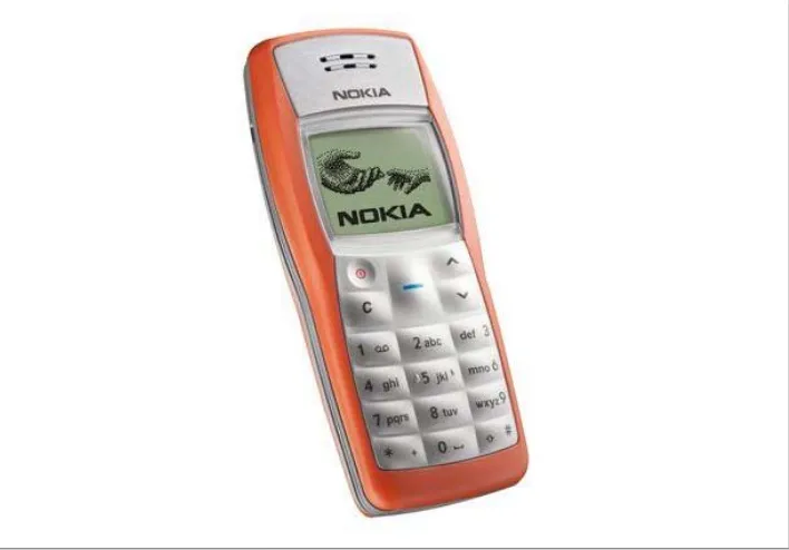
In a couple of years, because of device recycling, such phones will probably not be on the market anymore. The Nokia 1100 (see Figure 1-1) is currently the most widely distributed device in the world, with over 200 million sold since its launch in 2003. In terms of features, it offers nothing but an inbuilt flashlight. The problem is that we can’t create web content for it. Some companies may continue to make very low-end entry devices in the future, but hopefully Nokia and most other vendors will stop cre-ating this kind of device. Even newer, cheaper mobile devices now have inbuilt browser support. This is because the mobile ecosystem (vendors, carriers, integrators, and developers) wants to offer services to users, and a browser is the entry point.
For example, through its OVI Services Nokia offers OVI Mail, an email service for non-Internet users in emerging markets. Thanks to this service, many, many people who have never before had access to email can gain that access, with a mobile device costing less than $40. This widespread solution meets a real need for many people in emerging markets, like some countries in Africa and Latin America.
Low-end mobile devices
Low-end mobile devices have a great advantage: they have web support. They typically have only a very basic browser, but this is the gross market. People who buy these kinds of devices don’t tend to be heavy Internet users, but this may change quickly with the advent of social networks and Web 2.0 services. If your friends can post pictures from their mobile devices, you’ll probably want to do the same, so you may upgrade your phone whenever you can.
Mid-end mobile devices
This is the mass-market option for a good mobile web experience. Mid-end devices maintain the balance between a good user experience and moderate cost. From $150, we can find a lot of devices in this market sector. In this category, devices typically offer a medium-sized screen, basic HTML-browser support, sometimes 3G, a decent camera, a music player, games, and application support.
One of the key features of mid-end devices is the operating system (OS). They don’t have a well-known OS; they have a proprietary one without any portability across vendors. Native applications generally aren’t available publicly and some runtime, like Java ME, is the preferred way to develop installed applications.
The same vendors develop these devices as the low-end devices.
High-end mobile devices
[image:29.504.78.432.38.285.2]Originally the same category as smartphones, high-end devices are generally non-multitouch but have advanced features (like an accelerometer, a good camera, and Bluetooth) and good web support (but not the best in the market). They are better than mid-end devices but not on a par with smartphones. The enhanced user experience on smartphones is one of the key differences. The other difference is that high-end devices Figure 1-1. 200 million devices worldwide sounds very attractive but this device (Nokia 1100) is out of our scope because it doesn’t have a web browser.
generally are not sold with flat Internet rates. The user can get a flat-rate plan, but he’ll have to go out and find it himself.
You will find different mobile categories defined in different sources. There isn’t only one de facto categorization. The one used here is based on mobile web compatibility.
Smartphones
This is the most difficult category to define. Why aren’t some mid-end and high-end devices considered “smart” enough to be in this category? The definition of smart evolves every year. Even the simplest mobile device on the market today would have been considered very smart 10 years ago.
A device in this category can cost upwards of $400. You can probably get one at half that price from a carrier; the devices are often subsidized because when you buy them you sign up for a one- or two-year contract with a flat-rate data plan (hopefully). This is great for us as users, because we don’t care too much about the cost of bytes trans-ferred via the Web.
A smartphone, as defined today, has a multitasking operating system, a full desktop browser, Wireless LAN (WLAN, also known as WiFi) and 3G connections, a music player, and several of the following features:
• GPS (Global Positioning System) or A-GPS (Assisted Global Positioning System) • Digital compass
• Video-capable camera • TV out
• Bluetooth • Touch support • 3D video acceleration • Accelerometer
Google bills its own device, the Nexus One (launched in partnership with HTC), not as a smartphone but rather a “superphone,” because of its 1-Ghz processor. The fact is, any “superphone” is super only for a couple of months before it is knocked from the podium by some other device, so this is not really a valid category.
Some other companies, like Nokia, call their phones “mobile computers.”
If you are still confused about the models, brands, and operating systems, don’t worry, it will become clearer. Some confusion is normal, and I will help you to understand the mobile web ecosystem in the following pages.
Non-phone devices
This may sound a bit strange. Non-phone mobile devices? Indeed, there are some mo-bile devices that have all the features we’ve mentioned, but without voice support using the normal carrier services.
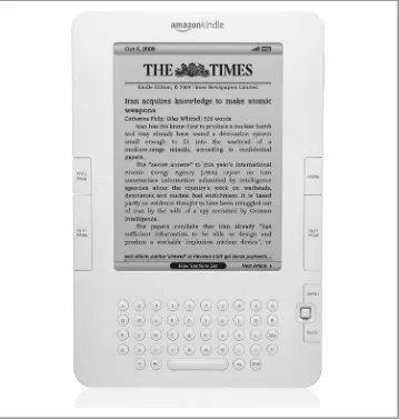
For example, Apple’s iPod Touch and iPad are devices in this category. They aren’t phones, but they can be personal, are portable and easy to use, can be kept with you most of the time, and have WLAN connections, so they fall into the category of limited connected devices. They both also have a great mobile browser—the same one as the iPhone—so they will be in our list of devices to be considered for development. We can also consider some of the new ebook readers. I have a Sony ebook reader, and it’s really great. My reader (a Sony PRS-700) isn’t a mobile device because it isn’t con-nected, but there are other versions (like the Amazon Kindle, shown in Figure 1-2, the Barnes & Noble Nook, and some newer Sony devices) with data connection support. The Kindle can display very basic web pages on its included browser, and a Kindle SDK has been announced for Java native development on this platform. Ebook readers aren’t phones, but they conform to all our other guidelines for mobile devices (with perhaps one difference: they are more likely to stay at home than to travel everywhere with us).
Small Personal Object Technology (SPOTs)
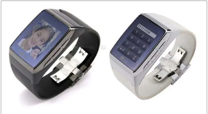
This may sound like a sci-fi category, but every year sci-fi gets nearer to us. The only difference between SPOTs and the other devices we’ve considered is their size: a SPOT may be a watch, or even a pair of glasses. The LG GD910 in Figure 1-3 is a watch with 3G support. It’s on the market now, so it’s not sci-fi.
“OK,” you may be thinking, “but are we really going to create a website for a one-inch screen?” Maybe not. But we can create small widgets to update information presented to the users, and this falls under the category of mobile web work.
Tablets, netbooks, and notebooks
I have to be honest: I love the tablet concept. For three years I had a Tablet PC from HP, and I always loved the idea of it. A small notebook with touch support was a really great device. However, when I bought it (back in 2005), the concept didn’t work. Why? I don’t know. However, the concept is back again, and we now have light netbooks, tablet PCs, the Apple iPad, and a variety of mobile-OS tablets on the market.
[image:32.504.74.433.36.414.2]These devices have at minimum a nine-inch display, and they are more like desktops than mobile devices. Some have desktop operating systems and desktop browsers, while others, such as the iPad, have mobile software.
If a device has a full operating system, you will need to install antivirus protection and a firewall on it, so it won’t meet the easy usage criterion for a mobile device. Also remember that you can’t use a netbook while walking.
Still, this concept is growing up. Nokia, a well-know mobile device manufacturer, is now creating a netbook line: its Booklet 3G has 3G and WLAN support and runs Windows. Apple, with the iPad, has also entered this market with a hybrid half–ebook reader, half-iPhone.
Mobile Knowledge
If you are not (up to now) a part of the mobile world, we need to discuss some things before we start analyzing the devices and before we do any coding. I know you want to start coding right now, but believe me that your project will be more successful if you know the environment.
Display
[image:33.504.70.434.45.246.2]I know what you’re thinking: “you’re going to talk me about the small screen prob-lems.” Yes, I was going to start with that. A mobile device has a very small screen compared with a desktop. While in desktop development we talk about 17-, 19-, and 21-inch screen sizes (diagonally), in mobile development we talk about 1.5, 2.3, or 3 inches. It’s really a big difference. Similarly, while in desktop development we talk about Figure 1-3. The LG GD910 (the “watchphone”) is the first of a new generation of mobile devices that will have web support through widgets with updatable information in the near future.
1024×768 pixel resolution, in mobile development we talk about a quarter or half of that.
Resolution
Resolution is the primary concern in mobile design. How many pixels (width and height) are available on a given device? This was the only portability problem for many years in the area of mobile development.
Portability refers to the ability of a mobile application to be used on multiple devices with different hardware, software, and platforms.
There are no mobile device standards regarding screen resolution. One device may have a resolution of 128×128 pixels, and another 800×600. But if we talk about devices sold from 2007, we can separate most of them into four basic groups:
• Low-end devices: 128×160 or 128×128 pixels
• Mid-end devices (group #1): 176×220 or 176×208 pixels
• Mid-end devices (group #2) and high-end devices: 240×320 pixels
• Touch-enabled high-end devices and smartphones: 240×480, 320×480, 360×480, 480×800, 480×854, or 640×960 pixels
Touch devices typically have a higher resolution than devices with a keyboard because no space needs to be reserved for the keypad.
Today, the most widely available screen resolution is 240×320 pixels. This is also known as QVGA (Quarter VGA), because the 1990s VGA standard was 640×480 pixels. An iPhone 3GS, for example, has a resolution of 320×480 pixels; this is known as HVGA (Half VGA).
There are also still a lot of devices with custom resolutions. Web technologies will simplify this problem for us, as we’ll see later in this book.
Physical dimensions
may be that a screen with a resolution of 128×160 is “smaller” than a screen with a resolution of 240×320, that may be a false conclusion.
One of the phones I owned back in 2006, thanks to a gift from Nokia, was an N90. The device was like a brick, but the great (or not so great, as it turned out) feature was its resolution: 352×416. The problem was that the screen size was very similar to those of other devices on the market at the time that used resolutions like 176×208. Therefore, I couldn’t use any game or application on the device, or browse the Web; I needed a magnifier to see the normal font size. Every programmer thought that more available pixels meant a bigger screen, so why bother increasing the font? “Let’s use the extra space to fit more elements,” everyone thought. Wrong.
In June 2010, Apple presented iPhone 4, the first device with a “retina display,” that is a display with 326 pixels per inch (ppi). The human retina has a limit of 300 ppi at a certain distance, so this device with 960×640 in landscape mode has more pixels per inch that the ones we can really see. This is perfect for images and zoom-out viewing, but remember that we need to zoom in or have large fonts to perfectly read text.
The Nokia N90 has a display size of 1.36″ × 1.6″ (3.45 cm × 4.07 cm) = 259 PPI (or 0.0979 mm dot pitch), in comparison with other devices with a similar screen size, which have between 130 and 180 PPI.
You can find an online PPI and DPI calculator at http://members.ping .de/~sven/dpi.html.
Aspect ratio
A device’s aspect ratio refers to the ratio between its longer and shorter dimensions. There are vertical (or portrait) devices whose displays are taller than they are wide, there are horizontal (or landscape) devices whose displays are wider than they are tall, and there are also some square screens, as shown in Figure 1-4. To complicate our lives as programmers even more, today there are also many devices with rotation capabilities. Such a device can be either 320×240 or 240×320, depending on the orientation. Our websites need to be aware of this and offer a good experience in both orientations.
Input methods
Today, there are many different input methods for mobile devices. One device may support only one input method or many of them. Possibilities include:
• Numeric keypad
• Alphanumeric keypad (ABC or QWERTY) • Virtual keypad on screen
• Touch • Multitouch
• External keypad (wireless or not) • Handwriting recognition
• Voice recognition
And of course any possible combination of these, like a touch device with an optional onscreen keyboard and also a full QWERTY physical keyboard (see Figure 1-5).
[image:36.504.73.434.38.255.2]If you are thinking that QWERTY sounds like a Star Trek Klingon’s word, go now to your keyboard and look at the first line of letters below the numbers. That’s the reason for the name; it’s a keyboard layout organized for the smoothest typing in the English language that was created in 1874. This layout is preserved in many onscreen keyboards (see Figure 1-6).
Other features
We could talk for hours about mobile device features, but we’ll focus on the ones that are useful for us as mobile web programmers. Key features include:
Geolocation
Many devices can detect the geographical location of the users using one or many technologies, like GPS, A-GPS, WPS (WiFi Positioning System), or cell-based lo-cation tracking.
Phone calls
Yes, mobile devices also make phone calls!
SMS (Short Message Service)
Most devices allow you to create text messages to send to other devices or to a server, with a length of up to 160 7-bit ASCII characters (or 140 8-bit ASCII char-acters, or 70 Unicode chars), or to concatenate many messages for a larger text.
MMS (Multimedia Message Service)
Mobile devices often allow users to create messages with text and attachments, such as images, videos, or documents.
Application installations
Many devices allow the user to download and install an application using OTA (Over-The-Air). This means that we can serve applications to a device from our websites.
Figure 1-5. The Nokia N97 mini has a full slider QWERTY keyboard and, when closed, an onscreen touch keyboard.
Brands, Models, and Platforms
Now that we have established a set of categories in the mobile world, let’s talk about the difficult part: the brands and models on the market. We are not going to talk about every model available, and we don’t need to know about all of them. We only need to be aware of some information that will be useful for making decisions in the future. Writing a book about brands and models is very difficult. The market changes a lot every year. In fact, during the months while I was writing this book, I had to update the information several times. That is why I will be general and aim to show you how to understand any new device that could appear on the market.
Apple
[image:38.504.76.434.44.314.2]We are going to start with Apple, not because its devices are the best or because it has the greatest market share, but because Apple has caused a revolution in the market. It changed the way mobile devices are seen by users, and it is the reason why many de-velopers (web or not) have turned their attention to the mobile world.
Apple, a well-known desktop computer company, entered the mobile world with a revolutionary device: the iPhone. Luckily for us, all of Apple’s devices are quite similar. They have a multitouch screen, a 3.5″ screen size, WLAN connections, and Safari on iOS (formerly Mobile Safari) as the browser.
Apple’s devices have a great feature: an operating system called iOS (formerly iPhone OS) that is based on Mac OS X (a Unix-based desktop OS). Up to this writing, even the first version of the iPhone can be upgraded to the latest operating system version. By default, the iPhone and iPod Touch are charged using USB; when you charge your device, iTunes (the Apple software for managing your device’s content and music) will detect automatically if an OS update is available for your device, and you can install the update in minutes without any technical skill needed.
That is why today, for a mobile web developer, it’s more important to know what OS version an Apple device has installed than which device it is. For those of us whose aim is to create great web experiences for the iPhone, it doesn’t matter if the device is an iPhone (the basic phone), an iPhone 3GS (S for speed, a device with more power and speed), an iPhone 4 or an iPod Touch (like the iPhone without the phone). Even within each device type, we have many generations.
The Apple iPad is a 9.7″ multitouch tablet running iOS 3.2 or greater. It includes the same functionality and browser as the iPhone, with minor differences because of the larger screen, which has a 768×1024 resolution.
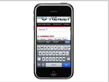
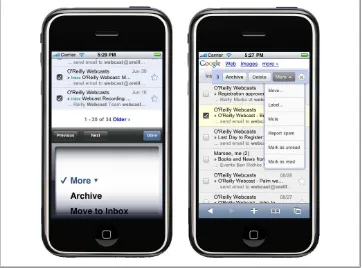
The important thing is to know which OS version a device that accesses your website is running. It may be iOS 1.0, 2.0, 2.2, 3.0, 3.2, 4.0, or newer (although versions 1.0 and 2.0 are rarely seen on devices in use today, so we can safely work with versions 2.2 and beyond). Up to version 4.0, iOS was called iPhone OS. Every version has upgrades in the browser and is backward compatible. For example, the Gmail version for the iPhone is different if you have an iPhone running OS 1.0, 2.2, or 3.0. You can see sample screens in Figure 1-7.
Today, we can develop applications for iOS devices on only two platforms: using mobile web techniques, and using the native Cocoa Touch framework built on Objective-C.
Later in this book, we are going to talk about how to detect the OS and use all the features available only in Safari on iOS. We will also talk about the App Store and how to distribute our mobile web applications via this store.
Nokia
Nokia has the largest market share in mobile devices and smartphones worldwide (but not necessarily in specific markets, like the U.S.). Nokia has devices in all the mobile categories, from very low-end devices to very high-end smartphones.
I’ve been working in the mobile development world since 2000 and I have to admit that Nokia has the best support for developers, compared to all the other companies. Hun-dreds of documents and a huge amount of sample code, ideas, and best practices for many technologies, including technologies used for mobile web development are avail-able on its website for developers, Forum Nokia.
I’ve been one of the Forum Nokia Champions (a worldwide recognition program for top mobile developers) since 2006, and I know that Nokia really cares about the de-veloper community.
[image:40.504.72.434.37.305.2]The bad news for developers is that hundreds of different Nokia devices are available today. The good news is that they are very well organized by platform into different series, making it easier for us to develop, test, and port our web applications to most of them.
Series 40
Nokia’s Series 40 consists of low- and mid-end devices using a proprietary Nokia OS focused on the mass market. The devices in this series first appeared in 2003, and today they are separated into different editions and even small update packages (called Fea-ture Packs) that will help us to understand the abilities of each mobile device in this series.
The series, the edition, and even the Feature Pack cannot be updated. So, there are no operating system changes in Series 40.
At the time of writing, Series 40 includes the following divisions: Series 40 1st edition
Series 40 2nd edition Series 40 3rd edition
Series 40 3rd edition Feature Pack 1 Series 40 3rd edition Feature Pack 2 Series 40 3rd edition Feature Pack 3 Series 40 5th edition
Series 40 5th edition Feature Pack 1 Series 40 5th edition Feature Pack 1 Lite Series 40 6th edition
Every edition has between 5 and 40 devices on the market today. The best part is that Nokia guarantees us that development for each device in one series is the same.
You may have noticed that there isn’t a 4th edition in Nokia’s Series 40. Why is this? Nokia has a lot of market share in Asia, and in China, 4 is considered a bad-luck number (like the number 13 in the Western world) because it is pronounced “si,” similar to “death” in Chinese.
All the Series 40 devices have a mobile browser and Java ME (Micro Edition)—formerly known as J2ME (Java 2 Micro Edition)—support. From the 3rd edition, they also sup-port different versions of Adobe Flash Lite.
Java ME is today the most widespread mobile platform, apart from mo-bile web. It was developed by Sun (now Oracle) in 1998, and the goal was to create a multiplatform programming language. Sun has said that Java ME will be retired in 2015.
Almost all the Series 40 devices have a numeric keypad and a medium-sized screen. Today, all have a camera and an MP3 player, and many of them have an FM receiver.
It’s interesting to see how the mobile world is changing other business markets. Today, the worldwide leading company in the MP3 player market is Nokia.
Some Nokia Series 40 devices that are well distributed in the market include: Nokia 6500
Nokia 6120 Classic Nokia 6600 Fold Nokia 6600 Slide Nokia 6131 Nokia 5310 Nokia 5200 Nokia 3220 Nokia 2610
S60
Series 60 began as the smartphone line from Nokia. Today these devices are closer to the high-end category, but the limit is not clear. All S60 devices use the Symbian op-erating system. The Symbian company was formed by a group of manufacturers in-cluding Nokia, Ericsson, and Motorola. Later, Samsung and Sony Ericsson were added to the member list. For many years Nokia has been the leading company using the Symbian platform, but there are some Samsung, Sony Ericsson, and Motorola Symbian-based devices on the market. Some of them use the same user interface layer and plat-form, so there are many non-Nokia S60 devices on the market today. Motorola and Sony Ericsson developed their own UI layers for Symbian, called UIQ, and DoCoMo in the Japanese market created MOAPS.
This is history, though. In 2008, after the launching of Android as an open source operating system, Nokia made a decision: it bought 100% of Symbian, Ltd. from all the other manufacturers and created the Symbian Foundation to migrate the Symbian operating system to open source.
Talking about only Nokia devices, the S60 platform is divided into the following versions:
S60
S60 2nd edition
S60 2nd edition Feature Pack 1 S60 2nd edition Feature Pack 2 S60 3rd edition Feature Pack 1 S60 3rd edition Feature Pack 2 S60 5th edition
After S60 5th edition, the platform was renamed to Symbian platform. All new devices coming from Nokia and other manufactures will not use the S60 brand.
All the S60 devices are based on Symbian and include a camera, a mobile browser, multitasking support, and a numeric or QWERTY keyboard. The 5th edition has touch support.
Apart from the technical series divisions, Nokia has divided its Symbian-based devices into commercial series based on the user groups for whom they were designed since the 3rd edition.
The n-series is intended for all type of users, including high-tech users, gamers, and Internet users. This series includes the N97, N95, N85, N78, etc. Some of these devices have hardware-accelerated video cards for 3D gaming.
The e-series is aimed at enterprise users wanting access to email, web browsing, and corporate applications. They include a corporate email application, and many of them have a QWERTY keyboard for easy typing. This series includes the E52, E65, E71, etc. The x-series (formerly known as XpressMusic) is designed for the music user. These devices have multimedia keys for easy music player manipulation and provide access to the Nokia Music Store so users can buy songs legally. The last devices from this series are touch-based. This series includes the 5800 XpressMusic (see Figure 1-8) and the X6.
Figure 1-8. The 5th edition Nokia 5800 XpressMusic was the first touch-enabled S60 device.
Every S60 device has a WebKit-based browser that allows the devices to browse almost any website on the Internet, including Flash-based sites like YouTube. The S60 WebKit browser is an open source browser developed by Nokia (now managed by the Symbian Foundation) based on WebKit, an open source browser originally developed by Apple Inc. Before this browser was developed, S60 devices included a proprietary Nokia browser or preinstalled some other browser, like Opera Mobile.
Maemo/MeeGo
Nokia has recently created a new platform, called Maemo. It’s a Linux-based operating system designed for small netbooks or devices with full web browsing support. The first devices to use Maemo weren’t phones, but today there are devices like the Nokia N900 with 3G support, competing directly with Symbian devices.
Future smartphone devices from Nokia will be Maemo-based. Maemo was the first mobile platform to support the popular Firefox browser and Google Chrome. In 2010, Nokia’s Maemo merged with Intel’s Moblin OS, creating the MeeGo OS. At the time of this writing, it is not yet clear whether Maemo will continue as a branding name or if MeeGo will replace it.
BlackBerry
In following chapters, we will cover all the tools, SDKs, and emulators available from each manufacturer to make our lives as web developers easier.
RIM has few devices aimed at the mass market, so most of them have QWERTY key-boards and aren’t designed for gaming. Many of them have proprietary input devices, like a scroll wheel or a touchpad; some touch-enabled devices have also been launched in the last few years. All BlackBerrys have the RIM OS, a proprietary operating system compatible with Java ME with extensions, and, of course, a mobile browser. We can categorize the devices by operating system version.
BlackBerry has become very popular in the corporate market because of its integration with Exchange and other corporate servers. A BlackBerry user can browse the Internet via the corporate Internet connection though a proxy, and many other manufacturers, such as Nokia, LG, HTC, and Sony Ericsson, support the BlackBerry email client.
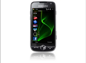
Samsung
Samsung has many devices on the market, most of which are divided into three different series: native devices, Symbian devices, and Windows devices. At the end of 2009, Samsung surprised the market with a new platform for the devices launching from 2010: Bada.
Samsung’s native devices are low- and mid-end mobile devices with a proprietary OS including a browser and Java ME support, and typically a camera and a music player. Prior to 2010, the smartphones and high-end devices were divided into two categories by operating system—Symbian and Windows Mobile—each having its own set of fea-tures. The latest devices on the market have touch support, with a UI layer installed over the operating system.
For newer devices, there is one feature that is available on all the three platforms: Sam-sung Widgets. These are small applications created using mobile web technologies that can operate on all the operating systems Samsung uses.
In Chapter 12, we will cover Mobile Widgets and offline applications. We will talk about the widget platform for Samsung there.
Starting in 2010, Samsung will also be delivering mobile devices with Bada, Android, and Windows Phone.
Sony Ericsson
Ericsson built many mobile phones in the 1990s, and in 2001 it merged with Sony and created the Sony Ericsson company. Today, Sony Ericsson produces a range of low-and mid-end devices low-and a couple of smartphones.
Sony Ericsson, like Samsung, has decided to offer devices with different operating sys-tems. It offers low- and mid-end devices using a proprietary Sony Ericsson operating system, as well as Windows Mobile devices, Android devices, and Symbian devices. Before 2009, the Symbian devices used UIQ as the UI layer for the operating system. Since 2009, there are Symbian Foundation devices using the same UI layer as Nokia’s and Samsung’s devices. So, in terms of developing web applications for them, they are very similar.
The proprietary OS devices support Java ME and Flash Lite development (and also both at the same time, thanks to a project called Capuchin), and they are divided in series according to the Java ME APIs they support. So, today we have Sony Ericsson devices from Java Platform 1 (JP-1) to Java Platform 8 (JP-8), with each category dif-fering in terms of the API support and the screen resolution.
All the devices have a camera, a music player and, of course, a web browser built in. The Symbian Foundation–based devices are touch-enabled.
Motorola
For many years, Motorola has been a leading manufacturer of low- and mid-end devi-ces. Motorola’s devices were the first mobile devices on the market, and the company pioneered the clamshell design with the classic Motorola StarTac. Motorola’s mobile devices have traditionally used either a proprietary operating system (like the well-known Motorola v3), Symbian UIQ, Windows Mobile, or a Linux-based operating system the company created for its devices. On the proprietary OS–based devices, Java ME and the browser were the only supported development platforms. The Linux-based OS supports Java ME, web, and native development.
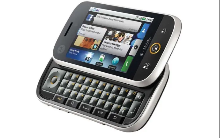
Figure 1-9. The Motorola CLIQ was the first Android-based device from this company. It includes MOTOBLUR, a push service connecting your home screen with social networks and news sites.
The Windows-based Motorola devices, like the Motorola Q, which has a QWERTY keyboard, are intended for the corporate market. The company also has some touch devices on the market, all with a built-in camera and music player, and some mobile devices for the two-way radio market, like the Nextel network. These devices have a proprietary OS and the model names usually start with an “i.”
There are no series divisions in Motorola, unlike in the Nokia and Sony Ericsson lines, so we will need to use other information (such as the browser used in each device) to test and make decisions about the devices.
LG Mobile
LG Mobile has many low- and mid-end devices on the market today. Most are based on a proprietary OS with Java ME, Flash, and web support. Some of the new ones support web widgets based on WebKit.
LG is currently working with Android and Windows Mobile/Windows Phone to create some new smartphones (the company has not previously produced any devices in this category). LG participated in the creation of the Symbian Foundation and has two Symbian devices based on the S60 platform, but as it has now decided to support Android, we should see a lot of Android-based LG devices in the future.
HTC
HTC has become very popular in the mobile market since it created the first and second Android devices in the world and the first Google phone, the Nexus One. But HTC doesn’t only create Android devices; it also produces a lot of Windows Mobile ones. Many HTC devices have touch support, and a key feature is that HTC tries to emulate the same user experience on all its devices. We can think of HTC devices as either Android devices or Windows devices; that’s the only distinction that’s needed. This simplicity is reflected in the HTC website for developers: it only contains kernel files for Android devices and links to the Android and Windows Mobile generic websites.
Android
This is the first platform we are covering that isn’t a manufacturer. Therefore, it may not seem to fit in this list. It does, though—if we are developing a website for an Android device, we don’t need to bother too much about who the manufacturer is. This is because the Android platform is powerful enough to leave the brand and model in a second place when we are talking about developer features.
Android is an open source, Linux-based operating system created and maintained by a group of software and hardware companies and operators called the Open Handset
Alliance. Google mainly maintains it, so it is sometimes known as the “Google Mobile
Operating System.” As with any open source software, any manufacturer could theo-retically remove all the Google-specific stuff from the operating system before installing it on their devices. However, as of this writing no vendor has done this, which is why every Android device is very “Goo