1
Cycle Mapping in the UK and the ‘London Cycle Map’
Dr Henrietta Sherwin and Dr Steve Melia,
Centre for Transport and Society,
University of the West of England, Bristol
Contents
Executive Summary ... 3
PART 1: THE CONTEXT CYCLE OF MAPPING IN THE UK ... 4
1 Introduction ... 4
2 Background and literature review ... 6
3 Cycling and Wayfinding ... 6
4 Mapping styles and usability ... 8
5 Trust and the relationship of the map to experience on the ground... 13
6 The process of map making ... 14
7 Issues from the Literature Explored in the Interviews ... 15
8 Research Method ... 15
9 The diversity of cycle maps styles ... 15
10 Detailed Maps... 16
11 Schematic Maps... 22
12 Map making and Data Collection ... 24
13 Evaluation ... 25
14 Open Source and Open Data Mapping ... 26
15 London – a Particular Case ... 27
16 Signage... 32
17 Conclusions ... 33
PART 2: THE LONDON CYCLE MAP AND EXPERIENCE OF THE INNOVATOR ... 35
1 Introduction ... 35
2 Policy Communities, Diffusion of Innovation and Cycling Policy ... 36
3 The Experience of the Innovator ... 38
2
Table of Figures
Figure 1 Map A Current Bristol Design... 10
Figure 2 Map A Current Bristol Design – Key ... 11
Figure 3 Signage along the blue-themed Frome Valley Greenway radial route in Bristol (see Map A) 11 Figure 4 Map D Schematic Bristol Map ... 12
Figure 5 Map D schematic Map of Bristol – Key ... 12
Figure 6 OS 1:25,000 (Explorer series) ... 17
Figure 7 Extract from the Key to OS Explorer series maps ... 18
Figure 8 Map B Cyclenation Style ... 19
Figure 9 Map B Cyclenation Style Map - Key ... 20
Figure 10 Edinburgh Inner Tube Map ... 23
Figure 11 Images from OS Opendata at: 1:10,000, 1:25,000 (‘backdrop’) and 1:250,000 scales ... 27
Figure 12 Extract from One of the Barclays Cycling Superhighway Maps ... 30
Figure 13 Barclays Cycling Superhighway Markings ... 32
Figure 14 London Cycle Map, Central Area ... 35
3
Executive Summary
This scoping report explores issues around cycle mapping and the use of maps by cyclists, potential cyclists and organisations seeking to promote cycling, including particularly, local authorities. It also seeks to evaluate the experience of an individual innovator, Simon Parker, in his efforts to promote a ‘tube style’ cycle map for London-the London Cycle Map. Part 1 explores broader issues around cycle mapping, through a literature review and interviews with stakeholders from local authorities, map-makers and cycling organisations. Sections 15 and 16 focus on cycle mapping and signage in London. Part 2 evaluates and analyses the specific experience of the innovator, drawing on the literature on policy communities and diffusion of innovation.
The study revealed a diversity of representational styles in cycle mapping in the UK. This partly reflects the lack of national standards, around what constitutes a ‘cycle route’ or a ‘traffic free route’, for example. Cycle maps in the UK vary from, general purpose maps, such as those published by Ordnance Survey (OS) to schematic maps such as the Edinburgh cycle tube map (Figure 10, page 23), which are intended more for promotion than wayfinding.
Many local authorities and some cycling organisations have produced maps to promote their cycling infrastructure. Some are schematic; others are grafted onto a detailed map base as in Bristol (Figure 1 page 10). The Bristol map and wayfinding system also uses colour-coded routes, similar to, but simpler and more limited than, the London Cycle Map. Cyclenation, the Federation of Cycle Campaign Groups in the UK and Ireland, produce a map (Figure 8, page 19) that grades roads according to their suitability for cycling. Public authorities and organisations with a valuable brand, such as Ordnance Survey have embraced open data maps, with some limitations, but not open source (where the public creates the data). Quality control and the commercial, political and possible legal consequences of misleading representations are the key concerns.
Demand for paper maps has remained more resilient than some in the industry expected, despite the growth of online and mobile forms of wayfinding. Some of the stakeholders identified
shortcomings of mobile wayfinding technology, such as vulnerability to breakdown and the inability to show the ‘big picture’. The limited available research suggests cyclists are mixing use of a growing range of tools, in which paper maps are likely to have a place for the foreseeable future.
Cycle mapping and cycle routes are highly political issues, particularly in London, with the division of responsibilities between TfL and the boroughs. Localism is likely to make coordination and
agreement on common standards more difficult in the immediate future.
4
PART 1: THE CONTEXT CYCLE OF MAPPING IN THE UK
“The big idea is to create a single ‘London cycle Map’ that’s clear and easy to use and corresponds to a unified network of signed cycle routes throughout Greater London: the cycling equivalent of the London Underground Map” London Cycle Map Campaign Guide
“What we wanted to do was to make people think slightly differently of their town and city. Most of us view a place through a prism of their usual journey, which is generally the main roads. Maps contribute to this world view - any regular map of a town will show the main roads in bold - they become the skeleton of the town with everything else seemingly built around them. This elevates them to a status that they don't deserve - why is an A road any more important than a B road or a path across a path? It is all viewed from the perspective of the motor car, and it constrains how people think and view their surroundings, and therefore predetermines where they travel to.”
Mark Sydenham, Edinburgh Bike Station
1
Introduction
This scoping report aims to explore key issues around cycle mapping and the use of maps by cyclists, potential cyclists and organisations seeking to promote cycling, including particularly, local
authorities. The original spur for this research came from the work by Simon Parker to promote a ‘tube style’ cycle map for London. Part 1 of this report will explore broader issues around cycle mapping, with occasional references to the London Cycle Map, through a literature review and exploratory stakeholder interviews. Sections 15 and 16 will focus on cycle mapping and signage in London. Part 2 will evaluate the specific experience of the innovator in his efforts to promote the London Cycle Map.
Many government departments and local authorities including Transport for London (TfL) are emphasising the promotion of walking and cycling (‘active travel’) to reduce CO2 emissions and
traffic congestion, and to tackle obesity. In the UK only two percent of all trips are made by bicycle (DfT 2011). Nearly a quarter of car journeys in the UK are of less than 2 miles, and over half of all journeys made by car are of less than 5 miles (Commission for Integrated Transport 2007). It has been estimated that cycling is a viable alternative for 30% of car trips within towns - a greater potential than for walking or public transport (Cycling England 2007).
Paper maps and the growing range of electronic delivery mechanisms for map-based information (e.g. websites, mobile ‘apps’ and journey planning tools) are just some of many tools to enable way-finding alongside other factors such as existing local knowledge, word-of- mouth, use of signage and other way-markers, exploration and experimentation.
5
that could encourage people to change mode. So a map isn’t the end in itself, it has got to be part of the set of tools so we can get more people to cycle”
John Franklin, Independent Cycling Skills and Safety Consultant
It is hard to judge with any precision the extent to which maps that have been produced act as an ‘enabler’ to encourage greater use of cycling as a transport mode, but within the complex decision processes surrounding modal choice they are likely to play a part.
Humans build mental maps: they develop ‘place cells’ in the brain corresponding to points in the physical environment and gradually build them up into a mental map of places, routes and, eventually, areas (AIG 2006). These maps are not geographic but revolve around the relationship between memorable locations and routes relevant to individual needs. As the majority of individuals in the UK drive for the majority of their journeys, their ‘mental map’ is likely to be based on the road network. Mental mapping is influenced by neighbourhood and travel mode experience in addition to demographic characteristics (Mondschein, Blumenberg & Taylor 2006). To a potential cyclist, who currently drives for most of their journeys, their driving mental map may act as a barrier to
contemplating cycling. So, for example, an individual might imagine that they would cycle along the same roads that they drive which might seem a dangerous and unattractive prospect. This has led many transport planners to the view that lack of knowledge about short-cuts, traffic-free routes, or routes with lighter motor traffic is a barrier to the take-up of utility cycling.
Consequently, many UK local authorities have produced cycling maps with the aim of helping individuals to find suitable routes for cycling. However, the design and style of such maps varies substantially across the UK (unlike road maps designed for driving, which follow a more standard format). Some, for example, show recommended cycle routes; others colour-code roads according the level of skill required to cycle on them; some provide highly stylised information, whilst others show street names and every cycle lane (Sherwin & Bartle 2012). Parker’s innovation the London Cycle Map codes routes using five compass colours to signify the direction of travel as a way of simplifying the complexity and randomness of the London street network.
This report lays out the context of cycle mapping generally, starting with a brief literature review around wayfinding in relation to cycling and its relationship with representation on a map, the connection with the real world and the different ways this information can be delivered from paper map to mobile apps. The underlying question is whether current cycle maps serve the intended purpose, to promote and enable more cycling journeys. The research methodology is outlined and the main section draws on in-depth interviews with stakeholders with a particular emphasis on the case of London and specifically what Simon Parker’s innovation might add to cycle mapping.
6
2
Background and literature review
At the outset it is important to note the distinction between an information barrier that facilitates pre-planning a cycle journey and wayfinding once on that journey and a map that prompts the deliberation of seeking such new information (Beale & Bonsall 2007) rather than a default source of travel information (Farag and Lyons 2008). Many habitual car drivers will not be aware that different information about their locality might enable them to build different mental maps to improve their cycling experience. In other words, if the goal is to encourage cycling, the first priority is to provide information that prompts deliberation and allows an individual to judge whether cycling is a feasible option for them and only then will they seek information to make it easier to find their way and improve the experience. Firstly an individual who does not cycle has to ask themselves whether they would consider cycling and then whether it is feasible to cycle to their destination. Once they have made that decision to try cycling they would search for information that can answer questions like How far? How fast? Which way? Which direction? How long? How easy? How safe?
This literature review explores the issues around wayfinding and cycling, the importance of map design in terms of the information it is able to convey to the user, the relationship of what is portrayed on the map to what is experienced on the ground, the process of map making and the potential of new technologies and how this might change the process of map making.
3
Cycling and wayfinding
The idea of the London Cycle Map innovation came from user experience, directly experiencing the problem space and coming up with an idea that would benefit himself and others.
“it had been a fairly long day on the bike, got lost more often, kept looking at the map…signs were not very consistent in those days, I got to the end of the street, seemed absolutely perfect started it, see a sign, get to the end and ‘no’ signs…. I didn’t know which direction I was going, by this time I’d been on a few back streets… I’d lost my sense of orientation. I think out of frustration I sort of shouted to myself…I don’t even know what direction I’m going in, how can I work out what to do next, if I don’t know where I’m coming from, I don’t know where to carry on…..from that there must be a way of doing this….the idea of coding the routes according to a direction of travel, had its genesis in that moment”
Simon Parker, Originator of the London Cycle Map
The question in this circumstance is what information, at what time (before or during the journey) and in what format would enable a cyclist to find their way easily. Adverse experiences of
wayfinding, getting lost and the emotions experienced might discourage future journeys (Campbell and Lyons 2008).
7
particularly in a new environment can take away attention from other activities like controlling the bicycle (TfL 2010a). One aim of cycle mapping is to reduce the cognitive load of the cyclist.
Research evidence on wayfinding amongst cyclists is very limited. This lack of evidence prompted Transport for London (TfL) to commission research to explore cyclists’ wayfinding experience in London (TfL 2010a). Their study took a bottom up approach, building on earlier work around pedestrian wayfinding in London (AIG 2006) and taking into account a broad range of factors – cognitive, behavioural, emotional and physical features. This resulted in eight draft principles of wayfinding on a bicycle:
‘Keep me safe’, ‘Secure my property’,
‘Clear and Succinct information’, ‘Use my knowledge’,
‘I am in control’, ‘Be inclusive’ and
‘Make my journey positive’.
Using these principles they surveyed 703 existing cyclists, looking at maps and other pre-journey planning tools, and also at on-journey tools e.g. signs. They found that the majority of cyclists’ decisions were informed by pre-journey planning (the majority using paper or online maps) or their existing knowledge of the area. On-journey information served mainly to reassure the cyclist that they were following their intended route. For pre-planning 27% used existing knowledge, 19% used the TfL journey planner, 16% Google maps, 13% cyclist-specific maps and 7% information from others. Often internet users printed out the maps for reassurance on the journey. Sherwin and Bartle (2012) found individuals used a wide range of information sources, often in combination, for planning and navigating an unfamiliar trip including: Google Maps and Google Streetview; AA Routeplanner; web-based cycling and walking route planners; SatNav and other GPS devices; Smartphones (including ‘apps’); A to Zs, Ordnance Survey (OS) maps; cycling maps; and word-of-mouth.
As noted in the introduction, people build cognitive maps or mental maps that are relevant to their individual needs. Mental maps are not geographic but revolve around the relationship between memorable locations and relevant routes. A significant volume of literature is devoted to the processes of acquiring spatial knowledge, drawn primarily from the field of cognitive psychology (Golledge 1999). Lynch’s (1960) seminal work ‘The image of the city’ defined the concept of wayfinding in terms of the legibility and the imagining of the built environment. He suggested that the legibility of the urban environment is a product of the environment and the observer, so the salience of a particular landmark is dependent on its importance to the observer.
8
Individual differences in cognitive abilities and spatial learning complicate the provision of
wayfinding information. For some, more willing to accept error, an experiential model of learning might be acceptable, but for others barriers such as cycling ability or personal safety may preclude this more adventurous wayfinding (Bunce 2011). Bunce (2011) found that some participants had taken up to 10 repetitions of a journey to learn the route; others accepted errors or used dummy runs to avoid the pressure of time. He found that cyclists developed personal cognitive maps, which allowed them to cope with a variety of barriers; where possible they navigated by pre-existing knowledge, resorting to external information only when necessary. The key requirement of a cognitive map is that it is sufficient for its creator to achieve their aims, thus the requirements of such a map depend upon the needs of the individual (Cornell and Heth, 2000).
Maiss and Handy (2011) have looked specifically at how the act of cycling influences the
development of spatial knowledge in young children and suggest that children who bike extensively have a more sophisticated mental map of Davis, California than those who have very little
experience biking and also may progress to the higher stages of spatial development at a younger age than their peers with less biking experience. This supports the idea that individuals develop mental maps that support their particular needs. There is no research that has looked specifically at how cycling maps have assisted in building mental maps or wayfinding in the field.
The needs of a confident cyclist are likely to be different from that of a potential or novice cyclist. Equally the needs of someone local who already has local knowledge and has built up something of a mental map of the area will be different to those who are totally new to the area. Some cyclists or potential cyclists would like to see routes suggested on a map, whilst others would prefer to be provided with information such as traffic intensity to help them identify their own routes (Sherwin & Bartle & 2012).
4
Mapping styles and usability
Once decisions have been made as to what information is relevant to the user, there is another question of how to represent this information in a usable way. Despite the volume of paper cycling maps produced across the UK, there has been only limited evaluation of different mapping styles (Sherwin & Bartle 2012), with no tests in the field as yet. One of the few studies of map use in a non cycling context was conducted by Soh and Smith Jackson (2004) who investigated the effects of map design, individual differences and environmental cues on wayfinding performance of walkers on forest trails. They found that experience in map usage, gender or whether someone was right or left handed made no difference in terms of their ability to complete a walking route but cultural
difference and signage did.
9
more said it was because they had new knowledge of cycle routes, new knowledge of safer/quieter routes and public transport was not convenient.
Guo (2011) laments the lack of literature that looks at the travel information conferred by a map to a traveller and the effect of a map on travel decisions. Using data from TfL’s origin and destination surveys he found that the London tube map did have an impact on travel decisions. The distances on the tube map were modelled along with actual journey times, with the map distances found to exert the stronger influence. Guo argues that altering the relative attractiveness of available paths through a schematic map can have a strong and lasting effect on travel decisions. This implies that it would be possible to change path choices by changing the map.
This type of schematic map may work for the tube traveller who is interested in getting from A to C which might involve changing trains at B but the distance and twists and turns on the route are of no consequence. This type of map may be less useful to a cyclist, as the distortion caused by this
approach undermines the appreciation of distances and relationships in the streetscape. So, for example, the physical distance between Leicester Square and Covent Garden is small but this is not clear from the map. So, 5% of passengers exiting Leicester Square tube station had started from a station less than 800m away. Most could presumably have walked (AIG 2006). The spatial
relationships are altered on the tube map, so for example, the Central and District lines between Paddington and Notting Hill Gate run north-south on the tube map but physically run east-west (Guo 2011).
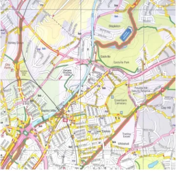
What this illustrates is the potential power of the visual representation and style of maps. Decisions about how much information to include are also important as too much information can detract from the map’s usability and render it confusing to the user (Sherwin & Bartle 2012). Sherwin & Bartle (2012) tested 4 different current UK map designs of the same area in Bristol with those who lived and worked in the area and either mainly drove for their journeys or cycled. Considerable confusion was shown amongst the participants about the different colours, symbols and meanings of certain words used on the maps and their interpretation of what that might experience on the ground. Two of the four maps used are shown on the following pages by way of illustration. Figure 1 below shows Map A the existing style of mapping in the Bristol area.
This map has a great deal of information including contours to allow users to assess the steepness of hills and also a grid for distance but also information about places of worship and advance stop lines as shown in the key.
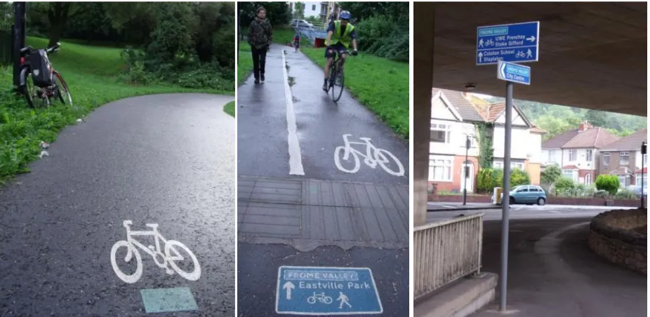
The ‘featured routes’ shown are eight radial cycling routes converging on the city centre, which are named and signed in consistent colours. The ‘Frome Greenway’ (a blue route) shown on Map A is one example. Some of the surface and pole-mounted signs along this route are shown in Figure 3.
Note that these radial routes are all represented in the same way on the map: with two parallel red lines, rather than the eight different colours (which would presumably introduce too much
10
11
Figure 2
Map A Current Bristol Design –
KeyFigure 3 Signage along the blue-themed Frome Valley Greenway radial route in Bristol (see Map A)
In contrast, Map D and its key on page 12 show far less and is more diagrammatic, highlighting traffic-free routes by green dots, key cycle routes in yellow showing whether they are traffic-free or not by using green dots, and plain green as other recommended cycle routes.
In the research reported in Sherwin and Bartle (2012) the OS based Map A Figure 1, Map D the schematic Map and two other map styles were tested mainly with non-cyclists and those who were considering cycling in focus groups of 6-8 participants (29 in total). The ages were mixed, with a balance of men and women, who lived within or just off the map (i.e. had local knowledge), who used different transport modes for their journey to their workplace in the centre of the map. It was feasible for all to cycle to work. The researchers would also have preferred to conduct a trial ‘on the ground’, but resource constraints precluded this.
12
Figure 4
Map D Schematic Bristol Map
[image:12.595.197.401.523.745.2]13
The tension between detail and visual simplicity was one of the main discussion points but also the considerable challenge to satisfy different groups with a single map; for example, someone who prioritises speed and directness over the perceived safety of off-road paths, or someone who likes to work out their own route versus someone who likes to see a clear, prescribed route.
Sherwin and Bartle (2012) found that more participants ranked D above Map A and liked the visual clarity of the more schematic approach but the exercise was about pre-planning a trip rather than actually testing whether the planning and execution of a journey would be better served by Map A or Map D. In the research it was not possible to identify a list of ‘essential’ features on which all map users would agree. However, there was a reasonable consensus on the importance of the following:
Clarity/consistency of terms used to describe routes Clear marking of cycle routes
information on gradients (either contours or other indication of inclines) information on distance
indication of traffic volume/speeds
visual clarity (e.g. clear fonts, contrasting colours), especially taking into consideration people who are colour blind or older users
The lack of UK ‘standards’ of cycle map representation in terms of colours or styles on the different maps or even what particular words mean in practice reduced the legibility for the potential users in the research. Each new user has to learn the meanings conveyed in the colours and style. There was much discussion about the choice of colours used, whether colours were clearly differentiated, and whether in some cases they distorted the information - for example, using two colours on the same road might make it appear wider than it was in reality. This was related to a lack of consistency across the maps, and led to uncertainty about what the different colours signified on the different maps.
5
Trust and the relationship of the map to experience on the ground
Maps are used to visualize geospatial data including distances, directions and elevations but in the case of many cycle maps they are also attempting to convey other information that is specific to cyclists’ needs but there is no consistency of the words used or their relationship to what is to be found on the ground (Sherwin and Bartle 2012). So for example, what is described as an off road route in one area might be shared path on the side of a road in one area or a piece of infrastructure unrelated to a road on another map. As participants in the focus groups conducted by Sherwin and Bartle (2012) had good local knowledge, they found discrepancies in the maps, questioning the labelling of some of the routes and whether it was possible to ‘trust’ the information shown on the maps. These difficulties of wording and representation were also partly a reflection of the lack of consistency of cycle infrastructure in the UK. One disagreement amongst participants concerned a narrow lane painted on the pavement of one side only of a busy road. Did this merit its
14
6
The process of map making
As stated in the introduction many local authorities are commissioning cycle maps to underpin their objective of promoting cycling. There is tension between the extent to which cycle mapping is ‘provider-led’ or ‘user-led’ and some would argue that bottom-up mapping or user-led mapping would be a better approach (Perkins 2007). So, for example, a local authority produced map may be a way to promote the infrastructure that they have implemented which may not amount to a coherent network or help a user with a particular journey need. This sort of problem was identified in the context of a pedestrian wayfinding system in London, where different borough councils had implemented different wayfinding systems. AIG (2006) found 32 separate pedestrian wayfinding systems in central London, with designs that varied widely as to colour, shape, typeface, materials and branding. The researchers concluded it was probably the cumulative effect of successive local borough activity with intermittent strategic direction.
Those who propose ‘user-led’ mapping (Perkins 2007) suggest that by engaging individuals in the process of map making, this participation itself raises awareness of the different opportunities for travel in an area. People are more likely to engage with others in their community – peers, friends and relatives – and are more likely to change their habits, or try different ways of travelling if their peers, friends and relatives are doing so, (this is known as the ‘authentic voice’), rather than if they are ‘told’ to do so (the ‘authority’ voice) (CIVITAS 2009). Bartle et al. (2009) also noted that
information that emerged from the real world experience of others was seen as particularly valuable. Bartle et al.’s (2009) exploration of peer to peer information sharing, using an online cycle mapping system, highlighted the value of the creation of an “in-group” (Bartle et al. 2011, Bartle 2011).
Maps are based on the underlying geographic data and the quality of that data is dependent on how it is collected and the relevance of the information for a particular user group. Local authorities use different map bases including those supplied by Ordnance Survey and Geographers’ A-Z. The advent of different data collection methods (e.g. user-generated information – Open Street Mapping) and on-screen maps which enable interactivity and the questioning of the data on which the maps are based have opened considerable opportunities for cycle mapping (Kraak & Ormeling 2009). More subjective information can be included so for example, whether a route is safe to cycle at night. The availability of increasing amounts of data makes it even more challenging to structure it and visualise it in a way that is accessible to the potential user. There are still many issues around the practicability of mobile devices, data communication speeds, small display size, individual preferences, capabilities of users and many have been producer-led or technical design-led rather than user-led (Delikostidis 2011, van Elzakker & Delikostidis 2010). Delikostidis (2011) investigated these issues through
research that observed those using these devices in the field, to develop a prototype of an improved pedestrian navigation system.
The Ordnance Survey has been involved in a series of workshops on usability issues around the explosion of new technologies, recognising that much current research and established
15
including that generated by the user it is even more important to identify what data is needed to find a suitable cycle route and navigate once on the journey.
7
Issues from the literature explored in the interviews
Each of the headings in this literature review is worthy of its own literature review but the intention was to clarify the key issues within cycle wayfinding and mapping, in order to explore the attitudes and experience of the stakeholders. The literature has illuminated some issues more than others; some substantial gaps clearly remain. Generic issues such as mental mapping and the cognitive processes of users are better understood than situation-specific issues such as the effectiveness of particular types of map or wayfinding tool. One of the objectives of the interviews was to explore to what extent informal, unpublished work might be filling some of those gaps – on user evaluation for example. The interviews also aimed to explore practice and trends in the UK.
The key areas explored in the interviews were:
the different types of cycle map produced in the UK and their intended purposes the methods and challenges of map making and data collection
evidence, or absence, of user evaluation representation of conditions on the ground
trends in mapping, particularly in response to technological change the politics of cycle mapping and cycle routes, particularly in London
the interactions between the innovator, authorities and cycling stakeholders concerning the London Cycle Map
8
Research method
A preliminary scoping exercise was conducted to establish the main issues around cycle mapping using emails, telephone conversations and meetings including with a leading UK map producer: CycleCity Guides, the Cyclists’ Touring Club (CTC), Sustrans, BikeStation (Edinburgh) Bristol City Council and Transport for London. In-depth interview were then conducted with those who
commission maps, produce maps and users groups. Occasional reference will also be made below to relevant online information.
9
The diversity of cycle maps styles
As revealed by the literature review, there is no agreed universal standard of representation for cycle mapping. The maps produced by the many different organisations may be characterised as a
16
Sustrans the UK charity with objective of enabling people to travel by foot, bike or public transport for more of their journeys produces several different styles of maps and have made it possible to download their maps. In the past they were mainly aimed at those cycling as an outdoor leisure activity conveying information about the National Cycle Network (NCN) but more recently the focus has been to assist access the NCN and new infrastructure and to create local links to it, for example links to school. They also produce Smarter Travel Maps (behaviour change maps) which give cycling information as well as bus and walking information for more local journeys.
As transport policy has moved towards promoting more sustainable travel, a need for more information to facilitate utility cycling has been recognised and with it the development of several different types of maps. Martin Whitfield, who founded CycleCity Guides and is one of the main cycle map producers in the UK, started cycling the streets of Bristol in 1996 and produced the cycle map of Bristol. He then went into business with the Ordnance Survey which took his hand-marked maps and translated the information onto a cycle route map which was printed and sold in shops in Bristol. CityCycle Guides went onto do the same for Oxford, Birmingham, Kent, Glasgow, Tyneside and Manchester. At a certain point local authorities decided to give them away free.
“They went from costing £4.95 to being free – with local authorities giving them away, so the market for me to sell them disappeared, but a new market appeared.”
Martin Whitfield, Founder CityCycle Guides
10 Detailed maps
Amongst the maps produced by Ordnance Survey, the 1:50,000 Landranger and 1:25,000 Explorer series (see Figure 6) are both widely used by cyclists. Richard Tyrrell, Product Manager was asked about the uses and target markets for their maps:
“A map should answer a question…people who want maps they have got a question in their head ‘where is this, how do I get there…where can I go? They either have that question in their head already and they go and search for the map with the area they are interested in…or in terms of these cycling maps that Local Authorities produce to promote local routes… ….the map is a prompt that by taking up cycling for regular journeys such as commuting you could save 1/2 an hour in our journey or you could save 1000 pounds on fuel…. To prompt the question How do I do this? It is the hook. Our users have that question already…Where can I park in the New Forest then do a 5 hour walk via a pub, and they know they can find that info in our OS maps”.
Richard Tyrrell, Product Manager Ordnance Survey
OS maps are mainly aimed at answering questions and conveying information to assist outdoor leisure pursuits like mountain biking and cycle touring rather than local utility journeys.
17
large area, whereas a touring cyclist will cover a bigger area, cycling on roads, 40 miles in a day, and they’d probably prefer a Landranger scale” Richard Tyrrell
OS research has found that familiarity is very important for users to find the maps legible and map reading is often a skill passed down from one generation to another.
“often the introduction to our leisure mapping is through somebody who already knows how to use it, for example a parent and child relationship where they are introduced to it by an expert user and their knowledge and skills develop until they in turn become and expert user and then pass that knowledge on again” EdwardMainwaring, Cartographer, OS
The paper mapping style at Ordinance Survey has evolved over time. At first they were limited by print technology. As this improved they were able to add more colours to make the maps more legible. With the advent of online mapping using a Vector format (i.e. a scalable format based on coordinates) these limitations have been overcome. Throughout the changes in technology they have sought to maintain a consistent, recognisable style, so for example a primary road will always be green at all scales, online or in print.
[image:17.595.148.451.393.678.2]As with some of the other map-makers, Ordnance Survey has had to make some difficult choices over the level of detail to be included on their maps:
Figure 6 OS 1:25,000 (Explorer series)
18
Figure 7 Extract from the Key to OS Explorer series maps
“One thing with designing maps is the principle that less is more. Because if you don’t need some information on the map, don’t put it on there. And logically, sometimes the answer is that you will need more than one map.” Edward Mainwaring, Cartographer OS
OS paper maps are a niche market, accounting for around 8 – 9% of the revenue of Ordnance Survey. It has been a struggle to attract new users who are not familiar with their maps, to get people to even pick up the maps and understand enough to decide they’ll try to use them.
“We’ve found it really hard to break into new markets to expand, to ‘preach to the unconverted’. The people who buy our paper maps are the same people who have always bought our maps although we have seen growth in the use of our mapping data in personal navigation applications on handheld devices and mobile phones. We’ve tried to latch onto government health drives ‘fit for life’ that kind of thing with marketing, none of it really worked and it was the same with other marketing campaigns that tried to reach a new audience”
Richard Tyrrell
The OS maps have a style of representation that has been developed over many years and there is a familiarity and expectation from their existing users.
19
Although some cycle routes are shown through urban areas, with their focus on rural outdoor pursuits, the Landranger and Explorer series are better adapted to wayfinding in rural than in urban areas.
The scale of the Explorer at 1:25,000 is still smaller than most urban cycle maps – the Bristol map shown in Figure 1 (page 10) was produced at 1:15,000. It is this gap that many local authorities are trying to fill with a variety of different mapping styles but some are critical of their approach. John Franklin is active with Cyclenation, the Federation of Cycle Campaign Groups in the UK and Ireland funded by contributions from their member groups:
“the traditional cycle map is targeted it seems to me at a very limited audience, the person who wants to go along a particular route from A to B irrespective of what the quality of that route is and irrespective of what might be best for them in the circumstances”
John Franklin, Independent Cycling Skills and Safety Consultant
[image:19.595.112.490.382.723.2]Cyclenation is promoting a style of map shown in Figure 8 below, which tries to address this problem by providing an accurate representation of the conditions on the ground, so people can choose the most appropriate routes for themselves.
20
Figure 9 Map B Cyclenation Style Map - Key
The map grades the relative cycle-friendliness of the entire road system, rather than marking recommended routes. This approach was originally pioneered by the Cheltenham Cycling Campaign in 2004 and Cyclenation have proposed it as a National Standard for cycle maps.
The roads are colour coded reflecting a subjective assessment of the level of experience required to ride on road, based on the speed and volume of traffic. Yellow roads are the quietest (least
experience required) going through green, orange, pink to purple representing fast roads (most experience required). Each individual can then use the map to suit their own needs.
John Franklin (Independent Cycling Skills and Safety Instructor- see Franklin 2007) and Andre Curtis (Chair of CycleNation) were both instrumental in the development of this style of map and in an interview explained that they felt that traditional cycle maps in their effort to show that there is some kind of ‘comprehensive’ network, had put individuals into difficult situations such as gyratories or busy main roads, which they would prefer to avoid. They feel that their maps are more honest and will avoid putting cyclists off with bad experiences.
21
Cyclenation’s attempts to gain acceptance for this approach as a national standard have not been successful so far:
“Cycling England’s position, and the DfT's position was that they would endorse the guidelines providing we could get consensus amongst the cycling community and that we have singularly failed to do, you know, in that particular period. We tried very hard to get everybody around the table and say ‘Yes, we will all sign up for the guidance’ and therefore
it would get official endorsement” Andre Curtis
As Sherwin and Bartle’s (2012) research showed, the Cyclenation style map was not ranked highly by potential users. Along with the other styles there has been no evaluation as to whether users find them legible or easy to use for planning or navigating a trip.
Detailed maps which aim to provide this type of information inevitably rely on subjective assessments of the map makers (or contributors to open mapping arrangements). The lack of consistency in dedicated cycling infrastructure discussed earlier, presents a particular problem. The colour coding of roads is also challenging: speed and volume of traffic will not necessarily be related, and both are likely to vary over the course of a day.
Many local authorities have produced cycle maps with varying levels of detail. The map shown in Figure 1 (Map A) is the 2011 version produced by Bristol City Council and CityCycle Guides. It is a detailed map using an OS base with contours and a grid allowing individuals to assess steepness and distance and has been distributed free of charge as a way of promoting cycling. An interview with two Bristol City Council officers responsible for commissioning the map revealed that they are currently reviewing what they produce for travel information and they raised four issues around cycling mapping:
the cost of producing paper maps(about 23p per cycle map) limits the amount of individuals they can reach and particularly as they are facing reduced budgets.
“if you use a tube map in London you also need an A to Z, why should we be spending 23 p and producing a beautiful A to Z map, why don’t we tell them the bones of the network and assume they have an A to Z because as a driver you don’t expect to get free maps…but that goes back to the objective: we are trying to help cyclists…” Bristol City Council Officer
the balance between legibility and the level of information needs to be revisited. Map A (Figure 1) shows advance stop lines, which the Council has been gradually implementing as part of its strategy to improve road conditions for cyclists. Does this information really help users find their way, however?
22
it is difficult to mark routes as ‘cycle routes’ which might not justify that title and may not be very cycle friendly in practice.
This thinking had prompted them to consider a more schematic and less detailed map that pointed individuals to where cycle routes existed (which closely matched infrastructure on the ground) and to give a sense of how to access these routes (an illustration of this style is Map D in Figure 5). Users may then need to refer to another map with more detail for wayfinding.
11 Schematic maps
The issues raised by the Bristol Council Officers have been encountered by others, particularly the tension between the amount of information provided and legibility amongst users. One organisation which made a deliberate decision to produce a more schematic map encountered pressure, which they resisted:
“from the other map makers in town, and the other cycle campaigners, to include all sorts of other bits of information”
Mark Sydenham, Edinburgh Bike Station
The Edinburgh Bike Station is a charity which produced the Inner Tube as a conscious decision to move away from the imagery of cyclists in yellow jackets and helmets, which makes “cycling look dangerous, undermining the purpose to increase cycling”, according to Mark Sydenham, one of the creators. He explained that he felt many traditional cycle maps reinforce stereotypes and include text that is ‘hectoring or patronising’. The Edinburgh map was designed to avoid this and simply advertise the many miles of totally off street, traffic free paths that are ideal for commuting but are little used and little known.
It was intended to be:
“something cool that people could not help but feel good about, leading them to want to get their bike out onto the routes. Once there, they then discovered that cycling was enjoyable, practical, and a logical transport choice (especially when backed up by all the other
promotional activities around the map that we carried out - events, social media, the website etc - all designed to make people think and feel differently about the paths and
23
Figure 10 Edinburgh Inner Tube Map
As a schematic map, it is not meant to replace other maps; individuals would still be expected to have the equivalent of an A to Z but it is designed to show the potential for cycling trips away from traffic. It is really a poster for cycling rather than a map.
“We had 10,000 website hits in the first 24 hours after the launch, and we have distributed some 100,000 copies in 12 months - and we are about to print edition three already. In one year, we recorded a 26% increase in cycle traffic on the paths (Nov 2010-Nov 2011, peak morning traffic 7.30am - 9.15am), which was far higher than the background increase in cycling across the city (around 12%).” Mark Sydenham, Edinburgh bike station
For this type of map to work without the wayfinding detail, there has to be very detailed signage on the ground that matches the routes shown on the maps. This again highlights the point made in the introduction that maps are just one of several tools to facilitate cycling and in many cases cyclists might need more than one type of map. This Edinburgh Inner Tube Map may have had a great deal of promotional impact because it was a ‘new’ map style and prompted deliberation amongst non-cyclists but its overall success in increasing cycling will depend on the quality of the signage and infrastructure found on the ground which influences the cycling experience.
24
12 Map making and data collection
In the previous section, it was noted that the first Bristol Cycling Map was originally produced by Martin Whitfield cycling around and marking what he considered to be the best routes on a map. Since then his company CityCycle Guides has systematically mapped cycle routes in England (and parts of Wales) assembling a comprehensive database of cycle route information nationwide. Some of this work, covering major settlements, was done for the DfT, which provides cycling journey planning information on the Transport Direct website. The advent of GIS technology has enabled this information to be collected electronically by freelance surveyors, many of whom are cycling trainers, using used handheld computers. The surveyors’ local knowledge may vary, particularly in respect of elements such as short cuts.
Unlike the road network which has primary routes designated by the Department of Transport, there is currently no ‘arbiter’ as to what constitutes a cycle route. Map makers are required to exercise their judgement. In the case of a cycle map without routes but designating roads according to their ‘cyclability’, John Franklin made the decisions about how each road in Cheltenham should be designated.
“It was mostly done by myself initially ... Cheltenham is a manageable sized area... it is a largish town but not a huge town, therefore it is the sort of area where it is not difficult to have a good perspective of conditions ... so a combination of personal experience [and] some exploration for the bits that I didn’t know too well, enabled me to categorise the road
network” John Franklin
In order to produce the Cheltenham map, Cyclenation had to obtain the support of politicians, council officers and key institutions like the hospital and local University. The first version was produced by John Franklin which was sent to CityCycle Guides to put it on a proper base map. At that point it went to a committee before the final conclusion.
“ The thing that took some decision was how many colours to use, whether it be five or three – more wasn’t really in the question – and we recognised from the outset that we were unlikely to get it right. ...It was also recognised that maybe from one time of day to another, conditions change... so the aim was to try and get a sort of average situation”
John Franklin
In other words the grading of a road is not an exact science but it does need someone with cycling experience. They concluded that, although such decisions are always subjective, five categories would enable a more accurate representation than three.
“the grading must come from people who regularly cycle. You can’t get away from that; you can’t employ a consultant really to go and produce one of these, not unless it was a
25
Once a map has been made, the process does not stop: it needs to be continually updated. Ordnance Survey have surveyors who update about 50 maps a year and they get most of their data from third parties, so Sustrans sends them a regular feed of information about their cycle routes. Local authorities hold a lot of information but there is a need for someone to co-ordinate it, collate it, merge it and host it. There are several hundred local authorities and for them it is a statutory obligation to provide information on public rights of way to Ordnance Survey but there is no such stipulation about data on cycle routes.
Following an internal reorganisation and budget cuts, the DfT has stated that it will continue to maintain the cycle route planning service on Transport Direct (DfT 2012) but there is uncertainty over the extent to which the database will be updated in future (Whitfield 2012).
Recently, Sustrans, the charity which developed the National Cycle Network (NCN) announced that it had made its data available to Google Maps as it already does to the Ordnance Survey. Martyn Brunt (Sustrans 2012), the NCN Director believed that this would be “a huge step forward for cycling” but acknowledged that there were problems:
“sometimes Google says a route is safe for cycling when it's quite blatantly not. One aggrieved individual pointedly asked me: 'What do you say to first time cyclists who get directed to take unsafe cycling routes, like busy dual carriage ways?' My response is that this is a fantastic tool for cyclists but it should not replace common sense.” Martyn Brunt, NCN Director Sustrans
13 Evaluation
Most of the stakeholders, with the partial exceptions of Ordnance Survey and TfL (TfL 2010a, mentioned in the literature review), appeared to have very little evidence of user perceptions of their maps, information about who was using them, for what purpose or their impact – if any – on cycling behaviour. Most had anecdotal feedback on issues around colours or symbols but had conducted no formal evaluations.
So for example, one of the consistent complaints that Sustrans had received was that their colour scheme was not legible for the 10% of the population with colour blindness.
“We do get a lot of feedback about how our mapping looks and that informed the biggest change of recent times - changing from red to purple for on-road routes due to the prevalence of red-green colour-blindness”. Adam Hillmann, Sustrans
Ordnance Survey’s user information comes largely from customer feedback. Some of this has surprised them:
26
that you would use, you know, SatNavs? GPS?’ We don’t really want to launch a new published map when technology is going to replace it in no time at all. And I’m starting to think there is something for that kind of touring cyclist.” Richard Tyrrell, Ordnance Survey
14
Open Source and open data mapping
One of the changes stimulated by the advance of new technology has been the growth in open source or ‘community mapping’ as described by Perkins (2007). Users upload their cycle routes and make changes themselves using new technologies that enable ‘crowd sourcing’ (Howe 2006) or a ‘wiki’ approach (Wikipedia 2012): the two definitions overlap where an organisation outsources work using wiki software. Cyclestreets works on this basis but there is a question of who ensures quality control. If a user uploads their favourite route but it is not a legal right of way, who takes the decision to remove it. In other words can the online community police the data? Another problem is that only areas where there are active users will have good data. Others may have no data submitted. The data that is uploaded represents the judgement of an individual that the route is usable, but is it usable for all types of cyclist? Someone using that data then has to ‘trust’ the information.
Despite the availability of open source data, many institutions still go to the Ordnance Survey for data because they trust it.
“they are paying for that little OS logo and what it means and that they have faith in our data because they know that it comes from a reliable source which has been verified and then we verify that as well when it goes into our product”. Richard Tyrrell, Ordnance Survey
The Ordnance Survey itself is now making a lot of data available free (‘open data’, but not ‘open source’) with the idea that anyone can make up their own maps and publish them online.
“We’re making now Vector products that we didn’t have in the past and they will allow you to literally say: ‘Here’s a road, here’s the vegetation, here’s the buildings, and you can make those look however you want to look and produce your own maps from it”. So we’ve kind of gone from, here’s your map in an OS style to: here’s the data that you can now manipulate
to make your own.” Richard Tyrrell
27
Figure 11 Images from OS Opendata at: 1:10,000, 1:25,000 (‘backdrop’) and 1:250,000 scales
The OS Opendata tool allows free production and reproduction of images, subject to certain
conditions, of maps at the 1:250,000 (Road Atlas of Great Britain) and 1:10,000 (Street View®) scales. The latter is already available freely (though not to the same level of detail) from Google maps. The intermediate scales most used by cyclists are only available free of charge in “backdrop” format, however, as illustrated in Figure 11 above. This is intended for users to “overlay their own
information”. A licence is required for electronic copies of full colour maps in these scales, costing several times the equivalent paper map (e.g. £44.40 for a 10km x 10km square).
Ordnance Survey itself is undergoing something of a transition and though it has made available this data, it is not clear at this stage how these tools will be used.
A combination of open source and ‘top down’ mapping is another possibility. This approach was taken in Scotland for depicting a Core Path network for walking. Every local authority and National Park authority (access authorities) in Scotland is required to draw up a plan for a system of paths (core paths) sufficient for the purpose of giving the public reasonable access throughout their area in consultation with the local community.
“Scotland has put together a Core Path network, a process which incorporated consultation with the local community. Each access authority drew up a core path plan which was then presented to their local community. Their community were encouraged to comment and identify routes of local importance for inclusion. Once authority and community were in agreement, the final plan was submitted for adoption as their Core Path network”
Edward Mainwaring, Ordnance Survey
A similar approach was taken in London when the first London CycleGuides were produced. TfL took the responsibility of standardising the representation across the London boroughs. The next section will look at the particular circumstances and challenges of map and route making in London.
15 London – a particular case
28
Rose Ades, Head of TfL’s Cycling Centre ofExcellence(2001-2010)
As the literature review section pointed out, one of the objectives of a map is to try to change an individual’s mental map of an area. In many cases this will be formed through car driving but this is likely to be less true in London where the London Tube Map also has a considerable influence on Londoners’ mental map. Daily journey stages by car are lower than elsewhere in the country at 36%, with 21% for walking, 31% by public transport and 2% by bicycle (TfL 2010b). Only since 2002/3 has the trend for bicycling been upwards: a set of permanent automatic cycle counters on the road network showed average flows 117 per cent higher in 2009/1010 than in 2000/01,
“In my first year (2001) at TfL cycling was at a low ebb, funding was cut and only restored after a full review of where investment should be targeted. My first task was to stem the decline and develop more positive public and political attitudes towards cycling”
Rose Ades
As a cyclist herself, Rose Ades knew from personal experience that London was a great city to explore by bicycle and it was also known that there were over a million bicycles in London that were never used.
“There’s a very extensive network of routes (on and off road) that are good for cycling:some had been identified and improved during the days of the Greater London council and had been incorporated into the, largely borough led, London Cycle Network; many were recommended by London Cycling Campaign’s local cyclists but had never been adopted formally by the local authority, or signed as cycle routes. The aim of the London Cycle Guides was to reposition cycling and raise awareness of it as a practical means of transport. This was the first time that licensed A-Z information alongside recommended cycle route information for the whole of London was made freely available. This was something tangible, that the non-cycling Mayor, Ken Livingston energetically promoted, and which turned out to be the beginning of cycling being a success story both for him and TfL” Rose Ades
It is difficult to discuss cycling mapping in London without an understanding of the politics. Responsibilities for transport are shared between the Mayor – with TfL reporting to him – and the individual boroughs. The Mayor and TfL are responsible for strategic transport planning, the strategic road network, the London Underground, London buses, transport policing and overall co-ordination. The boroughs are responsible for non-strategic roads and produce their own ‘Local Implementation Plans’, which include plans for cycle routes and cycling infrastructure in line with the Mayor’s Transport Strategy and other direction and guidance specific to London and national transport planning frameworks.
The London Cycle Network (LCN) was conceived as a coherent London-wide network, mainly on non-strategic roads. Brian Deegan was responsible for co-ordinating the delivery of the LCN. He
29
“the best ideas we had for how cyclists could get around, and lots of that was cutting across footways and through parks and... a lot of it just needed signing and we just needed to tell people: this is our best estimate”
Brian Deegan, Design Engineer London Borough of Camden (formerly Project Director of the London Cycle Network)
In other words, it was a work in progress and as part of this a process was developed to enable interested stakeholders to assist in deciding on these routes not just the project manager.
“We developed a process called the CRISP process - Cycle Route Implementations
Stakeholder Plan - so we had all these straight lines and we’d mapped them onto roads but then as Project Manager we didn’t really know whether you could cycle them or not, we didn’t know whether there was a really nice attractive alternative routes just round the
corner” Brian Deegan
Both the process of getting stakeholders involved and the implementation was very time consuming and often the most difficult barriers were too expensive to implement leaving a far from completed network (these issues have also affected the attempts of the innovator to gain acceptance for the London Cycle Map, as described in Part 2).
The next iteration of developing a network was called the LCN Plus which was more focussed on developing key corridors, more direct routes to serve areas with heavy cycle traffic. Since 2008/9 it has been the ‘Barclays Cycle Superhighways ’ intended to provide direct radial routes to and from central London, often, though not always, following strategic roads. In this process of developing a network, politics and funding have repeatedly intervened.
“Every new politician wants to come in and say everything before is rubbish, everything from now on is going to be great and so now we have the Superhighways and the Barclays
branding and the cycle hire” Brian Deegan
The Superhighways cross minor roads and local cycle routes, as illustrated by schematic ‘leaflet-style’ maps on the TfL website (TfL 2012), as illustrated in Figure 12 on the next page.
30
Figure 12 Extract from One of the Barclays Cycling Superhighway Maps
When the London Cycle Network was first introduced in the 1990’s, a semi-schematic map was produced with numbered routes, this was primarily as a planning tool for borough officers and not detailed enough for cyclists to use to find their way around the city. At the same time the Boroughs produced their own cycling maps, often to highlight (and justify) improvements they’d made, such as individual cycle facilities, signed routes or new cycle parking.
“I’ve seen them and they’ll be a line to one place and then a little railway track ten kilometres away and another one and it’s just like the most embarrassingly put together network you’ve ever seen in your life, but people want to get the map out to show what they’ve done. They’ll go: ‘oh there it is, fantastic’ and then they’ve got the whole back page to push through the policies and promotions and do whatever they want so it’s always been a key tool.” Brian Deegan
The different borough maps did not necessarily join up or use consistent styles nor could they afford to pay for better base maps. TfL and the Cycling Centre of Excellence were able to use increased resources to obtain licensing agreements with Ordnance Survey and A to Z and co-ordinate information from different sources to produce the London Cycle Guides which could replace this fragmented system.
31
All the routes were cycled to check that they met a basic standard of safety and continuity. For the first edition of the London Cycle Guides, The London Cycling Campaign contracted the route checking to Cycle City Guides and for subsequent editions TfL worked directly with Cycle City Guides. It was a mapping process that included both ‘top down’ and ‘bottom up’ mapping. This attempt to ensure consistency caused some conflict between TfL and the boroughs, as explained by Rose Ades:
“When some of the London Cycle Network routes were ridden and checked, if they were actually diabolical, they were removed from the initial Guides. This was case when there was no immediate plan or funding to upgrade them. Borough Officers were not used to having to negotiate with or account to anyone outside their senior management or Members”
Rose Ades
Rose Ades had hoped that other transport professionals in London would treat all the London Cycle Guide routes as ‘protected routes’, i.e requiring specific mitigations if quality standards were to fall and that this would apply to unofficial cycle routes as well as routes that were due to be upgraded as part of the LCN +. Often new road layouts were planned without new cycle facilities or kerbline alterations being updated on base maps. Similarly the legal status of cycling e.g. in a park or on a footway was not always recorded or properly signed. Complaints to TfL led to fuller investigation and amendments in later editions.
One potential response to these problems is to use open source data can be used but this creates other problems as already discussed. Brian Deegan (who now works for Camden Borough Council) explained:
“I can’t guarantee it as a responsible public servant. I can’t pass it on to the general public because I can’t guarantee the standard of the quality of the route... If people do their own thing, that’s fine but if I come in as a Camden Council Employee, someone who worked at TfL and someone who developed this network and go: ‘here’s all the data, knock yourself out’, people can quite rightly say: ‘well actually I tried to go along your route and it was closed and it was a nightmare and it took me to a dual carriageway and I had an accident’ and like: ‘I’ve lost my daughter now’, what do you say about that? You’re completely liable and
responsible for it so I can’t.” Brian Deegan
The co-ordination and development of improvements to the cycling infrastructure in London is an ongoing process and according to Deegan the localism agenda has complicated efforts to achieve a coherent cycle network across the city:
“You have to have cross borough co-ordination and the cross borough co-ordination for cycling has gone. The only co-ordination you get now is when you implement Superhighways which will run through two or three boroughs and then they’ll get everybody talking and
then they’ll build co-ordination” Brian Deegan
32
centres, via borough officers, the NHS and cycle shops. In August 2010 the print run of 825,000 cost £255.009, so each guide cost 31p to produce and they are distributed for free.
16
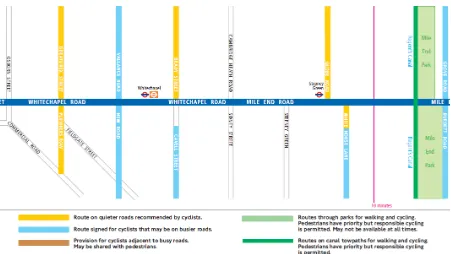
Signage
As discussed in the previous sections, the relationship between cycling infrastructure, maps and signage is a complex one. Schematic maps, such as those in Figure 10 or Figure 12 depend on either comprehensive signage, or another more detailed map. The Barclays Superhighways are intended to be navigable without a detailed map, comprising lanes and paths painted a standard shade of blue.
[image:32.595.74.527.332.684.2]“in terms of mapping the super highways themselves, you know, it’s kind of impossible to get lost in it, you know but that’s the core concept. It’s really well signed, there’s a consistent blue line to follow, what can possibly go wrong and it’s really like a network that doesn’t really need mapping. You’ll know if you come across it and you know if you get on it, it’s going to take you from A to B, kind of like a sort of tube map” Brian Deegan
Figure 13 Barclays Cycling Superhighway Markings
(Steve Collins, Creative Commons Attribution non-Commercial Generic 2.0 licence www.flickr.com/photos/smallritual/4743252149)
33
such as smart phones or cycle computers which assist in position finding, the directional signage on cycleways was still an important element of wayfinding, especially for visitors.
“Most people would say that navigating around using a map is fraught with problems, even Google mapping. What is needed is clear signage to remove the ambiguity and uncertainty around cycling and moving around” Mark Syndenham, Edinburgh Bike Station
17 Conclusions
This study has revealed the diversity of representational styles of cycle mapping in the UK which is partly a reflection of the wide variations in conditions on the ground. Without national standards of infrastructure there is ambiguity around words like a ‘cycle route’ or ‘traffic free route’ and these words do not mean the same thing in different parts of the country. Several of the OS map ranges show cycle routes designated by local authorities. They are general-purpose maps, designed for a range of users, including cyclists. The purposes of these maps may be to promote infrastructure for which the Council has paid, or to aid wayfinding, or some mixture of the two: the relative importance of these objectives may not always be explicitly understood.
The approach advocated by Cyclenation (Figure 9, page 20) attempts to provide information,
including road gradings, of specific use to cyclists. This inevitably involves subjective assessments by the map-makers or freelance surveyors employed by them. Many local authorities and some cycling organisations have produced maps to promote particular routes or cycling infrastructure. These may be schematic, as in the Edinburgh cycle tube map (Figure 10, page 23), or grafted onto a detailed map base as in the Bristol example shown in Figure 1.
A distinction needs to be drawn between open data maps, produced by the map makers, such as OS Opendata (Figure 11, page 27) and open source maps, where the underlying data is supplied by users or other volunteers. Public authorities, and organisations with a valuable brand, such as Ordnance Survey have embraced open data but not open source. Quality control and the commercial, political and possible legal consequences of misleading representations are the key concerns. The value of a brand such as OS relies largely on the issue of trust identified by Sherwin and Bartle (2012).
The development of new technologies has reduced the use of some paper-based maps, but the demand for the latter has remained more resilient than some people in the industry expected. Some of the stakeholders identified shortcomings of mobile wayfinding technology, such as vulnerability to breakdown and the inability to show the ‘big picture’. The limited research which has been done into cycle wayfinding (e.g. TfL 2010a) suggests that cyclists are mixing use of the growing range of tools, in which paper maps are likely to have a place for the foreseeable future.
34