A Regional Look at the Role
of House Prices and Labor
Market Conditions in
Mortgage Default
Sonya Ravindranath Waddell, Anne Davlin, and Edward Simpson Prescott
I
n the past few years, communities across the United States have witnessedunprecedented growth in the number of homeowners facing mortgage foreclosure. In this article, we take a closer look at default rates in the Fifth District. We use a linear fixed effects model to better understand the role of house price movements and local labor market conditions on prime and subprime foreclosure rates in the metropolitan areas of the Fifth Federal
Reserve District.1 We find that our simple model does a remarkable job of
capturing variation in foreclosure rates, and suggests that deteriorating labor and housing conditions explain most of the rising default in our region. Prime foreclosure is particularly well explained in our model, mostly because of the elevated importance of labor conditions in explaining prime default. We also study the regional variation in foreclosure rates by taking a closer look at two localities in our district: Prince William County, Virginia, and Charlotte, North Carolina. Through this analysis, it is easy to see how default rates—and changes in default rates—vary among localities despite the common causes of foreclosure that underlie rising rates across our region and our nation.
Although our region has not seen the staggering foreclosure rates of ar-eas in states like Florida, Arizona, or California, we have not been immune
The authors would like to thank Brian Gaines, Nika Lazaryan, Pierre Sarte, John Weinberg, and Kim Zeuli for their helpful comments. The views expressed in this paper are those of the authors and do not necessarily reflect the views of the Federal Reserve Bank of Richmond or the Federal Reserve System. The data reported is from staff calculations based on data pro-vided by LPS Applied Analytics. Any errors or omissions are the responsibility of the authors. E-mails: sonya.waddell@rich.frb.org, edward.prescott@rich.frb.org, anne.davlin@rich.frb.org.
1 The Fifth District of the Federal Reserve System comprises the District of Columbia, Maryland, North Carolina, South Carolina, Virginia, and most of West Virginia.
to the national “crisis” of foreclosure. From 1979–2006, the rate of serious
delinquency2 in the Fifth District averaged 1.9 percent; by the fourth
quar-ter of 2009, 8.7 percent of all mortgages in the Fifth District were seriously
delinquent (compared to 9.7 percent in the nation).3 Within the Fifth
Dis-trict, conditions vary significantly among states and localities. At the state level, the District of Columbia, Maryland, and Virginia default rates started to rise steeply along with the national rate in 2007, while North and South Carolina default rates lagged about one year. Within states, foreclosure rates are considerably higher, for example, in the Washington, D.C., metropolitan statistical area (MSA) and certain coastal zones in Virginia, North Carolina, and South Carolina, while other localities have maintained consistently lower rates of default.
Theoretical and empirical research has found that house price movements and local economic conditions (in addition to underwriting standards and certain borrower characteristics) affect foreclosure rates in significant ways. There is reason to believe, however, that the causes of foreclosure are different across states and regions. Some areas of the Fifth District—the Washington, D.C., metropolitan area, for example—experienced a boom and bust in house prices that was even greater than that of the nation as a whole. Other areas, like much of North and South Carolina, experienced considerably more muted house price movements. Conversely, Maryland and Virginia labor markets maintained low and relatively steady unemployment rates compared to other parts of the country while the unemployment rates in North and South Carolina have been some of the highest in the nation in recent years.
In addition, although the national rise in foreclosure was initially concen-trated in riskier, subprime loans, defaults have become increasingly common among prime borrowers. In the fourth quarter of 2007, 37 percent of all U.S. mortgages in foreclosure were prime loans. That number jumped to 54 per-cent by the fourth quarter of 2009 and has since increased further. In the Fifth District, prime foreclosures made up 52 percent of the foreclosure inventory by the end of 2009. Although earlier research has examined the factors that lead to subprime default, few have looked carefully at how prime default might differ.
The article is organized as follows. Section 1 provides a brief review of the literature on the theory and empirics of mortgage default. Section 2 describes the data, presents the model, and offers the results of the model. Section 3 examines the fit of the model and its effectiveness at predicting foreclosure rates for certain metro areas. Section 4 presents a more detailed discussion of dynamics in two interesting, and very different, areas in our district: a
2 The term “seriously delinquent” refers to loans 90 or more days delinquent and those in the foreclosure process.
particularly high foreclosure area of the Washington, D.C., MSA—Prince William County, Va.—and Charlotte, N.C. Section 5 concludes.
This analysis offers a model that captures most of the variation in default rates and provides an in-depth look at some of the variation between localities. In the end, a borrower’s decision to default on a home depends not only on national or state conditions, but also on the housing environment of a county, a zip code, or a neighborhood. Therefore, as we move through this crisis, it will be increasingly necessary to examine local dynamics more closely in order to determine the future direction of housing markets.
1. WHAT CAUSES MORTGAGE DEFAULT?
Mortgage valuation and the decision to default are often modeled using option
theory.4 A mortgage default amounts to the borrower effectively “selling” his
house to the lender for the current mortgage balance, or exercising his “put” option. The borrower’s other choices are to continue to make the scheduled payments through the life of the loan or to prepay the mortgage (the “call” option) either by selling the house or by refinancing into a new loan. The simplest of the option-theoretic mortgage pricing models (e.g., models that don’t account for the cost of default to the borrower) predict that the borrower will default immediately when the market value of the mortgage equals or exceeds the value of the house, or when the put option is “in the money”— a condition known as “negative equity.” Many models also incorporate the borrower’s prepayment option and a borrower’s future choices into the default valuation. (Kau, Keenan, and Kim 1994; Deng, Quigley, and Van Order 2000). Empirical work on mortgage default has found that borrowers do not de-fault immediately when the value of the collateral property falls below the value of the loan. For example, Foster and Van Order (1984) found default probabilities of less than 10 percent using Federal Housing Administration data even when equity was estimated to be quite negative. Using a large data set of conventional loans originated between 1975–1989, Quigley and Van Order (1995) found that at low levels of negative equity, the option to de-fault is not exercised immediately. More recently, Foote, Gerardi, and Willen (2008) estimated that of the roughly 100,000 households in Massachusetts who had negative equity during the early 1990s, fewer than 10 percent lost their homes to foreclosure. Elul et al. (2010) find that, although negative equity is an important predictor of mortgage default, a potentially equally im-portant predictor is the liquidity of the household, as measured by credit card utilization.
4 For a review of the literature on option theory, see Vandell (1995), Deng, Quigley, and Van Order (2000), or, more recently, Elul (2006).
One rationale for the lower-than-predicted mortgage default rates is the significant transactions costs associated with default, such as moving costs, the cost of purchasing or renting, and higher future borrowing costs that result from a damaged credit score. In addition, the borrower may face psychological and social costs in the face of default that result from the loss of one’s home or a social stigma associated with default. Some individuals may also take moral issue with defaulting on their loan when they can make the monthly payment. Guiso, Sapienza, and Zingales (2009) present survey results that show that people who consider default immoral are 77 percent less likely to declare their intention to do so, while people who know someone who defaulted are 82 percent more likely to declare their intention to default. They also find that the social pressure not to default is weakened when homeowners live in areas with a high frequency of foreclosures or know other people who have defaulted
strategically.5 This implies a cohort or contagion effect of foreclosure.
Another line of research has examined not just a borrower’swillingness
to stay current on a mortgage but herabilityto repay the loan. Crews Cutts
and Merrill (2008) find that for conforming, conventional loans, the primary reasons for default given by borrowers are loss of income, financial distress other than loss of income, death or illness in the family, and marital problems. Foote, Gerardi, and Willen (2008) provide evidence that, although negative
equity is anecessarycondition for default—positive equity enables the
bor-rower to sell the house, pay off the mortgage, and keep the difference—it is
not asufficient condition. They illustrate theoretically and empirically that
most defaults begin with a trigger event, such as illness, loss of job, divorce,
or a health shock.6 In earlier work, Vandell (1995) summarizes the arguments
in favor of a trigger event-based theory.
Although Pennington-Cross and Ho (2006) find that borrowers with lower credit scores are more likely to default on a subprime mortgage, Haughwout, Peach, and Tracy (2008) find that the deteriorating economic conditions— particularly falling house prices—contributed more to the rise in subprime and Alt-A default rates than did the changing risk characteristics of nonprime mortgages. Gerardi, Shapiro, and Willen (2009) also find that house prices played the primary role in rising default rates and that subprime mortgages end up in foreclosure more frequently because of their higher sensitivity to falling house prices.
5 “Strategic default” refers to a borrower choosing to default despite having the financial means to continue to pay the mortgage. It is also sometimes referred to as “ruthless default.”
6 Both theoretical and empirical work suggest a difference between mortgages on investor-owned properties versus those on owner-occupied properties. For more detail on the role of investors in the rise of default, see Robinson and Todd (2010). Coleman, LaCour-Little, and Vandell (2008) also explore the connection between lending patterns and house price increases over 1998–2006 and find that the surge in non-owner-occupied lending is of greater importance than the growth in subprime. Haughwout, Peach, and Tracy (2008) also find that, for borrowers with negative equity, investors are much more likely than owners to default.
Methodologically, this article most closely follows Doms, Furlong, and Krainer (2007) who model subprime delinquency rates using data on 309 MSAs in 2005 and 2006. They find that borrower risk measures are statistically significant in predicting subprime foreclosure rates, but that those factors have little explanatory power. They find, however, that house price and employment variables are both significant and explanatory. The labor market variables account for 30–40 percent of the variance in the default rates—much more than the risk proxies, but less than the house price effect. Another similar article by Amromin and Paulson (2009) uses a maximum likelihood bivariate probit model with state fixed effects to estimate the probability that a borrower will default within a year of loan origination. It is one of the few empirical papers that explains default rates on subprime and prime loans separately. Their findings suggest that, relative to subprime loans, prime defaults have a weaker relationship with home prices, once key borrower and loan characteristics are taken into account.
2. EMPIRICAL INVESTIGATION
Data
Our mortgage data comes from Lender Processing Services (LPS) Applied Analytics (formerly McDash). LPS collects the data from nine of the top 10 mortgage servicers in the country. The mortgage types are self-classified by the participating servicers. LPS claims that its data represent nearly 70 percent of
the mortgage market—including information on more than 39 million loans.7
It is important to note that, compared to other data sources, LPS data include a smaller share of the total subprime market. For example, since 2005, the Mortgage Bankers’ Association mortgage sample has included between 9.8 and 14.0 percent subprime loans, while over the same period, LPS has reported a subprime share of between 2.5 and 4.7 percent. Our sample uses monthly data from January 2005–September 2009 on all first-lien loans (approximately 2.5 million) for borrowers living in one of 44 MSAs in the Fifth Federal Reserve District. We define the foreclosure rate as the inventory of loans in foreclosure divided by the total inventory of loans in a given time period. The data is aggregated by MSA and quarter.
For house price data, we use the metropolitan area Federal Housing Finance Agency (FHFA) house price indexes and unemployment/payroll em-ployment data from the Bureau of Labor Statistics (BLS). The MSAs in our sample are listed in Appendix A. All data spans from the first quarter of 2005 through the third quarter of 2009.
T able 1 Summary Statistics of K ey V ariables Prime Subprime P er cent T w o-Y ear Y o Y Number F o reclosur e F or eclosur e P er cent Inter est-Only Change in Unemployment Employment of Loans Rate (%) Rate (%) Subprime (%) (%) HPI (%) Rate (%) Gr o wth (%) 2005 Mean 51,807 0.44 2.18 3.59 2.26 17.46 5.26 1.47 Std. De v. 0.32 1.50 1.48 1.86 13.45 1.46 1.74 2006 Mean 55,803 0.42 2.42 4.23 3.67 19.10 4.73 1.89 Std. De v. 0.28 1.54 1.62 2.99 12.42 1.33 2.24 2007 Mean 60,610 0.45 3.38 4.74 4.56 13.20 4.50 1.58 Std. De v. 0.25 1.94 1.68 3.67 7.30 1.11 1.96 2008 Mean 63,853 0.64 5.12 3.98 4.33 5.49 5.62 − 0.19 Std. De v. 0.30 2.09 1.45 3.59 6.19 1.59 1.94 2009* Mean 63,369 1.12 7.32 3.41 3.84 − 0.05 9.43 − 2.75 Std. De v. 0.50 2.69 1.29 3.25 6.51 2.28 1.90 Notes: Means are av erages across quarters and metro areas ; * = through September .
Table 1 summarizes our house price, borrower pool, and labor market vari-ables over the period and Figures 1–3 provide more detail on the relationship between our independent variables and prime/subprime foreclosure.
As discussed in Section 1, as house prices fall, borrowers are more likely to face negative equity, which increases the likelihood of foreclosure. Figures 1A and 1B illustrate the relationship between the preceding two-year change in house prices and the subprime and prime foreclosure rates, respectively, in our sample. Both figures indicate a negative relationship between the variables, but also indicate a nonlinearity in the relationship that begins to take shape when house price growth is zero percent. As home values appreciate, foreclosure rates fall, but by the time house price growth is around 10 or 15 percent, the effect on foreclosure dies out. In other words, the lower bound on foreclosure rates is above zero (some homeowners will default), no matter how much home values appreciate. We hypothesize that this nonzero bound in foreclosure results from non-uniformity in house price movements among neighborhoods and houses—ultimately, the selling price of a house has not only to do with overall demand for houses, but also the characteristics of the neighborhood and the house. In other words, individuals can see the value of their house fall even in an expanding housing market. Therefore, it is not surprising to see some nonzero level of default no matter the growth in house prices at the MSA level.
A further hypothesized relationship between foreclosure rates and house prices has to do with the volatility of house prices. If housing values are more volatile, that increases the likelihood that default is “in the money,” in the language of the option theory literature. This indicates that more volatile house prices should be associated with a greater incidence of default (Elul 2006, Kau and Keenan 1999). However, we did not find a strong relationship between the volatility of house prices and either prime or subprime foreclosure rates.
As discussed in Section 1, the early part of the last decade saw a prolifer-ation of nontraditional loan products, such as the interest-only (I/O) loan. I/O loans are loans for which the borrower starts off paying only the interest por-tion of the mortgage payment and at some specified “recast” date, the borrower starts to pay the principal as well. At the recast date, a borrower’s monthly payment increases, sometimes considerably. Although I/O loans were not a large share of the mortgage market in many areas of the Fifth District, there were pockets of high I/O lending, such as Washington, D.C., and Charleston, S.C., particularly in 2006 and 2007. For example, at the inventory peak in the third quarter of 2007, I/O loans accounted for 17.7 percent of all loans in the Washington, D.C., MSA, 13.1 percent of all loans in the Charleston, S.C., MSA, and 12.9 percent of all loans in the Winchester, Va., MSA. In the
Figure 1 House Prices and Foreclosure Rates
Panel A: House Prices and Subprime Foreclosure Rates
Panel B: House Prices and Prime Foreclosure Rates Two-Year Percent Change in House Prices
Two-Year Percent Change in House Prices
Subpr ime F oreclosure Rate Pr ime F oreclosure Rate -30 -20 -10 0 10 20 30 40 50 60 -30 -20 -10 0 10 20 30 40 50 60 20 18 16 14 12 10 8 6 4 2 0 3.5 3.0 2.5 2.0 1.5 1.0 0.5 0.0
Source: LPS and FHFA House Price Index.
LPS data set, I/O loans are almost entirely classified as prime loans.8 It is
likely that at least some share of the rise in prime foreclosure in our district metro areas is the result of an increase in foreclosure among these I/O loans.
8 The “prime” category in the LPS data includes both prime and “near prime” loans. Almost all Alt-A loans are classified as “prime” in LPS.
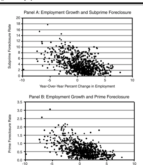
Figure 2 Employment Growth and Foreclosure Subpr ime F oreclosure Rate Pr ime F oreclosure Rate 20 18 16 14 12 10 8 6 4 2 0 3.5 3.0 2.5 2.0 1.5 1.0 0.5 0.0 -10 -5 0 5 10 -10 -5 0 5 10
Year-Over-Year Percent Change in Employment
Year-Over-Year Percent Change in Employment Panel A: Employment Growth and Subprime Foreclosure
Panel B: Employment Growth and Prime Foreclosure
Source: LPS and BLS payroll employment.
The role of I/O loans will also be discussed in more detail in the Section 4 discussion of Prince William County, Va.
Finally, we examine the role of local economic factors in rising foreclosure rates. In line with Doms, Furlong, and Krainer (2007) among others, we use the unemployment rate and employment growth rates at the MSA level to proxy for local economic conditions. An increase in the unemployment rate translates to more households with an unexpected income shock—a “trigger event”
Figure 3 Unemployment and Foreclosure Subpr ime F oreclosure Rate 20 18 16 14 12 10 8 6 4 2 0 Pr ime F oreclosure Rate 3.5 3.0 2.5 2.0 1.5 1.0 0.5 0.0 0 5 10 15
Unemployment Rate (Six-Month Lag)
0 5 10 15
Unemployment Rate (Six-Month Lag)
Panel B: Unemployment and Prime Foreclosure Panel A: Unemployment and Subprime Foreclosure
Source: LPS and BLS household unemployment.
discussed in Section 1. We hypothesize a six-month lag between a change in the unemployment rate and a change in the foreclosure rate. Figures 2 and 3 summarize the relationship between foreclosure rates and our employment variables.
We might expect rises in unemployment to affect subprime borrowers more than prime borrowers because the former are likely to be more vulnera-ble to income or liquidity shocks that damage their ability to pay a mortgage.
However, correlation coefficients between the foreclosure rates and ployment six months previous indicate a stronger relationship between unem-ployment and prime default (correlation of 0.69) than between unemunem-ployment and subprime default (correlation of 0.53).
In addition, higher unemployment can increase foreclosure through house prices. If unemployment starts to rise in an area, people will move to seek new jobs. This is likely to dampen the demand for homes. Thus, deteriorating labor markets could increase foreclosure rates both as a trigger event and through the subsequent decline in house prices because of a reduced demand for homes. In our sample, the correlation between the change in the unemployment rate and the change in house prices is about 0.55.
The Model
Given the regional nature of housing markets, using pooled ordinary least squares to estimate foreclosure rates will allow static differences among metro-politan areas to introduce bias into our parameter estimates. Indeed, statis-tical tests indicate heterogeneity among MSAs in our sample. Furthermore, when we estimated a simple linear regression model we found, for example, that including or excluding the Washington, D.C., MSA changed both the parameter estimates and the power of our different independent variables to explain the variance in foreclosure rates. The implications of Washington, D.C.’s influence in our estimation are two-fold: First, it indicates the need to recognize—and control for—differences among our MSAs. Second, it poten-tially brings into question the extent to which the previous default analysis in the boom/bust areas of our nation can be applied to the non-boom/bust areas in the rest of the country.
To control for the time invariant MSA characteristics that could bias our results, we engage the linear fixed effects model defined in equations (1) and (2) for subprime and prime foreclosure rates, respectively:
fits = β0i +β1Eit +β2Rit−6+β3Sit−12+β4Hit∗δ+it
+β5Hit ∗δ−it +eit, (1)
fitp = β0i+β1Eit +β2Rit−6+β3Sit−12+β4Iit−12+β5Hit ∗δ+it
+β6Hit ∗δ−it +eit. (2)
The subscriptsi andt refer to MSA and month, respectively. The variables
are defined as follows:
fs = subprime foreclosure rate,
E= change in payroll employment over the preceding year,
R= unemployment rate,
S= share of the loan pool that is subprime,
I = share of the prime loan pool that is interest-only,
H = change in house prices over the preceding two years,
δ+it = 1 ifHit ≥0, 0 otherwise,
δ−it = 1 ifHit <0, 0 otherwise.
The difference between the fixed effects model and the standard ordinary
least squares model lies in the constant termβ0i that can be broken down
into two components: β0i = β0 +αi. The αi term is the MSA-specific
parameter. Computationally, this model is estimated by transforming (de-meaning) the data. Intuitively, the model is equivalent to including a dummy
variable for every MSA in our estimation. The variablesδ+it andδ−it enable
the model to account for the nonlinearity in the relationship between house prices and foreclosure rates discussed earlier in the section and illustrated in Figure 1. Through these dummy variables, we separate the effect of a two-year appreciation in home values from a two-year depreciation.
The results are presented in Tables 2A and 2B.9The “withinR2” statistic
measures how well the model explains the variation in the dependent variable
within an MSA. The constant term reported in the tables is theβ0parameter.
The subject-specific parameters are reported in Table 3.
Both labor market conditions and house price movements are statistically and economically important predictors of foreclosure rates. Using the pa-rameter estimates in Tables 2A and 2B, column (5), a one-percentage-point increase in unemployment rate will increase the subprime foreclosure rate by almost 0.5 percentage point and the prime foreclosure rate by about 0.1 per-centage point. For illustrative purposes, we calculate that in the Washington, D.C., MSA, a one-percentage-point increase in the unemployment rate would translate (six months later) into about 100 additional subprime foreclosures and about 775 new prime foreclosures. As another example, the Charlotte MSA would see almost 30 new subprime foreclosures and around 220 new prime foreclosures.
9 We run this analysis on all first-lien loans in the MSAs. Restricting the sample to single-family homes changes the results only slightly (and in no statistically or economically significant way). If we restrict ourselves to purchase-only loans, we see larger, but still not dramatic, dif-ferences in results. For example, there is an increase in the magnitude of the coefficients on unemployment and both of the house price variables in the subprime model (5). There were similar—but notably smaller—changes to the prime model (5).
T able 2 MSA Fixed Effects Models of Subprime and Prime F o reclosur es 2A: MSA Fixed Effects Models of Subprime F o reclosur e (1) (2) (3) (4) (5) Emplo yment Gro wth − 0.473*** − 0.118** (One-Y ear % Change) (0.0622) (0.0427) Unemplo yment Rate 0.356*** 0.465*** (Six-Month Lag) (0.0719) (0.0660) Percent Subprime 0.746*** 0.705*** (One-Y ear Lag) (0.184) (0.174) House Price Gro wth − 0.141*** (T w o-Y ear % Change) (0.0124) House Price − 0.117*** − 0.0765*** Gro wth*Positi v e (0.0143) (0.0147) House Price − 0.295*** − 0.276*** Gro wth*Ne gati v e (0.0519) (0.0416) Constant 0.0230* 0.0127 0.0556*** 0.0518*** − 0.00341 (0.00385) (0.00767) (0.00144) (0.00177) (0.0102) Observ ations 836 660 836 836 660 W ithin R 2 (Adj) 0.385 0.039 0.501 0.518 0.677
T able 2 (Continued) MSA Fixed Effects Models of Subprime and Prime F o reclosur es 2B: MSA Fixed Effects Models of Prime F o reclosur e (1) (2) (3) (4) (5) Emplo yment Gro wth − 0.0546*** − 0.0201** (One-Y ear % Change) (0.0103) (0.00604) Unemplo yment Rate 0.108*** 0.0987*** (Six-Month Lag) (0.0103) (0.00855) Percent Subprime − 0.107** 0.0630** (One-Y ear Lag) (0.0386) (0.0217) Percent Interest-Only 0.147*** − 0.0171 (One-Y ear Lag) (0.0155) (0.0167) House Price Gro wth − 0.-204 (T w o-Y ear % Change) (0.00199) House Price − 0.0130*** − 0.00899** Gro wth*Positi v e (0.00180) (0.00289) House Price − 0.0675*** − 0.0580*** Gro wth*Ne gati v e (0.0111) (0.00778) Constant 0.000482 0.00512*** 0.00824*** 0.00707*** − 0.000273 (0.000535) (0.00144) (0.000231) (0.000225) (0.00134) Observ ations 836 660 836 836 660 W ithin R 2 (Adj) 0.513 0.311 0.510 0.593 0.797 Notes: Rob ust standard errors in parentheses; *** = significant at the 1 percent le v el, ** = significant at the 5 percent le v el, * = significant at the 10 percent le v el.
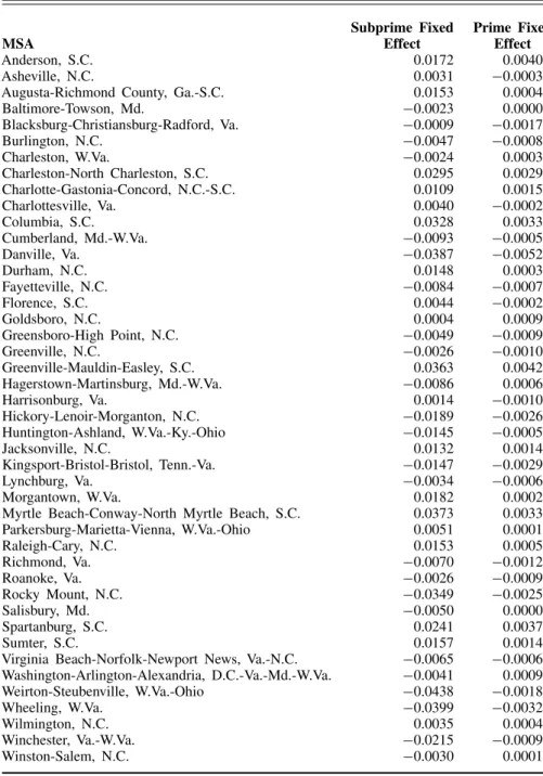
Table 3 MSA Fixed Effects
Subprime Fixed Prime Fixed
MSA Effect Effect
Anderson, S.C. 0.0172 0.0040
Asheville, N.C. 0.0031 −0.0003
Augusta-Richmond County, Ga.-S.C. 0.0153 0.0004
Baltimore-Towson, Md. −0.0023 0.0000 Blacksburg-Christiansburg-Radford, Va. −0.0009 −0.0017 Burlington, N.C. −0.0047 −0.0008 Charleston, W.Va. −0.0024 0.0003 Charleston-North Charleston, S.C. 0.0295 0.0029 Charlotte-Gastonia-Concord, N.C.-S.C. 0.0109 0.0015 Charlottesville, Va. 0.0040 −0.0002 Columbia, S.C. 0.0328 0.0033 Cumberland, Md.-W.Va. −0.0093 −0.0005 Danville, Va. −0.0387 −0.0052 Durham, N.C. 0.0148 0.0003 Fayetteville, N.C. −0.0084 −0.0007 Florence, S.C. 0.0044 −0.0002 Goldsboro, N.C. 0.0004 0.0009 Greensboro-High Point, N.C. −0.0049 −0.0009 Greenville, N.C. −0.0026 −0.0010 Greenville-Mauldin-Easley, S.C. 0.0363 0.0042 Hagerstown-Martinsburg, Md.-W.Va. −0.0086 0.0006 Harrisonburg, Va. 0.0014 −0.0010 Hickory-Lenoir-Morganton, N.C. −0.0189 −0.0026 Huntington-Ashland, W.Va.-Ky.-Ohio −0.0145 −0.0005 Jacksonville, N.C. 0.0132 0.0014 Kingsport-Bristol-Bristol, Tenn.-Va. −0.0147 −0.0029 Lynchburg, Va. −0.0034 −0.0006 Morgantown, W.Va. 0.0182 0.0002
Myrtle Beach-Conway-North Myrtle Beach, S.C. 0.0373 0.0033 Parkersburg-Marietta-Vienna, W.Va.-Ohio 0.0051 0.0001 Raleigh-Cary, N.C. 0.0153 0.0005 Richmond, Va. −0.0070 −0.0012 Roanoke, Va. −0.0026 −0.0009 Rocky Mount, N.C. −0.0349 −0.0025 Salisbury, Md. −0.0050 0.0000 Spartanburg, S.C. 0.0241 0.0037 Sumter, S.C. 0.0157 0.0014
Virginia Beach-Norfolk-Newport News, Va.-N.C. −0.0065 −0.0006 Washington-Arlington-Alexandria, D.C.-Va.-Md.-W.Va. −0.0041 0.0009 Weirton-Steubenville, W.Va.-Ohio −0.0438 −0.0018 Wheeling, W.Va. −0.0399 −0.0032 Wilmington, N.C. 0.0035 0.0004 Winchester, Va.-W.Va. −0.0215 −0.0009 Winston-Salem, N.C. −0.0030 0.0001
The effect of house price movements on foreclosure rates in our model is generally in line with the literature. In columns (4) and (5), we specify a piece-wise linear relationship between house prices and foreclosure rates such that the effect of a drop in house prices could be different from the effect of an increase. For illustrative purposes, suppose that house price movements are virtually stagnant and the two-year growth in house prices is slightly below
zero, say−0.1 percent. Then, suppose that over the subsequent two years,
house prices fell 7.4 percent, which amounts to a one standard deviation
ad-ditional depreciation.10 According to the coefficient estimates in column (5),
this increased depreciation will increase the subprime foreclosure rate by more than two percentage points and increase the prime foreclosure rate by 0.4 per-centage point. Alternatively, suppose that initially, the two-year change in house prices is 7.4 percent. Then, over the subsequent two years, house price appreciation falls to 0.1 percent. This decreased appreciation will increase the subprime foreclosure rate by 0.28 percentage point and the prime foreclosure rate by 0.03 percentage point. The result that changes in depreciating house values have a larger effect on foreclosure rates than changes in appreciating values is consistent with the theory that negative equity plays a significant role
in the decision to default.11
In addition to statistically and economically significant coefficients, the
R2values in the prime and subprime estimations are quite large. This simple
model of labor market conditions and house prices explains almost 70 percent of the variation in subprime foreclosure rates and almost 80 percent of the vari-ation in prime foreclosure rates across our region’s MSAs. In addition, house price conditions alone explain over 50 percent of the variation in subprime and prime foreclosure rates (column [4]). Labor market conditions account for almost 40 percent of the variation (column [1]) in subprime foreclosure rates and over 50 percent of the variation in prime foreclosure rates. These results are somewhat higher, but generally consistent, with existing literature. The fixed effect is a way to control for any characteristic of an MSA that leads to a permanently higher foreclosure rate in an area. In the pooled ordinary least squares model, we found that a high share of subprime loans does not necessarily engender a higher subprime foreclosure rate. This makes intuitive sense since, for example, many South Carolina metro areas have always had relatively high subprime foreclosure rates, but, particularly in recent years, a low share of subprime loans compared to other markets. However, when we include a fixed effect, we find a statistically significant (and economically
10 Standard deviation in 2007; see Table 1.
11 We tested the extent to which this difference is due to the dying out of the house price effect at around 10 percent house price growth (see Figures 1A and 1B). We find that although the difference between negative and positive price growth is diminished when eliminating some of the higher house price growth observations, the results hold—increased (or decreased) depreciation has a stronger effect on foreclosure rates than decreased (or increased) appreciation.
significant) relationship between the two variables. The “within” effect of subprime’s share of the market on subprime default is statistically more robust than the “between” effect; as the share of subprime within a metro area rises, the subprime foreclosure rate is likely to rise as well. A similar effect was found in the prime estimation.
The MSA fixed effect also influenced the explanatory power of the model. Labor market factors explained more of the variation in foreclosure rates within MSAs than between MSAs while house price movements explained more of the variation between MSAs than within MSAs. More intuitively, a MSA with a higher unemployment rate will not necessarily have a higher foreclosure rate, but as unemployment rates rise, foreclosure rates tend to rise. In addition, although house price declines do lead to higher foreclosure rates within a MSA, it is even more the case that areas with softer housing markets tend to have higher foreclosure rates.
Robustness of the Results
In this model, we examined the role of house price movements and employ-ment on mortgage default, using the inventory of loans in foreclosure as our measure of default. Whether or not a home enters foreclosure, however, also depends on federal and state regulatory systems and the incentives/situation of the mortgage lender. Many states, for example, have declared morato-riums on foreclosure at various points in the past few years. Furthermore, there are stories of borrowers who stopped paying their mortgage months, or even years, before the lender initiated foreclosure proceedings. To ensure the quality of our results, therefore, we ran our model using a metro area’s 90-day delinquency rate as the dependent variable. This is in line with much of the existing literature, which models delinquency rates instead of foreclosure rates. Our results held. We found little change in the signs of the coefficients or in their statistical significance and found that the magnitude of every key
variable increased for both prime and subprime models. TheR2value on the
full subprime model rises to 80 percent, and theR2value on the prime model
remains at about 80 percent.
In addition to looking at the role of appreciation or depreciation in homes, we also considered including a measure of the volatility of house prices. Op-tion theory suggests that increased house price volatility could lead to in-creased foreclosure rates. In our estimation, this variable—when measured by the quarterly change in the year-over-year house price growth—does not appear to have a significant effect, on either prime or subprime foreclosure rates, that is robust to even slight changes in the estimation strategy. In other words, the coefficient might have been statistically significant under certain circumstances, but the significance showed little resilience to controlling for
more/fewer variables, using robust standard errors, or controlling for MSA
fixed effects.12
3. WHAT DO THESE RESULTS MEAN?
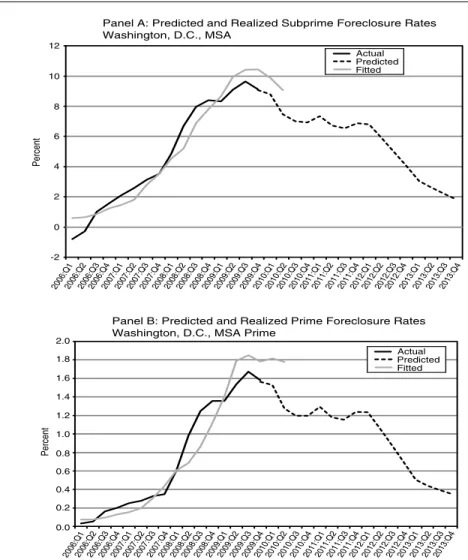
The fixed effects model does a good job of predicting foreclosure rates in our district. To better understand the implications of the results, we take a closer look at two metro areas in our district: the Washington, D.C., MSA and the Charlotte, N.C., MSA. We choose these two metro areas both because they are driving forces in their respective regions of the Fifth District and because we will explore the Charlotte, N.C., MSA and one county in the Washington, D.C., MSA more closely in the next section. Figures 5 and 6 plot the realized foreclosure rates against the predictions from the fixed effects models for the Washington, D.C., and Charlotte, N.C., metro areas. Our fixed effects model generally overpredicts default rates on both prime and subprime loans in the Washington, D.C., MSA before 2009, but begins to underpredict in 2009. For the Charlotte MSA, our model predicted a much sharper increase in foreclosure rates in the third quarter of 2009 than actually occurred. On the whole, though, the predictive power of the model is quite strong.
Intuitively, it makes sense that our model underpredicts for Washington, D.C., but overpredicts for Charlotte toward the end of 2009. The coefficient on the unemployment variable was estimated based on the effect of unem-ployment in every Fifth District metro area. But it is possible that borrowers in the Washington, D.C., MSA react more to increases in unemployment than do borrowers in, say, Charlotte, N.C., or Danville, Va. If the trigger event in a soft housing market is the primary mechanism through which unemployment affects foreclosure, then an increase in unemployment would affect borrowers in Washington, D.C., more because of how far house prices have dropped. The third quarter of 2008 marked the largest decline in house prices in the Washington, D.C., MSA. In that quarter, year-over-year house prices fell 13.1 percent. By the third quarter of 2009, house prices fell only 5.6 percent on a year-over-year basis. The third quarter of 2008 is when the model estimates begin to track below actual foreclosure rates. Furthermore, from the third quarter of 2008 to the third quarter of 2009, unemployment in the Washing-ton, D.C., MSA increased from 4.1 percent to 6.3 percent—a sizeable jump, but far smaller than the increase in most of our other sample metro areas. As will be discussed in the next section, the unemployment rate in the Charlotte MSA increased from 6.7 percent to 11.8 percent over the same period. With
12 Other robustness checks also included examining the effect of changes in our independent variables on changes in our dependent variable, including dummy variables to control for timing (both for every year included in our data and for before and after the financial crisis in the fall of 2008), and including dummy variables to control for geographic location (state and region) of the MSA. Our results are also robust to the same estimation on a national sample.
Figure 4 Predicted Minus Actual Foreclosure Rate Q106 Q206 Q306 Q406 Q107 Q207 Q307 Q407 Q108 Q208 Q308 Q408 Q109 Q209 Q309 Q106 Q206 Q306 Q406 Q107 Q207 Q307 Q407 Q108 Q208 Q308 Q408 Q109 Q209 Q309 Panel A: Subprime Panel B: Prime Predicted-Realiz ed F oreclosure Rate Predicted-Realiz ed F oreclosure Rate 4 2 0 -2 -4 -6 0.0 0.5 -0.5 -1.0
diminishing house price declines and unemployment rates that rose far less than in other metro areas in our sample (not to mention a falling share of sub-prime), it makes sense to think that our model would expect foreclosure rates to begin to flatten in Washington, D.C., toward the end of our sample period. However, we also underpredict for many of our other MSAs. As house price declines and increases in unemployment diminish, our model predicts the rise in default to moderate more than it did. Figures 4A and 4B offer a summary of how our predictions fared across MSAs. The variable is our predicted foreclosure rate minus the realized rate. A value of zero, then, is a perfect prediction. Although the predicted values bounce around the realized
Figure 5 Predicted and Realized Foreclosure Rates, Washington, D.C. Panel A: Predicted and Realized Subprime Foreclosure Rates Washington, D.C., MSA
Panel B: Predicted and Realized Prime Foreclosure Rates Washington, D.C., MSA Prime
Percent Percent Actual Predicted Fitted Actual Predicted Fitted 12 10 8 6 4 2 0 -2 2.0 1.8 1.6 1.4 1.2 1.0 0.8 0.6 0.4 0.2 0.0 2006:Q12006:Q22006:Q32006:Q42007:Q12007:Q22007:Q32007:Q42008:Q12008:Q22008:Q32008:Q42009:Q12009:Q22009:Q32009:Q42010:Q12010:Q22010:Q32010:Q42011:Q12011:Q22011:Q32011:Q42012:Q12012:Q22012:Q32012:Q42013:Q12013:Q22013:Q32013:Q4 2006:Q12006:Q22006:Q32006:Q42007:Q12007:Q22007:Q32007:Q42008:Q12008:Q22008:Q32008:Q42009:Q12009:Q22009:Q32009:Q42010:Q12010:Q22010:Q32010:Q42011:Q12011:Q22011:Q32011:Q42012:Q12012:Q22012:Q32012:Q42013:Q12013:Q22013:Q32013:Q4
values, we never underpredict subprime foreclosure rates across MSAs as notably as we do in 2009.
Forecasting Foreclosure Rates in Washington, D.C., and Charlotte, N.C.
Figures 5 and 6 offer predictions about the movement of foreclosure in the next few years, given some assumptions about what will happen to pay-roll employment, unemployment rates, and house prices in Charlotte and
Figure 6 Predicted and Realized Foreclosure Rates, Charlotte, N.C. Percent Percent 12 10 8 6 4 2 0 14 2.0 1.5 1.0 0.5 0.0 2.5 Actual Predicted Fitted Actual Predicted Fitted 2006:Q 1 2006:Q 2 2006:Q 3 2006:Q 4 2007:Q 1 2007:Q 2 2007:Q 3 2007:Q 4 2008:Q 1 2008:Q 2 2008:Q 3 2008:Q 4 2009:Q 1 2009:Q 2 2009:Q 3 2009:Q 4 2010:Q 1 2010:Q 2 2010:Q 3 2010:Q 4 2011:Q 1 2011:Q 2 2011:Q 3 2011:Q 4 2012:Q 1 2012:Q 2 2012:Q 3 2012:Q 4 2013:Q 1 2013:Q 2 2013:Q 3 2013:Q 4 2006:Q 1 2006:Q 2 2006:Q 3 2006:Q 4 2007:Q 1 2007:Q 2 2007:Q 3 2007:Q 4 2008:Q 1 2008:Q 2 2008:Q 3 2008:Q 4 2009:Q 1 2009:Q 2 2009:Q 3 2009:Q 4 2010:Q 1 2010:Q 2 2010:Q 3 2010:Q 4 2011:Q 1 2011:Q 2 2011:Q 3 2011:Q 4 2012:Q 1 2012:Q 2 2012:Q 3 2012:Q 4 2013:Q 1 2013:Q 2 2013:Q 3 2013:Q 4
Panel B: Predicted and Realized Prime Foreclosure Rates Charlotte, N.C., MSA
Panel A: Predicted and Realized Subprime Foreclosure Rates Charlotte, N.C., MSA
Washington, D.C.13 The assumptions are laid out in Appendix B; in short,
we assume that payroll growth and house prices will resume pre-boom trends and that the unemployment rate in each MSA will fall at the same rate that it did coming out of the recession of the early 1990s.
13 Our model is estimated through the third quarter of 2009. We use actual data and our model to predict foreclosure rates in the fourth quarter of 2009 and the first and second quarters of 2010. Our predictions after the second quarter of 2010 are based on assumptions about the movements of our model inputs that are laid out in Appendix B.
Given these assumptions, we predict that foreclosure rates in the Charlotte MSA will peak in the fourth quarter of 2010. The results for the Washington, D.C., MSA are more volatile, driven by the predicted path of house prices in that MSA. Nonetheless, our model predicts that foreclosure rates have already peaked (third quarter 2009) in Washington, D.C. One caveat of this prediction is that our model is designed such that as two-year house price growth increases, default rates should fall. In Washington, D.C., two-year house price growth turned negative in the first quarter of 2008. Therefore, in the second quarter of 2010, the typical homeowner will have experienced more than two years of depreciation. This could present a problem in our model. For example, from the third quarter of 2006 through the third quarter of 2008, house prices fell almost 18 percent. From the third quarter of 2008 through the third quarter of 2010, we predict house prices to fall a further 11 percent. Our model suggests that foreclosure rates should be lower in the third quarter of 2010 than in the third quarter of 2008 because the depreciation rate is lower; however, if the negative equity argument is true, then a homeowner
is more likely to experience deeper negative equity and thereforemorelikely
to default after four years of depreciation. In other words, our model does not take into account compounding house price declines. Therefore, even if our predictions are accurate and all other assumptions hold, we are likely to underestimate default rates starting in the first quarter of 2010 and, in fact, we do. In the second quarter of 2010, for example, we predict a subprime foreclosure rate of 7.5 percent in Washington, D.C., and a prime foreclosure rate of 1.3 percent, when the actual rates are 9.1 percent and 1.8 percent, respectively. In the Charlotte MSA—where house price declines have been much more moderate—we actually overpredict foreclosure rates. We predict a subprime foreclosure rate of 10.7 percent in the second quarter of 2010 and a prime foreclosure rate of 1.9 percent, while the real rates are 8.8 percent and 1.8 percent, respectively.
The next section offers a more in-depth look at foreclosure rates and the causes of foreclosure in specific areas of our district. Through this next analysis, we offer some local insight that is critical to understanding housing markets and the rising default rates across our district and the nation.
4. A CLOSER LOOK AT HIGH FORECLOSURE AREAS IN
OUR DISTRICT
In the previous section, our MSA fixed effect captured the time-invariant, unobservable characteristics of a metro area that could shift its foreclosure rate. Although outside the scope of the model, some of the characteristics that comprise a metro area’s fixed effect could interact with other variables to affect the direction and magnitude of foreclosure rate movements. This section takes a closer look at two areas of our district that have seen higher default rates
Figure 7 Foreclosure Rates of First-Lien Mortgages Foreclosure Rate NoVA Less PWC VA Less NoVA PWC/Manassas 4.0 3.5 3.0 2.5 2.0 1.5 1.0 0.5 0.0 200501200503200505200507200509200511200601200603200605200607200609200611200701200703200705200707200709200711200801200803200805200807200809200811200901200903200905200907200909200911
Notes: Federal Reserve Bank of Richmond estimates using data from LPS Applied Analytics (January 2002–December 2009). Data based on first-lien loans on owner- and non-owner-occupied homes.
than surrounding areas—Prince William County, Va., and Charlotte, N.C.— and builds a story to better understand the situation in those two areas.
Prince William County, Va.
Prince William County, Manassas City, and Manassas Park City are Virginia suburbs in the Washington, D.C., MSA. As we have already briefly discussed, the boom-bust in the Washington, D.C., MSA housing market was consider-ably sharper than in other areas of our district. The Northern Virginia sub-urbs of the MSA—and Prince William County (and Manassas) in particular— experienced stark rises in default rates beginning in 2007. There is no ques-tion that in this part of the Fifth District, a large porques-tion of the subprime and prime foreclosure story was the steep rise and subsequent fall in house prices. But as we illustrated in Section 3, there is more to the story than that. This
section will shed light on this small part of our district where a large number of borrowers continue to default on their mortgages.
Figure 7 shows the rise in default rates on first-lien loans in Prince William County/Manassas City/Manassas Park City (PWC/Manassas), Northern Virginia not including PWC/Manassas, and Virginia excluding all of
North-ern Virginia.14 Clearly, foreclosure rates were considerably higher in PWC/
Manassas than they were even in the rest of Northern Virginia, which itself was one of the highest default areas of our region. By the middle of 2009, the total foreclosure rate had peaked at 3.0 percent in PWC/Manassas, while the peak rates in Northern Virginia and in the rest of Virginia were 1.5 percent and 1.1 percent, respectively. Data on originations by year indicate that the loans originated in PWC/Manassas in 2005, 2006, and 2007 performed the worst of all.
House Price Boom and Bust
As illustrated in Figure 8, house prices in PWC/Manassas tripled from 1997 to the middle of 2005. From 2005 through the third quarter of 2009,
how-ever, houses in the area lost half of their value.15 The house price boom and
bust in PWC/Manassas is consistent with the experience in the neighboring Fairfax County/Alexandria City/Arlington County area, and in the Washing-ton, D.C., MSA as a whole, but the movements were far more dramatic in
PWC/Manassas.16 There can be no question that this was a huge driver of
the area’s rise in foreclosure rates. Clearly, a number of homeowners in that area must be facing negative equity, especially given the relaxation in underwriting criteria and the rise in junior lien borrowing and cash-out re-financing that characterized the lending environment in the early part of the decade.
Loan Composition and Borrower Characteristics
Subprime borrowers have higher default rates than prime borrowers. Similarly, the default rates among Alt-A mortgages—“near-prime” mortgages made to borrowers with good credit scores but for which there are other risk factors, such as relaxed underwriting, or risky loan characteristics—tend to be higher than those for regular prime mortgages. Here, we look most closely at one kind
14 The counties and cities in all of Northern Virginia are: Arlington County, Clarke County, Fairfax County, Fauquier County, Loudoun County, Prince William County, Spotsylvania County, Stafford County, Warren County, Alexandria City, Fairfax City, Falls Church City, Fredericksburg City, Manassas City, and Manassas Park City.
15 MRIS data tracks home sales and listings so that their reported average price is affected by the composition of homes for sale at any given time.
16 Interestingly, Prince William County is also an “exurb” of D.C., with a lot more undeveloped land than more centrally located suburbs.
Figure 8 House Prices in PWC/Manassas: Average House Price
U.S. Case-Shiller Home Price Index (1997=100) PWC/Manassas - MRIS (1997=100) Fairfax/Alexandria/Arlington - MRIS (1997=100) Washington, D.C., Metro Division - Case-Shiller Home Price Index (1997=100)
Average Price Index (1997:Q1 = 100)
350 300 250 200 150 100 50 0 2006:Q 1 2006:Q 3 2007:Q 1 2007:Q 3 2008:Q 1 2008:Q32009:Q 1 2009:Q 3 2005:Q 1 2004:Q 1 2003:Q 1 2002:Q 1 2001:Q 1 2000:Q 1 1999:Q 1 1998:Q 1 1997:Q 1 1997:Q 3 1998:Q 3 1999:Q 3 2005:Q 3 2004:Q 3 2003:Q 3 2002:Q 3 2001:Q 3 2000:Q 3
Source: S&P/Case-Shiller Home Price Index of existing single-family residential homes, Haver Analytics. Metropolitan Regional Information Systems, Inc. (MRIS) Market Statistics.
of Alt-A loan—the interest-only loan—that was described in Section 2 and was particularly prevalent in Northern Virginia generally and PWC/Manassas in particular. (As noted earlier, these I/O loans are primarily categorized as prime loans in the LPS data set.) Here, we evaluate the role of both market loan composition and the quality of the average borrower in PWC/Manassas in the rising foreclosure rate.
Looking at borrower characteristics, the LPS data indicate that PWC/ Manassas did not have lending standards that differed notably from the rest of the state. Loan-to-value ratios and FICO scores in PWC/Manassas were both steady and comparable to the rest of Virginia throughout the decade. On the other hand, as illustrated in Figure 9, PWC/Manassas had a much higher share of I/O loans and a slightly higher share of subprime loans than the rest of Virginia.
The composition of loans is important mostly because of differing fore-closure rates. Subprime forefore-closure rates are considerably higher than I/O
Figure 9 Mortgage Originations, PWC/Manassas
P
ercent
PWC/Manassas - % of Originations that are Prime, Non-I/O Loans
PWC/Manassas - % of Originations that are Prime, I/O Loans
PWC/Manassas - % of Originations that are Subprime Loans
VA less PWC/Manassas - % of Originations that are Prime, Non-I/O Loans VA less PWC/Manassas - % of Originations that are Prime, I/O Loans VA less PWC/Manassas - % of Originations that are Subprime Loans 100 90 80 70 60 50 40 30 20 10 0 200501200505200509200601200605200609200701200705 200709200801200805200809200901200905 200909 200409 200405 200301200305200309200401 200201200205200209 200101200105200109
Notes: Federal Reserve Bank of Richmond estimates using data from LPS Applied Analytics (January 2002–December 2009). Data for purchase-only loans on owner- and non-owner-occupied homes.
foreclosure rates, which are, in turn quite a bit higher than prime, non-I/O foreclosure rates (Figure 10). It is possible that if PWC/Manassas had Vir-ginia’s composition of loans, their total foreclosure rate would have been considerably lower. In order to test the role of composition, we calculated what the PWC/Manassas total foreclosure rate would have been if the area had its own foreclosure rates by product, but Northern Virginia’s composi-tion. The results are in Figure 11. We show that changing the composition of PWC/Manassas to Northern Virginia’s reduces the foreclosure rate by only 0.1 percentage point, at most. Changing the PWC/Manassas composition to Virginia’s composition accounts for slightly more of the difference in foreclo-sure rates, but still only reduces the forecloforeclo-sure rate by 0.25 percentage point, at most. Therefore, loan composition alone cannot explain the considerably higher rate of default in PWC/Manassas. The high share of foreclosures in PWC/Manassas must be because of higher foreclosure rates.
Figure 10 Foreclosure Rates by Loan Type, PWC/Manassas F oreclosure Rate 14 12 10 8 6 4 2 0
NoVA less PWC - Prime I/O FC NoVA less PWC - Prime Non-I/O FC NoVA less PWC - Subprime FC VA less PWC - Prime I/O FC VA less PWC - Prime Non-I/O FC VA less PWC - Subprime FC PWC/Manassas - Prime I/O FC PWC/Manassas - Prime Non-I/O FC PWC/Manassas - Subprime FC
200501200503200505200507200509200511200601200603200605200607200609200611200701200703200705200707200709200711200801200803200805200807200809200811200901200903200905200907200909200911
Notes: Federal Reserve Bank of Richmond estimates using data from LPS Applied Analytics (January 2005–December 2009). Data based on first-lien loans on owner- and non-owner-occupied homes.
In fact, the foreclosure rate on each type of loan has been higher in PWC/ Manassas (Figure 10) for some time. In particular, the PWC/Manassas I/O foreclosure rate was much higher than the rates in the rest of Northern Virginia and Virginia. In the end of 2009, approximately 50 percent of the inventory of loans in default in PWC/Manassas were I/O loans, 40 percent were prime non-I/O loans, and 10 percent were subprime loans. This is largely similar to the rest of Northern Virginia, but quite different from the state as a whole. In the rest of Virginia, only around 15 percent of defaults were on I/O loans, 68 percent were prime non-I/O loans, and about 17 percent were subprime loans. Employment Conditions
Did unemployment contribute to the increased foreclosure rates in PWC/ Manassas? A look at unemployment data from the BLS indicates that changes in the PWC/Manassas unemployment rate closely track movements in state unemployment and that area unemployment continues to be well below that of
Figure 11 Foreclosure Rates with Compositional Changes F oreclosure Rate 200501200503200505200507200509200511200601200603200605200607200609200611200701200703200705200707200709200711200801200803200805200807200809200811200901200903200905200907200909200911 4.0 3.5 3.0 2.5 2.0 1.5 1.0 0.5 0.0
Virginia less PWC/Manassas
VA Total FC with PWC/Manassas Composition Northern Virginia less PWC/Manassas NoVA Total FC with PWC/Manassas Composition Prince William County/Manassas
PWC/Manassas Total FC with VA Composition PWC Total FC with NoVA Composition
Notes: Federal Reserve Bank of Richmond estimates using data from LPS Applied Analytics (January 2005–December 2009). Data based on first-lien loans on owner- and non-owner-occupied homes.
the state and the nation. Unemployment in PWC/Manassas peaked at almost 6 percent in 2009—well below the 7 percent unemployment peak in Virginia as a whole (Figure 12).
This is not to say that rises in unemployment have played no role in the ris-ing foreclosure in PWC/Manassas. First, as discussed in the previous section, small increases in unemployment in places with steep house price declines can have a larger effect than those in places without much depreciation of house values. Second, it is possible that intra-industry unemployment changes had a large effect in PWC/Manassas. As house prices fell in Prince William County, housing starts declined and the construction industry suffered. Construc-tion employment declined in Prince William County by more than 6,300 net
jobs (−39.8 percent) between September 2005–March 2009.17 Figure 13
17 Prince William County Demographic Fact Sheet, 3rd Quarter 2009 (www.pwcgov.org/ demographics).
Figure 12 Unemployment in PWC/Manassas
Virginia PWC/Manassas
Unemplo
yment Rate (NSA)
8 7 6 5 4 3 2 1 0
Jan 1997Jul 1997Jan 1998Jul 1998Jan 1999Jul 1999Jan 2000Jul 2000Jan 2001Jul 2001Jan 2002Jul 2002Jan 2003Jul 2003Jan 2004Jul 2004Jan 2005Jul 2005Jan 2006Jul 2006Jan 2007Jul 2007Jan 2008Jul 2008Jan 2009Jul 2009
Source: BLS/Haver Analytics.
illustrates the sharp decline in the percent of workers in PWC/Manassas who were in the construction industry over the past few years. Since a notable portion of the construction workers in this area were legal and illegal immi-grants, it is possible that the construction decline in PWC/Manassas had a disproportionate effect on the immigrant population.
According to the Pew Hispanic Center, national increases in unemploy-ment have, in fact, disproportionately affected the U.S. Hispanic population and, more particularly, Hispanic immigrants. Nationally, Hispanic workers account for one-fourth of employment in construction and these workers ben-efited greatly from the housing boom that began in mid-2003. By the end of 2006, the U.S. Hispanic unemployment rate was at a historic low of 4.4 percent. But then, according to the Pew Hispanic Center, rising interest rates, home price depreciation, rising foreclosures, and a drop in new home starts affected Hispanic workers more than non-Hispanic workers because of the population’s reliance on the construction industry and a widespread lack of skills required to immediately move into a different industry. The national His-panic unemployment rate rose to 6.5 percent in the first quarter of 2008—well
Figure 13 Percent of Workers in the Construction Industry Virginia PWC/Manassas P ercent of Emplo y ees 14 12 10 8 6 4 2 0 16 18 2006:Q 1 2006:Q 3 2007:Q 1 2007:Q 3 2008:Q 1 2005:Q 1 2004:Q 1 2003:Q 1 2002:Q 1 2001:Q 1 2000:Q 1 2005:Q 3 2004:Q 3 2003:Q 3 2002:Q 3 2001:Q 3 2000:Q 3 2009:Q 1 2008:Q 3
Source: Labor Market Statistics, Covered Employment and Wages Program.
above the non-Hispanic unemployment rate of 4.7 percent. Weekly earnings for Hispanic workers also fell in 2007 (Kochhar 2008).
It is clear from Figure 14 that Prince William County has a higher share of Hispanic residents than other areas of Northern Virginia and Virginia and Table 4 illustrates the higher growth of the Hispanic population in PWC from 2003–2008. Furthermore, Figure 15 indicates that a disproportionately large share of borrowers in Prince William County were Hispanic. If it is true that a large share of the Hispanic population of Prince William County was em-ployed in the construction industry, and that employment in the construction industry declined more steeply in Prince William County, then it follows that more Hispanic borrowers than non-Hispanic borrowers in the county would have been affected by declining employment. Since much of the Hispanic population purchased homes in 2004–2006 (Figure 15), house price declines in the area make it likely that they were living in “underwater” properties when the construction industry decline sharpened and they became unem-ployed. In other words, this is a “trigger event” story transmitted through a minority population that is disproportionately employed in an industry that
Figure 14 Percent of Population that is Hispanic P ercent 50 45 40 35 30 25 20 15 10 5 0 2004 2005 2006 2007 2008
Prince William County Manassas City Manassas Park City Fairfax County Fairfax City
Loudon County Alexandria City Arlington County Virginia without Northern Va.
Source: Census Bureau.
suffered particularly during this downturn. It could explain at least some of the exceptionally high default rates in PWC/Manassas.
If this story is true (or even if it isn’t), it is possible that the Hispanic pop-ulation in Prince William County was a vulnerable poppop-ulation to begin with. Mayer and Pence (2008) document that, even controlling for credit scores and other zip code characteristics, race and ethnicity appear to be strongly and sta-tistically related to the proportion of subprime loans throughout the country. They find that a 5.4 percentage point increase in the percent of non-Hispanic blacks is associated with an 8.3 percent increase in the share of subprime orig-inations in the zip code and the same increase in the percent of Hispanics is associated with a 6.8 percent increase in the proportion of subprime loans.
These area-specific stories are difficult to incorporate into a broader esti-mation strategy, but they undoubtedly play a role in the unexplained portion of the model that we highlighted in the previous section.
Table 4 Change in Population 2003–2008
Ratio of Hispanic
Total Population Hispanic Population Growth to Total
Locality Growth Growth Growth
Prince William County 13.76% 53.86% 3.9
Manassas City −4.00% 39.40% 9.9
Manassas Park City 4.05% 33.62% 8.3
Virginia 5.51% 31.07% 5.6
Source: Population Division, U.S. Census Bureau.
Charlotte, N.C.
The story in Charlotte, N.C., is very different from that of PWC/Manassas. Although Charlotte has seen foreclosure rates rise notably faster than those in the rest of North Carolina, house price movements have been far more subdued than those in Northern Virginia. The story of Charlotte default rates cannot primarily be a house price story. On the other hand, unemployment rates in the MSA have risen much faster, and to much higher levels, than in other parts of the Fifth District.
Default rates in Charlotte did not start to rise until the end of 2008. From 2005 through the fall of 2008, foreclosure rates in Charlotte and the state of North Carolina were steady, varying from 0.6–0.8 percent in Charlotte and 0.4– 0.6 percent in North Carolina. In November of 2008, however, foreclosure rates began to increase dramatically and over the subsequent year, default rates in Charlotte more than doubled. As is clear from Figure 16, the total foreclosure rate in Charlotte grew at a faster pace and to much higher levels than the rate in North Carolina.
House Price Movement
Unlike many areas of the country (including PWC/Manassas), Charlotte did not have a large appreciation in house prices. As is clear from Figure 17, house price movements have been far less dramatic in Charlotte than in the United States as a whole (which, in itself, hides some of the more extreme house price movements in other areas of the country). Although the Case-Shiller Home Price Index suggests that house prices started to decline in the middle of 2008, the FHFA house price index that we use in our MSA estimation in Section 2 does not show house value depreciation in the MSA until the second
quarter of 2009.18 Either way, the decline in Charlotte house prices through
18 Although both the FHFA and the S&P/Case-Shiller home price indexes are both developed from a repeat-valuations approach, there are a number of data and methodological differences.
Figure 15 Percent of Borrowers that were Hispanic P ercent 50 45 40 35 30 25 20 15 10 5 0 2004 2005 2006 2007 2008
Prince William County Manassas City Manassas Park City Fairfax County Fairfax City
Loudon County Alexandria City Arlington County Virginia without Northern Va.
Notes: Federal Reserve Board of Governors, Home Mortgage Disclosure Act data. Data is for all occupancy, first-lien originations.
the third quarter of 2009 was mild compared to other parts of our District and our country.
Loan Composition and Borrower Characteristics
Similar to PWC/Manassas, the quality of the borrowers in Charlotte—as mea-sured by loan-to-value ratios and FICO scores—was steady and did not differ notably from the state overall. Furthermore, at their peak, I/O loans accounted for only about 14 percent of first-lien, purchase-only originations in Charlotte (as compared to a peak of 53 percent in PWC/Manassas). Subprime lending accounted for just over 5 percent of lending. In other words, Charlotte had a
For one, the Case-Shiller index uses only purchase price data while FHFA also includes refinance appraisals. Second, FHFA’s valuation data are derived from conforming, conventional mortgages (from Fannie Mae and Freddie Mac) while Case-Shiller includes conforming and nonconforming mortgages. Finally, the Case-Shiller indexes are value-weighted, so that price trends for more expensive homes have greater influence on estimated price changes than those for other homes. FHFA weights price trends equally for all properties.
Figure 16 Total Foreclosure Rates for First-Lien, Owner-Occupied Loans
F
oreclosure Rate
Charlotte
North Carolina less Charlotte United States 2.0 1.8 1.6 1.4 1.2 1.0 0.8 0.6 0.4 0.2 0.0 Lehman Brothers files for bankruptcy
200501200503200505200507200509200511200601200603200605200607200609200611200701200703200705200707200709200711200801200803200805200807200809200811200901200903200905200907200909200911
Notes: Federal Reserve Bank of Richmond estimates using data from LPS Applied Analytics (January 2002–December 2009). Data based on first-lien loans on owner- and non-owner-occupied homes.
high share of prime loans compared to other regions. Figure 18 illustrates the breakdown of lending by loan type in Charlotte.
It seems unlikely that the composition of loans had much effect on the total foreclosure rate in Charlotte, as such a high share of the loans were prime and non-I/O. Nonetheless, Figure 19 depicts the foreclosure rates by loan type in Charlotte. As expected, subprime loans have the highest foreclosure rates, followed by interest-only loans, and finally prime non-I/O loans. Default rates in Charlotte on all types of loans are higher than those in the state as a whole. At the end of 2009, approximately 10 percent of the Charlotte inventory of loans in foreclosure were interest-only, 77 percent were prime, and 13 percent were subprime—a composition very similar to the loan composition in the rest of North Carolina.
Figure 17 Case-Shiller Home Price Index Pr ice Inde x 350 300 250 200 150 100 50 0 United States Charlotte-Gastonia, N.C.-S.C. 2006:Q12006:Q32007:Q12007:Q32008:Q12008:Q32009:Q12009:Q3 2005:Q1 2004:Q1 2003:Q1 2002:Q1 2001:Q1 2000:Q1 1999:Q1 1998:Q1 1997:Q11997:Q3 1998:Q3 1999:Q3 2000:Q3 2001:Q3 2002:Q3 2003:Q3 2004:Q3 2005:Q3
Source: S&P/Case-Shiller Home Price Index of existing single-family residential homes, Haver Analytics.
Employment Conditions
Although subprime and Alt-A loans were not a large part of the Charlotte market and house price movements were nowhere near as dramatic as in other areas, employment conditions in the MSA deteriorated considerably in 2008 and 2009. As a major U.S. financial center, the financial crisis that intensified following the collapse of Lehman Brothers affected Charlotte more than many other metro areas. Bank of America—which announced significant job cuts
nationwide in December 200819—is headquartered in Charlotte. Wachovia
Corporation was also headquartered in Charlotte before it was bought by Wells
Fargo, a transaction that was estimated to cost the city at least 1,500 jobs.20
In fact, of the 47,800 jobs lost from September 2008–September 2009, almost 10 percent were in the financial activities sector and a further 25 percent were
19 http://newsroom.bankofamerica.com/index.php?s=43&item=8420.
Figure 18 First-Lien, Purchase-Only Mortgage Originations P ercent 100 90 80 70 60 50 40 30 20 10 0 200501200505200509200601200605200609200701200705200709200801200805200809200901200905200909 200409 200405 200301200305200309200401 200201200205200209 200101200105200109 200001200005200009
Charlotte - % of Originations that are Prime, Non-I/O Loans Charlotte - % of Originations that are Prime, I/O Loans Charlotte - % of Originations that are Subprime Loans NC less Charlotte - % of Originations that are Prime, Non-I/O Loans NC less Charlotte - % of Originations that are Prime, I/O Loans NC less Charlotte - % of Originations that are Subprime Loans
Notes: Federal Reserve Bank of Richmond estimates using data from LPS Applied Analytics (January 2002–December 2009).
in the professional and business services sector. The Charlotte manufacturing sector also saw notable job cuts in the period (about 20 percent of total losses), as did manufacturing sectors across North Carolina, the Fifth District, and the nation.
The spike in the Charlotte and North Carolina unemployment rates that was particularly dramatic after the fall of Lehman Brothers is illustrated in Figure 20. In just over a year, the unemployment rate in Charlotte doubled from around 6 percent to around 12 percent. Deteriorating employment conditions were very likely a key factor in rising default rates among Charlotte borrowers. Figure 16 marks the collapse of Lehman Brothers right at the beginning of the rise in foreclosure rates. The correlation between the total foreclosure rate and the unemployment rate across MSAs in the Fifth District is 0.72. The correlation for Charlotte is 0.90. Most of the loans in default in Charlotte are conventional prime loans, and we have already shown that the effect of labor market deterioration is more explanatory for prime default than for subprime default. In fact, the correlation between the subprime foreclosure rate and
Figure 19 Foreclosure Rates by Loan Type, Charlotte, N.C.
F
oreclosure Rate
Lehman Brothers files for bankruptcy 10 9 8 7 6 5 4 3 2 1 0 Charlotte - Subprime
North Carolina less Charlotte - Subprime United States - Subprime Charlotte - Prime, Non-I/O
North Carolina less Charlotte - Prime, Non-I/O United States - Prime, Non-I/O Charlotte - Prime, I/O
North Carolina less Charlotte - Prime, I/O United States - Prime, I/O
200501200503200505200507200509200511200601200603200605200607200609200611200701200703200705200707200709200711200801200803200805200807200809200811200901200903200905200907200909200911
Notes: Federal Reserve Bank of Richmond estimates using data from LPS Applied Analytics (January 2002–December 2009). Data based on first-lien loans on owner- and non-owner-occupied homes.
unemployment in Charlotte is high (0.83), but still smaller than that between the prime foreclosure rate and unemployment (0.90).
Of course, job loss does not necessarily lead to foreclosure; in most cases, it is better for the borrower to sell the house than to default. However, demand for housing has clearly dampened in the Charlotte MSA—a phenomenon clear from the recent fall in house prices. In our entire sample of MSAs, the correlation between the change in the unemployment rate and the change
in house prices is around−0.55; for the Charlotte MSA that correlation is
−0.93.21 So what is one likely story for Charlotte? Unemployment rose more
steeply and to higher levels than in other areas of the state. This fall dampened demand for housing, which has led to the recent (and continued) decline in house prices. The combination of the two has led to high default rates in
21 The other metro areas with correlations above 0.90 were: Kingsport-Bristol-Bristol, Tenn.-Va.; Durham, N.C.; and Raleigh-Cary, N.C.