Usability Issues from Testing a Census Web Survey: Results
from Testing of the Census Quality Survey (CQS)
Kathleen T. Ashenfelter, Temika Holland, Victor Quach, Elizabeth
Nichols, & Sabin Lakhe
11
U.S. Census Bureau, 4600 Silver Hill Road, Washington, DC 20233
Abstract
In 2010, the Census Bureau conducted the Census Quality Survey (CQS) in order to estimate measurement error, such as simple response variance, from a Census Internet questionnaire compared to that from a Census paper questionnaire (Bentley, Reiser, Stokes, & Meier, 2011). The Census Bureau’s Human Factors and Usability Lab
performed usability testing on prototypes of the CQS Internet questionnaire and provided feedback based on human factors considerations to the developers of the survey prior to its release.
For a data-collection Web survey to be successful, its user interface must support the user in completing the survey in an efficient, effective, and satisfying way. The Census Bureau’s Usability Lab conducted two rounds of usability testing of the online CQS instrument in April and June of 2010. The goal was to identify elements of the user-interface design that were problematic and led to ineffective and unsatisfying experiences for potential respondents of the survey. Usability issues identified during testing are discussed along with potential suggestions for the improvement of future online surveys.
Key
Words:
Usability testing, web surveys, demographic questionnaires, pre-testing1. Introduction and Background
When considering an online version of a survey, the overall usability of the survey must be taken into consideration, especially for an instrument that would be used by participants with a wide range of computer skills and expertise. For an online survey to be successful, its user interface must support the users’ expectations in completing the survey in an efficient, effective, and satisfying manner. The Census Bureau’s Usability Lab conducted two rounds of usability testing of the online Census Quality Survey (CQS) instrument in April and June of 2010. The goal was to identify elements of the user-interface design that were problematic and led to ineffective and unsatisfying experiences for the potential respondents of the survey. More details of this study can be found in (Ashenfelter, Quach, & Nichols, 2011), including screen shots of the CQS instrument in the appendices.
2. Methods for the CQS Instrument Testing
This section describes how the participants were selected for the CQS online instrument testing, how and where the testing was conducted, and what kinds of materials were used
in the testing. Two rounds of testing were conducted. Round 1 took place in April 2010 and involved five participants. All five were Census Bureau employees. The sponsors made changes based on usability recommendations between Rounds 1 and 2 of testing. Round 2 occurred in June 2010 and included 37 participants. Most were recruited through a database maintained by the Usability Lab. One was an internal Census employee who was recruited through known lab contacts. The participants were recruited because they had prior knowledge of how to navigate a Web site and/or online survey and had at least one year experience using a computer and the Internet. These Round 2 participants also were living in a complex household structure (e.g., living with roommates, having a child in shared custody, or living with five or more people. These were the type of situations that could prove challenging to a respondent when completing the CQS.
2.1 Participants
2.1.1 Participants in Round 1
All five participants were self-reported to be experienced in navigating the Internet and using a computer and had little to no experience with the CQS. All were female participants, ranging from 28 to 68 years of age with the mean age of 50.4 years. The majority of participants reported having at least some college credit.
2.1.2 Participants in Round 2
In total, 34 participants’ results were included in the results and analysis. Participants were self-reported to be experienced in navigating the Internet and using a computer and hadno experience with the CQS. There were 15 male and 19 female participants, ranging from 20 to 64 years of age with the mean age of 38.5 years. The majority of participants reported at least some college credit.
2.2 Procedure
All testing was conducted in the Usability Lab at the U.S. Census Bureau.
After the practice think-aloud task, the test administrator calibrated the participants’ eyes for eye tracking and gave the participants CQS mailing materials. Two different sets of mailing materials were tested along with the Internet instrument. One set of materials, the Internet Push materials, instructed respondents to complete the survey online. The other set of materials, the Internet/Mail Choice mailing materials, gave the reader a choice to either complete the survey online or complete the included paper form and mail it back. Participants were randomly assigned to receive one of these sets of mailing materials. The participants were informed that, if they were to receive the survey at home, the mailing materials would have their real address, but for the purpose of the study they were to pretend that their address was the address displayed on the address label of the materials (i.e., 123 Any Street in Anytown, US). For the participants of the usability sessions, each was told that he/she would have to complete the survey online.
In Round 1, the CQS screens were wireframes (i.e., not fully functional HTML pages with working links, etc.). Participants were asked to pretend that their name was “Pat Smith,” a gender-neutral name that was used for all participants. They were told that a second person named “Chris Smith” also lived with them, and they could answer the
questions for Chris as they applied to any other person living in their “real” household, or make up the information if they lived alone.
In contrast, in Round 2, the screens were functional and participants were asked to complete the survey as it applied to their real life household situation.
The test administrator left the room and went to a control room to do a sound check while the participant answered some demographic questions in addition to questions on their experience with computers and the Internet. Once these background questions were answered, the test administrator instructed the participant to use the mailing materials to complete the CQS as if he/she were at home. Participants were instructed to think aloud during the session and were prompted to do so if they fell silent (Ericsson & Simon, 1993). After completing the survey, the participant filled out a satisfaction questionnaire and the test administrator asked debriefing questions that elicited information about the participants’ overall impressions of and reactions to specifics aspects of the online CQS instrument.
2.3
Efficiency and Satisfaction Measurement Results
This section provides the efficiency and satisfaction scores associated with the CQS usability testing. Efficiency is measured by timing how long it took participants to finish the survey. Participants were not aware that they were being timed. Satisfaction was measured by the participant’s self-responses on a scale of 1 to 9 (with 1 being the lowest and 9 being the highest) on nine different categories. These questions asked about participants’ reactions to the overall design of the survey, the navigation within the survey (i.e., moving back and forth between screens and proceeding through the survey), the presentation of the questions, and the ease of responding to the questions.
Typically, a satisfaction questionnaire is used to gauge the success of the design, and the aim is usually to attain an overall satisfaction score of at least five. The Efficiency and Satisfaction results are presented for the first round followed by the second round of testing.
2.3.1. Round 1: User Efficiency
On average, participants in Round 1 completed the CQS in 8 minutes 35 seconds, which was consistent with the anticipated average completion time of around 10 minutes. Completion times ranged from 6 minutes 29 seconds to 19 minutes 39 seconds. Although participants were asked to think aloud during testing, past research has shown that including a concurrent think-aloud technique during usability testing does not necessarily impact efficiency (Olmsted-Hawala, Murphy, Hawala, & Ashenfelter, 2010).
T w F ra “I th F C A w ex The average sa was 7.60. As igure 1 show ating was “S Instructions d he ratings. Figure 1: Me CQS testing All nine of th which provide xperience for atisfaction sco ws, the aspect Screen Layou displayed on t an satisfactio he characteris es evidence t the responde
ore for all nin
of the online ut” (8.20). T the screens” (
on ratings acr
stics measure that the instr ents. ne characterist e survey that s The lowest s 6.80). Thus, t ross participan ed by this sa rument was s
tics that were
scored the hi scoring aspe there was ver
ants for surve
atisfaction sur successful at e measured in ighest mean s ect of the su ry little variat ey elements in rvey scored providing a Round 1 satisfaction urvey was tion among n Round 1 very well, satisfying
2. W in T te m m qu fu 2. T sa 2= in be fu m F th sa su .3.2. Round 2 While Round nstrument, Ro The average s esting was 11 minutes, 40 s minutes. The uickly. It is lo ully-programm .3.2 Round 2: The average atisfaction sc =7.97) and a nteraction wit e slightly hi unctional surv more static and
igure 2 chart here was ver atisfaction rat urvey was the
2: User Efficie 1 measured r ound 2 measu survey compl 1 minutes 6 s seconds. The survey was e ogical that Ro med screens t : User Satisfa satisfaction s cores from bo are on the h th the CQS in igher for Ro vey. In Roun d lacked a lot ts the mean ry little varia ting was “Fo e “Overall rea ency respondent sa ured satisfactio letion time f seconds, with average wa expected to b ound 2 took lo that required m faction score for pa oth rounds o high end, wh nstrument in b ound 2 becau nd 1, the wire of functional satisfaction r ation. The as orward navig action to the s atisfaction wi on with the fu for participan h a range betw as still close be short, and onger to com more interact articipants in f testing are hich indicates both rounds. use participan eframe screen lity. ratings for va spect of the gation” (8.66) survey” (7.53) ith a wirefram ully-programm nts in Round ween 5 minu to the antic d most partic mplete than Ro tion from the
Round 2 w very close ( s that partici The overall s ants were int ns displayed arious elemen online surve ). The lowest ). me version o med instrume d 2 of CQS utes, 32 secon cipated durat cipants finish ound 1 becau participants. was 7.97. Th (Round 1=7.6 ipants had a satisfaction sc teracting with on the comp nts of the CQ ey to score th t scoring asp of the CQS ent. instrument nds and 21 tion of 10 hed it very se it tested he average 60; Round satisfying core might h a fully-puter were QS; again, he highest pect of the
F C O co an w di ar co w
3
3. • • • • 3. P on Figure 2. Mea CQS instrumen3
Over the cours omments and nd negative f were uncover ifficulty logg re discussed s omplete it in was a fully-fun
.1 Usability
.1.1 Successe In gen compl On av the go Partici This r partici addres (Hype .1.2 Usability Difficulty articipants ha n the address an Satisfactio nt testing3. Usab
se of the usab d reactions to findings. This ed. Although ging in - each separately. O around 10 mi nctioning insty Study Resu
es neral, partici eting the onli erage, the su al. ipants underst round of tes ipants had an ss. Participant rtext Transfer y Issues locating the H ad some troub s label of the on ratings acrbility Study
bility evaluati the CQS ins s section disc h some find h round of tes One goal of th inutes. More f trument as oppults of Roun
ipants provid ine CQS. urvey took aptood the purp sting include ny difficulty ts were able t r Protocol Sec Household ID ble distinguis mailing mate ross participa
Results of t
ion, the test a strument. Th usses specific dings were u sting provides he CQS testin focus is given posed to a set
nd 1
ded positive proximately pose of the PINed an “ENTE with the “s to successful cure format) f
D for logging shing the Hou erials. The Ho
ants for surve
the CQS Ins
administrators he usability st c successes a universal acr s different su ng was for pa n to the result t of linked wi feedback a 10 minutes t N and why th ER URL” s s” in the “ht lly enter in th for the CQS. in usehold ID f ousehold ID w ey elements instrument
s observed pa taff noted bot and usability ross rounds upporting exa articipants to ts of Round 2 ireframes. about their e to complete, w hey might neescreen to se ttps” part of he unconventi
from the othe was needed f n Round 2 articipants’ th positive issues that - such as amples and be able to 2 because it experience which was ed it. e whether f the URL ional URL er numbers for logging
into the online survey. While commenting on the Satisfaction questionnaire (QUIS), one participant wrote, “Identify household ID on card; possibly star required information.”
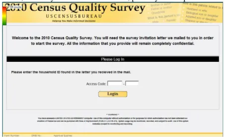
Figure 3: Login Screen for Round 1 of CQS Usability Testing
Another participant commented that she did not think the Household ID was labeled well enough on the screen. During debriefing, the same participant said that it was problematic that there was nothing on the screen itself telling you where the access code was. The inability to locate the Household ID on the mailing materials can prevent respondents from accessing the online survey and may increase unit non-response (i.e., respondents choosing not to complete the survey at all). This is the first encounter with the survey that respondents have and it is vital to survey completion. If respondents are experiencing difficulty logging in, they may be more likely to abandon the survey prematurely.
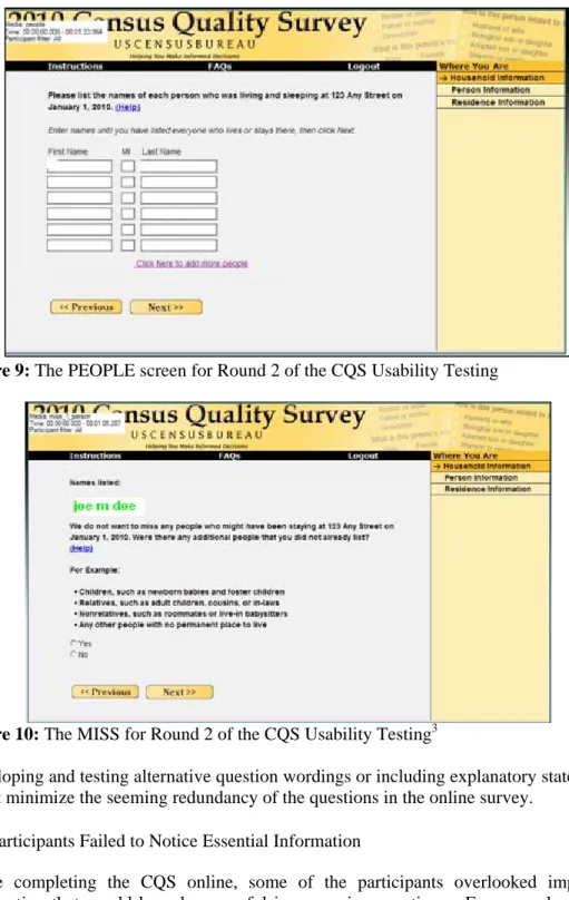
Help in deciding whom to include in the Initial Roster Listing (PEOPLE Screen) Some participants experienced difficulty deciding whom to include on the Roster listing presented on the PEOPLE screen (Figure 4). In fact, one participant clicked on the “Help” link for this screen, which was not yet functional. She said that she had a son in college and she was not sure whether to include him or not; she was concerned about him being counted twice. Another participant commented that a help box with the rules for listing people would be very helpful.
It appears that this uncertainty of whom to include on the roster listing may have been attributed to the limited functionality of the instrument during this initial phase of testing. However, it is important to note that respondents are seeking guidance on whom to include in the roster listing and that information should be readily accessible in the “Help” content.
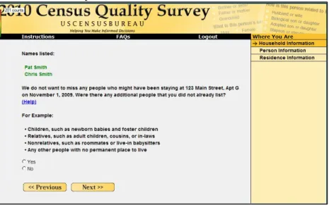
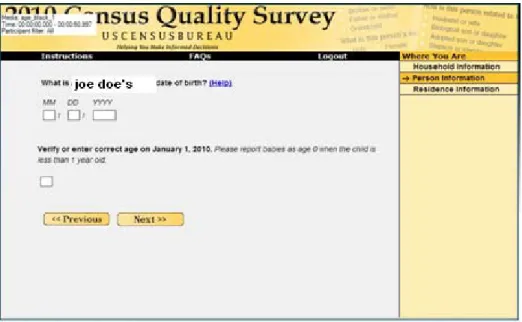
Redundancy of question wording on the PEOPLE and MISS screens
Two participants commented that the questions presented on the PEOPLE (Figure 4) and MISS (Figure 5) screens were the same. Participants noticed the listing of examples on the MISS screen (perhaps due to its bulleted format), yet they are not understanding its intent. The purpose of the MISS question should be clearly outlined on the screen. The content preceding the list of examples should be clear and concise, making it easier for respondents to read and comprehend.
Figure 5: MISS Screen for Round 1 of the CQS Usability Testing
It is important that content presented on the survey be clearly understood and differentiated. Having seemingly redundant content on a survey can adversely affect the respondent’s experience with it and should be avoided.
Missing or Misunderstanding the Census Day Rule on the AGE Screen
After entering their date of birth on the AGE screen, a few participants thought that their age was calculated incorrectly because it was a year younger than they currently were. They failed to notice the age verification date displayed on the screen (i.e., December 1, 2009). Instead, they were expecting to find their current age in the Age verification box. Aesthetics of the CQS
A few participants mentioned that they did not like the yellow color of the survey. This did not interfere with the participants’ ability to complete the survey, but it should be noted that people could have strong emotional reactions to color (Schloss & Palmer, 2009;
Palmer & Schloss, 2010).
An extreme aversion to a certain color could potentially cause someone to discontinue taking the survey or not complete it at all. Thisissue is discussed further in the results of Round 2, where participants had the same reaction to the color.
3.2. Changes made based on Usability Study of Round 1
Based on the results of the first round of testing, an image depicting an example Household ID was added to the LOGIN screen. This image was meant to address the usability issue identified in Round 1 where participants had difficulty locating the Household ID on the mailing materials in order to log in. In addition, the PIN was enlarged based on usability recommendations to make it stand out more, given that there was enough free space on the page to do so.
3.3. Usability Study Results of Round 2
3.3.1 Successes
The successes of the usability study of the online CQS instrument are listed below. • The example Household ID image that was added after the first round of testing
appeared to be helpful to participants with locating it in the mailing materials. • On average, the survey took approximately 10 minutes to complete, which was
the goal.
• Participants commented that the survey was “quick and simple.”
• Most participants liked the auto-tabbing feature, although some had issues with manually tabbing and entering numbers into the wrong field.
3.3.1 Usability
Issues
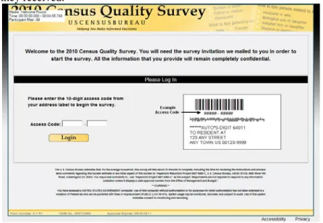
Difficulty Logging in
The LOGIN screen is essential in encouraging respondents to proceed through the survey and it should allow them to enter the survey easily (Couper, 2008). Although the example Household ID image added to the screen after Round 1 did appear to help participants find the Household ID in the mailing materials, they sometimes entered the example ID from the image first.
Eleven of the 34 Round 2 participants experienced difficulty logging in. Nine of the 11 participants had to receive assistance from the test administrator in order to log in successfully. Six of the 11 participants initially failed to use the mailing materials to find the access code and relied solely on the example image of the address label on the screen, entering pound symbols (#) or all zeros (0) in the access code entry fields. During debriefing, one participant commented that he had difficulty finding the access code. Taken together, this suggests that some participants did not read the instructions on the LOGIN screen before attempting to log into the survey.
Most of the participants paid little attention to the text presented above the “Please Log In” message. One potential explanation for this is that the white field box instantly catches participants’ attention and they overlook the surrounding text. This is typical web behavior of Internet respondents, where instead of reading the text word for word, they scan the page for content (Head, 1999). The text should be short and concise, making the online reading process smoother for the respondent (Powell, 2000).
Another potential explanation is the placement of the “Please log in” message in the center of the page as shown in Figure 6. Given its location, the message may be the first
thing respondents see when they access the online survey. This message immediately prompts respondents to begin by logging in, without directing them to the mailing materials they received.1
Figure 6: The LOGIN screen for the online Census Quality Survey (CQS) Instrument for Round 2 of the CQS Usability Testing2.
Questions in the Survey appear to be Redundant
A few participants thought that some of the CQS questions were redundant. During debriefing one participant commented that it seemed like he was “being asked the same questions repeatedly” while completing the survey.
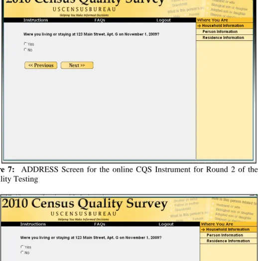
Some participants commented that they were being asked the same question twice when they saw the RIGHT RESPONDENT screen (shown in Figure 8) following the ADDRESS screen (shown in Figure 7 below). Since the two questions were related, the content from Address screen remained on the page when participants were shown the RIGHT RESPONDENT screen. They understandably believed that this survey item was being asked twice because the content from the previous screen (i.e., Address screen) appears on the new screen (i.e., RIGHT RESPONDENT screen). The text is not grayed out and it appears to be a new survey item. It forces participants to reread the content. Some participants even attempted to answer the question again by clicking on the radio buttons. While responding to the RIGHT RESPONDENT survey item, one participant commented, “It asked me the same question again, which I think is weird.” Eliminating the separate ADDRESS screen and combining the ADDRESS survey item (Figure 7) and the RIGHT RESPONDENT survey item (Figure 8) onto one instead of two, may help to remove redundancy.
1
In the field, the respondent would have received the mailing materials and used them to access the survey Web site, so this finding may be an artifact of testing in a laboratory setting.
2
Originally, the example access code contained numerals, but was changed to “#” symbols during testing.
Figure 7: ADDRESS Screen for the online CQS Instrument for Round 2 of the CQS Usability Testing
Figure 8: The RIGHT RESPONDENT screen for the CQS Instrument for Round 2 of the CQS Usability Testing
Some participants also felt that the MISS question (Figure 10) was redundant with the previous PEOPLE screen (Figure 9). They believed they answered the MISS question on the previous PEOPLE screen while listing the names of everyone who was staying at their household. It appeared that they might not have understood the purpose of the MISS question. Some believed it meant that they did not answer the PEOPLE screen correctly. One participant commented, “I don’t know why it’s asking me twice. I already told them who I put in.”
Figure 9: The PEOPLE screen for Round 2 of the CQS Usability Testing
Figure 10: The MISS for Round 2 of the CQS Usability Testing3
Developing and testing alternative question wordings or including explanatory statements might minimize the seeming redundancy of the questions in the online survey.
Participants Failed to Notice Essential Information
While completing the CQS online, some of the participants overlooked important information that would have been useful in answering questions. For example, during debriefing, 17 participants said they did not notice the reference date of January 1, 2010
3
The name Joe M. Doe was placed over the participant’s actual name to protect his or her privacy. The actual names were presented to respondents in a more seamless manner (e.g., no white border, same font type and size as the questions).
on the AGE question (Figure 11 below). However, a soft edit came up if the date of birth did not match the age or was a nonsensical value.
Figure 11: The AGE question for Round 2 of the CQS Usability Testing4
Aesthetics of the CQS
Several participants gave negative comments about the aesthetics of the online CQS. During debriefing, when asked, six participants commented that they did not like the yellow coloring on the screen. One participant said that the color yellow was sterile and did nothing to catch his eyes. The participant also stated that there was nothing elaborate or creative about the online survey. He said that the survey was “basic” and looked like a beginner or a student had designed it. One of the participants mentioned that the graphics (i.e., the banner at the top of the page) on the survey appear to be outdated as if it were from 2004.
Although the aesthetics of the CQS did not hinder participants from successfully completing the survey, they may have an impact on respondents outside the lab setting. For example, the aesthetics of the online survey may have the ability to influence whether or not a person chooses to respond to the survey at all.
It is important to note that “beauty is in the eye of the beholder” and it will be virtually impossible to create a design that is aesthetically appealing to all respondents. However, there is evidence that people have different emotional responses to different colors and blue is the most preferred (Palmer & Schloss, 2010; Schloss & Palmer, 2009). Moderation and careful design is the essential element in avoiding potentially jarring visual presentations (Couper, 2008).
4
As in the MISS question above, the name Joe Doe was placed over the participant’s actual name to protect his or her privacy. The actual names were presented to respondents in a more seamless manner.
Auto-Tab Feature
tabbing is a data entry function that is frequently utilized in online surveys. Auto-tabbing occurs when a respondent enters a specified number of characters in one field on the screen and his/her cursor is automatically moved to the next field in the specified tab order without the respondent having to click or press anything.
During debriefing and/or while entering the access code on the login screen, 12 participants commented that they expected an auto tab feature. The access code was a 10-digit number separated into two groups of 5 in two separate text entry boxes. Often participants would key in the entire string of numbers for the access code into the first entry box, failing to realize that the cursor did not automatically tab over to the next box. While logging in, one participant commented that he had “made a mistake” after he unknowingly keyed the entire 10-digit access code in the first entry box and tried to log into the survey unsuccessfully. He then realized that he needed to use his mouse to click into the second entry box and was able to log in successfully. Here the lack of an auto tab feature may have added undue stress to the participant before he was even able to enter the survey.
4. Summary
Overall, the CQS instrument performed very well during the two rounds of usability testing. Participants gave high satisfaction ratings and were able to complete the instrument within the goal of around 10 minutes. The most critical issues discovered during the testing included difficulty logging in and perceived redundancy of questions. The latter of these twoissues are not unique to the Internet mode of the CQS, but should be addressed in future survey testing.
In general, participants did not utilize the Help links, even when they were experiencing difficulties responding to questions. It could be the case that they were not prominent enough on the screen to be noticed, or Internet users may just be reluctant to access Help text. When presented with large blocks of text, participants did not tend to read all of it, and instead skimmed through content on the page. Even though an example image was added for Round 2, participants still had difficulty entering the correct access code into the login fields. Participants also expressed a preference for an auto-tabbing function on the login screen.
References
Ashenfelter, K.T., Holland, T., Quach, V., Nichols, E., & Lakhe, S. (2011). ACS Internet 2011 Project: Report for Rounds 1 and 2 of ACS Wireframe Usability Testing and Round 1 of ACS Internet Experiment . Center for Statistical Research & Methodology Study Series (Survey Methodology #2012-01). U.S. Census Bureau. Available online at <http://www.census.gov/srd/papers/pdf/ssm2012-01.pdf>. Bentley, M., Hill, J.M., Reiser, C., Stokes, S., Meier, A. (2011). 2010 Census Quality
Survey. DSSD 2010 CPEX Memorandum Series #A-02, 2010 Census Planning Memoranda Series No. 165. U.S. Census Bureau.
Chin, J. P., Diehl, V. A. and Norman, K. L. (1988). Development of an
instrument measuring user satisfaction of the human-computer interface. Proceedings of SIGCHI '88, (pp. 213-218), New York: ACM/SIGCHI.
Couper, M. P. (2008). Designing effective web surveys. New York: Cambridge University Press.
Ericsson, K. A. & Simon, H. A. (1993). Protocol analysis: Verbal reports as data. Revised edition. Cambridge, MA: The MIT Press.
Head, A. J. (1999). Design wise: A guide for evaluating the interface design of information resources. New Jersey: CyberAge Books.
Olmsted-Hawala, E. L., Murphy, E. D., Hawala, S., & Ashenfelter, K.T. Think-aloud protocols: a comparison of three think-aloud protocols for use in testing data-dissemination web sites for usability. In Proceedings of the 28th international conference on Human factors in computing systems, 2381–2390. CHI '10. New York, NY, USA: ACM, 2010. http://doi.acm.org/10.1145/1753326.1753685. Palmer, S. E. & Schloss, K. B. (2010). An Ecological Valence Theory of Human Color
Preference. Proceedings of the National Academicy of Sciences (USA), 107 (19): 8877-8882. Available at 10.1073/pnas.0906172107
Powell, T. A. (2000). The complete reference: Web Design. Berkeley: Osbourne/McGraw-Hill.
Schloss, K. B. & Palmer, S. E. (2009). An ecological valence theory of human color preferences. Journal of Vision, 9 (8).