Final Technical Report TNW2006-14
Research Project Agreement No. 821528-5
Data Visualization as a Tool
for
Improved Decision Making
within Transit Agencies
by
Thomas J. Kimpel
Center for Urban Studies College of Urban and Public Affairs
Portland State University P.O. Box 751 Portland, Oregon 97207
(503) 725-4020
A report prepared for
Transportation Northwest (TransNow)
University of Washington 135 More Hall, Box 352700
Seattle, Washington 98195-2700
February 2007
The author gratefully acknowledges the support provided by Tri-Met and the USDOT University Transportation Centers Program, Region X (TransNow). The contents of this paper reflect the views of the author, who is responsible for the facts and the accuracy of the data presented herein. The contents do not necessarily reflect the views or policies of TriMet or the U.S.
TECHNICAL REPORT STANDARD TITLE PAGE 1. REPORT NO.
TNW2006-14
2. GOVERNMENT ACCESSION NO.
3. RECIPIENT’S CATALOG NO.
4. TITLE AND SUBTITLE
Data Visualization as a Tool for Improved Decision Making within Transit Agencies
5.REPORT DATE February 2007
6. PERFORMING ORGANIZATION CODE 7. AUTHOR(S)
Thomas J. Kimpel
8. PERFORMING ORGANIZATION REPORT NO. TNW2006-14
9. PERFORMING ORGANIZATION NAME AND ADDRESS Transportation Northwest Regional Center X (TransNow) Box 352700, 123 More Hall
10. WORK UNIT NO.
University of Washington Seattle, WA 98195-2700
11. CONTRACT OR GRANT NO. 821528-5 12. SPONSORING AGENCY NAME AND ADDRESS
United States Department of Transportation Office of the Secretary of Transportation
13. TYPE OF REPORT AND PERIOD COVERED Final Report
400 Seventh St. SW Washington, DC 20590
14. SPONSORING AGENCY CODE 15. SUPPLEMENTARY NOTES
This study was conducted in cooperation with the University of Washington. 16. ABSTRACT
TriMet, the regional transit provider in the Portland, OR, area has been a leader in bus transit performance monitoring using data collected via automatic vehicle location and automatic passenger counter technologies. This information is collected and archived for offline analysis of transit operations. Performance monitoring at TriMet is structured to address both short and longer term business needs. Two general information dissemination methods are employed: 1) highly interactive, custom software applications allowing agency personnel to query and display information needed for the day-to-day management of operations and 2) static performance reports generated on regular bases (e.g., quarterly, annually) which provide a complete picture of the transit system at multiple summary levels as part of a longer term performance monitoring and evaluation program. While the amount of work undertaken in the area of performance measurement has been considerable, much of the information is not being presently utilized due to the sheer quantity of information available. Efforts to incorporate new data visualization techniques will do much to assist with the identification of operational problems as well as provide insight into potential solutions.
17. KEY WORDS
Data Visualization, Automatic Vehicle Location, Software, Performance Monitoring
18. DISTRIBUTION STATEMENT
No restrictions. This document is available to the public through the National Technical Information Service, Springfield, VA 22616
19. SECURITY CLASSIF. (of this report)
None
20. SECURITY CLASSIF. (of this page)
None
21. NO. OF PAGES
31
Abstract
TriMet, the regional transit provider in the Portland, OR, area has been a leader in bus transit
performance monitoring using data collected via automatic vehicle location and automatic
passenger counter technologies. This information is collected and archived for offline analysis
of transit operations. Performance monitoring at TriMet is structured to address both short and
longer term business needs. Two general information dissemination methods are employed: 1)
highly interactive, custom software applications allowing agency personnel to query and display
information needed for the day-to-day management of operations and 2) static performance
reports generated on regular bases (e.g., quarterly, annually) which provide a complete picture of
the transit system at multiple summary levels as part of a longer term performance monitoring
and evaluation program. While the amount of work undertaken in the area of performance
measurement has been considerable, much of the information is not being presently utilized due
to the sheer quantity of information available. Efforts to incorporate new data visualization
techniques will do much to assist with the identification of operational problems as well as
provide insight into potential solutions.
1. Introduction
TriMet, the regional transit provider in the Portland, OR, area has been a leader in bus transit
performance monitoring using data collected via automatic vehicle location (AVL) and
automatic passenger counter (APC) technologies. A vast amount of information is collected and
archived for offline analysis of transit operations. This information is summarized on regular
has also implemented several dynamic transit performance monitoring applications allowing for
the rapid retrieval of transit performance information needed to support daily operations.
Performance monitoring capabilities at TriMet greatly expanded in 2001— following a “shaking
out” period related to the adoption of Intelligent Transportation Systems (ITS) technologies.
During this period, a number of critical factors came together including sufficient experience
with the various ITS technologies; the development of backend data systems needed to house,
integrate, and access the data; and the efforts of key personnel to “make the system work”. The
majority of performance reports address various aspects of transit service at a given summary
level for the complete system (e.g., all routes, all stops). This provided the agency with a
snapshot of various states of the transit system at regular points in time. While this is important
for archival purposes, the reports contain a large amount of useful information that is presently
not being utilized by decision makers due to the sheer volume of information presented.
Although the performance reports generated at TriMet have been successful in identifying
scheduling and operational issues, a disjuncture exists with respect to the ability to convey
important information to key decision makers including schedulers, service planners, and
operations management personnel. This present study has two principal objectives: 1) to identify
methods that serve to reduce the quantity and enhance the quality of the performance monitoring
information and 2) to develop effective visualization techniques for presenting important
2. Background
2.1 Transit Performance Measurement
Performance measurement figures prominently in the ability of a transit agency to measure and
monitor progress towards meeting specific objectives outlined in the strategic plan. Performance
measurement is also used to determine how well an agency is adhering to it’s service standards.
Transit performance measures are highly flexible in that they can encompass multiple aspects of
transit service that are of interest to both agencies as well as passengers. The performance
measures of interest to transit agencies typically describe various aspects of service related to
cost efficiency, cost effectiveness, and service effectiveness (Fielding, 1987) whereas
customer-oriented measures tend to address issues related to transit availability, comfort and convenience,
and safety and security (Kittleson & Associates et al., 2003). While performance measurement
is particularly useful for identifying areas where operational problems exist such as the flagging
over and unproductive routes or identifying routes operating at or below capacity, it is not end in
itself. Fielding (1987) argues that the impetus for improving transit performance rests with
managers who must ultimately decide whether to take corrective action, typically on a
case-by-case basis, which also highlights the fact that performance measurement can be used to evaluate
the success of various management interventions.
2.2 Transit Data Systems
While there has been a considerable amount of work undertaken in the areas of transit GIS and,
more generally, visualization in transportation, specific research related to the visualization of
transit data within the context of performance monitoring has generally been lacking. A notable
technologies in the area of transit performance measurement. The study by Peng et al. (2006)
included a transit industry survey which found that while the overwhelming majority of transit
agencies felt that AVL and APC data were useful for, or held promise for, transit performance
measurement, most agencies did not actually monitor performance with data collected from these
technologies. Furthermore, the industry survey found that only about 43% of the transit agencies
used GIS for the analysis or reporting of transit performance data.
In discussing AVL and APC data applications, Furth et al. (2003) stated that the visualization of
bus transit performance information was ”presently underexploited.” This may be partially due
to the fact the data systems needed to support such activities have not sufficiently evolved at
most agencies that collect ITS data (Furth, 2000). Efforts to make use if ITS data have often
been hampered by problems with data collection, post processing, and integration with backend
systems (Hu et al., 2002; Gordon & Shaver, 2004) as well as budget limitations, inadequate
training of personnel, and lack of industry guidance (Peng et al., 2006). Problems also exist with
respect to the ability to integrate ITS data with spatial data housed inside a GIS. These problems
largely stem from incompatible file formats, issues surrounding the use of proprietary software,
and difficulties associated with maintaining accurate spatial layers in a rapidly changing
environment (Sutton, 2004). This is likely to change as agencies continue to migrate towards
more general purpose relational database management systems, GIS software, and standard data
models.
The use of GIS technology in transit agencies is widespread and the number of applications is
indicated that they used GIS (Sutton, 2004). Several studies shed light on myriad of uses of GIS
within transit agencies and the reader is directed to these publications for more detail (GIS/Trans,
Ltd. 2001; Sutton, 2004; FTA, 2005). Regarding the transit GIS literature, approximately 25%
of the publications to date can be classified as falling under the headings of either operations or
management, with the majority of transit industry publications related to service planning
(Sutton, 2004). The majority of studies that use GIS technology to integrate, analyze, and
display AVL and APC data can generally be characterized as “one-off projects”, with examples
of GIS being used to support of longer term business practices generally lacking.
The use of GIS at transit organizations is rapidly evolving, yet becoming more stratified over
time. According to Sutton (2004), there are three general levels of GIS integration with an
agency including: 1) use in support of specific project tasks, 2) use as a departmental resource in
support of an agency’s business practices such as planning, scheduling, and real-time bus
operations, and 3) use as an enterprise system where GIS is incorporated into an agency’s
information technology infrastructure (Sutton, 2004). Much of the impetus behind the transition
of GIS away from the desktop to becoming more fully integrated within an organization can be
attributed to synergistic effects resulting from the confluence of ITS, GIS, and information
technologies and a desire by management to more fully leverage ITS data to support business
decision making.
GIS figures prominently in transit data visualization because it is a powerful platform for
integrating data from disparate sources and because maps help facilitate cognitive understanding
symbology, the classification of attribute values, raster-based imagery, and surface visualization.
Much of what has been described thus far falls within the domain of GIS for Transportation
(GIS-T)—an emerging field focused on the development and use of an “enhanced” GIS for
transportation research, planning, and management (Thill, 2000; Miller & Shaw, 2001). Efforts
to effectively store, manage, and manipulate transportation data contained in a GIS are greatly
facilitated through use of well designed data models, which relate to the conceptual organization
of transportation features and attributes in a database, and data warehousing, which can
effectively link multiple backend data systems, thus providing ready access to data for analytical
purposes.
2.3 Transit Data Visualization
New analysis tools are needed to assist with the detection and quantification of transit
performance problems. Langendorf (2001) argues that the ability to understand complex
phenomena often requires investigation from multiple viewpoints using a variety of data sources
and that visualization can serve to enhance communication among the participants in the
problem solving process. Data visualization can also be used for exploratory analysis, pattern
identification, and the development of hypotheses (Miller & Shaw, 2001). Oftentimes, a
distinction is often made between “visual thinking”, which is exploratory in nature and helps
with preliminary investigation of problems, and “visual communication”, which is concerned
with explanation and presentation of findings (DiBiase et al., 1992). Advanced transit
A paucity of studies exist related to visualization of transit performance data over time. Of the
studies that do exist, the majority are based on aggregate data such as that collected annually for
National Transit Database reporting (Florida Department of Transportation, 2004; Polzin &
Page, 2003; U.S. Department of Transportation, 2002). Information graphics in the form of
charts are typically used to convey information about a single attribute measured at regular time
intervals. While highly aggregate performance measures are important from a managerial
perspective, they tend to mask a substantial amount of the variability occurring at more
disaggregate levels such as routes, blocks, trips, stops, time periods, days, or even operators.
Efforts to increase system-level performance rest squarely on the ability to identify the causes of
unreliable service at sub-system levels so that targeted interventions can take place.
Most transit GIS applications focus on a particular aspect of transit service occurring within
geographic space at a single point in time. Temporal GIS is characterized by Burrough (1986) as
a “set of tools for collecting, storing, retrieving at will, transforming, and displaying spatially and
temporally referenced data from the real world for a particular set of purposes” (as cited in Stead,
1998, p. 214). Zhao & Shen (1997) argue that a temporal GIS can be used to increase the range
of transit potential applications, thus aiding knowledge discovery.
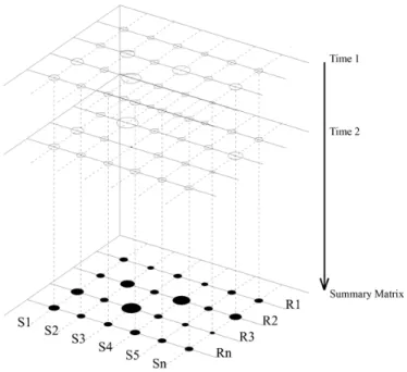
The temporal nature of transit service is shown in Figure 1. Individual stops (S) are sequentially
ordered in space along the Y-axis while consecutive runs (R) are represented on the X-axis. Two
different time snapshots are shown along the Z-axis (Time 1 and Time 2). The data structure is
time periods (e.g., peak, midday, etc.); and time can be aggregated over weekdays, months,
bookings, etc.
Figure 1: Transit Service in the Temporal Dimension
There are three general approaches to addressing time inside a GIS with respect to performance
monitoring. The first concerns calculating the difference in the values of a performance metric
associated with a particular geographic feature between any two points in time, then
subsequently displaying the result on a map. An example would be calculating the net or percent
change in excess passenger wait time at stops between quarterly bookings for a given route,
direction, and time period. The second approach concerns estimating the means or variances of
an attribute over multiple time intervals. This also produces a single estimate where the notion
of time is incorporated into the actual measure itself. For example, one can calculate the amount
of variability in passenger boardings at stops over four consecutive bookings in order to measure
context of a temporal GIS is to ignore temporal computations altogether and simply display the
time slices as a series of individual panels or in rapid succession in what amounts to a video
animation. Both of these methods depict temporal change across geographic space. An example
is provided in the work of Galindez and Mireles-Cordova (2001) who summarized passenger
load ratios by census tracts in order to evaluate changes in passenger activity occurring over the
morning peak time period. The results were presented a series of sequential images representing
various states of the transit system in 20 minute time intervals.
Another important consideration with respect to transit data visualization concerns the ability to
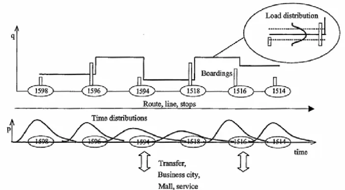
display multiple variables simultaneously. A report by Lehtonen at al. (2002) contains a highly
detailed, abstract figure of a line profile (Figure 2). The authors incorporate multiple stop and
Source: Lehtonen at al. (2002)
distance-based performance measures in a single graphic image including average boardings per
stop, average passenger load between stops, the load distribution between stops, scheduled
departure time, and arrive time variability at stops. High demand locations and transfer stops are
clearly labeled. The figure is notable in that it shows how numerous measures of central
tendency and dispersion can be simultaneously presented in a manner that is comprehensive, yet
simple to understand.
3. Problem Statement
Performance measurement is critical for the successful management of transit operations.
Performance measurement not only helps an agency determine whether or not it is meeting its
strategic objectives but can also be used to evaluate the success of various programs, plans, and
projects. Performance measurement capabilities have greatly expanded in recent years largely
because of advancements in information technologies and a desire to use the information
generated from ITS technologies to identify and fix operational inefficiencies. While numerous
data visualization examples can be found in the literature, the visualization techniques have not
kept pace with performance reporting since most information is still presented in tabular format.
It is also evident that there is a key role for GIS technology in transit data visualization and that
the time element has not been fully exploited. Visualization techniques that make use of
multiple variables are able to provide additional insight into the potential causes of transit service
problems. The question arises as to how best to incorporate data visualization techniques into
transit performance reporting in a manner that 1) highlights the most important information
relevant to decision makers 2) using a variety of presentation formats, 3) is comprehensive, and
4. Research Objective and Methodology
The present study utilizes TriMet as a case study. The aim of the research is to shed light on
transit performance reporting practices at TriMet and to show how data visualization techniques
can be used to enhance decision making capabilities within transit agencies. TriMet employs a
variety of methods to call attention to critical operations and scheduling problems. In addition to
regular, ongoing performance reporting, the agency has developed a number of custom software
applications allowing for the query and display of transit performance information needed by
operations managers for near term decision making. The study concludes with example data
applications showing how transit performance information can be visualized using time-distance
diagrams and GIS technology.
5. Findings
5.1 Transit Performance Reporting at TriMet
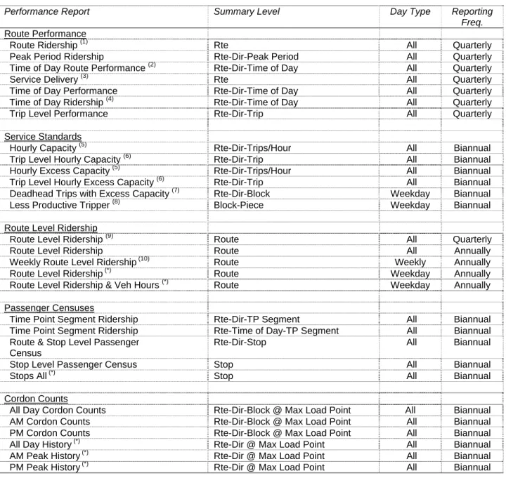
TriMet undertakes transit performance measurement at regular reporting intervals. An overview
of the majority of the “static” performance reports produced by TriMet relating to fixed-route
bus service is presented in Table 1. The summary level of the information contained in each
report varies according to the target audience. For example, schedulers require information
about the characteristics of service reliability at time points, passenger activity over time points,
and passenger loads at maximum load points whereas service planners require information about
route level productivity and passenger demand at stops. In most cases, TriMet generates separate
performance reports for each day type consisting of weekday, Saturday, and Sunday service.
Table 1: TriMet Performance Reports for Fixed Route Bus Service
Performance Report Summary Level Day Type Reporting
Freq. Route Performance
Route Ridership (1) Rte All Quarterly
Peak Period Ridership Rte-Dir-Peak Period All Quarterly
Time of Day Route Performance (2) Rte-Dir-Time of Day All Quarterly
Service Delivery (3) Rte All Quarterly
Time of Day Performance Rte-Dir-Time of Day All Quarterly
Time of Day Ridership (4) Rte-Dir-Time of Day All Quarterly
Trip Level Performance Rte-Dir-Trip All Quarterly
Service Standards
Hourly Capacity (5) Rte-Dir-Trips/Hour All Biannual
Trip Level Hourly Capacity (6) Rte-Dir-Trip All Biannual
Hourly Excess Capacity (5) Rte-Dir-Trips/Hour All Biannual
Trip Level Hourly Excess Capacity (6) Rte-Dir-Trip All Biannual
Deadhead Trips with Excess Capacity (7) Rte-Dir-Block Weekday Biannual
Less Productive Tripper (8) Block-Piece Weekday Biannual
Route Level Ridership
Route Level Ridership (9) Route All Quarterly
Route Level Ridership Route All Annually
Weekly Route Level Ridership (10) Route Weekly Annually
Route Level Ridership (*) Route Weekday Annually
Route Level Ridership & Veh Hours (*) Route Weekday Annually
Passenger Censuses
Time Point Segment Ridership Rte-Dir-TP Segment All Biannual
Time Point Segment Ridership Rte-Time of Day-TP Segment All Biannual
Route & Stop Level Passenger Census
Rte-Dir-Stop All Biannual
Stop Level Passenger Census Stop All Biannual
Stops All (*) Stop All Biannual
Cordon Counts
All Day Cordon Counts Rte-Dir-Block @ Max Load Point All Biannual
AM Cordon Counts Rte-Dir-Block @ Max Load Point All Biannual
PM Cordon Counts Rte-Dir-Block @ Max Load Point All Biannual
All Day History (*) Rte-Dir @ Max Load Point All Biannual
AM Peak History (*) Rte-Dir @ Max Load Point All Biannual
PM Peak History (*) Rte-Dir @ Max Load Point All Biannual
(1) Report provides comparison to previous year’s values, same quarter- boarding rides, rides per vehicle hours, net difference in boarding rides, percent change in rides per vehicle hour
(2) Multiple reports generated- sorted by percent late, excess wait, and headway adherence (3) Report provides comparison to previous year’s values, same quarter- on time percent (4) Multiple reports generated- sorted by rides per revenue hour, maximum load
(5) Individual report sorted by load to achievable capacity ratio > 80% (6) Individual report sorted by load to achievable capacity ratio < 50% (7) Individual report sorted by maximum load factor < 50%
(8) Individual report sorted by boardings per platform hour < 20%
(9) Report provides comparison to previous year’s values - boarding rides, rides per vehicle hours, net difference in boarding rides, percent change in rides per vehicle hour
(10) Multiple reports generated- sorted by total ridership, rides per revenue hour, rides per vehicle hour (*) Denotes that report provides summaries over time at level of reporting frequency
Performance reports denoted with an asterisk (*) highlight examples where certain measures are
tracked over multiple time periods. For example, one of the route level ridership reports tracks
total weekday boardings by year. Footnotes 1, 3, and 9 indicate the reports that provide a basis
for comparison to values from the previous year. Other techniques for calling attention to
operational problems include sorting the reports by different performance measures (Footnotes 2,
4, 10) and by limiting the number of cases that to those that exceed predetermined threshold
values (Footnotes 5-8).
The examples presented in Table 1 highlight several important features related to “standalone”
performance reports. The first concerns the fact that much of the information contained in the
static reports is either redundant or simply not relevant. Redundancy is particularly evident in
the static reports that differ only in the particular variable used as the basis for sorting.
Irrelevancy relates to the fact that the majority of the information is simply not important from a
management perspective since it represents service performing within acceptable bounds. It is
also evident that the ability to monitor longer term trends is presently not being exploited to its
fullest potential. For example, knowing whether the number of lift operations occurring in a
time point segment is trending upwards or downwards would be an important piece of
information for schedulers. The use of information graphics such as charts is also lacking which
is surprising given their ability to further summarize tabular data and call attention to important
5.2 Reporting Enhancements
Compared to static performance reports, a far more flexible and efficient method for presenting
transit performance information is through a custom query interface connected to a backend
database. Rather that determining a priori how best to structure each performance report,
reporting systems can be developed with built in tools allowing users to interactively filter and
sort information to provide access to highly specific information more quickly. Another
technique that can be used to enhance tabular output is to highlight values that exceed certain
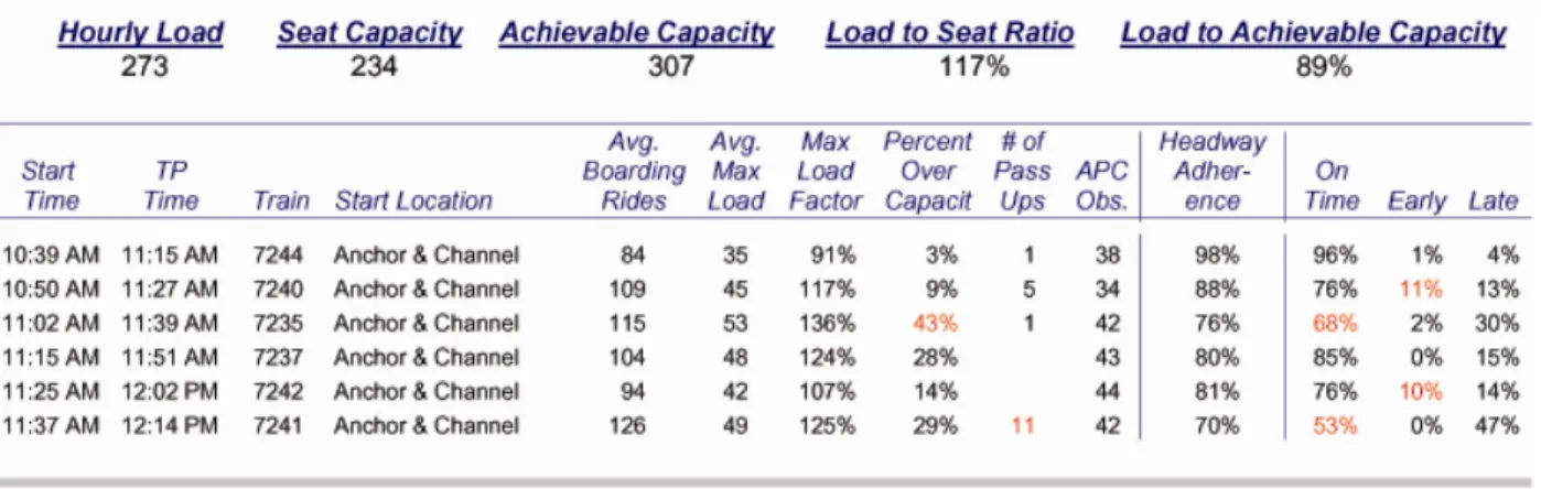
thresholds by varying text colors and/or cell background colors—a technique referred to as
traffic lighting. Figure 3 is a case in point where a different text color has been applied to
extreme values in a standard performance report. By using such a technique, one can readily
determine that because Trains (Blocks) 7240 and 7242 are running hot, that patrons on
subsequent vehicles are experiencing poor quality service in the form of overloaded buses and
longer wait times.
An additional technique that can be used to aid comprehension is hyperlinking which is an
efficient method for gaining access to supplementary information. Since most enterprise level
database and GIS systems are web-enabled, hyperlinking can be effectively used to gain access
to ancillary information in the form of tables, charts, and maps.
The reports that have been discussed up to this point by no means represent the totality of
performance monitoring capabilities at TriMet. A number of performance monitoring
applications have been developed that use an MS Access front end to retrieve data housed in an
Oracle database. These applications provide schedulers and garage managers with access to
information on bus operations and operator performance on a next day basis. Data can be
retrieved for any given day, the current booking, or previous bookings. Efforts are currently
underway at TriMet to elevate certain performance monitoring functions to the enterprise level,
thus making the information available to a wider array of business units. Two notable examples
include a system for transit operator management aimed at improving service quality and service
productivity and an application called the Bus Dispatch System Data Displayer (BUDS) which
provides a mechanism for querying and displaying archived AVL and APC data. BUDS allows
users to query any block over a several month period and plot the vehicle’s GPS points on a map
while also presenting output in the form of an MS Excel table.
5.3. Example Applications
Several transit data visualization examples are presented in the following section. The primary
areas that are explored include: 1) the general mapping of information representing quantities, 2)
applications, a limited set of data was employed since the main purpose is to present ideas and
facilitate discussion.
5.3.1 Mapping of Quantities
By far the simplest method for visualizing performance data using a GIS is to render quantities
of an attribute by varying it’s symbology either by graduated color, by graduated symbols, by
proportional symbols, or by dot density. An example of rendering quantities using proportional
symbols is presented in Figure 4. Event data related to unscheduled stops with dwell times
greater than 30 seconds on Route 14 is presented. The data indicate that excessive dwells
associated with unscheduled stops in the outbound direction tend to occur downtown on the
transit mall (where the majority of boardings occur) and at locations where the route intersects
major arterials (where congestion, signalization delays, and transfer activity occurs). Since the
spatial pattern of dwell time delay could also be explained by other confounding factors
including vehicle holding actions to maintain schedule adherence and facilitate transfers;
problems traversing signalized intersections; and bus crowding on the transit mall, additional
contextual information is clearly needed. Another method for displaying quantities is through
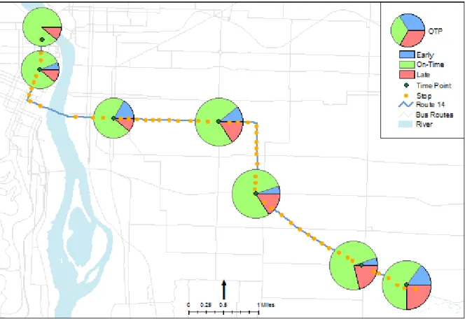
use of chart maps. The example provided in Figure 5 shows weekday on-time performance at
time points for Route 14 displayed as a series of pie charts. The information presented shows the
classic pattern of delay setting in as distance along the route increases. Interestingly, a large
percentage of buses that were on-time at the second to last time point are arriving at the terminal
location early. Similar techniques to the ones just mentioned can also be used to display event
data which are not tied to specific stop locations. Examples include fare evasions, passups, and
safety and security incidents.
5.3.2 Linear Referencing
Although linear referencing is commonly used in the transit field in the area of asset
management and to georeference transit features to street centerlines, there is little evidence of
its use for performance monitoring purposes. Given that dynamic segmentation provides an
efficient way to relate point and line events contained in tables to distance along routes, this is
somewhat surprising. This may be partially due to the fact that modern AVL systems measure
the movement of vehicles, passengers, operators, and events at precise XY locations, largely
Figure 5: On-Time Performance, Route 14 Outbound, Weekdays in June
there is no real benefit to displaying dwell time or passenger demand at stops using a linear
referencing system compared to using actual XY location. However, there are several instances
where a linear measurement system would be useful including cases where the value of an
attribute changes in relation to distance such as the display of passenger load flow information
(Figure 6) and cases where there is a need to display multiple attributes simultaneously (Figure
7).
Load flows based on total daily passenger loads are presented in Figure 6 for Route 20 in the
inbound direction. The information shows that passenger loads are heaviest just prior to the
measure that could be presented in a similar manner is cumulative running time delay. The
graphic image presented in Figure 6 could also have been generated without the use of a linear
referencing system by segmenting the bus route at each stop location, assigning passenger loads
to the individual segments, and then varying the line widths according to the load value. That
said, it is much simpler to generate an event table using a relational database than to use
geoprocessing techniques to snap bus stops to routes and then split routes into multiple segments.
Figure 6: Total Daily Passenger Loads, Route 20 Inbound (East-West), One Day, All Trips
Figure 7 displays passenger load variation in relation to running time delay variation. The figure
is also based on a linear referencing system except the route has been broken into time point
Figure 7: Load and Run Time Delay Variation, Route 14 Outbound, Trip 1575, 5 Weekdays
straightened in order to simplify the presentation of information. Figure 7 provides for accurate
spatial representation with respect to distance, yet is much more flexible with regards to the
display of performance information since each route in the system (which vary considerably with
respect to distance) can be broken into time point segments and displayed in a consistent manner.
Longer routes with more time points would simply have more segments displayed. This is in
contrast to the use of maps, where variable route lengths would require that the information be
displayed at different spatial scales.
5.3.3 Time-Distance Diagrams
Bruun, Vuchic, and Shin (1999) argue that time-distance diagrams are grossly underutilized at
North American transit agencies. This is somewhat surprising given their overall usefulness for
management interventions. Time-distance trajectories for four PM peak period outbound trips
on Route 14 are displayed in Figure 8. This one simple diagram provides insight into the
relationship between actual and scheduled service on a per trip basis as well as the spacing of
vehicles between successive trips—at any point in time and space (e.g., at each time point) as
well as over time and space (e.g., between time points). These relationships would be difficult to
identify if the data were presented in tabular format. For example, 244 data points were required
to generate Figure 8—four variables consisting of trip ID, schedule time, arrive time, and
cumulative distance from the route origin * 61 stops.
TriMet schedulers make regular use of the BDS Graph component of a legacy scheduling
application named the Interactive Schedule Mapper which is used to visually display AVL and
APC data (Figure 9). The left-side panel in the figure represents the “early-late” window and
shows the amount of deviation from schedule, run time deviation, idle time, and lift operation
time. The solid white vertical line represents on-time. Points the right of the vertical line are
early whereas points to the left are late. The colored lines represent day of week. Schedule time
at time points in minutes post the hour are shown in the time scale window (the narrow center
column). The right-side panel can display either passengers or stopping activity for a single trip
or multiple trips. Passenger activity information includes the start and end loads at each time
Stopping activity information includes the actual number of passenger stops, idle stops, and lift
operations between time points. The application is highly flexible in that the analyst can set
various parameters such as the number of sampled trips, booking, route, direction, trip, day type.
The analyst can interactively expand or compress the time scale, scroll the trips horizontally, and
also chose between displaying the performance measures as counts, averages, or variances.
Operator ID can also be displayed. While not a “true” time-distance application since time
points are spaced evenly without regards to distance and time in the horizontal scale is relative to
on-time, the application is more than adequate for scheduling purposes. BDS Graph is powerful
data visualization tool because of its interactive nature and because of the large amount of related
information can be displayed simultaneously.
Time-distance graphs can and should be used more widely as a data visualization tool in transit
performance monitoring since they can effectively summarize vast quantities of information in a
manner that sufficiently captures the dynamic nature of transit service. For example,
time-distance diagrams can provide insight into the interrelationship between service delays and
variations in passenger activity. The diagrams can be used to identify how delays at trip origins
can impact downstream performance and passenger loads as well as provide insight into the
amount of recovery time needed at route termini.
5.3.4 3-D Visualization
Certain types of transit performance information can be analyzed and displayed in the third
dimension, thereby providing additional insight into spatial patterns that cannot be realized in
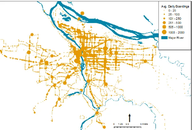
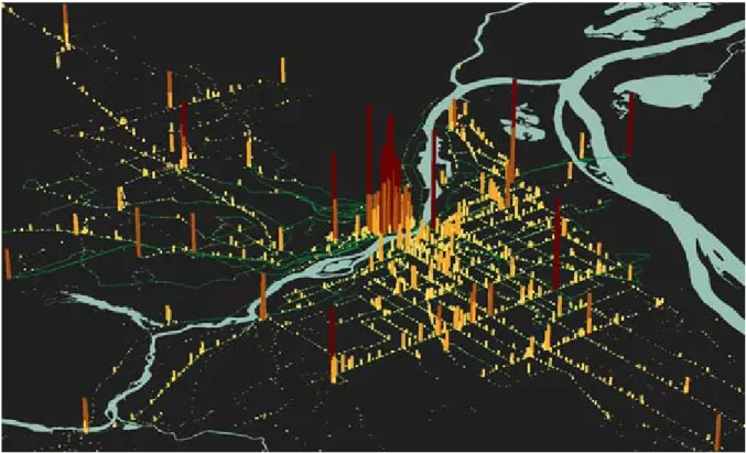
two dimensions alone. Figure 10 is an example of a two dimensional image showing average
show the same information in three dimensions, the first by extrapolating average daily
boardings at bus stops to the Z dimension and the second by using a raster-based 3-D surface
analysis technique. In comparing Figures 11 and 12 to Figure 10, one can more readily identify
high demand locations within a regional context as well as identify locations were transit is
underutilized (or where areas are underserved). 3-D visualization is an appropriate technique for
displaying transit performance information measured at point locations such as stops, time
points, maximum load points, and event locations. The Z- dimension can be modeled as counts,
net differences, averages, deviations from schedule, and variances.
Figure 11: Average Weekday Boardings at Stops, Fall 2005, 3-D Representation
6. Conclusions and Recommendations
The convergence of ITS, information technology, and advances in GIS present a unique
opportunity to take performance reporting to the next level through continued development of
user friendly data query and display interfaces and by extending current data visualization
techniques. In surveying the literature, is apparent that a most of the data visualization examples
to date are related to specific, one-off projects and are not part of longer-term performance
monitoring and evaluation programs. Techniques for creating information graphics on-the-fly or
as batch processes which can automatically generate graphic output for the complete system can
readily be developed using modern database, GIS, and statistical analysis software.
Much can be done to improve the readability of tabular output including the use of traffic
lighting which can help call attention to operational problems; the use of hyperlinking to provide
immediate access supplemental information in the form of tables, charts, and maps; and the
development of interactive software applications for data query and display purposes. Such
applications can target specific business needs related to the day-to-day management of transit
operations and can also be used as part of longer term performance monitoring and evaluation
programs. Information graphics in the form of charts, maps, and abstract diagrams can and
should be more fully leveraged because of their ability to further summarize what would
normally be tabular data, greatly aiding the understanding of complex phenomena. While maps
can be used to present spatial information with a high degree of accuracy, it is apparent that
space and time can be abstracted with little loss of information. It is also evident that transit data
visualization techniques capable of displaying multiple transit performance measures at one time
techniques worthy of additional exploration include those making use of temporal GIS, time
distance diagrams, and linear referencing.
It can be argued that transit data performance monitoring and transit data visualization are still in
their infancy since few transit properties have mature enough data systems and sufficient
experience using ITS data for performance monitoring purposes. This should gradually change
over time as agencies learn how to more fully leverage transit service performance data to
References
Bruun, E.C., Vuchic, V.R., & Shin, Y.E. (1999). Time-distance diagrams: a powerful tool for service planning and control. Journal of Public Transportation, 2 (2), 1-24.
DiBiase, D., MacEachren, A. M., Krygier, J. B., & Reves, C. (1992). Animation and the role of map design in scientific visualization. Cartography and Geographic Information Systems, 19, 201-214.
Federal Transit Administration (2005). Best Practices for Using Geographic Data in Transit: A Location Referencing Guidebook. Washington, D.C.: Author.
Fielding, G. (1987). Managing Public Transit Strategically: A Comprehensive Approach to Strengthening Service and Monitoring Performance. Jossey-Bass Publishers, San Francisco.
Florida Department of Transportation (2004). FTIS 2004: Florida Transit Information System Users Guide. Miami, FL: Lehman Center for Transportation Research, Florida
International University.
Furth, P.G. (2000). Data Analysis for Bus Planning and Monitoring. Synthesis of Transit Practice 34. Washington, D.C.: Transportation Research Board.
Furth, P. G., Hemily, B. J., Muller, T. H. J., & Strathman, J. G. (2003). Uses of archived AVL-APC data to improve transit performance and management: Review and potential. TCRP Web Document H-28, Washington, D.C.: Transportation Research Board.
Galindez, A.A. & Mireles-Cordova, R. (2001). Visualization of transit mobility and performance. Journal of Public Transportation, 3 (4), 61-72.
GIS/Trans, Ltd. (2001). Transportation Case Studies in GIS, Case Study 6: GIS for Transit Planning at OCTA. Washington D.C.: Office of Planning Innovation and Analysis, Federal Transit Administration, U.S. Department of Transportation.
Gordon, M. and Shaver, C. (2004). The Importance of Data Integration within the Agency.
Proceedings of the 2004 BUS, Paratransit & Bus Rapid Transit Conference. American Public Transportation Association, Washington, D.C.
Jia, W. & Ford, B. Transit GIS applications in Fairfax County, Virginia. Journal of Public Transportation, 2(4), 41-59.
Kittleson & Associates, Morepace International Inc., Queensland University of Technology and Nakanishi, Y. (2003). A Guidebook for Developing a Transit Performance-Measurement System. TCRP Report 88. Washington, D.C. Transportation Research Board.
Langendorf, R. (2001). Computer-aided visualization: Possibilities for urban design, planning, and management. In R. K. Brail & R. E. Klosterman (Eds.), Planning Support Systems (pp. 309-360). Redlands, CA: ESRI Press.
Lehtonen, M., Rosenberg, M., Räsänen, J. & Sirkiä, A. (2002). Utilisation of the smart card payment systems data in public transport planning and statistics. 9th World Congress of Intelligent Transport Systems, Chicago, IL.
Miller, H. J., & Shaw, S. (2001). Geographic information systems for transportation: Principles and applications. New York: Oxford University Press.
Miller, H. J., & Han, J. (1999). Discovering Geographic Data Knowledge in Data Rich
Environments. Project Varenius workshop “Geographic Knowledge Discovery In Data-Rich Environments”, Kirkland, WA, March 18-20.
Peng, Z., Lynde, E. & Beimborn, E. (2006). Use of Geographic Information Systems for Transit Performance Measurement. Milwaukee: WI, Center for Advanced Spatial Information Research University of Wisconsin-Milwaukee.
Polzin, S., & Page, O. (2003). Ridership trends of new start rail projects [Report No. NCTR 350-11] Tampa, FL: National Center for Transit Research.
Stead, S. D. (1998). Temporal dynamics and geographic information systems. In M. J. Egenhofer & R. G. Golledge (Eds.), Spatial and temporal reasoning in geographic information systems (pp. 214-219). New York: Oxford University Press.
Sutton, J. (2004). Geographic information systems applications in transit. TCRP Synthesis 55, Washington, D.C. Transportation Research Board.
Thill, J-C. (2000). Geographic information systems for transportation in perspective.
Transportation Research Part C, 8, 3-12.
U.S. Department of Transportation (2002). Transportation Indicators. Retrieved April 24, 2004, from Bureau of Transportation Statistics Web site:
http://www.bts.gov/publications/transportation_indicators/
Zhao, F. & Shen, D. (1997). GIS Applications for Public Transportation Management [Report No. NUTI3-FIU-2]. Tampa, FL: Center for Urban Transportation Research, University of South Florida.