ElectronicEngineeringDepartment UniversityofValencia
P
h.
D
T
HE
SI
S
VI
SUAL
DATA
MI
NI
NG
Re
a
l
Appl
i
c
a
t
i
o
ns
&
Ne
w
Appr
o
a
c
he
s
E
mi
l
i
o
So
r
i
a
Ol
i
v
a
s
Ad
v
i
s
o
r
s
:
J
o
s
é
M.
Ma
r
t
í
ne
z
Ma
r
t
í
ne
z
J
a
nu
a
r
y
,
2
01
4
Ph.D THESIS
Visual Data Mining: Real Applications and
New Approaches
by
Jos´
e Mar´ıa Mart´ınez Mart´ınez
Supervisors
Emilio Soria Olivas
Jos´e David Mart´ın Guerrero
Electronic Engineering Department University of Valencia Valencia - January, 2014
Visual Data Mining: Real Applications and New
Approaches.
Dpt. Enginyeria Electr`
onica. Escola T`ecnica Superior d’Enginyeria.
D. EMILIO SORIA OLIVAS, Doctor en Ingenier´ıa Electr´onica, Profesor Titular del Departamento de Ingenier´ıa Electr´onica de la Escola T´ecnica Superior d’Enginyeria de la Universitat de Val´encia, yD. JOS´E DAVID MART´IN GUERRERO, Doctor por la Universitat de Val`encia, Pro-fesor Titular del Departamento de Ingenier´ıa Electr´onica de la Escola T´ecnica Superior d’Enginyeria de la Universitat de Val´encia
HACEN CONSTAR QUE:
El Ingeniero en Electr´onica D. Jos´e Mar´ıa Mart´ınez Mart´ınez ha realizado bajo nuestra direcci´on el trabajo titulado “Visual Data Mining: Real Applications and New Approaches.”, que se presenta en esta memoria para optar al grado de Doctor.
Y para que as´ı conste a los efectos oportunos, firmamos el presente certificado, en Va-lencia, a de Enero de 2014.
Emilio Soria Olivas Jos´e D. Mart´ın Guerrero J. Rafael Magdalena Benedito Dtor del Departamento
Tesis Doctoral:
VISUAL DATA MINING:
REAL APPLICATION AND NEW APPROACHES
Autor:
JOS´
E MAR´IA MART´INEZ MART´INEZ
Directores:
Dr. EMILIO SORIA OLIVAS
Dr. JOS´
E DAVID MART´IN GUERRERO
El tribunal nombrado para juzgar la Tesis Doctoral arriba citada, compuesto por los doctores:
Presidente:
Vocal:
Secretario:
Acuerda otorgarle la calificaci´on de
Y para que as´ı conste a los efectos oportunos, firmamos el presente certificado.
This doctoral thesis has been partially supported by
Fresenius
Medical Care (FME)
through the research project entitled
“In-telligent analysis of Fresenius Medical Care data”
.
Agradecimientos
Desde estas l´ıneas pretendo expresar mi m´as sincero agradecimiento a todas
aque-llas personas que durante este largo camino de esfuerzo, trabajo y dedicaci´on han
estado a mi lado y que, de una u otra forma, han contribuido a que esta tesis haya llegado a buen fin. Sin todas ellas, hubiese sido del todo imposible afrontar con ´exito la elaboraci´on de este proyecto, en la que tanta ilusi´on he puesto.
En primer lugar a los directores de esta tesis, Emilio Soria y Jos´e D. Mart´ın, por ser los principales responsables de que este trabajo llegara a buen puerto, estando
siempre a mi lado, en los buenos y no tan buenos momentos, anim´andome siempre
a continuar. Agradecer su apoyo incondicional, sus fant´asticas ideas y aportaciones
a esta tesis que, especialmente sin ellos, no hubiera sido posible y no gozar´ıa de la misma calidad. Muchas gracias por vuestra ayuda, por considerarme uno m´as en el IDAL, por preocuparos constantemente de mi futuro y porvenir y sobretodo por considerarme, al igual que yo os considero, un buen amigo. Gracias por estos a˜nos de amistad y trabajo que espero, y deseo, que se prolonguen durante muchos m´as.
Tambi´en quiero agradecer al resto del IDAL (Juan, Pablo, Marcelino, Rafa,
Anto-nio y Joan) su constante apoyo y preocupaci´on. Gracias por haber hecho del nuestro
un ambiente de trabajo excepcional en el que se ha hecho muy f´acil trabajar durante todos estos a˜nos. Creo que esto se hace realidad gracias a la gran amistad que une al grupo de investigaci´on tanto dentro como fuera del trabajo. A ti en particular, Pablo, gracias por tu apoyo, amistad, ayuda y por compartir las mismas preocupaciones y devenires en nuestro camino con destino al grado de Doctor.
En especial a mi familia. A mis padres, Pedro y Sole, por haberme hecho disfrutar de la vida, por la educaci´on que me han dado y por inculcarme unos valores que han hecho de m´ı la persona que soy hoy en d´ıa. Gracias por ser un ejemplo a seguir en la vida y por vuestro apoyo y amor incondicional. A mi hermano Pedro, por creer en mi y por animarme siempre a seguir hacia adelante. Gracias por ser tambi´en un
ejemplo a seguir, y por hacer desde muy peque˜nos que los hermanos tuvi´esemos una
muy estrecha relaci´on. Gracias a ti, hoy puedo decir con la boca llena que mis mejores amigos son mis dos hermanos. A mi hermano Fran, por apoyarme, entenderme como nadie y por ser parte de mi. Sin ti no ser´ıa la persona que soy hoy en d´ıa. Gracias
por tantos y tan buenos momentos que hemos pasado juntos y por estar siempre a mi lado, aunque en ´epocas de la vida hayas estado f´ısicamente alejado. A mi abuela, por
todo lo que se preocupa por sus nietos. A mis cu˜nadas, Sandra y Helena, por estar
siempre ah´ı, cuidar de mis hermanos y demostrarme que son tambi´en familia carnal; y finalmente a mis sobrinos, Eric y Andrea, porque ellos hacen de la vida un lugar m´as bonito.
A mis amigos, por esos momentos de evasi´on en los que uno disfruta y se olvida de todo lo malo.
A las personas que, aunque no aparecen aqu´ı con nombres y apellidos, han estado presentes de alguna forma durante el desarrollo de este trabajo y han hecho posible que hoy vea la luz. A todos mi eterno agradecimiento.
Y finalmente en especial menci´on a Aida, por hacerme la vida mucho m´as feliz
y m´as f´acil, por sufrirme y soportarme d´ıa a d´ıa, en la convivencia, durante todo el
tiempo que le he dedicado a la tesis. Gracias por tu comprensi´on y por ser el pilar
de mi vida. Porque con una mirada, una caricia o un peque˜no gesto haces que me
olvide de todo. Por haberme apoyado en todo momento y haber estado ah´ı incluso en momentos dif´ıciles para ti. Gracias por tu altruismo para conmigo, por tu apoyo incondicional y sobre todo por ser como eres. Gracias por cambiarme la vida y hacer que no me la pueda imaginar sin estar junto a ti. No hay palabras en el mundo para agradecerte todo lo que eres y significas para mi.
Valencia, Octubre de 2013.
A mi Familia
“An attempt at visualizing the Fourth Dimension: Take a point, stretch it into a line, curl it into a circle, twist it into a sphere, and punch through the sphere.”
Contents
List of Figures IX
List of Tables XVII
1 Introduction 1
1.1 Research Motivation . . . 1
1.2 Knowledge Discovery in Databases (KDD) and Data Mining . . . 3
1.3 Data Visualization . . . 6
1.3.1 Introduction . . . 6
1.3.2 High dimensional visualization review . . . 9
1.3.3 Visual Data Mining . . . 12
2 Self-Organizing Maps: Theoretical Framework 15 2.1 Introduction . . . 15
2.2 SOM algorithm . . . 17
2.2.1 Size and shape . . . 17
2.2.2 Initialization . . . 18
2.2.3 Training . . . 19
2.2.4 Learning Rate . . . 20
2.3 SOM visualization . . . 23
2.3.1 Component planes . . . 23
2.3.2 Winners map . . . 25
3 Visual Data Mining with Self-Organizing Maps (SOMs) 27 3.1 Use of SOMs for Balanced Scorecard analysis to monitor the perfor-mance of dialysis clinic chains . . . 28
3.1.1 Introduction . . . 28
3.1.2 Balanced Scorecard and Key Performance Indicators Definition 31 3.1.3 Clinic data . . . 34
3.1.4 Methodology . . . 34
3.1.5 Results . . . 37
3.1.6 Conclusion . . . 60
3.2 Analysis of Patients Satisfaction Surveys (PSS) using Self-Organizing Maps . . . 61 3.2.1 Introduction . . . 61 3.2.2 PSP questionnaire . . . 63 3.2.3 Methodology . . . 65 3.2.4 Results . . . 66 3.2.5 Conclusions . . . 69
3.3 Visual Data Mining with Self-Organizing Maps for Ventricular Fibril-lation Analysis . . . 71 3.3.1 Introduction . . . 71 3.3.2 Data set . . . 73 3.3.3 Methodology . . . 77 3.3.4 Results . . . 78 3.3.5 Conclusions . . . 82
3.4.1 Introduction . . . 83
3.4.2 Case study . . . 84
3.4.3 Methodology . . . 85
3.4.4 Results . . . 86
3.4.5 Conclusions . . . 88
3.5 Use of SOMs for footwear comfort evaluation . . . 88
3.5.1 Introduction . . . 88
3.5.2 Data set . . . 90
3.5.3 Results . . . 91
3.5.4 Conclusions . . . 102
4 SonS and MDSonS: New Visualization Tools for Data Mining Tech-niques 103 4.1 Theorical bases . . . 104
4.1.1 Clustering algorithms . . . 104
4.1.2 Growing Hierarchical SOM (GHSOM) . . . 109
4.1.3 Classification trees . . . 112
4.2 Visualization methods for Data Mining techniques . . . 114
4.3 Proposed visualization methods . . . 117
4.3.1 Sectors on Sectors (SonS) . . . 117
4.3.2 Multidimensional Sectors on Sectors (MDSonS) . . . 119
4.4 Data sets . . . 123
4.4.1 Synthetic data set . . . 123
4.4.2 German elections data set . . . 124
4.4.3 Italian olive oil data set . . . 124
4.4.4 Iris flower data set . . . 125
4.5.1 SonS applied to hierarchical clustering . . . 126
4.5.2 MDSonS applied to in hierarchical clustering . . . 130
4.5.3 SonS applied to GHSOM algorithm . . . 133
4.5.4 SonS applied to classification tree models . . . 137
4.6 Conclusions . . . 140
5 ManiSonS: A New use ofSonS method for visualizing the results of Manifold Clustering 143 5.1 Introduction . . . 144
5.2 Supervised Manifolds . . . 145
5.2.1 Linear Discriminant Analysis (LDA) . . . 145
5.2.2 Neighbourhood Components Analysis (NCA) . . . 146
5.2.3 Maximally Collapsing Metric Learning (MCML) . . . 146
5.3 Results . . . 147
5.3.1 Data sets . . . 147
5.3.2 Performance evaluation . . . 148
5.4 Conclusions . . . 149
6 Conclusions and future prospects 151 6.1 General summary . . . 152
6.2 Summary of contributions . . . 155
6.3 Strengths and weaknesses of the proposed visualization techniques . . 157
6.4 Future prospects . . . 158
6.5 Scientific publications achieved with this thesis . . . 159
6.5.1 Journal publications . . . 159
6.5.2 Book chapters . . . 160
6.5.3 Conferences papers . . . 160
Appendix 162
A SonS method developed as an interactive tool 163
A.1 Introduction . . . 163
A.2 Developed interactive tool . . . 165
A.3 Conclusions . . . 166
List of Figures
1.1 More advanced data visualization than the basic charts. . . 6
1.2 Parallel Coordinate Visualization (from (Keim,2002)). . . 10
1.3 Dense Pixel Displays (from (Keim,2002)). . . 11
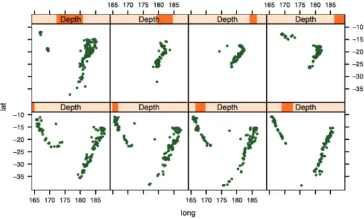
1.4 Scatter plots of locations of earthquakes in a trellis framework. The
observations in each panel are organized according to the depth at
which the earthquake happened (adopted from (Chen et al.,2008a)). . 11
1.5 Examples of existing glyphs (from (Ward,2002)). . . 11
1.6 Mosaic plot example of 4-D problem of the detergent data set ((Cox and
Snell,1981)). This data set consists of four variables: Water softness,
Temperature, M-user (person used brand M before study),Preference
(brand person prefers after test). The major interest of the study is to find out whether or not preference for a detergent is influenced by the brand someone uses. . . 12
1.7 Example path of a grand tour (adopted from (Chen et al.,2008a)). . . 12
2.1 Neighborhoods (size 1, 2, 3) of the unit marked with red dot: (a)
hexagonal lattice, (b) rectangular lattice. . . 18
2.2 Different map shapes: sheet on the left, cylinder in the center and
toroid on the right. . . 18
2.3 Updating the best matching unit (BMU) and its neighbors towards the
input sample marked with x. The solid and dashed lines correspond to the situation before and after updating, respectively. . . 19
2.4 Different learning rate function. In blue solid line the linear function, in black dashed line the exponential function and in red dot-dashed line the inversely proportional function. . . 21
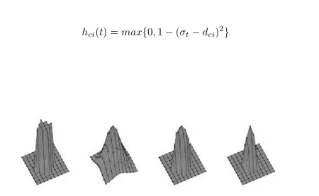
2.5 Different neighborhood function. From the left“Bubble”, “Gaussian”, “Cut Gaussian”, “Epanechnikov”.. . . 23
2.6 Example of a conventional “Hits map”, where each neuron is
repre-sented by a hexagon on the map grid. The colored area inside each hexagon is proportional to the number of input patterns which are best represented by this neuron. . . 26
3.1 Component planes for the SOM analysis obtained for Italy after
train-ing the model without the lost KPI (7) and without the constant KPIs (1, 13, 23, 28 and 29). Notice that color scales are normalized to the same interval, where 100 corresponds to the largest value over all weight vectors, and 0 to the smallest one; therefore, the maximum value for one KPI might not correspond to dark red for all planes. Also notice
that for KPIs marked with a * (also in Table 3.1), red regions
corre-spond to good scores which in turn are obtained for low raw values on those parameters: for instance, a red region in the HepB infection risk component (KPI 9) does not mean that the risk is high, but rather that the performance regarding such aspect is a good one - that is, the infection risk is low. . . 38
3.2 Trajectories of several clinics of Italy throughout the time in the SOM
grid. Each trajectory starts at the smallest green point and finishes at the biggest one. . . 41
3.3 Clustering obtained after applyingk-meansalgorithm (a) and clustered
map together with one clinic trajectory (b) in the SOM map for Italy. Black hexagons represent the cluster centroids or prototypes for each cluster. . . 42
3.4 SOM grid of Italy showing the winner neurons after training. . . 43
3.5 Parallel coordinates plot of Italy centroids. . . 43
3.6 Average of the KPIs component planes of Italy (Fig3.1) according to
the weight established by FME. . . 44
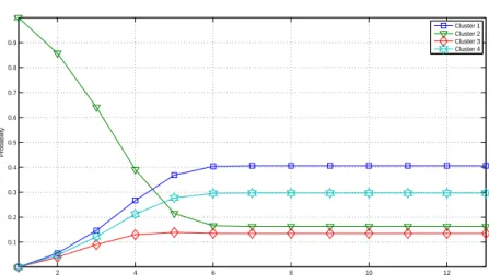
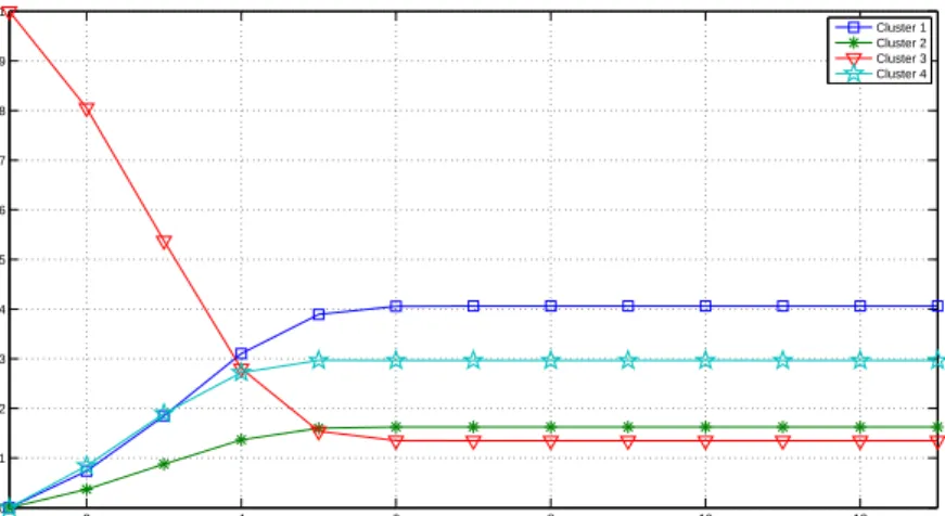
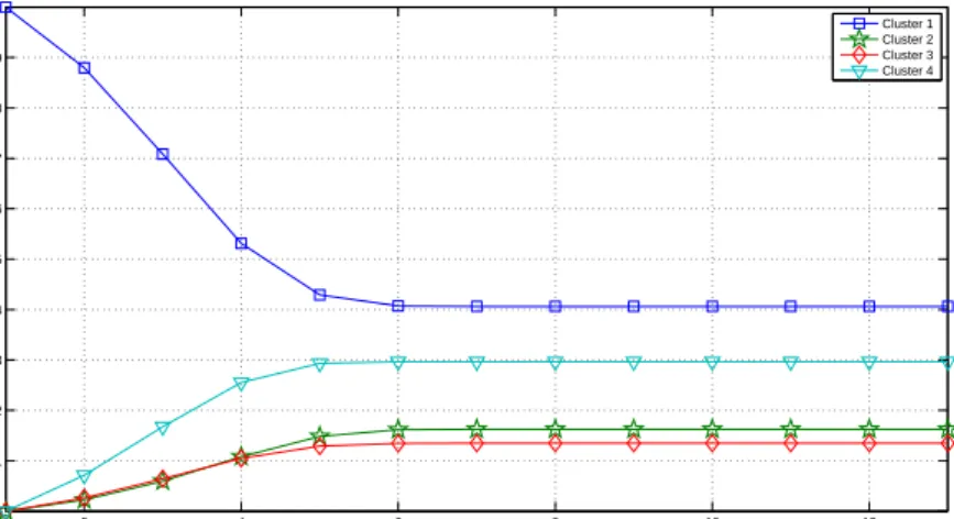
3.7 Probabilities of changing from the second cluster to the rest. . . 46
3.8 Probabilities of changing from the third cluster to the rest. . . 46
3.9 Probabilities of changing from the fourth cluster to the rest. . . 46
3.11 Component planes for the SOM analysis obtained for Turkey after training the model without the lost KPIs (7 and 14) and without the constant KPIs (12, 13, 23, 26, 28 and 29). Notice that color scales are normalized to the same interval, where 100 corresponds to the largest value over all weight vectors, and 0 to the smallest one; therefore, the maximum value for one KPI might not correspond to dark red for all planes. Also notice that for KPIs marked with a * (also in Table3.1), red regions correspond to good scores which in turn are obtained for low raw values on those parameters: for instance, a red region in the HepB infection risk component (KPI 9) does not mean that the risk is high, but rather that the performance regarding such aspect is a good one - that is, the infection risk is low. . . 47
3.12 Trajectories of several clinics of Turkey throughout the time over the SOM map. Each trajectory starts at the smallest green point and finishes at the biggest one. . . 49
3.13 Clustering obtained after applyingk-meansalgorithm in the SOM map
for Turkey. Black hexagons represent the cluster centroids or prototypes. 50
3.14 Average of KPIs component planes of Portugal (Figure3.11) according
to the weight established byFME. . . 50
3.15 SOM grid of Turkey showing the winner neurons after training. . . 51
3.16 Parallel coordinates plot of Turkey centroids. . . 51
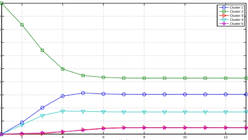
3.17 Probabilities of changing from the third cluster to the rest. . . 53
3.18 Probabilities of changing from the first cluster to the rest. . . 53
3.19 Probabilities of changing from the second cluster to the rest. . . 53
3.20 Probabilities of changing from the fourth cluster to the rest. . . 54
3.21 Probabilities of changing from the fifth cluster to the rest. . . 54
3.22 Component planes for the SOM analysis obtained for Portugal after training the model without the KPIs (1, 7, 12, 13, 14, 16, 19, 23, 28 and 29). Notice that color scales are normalized to the same interval, where 100 corresponds to the largest value over all weight vectors, and 0 to the smallest one; therefore, the maximum value for one KPI might not correspond to dark red for all planes. Also notice that for KPIs marked
with a * (also in Table 3.1), red regions correspond to good scores
which in turn are obtained for low raw values on those parameters: for instance, a red region in the HepB infection risk component (KPI 9) does not mean that the risk is high, but rather that the performance
3.23 Trajectories of several clinics of Portugal throughout the time in the SOM grid. Each trajectory starts at the smallest green point and finishes at the biggest one. . . 55
3.24 Clustering obtained after applyingk-meansalgorithm in the SOM map
for Portugal clinics. Black hexagons represent the clusters centroids or prototypes. . . 56
3.25 SOM grid showing the winner neurons after training for Portugal clinics. 56
3.26 Parallel coordinates plot of Portugal centroids. . . 57
3.27 Average of KPIs component planes of Portugal (Figure3.22) according
to the weight established by Fresenius. . . 57
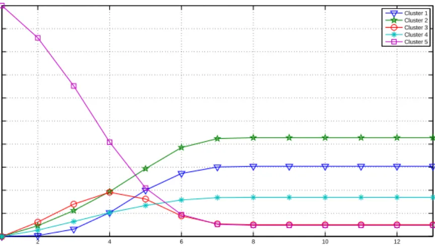
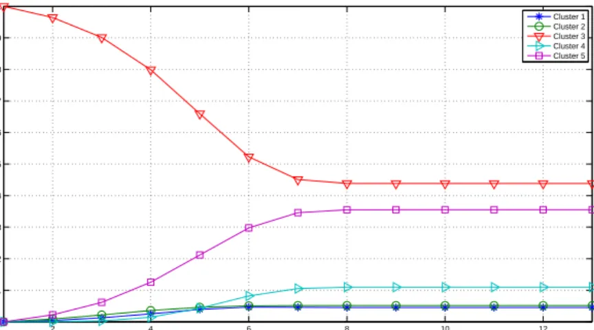
3.28 Probabilities of changing from the first cluster to the rest. . . 59
3.29 Probabilities of changing from the second cluster to the rest. . . 59
3.30 Probabilities of changing from the third cluster to the rest. . . 59
3.31 Probabilities of changing from the fourth cluster to the rest. . . 60
3.32 Probabilities of changing from the fifth cluster to the rest. . . 60
3.33 Maps obtained using the complete data set. The lower-right map
la-beled with numbers (k) represents the winner neurons, and thus
pro-vides information about the number of patients represented by each neuron (the blacker the neuron, the higher the number of associated patients). The other maps (called component planes: blocksa–j) show projections corresponding to the different input features (Age, Gender
and each one of the eight blocks of statements in the questionnaire). . 67
3.34 Maps obtained using patients mapped from area 3 of the map shown
in Figure 3.33. Component Planes (blocks a–j) and map of winner
neurons (k) are shown. . . 68
3.35 Normal sinus rhythm in the surface ECG. Temporal signal (top) and
its associated frequency (left) and PWV time-frequency representations. 74
3.36 Ventricular fibrillation rhythm in the surface ECG. Temporal signal (top) and its associated frequency (left) and PWV time-frequency rep-resentations. . . 75
3.37 Methodology carried out in this study. . . 78
3.38 “Hits map” obtained from the training with four groups of patients.
VF is represented in red,VT in black,HP in green andAHRin blue. 78
3.39 “Hits map” obtained from the training with three groups of patients.
3.40 “Hits map” obtained from the training with two groups of patients.
VFVT is represented in red andHP in green. . . 80
3.41 “Component planes” obtained from the training with two groups of patients (VFVT andHP). . . 81
3.42 “Winners map” of the obtained SOM. . . 86
3.43 Component planes obtained with SOM algorithm for patients after rehabilitation protocol. . . 87
3.44 Component planes obtained using after training the SOM with the complete data set. . . 92
3.45 Winners map obtained from the SOM training with the complete data set. . . 93
3.46 Winners map obtained from the SOM training with the complete data set. Red color represents not buying behavior and green color represent buying behavior. . . 93
3.47 Component planes obtained using after training the SOM with the
complete data set with the same color scale for all component planes. 97
3.48 Component planes obtained using after training the SOM considering only male testers. . . 98
3.49 Winners map obtained from the SOM training considering only male testers. . . 99
3.50 Winners map obtained from the SOM training considering only male testers. Red color represents not buying behavior and green color rep-resent buying behavior. . . 99
3.51 Component planes obtained using after training the SOM considering only female testers. . . 100
3.52 Winners map obtained from the SOM training considering only female testers. . . 101
3.53 Winners map obtained from the SOM training considering only female testers. Red color represents not buying behavior and green color rep-resent buying behavior. . . 101
4.1 A coarse clustering of the data results in two clusters (solid line),
whereas a finer one results in four clusters (dashed line). . . 105
4.2 Example diagram showing how the hierarchical clustering works for a
data set of five patterns. For agglomerative technique see the diagram from bottom to top, and for divisive technique see it from top to bottom.108
4.3 Example dendrogram for hierarchical clustering algorithm that groups a set of five patterns. . . 109
4.4 GHSOM reflecting the hierarchical structure of the input data (
Ditten-bach et al.,2000). . . 110
4.5 Insertion of units: A row (a) or a column (b) of units (shaded gray) is
inserted in between error unit eand the neighboring unit dwith the
largest distance between its model vector and the model vector ofein
the Euclidean space. . . 111
4.6 Splitting algorithm of CART, wheretp,tl,trare parent, left and right
nodes respectively; xj is variablej; andxRj is the best splitting value
of variablexj. . . 114
4.7 Example of how the method computes the radii of the different
subsec-tors in order to represent the relevance of the features in each cluster. After applying Eq. (4.3) to the vector [25,−5,−12], the relevance of each attribute is obtained. The sum of all these “transformed” at-tributes is equal to 1. . . 118
4.8 The three steps followed to create theSonSvisualization method. From
left to right: 1) producing as many sectors as clusters, 2) splitting each sector according to the attributes and 3) color coding to identify real values. . . 119
4.9 The three steps followed to create the MDSonS visualization method. 122
4.10 Representation of the first synthetic data set variant. The points cor-responding to each cluster after the first level (three clusters: A, B, C) are shown in different colors. Their centroids are represented with red dots. Subclusters at the second level of hierarchy are indicated with a
number (1, 2, 3) after the corresponding letter (A, B, C). . . 123
4.11 Representation of the second synthetic data set variant. The points corresponding to each cluster after the first level (three clusters: A, B, C) are shown in different colors. Their centroids are represented with red dots. Subclusters at the second level of hierarchy are indicated
with a number (1, 2, 3) after the corresponding letter (A, B, C). . . . 123
4.12 Regions and collections areas of Italy corresponding to the two kind of classes of the Italian olive oil data set. . . 125
4.13 Dendrogram corresponding to the clustering of the first variant of syn-thetic data set. Higher dashed line represents the distance of the first hierarchical level. Lower dashed line represents the distance of the second hierarchical level. . . 127
4.15 Dendrogram corresponding with the clustering of theGerman elections
data set. Higher dashed line represents the distance of the first hier-archical level. Lower dashed line represents the distance of the second hierarchical level. . . 128
4.16 German map with the 16 different German federal states. The 4 regions corresponding with the clustering in the first hierarchy level are shown in colors. . . 128
4.17 SonS visualization method forGerman elections data set. . . 129
4.18 Dendrogram corresponding to the clustering of the second variant of
synthetic data set. Higher dashed line represents the distance of the first hierarchical level. Lower dashed line represents the distance of the second hierarchical level. . . 131
4.19 MDSonS representation for the second variant of thesyntheticdata set.131
4.20 MDSonS visualization method forGerman elections data set. . . 132
4.21 SonS visualization method after trainingItalian olive oil data set with GHSOM algorithm. . . 134
4.22 Classification tree obtained for the“Iris flower data set”with theSonS
graph in the terminal nodes. . . 137
4.23 Classification tree obtained for the “Italian olive oils” data set with theSonS graph in the terminal nodes. . . 139
5.1 ManiSonS visualization method applied to thesynthetic data set. . . . 148
5.2 ManiSonS visualization method applied to theseeds data set. . . 149
A.1 Main window of the developed interactive tool. . . 165
A.2 Help window superimposed on the main window of the developed
in-teractive tool. The help window appears after typing “H”. . . 165
A.3 Snapshot of the application when mouse is over one sector. The num-ber of patterns included in the cluster corresponding to such sector is indicated. . . 166
A.4 Snapshot of the application when left-clicking on a sector. Information about patterns including in such cluster is shown by means of a bar chart showing the number of patterns of each class existing in such cluster . . . 166
List of Tables
3.1 KPIs, and corresponding perspectives, as defined in the FME BSC.
Notice that for KPIs marked with a *, high scores will correspond to good scores which in turn are obtained for low raw values on those parameters: for instance, a high score in the HepB infection risk KPI (9th KPI) does not mean that the risk is high, but rather that the performance regarding such aspect is a good one - that is, the infection risk is low. . . 33
3.2 Prototypes scores of Italy. . . 44
3.3 Prototypes scores of Turkey. . . 49
3.4 Prototype global scores for Portugal. . . 57
3.5 Level of satisfaction (average) of the eight different blocks of
state-ments. The scale goes from -3 (strongly disagree) to +3 (strongly agree). 65
3.6 Obtained time-frequency parameters (mean±std), where the “t” and
“tf” in the “Domain” column refers to temporal and time-frequency domains. . . 76
3.7 Mean and standard deviation of the variables used in the SOM analysis. 85
Summary and objectives
Data visualization has in recent years become a very active and vital area of re-search. It is an effective way to analyze large amounts of data to identify correlations, trends, outliers, patterns, among many other information. Raw data are often mean-ingless, but representing visually such data offers audiences important context for understanding the information contained in them. Due to the importance of this area of research, and its novelty, this thesis aims to discover new findings, draw conclusions and bequeath significant contributions to the scientific community in this field. To achieve this purpose, this work attempts to address two main objectives.
The first objective of this thesis is to try to develop new visualization methods for interpreting the results of several data mining algorithms. For example, cluster analysis is a big challenge in data visualization; for this reason, they both often go hand in hand. Nonetheless, there is a lack of visualization techniques associated with clustering and hierarchical clustering that provide information about the values of the centroids’ attributes and the relationships among them. Thus, this thesis researches new approaches that make possible to include this information visually, as well as to find new methods for visualizing the results of several data mining algorithms, apart from those above mentioned, in order to help simplify their interpretation and to obtain a better understanding.
Another objective of the present thesis is focused on addressing different real problems of diverse nature, some of them framed in funded research projects. The solution of these problems are approached through data visualization and visual data mining in order to gain insight about the problem making possible the knowledge extraction, the discovery of hidden information, and finding patterns and relationships in data. Particularly, the present thesis focuses on the use of the well-known Self-Organizing Maps (SOMs) to solve real problems in several different fields of research, providing solutions to complex problems that would otherwise have been very difficult to solve.
Resumen y objetivos
En los ´ultimos a˜nos, la visualizaci´on de datos se ha convertido en un ´area muy activa y vital de la investigaci´on. Es una manera eficaz de analizar grandes cantidades de datos para identificar correlaciones, tendencias, valores extremos, patrones, entre
otra mucha informaci´on. Los datos sin procesar a menudo carecen de sentido, pero
representar dichos datos visualmente ofrece al p´ublico un contexto importante para
entender la informaci´on contenida en ellos. Debido a la importancia de esta ´area
de investigaci´on, y a su novedad, esta tesis se centra en esta tem´atica y pretende descubrir nuevos hallazgos, extraer conclusiones y legar contribuciones relevantes a la comunidad cient´ıfica en dicho campo. Para alcanzar dicho prop´osito, este trabajo trata de abordar dos objetivos principales.
El primer objetivo de la presente tesis es tratar de desarrollar nuevos m´etodos de visualizaci´on para interpretar los resultados de varios algoritmos de miner´ıa de datos.
Por ejemplo, el an´alisis de clusters o t´ecnicas de agrupamiento es un gran desaf´ıo
en la visualizaci´on de datos; por esta raz´on, ambos van a menudo de la mano. Sin
embargo, hay una falta de t´ecnicas de visualizaci´on asociadas al clustering y
clus-tering jer´arquico que proporcionen informaci´on sobre los valores de los atributos de los centroides y de las relaciones entre ellos. Por lo tanto, esta tesis investiga nuevas aproximaciones que hagan posible incluir esta informaci´on visualmente, adem´as de en-contrar nuevos m´etodos para visualizar los resultados de varios algoritmos de miner´ıa de datos, aparte de los anteriormente mencionados, con el fin de ayudar a simplificar su interpretaci´on y para obtener una mejor comprensi´on.
Otro de los objetivos de esta tesis se centra en abordar diferentes problemas reales de diversa ´ındole, algunos de ellos enmarcados en proyectos de investigaci´on financia-dos. La soluci´on de estos problemas se aborda a trav´es de la visualizaci´on de datos y miner´ıa de datos visual con el fin de obtener una perspectiva sobre el problema, lo que hace posible la extracci´on de conocimiento, el descubrimiento de informaci´on oculta y encontrar patrones y relaciones entre los datos. En particular, la presente
tesis se centra en el uso de los conocidosSelf-Organizing Maps (SOMs)para resolver
problemas reales en diversos campos de investigaci´on, proporcionando soluciones a problemas complejos que de otra manera habr´ıa sido muy dif´ıcil de resolver.
Chapter 1
Introduction
Abstract
This chapter introduces general aspects about data visualization and presents the research mo-tivation of this thesis. In addition, this chapter presents a brief review of classical techniques to visualize multidimensional data sets and defines in general terms the concept of Visual Data Mining, which is the topic covered in this thesis.
1.1
Research Motivation
In recent years, there has been tremendous growth in our capabilities to generate and collect data, mainly due to the processing power of machines and its low-cost
storage (Han,2005). Hence, organizations today have large amounts of data stored
and organized, which cannot be analyzed efficiently in its entirety. However, within these large amounts of data there is a lot of hidden information of strategic impor-tance. Therefore, the knowledge extraction of these data is of great importance, and the organizations are very interested in analyzing the data optimally. The discovery
of this hidden information is possible through Data Mining (Fayyad et al., 1996),
Chapter 1. Introduction
possible building models among other sophisticated techniques, that is, abstract rep-resentations of reality. Thus, the real value of data lies in the information that can be extracted from them. This information helps us to make decisions or to improve our understanding of the phenomena around us.
A useful approach may be the transformation of data into visual representations that enable a human supervisor understand more easily the process and recognize important events. This strategy of Data Mining based on visual exploration of data
is called Visual Data Mining (Oliveira and Levkowitz, 2003; Berthold and J.Hand,
2002). Techniques of Visual Data Mining are very powerful, intuitive and they do
not need a lot of a priori knowledge on Data Mining techniques. Moreover, Visual Data Mining can be a previous stage to the Data Mining itself. Thus, they provide a snapshot of the data set that allows analysts to extract knowledge. Its main objective is, therefore, to integrate the person in the process of data exploration and exploit their skills of visual perception and reasoning with visible objects. Data visualizations help to find trends and correlations that can lead to relevant discoveries. Representing large amounts of information in a visual form often allows the visualization of patterns that would otherwise be impossible to find in datasets. Opposed to the traditional hypothesis-and-test method of inquiry, which relies on asking the right questions, data visualizations bring themes and ideas out to the surface, where they can be easily discerned. Summarizing, visualizations allow to better understand and process enormous amounts of information quickly because it is all represented in a single image or a reduced collection of images (Kirk,2012).
Most scientific, engineering, and business data is multi-dimensional; i.e. datasets contain typically more than three variables. A large number of representations in two and three dimensions can be carried out (classical representation as bar charts, scatter plots, boxplots, etc), but when the dimensionality is greater than three, it is very com-plicated to represent the obtained data without establishing any type of restriction (as keep fixed certain set of variables and representing the rest). Such a restriction leads to a partial representation of the information below certain conditions. There-fore, visualizing multi-dimensional data without restrictions has tremendous effects on science, engineering, and business decision-making. For that type of representa-tion, which will make possible to find patterns in data sets with high dimensionality, the multi-dimensional visualizations are specially indicated. Due to these facts, the central research question in this thesis is to create new visualization methods that
1.2. Knowledge Discovery in Databases (KDD) and Data Mining
make possible to understand large amounts of multidimensional data, extracting in-formation about them. In this way, data visualization will allow to detect which variables are relevant and the relationships among them. In addition to presenting new visualization techniques, a part of the research in this thesis focuses on the use of visualization techniques to solve real problems in different fields of research, providing solutions to complex problems that would otherwise have been very difficult to solve.
1.2
Knowledge Discovery in Databases (KDD) and
Data Mining
This section sets out the conceptual framework of the thesis. It explains the concepts of Knowledge Discovery in Databases (KDD) and Data Mining, outlining the steps in a typical KDD process.
KDD is the nontrivial process of identifying valid, novel, potentially useful, and ultimately understandable patterns in data (Jensen and Shen,2008). In other words, KDD prepares, sounds out and explores the data in order to extract the hidden information in them. KDD goals are (Zhang et al., 2004):
• Automatically process large amounts of raw data.
• Identify the most significant and relevant patterns.
• Presenting them as appropriate knowledge to meet the goals of the user.
An important issue regarding Data Mining and KDD is that they are frequently treated as synonyms, but Data Mining is actually part of the knowledge discovery process. That is, Data Mining encompasses a whole set of techniques designed to ex-tract knowledge implicit in the databases, but it does not embrace everything related to the data preparation. This fact can be checked as follows, where the steps of a typical KDD process are listed (Kohonen,2010)
• Selection of data set: This involve both the dependent variables and target variables, as well as the sampling of the available records in some cases. The se-lection includes both a filtering or horizontal merger (observations) and vertical (attributes).
Chapter 1. Introduction
• Analysis of the properties of the data: In particular, histograms, scatter plots, presence of outliers, missing data or null values as well as basic statistics should be at least taken into account.
• Transformation of input data set: There are several ways depending on the previous analysis, with the aim of preparing the input data set to imple-ment the Data Mining technique that best fits the data and the problem. This transformation of the data includes cleaning and pre-processing of data. This is achieved by designing an appropriate strategy for managing noise, incomplete values, time sequences, extreme cases (if necessary), etc. Moreover, feature se-lection or dimensionality reduction techniques can be applied to the data set depending on the addressed problem.
• Select and apply the Data Mining technique: This includes the selec-tion of the discovery task to perform, for example, classificaselec-tion, clustering, prediction, etc. It also includes the selection of the algorithms to use, the trans-formation of data to the format required by the specific Data Mining model as well as to carry out the process of Data Mining, looking for patterns that can be expressed in terms of a model or simply to express data dependencies. The obtained model depends on its purpose (classification, regression, etc.) and their representation approach (decision trees, rules, etc.). Finally, it must be specified a criterion for selecting a model within a possible set of models, as well as to specify the search strategy to use (usually is predetermined in the Data Mining algorithm).
• Model validation: Evaluate the results contrasting them with a previously reserved data set to validate the generality of the model. It involves the eval-uation, interpretation, processing and representation of the extracted patterns. This may involve repeating the process, perhaps with other data, other algo-rithms, other targets and other strategies. This is a crucial step, where having domain knowledge is needed. The interpretation may benefit from visualization processes, and it is useful to remove redundant or irrelevant patterns.
• Diffusion and use of new knowledge: After the interpretation of the results, the knowledge discovered can be used to take actions on the model (as retrain the model with other parameters, extract/include patterns of the data set, or even train another model usually to improve it) or it can be simply stored and
1.2. Knowledge Discovery in Databases (KDD) and Data Mining
reported to interested persons. In this sense, KDD involves an interactive and iterative process.
If the final model did not pass this evaluation, the process could be repeated from the beginning or, if the expert considers it appropriate, from any of the above steps. This feedback can be repeated as often as deemed necessary until obtaining a valid model. Once validated the model, if it is acceptable (providing appropriate outputs and/or with acceptable margins of error) it is ready for exploitation.
Regarding the Data Mining concept, it can be said that their foundations are found in Artificial Intelligence and Statistical Analysis. There are a number of differ-ent techniques that can be used in this framework; they include methods in a wide spectrum from statistics to neural networks. In general, methods for the extraction of
knowledge are known as Machine Learning (Alpaydin,2010). As its name suggests,
the aim of these techniques is to optimize an objective or adapt to it, learning from data. As a general feature, one can say that these techniques are generic and versatile, applicable to various types of systems. Some of this Machine Learning methods make use of unsupervised learning techniques, which do not require specifying desired out-puts or get reinforcements in the environment since its goal is to obtain an accurate representation of the input that conforms to the goals (Tzanako,2002). This fits with data visualization purposes, which is the theme of this thesis.
Summarizing, KDD is the nontrivial extraction of information that lies implicitly in the data using Data Mining techniques. KDD aims to, automatically, process large amounts of data to find useful knowledge in them, in this way it will allow the user to use this valuable information for his own convenience. At the same time, there is a deep interest in presenting the results visually or at least so that their interpretation is very clear. Due to this fact, and to the difficulty of finding valuable information, Data Mining techniques have been developed in the visualization field in last decade. Visualization of data is one of the techniques that is used in the KDD process as an approach to explore the data and also to present the results. The result of the exploration should be interesting, and its quality should not be affected by higher volumes of data or noisy data. In this sense, information discovery algorithms must be highly robust. The following section discusses various aspects of data visualization as well as what it is and what it is for. It also provides a brief review of high dimensional visualization. Finally, it explains in detail the concept of Visual Data Mining, which is the focus of the research conducted in this thesis.
Chapter 1. Introduction
1.3
Data Visualization
1.3.1
Introduction
Data visualization is a new term that expresses the idea that it involves more than just representing data in a graphical form (instead of using a table). The information behind the data should also be revealed in a good display. The graphic should aid readers or viewers in seeing the structure in the data. Data visualization is the process of representing data graphically and interacting with these representations in order to gain insight into the data (Simoff et al.,2008). Data is mapped to some numerical form and translated into some graphical representation. The most recognizable and utilized form of data visualization is the basic chart: bar charts, scatter graphs, line charts, pie charts and maps are examples of simple data visualizations that have been used for decades (Harris,1999). The first function of a good chart is to allow decision makers to examine the data and reduce the time required to extract key information.
More advanced examples of data visualization include, bubble charts1, tree maps
(Shneiderman, 1991), pareto charts (Wilkinson,2006), and many others (see Figure
1.1). These more sophisticated visualizations are designed to display data in ways
tailored to a specific function or problem.
60 50 40 30 20 10 0
Sample 1 Sample 2 Sample 3
(a) Bubble chart. Source: Wikipedia.
(b) Tree map. Source: Wikipedia.
(c) Pareto chart. Source: Wikipedia.
Figure 1.1: More advanced data visualization than the basic charts.
The graphs are very useful tools because they can represent relationships between sets of objects or data. Therefore, it is not surprising that graph based Data Mining has become quite popular in the last few years. They are used for modeling
com-1
http://office.microsoft.com/en-us/excel-help/creating-a-bubble-chart-HA001117076.aspx. (Last checked September 2013)
1.3. Data Visualization
plex systems and for visualizing relationships. In statistics and data analysis, several graphics are used for different purposes. For example, dendrograms are used in hi-erarchical cluster analysis; trees are used in classification and regression problems; and path diagrams are used and in Bayesian networks or in order to express depen-dencies between different variables (Chen et al., 2008a). A good graphic is of great importance in a given problem since it may be the key to understanding the problem. There is an extensive literature that considers the problem of how to draw a graph (Battista et al.,1994,1999).
The objective of visual exploration techniques, as introduced in section1.1, is to integrate people into the process of data exploration. These are techniques aimed at the representation data in a visual way that allow to exploit the flexibility, creativity
and knowledge about the field problem processes by humans (Keim,2001). Different
ways of visualizing a data set provide different types of information, which can help when trying to understand a model or a problem due to the fact that it is seen from different points of view.
According to (Friendly,2008) the main goal of data visualization is to communi-cate information clearly and effectively through graphical means. It does not mean that data visualization needs to look boring to be functional or extremely sophisticated to look beautiful. To convey ideas effectively, both aesthetic form and functionality need to go hand in hand, providing insights about complex dataset by communicating its key-aspects in a more intuitive way. However, designers often tend to discard the balance between design and function, creating gorgeous data visualizations which fail to serve its main purpose, communicate information (Friedman,2008).
One of the most important benefits of visualization is that it enables the access to huge amounts of data in ways that would not be otherwise possible. The knowledge encompassed in these various data sets would be nearly inaccessible to the casual, or even moderately interested viewer, if it was not visualized. But a good visualization gives access to that knowledge, and does so quickly, efficiently, and effectively. The data visualization tool to use depends on the nature of the data set and its underlying
structure. According to (Bansal and Sood, 2011), data visualization tools can be
classified into two main categories: a) multidimensional visualizations; b) specialized hierarchical and landscape visualizations.
The most commonly used data visualization tools are those that graph multidi-mensional data sets. Multidimultidi-mensional data visualization tools enable users to visually
Chapter 1. Introduction
compare among data dimensions. Section1.3.2presents a review of the most common
methods. Most multidimensional visualizations are used to compare and contrast the values among the different data dimensions in the prepared data set. They are also used to investigate the relationships between two or more continuous or discrete vari-ables in data sets. On the other hand, it can be found specialized hierarchical and landscape visualizations. Hierarchical, landscape, and other specialized data visual-ization tools differ from normal multidimensional tools in that they exploit or enhance the underlining structure of the data set itself (Soukup and Davidson,2002). We are most likely familiar with an organizational chart or a family tree. Some data sets pos-sess an inherent hierarchical structure. For example, tree visualizations can be useful for exploring the relationships between the hierarchy levels. This thesis proposes several methods that make possible to visualize the two key aspects of multidimen-sional and hierarchical visualizations previously mentioned, namely, the relationships between two or more variables, or dimensions, and the underlining structure of the data set making possible to obtain information about the structure of the data. This fact makes possible to extract the relationships among the variables even in different hierarchical levels.
As pointed out in (Bansal and Sood, 2011), most good data visualization allows
the user some key attributes:
• Ability to compare data.
• Ability to control scale (look from a high level or drill down to detail). • Ability to map the visualization back to the detail data that created it. • Ability to filter data to look only at subsets or sub regions of interest at a given
time.
On the other hand, data visualization can roughly be categorized into two appli-cations (Chen et al.,2008a):
• Exploration: In the exploration phase, the data analyst will use many graph-ics that are mostly unsuitable for presentation purposes, yet may reveal very interesting and important features. The amount of interaction needed during exploration is very high. Plots must be created fast, and modifications like sort-ing or rescalsort-ing should happen instantaneously so as not to interrupt the line of thought of the analyst.
1.3. Data Visualization
• Presentation: Once the key findings in a data set have been explored, these findings must be presented to a broader audience interested in the data set. These graphics often cannot be interactive but must be suitable for printed reproduction. Furthermore, some of the graphics for high-dimensional data are all but trivial to read without prior training, and thus probably not well suited for presentation purposes, especially if the audience is not well trained in statistics.
As a result, data visualization is used in a number of places within Data Mining (Bansal and Sood,2011)
• As a first-pass look at the “data mountain” that provides the user some idea of
where to begin mining.
• As a way to display the Data Mining results and predictive model in a way that
is understandable to the end user who is not an expert in Data Mining.
• As a way of providing confirmation that the Data Mining was performed the
correct way (e.g. to confirm intuitions and common sense at a very high level).
• As a way to perform Data Mining directly through exploratory analysis, allowing
the end user to look for and find patterns so efficiently that it can be done in real time by the end users without using automated Data Mining techniques.
1.3.2
High dimensional visualization review
Visualization is strongly connected with data and graphs, as mentioned in the previous section. The main task of graphs in visualization is, thus, the presentation of large amounts of data to the analyst, so that the information obtained by the graphs sharpen their reasoning and facilitate the recognition of structures, patterns, novelties, anomalies, trends or correlations. They also aim to facilitate the comparison among models and the discovery of errors or unexpected details. Reasoning with visual concepts has proven to be very appropriate in this regard for their utility when directly perceiving patterns that, otherwise, could only be discovered through arduous processes.
Due to the increasing size of data sets, both in number of objects and in number of attributes, new techniques focused on high-dimensional data visualization are used.
Chapter 1. Introduction
Figure 1.2: Parallel Coordinate Visualization (from (Keim, 2002)).
For this reason, high-dimensional data visualization is an active area of research and application.
One of the biggest challenges in high-dimensional data visualization is to find general representations of data that can present the multivariate structure of more
than three variables. Different types of graphs as mosaic plots, parallel coordinate
plots,trellis displays, andthe grand tour have been developed over the course of the last three decades (Chen et al., 2008a). Moreover, several visualization techniques
were proposed in (Keim, 2001) for high-dimensional data sets, which use various
methods to visualize more than three variables simultaneously. These techniques are based on:
• Geometric transformations, and Andrews curves or parallel coordi-nates technique(Keim, 2002), where a point of N-dimensional space is rep-resented by a poly-line. Parallel Coordinate is a technique for visualizing
mul-tidimensional data sets (Inselberg and Dimsdale, 1990). Parallel coordinate
plots, as described by Inselberg (Chen et al., 2008b), escape the dimensional-ity of two or three dimensions and can accommodate many variables at a time
by plotting the coordinate axes in parallel (Figure1.2). They were introduced
by Inselberg (1985) and discussed in the context of data analysis by Wegman (1990). Informally speaking, this technique lie in assigning to each dimension an
axis, and arrange this axes in a parallel way in the plane. Eachn-dimensional
data (a1, a2, a3, ..., an) is a poly-line that crosses then parallel axes at points
(p1, p2, p3, ..., pn).
• Dense pixel displays map each dimension to a colored pixel and group the
1.3. Data Visualization
(a)Recursive Pattern Technique. (b)Circle Segments Technique.
Figure 1.3: Dense Pixel Displays (from (Keim,2002)).
pixel displays use one pixel per data value allowing large amounts of data to be displayed (Keim,2002).
• Multiple simultaneous graphics, which allow effective visual inspection, since it is possible to interpret in a similar way and compare them. An example
can be the matrices of scatter plots2 or the well-known trellis displays
(Richard A. Becker,1996), which use a lattice like arrangement to place plots onto so-called panels (Figure 1.4). Each plot in a trellis display is conditioned upon at least one other variable. To make plots comparable, the same scales are used in all the panel plots. The simplest example of a trellis display is probably a boxplotxbyy. The panel plot is probably the core of a trellis display, in which up to two variables can be plotted in the panel plot (axis variables). In princi-ple, the panel plot can be any arbitrary statistical graphic, but usually nothing more complex than a scatter plot is chosen. A limitation with trellis displays is the fact that all variables besides the axis variables must be categorical. • Iconic displays or glyphsare the use of symbols, or icons, to map an attribute
of a multidimensional data set to an attribute of the icon. These icons might include faces (Chernoff,1973), sticks (Pickett and Grinstein,1988), color icons (Levkowitz,1991;Keim and Kriegel,1994) and geometric shapes (Keim,2002).
Figure1.5shows examples of existing glyphs.
2
Chapter 1. Introduction
Figure 1.4:Scatter plots of locations of earthquakes in a trellis framework. The observations in each panel are organized according to the depth at which the earthquake happened (adopted from (Chen et al.,2008a)).
1.3. Data Visualization
Figure 1.6: Mosaic plot example of 4-D problem of the detergent data set ((Cox and Snell, 1981)). This data set consists of four variables: Water softness, Temperature, M-user (per-son used brand M before study), Preference (brand per(per-son prefers after test). The major interest of the study is to find out whether or not preference for a detergent is influenced by the brand someone uses.
• Mosaic plots(Hartigan and Kleiner,1981;Friendly,1994;Hofmann,2000) are graphical displays that allow to examine the relationship between two or more
categorical variables (Figure 1.6). The mosaic plots begin as a square with
side length equal to one. The square is first divided into horizontal bars whose widths are proportional to the probabilities associated with the first categorical variable. Then, each bar is split vertically into bars that are proportional to the conditional probabilities of the second categorical variable. If more vari-ables must be used, further separations can be carried out. For the complete understanding of this visualization tool, a lot of training for the data analyst is required.
• Grand Tour(GT) of (Buja and Asimov,1986) is a dynamic data visualization tool that allows the analyst to view hyperdimensional data from all possible
angles. The idea is to project the n-dimensional data on a rotated line or a
plane (Figure1.7), and show one- or two-dimensional images of the projections
for each time step or angle. (Moustafa and Hadi,2009).
Although its appealing characteristics are beyond any doubts, the previous mul-tidimensional visual techniques also have problems, e.g., they neither reduce the size
Chapter 1. Introduction
Figure 1.7: Example path of a grand tour (adopted from (Chen et al.,2008a)).
nor the amount of data (Kaski, 1997). Therefore, they are not always sufficient to
help the analyst to reason with high-dimensional and large size data sets, of which direct representation would remain practically incomprehensible. In any case, this does not imply that these methods are not useful as auxiliary tools.
1.3.3
Visual Data Mining
Due to the inability of the visual techniques pointed out in section1.3.2, to solve the problem of visualizing in a more intelligent way, it is necessary to use techniques that project the data into a lower dimension in an effective way. However, most of them have not been specifically designed for viewing. These intelligent, or more advanced, techniques correspond to Visual Data Mining, which are, in short, Data Mining techniques focused on visualization (Simoff et al.,2008). Thus, it is necessary to simplify the data set to compress them; for this, machine learning techniques, as vector quantization algorithms (VQ) and clustering techniques among others are used. These algorithms provide an efficient and compact representation of data, providing a set of prototype vectors that minimizes some measure of distortion.
In (Soukup and Davidson,2002) two broad classes of visualizations are analyzed: data visualization techniques for visualizing data sets and Visual Data Mining tools
for visualizing and analyzing Data Mining algorithms. As pointed out in (Soukup
1.3. Data Visualization
• Data visualization tools can create two- and three-dimensional pictures of data that can be easily interpreted to gain knowledge and insights into those data sets. By visually inspecting and interacting with the two- or three-dimensional visualization, it is possible to identify the interesting (nontrivial, implicit, per-haps previously unknown and potentially useful) information or patterns in the data set.
• Visual Data Mining tools assist users in creating visualizations of Data Mining models that detect patterns in data sets that help with decision making and predicting. With Visual Data Mining tools, it is possible to inspect and interact with the two- or three-dimensional visualization, obtained from the predictive or descriptive Data Mining model, to understand (and validate) the information discovered by the Data Mining algorithm.
In both cases, visualization is key in discovering new patterns and trends. How-ever, the term Visual Data Mining, indicates the use of visualization techniques for inspecting, understanding, and interacting with Data Mining algorithms for better comprehension and faster time-to-insight. Unfortunately, not all models produced by Data Mining algorithms can be visualized (or wouldn’t make sense to get a vi-sualization). For instance, neural network models for classification, estimation and prediction do not lend themselves to useful visualization.
Summarizing, visualization and Visual Data Mining tools aid in the process of pat-tern recognition by synthesizing large quantities of complicated patpat-terns into two- and three-dimensional pictures of data sets and Data Mining models. Visualization helps data analysts to discover, quickly and intuitively, interesting patterns and underlying information that lie in the data sets.
Chapter 2
Self-Organizing Maps:
Theoretical Framework
Abstract
This chapter discusses the main theoretical aspects of the Self-Organizing Maps (SOMs), an Artificial Neural Network (ANN) used mainly for visualization purposes, due to the fact that it will be used in the next chapter to solve real problems in different fields of research.
2.1
Introduction
Self-organizing maps (SOM) (Kohonen,1989) are one of the most popular
visu-alization tool nowadays. The SOM is an Artificial Neural Network (ANN) proposed
by Teuvo Kohonen in (Kohonen,1982) and, since then, it has been analyzed and
em-ployed extensively. A recent overview can be found in (Kohonen,2001;Haykin,2009). An ANN is a computational model inspired by the basics of human brain functioning.
In general, an ANN employs connections between its processing units (calledneurons)
Chapter 2. Self-Organizing Maps: Theoretical Framework
characteristic of an ANN is the ability to learn from the environment and to improve its performance in accordance with a prescribed model that constitutes the learning paradigm (Haykin,2009).
In contrast to SOMs, classical techniques can only deal with accurate visualiza-tions of whole data sets when the number of features required is equal or lower than three; for a higher number of features to be represented, only projections onto three dimensions can be carried out, establishing restrictions (as keep fixed certain set of variables and representing the rest). Such a restriction leads to a partial representa-tion of the informarepresenta-tion. Moreover, most of the real data sets are formed by more than three features, making graphical representations difficult. For that type of representa-tion, which will make possible to find patterns in data sets with high dimensionality, the self-organizing maps (SOM) are specially indicated.
In particular, SOMs operate to produce a low-dimensional (typically 2D) repre-sentation of high-dimensional data by identifying data that are similar in the input
space, and grouping them on a grid (Kohonen,2001). The most appealing
character-istic of SOMs is that the underlying mathematics ensure that the map is a faithful representation of the original data, e.g. two data points are represented close to each other in the resulting map when they have similar features.
The SOM and its variants have been employed very often in a wide variety of domains, such as financial (Deboeck and Kohonen,1998), medical (Alakhdar et al.,
2012), engineering applications (Kohonen et al., 1996; D´ıaz et al., 2012) and even in the field of animal sciences (Soria et al.,2006; Fern´andez et al., 2006;Magdalena et al., 2009). This neural model has as mission to find and visualize patterns in N-dimensional data sets where the key working principle is to keep a neighborhood relation between the original space of the N-dimensional data (input space) and the regular low-dimensional grid (output space).
Regarding its structure, a SOM consists of elements of process, called neurons, organized on a regular low-dimension grid (normally in two dimensions), as mentioned above. The number of neurons may vary from a few dozen up to several thousands. Each neuron is presented by a d-dimensional weight vectorm= [m1, . . . , md], whered
is equal to the dimension of the input vectors. In its design, the first choice is related to the selection of the map type, and also with the number of neurons selected (as this will define the size of the low-dimensional grid). The first step of this algorithm is the weight initialization, which enables a great number of possibilities. Once the initial
2.2. SOM algorithm
values of synaptic weights have been selected, the next step is to get them closer to the optimum values by means of an iterative procedure. This steps are put forward in the next section.
2.2
SOM algorithm
2.2.1
Size and shape
In the SOM design, the main choices are related to the selection of the map type (hexagonal or rectangular grid, which indicates the topology or neighborhood relation) and the number of neurons (this will define the size of the low-dimensional grid). These choices depend on the number of patterns considered, number of variables defining these patterns and, finally, the existing data dispersion (Vesanto et al.,1999). The number of neurons should usually be selected as big as possible, with the neighborhood size controlling the smoothness and generalization of the mapping. As
pointed out in (Vesanto et al., 2000), the size of the map (number of neurons) can
be selected as the closest integer to 5√n, wherenis the number of training samples. The mapping does not considerably suffer even when the number of neurons exceeds the number of input vectors, if only the neighborhood size is selected appropriately. However, as the size of the map increases e.g. to tens of thousands of neurons the training phase becomes computationally impractically heavy for most applications.
A SOM is formed of neurons located on a regular, usually 1- or 2-dimensional grid. Also higher dimensional grids are possible, but they are not generally used since their visualization is much more problematic. The neurons are connected to adjacent neurons by a neighborhood relation dictating the structure of the map. In the 2-dimensional case the neurons of the map can be arranged either on a rectangular or a hexagonal lattice, see Figure2.1.
If the sides of the map are connected to each other, the global shape of the map becomes a cylinder or a toroid, see Figure2.2.
If possible, the shape of the map grid should correspond to the shape of the data manifold. Therefore, the use of toroid and cylinder shapes is only recommended if the data is known to be circular.
Chapter 2. Self-Organizing Maps: Theoretical Framework
(a)Hexagonal grid (b)Rectangular grid
Figure 2.1: Neighborhoods (size 1, 2, 3) of the unit marked with red dot: (a) hexagonal lattice, (b) rectangular lattice.
(a)Sheet (b)Cylinder (c)Toroid
Figure 2.2: Different map shapes: sheet on the left, cylinder in the center and toroid on the right.
of a neuron are at the same distance (as opposed to the 8 neighbors in a rectangular lattice). This way the maps become smoother and more pleasing to the eye. However, this is mostly a matter of taste.
2.2.2
Initialization
The neurons are defined by the weights; the weights represent the membership of the neuron to each of the components of the space defined by the input variables, which is known as representation space. Although the SOM is quite robust to different initialization, if it is made correctly, a faster convergence can be achieved. Basically,
2.2. SOM algorithm
there are three possible types of weights’ initialization (Kohonen,2001)
• Random initialization: The weights are chosen randomly so as to cover the entire space of representation.
• Sample initialization: The initial weights are assigned arbitrarily, that is, the weight vectors are initialized with random samples drawn from the input data set.
• Monotonous Initialization: The initial weights are assigned according to a monotonically increasing function, usually linear, covering the entire space of representation. As the feature map usually is two-dimensional, generally a principal component analysis (PCA) is carried out to determine the first two principal directions of the input set. Then the weights are increased following the principal directions obtained with the PCA along each of the dimensions of the feature map.
2.2.3
Training
Once the initial values of synaptic weights have been selected, the next step is to get them closer to the optimum values by means of an iterative procedure.
In each training step, one sample vector x from the input data set is chosen
randomly and the distances between it and all the weight vectors of the SOM are calculated using some distance measure. The neuron whose weight vector is closest
to the input vectorxis called theBest-Matching Unit (BMU), denoted here byc:
kx−mck=mini{kx−mik}, (2.1)
wherek kis the distance measure, typically Euclidean distance, which is denoted as
follows:
kx−mk2=X
k∈K