University of Tennessee, Knoxville University of Tennessee, Knoxville
Trace: Tennessee Research and Creative
Trace: Tennessee Research and Creative
Exchange
Exchange
Doctoral Dissertations Graduate School
8-2019
Advances in Big Data Analytics: Algorithmic Stability and Data
Advances in Big Data Analytics: Algorithmic Stability and Data
Cleansing
Cleansing
Yuping Lu
University of Tennessee, [email protected]
Follow this and additional works at: https://trace.tennessee.edu/utk_graddiss
Recommended Citation Recommended Citation
Lu, Yuping, "Advances in Big Data Analytics: Algorithmic Stability and Data Cleansing. " PhD diss., University of Tennessee, 2019.
https://trace.tennessee.edu/utk_graddiss/5514
This Dissertation is brought to you for free and open access by the Graduate School at Trace: Tennessee Research and Creative Exchange. It has been accepted for inclusion in Doctoral Dissertations by an authorized administrator of Trace: Tennessee Research and Creative Exchange. For more information, please contact [email protected].
Advances in Big Data Analytics: Algorithmic Stability and
Data Cleansing
A Dissertation Presented for the
Doctor of Philosophy
Degree
The University of Tennessee, Knoxville
Yuping Lu
August 2019
ii Copyright © 2019 by Yuping (Allan) Lu
iii
Acknowledgements
First and foremost, I would like to thank my advisor, Dr. Michael A. Langston, for his patience and guidance. Throughout my studies he encouraged me to develop independent thinking and research skills. Second, I would like to thank my research supervisor, Dr. Jitendra Kumar, for providing me the opportunity to do research at the ARM Data Science and Integration group of Oak Ridge National Laboratory and for always giving me the encouragement and support. I would also like to express my gratitude to my other exceptional doctoral committee members: Dr. Qing (Charles) Cao and Dr. Audris Mockus. I have been fortunate to work with my mentor Mr. John B. Rose for three years at the Office of Information Technology of University of Tennessee, where I learned web server configuration and optimization. I also extend my appreciation to Dr. George Ostrouchov for guiding me during my two summer internships at the Scientific Data Group of Oak Ridge National Laboratory. Former and present students I have worked with from Dr. Langston’s research team whose friendship I will always value include Kai Wang, Charles Phillips, Ronald Hagan, Clarence Jackson, Carissa Bleker, Stephen Grady, Austin Wyer and Brett Hagan. In addition, I would like to thank Drs. Huanliang Xu, Daolong Dou and Jingdong Liang, as well as many other professors at Nanjing Agricultural University, where I completed my bachelor’s degree. This dissertation could not have been written without the encouragement and help from my friends: Liang Wang, Lingyun Ren, Shaozhi Li, Yong Li, Xiaobing Li, Lipeng Wang, Cheng Chen, Katrina Schlum, Ben Ernest, Laxman Nathawat and many others. And last but not least, my gratitude and appreciation go to my family: my cousins Xueping Lu, Yunping Lu and Junping Lu, and especially my parents, Shuxin Lu and Xiaohong Pan, who were always there for me, guiding me to the right direction and supporting my decisions.
iv
Abstract
Analysis of what has come to be called “big data” presents a number of challenges as data continues to grow in size, complexity and heterogeneity. To help addresses these challenges, we study a pair of foundational issues in algorithmic stability (robustness and tuning), with application to clustering in high-throughput computational biology, and an issue in data cleansing (outlier detection), with application to pre-processing in streaming meteorological measurement. These issues highlight major ongoing research aspects of modern big data analytics. First, a new metric, robustness, is proposed in the setting of biological data clustering to measure an algorithm’s tendency to maintain output coherence over a range of parameter settings. It is well known that different algorithms tend to produce different clusters, and that the choice of algorithm is often driven by factors such as data size and type, similarity measure(s) employed, and the sort of clusters desired. Even within the context of a single algorithm, clusters often vary drastically depending on parameter settings. Empirical comparisons performed over a variety of algorithms and settings show highly differential performance on transcriptomic data and demonstrate that many popular methods actually perform poorly. Second, tuning strategies are studied for maximizing biological fidelity when using the well-known paraclique algorithm. Three initialization strategies are compared, using ontological enrichment as a proxy for cluster quality. Although extant paraclique codes begin by simply employing the first maximum clique found, results indicate that by generating all maximum cliques and then choosing one of highest average edge weight, one can produce a small but statistically significant expected improvement in overall cluster quality. Third, a novel outlier detection method is described that helps cleanse data by combining Pearson correlation coefficients, K-means clustering, and Singular Spectrum Analysis in a coherent framework that detects instrument failures and extreme weather events in Atmospheric Radiation Measurement sensor data. The
v framework is tested and found to produce more accurate results than do traditional approaches that rely on a hand-annotated database.
vi
Table of Contents
Chapter 1 Introduction ... 1
Review of Big Data ... 2
A Brief History of Big Data ... 2
Examples of Big Data ... 3
Big Data Analytics ... 4
Applications ... 5
Experimental Data ... 5
Graph Theoretical Basics and Related Algorithms ... 6
Similarity Metrics ... 7
Thresholding ... 8
Evaluation of Cluster Quality ... 8
Contributions of this Dissertation ... 9
Chapter 2 A Robustness Metric for Biological Data Clustering Algorithms ... 10
Abstract ... 11 Background ... 12 Methods ... 13 Algorithms ... 13 Robustness ... 14 Data ... 18 Comparisons ... 18 Results ... 21 Discussion ... 21 Conclusions ... 26
Chapter 3 Clique Selection and its Effect on Paraclique Enrichment: An Experimental Study ... 28
Abstract ... 29
Introduction ... 30
vii
Experimental Data ... 31
Results ... 32
Comparisons Between Highest and Lowest Weight Maximum Cliques ... 33
Comparisons Between Highest and Random Weight Maximum Cliques ... 37
Comparisons Between Random and Lowest Weight Maximum Cliques ... 37
Discussion and Conclusions ... 40
Limitations ... 41
Chapter 4 Detecting Outliers in Streaming Time Series Data from ARM Distributed Sensors ... 42 Abstract ... 43 Introduction ... 44 Datasets ... 47 Methodology ... 49 Data Pre-processing ... 49
Pearson Correlation Coefficient ... 49
Singular Spectrum Analysis ... 52
K-means ... 55
Evaluation of Outlier Detection ... 58
Results and Discussion ... 59
Conclusions ... 63
Chapter 5 Conclusions ... 64
Summary of Contributions ... 65
Future Research Directions ... 66
References ... 68
viii
List of Tables
Table 1. Clustering methods tested for robustness. ... 20
Table 2. Gene expression datasets tested in this study. ... 22
Table 3. Experimental results obtained at a threshold of 0.80. ... 34
Table 4. Paraclique with highest weight maximum clique vs paraclique with lowest weight maximum clique. ... 36
Table 5. Paraclique with highest weight maximum clique vs paraclique with random maximum clique. ... 38
Table 6: Paraclique with random maximum clique vs paraclique with lowest weight maximum clique. ... 39
Table 7. SGPMET datasets used in this study. ... 48
Table 8. Comparison of SSA and K-means Outlier Set Size. ... 60
ix
List of Figures
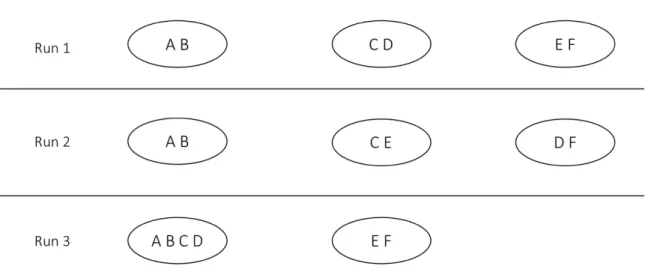
Figure 1. Clusters produced by three runs of a clustering algorithm. ... 16
Figure 2. Robustness of four hierarchical algorithms on 24 transcriptomic datasets. ... 23
Figure 3. Robustness of all algorithms tested on 24 transcriptomic datasets. ... 23
Figure 4. Average robustness of each algorithm. ... 24
Figure 5. Coefficient of variation of each algorithm. ... 24
Figure 6. Pearson Correlation patterns for ten meteorological variable pairs during spring season across all the years. ... 51
Figure 7. Decomposition of air temperature data from MET instrument at facility E33 using SSA method to isolate various frequencies. ... 57
Figure 8. Outliers detected using K-means method at facility E33. X-axis represents the daily meteorological time series, colored by cluster (weather regime) they belong to, while Y-axis shows the distance of the data point from the centroid of its cluster (weather regime). ... 60
Figure 9. Outliers detected at facility E33 for air temperature by Pearson correlation, SSA and K-means algorithms. The yellow shaded areas are outliers detected by Pearson correlation. Outliers detected by both SSA and K-means algorithms are shown by red squares, while those identified by SSA and K-means only are indicated by black stars and orange diamonds respectively. DQR records are denoted by the vertical green shaded areas. . 61
1
Chapter 1
Introduction
2 What has come to be known as “big data” often includes large-scale information collected from many different sources. A key characteristic of big data is its volume and complexity, which exceed the storage and analysis capability of common database software and other management tools [1].
Review of Big Data
A Brief History of Big Data
The concept of big data was mentioned as early as 1997 by Michael Cox and David Ellsworth when they worked on the visualization of computational fluid dynamics [2]. In 2000, Francis X. Diebold attempted a formal definition of big data: "explosion in the quantity (and sometimes, quality) of available and potentially relevant data, largely the result of recent and unprecedented advancements in data recording and storage technology [3].” One year later, the famous three Vs for describing big data, volume, velocity and variety, were introduced by Doug Laney [4]. Volume refers to the massive size of data, which is often bigger than petabytes [5]. Issues like computational cost and algorithmic instability are commonly seen due to such large size. Velocity is a measure of the speed of data generation, which includes data generated from batch, near real time, real time and streams [6]. One of velocity’s main challenges is noise accumulation. Noise can stem from a variety of sources, including measurement errors, missing values and outliers. Variety refers to the source of data and usually is divided into structured data, semi-structured data and unsemi-structured data [7]. The diversity of big data brings with it problems such as statistical bias, experimental variations and heterogeneity. Thus, robust algorithms are crucial to handle these issues [8]. A fourth V, value, is another important component frequently mentioned in big data analytics [9]. Value refers to insights gleaned from big data using tools such as graph algorithms, machine learning and other statistical methods [10]. Researchers have even proposed a fifth V, veracity, or certainty of data, to measure the credibility of big
3 data [11]. The copious amount and often high-dimensionality of data today presents both opportunities and challenges to modern big data analytics [6]. Thus, efficient algorithms and novel management tools are becoming a dominant focus for big data analytics. In a 2011 report, McKinsey Global Institute concludes that the two main factors of big data are as follows: 1) techniques for analyzing data, for example classification, cluster analysis, data mining and network analysis; and 2) big data technologies, such as Cassandra, cloud computing, distributed system and stream processing [9].
Examples of Big Data
Big data may come from a wide variety of fields. Examples include meteorology, genomics, neuroscience, social networks, public health, sensors, retail, financial services, transportation, web search, telecommunications and many other domains. In genomics alone, there are more than 500,000 microarray datasets publicly available due to the cheap price of genome sequencing [12]. Such a wealth of data has driven a trend where many researchers, instead of generating new data, are now concentrating on biological discovery in existing datasets [6]. Another application of big data is in the use of sensor networks. The Next Generation Weather Radar (NEXRAD), for example, collects data every five minutes over the entire U.S. (along with a few overseas locations) and makes it available to the public on Amazon S3 in real-time along with historical data dating back to June, 1991 [13]. In the field of public health, data from the U.S. healthcare system exceeded 150 exabytes in 2011 [11]. In social networks, 30 billion posts are shared on Facebook monthly. More than 100 million photos and videos are uploaded to Instagram daily. And 500 million tweets are posted on Twitter on a daily basis [14]. According to McKinsey Global Institute, projected growth in global data generated per year is 40% [9].
4 Big Data Analytics
Traditional techniques and technologies that perform well on conventional data cannot always be applied to big data. Thus, novel frameworks, tools and algorithms are needed to reach statistical accuracy and computational efficiency in modern big data analytics [6]. MapReduce is a good example. It is mainly a programming framework proposed by Google to process big data on computer clusters in parallel [15]. MapReduce consists of two steps: a map step that divides a task into many sub-tasks by a master node and assigns them to different worker nodes, and a reduce step that collects results from each worker node and analyze them together. Inspired by MapReduce and Google File System (GFS), Apache implemented Hadoop [16], its distributed file system. Hadoop is an open source cross-platform framework that contains an Hadoop Distributed File System (HDFS) to store big data with reliability and an Hadoop processing unit to form a MapReduce programming framework [17]. In 2010, Apache created Spark, a big data analytics engine, to outperform Hadoop in MapReduce [18]. In addition to these frameworks, big data issues are sometimes addressed using High Performance Computing (HPC) clusters. Unlike the frameworks mentioned previously, HPC clusters run faster, but require users to define their own data model using, for example, the Message-Passing Interface (MPI) because they have no upper level abstraction [1]. Representative clusters include Berkeley lab's the National Energy Research Scientific Computing Center (NERSC), and Oak Ridge National Laboratory (ORNL)’s the Compute and Data Environment for Science (CADES) and Summit, the fastest supercomputer in the world as of this writing [19]. To manage big data across many servers and even different data centers, Facebook developed a distributed NoSQL database system Cassandra [20]. Other popular database systems for big data are MongoDB, HBase, Neo4j and Hive. Cloud computing refers to the computing services provided by data centers without user maintenance [21]. According to vendors like Google App Engine, Microsoft Azure and Amazon AWS, these services can be classified into Software as a Service (SaaS), Infrastructure as a Service (IaaS) and Platform as a Service (PaaS)
5 depending on the type of products they provided. More and more big data is now generated, stored, and analyzed in the cloud.
Most techniques or algorithms on big data can be classified into one of several broad categories. Examples include cluster analysis, graph analytics, machine learning, data mining, natural language processing, neural networks, pattern recognition and spatial analysis [22]. These categories often overlap with no clear boundaries [23]. For instance, graph analytics includes graph partitioning, matchings, and graph clustering, each of which is also used for pattern recognition and data mining [24, 25]. In addition, each category itself has a wide range of applications in many different fields. For example, graph clustering algorithms have been applied to genomics, social networks and transportation. Effective scalable graph algorithms are especially important for big data.
Applications
The rise of big data promises many applications. In 2012, the Obama administration announced the “Big Data” initiative of $200 million to invest in research and development [26]. With the help of big data analytics, McKinsey estimates that more than $300 billion could be saved per year in U.S. healthcare [9]. Researchers have applied machine learning to big data to understand competitors and develop winning tactics in soccer [27]. Walmart detects patterns in their massive set of transaction data to help set prices and target advertisements [23].
Experimental Data
Perhaps the best algorithmic testbed available today is comprised of biological data, which includes data derived from experiments with DNA, RNA, proteins, metabolites and other sources. Due to its ease-of-access and diversity, we concentrate mainly on transcriptomic data, which simultaneously measures the
6 abundance of thousands of different mRNAs. DNA microarrays and next-generation sequencing (RNA-Seq) are two techniques for measuring transcript expression levels [28]. Here we focus only on publicly-available transcriptomic data downloaded from the Gene Expression Omnibus (GEO) [29], and use data from five species: baker’s yeast (S. cerevisiae), fruit fly (D. melanogaster), bacteria (E. coli), mouse (M. musculus) and fungi(P. chrysogenum).
For another rich yet considerably different algorithmic testbed we turn to meteorological data, specifically Atmospheric Radiation Measurement (ARM) sensor data. This data includes observational measurements of Earth’s climate from many ARM instruments distributed around the globe [30], and can be downloaded from the ADC website (https://www.arm.gov/data). ARM data comes in many forms, and includes readings from observation cameras, weather radars such as C-Band Scanning ARM Precipitation Radar (CSAPR), and satellite observations. In this work we will focus only on meteorological observation data from ARM's biggest facility located in Oklahoma, using these five core variables: air temperature, vapor pressure, atmospheric pressure, relative humidity and wind speed.
Graph Theoretical Basics and Related Algorithms
A graph ! = ($, &) is formed by a set of vertices $(!) and a set of edges &(!). Graphs mentioned in the dissertation are simple, finite, undirected and unweighted, unless otherwise stated. Two vertices (, ) are said to be adjacent if () ∈ &(!). A graph !, = -$,, &. / is a subgraph of ! = ($, &), if $, ⊆ $ and &, ⊆ &. The neighborhood of a vertex ( is a subgraph of ! induced by a set of vertices adjacent to vertex (, and denoted 1((). The cardinality of 1(() is the degree of (.
A clique, or complete subgraph, is a subgraph in which each vertex is connected to every other vertex in that subgraph. A maximal clique is a clique to
7 which no vertex can be added to form a larger clique. A maximum clique is a largest maximal clique. The clique number, 2(!), is used to denote the number of vertices in a maximum clique. The classical clique decision problem, where one is given a graph G and an integer k and asked whether G contains a clique of size k, is NP -complete [31]. For the maximal clique enumeration problem, the Bron-Kerbosch algorithm and Tomita et al. are two popular choices [32, 33]. Eblen et al. presented an efficient way to enumerate all maximum cliques [34], which has made testing of the selection strategies in Chapter 3 computationally feasible.
A paraclique is a near-clique, that is, one that is missing a handful of edges [35]. It is designed to ameliorate the effects of noise, and is constructed by first finding a maximum clique, C, and then adding vertices adjacent to most but not all of C in a tightly controlled fashion.
Similarity Metrics
A graph can be formed by treating entities, for example genes or proteins, as vertices. We often wish to know how similar each entity is to others. Depending on the application, such similarity can represent physical characteristics, location, or how the entities respond to different conditions. Similarity metrics for this purpose yield a single score for each pair. That score is then used to weigh the graph’s edges. Multiple methods are available to measure similarity. The selection of an appropriate similarity metric is highly dependent on the type and nature of the data and the goals of the analysis. When the data consists of measurements across multiple conditions, Pearson correlation is among the most commonly used similarity metrics [36]. It measures the linear relationship between entities. Spearman correlation is the Pearson correlation between the rankings of two entities and is resistant to outliers [37]. If one seeks non-linear relationships, mutual information is a good candidate [38]. Jaccard similarity is often used for similarity measurements of two sets [39]. Cosine similarity measures the similarity
8 between two non-zero vectors in vector space and is often applied to document comparison [40]. Euclidean distance is the straight-line distance between two entities in Cartesian space. Different from Euclidean distance, Manhattan distance is the sum of absolute differences of two entities' Cartesian coordinates. For mixed data, Goodall [41] and Gower [42] are good choices.
Thresholding
One technique for creating a graph is to let vertices in the graph represent entities and to weight the edges with the similarity between each pair of entities. This, of course, requires computation of all pairwise similarities. The result is a weighted graph which can then be transformed to an unweighted graph by picking a threshold and retaining only those edges at or above the threshold. Threshold selection is a topic of ongoing research. Many researchers pick a threshold, for example 0.875 Pearson correlation, based on their previous experience [43]. More rigorous methods for optimal threshold selection have been proposed, including the use of spectral graph theory [44]. In Chapter 2, we apply this technique to obtain rigorous thresholds for robustness comparisons.
Evaluation of Cluster Quality
Clustering is an important method for big data analytics. Chapters 2 and 3 in this dissertation each focus on a different aspect of clustering. In Chapter 3, we need a measure of cluster quality to test whether one clustering is “better” than another. Such a measure, however, can be difficult to quantify because often the ground truth is unknown. Cluster quality can be measured either by some theoretical standards or using a known classification scheme [39, 45, 46]. In the former case, commonly used statistical metrics include modularity [47], clustering coefficient [48, 49], silhouette coefficient [50], and adjusted mutual information [51]. In the latter case, domain-specific knowledge such as ontological enrichment [52, 53] is often applied to compare clusters extracted from transcriptomic data. In Chapter
9 3, we employ the latter method, using Gene Ontology (GO) [54, 55] categories to measure the quality of generated paracliques by comparing their enrichment p-values.
Contributions of this Dissertation
First, we concentrate on the ubiquitous clustering problem and introduce a robustness metric to measure the stability of a clustering algorithm when set to different parameters. Using transcriptomic data and a variety of commonly used clustering algorithms, we demonstrate how the robustness of the algorithms can be measured and compared. According to our tests, hierarchical methods and the paraclique algorithm have higher robustness scores than a host of other commonly-used clustering algorithms.
Second, we maintain our focus on clustering and evaluate tuning strategies for procedures such as the paraclique algorithm. Maximum clique methods typically return only the first one found, even though there may be many others [34]. We perform empirical testing on three different maximum clique selection strategies and find that selecting a maximum clique with highest average edge weight tends to produce superior results on transcriptomic data.
Third, we turn our attention to outlier detection, another foundational problem associated with big data, and concentrate on the analysis of time series data. We describe a novel automated framework for meteorological data collected via distributed sensors. We test the framework on ARM sensor data collected over an area of Oklahoma and stored in the database, where entries about outliers were inserted manually. Experimental results show that some 88.9% of outliers detected by the framework are not found in the database.
10
Chapter 2
A Robustness Metric for Biological Data Clustering
Algorithms
11 A version of this chapter written by Yuping Lu, Charles A. Phillips and Michael A. Langston has been submitted for publication and is currently under review.
My contribution was to collect the data from GEO, run the clustering algorithms, and calculate each algorithms’ robustness.
Abstract
Cluster analysis is a core task in modern data-centric computation. Algorithmic choice is driven by factors such as data size and heterogeneity, the similarity measures employed, and the type of clusters sought. Familiarity and mere preference often play a significant role as well. Comparisons between clustering algorithms tend to focus on cluster quality. Such comparisons are complicated by the fact that algorithms often have multiple settings that can affect the clusters produced. Such a setting may represent, for example, a preset variable, a parameter of interest, or various sorts of initial assignments. A question of interest then is this: to what degree do the clusters produced vary as setting values change? This work introduces a new metric, termed simply “robustness,” designed to answer that question. Robustness is an easily-interpretable measure of the propensity of a clustering algorithm to maintain output coherence over a range of settings. The robustness of eleven popular clustering algorithms is evaluated over some two dozen publicly available mRNA expression microarray datasets. Given their straightforwardness and predictability, hierarchical methods generally exhibited the highest robustness on most datasets. Of the more complex strategies, the paraclique algorithm yielded consistently higher robustness than other algorithms tested, approaching and even surpassing hierarchical methods on several datasets. Other techniques exhibited mixed robustness, with no clear distinction between them. Robustness provides a simple and intuitive measure of the stability and predictability of a clustering algorithm. It can be a useful tool to
12 aid both in algorithm selection and in deciding how much effort to devote to parameter tuning.
Background
Clustering algorithms are generally used to classify a set of objects into subsets using some measure of similarity between each object pair. Comparisons between clustering algorithms typically focus on the quality of clusters produced, as measured against either a known classification scheme or against some theoretical standards [39, 45, 46]. In the former case, varying criteria for what constitutes a meritorious cluster are often applied, employing domain-specific knowledge such as ontological enrichment [52, 53], geographical alignment [56] or legacy delineation [57]. In the latter case, statistical quality metrics are most often used, with cluster density something of a gold standard. Examples include modularity [47], which measures the density of connections within clusters versus density of connections between clusters, clustering coefficient [48, 49], which gives the proportion of triplets for which transitivity holds, and silhouette coefficient [50], which is based on how similar a node is to its own cluster as compared to other clusters. Additional metrics include the adjusted rand index [58], homogeneity [59], completeness [60], V-measure [61], and adjusted mutual information [51]. No single algorithm is of course likely to perform best over every metric.
In this chapter, we consider algorithmic comparisons from another perspective. Rather than attempt to measure the quality or correctness of the clusters themselves, we focus instead on the sensitivity of an algorithm’s clusters to changes in its various settings. The metric we introduce, which we term “robustness,” provides a relatively simple measure of a clustering algorithm's stability over a range of these settings. We note that robustness should not be confused with other clustering appraisals such as correctness or resistance to
13 noise, which are studied elsewhere in the literature. And while it might seem tempting to try to combine multiple notions, such as accuracy and robustness, into some single metric, the resultant analysis is fraught with complexity and well beyond the scope of this work.
In order to demonstrate the utility of robustness, we chose transcriptomic data publicly available from the GEO [62]. This is a relevant and logical choice given current technology because of gene co-expression data’s ready abundance, availability and standardized format, and because clustering of this sort of data is such an overwhelmingly common task in the research community’s quest to discover and delineate putative molecular response networks.
Methods
Algorithms
Clustering algorithms typically have one or more adjustable settings. For instance, such a setting may denote a preset variable, a relevant parameter, or sets of initial assignments. Sometimes the only setting available is the number of clusters desired. To make the scope of this work manageable, and to keep comparisons as equitable as possible, we only consider algorithms that produce non-overlapping clusters, and that are unsupervised, in the sense that classes into which objects are clustered are not defined in advance. (We deviate from this very slightly in the case of NNN [63], which allows a pair of clusters to share a single element.) For each method considered we selected a range of settings commonly used in practice.
Different algorithms may produce (sometimes vastly) different clusters, as may different settings of the same algorithm. In a previous comparison of genome-scale clustering algorithms [39], we focused on cluster enrichment, using Jaccard similarity with known GO and KEGG annotation sets as a measure of cluster
14 quality. In that study, graph-theoretical methods outperformed conventional methods by a wide margin. A natural question then is whether something along the same line may hold for robustness.
Robustness
We seek to define a measure of robustness that can provide a single, easily-interpretable metric that captures the tendency of a clustering algorithm to keep pairs of objects together over a range of settings. Indeed, each algorithm may have its own optimum settings. We did not try to isolate such settings, but rather to measure an algorithm's sensitivity to parameter variations. Let us consider the results of a single clustering algorithm (ALG). If in any run ALG assigns a pair P of objects to at least one cluster, then we define P’s robustness to be the proportion of clustering runs in which P appears together in any cluster. Thus, for example, if genes A and B appear together (in any cluster) in 17 of 23 clustering runs, then the score for that pair is 17 / 23 = 0.7391. We extend this from P to ALG by defining ALG’s robustness, R, as the average score of all such candidates for P. In this fashion, robustness is measured for one algorithm and for one dataset, but over multiple runs (setting values).
Formally, we therefore set R = t / (dr), where t denotes the total number of (not necessarily distinct) pairs of objects that appear together in some cluster summed over all runs, d represents the number of distinct pairs of objects that appear together in some cluster produced by some run, and r is the number of times the clustering algorithm was run, each run using a different value for some setting of interest. In other words, robustness is the proportion of clustering runs in which a pair of entities appears together in some cluster, given that they appear together in a cluster in at least one run, averaged over all such pairs. R thus lies in the interval (0, 1] and, when all else is equal, we seek algorithms with R values as high as possible. Note that the effect of a pair appearing (or failing to appear) in a
15 cluster is typically minor as it only reduces by one the denominator in the above formula. In order to compare robustness values fairly, we were careful to select a range of values that produced clusters of the same scale. The number of clusters was not a consideration, except of course for algorithms such as K-means where the number of clusters is itself the parameter being varied.
We illustrate the notion of robustness with an elementary example based on three runs of some arbitrary clustering algorithm. As shown in Figure 1, pair (A, B) appears in some cluster in all three runs. Its robustness score is therefore 3/3. Pair (C, D), on the other hand, appears in some cluster in only two of three runs. Its score is thus 2/3. Robustness scores for all pairs that appear in at least one cluster are as follows: (A, B): 3/3; (A, C): 1/3; (A, D): 1/3; (B, C): 1/3; (B, D): 1/3; (C, D): 2/3; (C, E): 1/3; (D, F): 1/3; and (E, F): 2/3. We now simply average these scores to compute R, making the robustness of the algorithm that produced these clusters 0.481.
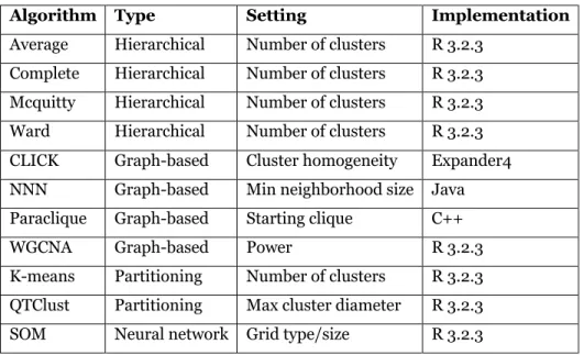
We tested several sorts of clustering algorithms, from conventional hierarchical clustering [64], to partitioning methods such as K-means [65] and QTClust [66], to graph-based methods such as paraclique [35, 67], CLICK [68], NNN [63] and WGCNA [69]. We also included SOM [70], a neural network method. Hierarchical clustering assigns items to clusters using a measure of similarity between clusters. Assignments are irrevocable; once an item has been placed in a cluster, it will remain in that cluster. Hierarchical clustering generally comes in two variants: bottom-up (agglomerative), which starts with size one clusters and iteratively combines clusters until only one is left, and top-down, which begins with all genes in one cluster, and then iteratively divides clusters until all clusters are size one. Agglomerative clustering is the simpler and more popular of the two, needing only a linkage criterion to compute cluster similarity. We therefore tested the agglomerative approach with four such criteria: average linkage [71], complete linkage [72], McQuitty [73], and Ward [74].
16
17 Graph-based methods model items as vertices, with edges between items determined based again on some sort of similarity measure. To create graphs for transcriptomic data on which to run the paraclique method, we constructed co-expression networks as described in [43]. Genes were thus represented by vertices, while edges were weighted by Pearson product-moment correlation coefficients. A threshold was then applied to the network, so that an edge was retained if and only if its weight was at or above this threshold. In some circles, it has been fashionable to choose an arbitrary threshold, for example 0.85, based on previous experience [75-77]. We prefer a more mathematical and unbiased treatment based on spectral graph theory, whereby eigenvalues are computed over a range of potential thresholds, with the final threshold set using inflection points in network topology [44]. After thresholding, the paraclique method employs clique to help find extremely densely-connected subgraphs, but ones that may be missing a small number of edges [35, 67]. To generate such a cluster, paraclique isolates a maximum clique, then uses a controlled strategy to combine other vertices with high connectivity. Paraclique vertices are then removed from the graph, and the process repeated to find subsequent paraclique clusters. CLICK uses a graph-based statistical method to identify kernels and then expands them into full clusters with several heuristic approaches [68]. NNN, like paraclique, depends upon finding cliques, but only cliques of a specified (typically small) size. It edits a graph by connecting each vertex only to the k most similar other vertices according to some metric such as Pearson correlation, where k is a user-selected value. NNN merges overlapping cliques in the resulting graph to form an initial set of networks. It then divides the preliminary network at any existing articulation points, and ensures that no cluster is larger than half the number of input vertices. WGCNA operates on weighted networks using a soft threshold, raising the similarity matrix to a user-selected power in order to calculate extended adjacencies [69]. It then identifies gene modules using average linkage hierarchical clustering and dynamic tree cut methods. K-means clustering [65, 78] randomly selects k centroids and assigns genes to the nearest centroid, iteratively reassigning and recalculating centroids
18 until it converges. QTClust is a method developed specifically for gene expression data [66]. It builds a cluster for each gene, outputs the largest cluster, then removes these genes and repeats the process until no genes remain. SOM is a machine learning approach that groups genes using unsupervised neural networks. SOM repeatedly assigns genes to the most similar node until the algorithm converges [70].
In all, we tested four hierarchical methods, four graph-based methods, two partitioning methods, and one neural network method. We used publicly available versions of each technique. Most are available in R [79]. Table 1 provides a summary, along with the setting we varied for each algorithm.
Data
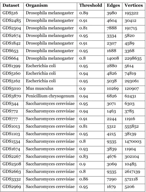
In previous work [39] we used Saccharomyces cerevisiae data from [80] to test cluster quality. In this chapter, we expand the test suite to 24 gene co-expression datasets from GEO, including the species Drosophila melanogaster, Escherichia coli, Mus musculus and Penicillium chrysogenum. Data from these organisms have been well-studied and annotated. All data are log2 transformed. Table 2 provides an overview of these datasets, along with the threshold selected using the aforementioned spectral techniques.
Comparisons
To compare algorithmic robustness, we altered a common setting for each method as specified in Table 1, selecting a range of values that produced clusters of the same scale. We transformed the myriad of output formats to simple cluster/gene membership lists. We also controlled r, the number of runs (values for each setting), to reduce its influence on our results. Runtime performance was not a consideration, although one algorithm, QTClust, never finished on dataset GDS5010, even after two weeks. We did not therefore obtain QTClust robustness
19 for that input. The robustness of each algorithm on each dataset was calculated for all runs over the range of settings.
Three algorithms (K-means clustering, hierarchical clustering and SOM) take the desired number of clusters as input. We thus selected this as the most appropriate setting to alter, and tested values from 200 to 300 so as to produce a range of average cluster sizes in line with the other algorithms. For example, hierarchical clustering produces a tree of clusters, and one obtains a list of disjoint clusters by choosing an articulation point in the tree. For SOM, we transformed the number of clusters to grid size. For example, when using 35 as the number of clusters (for dataset GDS344), the grid size was 5*7. We tested five grid sizes and two grid types (rectangular and hexagonal) for each dataset. We applied ten different powers (2, 4, 6, 8, 10, 14, 18, 22, 26 and 30) for WGCNA. For QTClust, we picked up ten different maximum cluster diameters from 0.05 to 0.5 with interval 0.05. For NNN, we chose ten different minimum neighborhood sizes ranging from 16 to 25. For CLICK, we applied nine homogeneity values (0.1, 0.2, 0.3, 0.4, 0.5, 0.6, 0.7, 0.8 and 0.9). For paraclique, we created graphs in the usual fashion, by calculating all pairwise correlations and placing edges between pairs correlated at or above a selected threshold. We controlled the number of paracliques generated so that they are in the same scale with other algorithms. We used the choice of maximum clique as the setting to vary. Dataset GDS772, for example, at threshold 0.94, resulted in a graph with nine maximum cliques. And so it was these nine cliques that provided variation. As can be seen from Table 2, over all inputs the threshold selected by spectral methods ranged from 0.8 to 0.95.
20
Table 1. Clustering methods tested for robustness.
Algorithm Type Setting Implementation
Average Hierarchical Number of clusters R 3.2.3 Complete Hierarchical Number of clusters R 3.2.3 Mcquitty Hierarchical Number of clusters R 3.2.3 Ward Hierarchical Number of clusters R 3.2.3 CLICK Graph-based Cluster homogeneity Expander4 NNN Graph-based Min neighborhood size Java Paraclique Graph-based Starting clique C++ WGCNA Graph-based Power R 3.2.3 K-means Partitioning Number of clusters R 3.2.3 QTClust Partitioning Max cluster diameter R 3.2.3 SOM Neural network Grid type/size R 3.2.3
21
Results
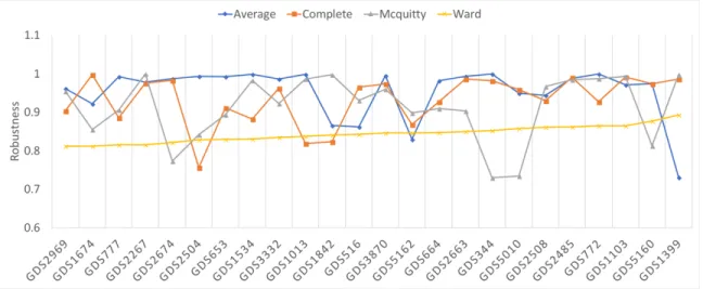
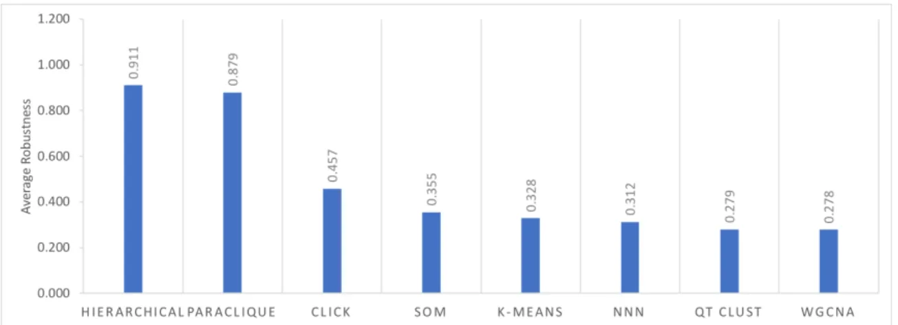
Figure 2 shows robustness results for the four hierarchical algorithms, as tested across the 24 datasets previously described. Because all have robustness above 0.72, we averaged their scores to simplify Figure 3, which shows robustness results for all algorithms tested. As can be seen from this figure, hierarchical clustering and paraclique exhibit higher robustness than other algorithms. In fact, hierarchical clustering and paraclique have average robustness scores above 0.87, while all others are below 0.5. Figure 4 summarizes the results into an average robustness of each algorithm.
We also calculated the coefficient of variation (CV), the ratio of the standard deviation to the mean, as a measure of the stability of an algorithm’s robustness. Hierarchical clustering exhibits the lowest CV, meaning that its robustness varies little across different datasets, whereas CLICK exhibits the highest CV. See Figure 5.
Discussion
It is not unexpected that hierarchical methods display the highest overall robustness. After all, results thereby produced form a hierarchical tree of successively merged clusters, so that varying the number of clusters simply cuts the tree at a different height, while the tree itself does not change. Once a pair of items appears together in some cluster, any decrease in the number of clusters on subsequent runs will continue to place that pair into the same cluster.
22
Table 2. Gene expression datasets tested in this study.
Dataset Organism Threshold Edges Vertices
GDS516 Drosophila melanogaster 0.89 3980 195322 GDS2485 Drosophila melanogaster 0.91 4604 30412 GDS2504 Drosophila melanogaster 0.81 7888 191715 GDS2674 Drosophila melanogaster 0.95 3334 5820 GDS1842 Drosophila melanogaster 0.91 2307 4589 GDS653 Drosophila melanogaster 0.95 1688 3368 GDS664 Drosophila melanogaster 0.8 14008 2298635 GDS1399 Escherichia coli 0.95 2880 5614 GDS5160 Escherichia coli 0.94 4826 74819 GDS5162 Escherichia coli 0.95 5038 293061 GDS5010 Mus musculus 0.9 10269 120907 GDS3870 Penicillium chrysogenum 0.94 6826 62431 GDS344 Saccharomyces cerevisiae 0.95 3071 6303 GDS772 Saccharomyces cerevisiae 0.94 1463 3785 GDS777 Saccharomyces cerevisiae 0.91 2244 11916 GDS1013 Saccharomyces cerevisiae 0.81 5312 555852 GDS1103 Saccharomyces cerevisiae 0.95 4215 38139 GDS1534 Saccharomyces cerevisiae 0.8 9335 1470003 GDS1674 Saccharomyces cerevisiae 0.93 3839 11904 GDS2267 Saccharomyces cerevisiae 0.83 4676 302104 GDS2508 Saccharomyces cerevisiae 0.9 3069 10485 GDS2663 Saccharomyces cerevisiae 0.8 9335 2617139 GDS3332 Saccharomyces cerevisiae 0.86 7290 572118 GDS2969 Saccharomyces cerevisiae 0.95 1679 5206
23
Figure 2. Robustness of four hierarchical algorithms on 24 transcriptomic datasets.
24
Figure 4. Average robustness of each algorithm.
25 One might expect similar behavior from WGCNA, since it uses hierarchical clustering to identify modules. Because WGCNA uses soft-power to construct its network, however, the topology of each weighted network changes with different powers, so that item pairs are not at all stable. For K-means, as one alters the number of clusters (and hence centroids), the centroid with which a particular item is associated can change, while not changing an item’s neighbors’ centroids. Thus, items often shift to different clusters as the number of clusters changes. SOM and QTClust behave in similar fashion, in that grid size has a large effect on SOM while the partitioning performed by QTClust can divide pairs of formerly clustered items. Of the graph-based methods, CLICK and NNN first try to find a base cluster and then absorb other items into it. The absorbed items may change with different settings, affecting the clusters generated. For paraclique, the high robustness with different starting cliques is likely due in part to the fact that many of these cliques have significant overlap [34], at least on transcriptomic data. Many gene pairs may thus be included in a given cluster, no matter which maximum clique is selected. We have also observed quite similar overlap in graphs derived from many diverse types of data, including for example that derived from social and communications networks.
It is probably worth noting how robustness compares to accuracy and sensitivity [81], two popular clustering metrics. Accuracy measures faithfulness to ground truth. We make no assumptions, however, that ground truth is available or that it can even be known. Sensitivity most commonly refers to random noise or outliers. Robustness is not really related to either. A clustering algorithm could be highly sensitive to random noise, for example, and still have either high or low robustness.
This brings us to interpretation. How is the user to make sense of all this information? In our opinion, an algorithm with high robustness is generally preferable whenever it is difficult to determine optimum parameter settings. This
26 is of course because its results are unlikely to vary greatly across an entire range of these settings. As a case in point, if ground truth is largely unknown, or if hierarchical structure is implicit in the data under study, then hierarchical clustering can serve at least as a good starting candidate given its excellent robustness, relative simplicity and intuitive appeal. For more complex clustering tasks, however, we would endorse instead a graph-theoretical method such as paraclique due to its solid overall robustness and its much improved potential for biological fidelity [39].
Conclusions
We have introduced a new clustering metric, termed “robustness,” in an effort to provide the research community with a simple, intuitive and informative measure of the stability and predictability of a clustering algorithm’s behavior. To demonstrate its use, we have employed a suite of transcriptomic datasets as an unbiased testbed for algorithmic variation and evaluation. Widely-available data such as this provides a well-understood basis on which to introduce, explain and illustrate the use of the robustness metric. We hasten to add that robustness can, quite naturally, be applied to virtually any sort of omics data, or in fact to practically any sort of data on which clustering may be performed.
Simple hierarchical clustering displayed the highest overall robustness, due no doubt to the rigidly fixed tree structure of its clusters. Of the more sophisticated methods tested, only paraclique demonstrated similar robustness, thus demonstrating its resilience to the choice of starting maximum clique. In practice, one might expect that selecting such a clique with, say, the highest overall edge weight would be preferable. And certainly, that has much intuitive appeal. Nevertheless, our results show that it does not really much seem to matter, at least on data akin to those we’ve employed here.
27 Open questions abound. Note, for example, that robustness can be applied to virtually any non-overlapping clustering algorithm. All one needs is a reasonable settings range. What then of powerful clustering algorithms like clique? Clique is nonparametric and thus without settings. And one of its core strengths is actually its propensity to produce overlapping clusters on biological data (genes, for example, are very often pleiotropic, and thus likely to belong to multiple clusters). We are studying these and other related questions, and observe that for methods such as clique, in fact for essentially all clustering methods, an alternate notion of robustness might try to capture output predictability as the underlying network is perturbed.
28
Chapter 3
Clique Selection and its Effect on Paraclique
Enrichment: An Experimental Study
29 A version of this chapter written by Yuping Lu, Charles A. Phillips, Elissa J. Chesler and Michael A. Langston has been submitted for publication and is currently under review.
My contribution was to write a suite of scripts to compare weighted paraclique enrichment p-values and to analyze the results.
Abstract
The paraclique algorithm provides an effective means for biological data clustering. It satisfies the mathematical quest for density, while fulfilling the pragmatic need for noise abatement on real data. Given a finite, simple, edge-weighted and thresholded graph, the paraclique method first finds a maximum clique, then incorporates additional vertices in a controlled manner, and finally extracts the subgraph thereby defined. When more than one maximum clique is present, however, deciding which to employ is usually left unspecified. In practice, this frequently and quite naturally reduces to using the first maximum clique found. In this chapter, maximum clique selection is studied in the context of well-annotated transcriptomic data, with ontological classification used as a proxy for cluster quality. Enrichment p-values are compared using maximum cliques chosen in a variety of ways. The most appealing and intuitive option is almost surely to start with the maximum clique having the highest average edge weight. Although there is of course no guarantee that such a strategy is any better than random choice, results derived from a variety of experiments indicate that, in general, this approach produces a small but statistically significant improvement in overall cluster quality.
30
Introduction
Clustering is a core task in biological network analysis, whereby a cluster is typically defined as a dense subnetwork extracted from high throughput omics data using some measure of pairwise similarity between genes, proteins, metabolites or other biological entities. Popular similarity metrics include Pearson’s product-moment correlation, Spearman's and Kendall’s rank correlations, and methods better suited for handling nonlinear relationships such as mutual information. An oft-used example is based on DNA microarray and gene co-expression analysis [82-84] in the context of the relevance network framework [85, 86]. In this setting, we begin with a complete graph whose vertices denote probe sets (gene surrogates), each of whose edges is assigned a weight equal to the similarity across all samples of the expression levels of its endpoints. Thresholding [44] produces an incomplete, unweighted graph on which scalable, state-of-the-art graph theoretical algorithms can be applied. The increased biological fidelity produced by these algorithms has previously been studied [39], further motivating their use. Well-known examples include clique-centric methods such as the bottom-up approach originally called k-clique communities [87] (now renamed clique percolation), and the more efficient top-down strategy known as paraclique first introduced in [35].
A main aim of the paraclique algorithm is to ameliorate the effects of noise, primarily by reducing type II errors (false negatives). It accomplishes this by expanding a maximum clique in a tightly-controlled manner with non-clique vertices that are adjacent to most, but not necessarily all, elements of the clique. We refer the reader to [67] for a density analysis and formal description of the paraclique method. A major motivation for such a strategy rests in the fact that clique-centric methods are highly sensitive to so-called “missing” edges, which may be lost due to noise, experimental data capture, the effects of thresholding, and a variety of other factors dependent on the problem at hand. The paraclique
31 algorithm has found utility in numerous network science domains. In the health sciences alone, it has been employed in the study of lung cancer [88] and the exposome [89], as well as in transcriptomics [90], proteomics [91], epigenetics [92, 93], diabetes [94], allergic rhinitis [95], obesity [96], community-acquired pneumonia [97] and even in studying the impact of low dose ionizing radiation [98].
The main feature of interest here is the selection criteria for the maximum clique chosen for expansion. This question may at first seem moot given the computational recalcitrance of finding even one maximum clique, a classic NP-complete problem [31]. But modern, practical algorithms make it feasible not only to find a single maximum clique, but to enumerate all of them [34]. With such capability now at hand, we created a test suite of graphs to measure the significance and consistency of maximum clique selection on cluster quality. For these we retained original edge weights, employed the well-known Gene Ontology (GO) [54, 55] as a proxy for a ground truth, and performed enrichment analysis [52] to determine how likely a cluster’s contents are to occur by mere chance alone. For each graph thus constructed, we compared paracliques expanded from a maximum clique with the highest average edge weight, from another with the lowest average edge weight, and from one chosen at random. We note that, for a given graph, all maximum cliques have the same size, and thus a maximum clique with the highest (lowest) average edge weight will naturally also have the highest (lowest) total edge weight.
Main text
Experimental Data
We employed 28 Saccharomyces cerevisiae microarray expression datasets obtained from the Gene Expression Omnibus (GEO) [29, 62, 99]. S. cerevisiae is
32 one of the simplest and best-studied eukaryotic organisms, possessing numerous essential cellular processes analogous to those found in humans. The first column of Table 3 contains the GEO accession numbers for datasets used in this study. For each, we constructed 21 unweighted graphs using Pearson’s product-moment correlations, with thresholds set at uniform increments of 0.01 over the interval 0.70 to 0.90. This produced a total of 588 graphs ranging in size from 1893 to 9335 vertices. Densities ranged from roughly 0.09% to 25%, where we define density in the usual way as the number of edges present divided by the maximum number of edges possible. On each such graph we tested the three aforementioned maximum clique selection strategies, and ran the paraclique algorithm using the ORNL CADES platform [100], a Cray CS400 with Intel Xeon E5-2698 v3 and 128–256 GB of RAM per node. We halted a run only if it failed to complete its task within 48 hours. All but 20 graphs were solved in this fashion. (These 20 were of course excluded from the analysis.) Over the remaining 568 graphs, we then performed GO functional enrichment using the tools at DAVID [53] on the first paraclique produced in each of the 1704 resultant paraclique listings. To produce a single score for each paraclique, we computed the p-value of its most significant GO term.
Results
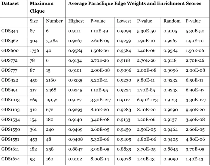
In Table 3, we list results obtained for graphs constructed at a sample threshold 0.80. Often the choice between a highest, a lowest, and a randomly-chosen maximum clique makes little difference in p-value. On the other hand, this difference can sometimes be quite large, as is seen for example in the case of GDS2267. Of these 28 graphs, 11 had a better p-value in the paraclique constructed using a highest weight maximum clique versus a lowest weight maximum clique, nine exhibited no difference, and in eight a maximum clique of lowest weight produced a paraclique with a better p-value than did a maximum clique of highest weight. Thus, the ratio 11/8=1.375 denotes a measure of how often a better p-value was obtained by choosing a highest versus a lowest weight maximum clique. If this
33 ratio across all tests tends to be consistently greater than 1, then it may be viewed as a reliable indication that selecting a highest weight maximum clique generally produces more highly enriched paracliques, which may then result in improved average cluster quality.
Comparisons Between Highest and Lowest Weight Maximum Cliques
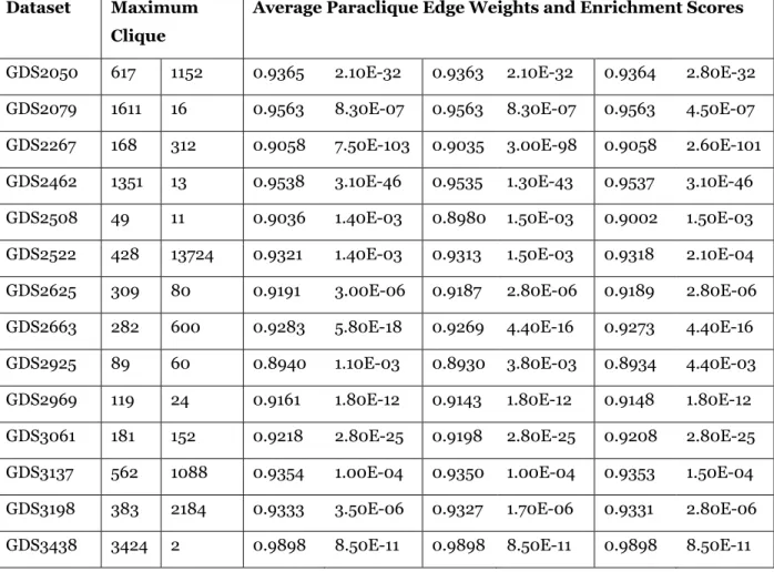
In Table 4, we summarize results comparing a highest weight paraclique to a lowest weight paraclique for all 21 thresholds under study. For each threshold, we list the number of graphs in which a highest weight maximum clique produced a lower p-value paraclique than did a lowest weight maximum clique, the number of graphs in which the reverse was true, the number of graphs in which the p-values were no different, and a ratio denoting the number of times highest weight was better to the number of times lowest weight was better. Overall, highest weight was better in 234 graphs, there was no difference in 177 graphs, and lowest weight was better in 157 graphs. Interestingly, the ratio was greater than one at all 21 thresholds, suggesting that it is generally beneficial to select a maximum clique of highest weight over one of lowest weight. Over the 1136 graphs tested, choosing a highest versus a lowest weight maximum clique resulted in improved cluster quality 1.490 times more often than it resulted in worse cluster quality. To estimate statistical significance, we employed two binomial tests. For the first test, shown in the last column of Table 4, we assumed an equal likelihood for each of three possible outcomes: a better, a worse, or an unchanged p-value. Overall, this test yielded a significant result, with p = 0.0000163. For the second test, we used the observed proportion of graphs for which there was no difference as an estimate of the proportion of “no difference” graphs in the population. This assumed that, for all other graphs, a paraclique constructed using a highest versus a lowest weight maximum clique had equal likelihood of producing a better p-value. This test was also significant, with p = 0.00047.
34
Table 3. Experimental results obtained at a threshold of 0.80. Dataset Maximum
Clique
Average Paraclique Edge Weights and Enrichment Scores
Size Number Highest P-value Lowest P-value Random P-value GDS344 87 6 0.9111 1.10E-49 0.9099 5.30E-50 0.9105 5.30E-50 GDS362 304 75184 0.9267 2.60E-09 0.9259 1.90E-10 0.9267 1.90E-10 GDS600 1736 40 0.9584 1.50E-06 0.9584 1.40E-06 0.9584 1.50E-06 GDS772 78 6 0.9134 2.70E-26 0.9118 2.70E-26 0.9118 2.70E-26 GDS777 87 15 0.9101 2.00E-08 0.9096 2.00E-08 0.9096 2.00E-08 GDS922 450 2160 0.9235 5.20E-11 0.9230 5.80E-11 0.9232 6.50E-11 GDS991 317 2468 0.9245 1.10E-95 0.9224 1.70E-85 0.9243 6.90E-97 GDS1013 269 19152 0.9127 3.30E-127 0.9112 6.90E-123 0.9123 3.30E-127 GDS1103 312 672 0.9293 8.10E-20 0.9283 8.10E-20 0.9290 9.40E-20 GDS1534 154 180 0.9140 3.40E-08 0.9133 1.20E-06 0.9137 3.40E-08 GDS1550 361 240 0.9469 2.60E-05 0.9459 2.50E-05 0.9464 2.60E-05 GDS1551 453 48 0.9408 5.30E-06 0.9405 4.80E-06 0.9405 4.80E-06 GDS1611 182 258 0.8847 3.90E-05 0.8839 3.70E-05 0.8845 3.70E-05 GDS1674 93 160 0.9102 8.00E-14 0.9078 1.40E-13 0.9090 1.40E-13
35
Table 3. Continued. Dataset Maximum
Clique
Average Paraclique Edge Weights and Enrichment Scores
GDS2050 617 1152 0.9365 2.10E-32 0.9363 2.10E-32 0.9364 2.80E-32 GDS2079 1611 16 0.9563 8.30E-07 0.9563 8.30E-07 0.9563 4.50E-07 GDS2267 168 312 0.9058 7.50E-103 0.9035 3.00E-98 0.9058 2.60E-101 GDS2462 1351 13 0.9538 3.10E-46 0.9535 1.30E-43 0.9537 3.10E-46 GDS2508 49 11 0.9036 1.40E-03 0.8980 1.50E-03 0.9002 1.50E-03 GDS2522 428 13724 0.9321 1.40E-03 0.9313 1.50E-03 0.9318 2.10E-04 GDS2625 309 80 0.9191 3.00E-06 0.9187 2.80E-06 0.9189 2.80E-06 GDS2663 282 600 0.9283 5.80E-18 0.9269 4.40E-16 0.9273 4.40E-16 GDS2925 89 60 0.8940 1.10E-03 0.8930 3.80E-03 0.8934 4.40E-03 GDS2969 119 24 0.9161 1.80E-12 0.9143 1.80E-12 0.9148 1.80E-12 GDS3061 181 152 0.9218 2.80E-25 0.9198 2.80E-25 0.9208 2.80E-25 GDS3137 562 1088 0.9354 1.00E-04 0.9350 1.00E-04 0.9353 1.50E-04 GDS3198 383 2184 0.9333 3.50E-06 0.9327 1.70E-06 0.9331 2.80E-06 GDS3438 3424 2 0.9898 8.50E-11 0.9898 8.50E-11 0.9898 8.50E-11
36
Table 4. Paraclique with highest weight maximum clique vs paraclique with lowest weight maximum clique.
Threshold Highest Better No Difference Lowest Better Highest Better / Lowest Better Binomial P-value 0.70 16 6 4 4 2.14E-03 0.71 10 7 6 1.667 9.96E-02 0.72 10 4 8 1.25 8.44E-02 0.73 11 6 9 1.222 9.96E-02 0.74 13 8 6 2.167 4.31E-02 0.75 14 5 8 1.75 2.15E-02 0.76 11 8 8 1.375 1.12E-01 0.77 13 8 7 1.857 5.36E-02 0.78 15 7 6 2.5 1.34E-02 0.79 9 10 8 1.125 1.61E-01 0.80 11 9 8 1.375 1.23E-01 0.81 12 7 8 1.5 7.47E-02 0.82 12 8 8 1.5 8.72E-02 0.83 9 12 7 1.286 1.58E-01 0.84 10 9 9 1.111 1.50E-01 0.85 11 8 9 1.222 1.23E-01 0.86 11 8 9 1.222 1.23E-01 0.87 8 13 7 1.143 1.42E-01 0.88 10 10 8 1.25 1.50E-01 0.89 10 10 8 1.25 1.50E-01 0.90 8 14 6 1.333 1.42E-01 Total 234 177 157 1.490 1.63E-05
37
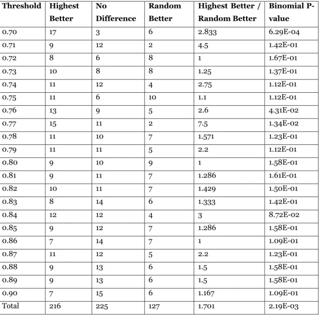
Comparisons Between Highest and Random Weight Maximum Cliques
In Table 5, we list the results of testing whether choosing a highest weight maximum clique may be superior to choosing an arbitrary maximum clique, a process we simulated by selecting a maximum clique at random from among all maximum cliques enumerated. Once again, all ratios in the penultimate column are greater than or equal to one, and so we conclude that choosing a highest weight maximum clique tends to be wiser than merely making an arbitrary choice. Overall, the highest weight was better in 216 graphs, there was no difference in 225 graphs, and a random choice was better in 127 graphs. At first these differences may not appear as striking as did the differences between using a highest versus a lowest maximum clique. For example, the number of graphs for which there was no difference is noticeably larger in Table 5 than it was in Table 4. On the other hand, choosing a highest weight maximum clique resulted in improved cluster quality 1.701 times more often than it resulted in worse cluster quality, which is a slightly higher ratio than that computed from Table 4. Moreover, repeating the two binomial tests just described, we obtained significant results for both, with p = 0.00219 and p = 0.0000278, respectively.
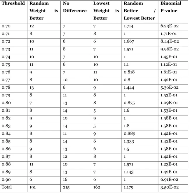
Comparisons Between Random and Lowest Weight Maximum Cliques
Lastly, we used the same approach to compare paracliques constructed using random versus lowest weight maximum cliques. The results are shown in Table 6. A random choice was better in 191 graphs, there was no difference in 215 graphs, and a lowest choice was better in 162 graphs. Although the aforementioned ratio was still above one (at 1.179), neither binomial test reached the level of significance, with p = 0.035 and p = 0.0876, respectively.
38
Table 5. Paraclique with highest weight maximum clique vs paraclique with random maximum clique. Threshold Highest Better No Difference Random Better Highest Better / Random Better Binomial P-value 0.70 17 3 6 2.833 6.29E-04 0.71 9 12 2 4.5 1.42E-01 0.72 8 6 8 1 1.67E-01 0.73 10 8 8 1.25 1.37E-01 0.74 11 12 4 2.75 1.12E-01 0.75 11 6 10 1.1 1.12E-01 0.76 13 9 5 2.6 4.31E-02 0.77 15 11 2 7.5 1.34E-02 0.78 11 10 7 1.571 1.23E-01 0.79 11 11 5 2.2 1.12E-01 0.80 9 10 9 1 1.58E-01 0.81 9 11 7 1.286 1.61E-01 0.82 10 11 7 1.429 1.50E-01 0.83 8 14 6 1.333 1.42E-01 0.84 12 12 4 3 8.72E-02 0.85 9 12 7 1.286 1.58E-01 0.86 7 14 7 1 1.09E-01 0.87 11 12 5 2.2 1.23E-01 0.88 9 13 6 1.5 1.58E-01 0.89 9 13 6 1.5 1.58E-01 0.90 7 15 6 1.167 1.09E-01 Total 216 225 127 1.701 2.19E-03
39
Table 6: Paraclique with random maximum clique vs paraclique with lowest weight maximum clique. Threshold Random Weight is Better No Difference Lowest Weight is Better Random Better / Lowest Better Binomial P-value 0.70 12 7 7 1.714 6.23E-02 0.71 8 7 8 1 1.71E-01 0.72 10 6 6 1.667 8.44E-02 0.73 11 8 7 1.571 9.96E-02 0.74 10 7 10 1 1.45E-01 0.75 11 6 10 1.1 1.12E-01 0.76 9 7 11 0.818 1.61E-01 0.77 8 10 10 0.8 1.42E-01 0.78 13 6 9 1.444 5.36E-02 0.79 8 11 8 1 1.53E-01 0.80 7 13 8 0.875 1.09E-01 0.81 8 14 5 1.6 1.53E-01 0.82 9 10 9 1 1.58E-01 0.83 9 14 5 1.8 1.58E-01 0.84 8 11 9 0.889 1.42E-01 0.85 8 14 6 1.333 1.42E-01 0.86 9 13 6 1.5 1.58E-01 0.87 8 12 8 1 1.42E-01 0.88 11 10 7 1.571 1.23E-01 0.89 8 13 7 1.143 1.42E-01 0.90 6 16 6 1 6.91E-02 Total 191 215 162 1.179 3.50E-02
40
Discussion and Conclusions
As can be seen in Table 3, there is sometimes little difference in enrichment p-values. And indeed, as can be seen in Tables 4 and 5, there are instances for which the choice makes no difference at all. Close scrutiny reveals that this is usually due to significant overlap between maximum cliques. In GDS344, for example, it turns out that 84 (of 87) vertices appear in all maximum cliques at a threshold of 0.8. We also note that the number of maximum cliques can vary greatly between datasets, and even between graphs constructed at different thresholds from the same dataset. In Table 3, for instance, we witnessed from 2 to 75184 maximum cliques at a single threshold. And GDS2925 had but one maximum clique when thresholded at 0.89, but 95044 when thresholded at 0.74.
These issues are relevant because large numbers of maximum cliques can dramatically increase computational costs. Thus, we tested only the first paraclique produced under each criterion, else time requirements quickly become prohibitive. To see this, note that not only is clique extraction an expensive operation in its own right, but a sample graph with, say, 100 different maximum cliques will yield 100 different first paracliques that, once deleted, leave a set of 100 new graphs, each of which may again have 100 different maximum cliques, paracliques and so on ad infinitum.
In summary, these comprehensive tests provide convincing evidence that selecting a highest weight maximum clique tends to produce more functionally enriched paracliques than does choosing either a lowest weight or an arbitrary maximum clique. While this seems rather intuitive and to be expected, the effect size has been small, and so a large number of graphs has been required to confirm this relationship. Across Tables 4 and 5, for example, only two thresholds are significant at p = 0.01. Every other result, when analyzed alone, is non-significant. It is therefore only when results at many thresholds are combined that we reach a