Air Force Institute of Technology
AFIT Scholar
Theses and Dissertations Student Graduate Works
3-21-2019
Effect of Using Probabilistic Contingency Tables to
Modify Forecast Predictions
Sarah A. Gold
Follow this and additional works at:https://scholar.afit.edu/etd
Part of theMeteorology Commons
This Thesis is brought to you for free and open access by the Student Graduate Works at AFIT Scholar. It has been accepted for inclusion in Theses and Dissertations by an authorized administrator of AFIT Scholar. For more information, please [email protected].
Recommended Citation
Gold, Sarah A., "Effect of Using Probabilistic Contingency Tables to Modify Forecast Predictions" (2019).Theses and Dissertations. 2300.
EFFECT OF USING PROBABILISTIC CONTINGENCY TABLES TO MODIFY FORECAST PREDICTIONS
THESIS
Sarah A. Gold, Second Lieutenant, USAF AFIT-ENS-MS-19-M-117
DEPARTMENT OF THE AIR FORCE AIR UNIVERSITY
AIR FORCE INSTITUTE OF TECHNOLOGY
Wright-Patterson Air Force Base, Ohio DISTRIBUTION STATEMENT A.
The views expressed in this thesis are those of the author and do not reflect the official policy or position of the United States Air Force, Department of Defense, or the United States Government. This material is declared a work of the U.S. Government and is not subject to copyright protection in the United States.
AFIT-ENS-MS-19-M-117
EFFECT OF USING PROBABILISTIC CONTINGENCY TABLES TO MODIFY FORECAST PREDICTIONS
THESIS
Presented to the Faculty
Department of Mathematics and Statistics Graduate School of Engineering and Management
Air Force Institute of Technology Air University
Air Education and Training Command In Partial Fulfillment of the Requirements for the Degree of Master of Science in Operations Research
Sarah A. Gold, BS Second Lieutenant, USAF
March 2019
DISTRIBUTION STATEMENT A.
AFIT-ENS-MS-19-M-117
EFFECT OF USING PROBABILISTIC CONTINGENCY TABLES TO MODIFY FORECAST PREDICTIONS
THESIS
Sarah A. Gold, BS Second Lieutenant, USAF
Committee Membership: Dr. Edward D. White Chair Dr. Darryl K. Ahner Member Dr. Christine M. Schubert-Kabban Member
AFIT-ENS-MS-19-M-117
Abstract
The 45th Weather Squadron (45 WS) records daily rain and lightning
probabilistic forecasts and the associated binary event outcomes. Subsequently, they evaluate forecast performance and determine necessary adjustments with an implemented verification process. For deterministic outcomes, weather forecast analysis typically utilizes a Tradition Contingency Table (TCT) for verification, however the 45 WS uses an alternative tool, the Probabilistic Contingency Table (PCT). Using the TCT for verification requires a threshold, typically at 50%, to dichotomize probabilistic forecasts. The PCT maintains the valuable information in probabilities and verifies the true
forecasts being reported. Simulated forecasts and outcomes as well as 2015-2018 45 WS data were utilized to compare forecast performance metrics produced from the TCT and PCT to determine which verification tool better supports producing the greatest quality forecasts. Comparisons of frequency bias, reliability, and Brier Score (BS) computed from both dichotomized and continuous forecasts revealed misrepresentative
performance metrics from the TCT as well as a loss of information necessary for verification. Exploration of the 45 WS data with a probabilistic verification process revealed a need to verify seasonally as well as slightly unreliable warm season lightning event forecasts.
Acknowledgments
I would like to express my sincerest gratitude to my faculty advisor, Dr. Tony White, for his patience, diligence, and mentorship throughout this thesis process. I would also like to thank my readers, Dr. Darryl Ahner and Dr. Christine Schubert-Kabban, as well as the members of the 45 WS, William Roeder and Mike Mcaleenan, for your many contributions. Lastly I would like to thank my friends and family for their constant support and encouragement.
Table of Contents
Page
Abstract ... iv
Acknowledgments...v
Table of Contents ... vi
List of Figures ... viii
List of Tables ...x
I. Introduction ...1
1.1 Background...1
1.2 Research Motivation ...1
1.3 Traditional Contingency Table ...2
1.4 Probabilistic Contingency Table ...4
1.5 Methodology...6
1.6 Overview ...6
II. Literature Review ...8
2.1 Introduction ...8
2.2 Evaluating General Classification Performance ...8
2.3 General Uses of Contingency Tables ...14
2.4 Evaluating Forecast Performance ...15
2.5 Probabilistic Contingency Table ...24
III. Methodology ...26
3.1 Chapter Overview ...26
3.2 Simulation Assuming Equal Forecasts ...26
3.3 Simulation Using 45 WS Empirical Distributions ...33
3.5 Summary...40
IV. Analysis and Results ...41
4.1 Chapter Overview ...41
4.2 Simulation Results and Trends - Unweighted ...41
4.3 Simulation Results and Trends - Weighted ...50
4.4 45 WS Forecasts and Observations ...55
V. Conclusions and Recommendations ...64
5.2 Discussion...64
5.3 Summary...65
5.4 Future Research Recommendations ...66
5.5 Final Remarks ...67
Appendix A ...69
Appendix B ...71
Appendix C ...79
List of Figures
Page
Figure 1. Precision- Recall Curve ... 11
Figure 2. ROC Curve ... 12
Figure 3. Reliability Diagram Modified from the 45 WS for Lightning Predictions and Observations ... 23
Figure 4. Examples of Varying Forecast Sharpness ... 24
Figure 5. 45 WS (2015-2018) Rain Forecast Distributions by Month ... 35
Figure 6. 45 WS (2015-2018) Lightning Forecast Distributions by Month ... 37
Figure 7. Accuracy Simulation Effect Size ... 43
Figure 8. POD Simulation Effect Size ... 44
Figure 9. POFD Simulation Effect Size ... 45
Figure 10. POFA Simulation Effect Size ... 45
Figure 11. TS Simulation Effect Size ... 47
Figure 12. KSS Simulation Effect Size... 47
Figure 13. HSS Simulation Effect Size... 48
Figure 14. Bias and Absolute Bias Simulation Effect Size ... 49
Figure 15. Seasonal Rain and Lightning Distributions ... 51
Figure 16. Weighted Cold Season Rain Effect Size ... 52
Figure 17. Weighted Warm Season Rain Effect Size ... 53
Figure 18. Weighted Cold Season Lightning Effect Size ... 54
Figure 19. Weighted Warm Season Lightning Effect Size ... 54
Figure 21. Warm Season Rain 45 WS Metrics ... 57
Figure 22. Cold Season Lightning 45 WS Metrics ... 58
Figure 23. Warm Season Lightning 45 WS Metrics ... 59
Figure 24. 2015-2018 45 WS Dichotomized Forecast Reliability Diagram ... 62
List of Tables
Page
Table 1. Traditional Contingency Table ... 3
Table 2. Probabilistic Contingency Table ... 4
Table 3. Example of 7-Day Dichotomous and Probabilistic Forecasts, and Outcomes ... 5
Table 4. TCT & PCT Example Calculated from Identical Forecasts and Outcomes ... 5
Table 5. Contingency Table Containing General Classification Terms, and Metrics ... 9
Table 6. Contingency Table Containing Weather Verification Terms ... 17
Table 7. Unbiased Thresholds for Likely to Occur Binned Forecast Simulations ... 27
Table 8. Unbiased Thresholds for Not Likely to Occur Binned Forecast Simulations .... 27
Table 9. Unbiased Binned Forecast Simulation: Events Observed for Likely to Occur Simulation, Non-events Observed for Not Likely to Occur Simulation, and Associated Dichotomous and Probabilistic Event/Non-event Forecasts ... 29
Table 10. Unbiased TCT Hits, False Alarms, Misses, and Correct Negatives by Ascending Forecast Bin ... 29
Table 11. TCTs Produced From Unbiased Binned Forecast Simulations ... 30
Table 12. Unbiased TCT Hits, False Alarms, Misses, and Correct Negatives by Ascending Forecast Bin ... 31
Table 13. PCTs Produced From Unbiased Binned Forecast Simulations ... 31
Table 14. Over-forecast Thresholds for Likely to Occur & Not Likely to Occur Binned Forecast Simulations ... 32
Table 15. Under-forecast Thresholds for Likely to Occur & Not Likely to Occur Binned Forecast Simulations ... 33
Table 16. Number of Cold Season Rain Forecasts for 2015-2018 ... 36
Table 17. Number of Warm Season Rain Forecasts for 2015-2018 ... 36
Table 18. Tukey’s Comparisons of Lightning and Rain Forecasts by Season ... 36
Table 19. Number of Cold Season Lightning Forecasts ... 38
Table 20. Number of Warm Season Lightning Forecasts ... 38
Table 21. Metric Ranges and Associated Perfect Scores ... 42
Table 22. Cold Season Rain Unbiased Weighted Simulation Results ... 56
Table 23. Percent Difference in Unbiased Weighted Simulation and 45 WS Data (Cold Season Rain) ... 56
Table 24. Warm Season Rain Unbiased Weighted Simulation Results ... 57
Table 25. Percent Difference in Unbiased Weighted Simulation and 45 WS Data (Cold Season Rain) ... 57
Table 26. Cold Season Lightning Unbiased Weighted Simulation Results... 58
Table 27. Percent Difference in Unbiased Weighted Simulation and 45 WS Data (Cold Season Lightning) ... 58
Table 28. Warm Season Lightning Unbiased & 5% Under-Forecasted Weighted Simulation Results ... 60
Table 29. Percent Difference in Unbiased and 5% Under-Forecasted Weighted Simulations and 45 WS Data (Warm Season Lightning) ... 60
EFFECT OF USING PROBABILISTIC CONTINGENCY TABLES TO MODIFY FORECAST PREDICTIONS
I. Introduction 1.1 Background
Proper weather forecasts are integral to maintaining the 45th Weather Squadron’s (45 WS) mission of safe access to air and space. The space program is very dependent on strict weather requirements for rocket launch preparation and execution (Harms et al., 1999). According to Roeder et al. (2014), the leading cause of launch delays and
cancellations is due to weather not meeting specified criteria. Additionally, poor weather impacts ground processing in preparation for the launches, influencing billions of dollars in equipment. Forecast performance directly impacts the safety of launches and
influences resource spending. Weather in east central Florida is very difficult to forecast due to subtle influences, requiring constant model verification and forecast improvement. Weather verification monitors prediction performance, identifies and corrects flaws, and results in improved decision making (Fowler et al., 2012).
1.2 Research Motivation
Probabilistic forecasts are reported daily at the 45 WS for rain and lightning events. Outcomes are later recorded based on specific criteria discussed in Chapter 2. Constant verification then follows to ensure maintenance of consistent and appropriate
forecasts. Common weather verification practices involves changing probabilistic predictions tobinary predictions based on a fixed threshold cutoff. If truncating the probabilistic forecasts results in improper verification, the 45 WS could produce unrepresentative forecasts, endangering both safety and cost.
Altman and Royston (2006) fault dichotomizing continuous results with reducing statistical power in detecting an outcome. This conversion to dichotomous predictions is common due to an aversion to probabilities because of the difficulty in interpretation and communication of the value's meaning (Altman & Royston, 2006). The conversion increases the number of false positive results, underestimates variation within a group, and ignores linear relationships between variables and the outcome (American
Meteorological Society [AMS], 2008). However, assuming all forecasts are deterministic yields simple interpretation but ignores important components of a forecast (Abramson & Clemen, 1995). Additionally, the dichotomous transformation does not account for the degree to which the forecasts differ from the threshold (Zhang & Casey, 2000).
Maintaining the probabilistic forecast would provide quantitative information regarding the uncertainty.
1.3 Traditional Contingency Table
Weather forecast predictions provide probabilistic values, which are converted to binary classifications for verification purposes. The models are verified using a
Traditional Contingency Table (TCT). Table 1 displays the customary form of a
contingency table having two rows (yes/no) as the forecast and two columns (yes/no) as the observed outcome (Agresti, 2002). The four cells are counts of events forecasted to
occur actually having occurred (a), number of events forecasted to occur that actually did not occur (b), number of events forecasted not to occur actually having occurred (c), and the number of events forecasted not to occur that actually did not occur (d).
The performance metrics such as Probability of Detection (POD), Probability of
False Alarm (POFA), and frequency bias calculated from the TCT may not capture the
weather model’s true forecasts and therefore may not be a proper validation tool. POD addresses what fraction of occurring events were correctly forecast. POFA answers what fraction of forecast likely to occur events did not occur. Frequency bias compares the frequency of likely to occur forecasts and the frequency of events which occurred
(Fowler et al., 2012). Model corrections based on such metrics may not represent the
accurate relationship between the model’s probabilistic forecasts and real-world
outcomes. Another approach to the TCT may be considered desirable to overcome such weaknesses.
Table 1. Traditional Contingency Table
Outcome
Yes No
Forecast Yes a b a+b No c d c+d
1.4 Probabilistic Contingency Table
The contingency table’s cells do not represent the true probabilistic forecasts; so to possibly improve the verification, this research compares an alternative tool, a
Probabilistic Contingency Table (PCT) displayed in Table 2. The row vector p represents probabilities of an event occurring (p1, p2…pn) during sample size i=1 to n total days. Row
vector k is the corresponding binary outcomes (k1, k2…kn); one representing an event
occurred and zero representing an event did not occur. Using the PCT, probabilistic forecasts are maintained and compared to event outcomes.
Table 2. Probabilistic Contingency Table
To depict the differences between the TCT and PCT, consider the following example: During a seven-day forecast, an event of rain has probability pi and outcome ki
displayed in Table 3, where one represents an observed event and zero represents an observed non-event. Outcome Forecast Yes No Yes E11= pʹk E12= pʹ(1-k) E11 + E12 No E21= (1-p)ʹk E22= (1-p)ʹ (1-k) E21 + E22 E11 + E21 E12 + E22 E11 + E12 + E21 + E22
Table 3. Example of 7-Day Dichotomous and Probabilistic Forecasts, and Outcomes Day PCT Prediction (pi) TCT Prediction Outcome (ki) 1-pi 1-ki 1 .60 1 1 .40 0 2 .55 1 0 .45 1 3 .70 1 1 .30 0 4 .10 0 0 .90 1 5 .20 0 1 .80 0 6 .30 0 0 .70 1 7 .20 0 1 .80 0
Table 4 displays the TCT and PCT from the seven-day rain forecast. The
observed event and event totals for both are equal, while the forecast event and non-event total differ from using the 50% cutoff based predictions and the true probabilistic predictions. Further comparison of the tables will be addressed in Chapter 3 after evaluating performance metrics such as POD, POFA, and frequency bias.
Table 4. TCT & PCT Example Calculated from Identical Forecasts and Outcomes Outcome TCT Forecast Yes No Total Yes a= 2.0 b= 1.0 3.0 No c= 2.0 d= 2.0 4.0 Total 4.0 3.0 7.0 Outcome PCT Forecast Yes No Total Yes E11= 1.7 E12= 0.95 2.65 No E21= 2.3 E22= 2.05 4.35 Total 4.0 3.0 7.0
1.5 Methodology
Using uniformly simulated forecasts and observations, contingency tables were first used to compare performance metrics of the same simulated data, utilizing the traditional approach and proposed alternative. The comparison of metrics was first
conducted for each individual forecast at varying levels of bias. The forecasts were biased by intentionally simulating 5% to 20% (incremented by 5%) greater or fewer observed events than forecasted likely to occur events. The bias levels were set according to the empirical forecast data. An unbiased forecast occurs with the same number of observed events as forecasted as likely to occur. An over biased forecast occurs when an event occurs less than is predicted by the forecast. An under biased forecast occurs when an event occurs more than is predicted by the forecast. The next step in the simulation involved fitting the forecasts to empirical distributions from data provided by the 45 WS. Similar comparisons were examined in the disparity of metric values calculated from the TCT and PCT using the weighted tables. Following the preliminary simulation results, data obtained from the 45 WS was evaluated by comparing the different verification approaches for rain and lightning events.
1.6 Overview
This research seeks to investigate the usefulness of probabilistic forecasts to produce informative performance metrics and representative forecast verification. The research addresses how the performance metrics calculated using the TCT and proposed alternative compare for varying levels of bias. Chapter 2 explores metrics used to evaluate general classification models, specifically emphasizing weather performance
metrics. The chapter also briefly introduces the proposed alternative method of the PCT used to avoid information loss from a probabilistic threshold cutoff. Chapter 3 explains the process of simulating weather events to calculate performance metrics for the two types of contingency tables. Chapter 3 then addresses the comparison of the TCT and proposed alternative with respect to the 45 WS data. Chapter 4 discusses the results and analysis of the simulation and real-world data, exploring the differences and trends in metric effect sizes by contingency table type. Chapter 5 presents, implications of the results, proposes future research, and final conclusions.
II. Literature Review
2.1 Introduction
Monitoring and maintaining adequate forecast performance requires an accurate and sound verification process. Given this thesis’ exploration of dichotomous
classification models and methods of performance evaluation, this chapter focuses on characterizing categorical responses. In addition, this chapter describes the tool of contingency tables for weather verification purposes. Based on the possible problems associated with verification of classification models using the TCT, the benefits of the alternative PCT method are discussed.
2.2 Evaluating General Classification Performance
Classification models generally dichotomize continuous responses into a zero or one class output. With the absence of a continuous response, model evaluation often
differs from classical regression metrics such as R2 (coefficient of determination). Instead
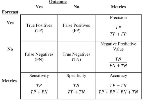
the comparison of predictions produced from a binary classification model and the observed outcome is usually arranged in a 2 x 2 contingency table, later used to calculate model performance metrics. Terms associated with classification and the table include true positives, true negatives, false positives, and false negatives; Table 5 displays these.
True positives occur when the prediction of an event matches the actual occurrence of the
event. Conversely, true negatives occur when the predicted lack of an event matches the event not occurring. With classification errors, false positives happen when a predicted
event does not transpire, while false negatives occur when an event takes place when it was not predicted to transpire (Tamilvanan & Bhaskaran, 2017).
Table 5. Contingency Table Containing General Classification Terms, and Metrics Outcome Forecast Yes No Metrics Yes True Positives (TP) False Positives (FP) Precision 𝑇𝑇𝑇𝑇 𝑇𝑇𝑇𝑇+𝐹𝐹𝑇𝑇 No False Negatives (FN) True Negatives (TN) Negative Predictive Value 𝑇𝑇𝑇𝑇 𝐹𝐹𝑇𝑇+𝑇𝑇𝑇𝑇 Metrics Sensitivity 𝑇𝑇𝑇𝑇 𝑇𝑇𝑇𝑇+𝐹𝐹𝑇𝑇 Specificity 𝑇𝑇𝑇𝑇 𝐹𝐹𝑇𝑇+𝑇𝑇𝑇𝑇 Accuracy 𝑇𝑇𝑇𝑇+𝑇𝑇𝑇𝑇 𝑇𝑇𝑇𝑇+𝐹𝐹𝑇𝑇+𝐹𝐹𝑇𝑇+𝑇𝑇𝑇𝑇
The four cells of the table are utilized to evaluate the model’s classification performance. Metrics commonly reported from the table include: accuracy, precision, negative predictive value, sensitivity, and specificity. Accuracy is the proportion of all predictions correctly classified by the model. Precision, also known as positive predictive value, is the proportion of all positive predictions correctly classified by the model. Precision provides valuable information when the cost of a false positive is high. It
addresses the question of all events classified as likely to occur, how many actually
occurred? Negative predictive value is the proportion of all negative predictions correctly classified by the model. It addresses the question of all events classified as not likely to
occur, how many actually did not transpire? Sensitivity, also known as recall is the proportion of all occurring events correctly classified as likely to occur by the model. It addresses the question of all occurring events, how many were correctly predicted by the model? Specificity is the proportion of all non-occurring events correctly classified as not likely to occur by the model. It addresses the question of all non-occurring events, how many were correctly predicted by the model? Equations one through five display the calculations for the commonly associated values of general classification models.
𝐴𝐴𝐴𝐴𝐴𝐴𝐴𝐴𝐴𝐴𝐴𝐴𝐴𝐴𝐴𝐴 =𝑇𝑇𝑇𝑇+𝑇𝑇𝑇𝑇𝐹𝐹𝑇𝑇+ +𝐹𝐹𝑇𝑇𝑇𝑇𝑇𝑇+𝑇𝑇𝑇𝑇 (1)
𝑇𝑇𝐴𝐴𝑃𝑃𝐴𝐴𝑃𝑃𝑃𝑃𝑃𝑃𝑃𝑃𝑃𝑃= 𝑇𝑇𝑇𝑇𝑇𝑇𝑇𝑇+𝐹𝐹𝑇𝑇 (2)
𝑇𝑇𝑃𝑃𝑁𝑁𝐴𝐴𝑁𝑁𝑃𝑃𝑁𝑁𝑃𝑃𝑇𝑇𝐴𝐴𝑃𝑃𝑃𝑃𝑃𝑃𝐴𝐴𝑁𝑁𝑃𝑃𝑁𝑁𝑃𝑃𝑉𝑉𝐴𝐴𝑉𝑉𝐴𝐴𝑃𝑃= 𝐹𝐹𝑇𝑇𝑇𝑇𝑇𝑇+𝑇𝑇𝑇𝑇 (3)
𝑆𝑆𝑃𝑃𝑃𝑃𝑃𝑃𝑃𝑃𝑁𝑁𝑃𝑃𝑁𝑁𝑃𝑃𝑁𝑁𝐴𝐴= 𝑇𝑇𝑇𝑇𝑇𝑇𝑇𝑇+𝐹𝐹𝑇𝑇 (4)
𝑆𝑆𝑆𝑆𝑃𝑃𝐴𝐴𝑃𝑃𝑆𝑆𝑃𝑃𝐴𝐴𝑃𝑃𝑁𝑁𝐴𝐴 = 𝐹𝐹𝑇𝑇𝑇𝑇𝑇𝑇+𝑇𝑇𝑇𝑇 (5)
Additional performance evaluation measures using these metrics help balance the
weaknesses of the metrics alone. Such measures include the F1 score, area under the
Receiver Operating Characteristic (ROC) curve, area under the Precision-Recall curve (AUPRC), and Youden’s J statistic.
The F1 score (see Equation 6) is a metric useful for imbalanced classes, meaning
the event or non-event occurs far more than the other. It is calculated by determining the harmonic mean of precision and sensitivity.
𝐹𝐹1 = 2∗ 𝑆𝑆𝐴𝐴𝑃𝑃𝐴𝐴𝑃𝑃𝑃𝑃𝑃𝑃𝑃𝑃𝑃𝑃𝑆𝑆𝐴𝐴𝑃𝑃𝐴𝐴𝑃𝑃𝑃𝑃𝑃𝑃𝑃𝑃𝑃𝑃 ∗ 𝑃𝑃𝑃𝑃𝑃𝑃𝑃𝑃𝑃𝑃𝑁𝑁𝑃𝑃𝑁𝑁𝑃𝑃𝑁𝑁𝐴𝐴+𝑃𝑃𝑃𝑃𝑃𝑃𝑃𝑃𝑃𝑃𝑁𝑁𝑃𝑃𝑁𝑁𝑃𝑃𝑁𝑁𝐴𝐴 (6)
The score ranges between zero and one, zero being the worst score and one the best score. The F1 score punishes extreme values so it tends to zero with either small values of
precision or sensitivity. A disadvantage of the F1 score is the tendency to favor models
with similar values for precision and sensitivity. Depending on classification objectives, higher precision or sensitivity may be more important, but the tradeoff between the two metrics results in a score close to zero.
The Precision-Recall curve plots the tradeoff of recall also known as sensitivity on the x-axis against precision on the y-axis, displayed in Figure 1. The figure shows a descending line, losing precision and gaining recall as it decreases. A graph of perfect precision and recall would display two straight lines going across the top and right side.
A visualization of classification performance depicting the tradeoff of sensitivity and specificity at varying probability classification thresholds can be displayed by the ROC curve. The curve plots the false positive rate on the x-axis, which is also equivalent to 100-specificity against the true positive rate (sensitivity) on the y-axis displayed in Figure 2. The area under the curve (AUC) is one summary measure that quantifies a model’s classification performance using the ROC. The AUC ranges from zero to one, with lower numbers indicating poor classification. A value of 0.50 represents random classification and depending on use of the classification model, an AUC of 0.90 indicates the model is excellent at classifying (Ozenne et al., 2015).
Figure 2. ROC Curve
The ROC curve, however, is insensitive to imbalanced classes and in such cases the Precision-Recall curve better represents performance of a classification model (Saito & Rehmsmeier, 2017). Also in the instance of rarely occurring events, the AUC reports
an overly optimistic classification performance, while the AUPRC reports more
representative results (Lobo et al., 2008).
Youden declared the need for a statistic to reduce the four cells displayed in a contingency table to one value to adequately characterize a classification model (Youden,
1950). He did so with the calculation in Equation 7.
𝐽𝐽= 𝑇𝑇𝑇𝑇𝑇𝑇𝑇𝑇+ 𝐹𝐹𝑇𝑇+𝑇𝑇𝑇𝑇 + 𝑇𝑇𝑇𝑇𝐹𝐹𝑇𝑇 −1 = 𝑃𝑃𝑃𝑃𝑃𝑃𝑃𝑃𝑃𝑃𝑁𝑁𝑃𝑃𝑁𝑁𝑃𝑃𝑁𝑁𝐴𝐴+𝑃𝑃𝑆𝑆𝑃𝑃𝐴𝐴𝑃𝑃𝑆𝑆𝑃𝑃𝐴𝐴𝑃𝑃𝑁𝑁𝐴𝐴 −1 (7)
The statistic ranges from zero to one with zero representing a model predicting an event occurrence for the same proportion of non-occurrences and occurrences. Youden
describes such a model as obviously worthless, garnering a value of zero. A value of one represents a model producing no false positives or false negatives. The statistic is
independent of the absolute sizes of the two classes, useful with imbalanced data classes. The logarithmic loss function is the last evaluation tool discussed in this section and is utilized to improve probabilistic classification models. The metric is similar to accuracy yet maintains the uncertainty of the probabilities. Equation 8 displays the calculation 𝑉𝑉𝑃𝑃𝑁𝑁𝑉𝑉𝑃𝑃𝑃𝑃𝑃𝑃= −𝑇𝑇 �1 (𝐴𝐴𝑖𝑖log(𝑆𝑆𝑖𝑖)) 𝑁𝑁 𝑖𝑖=1 + (1− 𝐴𝐴𝑖𝑖)log (1− 𝑆𝑆𝑖𝑖)) (8)
where y is the outcome of zero or one, pi is the predicted probability produced by the
model for the ith sample, and N is the total number of samples. To have the greatest classification performance, the logloss function must be minimized. If the outcome is observed (y=1), high probabilities minimize the function, and if the outcome is not observed (y=0), low probabilities minimize the function. If the logloss value is very high,
the model being used to produce the probabilities should be improved to better represent the real-world outcomes.
2.3 General Uses of Contingency Tables
As described, contingency tables are used for evaluating classification models which serve the purpose of descriptive modeling and predictive modeling (Tan et al., 2018). Descriptive models are a useful explanatory tool for distinguishing objects into classes and predictive models can be useful in predicting class discrimination beyond the given data. Contingency tables describe the interrelationship between any two categorical variables and can be useful in many fields. A variety of current uses include survey research, business intelligence, medical diagnosis, and meteorology.
Survey research compares the expected count gained from the surveys to the actual count. An example of contingency use for survey data is evident in a 2000 American National Election Study in which Census data was used to predict voting on defense spending by region (Burns et al., 2016). The contingency table in this case provides a good tool to evaluate future campaigning needs and trends in region population opinions.
An example of business intelligence use of contingency tables involves a binary classification. An insurance company classifies potential new customers to accept or decline, and the associated observation is whether or not that person was truly low or high risk (Anderson et al., 2010). The bank evaluates whether they made a mistake issuing insurance to a high risk person or declining insurance to a low risk person. A more serious error is issuing insurance to the high risk person and based on the number of
errors represented in the contingency table, banks improve classification models to have the lowest error.
To evaluate medical diagnostic tests, contingency tables are employed to improve models classifying diseases. The two errors made in diagnostic tests include informing a person they have the disease when they do not and informing a person they do not have the disease when they are diseased. The cost of not informing the diseased is much greater as they will not seek treatment, which may be fatal. Based on the findings from the table, diagnostic models aim to improve detection results
The focus of this research is the use of contingency tables in the field of
Meteorology, focusing on the forecasts and observations of precipitation and lightning strikes. Depending on the user, the cost of an incorrect classification varies (Jolliffe & Stephenson, 2003). Cancelling a non-refundable event believing the forecast of rain results in a monetary loss for such a user. Another user, believing a no rain forecast, may, for instance, ride a motorcycle that day and get into an accident from the observed rain, injuring the user. Pertaining to the 45 WS, this organization constantly works to improve misclassifications to prevent unnecessary launch cancellations and avoid any unsafe launches. To achieve such a goal, they prioritize iterative weather verification, evaluating performance metrics calculated from contingency tables.
2.4 Evaluating Forecast Performance
Many of the same metrics used to evaluate a general classification model are utilized in weather verification, but are often identified by different names. This research only explores applicable metrics used for weather verification. Commonly calculated
weather metrics include accuracy, POD, probability of false detection (POFD), POFA, and frequency bias. In addition, many measures of skill are used for weather verification, but for the purpose of this research only Threat Score (TS), Kuiper Skill Score (KSS), and Heidke Skill Score (HSS) are discussed.
Deterministic Evaluation.
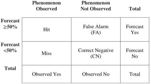
To calculate any of the metrics, however, first the observation must be defined to represent the forecast event (Fowler et al., 2012). In the cases of rain and lightning forecasts, the 45 WS has existing criteria to identify an event. A lightning event is recorded when a Phase-2 warning is issued for any area of Kennedy Space Center (KSC) or Cape Canaveral Air Force Station (CCAFS). Phase-2 warnings indicate lightning is imminent or occurring within the specified area (Roeder, 2017). A precipitation event is recorded when any one of the gauges reads more than .03 inches or at least three adjacent gauges reports greater than .01 inches (Mcaleenan, personal communication).
To evaluate the forecast to the defined observation, the cells of Table 6 are utilized for interpretation. The contingency table contains the associated weather verification terminology.
Accuracy is calculated just as it is from the general contingency table (see Equation 9). Once again, accuracy is simple and easy to interpret but does not represent the model’s ability to predict rare weather events. The metric inflates models’ true
performances by only disproportionately capturing the ability to predict common events.
Table 6. Contingency Table Containing Weather Verification Terms
Phenomenon Observed
Phenomenon
Not Observed Total
Forecast
≥50%
Hit False Alarm
(FA)
Forecast Yes Forecast
<50%
Miss Correct Negative
(CN)
Forecast No Total
Observed Yes Observed No Total
Probability of Detection (see Equation 10), also known as hit rate or the
generalized term of sensitivity, ranges from zero to one, one being a perfect score. POD is sensitive to hits but ignores false alarms. Rare events are captured with POD and with the simultaneous use of POFD, the ROC curve provides a good evaluation tool (Jolliffe & Stephenson, 2003).
𝑇𝑇𝑃𝑃𝑃𝑃= 𝐻𝐻𝑃𝑃𝑁𝑁
𝐻𝐻𝑃𝑃𝑁𝑁+𝑀𝑀𝑃𝑃𝑃𝑃𝑃𝑃
(10)
Probability of False Detection (see Equation 11), also known as false alarm rate is not often reported alone but is used in concurrence with POD to produce the ROC curve. POFD is sensitive to false alarms but ignores misses.
Probability of False Alarm (see Equation 12), also known as False Alarm ratio or the generalized term precision is sensitive to false alarms but ignores misses. POFA is more informative in conjunction with POD. A high POFA is inevitable in forecasting rare events (Olson, 1965).
𝑇𝑇𝑃𝑃𝐹𝐹𝐴𝐴= 𝐹𝐹𝐴𝐴𝐹𝐹𝐴𝐴+𝐻𝐻𝑃𝑃𝑁𝑁 (12)
Frequency Bias (see Equation 13) measures the ratio of the frequency of forecast events to frequency of observed events. The relative frequency does not measure how well the forecasts and observations correspond. The metric does reveal whether the model under forecasts or over forecasts. A perfect score of one indicates no bias, less than one represents under forecasting, and a score over one represents over forecasting (Schwartz, 2016).
𝐵𝐵𝑃𝑃𝐴𝐴𝑃𝑃=𝐻𝐻𝑃𝑃𝑁𝑁𝐻𝐻𝑃𝑃𝑁𝑁++𝑀𝑀𝑃𝑃𝑃𝑃𝑃𝑃𝐹𝐹𝐴𝐴 (13)
The ROC curve is conditioned on the observations, while reliability diagrams are conditioned on forecasts, making the pair of visuals very informative. A reliability diagram is also needed to complement the ROC curve as the curve is not sensitive to bias (Brown et al., 2015). False alarm rate is graphed against hit rate for the ROC curve.
Additional skill scores, measuring the predictive ability against a reference forecast, are necessary to evaluate model performance. The scores addressed in this research include: TS, KSS, and HSS.
The Threat Score (see Equation 14), also known as Critical Success Index, does not consider the correct negatives and answers how well the forecasted likely to occur events correspond to the observed events. It ranges from zero to one, zero being poor, and one being perfect. TS tends to excessively penalize predictions of rare events but is still a more balanced single metric than POD and POFA (Jolliffe & Stephenson, 2003).
𝑇𝑇𝑆𝑆= 𝐻𝐻𝑃𝑃𝑁𝑁+𝑀𝑀𝑃𝑃𝑃𝑃𝑃𝑃𝐻𝐻𝑃𝑃𝑁𝑁 + 𝐹𝐹𝐴𝐴 (14)
Kuiper Skill Score (see Equation 15) compares forecast skill to random chance, with a score of zero representing random chance. The formulation is equivalent to POD minus POFD, and for rare events POFD is very small, resulting in KSS converging to POD (World Meteorological Organization [WMO], 2014).
𝐾𝐾𝑆𝑆𝑆𝑆= ((𝐻𝐻𝑃𝑃𝑁𝑁 ∗ 𝐶𝐶𝑇𝑇𝐻𝐻𝑃𝑃𝑁𝑁+𝑀𝑀𝑃𝑃𝑃𝑃𝑃𝑃)−)((𝑀𝑀𝑃𝑃𝑃𝑃𝑃𝑃 ∗ 𝐹𝐹𝐴𝐴𝐹𝐹𝐴𝐴+𝐶𝐶𝑇𝑇)) (15)
Heidke Skill Score (see Equation 16) compares the prediction performance to a reference accuracy measure. The reference measure in the HSS is the proportion correct that would be achieved with random forecasts independent of observations. The score ranges from zero to one. Forecasts equivalent to reference forecasts produce a HSS of zero and perfect forecasts receive a HSS of one (Wilks, 2011). No single metric provides enough information to make proper adjustments; therefore all of the discussed weather metrics should be addressed collectively for forecast adjustments.
Probabilistic Evaluation.
Statistical forecasting can be classified as objective or subjective forecasting. Objective forecasts are produced by automatic means while subjective forecasts integrate and interpret information from the objective forecast. Subjective forecasts depend on human judgement of the objective data such as deterministic forecast information, dynamic integrations, and guidance from Model Output Statistics (MOS). Forecasters also use atmospheric observations such as surface maps and radar images, in addition to prior information on persistence, climatology, and previous experiences. A good
subjective forecast conveys the measure of a forecaster’s uncertainty which can be most accurately captured with in probability terms. (Wilks, 2011).
There are two possible ways to interpret a probabilistic forecast; using a Frequentist approach or a Bayesian approach. The Frequentist approach considers the long-run relative frequency. A 30% forecast means the event should occur 30% of the time for that given forecast bin. The Bayesian approach uses a subjective interpretation to convey the probability as a degree of belief regarding the uncertain event. Such beliefs are founded on previous knowledge and experiences. Bayesian interpretation is heavily utilized for the subjective forecasts.
The Brier Score (BS) (See Equation 18) is a commonly used metric for probabilistic forecasts of dichotomous events. It measures probabilistic prediction accuracy with a mean squared probability error. The score ranges from zero to one, zero being perfect and one being poor. BS can be decomposed into reliability (REL),
resolution (RES), and uncertainty. Perfect reliability (see Equation 19) exists when
Resolution (see Equation 20) is the ability of the forecast to distinguish different situations. The measure determines the distance between observed relative frequency and sample climatological base rate (see Equation 17).
𝑆𝑆𝐴𝐴𝑆𝑆𝑆𝑆𝑉𝑉𝑃𝑃 𝐶𝐶𝑉𝑉𝑃𝑃𝑆𝑆𝐴𝐴𝑁𝑁𝑃𝑃𝑉𝑉𝑃𝑃𝑁𝑁𝐴𝐴 =𝐻𝐻𝑃𝑃𝑁𝑁+𝐻𝐻𝑃𝑃𝑁𝑁𝐹𝐹𝐴𝐴++𝑀𝑀𝑃𝑃𝑃𝑃𝑃𝑃𝑀𝑀𝑃𝑃𝑃𝑃𝑃𝑃+𝐶𝐶𝑇𝑇 (17)
Uncertainty (see Equation 21) measures the variability in observations, indicating the difficulty in which situations can be climatologically predicted. Uncertainty cannot be influenced by anything the forecaster can do and is much higher when the sample climatological probability is close to 0.5 (Wilks, 2011).The BS score decomposes as follows: 𝐵𝐵𝑆𝑆 =𝑇𝑇 �1 (𝑆𝑆𝑘𝑘− 𝑃𝑃𝑘𝑘)2 = 𝑅𝑅𝑅𝑅𝑅𝑅 − 𝑅𝑅𝑅𝑅𝑆𝑆+𝑈𝑈𝑃𝑃𝐴𝐴𝑃𝑃𝐴𝐴𝑁𝑁𝐴𝐴𝑃𝑃𝑃𝑃𝑁𝑁𝐴𝐴 𝑁𝑁 𝑘𝑘=1 (18) 𝑅𝑅𝑅𝑅𝑅𝑅 =𝑇𝑇 � 𝑃𝑃1 𝑖𝑖(𝑆𝑆𝑖𝑖− 𝑃𝑃̅𝑖𝑖)2 𝐼𝐼 𝑖𝑖=1 (19) 𝑅𝑅𝑅𝑅𝑆𝑆 =𝑇𝑇 � 𝑃𝑃1 𝑖𝑖(𝑃𝑃̅𝑖𝑖 − 𝑃𝑃̅)2 𝐼𝐼 𝑖𝑖=1 (20) 𝑈𝑈𝑃𝑃𝐴𝐴𝑃𝑃𝐴𝐴𝑁𝑁𝐴𝐴𝑃𝑃𝑃𝑃𝑁𝑁𝐴𝐴 =𝑃𝑃̅(1− 𝑃𝑃̅) (21)
with N equal to the total number of forecasts, k indexing the forecast-event pairing,𝑃𝑃𝑖𝑖 the number of forecasts with the same probability category, 𝐼𝐼 the number of unique
forecasts,𝑃𝑃̅𝑖𝑖 the observed frequency given the forecast probability 𝑆𝑆𝑖𝑖, and 𝑃𝑃̅, the climatological base rate (Wilks, 2011).
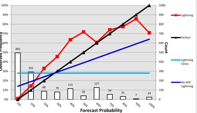
To provide a more informative representation of forecast performance, reliability diagrams display a greater diagnosis of strengths and weaknesses of the forecasts. Reliability measures the agreement between the probability forecasts and the average observed frequency of events, employing the Frequentist approach. In Figure 3 perfect reliability of lightning forecasts is plotted with the diagonal line. The deviation from the diagonal line indicates the conditional bias. Curves below the line represent over
forecasting, and above represents under forecasting. A flatter curve means less resolution. The climatology lines are horizontal because climatology forecasts have no resolution as they do not discriminate between events and non-events. The points between the no skill line and diagonal line contribute positively to the BS (Ferro & Fricker, 2012). Reliability plays an important role in subjective forecast verification as it can indicate bias from particular forecasters. No single verification metric dictates forecast adjustments, but reliability diagrams do provide obvious visuals of weaknesses in the probabilistic
forecasts. Chapter 4 discusses the importance of maintaining the probabilistic forecasts in relation to reliability and bias.
Figure 3. Reliability Diagram Modified from the 45 WS for Lightning Predictions and Observations
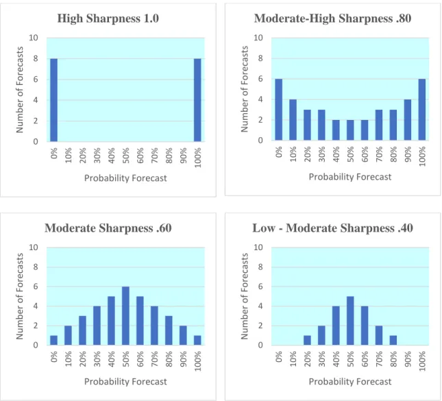
Another aspect of forecasts evaluated is the sharpness, an attribute of only the forecasts and not the observations. Sharp forecasts favor the extremes, meaning only forecasts of 0% and 100% would have perfect sharpness. Forecasters must balance all aspects of the forecasts, as perfectly sharp predictions could yield inaccurate and unreliable forecasts. Figure 4 references varying degrees of forecast sharpness.
Dichotomizing probabilistic forecasts would result in perfect sharpness, but not represent the true uncertainty in the forecasts. This research expands on the differences and
weaknesses of verifying forecasts such that all forecasts were made with perfect sharpness. 495 292 88 79 115 39 127 54 31 7 24 0 100 200 300 400 500 600 700 800 900 1000 0% 10% 20% 30% 40% 50% 60% 70% 80% 90% 100% Lightning Perfect Lightning Climo No Skill Lightning Forecast Probability Ob se rv ed Fre qu en cy Co un t
Figure 4. Examples of Varying Forecast Sharpness
2.5 Probabilistic Contingency Table
While the contingency table is a relatively straight-forward tool for evaluating dichotomous model performance, the current practices of dichotomizing the probabilistic forecasts for verification causes a great loss of information. Forecasters are unable or unwilling to use the probabilistic forecasts and default to the yes or no predictions, losing the quantifiable uncertainty associated with probabilities (Mason, 1979; Zhang & Casey,
0 2 4 6 8 10 0% 10% 20% 30% 40% 50% 60% 70% 80% 90% 100% Nu mb er o f F or ec as ts Probability Forecast High Sharpness 1.0 0 2 4 6 8 10 0% 10% 20% 30% 40% 50% 60% 70% 80% 90% 100% Nu mb er o f F or ec as ts Probability Forecast Moderate-High Sharpness .80 0 2 4 6 8 10 0% 10% 20% 30% 40% 50% 60% 70% 80% 90% 100% Nu mb er o f F or ec as ts Probability Forecast Moderate Sharpness .60 0 2 4 6 8 10 0% 10% 20% 30% 40% 50% 60% 70% 80% 90% 100% Nu mb er o f F or ec as ts Probability Forecast
2000). The conversion to deterministic forecasts is considered unfortunate information degradation and to the detriment of the forecast users (Wilks, 2011). The proper
probability threshold is dependent on the users, but is decided by forecasters often arbitrarily. Extensive literature exists encouraging against dichotomizing, so much that the editors of Medical Decision Making have enforced a policy limiting the practice with submissions to the journal (Dawson & Weiss, 2012).
All other fields suffer the same consequences of ignoring the information
provided in a probabilistic forecast, but still tend to the binary yes or no forecasts. Binary classification models are simple and intuitive to evaluate using a contingency table, explaining the tendency to dichotomize, but an alternative tool of the PCT maintains the simplicity and probabilistic information. One example of the PCT in circulation is evident in (Vêncio & Shmulevich, 2017). The next chapter lays the foundation of exploring if maintaining the probabilistic forecast with a PCT produces different results than the TCT by evaluating the performance metrics associated with the tables.
III. Methodology
3.1 Chapter Overview
This chapter provides an understanding of the techniques used to compare the resulting metrics from the TCT and PCT using simulated as well as real-world forecasts and observations. The comparison of the contingency tables was done in three main steps. The first section explains simulating the forecasts and observations with varying bias. The individual forecasts were used to calculate and evaluate the differences in the TCT and PCT. This process assumed that each forecast occurred an equal number of times. The second section addresses seasonal trends in the data provided by the 45 WS and the empirical distributions of the forecasts during the seasons. Using the
distributions, the number of simulated observations for each forecast varied according to the appropriate weight. The final section details the method comparing TCT and PCT using forecasts and observations for four years of rain and lightning events reported by the 45 WS.
3.2 Simulation Assuming Equal Forecasts
To establish fidelity in the comparison of the TCT and PCT with respect to real data, simulated weather observations were first used to establish a controlled evaluation. Using R programming language and the RStudio integrated development environment, observations were generated from forecasts ranging from 0% to 100%, incremented by 10%. Reliable, (i.e., unbiased forecasts) were first considered followed by over biasing
and under biasing. The biases varied by 5% increments from 5% to 20% to reflect realistic representation from 45 WS.
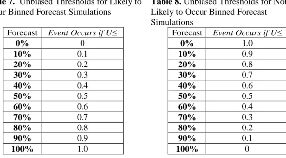
To produce the observations for the likely to occur forecasts we used a standard uniform distribution, U (0, 1), to generate unbiased observations based on the thresholds displayed in Table 7. To produce the observations for the not likely to occur forecasts, we used the thresholds in Table 8. Thirty replications of the 10,000 observations were
generated for each forecast level (0%, 10%...100%) at each forecast prediction (likely to occur, not likely to occur).
To calculate the values in each TCT, we maintained the standard that any forecast less than 50% was predicted as not likely to occur. Contingency tables were created for each forecast level and replication. For the TCT, hits were recorded as either zero for all forecasts under 50% or as the number of observations from the likely to occur for forecasts greater than or equal to 50%. False alarms were also zero for all forecast under 50% and 10,000 minus the number of hits for forecasts greater than or equal to 50%. The
Table 7. Unbiased Thresholds for Likely to Occur Binned Forecast Simulations
Forecast Event Occurs if U≤
0% 0 10% 0.1 20% 0.2 30% 0.3 40% 0.4 50% 0.5 60% 0.6 70% 0.7 80% 0.8 90% 0.9 100% 1.0
Table 8. Unbiased Thresholds for Not Likely to Occur Binned Forecast Simulations
Forecast Event Occurs if U≤
0% 1.0 10% 0.9 20% 0.8 30% 0.7 40% 0.6 50% 0.5 60% 0.4 70% 0.3 80% 0.2 90% 0.1 100% 0
number of correct negatives simulated for each TCT generated from a less than 50% forecast was equal to all observations produced from not likely to occur. The number of correct negatives for the TCTs from greater than or equal to 50% forecasts was zero. Misses were recorded as 10,000 minus the number of correct negatives for forecasts less than 50% and zero for all forecasts greater than or equal to 50%. Table 9 depicts an example of the simulated values and associated probabilities generated from unbiased forecasts used to produce forecast specific TCTs and PCTs.
Table 9 contains the forecast in the first column, results from the likely to occur simulations in the second column, results from the not likely to occur simulations in the third column, the associated binary scalars for each likely to occur forecast in column four, the associated binary scalars for each not likely to occur forecast in column five, the probabilities associated with the likely to occur forecast in column six, and the
probabilities associated with the not likely to occur forecast in column seven.
Table 10 displays the TCT column vectors calculated for one replication of the simulation representing the number of hits, false alarms, misses, and correct negatives. Hits were calculated with the Hadamard multiplication of the likely to occur vector and the accompanying binary vector Vyes. False alarms were determined by subtracting the vector of hits from the sample size 10,000 and calculating the Hadamard product of the resulting vector and the accompanying binary vector Vyes. Correct negatives were calculated with the Hadamard multiplication of the not likely to occur vector and the accompanying binary vector Vno. Misses were determined by subtracting the vector of correct negatives from 10,000 and calculating the Hadamard product of the resulting vector and the accompanying binary vector Vno.
Table 9. Unbiased Binned Forecast Simulation: Events Observed for Likely to Occur Simulation, Non-events Observed for Not Likely to Occur Simulation, and Associated Dichotomous and Probabilistic Event/Non-event Forecasts
Forecast Likely to
Occur Likely to Not
Occur Vyes Vno p 1-p 0% 0 10000 0 1.0 0 1.0 10% 1049 8941 0 1.0 0.1 0.9 20% 2020 7970 0 1.0 0.2 0.8 30% 2971 7019 0 1.0 0.3 0.7 40% 4042 6025 0 1.0 0.4 0.6 50% 4958 4922 1.0 0 0.5 0.5 60% 5992 4018 1.0 0 0.6 0.4 70% 7042 2932 1.0 0 0.7 0.3 80% 7978 2082 1.0 0 0.8 0.2 90% 8966 989 1.0 0 0.9 0.1 100% 10000 0 1.0 0 1.0 0
Table 10. Unbiased TCT Hits, False Alarms, Misses, and Correct Negatives by Ascending Forecast Bin
Hits= (Likely to Occur)∘ (Vyes) 0 0 0 0 0 4958 5992 7042 7978 8966 10000 False Alarms= (10,000-Hits)∘(Vyes) 0 0 0 0 0 5042 4008 2958 2022 1034 0 Misses=(Not Likely to Occur)∘(Vno) 0 1059 2030 2981 3975 0 0 0 0 0 0 Correct Negatives= (10,000-Misses)∘(Vno) 10000 8941 7970 7019 6025 0 0 0 0 0 0
From each replication for the unbiased forecasts, eleven TCTs and PCTs were produced. Table 11 and Table 13 display them respectively. This process was repeated
thirty times to capture the variability in the simulations. The example of each TCT was derived from the equivalent rows of each vector in Table 10.
Table 11. TCTs Produced From Unbiased Binned Forecast Simulations
0% 10% 20% 30% 0 0 0 10000 40% 0 0 1059 8941 50% 0 0 2030 7970 60% 0 0 2891 7019 70% 0 0 3975 6025 80% 4958 5042 0 0 90% 5992 4008 0 0 100% 7042 2958 0 0 7978 2022 0 0 8966 1034 0 0 10000 0 0 0
Table 12 displays the PCT column vectors calculated for one replication of the simulation representing the number of hits, false alarms, misses, and correct negatives. Hits were calculated with the Hadamard multiplication of the likely to occur vector and the accompanying probability vector, p. False alarms were determined by subtracting the vector of hits from 10,000 and calculating the Hadamard product of the resulting vector and the accompanying probability vector, p. Correct negatives were calculated with the Hadamard multiplication of the not likely to occur vector and the accompanying
probability vector, 1-p. Misses were determined by subtracting the vector of correct negatives from 10,000 and calculating the Hadamard product of the resulting vector and the accompanying probability vector, 1-p.
Table 12. Unbiased TCT Hits, False Alarms, Misses, and Correct Negatives by Ascending Forecast Bin
Hits= (Likely to Occur)∘(p) 0 97.7 402.2 879.9 1592.4 2498 3583.8 4932.2 6411.2 8073 10000 False Alarms= (10,000-Likely to Occur)∘(p) 0 902.3 1597.8 2120.1 2407.6 2502 2416.2 2067.8 1588.8 927 0 Misses= (Not Likely to Occur)∘(1-p) 0 945 1623.2 2083.9 2428.2 2491.5 2408 2101.5 1600.2 901.2 0 Correct Negatives= (10,000-Not Likely to Occur)∘(1-p) 10000 8055 6376.8 4916.1 3571.8 2508.5 1592 898.5 399.8 98.8 0
The four cells of the PCT sum to 10,000, equivalent to the TCT sum, but hits and false alarms are not restricted to zero for forecasts less than 50%, and misses and correct negatives are not restricted to zero for forecasts of 50% or greater. The example of each PCT in Table 13 was derived from the equivalent rows of each vector in Table 12.
Table 13. PCTs Produced From Unbiased Binned Forecast Simulations
0% 10% 20% 30% 0 0 0 10000 40% 97.7 902.3 945 8055 50% 402.2 1597.8 1623.2 6376.8 60% 879.9 2120.1 2083.9 4916.1 70% 1592.4 2407.6 2428.2 3571.8 80% 2498 2502 2491.5 2508.5 90% 3583.8 2416.2 2408 1592 100% 4932.2 2067.8 2101.5 898.5 6411.2 1588.8 1600.2 399.8 8073 927 901.2 98.8 10000 0 0 0
The seven metrics, accuracy, POD, POFD, POFA, TS, KSS, HSS, and frequency bias were calculated for each contingency table. Following this computation, the metrics were averaged for the thirty replications of each forecast level. Lastly, the averaged TCT metrics for each forecast were subtracted from the corresponding PCT metrics to
calculate the effect sizes of the differing tables. The effect size was then graphed against the forecasts to compare the performance of TCT and PCT for each forecast.
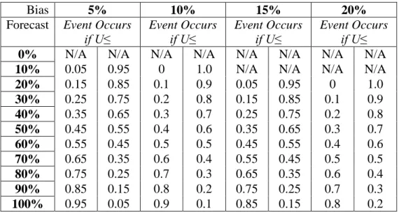
The biased forecasts follow the same process of simulations, but the thresholds vary for the likely to occur forecasts and not likely to occur forecasts. At each level of bias, thirty replications were simulated for each forecast level. Not all forecasts are possible with the different levels of bias. For example it is not possible to predict a forecast of 10%, over biased by 20% as you cannot predict under 0%. Table 14 displays the thresholds for likely to occur forecasts in the left of the column and not likely to occur forecasts on the right of the column for each over-forecast.
Table 14. Over-forecast Thresholds for Likely to Occur & Not Likely to Occur Binned Forecast Simulations
Bias 5% 10% 15% 20%
Forecast Event Occurs
if U≤ Event Occurs if U≤ Event Occurs if U≤ Event Occurs if U≤
0% N/A N/A N/A N/A N/A N/A N/A N/A
10% 0.05 0.95 0 1.0 N/A N/A N/A N/A
20% 0.15 0.85 0.1 0.9 0.05 0.95 0 1.0 30% 0.25 0.75 0.2 0.8 0.15 0.85 0.1 0.9 40% 0.35 0.65 0.3 0.7 0.25 0.75 0.2 0.8 50% 0.45 0.55 0.4 0.6 0.35 0.65 0.3 0.7 60% 0.55 0.45 0.5 0.5 0.45 0.55 0.4 0.6 70% 0.65 0.35 0.6 0.4 0.55 0.45 0.5 0.5 80% 0.75 0.25 0.7 0.3 0.65 0.35 0.6 0.4 90% 0.85 0.15 0.8 0.2 0.75 0.25 0.7 0.3 100% 0.95 0.05 0.9 0.1 0.85 0.15 0.8 0.2
Table 15 displays the thresholds for likely to occur forecasts in the left of the column and not likely to occur forecasts on the right of the column for each under-forecast. The cells labelled not applicable (N/A) are restrained by probability ranging from 0% to 100%.
Table 15. Under-forecast Thresholds for Likely to Occur & Not Likely to Occur Binned Forecast Simulations
Bias 5% 10% 15% 20%
Forecast Event Occurs
if U≤ Event Occurs if U≤ Event Occurs if U≤ Event Occurs if U≤
0% 0.05 0.95 0.1 0.9 0.15 0.85 0.2 0.8 10% 0.15 0.85 0.2 0.8 0.25 0.75 0.3 0.7 20% 0.25 0.75 0.3 0.7 0.35 0.65 0.4 0.6 30% 0.35 0.65 0.4 0.6 0.45 0.55 0.5 0.5 40% 0.45 0.55 0.5 0.5 0.55 0.45 0.6 0.4 50% 0.55 0.45 0.6 0.4 0.65 0.35 0.7 0.3 60% 0.65 0.35 0.7 0.3 0.75 0.25 0.8 0.2 70% 0.75 0.25 0.8 0.2 0.85 0.15 0.9 0.1 80% 0.85 0.15 0.9 0.1 0.95 0.05 1.0 0
90% 0.95 0.05 1.0 0 N/A N/A N/A N/A
100% N/A N/A N/A N/A N/A N/A N/A N/A
Contingency tables were produced for each applicable forecast in the same manner as the unbiased simulations. The seven metrics were calculated and used to determine effect sizes to graph the trends in the disparity between TCT and PCT for increasing biases of both over and under forecasting. The comparison of the TCT and PCT simulations for each forecast are discussed in the next chapter.
3.3 Simulation Using 45 WS Empirical Distributions
Many trends were discovered from the first simulations assuming equal number of forecasts, however, it was not realistic to assume only one level of a forecast will be
predicted repeatedly. For example, a 10% forecast of an event will not be made every day of the year. It is also not reasonable to assume all forecast levels are predicted the same number of times during the year. To overcome these assumptions, data from the 45 WS was used to fit representative empirical distributions.
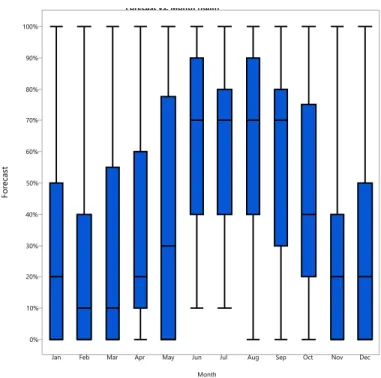
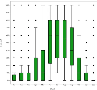
Four years of data from 2015-2018 were provided from the 45 WS in three different Excel workbooks containing many formulations not utilized in this research. The information that was used included the daily date, hour forecast of rain, and 24-hour forecast of lightning. The observation of “yes” or “no” for both the rain and lightning events are addressed in the next section. Looking first at rain forecasts, each forecast was binned by the month an observation occurred. Figure 5 displays the rain forecast distributions by month, suggesting two seasons. Months June through September were defined as the warmer season and months October through May were defined as the colder season. To confirm the seasonal divide a Tukey’s comparison test was conducted to test the equivalency of the mean rain forecasts among the two seasons. Table 18
confirms the mean rain forecasts have a statistically significant difference. Addressing the multiple comparisons of each month (output in Appendix C), at an alpha of 0.05, May and October are not statistically different from either season. This will be addressed in Chapter 5 for future recommendations.
Figure 5. 45 WS (2015-2018) RainForecast Distributions by Month
After determining the seasons according to rain forecasts, the data was divided by the respective seasons. The counts of each forecast in the given season are displayed in Tables 16 and 17 and were used to determine the proportion of times a forecast was predicted 24-hours prior to the event. To calculate the proportions for unbiased forecasts, the count was simply divided by the total number of forecasts in the seasonal data. For biased forecasts, the count of forecasts marked as N/A were removed from the total number of forecasts to determine the proportional values. For example, for a 10% over-forecast, 0% is a not a possible forecast; therefore 294 forecasts were removed from the total number of rain forecasts in the cold season. The remaining possible proportions were then calculated for forecasts of 10% to 100%.
Forecast vs. Month (Rain)
0% 10% 20% 30% 40% 50% 60% 70% 80% 90% 100%
Jan Feb Mar Apr May Jun Jul Aug Sep Oct Nov Dec Month
Table 16. Number of Cold Season Rain Forecasts for 2015-2018 Forecast Count 0% 294 10% 104 20% 117 30% 95 40% 84 50% 13 60% 68 70% 38 80% 55 90% 24 100% 78
Table 17. Number of Warm Season Rain Forecasts for 2015-2018 Forecast Count 0% 2 10% 7 20% 26 30% 62 40% 52 50% 12 60% 56 70% 82 80% 71 90% 39 100% 76
Lightning had the same seasonal relationships as found for the rain events for 24-hour forecasts, apparent in Figure 6. Table 18 confirms the seasonal divide with
significantly different mean lightning forecasts among the seasons. The multiple month comparisons in Appendix C reveals the mean lightning forecasts for May as not
significantly different from either season, but slightly closer to the cold season group mean calculated excluding May. As stated, only the 24-hour forecast was addressed as lightning forecasts for any more days prior to the event had a significantly different distribution. Lightning events were almost never forecasted as likely to occur more than one day prior to the event.
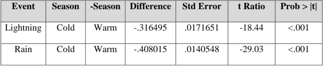
Table 18. Tukey’s Comparisons of Lightning and Rain Forecasts by Season
Event Season -Season Difference Std Error t Ratio Prob > |t|
Lightning Cold Warm -.316495 .0171651 -18.44 <.001 Rain Cold Warm -.408015 .0140548 -29.03 <.001
Figure 6. 45 WS (2015-2018) LightningForecast Distributions by Month For both rain and lightning events, forecasts of likely to occur were much higher during the warm season. Separating the data by season was important to determine if the difference in TCT and PCT performance was influenced by predicting more likely to occur events in the warmer season and more not likely to occur events in the colder season.
With the seasonal distributions, four different simulations were generated to compare the TCT and PCT. The likely to occur and not likely to occur matrices were calculated by simulating the weighted forecasts. Rather than simulating 10,000 runs for each forecast, the proportional number of runs were simulated. As an example, the
10,000 unbiased likely to occur forecasts for cold season lightning events were multiplied by the respective count and divided by the total number of cold season lightning events.
Forecast vs. Month (Lightning)
0% 10% 20% 30% 40% 50% 60% 70% 80% 90% 100%
Jan Feb Mar Apr May Jun Jul Aug Sep Oct Nov Dec Month
Tables 19 and 20 display the number of lightning event forecasts for each bin during 2015-2108 cold season and 2015-2018 warm season respectively.
Table 19. Number of Cold Season Lightning Forecasts Forecast Count 0% 618 10% 117 20% 58 30% 37 40% 41 50% 9 60% 38 70% 12 80% 22 90% 17 100% 0
Table 20. Number of Warm Season Lightning Forecasts Forecast Count 0% 7 10% 50 20% 61 30% 34 40% 59 50% 17 60% 70 70% 56 80% 55 90% 22 100% 54
As an example for a specific forecast, twelve forecasts of 70% were made for lightning during the cold season; therefore 12 was divided by the total count of 969. This quotient was then multiplied by 10,000, resulting in 123.839 simulated 70% forecasts (the number of forecasts were not rounded to maintain the empirical distribution representation). The number of hits, false alarms, misses, and correct negatives were calculated as before for each individual forecast. The respective cells of the contingency tables were then summed across all forecasts and averaged for the thirty replications. This produced one TCT and one PCT for the unbiased simulation. This was done for all bias levels of over-forecast and under-forecast, adjusting the number of runs simulated for each level of bias. The effect sizes from the PCT minus the TCT metric values were then graphed against the bias level for each seasonal event.
3.4 45 WS Forecasts & Observations
Following the simulations, the data provided by the 45 WS was used to compare the TCT and PCT for both rain events in the colder and warmer seasons, and for lightning events in the colder and warmer seasons. The data divided by seasons was used to
determine hits, false alarms, misses, and correct negatives of the TCT and PCT. For the TCT, hits were recorded for an observed “yes” for all 50% or greater forecasts. False alarms were counted for all 50% or greater forecasts observed as “no”. Misses were counted for all forecasts less than 50% observed as “yes”. Correct negatives were determined as all forecasts less than 50% observed as “no”.
For the PCT, the probability, pi is defined as the forecast and ki is the binary
outcome of one for “yes” observations and zero for “no” observations. Hits were
calculated as the dot product of vector, p and vector, k. False alarms were recorded as the dot product of vector, p and vector, 1-k. Misses were counts as the dot product of vector,
1-p and vector, k. Correct negatives were recorded as the dot product of vector, 1-p and vector, 1-k.
After creating TCTs and PCTs for each season and forecasted event, the same seven metrics, POD, POFD, POFA, TS, KSS, HSS, and frequency bias, were calculated. The effect sizes of the metrics calculated from the PCTs minus the TCTs were graphed separately for cold season rain forecasts, warm season rain forecasts, cold season lightning forecasts, and warm season lightning forecasts.
3.5 Summary
The first step of simulations was conducted with the intent to compare the performance metrics produced from the TCT and PCT at each forecast. It was also used to reveal metric tendencies for varying biases. There were many limitations however in the metric calculations due to the zero values in two of the cells for every TCT. This problem was resolved by summing over the different forecasts, introducing the empirical distributions. Simulations produced controlled results without the consideration of any unknowns. Comparing the data provided by the 45 WS introduced more chances of variability, but the simulations provided general standards and expectations of the real-world data. We next present the results of our analysis.
IV. Analysis and Results
4.1 Chapter Overview
This chapter reveals the trends of the graphs produced from the simulated output as well as from the data provided by the 45 WS. The first section contains the trends for the unweighted simulation for the effect sizes for POD, POFD, POFA, TS, KSS, HSS, and frequency bias for both over biased and under biased forecasts. The frequency bias metric was further examined with forecast by bias level for the TCT and PCT with over-forecasts and under-over-forecasts. The second section examines the metric effect sizes according to the four empirical distributions from cold and warm season rain and lightning events, separating results by over and under-forecasting. The last section explores the comparison of the TCT and PCT using the 45 WS forecasts and outcomes. The data is divided by the two seasons for the rain and lightning events. The metric comparisons strictly reveal the differences between the TCT and PCT including which metrics are closer to the perfect scores. Both tables are produced from the same data and neither table can be determined as “better” based on the metric values. Section 4.5 addresses BS, frequency bias, and reliability diagrams. The measures are examined with both dichotomized forecasts and probabilistic forecasts to determine the more
representative type of table to use for verification.
4.2 Simulation Results and Trends - Unweighted
The effect size for each metric was calculated by subtracting the value produced using the TCT by the value produced using the PCT. The perfect score for each metric is