1
Mobile Interface Design
for Dynamic Environments
Masters Thesis
R.P. Heuts
University of Twente, Enschede, The Netherlands.
Heuts, Robert Paul (MSc, Human Media Interaction)
Mobile Interface Design for Dynamic Environments
Thesis directed by Professor Dirk Heylen
A common problem with mobile devices is that when they are used in a
dynamic environment usability goes down drastically because of external influences.
Sunlight, sudden movements and interrupted use of the device change the experience
in a way that the designers of the application did not always take into account.
Although part of the problem is hardware related, it is possible that designers of
mobile applications can help improve the situation by taking into account these
dynamic environments when designing the interface or architecture.
This Thesis will describe the problem that users face when they are using
mobile devices in places where they were meant to be used: outside and in dynamic
environments. It will give an overview of the current state of research into mobile
devices and provide an example of a mobile application targeted for a mobile device.
Its architecture and interface choices will be discussed along with a special kind of
user testing. This user test allows testing specifically for external influences and
differ-ent interfaces when users use the device in a mobile envi¬ronmdiffer-ent.
The example application has two different interfaces built in, they not only
dif-fer in the graphical representation, but also the way users interact with the device.
Although the user test was mainly performed to confirm that this special kind of user
test is in fact possible, the results will be discussed to get an indication of which of the
interfaces available in the application is better fitted for the used mobile device. Heuts, Robert Paul (MSc, Human Media Interaction)
Mobile Interface Design for Dynamic Environments
The following thesis, although an individual work, benefited from the patience
and support from several people. First, my supervisor on location, Lewis Johnson,
allowing me to perform my research at the Information Sciences Institute and
provid-ing guidance durprovid-ing the research. In addition, Andre Valente provided timely and
instructive comments and evaluation throughout the project. Next, I wish to thank the
people I worked with during my stay at ISI and TLT, giving useful advice whenever
they can. I’d like to thank the complete Thesis Committee: Dirk Heylen, Anton Nijholt
and Betsy van Dijk.
In addition to the technical assistance above, I received equally important
assistance from my parents, family and friends. In particular my parents who made my
study possible in the first place. Their dedication created an informative and
User Test . . . 40
Remote User Testing . . . 41
Collecting Data . . . 42
Results . . . 43
Data . . . 43
Discussion . . . 47
5 Conclusions . . . 49
6 Future Work . . . 51
Appendix A PSP User Test Manual . . . 55
Appendix B PSP User Test Questionnaire . . . 57
v
Figure 3: Briefing before starting a mission...21
Figure 4: Virtual 3D Environment...21
Figure 5: Dialog page (PSP)...22
Figure 6: Pronunciation page (PSP) ...23
Figure 7: Multiple Choice page (PSP) ...24
Figure 8: Menu (PSP)...25
Figure 9: PC versus PSP interface...27
Figure 10: Toolbar example (PSP) ...28
Figure 11: Startup screen (PSP) ...29
Figure 12: Application architecture overview...36
Figure 13: Framework architecture overview ...37
Figure 14: Average time spend on complete lesson (seconds)...44
Figure 15: Average time spend on one page (seconds) ...45
Figure 16: Average number of pages for a complete lesson ...45
Figure 17: Average grade given to section two (Questionnaire) ...46
Chapter 1
Introduction
This is the Master Thesis of R.P. Heuts, written for his graduation to the
Uni-versity of Twente in the Netherlands. This thesis was written while performing
research at the Information Sciences Institute of the University of Southern California
in Marina Del Rey, Los Angeles.
This thesis will introduce and describe a common problem encountered while
using mobile devices in dynamic environments: usability goes down drastically when
a Personal Digital Agent (PDA), cell phone or mobile gaming device is used outside or
in a highly dynamic environment. This is one of the problems encountered when
developing a mobile application or porting an existing application to a mobile device.
This Thesis has been divided into two parts, the first part will introduce the topic and
discuss existing research featuring this topic. The second part will introduce a mobile
software solution that was developed during the research, especially the architecture of
the software will be dicussed.
The mobile software solution has been ported from an originally PC based
application. The technical design of the application has been adapted for mobile usage,
as this is closely related to the interface design. The technical design will be discussed
in more detail than the interface because the it is based on the PC interface. The
appli-cation is an eduappli-cational tool for studying and learning a foreign language and the
cul-ture accompanying the language. A more complete overview of the application will be
given when the technical design of the application is handled.
This section will continue to introduce the topic, goals and motivation for this
mobile interface design and mobile device input. The third chapter and start of the
sec-ond part of this thesis will discuss the approach taken in this research, introduce and
discuss the application and research application. It will also describe the different
tech-nical design approaches used to provide a basis to overcome the abovementioned
problem with mobile devices. After which the fourth chapter will describe the user
tests and their results. This thesis will be concluded with conclusions and future work
in chapter five.
1.1 Motivation
A very common problem with mobile devices (even laptops) is that, when used
outside, usability takes a hit because of mobile usage [Pascoe]. For example the
read-ability of the screen might be very poor because of sunlight interference. Software
can’t fully solve this problem as this is partly a hardware issue with the screen, but can
try to reduce the effect by adapting the interface. Little research has been done in this
direction as most research is focused on screen size and technical application design
for mobile devices. And user tests are usually performed in a controlled and well lit
environment [Gallant][Duh]. Everything changes as the user moves outside where
there are several external influences on readability and usability. Reading from a
mobile device screen can be very difficult with sunlight directly hitting the surface of
the screen, even handling the device can be a challenge when the environment is
unstable (may it be the workplace or just public transport for example).
Because of the limited research done in this direction this thesis will
summa-rize what has been done and partly evaluate those findings with the use of a user test
designed for mobile evaluation. During this research an actual software application
was ported from the PC to a mobile device and a special research version was used to
evaluate changes to the interface and input capabilities.
doing the user tests in a controlled environment, users can take the device to any place
they want and perform the user test there. This requires some modifications in the user
test design and those modifications will be discussed in this thesis. The results from
the user test are not as important yet; the user test is used to show that user testing does
not always require a controlled environment with supervisors.
1.2 Goals
This research is based on two research questions, namely:
• What solutions are currently at hand for the problems with mobile
devices caused by outside environments (light, noise, movement) applicable to the
interface and input capabilities?
• Is it possible to do user testing where users are in their natural mobile
environment, instead of a controlled laboratory environment?
Because this thesis does not only focus on research but also the development of
a prototype, another goal can be added:
• Development of a generic and easily portable framework, and
accompa-nying application prototype which is based on a PC application.
The first research question is more a theoretical question and will be answered
in the ‘related work’ section of this thesis (chapter 2) this can be seen as the first part
of the thesis. The second question is a more practical question and will partially be
answered using the user test (chapter 4). The out come of the third and final goal will
be discussed in detail in the second part of this thesis. The development platform, the
software architecture and framework that was created will be introduced and the
graphical interface will be disccused.
The overall goal of this thesis is to point out the serious problem that arises for
the user and developer when using mobile devices in a way they are meant to be used:
com-plete solution for the problem, especially because part of the problem is in the current
hardware that is used. In the next section an overview will be given of related studies
and work that has been done concerning this subject. A large number of experiments
have been done to study the interaction between user and mobile device. Usually
though, the actual user tests are done in a laboratory environment and do not concern
outside conditions. This thesis contains at least one user test using a different
approach, users can do the user test wherever they are, and whenever they want. An
extensive manual is provided and several data collecting techniques are used to
cap-ture the interaction of the user with the application and device.
The remaining part of this thesis will discuss the prototype that has been
devel-oped for a mobile device and how the user tests were performed with it. Some parts of
the software design will be covered and the design of the interface and input will be
handled. The goal of this is to show how mobile use influences software and interface
Chapter 2
Related Work
This section and first part of this Thesis will introduce the research and
experi-ments related to mobile usage of devices and educational software. A number of
dif-ferent problematic situations can arise when using a mobile device in a dynamic,
mobile environment. These situations are usually caused by the design of the device or
interface. A number of topics will be discussed here to identify which problem is
caused by what design choice.
The first topic covered is mobile device learning where the focus will be on the
usage of a mobile device to support mobile learning. The next topic is the design of
mobile interfaces for mobile usage. And this section will be concluded with a topic
about the interaction of the user with the device and the input capabilities of mobile
devices. This section will not cover every detail of the introduced topics, but instead
will try to give a brief overview of what research is available for the specific topic.
2.1 Mobile Device Learning
Ubiquitous and nomadic computing are becoming increasingly popular,
com-puting devices appear in all kinds of shapes and sizes. Part of this collection of mobile
computing devices consists of handheld computers or Personal Digital Assistants
(PDA). PDA’s are generally used for the calendar, contacts and note taking
functional-ity; office functions. This is partly because of the type of user using the device: when
PDA’s were introduced the price was rather high for the average consumer, it was
mainly targeted for and bought by business people. This user group would use mainly
abovementioned functions of the device. As prices dropped and technology advanced,
wid-ened to watching video, playing music, playing games and reading Electronic Books
(E-Books).
This growth in functionality is not limited to PDA’s; most mobile phones have
similar functionality when compared to PDA’s (although they are usually more
lim-ited in screen size). Mobile devices in general have a lot to offer and are becoming
increasingly interesting for educational purposes. Because these mobile devices
now-adays come with several communication technologies, collaboration is possible
between users and different devices. This section will discuss these prominent features
of mobile devices, starting with extending existing PC applications to a moble
plat-form, then studying and reading using mobile devices. This section is concluded with
collaboration techniques for mobile devices.
2.1.1 Extending
Research already has been conducted in extending existing software
applica-tions, usually for the PC to a mobile platform. Using design guidelines a concept map
creation utility was ported to a mobile application to test whether the design guidelines
would indeed function as intended and to perform user tests with an actual application
[Luchini]. Guidelines focussed on preventing cluttering of the interface and providing
multiple simpler screens instead of one screen featuring all the functionalities. Results
were promising, most of the guidelines were indeed effective on the mobile device.
This research is extended a few years later, adding a substantial amount of new
guidelines that focus on visibility, essentialness, usability and representation of
inter-face objects [Luchini-1]. Not only are there new guidelines, a number of new
applica-tions to perform user tests with are presented too, incorporating the new guidelines.
An important remark in this research about future work is named in the end, the
sys-tem could be used to analyze the effect of such studying aids; to test if these software
2.1.2 Reading
Studying usually consists of reading a large amount of documents. Mobile
devices currently seem to be well equipped to support the reading of larger documents.
PDA’s feature high resolution screens up to VGA and come with a relatively large
amount of memory to store not only documents but also video and pictures. Because
an increasingly amount of users use mobile devices as electronic books, several
authors argue that mobile devices can be usefully exploited as learning. To take the
idea a bit further, Sharples [Sharples] proposes that mobile devices could be used to
accompany learners throughout their lives tools [Waycott]. This enables users to
study anywhere, instead of being constrained to a specific location because of a
desk-top pc for example. An important downside of these mobile devices is the limited
screen size and it might handle very differently compared to reading from paper.
Some studies have already been performed to measure studying and reading
performance on mobile devices. One of those studies tested if students would perform
different if they would have the aid of a mobile device while studying for reading
pur-poses and note taking [Waycott]. PDA’s and paper versions of studying material were
used to evaluate the use of a mobile device for learning. Every student had access to
both versions of the material (digital and paper version). Before the students started
studying the material they were asked to fill in a questionnaire to test their
expecta-tions. A similar questionnaire had to be filled in at the end of the study to compare the
initial expectations and the actual experiences. Concluded was that mobile devices
change the way one studies by providing a means to study anywhere. But this has a
downside too, as taking notes is more difficult because of awkward methods of
enter-ing text on most devices. Another more serious complaint by the users was that the
mobile device forced a different reading strategy as screen size is limited. If mobile
devices are going to be a major part of studying these limitations have to be overcome.
PDA’s to use while studying (read intensive studying) [Marshall]. Interviews were
organized to evaluate the usage of these mobile devices. The conclusion was that the
downsides named in the previous paragraph are all compensated by fact that the
device can be used anywhere. This stresses again that mobile devices are to be used
anywhere to actually be beneficial enough to make extensive use of them.
Another important part of studying is making notes. While it is more difficult
to write down notes on a mobile device (see section 2.3 for more information on this
subject) it is easier to take them with you and share them with others. Another option
with physical paper is to make notes on the paper document itself, this is also
sup-ported in a similar way by a number of software applications on a mobile device with
the use of a touch screen.
2.1.3 Collaboration
Mobile devices not only provide a means to read anywhere but usually sport an
array of communication possibilities. This allows for a more dynamic way of
interact-ing with the device as new content can be transferred to the device, but also allows
multiple devices to communicate with each other. The latter allows users to
collabo-rate while using the device and thus while studying. Collaborative education is a
com-mon field of research and will not be discussed here; a rather quick overview will be
given.
The note taking during studying mentioned in the previous section comes into
focus with collaboration. Students might share notes and doodles they made during
class or studying. With a mobile device featuring for example Wi-Fi or infrared these
notes can be easily shared between devices. Some software even supports live
connec-tions where the doodles made by one user appear instantaneously on the other users
screen [Myers]. Not only can notes be shared between students, but teachers can have
direct access to these notes and provide information themselves by sending it to the
Research more specific to mobile devices and collaborative learning concluded
that the tools they devised for mobile collaborative learning would reduce time spent
in the several tasks that the system supported, provided new means of cooperation and
pro-actively helps students when a tutor is not around [Sá]. In this particular paper a
framework is introduced containing a number of applications and tools for teachers
and students to collaborate. The tools provide ways to create content, design
evalua-tions and use result analyzing tools. The student’s tool basically contains the
informa-tion and content the teacher created. This setup creates a high level of collaborainforma-tion
where the teacher can alter and add content dynamically when needed.
2.2 Interface Design
Interface design for mobile devices has a lot of attention because of the large
amount of devices currently available. A lot of effort has been invested into adapting
existing interfaces (usually originally PC based) to a smaller screen. While this is an
important issue, there has been basically no research done on how to improve the
resulting interface for actual mobile use. With mobile use meant here is that the device
is used outside with outside conditions. The next sections will give a short overview of
what research has generally been done in this field.
2.2.1 Interface Adaption
A lot of software for mobile devices originated on the PC and their
functional-ity is transferred to a mobile device. The difference between the two platforms should
be fairly obvious here: most important is the screen size and the input capabilities.
One way to overcome part of this problem is to scale down the interface to fit the new
screen size. Scaling down an interface brings a whole new range of problems. What
font size should be used? Can buttons be scaled down? How much scrolling of the
content can be used?
usability is to add components to the interface that enhance usability, especially for
mobile devices. A previously researched way of doing is, is to add sound to specific
parts of the interface [Brewster]. In this research and evaluation a user interface is
cre-ated on a PDA (featuring a touch-screen) consisting of buttons which the users have to
use to complete a specific task. There are four version of the interface, a version with
large buttons, a version with smaller buttons and previously named interfaces with the
addition of sound when a user clicks on the button. Concluded from the results of this
study is that buttons can be decreased in size when sound is added to the buttons.
There is a limit to the size to which buttons can be decreased, but adding audio to them
will positively affect usability.
Adaptive user interfaces are a new phenomenon introduced with mobile
inter-face design. Because a lot of different devices exist with different specifications it is
unwise to target your software solution to only one of those devices, especially if you
have a large target audience planned. Devices like cell phones, PDA’s and gaming
devices all feature a screen with usually different specifications. These specifications
might differ for example in the number of colors, resolution and size. Instead of hard
coding an interface for every device, adaptive interfaces can be used that adapt to the
specifications of the device to display the interface properly without any changes in
the code [Grundy].
These adaptive interfaces might solve the interface problem, but pose another
(maybe even bigger) problem: application size. Because a lot of information is needed
to adapt an interface to a specific device the size of the application grows accordingly.
And especially with mobile devices this might be an even bigger problem than an
interface that doesn’t display properly; the application won’t run at all. Distributed
computing offers a solution where interface information and even content can be
transferred to the device on-demand. Using a network connection or similar
device when it requests the data. This will cut down the memory requirements and
new interface adaptations can be added without changing the client software (the
soft-ware present on the mobile device).
2.2.2 Mobile Interface Design
Just scaling down an existing interface does not work for mobile devices;
read-ability will be severely reduced for example. Designing a good font is critical for
mobile usage by users because reading text from the screen is the primary function of
this screen usually. Little research has been done in the field of designing fonts (or
this information is not available to the public), while a good font can make or break a
mobile application. There are a number of default guidelines available for designing
fonts [Kahn], and specific ways to test what font is the most applicable for a software
solution by using user tests [Benson].
Adaptive user interfaces, already mentioned in the previous section, can be
very important in the mobile interface design process. A network oriented mobile
application may have access to multiple service providers and servers for content and
services. Service providers in a mobile environment can be printers or beamers for
example. Servers can provide the content and user interface for the device using a
handshaking technique in order for the server to know the device’s capabilities [Repo].
A very dynamic environment appears with perhaps multiple servers, and service
pro-viders appearing and disappearing. A single application running on a device will have
problems to support all these features and be easy to port to other devices. Adaptive
user interfaces can be a good solution for this environment as it uses the environment
it is trying to control.
Another research, also stressing that outside use can seriously influence mobile
usage of a device, proposes a design repository for mobile interface design [Paelke].
This repository includes the creation of a framework for techniques and design
requirements and defines the basic structure of the repository. It will feature a
collec-tion of techniques for designing mobile solucollec-tions in a way they can be reused
includ-ing solutions that usually are not publically accessible. Also present is the evaluation
and refinement of the collected techniques to determine possible uses, usability and
significant features from a design viewpoint in order to provide useful meta-data to
designers who use the repository. And a standard way of publication of the content of
the repository in a suitable way that enables fast, goal-directed access; for example a
web-based interface.
2.3 Device Input
A large number of research papers focus mainly on text input for mobile
devices [Goldstein][James][Mizobuchi], usually because mobile devices are usually
quite small; a full size keyboard is not favorable. A large number of text input
mecha-nisms exist: alphanumeric keys, T9 input, on-screen buttons, handwriting recognition,
etc. While text input is important for some devices, or in some situations, general
con-trol is just as important (for example selecting menus or buttons and scrolling).
Usu-ally a device supports either buttons, or a combination of touch-screen and some
buttons for interaction.
Research has been done to find new ways of interacting with mobile devices
too. Navipoint uses a technique that merges track-ball, analog stick and button
[Kawachiya]. Using an analog stick and stress sensor, the functionality of a trackball
can be simulated without interfering with the button function. The PSP has a similar
merge of technologies, although it merges a glide-pad like function with an analog
stick to create the analog-pad.
In the next section the analog or continuous input will be discussed, the section
2.3.1 Continuous versus Discrete input
With the term continuous input is meant that input is not constricted by the use
of one-way or multiple-way buttons. Continuous input can be a mouse, touch-screen
or a track-ball input for example. Instead, discrete input is usually provided by a
num-ber of buttons that direct focus into a specific static direction. Discrete input constricts
the user to specific directions or even specific interact able interface elements like
onscreen buttons.
Some interfaces favor the continous approach, when for example manipulating
a cursor, or inputting gestures, while other interfaces are more suitable for discrete
input. Discrete input might be more favorable in a more static interface which consists
of a limited amount of places where a user can perform a ‘clicking’ action. But not
only interfaces favor a different way of input, the external environment might cause
one input mechanism to be more favorable than the other. In a highly dynamic
envi-ronment, for example the before mentioned car, continous input might be difficult
because of shaking and the lack of imprecise movement. This environment might
require a more robust input that does not require the user to use precise movements
like selecting things on a small screen by pointing at it with a finger or stylus. Opposite
to this is the office environment where a user might prefer more freedom and faster
input by interacting directly with interface elements by using a touch-screen for
exam-ple.
Touch-screens give a lot of freedom to the user and the designer, but also
intro-duce mobile problems rarely studied in research. A number of papers describe
differ-ent uses of touch-screens or how to improve precision with touch-screens, but none
discusses the difficulties encountered when used in a mobile environment. One would
expect less precision when used walking or within a moving vehicle. For example, a
number of navigational systems for cars feature a touch-screen that has to be used
Although NaviPoint introduces a sound concept, and user tests showed that it
would indeed compete with current mobile solutions [Paelke] the user test was not
conducted in a mobile environment (There was no usable mobile prototype available).
A different approach would be to combine multiple input capabilities of the device as
has been shown in [Oviatt]. In this research speech recognition and pen-input
(touch-screen) is used to complement each other. Using the touch-screen interface, users were
able to correct or supplement the commands given by speech to the device. This
improved the recognition rate and improved general usability of the interface.
Choosing one ‘correct’ input mechanism for a mobile device might not be the
best option. Combining different input technologies or even giving the user the choice
at run-time which input to use might improve usability in different circumstances and
environments.
2.4 Prototype Design
Previously discussed research and topics are all focussed on mobile interface
design and mobile devices. The prototype discussed in this thesis features a mobile
interface, but instead of designing a new interface from the ground up, the interface
from the PC version is largely used in the prototype. This has been done due to time
constraints during the development stage and because the focus of the second part of
this thesis is on the software architecture, not specifically on interface design. The
architecture features a highly dynamic programming interface to support very
differ-ent graphical user interfaces.
A lot of research and user tests are performed for and around laboratory
envi-ronments. This chapter tried to capture and summarize the existing research that has
been done, to point out that not enough research is aimed at mobile usage of mobile
devices. While this is a very important subject and the most appearent part of the
foun-dation has to be created. The founfoun-dation for a mobile application can be very specific
for mobile devices (i.e. targeted for only one device with specific hardware features),
and the same application targeted at different devices can differ highly within the
source code. This means that several versions have to be created of one application to
be able to run the software on the different devices. The prototype that will be
dis-cussed later in this thesis was designed from the start with multiple devices in mind, it
can be ported more easily because less code has to be rewritten. This thesis will
con-centrate on this development in the next chapters, introducing and explaining the
soft-ware that was developed.
2.4.1 Mobile Design Guidelines
Although no emphasis is put on the graphical interface of the prototype in this
thesis, the reader should note that there are mobile design guidelines available in
liter-ature. A lot of guidelines are also available on the internet, and usually every (major)
company has its own guidelines for interface design. The larger SDKs or frameworks
usually come with a set of design guidelines to keep application appearance similar.
These guidelines can focus for example on icon design, control placement and screen
layout. In literature a number of general principles (and or guidelines) can be found
targeted at mobile interface design. A few of the most common principles [Love] will
be shortly described here.
2.4.1.1 Context of use
This is the design principle that is the focus of this thesis. The context of use
tells the designer where the device is going to be used. This can be outside, inside, in
restaurants or for example in class rooms. This also includes physical disturbances like
loss of connection, other people being close or the user using the device while running.
The protoype discussed later in this article has a menu system that was designed to
using the software and continue working from there.
2.4.1.2 Consistency and learnability
The interface should be similar to a user’s previous experience. This is applied
to the prototype described in this thesis. The interface is similar to the PC version to
give users a comparable experience on the mobile device. Instead of designing a new
interface which users would have to learn to use an already existing and well known
interface is chosen as the basis for the mobile interface.
2.4.1.3 Flexibility
This principle focusses on the flexibility of the application to adapt to different
users and their needs. This was the main focus for the architecture of the prototype, the
architecture supports a very flexible interface that can be adpated in a number of ways
to suit the users needs. The term flexibility here also includes the way information is
exchanged between different devices or a desktop PC for example. In the case of the
prototype, it uses the exact same content files as the PC version and thus is very
flexi-ble with the exchange information.
2.4.1.4 System feedback and support
The concern of this design principle is how the interface provides enough
information to the user in order to complete tasks. The interface should provide
appro-priate feedback so the user is aware what is happening. An example of a problem
related to this principle is a user being lost in a hierarchy of menus and sub-menus.
The menu available in the prototype has been specially designed to overcome this
problem (the menu will be discussed in more detail in the second part of the thesis.)
Another topic within this principle is the amount of controls and navigation
information visible on screen. A sliding menu in the prototype tries to overcome the
Chapter 3
Approach
In the previous chapter existing research in the field of mobile design was
dis-cussed, this section and beginning of the sceond part of this Thesis will introduce the
system that was developed and used for the research covered in this thesis. The system
is a real world mobile application ported from an already existing PC version. An
introduction to this mobile application is given and is briefly compared to the original
PC version. After which an overview of the architecture will be presented in order to
point out some of the design choices made while the mobile application was designed,
these development choices influenced the interface design of the application. The
interface design is shortly described to conclude this section and closely relates to the
next chapter where the actual user tests will be discussed.
3.1 Overview
This research is accompanied by a mobile application, Tactical Language PSP
(TLPSP). It represents part of a larger PC application: Tactical Language [TL].
Tacti-cal Language (TL) is educational software; it teaches a user a new language and
intro-duces the culture surrounding that language. This is accomplished by a conceptual part
where a user learns by means of lessons and a practical part where the user can
actu-ally venture around in a virtual world and interact with virtual characters. The Tactical
Language system was chosen because it is already widely used, extensively tested, and
there is a large community of users who have an interest in a mobile version. The
application also contains a number of different displays which can be used for mobile
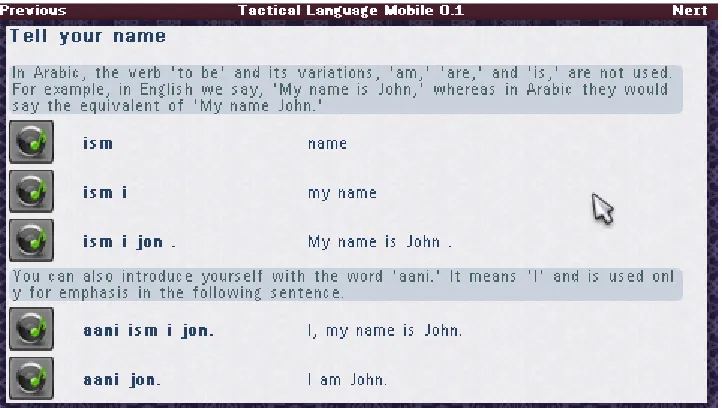
3.1.1 Tactical Language
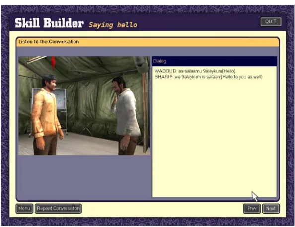
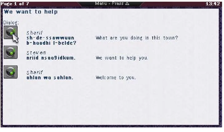
The conceptual part (the lessons) on the PC version consists of several
differ-ent lesson types, usually starting with a dialog between two characters. Each sdiffer-entence
is audible and the characters can be seen in a virtual world interacting with each other
(making gestures for example) as can be seen in Figure 1. After the dialog in which the
subjects for the particular lesson are introduced several next parts of the lesson explain
what happened in the conversation, show how to pronounce the words and sentences
and explain gestures and common practices when interacting with people from the
particular culture and during a lesson several questions are asked. There are a large
number of lessons available, and future version will support multiple languages and
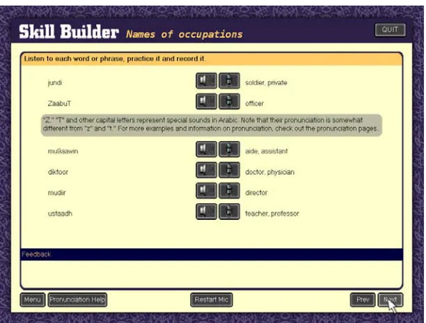
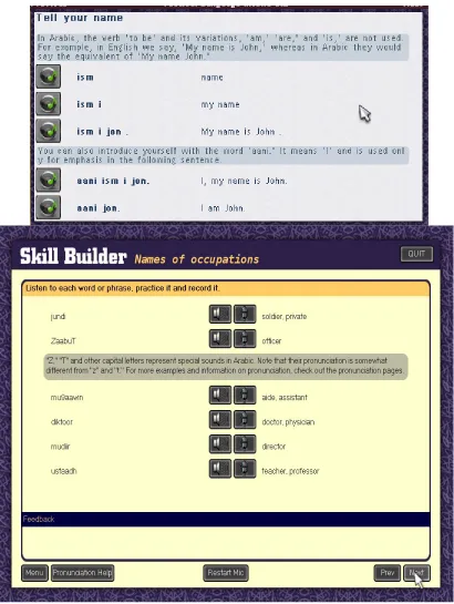
cultures to learn. Another example of a very common lesson page is the pronunciation
page, these pages provide words, sentences and parts of sentences to practice with.
With the use of a speech recognizer the user can test and hear if their pronunciation is
adequate. Figure 2 shows an example of a pronunciation page, the speaker button
allows the use to hear the sentence spoken by a native speaker and the microphone
button allows the user to record their own voice, play it back and let the speech
One of the main features of TL is the speech recognition, every sentence and
word in a lesson can be practiced and checked for errors by using the speech
recog-nizer. Some questions require you to respond in speech to someone and even a whole
conversation can be practiced with the aid of speech recognition. When used for
exam-ple in a lesson, a user can click on a button next to a sentence to practice that sentence.
After the user has listened to the correct pronunciation the user can record his own
voice and the speech recognizer will try and recognize it. The software will then use
the output of the speech recognizer to give advice when the pronunciation was not
cor-rect.
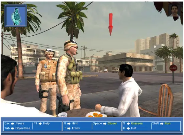
The practical part of TL is mission based (similar to a video-game), you’ll
receive instructions at the beginning of a mission (Figure 3) and will have to complete
the mission within the virtual environment (Figure 4) using the virtual characters that
are present there. Characters will interact with you and can show emotion depending
on the user saying correct or incorrect sentences. An aid in the form of a virtual
performed by using a microphone and the speech recognizer. Characters in the game
can react to a number of different responses of the user and as the game progresses the
difficulty increases.
Figure 3: Briefing before starting a mission
3.1.2 Tactical Language PSP
The mobile version of TL features currently only the conceptual part of the PC
version. All of the lessons are provided on the mobile device and as much of the lesson
content as possible is made available to the user. The mobile device used is the
Play-Station Portable (PSP). There are several technical reasons for choosing this device,
but one of the main reasons was that the target group already owned the device in large
numbers. The details of the PSP will be covered in the next section.
The PSP version is intended to be used as an extension of the main application
on the PC. It can be used for reference and extra training when a PC is not available.
To fulfill this task all the conceptual content is provided, though in a limited fashion.
For example, the starting dialog does not feature the virtual environment with the
char-acters interacting but only features the audio and text. During the research the
applica-tion was still in development (this research helped the development of the applicaapplica-tion).
Because of this the final version might support more than discussed in this paper. This
has no impact on this thesis, but should be noted when reading the thesis. Currently,
pronunciation pages feature similar functionality as their PC version counterparts, but
lack the speech recognition ability.
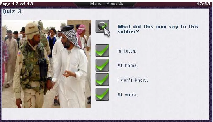
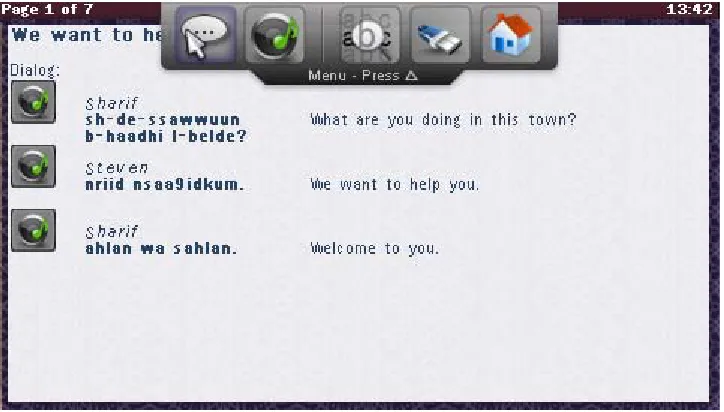
Figure 5 shows an example of an introductory dialog, and Figure 6 an example
of a pronunciation page. Information pages are pages containing usually a picture and
some text; they were easily transferred to the mobile version. Finally there are multiple
choice pages, usually featuring a question accompanied by an audio fragment and a
number of answers that can be chosen, Figure 7 shows a multiple choice page. There
were similar pages in the PC version but required the use of the microphone and
speech recognizer, as these are currently unavailable on the mobile version they are
left out for now.
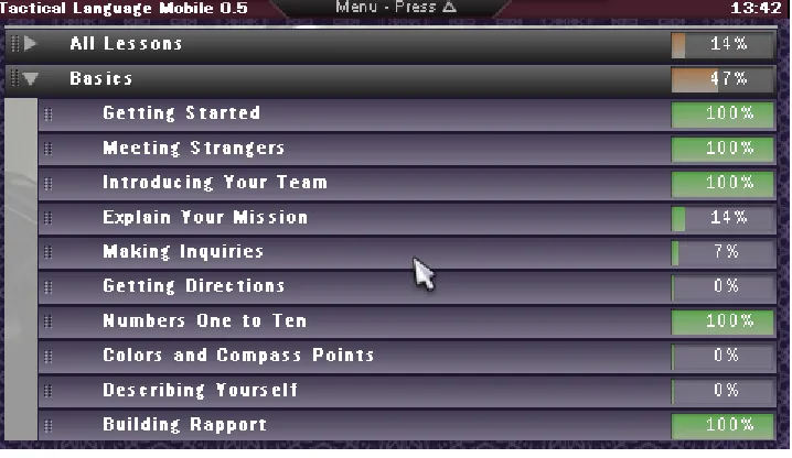
The lesson selection menu on the PSP has a similar content structure as the PC
version; menu groups can be opened and closed in a similar way. The only difference
is that it is designed to fit on a smaller screen and that a special progress tracking
sys-tem has been added. The mobile application will be used differently than the PC based
version, instead of using the software for a longer continues time, the mobile version
might be used in short bursts. To help users get started more quickly when returning,
the mobile application keeps track of where the user ended the previous session, and
what sections the user already finished. The current design of the menu is shown in
Figure 8. Each lesson shows the percentage of how far the user has progressed in that
particular lesson, and those percentages combined make up the percentage of the
group to which the lessons belong to. When a user finishes a complete group it will
show this with a filled bar and ‘100%’ sign. As has been mentioned in the first part of
3.2 PlayStation Portable and PC Version Comparison
The mobile interface is based on the PC version of Tactical language. The
gen-eral appearance is designed to be close to that of the PC counterpart, but there are a
number of differences that were introduced to enhance the user experience when using
the interface on a mobile device. The resemblance stresses the fact that it is an
exten-sion of the PC verexten-sion, creating a completely different interface could confuse users to
think that it is a very different product. The differences between the two versions will
be discussed below.
3.2.1 Less buttons
Instead of providing quite a number of onscreen buttons, the hardware
(physi-cal) buttons available on the PSP are used. The main reason for this is to save screen
estate by allowing more content to be visible instead of interface buttons. Another
rea-son is that the PSP user is already familiar with the buttons available on the device,
and they form the main means of input for it. The PSP does not feature a touch screen
The PC version can have more onscreen buttons because of the larger screen,
but also because of the mouse input. Buttons are more easily selected with a mouse
and PC users are already familiar with using large numbers of onscreen buttons.
Fig-ure 9 shows the difference between PC version and PSP (mobile) version. The top
image is the PC version, featuring a number of onscreen buttons. The image at the
bot-tom shows the PSP version with almost no onscreen buttons, and no onscreen buttons
are available for major functions (next page, main menu). They are instead mapped to
3.2.2 Toolbar
A number of functions cannot be assigned to hardware buttons because either
all of the buttons are already used, or the functions are not used frequently enough to
be assigned to those buttons. These functions are thus assigned to onscreen buttons.
But because they are not being used frequently enough it would be wasteful to present
them onscreen all of the time. Instead they are hidden off-screen on a toolbar that can
appear when the users need to access those functions. The toolbar is represented by a
label when it is hidden with a small instruction that tells the user which button to use to
show the full toolbar. A little slide animation was added to attract the user’s attention
when the toolbar shows itself. Figure 10 shows an example the toolbar. The two
but-tons on the left are used for audio recording and playback, the rest of the butbut-tons
repre-sent a font scaling feature, external USB on/off and a ‘back to main menu’ function.
The toolbar might be a useful extension to the PC version, but the same
reason-ing described above holds here too. The PC version has a lot more screen estate to
spare and because of that users might find it more useful to see those functions present
onscreen all of the time. The main reason for applying it to the mobile version was to
save screen estate for more content, and thus less scrolling for the user.
3.2.3 Button Layout
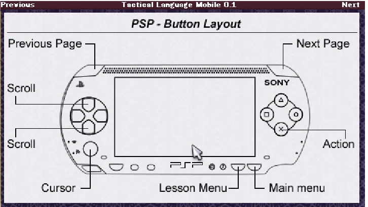
At startup of the mobile application an overview of the hardware buttons is
given. This appeared to be a valuable addition for users not familiar with the PSP or
the application and that used the application for brief moments of time. Because they
were not using the software regularly they kept forgetting the functions of the buttons
or even where specific buttons were placed. A simple startup screen giving a quick
schematic overview of where buttons are positioned and what function is assigned to
them can give non-regular users a quick start back into the usage of the application.
Another advantage is that users don’t have to use the manual every time when they
forget specific functions or buttons. Figure 11 shows the startup screen on the PSP, a
schematic overview of the PSP hardware and buttons is displayed.
3.2.4 Menu
The menu in the PC version is using only one screen to display all of the
con-tent in the menu. By clicking on the lesson group names on the left the concon-tent of the
large window on the right changes. This was unfeasible on the PSP because of the
displaying the list of lesson groups, the other the list of lessons. By clicking on a
les-son group name in the first screen the second screen displayed with the lesles-sons
belonging to that group. While this worked fairly well, users became disoriented when
returning to the menu, and users had difficulties remembering in what group they were
located.
The design that is currently used is based on the PC version but is compacted
into sliding menus. This gives a good overview and serves a number of preferences
that users might have. For example some users liked having a long list with all the
les-sons so they could scroll down the list. Other users preferred the multiple screen
ver-sion of the menu but agreed that the new menu was very close to that verver-sion if one
opened only one of the groups. Another advantage is that the current menu can be
extended with subgroups too. If, in the future, subgroups would be added the current
design would be very easy to adapt to show those groups. With the multiple screens
version this would result in adding more screens, increasing the confusion of where a
user is located in the tree structure. Figure 8 displays the menu as it was available in
the last version on the PSP (version 0.5). The final menu design uses the ‘System
feed-back and support’ design principle. The user has a clear view of what is happening
because menus open and then show new content instead of disappearing and being
replaced by the new content.
3.2.5 Console
A similarity with the PC version is the console which is mainly used for
devel-opment. The console can show a number of error and general logging messages.
Because the PSP has very limited debug functionality, logging capabilities were one of
the first things added to the framework. A number of messages can be logged, ranging
from text messages to critical errors. The TLCore class provides a static interface for
logging which is further handled in the TLDebug class. A window application
dis-plays any debug message in its window by using the basic text capabilities of the
Interface Manager. TLConsole is a nice example of how little code is needed for
dis-playing a functional window.
3.3 System Architecture
Because the architecture of the software was influenced by the interface design
and vice versa a short overview of the system architecture is given. First the PSP will
be discussed and then parts of the application will be discussed, focusing on how
inter-face and system design were influenced during the development process.
3.3.1 PlayStation Portable
The target device for the application to be ported to is the Sony PlayStation
Portable. The main reason for choosing this device is the high penetration rate of it in
the target user group. The PSP is a high performance gaming device at hart, featured
with a large screen and numerous buttons. It has Wi-Fi networking capabilities and
supports hardware add-ons (microphone, camera and keyboard for example). The 333
MHz processor (and second media processor) combined with a dedicated video and
audio chip provide enough performance for highly visual 3D content to be displayed.
The PSP features a number of buttons positioned around the device. Besides
normal buttons a small analog pad (or stick) is available for continuous input, as
opposed to the four-way directional pad. Most buttons are conveniently placed and
easily reachable when the device is held in both hands. The PSP lacks a touch screen
because it is rarely used in conventional games currently.
For development purposes a freely non-official Self Development Kit (SDK)
can be used, instead of the official SDK from Sony. The latter is only available to the
larger companies within in the gaming industry, while the first is available to
every-one. The non-official SDK can only be used for prototyping and non-commercial
utilities and libraries to aid the developer while programming for the PSP. While these
libraries make developing easier, they by no means deliver a framework for
applica-tion development. An addiapplica-tional, already existing framework was used created by the
author of this article. This framework is introduced in the next section, the actual
Tac-tical Language application was built on top of this framework.
3.3.2 Framework
The framework was created to add some abstraction to the software on the PSP,
instead of using native function calls (for example the graphics API on the PSP or
audio library) an abstraction layer provides more general calls to be used throughout
the application. This provides the option to port the framework to another device or
platform without having to change the applications running on top of the framework.
Currently the PSP framework that was created for this research provides: Accelerated
GPU rendering, audio output and recording, controller input (continuous / discrete),
graphical cursor handling, file input and output, window manager functions, debug
facilities, boot loader and configuration file support. These parts will be discussed in
more detail below.
3.3.2.1 GPU Rendering
This is one of the lower layers of the framework, providing basic functions to
render graphics to the screen and loading images from files for example. The PSP
fea-tures powerful but very specific graphics acceleration support. If the application would
have to be ported to another device or platform this would be a major difference and
would result in large amounts of code rewriting to adapt it to the new platform. While
designing this more general interface for graphical related functions in the framework,
the interfaces of existing libraries for other platforms were studied; this would make
porting to another platform somewhat simpler in the future.
memory (the TLImage class). This class is passed to graphical related functions and
contains info about the image it contains. The native image representation for the
form can be contained within this class to protect the rest of the application from
plat-form specific usage (for example bit depth or color bit arrangement). The interface
contains functions for direct rendering to the physical screen or images (TLImage
class), scaling images and loading images from files.
3.3.2.2 Audio Output / Input
Similar to the graphical interface, audio interfaces differ heavily between
plat-forms. The PSP lacks even a native audio library, so behind the generic interface that
was designed the complete audio library had to be implemented. The audio library
fea-tures playback of files and recording of audio to a file. Different audio codecs are
sup-ported but can differ depending on the platform. Codecs can be added or removed
without the application using the framework knowing. Only one function is used to
play an audio file, and the file type is determined automatically if the appropriate
codec is available. This enables changing the audio files (a different compression for
example) without changing the application. Adding the codec to the framework would
suffice.
3.3.2.3 Controller Input
User input can differ even on one platform. The PSP fox example supports a
four-way directional button and an analog stick. Both can be used for controlling a
cursor but are handled very different within the application code. A layer of
abstrac-tion is provided by encapsulating the controller info into a TLCursor class which
con-tains information about the current position of the cursor and a TLController class
which keeps track of buttons that are pushed. The framework translates any user input
(for example from the analog or digital pad) to a cursor position, the application can
application would be ported to a platform supporting touch-screen the framework
would have to be adapted slightly to support the touch-screen input. The framework
would then translate the touch-screen coordinates to a new cursor position and the
application would not even know it was handling touch-screen events.
3.3.2.4 Window Manager
This is one of the main functions of the framework, it provides a clean, abstract
interface for applications to run in a window. Applications are provided with cursor
positions and button clicks if the window was active during such an event. Windows
can be moved around or closed by the user and multiple windows can be displayed at
the same time. Each window can contain a separate application, where each
applica-tion does not know if there are more applicaapplica-tions (windows) running. Windows can be
decorated with borders and buttons or the window can be transparent. The Window
Manager also supports fullscreen applications, giving the application the whole screen
to draw too and capturing all control inputs.
The TLWindowManager class features a number of functions to create, destroy
or move windows. A window contains a TLWindowApplication which is basically an
abstract class providing a template for the actual application. It provides event
func-tions which are called when the window content should be updated, a button is
pressed, the cursor is moved or when the window is closed. An actual application can
be designed on top of those functions.
3.3.2.5 Configuration file support
A lot of design choices can be made while writing code (especially on
applica-tion level). To provide customizaapplica-tion without the need to rewrite code, configuraapplica-tion
file support is available. A number of properties can be entered into a configuration
file which is then read and parsed by the framework and a clean interface provides
file layout.
A configuration file consists of key and value pairs. When a value is needed
from a configuration file a function is called with the key that matches the requested
value. The value is then returned by the function and can be converted to a specific
type (int, string, etc) if needed. Values can be altered in a similar way or created if the
key did not exist yet.
Using the framework a developer can focus on application functionality and
use the provided libraries for easy access to the controls, audio system and screen. For
even more ease, an interface manager is provided that can take over part of the screen
and dynamically render images, text and buttons without the programmer worrying
about placement, scrolling and wrapping. The interface manager is another
abstrac-tion, one that disconnects the interface from a specific window or screen size, enabling
the application to be ported to devices with smaller or larger screens. The interface
manager accepts a number of arguments to provide some control of how objects are
rendered to the screen (indentation, horizontal placement, aligning, etc).
The function of the framework is twofold; it provides the developer with an
easy to use programming interface and provides abstraction, in order for the
applica-tion to be portable to other devices. The Tactical Language applicaapplica-tion never uses and
should not use any device dependent function, instead, the framework should be
extended. This ensures when the framework is ported the application can be easily
transferred with it, without major rewriting of interface code. Even when very
particu-lar features are used (for example 3D accelerated rendering) the higher levels of the
application should not directly access them but an (very light) abstraction can be used
to support other 3D hardware in the future when a different platform is used. Usually
interfaces are quite similar between different libraries or platforms. Adding this
abstraction to the framework can make development of other programs using the
which uses the ‘Flexibility’ design principle mentioned in part one of the thesis.
3.3.3 Architecture
The complete software solution consists of a number of layers as shown in
Fig-ure 12. The actual application code is on top and the lower levels of the framework are
at the bottom. While there are a number of layers, the framework is invoked from most
of the higher layers; hence it is depicted as a ‘shell’ around all the layers except the
application code which mainly uses the Interface Manager.
One of the more important abstractions is the interface manager; it provides an
easy interface to any interactive part of the visible screen. As the framework enables
the use of multiple windows to be displayed on screen, an application can use these
windows to display itself, or a number of different applications can run at the same
time. Because window size and screen size (perhaps due to running the application on
different devices) can differ quite a lot, the interface manager disconnects the interface
from the application. The interface manager can draw the same screen content to
dif-ferent screen sizes without changing the actual source code. This also means that font
size and other interface components can be scaled dynamically, this specific feature is
for example used for the font size option in the TL application. The font size can be
changed by the user and the content is dynamically redrawn and placed. The font
nessecary to make it more suitable to the situation the user is in. A larger font size
might help when screen visability is low. This feature also helps if the application is
ported to another device in the future, the content can be rendered to a smaller or larger
screen without any modification in the code.
The framework features a number of parts taking care of specific functionality
in order to provide abstraction and make maintaining the code easier. Although some
of the framework has been divided into layers, it is not that important as most of the
framework should be ported anyway when transferring to another device or
environ-ment, because the framework code consists of a lot of device dependent code. Figure
13 gives a schematic overview of the components of which the framework consists.
The framework is a set of utilities to provide easier access to the hardware so there is
no real architecture, but some of the components do have their own specific design and
architecture (File IO and the configuration-file system for example).
Because the application consists of a lot of content and the content is loaded
from external files the interface had to be very flexible in order for it to work without
too much adaptation in code. The Interface Manager solves this problem by rendering
text and media in a dynamic way, auto-wrapping text and scaling images much like a
web browser. Because of the adaptability and ease of implementation the Interface
Manager is used throughout the application to draw screens.
3.4 Interface Design
rendered to the screen by the Interface manager which was described in the previous
section. The colors and images used in the interface are inspired by the PC version,
aswell as the general placement of items and text. The design principle ‘Consistency
and learnability’ applies here. This mobile version is to be used as an extension of the
PC version, and thus users will be familiar with the interface from the PC version.
The interface manager’s rendering is up to a degree customizable. Indentations
can be set, and the decision to place two objects next to each other or below each other
is also up to the designer. A block of text can be restricted in width and images can be
scaled to a fixed size. This gives the designer some freedom to define the layout of a
page. Each type of page is a template that defines how the general layout is which is
then filled in at runtime. Content is extracted from the XML and assigned to the
pre-defined places on the page. The Interface manager dynamically places it at runtime so
the page fits on the visible screen. Most of the templates are created in a way that as
much related content as possible fits on the screen to prevent scrolling. Most of the
content consists of text and buttons, of which text is the most important. Because
screen size is limited on the PSP and very different users might use the application the
font size is user adaptable at any time. Some users prefer a larger font size with
scroll-ing while others prefer a smaller font size without scrollscroll-ing. The font size is adaptable
at runtime, again the interface manager makes this possible because it will
dynami-cally render the text and wrap it if needed. Appendix C shows a function used in the
application to render a pronunciation page to the screen. This code is slightly modified
for this example, but is basically the same. The lines that are printed in italic are API
calls to the Interface Manager, they are used to add text, images or buttons to the
screen. For example, the first API call ‘AddText’ will add a text string to the screen
with the specified color and fontsize. Because it is the first call for that screen, the text
will appear at the top of the screen. The Interface Manager will render every added
content to the screen but one has to finalize the modification with another ‘Commit’.
When the Commit function is called the positions of the objects added are calculated
to fit within the size of the visible screen and text is wrapped for example. These
func-tions show the high degree of abstraction that is present within the application. The
Interface Manager can handle very different screen sizes without any change to the
code. As a side note, the parameters that are not shown (and were replaced by ‘...’) are
used to position the text horizontally and specify if a hard enter should be present for
example.
During development a number of test sessions were organized to test specific
parts of the interface. During these sessions users were asked to use that specific
inter-face part and freely comment while using the application. This way a number of
changes were made early in development. One of the most important was the design of
the lesson selection menu. Instead of scrolling and a new screen for every lesson
group, a tab-inspired interface was created so users would not have to switch between
different screens. Users also made remarks that they forgot where they stopped the last
time, and if there was a ‘save’ option. These remarks led to the addition of the
pro-gression info in the menu by means of percentages.
To summarize, the interface was inspired by the PC version, but is largely
defined by how the Interface Manager renders the page in the end. The templates used
for the interface manager were designed with the aid of informal user tests, and parts
Chapter 4
Evaluation
A user test was conducted to evaluate the development state of the application
and interface. The user test procedure will be explained first in this section, the
docu-ments used during the user test can be found in the appendix. After the user test has
been introduced the user test process will be discussed. The user test was conducted in
two places because of time constraints. The second smaller user test was needed for
immediate results while the first user test (concerning more than one hundred subjects)
will be concluded at a later point. This second smaller user test will be discussed in
this thesis; the first user test results will be available as an addendum or as a new
research.
4.1 User Test
The second user test was conducted in a slightly more controlled situation than
the first user test. This resolved some of the problems that were encountered during the
first user test, especially the lack of technical support in between user tests and initial
setup. The PSP can be a difficult device to handle for people without any experience in
handhelds. The not so common software featuring a foreign language running on the
PSP made it even more daunting for the user. While the manual (Appendix A) is quite
elaborate, it can never replace an actual person giving instructions, especially if the
device reacts differently than stated.
Ten people were in this smaller user test, they were required to complete one
lesson on the PSP. This lesson was adapted to provide enough content and different
types of content. An early lesson was used to allow newcomers to complete the lesson
themselves to each other. After this example conversation a number of theory lessons
are given to rehearse the words used in the conversation. In these theory lessons users
can listen to single words. There are a number of information pages in the lesson
explaining specific cultural procedures during such a conversation. Lastly, there are
four multiple choice questions present in the lesson requiring the user to listen to an
audio fragment to answer the question.
The user group that participated consisted of a number of students working at
the Information Sciences Institute, all of those students were working on Computer
Science related subjects. The rest of the group consisted of employees working at the
Information Sciences Institute, again all working on a Computer Science related
sub-ject. The age of the participants ranged between twentyfour and thirtyone.
4.1.1 Remote User Testing
To enable mobile user testing a special user test was developed for user testing.
This special version of the software is a modified version of the original application
with only one lesson and a number of data gathering features. A number of
modifica-tions were done to create a self-sustained research application that can handle multiple
user tests, collect data and save the data in a way it can be retrieved easily. Another
modification is the appearance of a number of questions before the actual user test
starts, using this modification the user can be asked what the current conditions are of
where the user test is taking place. This way the user testing can be done without
inter-ference of a researcher and users can go anywhere they want with the device.
The lesson used in the user test consists of two versions, which are alternated
randomly between users. One version can be specified as the ‘inside’ interface while
the other is the ‘outside’ interface. The difference between the two is that the outside
interface features a higher contrast between interface and text, bigger font size and
dif-ferent input system. While the first two differences are assumed obvious, the third