Chapter I
Descriptive Statistics
... …...
Objetive
Chapter
The objective of statistical
Techniques is to provide students
majoring
in
management,
PART I OVERVIEW
1.1 Introduction of the course
This chapter prepares students how to obtaining data and transform it into information to describe, synthesizing, analyzing, and interpreting information by using table, graphs and summary statistic, also analyze business data, examining the relationships between variables and making economic forecasts and to use statistical tools necessary to perform data analysis and enable the make decisions under conditions of uncertainty considering estimation errors when performing their generalizations.
Therefore the statistic helps students to use methods and statistical techniques for making decisions or predictions about a population based on sampled data about scientific and technological research in the context of a Christian worldview.
Having completed the chapter the student should be able to:
understand the use of most simple statistical techniques used in the world of business; understand published graphical presentation of data;
present statistical data to others in graphical form;
summarize and analyze statistical data and interpret the analysis for others; identify relationships between pairs of variables;
use a statistical software package (SPSS).
Business statistics:
Any decision making process should be supported by some quantitative measures produced by the analysis of collected data. Useful data may be on:
Your firm's products, costs, sales or services Your competitors' products, costs, sales or services Measurement of industrial processes
Your firm's workforce, etc.
Once collected, this data needs to be summarized and displayed in a manner which helps its communication to, and understanding by, others. Only when fully understood can it profitably become part of the decision making process.
1.2 Why study Statistics?
The study of statistics will serve to enhance and further develop critical and analytic thinking skills. To do well in statistics one must develop and use formal logical thinking abilities that are both high level and creative.
an understanding of statistics, the information contained in this section will be meaningless. An understanding of basic statistics will provide you with the fundamental skills necessary to read and evaluate most results sections. The ability to extract meaning from journal articles and the ability to critically evaluate research from a statistical perspective are fundamental skills that will enhance your knowledge and understanding in related coursework.
Students and professional people may be called on to conduct research in their field, since statistical procedures are basic to research. To accomplish this, they must be able to design experiments; collect, organize, analyze, and summarize data; and possibly make reliable predictions or forecasts for future use. They must be able to communicate the results of the study in their own words.
Students and professional people can also use the knowledge gained from studying statistics to become better consumers and citizens. For example, they can make intelligent decisions about what products to purchase based on consumer studies, government spending based on utilization studies, and so on.
1.3 The Branches of Statistics
1.4 Definitions
A Population is the complete collections of measurement, objects, or individuals under study. Its size is usually denoted by “N"
A parameter is a numerical measure that describes a variable (characteristic) of a population. e.g., the average height of all Rwandese
A statistic is a numerical measure that describes a variable (characteristic) of a sample (part of population), e.g., the average height of a sample of Rwandese.
A variable is a characteristic that changes or varies over time and/or for different individuals or objects under consideration, e.g.,household income, time to failure of a computer component.
Sources of data:
o You begin every statistical analysis by identifying the source of the data. Among the important sources of data are published sources, experiments, and surveys.
o Published Sources are the data available in print or in electronic form, including data found on internet website. Primary data sources are those published by the individual or group that collected the data. Secondary data sources are those compiled from primary sources. (National Bank of Rwanda: http://www.bnr.rw/index.php?id=213; National Institute of Statistics of Rwanda (NISR): http://www.statistics.gov.rw/
o Survey a process that uses questionnaire or similar means to gather values for the responses from a set of participants.
1.5 Types of Data and Scales of Measurement
Variables can be classified in several ways. One method of classification refers to the type and amount of information contained in the data. Data are either categorical or numerical. Another method is to classify data by levels of measurement: nominal, ordinal, interval or ratio.
Numerical. Numerical or quantitative data arise from counting, measuring something, or some kind of mathematical operation.
This type of variable can be broken down into two types: Discrete and Continuous
Discrete. Often such data are integers. Example, number of takeoffs at Kigali International Airport, the number of people shopping in a supermarket.
Continuous. Is a numerical variable that can have any value within an interval. Example, weight of a package of rise (e.g., 495.897 grams), this is continuous variable because any interval such as <495 – 500> grams can contain infinitely many possible values.
Classification of variables according of measurement level
Nominal-Level data is merely descriptive, the data describing it are simple labels or names which cannot be ordered (e.g. religion, types of credit cards, sex). Any assigned numerical value is merely for convenience (e.g. Religion: Catholic = 1, Adventist = 2, Other = 3)
Ordinal-Level data has rank in a meaningful order, though intervals between data points cannot be considered equal (e.g. household Income (high/medium/low); Severity (poor, average, high).
Interval-Level, this kind of measurement not only assigns rank or order. The major strength of this scale lies in the fact that they have equal units of measurement. However they do not possess a true zero. Example: Fahrenheit or centigrade scale here the zero does not indicate the absence of heat, also the zero is arbitrary and not meaningful.
Likert scales. It is a special case that is frequently used in survey research. You have undoubtedly seen such scales. Typically, a statement is made and the respondent is asked to indicate his or her agreement/ disagreement on a five-point or seven-point scale using verbal anchors. Example:
"College-bound high school student should be required to study a foreign language." (Check one)
Strongly agree
Somewhat agree
Neither agree Nor Disagree
Somewhat Disagree
Strongly Disagree
comparative ratio in relation to some quality or property existing among different individuals. For example, profit is a ratio variable (e.g. 4 million is twice as much as 2 million), yet firms can have negative profit (i.e., a loss)
Types of Variables (Experimental design)
Independent variable. Variable controlled by the researcher; changes in this variable may produce changes in the dependent variable.(Is the presumed “cause” in the theoretical model)
Dependent variable. The observed variable that is expected to change as a result of changes in the independent variable in an experiment. (Is the presumed “cause” in the theoretical model.
Moderating variable. Suspected or known to impact or influence the Dependent variable.
1.6 Methods of data collection
Mailing paper questionnaires to respondents, who fill them out and mail them back
Having interviewers call to respondents on the telephone and ask them the question in a telephone interview
Sending the interviewers to the respondent’s home or office to administer the questions in face-to-face (FTF) interviews.
Published sources, experiments, and surveys.
Questions and answers in surveys
A questionaire is a standardised set of questions administered to the respondents in a survey.
Respondents are required to interpret a preestablished set of questions and to supply the information these questions seek.
Formatting the answer
Now, thinking about your physical health, which includes physical illness and injury, for how many days during the past 30 was your physical health not good? ………. 2. Closed questions with ordered response scales, example:
Would you say that in general your health is:
1 Excellent 2 Very good 3 Good 4 Fair 5 Poor
3. Closed questions with categorical response options Are you:
1 Married 2 Divorced 3 Widowed 4 Separated 5 Never married
6 A member of an unmarried couple
Non sensitive questions about behavior,
take attention to the wording
With closed questions, include all reasonable possibilities as explicit response options.Are you: Are you:
• Married
• Divorced Married
• Widowed Single
• Separated • Never married
Make the question as specific as possible (about who it covers, what time period, which behaviours…)
• Over the last month, that is ….. In a tipical week, how often do you how often do you read a newspaper read a newspaper?
in a tipical week?
Use words that virtually all respondents will understand
• Have you ever had a heart attack? Have you ever had a miocardial infarction?
Clearly specify the attitude object of interest
Measure the strength of the attitute(Using a response too litte, scale, a separate item or multiple items that can be combined into a scale).
1 Agree strongly Do you think the Government
2 Agree is spending about the right
3 Neither agree nor disagree amount, or too much on
4 Disagree education?
5 Disagree strongly
Example of Questionnaire
The Corporate Ethical Virtues Model
This survey is for a study on African Adventist leaders and ethics, conducted by Shawna Vyhmeister. Please answer as honestly as you can. Neither you nor your institution will be identified in any way, and the data will be reported in aggregate. Thank you in advance for your participation.
Choose the ONE position that best describes your current work:
Pastor1 Educator2 Financial Administrator3 Church Administrator4 Other5
Division of Employment: ECD1 SID2 WAD3
Key: 1= Never 2 = Rarely 3 = Sometimes 4 = Often 5 = Always
Clarity: The organization makes it sufficiently clear to me… N R S O A 1.1…how I should conduct myself appropriately toward others within the organization 1 2 3 4 5
1.2....how I should obtain proper authorizations 1 2 3 4 5
1.3. how I should use company equipment responsibly 1 2 3 4 5
1.4. how I should use my working hours responsibly 1 2 3 4 5
1.5. how I should handle money and other financial assets responsibly 1 2 3 4 5 1.6. how I should deal with conflicts of interests and sideline activities responsibly 1 2 3 4 5 1.7. how I should deal with confidential information responsibly 1 2 3 4 5 1.8. how I should deal with external persons and organizations responsibly 1 2 3 4 5 1.9. how I should deal with environmental issues in a responsible way 1 2 3 4 5 Congruency of Supervisors: My supervisor…
2.1…sets a good example in terms of ethical behavior 1 2 3 4 5
2.2…communicates the importance of ethics and integrity clearly and convincingly 1 2 3 4 5 2.3…would never authorize unethical or illegal conduct to meet business goals 1 2 3 4 5
2.4…does as he says 1 2 3 4 5
2.5….fulfills his responsibilities 1 2 3 4 5
2.6….is honest and reliable 1 2 3 4 5
Congruency of Management
3.1. The conduct of the Board and (senior) management reflects a shared set of norms and values 1 2 3 4 5
3.2. The Board and (senior) management sets a good example in terms of ethical behavior
1 2 3 4 5
3.3. The Board and (senior) management communicates the importance of ethics and integrity clearly and convincingly
1 2 3 4 5
3.4. The Board and (senior) management would never authorize unethical or illegal conduct to meet business goals
1 2 3 4 5
Feasibility
4.1. In my immediate working environment, I am sometimes asked to do things that conflict with my conscience
4.2. In order to be successful in my organization, I sometimes have to sacrifice my personal norms and values
1 2 3 4 5
4.3. I have insufficient time at my disposal to carry out my tasks responsibly 1 2 3 4 5 4.4. I have insufficient information at my disposal to carry out my tasks responsibly 1 2 3 4 5 4.5. I have inadequate resources at my disposal to carry out my tasks responsibly 1 2 3 4 5 4.6. In my job, I am sometimes put under pressure to break the rules 1 2 3 4 5 Supportability: In my immediate working environment, …
5.1.…everyone is totally committed to the (stipulated) norms and values of the organization
1 2 3 4 5
5.2….an atmosphere of mutual trust prevails 1 2 3 4 5
5.3….everyone has the best interests of the organization at heart 1 2 3 4 5 5.4….a mutual relationship of trust prevails between employees and management 1 2 3 4 5
5.5….everyone takes the existing norms and standards seriously 1 2 3 4 5
5.6….everyone treats one another with respect. 1 2 3 4 5
Transparency
6.1. If a colleague does something which is not permitted, my manager will find out about it
1 2 3 4 5 6.2. If a colleague does something which is not permitted, I or another colleague will
find out about it
1 2 3 4 5 6.3. If my manager does something which is not permitted, someone in the
organization will find out about it
1 2 3 4 5 6.4. If I criticize other people’s behavior, I will receive feedback on any action taken as
a result of my criticism
1 2 3 4 5 6.5.In my immediate working environment ,there is adequate awareness of potential
violations and incidents in the organization
1 2 3 4 5 6.6. In my immediate working environment, adequate checks are carried out to detect
violations and unethical conduct 1 2 3 4 5
6.7. Management is aware of the type of incidents and unethical conduct that occur in my immediate working environment
1 2 3 4 5 Discussability: In my immediate working environment…
7.1….reports of unethical conduct are handled with caution 1 2 3 4 5
7.2….I have the opportunity to express my opinion 1 2 3 4 5
7.3….there is adequate scope to discuss unethical conduct 1 2 3 4 5
7.4….reports of unethical conduct are taken seriously 1 2 3 4 5
7.5….there is adequate scope to discuss personal moral dilemmas 1 2 3 4 5
7.6….there is adequate scope to report unethical conduct 1 2 3 4 5
7.7….there is ample opportunity for discussing moral dilemmas 1 2 3 4 5
7.8….there is adequate scope to correct unethical conduct 1 2 3 4 5
Sanction ability
8.1.In my immediate working environment, people are accountable for their actions 1 2 3 4 5 8.2.In my immediate working environment, ethical conduct is valued highly 1 2 3 4 5 8.3.In my immediate working environment, only people with integrity are considered for
promotion
1 2 3 4 5 8.4.If necessary, my manager will be disciplined if she behaves unethically 1 2 3 4 5 8.5.The people that are successful in my immediate working environment stick to the
norms and standards of the organization
1 2 3 4 5 8.6.In my immediate working environment, ethical conduct is rewarded 1 2 3 4 5 8.7.In my immediate working environment, employees will be disciplined if they behave
unethically 1 2 3 4 5
8.8.If I reported unethical conduct to management, I believe those involved would be disciplined fairly regardless of their position
1 2 3 4 5 8.9.In my immediate working environment, employees who conduct themselves with
integrity stand a greater chance to receive a positive performance appraisal than employees who conduct themselves without integrity
Note: From Developing and Testing a Measure for the Ethical Culture of Organizations: The Corporate Ethical Virtues Model, by MuelKaptein, 2007. Erasmus Research Institute of Management, Report no. ERS-2007-084-ORG. Retrieved from http://hdl.handle . net/1765/10770. Used with permission.
Review problems of chapter Short answers
1. List three reasons to study Statistics.
2. List three applications of Statistics in your field or specialty.
3. From the following information that gave the National Institute of Rwanda, read and interpret those statistics.
“Rwanda’s Consumer Price Index (CPI), main gauge of inflation has risen 0.7 percent year on year in February 2015, down from 1.4 percent in January 2015.
In February 2015, “Housing, water, electricity, gas and other fuels” rose by 3.6 percent while Transport decreased by 4.3 percent.
The data also show the “local goods” increased by 1.1 percent on annual change and increased by 0.7 percent on a monthly basis, while prices of the “imported products” decreased by 0.3 percent on annual basis and decreased by 0.2 on a monthly basis.
The prices of the “fresh products” decreased by 2.9 percent between February 2015 and February 2014.
Source:
http://www.statistics.gov.rw/publications/consu mer-price-index-cpi-february-2015.
4. Search in the address
(http://www.statistics.gov.rw/publications/consu mer-price-index-cpi-february-2015) or http://www.bnr.rw/index.php?
id=171&tx_damfrontend_pi1%5Bpointer
%5D=1#test , there you will find articles about the economy in Rwanda, choose an item and present a summary and interpret the information prescribed. You will find the information in Attached files.
5. Mach each of the following terms to is correct definition:
TERMS DEFINITION
Parameter
a. The complete collection of items under study
Statistical Inference
b. A number that describes a sample characteristic
Census
c. Procedures for collecting, classifying, summarizing, and presenting data
Statistics
d. A number that describes a population characteristic
Population
e. The science of gathering and summarizing data and using results to make decisions Descriptive
Statistics f. A subset of the population
Sample
g. The process of arriving at a conclusion about a population parameter on the basis of a sample statistic
a population
6. Determine whether the following data is categorical (a) or numerical (b).
( ) The number of people living in a household ( ) The branches of Statistics
( ) The average miles per gallon on all new Fords. ( ) Customer Satisfaction
7. The portion of the population that is selected for analysis is called:
a. a sample b. a frame c. a parameter d. a statistic
8. A summary measure that is compute from only a sample of the population is called:
a. a parameter b. a population c. a discrete variable d. constant
e. statistic
9. The brand of an automobile (toyota, kia, Nissan, MW, and so on) is an example of a: a. discrete variable
b. continuous variable c. categorical variable d. constant
10. The number of credit cards in a person’s wallet is an example of a:
a. discrete variable b. continuous variable c. categorical variable d. constant
11. Statistical inference occurs when you:
a. compute descriptive statistics from a sample b. take a complete census of a population c. present a graph of data
d. take the result of a sample and reach conclusion about a population
12. The human resources director of a large corporation wants to develop a dental benefits package and decides to select 100 employees from a list of all 5,000 workers in order to study their preferences for the various components of a potential package. All the employees in the corporation constitute the ___________
a. sample b. population c. statistic d. parameter
13. Those methods that involved collecting, presenting, and computing characteristics of a set of data in order to properly describe the various features of the data are called:
a. statistical inference b. the scientific method c. sampling
d. descriptive statistics
14. Which of the following is a discrete variable? a. The favorite flavor of ice cream of student at your local elementary school
b. The time is takes for a certain student to walk to your local elementary school
c. The distance between the home of a certain student and the local elementary school
d. The number of teacher employed at your local elementary school
Answer True or False
15. The possible responses to the question, “How long have you been living at your current residence?” are values from a continuous variable
16. The possible responses to the question, ”How many times in the past three month have you visited a museum?” are values from a discrete variable
Fill in the blank:
18. An insurance company evaluates many variables about a person before deciding on an appropriate rate for automobile insurance. The distance a person drives in a day is an example of a _________variable 19. The portion of the population that is selected for analysis is called the ___
20. A college admission application includes many variables. The number of advanced placement courses the student has taken is an example of a ______________ variable
21. Construct a questionnaire with at least 2 general questions (demographic data), and five specific questions on any topic concerning Economy in Rwanda.
EXAMPLE OF QUESTIONNAIRE
ASSESSMENT OF RWANDA’S COMPLIANCE WITH EAC METROLOGY LEGISLATION AND ITS EFFECTS ON CONSUMERS
General Information:
Level of education: Occupation:
Specific Information:
Q1. What do you think are the main reasons for traders not using fair and accurate weights and measures?
Business malpractices Lack of inspection
Compensation for wholesaler unfail weigths and measures Other
Q2. How much per kg do you think you lose when you buy sugar?
1 - 50
Grams 51 - 100Grams 101 - 200Grams knowDon't
Q3. Have you ever heard of EAC legislation which provides for the use of accurate measurements and protection of consumers?
Yes No
Q4. What do they think is the biggest obstacle preventing the use of fair weights and measures?
Lack of enforcement
Weak consumer associations Low level of awareness Higher rate of taxes Don’t know
Other
PART II DESCRIBING DATA VISUALLY
1.7 Data Analysis: Tables and graphs
Farming Civil service NGO Business Faith based organization Unemployed Other Pre-primary education
The presentation of data is mainly done using two methods: the tabular and graphical method.
Tables and graphs play an important role in business communication mainly because they are two primary means to structure and communicate quantitative information.
We can’t say that Graphs are better than Tables or vice versa, but each is better than the other for a particular communication task. If your message requires the precision of numbers and text labels to identify what they are, you should use a Table. When you want to show the relationship of the data, use a graph.
Economics is a social science that attempts to understand for example, how supply and demand control the distribution of limited resources. Since economies are dynamic and constantly changing, economists must take snapshots of economic data at specified points in time and compare them to other fixed timed data sets to understand trends and relationships. To understand the relationships between these variables, economists use graphs to visually interpret and explain complex ideas.
1.8 Frequency table for numerical variable
Frequency Table: is a table used to organize data. The left column (called classes or groups) includes all possible responses on a variable being studied. The right column is a list of the frequencies, or number of observations and percentages, for each class.
Categorical variable
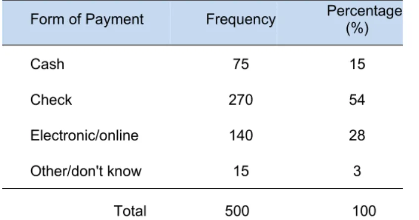
Example: The results of a survey that asked adults how they pay their monthly bills can be presented using a summary table:
Table 1. How Adults Pay Monthly Bills
Form of Payment Frequency Percentage(%)
Cash 75 15
Check 270 54
Electronic/online 140 28
Other/don't know 15 3
Total 500 100
Source: Data extracted from USA Today Snapshots, October 4, 2007
Interpretation: You can conclude that more than half the people pay by check and the majority (82%) either pay by check or by electronic/online forms of payment.
1.9 Graphical Representation of Data
A statistical chart or graph is the presentation of information by means of geometric figures. The primary objective of a graph is to give an overall visual impression for quick and easy to understand. It is important to consider the title of the figure, specify the scale, legend and determine the appropriate figure to information.
A graph consists of two axes called the x (horizontal) and y (vertical) axes. These axes correspond to the variables we are relating. In economics we will usually give the axes different names, such as Price and Quantity.
The point where the two axes intersect is called the origin. The origin is also identified as the point (0, 0).
Why Are Graphs Used in Economics?
Relationships. Graphs in economics can show the relationship between two variables. For example, a classic economic graph would be the cost of a product on one axis and the amount purchased on the other axis. This graph would illustrate how much goods would be purchased at different price points. This graph could help a company determine how much of a good to produce and where to price their product for maximum profit.
Changes. Economic graphs can help to illustrate what happens when there is a shift or change in variables. For example, if demand for a good is stable but supply suddenly drops due to resource constraints, the supply line on a graph will shift. This line shift graphically illustrates how cost will increase and demand decrease for a good.
Equilibrium. One of the classic uses of graphs in economics is to determine equilibrium and break even points. For example, the standard supply and demand graph results in an x shape. The point at which the supply and demand lines intersect is equilibrium. This equilibrium is where the supply of a good and the demand of a good for a given price are equal.
Data Sets. Graphs of two different data sets can help to explain the relationship between economic data. If graphed data shows two parallel lines, it can be inferred that both data sets increase and decrease at the same rate. If the graphed data crosses in an x formation, it is understood that as one data point increases, the other one decreases.
Chart Types
For categorical variables
• Pie circular Chart
(sex, profession, etc.). Want to know the frequency and percentage of total cases that fall into each category.
2007 Energy Balance
Other sources of Energy (14%) Wood for charcoal 23% Petroleum 11%
Wood 57% Electricity 3%
Agric. Peat 6%
Other 14%
• Bar chart: Like a histogram, but with gaps between bars, useful for showing two samples side-by-side Simple® a variable, even when the variable is quantitative but discreet
Interpretation: The bar or Pie chart enables you to see that most of the adults pay their monthly bills by check or electronic/online, a small percentage pay with cash.
Source: National Institute of Statistics of Rwanda
According to estimations based on the 2012 Population and Housing Census of Rwanda, the life expectancy at birth for women in Rwanda will increase by 3.5 years, from 66.2 in 2012 to 69.7 years in 2020 while for men it will increase by 3.2 years from 62.6to 65.8 years for the same period.
Estimates show that the total number of person aged 60 years and above, will be 707,058 in 2020 with 410,682 women (in 2012, the number of persons aged 60 years and above was 511,738 and 304,499 were women).
This growth of the life expectancy at birth and the resulting number of elderly persons in Rwanda reflects the development of Rwanda in various domains, especially the health system. This means that if Rwanda will continuously invest in health system, education and various other components of economic growth like agriculture etc, Rwandans will, without any doubt, go beyond the estimations of life expectancy at birth in 2020, which is 67.8 years.
• Pareto Chart
The Pareto Chart is named after Vilfredo Pareto, an Italian economist who lived in 1897, who postulated that a large share of wealth is owned by a small percentage of the population. This basic principle translates well into quality problems. A Pareto Chart is a series of bars whose heights reflect the frequency or impact of problems. The bars are arranged in descending order of height from left to right. This means the categories represented by the tall bars on the left are relatively more significant then those on the right. This bar chart is used to separate the “vital few” from the “trivial many”. These charts are based on the Pareto Principle which states that 80 percent of the problems come from 20 percent of the causes. Pareto charts are extremely useful because they can be used to identify those factors that have the greatest cumulative effect on the system, and thus screen out the less significant factors in an analysis. Ideally, this allows the user to focus attention on a few important factors in a process.
Note:
use of limited resources. You can separate the few major problems from the many possible problems so you can focus your improvement efforts, arrange data according to priority or importance, and determine which problems are most important using data, not perception.
How to Construct a Pareto Chart
A Pareto Chart can be constructed by segmenting the range of the data into groups (also called segments, bins or categories). For example, if your business was investigating the delay associated with processing credit card applications, you could group the data into the following categories:
•No signature
•Residential address not valid •Non-legible handwriting •Already a customer •Other
The left-side vertical axis of the pareto chart is labeled Frequency (the number of counts for each category), the right-side vertical axis of the pareto chart is the cumulative percentage, and the horizontal axis of the pareto chart is labeled with the group names of your response variables.
You then determine the number of data points that reside within each group and construct the pareto chart, but unlike the bar chart, the pareto chart is ordered in descending frequency magnitude.
Finally, Pareto charts can be used to identify problems to work on. They can help you produce greater efficiency, conserve materials, reduce costs or increase safety. They are most meaningful, however, if your customer–the person or organization that receives your work and helps define the problem categories.
Example:
A Pareto chart can be used to quickly identify what business issues need attention. By using hard data instead of intuition, there can be no question about what problems are influencing the outcome most.
In the example below, XYZ Clothing Store was seeing a steady decline in business. Before the manager did a customer survey, he assumed the decline was due to customer dissatisfaction with the clothing line he was selling and he blamed his supply chain for his problems. After charting the frequency of the answers in his customer survey, however, it was very clear that the real reasons for the decline of his business had nothing to do with his supply chain.
By collecting data and displaying it in a Pareto chart, the manager could see which variables were having the most influence.
Customer complaints Count Clothing faded 18 Clothing shrank 14
Rude sales 61
Poor lighting 44
Layout confusing 35
Sizes limited 23
Parking 82
Solution:
Customer complaints Count
Percent of Total Cumulative Percent Horizontal Line Value
Parking 82 29.6 29.6 80
Rude sales 61 22.0 51.6 80
Layout confusing 35 12.6 80.1 80
Sizes limited 23 8.3 88.4 80
Clothing faded 18 6.5 94.9 80
Clothing shrank 14 5.1 100.0 80
277 100.0
Interpretation: In this example, we see the significant vital few are: parking difficulties, rude sales people, poor lighting, and layout confusing were hurting his business most. Following the Pareto principle, those are the areas where he should focus his attention to build his business back up.
For Numerical or quantitative variables:
Stem and leaf
o A simple graph for quantitative data
o Uses the actual numerical values of each data point. Procedure
– Divide each measurement into two parts: the stem and the leaf.
– List the stems in a column, with a vertical line to their right.
– For each measurement, record the leaf portion in the same row as its matching stem. – Order the leaves from lowest to highest in each stem.
Stem-and-leaf plots are a method for showing the frequency with which certain classes of values occur. You could make a frequency distribution table or a histogram for the values, or you can use a stem-and-leaf plot and let the numbers themselves to show pretty much the same information.
Example:
Boxplot
This tool allows to study the symmetry of the data and detect outliers. This chart divides the data into four areas of equal frequency. The central box (where the middle 50% of the data) has a vertical (or horizontal) inside the box indicates the median (if this line is at the center in the center of the box there is symmetry). From the center of each side vertical (or horizontal) of the box are drawn whiskers. The mustache on the left (or lower) has its extreme value closer to Q1 - 1.5 * IQR, while the right whisker (or higher) has its extreme value closer to Q3 + 1, 5 * IQR, and are considered the most extreme outliers in Q3 + 3 * IQR or less than Q1 - 3 * IQR (in SPSS are represented by “o” or “x”, respectively). Remember that.
Q1 = quartile one or percentile 25.
Q2 = quartile two or percentile 50.
Q3 = quartile three or percentile 75.
IQR = interquartile range = Q3 - Q1.
Example
Suppose you have the age of members of small Church, the data is on the following list: 12, 13, 21, 27, 33, 34, 35, 37, 40, 40, 41.
Data: Age of members of small church
Minimum=12 Maximum=41 Q1= 21
Q2= 34
Q3= 40
Histograms
A Histogram is a pictorial method of representing data. It appears similar to a Bar Chart but has two fundamental differences:
The Area of a block, rather than its height, is drawn proportional to the Frequency, so if one column is twice the width of another it needs to be only half the height to represent the same frequency.
Example:
Customer waiting time (minutes)
Lines
A line chart or line graph is a type of chart which displays information as a series of data points called 'markers' connected by straight line segments. It is a basic type of chart common in many fields. A line chart is often used to visualize a trend in data over intervals of time.
Cumulative frequency graph or ogive of a quantitative variable is a curve graphically showing the cumulative frequency distribution.
Selling Prices ($ thousands)
Number of Vehicles sold
(frequency) Cumulativefrequency
12 8 8
15 23 31
18 17 48
21 18 66
24 8 74
27 4 78
30 2 80
50% of the vehicles sold for less than about $19,500
Gross Domestic Product - 2014 Q4 by Kind of Activity - Rwanda at current prices
(in billion Rwf)
Activity description 2011Q1 2011Q2 2011Q3 2011Q4 2012Q1 2012Q2 2012Q3 Q42012 2013Q1 2013Q2 2013Q3 Q42013 2014Q1 2014Q2 2014Q3 2014Q4
AGRICULTURE, FORESTRY & FISHING
Food crops 177 202 229 238 219 241 281 284 266 279 295 321 307 310 335 322
INDUSTRY
Mining & quarrying 18 17 19 20 17 15 18 19 20 24 23 23 24 23 26 23
TOTAL MANUFACTURING
Beverages & tobacco 22 23 29 26 25 27 32 31 29 31 34 33 33 32 32 31
Construction 66 55 59 72 69 67 77 91 88 80 87 94 97 86 94 106
TRADE &TRANSPORT
Transport 24 25 29 29 30 31 36 36 35 34 38 39 39 39 41 41
Hotels & restaurants 24 24 25 26 26 26 27 27 26 28 28 28 28 29 30 29
Financial services 26 30 28 23 32 37 32 36 41 40 35 48 39 43 39 50
Food Crops (in billions Rwf) 2011 – 2014 Rwanda
You can see a trend of growth in agriculture sector, however cyclically there is always a slight decline in the first quartile of the year.
Population Pyramid
A population pyramid, also called an age pyramid or age picture diagram, is a graphical illustration that shows the
distribution of various age groups in a population (typically that of a country or region of the world), which forms the shape
of a pyramid when the population is growing. It is also used in ecology to determine the overall age distribution of a
population; an indication of the reproductive capabilities and likelihood of the continuation of a species.
It typically consists of two back-to-back bar graphs, with the population plotted on the X-axis and age on the Y-axis, one showing the number of males and one showing females in a particular population in five-year age groups (also called cohorts). Males are conventionally shown on the left and females on the right, and they may be measured by raw number
or as a percentage of the total population.
These graphs give us a vision of youth, maturity and old age of a population and, therefore, also the degree of development of the population. According to their shape may have different types of pyramids:
Progressive:
A high percentage of young population, which will decline as they move ages. They are typical of underdeveloped countries where life expectancy is low and the high birth rate.
Constrictive pyramid:
Stationary pyramid
The intermediate age brackets have the same population as the base. They are typical of developing countries that have controlled mortality and begins to birth control.
Figure: Age of the resident population of Rwanda, 2012
Interpreting Graphs: Outliers
Are there any strange or unusual measurements that stand out in the data set?
Example:
A quality control process measures the diameter of a gear being made by a machine (cm). The technician records 15 diameters, but inadvertently makes a typing mistake on the second entry.
Misleading Graphs and Charts
Break the vertical scale to exaggerate effect
Mean Salaries at a Major University, 2010 - 2015
Horizontal Scale Effects
Mean Salaries at a Major University, 2010 - 2015
Compressing Vertical Axis
No Zero Point on Vertical Axis
Review problems of chapter
22. The number of goals scored by two rival teams in each of the 16 matches of soccer championship were:
Team A: 2 1 0 3 1 4 2 3 3 5 1 0 0 2 1 5
Team B: 3 5 1 2 1 0 0 4 1 1 1 2 3 4 5 2
Drawing a Box-Whisker plot for each distribution and compare and, which team got best?
Countries Life Expectancy Africa
Mauritius 73.9
Madagascar 66.5
Ghana 63.5
Kenya 59.7
Rwanda 59.6
South Africa 58.2
Uganda 55.8
Nigeria 53.2
Burundi 53
DR Congo 49.5
Sierra Leone 46.5
24. If your business was investigating the delay associated with processing credit card applications, you could group the data into the following categories:
•No signature
•Residential address not valid •Non-legible handwriting •Already a customer •Other
The data that were collected are shown in the following table:
Delay in processing credit card applications Count
No Signature 40
No Address 9
Illegible 22
Current Customer 15
Other 8
Construct a Pareto Chart, and answer the following questions a. •What are the largest issues facing our team or business?
b. •What 20 percent of sources are causing 80 percent of the problems (80/20 Rule)? c. •Where should we focus our efforts to achieve the greatest improvements?
25. Construct with the following data, a Pareto Chart, and answer the following questions: a. •What are the largest issues facing our team or business?
b. •What 20 percent of sources are causing 80 percent of the problems (80/20 Rule)? c. •Where should we focus our efforts to achieve the greatest improvements?
Restaurant Complaints
Complaint Count
Food is tasteless 65
Wait time 109
Unfriendly staff 12
Not clean 30
Overpriced 789
Too noisy 27
Small portion 621
No atmosphere 45
Other 15
Total 1722
26. In a survey respondents were asked to respond to a statement asking if their work was interesting. Interpret the frequency distribution in the SPSS output below.
“My work is interesting”
Category Label Absolute frequency Relative frequency Very true 650
Somewhat true 303 Not very true 61 Not at all true 28
Total 1042
a. Complete the table 2 and interpret.
b. Which graphical method do you think is best to portray these data? (construct)
27. Construct the most appropriate graph for the following information (at least graphing two activities)
Gross Domestic Product - 2014 Q4 by Kind of Activity – Rwanda at current prices (in billion Rwf)
(in billion Rwf) 2011Q1 2011Q2 2011Q3 2011Q4 2012Q1 2012Q2 2012Q3 Q42012 2013Q1 2013Q2 2013Q3 Q42013 2014Q1 2014Q2 2014Q3 2014Q4
AGRICULTURE, FORESTRY & FISHING
Food crops 177 202 229 238 219 241 281 284 266 279 295 321 307 310 335 322
INDUSTRY
Mining & quarrying 18 17 19 20 17 15 18 19 20 24 23 23 24 23 26 23
TOTAL MANUFACTURING
Beverages & tobacco 22 23 29 26 25 27 32 31 29 31 34 33 33 32 32 31
Construction 66 55 59 72 69 67 77 91 88 80 87 94 97 86 94 106
TRADE &TRANSPORT
Transport 24 25 29 29 30 31 36 36 35 34 38 39 39 39 41 41
OTHER SERVICES
Hotels & restaurants 24 24 25 26 26 26 27 27 26 28 28 28 28 29 30 29
Financial services 26 30 28 23 32 37 32 36 41 40 35 48 39 43 39 50
28. Construct a Pyramid graph for the information that you find in internet about the population of the country you study in the first class.
29. Construct a Steam and Leaf and interpret the following information
12, 13, 21, 27, 33, 34, 35, 37, 40, 40, 41, 50, 25, 36, 58, 48, 60, 15, 25, 29, 22, 36, 28
Short Answer
30. Which of the following graphs is not appropriate for numerical data: a. Pareto chart
b. Bar chart c. Pie chart d. Histogram
Answer True or False
31. One of the advantages of a pie chart is that it shows that the total of all the categories of the pie adds to 100% 32. Histograms are used for numerical data, whereas bar charts are suitable for categorical data
33. A computer company collected information on the age of its customers. The youngest customer was 12, and the oldest was 72. To study the distribution of the age of its customer, the company can use a pie chart
34. A financial services company wants to collect information on the weekly number of transaction. To study the weekly transaction, it can use a pie chart.
PART III ANALIZES OF THE DATA
1.10 Introduction
Descriptive measures derived from a sample (n items) are statistics, while for a population (N items or infinite) they are parameters. For a sample of numerical data, we are interested in three key characteristics: center, variability and shape. (Doane & Seward).
Characteristic Interpretation
Center Where are the data values concentrated? What seen to be typical or middle data values? Isthere central tendency?
Variability How much dispersion is there in data? How spread out are the data values? Are there unusual values? Shape Are the data values distributed symmetrically? Skewed? Sharply peaked? Flat? Bimodal?
1.11 Measure of Central Tendency
Measures of central tendency provide information about the average or typical score in a data set. The most widely used and familiar average. They are computed to give a “center” around which the measurements in the data are distributed; i.e. the central indicate that the data seem to cluster:
Mean, Median, Mode and Geometric mean.
Type of Scale Measure of CentralTendency Measure of Dispersion
Nominal( ) Mode None
Ordinal( ) Median Percentile
Interval or Ratio( ) Mean, Geometric mean
Standard deviation, Range, Coefficient of variation, IQR
Mean
Sample Mean: Population Mean:
x represents the value of the data (individual score)
called X-bar, 'sample mean'
is the shorthand way of writing 'population mean'
(Greek letter sigma) is the shorthand way of writing 'the sum of'. N population size (the total number of scores in distribution) n sample size (the total number of scores in distribution)
The mean may be thought of as the 'typical value' for a set of data and, as such, is the logical value for use when representing it.
Characteristics
• Most sensitive of all measures of central tendency
• Most appropriate measure of central tendency to use for ratio data (may be used on interval data) • Considers all information about the data and is used to perform other statistical calculations • Influenced by extreme scores, especially if the distribution is small
Example:
. 29 . 89 7 625 7
40 70 100 150 140 80 45
cm n
x
x
Interpretation: The average is 89.29 cm of high.
Median
Is the middle score in a set of ranked scores; score that represents the exact middle of the distribution; the fiftieth percentile; the score that 50% of the scores are above and 50% of the scores are below.
Characteristics
• Not affected by extreme scores. • A measure of position.
Steps to computing the median
1. Arrange the scores in ascending order 2. Count up to middle score
• If odd n, middle value of sequence
if X = [1,2,4,6,9,10,12,14,17], then 9 is the median • If even n, average of 2 middle values
Example
Interpretation: 50% of the people are above than 80 cm of heights and 50% of the heights are below
Mode
Most common value
In the previous example (the height in cm), there is no mode, because nobody has the same height..
When to Use What
• Mean is a great measure. But, there are time when its usage is inappropriate or impossible. Nominal data: Mode
The distribution is bimodal: Mode You have ordinal data: Median or mode Are a few extreme scores: Median
Relationship between Mean , Median and Mode
Geometric Mean in Finance
GM=
Where
a = individual score
n = sample size
Geometric mean is often used in finance to calculate an average return on investment, from returns during several given years. Below, the typical use of Geometric mean in finance is shown. For financial investment return calculations, the geometric mean is calculated on the decimal multiplier equivalent values, not percent values (i.e., a 6% increase becomes 1.06; a 3% decline is transformed to 0.97.
Calculating Geometric Mean with Negative Values
Like zero, it is impossible to calculate Geometric Mean with negative numbers. However, there are several work-arounds for this problem, all of which require that the negative values be converted or transformed to a meaningful positive equivalent value. Most often this problem arises when it is desired to calculate the geometric mean of a percent change in a population or a financial return, which includes negative numbers.
For example, to calculate the geometric mean of the values +12%, -8%, and +2%, instead calculate the geometric mean of their decimal multiplier equivalents of 1.12, 0.92, and 1.02, to compute a geometric mean of 1.0167. Subtracting 1 from this value gives the geometric mean of +1.67% as a net rate of population growth (or in financial circles is called the Compound Annual Growth Rate-CAGR).
Example
Suppose that you invested $1000.00 in a mutual fund for four years. If your return rates each year were r1=10%, r2=14%,
r3=16% and r4=-10%, what would your average return rate be during this period?
If you are calculating the average return rate simply as Arithmetic mean of annual rates, you would get an answer of 7.5%. But this is not correct calculation. The correct calculation is better with geometric mean, as follows.
After the first year you will have 1000.00*(1+0.1) dollars.
After the second year you will have 1000.00*(1+0.1)*(1+0.14) dollars. After the third year you will have 1000.00*(1+0.1)*(1+0.14)*(1+0.16) dollars.
After the fourth year you will have 1000.00*(1+0.1)*(1+0.14)*(1+0.16)*(1-0.1) dollars.
If we designate the average annual return rate as r, then your return after four years is , and an equation to calculate the unknown value of r is:
Hence, 1+r is simply Geometric mean of four numbers
This means that
So, the average annual rate is 6.97%.
From this example you can see that Geometric mean is an appropriate tool to calculate average growth rate for processes with variable (in time) growth rate.
1.12 Measures of Variability
Indicate the degree of concentration data with respect to mean or how far away the measurements are from the center: Variance, standard deviation, coefficient of variation, range, maximum and minimum
Range
The range is the difference between the maximum and minimum values in a set: RANGE = (Xlargest – Xsmallest)
Example
Data set 2: [48, 49, 50, 51, 52]; R: 52-48 = 5
The range ignores how data are distributed and only takes the extreme scores into account
Variance
Asummary statistic indicating the degree of variability among participants for a given variable
Where
σ = standard deviation population x = each value in the data set
= sample mean in the data set µ = population mean in the data set
Standard Deviation
Shows the data scatter about the mean. The standard deviation (SD) quantifies variability. It is expressed in the same units as the data.
A small standard deviation means that the group has small variability or relatively homogeneous.
At a distance of one half standard deviations of 68% will observations. At a distance of two half standard deviation of 95% will observations.
Example: A sample of 9 people is taken and its size is measured (in inches). You want to know the variability of this height in inches.
X(inches) x2
54 2916
77 5929
67 4489
68 4624
46 2116
64 4096
62 3844
56 3136
38 1444
Interpretation: The variability around mean is 12 of inches. The variance and standard deviation, usually accompanied by the mean, help to you know how a set of data values distributes around its mean. In our example you conclude that most height of the people in this sample are between 47.13 (59.11-11.98) inches and 71.09 (59.11+11.98) inches.
Standard Error of the Mean
The Standard Error of the Mean (SEM) quantifies the precision of the mean. It is a measure of how far your sample mean is likely to be from the true population mean. It is expressed in the same units as the data.
Coefficient of variation:
The coefficient of variation (CV) is a standardized measure of dispersion. It is defined as the ratio of the standard deviation to the mean, applies in the single variable setting. In the modeling setting, the CV is calculated as the ratio of the root mean squared error (RMSE) to the mean of the dependent variable. In both settings, the CV is often presented as the given ratio multiplied by 100. The CV for a single variable aims to describe the dispersion of the variable in a way that does not depend on the variable's measurement unit. The higher the CV, the greater the dispersion in the variable. The CV for a model aims to describe the model fit in terms of the relative sizes of the squared residuals and outcome values. The lower the CV, the smaller the residuals relative to the predicted value. This is suggestive of a good model fit.
Let’s compare variability between samples where units are different. Example: For the above example the coefficient of variation is:
Interpretation: 20 % of variability with respect to the mean, i.e., the data is Regular (acceptable). Note:
0 to 10% Very Homogeneous 11% to 15% homogeneous 16% to 20% Regular (acceptable) 21% to 25% Heterogeneous More than 25% Very Heterogeneous
Risk of a Single Asset (standard deviation)
Wes and Jennie Moore, owners of Moore’s Foto Shop in western Pennsylvania, are considering two investment alternatives, asset A and asset B. They are not sure which of these two single assets is better, and they ask Sheila Newton, a financial planner, for some assistance.
Solution: Sheila knows that the standard deviation “s”, is the most common single indicator of the risk of the variability of a single asset. In financial situations the fluctuation around a stock’s actual rate of returns and is expected rate of return is called the risk of the stock. The standard deviation measures the variation of returns around an asset’s mean. Sheila obtains the rates of return of each asset. The results are show in the following table. Notice that each asset has the same average rate of return of 12.2%. However, once Sheila obtains the standard deviation and CV, it becomes apparent that asset B is a more risky investment.
Rates of Return
Year Asset A (%) Asset B (%)
5 years ago 11.3 9.4
4 years ago 12.5 17.1
3 years ago 13 13.3
2 years ago 12 10
Total 61 61 Average rate of return 12.20% 12.20%
Standard deviation 0.63 3.12
CV 5.16 25.57
Interquartile range:
One half of the difference between the upper quartile (the 75%’ile) and the lower quartile (the 25%’ile) in a distribution Similar to the range, but eliminating extreme observations below and above. It is not as sensitive to extreme values.
1.13 Measures of Relative Position
Defines the order quantile as a variable value below which is a cumulative frequency. Special cases are the percentiles, deciles, and quartiles
Percentiles: The p-the percentile is a number such that at most p% of the measurements are below it at most 100-p percent of the data are above it.
Example, if in a certain data the 85th percentile is 17 means that 15% of the measurements in the data are above 17. It
also means that 85% of the measurements are below 17.
• Quartiles: Divide the data into 4 equal values • Deciles: Divide the data into 10 equal values
• Percentiles: Divide the information into 100 equal values
Quartiles
In descriptive statistics, a quartile is any of the three values which divide the sorted data set into four equal parts, so that each part represents 1/4th of the sample or population.
– first quartile (designated Q1) = lower quartile
• cuts off lowest 25% of data (25th percentile ) – second quartile (designated Q2) = median
• cuts data set in half (50th percentile ) – third quartile (designated Q3) = upper quartile
• cuts off highest 25% of data, or lowest 75% (75th percentile )
The difference between the upper and lower quartiles is called the interquartile range.
Calculation: Q1
The rank of Q1 is 2.50 th, then the decimal fraction is 0.50, and
Q1 = 54*0.50+46*0.50 = 50 (Q1: 25% of the height of people is 50 inches or less and that the other 75% are 50 inches
or more).
Q2
The rank of Q2 is 5 th, when is entire value, the quartile is the value that correspond at rank, i.e. Q2= 62
Q3
The rank of Q3 is 7.50 th, then the decimal fraction is 0.50, and
Q3 = 67*0.50+68*0.50 = 67.5 (Q3: 75% of the height of people are 67.5 inches or less and 25% are greater than or
equal to the third quartile).
IQR= Q3- Q1=67.5 – 50 = 17.5 (The middle 50% of the data have a spread of only 17.5 inches)
1.14 Shape of Distributions: Skewness and Kurtosis
The histogram can give you a general idea of the shape, but two numerical measures of shape give a more precise evaluation: skewness tells you the amount and direction of skew (departure from horizontal symmetry), and kurtosis tells you how tall and sharp the central peak is, relative to a standard bell curve.
On the picture above the first distribution is symmetric, and the second one is moderately skewed right: its right tail is longer and most of the distribution is at the left. By contrast, the third is moderately skewed left: the left tail is longer and most of the distribution is at the right.
Interpreting
If skewness = 0, the data are perfectly symmetrical. But a skewness of exactly zero is quite unlikely for real-world data, so how can you interpret the skewness number?
If skewness is less than −1 or greater than +1, the distribution is highly skewed.
If skewness is between −1 and −0.5. or between +0.5. and +1, the distribution is moderately skewed. If skewness is between −0.5. and +0.5., the distribution is approximately symmetric.
Formula
Example
Height
(inches) (x- ) (x- )3
54 -5.1 -133.5 77 17.9 5724.7
67 7.9 491.0
68 8.9 702.3
46 -13.1 -2253.8
64 4.9 116.9
62 2.9 24.1
56 -3.1 -30.1 38 -21.1 -9408.8
532 -4767.3
Data: =59.111, Std. Deviation=11.973, (sd)3=(11.973)3=1716.4
Right Skewed
Left Skewed If Skewed 0 the distribution is symmetric
Skew > 0 the distribution is positive (Positively asymmetry). Fewer scores right of
the peak
Can be caused by a floor effect
Skew < 0 the distribution is negative (Negatively asymmetry). Fewer scores left of
the peak
Interpretation: A little skewed negatively or moderately
Kurtosis
Intuitively, the kurtosis is a measure of the peakedness of the data distribution.
Interpretation
If k 0.0, we say that the curve corresponding to the frequency distribution is mesokurtic (has just pointing to the normal or Gaussian).
If k <-0.263, we say that the curve corresponding to the frequency distribution is platykurtic If k> 0.263, we say that the curve corresponding to the frequency distribution is leptokurtic
Formula
Different statistical packages compute somewhat different values for kurtosis; the following formula is that SPSS used:
Example Height
(inches)
54 -5.1 26.01 676.5201
77 17.9 320.41 102662.6
67 7.9 62.41 3895.008
68 8.9 79.21 6274.224
46 -13.1 171.61 29449.99
64 4.9 24.01 576.4801
62 2.9 8.41 70.7281
56 -3.1 9.61 92.3521
38 -21.1 445.21 198211.9
532 1146.89 341909.8
Review problems of chapter
35. What are descriptive statistics? How do they differ from visual displays of data? 36. Explain each: (a) center, (b) variability, and (c) shape
37. List strengths and weaknesses of each measure of center measure and write its Excel function: (a) mean, (b) median, and (c) mode.
38. For each data set: (a) Find the mean, median and mode. (b) Which, if any, of these three measures is the weakest indicator of a “typical” data value? Why?
a. 100 m dash times (n= 6 top runners): 9.87, 9.98, 10.02, 10.15, 10.36, 10.36 b. Number of children (n=13 families): 0, 1, 1, 2, 2, 2, 2, 2, 2, 2, 2, 2, 6
c. Numbers of cars in driveway (n= 8 homes): 0, 0, 1, 1, 2, 2, 3, 5
39. Analysis of portfolio returns over a 20 year period showed the statistics below. (a) Calculate and compare the coefficient of variation. (b) Why would we use a coefficient of variation? Why not just compare the standard deviations? (c) What do the data tell you about risk and return?
Comparative Returns on Four Types of Investments
Investment ReturnMean DeviationStandard Coefficient ofVariation
Venture funds 19.2 14 72.92
Common stocks 15.6 14 89.7
Real State 11.5 16.8 146.1
Federal Short-term paper 6.7 1.9 28.1
40. Two people work in a factory making parts for cars. The table shows how many complete parts they make in one week.
Worker Mon Tue Wed Thu Fri
Samuel 20 21 22 20 21
Pheneas 30 15 12 36 28
a. Find the mean and measure of variability for Samuel and Pheneas b. Who is most consistent?
c. Who makes the most parts in a week?
41. Weight of luggage presented by airline passengers at the check-in (measured to the nearest kg).
18 23 20 21 24 23 20 20 15 19 24
a. Compute and interpret the measurement of central tendency: mean, median and mode. ( 20.64, Me=20, Mo= 20)
b. Compute and interpret the measurement of variability: Standard deviation, coefficient of variation, range. (Sd=2.77, CV=13.4%, R=9)
c. Compute and interpret Quartiles, Interquartile range. (Q1=19, Q2=20, Q3=23, IQR=4) d. Compute and interpret Skewness and Kurtosis (Skw=- 0.577, K=.163)
42. An investor invests $100 and receives the following returns: Year 1: 3%
Year 4: -1% Year 5: 10%
Calculate the geometric mean and interpret the result Answer: The average return per year is 4.93%