SDAR* Journal of Sustainable Design & Applied
Research
Volume 6 | Issue 1
Article 5
2018
The Built Environment and Its Patterns: a View
From the Vision Sciences
A.J. Wilkins
University of Essex, [email protected]
Olivier Penacchio
[email protected]Ute Leonards
University of Bristol, [email protected]
Follow this and additional works at:
https://arrow.dit.ie/sdar
This work is licensed under aCreative Commons Attribution-Noncommercial-Share Alike 3.0 License
Recommended Citation
Wilkins, A.J.; Penacchio, Olivier; and Leonards, Ute (2018) "The Built Environment and Its Patterns: a View From the Vision Sciences,"SDAR* Journal of Sustainable Design & Applied Research: Vol. 6: Iss. 1, Article 5.
The built environment and its
patterns – a view from
the vision sciences
Prof A J Wilkins
DEPARTMENTOF PSYCHOLOGY, UNIVERSITYOF ESSEX
Dr Olivier Penacchio
DEPARTMENTOF PSYCHOLOGY, UNIVERSITYOF ST ANDREWS
Dr Ute Leonards
Abstract
Visual patterns are all around us. Despite overwhelming evidence from the visual sciences that some visual patterns, in particular highly-geometric and repetitive patterns, can be aversive, patterns in our visual environment are rarely considered with regard to their impact on brain, behaviour and well-being.
Yet, attempts toward developing healthier, more inclusive cities recently attracted negative headlines, for example for their use of dazzling floor patterns in public spaces that lead to discomfort, avoidance behaviours and falls, particularly in older citizens.
Recent developments in analysis now allow us to measure and predict adverse effects of patterns in the real world. Here, we show that aversive patterns are rare in natural scenes but prevalent in modern man-made settings. They occur at every spatial scale, partly because of modular construction, partly because of artistic expression. We review the evidence that visual discomfort and other adverse neurological and behavioural effects arise from aversive patterns, and hypothesise that this is because of the way our visual system has evolved to analyse scenes from nature. We finish our review with an outlook for future research and by proposing some simple ways of preventing adverse effects from visual environments, using urban design as example.
Keywords
Visual patterns; visual discomfort; migraine; urban environment; design; architecture.
1. Introduction
In his seminal book on Survival through Design, architect Richard Neutra stressed the need for objective criteria to judge the quality of design in architecture (Neutra, 1954). In particular, he, Frank Lloyd Wright and others raised concerns that the environments we create might directly impact on our ability to function as human beings, affecting our behaviour, our emotion and our ability to think (Robinson, 2015); i.e. our well-being. Yet, 60 years after the first publication of Neutra’s book, we are still surprisingly far from criteria to define the quality of design in the sense that Neutra understood them.
New developments in translational research in the cognitive neuro-sciences now start to see neuroscientists and architects working together to investigate the impact architectural design might have on the person as a whole, including their brain (see e.g. Robinson & Pallasmaa, 2015) and mind (see e.g. Maslin, 2012).
In this article, we propose that vision sciences might not only be able to help to define one of Neutra’s objective criteria for design, but to tackle the wider issue of modern living, namely how the context of the (visual) world we live in affects our behaviour, our physical and mental abilities.
2. Discomfort can be caused by patterns,
and these uncomfortable patterns are
common in the man-made urban
environment
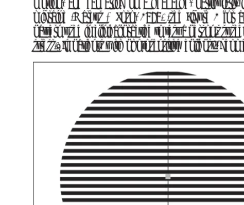
In this paper we focus on a phenomenon known as “visual stress” induced by repetitive, geometric patterns around us. Geometric patterns, particularly patterns of stripes, can be uncomfortable to look at (Wilkins et al., 1984). They can induce illusions of colour, shape and motion, and can bring on a headache, particularly in patients with migraine (Marcus & Soso, 1989) (see Figure 1 for an example of a pattern used in clinical practice to test a person’s susceptibility to visual stress). In patients with photosensitive epilepsy, geometric patterns of SDAR Journal 2018
[image:3.654.306.543.567.766.2]42
Figure 1. A glaring pattern used to elicit symptoms of visual stress.
this kind can even evoke epileptic seizures (Wilkins, Darby, & Binnie, 1979). The aversive properties of patterns are important not only because they might induce dramatic neurological consequences in visually-sensitive individuals, but also because there are consequences that are subtle and insidious: aversion to patterns may interfere with reading (Wilkins & Nimmo-Smith, 1987; Wilkins et al., 2007) and with other tasks that require visual search of spatially-repetitive material to find target objects (Singleton & Henderson, 2007); repetitive floor patterns may even interfere with walking trajectories (Leonards, Fennell, Oliva, Drake, & Redmill, 2015).
Note that this article is not concerned with trying to judge artistic expressions in design but concentrates purely on how the outcomes of our visual environment might affect human behaviour.
3. Examples of problems from patterns
Many patients with migraine report that their headaches can be visually triggered. Harle and colleagues (Harle, Shepherd, & Evans, 2006) described some of the triggers, which include patterns of stripes such as the doormat shown in Figure 2. Sometimes the patterns can be so unpleasant that they affect healthy individuals who do not suffer migraine. When this is the case, the national press sometimes become involved as happened in the case of the “rug that will make you sick” (Daily Mail 6 February 2012) and the “headache carpet in hospital” and similar instances listed by Wilkins (1995, Chapter 8). Readers who are unfamiliar with patterns of this kind may wish to google “patterns that make you sick”. [image:4.654.304.545.123.384.2]4. Parameters of uncomfortable stripes
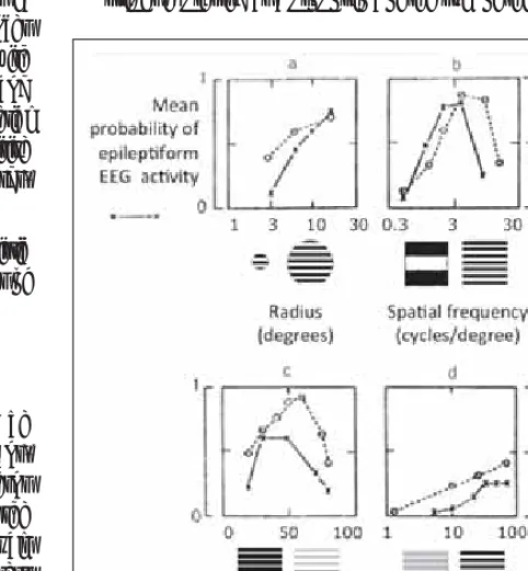
The characteristics of uncomfortable patterns of stripes that induce perceptual distortions, discomfort and seizures were described by Wilkins et al. (1984) and are summarised in Figure 3.Figure 3 shows the effects of:
(a) size (angle in degrees radius subtended at the eye);
(b) spatial frequency (the reciprocal of the period of the grating ex- pressed in terms of the angle this spatial period subtends at the eye);
[image:4.654.46.286.422.622.2](c) duty cycle (the proportion of the cycle that the stripes are bright;) (d) contrast (the difference in the luminance of the bright and dark stripes expressed as a proportion of the sum of the luminances).
Figure 2. A doormat with stripes that can trigger epileptic seizures and migraines.
Figure 3. Spatial parameters of patterns that evoke perceptual distortion in normal observers (broken lines) and paroxysmal electroencephalographic activity in patients with photosensitive epilepsy (solid lines). Effects of (a) size; (b) spatial frequency; (c) duty cycle; and (d) luminance contrast. From Wilkins (1995).
[image:4.654.304.544.447.750.2]Figure 4 shows that the effects of a spatially-periodic pattern (in this case from a railing) depend on the distance from which the pattern is viewed. The viewing distance determines both the spatial frequency of the pattern and the angle the entire pattern subtends at the eye. The distance at which the railing is most unpleasant depends on the interplay of these two factors. The unpleasantness increases with the subtense of the pattern and reaches a maximum at a spatial frequency of about three cycles per degree of visual angle, i.e. when the spatial period of the pattern (a pair of light and dark stripes) subtends about 20 minutes of arc at the eye. As a rough estimate, one’s thumb held at an arm’s length corresponds to two degrees of visual angle (O’Shea, 1991); a black and white striped pattern of three cycles per degree would thus provide six black and six white stripes covering an area as wide as the thumb at arm’s length .
5. Predicting the adverse effects of visual
images other than stripes
Discomfort can occur not simply from basic geometric patterns but from more complex images. Recent work has shown that a simple mathematical algorithm can predict discomfort from images of all types, including (but not restricted to) stripes (Penacchio and Wilkins, 2015). Our research suggests that it does so sufficiently well to be of direct use in predicting discomfort and would thus provide a simple tool to avoid uncomfortable visual environments, and uncomfortable design more generally.
This algorithm is based on a mathematical technique known as Fourier analysis: any image can be construed as made up of spatially-defined waves having a wide variety of wavelengths, amplitudes, orientations and phases. Waves of the appropriate amplitudes, orientations and phase are added one to another to create the image. These waves thus comprise the Fourier components of an image. The wavelength of each wave is usually specified by its reciprocal, its spatial frequency. When images are analysed in this way, the waves with long wavelength (low spatial frequency) are typically of greater amplitude than those with short wavelength (high spatial frequency), see Figure 5.
In images from nature, there is on average a simple relationship between the amplitude of the wave, s, and its spatial frequency, f: the amplitude is roughly proportional to the reciprocal of frequency, i.e. s ~ 1/fa where a is close to 1 (Field, 1987). When the amplitude and spatial frequency for natural images are plotted on log-log axes, the 1/f spectrum has a straight line with a slope close to -1 (see right inset in Figure 5).
Images that have a spectrum with a slope that substantially departs from 1/f are uncomfortable to look at, irrespective of what they represent. Periodic patterns of stripes such as Figure 1 depart radically from 1/f so the algorithm identifies them as problematic. Juricevic, Land, Wilkins, and Webster (2010) asked observers to rate the discomfort of images composed of filtered noise or randomly-disposed, randomly-sized, rectangles. For both categories of image, the discomfort was minimal when the Fourier amplitude spectrum had a slope of -1 (expressed on log-log coordinates) and increased when the slope was substantially greater or smaller than -1. Note that this held even for white noise and blurred images, which clearly depart from 1/f and are perceived as rather uncomfortable to look at (Juricevic et al., 2010).
However, it is not simply the slope of the amplitude spectrum that is critical in determining visual discomfort. Fernandez and Wilkins (2008) showed images of non-representational modern art to a variety of observers. Again, images with a 1/f spectrum were rated as comfortable to look at. In this experiment, however, the uncomfortable images had a spectrum that departed from 1/f in terms of the shape, not the slope, of the Fourier amplitude spectrum. The uncomfortable images had a curvilinear spectrum with an excess of contrast energy at mid-range spatial frequencies relative to that expected from the 1/f function. Mid-range spatial frequencies are those to which the human visual system is generally most sensitive (Campbell & Robson, 1968). Using artificial images made by filtering random noise, Fernandez and Wilkins (2008) showed that departures from 1/f were responsible for discomfort, but particularly if the departures registered an excess energy at a spatial frequency close to three cycles per degree. By exchanging the phase and amplitude of comfortable and uncomfortable images, they also showed that discomfort was determined by the amplitude rather than the phase information entailed in the image. O’Hare and Hibbard (2011) used images constructed from filtered noise and controlled for the apparent luminance contrast of the stimuli. Again, an excess of energy at mid-spatial frequencies determined discomfort ratings, although with a spatial frequency tuning that was slightly lower than that obtained by Fernandez and Wilkins (2008).
A Fourier amplitude spectrum is two-dimensional because it reflects the periodicity of the images at all orientations (vertical, horizontal and all orientations in between). The studies described above measured the Fourier amplitude spectrum by averaging over all orientations. Such averaging over orientations loses the distinction between periodicity in one orientation and that in another. Wilkins et al. (1984) showed that checkerboards (which have contrast energy in several orientations) are less uncomfortable than stripes in which the energy varies in only one orientation. Penacchio and Wilkins (2015) therefore measured the Fourier amplitude in two dimensions. Instead of averaging over all orientations and fitting a straight line on log-log SDAR Journal 2018
[image:5.654.46.285.559.715.2]44
Figure 5. Illustration of the component waves in Fourier analysis. The varia-tion in luminance over space (luminance profile) of the sample shown at the top and enlarged in the first row of the left hand inset can be thought as composed of the addition of the waves shown below, and numbered 1-5. The amplitude decreases with their spatial frequency as shown in the right-hand inset.
coordinates, as had previously been done, Penacchio and Wilkins (2015) fitted a cone with slope of -1 to the two-dimensional log amplitude spectrum. The residual error in the fit provided a useful index that could predict how uncomfortable the image was. Indeed, the residual error increased as the structure of the image departed from that expected for a natural image.
To test the generality of their approach, Penacchio and Wilkins (2015) used five categories of images obtained from seven different image sets: photographs of everyday scenes, of buildings, and of animals, images of randomly-generated polka dots and non-representational art. All images were rated for their visual discomfort. Despite the large range of images, the index explained 17% of the variance in judgements of discomfort.The prediction was improved when residuals were weighted to take account of the greater sensitivity to mid-range spatial frequencies, as reflected in a published estimate of the contrast sensitivity function (Mannos and Sakrison, 1974). From these two principles gleaned entirely from the literature (i.e. extent of residual error in 2D log amplitude spectrum and weighting of residuals based on human spatial frequency sensitivity function), Penacchio and Wilkins (2015) were able to explain an average of 27% of the variance in judgments of discomfort without fitting any specific parameters .
In summary, two related factors were found to predict judgments of discomfort: 1 – departure from the statistics of natural images, and 2 – excess of energy at the spatial frequencies to which the human visual system is generally most sensitive.
It is worth keeping in mind that ratings of discomfort from one person tend to correlate with those from another person with a coefficient of only about 0.8 across individuals and studies (Penacchio & Wilkins, 2015). Indeed, across the population, sensitivity to pattern-induced visual stress seems to lie on a continuum (Wilkins, 1995). This intrinsic variability limits the variance that can be explained by any model, deterministic or otherwise. Moreover, the algorithm by Penacchio and Wilkins (2015) only analyses the luminance of images without considering their chromatic content, which may also have an influence on judgement of discomfort (Haigh et al., 2013). It is therefore remarkable that an algorithm as simple as this was able to explain a comparably large proportion of the variability in discomfort induced by different types of image – the more so, because the images were sourced from the web and were not calibrated or otherwise matched (see Penacchio & Wilkins, 2015 for a discussion on possible confounds due to low image quality).
6. Explaining the adverse effects of
patterns – some speculatione
In the previous section we showed that a simple algorithm can predict reasonably well how much visual discomfort different types of image might evoke. But why is this the case?
It is tempting to speculate that, over the course of human evolution, the visual system has adapted to process efficiently those images of the environment human beings were mostly exposed to (Attneave, 1954; Barlow, 1961); i.e. those from the natural world such as grass
and woodland. Not surprisingly then, there is a large body of evidence in support of the hypothesis that visual processing is most efficient when images have the spatial characteristics of natural images (e.g. Atick & Redlich, 1992; Field, 1987; Graham, Chandler, & Field, 2006). For example, the human contrast sensitivity function is highly efficient for encoding images with the 1/f structure (Atick & Redlich, 1992) inherent in natural images.
Several psychophysical studies have shown that performance in discrimination tasks is at its best when the amplitude spectra of the stimuli are close to 1/f, and that performance consistently drops with departures from 1/f (Girshick, Perry, Super, & Gallogly, 2001; Knill, Field, & Kersten, 1990; Parraga, Troscianko, & Tolhurst, 2000). In the same vein, using a binocular rivalry paradigm in which the two eyes are presented with a different image, each image competing with the other, Baker and Graf (2009) showed that images whose amplitude spectrum is close to 1/f dominate over images with other amplitude spectra.
7. Design has got more uncomfortable
over the last century
We have reviewed evidence that visual images can be uncomfortable to look at when they do not possess the spatial characteristics of natural scenes. Our modern world is built from repetitive elements, and these elements are often used as the basis of design. This applies at all spatial scales, in buildings at one extreme of scale and in written text, web page design, or clothing at the other extreme. Here, we will concentrate on the large scale most relevant to architecture and building design. First, images of the modern urban environment conform less to 1/f than do images of the modern rural environment, as can be seen in the following demonstration.
We analysed images of urban and rural scenes using the algorithm by Penacchio and Wilkins (2015). The images were sourced from entries to a photographic competition of images of Britain held by the British Broadcasting Corporation (BBC). The images were published on the BBC website, conveniently categorised by the BBC into those with urban and those with rural content. Consecutive samples of 200 urban and 200 rural images were analysed, and the urban images had larger residuals than the rural ones (p<<0.0001, Cohen’s d=0.63). Given that the residuals predict discomfort from the image, it would appear that rural images may be, in principle at least, more comfortable to look at. Designers have long supposed that images from nature are restful and restorative (Korpela, Ylen, Tyrvainen, & Silvennoinen, 2010), and recent studies have involved the measurement of cerebral haemodynamics in the study of such restoration (Pati et al., 2014).
Given that images with large residuals are generally less comfortable than those that have small residuals and conform to 1/f, it would then appear that the urban environment in which the majority of today’s society lives has become visually less comfortable over the last century. This is partly because stripes are such a common feature of recent architectural and industrial design. Although high-contrast stripes are sometimes used in an attempt to produce a safer environment (e.g. high-contrast edging on stairs to increase the conspicuity of steps; markers to reduce speed on the road, and so on), they are also used simply as decoration or appear as a by-product of modular construction.
In their publication, Penacchio and Wilkins (2015) included a set of case histories in which artistic, industrial and architectural design has led to problems. These ranged from modern art that gave headaches, to epileptic seizures induced by swirling stripes in street design. In each case, the measure of residuals predicted the complaints: the designs all had percentile scores higher than the 90th percentile of the set of images (~~800) investigated in total. The problematic designs consisted of spatially-repetitive elements, usually but not exclusively of stripes. Figure 7 shows examples. Note that the examples have been adapted slightly so that the locations of the buildings cannot be identified.
As we stressed above, there are a great many striped patterns in the modern urban environment. This was dramatically illustrated by the case of a patient with pattern-sensitive epilepsy who suffered absence seizures only when she looked at striped lines (Wilkins, Andermann, & Ives, 1978). Telemetric recording over the course of several days showed frequent absences (about 22/hour). These were reduced to two per hour when the patient wore spectacles with one frosted lens which, in laboratory studies, demonstrably reduced her susceptibility to stripes. Evidently, it was the many and varied stripes in her environment that were responsible for her seizures.
Note that we do not want to imply that stripes should be avoided at all costs. Using stripes to accentuate areas of danger might be highly beneficial. The point we want to bring across is that it might be time we started to investigate more carefully the extent and the circumstances under which repetitive visual patterns are used in our environment, their luminance contrast and spatial frequency content, and the impact these might have not only on people suffering from migraine or photosensitive epilepsy, but more generally on people’s behaviour, health and well-being.
We now consider what can be done in the short term to reduce possible adverse effects of patterns in everyday visual environments, how to estimate the strength of adverse effects, and for whom this might be important. Again, we will concentrate on building design, but similar criteria would concern any kind of visual environment a person is exposed to.
SDAR Journal 2018
[image:7.654.305.544.79.402.2]46
[image:7.654.46.286.82.389.2]Figure 6. Log of the residual error after a cone with slope of 1/f has been fitted to the two-dimensional Fourier amplitude spectrum of images from a Google image search for photographs of apartment buildings, classified by year of construction. An average of 22 images per decade were analysed. Bars show standard error. The regression explains 30% of the variance of the means for each decade. Without the outlier from the 1930s, the regression explains 37% of the variance.
Figure 7. Examples of repetitive patterns that have caused complaints.
8. Making our visual environment more
comfortable
In the previous section, we saw how repetitive elements in today’s built environment lead to departures from the characteristics of natural images, making them more uncomfortable to look at. In this section, we consider briefly some of the more obvious ways in which the modern environment can be made more comfortable.
It is common practice in domestic buildings to place pictures on internal walls and to train plants to grow so as to cover external walls. The use of plants has been taken to extremes in the vertical forest skyscrapers of Milan, the Los Conquistadores Street Office in Santiago and the greenery curtains of Anjo City in Japan. The plants that cover the buildings not only provide insulation but a textured surface that breaks up the regularity of the structure, turning it into a scene closer to that found in nature.
In street design, it is popular to use paved surfaces in public spaces. The tessellation of the stones can provide uncomfortable patterns, particularly when oblique rays from the sun highlight the grouting, thus increasing contrast of the tiles themselves. The same is true on a smaller scale in interior design, particularly with respect to tiled floors and tiled or panelled walls. Not only can the patterns be uncomfortable to look at, but even for people not prone to visual discomfort, the orientations within such patterns can make them veer away from their intended walking direction, thus directly impacting on their gait (Leonards et al., 2015). Moreover, dazzling floor and background patterns can make it difficult to perceive curbs on pavements and edges of steps, or to find objects.
Although patterns may be fun for the designer and those in the population who are less sensitive to aversive patterns, one has to consider the entire community that is exposed to the design, in particular in public spaces; this community includes a large number of people with neurological and mental difficulties. Among these, the most common are those who suffer migraine (at least 15% of the general population worldwide as estimated by the WHO in their latest headache fact sheet in April 2016), but increased pattern sensitivity has been described for stroke patients (Beasley & Davies, 2013), patients with multiple sclerosis, chronic fatigue syndrome (Wilson, Paterson, & Hutchinson, 2015), children with Tourette syndrome and with autism spectrum disorder (Ludlow & Wilkins, 2016), and people with dyslexia. There is even evidence that visual pattern sensitivity might vary with personality style (Hollis, Allen, Fleischmann, & Aulak, 2007). Figure 8 provides examples of aversive design. The first caused an elderly person to fall and severely injure herself, the others gave headaches.
[image:8.654.48.544.81.236.2]The negative impact of such patterns on the visual system can be reduced by using thin grouting that contrasts little with the surround (thereby reducing the energy in the pattern), or by breaking the pattern up through mixing of different-sized tiles or bricks. Even when the bricks are identical, it is possible to tessellate a surface without repetition provided the bricks have the appropriate shape (Figure 9).
Wall and floor coverings often incorporate a repetitive design, and sometimes the pattern is evident only if large surfaces are covered. Such patterns, when striped, have been associated with complaints (Bonato, Bubka, Ishak, & Graveline, 2011; Penacchio & Wilkins, 2015; Wilkins, 1995, Chapter 8) and are best avoided.
9. Advice for design
What could be simple rules of thumb for designers and others to estimate (and reduce) the visual stress of their environment, based upon the precepts outlined in the previous sections?
[image:8.654.46.285.655.767.2]Avoid larger areas of repetitive stripes that are simply a feature of design, particularly when each stripe subtends at the eye an angle of between four and 60 minutes of arc because these are the most aversive (Wilkins, 1995), see Figure 3. You can calculate the angular Figure 9. Examples of repetitive patterns that have caused complaints.
subtense (A) from the width of a stripe (w) and the distance from which it is likely to be viewed (d), as follows: A = arctan(w/d). Stripes can consist of groups of elements when they form a repetitive pattern, as in Figure 4. Keep in mind that the spatial frequency of the patterns depends strongly on the viewing distance; stripes that close-up are widely spaced and thus do not induce discomfort can do so when looked at from further away;
Where patterns of repetitive elements are necessary for construction, keep the visible area as small as possible. Avoid repetitive elements that are as wide as the space between them, because evenly-spaced stripes are the most aversive. If stripes are unavoidable, choose the reflectance to keep the difference in luminance less than 10% of the average luminance, and the difference in colour (separation in UCS chromaticity) to a minimum. This minimises the aversive effects (Haigh, Cooper, & Wilkins, 2015). Note that this advice may run counter to current building regulations, particularly those concerning stair treads;
Remember that if the repetitive elements are of different heights, they can cast a shadow, and the shadow can increase the contrast between them;
Common sources of repetitive patterns are carpets and doormats, see Figure 1. It is possible to choose mats with lower contrast. Paving provides another source of repetitive patterns, and these patterns can be broken up (and their visual interest increased) by tessellating paving stones of a variety of sizes. Tiling in washrooms is another source of repetitive pattern. The grouting can be chosen to reduce the contrast;
When it is possible to use computer-aided design to provide views of the completed project, subject these images to the algorithm described by Penacchio and Wilkins (2015).
10. Conclusion
The above review has highlighted the translational and interdisciplinary power of current research in the visual sciences related to pattern-induced visual stress. In particular, we argue that a solid scientific evidence base has begun to emerge to suggest that visual design in modern environments can cause visual discomfort and accompanying adverse effects, most probably related to neurological processing within the brain, possibly processing that is inefficient. The extent of negative consequences on everyday functioning arising from such pattern-induced visual stress remains as yet unknown, but is likely to go far beyond the classic cases of visual discomfort, migraine and epilepsy that are mostly described in the literature. Future research might want to concentrate on possible links to vision-related risk of falls, place-specific cognitive abilities, emotional consequences and social inclusivity of places inducing visual stress, to name but a few. Other areas might include neuro-aesthetics and mental health.
With regard to urban design we propose here that one criterion of good (and inclusive) design should be the avoidance of visual patterns that cause visual stress. A simple and fast mathematical algorithm can flag design areas that are most likely to lead to such symptoms based on their visual characteristics: Estimating the spatial frequency
distributions within the visual environment and eliminating as much as possible those that clearly diverge from the distributions of natural scenes, would be a comparably easy mechanism to improve architect-ural design and avoid costly failures leading to accidents or rejection of the building by users, finally moving towards Neutra’s goal: to find objective criteria for good design of our (visual) environment; and to do this quite generally – not just in architecture.
Author contribution
AJW provided a first draft of the manuscript and it was subsequently elaborated by all authors.
Acknowledgements
Our interest in aversive patterns was kindled long ago by Dr Fred Andermann (Montreal Neurological Institute) and his patient. SDAR Journal 2018
48