June 2009, Volume 30, Issue 12. http://www.jstatsoft.org/
BiplotGUI
: Interactive Biplots in
R
Anthony la Grange Stellenbosch University Ni¨el le Roux Stellenbosch University Sugnet Gardner-Lubbe Stellenbosch University Abstract
Biplots simultaneously provide information on both the samples and the variables of a data matrix in two- or three-dimensional representations. The BiplotGUIpackage pro-vides a graphical user interface for the construction of, interaction with, and manipulation of biplots inR. The samples are represented as points, with coordinates determined either by the choice of biplot, principal coordinate analysis or multidimensional scaling. Various transformations and dissimilarity metrics are available. Information on the original vari-ables is incorporated by linear or non-linear calibrated axes. Goodness-of-fit measures are provided. Additional descriptors can be superimposed, including convex hulls, alpha-bags, point densities and classification regions. Amongst the interactive features are dynamic variable value prediction, zooming and point and axis drag-and-drop. Output can easily be exported to the Rworkspace for further manipulation. Three-dimensional biplots are incorporated via therglpackage. The user requires almost no knowledge of Rsyntax.
Keywords: alpha-bag, biplot, circular non-linear, canonical variate analysis, graphical user in-terface, multidimensional scaling, principal component analysis, principal coordinate analysis,
Procrustes, R,Tcl/Tk.
1. Introduction
In this section we give a brief overview of biplots, existing biplot software, and the statistical
programming language and environment R. In Section 2 we set out the main aims of the
BiplotGUI package, while its most important features are showcased in Sections 3 and 4
through the exploration of three data sets. Further features are illustrated in Section 5. In
Section6 we list some ideas for future releases. The present version of the package is 0.0-4.1.
The article is intentionally non-mathematical. This allows the focus to lie firmly with the package and its features. However, detailed references are provided for those who wish to gain a fuller understanding of the underlying theory. In addition, the main computations
1.1. Biplots
Introduced by Gabriel (1971), the biplot is described by Gower and Hand (1996) in their
authoritative monograph as the multivariate analogue of the ordinary scatter plot. As such, biplots are representations of multivariate data in which information on both the samples (observations) and the variables of a data matrix is given simultaneously in two or three dimensions: the samples are represented as points, while the variables are represented as labelled, calibrated axes. The axes are either linear and oblique, or non-linear. This new approach to biplots differs from the more traditional approach in which samples and variables are represented as points and/or uncalibrated vectors.
Some dimension-reduction technique is typically used to represent the samples as points,
of-ten principal component analysis (PCA,Pearson 1901;Hotelling 1933) or canonical variate
analysis (CVA, Hotelling 1935, 1936). More generally, scaling techniques such as principal
coordinate analysis (PCO,Torgerson 1952;Gower 1966) or metric or non-metric
multidimen-sional scaling (MDS, Kruskal 1964a,b; Sammon 1969) are used. Jolliffe (2002) dedicates a
monograph to PCA, while Krzanowski (2000) covers general multivariate topics. Cox and
Cox(2001) and Borg and Groenen(2005) are standard references for scaling techniques.
The placement of the axes depends partly on the mechanism used in the placement of the
points. The PCA biplot provides linear axes for points placed by PCA (Gower and Hand
1996, Chapter 2); similarly the CVA biplot provides linear axes for points placed by CVA
(Gabriel 1972;Gower and Hand 1996, Chapter 5). The regression biplot (Gower and Hand
1996, Chapter 3) gives approximate linear axes for any ordination of points. So too does
the Procrustes biplot (Gower and Hand 1996, Chapter 3). The regression and Procrustes
biplots correspond to the PCA biplot for points determined by PCO based on Pythagorean
dissimilarities. The covariance biplot (Greenacre 1984;Underhill 1990) adjusts the points and
axes of the PCA biplot so that the cosines of the angles between the axes approximate the correlations between the corresponding variables. The correlation biplot is similar, except that the variables are first scaled to have unit variances.
The placement of the axes may also depend on how they are to be used. Predictive axes are
positioned and calibrated so that the orthogonal projection of a point onto an axis ‘predicts’ as best as is graphically possible the value of the corresponding sample on the corresponding
variable. Interpolative axes, on the other hand, are positioned and calibrated so that a new
sample may be added to an existing configuration of points at the most appropriate position graphically possible. Interpolation can be either by the centroid or vector sum of the positions on the axes corresponding to the respective variable values of the new sample.
For additive inter-sample dissimilarities (Gower and Hand 1996, p. 105), biplots with
non-linear axes (or trajectories) may be constructed for points determined by PCO. The PCO
solution itself requires the inter-sample dissimilarities to be Euclidean-embeddable (Gower
1982); dissimilarity measures for which this is the case are discussed by Gower and Legendre
(1986). Non-linear predictive axes may make use of circular projection (Gower and Hand
1996, Chapter 6), while non-linear interpolative axes (Gower and Harding 1988;Gower and
Hand 1996, Chapter 6) are used in the same way as the linear variety. Non-linear biplots are
often most useful to gauge what is otherwise approximated by linear biplots.
While very many examples of biplots of the traditional approach may be found in the lit-erature, there are fewer examples of biplots of the new approach. An important reason has
the new approach, however, has often been demonstrated. In an easy to read introduction,
for example, Le Roux and Gardner (2005) cite and showcase many examples of the uses of
linear biplots, from such diverse fields as archaeology, agriculture, antiques, education, finan-cial management, mineralogy and process control. Other recent fields of application include
cephalometry (Naidooet al.2006), chemistry (Alveset al.2005) and mineralogy (Jemwa and
Aldrich 2006). Examples of non-linear biplots may be found in Gower and Harding (1988),
Gower and Hand(1996), Cox and Cox(2001) and Gower and Ngouenet(2005).
Given the ubiquity of multivariate data and the usefulness of biplots in describing such data, there is still much scope for the further popularization of the technique.
1.2. Existing biplot software
Many statistical packages can be used to produce at least the simplest of biplots of the
traditional approach. These include the major statistical packagesMinitab(MinitabInc 2007),
SPSS (SPSS Inc 2008), Stata (StataCorp LP 2007) and various products from SAS (SAS
Institute Inc 2009). However, functionality is often limited, and the results hard to obtain.
Greater functionality is provided by the three dedicated biplot programsXLS-Biplot (Udina
2005a,b),GGEBiplot(Yan and Kang 2006) andBiPlot(Lipkovich and Smith 2002a,b).
XLS-Biplotis based onXLisp-Stat(Tierney 1990) and has many useful features including a related
web-server that can be used to construct biplots online. GGEbiplot is aimed mainly at
agronomists, crop scientists and geneticists. It supplements the book by Yan and Kang
(2003). BiPlot is an add-on for Excel, and although therefore potentially widely useful, it
unfortunately has some minor but serious shortcomings (see Udina 2005b).
TheGenstatpackage (VSN International Ltd 2008) can be used to calculate the coordinates of
the elements of a biplot. These can then be drawn using a procedure from an add-on library.
Other packages, offering some traditional biplot functionality, includeManet(Hofmann 2000),
for Macintosh only, andViSta(Young 2001). Some packages are aimed at ecologists—brodgar
(Highland Statistics Ltd 2008) with R, Canoco (Plant Research International 2002) with
CanoDraw(Smilauer 2003),MVSP (Kovach Computing Services 2008) and PC-ORD (MjM
Software Design 2009)—while theExceladd-onBrandMap(WRC Research Systems Inc 2007)
is aimed at marketers.
STATISTICA(StatSoft Inc 2009) is currently the only mainstream statistical package capable
of producing calibrated new-approach biplots, albeit the PCA biplot only. All the software
mentioned are for purchase, exceptXLS-Biplot,BiPlot,ManetandViStawhich are available
free of charge. So too isR.
1.3. R
R(RDevelopment Core Team 2009) is a free statistical programming language and
environ-ment capable of producing high-quality graphics. Initiated byIhaka and Gentleman (1996),
it has become ‘thede facto standard for statistical computing’ (Greenacre 2007, p. 213). It
is an open-source implementation of theSprogramming language, available for download for
all the major platforms from theRproject home page athttp://www.R-project.org/. The
Rcore is updated regularly with minor version revisions released roughly every six months.
The current version (as of April 2009) isR2.9.0. Updates are relatively painless. Ris easily
extensible: a large number of user-written packages is available for download from repositories
Bioconductor(http://www.bioconductor.org/). These repositories can be accessed via the
Rproject home page (see also AppendixB). AsRhas increased in popularity, so too has the
number of books devoted to it. Recent general-topic books onRincludeBraun and Murdoch
(2007), Chambers (2007) and Spector (2008). The book by Murrel (2005) deals specifically
with graphics inR. Many more resources are freely available from the RProject home page.
As far as biplots are concerned, thebiplot method in R can be used to produce two
vari-ations of Gabriel’s (1971) classical biplot. The classical biplot is most similar to the
co-variance/correlation biplot described earlier. Packages with support for traditional biplots
includeade4(Dray and Dufour 2007,2009),ade4TkGUI (Thioulouse and Dray 2009,2007),
bpca(Faria and Demetrio 2008) and vegan(Oksanenet al. 2009). In addition, the calibrate
package (Graffelman 2009) can be used to calibrate both scatter plot and biplot axes as
de-scribed byGraffelman and van Eeuwijk(2005). In general, however, these calibrations do not
correspond to those ofGower and Hand (1996).
As opposed to the many solutions for biplots of the traditional approach listed in this section and in the previous one, software for biplots of the new approach has not been readily available. To produce biplots of the new approach, users have had to do their own programming in a
suitable environment (for example, Gardner 2001). To many potential users, such a task
represents a major obstacle.
2. A new package
The primary aim with theBiplotGUIpackage is to make it easy to construct biplots of the kind
advocated byGower and Hand (1996) – biplots in which samples are represented as points
and variables are represented as calibrated axes. The package goes beyond this, however, allowing users to interact with the data through the biplots which are produced. Naturally, the graphical output should be of a high quality, and the graphs easily customisable. Its
characteristics makeRthe ideal environment for the development of such a package.
In the next two sections, the most important features of theBiplotGUIpackage are illustrated.
This is done through the exploration of three data sets. Further features are highlighted in
Section5. A systematic account of all features is given in the ‘Details’ chapter of the package
manual. This manual can be accessed via the Help menu from within the package. The
package does not currently support biplots of categorical variables. Further resources and tools
are available via the package home page athttp://biplotgui.R-Forge.R-project.org/.
3. A first example
In this section we introduce a country-comparative data set. It is used to show how the graphical user interace (GUI) of the package may be initialized, how its features are laid out, and how it may be used to explore multivariate data using, amongst other things, PCA and regression biplots.
3.1. The country data
Table1 shows eight variables measured on the countries with the 15 largest economies (by
Country GDP HIV.Aids Life exp. Mil. Oil cons. Pop. Tel. Unempl. Brazil 8 710 0.7 72.2 2.6 4.0 190 204.2 9.6 Canada 35 370 0.3 80.3 1.1 25.1 33 622.3 6.4 China 7 724 0.1 72.9 4.3 1.8 1 322 278.4 4.2 France 29 852 0.4 80.6 2.6 11.3 64 543.5 8.7 Germany 31 941 0.1 79.0 1.5 11.7 82 657.8 7.1 India 3 685 0.9 68.6 2.5 0.8 1 130 44.0 7.8 Indonesia 4 041 0.1 70.2 3.0 1.8 235 63.2 12.5 Italy 30 199 0.5 79.9 1.8 11.8 58 430.8 7.0 Japan 33 100 0.1 82.0 0.8 16.0 127 432.8 4.1 Mexico 10 570 0.3 75.6 0.5 6.6 109 182.7 3.2 Russia 12 350 1.1 65.9 2.7 6.5 141 283.6 6.6 S Korea 24 386 0.1 77.2 2.7 16.0 49 547.8 3.3 Spain 27 418 0.7 79.8 1.2 14.2 40 454.5 8.1 UK 31 723 0.2 78.7 2.4 11.0 61 552.9 2.9 USA 43 369 0.6 78.0 4.1 25.1 301 571.2 4.8
Table 1: The country data. Eight variables measured on the countries with the 15 largest economies (PPP GDP) in 2007; countries listed in alphabetical order.
derived largely from the 2007 CIA World Factbook (Central Intelligence Agency 2007) and are
for illustrative purposes only. The variables are: PPP GDP per capita in US dollars (GDP); HIV/Aids prevalence as a percentage of the population (HIV.Aids); life expectancy in years (Life exp.); military spending as a percentage of GDP (Mil.); oil consumption in barrels per annum per capita (Oil cons.); population in millions (Pop.); number of fixed line telephones
per 1 000 people (Tel.); and percentage unemployed (Unempl.). The aim is to represent
these data in two or three dimensions so that a single, multivariate visual impression may be obtained, with the calibrated biplot axes incorporating information on the original variables.
3.2. Getting started
After R has been downloaded and installed, it is also necessary to install the BiplotGUI
package and its dependencies (details are provided in AppendixB). This process needs to be
performed only once. To then load the BiplotGUI package intoR, the following command is
entered at the Rprompt, followed as usual by the enter key:
R> library("BiplotGUI")
If the user is acquainted with R, data may be entered at the keyboard or be imported intoR
and saved as a matrix or a data frame. The country data have already been included in the
package as a data frame, and may be viewed from within Rby typing the commands
R> data("Countries") R> Countries
at theRprompt. To initialize the GUI with the country data, the command
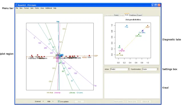
Figure 1: A screenshot of the BiplotGUI window as it initially appears. A predictive PCA biplot of the country data is shown towards the left. The axis predictivities are shown top right.
is entered. No further Rcommands are needed.
3.3. The layout
Figure 1 shows the layout of the GUI after it has launched. Six regions are indicated:
The menu bar, in addition to the settings box, contains the most important options.
The menu bar options are laid out in full in Table 2. The three most important
drop-down menus are Joint, Points and Axes. The biplots listed under Joint have both
their points and axes determined according to a single, joint mechanism. The other
biplots have their points determined from the Points menu and their axes determined
from the Axes menu.
The biplot region is where the biplot and optional title and legend are displayed. This space is responsive to mouse clicks and motion.
The settings box may be used to set the action of the biplot axes, either predictive, centroid interpolative or vector sum interpolative. Various data transformations may be effected.
The diagnostics tabs show output related to the currently displayed biplot. The
Convergence tab shows a graph of convergence; the Points, Groups and Axes tabs
File Save as – PDF... – Postscript... – Metafile... – Bmp... – Png... – Jpeg * 50% quality... * 75% quality... * 100% quality... Copy Print... Options. . . Exit View Show title
Clip around points
Clip around points and axes
Show point labels
Show point values
Show group labels in legend
Don’t show axis labels
Show clinging axis labels
Show axis labels in legend
Show Additional labels in legend
Show next legend entries
Show previous legend entries
Calibrate display space axes
Format Title. . . By groups. . . Axes. . . Interaction. . . Diagnostic tabs. . . Reset all. . . Joint PCA Covariance/Correlation CVA Points Dissimilarity metric – Pythagoras – Square-root-of-Manhattan – Clark – Mahalanobis PCO MDS – Run – Identity transformation – Monotone regression
– Monotone spline
transforma-tion. . .
– Primary approach to ties
– Secondary approach to ties
– Random initial configuration
– In terms of principal axes
Axes None Regression Procrustes Circular non-linear Default Additional Interpolate – A new sample. . .
– Sample group means. . .
Convex hulls. . . Alpha-bags. . . Point densities. . . Classification regions. . . Clear all Help Manual (in PDF) Home page
Show pop-up help
About. . .
the Predictions tab shows dynamically predicted variable values; while the Export
tab allows various objects to be exported toR.
The kraal is where points and axes may be kept, temporarily removing them from consideration.
Other. The options in this section can be used to show the currently displayed biplot in an external window (in two or three dimensions), to control the biplot region or to control the kraal. While the GUI is busy, a progress bar is shown towards the left of this area.
TheShow pop-up helpoption in theHelpmenu activates pop-up help messages which appear
when the mouse cursor is hovered over the components of the main GUI window.
3.4. Exploring
The PCA biplot with predictive axes is shown by default. For the country data, this is the
biplot shown towards the left of the screenshot in Figure 1. As should be the case for all
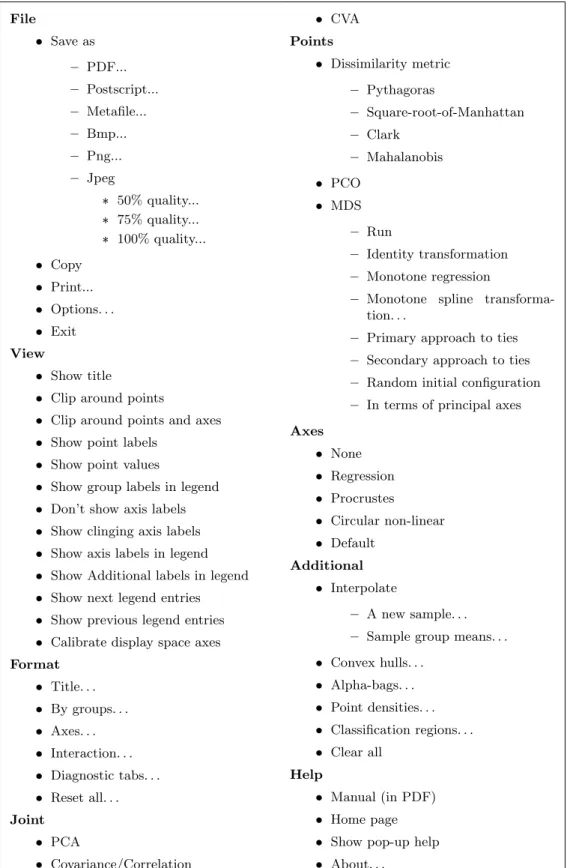
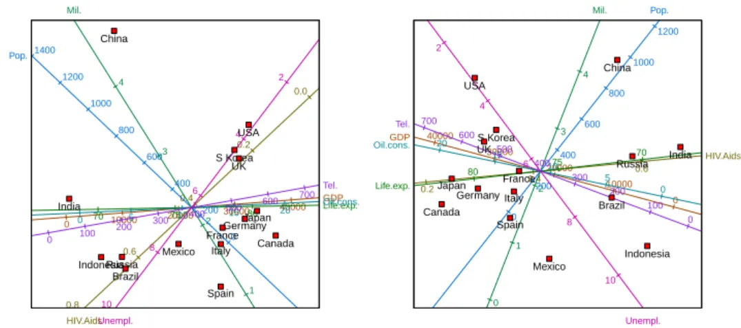
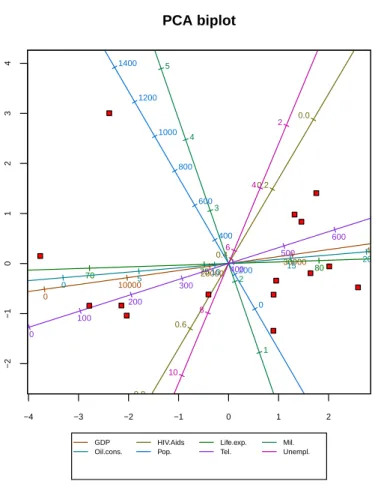
biplots, a unit aspect ratio is used to ensure that distances within the biplot are properly represented. In this biplot, the points representing the countries lie ordered along a virtually straight line. In fact, the imagined line corresponds very closely to the biplot axis for GDP, and importantly, the line is almost horizontal. The reason for this becomes clear by looking at the GDP column of the country data set. The values of GDP are orders larger than those of the other variables. Therefore, that linear combination of the variables that has the largest possible variation (the first principal component) is heavily weighted towards GDP.
In effect, GDP drowns out the other variables. To avoid this, we choose the Centre, scale
transformation from the available transformations in the settings box. This transformation independently transforms each variable to unit variance and automatically updates the biplot
to the one shown in the top left panel of Figure 2 (see Appendix A.2 for details on the
calculations involved). Irrespective of the chosen transformation, however, the axes are always calibrated in terms of the original variable values. The first principal component in this new figure still ranks the countries from least to most wealthy, in some more complicated sense. The developed countries of the West, together with Japan and newly-industrialized South Korea, cluster in the south-east quadrant. Brazil, Russia and Indonesia lie more towards the west, with Mexico straddling the divide. India, and especially China, lie further away. While the relative positions of the points are interesting, biplots come into their own when the points are related to their original variable values through the axes. By right clicking inside
the predictive linear biplot and selectingPredict cursor positionsfrom the pop-up menu,
an array of orthogonally projecting lines emanates from, and follows, the cursor as it moves
over the biplot. IfPredict points closest to cursor positionsis selected instead, the
lines project from the point closest to the cursor as it moves, rather than from the cursor
itself. So for example, the image in the top right panel of Figure2was created by hovering the
cursor closer to the point for China than to any other point. These orthogonally projecting lines intersect the axes at the positions at which the optimal approximations to the original variables values are to be read off. It can be seen from the image that China scores relatively
low on all the variables except population and military spending. As the cursor moves,
these predictions are also given numerically, in real time, in thePredictions tab. Dynamic
GDP 0 10000 20000 30000 40000 50000 HIV.Aids 0.0 0.2 0.4 0.6 0.8 1.0 Life.exp. 65 70 75 80 85 Mil. 0 1 2 3 4 5 Oil.cons. 0 5 10 15 20 25 Pop. 0 200 400 600 800 1000 1200 1400 Tel. 0 100 200 300 400 500 600 700 Unempl. 2 4 6 8 10 12 Brazil Canada China FranceGermany India Indonesia Italy Japan Mexico Russia S Korea Spain UK USA GDP 0 10000 20000 30000 40000 50000 HIV.Aids 0.0 0.2 0.4 0.6 0.8 1.0 Life.exp. 65 70 75 80 85 Mil. 0 1 2 3 4 5 Oil.cons. 0 5 10 15 20 25 Pop. 0 200 400 600 800 1000 1200 1400 Tel. 0 100 200 300 400 500 600 700 Unempl. 2 4 6 8 10 12 Brazil Canada China FranceGermany India Indonesia Italy Japan Mexico Russia S Korea Spain UK USA ● ● ● ● ● ● ● ● HIV.Aids Life.exp. Mil. Oil.cons. Pop. Tel. Unempl. 8710.000 35370.000 7724.000 29852.00031941.000 3685.000 4041.000 30199.000 33100.000 10570.000 12350.000 24386.000 27418.000 31723.000 43369.000 Brazil Canada China FranceGermany India Indonesia Italy Japan Mexico Russia S Korea Spain UK USA GDP 0 10000 20000 30000 40000 50000 ● Point predictivities 0.0 0.2 0.4 0.6 0.8 1.0 0.0 0.2 0.4 0.6 0.8 1.0 Brazil Canada China France Germany India Indonesia Italy Japan Mexico Russia S Korea Spain UK USA Axis predictivities 0.0 0.2 0.4 0.6 0.8 1.0 0.0 0.2 0.4 0.6 0.8 1.0 GDP HIV.Aids Life.exp. Mil. Oil.cons. Pop. Tel. Unempl. ● ● ● ● ● ● ● ●
Figure 2: Top left panel: a predictive PCA biplot of the centred, scaled country data. Top right panel: a predictive PCA biplot of the centred, scaled country data with China projected onto all the biplot axes. Centre panel: a predictive PCA biplot of the centred, scaled country data with GDP highlighted and China projected. Bottom left panel: PCA point predictivities of the centred, scaled country data. Bottom right panel: PCA axis predictivities of the centred, scaled country data.
the pop-up menu. (Some numerical predictions are given below.) Notice that although the predictions are optimal, they remain approximations. An unfortunate consequence is that values close to zero on variables measured on the ratio scale can have negative predicted
values. For example, in Figure2 the population of Spain is predicted to be less than zero.
With many variables, a biplot may become crowded. A particular axis can be highlighted by
right clicking it and then selectingHighlightfrom the pop-up menu. Doing so greys the other
axes, and displays the true variable values of the highlighted axis above the corresponding points. The displays in the diagnostic tabs are shaded accordingly and orthogonal projections
are drawn to the highlighted axis only. An example is shown in the centre panel of Figure2,
where GDP is highlighted and China is predicted.
The question of course, is how good the biplot approximation is. This depends on both the points and the axes. As for the points, the ‘quality’ of the PCA approximation is found
by clicking to the Export tab, selecting quality, and then clicking Display in console
to display the result in the Rconsole, or otherwise clicking Save to Workspace to save the
result as an object in theR workspace. In the case of the country data, the quality, 0.693,
implies that 69.3% of the variation in the samples is accounted for by the first two principal
components. Point and axis predictivities may also be calculated (Gardner-Lubbeet al.2008).
Predictivities indicate how wellindividualpoints or axes are represented in various dimensions
of the biplot. Diagrams of point and axis predictivities are available in thePoints and Axes
tabs, respectively. Those for the country data are shown in the bottom panels of Figure2.
The points and axes in these figures always appear above the diagonal in the unit square. The further to the right a point or axis appears, the better represented it is in the first (or horizontal) biplot dimension. The closer to the top of the diagram, the better the point or axis is represented overall in the biplot, taking into account the contribution of both the first and the second (vertical) biplot dimension. The marginal contribution of the second biplot dimension is indicated by the vertical distance between the diagonal line and the point or axis. This interpretation suggests that India, Canada and Brazil are relatively well represented in the first biplot dimension. Japan, Germany and Indonesia are represented reasonably in the first dimension, but poorly in the second. France, the United States and Russia are poorly represented overall, and Mexico extremely poorly. China is the best represented country
overall. The axes may be similarly interpreted. The two diagrams were saved by right
clicking them in the GUI, then making use of the Save as options in the pop-up menu.
Predictivities are also available numerically from the Export tab. The formulae for quality,
point predictivities and axis predictivities for PCA biplots are given in AppendixA.3.
Another measure of the goodness of the approximation is its relative absolute error, which may be calculated for any sample on any variable. The relative absolute error is defined to be the absolute difference between the predicted and actual values, expressed as a percentage of
the range (max−min) of the actual values of the particular variable. For GDP, for example,
the following output is obtained for the country data by selectingPred from theExport tab:
GDP
Prediction Actual RelAbsErr%
Brazil 9330.3 8710 1.6
Canada 37282.7 35370 4.8
China 10606.7 7724 7.3
Germany 31869.4 31941 0.2 India 40.2 3685 9.2 Indonesia 5054.5 4041 2.6 Italy 27130.3 30199 7.7 Japan 34209.8 33100 2.8 Mexico 19392.0 10570 22.2 Russia 8865.5 12350 8.8 S Korea 30946.1 24386 16.5 Spain 26507.7 27418 2.3 UK 31644.7 31723 0.2 USA 33889.0 43369 23.9
Although the United States, Mexico and South Korea predict poorly on the GDP axis, the overall configuration is optimal. By taking means over the samples, mean relative absolute
errors may be obtained for the different variables. From the Export tab’s MeanRelAbsErr
entry these are:
GDP HIV.Aids Life.exp. Mil. Oil.cons. Pop. Tel. Unempl.
7.7 20.1 9.8 14.4 11.2 11.3 8.8 15.1
These error rates reinforce what is conveyed by the axis predictivities: that HIV/Aids preva-lence, unemployment and military spending are relatively poorly represented, the other vari-ables better. Mean relative absolute errors are useful as a measure of the loss of information in biplots since they can be calculated for any type of biplot. Predictivities are defined only
when certain orthogonal decompositions exist (Gardner-Lubbeet al.2008), as they do in the
case of PCA, CVA and analysis of distance (AOD, Krzanowski 2004; Gardner et al. 2005)
biplots.
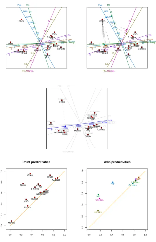
For a biplot to be usable in printed form, it must necessarily be two-dimensional. However, assisted by a computer, a user may easily interact with a biplot in three dimensions.
Three-dimensional, non-MDS biplots may be obtained in the BiplotGUI package by clicking the
External menu button at the bottom left of the GUI and then selecting the In 3D option.
Alternatively, the user may simply press the F12 shortcut key shown alongside the option. Doing so renders the three-dimensional version of the currently displayed two-dimensional
biplot in an external window. This feature makes use of therglpackage (Adler and Murdoch
2009) and allows the biplot to be rotated and enlarged dynamically. Figure 3 shows the
three-dimensional predictive PCA biplot of the country data that corresponds to the
two-dimensional version at the top left of Figure 2. A further 12.9% of the total variation in
the samples is accounted for in the additional dimension – the third value from eigenin the
Export tab divided by the sum of the eigenvalues. An initial 360 degree ‘fly-by’ of
three-dimensional biplots can be enabled via theFile → Optionsdialogue box.
A PCA approximation results from the projection of samples onto the plane of best fit. In
a covariance biplot (Joint →Covariance/Correlation), these ‘scores’ are adjusted so that
the cosines of the angles between the biplot axes approximate the correlations between the corresponding variables. The correlation biplot is the same as the covariance biplot, but with the variables first scaled to have unit variances (via the settings box, in the usual manner).
Dimension 3 14 Unempl.+ HIV.Aids+ 12 Pop.-Dimension 1 10 Russia 1.0 1.2 Mil.-0 Spain Dimension 2 Oil.cons.- GDP- Tel.-India 65 Life.exp.-Mexico 0Indonesia100 200 300 0.4400 Brazil 8 75 0.6 0.8 1 2 200 0 Italy Canada France 15 20 25 Germany 30000 40000 85 Japan 80 500 600 10 70 0 10000 20000 0 5 4003 0.2 6 700 HIV.Aids-0.0 2 4 UK S Korea China 600 800 1000 1200 4 5 USA 1400 Pop.+ Mil.+ Unempl.-30 Oil.cons.+ 50000 GDP+ Life.exp.+ Tel.+
Figure 3: The predictive PCA biplot of the centred, scaled country data, in three dimensions.
This figure corresponds to the two-dimensional biplot at the top left of Figure2.
groups of variables are seen to be highly positively correlated (the angles between them are small):
the number of telephone lines, GDP, oil consumption, life expectancy;
HIV/Aids prevalence, unemployment;
population, military spending.
The computations underlying these biplots are set out in Appendix A.4. Notice that the
labels of the axes are attached to those ends of the axes that have the higher calibrations. This is the default option for all linear biplots. Alternatively, the axis labels may be given in a legend underneath the biplot, or no axis labels may be given whatsoever. These and
other similar options may be set via the View menu. Notice also that the option Joint →
CVAis disabled since the samples of the country data have not been grouped in any way, for
example by continent. We return to CVA biplots in Section 4.1, where the samples of the
antique furniture data set are grouped, and where group differences are investigated.
As opposed to dimension reduction by projection, in MDS the points are chosen so thatstress,
GDP 0 10000 20000 30000 40000 50000 HIV.Aids 0.0 0.2 0.4 0.6 0.8 Life.exp. 65 70 75 80 85 Mil. 1 2 3 4 5 Oil.cons. 0 5 10 15 20 25 Pop. 0 200 400 600 800 1000 1200 1400 Tel. 0 100 200 300 400 500 600 700 Unempl. 2 4 6 8 10 Brazil Canada China FranceGermany India Indonesia Italy Japan Mexico Russia S Korea Spain UK USA GDP 0 10000 20000 30000 40000 50000 HIV.Aids 0.2 0.4 0.6 0.8 Life.exp. 65 70 75 80 85 Mil. 0 1 2 3 4 5 Oil.cons. 0 5 10 15 20 25 Pop. 0 200 400 600 800 1000 1200 1400 Tel. 0 100 200 300 400 500 600 700 Unempl. 2 4 6 8 10 12 Brazil Canada China France Germany India Indonesia Italy Japan Mexico Russia S Korea Spain UK USA ● ●● ●● ● ● ● ● ● ● ●●● ● ● ● ●● ● ● ● ● ● ●● ● ● ● ● ● ● ● ● ● ● ● ● ● ● ● ● ● ● ● ● ● ● ● ● ● ● ● ● ● ●●● ● ● ●● ● ● ● ● ● ● ●● ●● ● ● ● ● ● ● ● ● ● ● ●● ● ● ● ● ● ● ● ● ● ●● ● ● ● ●● ● ● ● ● ● 1 2 3 4 5 6 1 2 3 4 5 6 7 Shepard diagram 2 3 5 4 1 1. China, Russia 2. India, Russia 3. Mexico, Spain 4. Indonesia, Mexico 5. Indonesia, Russia GDP 0 10000 20000 30000 40000 50000 HIV.Aids 0.0 0.2 0.4 0.6 0.8 1.0 1.2 Life.exp. 65 70 75 80 85 Mil. 0 1 2 3 4 5 Oil.cons. 0 5 10 15 20 25 30 Pop. 0 200 400 600 800 Tel. 0 100 200 300 400 500 600 700 Unempl. 4 6 8 10 12 Brazil Canada France Germany India Indonesia Italy Japan Mexico Russia S Korea Spain UK USA Brazil Canada France Germany India Indonesia Italy Japan Mexico Russia S Korea Spain UK USA
Figure 4: Top left panel: a predictive correlation biplot of the centred, scaled country data. Top right panel: a predictive regression biplot for the metric MDS representation of the
centred, scaled country data. The MDS representation is in terms of its principal axes.
Centre panel: the Shepard diagram corresponding to the regression biplot of the top right panel. Bottom left panel: a predictive regression biplot for the metric MDS representation of the centred, scaled country data, but with China removed. Bottom right panel: the metric MDS of the centred, scaled data with China removed.
distances, is explicitly minimized (details in Appendix A.8). ThePoints → MDSmenu gives various options. These include taking the inter-sample disparities to be the inter-sample
dissimilarities themselves (the identity transformation); retaining merely the order of the inter-sample dissimilarities by optimally transforming them into disparities (monotone
re-gression, Kruskal 1964b); or monotonically smoothing the inter-sample dissimilarities into
disparities (the monotone spline transformation, Ramsey 1982, 1988). Therefore metric,
non-metric and semi-metric MDS representations are available. The inter-sample
dissimi-larities are calculated according to the chosen dissimilarity metric (AppendixA.6). Four
met-rics are currently available from thePoints → Dissimilarity metric menu: Pythagoras,
Square-root-of-Manhattan,Clark and Mahalanobis. Inter-point distances are always
Py-thagorean. An iterative majorization (IM) algorithm (De Leeuw 1977;De Leeuw and Heiser
1980) is used to find the MDS solutions. The IM algorithm converges uniformly, and usually
leads to a local minimum, although in theory a saddle-point cannot be ruled out.
The top right panel of Figure4shows a metric MDS of the country data, expressed in terms of
its principal axes, with approximate regression biplot axes superimposed (fromPoints→MDS
→In terms of principal axes, thereafterPoints→MDS→Identity transformation).
The default dissimilarity metric,Pythagoras, is retained. In this representation, the relative
distances between the points are directly related to the corresponding dissimilarities between the countries. The United Kingdom and South Korea, therefore, are more similar to one another than they are to the other countries with respect to the eight variables. As the algorithm converges, updates of the configuration are shown in the biplot region, together
with updates of the graphs in the diagnostic tabs. TheLive updates option, however, may
be disabled to increase the speed at which the algorithm runs (the checkbox in question is amongst the buttons at the bottom of the GUI). A graph of the stress values over iterations is
given in theConvergencetab; in this instance, from the Export tab, convergence is reached
after 96 iterations, with a final stress value of 45.8. By default, the IM algorithm is taken to
have converged as soon as the relative decrease in stress is lower than 10−6. The algorithm
is also stopped once more than 5 000 iterations have been performed. These options can be
adjusted via the File → Options dialogue box. A Shepard diagram (Borg and Groenen
2005, Section 3.3; Shepard 1962) can be found in the Points tab and is shown at the centre
of Figure4. Each circle in the Shepard diagram represents a pair of samples. The horizontal
axis indicates the inter-sample dissimilarity; the vertical axis indicates the corresponding inter-point distance. The blue dots on the yellow line (which generalizes to a step function or a curve) indicate the disparities. Thus the closer the circles are to the line (or step function or curve), the better the overall fit. The five worst-fitting point pairs are identified in the top left corner of the diagram. The dissimilarity between China and Russia, therefore, is most
poorly approximated by the points. ThePoints →MDS→Random initial configuration
option forces the algorithm to start from a random configuration at each run; a new run
is initiated by clicking Points → MDS → Run or by re-clicking Points → MDS → Identity
transformation. Otherwise, the last PCO or MDS solution is taken to be the new initial
configuration, as is the case for Figure4.
To conclude with the country data, suppose that we feel that China is in many ways atypical, and that we would like to see what the effect would be of removing it from consideration. To do so we need simply ‘drag’ the point representing China from the biplot into the kraal.
We may also right click the point representing China and select Send to kraal from the
of the data set. The updated biplot is given in the bottom left panel of Figure 4. Russia’s position relative to the other countries seems to have been most greatly affected. There has also been a re-alignment amongst the axes, most notably the axes for HIV/Aids, population and unemployment. Axes may also be removed to the kraal. Points and axes which have been removed to the kraal may be dragged back onto the biplot, or the kraal may be emptied of its points only, its axes only, or of both its points and axes simultaneously by making use of the buttons below it, or by right clicking inside it and selecting the desired option from the pop-up menu. At any stage, the points and/or axes of any representation may be hidden
by clicking on the options in theHide menu button at the bottom of the window. The figure
at the bottom right of Figure 4 is the same as the one in the bottom left panel, but with the
biplot axes hidden as described.
4. Two more examples
In this section we consider two more examples. In Section 4.1 we focus our attention on
grouped data by investigating antique furniture, while non-linear prediction is illustrated in
Section 4.2at the hand of fighter aircraft data.
4.1. Antique furniture
It is often of great interest to collectors, auctioneers and cultural historians to be able to correctly identify the type of wood used to make antique furniture. In the period between
1652 and 1900, wood from both the indigenousOcotea bullata(‘Stinkwood’) and the imported
Ocotea porosa (‘Imbuia’) were used to make Old-Cape furniture in South Africa. Being from
the same genus and family (Lauraceae), it is often difficult to distinguish between the two
types of wood based solely on a traditional analysis of colour, smell, and other observable
characteristics. Burden et al. (2001) and Le Roux and Gardner (2005) make use of CVA
biplots of anatomical measurements to distinguish between the species. A third species,
Ocotea kenyensis, is also included in the analyses. The microscopically measured variables
are: tangential vessel diameter in µm (VesD); vessel element length in µm (VesL); fibre
length inµm (FibL); ray height in µm (RayH); ray width in µm (RayW); and the number
of vessels per mm2 (NumVes). The 37 observations are the mean values over fifty
repeat-measurements made on 20 samples of Ocotea bullata, 10 samples of Ocotea porosa, and 7
samples of Ocotea kenyensis. The data are included in the BiplotGUI package as the data
frame AntiqueFurniture, of which the first column contains the group specifications. The
data may be viewed from within R by entering the following instructions at the prompt of
theRconsole:
R> data("AntiqueFurniture") R> AntiqueFurniture
To initialize the GUI with the antique furniture data, the following instruction may be entered: R> Biplots(Data = AntiqueFurniture[, -1], groups = AntiqueFurniture[, 1])
In other words, the data consist of all the columns of AntiqueFurniture except the first,
● Obul Oken Opor VesD 60 80 100 120 140 160 180 VesL 300 400 500 FibL 800 1000 1200 1400 1600 1800 RayH 300 350 400 450 500 550 RayW 20 25 30 35 40 45 50 NumVes 5 10 15 20 1 23 4 5 6 7 8 9 10 11 12 13 14 15 16 17 18 19 20 21 22 23 24 25 26 27 28 29 303132 33 34 35 36 37 ● ●●● ● ● ● ● ● ● ● ● ● ● ● ● ● ● ● ● Obul Oken Opor ● ● ● ● ● ● ●
● Obul Oken Opor
VesD 60 80 100 120 140 160 180 VesL 300 400 500 FibL 800 1000 1200 1400 1600 1800 RayH 300 350 400 450 500 550 RayW 20 25 30 35 40 45 50 NumVes 5 10 15 20 1 23 4 5 6 7 8 9 10 11 12 13 14 15 16 17 18 19 20 21 22 23 24 25 26 27 28 29 303132 33 34 35 36 37 ● ●●● ● ● ● ● ● ● ● ● ● ● ● ● ● ● ● ● Obul Oken Opor ● ● ● ● ● ● ●
● Obul Oken Opor
VesD 60 80 100 120 140 160 VesL 400 500 FibL 800 1000 1200 1400 1600 RayH 250 300 350 400 450 RayW 20 25 30 35 40 NumVes 10 15 20 1 234 5 6 7 8 9 10 11 12 13 14 15 16 17 18 19 20 21 22 23 24 25 26 283031 32 33 34 35 36 37 ● ● ● ● ● ● ● ● ● ● ● ● ● ● ● ● ● ● ● ● Obul Oken Opor ●
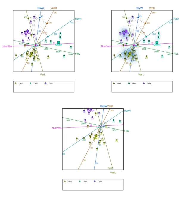
Figure 5: Top left panel: a predictive CVA biplot of the antique furniture data with sample 29 projected onto all the biplot axes. The group means are also shown. Top right panel: as in the top left panel, but with the biplot overlain onto the two-dimensional density estimate of the points. Bottom panel: the same biplot as the other two, but zoomed in around the
mean of the speciesOcotea bulluta.
As was mentioned earlier, upon initialization of the GUI, the predictive PCA biplot is shown
by default. To show the CVA biplot instead, the user simply needs to click the option
Joint →CVA. This option is now available since, in the call to the Biplotsfunction, groups
were specified. The predictive CVA biplot of the antique furniture data is shown in the top
left panel of Figure 5. The positions of the points are determined by the first two canonical
variates – those linear combinations of the original variables that maximally separate the group
themselves are shown as larger but corresponding symbols (activated by clickingAdditional
→Interpolate→Sample group means, retaining the default options). Since there is more
than one group, an optional legend is included below the biplot by default. The mechanism for the prediction of the variable values is the same as before and is illustrated in the figure in the case of sample 29.
The top right panel of Figure 5shows the same biplot, now overlain onto a two-dimensional
density estimate of the points. The density estimate is obtained by clicking Additional →
Point densities and accepting the default options (amongst other things, for the point
densities to be estimated for all points, as opposed to certain groups of points only). The
point densities are calculated using the default arguments to the bkde2D function of the
KernSmoothpackage (Wand and Ripley 2009). Similar biplots can be found inBlasiuset al.
(2009).
Sometimes it is helpful to zoom into or out of portions of a biplot. This is done by right
clicking on a focal point inside the biplot, and selecting theZoom inorZoom outoption from
the pop-up menu which then appears. The bottom panel of Figure5shows the CVA biplot of
antique furniture, enlarged around the mean of the speciesOcotea bullata. The original view
can be restored by choosing theReset zoomoption from the pop-up menu.
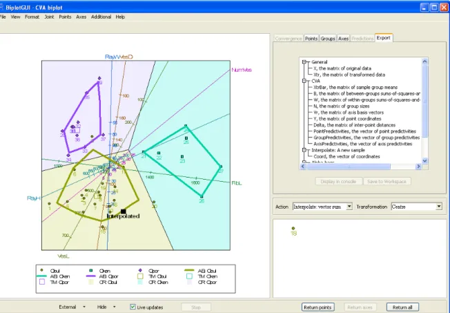
A screenshot of the GUI is shown in Figure 6. To the left, a CVA biplot of the antique
furniture data appears. From the settings box, it can be seen that the axes are not predictive; in fact they are vector sum interpolative. Also, the data have not been transformed, except for the obligatory centring of the columns to have zero means. In any case, CVA biplots are unaffected by the scaling of the variables to have unit variance.
Sample 18 has been dragged from the biplot into the kraal. It has therefore not been taken into account in the construction of the biplot. However, using its original variable values— 104, 387, 1 290, 381, 22 and 12, respectively—it has subsequently been interpolated onto the
biplot towards the bottom of the image (using the Additional → Interpolate → A New
Sample option). This is the most appropriate position for the sample in the existing biplot.
It is reassuring that the positions assigned to sample 18 in Figures 5 and 6 correspond so
closely. This need not have been the case. Also notice that, notwithstanding the removal
of sample 18, the calibrations and directions of the predictive and interpolative biplot axes
differ. This is in general the case for CVA biplots. More details are given in AppendixA.5.
The biplot in Figure6 also sports colour-coded classification regions. These are the regions
in the display space plane closest to the respective group means in a specified number of canonical dimensions, here the default number, two. The classification regions are included
by selectingClassification regionsfrom theAdditionalmenu. They may be used for the
classification of interpolated samples. For more on the links between biplots and
discrimina-tion, seeGardner and Le Roux(2005). Furthermore, by clickingAdditional→Alpha-bags,
alpha-bags (Gardner 2001;Aldrichet al. 2004) and Tukey medians have been superimposed
for the speciesOcotea bullata andOcotea porosa (there are too few samples for an alpha-bag
for Ocotea kenyensis to be constructed; with an appropriate warning, a convex-hull is
dis-played instead). Alpha-bags are closely related to the bagplots of Rousseeuw et al. (1999)
and enclose regions that contain approximately the inner 100α% of samples, here 90% of the samples for the two species separately. The alpha-bags and convex hull do not over-lap. This emphasizes the high degree of separation between the species. For CVA biplots, group predictivities may also be calculated, in addition to the point and axis predictivities
Figure 6: A screenshot of the GUI. A vector sum interpolative CVA biplot of the antique furniture data is shown towards the left, with sample 18 removed to the kraal. Sample 18 has then been interpolated to give its implied position. Classification regions are shown, as well
as 90% alpha-bags for the speciesOcotea bullata andOcotea porosa. A convex hull surrounds
the points of the species Ocotea kenyensis. TheExport tab is shown top right.
discussed earlier (Gardner-Lubbe et al. 2008). A diagram of these is available in the Groups
tab. Finally, Figure 6 also shows the Export tab. As explained previously, various objects
are available for export from this tab. The objects may be displayed in theR console or be
saved to the currentRworkspace. The list of available objects depends on what is shown in
the biplot.
4.2. Fighter aircraft
Measurements of four variables on 22 types of fighter aircraft were extracted by Cook and
Weisberg (1982) from a report by Stanley and Miller (1979). Following Gower and Hand
(1996), we consider only the first 21 of these aircraft in the biplots below. The four variables
are: specific power, proportional to power per unit weight (SPR); flight range factor (RGF); payload as a fraction of gross weight (PLF); and sustained load factor (SLF). These data can
be found in the FighterAircraftdata frame included in theBiplotGUI package. The GUI
is initialized in the same way as it was for the country data in Section3.2.
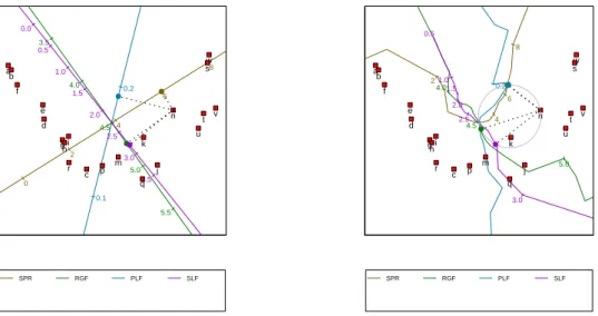
The left panel of Figure 7 shows a regression biplot of the fighter aircraft data with the
SPR RGF PLF SLF 0 2 4 6 8 10 3.0 3.5 4.0 4.5 5.0 5.5 6.0 0.0 0.1 0.2 0.3 0.0 0.5 1.0 1.5 2.0 2.5 3.0 3.5 a b c d e f ghi j k m n p q r s t u v w ● ● ● ● SPR RGF PLF SLF 2 4 6 8 4.0 4.5 5.0 0.2 0.5 1.0 1.5 2.0 2.5 3.0 a b c d e f ghi j k m n p q r s t u v w ● ● ● ●
Figure 7: Left panel: a predictive regression biplot of the fighter aircraft data, with points determined by PCO based on the Square-root-of-Manhattan dissimilarity metric. The or-thogonal prediction of the variables values of aircraft ‘n’ is shown. Right panel: a predictive circular non-linear biplot of the fighter aircraft data, with points determined by PCO based on the Square-root-of-Manhattan dissimilarity metric. The circular prediction of the variable values of aircraft ‘n’ is shown.
Square-root-of-Manhattan dissimilarity metric. The figure is obtained by clicking Points
→ Dissimilarity metric → Square-root-of-Manhattan and then Axes → Regression.
Making use of orthogonal projection, the variable values for aircraft ‘n’ are predicted to be 5.980, 4.73, 0.191 and 2.80, respectively. These can be compared to the actual values, 5.855,
4.53, 0.172 and 2.50. The right panel of Figure7shows the corresponding circular non-linear
biplot (obtained by clicking Axes → Circular non-linear). Here prediction is performed
by completing the circle which has, as diagonal, the line stretching from the origin of the biplot to the point to be predicted. The predicted values are read off at the points at which
the circle intersects the axes (Gower and Hand 1996, Section 6.3.2). If a particular axis is
intersected at more than one position, the position closest to the point being predicted is used. If an axis isn’t intersected at all, no prediction can be made for the corresponding variable. For aircraft ‘n’, the valid points of intersection are shown in the figure as small, filled circles
on the circumference of the larger circle. From thePredictions orExport tabs, the circular
non-linear predictions for aircraft ‘n’ are 6.090, 4.54, 0.174 and 2.90, respectively (these values depend on how finely the non-linear axes are constructed; by default 20 positions are taken into account from each calibrated marker to the next). Except for the fourth variable, the non-linear predictions are very close to the actual values.
Appendix A.7 provides the steps required to perform a PCO; the formulae underlying the
GDP Oil.cons. HIV.Aids Pop. Life.exp. Tel. Mil. Unempl. −4 −3 −2 −1 0 1 2 −2 −1 0 1 2 3 4 PCA biplot 0 10000 20000 30000 40000 0.0 0.2 0.4 0.6 0.8 1.0 65 70 75 80 85 0 1 2 3 4 5 0 5 10 15 20 25 0 200 400 600 800 1000 1200 1400 0 100 200 300 400 500 600 700 2 4 6 8 10 12 14
Figure 8: A modified version of the biplot given in the top left panel of Figure2: a predictive
PCA biplot of the country data with a title, hidden point labels, axis labels in a legend, and the axes of the display space calibrated.
5. Further features
This section touches upon the customization and export of biplots and other graphs produced
using theBiplotGUI package.
There are two main ways in which the graphs of the package can be customized. Basic
customization can be performed using the options of theView menu, while theFormatmenu
options can be used to alter a large number of graphical parameters.
Figure 8 shows the same predictive PCA biplot of the country data that was shown in the
top left panel of Figure 2. However, the biplot in Figure 8 has been modified by changing
the default selections in the View menu. The Show title option places a title above the
biplot; by default the title reflects the type of biplot, but it may be changed via the Format
→ Titleoption. Furthermore, the point labels have been hidden by deselectingShow point
labels. Instead of showing the axis labels around the edges of the biplot as in Figure2, the
labels in Figure 8 are shown in a legend (Show axis labels in legend). The Calibrate
display space axes option calibrates the two dimensions of the biplot, but this is generally
● Obul Oken Opor Antique furniture VesD 60 80 100 120 140 160 180 VesL 300 400 500 FibL 800 1000 1200 1400 1600 1800 RayH 300 350 400 450 500 550 RayW 25 30 35 40 45 50 NumVes 5 10 15 20 1 23 4 5 6 7 8 9 10 11 12 13 14 15 16 17 18 19 20 21 22 23 24 25 26 27 28 29 303132 33 34 35 36 37 ● ●● ● ● ● ● ● ● ● ● ● ● ● ● ● ● ● ● ● Obul Oken Opor
●
● ● ● ● ● ●Figure 9: A modified version of the biplot given in the left panel of Figure 5: a predictive
CVA biplot of the antique furniture data.
The Format menu allows virtually any of the graphical parameters used internally by the
package to be altered. The biplot in Figure9 serves as an example. This biplot is the same
as the biplot that appears in the left panel of Figure5, but with some of the default graphical
parameters changed. The By group option allows the graphical parameters that relate to
points, sample group means, convex hulls / alpha-bags and classification regions to be set
for all groups simultaneously, or for a single group at a time. Figure 10 shows theBy group
dialogue box for the points of the speciesOcotea bullata. The parameter values shown are as
they have been set for Figure 9. TheAxes option similarly allows the graphical parameters
that relate to axes to be set. Figure 11 shows the Axes dialogue box for the axis ‘RayW’,
again with the parameters as they have been set for Figure9. The graphical parameters used
for dynamic variable value prediction and in the highlighting of axes can also be modified
by clicking Format → Interaction, while diagnostic tab customization may be performed
via theDiagnostic tabsoption. TheReset alloption reverts all the graphical parameters
back to their default values. In all, more than 80 different graphical parameters may be set, often-times differently for different groups or axes. All these parameters are documented in detail in the package manual.
Biplots and diagnostic tab graphs can be saved in various file formats: PDF, Postscript, Metafile, BMP, PNG, JPEG (50%, 75%, 100% quality) and PicTeX. Any graph can be saved
Figure 10: TheFormat → By groupdialogue box as it appears for the biplot in Figure 9.
via theFile → Save as menu. While the images shown onscreen are by necessity Metafile images, the images that appear in this article—besides the screenshots—were saved in PDF
format. Together with Postscript, such images are of the highest quality. Copy and Print
options are also available.
6. Future work
Being in its first release, there is much that may be improved and expanded upon. Amongst the techniques that might sensibly be incorporated into the package are:
Special options for CVA biplots in the case of two groups only (Le Roux and
Gardner-Lubbe 2008);
Orthogonal predictive non-linear biplots (Gower and Ngouenet 2005);
AOD biplots (Krzanowski 2004;Gardner et al.2005);
The adjustments to the regression and Procrustes biplots suggested by Gower et al.
(1999) to better suit non-metric MDS representations;
Sensitivity analysis for PCO-based biplots (Krzanowski 2006);
Support for categorical variables in the form of generalized biplots (Gower 1992);
A better approach to the calculation of classification regions (Gower 1993).
Other improvements may also be made. These include:
Allowing any pair of principal components, canonical variates or principal coordinates
to be shown, as opposed to only the first two;
Supporting a greater number of dissimilarity metrics;
Allowing interactive orthogonal parallel translation so that axes can be moved towards
the edges of biplots (Blasiuset al. 2009);
Incorporating a graded legend for point density estimates;
Improving the three-dimensional biplots (providing support for additional descriptors,
allowing dynamic variable value prediction);
Otherwise improving the GUI and general performance.
As for any such package, suggestions and bug-reports by users are important and greatly encouraged.
7. Summary
In this paper, theBiplotGUIpackage forRwas introduced. Its features were illustrated using
three data sets. Ideas for future releases were briefly explored, and computational details were provided in an appendix.
The package makes it possible to easily construct many types of biplots and to interact with them in various ways. The package is free and its source code shared. Amongst linear bi-plots, the PCA, covariance/correlation, CVA, regression and Procrustes biplots are supported. Circular non-linear biplots can be created. In addition, PCO and MDS representations can be displayed on their own, without added biplot axes. Additional descriptors can be
su-perimposed, and three-dimensional biplots can be explored using the rgl package. Various
goodness-of-fit measures are easily accessible.
Acknowledgments
We would like to thank two anonymous reviewers for their helpful comments and suggestions. This work is based upon research supported by the National Research Foundation of South Africa. Any opinions, findings and conclusions, or recommendations expressed in this material are those of the authors and therefore the NRF does not accept any liability in regard thereof.
References
Adler D, Murdoch D (2009). rgl: 3D Visualization Device System (OpenGL). R package
version 0.84, URLhttp://CRAN.R-project.org/package=rgl.
Aldrich C, Gardner S, Le Roux NJ (2004). “Monitoring of Metallurgical Process Plants by
Use of Biplots.” AIChE Journal,50(9), 2167–2186.
Alves MR, Cunha SC, Amaral JS, Pereira JA, Oliveira MB (2005). “Classification of PDO
Olive Oils on the Basis of Their Sterol Composition by Multivariate Analysis.” Analytica
Chimica Acta,549, 166–178.
Blasius J, Eilers P, Gower JC (2009). “Better Biplots.” Computational Statistics & Data
Analysis,53, 3145–3158.
Borg I, Groenen PJF (2005). Modern Multidimensional Scaling: Theory and Applications.
Springer Series in Statistics, 2nd edition. Springer-Verlag, New York, NY, USA.
Braun WJ, Murdoch DJ (2007).A First Course in Statistical Programming withR. Cambridge
University Press, Cambridge, UK.
Burden M, Gardner S, Le Roux NJ, Swart JPJ (2001). “Ou-Kaapse Meubels en
Stinkhout-Identifikasie: Moontlikhede met Kanoniese Veranderlike-Analise en Bistippings.” South
African Journal of Cultural History,15, 50–73.
Central Intelligence Agency (2007). The World Factbook: 2007, CIA’s 2006. Potomac Books,
Washington, DC, USA.
Chambers JM (2007). Software for Data Analysis: Programming with R. Springer-Verlag,
New York, NY, USA.
Clark PJ (1952). “An Extension of the Coefficient of Divergence for Use with Multiple
Cook RD, Weisberg S (1982).Residuals and Influence in Regression. Monographs on Statistics and Applied Probability. Chapman & Hall, London, UK.
Cox TF, Cox MAA (2001). Multimensional Scaling. Monographs on Statistics and Applied
Probability, 2nd edition. Chapman & Hall/CRC, Boca Raton, FL, USA.
De Leeuw J (1977). “Applications of Convex Analysis to Multidimensional Scaling.” In
JR Barra, F Brodeau, G Romier, B van Cutsem (eds.),Recent Developments in Statistics,
pp. 133–145. North-Holland Publishing Company, Amsterdam, The Netherlands.
De Leeuw J, Heiser WJ (1980). “Multidimensional Scaling with Restrictions on the
Configura-tion.” In PR Krishnaiah (ed.),Multivariate Analysis, volume V, pp. 501–522. North-Holland
Publishing Company, Amsterdam, The Netherlands.
Dray S, Dufour AB (2007). “The ade4 Package: Implementing the Duality Diagram for
Ecologists.” Journal of Statistical Software, 22(4), 1–20. URL http://www.jstatsoft.
org/v22/i04.
Dray S, Dufour AB (2009). ade4: Analysis of Ecological Data: Exploratory and
Eu-clidean Methods in Environmental Sciences. Rpackage version 1.4-11, URLhttp://CRAN.
R-project.org/package=ade4.
Faria JC, Demetrio CGB (2008). bpca: Biplot of Multivariate Data Based on Principal
Components Analysis. UESC and ESALQ, Ilheus, Bahia, Brasil and Piracicaba, Sao Paulo,
Brasil. Rpackage version 1.02, URL http://CRAN.R-project.org/package=bpca.
Gabriel KR (1971). “The Biplot Graphic Display of Matrices with Application to Principal
Component Analysis.”Biometrika,58(3), 453–467.
Gabriel KR (1972). “Analysis of Meteorological Data by Means of Canonical Decomposition
and Biplots.”Journal of Applied Meteorology,11, 1071–1077.
Gardner S (2001). Extensions of Biplot Methodology to Discriminant Analysis with
Appli-cations of Non-Parametric Princial Components. Unpublished PhD thesis, Stellenbosch University, Stellenbosch, South Africa.
Gardner S, Le Roux NJ (2005). “Extentions of Biplot Methodology to Discriminant Analysis.”
Journal of Classification,22, 59–86.
Gardner S, Le Roux NJ, Rypstra T, Swart JPJ (2005). “Extending a Scatterplot for Displaying
Group Structure in Multivariate Data: A Case Study.”ORiON,21(2), 111–124.
Gardner-Lubbe S, Le Roux NJ, Gower JC (2008). “Measures of Fit in Principal Component
and Canonical Variate Analyses.”Journal of Applied Statistics,35(9), 947–965.
Gower JC (1966). “Some Distance Properties of Latent Root and Vector Methods Used in
Multivariate Analysis.”Biometrika,53(3/4), 325–338.
Gower JC (1982). “Euclidean Distance Geometry.”The Mathematical Scientist,7, 1–14.
Gower JC (1993). “The Construction of Neighbour-Regions in Two Dimensions for Prediction
with Multi-Level Categorical Variables.” In O Opitz, B Lausen, R Klar (eds.),Information
and Classification: Concepts-Methods-Applications Proceedings 16th Annual Conference of the Gesellschaft fur Klassifikation, pp. 174–189. Springer-Verlag, Berlin, Germany.
Gower JC, Dijksterhuis GB (2004). Procrustes Problems. Oxford Statistical Science Series.
Oxford University Press, Oxford, UK.
Gower JC, Hand DJ (1996). Biplots. Monographs on Statistics and Applied Probability.
Chapman & Hall, London, UK.
Gower JC, Harding SA (1988). “Nonlinear Biplots.”Biometrika,75(3), 445–455.
Gower JC, Legendre P (1986). “Metric and Euclidean Properties of Dissimilarity Coefficients.”
Journal of Classification,16, 5–48.
Gower JC, Meulman JJ, Arnold GM (1999). “Nonmetric Linear Biplots.”Journal of
Classi-fication,16, 181–196.
Gower JC, Ngouenet RF (2005). “Nonlinearity Effects in Multidimensional Scaling.”Journal
of Multivariate Analysis,94, 344–365.
Graffelman J (2009). calibrate: Calibration of Biplot Axes. R package version 1.5, URL
http://CRAN.R-project.org/package=calibrate.
Graffelman J, van Eeuwijk FA (2005). “Calibration of Multivariate Scatter Plots for Ex-ploratory Analysis of Relations Within and Between Sets of Variables in Genomic Research.”
Biometrical Journal,47(6), 863–879.
Greenacre MJ (1984).Theory and Applications of Correspondence Analysis. Academic Press,
London, UK.
Greenacre MJ (2007). Correspondence Analysis in Practice. Interdisciplinary Statistics, 2nd
edition. Chapman & Hall/CRC, London, UK.
Grosjean P (2009). tcltk2: Additional Tcl/Tk Widgets and Commands for R. R package
version 1.0-8, URLhttp://CRAN.R-project.org/package=tcltk2.
Highland Statistics Ltd (2008). brodgar, Version 2.5.7. Highland Statistics Ltd, Newburgh,
UK. URL http://www.brodgar.com/.
Hofmann H (2000). Manet, Version 1862. URL http://stats.math.uni-augsburg.de/
manet.
Hotelling H (1933). “Analysis of a Complex of Statistical Variables into Principal
Compo-nents.” Journal of Educational Psychology,24, 417–441.
Hotelling H (1935). “The Most Predictable Criterion.” Journal of Educational Psychology,
26, 139–142.
Ihaka R, Gentleman R (1996). “R: A Language for Data Analysis and Graphics.”Journal of Computational and Graphical Statistics,5(3), 299–314.
Ihaka R, Murrel P, Hornik K, Zeileis A (2009). colorspace: Colorspace Manipulation. R
package version 1.0-1, URL http://CRAN.R-project.org/package=colorspace.
Jemwa GT, Aldrich C (2006). “Kernel-Based Fault Diagnosis on Mineral Processing Plants.”
Minerals Engineering,19, 1149–1162.
Jolliffe IT (2002). Principal Component Analysis. Springer Series in Statistics, 2nd edition.
Springer-Verlag, New York, NY, USA.
Kovach Computing Services (2008). MVSP, Version 3.1. Kovach Computing Services,
Anglesey, UK. URLhttp://www.kovcomp.co.uk/mvsp.
Kruskal JB (1964a). “Multidimensional Scaling by Optimizing Goodness-of-Fit to a Nonmetric
Hypothesis.” Psychometrika,29, 1–27.
Kruskal JB (1964b). “Nonmetric Multidimensional Scaling: A Numerical Method.”
Psy-chometrika,29, 115–129.
Krzanowski WJ (2000). Principles of Multivariate Analysis: A User’s Perspective. Oxford
Statistical Science Series, revised edition. Oxford University Press, New York, NY, USA.
Krzanowski WJ (2004). “Biplots for Multifactorial Analysis of Distance.” Biometrics, 60,
517–524.
Krzanowski WJ (2006). “Sensitivity in Metric Scaling and Analysis of Distance.”Biometrics,
62, 239–244.
Lawrence M, Temple Lang D (2009). RGtk2: R Bindings for GTK 2.8.0 and Above. R
package version 2.12.11, URLhttp://CRAN.R-project.org/package=RGtk2.
Le Roux NJ, Gardner S (2005). “Analysing Your Multivariate Data as a Pictorial: A Case
for Applying Biplot Methodology?” International Statistical Review,73(3), 365–387.
Le Roux NJ, Gardner-Lubbe S (2008). “Geometrical Considerations and Biplots Associated with Canonical Variate Analysis Involving Two Classes.” Conference on High-dimensional Data Modelling. June 2008, Kayseri, Turkey.
Lipkovich I, Smith EP (2002a). BiPlot. Virginia Tech, Blacksburg, VA, USA. URL http:
//filebox.vt.edu/artsci/stats/vining/keying/biplot_final.zip.
Lipkovich I, Smith EP (2002b). “Biplot and Singular Value Decomposition Macros forExcel.”
Journal of Statistical Software,7(5), 1–15. URLhttp://www.jstatsoft.org/v07/i05.
Mahalanobis PC (1936). “On the Generalised Distance in Statistics.” Proceedings of the
National Institute of Science of India,12, 49–55.
MinitabInc (2007). Minitab, Version 15. MinitabInc, State College, PA, USA. URL http:
MjM Software Design (2009). PC-ORD, Version 5.20. MjM Software Design, Gleneden
Beach, OR, USA. URLhttp://home.centurytel.net/~mjm/pcordwin.htm.
Murrel P (2005). R Graphics. Chapman & Hall/CRC, Boca Raton, FL, USA.
Naidoo S, Harris A, Swanevelder S, Lombard C (2006). “Fetal Alcohol Syndrome: A
Cephalo-metric Analysis of Patients and Controls.”European Journal of Orthodontics,28, 254–261.
Oksanen J, Kindt R, Legendre P, O’Hara B, Simpson GL, Stevens MHH, Wagner H
(2009). vegan: Community Ecology Package. R package version 1.15-2, URL http:
//CRAN.R-project.org/package=vegan.
Pearson K (1901). “On Lines and Planes of Closest Fit to Systems of Points in Space.”
Philosophical Magazine,2, 559–572.
Plant Research International (2002). Canoco, Version 4.5. Plant Research International,
Wageningen, The Netherlands. URLhttp://www.pri.wur.nl/uk/products/canoco.
Ramsey JO (1982). “Some Statistical Approaches to Multidimensional Scaling Data.”Journal
of the Royal Statistical Society A,145(3), 285–312.
Ramsey JO (1988). “Monotone Regression Splines in Action.”Statistical Science,3(4), 425–
441.
RDevelopment Core Team (2009). R: Language and Environment for Statistical Computing.
RFoundation for Statistical Computing, Vienna, Austria. ISBN 3-900051-07-0, URLhttp:
//www.R-project.org/.
Rousseeuw PJ, Ruts I, Tukey JW (1999). “The Bagplot: A Bivariate Boxplot.”The American
Statistician,53(4), 382–387.
Sammon JW (1969). “A Nonlinear Mapping for Data Structure Analysis.”IEEE Transactions
on Computers,18, 401–409.
SASInstitute Inc (2009). Cary, NC, USA. URL http://www.sas.com/.
Shepard RN (1962). “The Analysis of Proximities: Multidimensional Scaling with an Unknown
Distance Function.”Psychometrika,27(2), 125–140.
Smilauer P (2003).CanoDraw, Version 4.1. University of South Bohemia, Cesk´e Budejovice,
Czech Republic. URLhttp://www.canodraw.com/.
Spector P (2008). Data Manipulation withR. Springer-Verlag, New York, NY, USA.
SPSSInc (2008). SPSS, Version 17. Chicago, IL, USA. URL http://www.spss.com/.
Stanley W, Miller M (1979). “Measuring Technological Change in Jet Fighter Aircraft.”
Technical Report R-2249-AF, RAND Corporation, Santa Monica, CA, USA.
StataCorp LP (2007). Stata, Version 10. StataCorp LP, College Station, TX, USA. URL
http://www.stata.com/.
StatSoft Inc (2009).STATISTICA, Version 9. Tulsa, OK, USA. URL http://www.statsoft.
Thioulouse J, Dray S (2007). “Interactive Multivariate Data Analysis inRwith theade4and
ade4TkGUI Packages.” Journal of Statistical Software, 22(5), 1–14. URL http://www.
jstatsoft.org/v22/i05.
Thioulouse J, Dray S (2009).ade4TkGUI:ade4Tcl/TkGraphical User Interface.Rpackage
version 0.2-4, URLhttp://CRAN.R-project.org/package=ade4TkGUI.
Tierney L (1990). Lisp-Stat: An Object-Oriented Environment for Statistical and Dynamic
Graphics. Wiley Series in Probability and Mathematical Statistics. John Wiley & Sons, New York, NY, USA.
Tierney L (2008). tkrplot: TK Rplot. R package version 0.0-18, URL http://CRAN.
R-project.org/package=tkrplot.
Torgerson WS (1952). “Multidimensional Scaling: 1. Theory and Method.” Psychometrika,
17, 401–419.
Turner R (2009). deldir: Delaunay Triangulation and Dirichlet (Voronoi) Tessellation. R
package version 0.0-8, URL http://CRAN.R-project.org/package=deldir.
Udina F (2005a). “Interactive Biplot Construction.” Journal of Statistical Software, 13(5),
1–16. URLhttp://www.jstatsoft.org/v13/i05.
Udina F (2005b). XLS-Biplot, Version 1.1a. Universitat Pompeu Fabra, Barcelona, Spain.
URLhttp://tukey.upf.es/xls-biplot/index.html.
Underhill LG (1990). “The Coefficient of Variation Biplot.” Journal of Classification, 7,
241–256.
Urbanek S (2009). rJava: Low-Level R to Java Interface. R package version 0.6-2, URL
http://CRAN.R-project.org/package=rJava.
Venables WN, Ripley BD (2002). Modern Applied Statistics withS. Statistics and Computing,
4th edition. Springer-Verlag, New York, NY, USA. URL http://www.stats.ox.ac.uk/
pub/MASS4.
Verzani J (2009). gWidgets: API for Building Toolkit-Independent, Interactive GUIs. R
package version 0.0-35, URLhttp://CRAN.R-project.org/package=gWidgets.
VSN International Ltd (2008). Genstat, Version 11.1. VSN International Ltd, Hemel
Hemp-stead, UK. URLhttp://www.genstat.com/.
Wand M, Ripley BD (2009). KernSmooth: Functions for Kernel Smoothing for Wand and
Jones (1995). R package version 2.23-1, URL http://CRAN.R-project.org/package=
KernSmooth.
WRC Research Systems Inc (2007). BrandMap, Version 7. WRC Research Systems Inc,
Downers Grove, IL, USA. URLhttp://www.wrcresearch.com/brandmap50.htm.
Yan W, Kang MS (2003). GGE Biplot Analysis: A Graphical Tool for Breeders, Geneticists,
Yan W, Kang MS (2006). GGEbiplot, Version 5. URLhttp://www.ggebiplot.com/.
Young FW (2001). ViSta, Version 6.4. University of North Carolina, Chapel Hill, NC, USA.