Journal of eScience Librarianship
ISSN 2161-3974
Volume 7
Issue 1
Special Issue: Visualizing the (Data) Future
Article 1
2017-12-31
Gaining Competency: Learning to Teach Data
Visualization
Kristin A. Briney
University of Wisconsin - Milwaukee Corresponding Author(s)
Kristin Briney, Data Services Librarian, University of Wisconsin-Milwaukee, 2311 E Hartford Ave, Milwaukee, WI 53211; [email protected]
Follow this and additional works at:
https://escholarship.umassmed.edu/jeslib
Part of the
Educational Methods Commons,
Information Literacy Commons, and the
Other
Education Commons
This work is licensed under a
Creative Commons Attribution 4.0 License.
This material is brought to you by eScholarship@UMMS. It has been accepted for inclusion in Journal of eScience Librarianship by an authorized administrator of eScholarship@UMMS. For more information, please [email protected].
Recommended Citation
Briney, Kristin A.. 2018. "Gaining Competency: Learning to Teach Data Visualization."Journal of eScience Librarianship7(1): e1116. https://doi.org/10.7191/jeslib.2018.1116
Correspondence: Kristin Briney: [email protected]
Keywords: Data visualization, Bloom's Taxonomy, Data information literacy, Information literacy instruction, Data information literacy competencies
Rights and Permissions: Copyright Briney © 2018
EScience in Action
Gaining Competency: Learning to Teach Data Visualization
Kristin BrineyUniversity of Wisconsin – Milwaukee, Milwaukee, WI, USA
All content in Journal of eScience Librarianship, unless otherwise noted, is licensed under a Creative Commons Attribution 4.0 International License.
Abstract
Data services librarians are often faced with local needs in all 12 data information literacy competencies (Carlson et al. 2011) but may not have the requisite skills in each area to offer services.
Gaining expertise in an unfamiliar competency, particularly one which has not historically been associated with the library like “data visualization and representation”, can be challenging. This paper identifies a scaffolding for librarians gain foundational experience in data visualization and provides a case study on one library’s initial service offering in this area – a “Data Visualization 101” workshop.
Gaining Competency JeSLIB 2018; 7(1): e1116 doi:10.7191/jeslib.2018.1116 Introduction
Librarians engaged in research data services can make use of the 12 data information literacy competencies (Carlson et al. 2011) to guide development of researcher data skills. Several of these competencies correlate with activities classically situated in the library, such as “metadata and data description” and “discovery and acquisition of data,” but there are also competencies that have traditionally laid outside of the library, of which “data visualization and representation” is a key example. This can lead to challenges for a librarian attempting to support patrons when they themselves are not fluent in the corresponding skills.
By the definition outlined by Carlson et al., a researcher mastering the visualization competency meets the following objectives: “Proficiently uses basic visualization tools of discipline. Avoids misleading or ambiguous representations when presenting data. Understands the advantages of different types of visualization, for example, maps, graphs, animations, or videos, when displaying data” (Carlson et al. 2011). In one study, researchers ranked the data visualization competency as being of the highest importance of the 12 competencies (Carlson et al. 2013). Libraries likewise prioritize visualization and list it as a desired competency for data librarians in job postings (Lyon et al. 2015). However, major data curation curricula offer almost no support for this topic (Lamar Soutter Library 2017; DataONE 2017; EDINA and Data Library 2017; Johnston and Jeffryes n.d.), nor is visualization considered under the umbrella of data management education or data services in several studies (Tenopir et al. 2016; Strasser and Hampton 2012; Tenopir et al. 2015; Hernandez et al. 2012; Harris-Pierce and Quan Liu 2012; Bresnahan and Johnson 2013). Librarians providing research data services may therefore need strategies to develop expertise in data visualization in order to provide service in this area. This paper describes a process for gaining this foundational knowledge and creating an initial data visualization service – a “Data Visualization 101” workshop, for which materials are available (Briney 2017) – and shares resources for other librarians to become more comfortable with the “data visualization and representation” competency.
Learning Data Visualization
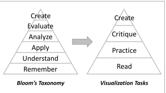
Librarians who provide information literacy instruction often leverage the cognitive domain of Bloom’s Taxonomy (Bloom 1956; Armstrong 2017; Kugelman 2017) to create engaging instruction. This taxonomy can also be used for self-directed learning. In the case of data visualization, the six Bloom’s categories – “Remember,” “Understand,” “Apply,” “Analyze,” “Evaluate,” and “Create” – can be adapted into a scaffolding of four major tasks for a librarian to undertake: “Read,” “Practice,” “Critique,” and “Create” (see Figure 1).
At the base of the Taxonomy, the basic cognitive processes of “Remember” and “Understand” become “Read,” a task to learn about the history and theory of data visualization. The next Bloom’s level, “Apply,” becomes “Practice” and entails going through the mechanics of producing different charts in a chosen software program. The higher Bloom’s levels “Analyze” and “Evaluate” become “Critique,” which requires the librarian to evaluate existing visualizations using lessons learned through Reading and Practice. Finally, the Bloom’s “Create” category becomes the “Create” task, in which the librarian brings their new knowledge and skills together to design effective visualizations. Working through each task raises skills and fluency in data visualization, ultimately positioning the librarian to confidently develop services around this competency.
Read
Librarians can gain a foundational background in data visualization by reading about the topic. An avenue of exploration is the rich history of data visualization. The history of representing data with charts extends back into the late 1700s with economist William Playfair’s invention of bar and pie charts, Florence Nightingale’s use of “coxcomb” charts to explain army mortality in the 1850s, and Charles Minard’s famous visualization of Napoleon’s doomed 1812 Russia campaign (Playfair 1786; Tufte 1983; Berinato 2016). Recently, several excellent resources on data visualization best practices have been published (Rougier et al. 2014; Yau 2011; Yau 2013; Yuk and Diamond 2014; Berinato 2016; Evergreen 2017), but librarians are also encouraged to seek out two older resources. The first is Edward Tufte’s seminal book, “The visual display of quantitative information” (Tufte 1983). While Tufte covers visualization standards such as graphical excellence and integrity, his idea that extraneous content, so-called “chartjunk,” should be removed from a graphic to maximize “data-ink” has been highly influential to modern visualization. The second resource that librarians should familiarize themselves with is from graphical theory. Cleveland and McGill studied the comprehension of information encoded by position, length, direction, angle, area, volume, curvature, and shading. They found that data represented by position on a line was easier for individuals to accurately interpret than data represented by length; ease of comprehension continues from best to worst in the order of the above list (Cleveland and McGill 1984). This research explains why bar charts (data represented by length) are easier to interpret than pie charts (data represented by angle).
Gaining Competency JeSLIB 2018; 7(1): e1116 doi:10.7191/jeslib.2018.1116 Practice
Building on a knowledge of the history and theory of data visualization, librarians can increase their visualization skills by practicing chart creation. This “Practice” task revolves around the mechanics of using visualization software rather than the design of the visual; the practitioner should focus on the process of making different types of charts in a specific software program, rather than making “good” charts. Librarians should pick a tool such as Microsoft Excel, Tableau, or R, etc., and work through the process of creating visuals in the desired program. Local researcher need can inform the best software to learn. Librarians should start with basic software fluency and work toward being able to guide a patron through the creation of visual or answer visualization software-related questions that might arise. Tutorials and guidebooks exist for many programs – such as for Excel (Evergreen 2017), Tableau (Murray 2016), and R (Chang 2013) – and can be used as a starting point for this work.
Critique
To further hone data visualization skills, it is important to critique existing visuals. Questions to ask might include: “is the visual good or bad?,” “why?,” and “how could it be improved?” Print and internet resources abound with data visualization examples for critique. Sites such as viz.wtf exhibit user submitted bad visualizations (“WTF Visualizations” 2017), although they don’t always explain what is wrong with the image. In contrast, flowingdata.com and informationisbeautiful.net highlight good visualizations (Yau 2017; McCandless 2017). Books compiling good visuals are also available (Cook and Krulwich 2016; McCandless 2012). Librarians are likely to encounter visualizations for critique in everyday life such as through the news, the quintessential example being fivethirtyeight (Silver 2017), and in published library literature. Critiquing existing materials is necessarily a higher-order task in the learning process, as evaluation should be done with reference to best practices learned during the “Read” task.
Create
The final task recommended in initially exploring data visualization is to synthesize all of this information to make good visuals. This involves more than simply creating a sample chart in the chosen software – as in the “Practice” task – but instead deeply thinking about design elements such as visual type, content, colors, etc. This capstone effort builds on the earlier activities of reading, practicing, and critiquing in order to create visuals that are both attractive and effective. There are many options for working through this process, such as reworking existing charts, creating new charts from library data for assessment purposes, or pulling from outside data sources to practice visualization.
Self-directed learning through the scaffolding tasks of Reading, Practicing, Critiquing, and Creating does not need to be formal. Rather, a librarian should pick what is most useful in each task – being sure to do something at all four levels – to work toward competency in this area of data literacy. Librarians should also consider whether they are effective self-directed learners. This includes the motivation for self-directed learning as well as being able to accurately learn content without receiving correcting feedback from an expert. For those needing more discussion and guidance on the topic of data visualization, working through the four tasks with a group or enrolling in a formal course are two alternatives.
Teaching Data Visualization
After working through the four outlined tasks, the author decided that her Library’s initial data visualization support offering would be a workshop, “Data Visualization 101.” This service was chosen to fit within existing data workshop offerings because there is local need for basic visualization training, as evidenced by patron requests and lack of current campus workshops on this topic. A second motivation for developing a workshop was to train library peers in visualization, as it would complement a Library strategic focus on data-driven decision making. The workshop was therefore designed with the intent to present it to both a librarian and a campus researcher audience.
The workshop centered on two learning objectives:
1. Participants will be able to choose the right chart for their message and type of data. 2. Participants will be able to create effective visualizations by highlighting only
important information.
In order to reduce the learning curve for initial participant success, the workshop focused on how visualization could be done with Microsoft Excel, one of the most popular programs used for research (Buys and Shaw 2015; Pouchard and Bracke 2016; Van Tuyl and Michalek 2015). The workshop materials pulled extensively from existing content, such as: Evergreen’s “Effective Data Visualization” (Evergreen 2017); existing visualizations (both good and bad); and one of the author’s previously published figures, which was used to demonstrate the process of improving a chart.
The workshop itself was one-hour long and divided into two parts, each consisting of a lecture followed by a hands-on activity. Activities were developed using backward design (Wiggins and McTighe 2006) rather than explicitly referencing Bloom’s Taxonomy. The first half of the workshop focused on choosing the right chart. Participants were presented with a framework for choosing a chart type by: identifying their message, deciding which type of data they have (which can vary for the same data depending on the message), and then choosing a chart type from a handout matrix of data types and corresponding possible charts. The matrix handout included standard chart options – such as a bar graph, line graph, pie chart, and scatterplot – but also featured nonstandard charts – such as an icon array, back-to-back bar chart, dot plot, and small multiples chart (handouts and slides for the workshop are available (Briney 2017)). Strategies for making the nonstandard visuals in PowerPoint and Excel were summarized from “Effective Data Visualization” (Evergreen 2017) and added to the back of the matrix handout. The hands-on activity for this portion of the workshop gave participants the opportunity to individually apply the framework to a sample dataset. Participants chose a message using sample data, explained which data type this corresponded to, and identified the chart type they would choose. They then sketched out a sample chart on paper. Sketches were voluntarily shared and discussed with the larger group.
The second half of the workshop focused on improving a chart. A brief presentation was given on avoiding the misrepresentation of data, complete with real-life bad examples. From there, the author modelled steps for improving a chart: highlighting only important data, choosing meaningful colors, reordering the data to improve readability, eliminating junk, and adding
Gaining Competency JeSLIB 2018; 7(1): e1116 doi:10.7191/jeslib.2018.1116
strategic labels. This process was demonstrated by incrementally improving a chart from the default Excel output through to the final “improved” chart. The hands-on activity for this section was a think-pair-share activity for improving a bad example chart.
Outcome
The process of learning and teaching data visualization provided outcomes in three different areas: for workshop participants, for the author, and for the Library’s Data Services program. Participants left the workshop with a framework for picking a chart type, ideas for creating nonstandard charts, and strategies for improving existing charts, as well as having worked through the process of making and improving a chart. As this was a pilot project, a formal IRB-approved assessment was not conducted. This is an area for further research and improvement of workshop materials.
There were also positive outcomes for the author. Learning about data visualization empowered her to feel comfortable with a data information literacy competency that previously felt daunting to master. It also prompted the author to re-evaluate her own data visualizations and strategize how to improve future charts. Finally, the author’s coworkers have started referring visualization questions to her.
For the Library’s Data Services program, this workshop represents a first step into the area of data visualization. It will be added to the current workshop rotation and provides a foundation for further developments around data visualization, which continues to be a growing need within the library and on campus.
Disclosure
The author reports no conflict of interest. References
Armstrong, Patricia. 2017. “Bloom’s Taxonomy.” Vanderbilt University Center for Teaching.
https://cft.vanderbilt.edu/guides-sub-pages/blooms-taxonomy
Berinato, Scott. 2016. Good Charts: The HBR Guide to Making Smarter, More Persuasive Data Visualizations. Boston: Harvard Business Review Press.
Bloom, Benjamin S. 1956. Taxonomy of Educational Objectives: The Classification of Educational Goals. New York: Longmans, Green.
Bresnahan, Megan M. and Andrew M. Johnson. 2013. “Assessing Scholarly Communication and Research Data Training Needs.” Reference Services Review 41(3): 413-433.
http://doi.org/10.1108/RSR-01-2013-0003
Briney, Kristin. 2017. “Data Visualization Camp Instructional Materials (2017).” UWM Libraries Instructional Materials. http://dc.uwm.edu/lib_staff_files/4
Buys, Cunera M. and Pamela L. Shaw. 2015. “Data Management Practices Across an Institution: Survey and Report.” Journal of Librarianship and Scholarly Communication 3(2): eP1225.
Carlson, Jacob, Michael Fosmire, C.C. Miller and Megan Sapp Nelson. 2011. “Determining Data Information Literacy Needs: A Study of Students and Research Faculty.” Portal: Libraries and the Academy 11(2): 629-657.
http://dx.doi.org/10.1353/pla.2011.0022
Carlson, Jacob, Lisa Johnston, Brian Westra and Mason Nichols. 2013. “Developing an Approach for Data Management Education: A Report from the Data Information Literacy Project.” International Journal of Digital Curation 8(1): 204-217. http://doi.org/10.2218/ijdc.v8i1.254
Chang, Winston. 2013. R Graphics Cookbook. O’Reilly.
Cleveland, William S. and Robert McGill. 1984. “Graphical Perception: Theory, Experimentation, and Application to the Development of Graphical Methods.” Journal of the American Statistical Association 79(387): 531-554.
http://doi.org/10.1080/01621459.1984.10478080
Cook, Gareth and Robert Krulwich. 2016. The Best American Infographics 2016. Boston: Houghton Mifflin Harcourt Publishing Company.
DataONE. 2017. “Education Modules.” Accessed May 17. https://www.dataone.org/education-modules
EDINA and Data Library, University of Edinburgh. 2017. “Research Data MANTRA.” Accessed May 17.
http://datalib.edina.ac.uk/mantra
Evergreen, Stephanie. 2017. Effective Data Visualization: The Right Chart for the Right Data. Los Angeles: SAGE. Harris-Pierce, Rebecca L. and Yan Quan Liu. 2012. “Is Data Curation Education at Library and Information Science Schools in North America Adequate?” New Library World 113(11/12): 598-613.
http://doi.org/10.1108/03074801211282957
Hernandez, Rebecca R., Matthew S. Mayernik, Michelle L. Murphy-Mariscal and Michael F. Allen. 2012. “Advanced Technologies and Data Management Practices in Environmental Science: Lessons from Academia.”
BioScience 62(12): 1067-1076. http://doi.org/10.1525/bio.2012.62.12.8
Johnston, Lisa R. and Jon Jeffryes. n.d. “Instructor Guide to the Flipped Data Management Course.” University of Minnesota Libraries.
Kugelman, Francie. 2017. “Bloom’s Taxonomy Cheat Sheet.” Bloom's Taxonomy.org. Accessed April 24.
http://www.bloomstaxonomy.org/Blooms Taxonomy questions.pdf
Lamar Soutter Library, University of Massachusetts Medical School. 2017. “New England Collaborative Data Management Curriculum.” Accessed May 17. http://library.umassmed.edu/necdmc/index
Lyon, Liz, Eleanor Mattern, Amelia Acker and Alison Langmead. “Applying Translational Principles to Data Science Curriculum Development.” In Proceedings of the 12th International Conference on Digital Preservation, Chapel Hill, North Carolina. http://phaidra.univie.ac.at/o:429552
McCandless, David. 2017. “Information Is Beautiful.” Accessed May 16. http://www.informationisbeautiful.net
———. 2012. Information Is Beautiful. London: Collins.
Murray, Daniel G. 2016. Tableau Your Data!: Fast and Easy Visual Analysis with Tableau Software. Wiley. Playfair, William. 1786. The Commercial and Political Atlas Representing, by Means of Stained Copper-Plate Charts, the Exports, Imports, and General Trade of England, at a Single View. London.
Pouchard, Line and Marianne Stowell Bracke. 2016. “An Analysis of Selected Data Practices: A Case Study of the Purdue College of Agriculture.” Issues in Science and Technology Librarianship 85(Fall 2016).
Gaining Competency JeSLIB 2018; 7(1): e1116 doi:10.7191/jeslib.2018.1116 Rougier, Nicolas P., Michael Droettboom and Philip E. Bourne. 2014. “Ten Simple Rules for Better Figures.” PLoS Computational Biology 10(9): e1003833. http://doi.org/10.1371/journal.pcbi.1003833
Silver, Nate. 2017. “FiveThirtyEight.” Accessed May 16. https://fivethirtyeight.com
Strasser, Carly A. and Stephanie E. Hampton. 2012. “The Fractured Lab Notebook: Undergraduates and Ecological Data Management Training in the United States.” Ecosphere 3(12): art116. http://doi.org/10.1890/ES12-00139.1
Tenopir, Carol, Suzie Allard, Mike Frame, Ben Birch, Lynn Baird, Robert Sandusky, Madison Langseth, Dane Hughes and Andrew Lundeen. 2015. “Research Data Services in Academic Libraries: Data Intensive Roles for the Future?” Journal of eScience Librarianship 4(2): e1085. http://doi.org/10.7191/jeslib.2015.1085
Tenopir, Carol, Suzie Allard, Priyanki Sinha, Danielle Pollock, Jess Newman, Elizabeth Dalton, Mike Frame and Lynn Baird. 2016. “Data Management Education from the Perspective of Science Educators.” International Journal of Digital Curation 11(1): 232-251. http://dx.doi.org/10.2218/ijdc.v11i1.389
Tufte, Edward R. 1983. The Visual Display of Quantitative Information. Cheshire, Conn.: Graphics Press. Van Tuyl, Steve and Gabrielle Michalek. 2015. “Assessing Research Data Management Practices of Faculty at Carnegie Mellon University.” Journal of Librarianship and Scholarly Communication 3(3): eP1258.
http://doi.org/10.7710/2162-3309.1258
Wiggins, Grant P. and Jay McTighe. 2006. Understanding by Design. Upper Saddle River, NJ: Pearson Education, Inc.
“WTF Visualizations.” 2017. Accessed April 13. http://viz.wtf
Yau, Nathan. 2017. “FlowingData.” Accessed April 13. http://flowingdata.com
———. 2011. Visualize This: The FlowingData Guide to Design, Visualization, and Statistics. Wiley Pub. ———. 2013. Data Points: Visualization That Means Something. Wiley.