Web-based Spatio-Temporal Presentation
and Analysis of Thematic Maps
Hans Voss, Natalia Andrienko, Gennady Andrienko, Peter Gatalsky
Abstract
Map-based visualization and analysis will become an important factor in future Web-applications. Regional location atlases and logistics support are prominent examples. Location-based services will likely become a killer application of next generation mobile phone computers using, e.g., UMTS technology. In the paper we introduce our Descartes system as an interactive, direct manipulation Web-Map software. Descartes is specifically designed to support thematic mapping by automatically proposing alternative visualizations of geo-referenced statistical variables and by providing many functions for analysis. By examples, the paper sketches some of the newer functions built for mapping of spatio-temporal data. Résumé (in French)
Not to be written by us.
Hans Voss, Natalia Andrienko, Gennady Andrienko, Peter Gatalsky
German National Research Institute for Information Technology - GMD D-53754 Schloss Birlinghoven
Fax:+49 2241 142889 e-mail: [email protected]
Why Web-based map presentation and
analysis?
Governments of cities and regions have many reasons to utilize Geographical Information Systems (GIS). Besides to classical applications for land registers, planning or traffic management, which are mainly used inside of or between
departments of one organization, there are new applications that also address people, organizations and companies outside of the organization. The medium making this possible is the Internet. The current paper shall convey new technologies for presenting geographical, spatio-temporal data through the Internet, and make them interactively analyzable by cartographic experts as well as lay persons in- and outside of the issuing organization. Although the tools thus provided can also be run on local computers the paper focuses on their use in the Internet because it most clearly demonstrates chances and potential of innovative GIS applications. One prominent such application is the digital location atlas. It may address private persons looking for a new home when moving to a city or region or industrial and service companies when looking for a new location for production, central facilities, service or warehouse center. Site constraints and potential are of increasing
importance for most types of enterprises. An intensive and qualified evaluation of many hard and soft factors is most essential in view of an increasing national and international competition in the global age, where the relocation to distant but cheaper places is often not a big stumbling-block any more. From an environmental perspective one has to make up the ecological balance related to the location decision - as has become law in many countries, e.g. the German UVP
(Umweltverträglichkeitsprüfung - evaluation of environmental compatibility). All in all, the right location selection is one of the most important entrepreneurial decisions inducing long-term effects on internal logistics and overall cost structures.
Vice versa, a city or region as a potential location is most interested to "market" what it has to offer in order to lure enterprises to settle in its fiscal sphere. Cities and communes, but increasingly regions or pools of cities and communes, have always invested huge resources for (co-operative) public relations. They provide location atlases to the information seeker, and comfortable conditions regarding taxes, land or employees to those interested. Ever more and increasingly attractive presentations are nowadays published in the Internet. The presentation not being "in" may perhaps imply to be "out" as a candidate.
This paper shall demonstrate that a powerful technology is available that allows ordinary people to view and analyze maps through the Internet. In particular, we will illustrate by example how our software Descartes can be used for this purpose. Descartes can be used as a general Web mapping tool, but is specially designed to support the automatic mapping of geo-referenced statistical data. The user interface of Descartes - the Web client - is a Java applet. The rationale is that we want to
provide as much direct interactivity for the user as possible. It is not possible to survey all available features and visualization methods of Descartes in the present paper. We will instead focus on some new techniques that were invented to support the analysis of spatio-temporal data.
In the rest of the paper we will first assess relevant currently available research results and technology. We will then introduce specific concepts of Descartes by working through an example. The scenario is that someone, say a person given the task of looking for a location of a new service center, analyzes the financial situation of people living in the candidate districts of a prospective city. We further narrow the scenario by taking "family income" as the considered attribute and the City of Helsinki as the city.
State of the Art
Nowadays maps are increasingly conceived as useful tools for “visual thinking”, i.e. for the analysis of spatially related data in the context of problem solving and decision making. To fulfil this role, the maps should not only be properly designed according to cartographic principles. What the users really need are highly
interactive, dynamic map displays that are linked to various additional instruments supporting these creative activities (MacEachren 1994, MacEachren and Kraak 1997). While commercially available GIS do not (yet) meet these requirements, software developed within some research projects successfully demonstrate the potential of novel tools based on highly interactive maps (Symanzik et al. 1996, Dykes 1997, Andrienko and Andrienko 1999).
Analysis of spatio-temporal data is especially challenging. It requires tools for representation and manipulation of all three aspects of the data: thematic (values of attributes), temporal and spatial. Due to increased speed, space, and graphical displays modern computers offer new opportunities to properly visualize the temporal variation of spatially referenced data. In particular, they render possible and affordable cartographic animation when a map on the screen shall represent the dynamics of phenomena by rapidly changing its appearance. One of the first implementations of animated map displays was Tobler’s (1970) representation of urban growth.
Animation produces a strong visual effect on a viewer when it demonstrates some rather apparent dependencies and trends like urban growth, or shrinkage of forest areas. On the other hand, the usefulness of animation for data exploration, i.e. for the detection of new and interesting knowledge, must not be overestimated. Map iteration as the presentation of states of a phenomenon at different moments by a collection of maps arranged in a chronological order, is still seen as a more valuable tool for visual analysis. It is more appropriate for the comparison of states of a phenomenon at different time moments, and particularly so for detecting changes that occurred between two consecutive moments. The classical map iteration technique can be considerably improved in its effectiveness by proceeding from static map images to interactive displays on computer screens. However, the
iteration technique has an evident limitation: it is hardly suitable for long time series, which would require a large number of maps.
At the present time considerable research and development is being done for visualization and support of exploratory analysis of spatio-temporal data.
Monmonier (1990) put forward ideas of temporal focusing and temporal brushing as an extension to the mechanism of dynamic linking (“brushing”) between multiple displays representing different aspects of data developed in statistical graphics (Buja et al. 1991). Kraak, Edsall and MacEachren (1997) suggest so called “active
legends” that display the time reference of the data currently presented in the map and at the same time allow the user to control the animation. It can be noted that the works on active legends are mostly concerned with selection of time moment(s) to be represented in the map.
The considered techniques of controlling map animation help in making animated presentations more suitable for data analysis. Still, further enhancement of the arsenal of tools supporting analysis is needed. For example, visualization of the difference between the state of data at each time moment and that at the previous time moment is very useful for revealing changes of data. This feature has been implemented, for example, in the multimedia “Atlas of Switzerland” (Oberholzer and Hurni, 2000).
In our research we consider various kinds of phenomena as well as various types of changes that may happen in time. Thus, we distinguish between continuous phenomena spread over a territory, spatial entities having distinct locations and shapes, and events occurring in space. Temporal changes can be classified into changes of existence (appearing and disappearing), location, geometry (shape and size), and thematic characteristics. We realize that diverse instruments are needed depending on properties of spatio-temporal phenomena and on what type of change is to be studied (Andrienko, Andrienko, and Gatalsky 2000). The present paper illustrates several instruments that we developed for supporting Web-based analysis of thematic (numeric) time-series data referring to areas of territory division.
A Guided Tour
The tour consists of three stages. During the tour we will analyze the attribute "income per family" for districts of the City of Helsinki. The first stage visualizes this attribute for one specific year. In the second stage we will be able to analyze the same attribute for several consecutive years using a time plot representation. Finally, we will use time plots together with brushing techniques in order to study the relationship between two different temporal attributes.
Stage 1
Imagine that our user, i.e. the person looking for a location of the company's service center, becomes interested in the demographic situation of the candidate locations. In particular, our user - whom we assume to be female - becomes interested in statistics about the financial situation of people living in the districts of Helsinki.
She has just selected the entry "income per family (1996)" from a table of available statistical variables. As a result, the application built with Descartes will then offer a set of alternative map-based visualizations of this variable for further inspection. One or more tables with statistical data linked to the elements of a territory and a corresponding vector-based map is what is needed to build an application with the tool Descartes. An interactive tool called Descartes Application Builder supports this process by guiding the user through the required steps, and by providing transparent use of several converters for table and map data so that many common formats are allowed as input.
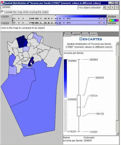
Figure 1. Statistics for Income per Family (1996)
Internally, an application includes data files for statistical and geographical data: tables with attribute data referring to spatial objects (districts, towns, countries,
and so on). The objects are denoted in the tables by their identifiers. Each table must contain at least one column with spatial object identifiers;
geographic layers, i.e. files containing points, lines, or areas (polygons) in vector format. For each table there must be a geographic layer containing the spatial objects from this table.
The layers that do not contain objects from a table may create a geographical
background for data presentation. The layers to be actually shown on the map can be dynamically selected from the "Layers"-menu of the application.
An application also contains a file describing the relevant domain notions (thematic data) and relationships between them. For example, a demographic application may include the notions "Male population" and "Female population", and it might be specified that these together form the "whole population". Such information is essential for the correct selection of presentation techniques. For example, if the user wants to visualize the number of male and female population, Descartes would know that this can be done using pie-charts, where the full pie represents the whole
population.
In general, Descartes incorporates such knowledge about thematic cartography in the form of generic, domain-independent rules. These rules exploit the characteristics of user selected attributes and relations between them to automatically generate
"correct" and convincing visual presentations. Examples of characteristics and relations are: Type and value range of an attribute; comparability, dependency, or hierarchical and compositional relations between attributes.
We assume here - just for illustration - that a department of the Helsinki City Administration provided these data, a system administrator built the application, and made it accessible in the Internet1.
We continue the example scenario by letting the user select the choropleth map presentation of the income data. She will then see a window as displayed in Figure 1. This window has many interactive features operated by the Descartes' client, which is a Java Applet. The user interface for choropleth maps is divided into four frames. The top frame provides some controls to select a specific object as reference object so that all objects are painted with colors defined relative to the reference object, which itself is white. The bottom left frame presents the thematic map, and the bottom right frame (the last two lines on the right hand side) shows the actual values of the displayed attributes for the object currently under mouse in the map frame. In the example, this is district Kulosaari with family income of 289,991 Finnish Markka in the year 1996.
1
Actually, we have build the application ourselves, and also made it available in the Internet under http://borneo.gmd.de/and/time/helsinki.html. The City of Helsinki was, however, supportive in providing us with the data for the map contours. The statistical data used in the examples were taken from web-published Helsinki Region Statistics, cf.
The middle right frame contains four different panels. Actually shown is the Legend-panel, which in this case shows the minimum and maximum value of the given attribute and some statistics (median value and quartiles). The Tools-panel provides some functions for zooming, panning, and brushing, where the zooming functions are further refined in the separate Zoom-panel. Finally, the layers-panel allows the selection and ordering of layers, and also some basic tools for editing the appearance of layers.
The color scheme employed for "visual comparison" as used in Figure 1 is known in cartography as "double-ended" or "diverging". Cartographers use the diverging scheme for emphasizing progressions outward from a critical midpoint of data. In exploratory data analysis, however, such critical points are often previously unknown. Therefore, Descartes provides various opportunities to dynamically change the midpoint and observe corresponding changes of the map.
One of the arguments for the use of the dynamic comparison tool is that perception of the degree of darkness strongly depends on the context. That is, a shade is perceived lighter in dark surroundings and darker in light surroundings. Therefore, when two non-adjacent area objects are painted seemingly in the same shade, it is difficult to recognize whether one of the corresponding values is equal to, greater than, or less than the other. With the dynamic choropleth map in our example, you need only to click on one of the districts and see whether the other object turns white, green, or cyan (green-cyan is the diverging scheme that we used here in the original color display).
To summarize, the manipulation tools for choropleth maps allow various ways of interactively selecting some midpoint or reference number, N. The map will be dynamically redrawn when N is changed so that values greater than N are encoded by shades of one color tone and those less than N are shown by shades of another color tone (by default, green and cyan, respectively). Values exactly equal to N are shown in white. In the example map, N equals 200,000:
The upper left panel and the map panel in Figure 1 provide the controls to manipulate the value of N:
1. You may enter an exact number in the editing field (upper left corner).
2. You may move the slider that linearly lists in increasing order all values of the selected attribute for all existing districts. This dot plot is linked to the map. Pointing on a dot with the mouse (not clicking) will highlight the corresponding district in the map. Clicking on a dot will set the new reference value accordingly. The triangle delimiters within the slider unit can be used for focusing on a value subrange of the represented attribute.
3. You may click on an object (district) in the map. Its attribute value will then become the new reference value, and its color will turn white.
4. You may select a particular district from the pull-down menu (upper line, in the middle).
5. You may select successive attribute values by pressing the "<" or ">" buttons. This method allows you to quickly iterate through the values before deciding which representation is most appropriate for your task.
Whatever function you choose, the map will be immediately repainted. Moreover, and this is another salient feature, Descartes will simultaneously and automatically adapt the legend to the new situation. Finally, if you click on the "rainbow" icon in the lower right corner of the Manipulation area, a "Select color scale" dialog will appear that allows you to select other color schemes to represent positive and negative values.
Stage 2
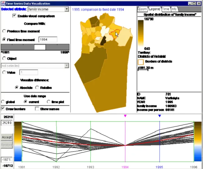
Our user becomes now aware that the current map is quite informative by showing the spatial distribution of the family income attribute but that it is of limited use because it is a static presentation, i.e. only covers one moment (year). It would additionally be very interesting to observe the development of the respective variable over time, and perhaps detect some trend. Our user can try to do this by selecting the same attribute for the consecutive years from 1991 to 1996. Descartes will then offer the time plot representation as displayed in Figure 2 as one useful visualization method.
The map in the middle top frame always shows one aspect of the variable family income for a given year of the specified period. In the figure the considered year is 1995. The map may show the absolute values for the given year, or it may show changes, where a change can be the difference to the previous year (zero for the first year), or to some other year. The change may be expressed in absolute or relative numbers. All these parameters can be set and varied in the top left frame or in the time plot. The time plot contains one line for every district of Helsinki. The district Vartiokyla, which is highlighted in the map, is simultaneously highlighted in the time plot (our user observes that is belongs to the average "performers"). Vice versa, moving the mouse over one of the lines would cause the highlighting of the
corresponding district in the map presentation.
The time plot of the current example has defined 1994 as the year of reference. According to further settings, every line in the time plot thus depicts the differences in absolute numbers of the respective years as compared to the value for the year 1994. One can clearly observe that there are three districts which outperformed the others (in absolute numbers, so be careful!) in 1995 and partially in 1996. Another observation is that for almost all districts, family income has decreased from 1991 until 1994, and increased from 1994 to 1996. We also want to mention that the time plot representation is very good in detecting anomalies. In the time plot of Figure 2 our user would thus be clearly suspicious about the behavior of one of the lines (districts), which takes some big steps up and down in the first four years.
Stage 3
Family income is a good indicator for the "wealth" of a district. Yet our user
wants to further investigate the situation. A district with high score in family
income could have a high percentage of rich singles, or it could have many
larger families with many but smaller incomes. Hence, she thinks that
relating the attribute "family income" to the available attribute "income per
capita" could be more revealing. One way of analyzing relationships between
the attributes is to view every one in a separate window while simultaneously
highlighting related information in both windows when moving the cursor or
clicking on an object.
Figure 3 gives an example of how Descartes supports this so called brushing
technique. In the upper window the four top scorers based on family income
have been highlighted (thick black lines in the time plot). The corresponding
lines in the time plot of the lower window divulge that one of the districts
with highest family income is the clear leader regarding income per capita.
The other three high level districts regarding family income are also in the
high end of income per capita but not so clear in the lead as was the case with
family income.
Unfortunately, it is not possible to continue this analysis here in more detail,
e.g. taking into account size of households, unemployment rate, etc. We hope
to have described some concepts of Descartes so that the reader may start her
own exploration using it. The application with data of Helsinki and many
others can be further investigated in the Internet at the addresses given
below.
Conclusions
Map-based visualization and analysis will become an important factor in future Web-applications. Regional location atlases and logistics support are prominent examples. Location-based services will likely become a killer application of next generation mobile phone computers using, e.g., UMTS technology. In the present paper we introduced Descartes as an interactive, direct manipulation Web-Map software. Although the paper could only give a sketch we hope that we could at least signify the potential of this type of technology. Of course, there are many issues left for further research. Our own work will focus on developing further analytical tools, particularly addressing new ways of comparing multiple attributes in time-series data. Another focus will be on combining visualization techniques with data mining algorithms. The power of human visual and mental intuition and imagination and the number and symbol crunching power of computers - applied to smart knowledge discovery methods - will thus probably contribute to a new dimension of analytical tools.
URLs:
Helsinki application:
http://borneo.gmd.de/and/time/helsinki.html
References
Andrienko, N., Andrienko, G. (1999): Interactive maps for visual data exploration‚ International Journal of Geographic Information Science13(4), 355-374.
Andrienko, N., Andrienko, G., and Gatalsky, P. (2000): Supporting Visual Exploration of Object Movement. In V. Di Gesu, S. Levialdi, L. Tarantino (eds.) Proceedings of the Working Conference on Advanced Visual Interfaces AVI 2000, Palermo, Italy, May 23-26, 2000. ACM Press, 2000, pp.217-220, 315
Andrienko, N., Andrienko, G., and Gatalsky, P. (2000): Visualization of Spatio-Temporal Information in the Internet, A.M.Tjoa, R.R.Wagner, A.Al-Zobaidie (eds.), Second International Workshop on Web-Based Information Visualization: WebVis 2000, Greenwich, London, UK, 4-8 September, 2000, 11th International Workshop on Database and Expert Systems Applications, Proceedings IEEE Computer Society, Los Alamitos, California, 2000, pp.577-585
Andrienko, G., Andrienko, N., Voss, H., and Carter, J. (1999): Internet Mapping for Dissemination of Statistical Information. Computers, Environment and Urban Systems, v.23 (6), pp.425-441
Buja, A., McDonald, J.A., Michalak, J., and Stuetzle, W. (1991): Interactive data visualization using focusing and linking. In Proceedings IEEE Visualization’91 (Washington: IEEE Computer Society Press), 156-163.
Dykes, J.A. (1997): Exploring spatial data representation with dynamic graphics. Computers & Geosciences, 23, 345-370.
Kraak, M.J., Edsall, R., and MacEachren, A.M. (1997): Cartographic animation and legends for temporal maps: exploration and/or interaction, Proceedings 18th International Cartographic Conference, vol. 1, pp. 253-261.
MacEachren, A.M. (1994): Visualization in modern cartography: setting the agenda. In Visualisation in Modern Cartography (NY: Elsevier Science Inc.), pp. 1-12 MacEachren, A.M. and Kraak, M.-J. (1997): Exploratory cartographic visualization: advancing the agenda. Computers and Geosciences, 23 (4), 335-344.
Monmonier, M. (1990): Strategies for the visualization of geographic time-series data. Cartographica, 27 (1), pp. 30-45.
Oberholzer, C., Hurni, L. (2000): Visualization of change in the Interactive Multimedia Atlas of Switzerland, Computer & Geosciences, 26 (1), pp. 423-435. Symanzik, J., Majure, J., and Cook, D. (1996): Dynamic graphics in a GIS: a bidirectional link between ArcView 2.0 and XGobi. Computing Science & Statistics,
Tobler, W. (1970): Computer movie simulating urban growth in the Detroit region, Economic Geography, 46 (2), pp.234-240.
Acknowledgement:
Special thanks go to Esa Tiainen and Matti Arponen for supporting us with the Helsinki application.