Follow this and additional works at:
https://lib.dr.iastate.edu/etd
Part of the
Statistics and Probability Commons
This Dissertation is brought to you for free and open access by the Iowa State University Capstones, Theses and Dissertations at Iowa State University Digital Repository. It has been accepted for inclusion in Graduate Theses and Dissertations by an authorized administrator of Iowa State University
Digital Repository. For more information, please [email protected].
Recommended Citation
Cheng, Xiaoyue, "Interactive visualization for missing values, time series, and areal data" (2015).Graduate Theses and Dissertations. 14661.
by
Xiaoyue Cheng
A dissertation submitted to the graduate faculty in partial fulfillment of the requirements for the degree of
DOCTOR OF PHILOSOPHY
Major: Statistics
Program of Study Committee: Dianne Cook, Co-Major Professor Heike Hofmann, Co-Major Professor
Amy Froelich Zhengyuan Zhu Alan Wanamaker
Iowa State University Ames, Iowa
2015
TABLE OF CONTENTS
LIST OF TABLES . . . . vii
LIST OF FIGURES . . . . viii
ACKNOWLEDGEMENTS . . . . xi
ABSTRACT . . . . xii
CHAPTER 1. INTRODUCTION . . . . 1
1.1 Interactive graphics . . . 2
1.2 Missing data exploration . . . 2
1.3 Time-related interactions . . . 3
1.4 Cartogram evaluation . . . 4
CHAPTER 2. VISUALLY EXPLORING MISSING VALUES IN MULTI-VARIABLE DATA USING A GRAPHICAL USER INTERFACE . . . . 5
2.1 Introduction . . . 6
2.2 Functionality . . . 8
2.2.1 Overview of the missing data GUI . . . 8
2.2.2 Summary of missing values . . . 9
2.2.3 Imputation . . . 12
2.2.4 Plot types . . . 19
2.2.5 Design issues . . . 21
2.2.6 Data input and output . . . 22
2.2.7 Additional features of the GUI . . . 24
2.3 Example . . . 25
3.1.1 Characterizing time . . . 33
3.1.2 Visualizing time . . . 34
3.1.3 Interactive graphics . . . 38
3.2 Layering to create a plot . . . 39
3.3 A taxonomy of interactions for temporal data displays . . . 40
3.4 Display Pipeline . . . 46 3.4.1 Wrapping . . . 47 3.4.2 Faceting . . . 50 3.4.3 Mirroring . . . 51 3.4.4 Shifting . . . 51 3.4.5 Additivity of interactions . . . 52
3.4.6 Incremental vs baseline operations . . . 53
3.5 Linking . . . 55
3.5.1 Self-linking . . . 55
3.5.2 Linking between plots . . . 58
3.5.3 Additional linking issues . . . 61
3.6 Querying . . . 62
3.7 Conclusions and future work . . . 62
CHAPTER 4. CRANVASTIME: AN INTERACTIVE TOOL FOR TEM-PORAL AND LONGITUDINAL DATA PLOTS . . . . 64
4.1 Introduction . . . 64
4.3 Data . . . 67
4.4 Functionality . . . 71
4.4.1 Discover the seasonality . . . 71
4.4.2 Explore the individual variation . . . 74
4.4.3 Focalize to the center of y . . . 78
4.4.4 Connect time series to other variables . . . 82
4.4.5 Miscellaneous . . . 86
4.5 Conclusions and future work . . . 89
CHAPTER 5. NEW APPROACHES TO EVALUATE CONTIGUOUS CAR-TOGRAMS FOR AREAL DATA . . . . 90
5.1 Introduction . . . 90 5.1.1 Non-contiguous cartogram . . . 90 5.1.2 Contiguous cartogram . . . 92 5.1.3 Software . . . 93 5.1.4 Visual challenges . . . 94 5.2 Evaluating cartograms . . . 95 5.2.1 Existing work . . . 95 5.2.2 Problems . . . 96
5.2.3 Proposed evaluation functions . . . 97
5.3 Interactivity . . . 101
5.3.1 Linear interpolation . . . 102
5.3.2 Parameter tuning by graphical user interface . . . 103
5.4 Sensitivity analysis . . . 107
5.4.1 Data and parameters . . . 107
5.4.2 Results . . . 108
LIST OF TABLES
Table 2.1 Imputation methods included in the missing data GUI . . . 13
Table 2.2 Comparison of three multiple imputation packages . . . 18
Table 3.1 Examples fromcranvas of layers used in constructing plots . . . 40
Table 3.2 The combination of interactions modifies they-coordinates . . . . 53
Table 3.3 Brushing the “wide data” format . . . 56
Table 3.4 Brushing the “long data” format . . . 57
Table 3.5 Linking between the long and wide data format may produce a problem 60 Table 5.1 Comparing two diffusion cartograms . . . 102
Table 5.2 Parameter values in the sensitivity analysis . . . 108
Figure 2.1 Overview of the missing data GUI . . . 8
Figure 2.2 A numerical summary of missing values . . . 10
Figure 2.3 Missingness maps . . . 11
Figure 2.4 Results of different univariate imputations . . . 14
Figure 2.5 Results of the nearest neighbor imputation methods . . . 15
Figure 2.6 Illustration of theknearest neighbors imputation method . . . 16
Figure 2.7 Results of the multiple imputations . . . 17
Figure 2.8 Results of four imputing chains by themice package . . . 19
Figure 2.9 Effect of conditioning on imputed values . . . 20
Figure 2.10 Four types of graphs available in the GUI . . . 22
Figure 2.11 Subsidiary GUI tabs . . . 23
Figure 2.12 Subsidiary GUI to import data . . . 24
Figure 2.13 Subsidiary GUI to export data . . . 24
Figure 2.14 Interactive attributes list for variable selection . . . 25
Figure 2.15 Exploring the effect missingness of the tao data . . . 27
Figure 2.16 Exploring the effect missingness conditionally . . . 28
Figure 2.17 Checking assumptions by parallel coordinates plots . . . 29
Figure 2.18 Finding the dependent variables by scatterplots and contour plots . . . 30
Figure 3.1 Time series plots for regular and irregular time spacing . . . 34
Figure 3.2 Six variations of horizontal axis time plots for multivariate time series 35 Figure 3.3 Three types of time series plots in polar coordinates . . . 38
Figure 3.5 Interactions for the pig production data . . . 43
Figure 3.6 Order of interaction matters on faceting . . . 44
Figure 3.7 Bi-directional faceting . . . 45
Figure 3.8 Illustration of shifting . . . 46
Figure 3.9 Cartoon illustrating thex-wrapping . . . . 50
Figure 3.10 Three modes of highlighting when a point is brushed . . . 57
Figure 3.11 Linking between different plots for the Google Flu Trends data . . . . 59
Figure 3.12 Additional data created from the vertical faceting . . . 62
Figure 4.1 Limitations of the static plots . . . 64
Figure 4.2 Basic time plots created by cranvastime . . . 70
Figure 4.3 X-wrapping the time series of nasa data . . . 71
Figure 4.4 X-wrapping the time series with a larger period . . . 72
Figure 4.5 Fully x-wrapping the time series . . . 72
Figure 4.6 Calculation of R squares . . . 74
Figure 4.7 Univariate time series with a non-integer period . . . 75
Figure 4.8 Faceting the pig production data by variable . . . 76
Figure 4.9 Faceting by longitudinal individual . . . 77
Figure 4.10 Shifting a variable over time to check the dependence . . . 77
Figure 4.11 Mirroring the lynx data by the mean . . . 79
Figure 4.12 Y-wrapping the lynx data before and aftering mirroring . . . 79
Figure 4.13 Y-wrapping the four variables of the pig production data . . . 80
Figure 4.14 Y-wrapping the Google Flu Trends data by state . . . 81
Figure 4.15 Faceting the Remifentanil data by four covariates . . . 83
Figure 4.16 Faceting the nasa data by grid . . . 84
Figure 4.17 Linking several plots for the Google Flu Trends data . . . 85
Figure 4.18 Switching to the area plots from line plots . . . 86
Figure 4.19 Zooming in and zooming out . . . 87
Figure 5.5 Angle difference . . . 97
Figure 5.6 Edge difference . . . 98
Figure 5.7 Angle and edge difference before and after the diffusion cartogram . . 100
Figure 5.8 Scatterplots between the shape error and area error . . . 101
Figure 5.9 Linear interpolation between two polygons . . . 102
Figure 5.10 Linear interpolation between the original map and diffusion cartogram 103 Figure 5.11 Errors of the linear interpolations with weights spaced by 0.05 . . . 104
Figure 5.12 Six parameters to create the density matrix for the diffusion method . 105 Figure 5.13 The shiny GUI for diffusion cartograms . . . 106
Figure 5.14 The vertices tab . . . 107
Figure 5.15 The best and worst cartograms selected by the total error . . . 109
Figure 5.16 Errors by the interpolation weight . . . 110
Figure 5.17 Line plots between the interpolation weight and total error . . . 111
Figure 5.18 Boxplots of errors by the number of rows and aspect ratio . . . 112
Figure 5.19 Boxplots of errors by blank and sea weight . . . 112
Figure 5.20 Boxplots of errors by blank weight and the weight difference . . . 113
Figure 5.21 Boxplots of errors by blur and blank weight . . . 114
ACKNOWLEDGEMENTS
I am very grateful to my major professors Dr. Di Cook and Dr. Heike Hofmann for their guidance, patience and support throughout this research. From Di and Heike, I learned a lot on Statistical computing and graphics, as well as the way of scientific research. I could not have completed my graduation education or started an acadamic career without Di’s encouragement and direction.
I would like to thank my committee members: Amy Froelich, Zhengyuan Zhu, Alan Wana-maker, and Petrutza Caragea, for their time and suggestions on my work. Additionally, I thank Dr. Froelich for funding me as a graduate assistant in the Stat 101 report project for three years. It was a great experience which benefitted me a lot in both research and teaching.
I would also like to thank John McDanold and Russell Allgor for the opportunities they have provided me as a summer intern in 2012 and 2013. They encouraged me to implement my research to the complex real problems, and their feedback enlightened me to improve my work. The cartogram chapter of my dissertation was inspired by the internship experience.
Finally I thank my family and friends for their support during my study at Iowa State University. My husband Yihui always cooked for me and told dry jokes. I would like to name one of the friends, Wei Zhang, who pushed me to do much exercise in the recent five years, resulting in my first 5K race and Cyman triathlon.
down into a fine resolution, query or lookup elements, look at data from various directions, and connect plots with model analysis. However, for specific data types and specific exploratory purposes, the general interactions like brushing, panning, zooming, and querying can be in-sufficient. The lack of a grammar for interactive graphics makes differences between the user interactions on data and on the view of data difficult to delineate. This thesis partially ad-dresses these issues and fills gaps in methodology from three application areas: missing values, temporal/longitudinal data, and areal data.
Interactive graphics plays different roles in three areas. In missing data analysis, many im-putation methods have been developed but little has been done for exploring the missing value structure to determine the missingness pattern, or to evaluate the imputations. This research addresses this gap, focusing on an interactive tool to explore missings, check the missingness as-sumptions, and compare imputation methods. For temporal and longitudinal data, using static plots is inadequate for exploring the trends, seasonality or unusual individuals, especially when the data set is large. This research develops special interactions and discusses the elements and pipeline in the interactivity construction. It is implemented in the R package, cranvastime, with details on how to use for a number of datasets. For the areal data, cartograms are widely used but there is no universally good algorithm for cartogram construction or evaluation. This research proposes an evaluation criterion and utilizes an interactive interface to optimize the visualization between the original shape-reserved map and area-reserved cartogram.
CHAPTER 1. INTRODUCTION
Visualization is important for data exploration, to examine variation, assess trends, and di-agnose statistical models. Unlike static graphs, the strength of dynamic and interactive graphics is generating plots that can be refreshed smoothly and quickly, enabling the display of many more views of the data and model in rapid succession. With multiple linked windows different aspects of data can be explored simultaneously. Interactive plots emphasize the user control, so that users can re-focus the view to features of interest, drill down into a fine resolution, query or lookup elements, and look at data from various directions. One important focus of statistical graphics is the desire to have interactive graphics to be closely connected with analyzing and modeling, which can involve specific exploratory purposes and data types. Hence the general manipulations such as brushing, panning and zooming, querying, can be insufficient. With the design of novelty interactions, a lack of the grammar for interactive graphics makes differences between the user interactions on data and on the view of data difficult to delineate. This thesis addresses these issues and fills the gaps in methodology for three application areas: missing values, temporal/longitudinal data, and areal data.
The dissertation consists of four parts, including three independent papers and a vignette for the interactive graphics software that applies the proposed grammatical construction. Chapter
2develops a graphical user interface (GUI) to interactively explore the missing patterns,
sum-marizes and imputes missing values with various methods. Chapter3 discusses the elements
of the interactive graphics for temporal and longitudinal data, and proposes the constructive
pipeline for data transformation during complex interactions. Chapter4implements the
gram-matical construction in Chapter3 to a software package, and document usage with many data
examples. Chapter 5studies the errors in contiguous cartograms, and develops an application
Theus (2003), GGobi Swayne et al. (2003), and the R packages iplots Urbanek and Theus (2003), cranvasXie et al.(2015),ggvisRStudio(2014). TheRpackages represent very current directions of research in terms of getting interactive graphics available directly integrated with
the prominent contemporary data analytical tool,R. From the computer science and information
visualization communities there have been parallel graphics developments over the same time
frame. Several currently available interactive software systems are Tableau Hanrahan et al.
(2007), d3.jsBostock(2012), and Processing Reas and Fry(2007).
There has also been substantial research on how to effectively construct a display of data.
For the static graphics, Cleveland (1985, 1993a) and Cleveland and McGill (1987) studied
human perception of data plots, reporting that position along a line is the mapping of data to
plot element that people can read off most accurately. Wilkinson et al. (2006) and Wickham
(2009) developed a grammatical construction for data plots, that helps to explain how different
charts are similar or distinct from each other, and standardize plot construction. Underlying
the construction of interactive graphics is a data pipeline discussed in Buja et al. (1988a),
Wickham et al.(2009),Lawrence and Verzani (2012),Xie et al. (2014).
1.2 Missing data exploration
Missing values are a very common problem affecting data analysis. Many imputation meth-ods have been developed but little has been done for exploring the missing value structure in order to determine the type of missing value pattern, and to evaluate the imputations. Many software packages handle missing values by simply removing the incomplete records with or without a warning, especially when the data are real-valued and multivariate. In order to
decide what to do with the missing values, before analyzing the data, we need to understand what the distribution of the missing values is, and how the missingness depends on the other collected variables. Also, for some model-based imputation methods, it is important to check the assumptions, like missing completely at random (MCAR) or missing at random (MAR), despite being difficult to prove.
Chapter 2describes an interactive tool, theRpackageMissingDataGUI, to explore missing
value structure, examining missingness assumptions, and comparing imputation results using static plots and numerical summaries. The GUI can handle the data set with multiple types of variables, summarize the missing values numerically and graphically, impute the missings by univariate, multivariate, and multiple imputation with or without conditioning factors, compare the results from different methods and chains, and suggest the dependent variables. Two real data studies were given to reveal the ability of comparing the imputation methods,
and checking the assumptions. This paper is accepted by Journal of Statistical Software, and
the packageMissingDataGUI is available on CRAN.
1.3 Time-related interactions
For the temporal and longitudinal data, using the static plots is inadequate for exploring the trends, seasonality or unusual individuals, especially when the data set is large. With large longitudinal data plots are too congested by lines to reveal interesting details. Long time series make it difficult to explore periodicity and trend. Interactive graphics can help to tease these many components apart. Users should be able to facet multiple series, zoom in a long time series, query a specific individual, or wrapping the series to check the regularity of the period. Facilitating these interactions requires a new conceptual framework, and a proof-of-concept implementation for testing.
Chapter3elaborates the elements and pipeline of the interactive visualization for temporal
and longitudinal data. Starting with an overview of the existing static visualization on time series and longitudinal data, the chapter introduces the basic elements and necessary interac-tions for time dependent data, followed by the pipeline of data transformation and linkage. This work is different from the existing interactive visualization grammar, because the new
large set of series. More concrete interactions with real examples are introduced in this chapter.
1.4 Cartogram evaluation
In the analysis of spatial data it is common to examine variables measured on areas. For example, to examine the US electoral trends, in electing a president, the basic unit is a state, because states votes are added as blocks to give a total count for each candidate. Among many types of spatial data, like points, lines, or areas, this work focuses on the areal data, which is displayed by polygons. This type of data is commonly represented by choropleth maps. However, in these displays attention focuses on the large regions, tending to diminish the small areas, which could be crucial areas. To emphasize the important areas, cartogram can be used. A cartogram reshapes the areas in proportion to the numerical value, while maintaining spatial integrity as much as possible. These have been effectively constructed manually, for specific purposes, but there is no universally best automatic algorithm for cartogram construction. In addition, evaluating the error in a cartogram is not broadly discussed and simply absent from the documentation of different cartogram methods. The result can be distorted cartograms, that are barely recognizable by a viewer, and inaccurate representation of the data.
Chapter 5 introduces the visualization for areal data focusing on diffusion cartograms.
The cartogram interactions are described, and a new criterion to evaluate the visualization
is proposed. The work also investigates the criterion with a simulation study. An Rpackage
cartogram is developed with an interactive application by shiny Chang et al. (2015). Four cartogram algorithms are provided in the package: Dorling and Dorling-like, non-contiguous, diffusion-based and grid-based cartograms.
CHAPTER 2. VISUALLY EXPLORING MISSING VALUES IN MULTIVARIABLE DATA USING A GRAPHICAL USER INTERFACE
A paper accepted by Journal of Statistical Software
Xiaoyue Cheng, Dianne Cook, Heike Hofmann
Abstract
Missing values are common in data, and usually require attention in order to conduct the statistical analysis. One of the first steps is to explore the structure of the missing values, and
how missingness relates to the other collected variables. This article describes anRpackage, that
provides a graphical user interface (GUI) designed to help explore the missing data structure and to examine the results of different imputation methods. The GUI provides numerical and graphical summaries conditional on missingness, and includes imputations using fixed values, multiple imputations and nearest neighbors.
Keywords: missing values, imputation, exploratory data analysis, statistical graphics, data visualization, graphical user interface
values, delete pairwise or on single variables only.
The issue is, that in order to decide what to do with the missing values before analyzing the data, we need to understand what the distribution of the missing values is, and how the
miss-ingness depends on the other collected variables. A few Rpackages, likeHmisc (Harrell,2013),
norm (Novo and Schafer,2013), andmice (van Buuren and Groothuis-Oudshoorn,2011), have
some routines for summarizing the number of missing by variable, and by case, in preparation for imputing the missing values. To understand the distribution of missings versus non-missings it is also important to make plots of the data.
For model-based imputation methods, it is important to check assumptions like missing completely at random (MCAR) or missing at random (MAR). These are not easy to verify.
Little(1988) provided tests of the MCAR assumption, under normality conditions, andJaeger
(2006) proposed a test for MAR under some distributional conditions. Both tests employ
inference based on likelihood ratios, and caution that the tests are sensitive to model
misspeci-fication (Little,1988). Visual exploration of the missingness can help check the assumptions: it
cannot prove any randomness assumption holds but visual checks can be used to reject MCAR assumptions, or suggest what dependencies exist, and should be incorporated into imputation for MAR data.
Some existing work describing visual exploration of missingness, and implementations, can
be found in Unwin et al. (1996a), Swayne and Buja(1998), and Templ and Filzmoser (2008).
MANET(Unwin et al.,1996a) implements the interactive methods to missing data. It presents the segmented barcharts of missing versus non-missing values for each variable, and with its many plot types like histograms, scatterplots, and mosaic plots, encourages the user to select cases
that are missing on any variable to highlight in other plots. This enables the user to explore the missing status dependence in the distributions of the complete cases of other variables.
XGobi(Swayne et al.,1998), which implements the ideas described inSwayne and Buja(1998),
is similar to MANET, but focuses on interactive graphics for exploring missing values in
real-valued data. It creates a shadow matrix of the original data where entries are 0 (complete) or 1 (missing value). This additional data structure allows the user to explore the multivariate pattern of missing values, the dependence between missing value status and complete cases,
and compare imputation mehtods. These ideas were re-implemented in GGobi(Swayne et al.,
2003).
In theRcommunity, the packageVIM(Templ et al.,2013) provides a graphical user interface
via VIMGUI (Schopfhauser et al., 2013), to explore the structure of missing values and the quality of several single imputation methods (kNN, hotdeck, irmi). Some packages for multiple
imputation have interfaces for easy manipulation, for example,migui,AmeliaView()and miP.
The migui (Lee and Su, 2011) is an interface for mi (Su et al., 2011), which implements
multiple imputation via Bayesian models and weakly informative prior distributions. The
function AmeliaView() in Amelia (Honaker et al., 2011), generates a graphical interface, to
implement its “EM with bootstrapping” algorithm. The package miP(Brix, 2012) adopts VIM
to visualize the imputation results from packages mice,mi, and Amelia.
This current work describes a new package for R, MissingDataGUI, which allows the
ex-ploration of missing value structure, and comparison of different imputations, using static graphics and numerical summaries. The GUI makes these methods accessible for novice users.
This work builds on the ideas developed in Unwin et al.(1996a) andSwayne and Buja(1998).
The package utilizes routines in Hmisc,norm, mice, andmi for multiple imputation, and
pro-vides several other routines including kNN, random sampling and fixed values for the single
imputation. Section2.2explains the GUI design, functionality and rationale. Section2.3gives
Figure 2.1 Overview of the missing data GUI. Region 1 contains the list of variables, variable type, and summary of missings on that variable. Region 2 has a list of the cate-gorical variables that can be used for conditioning plots and imputations. Region 3 has a selection panel for selection of coloring by different types of missingness in the plots. Region 4 contains a radio button selection of imputation methods. Region 5 has several plot type selections, and region 6 allows selecting numeric or graphical summaries and some output routines. The summaries are displayed in the region 7.
The appearance of the missing data GUI is shown in Figure2.1. (Section2.3 describes the
dataset.) All variables in the data along with the variable type and the percentages of NA’s are
listed on the top left (region 1). The categorical variables (factor, ordinal factor, and character), auto-detected by their type, are shown on the bottom left as the potential conditioning variables (region 2). The variables having missing values are displayed under “Color.by.the.missing.of” on the top center (region 3). The graphical summary will distinguish the imputations from the observations by two colors, yellow (missing) versus blue (non-missing). This panel is used to choose what missing structure to color. Selecting the first row “Missing Any Variables” means that the color will depend on whether the case has missing values in any variables. The second row “Missing on Selected Variables” means the graph is colored by whether the case has missings in the selected variable. “Method” (region 4) and “Graph Type” (region 5) are
two widgets illustrated in Sections 2.2.3and 2.2.4. On the top right (region 6) there are five
buttons: “Summary” can create a window as described in Section 2.2.2; “Plot” produces the
plots in the graphics panel on the bottom right of GUI (region 7); “Export data” saves the
imputed data into a file or to an R data frame; “Save plot” saves the plots in region 7 to png
files; “Quit” destroys the main GUI window and the derived child windows.
2.2.2 Summary of missing values
2.2.2.1 Numerical summaries
To investigate missingness in a data set, start examining the numerical summaries of the missings. The “Summary” button will open a window with the overall missingness information
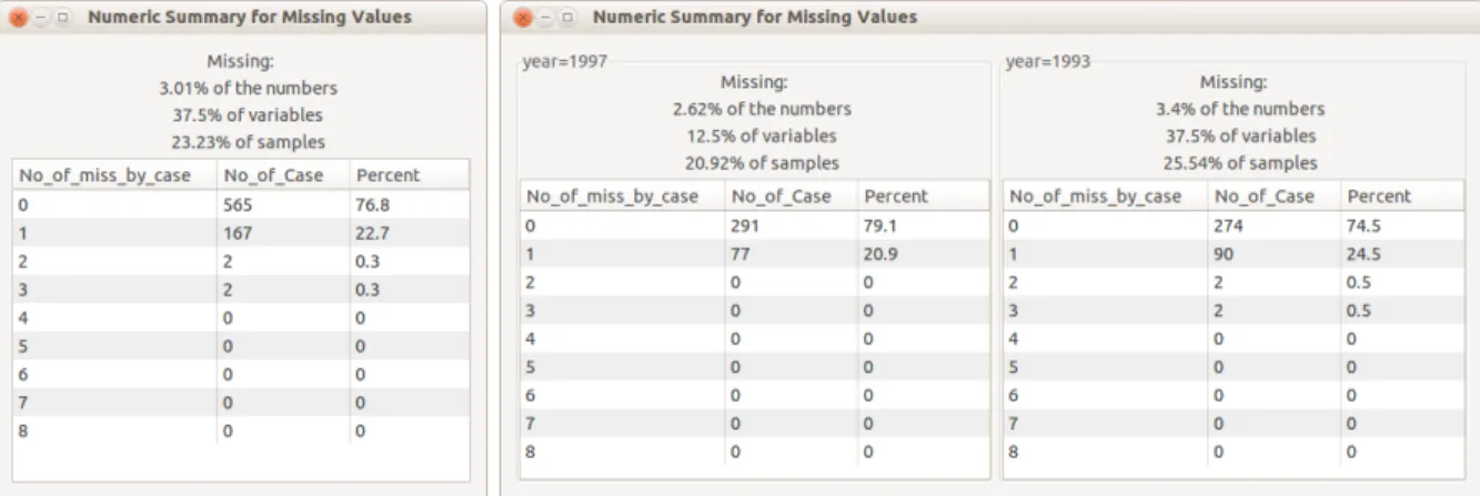
(Figure2.2left panel) or conditional summary (Figure2.2right panel), depending on whether
conditioning variables are chosen. Both summary windows present the percent of the values that are missing, the percent of variables that contain missing values, the percent of the cases that have at least one missing value, along with a tabulation of the number of values missing per
case. The style of the table follows the summary provided by the package norm. In Figure 2.2
(left) it can be seen that the data has two observations have 3 missing values, another two have 2 missing values, 167 observations have one missing value and 565 are complete. By
Figure 2.2 A numerical summary of missing values in the data is shown in a pop-up window. The left panel is the overall summary. The right panel shows the summary con-ditioned on “year”. The percentages of missings by total number of data values, by variables and by cases, is shown on the top. This dataset has 8 variables and the missing values by variable are summarized in the bottom table. No cases have more than 3 missing values, 76.8% of cases are complete, 22.7% of cases have one missing value, and only 4 cases have more than one missing values. The right panel shows that the missing pattern is different for each year.
2.2.2.2 Missingness map
The missingness map (Figure 2.3) provides a graphical summary of the missing patterns.
Like the shadow matrix used inGGobi, the missingness map shows the position of missing values
relative to variables and cases. TheRpackagesAmelia(Honaker et al.,2011) andVIM(Templ
et al.,2013) have versions of missingness maps. Organizing the missing values into blocks can be
for large data. Two re-ordered missingness maps are shown in Figure 2.3. One arranges the variables and cases by the number of missings, from the largest to the smallest; the other applies hierarchical clustering to both rows and columns. The strength of missingness map is to reveal whether the missings occur at some variables simultaneously. If so, then a similar missing pattern may indicate some association between the variables. If the missings happen at some observations synchronously, then it suggests dependence between those observations.
Figure 2.3 Missingness maps, same data but different ordering of variables (rows) and cases
(columns): (left) raw data order, (middle) variables and cases sorted by decreasing number of missing values, (right) sorted by hierarchical clustering of missingness. From the raw data missingness map, the horizontal stripes indicate several vari-ables have many missings, and the vertical stripes near the bottom indicate some structural missing cases. When variables and cases are sorted by missingness rate (middle), variables with missings often have missings on the same cases, and the additional few sporadic missing values can be easily spotted. Using the clustered missingness map (right) the blocks of missings on variables and cases is more easily seen.
Figure 2.3 displays 245 observations and 34 variables for the dataset brfss (described in
Section2.3). From the missingness maps we can see that most of the missings occurred in seven
variables. The missingness on some variables occur synchronously, indicating assoication. Users of the data should check the data collection procedures for these variables. For example, in
enable exploring dependence between missings or non-missings, and also to produce a complete data set for later analysis. A few criteria were considered in the choices of methods to make available and the design: (1) easy to understand and implement; (2) computing complexity is medium or low; (3) adaptability to different situations, i.e., no strong model assumptions. Not
all of the imputation methods available in Rare available in the package because (1) there are
too many methods and variations, so it is not practical to include all, and (2) users may use their own method and import the result to missing data GUI for exploration.
The seven imputation methods provided are: “Below 10%”, “Simple”, “Neighbor”, “MI:areg”, “MI:norm”, “MI:mice”, “MI:mi”. “Simple” and “Neighbor” contain more than one method. Some methods (e.g., “Below 10%”) are only suitable for exploring the missingness patterns, and are not suitable to use for producing a complete data set for analysis. Three tab labels interface to the three methods provided by “Simple”, overall median, mean, and random value
(Figure2.1, region 7). “Neighbor” interfaces to two methods,: mean of the nearest neighbors,
and random nearest neighbor. The neighbor methods also allow the user to change the number
of neighbors. Table 2.1 summarizes and compares the imputation methods available in the
GUI.
2.2.3.1 Univariate imputations
The simplest start involves setting the missing values to 10% below the minimum on each variable. The purpose of this is to place the missing values into the plot where they can be distinguished from the non-missing values. In a scatterplot, all missing values will lie along a
Table 2.1 Imputation methods included in the missing data GUI. Strictly speaking, “Below 10%” is not an imputation method, but a way to put the missing values in the same graph with the observations. “Deterministic” indicates whether the method has a stochastic component or not. “Univariate” means whether the imputation only uses the individual variable where imputation is needed, or makes use of other
variables as well. “Multiple imp.” indicates whether the methods is a type of
multiple imputation that will provide multiple samples to impute the missings.
Method Description Determinisitic Univariate Multiple imp.
Below 10% below 10% of the range x x
overall median x x
Simple overall mean x x
random value x
Neighbor mean of the nearest neighbors x
random nearest neighbor
MI:areg predictive mean matching x
MI:norm multivariate normal model x
MI:mice multivariate imp. by chained equations x
MI:mi multiple iterative regression imputation x
vertical line on the left or a horizontal line on the bottom of the display (Figure 2.4(a)).This
placement enables the distribution of missings to be compared with the distribution of non-missings. In the histogram, missing values will form a bar to the left of other data values. And in the parallel coordinates plot, the missing values are at the bottom of each axis.
Using the median, mean, or mode of the complete cases is a simple way to impute missing values. The software makes some automatic choices for the user: if the user selects median but the variable type is nominal, or selects mean but the variable is categorical, then the mode is returned. In the graph, points and bars are colored according to the missing status of the
case. Figure 2.4 (b) and (c) show examples of the imputation by the median and mean for
real-valued variables.
The “random value” method (Figure 2.4 (d)) randomly selects an existing value of the
variable to impute the missing. When there is more than one missing value in an observation, then values are sampled independently from each related variable.
These imputation methods operate separately on each variable. Dependencies between variables are ignored, yielding covariance and correlation estimates that are potentially very
(c) Overall mean (d) Random value
Figure 2.4 Four panels of scatterplots displaying the results of different univariate
imputa-tions: (a) 10% below the minimum (not strictly an imputation method, it is used for displaying missings as part of a plot of complete cases); (b) median of each variable; (c) mean of each variable; (d) random selection from the existing values.
different from those of the complete cases. This could be a big problem for some analyses. These methods are not ideal from a statistical perspective. In some situations where the inadequate estimation of covariance does not affect results and conclusions they can provide a simple, few assumptions required, solution, but in most situations they are not advised. For the application here, we are primarily concerned about providing methods for analysts to explore the missing value structure, and the plots reveal quite clearly why these univariate imputation methods are
inadequate. Figure 2.4 shows the “cross structure” (orange) induced on the pattern of points
by mean and median imputation, and makes it quite clear that the covariance estimates for the imputed data would not well match that of the complete cases.
2.2.3.2 Neighbor imputations
The “Neighbor” methods replace a missing value with the mean of, or a random selection
from, its k nearest complete neighbors (Figure 2.5). The distance between two observations
is calculated using Euclidean distance on the standardized variables that have no missings.
Figure 2.6 illustrates the procedure. Ties are not considered, and only the first k entries are
used. This method requires at least one case in the dataset to be complete, and no categorical
variables can be used. (Ordinal variables are treated as integers.) If there are less than k
complete cases, then all of them are used to generate the mean or a random value. If none of the cases are complete, then the mean or a random value of the entire data will be returned.
By default k= 5, but this is the user’s choice.
(a) Mean of the neighbors (b) Random neighbor
Figure 2.5 Scatterplots for nearest neighbor imputation methods: (a) mean of the 5 nearest
neighbors, (b) a random value from the 5 nearest neighbors.
The neighbor methods in MissingDataGUI can be seen as two special cases of hot deck
imputation (Andridge and Little,2010). The neighbor mean method averages the weights on
all chosen neighbors, and the random neighbor method places all the weight on one arbitrary
Figure 2.6 Illustration of the k nearest neighbors imputation method. The shaded entries are the complete observations to rank. The variables in red frames are used to compute the distance. After getting the rank of all complete observations, the first
kare used as neighbors.
2.2.3.3 Multiple imputations
Multiple imputation, first proposed byRubin(1978), is a method to get valid inferences by
simulation. Multiple imputed datasets are generated based on the joint distribution, and serve
a wide variety of analytical purposes. Functions from fourRpackages are utilized to implement
multiple imputations in MissingDataGUI. Figure 2.7 demonstrates the results from different
multiple imputations on the same data.
Among the four packages, norm is quite different from the other three. The ideas behind
the package were introduced by Schafer and Olsen (1998). It assumes the observations are
sampled from a multivariate normal distribution, and uses the EM algorithm to estimate the mean and variance-covariance matrix. It utilizes a data augmentation method to converge on distribution.
The other packages use a chained equation approach with similar steps but different settings.
A comparison between the three packages is given in Table 2.2, based on Harrell (2013), van
Buuren and Groothuis-Oudshoorn (2011), and Su et al. (2011). The main differences are
that Hmisc provides three models with flexible drawing methods around the predicted values for quantitative variables, and applies bootstrap to obtain a sample for every iteration. The
package mi uses a convergence criterion to stop the iteration with some allowance for special
situations. In between these two is mice: The models provided are more flexible than Hmisc,
but not as bayesian asmi.
By default,m= 3 chains are imputed and users can choose the number of chains. Each chain
will produce a result shown in a separate graphical panel. By switching between the panels, the
user can compare the results and observe discrepances between the results. Figure 2.8 shows
the results of four different chains produced bymice. Three of the four produced results where
a small clump of imputed values occurred.
(a)Hmisc: predictive mean matching (b)norm: multivariate normal model
(c)mice: chained equations (d)mi: iterative regression
Figure 2.7 Scatterplots for the multiple imputations from four R packages: (a) predictive
mean matching by Hmisc; (b) multivariate normal model bynorm; (c)
multivari-ate imputation using chained equations by mice; (d) multiple iterative regression
5. Stop when achieving the max # of iterations difference of within and between variance is small
2.2.3.4 Conditional on the categorical variables
When the variables of interest have bimodal or multi-modal distributions, using center statistics like the mean or median for imputation, or simulating from an overall estimate like
normdoes, is inadequate because the center does not reflect the shape of distribution properly.
In many situations, the modalities arise from the mixture of groups. Hence, a better imputation method is to condition by group, and then calculate the statistics.
This is available using the controls “categorical variables to condition on”. All categorical variables are listed with checkboxes. The variables checked will partition the data into blocks and then the imputation method is implemented in each block of the data. However, the condition is not used when the method is “Below 10%”, since the aim of “Below 10%” is simply to display the missings away from the non-missings. If the conditioning factor variable has
missing values, then a “factor =NA” group will be generated to calculate the numeric summary
or the imputed values. If the conditioning factor itself is one of the plotting variables, then a message box will emerge to ask the user to impute the missing values on the factor before other variables, and the plots are created without the condition.
The importance of conditioning in the imputation is illustrated in Figure 2.9. Without the
condition, the imputated do not match the distribution of complete values (Figure 2.9 left).
Figure 2.8 Results of four imputing chains by mice, starting with the default random seed. Users can switch the panels by clicking the tabs, or close a panel by hitting the ‘x’ sign. Focusing on the imputed values when air temperatures around 22 degree, we see that the first, third and fourth chains cluster values in a small range of y-axis, but the second chain spread them very evenly in the y-direction.
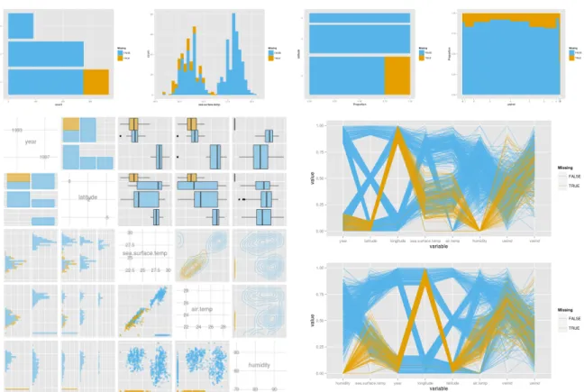
2.2.4 Plot types
There are four types of graphs available in MissingDataGUI: histogram/barchart,
spino-gram/spineplot, pairwise plots, and parallel coordinates plot. Figure 2.10 displays all the
graph types. Two color-blind friendly colors represent the observations and imputed values on
any chosen variables. In Figure2.10the yellow color means that the value is originally missing
Figure 2.9 Effect of conditioning on imputed values. The left panel is the imputation by median without condition and the right one is conditioned on year. In the left plot we can see that the imputed values (yellow) fall between the two clusters, at the overall median. But when the imputation is conditioned on year (right plot), the imputed values are now better placed into the two clusters in the data.
Separate histograms (continuous variables) and barcharts (categorical variables) are shown for each of the variables selected. When the missing values and the complete values share one bar, the bar is cut into two parts, and the ratio of the two heights is equal to the ratio of missing and non-missing values in that bar.
The spinogram (continuous variable) and spineplot (categorical variable), introduced by
Hummel (1996) and Theus and Lauer (1999), use width of the rectangle to represent count.
Height is the same for all bars. The focus is on proportion for each group. The bars in the spinogram or spineplot are partitioned into two colors for the missing and non-missing values. A scatterplot matrix is used to display pairs of variables. Variable names and scales are placed on the diagonal. For the continuous variables, the pairwise scatterplots are placed in the lower triangle, and the contour plots are shown in the upper triangle. For the categorical
variables, barcharts are displayed in both upper and lower triangles. Bars are colored in
proportion to the missings. The combination of continuous and categorical variables is displayed as side-by-side boxplots of missing and non-missing values for each category on the upper
triangle and side-by-side histograms on the lower triangle. Limited space available to the graphics device limits the number of variables that can be shown. The upper limit of the number of variables is set to be 5 and the lower limit is 2.
The parallel coordinates plot by Inselberg(1985) andWegman(1990) can be used to
high-dimensional data. Though many plot types, like the scatterplot or histogram, are helpful to reveal the missing pattern, they are not convenient to display many variables simultaneously. The parallel coordinates plot can give an overview of a relatively large quantity of variables. In
MissingDataGUI, the order of the variables can be chosen in one of two ways: the original order in the data, or by sorting the variables from the best separator to the worst of missing values by
the F-statistic from ANOVA. In Figure 2.10, the best separating variable for the missingness
of humidity is humidity itself, because the “below 10%” method makes a big gap between the missing and non-missing values. “Below 10%” is not an ideal method for the ordered parallel coordinates plot. However, the plot is still useful: it reveals that the missingness on humidity occurred in one year and one location, when sea.surface.temp and air.temp were low.
2.2.5 Design issues
The missing data GUI is organized as one window with three tabs. As shown in Figure2.1,
the summary tab includes all the important widgets: list of variables, radio for imputation methods, checkboxes for the conditional variables, the graphics device, etc. An appropriate layout makes the widgets less crowded, and is easy to maintain. The other two tabs are not as critical as the main tab, but also play important roles.
The help tab shown in Figure2.11(left) has the same layout as the summary tab. The only
difference is that the graphics device is replaced by the help document. The corresponding help shows up when the user moves the mouse upon a widget.
The Settings tab shown in Figure 2.11 (right) allows the user to choose options for the
imputation methods in the packagemice, as well as other settings for the multiple imputation,
Figure 2.10 The four types of graphs available: (top, from left to right) barchart, histogram, spineplot, and spinogram, and (bottom, left to right) pairwise plots, and two parallel coordinates plots. The order of variables in the parallel coordinate plot changed from the original (upper plot) to being ordered by difference between missings and non-missings. All the plots use “below 10%” imputation and are colored by the missingness on humidity.
models, users can double click a variable in the left table, and select any method provided in the pop-up window. The choices vary depending on the type of the variable.
2.2.6 Data input and output
Data can be entered as either a data frame or a comma separated file (csv). The preferred
approach is to read an existing data frame in R because the type of variables (e.g., factor,
numeric) are preserved. MissingDataGUI(data) is used to achieve this.
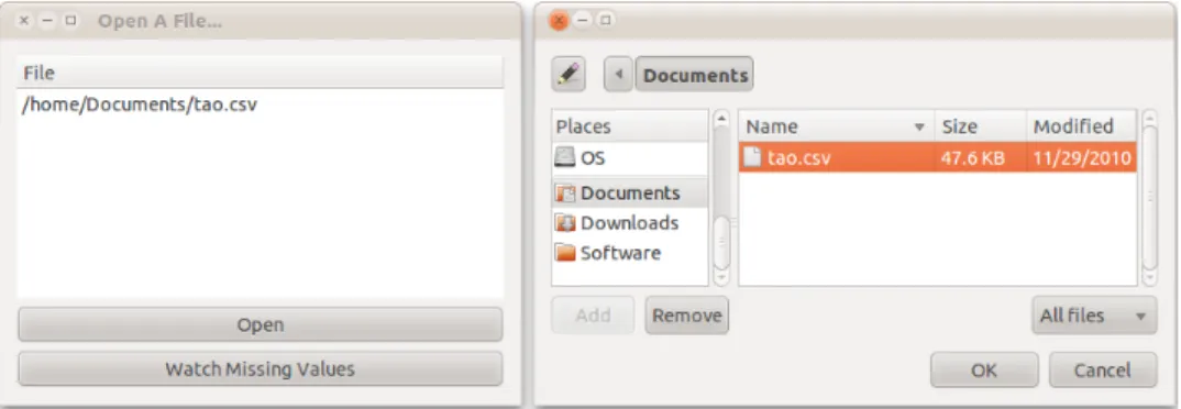
If reading from a csv file,MissingDataGUI()will trigger the data import GUI (Figure2.12),
from which to select a file. The “Open” button is for choosing files and the “Watch Missing Values” buttons will launch the missing data GUI. The file format must be csv, and only one
Figure 2.11 Subsidiary GUI tabs: (left) help tab, (right) settings tab. The layout of the help tab mirrors the actual functional GUI. Mousing over any part of it or clicking the radio/checkbox items will pop up text explanations in the summary region. All the widgets have a detailed introduction. The settings tab is used to make changes to the variable types and algorithm options. Users can modify the number of imputed sets to generate, the random number seed, the number of neighbors, and the jitter setting for parallel coordinates plot.
data set can be imported into the missing data GUI at a time, although several files can be opened in the data import GUI.
Once values are imputed, and a complete data set created, it can be saved using the “Export
data” button (Figure2.13). Only the selected variables will be imputed, but users could choose
whether to export the selected columns or all the columns (withNA’s existing in the unselected
variables). The shadow matrix is exported by default, so that analysts can always track back to find the locations of the real missings. Data can be saved in three ways: a csv file, an rda file, or a data frame. The multiple imputed sets from several chains will be saved as a list in rda format or data frame, or in separate csv files.
The exported data with its shadow matrix can be loaded back into the GUI, which implies the imputed data from other imputation methods (not provided by the missing data GUI) can also be imported. Users only need to provide a shadow matrix which indicates the locations of missings. In other words, the imported structure should be a data frame or a csv file with the
Figure 2.12 The data import GUI, with file selector, which pops up upon clicking the “open” button. More than one file could be listed in the GUI, but only one data set is allowed active in the missing data GUI. The first file is automatically imported if none of the data sets are chosen when the “Watching Missing Values” button is hit.
Figure 2.13 The data export GUI. By default, all columns are exported with a shadow matrix.
The current working directory is set to be location for the exported files. Three exporting formats are provided.
2.2.7 Additional features of the GUI
• Change the variable attributes. Double clicking on any variables in the top left table
of the summary tab will open an attribute window, as displayed in Figure 2.14. Users
could edit the variable name, or assign another class to the variable. When the class of a variable is switched from numeric/integer to character/factor/ordinal, the variable will be automatically loaded into the checkbox group as the potential conditioning variable.
• Search a variable by text typing. The variable table, conditioning checkboxes, and color-by-variable selector allow text entry to find a variable. This feature is especially useful when there are many variables in the data.
• Save the plots. Plots can be saved to png formatted files by “Save plot” button. The imputation method and plot type will be auto-completed in the file name.
Figure 2.14 The attributes list for variable selection is interactive. The name can be edited,
and the class could be changed to one of the five classes: integer, numeric, char-acter, factor, or ordinal (factor). When a numeric variable is changed to a cate-gorical variable, the widget for conditions will be updated.
2.3 Example
2.3.1 Data
Two data sets are provided with the package: tao, which is used as the example in this
section, and brfss. The brfss data is a subset of the 2009 survey from the Behavioral Risk
Factor Surveillance System, an ongoing data collection program designed to measure behavioral risk factors for the US adult population (18 years of age or older). The website for this program ishttp://www.cdc.gov/BRFSS/index.htm.
ure 2.2. This subset is provided by Cook and Swayne (2007a). We can open the GUI by the following commands:
library("MissingDataGUI") MissingDataGUI(tao)
2.3.2 Exploring missings
Three of the 8 variables have missing values. First, let’s look at the distribution of
missings on these variables. Figure 2.15 (left) shows the pairwise plots of three variables
(sea.surface.temp, air.temp, and humidity) with missing values on any of the three variables colored in yellow, and shown as 10% below the minimum data value. Cases which are missing on humidity (string of points at bottom of bottom row of plots) have low values of sea and air temperature. This suggests the dependence between humidity missingness and the temperature variables. Imputation methods that incorporate this dependence may be preferable.
Figure2.15(right) shows the data imputed with median values. This imputation imposes a
cross structure on the data, which does not match the shape of the complete cases. This would not be a recommended method for creating a complete data set.
Figure 2.16 (left) shows the data imputed with median values conditional by year. This
better matches the distribution of complete cases, although the imputed values still form bands in the scatterplot. This might be a problem because the variance estimation will be affected.
For this data, the better ways to impute the data would take the strong association between the variables into account. This suggests that neighbor or multiple imputation might be the
Figure 2.15 (Left) Exploring the effect missingness (yellow) on humidity, sea and air temper-ature. Missings on humidity (the bottom line of the third row) occur at the lower temperature values, suggesting a dependence relationship. Missing values are not missing completely at random. (Right) Imputation using the medians. Median imputation introduces a cross structure to the point scatter, and the imputed values don’t match the data well.
regression-based imputation, conditional on year. The imputed values match the distribution of complete cases reasonably well. There are a few slight concerns: some of the imputed values have lower air temperature values than any of the complete cases, the spread of the imputed values is a little greater than the complete cases. But overall, this is probably as good as it is going to get with imputing the missings for this data set. It would be reasonable to export the imputed data for further analysis at this point.
2.3.3 Check assumptions
In the statistical imputation literature, there are three types of missing data mechanisms: MCAR (missing completely at random), MAR (missing at random), and MNAR (missing not at random). Many imputation methods, including multiple imputation, assume MCAR or MAR. However, MCAR is the most difficult mechanism to substantiate, because it requires that missingness be independent of the observed or other missing values. MAR is less strict, because it allows for missings to be dependent on observed values, but it still expects the missingness
Figure 2.16 (Left) Imputation using the median, conditional on year. Imputed values better match the complete cases, with the exception of the banding due to a fixed median value. (Right) Imputation using the multiple imputation MI:areg conditional on year. The distribution of imputed values is fairly close to the distribution of complete cases.
to be independent from other missing values. To assess the adequacy of the assumptions, an important step is to review the data generation process. Beyond this we follow a process of elimination. The missing pattern is believed MCAR unless there is strong evidence against it. If MCAR is negated, then it is believed that the pattern is MAR, unless there are strong indications in the data generation process that render MAR implausible. If not MAR, then MNAR has to be assumed.
As an example, let us check whether the two incomplete variables (air.temp and humidity)
in the datataofollows MCAR or MAR. Figure2.17gives two parallel coordinates plots, colored
by the missingness on air.temp (left) and humidity (right). The yellow lines are the cases that are missing only on air.temp (or humidity). The missing values are represented by “Below 10%” method. Most of the missings on air.temp occurred in one year and one location, with higher sea.surface.temp, higher uwind, and lower humidity. Most of the missings on humidity happened in the same location as the missings on air.temp but in another year, with lower sea.surface.temp and lower air.temp. This is strong evidence against MCAR.
air.temp humidity
Figure 2.17 Parallel coordinates plots colored by whether missing on air.temp (left) or
hu-midity (right). The variables are sorted by the F-statistic of ANOVA, i.e., the
difference between the missing data and the observed data on a standard scale. Any missing values in the present variables are imputed by “Below 10%” method. Obviously the missingness on air.temp and humidity associates with other vari-ables like year and location, so the MCAR assumption on these two varivari-ables are violated.
Rejecting MAR is very difficult generally, even when an obvious difference between miss-ings and non-missmiss-ings can be seen in the plots, because the real values of the missmiss-ings are
unknown. For example, in Figure 2.18, the distributions of uwind and vwind conditioned on
the missingness of air.temp are different, since the missings on air.temp are higher in uwind and more scattered in vwind. The reasoning is complicated, but we cannot reject MAR. It is possible that, conditional on uwind and vwind, the distribution of true air.temp values of the missings is the same as that of the observed values. Thus, uwind and vwind remove any dependence of missing status for the air.temp variable. Generally, it is not possible to establish MNAR without actually knowing the true values of the missings. However, for this data, the plots suggest that the imputation of air.temp should involve uwind and vwind.
2.4 Summary
The MissingDataGUI package makes it possible to explore patterns of missingness in data and the impact of various imputation methods on the distribution of values in the data. Future work would add interaction to the plots so that it is possible to brush points to more completely
Figure 2.18 Scatterplots (top row) and contour plots (bottom row) of uwind and vwind, two complete variables, colored by whether missing on air.temp (left column) or hu-midity (right column). The missings of air.temp is averagely higher on uwind and has a larger variation, than the non-missings of air.temp. In reverse, the joint distribution of uwind and vwind on the missings of humidity is closer to that of the non-missings.
Software
MissingDataGUI is written in R 3.1.1 (R Development Core Team, 2012) and based on
the package gWidgets (Verzani et al., 2012) with the toolkit RGtk2. On different platforms
(Windows, Linux, Mac) the appearance of the GUI will differ slightly, but the functionality will be the same.
The histogram/barchart, spinogram/spineplot, and missingness map are generated using
ggplot2 (Wickham,2009). The scatterplot matrix and parallel coordinates plot are produced
by package GGally(Schloerke et al.,2013).
Acknowledgements
This work was partially supported by an unrestricted fellowship from Novartis, and National Science Research grant DMS0706949.
A paper submitted toJournal of Computational and Graphical Statistics Xiaoyue Cheng, Dianne Cook, Heike Hofmann
Abstract
Temporal data is information measured in the context of time. This contextual structure provides components that need to be explored to understand the data and that can form the basis of interactions applied to the plots. In multivariate time series we expect to see temporal dependence, long term and seasonal trends and cross-correlations. In longitudinal data we also expect within and between subject dependence. Time series and longitudinal data, although analyzed differently, are often plotted using similar displays. We provide a taxonomy of interactions on plots that can enable exploring temporal components of these data types, and describe how to build these interactions using data transformations. Because temporal data is often accompanied other types of data we also describe how to link the temporal plots with other displays of data. The ideas are conceptualized into a data pipeline for temporal data,
and implemented into theR package cranvas. This package provides many different types of
interactive graphics that can be used together to explore data or diagnose a model fit.
Keywords: interactive graphics, multivariate time series, longitudinal data, multiple linked windows, data visualization, statistical graphics
3.1 Introduction
Constructing interactive graphics for temporal data can be enabled by building upon static displays. Aspects of the graphical elements in the displays can be made accessible to mod-ification by user actions, for the purpose of facilitating different exploration of the temporal components in the data. To explain how to do this we first need to understand how time might be structured, and the common types of temporal data displays.
3.1.1 Characterizing time
In data, time is coded in many different ways: as a date/time format ("Wed Oct 15 09:51:53 2014"), as discrete or continuous values, sporadic events or intervals. Recoding a time variable into other units like week in the year or days in the month, although convenient for some tasks, brings imprecision, as do events like leap years, and seconds. There may not be a well-defined absolute time line, and periodicity can be hard to quantify. Variables measured over time may be measured on different scales, e.g. atmospheric particulate matter and mortality might be drawn from different sources to study the effect of pollution on human health and measured at different resolutions.
The most common description of time is as a continuous or discrete ordered numerical variable. All data is technically discrete, but if measurements are recorded often enough, and long enough they are effectively continuous. For example, currency exchange rates change on a microsecond basis, blood pressure measurements made with a wearable device records at every minute. For these examples time could essentially be considered continuous. However, it may be not helpful to evaluate trends on this microscale, and aggregating at an hourly, daily or monthly value may be sufficient. For simplicity, the methods developed in this paper assume the time variable is measured on a discrete scale.
On a discrete scale, it may be possible to have regular or irregular time spacing. Regular time spacing means that the measurement is collected on constant time intervals, e.g. average monthly temperature in climate records. Irregular time spacing typically arise from events like
0 20 40 60
Time
0 10 20 30 40
Time
Figure 3.1 Time series plots for regular time spacing (left) and irregular time spacing (right).
Tick marks at bottom indicate the time sampling.
When many measurements are made more complications ensue. In climate records we may have temperature measurements taken at many different locations. In longitudinal data, we may have records for many patients. Making comparisons between many time series is a challenge. This work addresses this for a moderate number of series.
3.1.2 Visualizing time
Longitudinal data and time series data, although analyzed very differently, have in common the context of time that is commonly plotted in similar ways. Here are examples of common types of temporal displays.
Time is most conventionally displayed on a horizontal axis of a plot. There are many different variations:
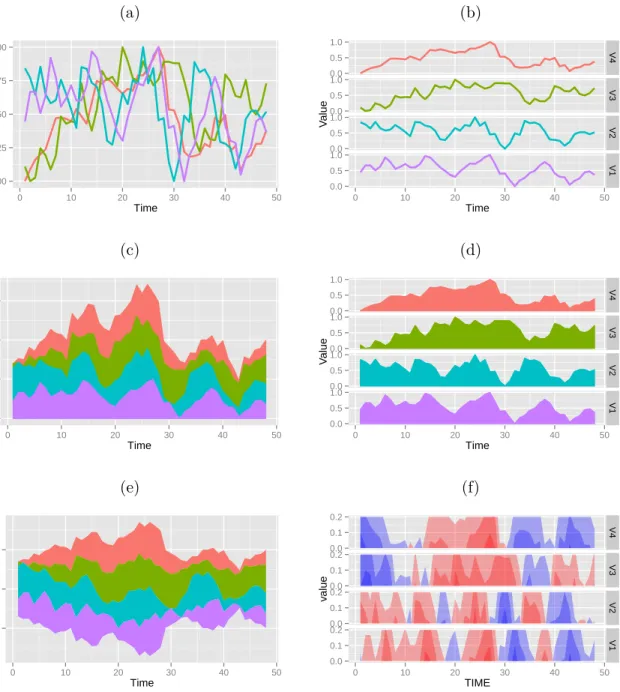
• A line graph, the basic building block for temporal data, displays the measured variable on the vertical axis, time horizontally, and consecutive time points are connected with line
segments. Figure 3.1 gives two examples of line graphs, for a single measured variable:
(left) a classical time series plot, (right) a profile plot of longitudinal data. When there are many series, for example time series of different stocks or different geographic locations,
or many patients, the series may be overlaid on the same plot (Figure3.2 row 1 left), or
(a) (b) 0.00 0.25 0.50 0.75 1.00 0 10 20 30 40 50 Time V alue 0.0 0.5 1.0 0.0 0.5 1.0 0.0 0.5 1.0 0.0 0.5 1.0 V4 V3 V2 V1 0 10 20 30 40 50 Time V alue (c) (d) 0 1 2 3 0 10 20 30 40 50 Time V alue 0.0 0.5 1.0 0.0 0.5 1.0 0.0 0.5 1.0 0.0 0.5 1.0 V4 V3 V2 V1 0 10 20 30 40 50 Time V alue (e) (f) −1 0 1 0 10 20 30 40 50 Time V alue 0.0 0.1 0.2 0.0 0.1 0.2 0.0 0.1 0.2 0.0 0.1 0.2 V4 V3 V2 V1 0 10 20 30 40 50 TIME v alue
Figure 3.2 Six variations of horizontal axis time plots for multivariate time series: (From top
left to bottom right) overlaid line plots, faceted line plots, stacked graph, faceted area chart, themeriver, horizon graph. Plots in the right column are examples of small multiples.
Wattenberg (2008); Javed et al. (2010); Heer et al. (2010), a stacked graph draws the time series sequentially, and uses the previous time series as the baseline for the current
series (Figure 3.2 row 2 left). It is mostly used for the longitudinal data rather than
multivariate time series since the individuals from the longitudinal data share the same scale.
• Themeriver and streamgraph. Themeriver is created by Havre et al. (2000), which is a
special case of the stacked graphs, since it moves the starting baseline from the bottom to
the center, and makes the plot symmetric vertically (Figure3.2row 3 left). Streamgraph
is developed later by Byron and Wattenberg (2008). It changed the algorithm to avoid
the symmetry which increases the internal distortion.
• Horizon graphs. The horizon graph is inspired by two-tone pseudo coloring (Saito et al.,
2005) and formally developed at Panopticon Software (Reijner et al., 2008). Two-tone
pseudo coloring is a technique to visualize the details of multiple time series precisely and effectively. However, the horizon graph became more popular after mirroring the lower
part of the series and simplifying the color scheme (Figure3.2 row 3 right). The horizon
graphs were designed for visualizing the stock prices and economic/financial data, so the features fit the requirements very well: (1) The data have a baseline, which is usually the value at the starting time point. Then the baseline can be used to mirror the negative part to the positive, in order to save the graph space, where ‘negative/positive’ means smaller/greater than the baseline. (2) The positive and negative performance should be distinguished, so the horizon graph provides two hues. (3) The number of the color bands should be small, usually three color bands for the positive values and three for the
negative. Finding the band height is easy for the stock prices since they can use 10% of the initial value, and in most cases the price will not increase or decrease for more than 30%.
When time can be broken into two components it might be displayed on both horizontal and vertical axes:
• A high frequency time series often has hierarchic or nested period levels, like year, day, minute, etc. Those levels can be placed on horizontal and vertical axes to reveal the
periodic dependency. For example,Keller and Keller(1993) used days and hours on two
axes. In these graphs, the measurements of the time series are drawn in the grids via aesthetic settings like color or size.
• Calendar heat maps. Van Wijk and Van Selow(1999) proposed a colored calendar
visu-alization (weeks and days on two axes). d3.js(Bostock et al.,2011) applies the calendar
heat maps and makes it interactive.
Because time in some circumstances can be considered to be cyclical it is sometimes dis-played in the polar coordinates:
• Nightingale’s coxcomb. Florence Nightingale might be the earliest author of a time series plot in polar coordinates. In the original plots, two unstacked barcharts were made in polar coordinates. Each diagram represents for one year. Later, people use the
Nightin-gale’s coxcomb (Nightingale,1858), also called circular histogram or rose diagram (Nemec,
1988), to plot the time series with a regular period like year or day.
• Spiral graphs. This approach is proposed by Weber et al. (2001). It can be seen as
a temporal heatmap in polar coordinates. Figure 3.3 (right) shows an example. This
approach is good for seeking the period, but the length for the same time unit changes over the loops. Besides, spiral graphs would be unhandy for the short period problems and multiple time series.
Figure 3.3 Three types of time series plots in polar coordinates for the same data as used
regularly spaced series shown in Figure 3.1: direct conversion (left), wrapped by
the period (middle), and spiral graph with the colored grey scale representing the values (right).
3.1.3 Interactive graphics
Interactive graphics emphasize the user manipulation of plot elements via input devices
like the keyboard and mouse (Symanzik, 2012). Swayne and Klinke (1999) surveyed the use
of the term “interactive graphics”, which revealed some differences in what people mean when they use the term. They found that most commonly people perceived interactive graphics to mean that a new plot can be recreated quickly from the command line, like base R plots. They suggested using a different term, direct manipulation, to mean directly changing elements of the plot using input devices. However, this term did not gain traction in the community, and we still use interactive graphics. To be clear, we use it here to indicate direct manipulation of plot elements through input actions of mouse or key strokes.
The work described here builds from a history of statistics software systems that support
interactive graphics: e.g. PRIM-9 (Fisherkeller et al., 1988), Data Desk (Velleman and
Velle-man, 1988), LISP-STAT (Tierney, 1990), XGobi (Swayne et al., 1998) and GGobi (Cook and