Supporting the Analytical Reasoning Process in
Information Visualization
Yedendra B. Shrinivasan
Dept. Mathematics and Computer Science
Technische Universiteit Eindhoven
y.b.shrinivasan@tue.nl
Jarke J. van Wijk
Dept. Mathematics and Computer Science
Technische Universiteit Eindhoven
vanwijk@win.tue.nl
ABSTRACTThis paper presents a new information visualization frame-work that supports the analytical reasoning process. It con-sists of three views - a data view, a knowledge view and a navigation view. The data view offers interactive informa-tion visualizainforma-tion tools. The knowledge view enables the an-alyst to record analysis artifacts such as findings, hypotheses and so on. The navigation view provides an overview of the exploration process by capturing the visualization states au-tomatically. An analysis artifact recorded in the knowledge view can be linked to a visualization state in the navigation view. The analyst can revisit a visualization state from both the navigation and knowledge views to review the analysis and reuse it to look for alternate views. The whole analysis process can be saved along with the synthesized information. We present a user study and discuss the perceived usefulness of a prototype based on this framework that we have devel-oped.
ACM Classification Keywords
H.5.2 [Information Interfaces and Presentation]: User Inter-faces Graphical User InterInter-faces (GUI);
Author Keywords
Visual analytics, analytical reasoning process, information visualization
INTRODUCTION
Information visualization helps to understand data using in-teractive abstract visual representations [10]. Inin-teractive ex-ploration of the data can lead to many discoveries in terms of relations, patterns, outliers and so on. It is difficult for the human working memory to keep track of all findings. Hence, synthesis of many different findings and relations between those findings increase the cognitive overload [27] and thereby hinders the reasoning process.
Visual analytics is the science of analytical reasoning facili-tated by interactive visual interfaces [32]. It combines
tech-Permission to make digital or hard copies of all or part of this work for personal or classroom use is granted without fee provided that copies are not made or distributed for profit or commercial advantage and that copies bear this notice and the full citation on the first page. To copy otherwise, or republish, to post on servers or to redistribute to lists, requires prior specific permission and/or a fee.
CHI 2008, April 5 - 10, 2008, Florence, Italy. Copyright 2008 ACM 1-59593-178-3/07/0004...$5.00.
niques from information visualization and computational data analysis to support the analytical reasoning process. The grand challenge in the visual analytics research agenda [32] calls for developing information visualization to perform data analysis as well as structured reasoning. This includes the construction of arguments, convergent-divergent investiga-tion and evaluainvestiga-tion of alternative hypotheses. In this way, sensemaking is facilitated.
Sensemaking involves seeking information, organizing and analyzing it, and possibly forming new knowledge and in-forming further action [10]. Pirolli and Card [27] organize the sensemaking process of an analyst into two major loops: the information foraging loop and the sensemaking loop. The information foraging loop involves organizing informa-tion into some schema [26]. The sensemaking loop involves development of a mental model from the schema to support or contradict the claims [29]. They found that for effective analytical reasoning, analysts opportunistically mix the two loop. In practice, the support of information visualization tools for the sensemaking process is limited to the informa-tion foraging loop, and the sensemaking loop has to be done in the analyst’s mind.
In this paper, we present a new information visualization framework that supports the analytical reasoning process. We first consider analytical reasoning in general and in com-bination with visualization, and derive requirements from this. Next, we present our solution, which consists of a com-bination of three views - a data view, a knowledge view and a navigation view. The data view offers interactive infor-mation visualization tools. The knowledge view enables an analyst to record the analysis artifacts. The navigation view provides an overview of the exploration process by capturing visualization states automatically and presenting them to the user. We argue that by using this information visualization framework the analyst can review the analysis, validate the findings and revise them. The analyst can also organize the findings in the knowledge view to build a case. The whole analysis process can be saved and presented to others along with the findings. To support this argument, we present a user study and discuss the perceived usefulness of a proto-type based on this framework that we have developed. ANALYTICAL REASONING IN INFOVIS
The analytical reasoning process is often not a systematic process. Information foraging in information visualization can be described as navigation through an information space
facilitated by various interactions such as dynamic query [30], overview + detail [28], direct manipulation [11], focus + context [15] and so on. These interactions enable the ana-lyst to view the data in different ways during the exploration process. The exploration evolves based on the analyst’s prior knowledge, and clues or findings in each visualization state. It is similar to berrypicking [2] in which the evolution of the navigation is opportunistic, and information is gathered in bits and pieces. In this context, the knowledge creation pro-cess is unsystematic, continuously evolving and emergent [6]. Hence, the analyst must be aware of what has been done and found during the exploration process to perform effec-tive reasoning.
During data analysis, the user looks for evidence from the data to construct, confirm or contradict a claim. Based on the relations that the evidence have with the data in context of the analysis’ purpose, the user’s mind constructs men-tal models of the information structure [20]. In the context of interactive information visualization, the evidence can be found in terms of patterns or outliers by changing views and data specifications. If the argumentation process is complex, it is important to externalize the evidence and causal links between them for effective reasoning [25].
To further understand the requirements for the analytical rea-soning process in information visualization, we looked at traditional well-founded reasoning theories. Johnson-Laird and Byrne [21] observed that there are three basic stages in different reasoning theories such as spatial reasoning, propo-sitional inferences, syllogisms, and so forth. They aremodel construction,revisionandfalsification. In the first stage, the argument premises are understood and mental models are constructed based on the premises’ content. In the second stage, the model is scanned to formulate a putative conclu-sion. In the third stage, alternate models are searched for to contradict the putative conclusion. If there are no alter-nate models, the conclusion is accepted; otherwise, the an-alyst returns to the second stage to assert the validity of the other conclusions against the alternate models. Therefore, it is clear that externalization of the mental models is not enough to support the entire reasoning process. The other two analytical reasoning phases — revision and falsification — have to also be supported.
Further, it is important to communicate what has been found during the exploration process to others for a collaborative decision making process. Viegas and Wattenberg strong ar-guments for communicating insights along with visualiza-tion to others through their communicavisualiza-tion-minded visual-ization framework [35]. Further design considerations for sharing insights in collaborative visual analytics are discussed by Heer and Agarwal [17].
From the above discussion, we set out the following require-ments for the analytical reasoning process in information vi-sualization. The user has to be enabled to:
1. externalize the analysis artifacts such as evidence, hypothe-ses, assertions and causal links between them;
2. organize the analysis artifacts and the causal links between them to support or contradict a claim;
3. review and revise the exploration process;
4. link externalized analysis artifacts and visualizations to support these;
5. present his findings along with his analysis process to oth-ers.
In summary, for effective reasoning process, the user must have an overview of what has been done and found. There-fore, to keep track of the exploration process and insights, a history tracking mechanism and a knowledge externalization mechanism respectively are essential. Hence, to support the analytical reasoning process in information visualization, a framework with both a history tracking mechanism and a knowledge externalization mechanism is required.
RELATED WORK
We now present previous work in history tracking and in knowledge externalization.
History Tracking
A common approach to automatically record the exploration process is to capture low-level user actions such as mouse events, keyboard events and to provide a linear history. The user can revisit the linear history using an undo-redo mech-anism. It is used for recovery and reversal operations [1]. After backtracking, on performance of a new action by the user, the recent forward actions are deleted. Hence, the com-plete navigation is not captured.
Another approach is to use a tree structure to capture the ex-ploration process. In GRASPARC [7], a problem solving framework which integrates the computation and visualiza-tion process, a history tree is used to model the search for an optimal solution to numerical simulations. The nodes of the history tree hold snapshots of the parameters, raw data and image representation at various stages of the analysis, and edges represent the user navigation. It allows the user to se-lect a snapshot as a new branch point, or to sese-lect a sequence of snapshots for visualization.
In image-graphs [24], a graph representation is used to cap-ture the parameter settings during visual data exploration. The edges hold parameters, nodes display the resulting im-ages. The user can perform operations on the edges and nodes to produce new visualizations. Since the image graph is a parameter-based interface, the rate of growth of param-eter settings makes it difficult to display and compare re-sulting images. A branching time model is used in Visage [13] to capture direct manipulation tasks during visual data exploration. A time-travel interface is used to visualize the branching time model that allows the user to revisit the anal-ysis and reuse a sequence of direct manipulations on a new branch timeline.
In scientific visualization, there is a growing interest in the management of the scientific data and visualization process.
Often, the scientific data changes during analysis and the specifications of the visualization pipeline have to be tweaked for accurate results. VisTrails [4], a scientific visualization workflow system, allows the creation and maintenance of vi-sualization pipelines, and optimizes their execution. The models described above provide solutions for backtrack-ing visualization states usbacktrack-ing history or workflow mecha-nism. However, they do not enable the user to capture his reasoning while viewing the data.
Knowledge Externalization
The design of information visualization tools often ends af-ter creating inaf-teractive visualizations to explore the data, and little support for information synthesis for analytical reason-ing is offered. Sometimes, annotations are offered to identify interesting patterns or objects on the visualization. Anno-tations can be attached to hand-drawn marks that are used to highlight interesting patterns or objects, for instance, en-circling a region in the visualization. Denisovich [12] uses hand-drawn marks on top of a map to select objects, simi-lar to lasso selection, and to attach annotations to them. The user can access the findings from the annotations list. Ellis and Groth [14] use annotations to share discoveries in their collaborative data visualization environment. The annota-tions are stored in a separate layer on top of the data and enable expression of free thoughts. Often, annotations are used as attention pointers to the synthesized information. If the number of annotations on top of the visualization is large, it is difficult to express relations among the annotations. In sense.us [18], a discussion forum is used to express opin-ions on visualizatopin-ions. The users can share their findings or free thoughts by starting a new thread or adding to an exist-ing thread along with a link to the visualization. The threads within the discussion forum are independent and do not pro-vide an overview of the causal links between the findings shared in the discussion forum. While performing complex analysis, it becomes difficult for the human working mem-ory to maintain the causal link between various propositions in the discussion forum [5].
In Harvest [16], knowledge is synthesized as concept in-stances. A concept is described using a data ontology based on type, parent type and user-defined attributes. The user can create a new concept or collect evidence to an exist-ing concept. The concepts can be modified, merged, or re-moved. The links between the concepts and evidence are maintained by the synthesis manager based on the data on-tology. The synthesized knowledge is visualized using a graph-like structure in the synthesis space. Sandbox [37] al-lows the user to jot down hypotheses, evidence using a white board metaphor within the TRIST framework [22]. It allows the analyst to save references to any relevant information in-cluding documents, snippets, images, tables, etc. Concept maps are automatically generated by Sandbox based on the text-to-concept map algorithm. Jigsaw [31], a visual analyt-ics system represents connections and relationships between entities in document collections.
APPROACH
Harvest and Sandbox offer support for evidence marshalling. However, they do not associate synthesized concept with any visualization. It is not possible to review the synthesized concept using the corresponding visualization that leads to the finding. Hence, they do not suffice the requirements for supporting the analytical reasoning process. To satisfy the requirements for the analytical reasoning process through information visualization, we argue that the user has to be provided with three different types of visual representations: • Data view: visual representation(s) of the data;
• Navigation view: visual representation(s) of the explo-ration process;
• Knowledge view: visual representation(s) of the analysis artifacts and their causal links.
The data view consists of interactive information visualiza-tion tools. The navigavisualiza-tion view provides an overview of the exploration process by capturing the visualization states automatically. The knowledge view enables the users to record their analysis artifacts and the causal links between them. The users can also organize the analysis artifacts in the knowledge view to build a case to support or contradict an argument. The user can establish a link between an analysis artifact in the knowledge view and a visualization state in the navigation view. Hence, the user can revisit a visualization state from both navigation and knowledge views to review the analysis and to validate the findings. After revisiting the visualization state, the user can reuse it to look for alter-nate views. Thus, the three phases of the analytical reason-ing process (model construction, revision and falsification) are supported. This information visualization framework for supporting the analytical reasoning process is shown in (fig-ure 1).
Figure 1. An information visualization framework for supporting the analytical reasoning process
The key feature in this framework is that it allows the user to establish a link between the externalized knowledge artifact in the knowledge view and a particular visualization state
asynchronously. A visualization state can be associated with more than one analysis artifact in the knowledge view. In the following sections, we describe the components of the framework in detail.
Data View
The data view is a container for interactive information vi-sualization tools to explore the data. It has two components: visual representations and interactions. Visual representa-tions can vary from a single visualization to multiple visual-izations depending on the nature of the data and the analysis.
Often, the data is so complex and large that static visualiza-tions fall short. Hence, interacvisualiza-tions are needed to explore the data by modifying the data transformation, visual mappings and view transformation [10].
Aninteraction interfaceis defined as an interface that trans-lates user actions such as mouse events, key events and other input events into visualization specifications. These interac-tion interfaces enable the user to apply changes to various stages in visualization pipeline [10] such as the data orga-nization, data filtering, data mapping on visual representa-tion, and displaying to the user. A dynamic query interface is used for specifying data filters. A visual mapping inter-face is used to specify transformations from data to visual representations, for instance, a data clustering interface and changing axes in a scatter plot. Direct manipulation is used to select objects for tracking or emphasis. A view settings interface is used to change color maps, form (shape) encod-ing, camera parameters, overview and details, panning and zooming. These interfaces are some examples of how inter-action interfaces help to specify visualizations interactively and explore complex dataset rapidly.
Navigation View
The navigation view provides an overview of the exploration process by capturing the visualization states automatically. We now describe a history tracking mechanism to capture the visualization states automatically.
In interactive visualization, the datasetDis transformed into an imageIbased on a specificationS [34].S includes visu-alization methods, attribute filters, graphical filters applied through direct manipulation, color mappings, clustering and so forth. The user provides the specificationStto the system based on the current knowledgeKt−1to generate the image It.Ktis the total knowledge gained by the user. The user re-peats the process of generating a new imageIt+1by
provid-ing a new specificationSt+1based onKt, until the desired results are achieved. Thus, the user navigates through the data by changing S. Figure 2 shows the visualization state in the user navigation at time t.
Figure 2. The visualization state in the user navigation at time t A new visualization state is recorded automatically when the visualization specification is changed via aninteraction in-terface. This allows users to roll back to previous visualiza-tion states. When a visualizavisualiza-tion state is revisited, the image
I is regenerated based onS andD of that state. The user can reuse the revisited visualization state by changingS and
D. This creates a new branch, resulting in a tree structured navigation path that is similar to a history tree representation [7].
Initially, we use a history tree representation to show the structure of the exploration process. A node represents a
Figure 3. Navigation view
Figure 4. Navigation view implementation
visualization state. An edge between the adjacent nodes is labeled with the user action (see figure 3(a)). The history tree is drawn using a horizontal-vertical tree layout. A new node is appended to the tree at the right in the horizontal direction. A new branch is created below existing ones in the vertical direction. To avoid cluttering between edges, a right heavy horizontal-vertical layout algorithm is used [33]. Figure 3(a) shows the structure of the navigation. A branch represents a revisit and reuse of an already existing visualization state. To understand the temporal context, it is important to see the sequence of visualization states along with the structure of the navigation. Figure 3(b)) shows the structure of the navigation ordered by time in the horizontal direction. The user can toggle between the two representations during the analysis via thesettingsinterface (see figure 4(a)). The user can revisit the visualization states sequentially in the order of creation using back and forward arrow keys. This action is similar to the undo-redo mechanism. Also, the user can hover over a node to get information about the visualization state (see figure 4(c)) and jump to any visualization state in the navigation view. An overview window is used for pan-ning over the history tree (see figure 4(d)).
When a visualization state is linked to objects in the knowl-edge view, it is marked with a star in the navigation view (see figure 3 and figure 4(b)). The current visualization state in the navigation is highlighted in yellow.
Knowledge View
According to Larkin and Simon [23], a diagrammatic repre-sentation is better than a sentential reprerepre-sentation for
search-ing and recognizsearch-ing concepts and their relations. The use of an appropriate diagram helps the user to make all the possibilities explicit and reason more rapidly and accurately [3]. Based on these premises, numerous diagramming tech-niques such as mind maps, concept maps, cognitive maps, affinity diagrams, causal maps, and so forth have been de-veloped to facilitate the reasoning process [8]. However, in some cases just placing the concepts next to each other in some meaningful order will be sufficient. Hence, a knowl-edge view should be a flexible environment for analysts to structure the analysis artifacts according to their thought pro-cess. We therefore have chosen to design the knowledge view as a basic graphics editor. It helps the users to construct diagrams to externalize their mental models and structure ar-guments.
A note is the basic entity to record the findings. A note is ei-ther rectangular (see figure 5(a)) or elliptical (see figure 5(b)) in shape. Notes can be organized into a group with a title (see figure 5(c)). The tool supports multiple group levels (see figure 5(d)). A connector line can be drawn between notes, groups, and a note and a group (see figure 5(e)). The connec-tor line can be drawn with or without directed arrows to rep-resent causal relations between findings. These entities en-able the analyst to record the analysis artifacts such as find-ings, assumptions, hypotheses and causal relations; organize them into some schema; and build a case to support or con-tradict an argument. Thus, the output of the knowledge view can vary from simple placement of notes next to each other to highly structured and systematic argumentation based on a diagramming technique. The knowledge view canvas can be panned in all directions if more space is needed. The knowl-edge view uses a flip-chart metaphor, such that the analyst can create any number of sheets to record the findings. When an entity in the knowledge view is linked to a visual-ization state, it is marked with a star (see figure 5(f)). The user can revisit visualization states by clicking on the starred entities in the knowledge view. The knowledge view sup-ports an undo and redo mechanism for creating entities, re-arranging and linking with a visualization state. The linking is synchronized with the history tracking mechanism (de-scribed in the previous section).
PROTOTYPE
For understanding the support offered by the information visualization framework for analytic reasoning process, we implemented a prototype of the framework - Aruvi. We de-veloped a scatterplot visualization with a dynamic query in-terface as a part of the data view. Scatterplots are extensively used in multivariate data analysis to identify correlation be-tween two attributes. A classic example of a scatterplot com-bined with a dynamic query interface is the dynamic home finder application[36]. This approach is also found modern tools such as SpotfireTMand GapMinderTM, to name a few.
The scatterplot in the data view can plot ordinal and nom-inal attributes on the x- and y- axes. In case of nomnom-inal attributes, the unique values of the attribute are sorted al-phabetically and mapped onto an axis. When the attribute
Figure 5. Knowledge view
mapping of an axis of the scatterplot is changed via a drop-down menu (see figure 6(k)), the transition to a new mapping is animated. When one of the axes is kept constant and other axis is changed continuously, it aids to recognize the change in the correlation between the new attribute and the previous attribute.
Three different mappings of the data are available in the scat-terplot based on size encoding. First, the objects are plotted on the scatterplot without size encoding. This view helps to understand the correlation between the two attributes. Sec-ond, the objects can be grouped according to the x- and y-axes values and the density of the objects at each data point on the scatterplot is plotted using size. Third, the object size can be set based on an attribute value. This mapping en-ables comparison of three attributes at the same time. These different mappings can be chosen via thesizeinterface (see figure 6(d)). The scatterplot is attached to a dynamic query interface. The dynamic query interface automatically gen-erates query widgets for the data attributes according to the data type. For text and boolean data types, a check box list with unique values is created (see figure 6(n)). For numeric data types, a slider is created to specify range selection (see figure 6(g)). Any change in the attribute filters is reflected on the scatterplot dynamically. An attribute filter is reset using the reset button (see figure 6(h)).
The scatterplot implements a Degree of Interest (DOI) model based on attribute filtering through a dynamic query inter-face, and selection through a direct manipulation technique. The objects on the scatterplot are selected or unselected by picking, and rectangles drawn on top of the scatterplot. There are three levels of DOI:low(objects that do not satisfy the attribute filters),medium(objects that satisfy the attribute fil-ters), andhigh(objects that satisfy the attributes filters and are selected through direct manipulation). The color encod-ings for the three levels of DOI are gray, green and orange respectively (see figure 6(m)). Only the objects withmedium
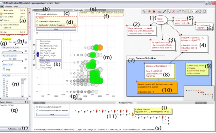
Figure 6. The Aruvi prototype. The alphabet labels describe the interaction interfaces of the prototype explained in the Prototype section. The numeric labels are used to describe an analysis process presented in the Use Case section.
of the objects does not change when the data mapping is changed by changing the axes or size. Hence, it is possible to track or emphasize the interesting objects during the en-tire exploration process. The three levels of DOI facilitate convergent analysis. However, the analyst can revert back to a previous DOI of the objects using the history tracking mechanism and continue the analysis with different DOIs for the objects. Hence, divergent analysis is also supported. The analyst can choose to show or hide thelowDOI objects via theshow only filtered datainterface (see figure 6(c)). The
current selectioninterface (see figure 6(q)) displays the list of objects withhighDOI. When there is no selection, it dis-plays the list of objects withmediumDOI. The object list in thecurrent selectioninterface can be added as a note in the knowledge view using thepaste as new noteinterface (see figure 6(r)). The scatterplot allows zoom-in to a particular region of the scatterplot via theZoom ininterface (see fig-ure 6(e)). Thesettingsinterface (see figure 6(b)) toggles the display of thesizeandshow only filtered datainterfaces. An
information barinterface (see figure 6(f)) is used to display details about the selection and size encoding. Finally, the analyst can save, reopen or recover the last analysis using a file menu (see figure 6(a)).
History Tracking
The granularity of the history tracking can be chosen in vari-ous ways. For instance, all changes to the visualization
ification can be captured. However, some heuristics on spec-ification change detection can be applied to avoid too much low level detail. For instance, when the user continuously changes the filter in the dynamic query interface, the changes are reflected in the visualization (scatterplot) but are not cap-tured by the history tracking module. We found it to be con-venient just to capture the visualization state when the mouse pointer leaves the dynamic query interface and if atleast one of the filters has been changed. Other heuristics, like detec-tion of (not necessarily continuous) change patterns could be used and will be studied in the future. The base model itself does allow for a variety of choices here.
USE CASE
We now present a simple use case where a user explores a digital camera dataset (565 cameras with 15 attributes) us-ing the Aruvi prototype. There are a several tasks that the user might perform with the data, such as detecting trends and finding cameras that meet user requirements. To per-form trend analysis, the user compares the digital camera attributes for different years. The user uses the scatterplot in the data view for this comparison.
The user records the findings in the knowledge view using a mind map. The mind map is a diagram used to represent ideas linked to and arranged radially around a central idea [9]. The user records the central idea - trend analysis - in note 1 (see figure 6(1)). Firstly, the user plots the number
of megapixels over the years. The user records the finding in note 2 (see figure 6(2)) and links the note to the current visualization state in the navigation view. Subsequently, the user compares the zoom-ratio, eyepiece and download in-terface attributes against year by changing the scatterplot y-axis. Notes 3, 4 and 5 are the user’s findings; each of these notes is linked to the corresponding visualization state in the navigation view. The user then checks whether the selected cameras have internal memory and records the findings in note 6. The user completes the mind map by connecting notes 2, 3 and 4 with note 1, and note 6 with note 5 using the connector line with arrow.
Based on the trend analysis and the user’s own knowledge about the digital camera market, the user defines require-ments for selecting a camera. The user revisits the visualiza-tion states by clicking on the notes recorded in the knowl-edge view to gain an overview of his analysis. The user records those requirements in note 7. In this case, the user is looking for a recent camera from manufacturers such as Canon, Nikon, and Sony with 7 megapixels and with a dig-ital TTL (through-the-lens) eyepiece. The user revisits the visualization state where the cameras with digital TTL were selected by clicking on note 4. Then the user changes the size encoding to the megapixels attribute. This creates a new branch in the navigation view (see figure 6(8)).
Using the dynamic query interface, the user selects those manufacturers recorded in note 7 and sets the megapixels attribute range to above 7 megapixels. Three cameras match the requirements. The user records this finding in note 9. The user plots the zoom-ratio attribute against year. Then the user picks the most recent camera with high zoom-ratio sat-isfying the requirements. The scatterplot in the figure shows this state (see figure 6(f)). The user records this state with note 10. The user connects notes 4 and 9, and 9 and 10 to indicate the selection process. The user then groups notes 7, 9 and 10 used for the camera selection (see figure 6(10)). This use case demonstrated how a user combined both the in-formation foraging loop and sensemaking loop opportunisti-cally to reason about the camera dataset and select cameras. This combination was facilitated by revisiting the visualiza-tion states from the externalized the analysis artifacts in the knowledge view and revising them. Thus, using the data, navigation and knowledge views, the whole exploration pro-cess can be revisited, revised, and presented to others along with the synthesized information.
USER STUDY
We conducted a user study to understand the support of-fered by the Aruvi prototype to the analytical reasoning pro-cess. The user experiment focused on the quality of results achieved using the Aruvi prototype. Further, the user re-quirements were captured for adding new features and for enhancing the existing features of the Aruvi prototype to im-prove the analysis process.
We invited analysts from different domains to participate in the user study. Four analysts participated in the final user
study. The analysts came up with their own datasets. Ana-lyst 1, a usability researcher, was interested in understanding the qualitative output of a usability analysis. The analyst was using a scatterplot to generate hypotheses on the data and perform an initial assessment to decide on the choice of sta-tistical analysis method to draw clear conclusions. Analyst 2, a software quality consultant, was interested in the cor-relation between the software metrics of a software project to assess the software maintainability and design test cases. The analyst so far was using a pivot table [19] to arrange and sort the columns for comparison. Analyst 3, a software qual-ity modeling researcher, was interested in identifying the outliers and build a case for software analysis based on the software metrics data of a software project. Analyst 4, an ur-ban planning researcher, was interested in the chronological buildings characterization for a city in India to understand how the buildings were developed and their attributes were shaped.
The study had three steps: a training session, an exploration session and an interview with the analyst. Following the training session, the analysts were asked to perform an anal-ysis of their own dataset using the Aruvi prototype without any time limit. Usage characteristics were captured while the analysts performed the analysis. After the exploration session, each analyst was interviewed to reflect on the fol-lowing:
• Which features of the Aruvi prototype made a difference in their analysis process?
• Why were those features important for them?
• Express opinions on the prototype in general, for instance, the positive and negative aspects of it.
Further, if there were any interesting usage patterns observed during the exploration sessions, the analyst was asked to ex-plain the intention of such usage behavior.
Discussion
Analysts agreed that the knowledge view helped to clearly see the analysis process by building a bridge between visu-alization and knowledge gained. Analysts found recording the findings, and linking them to the visualizations and orga-nizing them were very important for their analysis process, and the use of the Aruvi prototype improved their quality of results. The knowledge view helped to visualize all possi-bilities, for instance, the analyst’s hypotheses and assertions, and restructure the analysis to build a case. The analysts also recorded their free thoughts apart from the analysis artifacts linked with visualizations. Analyst 1 said “the knowledge view is simple and easy to use for grouping hypotheses, and for quickly constructing and visualizing the structure of all hypotheses”. Analyst 2 said “Aruvi is really cool to explore the software metrics rapidly and it will help me create an optimal method for analyzing the data in the future”. Ana-lysts 2 and 4 modified few links between visualization and analysis artifacts when there were better evidence available in the visualization or some contradictions to their claims were found in the visualization (see unlink visualization and
analysis artifacts in figure 7). Analysts 2, 3 and 4 rearranged and grouped the findings at the end of the analysis to build cases based on the dataset. However, Analyst 1 rearranged the analysis artifacts quite often in the middle of the anal-ysis (see Arrange analanal-ysis artifacts in figure 7).The analyst explained that rearranging helped to restructure the analysis process to look for clear conclusions.
Analyst 1 mainly used notes in the knowledge view to re-visit a particular visualization state (see rere-visit pattern of an-alyst 1 in figure 8) and reused it to refine the hypotheses (see branching pattern of Analyst 1 in figure 8)). The analyst organized key visualization states by rearranging the corre-sponding notes into a group and switched between them to compare different visualization states. However, the analyst expressed that side by side comparison will be more effec-tive than switching between the states.
Analyst 4 could clearly see in the navigation view that the analysis was performed in three different lines of thought (see branching in figure 8). For analyst 2, the sequence in the navigation view was important, since it represents a workflow. The analyst wanted to rearrange and purge cer-tain visualization states in the navigation view to create an optimum analysis workflow template. This is particularly important for the analyst since this analysis has to be re-peated for different datasets quite often. Since the history tracking module captures the dataset and visualization spec-ification of the visualization states separately, the workflow template extraction is possible. This is a promising use case for reusing visualization exploration processes.
Figure 7. Knowledge externalization and organization pattern
Figure 8. Revisit and reuse pattern
Analyst 3 revisited the visualization states to review the anal-ysis. The analyst expressed difficulties in finding the
rele-vant notes in the knowledge view and suggested a text based search to locate the notes within the knowledge view. The analyst felt that the branching in the history tree showed the reuse pattern but it did not clearly bring out his implicit thought process. The analyst expressed the requirement to have visualization states in the navigation view grouped and highlighted based on changes in a particular interaction in-terface. For instance, the analyst wanted to group visual-ization states between x-axis changes in the scatterplot and highlight them. This facility would enable analysts to play around with different groupings of interaction interfaces to extract the implicit thought process in the navigation struc-ture. This is particularly important when an analysis is con-tinued at different times, and the analyst wants to get an overview of the analysis.
For analyst 1, the revisit from the knowledge view was easier and more meaningful than from the navigation view. How-ever, the analyst used the navigation view to back track re-cent visualization states. The analyst also recorded notes on the revisited nodes. The same usage pattern was also ob-served for other analysts (see revisit using history tree and keyboard in figure 8). It supports the fact that knowledge creation is an unsystematic process; and the analyst wants to back track to see what has happened in the recent history to affirm a thought. Since the history tracking mechanism cap-tures the visualization states automatically, the analyst can get access to the exhaustive list of visualization states via the navigation view. On the other hand, the knowledge view enables the analyst to record visualization states selectively. Hence, the analysts can opportunistically use the navigation view and knowledge view to revisit the visualization states for reviewing and validating their findings, and reusing the visualization to look for alternate views. Analysts 1, 2 and 4 expressed a need for export of the output of knowledge view and visualizations as a report or presentation file. The analysts appreciated the possibility to save and restore their analysis.
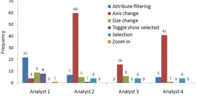
Figure 9. Interaction pattern in the data view (scatterplot with dynamic query interface)
The analysts were satisfied with the fairly straightforward visualization offered. They commented that the interactive scatterplot visualization improved their analysis process. The analysts expressed that it was quite handy since they need not look back into the data to modify the data selection and visualize it. Figure 9 summarizes the usage pattern of the scatterplot with dynamic query in the data view. The usage pattern varied based on the different analysis processes of
each analyst. Analyst 1 used mostly dynamic query and tog-gle show selectedinterfaces; while other analysts predomi-nantly changed axes. The analysts commented that size en-coding is useful. Analyst 4 used size en-coding based on ob-ject density for the entire analysis. Analyst 2 and 3 used selection to track software modules’ behavior while com-paring various different attributes. Analyst 2 also suggested adding trend lines to the scatterplot, and displaying statis-tical information such as x and y axes averages, and cor-relation coefficient of the current selection against the en-tire dataset. Currently the scatterplot is the only visualiza-tion supported in the prototype. The analysts were able to discover many interesting facts using scatterplot. However, they also expressed a need for some other visualizations. Analyst 1 asked for a scatterplot matrix for simultaneously plotting different datasets. Analysts 2 and 3 said linking scatterplot visualization to an UML diagram would help them to have an overview of the architecture of the software. An-alyst 4 asked for a map visualization to get a spatial context of a pattern seen in the scatterplot. In the future, we plan to support multiple visualizations in the prototype.
CONCLUSION
In this paper, we presented an information visualization frame-work that supports the analytical reasoning process. The analytical reasoning is facilitated by extending visualization support to externalize the mental models and link the analy-sis artifacts to the visualizations. It also enables the analysts to revisit the visualization states to review and validate the findings, and reuse it to look for alternate views. Finally, the analyst can organize the externalized analysis artifacts to build a case.
To support the reasoning process, the information visualiza-tion framework consists of three fundamental views: data view; knowledge view; and navigation view, and a history tracking mechanism. Four analysts participated in a user study with their own datasets. The perceived usefulness of the Aruvi prototype was discussed based on the usage pat-tern of the exploration sessions and the interviews conducted with the analysts. Analysts found that recording the find-ings, and linking them to the visualizations and organizing them were very important for their analysis process. Ana-lysts agreed that the use of the Aruvi prototype improved the quality of their results.
FUTURE WORK
The user study also resulted in a list for future work such as template extraction from the navigation view, highlighting visualization states in the navigation view based on type of specification change, text search in the knowledge view and a number of minor changes.
If the exploration session is long, history tree may not help the user to review the exploration process anymore. This is an interesting meta-visualization challenge. It is important to create simple and intuitive visual representations as a part of navigation view for getting an overview and revision of the exploration process. Variable granularity of the history presentation is one important aspect here.
In future, we plan to add a data management suite to sup-port multiple data sources and different data models. In re-ality, analysts are often confronted with inputs from different sources such as text, videos, and automatic reasoning algo-rithms, to name a few. Visual analytics research considers interactive visualization as glue for combining various com-putational data analysis techniques to support the analytical reasoning process. In principle, our framework should ac-commodate these techniques in the data view and we will investigate how to integrate these.
ACKNOWLEDGEMENTS
This work is done under the Expression of Interest project. The project is supported by the VIEW programme of the Netherlands Organisation for Scientific Research (NWO) un-der research grant no. 643.100.502. We thank the review-ers and Hannes Pretorius for their insightful comments. We thank Jean-Bernard Martens for his guidance on conducting the user study. We also thank the analysts who participated in the user study.
REFERENCES
1. G. D. Abowd and A. J. Dix. Giving undo attention.
Interacting with Computers, 4(3):317–342, 1992. 2. M. J. Bates. Design of browsing and berrypicking
techniques for the online search interface.Online Review, 13:407–424, 1989.
3. M. I. Bauer and J. J. Laird. How diagrams can improve reasoning.Psychological Science, 4(6):372–378, 1993. 4. L. Bavoil, S. Callahan, P. Crossno, J. Freire,
C. Scheidegger, C. Silva, and H. Vo. Vistrails: Enabling interactive, multiple-view visualizations. In
Proceedings of IEEE Visualization 2005 conference, pages 135–142. IEEE Computer Society Press, 2005. 5. J. R. Beech and A. M. Colley, editors.Cognitive
Approaches to Reading, chapter Reading and working memory, pages 57–86. John Wiley & Sons, Limited, 1987.
6. G. D. Bhatt. Organizing knowledge in the knowledge development cycle.Journal of Knowledge
Management, 4(1):15–26, 2000.
7. K. Brodlie, L. Brankin, G. Banecki, A. Gay, A. Poon, and H. Wright. GRASPARC - a problem solving environment integrating computation and visualization. InProceedings of IEEE Visualization 1993 conference, pages 102–109. IEEE Computer Society Press, 1993. 8. R. A. Burkhard.Knowledge and Information
Visualization, volume 3426/2005 ofLecture Notes in Computer Science, chapter Towards a Framework and a Model for Knowledge Visualization: Synergies
Between Information and Knowledge Visualization, pages 238–255. Springer, 2005.
9. T. Buzan and B. Buzan.The Mind Map Book: How to Use Radiant Thinking to Maximize Your Brain’s Untapped Potential. Penguin Books, 1993.
10. S. K. Card, J. D. Mackinlay, and B. Shneiderman, editors.Readings in information visualization: using vision to think. Morgan Kaufmann Publishers Inc., San Francisco, CA, USA, 1999.
11. M. C. Chuah, S. F. Roth, J. Mattis, and J. Kolojejchick. Sdm: selective dynamic manipulation of visualizations. InUIST ’95: Proceedings of the 8th annual ACM symposium on User interface and software technology, pages 61–70. ACM Press, 1995.
12. I. Denisovich. Software support for annotation of visualized data using hand-drawn marks. InIV ’05: Proceedings of the Ninth International Conference on Information Visualisation (IV’05), pages 807–813. IEEE Computer Society Press, 2005.
13. M. Derthick and S. F. Roth. Enhancing data exploration with a branching history of user operations.
Knowledge-Based Systems, 14(1-2):65–74, Mar. 2001. 14. S. E. Ellis and D. P. Groth. A collaborative annotation
system for data visualization. InAVI ’04: Proceedings of the working conference on Advanced visual interfaces, pages 411–414. ACM Press, 2004. 15. G. W. Furnas. Generalized fisheye views. InCHI ’86:
Proceedings of the SIGCHI conference on Human factors in computing systems, pages 16–23. ACM Press, 1986.
16. D. Gotz, M. X. Zhou, and V. Aggarwal. Interactive visual synthesis of analytic knowledge. InProceedings of the IEEE Symposium on Visual Analytics Science and Technology, pages 51–58, October 2006. 17. J. Heer and M. Agrawala. Design considerations for
collaborative visual analytics.IEEE Symposium on Visual Analytics Science and Technology, 2007. VAST 2007., pages 171–178, 2007.
18. J. Heer, F. B. Vi´egas, and M. Wattenberg. Voyagers and voyeurs: supporting asynchronous collaborative information visualization. InCHI ’07: Proceedings of the SIGCHI conference on Human factors in computing systems, pages 1029–1038. ACM Press, 2007.
19. B. Jelen and M. Alexander.Pivot Table Data Crunching. Que Corp., Indianapolis, IN, USA, 2005. 20. P. N. Johnson-Laird.Mental models: towards a
cognitive science of language, inference, and
consciousness. Harvard University Press, Cambridge, MA, USA, 1983.
21. P. N. Johnson-Laird and R. Byrne, editors.Deduction. Lawrence Erlbaum Associates., Hillsdale, NJ, 1991. 22. D. Jonker, W. Wright, D. Schroh, P. Proulx, and
B. Cort. Information triage with TRIST. In
International Conference on Intelligence Analysis, May 2–4 2005.
23. J. H. Larkin and H. A. Simon. Why a diagram is (sometimes) worth ten thousand words.Cognitive Science, 11(1):65–100, 1987.
24. K.-L. Ma. Image graphs - a novel approach to visual data exploration. InProceedings of IEEE Visualization 1999 conference, pages 81–88. IEEE Computer Society Press, 1999.
25. J. Oakhill and A. Garnham, editors.Mental Models in Cognitive Science, chapter Models, Arguments, and Decisions, pages 95–118. Psychology Press, 1996. 26. P. Pirolli and S. Card. Information foraging.
Psychological Review, 106 (4):643–675, 1999. 27. P. Pirolli and S. Card. The sensemaking process and
leverage points for analyst technology as identified through cognitive task analysis. InInternational Conference on Intelligence Analysis, May 2–4 2005. 28. C. Plaisant, B. Milash, A. Rose, S. Widoff, and
B. Shneiderman. Lifelines: visualizing personal histories. InCHI ’96: Proceedings of the SIGCHI conference on Human factors in computing systems, pages 221–227. ACM Press, 1996.
29. D. M. Russell, M. J. Stefik, P. Pirolli, and S. K. Card. The cost structure of sensemaking. InCHI ’93: Proceedings of the INTERACT ’93 and CHI ’93 conference on Human factors in computing systems, pages 269–276. ACM Press, 1993.
30. B. Shneiderman. Dynamic queries for visual information seeking.IEEE Software, 11(6):70–77, 1994.
31. J. Stasko, C. Gorg, Z. Liu, and K. Singhal. Jigsaw: Supporting investigative analysis through interactive visualization.Visual Analytics Science and Technology, 2007. VAST 2007. IEEE Symposium on, pages
131–138, 2007.
32. J. J. Thomas and K. A. Cook, editors.Illuminating the Path: The Research and Development Agenda for Visual Analytics. IEEE Computer Society Press, 2005. 33. I. G. Tollis, G. D. Battista, P. Eades, and R. Tamassia.
Graph Drawing: Algorithms for the Visualization of Graphs. Prentice Hall, 1999.
34. J. J. van Wijk. The value of visualization. In
Proceedings of IEEE Visualization 2005 conference, pages 79–86. IEEE Computer Society Press, 2005. 35. F. B. Vigas and M. Wattenberg.
Communication-minded visualization: A call to action. Technical Report 4, IBM Systems Journal, 2006. 36. C. Williamson and B. Shneiderman. The dynamic
homefinder: evaluating dynamic queries in a real-estate information exploration system. InSIGIR ’92:
Proceedings of the 15th annual international ACM SIGIR conference on Research and development in information retrieval, pages 338–346. ACM, 1992. 37. W. Wright, D. Schroh, P. Proulx, A. Skaburskis, and
B. Cort. The sandbox for analysis: concepts and methods. InCHI ’06: Proceedings of the SIGCHI conference on Human Factors in computing systems, pages 801–810. ACM Press, 2006.