The New Zealand-Australian
income differential
NZIER working paper 2006/05
Public discussion document
8 Halswell St, Thorndon P O Box 3479, Wellington Tel: +64 4 472 1880 Fax: +64 4 472 1211 econ@nzier.org.nz www.nzier.org.nz
NZIER’s standard terms of engagement for contract research can be found at www.nzier.org.nz. Preface
The New Zealand Institute of Economic Research (NZIER) is a specialist consulting firm that uses applied economic research and analysis to provide a wide range of strategic advice to clients in the public and private sectors, throughout New Zealand and Australia and further afield.
NZIER is also known for its long-established Quarterly Survey of Business
Opinion and Quarterly Predictions. NZIER was established in 1958. Authorship
This report has been prepared at NZIER by Johannah Branson and Brent Layton and reviewed by John Yeabsley. The assistance of Jean-Pierre de Raad and Sarah Spring is gratefully acknowledged.
Acknowledgement
The preparation of this report has been provided from NZIER’s annual budget for public good projects. The resources for this budget are obtained from the subscriptions of Members of NZIER, particularly Major Members, and from its employees. Their financial assistance is much appreciated, but they are not responsible for either the selection of the topic or the content of the report. The current Major Members of NZIER are:
• ABN AMRO New Zealand Limited
• Air New Zealand
• Department of Labour
• Electricity Commission
• Inland Revenue Department
• Ministry of Economic Development
• Ministry of Foreign Affairs and Trade
• PriceWaterhouseCoopers
• Reserve Bank of New Zealand
• Telecom New Zealand Ltd
Executive summary
There is a vast and still growing body of literature on New Zealand’s economic performance. In this paper, we aim to provide a concise, non-technical overview of its answers to date to three fundamental questions with regard to the income differential between New Zealand and Australia:
• What is the difference?
• Why is there a difference?
• What can we do about it?
In 2004 the average income of New Zealanders, in terms of GDP per capita, was three-quarters that of Australians. Despite some improvement since 1993, our relative income has been declining for over 30 years.
Measured income does not fully reflect quality of life, but is an indicator of material living standards. Continuing lower income in New Zealand may intensify competition for both skilled and unskilled labour. Australia is not our only competitor, but our closest and most significant, and represents a useful comparator for evaluating our economic performance and how we might improve. The literature to date provides no definitive explanation for New Zealand’s lower income, but points to three main candidates:
• New Zealand’s low export growth, due to the dominance of the land-based primary sector
• New Zealand’s lower labour productivity, largely due to lower capital per worker, the reasons for which are unclear, and
• New Zealand’s smaller scale and greater degree of geographical isolation. The range of suggested sources of New Zealand’s poorer economic performance implies a multifaceted policy strategy, rather than a single solution. The literature to date indicates a range of options, comprising improvements across the areas of resources, infrastructure and institutions, and labour and capital. Whilst most of these suggestions seem quite sensible, we draw some more general conclusions that might form the basis of a broader strategy for New Zealand.
New Zealand’s relatively small population and economy and distance from global economic activity are significant influences, even in comparing its performance with that of neighbouring Australia. Australia is a sizeable economy on a world scale and not nearly as isolated from the fast growing areas of Asia as is New
and the rest of the world in terms of flows of investment capital and goods and services.
An essential element of such a strategy for New Zealand should be to eliminate obstacles to investment and the associated transfer of technology. As a small economy, New Zealand risks being passed over by investors unless it has a comprehensible and congenial regulatory regime in which investors can have confidence. The regulatory regime must be simple, stable and free from political opportunism. The industry-specific provisions for lines companies and telecommunications that have been tacked onto the existing general provisions in Part 4 of the Commerce Act 1986 since 2000 are difficult to understand, especially for foreign investors, and unlikely to appear stable. There have also been several very public instances in recent years of political intervention in the regulatory process or the market that determines the returns available to investors. The delays and uncertain outcomes of New Zealand’s environmental planning processes under the Resource Management Act 1991 are a further aspect of the regulatory regime that is not conducive to encouraging investment. Nor is ongoing uncertainty about the policies New Zealand will eventually adopt to fulfil its Kyoto Protocol undertakings.
In terms of impediments to the movement of goods and services, an obvious element of a strategy for New Zealand is to continue to advance freer trade in the primary sector goods in which we have a comparative advantage. The breakdown of the Doha Round is probably a greater setback for New Zealand than Australia. New Zealand is likely to have more success in inclusion with other countries in multilateral negotiations such as the Doha Round than in finding interested counterparties to bilateral agreements. We should remain vigorous in pursuing opportunities to promote multilateral agreements. More generally, we should ensure that our international trade links, including airports, airlines and telecommunications, remain competitive and barriers to entry for new competitors are kept low.
These two broad elements of a strategy for New Zealand – facilitating flows of investment capital and goods and services – both reinforce the importance of an appropriate regulatory environment if we are to minimise the disadvantages of New Zealand’s small scale and geographical isolation.
The promotion of investment suggests a regulatory regime that enables high returns by prioritising incentives to pursue investment that reduces prices over time over charging accurate prices. The facilitation of trade suggests that airports, airlines and telecommunications firms should be constrained in their ability to use market power to raise prices – that accurate prices and wealth transfers do matter. Whilst this presents a policy challenge, we do not believe it to be insurmountable. Indeed, the “light-handed” regulatory approach pursued in the 1990s went a long way to resolving this conflict.
In our view, New Zealand should abandon the industry-specific regulations developed since 2000 and return to the light-handed regulatory regime of the 1990s. We should, however, supplement this approach with a programme of regular reviews, say five yearly, of a select set of industries with potential monopoly pricing problems – airports, ports, gas transmission and distribution, electricity transmission and distribution, and fixed line and mobile telecommunications. These reviews should adopt broad criteria, pertaining to levels of investment, pricing and customer satisfaction. These criteria should be specified in advance, as should the pricing principles and approach for assessing whether there is any evidence of significantly excess returns. The consequences of being found to have charged prices leading to significantly excess returns should also be identified at the outset.
Finally, one approach that we contend is unlikely to succeed in improving New Zealand’s relative performance is for the government, government agencies or government-funded agencies to attempt to pick “winning” industries or firms and to subsidise their growth and development. New Zealand’s problems are primarily low labour productivity, small scale and geographical isolation. Unless it is clear why the market is failing, government intervention is likely to be misdirected and resources wasted. Even apparent success in developing chosen industries and firms redirects resources away from other potentially more efficient uses, the cost of which is not obvious and is seldom recognised by proponents of such schemes. Schemes of this kind were much favoured in the 1970s and early 1980s and the long-run results were poor. Such schemes have recently returned to favour, but we see nothing to suggest greater success this time around.
Contents
1. Introduction... 1
2. What is the difference?... 1
2.1 Current ... 1 2.2 Trend ... 2 2.3 Outlook ... 5 2.4 Other measures... 5 2.4.1 Income... 5 2.4.2 Cost of living ... 6 2.4.3 Quality of life... 6 2.5 Consequences ... 8
3. Why is there a difference?... 11
3.1 Growth theory... 11
3.2 Potential sources... 12
3.3 Resources ... 12
3.4 Infrastructure and institutions ... 17
3.5 Labour and capital... 21
3.5.1 Labour productivity ... 24
3.6 Conclusions... 36
4. What can we do about it? ... 36
4.1 Options from the literature... 36
4.2 Our conclusions ... 39
Figures
Figure 1 GDP per capita 2004... 1
Figure 2 Real GDP per capita ... 3
Figure 3 Annual growth in real GDP per capita, 11-year moving average* ... 3
Figure 4 Ratio of New Zealand to Australian real GDP per capita ... 4
Figure 5 GDP and gross state product per capita 2004 ... 4
Figure 6 Gross national income per capita 2003... 6
Figure 7 Quality of life by city 2006 ... 8
Figure 8 New Zealand’s foreign direct investment 2005 ... 9
Figure 9 New Zealand’s foreign direct investment from and to Australia... 9
Figure 10 Permanent and long-term arrivals to and departures from New Zealand 2006... 10
Figure 11 Permanent and long-term arrivals to and departures from New Zealand from and to Australia ... 10
Figure 12 Percentage of total value added by industry 2001 ... 13
Figure 13 Land area, population and GDP 2004... 14
Figure 14 Trade as a percentage of GDP 2004 ... 15
Figure 15 Log (GDP) and trade as a percentage of GDP 2004 ... 15
Figure 16 Real export volumes... 16
Figure 17 Foreign direct investment flows as a percentage of GDP, annual average 2000-2004 ... 17
Figure 18 Tax on the average production worker as a percentage of labour cost 2004... 18
Figure 19 Ease of doing business 2005, top 30 countries ... 19
Figure 20 Competitiveness scoreboard 2006, top 30 economies ... 20
Figure 21 Growth competitiveness index 2005, top 30 countries ... 20
Figure 22 Business competitiveness index 2005, top 30 countries ... 21
Figure 23 Labour force participation rate 2004 ... 22
Figure 24 Employment rate 2004 ... 22
Figure 25 Hours worked per year per person in employment 2004 ... 23
Figure 26 Investment as a percentage of GDP 2004 ... 23
Figure 27 Labour productivity 2004 ... 24
Figure 32 Ratio of New Zealand to Australian capital-labour ratios ... 28
Figure 33 Multifactor productivity 2002 ... 30
Figure 34 Annual growth in multifactor productivity... 30
Figure 35 ICT investment as a percentage of total investment 2002... 31
Figure 36 Research and development expenditure as a percentage of GDP 2003 ... 31
Figure 37 Australia’s actual and predicted aggregate trade... 34
Figure 38 New Zealand’s actual and predicted aggregate trade ... 35
Figure 39 Actual as a percentage of predicted trade 2001 ... 35
Tables
Table 1 Quality of life indicators ... 71. Introduction
This public good project was initiated by NZIER in response to increasing media attention on the difference in average income between New Zealand and Australia. There is a vast and still growing body of literature on New Zealand’s economic performance. In this paper we aim to provide a concise, non-technical overview of its answers to date to three fundamental questions:
• What is the difference?
• Why is there a difference?
• What can we do about it?
2. What is the difference?
2.1 Current
Using Gross Domestic Product (GDP) per capita as a measure of average real income, in 2004 New Zealand ranked 21st of the 30 OECD member countries, whilst Australia ranked ninth, as shown in Figure 1.
Figure 1 GDP per capita 2004
New Zealand dollars at current prices and purchasing power parities
0 10,000 20,000 30,000 40,000 50,000 60,000 70,000 80,000 90,000 100,000 Lu xe m b o u rg No rw a y US A Ir e la n d Sw itz e rla n d N e ther la n d s Aus tr ia Ic e la n d Au st ra lia D e nm ar k C anad a Be lg iu m S w ed en U n ite d K in gdom Fi n la n d Japa n F ranc e Ge rm a n y It a ly O E CD t o ta l Sp ai n N e w Z eal and G reec e Kor e a P o rt u gal C zec h R e p ubl ic H ung ar y Sl ov ak R e pu b lic Pol a nd M e xi co Tu rk e y
Source: OECD (2006a); OECD (2006c)
At $36,400, New Zealand’s per capita GDP was 88 per cent of the OECD’s and 76 per cent ($11,600 short) of Australia’s $48,000.1
2.2 Trend
Relatively low economic growth has long been a concern of New Zealand’s policy makers (Blyth and Crothall, 1962).
In 1970 New Zealand had the ninth highest level of per capita income in the OECD. Whilst our subsequent slide down the OECD rankings was concentrated in the period 1975 to 1980, between 1984 and 1993 New Zealand’s GDP per capita grew much more slowly than the OECD average. Although New Zealand’s small scale and geographical isolation inevitably played a part, other causes included relatively high initial incomes (such that our growth was relative to an already high base), low savings rates, high inflation rates and relatively low export growth.
Since 1993 New Zealand’s per capita GDP has grown slightly faster than the OECD average and we have risen in the OECD rankings (although note that the composition of the OECD has changed over time as additional countries have become members). This recent improvement has been attributed to our changing industrial structure; fast growth in the service sector and continued above average performance in the primary sector; improved labour utilisation and increased multifactor productivity; supported by structural reforms since the 1980s and continued confidence in the macroeconomic environment promoted by transparent monetary and fiscal policy frameworks (IMF, 2004a; IMF, 2004b; Treasury, 2004). Given time lags, it is likely that the full benefits of these institutional and policy reforms have yet to feed through to economic growth.
Despite this improvement, we are still trailing behind Australia in particular, as shown in Figure 2 and Figure 3. Improved growth since 1993, and indeed higher average annual growth than Australia since 1999, has as yet produced only a modest recovery in our relative level of GDP per capita, as Figure 4 shows very clearly. The ratio of New Zealand’s real per capita GDP to Australia’s fell from a high of 1.05 in 1974 to 0.78 in 2004, following modest recovery from a low of 0.74 in 1998. This left New Zealand’s GDP per capita lower than the gross state product per capita in all but one of Australia’s states, as shown in Figure 5.
Figure 2 Real GDP per capita
New Zealand dollars at price levels and purchasing power parities of 2000
15,000 20,000 25,000 30,000 35,000 40,000 45,000 1970 1972 1974 1976 1978 1980 1982 1984 1986 1988 1990 1992 1994 1996 1998 2000 2002 2004 Australia OECD total New Zealand
Source: OECD (2006b); OECD (2006c)
Figure 3 Annual growth in real GDP per capita, 11-year moving average*
New Zealand dollars at price levels and purchasing power parities of 2000
0.0% 0.5% 1.0% 1.5% 2.0% 2.5% 3.0% 1971 -1 981 1973 -1 983 1975 -1 985 1977 -1 987 1979 -1 989 1981 -1 991 1983 -1 993 1985 -1 995 1987 -1 997 1989 -1 999 1991 -2 001 1993 -2 003 Australia OECD total New Zealand
Notes: * To smooth the data of business cycle effects. Source: OECD (2006b); OECD (2006c)
Figure 4 Ratio of New Zealand to Australian real GDP per capita
New Zealand dollars at price levels and purchasing power parities of 2000
0.70 0.75 0.80 0.85 0.90 0.95 1.00 1.05 1.10 19 70 19 72 19 74 19 76 19 78 19 80 19 82 19 84 19 86 19 88 19 90 19 92 19 94 19 96 19 98 20 00 20 02 20 04
Source: OECD (2006b); OECD (2006c)
Figure 5 GDP and gross state product per capita 2004
New Zealand dollars at current prices and purchasing power parities
0 10,000 20,000 30,000 40,000 50,000 60,000 70,000 AC T N o rt h e rn T e rrit o ry We st e rn A u st ra lia Ne w S o u th W a le s Vi ct o ria A u st ra lia to ta l Q uee ns land So ut h Au st ra lia N e w Z eal and Ta sm a n ia
2.3 Outlook
NZIER’s Quarterly Predictions publication reports annual average growth in real GDP for New Zealand of 2.2 per cent in the year to March 2006, down from 3.7 per cent in the year to March 2005. Economic growth is forecast to slow further of 1.5 per cent in the March 2007 year, before a gradual recovery to 1.8 per cent in 2008, accelerating to 3.3 per cent in 2009, 2.9 per cent in 2010 and 4.0 per cent in 2011. This compares with forecasts for Australia of average annual growth of around 3.2 per cent between 2006 and 2010 (NZIER, 2006).
Australia’s projected population growth over this period is not sufficiently greater to undermine its continued higher GDP per capita growth (Statistics New Zealand and Australian Bureau of Statistics medium population projections).
2.4 Other
measures
GDP measures total economic activity in terms of the total market value of goods and services produced within a given period less the cost of goods and services used in production. It is, however, an incomplete and imperfect measure of well-being. For example, it omits unpaid work, includes revenue paid to overseas residents, ignores distribution, does not incorporate qualitative environmental and social aspects of well-being, and, even as a measure of income, is fraught with data measurement and estimation difficulties, compounded in inter-country comparisons.
2.4.1 Income
Two other measures for comparing income levels are per capita gross national income (GNI) and net national income (NNI). GNI is defined as GDP plus net receipts of wages, salaries and property income from abroad. NNI is GNI less depreciation in the value of fixed capital assets. With these inclusions, these measures are methodologically superior to GDP per capita, but face practical difficulties in measuring international flows of wages, salaries and property income and depreciation, such that GDP remains the most widely used measure. Figure 6 illustrates country rankings in terms of GNI per capita in 2003, the latest year for which data are available. New Zealand ranked 21st, the same as its GDP per capita ranking, above. Australia ranked 12th in the OECD on GNI per capita, compared with ninth on GDP per capita. New Zealand’s per capita GNI was 76 per cent of Australia’s and 86 per cent of the OECD average, very similar to its relative GDP per capita.
Figure 6 Gross national income per capita 2003
New Zealand dollars at current prices and purchasing power parities
0 10,000 20,000 30,000 40,000 50,000 60,000 70,000 Lu xe m b o u rg US A No rw a y Sw itz e rla n d D e nm ar k U n ite d K in gdom Aus tr ia Be lg iu m N e ther la n d s C anad a Ic e la n d Au st ra lia S w ed en Japa n F ranc e Fi n la n d Ir e la n d Ge rm a n y It a ly O E C D av e rag e Sp ai n N e w Z eal and G reec e Kor e a P o rt u gal C zec h R e p ubl ic H ung ar y Sl ov ak R e pu b lic Pol a nd M e xi co Tu rk e y Source: OECD (2006c) 2.4.2 Cost of living
Income may be lower in New Zealand, but so may be the cost of living.
IMD (2004) measures the cost in other cities around the world of a set of goods and services that would cost US$100 in New York City. In 2004, this cost was US$61.95 in New Zealand and US$62.46 in Australia. Mercer Human Resource Consulting (2006a) measures the comparative cost of over 200 items, including housing, transport, food, clothing, household goods and entertainment, in 144 cities around the world. In 2006, Auckland ranks 100th and Wellington 105th most expensive. Sydney ranks 19th, the most expensive city in Australasia, Melbourne 74th and Brisbane 99th.
The use of purchasing power parities instead of exchange rates in international comparisons of GDP or GNI per capita, as above, should already adjust for differences in price levels between countries. Purchasing power parities are only a general measure, however, calculated by comparing prices of a common basket of goods and services.
2.4.3 Quality of life
Perhaps qualitative aspects of well-being, not represented in GDP per capita comparisons, to some extent offset New Zealand’s lower measured income.
OECD (2006c) compares member countries on a wide range of economic, environmental and social indicators. Table 1 presents selected quality of life indicators for New Zealand, Australia and the OECD average. Australia scores a higher quality of life on all indicators except obesity and victimisation rate for assaults and threats.
Table 1 Quality of life indicators
For 2003 or latest year available New Zealand Australia OECD average Health
Life expectancy (years) 78.7 80.3 77.8
Infant mortality (deaths per thousand live births) 5.6 4.8 6.1 Obesity (% of adult population overweight or obese) 56.2 58.4 47.7 Society
Income inequality (Gini coefficient*) 33.7 30.5 31.0
Crime
Prison population (per 100,000 population) 132.3 93.4 94.5 Victimisation rates (% of population victims of assaults
and threats)
5.7 6.4 3.7 Victimisation rates (% of population victims of burglaries) 4.3 3.9 1.9
Notes: * The Gini coefficient is a common measure of equality, which ranges from 0 for “perfect equality” (each share of the population gets the same share of total income) to 100 for "perfect inequality” (all income goes to the share of the population with the highest income.
Source: OECD (2006c)
In contrast, a worldwide survey of quality of life, comprising 39 criteria covering political, social, economic and environmental factors, personal safety and health, education, transport and other public services, rates New Zealand cities highly (Mercer Human Resource Consulting, 2006b). Figure 7 shows the top 30 cities. Auckland and Wellington rank fifth and 12th respectively, a higher quality of life than all but one of Australia’s five largest cities, which rank ninth, 17th, 21st 29th and 31st.
Despite its limitations, in the absence of a satisfactory, comprehensive measure of economic well-being, GDP per capita remains the generally accepted and most commonly used indicator of material living standards for inter-country comparisons.
Figure 7 Quality of life by city 2006
Index relative to 100 for New York City
100 101 102 103 104 105 106 107 108 109 Zu ric h Ge n e va V a nc ouv er V ie nna Auc kl a n d D u ss el do rf F ran kf ur t Mu n ic h Ber n S ydne y C o pen hag en W e llin g to n A m st er da m B ru sse ls T o ront o Ber lin M e lb our ne Lu xe m b our g Otta w a S toc khol m Pe rt h M o nt re al N u rn b e rg Du b lin Ca lg a ry H a m bur g Ho n o lu lu S a n F ran ci sc o A del ai de He ls in ki B ris b ane
Source: Mercer Human Resource Consulting (2006b)
2.5 Consequences
Why should we be concerned about the significance and persistence of the difference in income between New Zealand and Australia in particular?
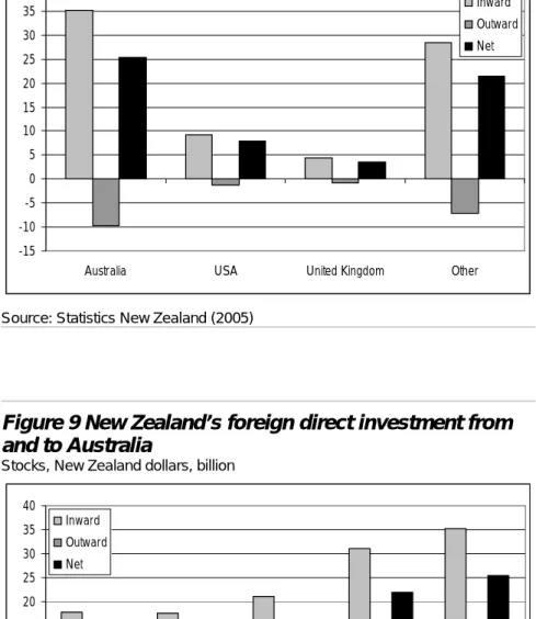
Australia is our largest trading partner, buying one fifth of our exports, whilst New Zealand is Australia’s fifth largest market (Statistics New Zealand, 2006b; Australian Bureau of Statistics, 2006). We are also significant investors in each other’s economies, as shown in Figure 8. In the year to March 2005, Australia constituted the largest source of foreign direct investment in New Zealand (46 per cent of a total $77 billion) and the top destination for New Zealand’s direct investment overseas (52 per cent of a total $19 billion). Direct investment is defined as ownership of at least 10 per cent of a firm’s voting equity, thus Australian firms have considerable, and growing as shown in Figure 9, ownership of New Zealand firms and say in their decisions (although many Australian firms investing in New Zealand have significant shareholdings by New Zealanders).. Australia is the most common destination of permanent and long-term (for 12 months or more) departures from New Zealand and the second largest single source of permanent and long-term arrivals to New Zealand, facilitated by the common labour market between these two countries. In the year to May 2006, over 20,000 more people moved from New Zealand to Australia than vice versa, as shown in Figure 10 – the highest number for the past five years, as shown in Figure 11.
Figure 8 New Zealand’s foreign direct investment 2005
Stocks, New Zealand dollars, billion
-15 -10 -5 0 5 10 15 20 25 30 35 40
Australia USA United Kingdom Other
Inward Outward Net
Source: Statistics New Zealand (2005)
Figure 9 New Zealand’s foreign direct investment from and to Australia
Stocks, New Zealand dollars, billion
-15 -10 -5 0 5 10 15 20 25 30 35 40 2001 2002 2003 2004 2005 Inward Outward Net
Figure 10 Permanent and long-term arrivals to and departures from New Zealand 2006
-35,000 -25,000 -15,000 -5,000 5,000 15,000 25,000 Australia Other Oceania Asia United Kingdom Other Europe USA Other Americas Other Arrivals Departures Net
Source: Statistics New Zealand (2006a)
Figure 11 Permanent and long-term arrivals to and departures from New Zealand from and to Australia
-35,000 -25,000 -15,000 -5,000 5,000 15,000 25,000 35,000 2002 2003 2004 2005 2006 Arrivals Departures Net
James et al. (1995) indicates annual growth in GDP per capita to be a significant influence on trans-Tasman migration (weekly earnings ratios and real airfare costs less so). Glass and Choy (2001) finds that Australia attracts not only the highest skilled of New Zealand’s citizens but a fairly representative cross-section of the general population. Continuing lower incomes in New Zealand may therefore intensify competition for both skilled and unskilled labour. Such a trend may also increase the number of migrants from other countries choosing Australia over New Zealand. Australia is not our only competitor in these regards, but is our closest and most significant.
Irrespective of consequences, “The two countries are similar enough, for example in industrial and institutional structures, to make a comparison valid. Yet there are sufficient differences in policy approaches and performance to make a comparison potentially instructive and valuable.” (Parnham and Roberts, 2004, p.1).
3. Why is there a difference?
3.1 Growth
theory
The total output of the economy is a function of the “factors of production” – inputs of “land” (resources), labour and “capital” (machinery and other equipment). There are three sources of growth in output:
• an increase in the available stock of factors of production – producing more output by using more inputs
• an increase in the productivity of existing factors of production – producing more output from current inputs and
• technological change – developing better or new ways of using current or new types of input to produce current or new types of output.
Both neo-classical economics (originating in Solow, 1956; and Swan, 1956) and more recent endogenous growth models (such as Grossman and Helpman, 1994; Lucas, 1988; Romer, 1990; and Romer and Rivera-Batiz, 1991) highlight the limitations of the first of the above sources – accumulation – as diminishing marginal returns set in. Both stress the more promising potential of the third of the above sources – technological change – although neo-classical theory says little about its possible sources in turn, whilst these have been the central focus in the development of endogenous growth models (e.g. human capital, innovation, knowledge spillovers within and between countries).
3.2 Potential
sources
Australia’s higher GDP per capita might derive from national differences in a range of areas:
• resources – influencing what and how much is produced, imported and exported
• infrastructure – such as energy, transport, water and telecommunications
• institutions – including regulatory frameworks, government policies and financial systems
• labour – both utilisation (employment and hours worked) and productivity (including that due to skills, training and capital-labour ratios) and
• capital – both investment levels and productivity (including due to innovation, research and development).
3.3 Resources
A country’s endowment of resources influences what and how much it can produce for itself, needs to buy in as imports and can sell to other countries as exports. Paradoxically, there can be a negative correlation between abundance of natural resources and economic growth (“the resource curse”), for reasons such as lower competitiveness in other sectors, underinvestment in education and mismanagement of revenues from the natural resource sector (Sachs and Warner, 1995).
Figure 12 compares the industrial structures of New Zealand and Australia. The most significant differences, resulting from differences in natural resources, are the greater importance of mining and quarrying in Australia and agriculture, hunting, forestry and fishing in New Zealand. Also noticeable are the proportionately greater contributions of construction in Australia and manufacturing in New Zealand, although one third of the latter is of food products.
Underlying these comparisons in industrial structure, however, is the marked difference in scale between New Zealand and Australia, as shown in Figure 13. Australia has over 28 times the land area, five times the population and 6.5 times the GDP of New Zealand.
International trade provides a means to access larger markets beyond domestic size constraints and therefore tends to be proportionately more important for smaller countries, for both inputs and outputs. Compared with other small countries, New Zealand makes relatively low use of trade to compensate for its smaller size, as shown in Figure 14 and Figure 15.
Figure 12 Percentage of total value added by industry 2001
0% 5% 10% 15% 20% 25% 30% 35%
Community social and personal services Finance, insurance, real estate and business
services
Transport, storage and communication Wholesale and retail trade, restaurants and hotels Construction Electricity, gas and water supply Manufacturing Mining and quarrying
Agriculture, hunting, forestry and fishing Australia
New Zealand
Figure 13 Land area, population and GDP 2004 Data type New Zealand 271 Australia 7,687 Land area (km2 thousand)
New Zealand 4.1 Australia 20.1 Population (million) Australia 968.4 New Zealand 148.6 GDP (NZ$ billion)
Figure 14 Trade as a percentage of GDP 2004
Average of imports and exports of goods and services
0% 20% 40% 60% 80% 100% 120% 140% Lux e m b o u rg Be lg iu m S lov ak R e p ubl ic Ir e lan d C zec h R e pu b lic H ung ar y N e ther la n d s Aus tr ia O E C D av er age D e nm ar k Sw itz e rlan d S w ed en K o rea Pol a nd Ic e lan d No rw a y Ca n a d a Ge rm a n y F in lan d P o rt u gal Tu rk e y M e xi co N e w Z e al an d Sp ai n U n ited K ing dom Italy Fr a n ce Gr e e ce Aus tr a lia US A Ja pa n Source: OECD (2006c)
Figure 15 Log (GDP) and trade as a percentage of GDP 2004
Average of imports and exports of goods and services, New Zealand dollars, billion 0% 20% 40% 60% 80% 100% 120% 140% 0 1 2 3 4 5 6 7 Log (GDP) T rade as % o f G D P USA Japan Luxembourg Australia New Zealand OECD average Korea
Notes: With logarithmic trend line shown Source: OECD (2006c)
Furthermore, explanations for New Zealand’s poorer economic performance have included that our production and exports are concentrated in industries for which world demand has been growing less rapidly than total world exports (NZIER, 2001a; Figure 16).
Figure 16 Real export volumes
Index relative to 100 in 1960, prices and exchange rates of 1990
0 200 400 600 800 1,000 1,200 1960 1964 1968 1972 1976 1980 1984 1988 1992 1996 New Zealand OECD Australia Source: NZIER (2001b)
New Zealand’s exports have long been, and continue to be, dominated by land-based primary sector goods. Demand for such goods typically increases less-than-proportionately as economies become wealthier, although there are exceptions such as the “luxury goods” of butter and carpet wool. Only a quarter of our exports come from the manufacturing sector, whilst most developed countries have come to rely much more heavily on manufactured exports, which has been the fastest growing sector of recent decades, and service exports. NZIER (2001b) finds, however, that Australia’s export commodity composition has not provided it much advantage over New Zealand’s and therefore cannot account for its stronger economic growth. New Zealand’s service exports have kept pace with those of other countries. Our service exports are dominated by tourism, in which New Zealand and Australia are each the other’s largest market.
Foreign direct investment is another important means of international integration – providing not only flows of investment funds and subsequent income, but also knowledge and technology transfers (whether introducing these to New Zealand or providing opportunity to market New Zealand-developed innovations overseas). New Zealand’s outward flows of foreign direct investment are proportionately low by international standards, as shown in Figure 17, averaging 26th and Australia 16th highest in the OECD over the period 2000 to 2004. New Zealand ranks slightly higher for inward flows, at 21st whilst Australia ranks 15th, but the quality of inflows has been assessed as poor, consisting mostly of
privatisation or mergers and acquisitions with little flow-on benefits and minimal export-oriented greenfield investments, which have tended to be concentrated in low-growth, low-return industries (Boston Consulting Group, 2001). The simple comparison of ratios, however, ignores differences in industrial structure and that foreign direct investment may be more important in manufacturing and less so in many service industries, which have played a large part in New Zealand’s recent economic growth.
Figure 17 Foreign direct investment flows as a percentage of GDP, annual average 2000-2004
Current prices and purchasing power parities
0% 2% 4% 6% 8% 10% 12% 14% 16% 18% 20% Lu xe m b o u rg* Sw itz e rla n d Ic e la n d N e ther la n d s Be lg iu m S w ed en U n ite d K in gdom Fi n la n d Ir e la n d F ranc e D e nm ar k Sp ai n C anad a P o rt u gal Aus tr ia Au st ra lia No rw a y US A It a ly Ge rm a n y Japa n H ung ar y G reec e Kor e a M e xi co N e w Z eal and C zec h R e p ubl ic Tu rk e y Sl ov ak R e pu b lic Pol a nd Outward Inward
Notes: * Luxembourg: 388% outward, 361% inward; Luxembourg and Belgium are averages for 2002-2004 only.
Source: OECD (2006b); OECD (2006c)
The influence of size – in terms of both the scale and concentration of population and economic activity – and distance from the rest of the world, particularly our trading partners, is discussed further in Section 3.5.1c), below.
3.4 Infrastructure and institutions
Infrastructure and institutions constitute the fundamental economic environment and conditions that of themselves do not drive but underlie and enable economic growth.
Infrastructure, such as transport, water, energy and telecommunications, contributes to economic growth through both supply and demand, reducing production costs, increasing returns to labour (by reducing workers’ time in
non-economic growth directly, infrastructure assists (or its inadequacy can impede) the effective contribution of other factor inputs such as labour and capital (Kessides, 1993, in O’Fallon, 2003).
Adequate provision of infrastructure is a significant concern to New Zealand firms, current constraints in land transport, water allocation and energy infrastructure in particular (Infometrics, 2003; PricewaterhouseCoopers, 2004). Australia is also now starting to reach the limits in capacity of its transport systems (rail and ports), restricting its ability to meet demands for its mineral exports. Its electricity, gas and water infrastructure are also in need of improvement if they are not to inhibit continued economic growth (Economist, 2005).
Institutions set the organisational, governance and incentive parameters within which the economy operates. These extend far wider than just taxation, which has been stealing the headlines of late. On this point, Figure 18 shows that, taking into account not only personal income tax but also employees’ and employers’ social security contributions and any payroll taxes, the difference between labour cost and labour income is significantly smaller in New Zealand than in Australia.
Figure 18 Tax on the average production worker as a percentage of labour cost 2004
0% 10% 20% 30% 40% 50% 60% M e xi co Kor e a N e w Z eal and Ir e la n d Japa n Au st ra lia Sw itz e rla n d US A Ic e la n d U n ite d K in gdom Lu xe m b o u rg C anad a P o rt u gal G reec e O E C D av e rag e No rw a y Sp ai n D e nm ar k Sl ov ak R e pu b lic Tu rk e y Pol a nd N e ther la n d s C zec h R e p ubl ic Fi n la n d Aus tr ia Ita ly H ung ar y F ranc e S w ed en Ge rm a n y Be lg iu m Source: OECD (2006c)
Institutions include regulatory frameworks (such as for the protection of property rights), government policies (including monetary and fiscal) and market and financial systems (enabling accurate price signals and incentives). These institutions support economic growth through facilitating the allocation of resources to their most economically efficient uses and may thereby promote physical and human capital investment and improve incentives to innovate and raise productivity. They may also enhance economic stability, reducing uncertainty and boosting resistance to or ability to recover from economic shocks.
Since the mid 1980s both New Zealand and Australia have implemented major programmes of regulatory and financial reform. World Bank (2005) now ranks New Zealand top and Australia sixth of 155 countries in terms of “ease of doing business”, as shown in Figure 19. This assessment is based on a number of measures of business regulations and their enforcement (starting a business, dealing with licences, hiring and firing, registering property, getting credit, protecting investors, paying taxes, trading across borders, enforcing contracts, closing a business), indicating the regulatory costs of business and the extent to which regulations enhance or constrain investment, productivity and growth.
Figure 19 Ease of doing business 2005, top 30 countries
Ranking Ne w Z e a la n d S ing apo re US A C a n ada No rw a y Au st ra lia H ong K o ng D enm ar k U n ited Ki ngd om Ja pan Ir el and Ic el and F inl and S w ede n Li thua ni a Es to n ia S w itz e rland Be lg iu m Ge rm a n y T hai la n d M a la ys ia P uer to R ic o M a u rit iu s N e ther
lands Chile Latvi
a Ko re a S o ut h A fr ic a Is ra e l S pai n
Source: World Bank (2005)
In terms of competitiveness, whether real or perceived, IMD (2006) ranks Australia sixth but New Zealand only 22nd of 61 economies, as shown in Figure 20. These rankings are based on a wide range of criteria in the categories of economic performance (domestic economy, international trade, international investment, employment, prices), government efficiency (public finance, fiscal policy, institutional framework, business legislation, societal framework), business efficiency (productivity, labour market, finance, management practices, attitudes and values) and infrastructure (basic infrastructure, technological infrastructure, scientific infrastructure, health and environment, education).
Figure 20 Competitiveness scoreboard 2006, top 30 economies
Score relative to 100 for USA
0 10 20 30 40 50 60 70 80 90 100 US A H ong K o ng S ing apo re Ic el and D enm ar k Au st ra lia C a n ada S w itz e rland Lux em bou rg F inl and Ir el and No rw a y Au st ria S w ede n N e ther lands Ba va ria Ja pan Ta iwa n Ch in a Es to n ia U n ited Ki ngd om Ne w Z e a la n d M a la ys ia Ch ile Is ra e l Ge rm a n y Be lg iu m Ile- de-F ranc e Indi a S cot la nd Source: IMD (2006)
Similarly, World Economic Forum (2005) ranks New Zealand 16th in growth competitiveness and 18th in business competitiveness, with Australia 10th and 15th respectively, of 117 economies, as shown in Figure 21 and Figure 22.
Figure 21 Growth competitiveness index 2005, top 30 countries Score 0 1 2 3 4 5 6 Fi n la n d US A S w ed en De n m a rk Ta iw a n S ingap or e Ic e la n d Sw itz e rla n d No rw a y Aus tr a lia N e ther land s Japa n U n ited K ing dom C anad a Ge rm a n y N e w Z eal and Ko re a U n ited Ar ab E m ira tes Qa ta r E st oni a Aus tr ia P o rt u gal Ch ile Ma la ys ia Lu xe m b o u rg Ir e la n d Is ra e l H ong K ong S pai n F ranc e
Figure 22 Business competitiveness index 2005, top 30 countries Ranking US A F inl and Ge rm a n y D enm ar k S ing apo re U n ited Ki ngd om S w itz e rland Jpa n N e ther lands Au st ria Fr a n ce S w ede n C a n ada Ta iwa n Au st ra lia Be lg iu m Ic el and Ne w Z e a la n d Ir el and H ong K o ng No rw a y Is ra e l M a la ys ia Ko re a S pai n Es to n ia C zec h R epu bl ic S o ut h A fr ic a Ch ile P o rt ug al
Source: World Economic Forum (2005)
The growth competitiveness index encompasses measures of the quality of the macroeconomic environment, the state of public institutions (on which New Zealand ranks first) and the level of technological readiness. The business competitiveness index focuses on the underlying microeconomic factors that determine productivity and competitiveness, specifically the sophistication of company operations and strategy and the quality of the overarching national business environment in which they operate.
Although rankings vary according to how conditions are measured and by whom, both New Zealand and Australia rate relatively highly internationally on the state of their infrastructure and institutions. Both face deficiencies and impediments to performing more efficiently. One advantage Australia may have over New Zealand is economies of scale, including in the provision of government services (see Section 3.5.1c).
3.5 Labour and capital
In seeking to explain New Zealand’s growth performance and to identify means of its improvement, much attention has been directed at the other two factors of production – labour and capital – both their utilisation and productivity.
of income tax comes into effect at a relatively low income threshold. (Economist, 2005).
Figure 23 Labour force participation rate 2004
Percentage of 15-64 year olds in the labour force
0% 10% 20% 30% 40% 50% 60% 70% 80% 90% Ic e la n d Sw itz e rla n d D e nm ar k No rw a y S w ed en C anad a N e w Z eal and U n ite d K in gdom N e ther la n d s US A Au st ra lia Fi n la n d P o rt u gal Ge rm a n y Japa n Aus tr ia C zec h R e p ubl ic O E CD t o ta l Sl ov ak R e pu b lic Sp ai n F ranc e Ir e la n d G reec e Kor e a Lu xe m b o u rg Be lg iu m Pol a nd M e xi co Ita ly H ung ar y Tu rk e y
Source: OECD (2006e)
Figure 24 Employment rate 2004
0% 10% 20% 30% 40% 50% 60% 70% 80% 90% Ic el and S w itz e rland D enm ar k No rw a y N e w Z e al a nd S w eden U n ited K ingd om N e th er la nds C a n ada USA Au st ra lia Ja pan P o rt uga l Au st ria F inl and Ir el and G e rm any OE C D to ta l C zec h R epu bl ic * Ko re a Fr a n ce Spa in Lux em bour g M e xi co Bel g iu m Gr e e ce Ita ly S lov ak R epub lic H u n gar y P o land Tu rk e y Notes: * 2003 data. Source: OECD (2006c)
Figure 25 Hours worked per year per person in employment 2004 1,200 1,400 1,600 1,800 2,000 2,200 2,400 Ko re a C zec h R epu bl ic * P o land S lov ak R epub lic Gr e e ce H u ngar y M e xi co N e w Z e al a nd US A Au st ra lia Ic el and Spa in Ja pan C a n ada F inl and O E C D av er age P o rt uga l U n ited K ingd om Ir el and Italy S w eden S w itz e rland Au st ria D enm ar k Bel g iu m Fr a n ce * G e rm any No rw a y N e th er la nds Notes: * 2003 data. Source: OECD (2006c)
Domestic saving is the main source of funds for capital investment. New Zealand does not have good data on household saving, but saving rates are thought not to differ markedly between New Zealand and Australia. New Zealand’s investment to GDP ratio is a little below Australia’s but higher than the OECD average, as shown in Figure 26.
Figure 26 Investment as a percentage of GDP 2004
Gross fixed capital formation
0% 5% 10% 15% 20% 25% 30% Kor e a Sp ai n C zec h R e p ubl ic G reec e Ir e la n d Au st ra lia Sl ov ak R e pu b lic Japa n Ic e la n d N e w Z eal and H ung ar y P o rt u gal O E C D av e rag e Aus tr ia Sw itz e rla n d N e ther la n d s C anad a M e xi co It a ly D e nm ar k Lu xe m b o u rg F ranc e Fi n la n d US A Be lg iu m Pol a nd No rw a y Tu rk e y Ge rm a n y U n ite d K in gdom S w ed en
The productivity literature is vast, with a substantial body of further research in progress currently, but to date seems to point to one factor above all others in explaining our poor performance relative to Australia – our relatively low labour productivity.
3.5.1 Labour productivity
New Zealand and Australia have experienced generally similar rates of growth in multifactor productivity since 1988. Multifactor productivity is the change in GDP that cannot be explained by changes in labour and capital use. It derives from more efficient management of production processes, more efficient use or combination of labour and capital or reduction in the quantity of intermediate goods and services needed to produce a given amount of output.
New Zealand has had higher capital productivity growth than Australia since 1994, reflecting a greater increase in hours worked in New Zealand (Black et al., 2003). Australia has achieved much more impressive growth in labour productivity, however. New Zealand’s labour productivity has improved in recent years, but remains low – in both level and growth – by OECD standards, as shown in Figure 27 to Figure 29. In 2004, New Zealand’s labour productivity, measured in terms of output per hour, was 73 per cent of Australia’s.
Figure 27 Labour productivity 2004
GDP per hour worked, New Zealand dollars at current prices and purchasing power parities 0 10 20 30 40 50 60 70 80 90 No rw a y Lux em bo ur g Be lg iu m Ir e la n d F ranc e N e ther la n d s US A Ge rm a n y D e nm ar k S w ed en Aus tr ia U n ited K ing dom Fi n la n d Sw itz e rla n d Aus tr a lia Sp ai n It a ly C a nad a O E CD t o ta l Ic e la n d Japa n G reec e N e w Z eal and P o rt u gal H ung ar y S lov ak R e p ubl ic C zec h R e pu b lic Kor e a Pol a nd M e xi co Tu rk e y
Figure 28 Labour productivity
GDP per hour worked, New Zealand dollars at price levels and purchasing power parities of 2000 20 25 30 35 40 45 50 19 70 19 72 19 74 19 76 19 78 19 80 19 82 19 84 19 86 19 88 19 90 19 92 19 94 19 96 19 98 20 00 20 02 20 04 Australia OECD average New Zealand
Source: OECD (2006c); OECD (2006d)
Figure 29 Annual growth in labour productivity, 11-year moving average*
GDP per hour worked, New Zealand dollars at price levels and purchasing power parities of 2000 0.0% 0.5% 1.0% 1.5% 2.0% 2.5% 3.0% 3.5% 1971 -1 981 1973 -1 983 1975 -1 985 1977 -1 987 1979 -1 989 1981 -1 991 1983 -1 993 1985 -1 995 1987 -1 997 1989 -1 999 1991 -2 001 1993 -2 003 Australia OECD average New Zealand
Notes: * To smooth the data of business cycle effects. Source: OECD (2006d)
Note that data limitations and methodological difficulties in measuring productivity are compounded in country comparisons. Furthermore, aggregate productivity statistics conceal significant variation between industries and national differences may reflect different industrial structures. Statistics New Zealand’s new official productivity estimates for New Zealand have been prepared using similar methods and coverage to Australian estimates. These suggest that both multifactor and labour productivity growth since 1993 have been better than previously thought, with annual growth in labour productivity even slightly higher than in Australia (Statistics New Zealand, 2006c). Further work planned includes developing industry level measures. These would assist in determining whether New Zealand’s productivity growth has been concentrated in sectors where it is cost-reducing, in reducing the inputs required, rather than volume-increasing. As an explanation for our lower GDP per capita, this simply raises the question of why our labour productivity has been lower. The main possibilities are differences in worker skills and abilities (human capital) and amount of capital equipment per worker (physical capital) plus New Zealand’s small scale and geographic isolation.
a) Human capital
Human capital, although believed to make a significant contribution to economic growth, is notoriously difficult to measure. Estimates of its effects vary according to the methods and measures used, of which there are many (see Oxley, 2004). Two examples reported by the OECD are shown below. The OECD’s Programme for International Student Assessment, shown in Figure 30, assesses student knowledge and skills in reading, mathematics, science and cross-curricular competencies such as problem-solving at age 15, close to the end of compulsory education. Figure 31 shows the percentage of the working age population who have tertiary level qualifications, which is considered to be a key indicator of how well countries are placed to profit from technological and scientific progress. New Zealand ranks highly on both of these, although not quite as highly as Australia. Treasury (2001) examines the indicators of years of education, years of tertiary education and participation rates in adult education and training, in which New Zealand performs no worse than many of its competitors. As in other English speaking countries, there is a wide range in ability in schools and the labour force. New Zealand seems not to be making as much progress as Australia and other countries in raising the skill levels of less able students. In contrast, Australia has lower than average participation in non-compulsory education, whilst New Zealand rates well in terms of continuing adult education and training. In recent years, both countries have been suffering shortages of skilled labour in a diverse range of industries.
Figure 30 Student literacy 2003
Reading, mathematics and science scales combined, mean score
375 400 425 450 475 500 525 550 F in lan d K o rea Japa n C anad a N e ther land s Au st ra lia N e w Z eal and B e lg iu m Sw itz e rla n d S w ed en C zec h R e p ubl ic Ir e la n d F ranc e Ic e la n d Ge rm a n y O E C D av e rag e Aus tr ia Pol a nd D e nm ar k No rw a y H ung ar y US A Sl ov ak R e pu b lic Lu xe m b o u rg Sp ai n It a ly P o rt u gal G reec e Tu rk e y M e xi co Source: OECD (2006c)
Figure 31 Tertiary attainment 2003
Percentage of 15-64 year olds having a tertiary qualification
0% 5% 10% 15% 20% 25% 30% 35% 40% 45% C anad a US A Japa n S w ed en Fi n la n d D e nm ar k Au st ra lia No rw a y N e w Z eal and Kor e a Be lg iu m U n ite d K in gdom Sw itz e rla n d Ir e la n d Ic e la n d Sp ai n N e ther la n d s O E C D av e rag e Ge rm a n y F ranc e G reec e H ung ar y M e xi co Lu xe m b o u rg Aus tr ia Pol a nd C zec h R e p ubl ic Sl ov ak R e pu b lic P o rt u gal It a ly Tu rk e y Source: OECD (2006c)
b) Physical capital
Since the early 1990s, our rate of accumulation of physical capital has been slower than the OECD average, resulting in a lower level of capital per hour worked, known as “capital intensity”. Meanwhile, Australia’s higher labour productivity growth has been driven by greater investment (OECD, 2003). Hall and Scobie (2005) identifies that capital intensity has been increasing more slowly in New Zealand than in Australia for nearly 25 years, as shown in Figure 32.
Figure 32 Ratio of New Zealand to Australian capital-labour ratios 0.60 0.65 0.70 0.75 0.80 0.85 0.90 0.95 1.00 19 78 19 80 19 82 19 84 19 86 19 88 19 90 19 92 19 94 19 96 19 98 20 00 20 02 20 04
Source: Hall and Scobie (2005)
Hall and Scobie (2005) estimates that 70 per cent of the difference in GDP per hour worked between New Zealand and Australia over 1995 to 2002 can be explained by our lower capital intensity (the remainder by our slower growth in multifactor productivity, as shown in Figure 34 below). Over the period 1990 to 2002 capital per hour worked grew very slowly in New Zealand, whilst rising 25 per cent in Australia. Capital per hour worked was approximately equal in 1978, but by 2002 was 50 per cent greater in Australia than in New Zealand.
Attributing our lower GDP per capita to our lower labour productivity, attributed in turn to our lower capital intensity, simply raises the further question of why we have lower capital intensity. Is the cost of capital higher in New Zealand, is the return on capital lower or are we using different production technologies?
Lally (2000) estimates the real cost of capital to be only slightly higher in New Zealand than Australia, or comparable allowing for market segregation (although considerably higher than in the USA). New Zealand also has a slightly higher perceived market risk premium than Australia.
Diewert and Lawrence (1999) estimates New Zealand to have a similar return on capital to other western countries. Hall and Scobie (2005) finds that since 1993 New Zealand has had a higher rate of return on capital than both the OECD average and Australia (by 15 to 20 per cent in 2002, possibly due to a higher risk premium in New Zealand).
Lower capital intensity may stem from a lower cost of labour relative to capital, which encourages the adoption of less capital intensive production methods. Australia’s labour market, with its system of “awards” covering terms and conditions across firms or industries, has kept Australia’s minimum wage amongst the highest in the world. Whilst the cost of labour relative to capital has been rising in Australia, in New Zealand it declined by 20 per cent between 1987 and 2002. As a result, it fell from around parity with Australia in the late 1980s to 60 per cent of Australia’s in 2002 (Hall and Scobie, 2005). Hall and Scobie (2005) also finds some evidence of differences in production technologies between New Zealand and Australia, reflected in New Zealand’s lower responsiveness of capital intensity to changes in the wage rate relative to the return on capital.
New Zealand’s recent improvement in economic growth was fuelled by an increase in labour participation, which is now high relative to other countries. Rising participation is likely to have had some effect in driving down average labour productivity, as lower skilled workers are brought into employment. Furthermore, as labour productivity increases, workers reduce their hours for more leisure time. Parnham and Roberts (2004) argues that periods of labour expansion, prompted by labour market reforms reducing the real wage, should be excluded from national productivity comparisons. With this exclusion, Parnham and Roberts (2004) considers the explanation for New Zealand’s poorer labour productivity to lie less in lower capital intensity than in lower overall levels of efficiency of resource use as measured by multifactor productivity, as shown in Figure 33.
Parnham and Roberts (2004) suggests that New Zealand’s lower multifactor productivity may be due to gaps in uptake of information and communications technology (ICT) and investment in research and development, as shown in Figure 35 and Figure 36.
Figure 33 Multifactor productivity 2002 Index 0.0 0.5 1.0 1.5 2.0 2.5 3.0 3.5 4.0 4.5 5.0 Ir el and Lux em bou rg US A Fr a n ce S w eden Ita ly C a n ada N e ther lands U n ited Ki ngd om D enm ar k Ge rm a n y F inl and Au st ra lia Ic el and S w itz e rland Spai n Ne w Z e a la n d Ja pan
Source: Ministry of Economic Development and the Treasury (2005)
Figure 34 Annual growth in multifactor productivity
-1.5% -1.0% -0.5% 0.0% 0.5% 1.0% 1.5% 2.0% 2.5% 3.0% 3.5% 19 85 19 86 19 87 19 88 19 89 19 90 19 91 19 92 19 93 19 94 19 95 19 96 19 97 19 98 19 99 20 00 20 01 20 02 20 03 Australia New Zealand Source: OECD (2006c)
Figure 35 ICT investment as a percentage of total investment 2002
Share of ICT investment in gross fixed capital formation
0% 5% 10% 15% 20% 25% 30% 35% US A F inl and S w eden Au st ra lia U n ited Ki ngd om Be lg iu m Ne w Z e a la n d D enm ar k C a n ada Ko re a Ge rm a n y N e ther
lands Italy Spai
n Au st ria Fr a n ce Ja pan No rw a y P o rt ug al Gr e e ce Ir el and Source: OECD (2006c)
Figure 36 Research and development expenditure as a percentage of GDP 2003 0.0% 0.5% 1.0% 1.5% 2.0% 2.5% 3.0% 3.5% 4.0% 4.5% S w ed en Fi n la n d Japa n Ic e la n d US A Kor e a D e nm ar k S w itz e rla nd* Ge rm a n y O E CD t o ta l Aus tr ia F ranc e C anad a Be lg iu m U n ite d K in gdom N e ther la n d s Lu xe m b o u rg No rw a y Au st ra lia * C zec h R e p ubl ic Ir e la n d It a ly * N e w Z eal and Sp ai n H ung ar y P o rt u gal Tu rk e y* G reec e Sl ov ak R e pu b lic Pol a nd Me xi co *
Notes: * Latest year for which data are available. Source: OECD (2006c)
Country comparisons are confounded, however, by difficulties in ensuring comparable definitions and measurement, including due to differences in incentives for firms to report these expenditures separately (such as tax relief in Australia but not New Zealand) and statistical treatment in national accounts. They also ignore differences in industrial structure, with ICT, uptake of which accelerated strongly in Australia in the mid 1990s, more readily applied in financial services and wholesale and retail distribution. New Zealand’s research and development has been dominated by the public sector, whilst private sector expenditure has been low, partly due to the small scale of firms, but is rising. Industrial structure and firm size have also been suggested as direct reasons for New Zealand’s lower capital intensity. Mining and quarrying, which are capital intensive, are much more important in Australia than in New Zealand. Smaller firms may be more finance constrained, due to the cost to financial institutions of collecting firm specific information on credit risk, and therefore more dependent on internal cash flows to fund capital investment (Bernanke et al., 1999; Gertler and Gilchrist, 1994). Treasury (2004) suggests, however, that differences in industrial structure between these two countries are unlikely to provide significant explanation and identifies that Australia has a higher proportion of small firms. Treasury (2004) notes differences in the timing of changes to labour and capital market regulation as a remaining possible explanation for differences in capital and labour growth paths over the 1990s.
c) Small scale and geographical isolation
New Zealand’s relatively small size and distance from the rest of the world have been widely proclaimed as significant impediments to our economic growth, both directly, through size of domestic market and distance to overseas markets, and indirectly, through the influence of these factors on labour productivity.
Analysis by the International Monetary Fund (IMF, 2004b) estimates New Zealand's distance from the world’s main economic centres to account for over half of our economic under-performance relative to the OECD average since 1970 (the remainder it attributes to New Zealand’s high initial incomes, historically low savings rates, high inflation rates and, as discussed above, relatively low rate of capital accumulation).
Distance alone does not explain why New Zealand’s performance worsened over this period. We did not move further away from the rest of the world. Indeed, transport technologies have improved and information and transport costs have fallen (McCann, 2003), which should have made distance less of an impediment. Conversely, it is argued that transport costs can provide local producers some natural protection from competition from larger scale but more distant producers, such that a fall in transport costs results in a decline in production in more peripheral economies (Krugman, 1991; Fujita et al., 1999). What has occurred is a shift towards production and marketing methods in which distance, together with lower density, may be more of an impediment. These include “just-in-time”
production and distribution processes (OEDC, 2003) and the increasing importance of market information in determining competitiveness (Krugman, 1991; Porter, 1990). The importance of distance varies by industry sector. For example, NZIER (2001c) finds that whilst distance to export destinations has significantly influenced New Zealand’s trading patterns, meat exports are driven largely by factors other than distance (possibly tastes and protectionist measures). Agglomeration – the concentration of economic and social activity in clusters, such as highly urbanised cities – provides benefits through not only economies of scale and scope but also proximity and accessibility, including knowledge and technology spillovers. A smaller size can, however, have some advantages in terms of lower congestion and administration costs and governance over a less diverse group of people. McCann (2003) argues that the agglomeration model may be less applicable for New Zealand than the social network model in which strong inter-firm and inter-personal networks across distance compensate for less concentrated population and economic activity. Furthermore, firms may engage directly in the international economy rather than work up to this through first gaining supremacy domestically.
Davis and Ewing (2005) explores a number of potential sources of the difference in labour productivity between New Zealand and Australia – regulatory policy, level of education, research and development intensities and the interaction of productivity with participation – but finds the most promising explanation to lie in the impact of location relative to global economic activity, internal geography and population density. Indeed, with allowance for these characteristics, Davis and Ewing (2005) suggests that the labour productivity gap is “not outside reasonable expectations”. New Zealand is further from the rest of the world. Its population is smaller and less concentrated than Australia’s, being less urbanised and its cities relatively small and distant from each other. Australia’s advantages over New Zealand in these respects may explain its higher labour productivity through its greater ability to capture increasing returns to regional concentration from knowledge spillovers, thick labour markets and supplier proximity to consumers. Auckland is approximately equal in size to Adelaide, which has the second lowest state product per capita (Figure 5).
The influence of distance, given size, has been investigated using “gravity models”. These draw an analogy with Newton’s law of gravity, which postulates that the force of attraction between two objects is a function of their respective masses and the distance between them. Trade between two economies is modelled as a function of their economic sizes, the distance between them and a range of other characteristics such as whether they have a common land border, language or currency or a trade agreement. Gravity models can be used to analyse the
distance. Gravity models were founded empirically, without a basis in economic theory, which has since sought to find explanations for their apparent validity. Battersby and Ewing (2005) models Australia’s trade performance and finds that, since the mid 1980s, Australia’s actual trade has been slightly higher than predicted on the basis of its size and distance from trading partners, as shown in Figure 37.
Figure 37 Australia’s actual and predicted aggregate trade US dollars, billion 0 20 40 60 80 100 120 140 1980 1982 1984 1986 1988 1990 1992 1994 1996 1998 2000 Australia actual Australia predicted
Source: Battersby and Ewing (2003)
In contrast, New Zealand’s trade is found to have been sometimes higher and sometimes lower than predicted, including in recent years, as shown in Figure 38. Although performing worse than Australia, New Zealand does not rank badly compared with other countries, however, as shown in Figure 39, which compares favourably with its ranking on trade alone without controlling for size and distance, as shown in Figure 14, above.
Figure 38 New Zealand’s actual and predicted aggregate trade US dollars, billion 0 5 10 15 20 25 30 35 19 80 19 82 19 84 19 86 19 88 19 90 19 92 19 94 19 96 19 98 20 00
New Zealand actual New Zealand predicted
Source: Battersby and Ewing (2003)
Figure 39 Actual as a percentage of predicted trade 2001
0% 20% 40% 60% 80% 100% 120% 140% 160% 180% Ir el and N e th er lands S w ede n G e rm any U n ited K ingd om Au st ra lia S w itz e rland USA Ne w Z e a la n d Ja pan C a n ada Au st ria Fr a n ce It a liy F inl and No rw a y S pai n P o rt uga l D enm ar k Tu rk e y Ic el and
The implications of these gravity models are twofold. First, size and distance are indeed significant impediments and therefore limit the extent to which policy initiatives might be able to close the gap in economic performance with other countries. Second, whilst New Zealand does face a greater disadvantage in its relatively small scale and geographical isolation, it has not performed as well as it could have even allowing for these impediments. Australia is not only less disadvantaged in size and distance, but has performed slightly better than these should have allowed.
3.6 Conclusions
The literature to date provides no definitive explanation for New Zealand’s lower income, but points to three main candidates:
• New Zealand’s low export growth, largely due to its industrial structure
• New Zealand’s lower labour productivity, largely due to lower capital per worker, the reasons for which are unclear, and
• New Zealand’s smaller scale and greater degree of geographical isolation.
4. What can we do about it?
4.1 Options from the literature
The range of suggested sources of New Zealand’s poorer economic performance implies a multifaceted policy strategy rather than a single solution. The literature reviewed above advocates or indicates the following options.
Resources:
• Although we do not have Australia’s mineral and energy wealth, we could allow greater exploitation of the resources that New Zealand does possess, such as easing our self-imposed restrictions on the use of coal.
• For many decades now, we have been advised to increase our exports, especially by moving into industries subject to faster export demand growth. New Zealand does have some emerging industries in the manufacturing and service sectors, but our exports are still dominated by land-based primary sector industries. Our small size and distance from overseas markets hinder our ability to compete with other countries’ large-scale, low-cost manufacturers.
• Under our current industrial structure, we might make greater use of processing to derive more value from food and fibre products, in which we have an established comparative advantage. Whilst many primary sector goods have low income elasticities of demand, we could expand production of luxury goods such as butter and carpet wool.
• Another possibility is to develop new low-volume, high-value products, including those that, in either their production methods or their product attributes, are to some degree unique to New Zealand.
• We could also seek to expand our service exports, overstepping the traditional development path through manufacturing. Our service exports are generally very small, with the exception of tourism. There is scope to increase the size of and returns to the tourism industry. We could also develop our export potential in other industries, such as educational services, healthcare services, telecommunications services and consulting, in contrast to the “old” services of shipping, transport and banking.
• New Zealand firms could also make greater use of overseas networks, exports and outward foreign direct investment to expand in scale and scope beyond the limitations of our small domestic market and to gain exposure to overseas knowledge and innovation.
• We could continue our endeavours in trade liberalisation and market access.
• To support export growth, we could improve the competitiveness of our export infrastructure, including transport, ports and customs processing.
Infrastructure and institutions:
• We could address current constraints in land transport and energy infrastructure in particular.
• Given New Zealand’s geographical shape, we need a competitive transport system, including air and sea.
• Future increasing urbanisation will also intensify infrastructure needs in Auckland and other cities.
• To enable infrastructure development to keep pace, we need more effective and efficient regulatory frameworks for infrastructure regulation and decision-making, to reach more rapidly the appropriate balance between infrastructure needs, environmental concerns and private interests.
• New Zealand’s institutional environment compares well internationally, but there remains scope to improve regulatory frameworks and remove unnecessary regulatory barriers.
• Two particular areas we could address are current institutions for water allocation and environmental approval.
• We could ensure that employment legislation supports efficient labour market outcomes and consider the impacts of the tax system on labour utilisation and human capital development.
• We could remove or reduce barriers to investment and innovation, which might include simplifying the tax regime for research and development expenditure,