Instructor
Topic Visualization and Survival Analysis
Ping WangHelsinki May 28, 2017
UNIVERSITY OF HELSINKI Department of Computer Science
Faculty of Science Department of Computer Science Ping Wang
Topic Visualization and Survival Analysis Computer Science
M.Sc. Thesis May 28, 2017 47 pages + 41 appendices
topic visualization, topic trend, LDA, survival analysis
Latent semantic structure in a text collection is called a topic. In this thesis, we aim to visualize topics in the scientific literature and detect active or inactive research areas based on their lifetime. Topics were extracted from over 1 million abstracts from the arXiv.org database using Latent Dirichlet Allocation (LDA). Hellinger distance measures similarity between two topics. Topics are determined to be relevant if their pairwise distances are smaller than the threshold of Hellinger distance we set beforehand. The dynamic topic graph displays the evolution of topics over time. Topic hierarchical relationships are shown in a tree, where topics near the leaves are subtopics to those far from the bottom. The dynamic topic graph of category focuses on topics associated with a particular categories in the arXiv classification system.
Logistic regression was used to predict topic lifetime and discover which factors have positive effect on lifetime and which ones induce the death of topics. Especially, we are interested in the effect of time, category, the number of documents, the number of topic variety and their interactions. In the experiment, we investigated topics in the dynamic topic graph of category under thresholds of Hellinger distance of 0.4, 0.5 and 0.6, respectively. Categories whose coefficients were negative for all datasets are defined to be popular as topics in this field are more probable to survive.
ACM Computing Classification System (CCS): G.4 [MATHEMATICAL SOFTWARE], G.3 [PROBABILITY AND STATISTICS]
Tekijä — Författare — Author Työn nimi — Arbetets titel — Title
Oppiaine — Läroämne — Subject
Työn laji — Arbetets art — Level Aika — Datum — Month and year Sivumäärä — Sidoantal — Number of pages Tiivistelmä — Referat — Abstract
Avainsanat — Nyckelord — Keywords
Säilytyspaikka — Förvaringsställe — Where deposited Muita tietoja — övriga uppgifter — Additional information
Contents
1 Introduction 1
2 Topic visualization 2
2.1 Latent Dirichlet Allocation . . . 3
2.2 Hellinger distance . . . 4
2.3 Dynamic topic graph . . . 5
2.4 Hierarchy topic graph . . . 6
2.5 Dynamic topic graph of category . . . 7
2.6 Demo . . . 8
2.6.1 Data . . . 9
2.6.2 Preprocessing . . . 9
2.6.3 Results . . . 10
2.7 Related work and discussion . . . 15
3 Survival analysis 16 3.1 Data . . . 17
3.2 Model . . . 19
3.2.1 Discrete hazard and survival . . . 19
3.2.2 Logistic regression . . . 20
3.2.3 Logistic regression with c-log-log link . . . 20
3.3 Model selection . . . 21
3.3.1 Complete and quasi-complete separation . . . 22
3.3.2 Akaike information criterion . . . 23
3.3.3 Likelihood ratio test . . . 25
3.3.4 Wald test . . . 28
3.3.5 Link functions . . . 29
3.4 Results . . . 30
3.4.2 Group effects . . . 31
3.4.3 Interaction . . . 37
3.4.4 Hazard and survival probabilities . . . 39
3.5 Related work and discussion . . . 41
4 Conclusion 43
References 45
Appendices
A Tables of category effect on hazard 0
1
Introduction
In the era of big data, how to obtain the relevant information from a large collection of documents efficiently is an important and hot topic in the research community. Athukorala et al. [AMO+16] built a search system supporting both look up and
exploratory searches, because it applies reinforcement learning (RL) which allows a trade-off between exploration and exploitation. The exploration rate is set 1 if the search task is detected to be exploratory, otherwise it is 0 in the look up search. Subsequent studies on selecting an appropriate exploration rate to optimize the per-formance have been done in the work [AMIG15, MPG17]. In the work [SIG17], authors integrated a topic model into the search engine. After finding the most rel-evant topics, the system returns corresponding keywords and articles. Thus, users are allowed to select keywords offered by the system as their next query rather than revise keywords in the query manually. In addition to improve the search system itself, providing an insight into the database to users can help them retrieve infor-mation relevant to their interest as well. Systems in previous work start from an empty search bar waiting to be filled by users. An overview of semantic contents in the collection saves users who have no knowledge about what they are looking for in advance. Moreover, a further analysis of contents can offer more interesting in-formation. For instance, analyzing popularity of topics from different research fields plays a role in scientist’s assessment in which areas are rising or which are falling. In this work, we visualize the relationships of latent semantic structures in the sci-entific documents. Then, survival analysis is conducted for detecting popularity of research disciplines.
In the task of topic visualization, topics were extracted from over 1 million abstracts from the arXiv.org database using Latent Dirichlet Allocation (LDA). Hellinger dis-tance is used to measure similarity between two topics. The dynamic topic graph displays the evolution of topics over time. Topic hierarchical relationships are shown in a tree, where topics near the leaves are subtopics to those far from the bottom. The dynamic topic graph of category focuses on topics associated with a particular categories in the arXiv classification system. As to survival analysis, Logistic re-gression was used to predict topic lifetime and discover which factors have positive effect and which ones induce the death of topics. Especially, we are interested in the effect of time, category, the number of documents, the number of topic variety and their interactions.
par-ticular how do we draw the dynamic topic graph, the hierarchy topic graph and the dynamic topic graph of category. In the next section, we conduct survival analysis of topics in the dynamic topic graph of category, where we predict hazard and survival probabilities of topics and analyze related risk factors. We conclude our work with a discussion on future work. Full experiment results are given in the appendix.
2
Topic visualization
In this section, we show how to illustrate topic relationships and evolution by draw-ing three graphs, i.e. the time dynamic graph, the hierarchy topic graph and the time dynamic graph of category.
We have to solve two problems before introducing algorithms for drawing these graphs: how to extract topics from collections, and how to measure relationships among topics. Managing, organizing, browsing and exploring written materials is a critical task as they help people to use or process information effectively. How-ever, in the age of information, the amount of collections is already beyond manual processing capacity. Therefore, scientists hope to find a tool which automatically discovers instructive structures to offer an insight into the content of documents. Topic model is a statistical model for uncovering the latent semantic structure of text collections. Probabilistic latent semantic indexing (pLSI) [Hof99] treats a topic as a distribution over words and assumes each word is generated from a single topic. It allows a document to belong to multiple topics, but such mixing topic distribution is explicitly specified by the document so that with the increase of the number of documents, the number of parameters grows dramatically. In addition, there is no way to estimate parameters for documents outside the training set. Latent Dirichlet allocation (LDA) [BNJ03] is an extension of pLSI which overcomes these drawbacks by treating the mixing topic distribution as a multi-dimensional hidden variable. It is currently widely used to extract latent semantic content from large document collections. Besides, there are many packages developed for LDA already, so we use it to extract topics from corpus. As to the other question, since a topic is treated as a distribution, intuitively we need a measure to quantify similarity or difference between two probability distributions. Kullback-Leibler divergence is commonly used in statistics, but it cannot be a metric due to non-symmetricity and the lack of an upper bound, otherwise it will be difficult to define what kind of distance is close and what is distant. Jensen-Shanon divergence, based on Kullback-Leiber divergence, gets rid of these two flaws. Hellinger distance is another special case
in the family of f-divergence without those disadvantages. Because Jensen-Shannon divergence is more applicable to problems with multiple distributions, we choose Hellinger distance in our application following its widespread use in various topic model applications.
Next, we introduce three algorithms embedding these two techniques of drawing graphs. Moreover, we present a demo based on over 1 million abstracts collected from arXiv.org. Finally, we review and discuss related work on topic visualization.
2.1
Latent Dirichlet Allocation
Latent Dirichlet Allocation is a generative probabilistic topic model. In LDA, a topic is composed of a distributionβ over the vocabulary, where
βij =p(wj = 1|zi = 1) (2.1)
represents the probability of word j under the topici. A document is modeled as a sequence of tuples containing indexes of words and their occurrences. The topic of a document is represented as a distribution θ over all topics. Each document w in the corpus D is generated following this process:
1 Choose a number of total words N ∼ Poisson(ξ) 2 Choose a topic distribution θ ∼ Dir(α)
3 For each word wn:
(a) Choose a topic assignment zn ∼ Multinomial(θ)
(b) Choose a word wn from a multinomial distribution p(wn|zn, β)
There are several assumptions simplifying the model above. First, the number of topics k is known beforehand. Second, topic distributions β is a fixed quantity. Moreover, N is independent of steps 2 and 3, so here it is just an ancillary variable and we will ignore it in the future. Last but not least, each wordwnis exchangeable
in the document and also each documentwis exchangeable in the corpusD. There-fore, complex joint probability can be reduced to factorial form while marginalizing hidden variables.
model. The dark circle represents the observed variable w, external circles are pa-rameters α and β to be estimated and θ and z are hidden variables to be inferred. Given a document, the posterior distribution of the hidden variables is
p(θ,z|w, α, β) = p(θ,z,w|α, β)
p(w|α, β) (2.2)
Figure 2.1: Graphical model of LDA. It is a three-level hierarchical probabilistic model. The first level outside the boxes is composed of parametersαandβ. Hidden variablesθandzare in the second and third level, respectively, and the last one is the observed variable w. M and N are numbers of documents and words, respectively.
2.2
Hellinger distance
Hellinger distance is a quantity measuring similarity between two probability dis-tributions. Assume that on a measurable space (X,B), P and Q are all absolutely continuous to some σ-finite measure λ onB. It is defined as
H(P, Q) = ( Z X ( r dP dλ − r dQ dλ) 2dλ)1/2, (2.3)
and does not depend on the choice of the dominant measureλ. WhenP and Qare two discrete distributions, it is in the form of
H(P, Q) = v u u t k X i=1 (√pi− √ qi)2, (2.4)
which is obviously equivalent to Euclidean distance k√P −√Qk2.
To ensure it ranges between 0 and 1, we add a scalar √1
2. Thus, Hellinger distance
has the following properties, • 0≤H(P, Q)≤1;
• H(P, Q) = 0 if and only if P ≡Q;
• H(P, Q) = 1 if and only if P and Qare mutually singular.
2.3
Dynamic topic graph
The dynamic topic graph is designed to discover how topics change over time. Blei et al. [BL06] proposed a dynamic time model to trace the evolution of a specific topic, which means how top terms of a topic change. Here, we focus on the connections among topics in different years, i.e. how one topic affects or can be affected by others.
Algorithm 1: How to draw dynamic topic graph. Data: set of documents
Result: data structure encoding graph 1 Set a threshold of Hellinger distance Hmax; 2 Group data by year;
3 for each year do
4 Set the number of topics N;
5 Train LDA and collect topic distributions; 6 end
7 for two adjacent years (i, i+ 1) do
8 for each pair of topics (p, q) from years(i, i+ 1) do 9 Calculate Hellinger distance H(p, q);
10 if H(p, q)< Hmax then 11 Add a link between them; 12 end
13 end 14 end
The overview of the approach of how to draw a dynamic topic graph is shown in Algorithm 1. Notice that in line 4, we do not give a specific method to determine the number of topics as it is not the goal of our work. Commonly, topics with the highest
likelihood, or the ones with the lowest perplexity. Both methods require exhaustive search on the number of topics and it can be quite time-consuming for big data. In addition, topics in the dynamic topic graph are expected to be general or at least more general than those in the hierarchy topic graph. Thence, we simply calculate the number of topics via dividing the number of documents by a number where the denominator is 200 when the size of collection is around 10,000. For our dataset, this procedure provides both detailed enough topics as well as a sufficient number of topics to make the visualisation comprehensible for the reader. The procedure from line 7 to 14 can be viewed as a technique to process time series data by a sliding window with size of two years. Therefore, only connections between two successive years can be detected. The output is a graph consisted of nodes grouped by year representing topics and edges between nodes denoting topic heredity.
2.4
Hierarchy topic graph
Usually researchers consider learning hierarchical topic relationships as a task to seek an optimal tree structure from a very large trees space. Here, we simplify the problem by adding two assumptions. One is that we know the number of levels in the tree beforehand, and the other is that topics are already separated into their corresponding levels. Hence, the task is to assign a topic in the lower level to the one in its adjacent upper level.
Algorithm 2: How to draw hierarchy topic graph Data: a set of documents
Result: a set of data structures encoding graphs 1 Group data by year;
2 for each year do
3 Compute a sequence of topic numbers N(Ni < Ni+1);
4 for Ni in N do
5 Train LDA with topic numNi to obtain topic distributions; 6 end
7 for each topic p from level i do
8 for each topic q from level i+ 1 do 9 Calculate Hellinger distance H(p, q); 10 end
11 if H(p, q∗) is minimum in all H(p, q) then 12 Set topic q∗ as topic p’s parent;
13 end 14 end 15 end
Algorithm 2 is a detailed version of the approach. Line 3 produces a sequence of numbers where they have to grow fast because training LDA with a large topic number generates more restricted topics while small topic number leads to more general topics. The premise of the procedure from line 11 to 13 is that we assume a parent topic should have a similar distribution to its descendants. In the case that there exist more than one topic in the upper level having the same minimum distance is excluded from further consideration. The algorithm outputs a set of independent trees containing nodes for topics, where there is one tree for each year.
2.5
Dynamic topic graph of category
When authors submit papers to arXiv.org, they are required to label a primary category in the arXiv classification system they belong to and they may also cross-list articles to other categories that they think readers are also interested in. These labels help the user to limit the search of articles to a subset. In this section, we show topic relationships under various categories and try to make comparison between different views of different categories. For instance, we may study the survival analysis of topics for a given category. We can see under which categories
topics live longer or look more vigorous, and under which categories topics are more probable to die.
Algorithm 3: How to draw dynamic topic graph of category Data: a set of documents
Result: a set of data structures encoding graphs 1 Group data by year;
2 for each year do
3 Obtain topic distributions of documents from LDA; 4 for each document do
5 Labelled as a topic with the highest probability; 6 for each category related to the document do 7 Associate the topic with it;
8 end 9 end
10 for each category do
11 Count topic frequencyw; 12 end
13 end
14 for each category do
15 DynamicTimeGraph(w); 16 end
The approach is given in Algorithm 3. Line 11 counts the number of documents in the category associated with a specific topic. Line 15 calls the function described in Section 4.1, whereas the sizes of nodes are dependant on topic frequencies.The algorithm produces a set of independent dynamic topic graphs, where there is one graph for one category.
2.6
Demo
In this section, demonstrations of dynamic topic graph, hierarchy topic graph and dynamic topic graph of category of the arXiv data are shown. We also discuss their empirical performance.
2.6.1 Data
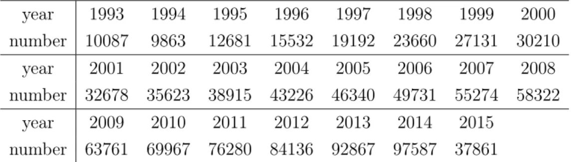
The data are 1030924 abstracts, including their labels, collected from arXiv.org between 1986 and 2015, where articles in 2015 only are covered from January to May. One interesting phenomenon is that the number of documents increases by year and for some years, the number of documents is quite small so that it is meaningless to explore their underlying topics. For example, there is only 1 document in 1986. We group the data from 1986 to 1993 together as we process data by year and wish the data of every year to be of meaningful and calculable scales. The statistical information about the data is shown in Table 2.1.
Table 2.1: The number of documents for each year year 1993 1994 1995 1996 1997 1998 1999 2000 number 10087 9863 12681 15532 19192 23660 27131 30210 year 2001 2002 2003 2004 2005 2006 2007 2008 number 32678 35623 38915 43226 46340 49731 55274 58322 year 2009 2010 2011 2012 2013 2014 2015 number 63761 69967 76280 84136 92867 97587 37861 2.6.2 Preprocessing
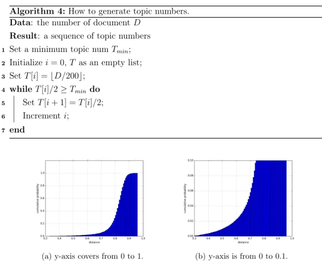
Conventionally, the first step is to reduce the noise in the data. We remove words in the standard list of stop-words, get rid of punctuation and mathematical marks and eliminate words whose frequencies are less than 10. The input to LDA is the so called bag-of-words representation. A vocabulary including all words is created and then each abstract is represented by the total number of unique words in the abstract and a sequence of triples {word index in the vocabulary : occurrence}. Moreover, to train the model we need to specify the number of topics, which is equivalent to the number of centroids in the K-means algorithm. Our topic numbers are obtained through Algorithm 4. Line 3 indicates that topic numbers are dependant on the number of documents and line 5 ensures that the numbers increase rapidly. The output is a sequence of topic numbers. We only use the first number i.e. the minimum one for the dynamic topic graph in Sections 4.1 and 4.3, while for hierarchy topic graph in Section 4.2 we apply the whole sequence. We wish to display all topics without scrolling, so here the constraint on topic number Tmin is smaller than 32.
graph on a device with a smaller screen such as a tablet or a mobile phone, it should be reduced a bit in order to see words in the topic and links between them clearly. Algorithm 4: How to generate topic numbers.
Data: the number of documentD Result: a sequence of topic numbers 1 Set a minimum topic num Tmin; 2 Initializei= 0, T as an empty list; 3 Set T[i] =bD/200c;
4 while T[i]/2≥Tmin do 5 Set T[i+ 1] =T[i]/2; 6 Increment i;
7 end
(a) y-axis covers from 0 to 1. (b) y-axis is from 0 to 0.1.
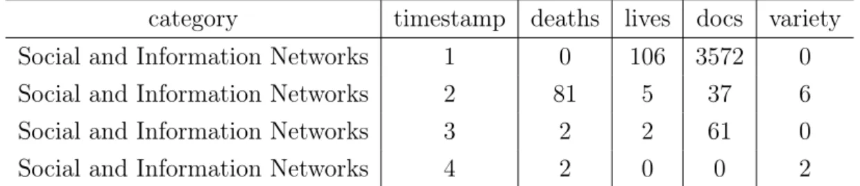
Figure 2.2: Cumulative distribution of Hellinger distances. Figure (a) is the overview of the whole distribution. To obtain a detailed look, Figure(b) is focused on proba-bilities from 0 to 0.1.
The last step is setting the threshold of Hellinger distance in the dynamic topic graph and the dynamic topic graph of category. The cumulative distribution of Hellinger distances among all topics is shown in Figure2.2. The connection of topics are expected to be close, so the ideal thresholds are those whose probabilities are roughly under 0.02, i.e. they are 0.4, 0.5 and 0.6. Here, we set the middle number 0.5 to be the threshold.
2.6.3 Results
Figure 2.4 illustrates a segment of the entire graph, in which topics in the same year are aligned in the same vertical line and the text of the nodes is top 5 terms in the
topic distribution. A thick edge linking topic A and topic B means that topic B is inherited from topic A or topic A affects topic B. The blue node without any text is a null node, and thin edges connected to it are called virtual links. Null nodes and virtual links help to adjust all nodes to the right positions and so users can ignore them. Figure 2.3 indicates that there exist various relationships among topics. For
(a) The evolution that two top-ics: "pi gamma lambda decay" and "quark qcd chiral corrections order" merge into "pi gamma quark qcd lambda".
(b) The topic "neutrino gamma mu pi model" splits into two topics "neutrino model mass mixing scale" and "pi gamma lambda mu decay". Figure 2.3
instance, topic "pi gamma lambda decay" and topic "quark qcd chiral corrections order" in 2002 merged into topic "pi gamma quark qcd lambda" in 2003, while the topic "neutrino gamma mu pi model" is split to topic "neutrino model mass mixing scale" and topic "pi gamma lambda mu decay".
Figure 2.5 is the hierarchy topic graph for the year 2001. Nodes at the leftmost are the ones at the topmost level in the tree i.e. more general topics and, those on the right side are their subtopics. It is not the complete graph as only a part of parent nodes are spread. To see other subtopics, the user needs to click the rest of the parent topics.
We refer to the classification systems from arXiv as category. Figure 2.6 is the dynamic topic graph for "material science" from 2002 to 2006. Unlike in a typical dynamic topic graph, in which all edges are assigned merely by two values – one for true link and the other for virtual link, all nodes are displayed by their weight. In other words, topics associated with more documents are much larger than others. Therefore, it is also able to discover hot topics or mainstream issues in a research area. Here, we find that most people worked on topic "magnetic field temperature transition phase" and topic "spin electron quantum state two" in 2002.
Figure 2.4: The dynamic topic graph from 2000 to 2005. T opics in the same y ear are aligned in the same v ertical line and the text of the no des is top 5 terms in the topic dis tr ibution. Th ic k edges lin k in g tw o topics represen t their heredit y relationship. The bl ue no de without an y text is a n ull no de, and thin edges connected to it are called virtual links, whic h can b e ignored as they are me an t to adjust the p ositions of th e no des.
Figure 2.5: Hierarc h y topic graph for the y ear 2001. T opics on the righ t are more ge n era l topics and those on the left are subtopics. The figure do es not sho w the en tire topic tree as w e only spread some no d es for the demo.
Figure 2.6: Dynamic topic graph of "material science" b et w een 200 2 and 2006. T opic n o des with more w eigh ts are more frequen tly studied as they are asso ciated with more articles.
2.7
Related work and discussion
There are many research directions related to topic modeling, such as model evalu-ation and checking, visualizevalu-ation of topics and documents and data discovery. Our graphs provide a visualization of topics and their relationships. There is also related work in the field of visualization and user interface. Griffiths and Steyvers [GS04] trained an LDA by using 2,620 abstracts in 2001 from PNAS. They computed a mean vector θ of topic distribution for 3 major disciplines and 33 minor categories. The relationship between categories is presented via a matrix whose rows represent categories and columns are indexes of topics in which an element is colored when the topic is diagnostic of the category. For instance, diagnostic topics in minor categories in Physical Science and Social Science share more commonality than cat-egories in Biological Science. Due to the formation of the matrix, the size of the collections and the number of topics are limited, which makes it non-scalable to the size of big data in the current era. Talley et al. [TNM+11] designed a full topic representation, where a topic is shown not only by its top N words but also with its related topics, topics with highest co-occurrence probability and other metadata. Related topics are calculated by Jensen-Shannon distance which is an alternative to Hellinger distance. Such representation offers a comprehensive sight of a topic, but merely listing related topics in text is not intuitive enough. In our work, re-lated topics are ordered by time in the dynamic topic graph and they are shown by level in the hierarchy topic graph so that it furnishes a more comprehensive view of related topics. Murdock and Allen [MA15] built a system interpreting documents and topics learned by LDA. Top 18 articles with highest relevance to keywords en-tered by the user are retrieved, where each article is represented by a colored band indicating its topic distribution. Furthermore, the length of band is weighted by a normalized Jensen-Shannon distance between items thereby topic-document and document-document relations being displayed intuitively.
Document modeling is crucial to information retrieval (IR), so topic models are widely used in IR as they offer a structured document representation and richer information about the dataset. In [WC06], authors linearly combined the standard query likelihood model with LDA which is named LBDM. The experimental results show that LBDM leads to a higher precision than the standard query learning and cluster-based retrieval, which is evidence that topic modeling is feasible and effective in IR. Newman et al. [NHCS07] introduced an algorithm which automatically cleans the vocabulary of the corpus in order to improve the quality of topics extracted by
the topic model and then mapped topics to a hierarchy category system. When one enters keywords and selects the category, the literature search system retrieves all records labeled by the category with containing keywords thereby enhancing the effectiveness of IR. Moreover, records belonging to similar topics are given in the recommendation list. A similar approach was used in [SIG17]. A database of NIH grants using LDA was developed in [TNM+11], where documents are clustered by
document similarity which is a combination of equally weighted Kullback-Leibler divergence of word and topic probabilities. Rather than traditional keyword based query, users search by topics in the database. In particular, after entering a word in the query field, the system returns top 10 words from the topics auto-populated by the given word and highlights all relevant documents in the clustering graph. Topic based query saves the user for extensive query revision, which is often re-quired in traditional IR systems. In addition, it is more convenient for users to find relevant documents in that they are probably close in the clustering graph. Our graphs is also applicable to the search engine. For example, in the PULP system [MIW+16, AMO+16, AMIG15, MPG17], users can start their initial search by
pick-ing up words in the topics shown in the graph. There are several advantages. The first is users do not have to formulate query by themselves. Secondly, these topics are mined from the dataset which should be more effective than keywords conceived by users who are not fully aware what types of papers are contained in the database. Last but not least, topics are placed based on their relationships that helps the user to find a good initial query.
3
Survival analysis
Survival analysis is analyzing the expected duration until an event happens such as the lifetime of a human being. In the section, we attempt to predict the potential lifetime of topics under a specific category and discover which factors cause their death. Survival data are always censored, in other words for some units of the time, the event has not occurred before the time of the analysis. Our study pertains the case of random censoring where for a topici, it is associated with a censoring time Ci, which is independent of the lifetimeTi and we observeYi = min{Ci, Ti} with an
indicator stating whether the observation is terminated by the event or censoring. The distribution of event times is described by the survival function and the hazard function. The survival function is the probability that for each time pointti, a topic
already survived up toti−1.
Methods estimate the survival and the hazard functions are classified to parameter, non-parameter and semi-parameter types. Parameter estimators assume that the distribution of survival times follows a specific known distribution such as exponen-tial, Weibull and lognormal distributions. Kaplan Meier method is a popular non-parameter method. It is used to plot survival probabilities over time and compare the survival function for two or more groups. Semi-parameter models make weaker assumptions than the parameter ones and stronger assumptions than non-parameter methods. For instance, the popular Cox proportional hazard (PH) regression model assumes that the hazard ratio between two observations is constant over time while allowing all shapes of the hazard baseline. Cox PH model is the most popular so far thanks to the following advantages. First off, when we are not sure of the correct model, it gives us a safe choice because the hazard baseline is not specified. The exponential function ensures that the estimation of hazards are non-negative so that it is preferred over linear models. Furthermore, the effect of explanatory variables in the model is accessible to us. Therefore, we select the Cox proportional model as our estimator.
3.1
Data
The data about topic lifetime are collected from the dynamic topic graph of category in Section 2, but we do not need node weight here as all the nodes in the graph are set with the same weight and the number of topics is restricted to around 50 as topics are expected to be from the same level. Firstly, we extract independent lifelines from the graph and then at each time stamp in the line, we observe the number of related documents, whether the topic changed and whether it was alive or dead. In the end, we accumulate these information by time stamp. As shown in the dynamic topic graph, sometimes a few topics merge into a single topic, while sometimes a single topic is split into several topics. We regard these events as the variety of topics and hence they are settled to be dead. Certainly, when there is no connection to the topics in the next year, it is counted as death. Take Figure3.1 as an example, in which there are five topic lines colored in five colors. The red line and the blue lines are merged in 2003, so they were dead and a new topic was born in 2003. Similarly, in 2005 the green line is split, which means it was dead and consequently two new topics were generated. For the red line, in 2001 it was born and thus we record 1 live and 0 death at time stamp 1. Then, it stayed alive in 2002 and we write 1 live
and 0 death at time stamp 2, whereas it changed in 2003, so we obtain 0 live, 1 death and 1 variety at time stamp 3. The remaining lines are observed in the same process, and finally the data are updated in Table3.1.
Figure 3.1: An example of how to extract lifelines from the dynamic topic graph. Five different colored lines represent five topic lifelines.
Table 3.1: Topic lifetime data for Figure 3.1. timestamp deaths lives variety
1 0 5 0
2 2 3 0
3 3 0 3
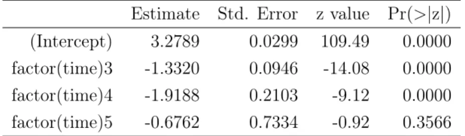
Also, we are interested in analyzing data and results from the dynamic topic graph with different thresholds of Hellinger distance. Recall from Section 2.6.2 that 0.4, 0,5 and 0.6 are also suitable to be thresholds, so we also use the data generated from the dynamic topic graph under these thresholds. Table 3.2 is a sample of the experimental data of the category "Social and Information Networks" when the threshold of Hellinger distance is equal to 0.4. It should be noted that the number of dead and live topics from time stamp 2 to 4 is not the same as the number of alive topics in time stamp 1. This is because we cannot tell which topics that were alive in 2015 would be live or dead in 2016, therefore, our data is right censored.
Table 3.2: A fraction of topic survival data extracted from the dynamic topic graph under the threshold of 0.4.
category timestamp deaths lives docs variety
Social and Information Networks 1 0 106 3572 0
Social and Information Networks 2 81 5 37 6
Social and Information Networks 3 2 2 61 0
Social and Information Networks 4 2 0 0 2
3.2
Model
The classical Cox PH model is designed for continuous time data. In this section, we describe two proportional hazards models for discrete time data which extend from the Cox PH model.
3.2.1 Discrete hazard and survival
Assume T is a discrete random variable that represents the survival time, and the observed time values are t1 < t2 < ... < tj <∞. The probability that T equals tj is
denoted as
P r{T =tj}=f(tj) = fj. (3.1)
The survival function is the probability that the survival time T is at least tj, so
that S(tj) = Sj =P r{T ≥tj}= ∞ X k=j fk. (3.2)
The hazard at time tj is defined as the conditional probability of dying at time tj
given that one has survived to the current point, which is λ(tj) =λj =P r{T =tj|T ≥tj}=
fj
Sj
. (3.3)
Following Equation 3.3, we obtain the relationship between the survival and hazard functions as
Sj = (1−λ1)(1−λ2)...(1−λj−1), (3.4)
which means one has to survive at all the moments before tj if its survival time is
3.2.2 Logistic regression
Cox proposed an extension model based on proportional hazards, where the condi-tional odds of dying at time tj is assumed to be
λ(tj|xi)
1−λ(tj|xi)
= λ0(tj) 1−λ0(tj)
exp{x0iβ}. (3.5) λ(tj|xi)is the hazard of individuali at time tj; λ0(tj) is the corresponding baseline
hazard;xiare the covariates of individualiandexp{x0iβ}represents the relative risk.
Consider a example where we have two groups of individuals. A dummy variable xi
is zero when individual i belongs to the first group and takes one vice versa. Thus, λ(tj|xi) 1−λ(tj|xi) = λ0(tj) 1−λ0(tj) if xi = 0 λ0(tj) 1−λ0(tj)exp{β} if xi = 1
If β = log 2, then the odd of hazard of the second group is twice as the one of the first group. Taking logs, the logit of hazard is
logitλ(tj|xi) =αj +x0iβ, (3.6)
where α is the logit of baseline hazard.
This model is equivalent to the logistic regression model as follows. Letdij represent
the alive status of individual i at time tj. The observation dij is generated from a
Bernoulli distribution with probability λij, where the canonical parameter λij is
modelled to be a linear predictor logitλ(tj|xi) = αj +x0iβ. More generally, the
observations with the same covariates can be treated together. Thus, dij denotes
the number of deaths of individuals in group i at time tj, and then we treat dij as
the response from a Binomial distribution with the size of nij that is the number
of individuals in the group and death probability λij. The analogy of these two
model is proved by verifying the equivalence of the likelihood of the discrete model under random censoring and the binomial likelihood by treating the indicator as independent Bernoulli or binomial.
3.2.3 Logistic regression with c-log-log link
We assume that the survival function has the following proportional relationship: S(tj|xi) =S0(tj)exp{x
0
where S(tj|xi) is the survival function of individual i at time tj and S0(tj) is the
baseline. Derived from Equations 3.4 and 3.7, we obtain a similar format for the hazard function.
1−λ(tj|xi) = (1−λ0(tj))exp{x
0
iβ}. (3.8)
Similarly,λ(tj|xi)is the hazard associated with covariates xi andλ0(tj) is the
base-line hazard. Taking the log twice, finally the model is
log(−log(1−λ(tj|xi))) =αj +x0iβ, (3.9)
where the baseline is encased into αj.
The likelihood of this model under random censoring coincides with the binomial likelihood in Section 3.2.2, however, the canonical parameter is assumed to be
log(−log(1 −λ(tj|xi))) = αj +x0iβ. Here, 1−λ(tj|xi) is the complement of the
hazard and it takes log twice, so the link function is called c-log-log. Further-more, it is also the unique discrete model applicable to grouped continuous data from the proportional hazard model. We cut the continuous time into intervals τ0 < τ1 < ... < τj < ... < ∞. Consider the standard proportional hazard model,
which is:
λ(t|x) = λ0(t) exp{x0β}, (3.10)
whereλ0 is the baseline whenx=0andx0βis the proportional relative risk. Denote
λij to be the conditional probability that individuali cannot live afterτj given it is
alive atτj−1. Then, we derive
1−λij = P r{Ti > τj|Ti > τj−1} = exp{−Rτj τj−1λ(t|xi)dt} = exp{−Rτj τj−1λ0(t)dt} exp{x0 iβ} = (1−λj)exp{x 0 iβ},
where λj is defined as the baseline hazard in the interval (τj−1, τj). The final
con-sequent is the same as in Equation 3.8, thereby the generalized linear model with c-log-log link being equivalent to the standard proportional hazard model when grouping the continuous time.
3.3
Model selection
In Section 3.2, we determined that the model is logistic regression even though in order to obtain the final model, there are still two tasks left. One is to discover the
optimal terms in the linear predictor which is neither under-fitting nor over-fitting the data and the other is to compare the model with different link functions, i.e. logit and c-log-log links. In particular, the terms in the candidate list are time stamp(T), category(C), the number of documents(D), the number of variety(V) and their interactions. We treat T and C as categorical variables and the rest as continuous variables.
3.3.1 Complete and quasi-complete separation
Before discussing model selection, we have to address the problem of the so-call complete or quasi-complete separation which occasionally happens when fitting the logistic regression model. Table 3.3 is an example of complete separation, where Y
Table 3.3: Example data for complete separation.
Y 0 0 0 0 1 1 1 1
X1 1 2 3 3 5 6 10 11
X2 3 2 -1 -1 2 4 1 0
Table 3.4: Example data for quasi-complete separation.
Y 0 0 0 1 1 1 1 1
X1 1 2 3 3 5 6 10 11
X2 3 2 -1 -1 2 4 1 0
is the response and X1 and X2 are inputs. When Y is observed to be 0, X1 is always no bigger than 3 and when Y is 1, X1 stays larger than 3. Therefore, Y separates X1 completely, which is called complete separation. In other words, X1 predicts Y perfectly. Similarly, looking at the example data in Table 3.4, Y separates X1 very well except when X1 is equal to 3. This phenomenon is called quasi-complete separation.
The reason for complete or quasi-complete separation varies. For instance, one common scenario is that the categorical variable in the linear predictor is coded by indicators. In our data, we treat the time stamp(T) as a categorical variable and at time 1, all topics were alive as it is the moment they were born so that the probability P(y|T = 1) = 1. Also, it occurs when all topics were dead or live at the last time stamp. Sometimes, there exists one variable in the predictor which is
another version of the outcome, for example, it is dichotomized by the response. In addition, when the size of the data is not big enough, this problem may occur.
Table 3.5: Logistic regression fitted by all time stamps. Estimate Std. Error z value Pr(>|z|) (Intercept) -23.9352 521.2293 -0.05 0.9634 factor(time)2 27.2141 521.2293 0.05 0.9584 factor(time)3 25.8821 521.2293 0.05 0.9604 factor(time)4 25.2953 521.2293 0.05 0.9613 factor(time)5 26.5379 521.2298 0.05 0.9594 factor(time)6 43.5013 7622.0783 0.01 0.9954
Table 3.6: Logistic regresion fitted after removing variables causing quasi-complete separation.
Estimate Std. Error z value Pr(>|z|) (Intercept) 3.2789 0.0299 109.49 0.0000 factor(time)3 -1.3320 0.0946 -14.08 0.0000 factor(time)4 -1.9188 0.2103 -9.12 0.0000 factor(time)5 -0.6762 0.7334 -0.92 0.3566
Because there is no observation with y = 0 or y = 1, the likelihood maximum estimation(MLE) method cannot determine the coefficients of these variables. Take the data with the threshold of Hellinger distance with 0.5 as an instance. Tables 3.5 and 3.6 are coefficients of variables by fitting the logistic regression model with data including time 1 and time 6 and the data without them, respectively. Coefficients estimated by the full data are very large and their standard errors are enormous as well, which proves that MLE is unable to work. In contrast, estimation by deleting these two variables makes more sense. Hence, we remove those variables causing complete or quasi-complete separation before applying common criteria to select the optimal model.
3.3.2 Akaike information criterion
Akaike information criterion (AIC) is a measurement to evaluate the relative quality of models given a dataset. It is defined as
in which k is the number of parameters and L is the likelihood. The preferred model is the one with the minimum AIC value. In Equation 3.11, a negative sign is assigned to the likelihood while a positive sign is for the number of parameter as a penalty. Hence, AIC makes a trade-off between the complexity of the model and its goodness fit. Using the logarithm of the number of observationsn instead of logarithm of 2, AIC yields another popular criterion, Bayesian information criterion (BIC), which gives higher penalty to the complexity of the model.
Here, we pick the model with the minimum AIC value from a list of candidate models, where the lower bound is the model including only one term i.e. category(C) as we aim to discover the prosperity of categories so that it has to be retained and the upper bound is the model with all the terms excluding the factor category×year, otherwise it becomes a saturated model which has a parameter for each observation. Rather than search the complete list, we start with a model and stop when the AIC value does not decrease. We use three directions of search which are forward, backward and both. In the backward mode, the search starts with the upper bound model, then it removes a factor which reduces the AIC value mostly and repeats until the AIC value stops decreasing. When searching forward, it starts with the lower bound model. In each round, a term with the minimum value is added into the model where the main effects are usually taken into account first and then it goes on with their interactions. The both mode is similar to the forward search, except that it also removes terms which are already selected in the model if such an operation reduces the AIC value.
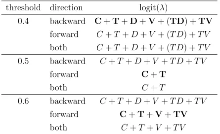
Table 3.7: The models selected by different search directions for logit link. threshold direction logit(λ)
0.4 backward C+T+D+V+ (TD) +TV forward C+T +D+V + (T D) +T V both C+T +D+V + (T D) +T V 0.5 backward C+T +D+V +T D+T V forward C+T both C+T 0.6 backward C+T +D+V +T D+T V forward C+T+V+TV both C+T +V +T V
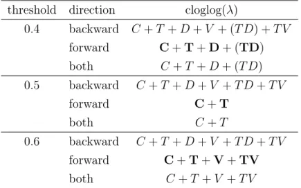
Table 3.8: The models selected by different search directions for c-log-log link. threshold direction cloglog(λ)
0.4 backward C+T +D+V + (T D) +T V forward C+T+D+ (TD) both C+T +D+ (T D) 0.5 backward C+T +D+V +T D+T V forward C+T both C+T 0.6 backward C+T +D+V +T D+T V forward C+T+V+TV both C+T +V +T V
3.8. We pick the model favored by the majority for each link function under three datasets with three thresholds of Hellinger distance. It should be noted that when the threshold is 0.4, there exists quasi-complete separation for the factorT D, so we remove it from the model even though the model including it is preferred by the AIC value. At the moment, the candidate models are logit(λ) :C+T+D+V +T V and cloglog(λ) : C+T +D, logit(λ) : C +T and cloglog(λ) : C +T, logit(λ) :
C +T +V +T V and cloglog(λ) : C +T +V +T V, for threshold with 0.4, 0.5 and 0.6, respectively. Single factors, such as C, T are the main effect and others represent interaction of main effects, for instance, T V is the interaction between time and the number of variety.
3.3.3 Likelihood ratio test
Log likelihood ratio (LR) test is used to compare the goodness fit of two models, where one is a special case of the other. Assume θ is a p-dimensional vector, and we have two hypotheses:
H0 :θ=θ0, H1 :θ6=θ0,
then the LR statistic is
χ2LRT =−2 logL(θ =θ0)−2 logL(θ =θˆM LE), (3.12)
where L is the likelihood. If the null hypothesis H0 is true, then when the
num-ber of samples n is asymptotic to infinity, the statistic converges to a Chi-squared distribution with p degrees of freedom. AIC offers a preferred model, however, we
still need to investigate whether the model is over-fitting or under-fitting according to LR test. In other words, LR test is utilized to detect the necessities of terms in the model. For example, when checking whether termθ should leave or stay in the linear predictor, we have the following hypotheses:
H0 :θ =0, H1 :θ6=0,
where H0 means that the term is not necessary, while H1 is the other side. Let the
significance level be α. If the p-value of χ2
LRT in a Chi-squared distribution with p
degrees of freedom is smaller thanα, then the corresponding model toH0is rejected,
which means the termθ should be retained. In particular, when inspecting whether the candidate model is over-fitting, it is H1 in the test, while when examining the
under-fitting, it isH0 in the test, where it is compared with the saturated model.
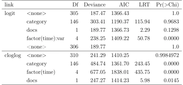
Table 3.9: LR test for the threshold of 0.4.
link Df Deviance AIC LRT Pr(>Chi)
logit <none> 305 187.47 1366.43 1.0 category 146 303.41 1190.37 115.94 0.9683 docs 1 189.77 1366.73 2.29 0.1298 factor(time):var 4 238.25 1409.22 50.78 0.0000 <none> 306 189.77 1.0 cloglog <none> 310 241.29 1410.25 0.9984972 category 146 484.74 1361.70 243.45 0.0000 factor(time) 4 677.05 1838.01 435.75 0.0000 docs 1 247.27 1414.23 5.98 0.0145
Recall that for the data of threshold with 0.4, AIC prefers the model that is logit(λ) :
C +T +D+ V +T V. Table 3.9 gives LR test results for this model which is divided into two parts according to the link function. In each segment, the first row represents the candidate model itself and the rest are alternative models excluding the specified term. Models without variety V or time T are not in the test as their interaction is in the candidate model and hence they are regarded as necessary main effects. The column Df is the difference between the degrees of freedom; here it is equal to the difference between the numbers of parameters between models. It should be noted that the first row, i.e. the candidate model, takes the saturated model as the reference model, while the others are referenced by the candidate model. That is to sayDf in the first row is the difference between the candidate model and the
saturated model, while the rest are the differences between the alternative model and the candidate model. Deviance is the log likelihood ratio between the model and the saturated model. The next columns are AIC values and LR test statistic, which is the difference between deviances, and the last one is the p-value in the LR test. In this thesis, we use the conventional five percent significance level. The p-value of the interaction between time and variety T V is 0 so that the alternative model is rejected. The p-value of categoryC and docsDare larger than 0.05, which means they should be removed in case of over-fitting, but we aim to see the survival analysis in terms of the category so we only remove the docs D from the model. The result of comparison with the saturated model showed that 189.77 reduction in deviance by loss of 306 degrees of freedom is insignificant. Therefore, the model is not under-fitting and we accept it. Our final model for the data of threshold with 0.4 based on the logit link function is logit(λ) : C+T +V +T V. Models for the c-log-log link function and other thresholds are selected similarly. In brief, the results are shown in Tables 3.10 and 3.11.
Table 3.10: LR test for the threshold of 0.5.
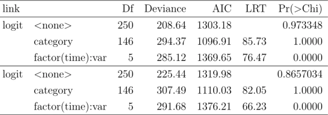
link Df Deviance AIC LRT Pr(>Chi)
logit <none> 271 296.13 1366.19 0.1408854 category 146 575.76 1353.81 279.62 0.0000 factor(time) 3 445.21 1509.27 149.07 0.0000 cloglog <none> 271 292.75 1362.81 0.1738769 category 146 575.76 1353.81 283.00 0.0000 factor(time) 3 445.21 1509.27 152.45 0.0000
Table 3.11: LR test for the threshold of 0.6.
link Df Deviance AIC LRT Pr(>Chi)
logit <none> 250 208.64 1303.18 0.973348 category 146 294.37 1096.91 85.73 1.0000 factor(time):var 5 285.12 1369.65 76.47 0.0000 logit <none> 250 225.44 1319.98 0.8657034 category 146 307.49 1110.03 82.05 1.0000 factor(time):var 5 291.68 1376.21 66.23 0.0000
3.3.4 Wald test
Wald test is a parametric statistical test which tests the true value of the parameter based on the sample estimates. Let θ be a vector with p dimensionality, and the test hypotheses are:
H0 :θ =θ0, H1 :θ6=θ0.
Then, the statistic in the Wald test is:
W = (ˆθ−θ)[In(ˆθ)](ˆθ−θ), (3.13)
whereθˆ is the maximum likelihood estimation of θ and I is the Fisher information function. As in the LR test, if the null hypothesis is true, then W follows a Chi-squared distribution with p degrees of freedom. Wald test is also used to test the significance of factors as it approximates LR test, while only requiring one model rather than two as is the case in the LR test. Here, we treat it as a supplementary verification of the LR test.
More precisely, we have two hypotheses:
H0 :θ =0, H1 :θ6=0,
whereH0 shows that the coefficient of the parameterθ is zero, which indicates that
changes of the corresponding factor do not affect the response i.e. the number of deaths significantly, whileH1 does the opposite.
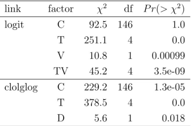
Table 3.12: Wald test for the threshold of 0.4. link factor χ2 df P r(> χ2) logit C 92.5 146 1.0 T 251.1 4 0.0 V 10.8 1 0.00099 TV 45.2 4 3.5e-09 clolglog C 229.2 146 1.3e-05 T 378.5 4 0.0 D 5.6 1 0.018
Results of the Wald test are listed in Tables 3.12, 3.13 and 3.14. Everything is consistent with the LR test except for the threshold of 0.6, where the Wald test suggests to remove varietyV. The LR test has better property and is more reliable, and varietyV is the main effect of the interactionT V, so we retain the termV even though the Wald test contradicts the LR test.
Table 3.13: Wald test for the threshold 0f 0.5. link factor χ2 df P r(> χ2) logit C 270.4 146 1.8e-09 T 187.2 3 0.0 cloglog C 271.2 146 1.5e-09 T 146.5 3 0.0
Table 3.14: Wald test for the threshold of 0.6. link factor χ2 df P r(> χ2) C 78.5 146 1.0 T 153.2 5 0.0 V 1.0 1 0.31 TV 50.6 5 1.1e-09 C 80.2 146 1.0 T 108.3 5 0.0 V 0.23 1 0.63 TV 9.4 5 0.095 3.3.5 Link functions
Table 3.15: Comparison of models under logit and c-log-log links.
threshold model error AIC AIC diff
0.4 logit(λ) :C+T+V+TV 42.59864 1366.727 3.536829e-10 cloglog(λ) :C+T +D 53.32755 1410.252 0.5 logit(λ) :C+T 50.24979 1366.192 0.184462 cloglog(λ) :C+T 50.68338 1362.812 0.6 logit(λ) :C+T+V+TV 36.00645 1303.179 0.0002247537 cloglog(λ) :C+T +V +T V 39.82218 1319.98
Table 3.15 shows an overview of the performance of the final models under logit and c-log-log links. The error is P|
y − yˆ|, where y is the true value and yˆ is our prediction. Denote AICM1 and AICM2 as AIC values of two models M1 and
M2. The AIC difference is calculated by diff= exp{AICM1−AICM2/2}, where we
assume AICM1 < AICM2, which means that M2 is diff times more probable than
however AIC does not have such restriction, so it is still feasible to compare models with different link functions. Both the summation of absolute error and AIC favor the same model despite the fact that they cannot be distinguished models under the threshold of 0.5. Therefore, our final models are those with minimal AIC values, which are logit(λ) :C+T+V +T V, logit(λ) :C+T and logit(λ) :C+T+V +T V for thresholds of 0.4, 0.5 and 0.6, respectively. It is interesting that for all the thresholds, the logit link function is preferred. Thus, our data is closer to discrete time than grouped continuous time.
3.4
Results
First off, we have to interpret the relationship between the linear predictor and the response hazard derived from Equation 3.6 – that is
λ= exp{αj +x0iβ}/(1 + exp{αj+x0iβ}).
In Figure 3.2, we see that with the increase in the linear predictor αj +x0iβ, the
Figure 3.2: Plot of the logit function. The y value is restricted within 0 and 1 with the increase in x, y grows as well.
hazardλ rises correspondingly. In Section 3, we obtained the final linear predictors which are:
logit(λ) =η+αt+γc+βvxv +βtvαtxv, (3.14)
for the thresholds of 0.4 and 0.6 and
for the threshold of 0.5, whereηis the logit of the baseline hazard,αtis the effect of
timet;γc is the effect of category c; xv represents the number of variety of category
c in the time stamp t; αtxv is the interaction of time i and its variety. Next, we
analyze the relationship between causal factors of dying topics and hazard by looking into coefficients of these terms. At the end of this section, we will present the final hazard and survival lines.
3.4.1 Explanatory variable
Table 3.16 shows the coefficients of the explanatory variable variety xv and the
baseline hazard logit(η) for category Accelerator Physics at time stamp 2. The baseline for all thresholds is quite close, so we conclude that the change of threshold for the Hellinger distance does not affect the hazard very much. For the threshold of 0.6, the coefficient of variety is negative, which means it reduces the hazard and thus with more occurrence of topic variety the more probable topics live longer, while for the threshold of 0.4, the situation is reversed. Therefore, the effect of topic variety on topic lifetime is not determined yet.
Table 3.16: Coefficients of the intercept and explanatory variables. threshold intercept η baseline logit(η) variety βv
0.4 3.315612 0.9649605 0.01774677
0.5 3.288632 0.9640368
0.6 3.327047 0.9653451 -0.002178641
3.4.2 Group effects
The dataset is grouped by two categorical variables i.e. time αt and category γc.
Take time stamp 2 as the reference, then its coefficient is zero and coefficients of the other time stamps are the differences between effects of themselves and effect of the reference time. After subtracting coefficients αi with their mean, we obtain
the relative effect of each time displayed in Tables 3.17, 3.18 and 3.19. Positive relative effect implies that more topics died at those time stamps than others with negative effects. The data is grouped by year, so 1 time stamp stands for 1 year here. Figure 3.3 illustrates how baseline varies under different thresholds. For all thresholds, the hazard at time stamp 2 is the highest, which indicates most topics
Table 3.17: Time effects on hazard under threshold of 0.4. coefficient αt relative effect αt−α¯t baseline
factor(time)2 0.00000 1.71650 0.96496
factor(time)3 -2.31223 -0.59572 0.73172 factor(time)4 -2.87085 -1.15434 0.60939
factor(time)5 -1.36558 0.35091 0.87544
factor(time)6 -2.03386 -0.31735 0.78274 Table 3.18: Time effects on hazard under threshold of 0.5.
coefficient αt relative effect αt−α¯t baseline
factor(time)2 0.00000 0.75370 0.96404
factor(time)3 -1.13975 -0.38605 0.89556 factor(time)4 -1.59841 -0.84471 0.84425
factor(time)5 -0.27663 0.47707 0.95311
Figure 3.3: Baseline hazard at all time stamps under different thresholds. The shapes of three curves are similar, which means a lot of topics died in their 2nd year, while the survivors would live in the 3rd and the 4th years with a higher probability. However, a new cycle started in the 5th year again.
Table 3.19: Time effects on hazard under threshold of 0.6. coefficient αt relative effect αt−α¯t baseline
factor(time)2 0.00000 5.25488 0.96535 factor(time)3 -2.07380 3.18108 0.77786 factor(time)4 -3.52207 1.73281 0.45140 factor(time)5 -3.40716 1.84772 0.47998 factor(time)6 -3.83246 1.42243 0.37627 factor(time)7 -18.69380 -13.43892 0.00000
only lived for 1 year. The shapes of three curves are cognate in spite of the fact that the baseline for the threshold of 0.5 after time stamp 5 is not estimable. Thus, we observe that if a topic is able to survive in the 2nd year, then it is more probable to live in the next year. Moreover, catastrophe would take place again in the 5th year. Similarly, the relative effect of category is shown in Table 3.20, where when the coefficient of category is positive, we mark it ’+’, otherwise ’-’. Thus, topics in the category with a positive value have a shorter lifetime than the ones in a category with a negative value. However, there exist conflicts for different thresholds, for instance, for category Adaptation and Self-Organizing Systems, it is positive under thresholds of 0.4 and 0.5 but it obtains a negative value under threshold of 0.6. These conflict categories are bold in the table. The numbers of inconsistency are 48, 68 and 32 between thresholds of 0.4 and 0.5, thresholds of 0.4 and 0.6, and thresholds of 0.5 and 0.6, respectively. In total, the number is 74. So we can only be sure of the effect of 73 categories on topic lifetime. The detailed version on category effect is available in the appendix.
Table 3.20: Relative effect of category for all thresholds.
category 0.4 0.5 0.6
Accelerator Physics + + +
Adaptation and Self-Organizing Systems + +
-Algebraic Geometry - + + Algebraic Topology - - + Analysis of PDEs - + + Applications - - + Artificial Intelligence - - -Astrophysics + + + Astrophysics of Galaxies + + +
Atmospheric and Oceanic Physics + - +
Atomic and Molecular Clusters - + +
Atomic Physics - + +
Automata and Lattice Gases + +
-Biological Physics + + +
Biomolecules + +
-Category Theory - -
-Cell Behavior + -
-Cellular Automata and Lattice Gases + -
-Chaotic Dynamics - + +
Chemical Physics - + +
Classical Analysis and ODEs - - +
Classical Physics - + +
Combinatorics - - +
Commutative Algebra - -
-Complex Variables - -
-Computation - -
-Computation and Language + -
-Computational Complexity - -
-Computational Engineering, Finance, and Science + -
-Computational Finance - -
-Computational Geometry - -
-Computational Physics - + +
Computer Science and Game Theory - -
-Computer Vision and Pattern Recognition - -
-Computers and Society - +
-Condensed Matter + + +
Cosmology and Nongalactic Astrophysics - + +
Cryptography and Security - -
-Data Analysis, Statistics and Probability - + +
Data Structures and Algorithms - -
-Databases - -
-Differential Geometry - + +
Digital Libraries - -
-Discrete Mathematics - -
Distributed, Parallel, and Cluster Computing - -
-Dynamical Systems + + +
Earth and Planetary Astrophysics + - +
Economics - -
-Emerging Technologies - -
-Exactly Solvable and Integrable Systems - - +
Fluid Dynamics - + +
Formal Languages and Automata Theory - - +
Functional Analysis - + +
General Finance - -
-General Literature - -
-General Mathematics - - +
General Physics - + +
General Relativity and Quantum Cosmology - + +
General Topology - - -Genomics - - -Geometric Topology - - + Geophysics + - + Graphics - - -Group Theory - - -Hardware Architecture - -
-High Energy Astrophysical Phenomena + + +
High Energy Physics - Experiment + + +
High Energy Physics - Lattice + + +
High Energy Physics - Phenomenology - + +
High Energy Physics - Theory - + +
History and Overview - -
-History and Philosophy of Physics - -
-Human-Computer Interaction - -
-Information Retrieval - -
-Information Theory - - +
Instrumentation and Detectors - - +
Instrumentation and Methods for Astrophysics + + +
K-Theory and Homology - -
-Logic - - +
-Machine Learning - - -Materials Science - + + Materials Theory + + + Mathematical Finance - - -Mathematical Physics - + + Mathematical Software - - -Medical Physics + +
-Mesoscale and Nanoscale Physics - + +
Methodology - -
-Metric Geometry - - +
Molecular Networks - +
-Multiagent Systems - -
-Multimedia - -
-Networking and Internet Architecture - -
-Neural and Evolutionary Computation - -
-Neurons and Cognition + -
-Nuclear Experiment - + + Nuclear Theory - + + Number Theory - - + Numerical Analysis - - + Operating Systems - - -Operator Algebras - - -Optics - + +
Optimization and Control - - +
Other - -
-Other Condensed Matter - + +
Other Quantitative Biology + -
-Other Statistics - -
-Pattern Formation and Solitons + + +
Performance - -
-Physics and Society - +
-Physics Education - -
-Plasma Physics - + +
Popular Physics - - +
Populations and Evolution + +
-Pricing of Securities - - -Probability - + + Programming Languages - - -Quantitative Biology + + -Quantitative Methods + + + Quantum Algebra - - + Quantum Gases - + + Quantum Physics - + + Representation Theory - - +
Rings and Algebras - -
-Risk Management - -
-Robotics - - +
Social and Information Networks - -
-Soft Condensed Matter - + +
Software Engineering - -
-Solar and Stellar Astrophysics - + +
Sound - - -Space Physics + + + Spectral Theory - + + Statistical Finance - - -Statistical Mechanics - + + Statistics Theory - + +
Strongly Correlated Electrons - + +
Subcellular Processes - -
-Superconductivity - + +
Symbolic Computation - -
-Symplectic Geometry - -
-Systems and Control - - +
Tissues and Organs - -
-Trading and Market Microstructure - -
-3.4.3 Interaction
Models for the thresholds of 0.4 and 0.6 include the interaction of time and variety T V. It is an interaction between a categorical variable and a continuous variable that
reveals how the slope of a continuous variable changes under different categories. In other words, it indicates the variety of the effect of a continuous variable based on a categorical variable. Let us reduce the model to
logit(λ) = η+βvxv +βtvαtxv
= η+ (βt+βtvαt)xv.
(3.16) The transformation interprets how the interactionβtv contributes to the slope of the
number of variety xt. Since the interaction is based on time, it is analogical to the
analysis of group effect on time that we calculate the relative effects of interaction by taking time stamp 2 as the reference. Tables 3.21 and 3.22 show final results for thresholds of 0.4 and 0.6, respectively. For both threshold of 0.4 and 0.6, the value of relative effect of interaction between time and variety grows with time, which means with the increase in topic lifetime, topic variety is more likely to cause death.
Table 3.21: Relative effects of interaction between time and variety T V for the threshold of 0.4.
coefficients βtv relative effectβtv−β¯tv
factor(time)2:var 0.00000 -7.04583
factor(time)3:var 0.29983 -6.74599
factor(time)4:var 2.22260 -4.82323
factor(time)5:var 16.04939 9.00356
factor(time)6:var 16.65731 9.61149
Table 3.22: Relative effects of interaction between time and variety T V for the threshold of 0.6.
coefficients βtv relative effectβtv−β¯tv
factor(time)2:var 0.00000 -9.27280 factor(time)3:var 0.19141 -9.08140 factor(time)4:var 2.27800 -6.99480 factor(time)5:var 2.38822 -6.88458 factor(time)6:var 17.74834 8.47553 factor(time)7:var 33.03085 23.75805
Take the interaction of time 2 and time 3 under threshold of 0.4 as an example. Figure 3.4 illustrates the variety of linear predictor logit(λ) in Equation 3.16 with
Figure 3.4: Interaction of time and variety under threshold of 0.4. The slope of time 2 is lower than the one of time 3, which shows that the represented variety is less likely to cause death at time 2 than time 3.
the number of topic variety for time 2 and time 3. It can be seen that both slopes are downwards while the slope of time 2 is a bit lower than the one of time 3, which is consistent with Table 3.21, where the vale of time 2 is smaller than the other.
3.4.4 Hazard and survival probabilities
The final hazards are calculated from Equations 3.14 and 3.15. The complete list is very long so we put it in the appendix. Here, we select categoriesMachine Learning
and Artificial Intelligence as examples for studying the results. Figure 3.5 displays their hazards at the whole timeline under all the thresholds. As can be observed, the longest topic under Machine Learning is 4 years old and the longest one under Ar-tificial Intelligence is 5 years old, the whole timeline does not cover all time stamps in Section 3.4.2. For both categories, the lengths of lines under all the thresholds are irregular and they are not a special case as it happens to other categories as can be seen from the complete list, where there are 76 differences for thresholds of 0.4 and 0.5, 104 differences for thresholds of 0.4 and 0.6, and 104 for thresholds of 0.5 and 0.6. Thus, we posit that with the increase in threshold, there is no guarantee that the lifetime of topics will be longer or shorter. This is because an increase in the threshold makes topics more probable to live in the next year, but it also raises the probability of topic variety. The shapes of lines are also different, especially
Figure 3.5: Hazards for categoriesMachine Learning andArtificial Intelligence. The lengths and shapes of the lines under all thresholds are irregular for both categories. Nevertheless, at time 2 the hazards are all lower than those at time 1 and are raised with an increase in the threshold. Furthermore, hazard of Artificial Intelligence
under the threshold of 0.6 is abrupt at time 4, which is due to the 0 topic variety at this point.
the one for Artificial Intelligence under threshold of 0.6, where there exists a much lower hazard at time 4 compared to others. However, there are some interesting phenomena. For instance, hazards at time 3 are all lower than the corresponding ones at time 2, which is consistent with the results in Section 3.4.2. Moreover, at time 3 hazards increase by the threshold for both categories and also hazards for
Machine Learning are all lower than the ones forArtificial Intelligence. Recall that in Sections 3.4.1 and 3.4.3, under the threshold of 0.6 the coefficients of variety is -0.002178641, which is quite smaller than coefficients of the interaction of time and variety. Therefore, the interaction outweighs terms of the hazard but not the variety for Artificial Intelligence at time 4, which explains the odd point in the line. The survival probability is obtained in Equation 3.4, which is fully listed in the appendix. Survival curves for Machine Learning and Artificial Intelligence are
pro-(a)Machine Learning (b)Artificial Intelligence
Figure 3.6: Two topic survival curves.
vided in Figure 3.6. Rather than an odd point in the hazard line, all survival lines look normal. The survival probability at time 4 is the product of complements of hazard from time 2 to time 4, which decreases the effect of hazard at time 4.
3.5
Related work and discussion
Topics are generated from scientific documents, so it is believed that by analyzing the trend of topics, we can obtain an insight into the dynamics of the development of scientific research. Many researchers have tried to discover it through various indicators of topic trends, for instance, Griffiths and Steyvers [GS04] computed a mean vector θ of document-topic distribution as mentioned in Section 2. Conse-quently, they conducted a linear trend analysis ofθj in order to detect hot and cold
topics. In particular, hot topics are those gaining an increasing linear trend while cold topics lead to a decreasing trend. Bolelli et al.[BEG09] defined the popularity of a topic by the fraction of words assigned to the topic. Topic trend of interest is displayed by plotting the popularity for each year. The drawback of the method