Abstract:
The ability to visualize a network as it varies over time has become a challenge for researchers despite the rapid growth of visualization techniques. Node-link approaches are no more attempted than matrix, plotting or graphing methods. The ability to classify and visualize the difference between ties, especially reciprocity, has become an increasingly interesting topic in recent years. Very few attempts have bridged the visualization of the evolution of ties over time. In this paper we present a Tie Visualization extension to the Node-Link visualization tool NodeXL. The Tie Visualization extension classifies reciprocated and non-reciprocated ties between nodes in a network. It then uses color to distinguish between the different relationships, producing a single node-link representation of the network that captures the evolution over a set period of time.
I. Introduction
In recent years, visualization techniques for the analysis of network evolution have lagged behind the rapid growth of social media and electronic databases. Attempts vary in approach from graphs, matrices and even node-‐link diagrams. Node-‐Link diagrams typically portray evolution through the use of multiple images, either juxtaposed or shown in sequence through the use of a slider. Matrix or graph approaches benefit from the fact that they are able to show this evolution through one single image. The advantage is that the end user does not have to reply on memory to piece together the different images to comprehend what changed over the temporal period. Few node-‐link approaches have captured the evolution through a single image.
Almost equally behind in progress is the classification, identification and visualization of the difference between the different ties within a social
network. Researchers are interested in the identification of different relationships between nodes within a network as this can help identify the dynamics between the actors within the network. Few attempts take into consideration time or how the relationship may vary over time. Increased interest in recent years has been the identification of reciprocated relationships.
In this paper we present a method to classify relationships based on how the level of general interaction and reciprocity changes over time. This dimension of evolution is then visualized with node-‐link diagrams. The necessary calculations to classify and visualize are accomplished using NodeXL. Color is used as the distinguishing factor after relationships have been classified. Using this technique, one single image portrays the evolution of the network over a predefined time period rather than multiple over. The purpose of this method is to distinguish between different types of relationships and help identify which relationships are flourishing or fading over a period of time. This technique it then applied to existing and new datasets in an effort to show the validity of such classification and visualization methods.
The rest of the paper proceeds as follows: Section 2 will provide a related works section and compare previous approaches with the one introduced in this paper. Section 3 will outline the approach and methods used. The integration with NodeXL to make the calculation and visualization possible is discussed in section 4. Analysis and sample networks will be discussed in section 5. We conclude with section 6 where we discuss challenges with this work and future plans.
II. Related Work
Tie Visualization in NodeXL
Nick Gramsky
ngramsky at cs.umd.edu
CMSC 838C – Social Computing
University of Maryland
College Park
“The Strength of Ties” [4] is arguably the most influential work regarding social ties between people in a social network. Since the publication of this work, researchers have sought to further this research in many ways. An indication of the strength of this work may be found in the almost 19,000 citations of this work (according to Google Scholar) since it’s publication in 1973. While the work in this paper does not identify strong or weak ties, one of the main motivations of this work is the desire to classify the difference between a strengthening or weakening tie and then visualize it in the context of the network structure.
Other attempts have worked to quantify ties in social networks. [2] defined a framework to quantify the different levels of strengths of relationships. This was accomplished by classifying Facebook relationships on 70 different numerical indicators. Time between interactions was used in a few of these dimensions, though it was never taken into account over the entire life span or a set period of time. [5] succeeded in quantifying the change in the interactions of people as well as the entire network in general by evaluating an email network of a large university over the course of a year. Neither of these, however, provided any visualization techniques.
Very few attempts have been made to quantify reciprocity and ever fewer have made attempts to visualize the ties based on reciprocity. [9] was able to assign reciprocity indices to individuals based on the amount of time between interactions. This was accomplished by aggregating the behaviors of every relationship for each node. This index does not, however, provide any indication if the level of reciprocity is increasing or decreasing nor does it distinguish one relationship from another. [1] studied patterns of reciprocity and actually visualized these patterns but did so with bar charts. For her Master’s Thesis, [Sankaranarayanan] used reciprocity as the means to visualize the ties within a blogging site. Different shades of color were used to distinguish between reciprocated and non-‐reciprocated edges. This work used novel approaches to show network structure by using flower petals instead of node-‐link diagrams, however the basis of the coloring scheme was based on an index showing how much two nodes reciprocated one another, not how reciprocity varied over time.
Attempts to show network evolution over time vary in approach. [3] used matrices to show how degree and other network traits vary over time, however interactions between nodes required a second view and were limited to one slice at a
time. [7] visualized the differing levels of general interaction in the Ben Shneiderman email collection through the use of bar graphs and hierarchial clustering techniques and was effective in showing how relationships vary over time based on general interaction. Both of these methods, however, do not portray the structure of the social network, requiring one to visualize the network in a separate utility if insight to the network structure is needed. [6] succeeded in showing the evolution of a social network over time in a node-‐link diagram using NodeXL. This approach however, merely showed the emergence and vacation of nodes and edges over discrete periods of time and did not take into account varying attributes of relationships between the nodes.
III. Methods
The aim of this work is to accomplish two goals: 1) Classify ties between nodes and 2) visualize them in a single node-‐link diagram over a pre-‐defined temporal period. Two types of classification methods are sought after in this work: classifying ties based on the variance of general interaction and the variance of reciprocity. We define variance as the identification of a relationship increasing, decreasing, or remaining stable in one of the two categories over a period of time. Indices will be calculated for each variance and will be used as the basis for the coloring of the edges in the node-‐link diagram. As two nodes can both vary in the amount of general interactions and/or reciprocity between one another, we are only able to visualize one dimension at a time in the node-‐link diagram. We now briefly discuss the methods to calculate each index.
A. General Activity Index
The general activity index is used to quantify how the general interaction between two nodes varies over time. General activity is defined as any interaction between two nodes and is independent of who initiates the interaction. Interactions could be an email being sent in an email network, a reply or comment in a blog site, Twitter mention or re-‐tweet in a Twitter network, etc. The general activity Index is designed to show if these interactions are flourishing, remaining stable or dying in nature. Such classification could be used to infer a change in relationship status between the two nodes. For example a decrease in Facebook activity over a long period of time could
be a possible indication of a failing friendship. An increase in activity between one node and another node of high betweenness centrality might be an indication of a node becoming more powerful in a terrorist or workplace network.
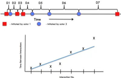
The index is a simple calculation computed as follows: For each relationship all interactions between both nodes that compose the tie are gathered in a list and ordered by time. The delta between each interaction is calculated resulting in N-‐1
deltas for N interactions. The deltas are plotted sequentially as Cartesian points with each interaction plotted along the X-‐axis and the value of the delta as the y-‐value.
from the first interaction between the two nodes until the very last interaction of every node in the entire network. This assumes the relationship remains in existence from the start of the relationship until the last known time period of the network. In an effort not to bias the amount of time between the last interaction and the end of the total time for the network, if the time between the last interaction and the end of the network is greater than the average of all deltas, the value is used. If it is less than the average, it is discarded. The reasoning is as follows: If two people email each other every day at 8AM and the network sample goes from 7AM Mon – 9AM Sun, the last delta between each node will still be 24 hours but the time between the last interaction and the end of the network will be one hour. If that one-‐hour period is used in the calculation the slope will indicate a slight increase in activity. However, if the two nodes emailed every day except for the weekends, the last delta would be 24 hours but the tail would show an interaction lapse of 49 hours. In the former example we use this long tail as the relationship has faded in the time period of the network as it is entered. We account for issues of this nature without incorrectly biasing potential short interactions.
The index for the relationship is the slope of the trend line for the plotted data. A simple linear regression using least squares is used to calculate the slope of the trend line for the series of deltas. Slopes positive in nature indicate a decrease in activity, negative in nature indicates an increase in activity and those around 0indicate a stable relationship. As we calculate a slope using least squares, at least 3 interactions (or 2 deltas) are needed in order to classify a tie. Figure 1 provides a visualization of this calculation.
B. Reciprocity Index
Similar to the general activity index, the reciprocity index is calculated using a simple linear regression but the data used for the plots is substantially different. As we are dealing with reciprocal relationships, these relationships must be ones where the nodes reciprocate interactions between one another. Thus it is not as simple as one node emailing another in an email network, the other node must return the email or reciprocate the interaction in some form. Similar to the general activity index we will use deltas between interactions but here we will use the difference in the number of unreciprocated interactions between each reciprocation as the value. We will simply look at the number of one-‐sided interactions between a reciprocated interaction. That number will be the delta we will use in the least squares calculation. 3 interactions will not necessarily guarantee we can calculate an index unlike the previous index. Here we need 3 reciprocated interactions. One should note that the length of time between interactions is not taken in account as the index is calculated. Figure 2 visualizes how this index is calculated.
As NodeXL is used to implement these methods, we now turn to a discussion of how this is accomplished.
IV. Implementation
The calculation of the indices and the coloring methods were accomplishing by extending NodeXL. NodeXL is a free add-‐on to the Microsoft Excel program. It provides templates that visualize
Fig. 1 – Visualization of the calculation of the General Activity Index.
network data into node-‐link diagrams. Index calculation is made possible through the addition of a time-‐series tab, a calculation method and classifier dialogue for users to navigate as they classify and visualize the ties in their network data. Figure 3 shows the enhanced NodeXL ribbon with buttons to navigate new features.
Users must walk through a 3-‐step process to obtain the visualization: Input, calculation and visualization. Upon opening the new version of NodeXL users select the “Create Time Series” button and are presented with a tab to enter a time series for the network. Data is to be entered as a list of edges with timestamps for each edge. Timestamps are interactions between the nodes themselves. For an example in a Twitter dataset we could enter Tweets where a user mentions or Re-‐Tweets another Tweet. Each pair of users listed in the tweet would create an edge between the tweeter
and the user mentioned in the tweet and the timestamp would be the time the tweet was created. After creating the time series the user would select ‘Create Indices’ and the General Activity Index, Reciprocity Index and weight (number of interactions) of each edge is calculated. The
program assumes the data is from a directed graph and thus like edges (reversed in nature) share values. Thus the edge A-‐B which indicates edge A initiated an interaction with B will share the same values as B-‐A.
After calculating the indices the user then has the option to color the edges according to their classification. The ‘Color Ties’ button brings up the dialogue seen in Figure 4. The user has the option of assigning colors to edges based on Reciprocity Index or General Activity Index. For each index, color is assigned to one of 3 classifications: Increasing, Stable or Decreasing. Assignments to each classification are accomplished via the range slider at the bottom. Users can ignore the stable entity and color the graph with a binary representation by ignoring the stable label and coloring everything as increasing or decreasing by setting both range sliders to 0.
V. Results
Several datasets were visualized with the Tie Visualization extension during the testing phase of the software. Figure 5 presents a view of the NON dataset from November 2005 through August 2010. In this visualization blue indicates edges that are decreasing in general activity where red edges are those that are increasing inactivity and grey are those considered to be stable. Initial glances
Fig. 2 – Visualization of the calculation of the Reciprocity Index.
Fig. 3 – Additional Controls added to NodeXL Ribbon (highlighted in red box)
Fig. 4– Coloring dialogue added to NodeXL to allow the user to classify and color nodes after indices are calculated.
indicate that the network as a whole is slowing fizzling out as almost half of the relationships appear to be slowly dying. The exception lies in a single relationship that is thriving.
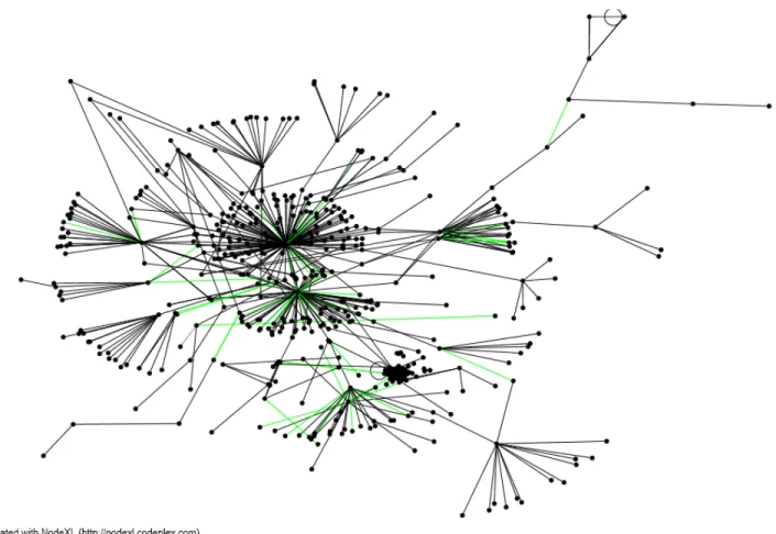
Perhaps a more intriguing visualization can be found using date from the VAST
2008 Cell Phone [10] mini-‐ challenge. Figure 6 has a binary coloring of that dataset. Edges are filtered such that only edges of weight 3 or more are shown. This filtering, in essence, not only removes relationships with low frequency but also provides a list of edges that guarantee a general activity index. Again black edges are fading and lime edges are flourishing. What is interesting to note in this visualization are the hub nodes, or the ones with a high betweenness centrality. The edges emanating from these edges are all black, indicating that the characters that were essentially the glue in this network have allowed their relationships with others to fade. Previous analyses of this network show that key roles of actors were switched to nodes of different identities to throw off the authorities.
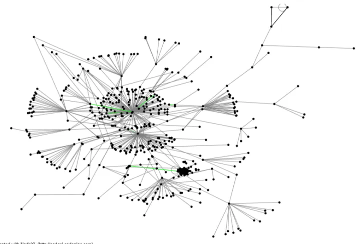
More recent data
visualized with this approach includes the social network behind
the Occupy Wall Street movement. For the month of November all Tweets that contained the #occupywallstreet hashtag on Twitter were gathered and archived in a database. At 1:30AM on November 15 the New York City Police Department conducted a raid on Liberty Square in an effort to clean the park, thereby disrupting the movement and its populous. Figures 6 and 7 are the Twitter social networks behind the OWS movement from 10PM November 14 – 4AM November 15. Figure 7 visualizes the general activity index and figure 8 visualizes the reciprocity index.
The graph is again filtered much like the VAST network to only show edges of weight 3 or higher. One should note that the daily volume of Tweets increased 1000% from the previous week during the 24-‐hour period starting at the point of the raid. It is interesting to note how activity declined over this period. Investigation into the political nature of the hub nodes indicate they are in favor of the OWS movement. Perhaps the timing of early morning hours police activity is the cause behind a weakened social network despite one of its more critical periods. Clearly people were tweeting as indicated by the volume of tweets, but the interactions between key figures is not flourishing
Fig. 5 – NON network of blog replies. Blue indicate fading relationships between users, grey are stable relationships and the single red tie is the only considered to be flourishing.
Fig. 6 – 2008 VAST Cell Phone Challenge. Hub nodes are all fading. This is a relic of key figures of the network changing identities near the end of a 10-day activity.
in general through this time.
Reciprocity is, however, increasing where calculations are possible. Only a few ties are subject to the calculation (as figure 7 would suggest), yet those who are talking to/mentioning each are doing so, they are do so more often. Further research could look at these traits and see if similar patterns are found in protesting movements as well as seeing if successful movements contain different behaviors compared to unsuccessful movements.
VI. Challenges / Future work
Despite the ability to visualize networks and calculate the different indices for networks with ease this effort has room for improvement. Most noticeably with this extension to NodeXL is the performance. Calculating the indices for a network with thousands of entries in a time series is computationally challenging. Representing a network through a time series expands the size of the network and space needed. Where NodeXL can easily work with a hundred or so nodes with ease
doing so over time can be a challenge. If every link of a network has 10 distinct time points or interactions, the space is now 10 times the size of the same static network. Calculation of large networks such as the #occupywallstreet network took well over 30 minutes. Efforts to filter out nodes that do not factor into the calculations prior to computation or parallel processing can be explored.
Aside from technical issues that can make the tool unbearable at times there exist other areas where NodeXL can be enhanced to further the tie visualization capabilities. Currently the time series of the network defines the temporal period that the network is visualized over. A time slider that re-‐ calculates the indices and re-‐colors the edges as a user navigates with the slider could help better identify critical moments within the network. Currently one must chose a time period and explore the network as it is entered. This feature, however, greatly depends on the ability to quickly calculate the indices for each edge.
Fig. 8 – Social network showing evolution of general activity from #occupywallstreet hashtag on Twitter from 10PM 11/14 – 4AM 11/15. Black edges are those that are fading and lime edges are the few that are thriving.
The current method to color the ties upon calculations is in need of tuning. The slider present should be accompanied with a histogram to aid the user in defining the breaking point between increasing, stable and decreasing points. Additionally NodeXL has the ability to vary color over a range of values for edges or nodes. The built-‐ in feature does not work with general activity or reciprocity indices as the indices can be skewed towards one side or the other, providing false coloring schemes. The ability to refine the gradual transition of color form increasing <-‐> decreasing might remove the need to distinctly classify relationships.
Though accurate in the ability to identify a change in reciprocity between two nodes, it is unclear how valuable such a metric or visualization method is. No clear insights were gained as the datasets presented in this paper were analyzed. Further investigation into other datasets are needed before a determination can be made. Furthermore the results presented in this paper were made solely by the author of the paper.
Additionally this work could benefit from a user study to effectively evaluate the value of these methods. Such a user study should investigate the usability of the additional dialogues and methods added as well as the ability for users to provide insights to datasets through a controlled experiment. This approach and methods discussed in this paper were shared with a leading expert in the field of information visualization. He confirmed the academic field has an increased interested in investigating and visualizing reciprocity and this attempt, though limited does offer merit.
Lastly this paper discusses ways to classify and visualize edges in a link-‐node diagram in an effort to identify varying relationships. Similar index calculations and coloring techniques could extend to nodes as well. [9]’s reciprocity index could possibly be used to classify and color different nodes in a network.
VII. Conclusion
Fig. 6 – Social network showing evolution of general activity from #occupywallstreet hashtag on Twitter from 10PM 11/14 – 4AM 11/15. Black edges are those that are fading and lime edges are the few that are thriving.
This paper presents a method for
classifying and visualizing tie in a social network through NodeXL. We extended the current NodeXL software by allowing the entry of a time series network. From there we classified if networks were increasing, remaining stable or decreasing in either general activity or reciprocity. Using NodeXL users can color the edges to gain a further insight of how the network has evolved over time through one static image.
References
[1] Garlaschelli, D., and Loffredo, M., Patterns of link reciprocity in directed networks. Physics Review Letters, 93, 2004.
[2] Gilbert, E. and Karahalios, K., Predicting Tie Strength With Social Media. In Proc. of CHI, 2009.
[3] Gove, R., Gramsky, N., Kirby, R., Sefer, E., Sopan, A., Dunne, C., Shneiderman, B. and Taieb-‐Maimon, M., NetVisia: Heat map & matrix visualization of dynamic social network statistics & content, Proc. IEEE Conference on Social Computing, IEEE Press, Piscataway, NJ (October 2011).
[4] Granovetter, M. S., The strength of weak ties. American Journal of Sociology, 78:1360–1380, 1973.
[5] Kossinets, G., Watts, D., Empirical analysis of an evolving social network. Science, 311:88 – 90, 2006.
[6] Khurana, U., Nguyen, V., Cheng, H., Ahn, J., Chen, X., Shneiderman, B., Visual analysis of temporal trends in social networks using edge color coding and metric timelines, Proc. IEEE Conference on Social Computing, IEEE Press, Piscataway, NJ (October 2011).
[7] Perer, A., Shneiderman, B., and Oard, D. W., Using rhythms of relationships to understand e-‐mail archives. J. Am. Soc. Inf.
Sci. Technol., 57(14):1936–1948, 2006.
[8] Sankaranarayanan, K. Visualizing Reciprocity In an Online Community To Motivate Participation. Masters Thesis, University of Saskatchewan, Saskatoon. 141 p.
[9] Zhang, H.; Dantu, R.; Cangussu, J. W. Quantifying Reciprocity in Social Networks. CSE (4). [S.l.]: IEEE Computer Society. 2009. p. 1031-‐1035.
[10]
http://www.cs.umd.edu/hcil/VASTchallenge08/