Worcester Polytechnic Institute
Digital WPI
Masters Theses (All Theses, All Years) Electronic Theses and Dissertations
2005-01-11
Clutter-Based Dimension Reordering in
Multi-Dimensional Data Visualization
Wei Peng
Worcester Polytechnic Institute
Follow this and additional works at:https://digitalcommons.wpi.edu/etd-theses
Repository Citation
Peng, Wei, "Clutter-Based Dimension Reordering in Multi-Dimensional Data Visualization" (2005).Masters Theses (All Theses, All Years). 65.
Clutter-Based Dimension Reordering in Multi-Dimensional
Data Visualization
by Wei Peng
A Thesis
Submitted to the Faculty of the
WORCESTER POLYTECHNIC INSTITUTE In partial fulfillment of the requirements for the
Degree of Master of Science in
Computer Science by
January 2005 APPROVED:
Professor Matthew O. Ward, Thesis Advisor
Professor Daniel J. Dougherty, Thesis Reader
Abstract
Visual clutter denotes a disordered collection of graphical entities in information visualization. It can obscure the structure present in the data. Even in a small dataset, visual clutter makes it hard for the viewer to find patterns, relationships and structure.
In this thesis, I study visual clutter with four distinct visualization techniques, and present the concept and framework of Clutter-Based Dimension Reordering (CBDR). Dimension order is an attribute that can significantly affect a visualiza-tion’s expressiveness. By varying the dimension order in a display, it is possible to reduce clutter without reducing data content or modifying the data in any way.
Clutter reduction is a display-dependent task. In this thesis, I apply the CBDR framework to four different visualization techniques. For each display technique, I determine what constitutes clutter in terms of display properties, then design a metric to measure visual clutter in this display. Finally I search for an order that minimizes the clutter in a display. Different algorithms for the searching process are discussed in this thesis as well.
In order to gather users’ responses toward the clutter measures used in the Clutter-Based Dimension Reordering process and validate the usefulness of CBDR, I also conducted an evaluation with two groups of users. The study result proves that users find our approach to be helpful for visually exploring datasets. The users also had many comments and suggestions for the CBDR approach as well as for visual clutter reduction in general. The content and result of the user study are included in this thesis.
Acknowledgements
With my greatest sincerity I would like to thank my advisor, Professor Matt Ward, for his patient guidance and inspirational advice. His unique “walkie-talkie” style meetings are great experience that I will be missing even years later. I would like to express my gratitude to Professor Elke Rundensteiner for her insightful com-ments and invaluable contributions to my work. And I want to thank my thesis reader, Professor Dan Dougherty, who read this work thoroughly and gave me valu-able feedback and kind encouragement.
I would also like to thank the Xmdv group: Jing Yang, Anil Patro, Nishant Mehta, and Shiping Huang for generously sharing their research experience and unselfish help. Also, I want to thank my user study subjects for their valuable time and feedback.
Last but not least, I would like to thank my parents and friends, who have always been very supportive and never lost faith in me. I also want to dedicate this thesis to my two grandparents who passed away while I was pursuing my master’s degree.
Contents
1 Introduction 1
1.1 Exploratory Data Analysis and Data Visualization . . . 1
1.2 Multi-Dimensional Data Visualization . . . 2
1.3 Visual Clutter Reduction in Multi-Dimensional Data Visualization . . 3
1.4 Dimension Reordering in Multi-Dimensional Data Visualization . . . 5
1.5 Goals of This Thesis . . . 6
1.6 Overview of The Approach . . . 7
1.7 Organization . . . 8
2 Related Work 10 2.1 Clutter Reduction Techniques . . . 10
2.1.1 View Related Approaches . . . 10
2.1.2 Data Related Approaches . . . 14
2.2 Reordering Techniques in Data Visualization . . . 17
2.2.1 Reordering in General . . . 17
2.2.2 Dimension Reordering . . . 18
3 XmdvTool 20 3.1 Parallel Coordinates . . . 21
3.3 Star Glyphs . . . 23
3.4 Dimensional Stacking . . . 24
4 Clutter-Based Dimension Reordering in Parallel Coordinates 25 4.1 Clutter Analysis of Parallel Coordinates . . . 25
4.2 Clutter Measure in Parallel Coordinates . . . 27
4.2.1 Defining and Computing Clutter . . . 27
4.2.2 Deciding Dimension Order . . . 29
4.3 Example . . . 29
5 Clutter-Based Dimension Reordering in Scatterplot Matrices 30 5.1 Clutter Analysis in Scatterplot Matrices . . . 30
5.2 High-Cardinality Clutter Measure in Scatterplot Matrices . . . 32
5.2.1 Defining and Computing Clutter . . . 32
5.2.2 Deciding Dimension Order . . . 34
5.3 Low-Cardinality Clutter Measure in Scatterplot Matrices . . . 35
5.3.1 Defining and Computing Clutter . . . 35
5.3.2 Deciding Dimension Order . . . 35
5.4 Example . . . 35
6 Clutter-Based Dimension Reordering in Star Glyphs 37 6.1 Clutter Analysis in Star Glyphs . . . 37
6.2 Clutter Measure in Star Glyphs . . . 38
6.2.1 Defining and Computing Clutter . . . 38
6.2.2 Deciding Dimension Order . . . 39
7 Clutter-Based Dimension Reordering in Dimensional Stacking 42
7.1 Clutter Analysis in Dimensional Stacking . . . 42
7.2 Clutter Measure in Dimensional Stacking . . . 44
7.2.1 Defining and Computing Cluttern . . . 44
7.2.2 Deciding Dimension Order . . . 44
7.3 Example . . . 45
8 Analysis of Reordering Algorithms 46 9 User Study 49 9.1 Testing Procedure . . . 50
9.2 Testing Results . . . 51
9.3 User Comments . . . 53
10 Conclusion and Future Work 55 10.1 Conclusion . . . 55
10.2 Future Work . . . 56
A User Study Materials 58 B User’s Manual 69 B.1 Running XmdvTool . . . 69
B.2 Dimension Reordering Module . . . 72
B.3 Reordering Parameters . . . 72
B.3.1 General Reordering Parameters . . . 73
B.3.2 Similarity-Based Dimension Reordering Parameters . . . 74
List of Figures
1.1 Parallel Coordinates . . . 4 1.2 Cluttered Parallel Coordinates . . . 4 2.1 Visualizations of housing cost (x axis) and income (y axis) of states
in the United States before and after semantic zooming according to information density. Figure taken from [1] . . . 12 2.2 Directory visualization using Sunburst system. Figure taken from
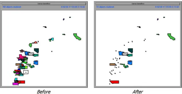
http://www.cc.gatech.edu/gvu/ii/sunburst/ . . . 13 3.1 Parallel Coordinates visualization of Detroit crime dataset (7
dimen-sions, 13 data items). . . 21 3.2 Scatterplot Matrices visualization of Iris dataset (4 dimensions, 150
data items). . . 22 3.3 Star Glyphs visualization of Detroit crime dataset (7 dimensions, 13
data items). . . 23 3.4 Dimensional Stacking visualization of Iris dataset (4 dimensions, 150
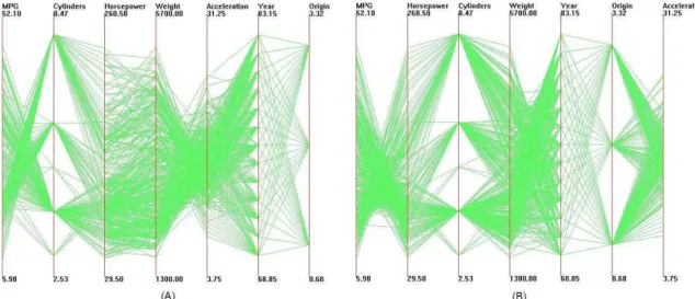
data items). . . 24 4.1 Parallel coordinates visualization of Cars dataset. Outliers are
4.2 Parallel coordinates visualization of Cars dataset after clutter-based dimension reordering. Outliers are highlighted in (b). . . 26 5.1 Scatterplot matrices visualization of Cars dataset. In (a) dimensions
are randomly positioned. After clutter reduction (b) is generated. The first four dimensions are ordered with the high-cardinality dimen-sion reordering approach, and the other three dimendimen-sions are ordered with the low-cardinality approach. . . 32 5.2 Illustration of distance calculation in scatterplot matrices. . . 33 6.1 The two glyphs in (a) represent the same data points as (b), with a
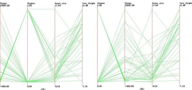
different dimension order. . . 38 6.2 Star glyph visualizations of Coal Disaster dataset. (a) represents the
data with original dimension order, having a clutter count of 488, and (b) shows the data after clutter is reduced, clutter count is 190. The shapes on (b) should mostly appear simpler. . . 41 7.1 Dimensional stacking visualization for Iris dataset. (a) represents the
data with original dataset, and b) shows the data with clutter reduced. 43 A.1 Parallel coordinates visualizations of the Acorns Dataset. . . 58 A.2 Parallel coordinates visualizations of the Cars Dataset. . . 59 A.3 Parallel coordinates visualizations of the Cereal Dataset. . . 59 A.4 Parallel coordinates visualizations of the Coal Disaster Dataset. . . . 60 A.5 Parallel coordinates visualizations of the Detroit Crime Dataset. . . . 60 A.6 Parallel coordinates visualizations of the Iris Dataset. . . 61 A.7 Parallel coordinates visualizations of the Rubber Dataset. . . 61 A.8 Scatterplot matrix visualizations of the Acorns Dataset. . . 62
A.9 Scatterplot matrix visualizations of the Cars Dataset. . . 62
A.10 Scatterplot matrix visualizations of the Cereal Dataset. . . 63
A.11 Scatterplot matrix visualizations of the Coal Disaster Dataset. . . 63
A.12 Scatterplot matrix visualizations of the Detroit Crime Dataset. . . 63
A.13 Scatterplot matrix visualizations of the Iris Dataset. . . 64
A.14 Scatterplot matrix visualizations of the Rubber Dataset. . . 64
A.15 Scatterplot matrix visualizations of the Voy Dataset. . . 64
A.16 Star glyph visualizations of the Acorns Dataset. . . 65
A.17 Star glyph visualizations of the Coal Disaster Dataset. . . 65
A.18 Star glyph visualizations of the Detroit Crime Dataset. . . 66
A.19 Star glyph visualizations of the Iris Dataset. . . 66
A.20 Star glyph visualizations of the Rubber Dataset. . . 66
A.21 Dimensional stacking visualizations of the Acorns Dataset. . . 67
A.22 Dimensional stacking visualizations of the Coal Disaster Dataset. . . 67
A.23 Dimensional stacking visualizations of the Iris Dataset. . . 68
A.24 Dimensional stacking visualizations of the Rubber Dataset. . . 68
B.1 Open XmdvTool and load datasets . . . 69
B.2 Parallel Coordinates visualization of Iris dataset. . . 70
B.3 Scatterplot Matrix visualization of Iris dataset. . . 70
B.4 Star Glyphs visualization of Iris dataset. . . 71
B.5 Dimensional Stacking visualization of Iris dataset. . . 71
B.6 Activate the Dimension Reordering function. . . 72
B.7 The Dimension Reorder dialog box for similarity-based dimension reordering. . . 73
B.8 The Dimension Reorder dialog box for clutter-based dimension re-ordering. . . 74
List of Tables
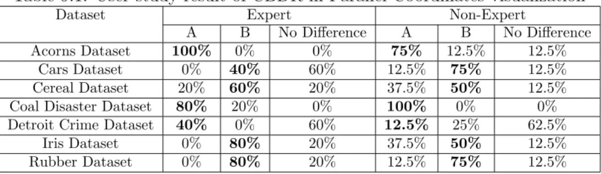
8.1 Table of computation times using optimal ordering algorithm . . . 46 8.2 Table of computation times using heuristic algorithms . . . 48 9.1 User study result of CBDR in Parallel Coordinates visualization . . . 51 9.2 User study result of CBDR in Scatterplot Matrices visualization . . . 52 9.3 User study result of CBDR in Star Glyph visualization . . . 53 9.4 User study result of CBDR in Dimensional Stacking visualization . . 53
Chapter 1
Introduction
1.1
Exploratory Data Analysis and Data
Visual-ization
A picture is worth a thousand words.
- Chinese proverb
Exploratory data analysis (EDA), as opposed to confirmatory data analysis (CDA), was first defined by John Tukey [2, 3], with the goal to maximize the ana-lyst’s insight into a data set and into the underlying structure of a data set, while providing all of the specific items that an analyst would want to extract from a data set [4]. In EDA, the role of the researcher is to explore the data in as many ways as possible until a plausible “story” of the data emerges. As [4] summarized, this approach/philosophy for data analysis employs a variety of techniques (mostly graphical) to:
• maximize insight into a data set;
• extract important variables;
• detect outliers and anomalies;
• test underlying assumptions;
• develop parsimonious models; and
• determine optimal factor settings.
Many EDA techniques are graphical in nature, with a few quantitative tech-niques. They are often referred to as Data Visualization, which is a basic element in exploratory data analysis [4].
1.2
Multi-Dimensional Data Visualization
Multi-dimensional visualization is one sub-field of data visualization that focuses on multi-dimensional (multivariate) datasets. Multi-dimensional data can be defined as a set of entitiesE, where theith elementeiconsists of a vector withnvariables, (xi1,
xi2, ..., xin ). Each variable (dimension) may be independent of or interdependent
with one or more of the other variables. Variables may be discrete or continuous in nature, or take on symbolic (nominal) values. Applications such as censuses, surveys and simulations are some of the most common sources of multi-dimensional data.
Visual exploration of multi-dimensional data is of great interest in Statistics and Information Visualization. It helps the user find trends and relationships among dimensions. When visualizing multi-dimensional data, each variable may map to some graphical entity or attribute. According to the different ways for dimension-ality manipulation, we can broadly categorize the display techniques as:
• Axis reconfiguration techniques, such as parallel coordinates [5, 6] and glyphs [7, 8, 9, 10, 11].
• Dimensional embedding techniques, such as dimensional stacking [12] and worlds within worlds [13].
• Dimensional subsetting, such as scatterplot matrices [14].
• Dimensional reduction techniques, such as multi-dimensional scaling [15, 16, 17], principal component analysis [18], and self-organizing maps [19].
1.3
Visual Clutter Reduction in Multi-Dimensional
Data Visualization
A good visualization clearly reveals structure within the data and thus can help the viewer to better identify patterns and detect outliers. Visual clutter, on the other hand, is characterized by crowded and disordered visual entities that obscure the structure in visual displays. In other words, visual clutter is the opposite of visual structure; it corresponds to all the factors that interfere with the process of finding structures. Clutter is certainly undesirable since it hinders viewers’ understanding of the content of the displays. However, when the number of dimensions or data items grows high, it is inevitable for displays to exhibit some clutter, no matter what visualization method is used. For example, Figure 1.1 denotes the parallel coordinates visualization of the Iris dataset (4 dimensions, 150 data items), and Figure 1.2 represents the AAUP salary dataset (14 dimensions, 1161 data items). For the Iris dataset, each individual green line is well separated and easy to identify, while for the AAUP dataset, the number of data items and dimensionality both exceed those in the Iris dataset, resulting in more axes and polylines on the screen and cluttering the display. It is much more difficult for the viewer to identify individual data items or find patterns in the AAUP dataset.
Figure 1.1: Iris dataset (4 dimen-sions, 150 data items) in Parallel Co-ordinates.
Figure 1.2: AAUP salary dataset (14 di-mensions, 1161 data items) in Parallel Co-ordinates.
Clutter reduction in data visualization is not a simple problem with one solution or one type of solution, due to the variety of visualization techniques and analysis goals. As stated before, the crowded and disordered visual entities are the compo-nents of visual clutter in a display. Obviously, visual entities vary from one type of visualization to another, and thus so do the definitions of “structure” and “pattern”. As a result, there is no one “magic” solution to address the clutter reduction prob-lem as a whole; instead, various distinct approaches have been proposed to address this problem from different perspectives. Some of these target reducing the density of visual entities, such as lines, dots and shapes, while others try to organize the entities in a certain way to enhance the structure in a display so that it can be better interpreted.
In multi-dimensional data visualization, the clutter reduction problem has been widely discussed. Typical approaches include multi-resolution techniques [20, 21, 22], dimensionality reduction [18, 15, 17, 19], and distortion [23, 24]. These ap-proaches attack this problem focusing on different aspects of the dataset and dis-play, and thus make it possible to reduce clutter under different conditions. However,
each approach has its own advantages and disadvantages, working well with some displays and tasks, but performing poorly with others. What is more, to serve the purpose of clutter reduction, these solutions choose to sacrifice some information that’s considered “unimportant”. They either sacrifice the integrity of the data or fail to generate an unbiased representation of the data. Under some circumstances, this is acceptable and even desirable, especially when the user wants to obtain an overall image of the data and does not care very much about the details and pre-cision. However, there are also cases where the user wants to reduce clutter in a display as much as possible without losing any information or getting any incor-rect information. The current approaches, unfortunately, don’t cope well with these goals. In order to complement these approaches by reducing clutter in visualization techniques while retaining the information in the display, I have developed a clutter reduction technique using dimension reordering.
1.4
Dimension Reordering in Multi-Dimensional
Data Visualization
In many multivariate visualization techniques, such as parallel coordinates [5, 6], glyphs [7, 8, 9, 10, 11], scatterplot matrices [14] and pixel-oriented methods [25], di-mensions are positioned in some one- or two-dimensional arrangement on the screen [26]. Given the 2-D nature of this medium, some order or organization of the di-mensions must be assumed. This organization can have a major impact on the expressiveness of the visualization. Different orders of dimensions can reveal differ-ent aspects of the data and affect the perceived clutter and structure in the display, causing completely different conclusions to be drawn based on each display. Unfor-tunately, in many existing visualization systems that encompass these techniques,
dimensions are usually ordered without much care. In fact, dimensions are often displayed by the default order in the original dataset. Realizing the importance of dimension order in a multi-dimensional visualization, we choose it to be our object to work on for clutter reduction.
Manual dimension reordering is available in some systems. For example, Polaris [27] allows users to manually select and order the dimensions to be mapped to the display. Similarly, in XmdvTool [26], users can manually change the order of dimensions from a reconfigurable list of dimensions. However, the exhaustive search for the best order is tedious even for a modest number of dimensions. Also, the user will have difficulty remembering all the views and corresponding dimension orders she has traversed. Therefore, we are in need of a way to automatically search for the best dimension order in a display.
1.5
Goals of This Thesis
Visual clutter reduction is a visualization-dependent task because visualization tech-niques vary largely from one to another. However, by experimenting with a few pre-vailing visualization techniques, we can demonstrate the importance of dimension order in terms of clutter reduction and acquire guidelines that are also applicable in other visualization techniques.
The basic goal of this thesis is to:
• present the concept of Clutter-Based Dimension Reordering (CBDR),
• sketch a general framework for performing the clutter-reduction task using dimension reordering,
pop-ular multivariate data visualization techniques.
The Clutter-Based Dimension Reordering approach has two primary advantages: (1) the display retains all the information in the data after clutter reduction; (2) the optimal dimension order is derived automatically, so as to lessen the burden from the user’s side. Hopefully this solution will remedy the shortcomings of the current tools in some way, and this general framework will be of use for clutter reduction in other multi-dimensional visualization techniques.
1.6
Overview of The Approach
Gestalt Laws [28] are robust rules of pattern perception. These laws emphasize that we perceive objects as well-organized patterns rather than separate component parts. According to [29], the focal point of Gestalt theory is the idea of ”grouping,” or how we tend to interpret a visual field or problem in a certain way. The main factors that determine grouping are:
• proximity - how elements tend to be grouped together depending on their closeness.
• similarity - how items that are similar in some way tend to be grouped together.
• closure - how items are grouped together if they tend to complete a pattern.
• simplicity - how items are organized into figures according to symmetry, reg-ularity, and smoothness.
We use these laws as our guidelines for defining visual clutter and structure. In the following chapters, the definition and measure for specific visualizations will be discussed respectively, following the Gestalt laws.
I implemented the work in the context of the XmdvTool [26, 30] project, a public domain visualization system that integrates multiple techniques for displaying and visually exploring multi-dimensional data. Among these, parallel coordinates [5, 6], scatterplot matrices [14], star glyphs [9] and dimensional stacking [12] are the focused visualization techniques.
In order to automate the dimension reordering process for a visualization gener-ated by XmdvTool, we are concerned with three issues:
1. determining the way clutter manifests itself in the display, 2. designing a metric to measure visual clutter, and
3. arranging the dimensions for the purpose of clutter reduction.
I will discuss the CBDR process applied to four visualization techniques sepa-rately, one per chapter. I follow the same framework in all of them. Within each chapter, I first determine the visual characteristics that would be labeled as clut-ter, and then carefully define a metric for measuring clutter. The clutter analyses and measures I provide are specifically tuned to each individual technique, which are quite different due to the diversity of the four techniques. At the end of each chapter, I apply an optimal ordering algorithm to arrange the dimensions to achieve the best order under our clutter measure. Heuristic reordering algorithms that can significantly reduce processing time are discussed in a separate chapter.
1.7
Organization
This thesis is organized as follows. Chapter 2 provides a review of related work in current clutter reduction and dimension reordering techniques in data visual-ization. Chapter 3 gives an overview of the XmdvTool system. Chapters 4, 5, 6
and 7 describe the Clutter-Based Dimension Reordering framework for four differ-ent visualization techniques respectively. In Chapter 8, algorithms for dimension reordering are discussed. Chapter 9 presents the results from an evaluation targeted at the users’ ability to distinguish the improved visualizations from the original one. Chapter 10 concludes the thesis and points out directions for future work.
Chapter 2
Related Work
2.1
Clutter Reduction Techniques
Many approaches have been proposed to overcome the clutter problem in data visual-ization from various perspectives. We can classify the strategies into two categories: View Related and Data Related.
In view related approaches, the spatial characteristics of graphical entities are modified to address the clutter problem. Techniques such as distortion and zooming are view related techniques. Data related approaches reduce the dataset itself by clustering, sampling and filtering, resulting in a view with fewer graphical entities, thereby reducing the clutter in a view. Both the data volume and dimensionality can be reduced in multi-dimensional datasets.
2.1.1
View Related Approaches
Zoom/Semantic Zoom Techniques
Zooming is an intuitive method to facilitate the user in retrieving information in a dense display. It allows the user to zoom in and out on the interesting objects.
Most visualization systems support zoom in/out; Treemap [31], Xgobi [32], DataS-pace [33], and XmdvTool [26, 30] are among those that support this functionality. Zooming helps to remove unnecessary information from the display and make the interesting objects easier to examine. However, due to this very nature, the user can only explore one part of the data at a time, and thus can lose track of the global context.
In systems that involve a spatial metaphor, a common technique is to automat-ically change the representation of objects as the user zooms. This functionality is described as semantic zooming [34, 35, 1]. Pad [34] and Pad++ [35] are two graph-ical interfaces intended to be alternatives to traditional windows and icon-based approaches to interface design. Objects in these systems (such as a text file, a clock program, or a personal calendar) can be represented differently as the user zooms in and out on them. For example, when a text document is small on the screen the user may only want to see its title. As the object is zoomed in, this may be augmented by a short summary or outline. At some point the entire text is revealed. Woodruff et al. [1] applied the cartographic Principle of Constant Information Density in in-teractive visualizations of cartographic and non-cartographic data. They supported two density metrics, number of objects and number of vertices. As the user zooms in or out, the shape and size of displayed objects will change accordingly to keep the information density constant. Figure 2.1 is an example of semantic zooming in DataSplash [36], a database visualization system. These techniques will reduce the clutter only when the objects have multiple spatial metaphors.
Distortion Techniques
Distortion is a widely used technique for visually exploring dense information dis-plays. Distortion-oriented techniques allow the user to examine a local area in detail
Figure 2.1: Visualizations of housing cost (x axis) and income (y axis) of states in the United States before and after semantic zooming according to information density. Figure taken from [1]
on a section of the screen, and at the same time present a global view of the space to provide an overall context to facilitate navigation [24]. By intentionally disregarding some details in the uninteresting area, distortion techniques can significantly unclut-ter the view so that the inunclut-teresting area can take up more space and be carefully examined.
Focus+Context techniques are applied in many multi-resolution visualization systems, including Radial, Space-Filling (RSF) hierarchy visualizations [37, 38, 39]. Andrews and Heidegger’s information slices technique [37] uses two semi-circular ar-eas to represent a file system. By selecting a focus (typically small) directory in an overview window and displaying that directory and its descendant file/directories in the other view, they provide a form of two-level “overview and detail” information visualization. Stasko et al. proposed another file system examination tool, Sunburst [38], that employs three major techniques to show the focus+context of the hierar-chy, namely the Angular Detail method, the Detail Outside method and the Detail
Inside method. The Angular Detail method first shrinks the overview hierarchy and moves it to the boundary of the window, then expands the selected item and its children radially outward to occupy a larger display area. The Detail Outside method first shrinks the entire hierarchy to the center of the window, and then ex-pands the selected item and its children to be a new complete circular ring-shaped region around the overview. The Detail Inside method works similarly to Detail Outside, except that it pushes the overview outward to take a large ring shape and expands radially the selected item as well as its children to occupy the center of the display. Figure 2.2 illustrates an example of Focus+Context visualization using the Sunburst system. Yang et al. visualized hierarchies of dimensions using a system called InterRing [39]. This system allows the user to distort a node both circularly and radially. The circular distortion of a node and its children is done by increasing or decreasing the sizes of its siblings, but the size of the selected node can’t exceed that of its parent. The radial distortion can increase or decrease the thickness of the selected layer by changing those of the other layers.
Figure 2.2: Directory visualization using Sunburst system. Figure taken from http://www.cc.gatech.edu/gvu/ii/sunburst/
presenta-tion strategy with the motivapresenta-tion of providing a balance of local detail and global context. The essence of this technique is called thresholding. Each information element in a hierarchical structure is assigned a number based on its relevance (a priori importance or API) and a second number based on the distance between the information element under consideration and the point of focus in the structure. A threshold value is then selected and compared with a function of these two numbers to determine what information is to be presented or suppressed. Consequently, the more relevant information will be presented in great detail, and the less relevant information presented as an abstraction, based on a threshold value. The Fisheye View is a great technique for navigating dense charts, graphs and maps, where the user is concerned with graphical details and hopes to retain the global view at the same time.
The distortion techniques discussed above change the spatial relationship be-tween graphical entities, which is intentional in some visualizations but not proper for more accurate quantitative data exploration and analysis. What is more, in many visualizations, the user focuses not on the local details but on the overall trends and patterns in the dataset or relationships between dimensions; distortion is not sufficient to serve this purpose.
2.1.2
Data Related Approaches
In recent years, many techniques have been proposed to reduce the dataset size while preserving significant features. Some of these focus on reducing the number of data items to be visualized, and the others deal with high dimensionality.
Reducing Data Volume
There are many approaches towards reducing the size of a dataset for visualization. Some common ones are briefly described below.
Wavelets are mathematical functions that can be used to approximate data and analyze them at multiple scales. Wong and Bergeron [20] described the construc-tion of a multi-resoluconstruc-tion display using wavelet approximaconstruc-tions. They reduced the data volume through repeatedly merging neighboring points. The wavelet trans-forms identify averages and details present at each level of compression. They also incorporated the brushing functionality into their model and the brushed data are displayed at a higher resolution than the non-brushed ones. However, the wavelet transform requires data to be ordered, making it useful only for datasets with a natural ordering along one dimension, such as time-series data.
Wills [41] described a visualization technique for hierarchical clusters. He built his work upon the tree-map idea [31] by recursively subdividing the tree based on a similarity measure. Wills used the similarity measure as a value to control the clustering granularity. For instance, with a small value, fewer clusters with more elements could be shown. This measure also acted as a level-of-detail control for smooth transitions across tree-maps of different granularity. Their main purpose was to display the clustering results, and in particular, the data partitions at a given similarity value. Hence, the N-dimensional characteristics of the clusterings such as the mean or extents information were not displayed along with the tree-map.
Fua et al. [21] reduced data density by taking a hierarchical approach to structure the data. The data were displayed at a certain level of abstraction at any one time. The work was based on the XmdvTool [26] visualization system, and utilized varying translucency and a proximity-based coloring scheme that visually segregates data elements based on similarities. The population and extents of clusters were shown
with bands of varying translucency, resulting in a less cluttered view than that with all the data items being shown on the screen.
Reducing Dimensionality
High dimensionality is another source of clutter. Most traditional multi-dimensional visualizations become cluttered when the dimensionality of a dataset grows high. Many approaches exist for handling high-dimensional datasets.
Principal Component Analysis [18], Multi-dimensional Scaling [15, 16, 17], and Self Organizing Maps [19] are three major dimensionality reduction techniques used in data and information visualization. Principle Component Analysis (PCA) [18] attempts to project data down to a few dimensions that account for most vari-ance within the data. Multidimensional Scaling (MDS) [15, 16, 17] is an iterative non-linear optimization algorithm for projecting multi-dimensional data down to a reduced number of dimensions. Kohonen’s Self Organizing Map (SOM) [19, 42] is an unsupervised learning method to reduce multi-dimensional data to 2D feature maps [43].
Many new dimensionality reduction techniques also have been proposed to han-dle this problem. For example, Random Mapping [44] used a random transform matrix to project the high dimensional data to a lower dimensional space. [44] presented a case study of a dimension reduction from a 5781-dimensional space to a 90-dimensional one with Random Mapping. In [45, 46], an algorithm called An-chored Least Stress is developed to handle very large datasets when MDS alone does not suffice. This algorithm combines PCA and MDS and makes use of the result of data clustering in the high dimensional space. Yang et al. [47] proposed a visual hierarchical dimension reduction technique that groups dimensions into a hierarchy and constructs lower dimensional spaces using clusters of the hierarchy. This
tech-nique generates lower dimensional spaces meaningful to users, and it allows user interactions in most steps of the process.
These data-related approaches reduce the number of data items or the dimension-ality and map the lower data and dimension space to the screen for a less cluttered view. The major concern of these approaches is the data integrity. In order to cope with the clutter problem, these approaches unavoidably sacrifice some information in the original dataset during the clustering, sampling or filtering process.
2.2
Reordering Techniques in Data Visualization
2.2.1
Reordering in General
In information visualization, the order of visual entities can greatly impact the quality of a display. In some cases, entities have a natural order for all presentation goals. But in other cases, where they do not have an obvious order, they can be arranged carefully to enhance the displays.
Friendly et al. [48] designed a general framework for ordering information in visual displays according to the desired effects or trends, and presented several techniques for ordering items based on some desired criterion in different displays. Their idea, termed effect-ordered data displays, can be applied to the arrangement of unordered factors for quantitative data and frequency data, and to the arrangement of variables and observations in multi-dimensional displays.
Ma et al. [49] ordered categorical values by: (1) constructing natural clusters of categorical values based on domain semantics; (2) ordering values in the clusters; and (3) ordering the categorical values within each cluster. Rosario et al. [50] proposed a Distance-Quantification-Classing (DQC) approach for visualizing nominal values.
They transform the data and search for a set of independent dimensions that can be used to calculate the distance between nominal values. This distance is based on each value’s distribution across several other nominal variables. Based on the distance information, order and spacing can be assigned among the nominal values. In hierarchical cluster analysis, the terminal nodes of a tree can be arranged based on some criteria to best reveal the relationship between the nodes and enhance the visual display. Gruvaeus and Wainer [51] presented an algorithm that applied a series of tests for locally orienting the nodes so that objects displayed on the left and right edges of each cluster are adjacent to those objects outside the cluster to which they are most similar. Due to the large number of applications that construct trees for analyzing datasets, many different heuristics have been suggested to solve the problem of ordering the leaves of a binary hierarchical clustering tree [52, 53]. Particularly, it is intensely discussed in bioinformatics literature to better display gene microarrays [53, 54, 55, 56, 57].
2.2.2
Dimension Reordering
Dimension order is an important issue in visualization. Bertin [58] gave some ex-amples illustrating that permutations of dimensions and data items reveal patterns and improve the comprehension of visualizations.
Ankerst et al. [59] pointed out the importance of dimension arrangement for order-sensitive multidimensional visualization techniques. They defined the concept of similarity between dimensions and discussed several similarity measures, and proposed a method to arrange dimensions according to their similarities so that similar ones are adjacent to each other. They proved that their problem is an NP-complete problem by equating it to the Traveling Salesman Problem, and used an automatic heuristic approach to generate a solution.
Yang et al. [60] imposed a hierarchical structure over the dimensions themselves, grouping a large number of dimensions into a hierarchy so that the complexity of the ordering problem is reduced. They first order each cluster in the dimension hierarchy. For a non-leaf node, they use its representative dimension in the ordering of its parent node. Then, the order of the dimensions is decided by the order of the dimensions in a depth-first traversal of the dimension hierarchy. User interactions are then supported to make it practical for users to actively decide on dimension reduction and ordering in the visualization process.
In these two approaches, dimensions are reordered according to similarities be-tween dimensions. This is the proper thing to do when relationships bebe-tween di-mensions are the major concern of the user. Although their work is not directly related to the results of this thesis, the idea of using dimension ordering to improve dimension similarities inspired the technique of this thesis, ordering dimensions to reduce visual clutter in multi-dimensional data visualization.
Chapter 3
XmdvTool
XmdvTool is a multivariate visualization system developed by Ward et al. [26, 30] that integrates several techniques for displaying and visually exploring multivariate data. It is available on all UNIX platforms that support XR4 or higher. Xmdv-Tool 4.0 and later versions are also available on Windows95/98/NT platforms, and are based on OpenGL and Tcl/Tk. The current released version, XmdvTool 6.0 Alpha, supports four methods for displaying multi-dimensional data in both flat (non-hierarchical) and hierarchical form. The four techniques are scatterplot matri-ces [14], parallel coordinates [5, 6], star glyphs [9] and dimensional stacking [12]. By combining these different techniques within one system, XmdvTool enables users to explore their data in various views. The users can easily switch between the four views to discover trends and patterns, reveal relationships between dimensions and find outliers.
In addition, XmdvTool also supports a variety of interaction tools to assist users in navigating their data. For flat visualizations, the N-dimensional brush [30, 61] allows the user to interactively select subsets of the data by painting over them with a mouse so that they may be highlighted, deleted or masked. For hierarchical
visualizations, the structure-based brush [62, 63] is available to allow users to select subsets of data by specifying focal regions within the data hierarchy as well as a level-of-detail. Other major interaction tools include zooming/panning, interactive dimension reduction/distortion, and color scheme selection.
In the following sections we provide a brief introduction to the four visualization techniques available in XmdvTool. More detailed information about this tool can be obtained from [26].
3.1
Parallel Coordinates
Figure 3.1: Parallel Coordinates visualization of Detroit crime dataset (7 dimen-sions, 13 data items).
Parallel coordinates visualization [5, 6] is a technique pioneered in the 1980’s that has been applied to a diverse set of multidimensional analysis problems. Be-sides XmdvTool, it has been incorporated into many commercial and public-domain systems, such as WinViz [64] and SPSS Diamond [65].
In this method, each dimension corresponds to an axis, and the N axes are organized as uniformly spaced vertical or horizontal lines. A data element in an
N-dimensional space manifests itself as a polyline that traverses across all of the axes, crossing each axis at a position proportional to its value for that dimension.
Figure 3.1 shows a parallel coordinates display of the Detroit crime dataset, which has 7 dimensions (depicted by the vertical axes) and 13 data items (each depicted by a series of lines across the axes). The name of each dimension is shown on the top of each axis. The minimum and maximum values of each dimension are indicated at the two ends of each axis.
3.2
Scatterplot Matrix
Figure 3.2: Scatterplot Matrices visualization of Iris dataset (4 dimensions, 150 data items).
Scatterplots [14] are one of the oldest and most commonly used methods to project high dimensional data to 2-dimensions. Two data variables are used to specify the location of a dot or other marker on the plot. In a scatterplot matrix visualization of an N-dimensional dataset, N2
two-dimensional scatterplots are gen-erated, each giving the viewer a general impression regarding relationships within the data between pairs of dimensions. The plots are arranged in a grid structure to
help the user remember the dimensions associated with each projection. Figure 3.2 is a scatterplot matrix visualization of Iris dataset.
3.3
Star Glyphs
Figure 3.3: Star Glyphs visualization of Detroit crime dataset (7 dimensions, 13 data items).
A glyph [7, 8, 10, 11] is a representation of a data element that maps data values to various geometric and color attributes of graphical primitives or symbols. A Star glyph [9] is one type of glyph visualization. In this technique, each data element occupies one portion of the display window. Data values control the length of rays emanating from a central point. The rays are then joined by a polyline drawn around the outside of the rays to form a closed polygon. Figure 3.3 represents the Detroit crime dataset. The 13 data items are displayed with 13 glyphs, and the lengths of rays are proportional to the data values on the corresponding dimensions.
Figure 3.4: Dimensional Stacking visualization of Iris dataset (4 dimensions, 150 data items).
3.4
Dimensional Stacking
The dimensional stacking technique is a recursive projection method developed by LeBlanc et al. [12]. It displays an N dimensional dataset by recursively embed-ding pairs of dimensions within each other. Each dimension of the dataset is first discretized into a user-specified number of bins, which is termed the dimension cardi-nality. Then two dimensions are defined as the horizontal and vertical axes, creating a grid on the display. Within each box of this grid this process is applied again with the next two dimensions. This process continues until all dimensions are assigned. Each data point maps to a unique bin based on its values in each dimension, which in turn maps to a unique location in the resulting image (See Figure 3.4). In Xmdv-Tool, the dimensions are mapped to horizontal and vertical axes alternatively, from outer-most (slowest) to inner-most (fastest), based on their order in the input file.
Chapter 4
Clutter-Based Dimension
Reordering in Parallel Coordinates
4.1
Clutter Analysis of Parallel Coordinates
In the parallel coordinates display, as the axes order is changed, the polylines rep-resenting data points take on very distinct shapes. In Figures 4.1 and 4.2, the two displays depict the same dataset with different dimension orders. As can be seen in the figures, a parallel coordinates display makes inter-dimensional relationships between neighboring dimensions easy to see, but does not disclose relationships between non-adjacent dimensions. Therefore, our hope is that by changing the dimension orders, the inter-dimensional relationships of the dataset can be better revealed to the user.
According to the Gestalt Laws [28], users tend to perceive objects in groups and consider these groups to be more well-organized than separate components. Bearing this in mind, in parallel coordinates visualization, we conjecture that more clustered polylines between dimensions make pattern recognition easier for the user. In a
Figure 4.1: Parallel coordinates visualization of Cars dataset. Outliers are high-lighted in (b).
Figure 4.2: Parallel coordinates visualization of Cars dataset after clutter-based dimension reordering. Outliers are highlighted in (b).
display of parallel coordinates without data-related clutter reduction approaches, such as sampling, filtering or multi-resolution processing, if polylines between two dimensions can be naturally grouped into a set of clusters, we assume the user will likely find it easier to comprehend the relationship between them. Instead, if there are many lines that don’t belong to any cluster, the space between the two
dimensions can be very cluttered. These polylines make it hard for the viewer to find patterns and discover relationships; we refer to them as outliers. According to [4], the definition of outlier is:
Definition 1 An outlier is an observation that lies an abnormal distance from other values in a random sample from a population.
For clutter reduction in parallel coordinates visualization, we developed our own formal definition for an outlier in a dataset:
Definition 2 Let D be a dataset, and let i, jbe two variables. A data point d is an
outlier for iandj ifd’s Euclidean distance to any of the other data points is greater
than a defined number, t, in the two-dimensional space formed by i and j.
It is true that one of the strengths of parallel coordinates visualization is to help find outliers, but in our case, a lot of outliers between a pair of dimensions often indicates that there is little relationship between them. Since our goal is to disclose more relationships and patterns between dimensions, we want to minimize the impact from outliers; in other words, we carefully order the dimensions to avoid them.
4.2
Clutter Measure in Parallel Coordinates
4.2.1
Defining and Computing Clutter
With our conjecture discussed in the last section, we can define a visual clutter measure in parallel coordinates visualization. Due to the fact that outliers often obscure structure and thus confuse the user, clutter in parallel coordinates can be defined as the proportion of outliers against the total number of data points.
To reduce clutter in this technique, our task is to rearrange the dimensions to minimize the outliers between neighboring dimensions. In order to calculate the score for a given dimension order, we first count the total number of outliers between neighboring dimensions, Soutlier. If there are n dimensions, the number of
neighboring pairs for a given order is n−1. The average outlier number between dimensions is defined to beSavg =Soutlier/(n−1). LetStotal denote the total number
of data points. The clutter C, the proportion of outliers, can then be defined as follows: C =Savg/Stotal = Soutlier n−1 Stotal (4.1) Since n−1 and Stotal are both fixed for a given dataset, dimension orders that
reduce the total number of outliers also reduce clutter in the display according to our notion of clutter.
Now we are faced with the problem of how to decide if a data item is within a cluster or is an outlier. Since we have restricted the notion of clutter to the number of outliers within neighboring pairs of dimensions, we can use the normalized Euclidean distances between data points to measure their closeness. If a data point does not have any neighbor whose distance to it is less than threshold t, we treat it as an outlier. In this way, we are able to find all the data points that don’t have any neighbors within the distance t in the specified two-dimensional space. If the number of data points is m, this can be done in O(m2
) time. We do this for every pair of the n dimensions and store the outlier numbers in a outlier matrixM. The total time for building this matrix is O(m2
n2
). Given a dimension order, we can then decide the clutter in the display by adding up outlier numbers between neighboring dimensions.
the dataset, or develop algorithms that don’t involve thresholds. However, since we want to give the user more flexibility and interaction when ordering the dimensions, we believe that allowing the user to decide the thresholds for cluster distance is preferable. Thus the threshold here and those in the following chapters all can be user-defined, though each has a fixed default value.
4.2.2
Deciding Dimension Order
In a given dimension order, we can add up outlier numbers between neighboring dimensions in the display. This takes O(n) time. The optimal dimension order is decided by selecting the one dimension order that minimizes this number. This exhaustive search takes O(n!) time.
4.3
Example
Figures 4.1 and 4.2 both represent the Cars dataset. In Figure 4.1 the data is displayed with the default dimension ordering. Figure 4.2 displays the data after being processed with clutter-based ordering. In the rightmost image in each figure, polylines highlighted in red are outliers according to our clutter metric. With a glimpse we can identify more outliers in the original visualization than the improved one, which suggests the neighboring dimensions in the latter visualization are more closely related to each other. From our evaluations, we discovered that most users found that data points were better separated in the improved view and they could identify patterns and outliers more easily with this view.
Chapter 5
Clutter-Based Dimension
Reordering in Scatterplot
Matrices
5.1
Clutter Analysis in Scatterplot Matrices
In clutter reduction for scatterplot matrices, we focus on finding structure in plots rather than outliers, because the overall shape and tendency of data points in a plot can reveal a lot of information. Some work has been done in finding structures in scatterplot visualizations. PRIM-9 [66] is a system that makes use of scatterplots. In this system data is projected onto a two-dimensional subspace defined by any pair of dimensions. Thus the user can navigate all the projections and search for the most interesting ones. Automatic projection pursuit techniques [67] utilize algorithms to detect structure in projections based on the density of clusters and separation of data points in the projection space to aid in finding the most interesting plots.
struc-ture, but also can view and compare the relationships between these plots. Since all orthogonal projections are displayed on the screen, changing the dimension or-der does not result in different projections, but rather a different placement of the pairwise plots. According to the Gestalt Laws [28], proximity is a factor which will affect the user’s perception of groupings. The conjecture with the scatterplot matrices visualization technique is that similar plots should be placed near each other. Specifically, we assume the user would find it beneficial to have projections that disclose a related structure to be placed next or close to each other in order to reveal important dimension relationships in the data. To make this possible, we have defined a clutter measure for scatterplot matrices. The main idea is to find the structure in all 2-dimensional projections and use it to determine the position of dimensions so that plots displaying a similar structure are positioned near each other.
Figure 5.1 gives two views of a scatterplot matrix visualization. In this type of visualization, we can separate the dimensions into two categories: high-cardinality dimensions and low-cardinality dimensions. In high-cardinality dimensions, data values are often continuous, such as height or weight, and can take on any real number within the range. In low-cardinality dimensions, data values are often dis-crete, such as gender, type, and year. These data points often take a small number of possible values. It is often perceived that plots involving only high-cardinality dimensions will place dots in a irregular cloud-like shape, while plots involving low-cardinality dimensions will place dots in straight lines because a lot of data points share the same value on this dimension. In this thesis, we determine if a dimension is high or low-cardinality depending on the ratio of its cardinality and the pixel number of the scatterplots’ sides. If it exceeds the specified threshold, then the dimension is considered high-cardinality, otherwise low-cardinality.
Figure 5.1: Scatterplot matrices visualization of Cars dataset. In (a) dimensions are randomly positioned. After clutter reduction (b) is generated. The first four dimensions are ordered with the high-cardinality dimension reordering approach, and the other three dimensions are ordered with the low-cardinality approach.
We will treat high-cardinality and low-cardinality dimensions separately because they generate different plot shapes. The clutter definition and clutter computation algorithms for these two classes of dimensions will differ from each other.
5.2
High-Cardinality Clutter Measure in
Scatter-plot Matrices
5.2.1
Defining and Computing Clutter
The correlation between two variables reflects the degree to which the variables are associated. The most common measure of correlation is the Pearson Correlation Coefficient [68], which can be calculated as:
r= P i(xi−xm)(yi−ym) q P i(xi −xm)2 q P i(yi−ym)2 (5.1)
xm and ym represent the mean value of the two dimensions.
Since plots similarly correlated will likely display a similar pattern and tendency, we can calculate the correlations for all the two-dimensional plots (in fact half of them because the matrix is symmetric along the diagonal), and reorder the dimen-sions so that plots whose correlation differences are within threshold t are displayed as close to each other as possible. To achieve this goal, we define the sum of the dis-tances between similar plots to be the clutter measure. In our implementation, we define the plot side length to be 1 and calculate the distance between plots X and
Y using q(RowX −RowY)2+ (ColumnX −ColumnY)2. For example, in Figure
5.2, the distance between similar plots A and B will be q(1−0)2+ (1
−0)2 =√2.
Larger distance sum means similar plots are more scattered in the display, thus the view is more cluttered.
Figure 5.2: Illustration of distance calculation in scatterplot matrices.
In the high-cardinality dimension space, our approach to calculate total clutter for a certain dimension ordering is as follows. Let pi be the ith plot we visit. Let
threshold t be the maximum correlation difference between plots that can be called ”similar”. Note that we are only concerned with the lower-left half of the plots, because the plots are symmetric along the diagonal. The plots along the diagonal
will not be considered because they only disclose the correlations of dimensions with themselves. This is always 1.
In a fixed matrix configuration, we do the following to compute the clutter of the display. First, a correlation matrix M[n][n] is generated for all n high-cardinality dimensions. M[i][j] represents the Pearson correlation coefficient for the plot on the
ith row and jth column. If data number is m, the complexity of building up this matrix is O(m∗n2
). Then, for any plot pi, we find all the plots that have a similar
correlation with it, i.e, the differences between their Pearson correlation coefficients with pi’s are within a user-defined threshold t. This process will take O(n3). We
store this information so we only have to do it once.
5.2.2
Deciding Dimension Order
For any scatterplot matrix display, we can get a total distance between similar plots. With this measure, comparisons between different displays of the same data can be made. Unlike the one-dimensional parallel coordinates display, we have to calculate distances for every pair of plots. If a pair of plots has similar correlation, their distance is added to the total clutter measure of the display. This is an O(n2
) process. An optimal dimension order can be achieved by an exhaustive search for the smallest total distance with complexity O(n!).
5.3
Low-Cardinality Clutter Measure in
Scatter-plot Matrices
5.3.1
Defining and Computing Clutter
In low-cardinality dimensions, we also want to place similar plots together. But we use a different clutter measure than for high-cardinality dimensions.
For plots with low-cardinality dimensions, the higher the cardinality, the more crowded the plot seems to be. Therefore, instead of navigating all dimension or-ders and searching for the best one, we will order these dimensions according to their cardinalities. Dimensions with higher cardinality are positioned before lower-cardinality dimensions. In this way, plots with similar density are placed near each other. This satisfies our purpose for clutter reduction. The dot density of plots will appear to decrease gradually, resulting in less clutter, or more perceived order, in the view.
5.3.2
Deciding Dimension Order
With low-cardinality dimensions, the dimension reordering can be envisioned as a sorting problem. With a quicksort algorithm, we can achieve the desired dimension order for low-cardinality dimensions within an average of O(n∗logn) time.
5.4
Example
From Figure 5.1 we notice that plots generated by two high-cardinality dimensions are very different in pattern than plots involving one or two low-cardinality dimen-sions. We believe that separating the high and low-cardinality dimensions from each
other is useful in identifying similar low-cardinality dimensions and finding similar plots in the high-cardinality dimension subspace.
Chapter 6
Clutter-Based Dimension
Reordering in Star Glyphs
6.1
Clutter Analysis in Star Glyphs
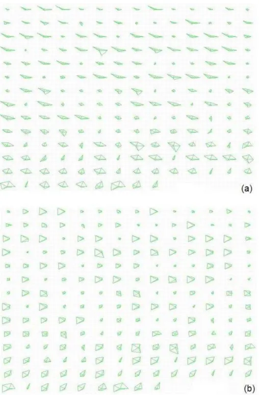
In star glyph visualization, each glyph represents a different data point. With dimensions ordered differently, the glyph’s shape varies. Gestalt Laws [28] state that the simplicity of shapes, for example, symmetry, regularity, or smoothness, can determine groupings of objects. Therefore, our clutter measure in this visualization technique is related to the simplicity of glyph shapes in a view. We conjecture that reducing clutter here means making the shape of glyphs seem more regular and smooth. Our clutter measure is defined according to this conjecture. We call a glyph well structured if its rays are arranged so that they have similar length to their neighbors and are well balanced along some axis. In our approach, we define monotonicity and symmetry as our measures of structure for glyphs. In a perfectly structured glyph:
• The lengths of rays are ordered in a monotonically increasing or decreasing manner on both sides of an axis.
• Rays of similar lengths are positioned symmetrically along either a horizontal or vertical axis.
The perfectly structured star glyph is thus a teardrop shape. With such shapes in glyphs, the user will find it easier to identify relative value differences between dimensions, and can better discern rays and the bounding polylines. For instance, the data points shown in Figure 6.1 present very different shapes with different dimension order. The original order in Figure 6.1-(a) makes them look irregular and display a concave shape, while the dimension order in Figure 6.1-(b) makes them more symmetric and easy to interpret.
Figure 6.1: The two glyphs in (a) represent the same data points as (b), with a different dimension order.
6.2
Clutter Measure in Star Glyphs
6.2.1
Defining and Computing Clutter
To reduce the clutter for the whole display, we seek to reorder the dimensions to minimize the total occurrence of unstructured rays in glyphs. Therefore, we define clutter as the total number of non-monotonic and non-symmetric occurrences. We
believe that with more rays in data points displaying a monotonic and symmetric shape, the structure in the visualization will be easier to perceive.
In order to calculate clutter in one display, we test every glyph for its monotonic-ity and symmetry. Suppose the user chooses both monotonicmonotonic-ity and symmetry as the structure measure, and specifies the first half of the dimensions being monotonically increasing and the second half of the dimensions being monotonically decreasing. The user can then choose a threshold t1 for checking monotonicity, and a thresh-old t2 for checking symmetry. t1 and t2 are measures for normalized numbers and thus can take any number from 0 to 1. Suppose a point has normalized values on two neighboring dimensions (dimensionn−1 and dimension0 are not considered
neighbors), pi and pi+1. If the two values don’t violate the user’s specification for
monotonicity, nothing happens. However, if the two values violate the user’s specifi-cation for monotonicity, we will check their difference and decide if they clutter the view or not. For instance, ifpi+1 is less thanpi while dimensioni and dimensioni+1
are among the first half of the dimensions, it is a violation of the monotonicity rule. We will see if pi − pi+1 is less than threshold t1 or not. If so, we consider this
non-monotonicity occurrence as tolerable. If not, we will add this occurrence to our measure count of unstructuredness. Similarly, for two dimensions that are symmet-rically positioned along the horizontal axis, if their difference is within threshold
t2, they are considered symmetric to each other. Otherwise the total occurrence of unstructuredness is incremented.
6.2.2
Deciding Dimension Order
The calculation for a single glyph involves going through n−1 pairs of neighboring dimensions to check for monotonicity and n/2 pairs of dimensions symmetric along the axis. Therefore, for a dataset withmdata points, the calculation takesO(n∗m).
With the exhaustive search for best ordering, the computational complexity for dimensional reordering in star glyphs is O(n∗m∗n!).
6.3
Example
For each ordering we can count the unstructuredness occurrences to find the order that minimizes this measure. Figure 6.2 displays the Coal Disaster dataset before and after clutter reduction. In Figure 6.2-(a), many glyphs are displayed in a concave manner, and it’s hard to tell the dimensions from bounding polylines. This situation is improved in Figure 6.2-(b) with clutter-based dimension reordering.
Figure 6.2: Star glyph visualizations of Coal Disaster dataset. (a) represents the data with original dimension order, having a clutter count of 488, and (b) shows the data after clutter is reduced, clutter count is 190. The shapes on (b) should mostly appear simpler.
Chapter 7
Clutter-Based Dimension
Reordering in Dimensional
Stacking
7.1
Clutter Analysis in Dimensional Stacking
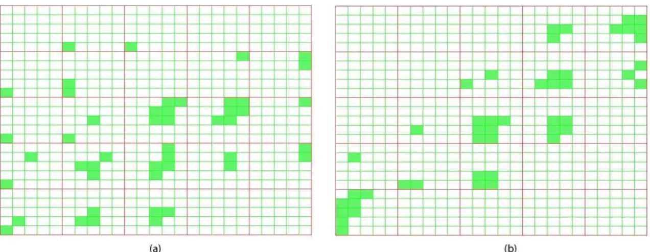
Figure 7.1-(a) illustrates the Iris dataset with the original dimension order, i.e., dimensions in the order: sepal length, sepal width, petal length and petal width, represented in this display as “outer horizontal”, “outer vertical”, “inner horizontal” and “inner vertical” respectively. Each of the four dimensions is divided into five bins (ranges of values).
In this technique, the dimension order determines the orientation of axes and the number of cells within a grid. The inner-most dimensions are named the fastest dimensions because along these dimensions two small bins immediately next to each other represent two different ranges of the dimensions. In contrast, the outer-most dimensions have the slowest value changing speed, meaning many neighboring bins
Figure 7.1: Dimensional stacking visualization for Iris dataset. (a) represents the data with original dataset, and b) shows the data with clutter reduced.
on these dimensions are within the same value range. Therefore, in dimensional stacking, the order of dimensions has a huge impact on the visual display.
For dimensional stacking, the bins within which data points fall are shown as filled squares. These bins naturally form groups in the display. Gestalt Laws [28] can be applied here as well. We hypothesize that a user will consider a dimensional stacking visualization as highly structured if it displays these squares mostly in groups. Compared to a display with mainly randomly scattered filled bins, those that contain a small number of groups appear to have more structure and thus can be better interpreted. The data points within a group share similar attributes in many aspects. Thus this view will help the user to search for groupings in the dataset as well as to detect subtle variances within each group of data points. The other data points that are considered outliers may also be readily perceived if most data falls within a small number of groups.
7.2
Clutter Measure in Dimensional Stacking
7.2.1
Defining and Computing Cluttern
According to our conjecture, we define the clutter measure as the proportion of occupied bins aggregated with each other versus small isolated “islands”, namely the filled bins without any neighbors around them. A measure of clutter might then be number of isolated f illed bins
number of total occupied bins. The dimension order that minimizes this number will
then be considered the best order. The user can define how large a cluster should be for its member bins to be considered “clustered” or “isolated”. Besides that, we need to also define which bins are considered neighbors. The choices are 4-connected bins and 8-connected bins. 4-connectivity and 8-connectivity are terms from image science, which help to define neighbors of pixels. Since we are dealing with bins in grids that are quite similar to pixels in images, we employ the concept here. Two bins are 4-connected if they lie next to each other horizontally or vertically, while they are 8-connected if they lie next to one another horizontally, vertically, or diagonally. With 4-connectivity being used, the adjacent bins would share the same data range on all but one dimension, while the 8-connectivity bins may fall into different data ranges on at most two dimensions.
Given a dimension order, our approach will search for all filled bins that are connected to neighbors and calculate clutter according to the above clutter measure. The dimension order that minimizes this number is considered the best ordering.
7.2.2
Deciding Dimension Order
This algorithm is similar to that used with high-cardinality dimensions in scatterplot matrices. However we are comparing the position of bins instead of plots. It takes
O(m2
for the least isolated bins, it would thus takeO(m2
∗n!) to find the optimal dimension order.
7.3
Example
An example of clutter reduction in dimensional stacking is given in Figure 7.1. We use 8-adjacent neighbors in our calculation. Figure 7.1-(a), denoting the original data order, is composed of many “islands”, namely the filled bins without any occupied neighbors. In Figure 7.1-(b), the display has the optimal ordering: petal length, petal width, sepal length, sepal width. We can discover that there are fewer “islands”, and the filled bins are more concentrated. This helps us to see groups better than in the original order. In addition, the bins are distributed closely along the diagonal, which implies a tight correlation between the first two dimensions: petal length and petal width.
Chapter 8
Analysis of Reordering Algorithms
As stated previously, the clutter measuring algorithms for the four visualization techniques take different amount of time to complete. Experiments were indispens-able to gauge the performances of these algorithms. Let m denote the data size, and ndenote the dimensionality. The computational complexity of using dimension reordering to reduce visual clutter in the four techniques is presented in Table 8.1. The experiments were run on a Windows PC with Intel Celeron 1.2GHz CPU and 256M memory.
Exhaustive search would guarantee the best dimension order that minimizes the total clutter in the display. However, in [59], Ankerst et al. proved that computing
Table 8.1: Table of computation times using optimal ordering algorithm
Visualization Alg. Complexity Dataset Data No. Dim. No. Time
Parallel Coordinates O(n!) AAUP-Part 1161 9 3 sec.
Cereal-Part 77 10 23 sec.
Voy-Part 744 11 4:02 min.
Scatterplot Matrices O(n!) Voy-Part 744 11(5 high-card) 5 sec.
AAUP-Part 1161 9(8 high-card) 3:13 min.
Star Glyphs O(m∗n!) Cars 392 7 18 sec.
Dimensional Stacking O(m2∗n!) Coal Disaster 191 5 10 sec.