This item was downloaded from IRIS Università di Bologna (
https://cris.unibo.it/
)
When citing, please refer to the published version.
This is the final peer-reviewed accepted manuscript of:
Golfarelli M., Rizzi S. (2020). A model-driven approach to automate data
visualization in big data analytics. Information Visualization, 19(1), 24–47.
The final published version is available online at:
https://doi.org/10.1177/1473871619858933
Rights / License:
The terms and conditions for the reuse of this version of the manuscript are specified in the
publishing policy. For all terms of use and more information see the publisher's website.
A Model-Driven Approach to Automate
Data Visualization in Big Data Analytics
Matteo Golfarelli
1and Stefano Rizzi
1Abstract
In big data analytics, advanced analytic techniques operate on big data sets aimed at complementing the role of traditional OLAP for decision making. To enable companies to take benefit of these techniques despite the lack of in-house technical skills, the H2020 TOREADOR Project adopts a model-driven architecture for streamlining analysis processes, from data preparation to their visualization. In this paper we propose a new approach named SkyViz focused on the visualization area, in particular on (i) how to specify the user’s objectives and describe the dataset to be visualized, (ii) how to translate this specification into a platform-independent visualization type, and (iii) how to concretely implement this visualization type on the target execution platform. To support step (i) we define a visualization context based on seven prioritizable coordinates for assessing the user’s objectives and conceptually describing the data to be visualized. To automate step (ii) we propose a skyline-based technique that translates a visualization context into a set of most-suitable visualization types. Finally, to automate step (iii) we propose a skyline-based technique that, with reference to a specific platform, finds the best bindings between the columns of the dataset and the graphical coordinates used by the visualization type chosen by the user. SkyViz can be transparently extended to include more visualization types on the one hand, more visualization coordinates on the other. The paper is completed by an evaluation of SkyViz based on a case study excerpted from the pilot applications of the TOREADOR Project.
Keywords
Big data visualization, Skyline, Model-driven architecture
1. CIM (Computation-Independent Model): an
abstract and platform-independent model that specifies the user objectives (what big data analytics should achieve) in terms of data collection, preparation, analysis, and visualization.
2. PIM (Platform-Independent Model): a
platform-neutral, vendor-independent model that specifies the algorithms for data preparation and for parallelizing and executing the analytics, as well as the way to present the results to users (how big data analytics should work).
3. PSM (Platform-Specific Model): the computational
components and other resources for the process on a
1DISI — CINI, University of Bologna, Italy
Corresponding author:
Stefano Rizzi, DISI — CINI, University of Bologna, Viale Risorgimento 2, 40136 Bologna, Italy.
Email: [email protected]
Introduction
Bigdataanalyticsistheprocessofcollectingandanalyzing
largevolumesof data toextract hiddenusefulinformation using advanced analytic techniques. In the last few years it has become more and more popular in companies of all sizes to complement the role of traditional OLAP and data warehouses by taking advantage of the increasing amounts of valuable data generated by sensors, devices, social media, etc.1. Unfortunately, companies are often discouraged from running analytics because it requires technicalskillsthattheylack,whilethecostsforoutsourcing would be too high. Aimed at filling this gap, the H2020 TOREADOR (TrustwOrthy model-awaRE Analytics Data platfORm) Project adopts amodel-driven architecture2 to speedupandsimplifytheanalysisprocesssoastomakeit widelyavailabletocompaniesviaananalytics-as-a-service approach. Following the basic principles of model-driven architectures,TOREADORreliesonthreemodels3:
• We formalize the CIM in terms of a visualization
context based on seven prioritizable coordinates
for assessing the user’s objectives and conceptually describing the data to be visualized (Section “An objective-based CIM for data visualization”). With reference to what was done in a previous paper7, we enhance the approach to let users select multiple values for some coordinates and adopt a simpler formalization.
• We describe a skyline8-based technique for automati-cally translating a visualization context from the CIM
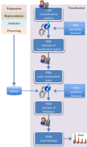
Figure 2. Approach overview
onto the PIM in the form of a set of most-suitable visualization types (Section “Translating the CIM into the PIM”).
• We describe a skyline-based technique for finding the best bindings between the columns of the dataset and the graphical coordinates used by the visualization type chosen by the user (among those determined at the previous step), so as to bridge the gap between the PIM and the PSM (Section “Translating the PIM into the PSM”)
The overall approach is sketched in Figure2. The user drives the process by first declaring the visualization context, then by choosing one visualization type among those proposed, and finally by choosing one binding among those proposed; this binding is then directly translated into a call to the graphical library adopted. Both CIM-to-PIM and PIM-to-PSM translations are based on a suitability function that rates visualization types and bindings; in particular, the set of possible bindings can be determined only after the dataset has been made available.
Visualization Preparation Representation Analytics Processing CIM (visualization context) PIM (skyline of visualization types) PIM (one visualization type) dataset PIM suitability function PSM (skyline of bindings) PSM suitability function PSM (one binding) chart Visualization Preparation Representation Analytics Processing PSM PIM CIM
Figure 1. The framework of the TOREADOR Project
specific target execution platform (e.g., Hadoop-as-a-service).
In compliance with model-driven architectures, each model can be semi-automatically derived from the previous one.
Figure 1 shows how, in the TOREADOR Project, these three models are split into five conceptual areas:preparation,
representation,analytics,processing, andvisualization. The
focus of our work is on visualization, which has a key role in big data analytics to enable users understand the problem, generate hypotheses, and define the solution, as well as to steer the analysis process when dealing with massive, incomplete, and incorrect data4,5. Specifically, we investigate (i) how to specify the user’s objectives and describe the dataset to be visualized within the CIM (e.g., comparison-oriented visualization of n-dimensional numerical data with low cardinality), (ii) how to translate this specification into a platform-independent visualization type (e.g., bar chart) within the PIM, and (iii) how to concretely implement this visualization type into a PSM on the target execution platform (e.g., stacked-to-group bar chart in the D3 Javascript library6). In a previous paper7 a preliminary solution to the first part of the problem, i.e., how to move from the CIM to the PIM, has been sketched. In this paper we propose the complete approach, named SkyViz; the main contributions are:
dimensions into account: goal (“why is a task pursued?”), means (“how is a task carried out?”), data characteristics (“what does a task seek?”), target (“where in the data does a task operate?”), order (“when is a task performed?”), and user type (“who is executing a task?”)14. More recently, B¨orner surveyed the main classifications proposed in the literature to integrate them into a single framework15based on six coordinates, namely insight need type, data scale
type, visualization type, graphical symbol type, graphical
variable type, andinteraction type. Data types were further
classified with specific reference to the visualization of linked open data16; the paper also suggests suitable user goals some for some common chart types. Finally, theuser typecoordinate (which distinguishes users intolay-usersand
techies) was introduced for visualizing linked open data17.
During the last 30 years, several approaches have been focused on the criteria for suggesting the most suitable type of chart for each data type, dimensionality, user goal, etc., and on methods and tools for automating visualization, using a variety of techniques that range from natural language processing (NLP) to genetic algorithms. A seminal approach in this direction is APT18, which automatically designs effective graphical presentations of relational information; the underlying idea is that graphical presentations are sentences of graphical languages, and that the graphic design issues are codified as expressiveness and effectiveness criteria for graphical languages. A few years later, Vista19 extended the design methodology of APT18 from 2-dimensional to 3-2-dimensional graphics. Vista automatically generates an interactive visualization of a given data set by heuristically composing primitive visualization techniques (e.g., size and color).
Besides APT and VISTA, some other approaches can be classified as data-driven, since they do not explicitly consider the specific goal of the user for the current analysis, thus mainly relying on the dataset features to select a suitable visualization. Among these, Show Me20 incorporates automatic presentation into the Tableau tool. It presents data within multiple displays, basically by applying visualization best practices based on the properties of the data fields. The DataVizard system21 recommends the most appropriate visual presentation for the structured data either resulting from a SQL query or arranged within a data table taken for instance from the web. In the first case, the best visualization type is determined by first classifying the data columns into independent and dependent variables, then by considering their data type. In the second case, an NLP-based analysis of the table caption and of the table content is made. The VISO visualization ontology22 formalizes the Thanks to the use of skyline computation to find the
mostsuitable visualization(s),SkyViz canbetransparently extended to include more visualization types on the one hand,morevisualizationcoordinatesonthe other.Besides, sincethevisualizationbestpracticesarenothard-codedbut modeledinthesuitabilityfunctionusing atableof explicit scores,SkyVizcanbetailoredtotheneedof specifictypes of users bysimply changing the scores (e.g., if users feel uncomfortablewithreadingdendrograms,thecorresponding scores can be decreased). Finally, although in the paper we adopt D3 as a reference graphic library, SkyViz can be easily plugged into any other graphic library as long asthe signaturesfor invokingits visualization servicesare known. Noticeably, all these possible extensions do not underminethe performanceof theapproach;indeed,aswe willdiscussinthepaper,skylinecomputationstillgives real-timeperformances when workingwithsets of objects that areordersofmagnitudelargerthatthoseusedinSkyViz.
The paper outline is completed by Section “Related Work”, which discusses the related literature, by Section “Case Study and Evaluation”, which evaluates SkyViz mainlythrough a real case study excerpted from the pilot applications of the TOREADOR Project, and by Section “Conclusions”,whichdrawstheconclusions.
Related
Work
Principles and taxonomies to classify the different approaches for visualizing data and interacting with them have been proposed in the literature. First of all, Shneiderman proposed a classification taxonomy for data visualization based on the task (e.g., zoom and relate) and data type coordinates (e.g., multidimensional and tree)9. Similarly, visualization problems had been previouslyclassifiedbasedontheoperationtobeperformed (e.g., categorize and correlate) and on the object to be visualized(e.g.,nominalandposition)10.Afewyearslater, adifferent classification of data visualization techniques11 was suggested by considering, besides the data type (which mostly overlaps with the homonym coordinate of Shneiderman’s work), the visualization technique (which corresponds to the tasks9) and the interaction
and distortion technique (which distinguishes between
standard displays, icon-based displays, dense displays, and stacked displays). Abela also listed four possible
goals for visualization, namely relationship, comparison,
distribution, andcomposition12.Tory etal.13 introduced a high-levelvisualizationtaxonomybasedondesignmodels. Adesignspaceofvisualizationtaskwasproposedtakingsix
dimensionality, but not all combinations are covered. In Articulate30 a conversational user interface enables users to verbally describe their analysis task; natural language sentences are then translated into explicit expressions and a visualization is heuristically selected using a decision tree inspired by Abela’s work12. In the context of big data, a framework for choosing the best visualization is outlined31; the main types of charts are related to the user goals they fulfill and to the data dimensionality, cardinality, and type they support. VizAssist32 is a user assistant that aims at improving the data-to-visualization mapping in data mining by means of an interactive genetic algorithm. To propose suitable visualizations for data it relies on a model of data (data type and importance of each variable in the dataset, and data cardinality), on a model of data mining objectives, and on a model of visualizations (which quantifies, for each visualization type, to what degree it is suitable for each data type, cardinality, and objective).
A separate mention is due for behavior-driven visualiza-tion recommendavisualiza-tion33; here, the user’s behavior is analyzed to detect meaningful interaction patterns, then these patterns are used to infer the user’s intention for the current visual task and to suggest possible visualizations. In a more cognitive direction, Rogowitz et al. use perceptual rules to ensure that the structure of the data is faithfully represented in the visualization and to transform the structure of data so as to highlight specific features34. Their following work35 introduces the PRAVDAColor tool, which is specifically focused at improving the user’s selection of colormaps based on the structure of the data and on the visualization goal.
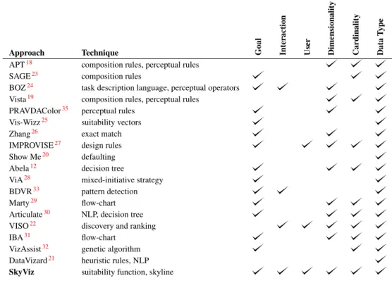
Table 1 shows a comparison of the above-mentioned approaches in terms of the coordinates they use for determining the best visualization. It emerges that, to the best of our knowledge, no previous approach took into account all the coordinates we consider. Besides, SkyViz is the first approach that uses skyline computation to find the best visualizations, which ensures full extensibility in terms of both the coordinate set and the set of visualization charts. Overall, the approaches that are more strictly related to ours are:
1. Vis-Wizz25, which —similarly to SkyViz— relies on suitability functions to assess to what degree each visualization technique is suitable for each possible objective; however, differently from SkyViz, it gives no model of this function.
2. The approach by Zhang26 can be seen as a way to bridge the gap between the PIM and the PSM; vocabularyfortheinterdisciplinaryvisualizationdomainand
properlyannotatesbothdataandvisualization components. VISOisusedtodeterminetheapplicablemappingsbetween datavariablesandgraphiccoordinates;then, mappingsare rankedtakingintoaccounttheuseranddevicecontextsoas toeventuallyrecommendasetofvisualizations.
Several other approaches can be classified as
problem-driven, since they directly take into account the various
aspects that influence the effectiveness of a visualization, including the user’s goal. In SAGE23, a composite presentation for data is selected based on the data characteristics (e.g., their domain and their ordering), on the properties of the relational structure of data, and on the user’s goal. BOZ24 designs a visualization for data based on a user-provided logical description of the analysis task to be executed. The logical operators in this description are then turned into perceptual operators that can be graphically rendered, aimed at supporting efficientandaccurate performanceofthe user’sperceptual procedure. Vis-Wizz25 recommends a visualization based on data characteristics and users goal as well as on an evaluation of the visual representation to be generated. A relevant approach was proposed by Zhang26; here, scale types (i.e., ratio, interval, ordinal, and nominal) are used todetermineeffective mappings between represented dimensions (columns of the dataset) and representing dimensionsofthecharttype(e.g.,length,color,andshape). IMPROVISE27 uses a data-analysis taxonomy plus some presentationcontextinformationtoproduceauser-centered visual design. The process is guided by a set of design principlesthat ensure the expressiveness andeffectiveness of a design. Abela12 proposes a decision tree to select the best visualization according to the user’s goal and to themainfeatures of data(numberof variables, cyclicality, and size). This work inspired Chart Chooser (labs.
juiceanalytics.com/chartchooser), a web site
which returns the subset of Excel/PowerPoint charts compatible with one or more visualization goals selected bytheuser.ViA28 isavisualization assistantthat supports users in identifying perceptually salient visualizations for large, multidimensional datasets; this is done by applyingknowledge of low-levelhuman visiontoevaluate visualizations given the dataset features (e.g., the spatial frequency of the attribute values) and analysis task (e.g., searchandestimate).Marty29 providesadescriptionofthe prosandconsofdifferentcharttypesinthesecuritydomain, taking into account the data dimensionality, cardinality, and type. A flow-chart is proposed to help users in choosingtherightvisualizationfordifferentgoalsanddata
Table 1. A comparison of approaches to select the best visualization
Approach Technique Goal Interaction User Dimensionality Cardinality Data
T
ype
APT18 composition rules, perceptual rules
SAGE23 composition rules
BOZ24 task description language, perceptual operators
Vista19 composition rules, perceptual rules PRAVDAColor35 perceptual rules
Vis-Wizz25 suitability vectors
Zhang26 exact match
IMPROVISE27 design rules
Show Me20 defaulting Abela12 decision tree
ViA28 mixed-initiative strategy
BDVR33 pattern detection
Marty29 flow-chart
Articulate30 NLP, decision tree VISO22 discovery and ranking
IBA31 flow-chart
VizAssist32 genetic algorithm DataVizard21 heuristic rules, NLP
SkyViz suitability function, skyline
however, it is limited to considering data types, user goals, and dimensionality.
3. Like SkyViz, VizAssist relies on extensible models created by domain expert; however, its models do not cover interactions, user type, and dimensionality. 4. The approaches by Abela12 and Marty29 give precise
suggestions about the degree to which the most common visualization types are fit for different user goals and data features; hence we incorporated them into our suitability functions, though we had to extend them since they do not cover all our coordinates.
same is true for SeeDB39, which is focused on efficiently finding the most interesting views of a multidimensional dataset (a view is considered to be interesting if it shows a deviation from a reference). More recently, an approach to recommend aggregate data visualization was proposed40; however, the emphasis is not on choosing a visualization type (only column charts are used) but rather on determining the most effective ways to aggregate data for generating interesting, usable, and accurate views. Similarly, a recommender system was used41to suggest visualizations; this was done through an ad-hoc query language and by introducing methods for choosing, ranking, and grouping recommended visualizations. Finally, Streit et al.42 propose a comprehensive approach to the codesign of data, view, analytics, and tasks for heterogeneous data. The approach is based on a domain-independent model of the setup in which the analysis takes place, on a model of the domain that captures what can be done with a given setup in the context of a specific domain, and on a model of the analysis session that lists what has to be done to pursue a given analysis goal. The emphasis here is more on delivering an end-to-end guide to the user through the analysis process than on selecting the most appropriate visualization for data.
Adifferentline ofapproachesisthe onethat proposesa framework to recommend a set of low-cost visualizations to users based on statistical properties of the dataset to be visualized such as its selectivity, data distribution, and numberof distinct values36.This approachhas adifferent goalfromSkyVizsinceitactuallyaimsatfindingthemost interesting variables of a large dataset to be visualized rather than the most appropriate visualization type for them. In the same direction, VizRank37 is a method to automatically select the most useful data projections (i.e., thosethat bestvisuallydiscriminatebetweenclasses) of 2-dimensionaldatasets. Similarly, AutoVis38 isan automatic visualization system aimed at giving analysts a first view of any data source; as such, it is more concerned with determining the most interesting views of a dataset than onfindingthemosteffectivewaytovisualizethem.The
An objective-based CIM for data
visualization
As already mentioned, the CIM is an abstract and platform-independent model that specifies the user objectives for visualizing the analysis results. In SkyViz, the CIM is defined in terms of a set ofvisualization coordinateswhose values are specified by the user aimed at declaring her objectives and describing the dataset to be visualized. To select these coordinates in the context of the TOREADOR Project we adopt a requirement elicitation method that can be summarized as follows:
1. Based on the literature on the taxonomies of data visualization and interaction paradigms, we derived a set of candidate coordinates (e.g., data type) and, for each coordinate, a set of candidate values (e.g., ordinal). Each coordinate/value pair corresponds to a requirement.
2. From these requirements we derived a questionnaire which was submitted to users for requirement elicitation. More specifically, we involved 27 users of the pilot applications of the TOREADOR Project; of these, 13 were domain experts, 11 data engineers, and 3 data scientists.
3. Based on the results of requirement elicitation, we selected the final set of coordinates and values. For requirement elicitation we adopted the Kano model43, which enables designers to understand the needs and expectations of a stakeholder based on how they affect his/her satisfaction. The Kano model classifies requirements in the following classes:
• Must-be, which customers take for granted; if these
requirements are not achieved, the stakeholder will be severely dissatisfied and not interested in the product at all.
• One-dimensional, those for which the level of
func-tionality is proportional to the degree of satisfaction: the better a requirement is achieved, the higher the stakeholder will be satisfied, and vice versa.
• Attractive, which are usually unexpected by the
stakeholders but have the greatest influence on how satisfied they will be. As the level of functionality achieved by these requirement increases, the stakeholder’s satisfaction increases more than proportionally.
• Indifferent, which are rated as neither good nor bad.
• Reverse, which cause dissatisfaction when present and
satisfaction when absent.
The Kano model is typically constructed using a survey methodology, where requirements are first classified at the individual stakeholder level through a questionnaire and then aggregated. The Kano questionnaire contains a list of question pairs for each requirement; the question pair includes a functional question, asking how the user would feel if a certain requirement were met, and a dysfunctional
question, asking how the user would feel if that requirement
were not met. An example of requirement and of the two related questions posed to users is shown in Table 2. To answer each question, the user had the options listed below:
• Like: “This would be helpful to me”
• Expect: “This is a basic requirement to me”
• Neutral: “This would not affect me”
• Tolerate: “This would be a minor inconvenience”
• Dislike: “This would be a major problem for me”
The answers to all questions were collected and analyzed using the DuMouchel methodology44. This methodology assumes the use, together with the Kano questionnaire,
of a self-stated importance questionnaire which makes the
respondents rank each requirement on a scale of importance aimed at determining the relative importance of each individual requirement. Then it assigns three scores to each requirement: the functional score maps each answer given to a functional question onto the range from 4 (Like) to−2 (Dislike); the dysfunctional score maps each answer given to a dysfunctional question onto the range from −2 (Like) to 4 (Dislike); theimportance scoremaps each answer in the self-stated importance questionnaire onto the range from 1 to 5. The three scores obtained for each requirement, averaged over the set of all respondents, enable the categorization of that requirement as either must-be, one-dimensional, attractive, indifferent, or reverse according to its positioning within a two-dimensional grid44. As a consequence of the process described above, all the candidate coordinates were deemed to be either must-be (e.g., user), one-dimensional (e.g., goal), or attractive (e.g., cardinality). Conversely, some coordinate values (e.g, the history and projection interactions) were categorized as reverse, since they were considered to be too specific and possibly misleading, so we had to exclude them.
In the following we list the seven coordinates we selected, see Table 3for the complete list of values each coordinate can take:
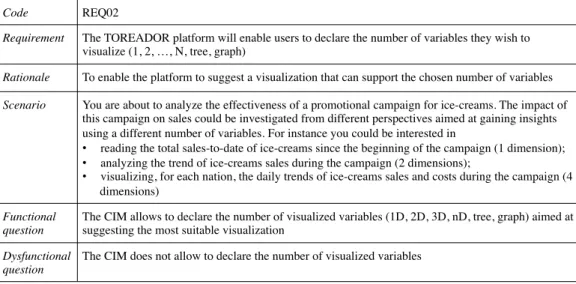
Code REQ02
Requirement The TOREADOR platform will enable users to declare the number of variables they wish to visualize (1, 2, …, N, tree, graph)
Rationale To enable the platform to suggest a visualization that can support the chosen number of variables
Scenario You are about to analyze the effectiveness of a promotional campaign for ice-creams. The impact of this campaign on sales could be investigated from different perspectives aimed at gaining insights using a different number of variables. For instance you could be interested in
• reading the total sales-to-date of ice-creams since the beginning of the campaign (1 dimension);
• analyzing the trend of ice-creams sales during the campaign (2 dimensions);
• visualizing, for each nation, the daily trends of ice-creams sales and costs during the campaign (4 dimensions)
Functional question
The CIM allows to declare the number of visualized variables (1D, 2D, 3D, nD, tree, graph) aimed at suggesting the most suitable visualization
Dysfunctional question
The CIM does not allow to declare the number of visualized variables
Table 3. Visualization coordinates
Value Description Example
Goal
Composition highlighting the way in which distinct parts of data are composed to form a total stacked column chart Order analyzing objects by emphasizing their ordering alphabetical list of names Relationship analyzing the correlation between two or more objects or attribute values point graph
Comparison examining two or more objects or values to establish their similarities and dissimilarities column chart Cluster analyzing data in such a way as to emphasize their grouping into categories dendrogram Distribution analyzing how objects are dispersed in space histogram Trend examining a general tendency of data variables line graph Geospatial analyzing data values using a geographical map as a graphical context choropleth map
Interaction
Overview gain an overview of the entire data collection dendrogram
Zoom focus on items of interest network map
Filter quickly focus on interesting items by eliminating unwanted items area chart Details-on-demand select an item and get its details choropleth map
User
Lay computer-literates who may have troubles in understanding complex visualizations line graph Tech skilled users with a deeper understanding of analytics tree map
Dimensionality
1-dimensional a single numerical value or a string gauge
2-dimensional one dependent variable as a function of one independent variable single line graph n-dimensional each data object is a point in ann-dimensional space bubble graph Tree a collection of items, each having a link to one parent item dendrogram Graph a collection of items, each linked to an arbitrary number of other items network map
Cardinality
Low from a few items to a few dozens items pie chart
High some dozens items or more heat map
Independent/Dependent Type
Nominal qualitative, each data variable is assigned to one category (e.g., “male” and “female”) pie chart Ordinal qualitative, categories can be sorted (e.g., “small”, “medium”, “large”) column chart Interval quantitative, it supports the determination of equality of intervals or differences (e.g., a
temperature)
line graph
Ratio quantitative, with a unique and non-arbitrary zero point (e.g., an income) point graph
(1) Goal, which enables users to declare their main analysis goal(s). This classification follows the one intobasic task
types15; examples of goals are that of analyzing data
based on their order (in which case, a sorted list of data could be a good choice) and that of comparing pieces of data to assess how similar they are (e.g., using a column chart).
(2) Interaction, which enables users to declare the type of
interactions to be supported by the visualization. This classification derives from a previous one15; specifically, based on requirement elicitation, we selected a subset of most common and intuitive interaction types11. For instance, the user may wish to gain an overview of the data using a dendrogram, or may need to get further
details about a selected piece of data by clicking on a mark in a marked line graph.
(3) User, which enables users to declare their skill17. We distinguish lay users, for which simple visualization types such as line graphs are more suitable, and tech users, who can also understand more complex visualization types such as tree maps.
(4) Dimensionality, which enables users to declare the
number of variables they wish to visualize. Here, as done by Abela12, we count all variables without distinguishing between independent and dependent variables. Clearly, while a few visualization types are suitable for 1-dimensional datasets (e.g., gauges and alerts), most of them require n-dimensional datasets (e.g., histograms and bubble graphs). Also trees and graphs are considered here, which can be visualized using dedicated approaches like dendrograms and networks map, respectively.
(5) Cardinality, which enables users to qualitatively declare
the cardinality of the data to be visualized12. Since the user at this stage will probably have only a rough idea of the cardinality, here we just distinguish between low cardinality, up to a few dozens rows (which are better visualized using a pie chart, for instance) and high cardinality (which should be shown using dense visualization types such as line graphs and heat maps).
(6) Independent Type, which enables users to declare the
type of the independent variable(s) to be visualized. The classification we adopt here45 includes four data types: nominal (qualitative and unordered, can be visualized using for instance the colors in a pie chart), ordinal (qualitative and ordered, shown for instance through the row labels in a pivot table), interval (quantitative with no zero point, can be visualized using for instance the X-axis of a column graph), and ratio (quantitative with zero point, shown for instance through the X-axis of a point graph).
(7) Dependent Type, which enables users to declare the
type of the dependent variable(s) to be analyzed. The classification we adopt here is the same of the independent type. Using two separate coordinates for independent and dependent variables enables a finer specification of the CIM29 and a more accurate translation into the PIM and the PSM; for instance, while the color in a pie chart is suitable to show a nominal variable, the width of each sector should represent a ratio variable.
Note that, while for coordinates User, Dimensionality, and Cardinality, one single value can be specified by the user because the possible values have disjunctive semantics, for coordinates Goal, Interaction, Independent Type, and Dependent Type the semantics of values is conjunctive, so the user can specify multiple values (e.g., the user might be interested in interacting with the visualization using both overview and details-on-demand).
We now formalize the CIM in terms of a visualization
context based on the seven coordinates listed above for
assessing the user’s objectives and conceptually describing the data to be visualized. The context has variable size to accommodate both the case in which the user does not specify a value for some coordinate(s) and that in which she specifies multiples values for some coordinate(s). Besides, the user can prioritize coordinate values to express her higher or lower confidence and interest in each value.
Definition 1.Visualization Context. Let
Ogoa={Composition,Order,Relationship,Comparison, Cluster,Distribution,Trend,Geospatial}
Oint={Overview,Zoom,Filter,Details-on-demand} Ouse={Lay,Tech}
Odim={1-dimensional,2-dimensional,n-dimensional, Tree,Graph}
Ocar={Low,High}
Oind={Nominal-i,Ordinal-i,Interval-i,Ratio-i} Odep={Nominal-d,Ordinal-d,Interval-d,Ratio-d}
be the sets of values for coordinates goals, interactions, users, dimensionalities, cardinalities, independent types, and
dependent types, respectively; let O=Ogoa∪Oint∪Ouse∪
Odim∪Ocar∪Oind∪Odep. Avisualization contextis defined
as C,C, where C⊂O is a subset that includes at most
one element from Ouse, Odim, and Ocar, and
C
is a weak
order onCthat expresses the priorities between the different
coordinate values.
Example 1. An example of visualization context is C,C
where
C={Comparison,Tech,n-dimensional,High,Interval-i, Ratio-d,Nominal-d}
and
(Tech∼CInterval-i)CComparisonC
C
(n-dimensional∼C High∼C Ratio-d∼C Nominal-d)
where the user expresses three levels of priority: high (for the user and independent type coordinates), medium (for the goal coordinate), and low (for the dimensionality, cardinality, and dependent type coordinates). No value is
specified for the interaction coordinate. 2
Translating the CIM into the PIM
In this section we discuss the CIM-to-PIM transformation, specifically, how the visualization context stated by the user in the CIM can be transformed into a set of suitable visualization types in the PIM. The first step in this direction requires to assess to which extent each visualization type is suitable for each value of each visualization coordinate introduced in Section “An objective-based CIM for data visualization”.
Definition 2.PIM Suitability Function. APIM suitability
functionis a total functionσ:O×V →s whereO is the
set of all coordinate values,V is the set of all visualization
types, ands∈ {unfit,discouraged,acceptable,fit}is a score.
The semantics of the scores is as follows:
• unfitmeans that the visualization typeshould not be
usedfor the coordinate value. For instance, a pie chart cannot be used to represent 1-dimensional data.
• discouragedmeans that the visualization typecan be
used in principle for the coordinate value, but it may distort the very nature of that specific goal, interaction, user, dimensionality, cardinality, or type. For instance, a pie chart should not be used to fulfill the distribution goal because it does not emphasize how objects are dispersed in space.
• acceptable means that the visualization type is
compatible with the coordinate value, though it may
fail to emphasize some of the features of that specific goal, interaction, user, dimensionality, cardinality, or type. For instance, a pie chart can successfully be used to visualize an ordinal independent variable such a S/M/L/XL tag, but it will give no specific emphasis to the ordering of values.
• fitmeans that the visualization type is fully compatible with the coordinate value, and has been declared in
(a) (b)
(c) (d)
(e) (f)
(g) (h)
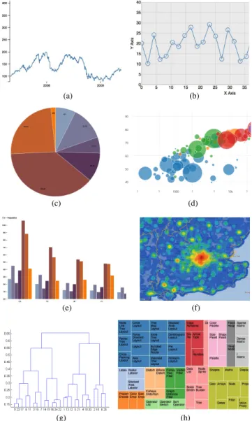
Figure 3. A single line graph (a), a marked line graph (b), a pie
chart (c), a bubble graph (d), a grouped column graph (e), a heat map (f), a dendrogram (g), and a tree map (h)
the literature to be a best visualization practice for that specific goal, interaction, user, dimensionality, cardinality, or type. For instance, the pie chart is perfectly fit to visualize a nominal independent variable (such as Continent) and a ratio dependent variable (such asSalesRevenues).
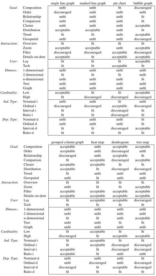
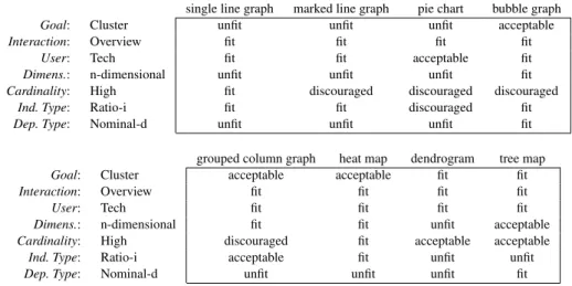
SkyViz can be applied to each possible visualization type v as long as a suitability evaluation is done by a visualization expert for v based on our seven coordinates. In this paper we focus on the eight popular visualization types shown in Figure3, namely, single line graph, marked line graph, pie chart, bubble graph, grouped column graph, heat map, dendrogram, and tree map. For each of them we assigned a score to each every coordinate-value pair, so as to define a PIM suitability function as shown in Table 4. The scores were mainly derived from the best practices found in the literature12,15,29; where we could not find any specific
prescription in the literature, we fell back on common sense to complete the function assignments.
The PIM suitability function can now be used to find one or more “most suitable” visualization types for a given visualization contextC,C. To this end we start by observing that, with reference toC={c1, . . . , cp}, visualization typev is evaluated through a set{σ(c1, v), . . . , σ(cp, v)}of scores, where each element expresses the suitability ofvforCalong one coordinate value. We also note that the scores introduced in Definition2are obviously related by a strict total order that expresses a preference:
fit>acceptable>discouraged>unfit
This enables a comparison between any two possible visualization types v, v0∈V along each single coordinate value: for the i-th value, v is preferred to (i.e., is strictly better than)v0ifσ(ci, v)> σ(ci, v0).
The next step is to understand how to combine the p resulting one-dimensional preferences for each visualization coordinate into a single one for the whole visualization context. A very reasonable way to cope with this problem is to look for visualization types that are Pareto-optimal. A visualization types is Pareto-optimal when no other visualization types dominates it, being better along one coordinate and not worse along all the other coordinates. In the database community, when multiple preferences are defined over a set of tuples, the set of tuples (in our context, visualization types) satisfying Pareto-optimality is called a
skyline46.
The definition of dominance is given below in flat (non-prioritized) form first; then, we will generalize it to cope with the presence of priorities.
Definition 3.Flat Dominance. Given visualization context
C,C and two visualization types v and v0, we say that v
is equivalent to v0 on C, denoted v∼Cv0, iff σ(cj, v) =
σ(cj, v0)for allcj∈C. We say thatvflat-dominatesv0 on
C, denotedvBC v0, iff
(a) ∃ci∈C:σ(ci, v)> σ(ci, v0)and
(b) for all othercj∈Cit isσ(cj, v) =σ(cj, v0)
single line graph marked line graph
pie chart bubble graph
grouped column graph
heat map
dendrogram tree map
single line graph marked line graph
pie chart bubble graph grouped column graph
heat map
dendrogram tree map
single line graph marked line graph
pie chart bubble graph
grouped column graph
heat map
dendrogram tree map
single line graph marked line graph
pie chart bubble graph
grouped column graph
heat map
dendrogram tree map
single line graph marked line graph
pie chart bubble graph grouped column graph
heat map
dendrogram tree map
single line graph marked line graph
pie chart bubble graph
grouped column graph
heat map
dendrogram tree map
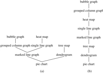
(a) (b)
Figure 4. Flat dominance (a) and dominance (b) relationships
for Example2
except goal and dimensionality, on which it is better. On the other hand, there is no flat-dominance or equivalence between bubble graph and heat map because the first is better on the goal coordinate, while the second is better on the cardinality coordinate. So overall, if coordinate priorities are not considered, bubble graph, heat map, and tree map are Pareto-optimal and would belong to the skyline, while
the others would not. 2
The definition of dominance is now generalized to cope with the priorities C declared by the user. To this end we resort to the concept of prioritized skyline46 and redefine dominance as follows. Intuitively, if v is better than v0 with reference to the coordinate values that take highest priority for the user, then it is unconditionally better than v0; otherwise, ifvis equivalent tov0 with reference to those coordinate values, we have to check if it is better with reference to the coordinate values taking second priority, and so on.
Definition 4.Dominance. Given visualization contextC,C
and two visualization types v and v0, and given the set
of coordinate values C⊆C, we say that v dominates
v0 on C (denoted vICv0) iff either (a) vBmax(C)v0
or (b)(v∼max(C)v0)∧(vIC\max(C)v0), wheremax(C)
denotes the top coordinate values in theCorder restricted to
C.
Definition 5.PIM Skyline. ThePIM skylineforC,Cis the
set of visualization types inV that are not dominated onC
by any other visualization type.
It is easy to prove that vBCv0 implies vICv0 for any C; as a consequence, the skyline for flat dominance always includes the skyline for dominance, i.e,prioritizing
coordinate values leads to reducing the skyline.
Example 2. Consider again the visualization context in
Example 1, which we match with the eight visualization
types in Table 4. The eight corresponding suitability sets
are singled out in Table 5. The resulting flat dominance
relationships are shown in Figure 4.a. For instance,
heat map flat-dominates single line graph (heatmapBC
Table 4. PIM suitability scores for eight visualization types
single line graph marked line graph pie chart bubble graph
Goal: Composition unfit unfit fit discouraged Order discouraged unfit unfit unfit Relationship unfit unfit unfit fit Comparison unfit unfit unfit fit Cluster unfit unfit unfit acceptable Distribution acceptable acceptable unfit fit
Trend fit fit unfit acceptable
Geospatial unfit unfit unfit discouraged
Interaction: Overview fit fit fit fit Zoom acceptable acceptable unfit acceptable Filter discouraged discouraged acceptable discouraged Details-on-dem acceptable fit acceptable acceptable
User: Lay fit fit fit acceptable
Tech fit fit acceptable fit
Dimens.: 1-dimensional unfit unfit unfit unfit 2-dimensional fit fit fit unfit n-dimensional unfit unfit unfit fit
Tree unfit unfit unfit unfit
Graph unfit unfit unfit unfit
Cardinality: Low acceptable fit fit acceptable High fit discouraged discouraged discouraged
Ind. Type: Nominal-i unfit unfit fit unfit Ordinal-i discouraged discouraged acceptable discouraged Interval-i fit fit discouraged fit Ratio-i fit fit discouraged fit
Dep. Type: Nominal-d unfit unfit unfit fit Ordinal-d unfit unfit unfit fit Interval-d fit fit discouraged acceptable
Ratio-d fit fit fit fit
grouped column graph heat map dendrogram tree map
Goal: Composition acceptable unfit acceptable acceptable Order acceptable unfit discouraged unfit Relationship discouraged unfit acceptable fit Comparison fit acceptable discouraged acceptable Cluster acceptable acceptable fit fit Distribution acceptable fit discouraged discouraged
Trend fit unfit unfit unfit
Geospatial unfit fit unfit unfit
Interaction: Overview fit fit fit fit
Zoom unfit fit fit acceptable
Filter acceptable acceptable acceptable acceptable Details-on-dem acceptable acceptable acceptable acceptable
User: Lay fit acceptable acceptable discouraged
Tech fit fit fit fit
Dimens.: 1-dimensional unfit unfit unfit unfit 2-dimensional unfit unfit unfit unfit n-dimensional fit fit unfit acceptable
Tree unfit unfit fit fit
Graph unfit unfit unfit unfit
Cardinality: Low fit acceptable fit fit High discouraged fit acceptable acceptable
Ind. Type: Nominal-i fit acceptable fit fit Ordinal-i fit acceptable discouraged discouraged Interval-i acceptable fit discouraged discouraged Ratio-i acceptable fit unfit unfit
Dep. Type: Nominal-d unfit unfit unfit fit Ordinal-d unfit discouraged unfit discouraged Interval-d discouraged fit acceptable discouraged
Ratio-d fit fit fit fit
on the two top-priority coordinates of C (max(C) =
{Tech,Interval-i}) except pie chart, dendrogram, and tree map, which are flat-dominated by other visualization types and can be immediately excluded from the PIM skyline. For
Example 3. Considering again the visualization context
in Examples 1 and 2, and taking now into account the
coordinatepriorities,thedominancerelationshipsareshown
Table 5. Suitability tuples for eight visualization types with reference to the visualization context in Example1
single line graph marked line graph pie chart bubble graph
Goal: Comparison unfit unfit unfit fit
User: Tech fit fit acceptable fit
Dimens.: n-dimensional unfit unfit unfit fit
Cardinality: High fit discouraged discouraged discouraged
Ind. Type: Interval-i fit fit discouraged fit
Dep. Type: Ratio-d fit fit fit fit
Dep. Type: Nominal-d unfit unfit unfit fit grouped column graph heat map dendrogram tree map
Goal: Comparison fit acceptable discouraged acceptable
User: Tech fit fit fit fit
Dimens.: n-dimensional fit fit unfit acceptable
Cardinality: High discouraged fit acceptable acceptable
Ind. Type: Interval-i acceptable fit discouraged discouraged
Dep. Type: Ratio-d acceptable fit fit fit
Dep. Type: Nominal-d unfit unfit unfit fit
each variable and a graphical coordinate ofv. For instance, if the user has picked pie chart as her preferred visualization type out of the PIM skyline to visualize a dataset including variables Continent and SalesRevenue, two bindings are possible: using colors to represent continents and arc widths to represent revenues, or the opposite.
To discuss how this translation can be automated, we need some preliminary definitions.
Definition 6. Dataset and Variable. A dataset D is a
list of tuples, where each tuple consists of n variables.
Each variable ai has a type, type(ai)∈T, with T =
{Nominal,Ordinal,Interval,Ratio,Tree,Graph}.
Given a dataset, determining the types of its variables can be done automatically to some extent, since nominal and ordinal variables are normally represented by strings, interval variables are represented by either numbers or dates/timestamps, and ratio variables are represented by numbers. To distinguish nominal from ordinal variables we must resort to the user’s judgement (a qualitative variable is ordinal if there is a meaningful ordering of values, nominal otherwise). Similarly to distinguish interval from ratio variables (a quantitative variable is ratio if it has a meaningful zero, interval otherwise).
Note that we added Tree and Graph to the set of simple types introduced in Table3. This is to effectively deal with visualization types which operate on trees and graphs, such as dendrograms and chords, respectively. Indeed, in this case, a graphical coordinate of the visualization type has to be fed with a complex variable that uses some conventional notation to code a topology (for instance, in the D3 library a tree-like topology can be expressed using the dot notation to represent each path in the tree, while a graph topology can be expressed as a couple of labels to denote each arc). Though the complex
theremaining sixvisualization typeswehave tocheck the
second-prioritycoordinate (max(C\{Tech,Interval-i})=
{Comparison}),onwhichbubblegraphandgroupedcolumn
grapharebetterthanheatmap;thus,heatmapisdominated
andexcludedfromthePIMskyline.Singleandmarkedline
graphare inturndominated byheatmap, so theytoo can
beexcluded.Finally,wefindthatbubblegraphandgrouped
columngraphareequivalentontheremainingcoordinates,
exceptfor the dependent typecoordinate on which bubble
graphis better.So,taking intoaccount priorities,the PIM
skylineonlyincludesbubblegraph. 2
Weclosethissectionbyrecallingthatskylineapproaches arenormallyappliedtorankthetuplesofadatabasebased on the users preferences. As such, they give real-time performanceoverthousandsofobjects.Theperformanceand scalabilityofanalgorithmforcomputingprioritizedskylines havebeen measured46, and it turned out that the timefor computingtheresultisalwaysbelow1second,withadataset including50000tuplesand20attributes—wellbeyondthe maximum number of visualization types we are expected to manage and the seven coordinates we currently use in SkyViz.
Translating
the
PIM
into
the
PSM
Inthemodel-drivenapproach,definingthePSMrequiresfirst ofalltochooseatargetexecutionplatform.Inourcontext, this means choosing a specific platform that implements visualization services. In the following we pick the well-knownD3Javascriptlibrary6asareferenceplatform.Then, translatingaPIMintoaPSMmeans,givenadatasetD to bevisualizedandavisualizationtypev pickedbythe user amongthoseinthePIMskyline,decidinghoweachvariable inDwillbevisualized,i.e.,establishingabindingbetween
types we consider are those most commonly used in big data analytics, SkyViz may be gracefully extended to cope with more sophisticated types (such as hypergraphs) by adding them toT.
Example 4. Figure 5 shows an excerpt of two sample
dataset available on the D3 site (athttp://bl.ocks.
org/josiahdavis/a3534073492ca37b3682 and
https://bl.ocks.org/mbostock/3883245, respectively). The first dataset includes 6 variables, the first three with type nominal, the remaining three with type ratio. The second dataset includes 2 variables with type interval and ratio respectively.
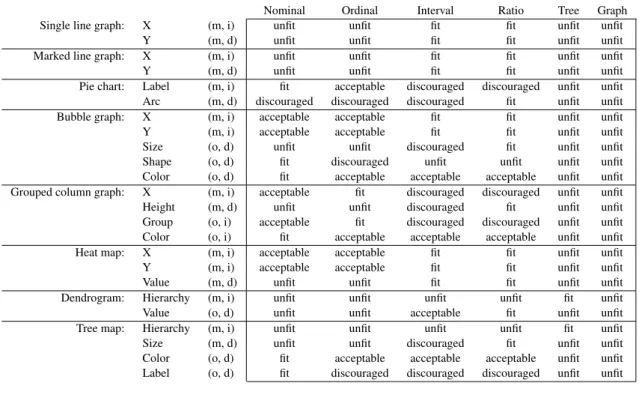
In the context of a specific platform that implements visu-alization services, each visuvisu-alization typevis characterized by a set of graphical coordinates, G(v). Each graphical coordinate g∈G(v) can be either mandatory or optional (denoted by Boolean function mand(g)), independent or dependent (denoted by Boolean functionindep(g)). Like in Definition2, and consistently with a previous approach26, the suitability ofg to be used for displaying a variable of typetis assessed by aPSM suitability function:
Definition 7.PSM Suitability Function. APSM suitability
functionis a (total) functionτ:G(v)×T →s wheres∈ {unfit,discouraged,acceptable,fit}is a score.
Here, the semantics of the scores (to be defined by a visualization expert for the specific platform adopted) is as follows:
• unfit means that the graphical coordinate cannot be
used to display the variable type, typically because of the parameter type required by the visualization service. For instance, the X coordinate of a line graph cannot be used to display a nominal variable in D3 because the service only accepts numbers.
• discouragedmeans that the graphical coordinatecan
be usedto display the variable type, but this distorts
the very nature of that variable. For instance, the label coordinate of a pie chart can be used to display a number in D3, but —conceptually speaking— the label should be mapped onto a qualitative rather than a quantitative variable.
• acceptable means that the graphical coordinate is
compatiblewith the variable type, though it may fail
to emphasize some of the features of that variable. For instance, the label coordinate of a pie chart can be used to display an ordinal variable in D3, but it will give no specific emphasis to the ordering of values.
• fit means that the graphical coordinate is fully
compatible with the variable type. For instance, the
arc coordinate of a pie chart is perfectly suitable for visualizing a ratio variable.
Table 6 shows the graphical coordinates and the related scores for eight visualization types in their D3 implementa-tion (all scores for Graph are unfit because no graph-oriented visualization types are included among the eight ones we picked as a reference in the paper).
A binding is an assignment of all or some of the variables of a dataset to the graphical coordinates of a visualization type. To be feasible, a binding must assign one variable to each mandatory graphical coordinates; besides, the scores for all assignments must be different from unfit.
Definition 8. Binding. Given visualization type v with
graphical coordinates G(v), and dataset D with variables
A={a1, . . . , an}, a binding of D onto v is an injective,
partial functionβ:A→G(v)such that
(a) the image of β includes all the g∈G(v) for which
mand(g) =T RU E, and
(b) for all ai∈Aˆ, where Aˆ={ai∈A:∃β(ai)}
(Aˆ⊆A, called the active domain of β), it is
τ(β(aij), type(aij))>unfit.
For instance, reconsidering the sales revenue example mentioned above to be visualized with a pie chart, the two possible bindings (sketched in Figure6) are
β(Continent) =Label β(SalesRevenue) =Arc
and
β(Continent) =Arc β(SalesRevenue) =Label
Of these, only the first one is actually compatible with the visualization type.
As done in Section “Translating the CIM into the PIM” to compare visualization types, to compare bindings we introduce a notion of dominance aimed at proposing to the user only the best bindings, i.e., those in the skyline. Intuitively, a binding is better than another if it assigns at least the same variables, and if the related scores are not worse.
Figure 5. Two sample datasets
Table 6. Graphical coordinates (in the D3 library) and PSM suitability scores for eight visualization types (m=mandatory,
o=optional, i=independent, d=dependent)
Nominal Ordinal Interval Ratio Tree Graph Single line graph: X (m, i) unfit unfit fit fit unfit unfit
Y (m, d) unfit unfit fit fit unfit unfit Marked line graph: X (m, i) unfit unfit fit fit unfit unfit Y (m, d) unfit unfit fit fit unfit unfit Pie chart: Label (m, i) fit acceptable discouraged discouraged unfit unfit Arc (m, d) discouraged discouraged discouraged fit unfit unfit Bubble graph: X (m, i) acceptable acceptable fit fit unfit unfit Y (m, i) acceptable acceptable fit fit unfit unfit Size (o, d) unfit unfit discouraged fit unfit unfit Shape (o, d) fit discouraged unfit unfit unfit unfit Color (o, d) fit acceptable acceptable acceptable unfit unfit Grouped column graph: X (m, i) acceptable fit discouraged discouraged unfit unfit Height (m, d) unfit unfit discouraged fit unfit unfit Group (o, i) acceptable fit discouraged discouraged unfit unfit Color (o, i) fit acceptable acceptable acceptable unfit unfit Heat map: X (m, i) acceptable acceptable fit fit unfit unfit Y (m, i) acceptable acceptable fit fit unfit unfit Value (m, d) unfit unfit fit fit unfit unfit Dendrogram: Hierarchy (m, i) unfit unfit unfit unfit fit unfit Value (o, d) unfit unfit acceptable fit unfit unfit Tree map: Hierarchy (m, i) unfit unfit unfit unfit fit unfit Size (m, d) unfit unfit discouraged fit unfit unfit Color (o, d) fit acceptable acceptable acceptable unfit unfit Label (o, d) fit discouraged discouraged discouraged unfit unfit
Continent SalesRevenue Continent SalesRevenue Country Quarter DollarSales
Figure 6. The two bindings for the sales revenue example
Definition 9. Binding Dominance. Given two distinct
bindings ofDontov,β andβ0 with active domainsAˆand
ˆ
A0respectively, we say thatβdominatesβ0, denotedβ Iβ0,
iff either (1a) Aˆ≡Aˆ0, (1b) ∃j:aij ∈Aˆ∩Aˆ 0∧ τ(β(aij), type(aij))> τ(β 0(a ij), type(aij)), and
(1c) for all otherj:aij ∈Aˆ∩Aˆ
0it is τ(β(aij), type(aij)) =τ(β 0(a ij), type(aij)) or (2a) Aˆ⊃Aˆ0and (2b) for allj :aij ∈Aˆ∩Aˆ 0it is τ(β(aij), type(aij))≥τ(β 0(a ij), type(aij))
This is to say thatβ dominatesβ0 if either (1a)β andβ0 assign the same variables, (1b)β is better thanβ0on at least one coordinate, and (1c)βandβ0are equivalent on all other coordinates, or (2a)βassigns more coordinates thanβ0 and (2b)βis not worse thanβ0on all the coordinates assigned by β0.
Definition 10.PSM Skyline. ThePSM skylineforDand
vis the set of bindings ofDontovthat are not dominated by
any other binding.
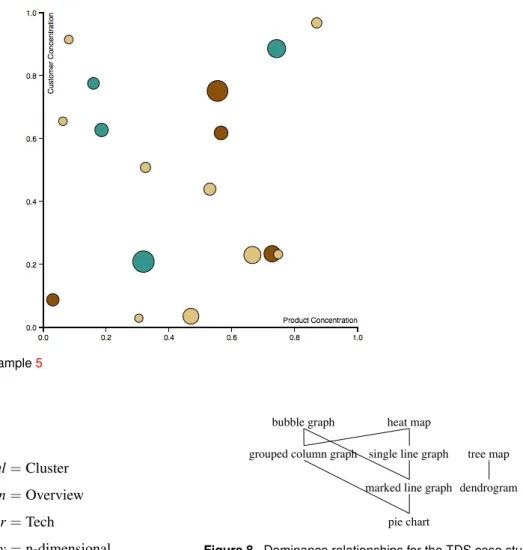
Example 5. Consider again the first, n-dimensional dataset
in Example 4, featuring 3 nominal and 3 ratio variables.
We assume that, based on her analysis objectives, the user has selected bubble graph out of the PIM skyline as the
preferred visualization type. As summarized in Table6, in
D3 a bubble graph has 5 graphical coordinates:X,Y(both
mandatory and requiring to be preferably either an interval or a ratio, but possibly also a nominal or an ordinal), Shape(optional, to be preferably bound to a nominal),Size (optional, to be preferably bound to a ratio but possibly also
to an interval), and Color (optional and compatible with
all variable types). Based on these constraints, a possible
binding (corresponding to the visualization in Figure7) is as
follows:
β(ProductConcentration) =X β(CustomerConcentration) =Y
β(TotValue) =Size β(Category) =Color Note that binding
β(ProductConcentration) =X β(CustomerConcentration) =Y
β(TotValue) =Size
for their analytics use cases, asked them to select one preferred visualization type out of those proposed by the system, and showed them the visualizations produced using the bindings in the PSM skyline. Here we will describe two use cases out of those evaluated, namely, the one related to threat detection and prevention in software ecosystems, and the one related to predictive maintenance of solar farms.
Threat Detection Systems
Threat Detection Systems (TDS) in software ecosystems47 detect potential attacks on the application landscape by gathering and analyzing log data, such as user change logs, security audit logs, remote function call gateway logs, and transaction logs. Logs are pre-processed, anonymized, translated into a common format, and analyzed by pattern or anomaly detection algorithms, which can highlight suspicious events. On top of the generated events and alerts, a detailed investigation is performed by a human expert to decide if a real attack was detected or was a false positive. However, with the increasing size and complexity of software systems, the volume and diversity of log data are becoming major issues. Customers use a large spectrum of different systems and adopt a wide range of data security policies. As a result, including and managing these heterogeneous log files currently requires a significant customization effort, especially when they contain sensitive and personal information (e.g., user IDs, IP addresses), come from logs of multiple customers, or are accessed via a third party (e.g., a cloud provider) running the TDS. Similarly, customers often need different security analyses depending on the security context, industrial sector, and risk management policies.
For simplicity, we focus on a simple, but relevant, scenario for TDS: security incident analysis through usage of anomaly detection analytics. The major challenge when searching for security incidents lies in the ability either to detect a deviation from a normal, standard behavior (unplanned anomalous activity) during or outside an exceptional process (planned anomalous activity), or to detect regular malicious activity merged into the normal state of operations (unplanned ordinary activity such as advanced persistent threat or repeated fraud). In this context, starting from a dataset where each row corresponds to a network node and is labelled with the size of data exchanged, the transaction type, and the user who activated the service, a clustering algorithm is applied. The users’ declaration for the data visualization
is dominated by the previous one because its active
domain is smaller. Overall, the PSM skyline for this
exampleconsists ofallthe bindings whereX,Y,and Size
are bound to any permutation of ProductConcentration,
CustomerConcentration, and TotValue, while Color and Shape are bound to either Metric, SubCategory, or Category.
Case
Study
and
Evaluation
ToevaluateSkyVizwehaveimplementedaJavaprototype whosewebinterface(developedinJavascript) supportsthe declarationofthevisualizationcontextandreturnsthebest visualizations; the underlying database is MySQL andthe reference graphical library for visualizations is D3. Both the PIM and the PSM skylines are computed using the
Maintaining the Window as a Self-organizing List variant
oftheblock-nested-loopsalgorithm8.Thenwehaveletthe users of the four pilot applications of the TOREADOR Projectusethisprototypetoexpressavisualizationcontext
Figure 7. Bubble graph for Example5 area is as follows: Goal=Cluster Interaction=Overview User=Tech Dimensionality=n-dimensional Cardinality=High
Independent Type=Ratio
Dependent Type=Nominal
with no priorities, which translates into the following visualization context:
C={Cluster,Overview,Tech,n-dimensional,High, Ratio-i,Nominal-d}
Cluster∼COverview∼C Tech∼Cn-dimensional∼C
C
∼High∼C Ratio-i∼CNominal-d
single line graph marked line graph
pie chart bubble graph
grouped column graph
heat map
dendrogram tree map
single line graph marked line graph
pie chart bubble graph grouped column graph
heat map
dendrogram tree map
single line graph marked line graph
pie chart bubble graph
grouped column graph
heat map
dendrogram tree map
Figure 8. Dominance relationships for the TDS case study
ScaleDataTransfer (ratio), User (nominal), Transaction-Type (nominal), andCluster (nominal). Here is an excerpt from the dataset:
ID DataSent ScaleDataTransfer User Trans.Type Cluster
32 916 −0.46290193656 u1 t3 6
232 967 −0.23589474886 u2 t5 5
432 1130 0.489638027516 u1 t2 6
632 1063 0.191412898577 u2 t3 4
832 1121 0.449577935569 u1 t1 2
As shown in Table6, the graphical coordinates for bubble graphs are X, Y (mandatory and independent), Size, Shape, and Color (optional and dependent). Two possible bindings are
β(ScaleDataTransfer) =X β(TransactionType) =Y
β(User) =Shape β(Cluster) =Color Thedominancerelationshipsinducedonvisualizationtypes
byC,computedasinSection“TranslatingtheCIMintothe PIM”basedon thescores excerptedinTable7,are shown inFigure8.ThecorrespondingPIMskylineincludesbubble graph,heatmap,andtreemap.Outof thesethree,theuser selectedbubblegraph.
To move to the PSM, we consider the details of the datasetresultingfrom clustering,whose mainvariablesare
Table 7. Suitability tuples for eight visualization types with reference to the visualization context of the TDS case study single line graph marked line graph pie chart bubble graph
Goal: Cluster unfit unfit unfit acceptable
Interaction: Overview fit fit fit fit
User: Tech fit fit acceptable fit
Dimens.: n-dimensional unfit unfit unfit fit
Cardinality: High fit discouraged discouraged discouraged
Ind. Type: Ratio-i fit fit discouraged fit
Dep. Type: Nominal-d unfit unfit unfit fit grouped column graph heat map dendrogram tree map
Goal: Cluster acceptable acceptable fit fit
Interaction: Overview fit fit fit fit
User: Tech fit fit fit fit
Dimens.: n-dimensional fit fit unfit acceptable
Cardinality: High discouraged fit acceptable acceptable
Ind. Type: Ratio-i acceptable fit unfit unfit
Dep. Type: Nominal-d unfit unfit unfit fit
and
β(ScaleDataTransfer) =Size β(TransactionType) =Y
β(User) =X β(Cluster) =Color
the mean time between failures, i.e., the predicted elapsed
time between inherent failures of a mechanical or electronic system during normal system operation.
Here we focus on a 3-dimensional dataset that includes, for 65 customers, a customer identifier, the mean time (in days) between battery charging failures, ChargingMTBF, and the one for which no power was generated by the solar panels,NoPowerMTBF. The visualization context declared by the users is as follows:
C={Comparison,Filter,Lay,n-dimensional,High, Nominal-i,Ratio-d}
Nominal-i∼C Ratio-dCComparison∼CFilter∼C
C
∼Lay∼C n-dimensional∼CHigh
The PIM skyline for this visualization context includes grouped column graph, dendrogram, and tree map; by discarding the visualization types that feature one or more unfit scores, only grouped column graph and tree map are left. The user clearly selected grouped column graph, which is more well-known and intuitive for a lay user.
To call the D3 library for creating grouped column graphs, we had to transform the dataset by replacing the two variablesChargingMTBFandNoPowerMTBFwith two variables MTBF and FailureType; the former stores the values of the two previous ratio variables, while the latter describes the values of the former and can take two nominal values,chargingandno power. There are two bindings in the PSM skyline: in both,MTBFis bound to Height;Customer andFailureTypeare bound to X and Color or vice versa. Of the two corresponding visualizations, users selected the one that bindsCustomerto X, since the customers are too many Of these, the first one (corresponding tothe visualization
in Figure 9) dominates the second one and is the one proposedtothe user.Though thisvisualizationisprobably not 100% optimal since it does not clearly show shapes (whichrepresent the User variable), it is the oneactually preferredbythe usersinceit properlyemphasizesclusters.
Predictive
Maintenance
of
Solar
Farms
This pilot is related to a global market leader in the development, acquisition, and long-term management of international large-scale solar projects and smart energy solutions.It hasdeveloped an asset management platform whose main goal is to provide, in a timely and concise manner,informationtotheusersontheoperationofthesolar farms.Alldataoriginatingfrom the fieldareforwarded to thisplatform,wheretheyarestoredandprocessed.
The usecasewe discusshereisrelatedtotheprediction of equipment maintenance based on historical data about equipment anomalies in work cycles of the devices (inverters,transformers, smart meterfailures). To thisend, data from the large-scale solar plants of three years and from residential assets are analyzed to prevent anomalies regarding spikes in voltage, giving frequency response of thegridquality,andreceivingtemperature ofinverters and ampereinformation.Specifically,analysesarefocusedon
Figure 9. Data visualization using a bubble graph for the TDS case study
SkyViz, the user would declare the following visualization context:
C={n-dimensional,Low,Interval-i,Nominal-i,Ratio-d}
Note that, to avoid biases, we have not specified the goal, interaction, and user coordinates. The PIM skyline for this context includes bubble graph, grouped column graph, and heat map (also single and marked line graph would be part of the skyline, but they can be excluded because they are scored as unfit on both the dimensionality and independent type coordinates). Indeed, heat maps can provide an effective visualization for the dataset at hand as shown in Figure13.d.
In the next example we discuss the impact of user-defined priorities on the PIM skyline. As already mentioned, the skyline for flat dominance always includes the skyline for dominance, i.e, prioritizing coordinate values leads to reducing the PIM skyline. As a consequence, users must be aware that providing priorities for coordinates may lead them to miss some effective visualization types for their dataset. On the other hand, priorities are useful to deal with situations where requirements are potentially conflicting, and users are willing to sacrifice the effectiveness of visualization from some points of view to increase it from other points of view. For instance, consider the following visualization context:
C={Comparison,Zoom,Lay,2-dimensional,Low, Interval-i,Interval-d}
declared by a lay user who wants to analyze a small 2-dimensional dataset providing daily temperatures in a given location during one month. The eight corresponding suitability sets are singled out in Table 8. The flat tobedisplayedusing colors.TheresultisshowninFigure
10.
The fact that users assigned to customers the role of the independent variable and to the mean times that of thedependent variables,led SkyViz tomiss the chance of proposingabubblegraphusingtheXandYaxistorepresent mean times as shown in Figure 11; such bubble graph, coupledwithadetail-on-demand interactionfor seeingthe detailsof single customers, mayindeed turnout tobe the mosteffectivevisualizationforthedataset.Infact,ourchoice of distinguishing independent from dependent data types invisualization contextshastwoconsequences: ontheone hand, it gives users a closer control of the PIM skyline andcreates a better connection tothe nextstage, i.e., the computationofthePSMskyline;ontheother,shouldusers failinproperlyidentifyingtherolesofvariables,itmaylead tomissinginterestingvisualizations.
Evaluation
ForamorecriticalevaluationofSkyViz,inthissectionwe simulatesomechallengingscenarios.
First of all, we show a simple example for which SkyVizcan suggest an effective visualization which alay user would hardly think of. Consider a dataset including threevariables:Quarter(interval), Country(nominal),and DollarSales (ratio). To visualize this dataset, a lay user would probably choose either a grouped line graph (e.g., using different colored lines for countries like in Figure 13.a),oragroupedcolumngraph(usingcolorstorepresent countrieslikeinFigure13.b),ormaybeevenabubblegraph (placing countries andquarters on the X and Y axis, and usingthebubblesizetorepresentsaleslikeinFigure13.c). These intuitive bindings are summarized in Figure 12. In