ALTERNATIVES TO THE POPULATION PYRAMID FOR MAPPING AGE-SEX CHARACTERISTICS OF METROPOLITAN CENSUS TRACTS
Richard Lycan
Center for Population Research and Census Portland State University, Portland, Ore. 97207 I. Introduction
Data on the age and sex of residents are extensively used in the planning of health care and other social services programs. This information must be available for small geographic areas, such as metropolitan census tracts, when planning facility locations or designing service delivery systems. Often it is desirable to utilize maps showing age-sex characteristics of tracts, either as a tool to help the planner visualize possi bilities or to communicate alternatives to interested groups. Two types of maps are typically utilized to display such information: (1) choropleth maps for in dividual age-sex groups (eg: males 65 years or older) or (2) multiple population pyramids superimposed upon a base map. The choropleth map suffers by requiring as many maps as age-sex groups, making intergroup com parisons difficult. The use of pyramids permits a single map, but is visually so complex that comprehen sion of spatial patterns is difficult.
This paper describes and graphically displays several alternative approaches for mapping age-sex character istics of metropolitan census tracts. These alterna tives are based in part on a factor analysis that reduces the numbers of categories to be mapped from approximately 30 age-sex groups to two to four deriv ative components and permits the use of simpler mapping symbology than the age-sex pyramid. The alternative displays include: (1) a typology of pyramids for use in the legend of age-sex pyramid maps which facilitates
reading this complex type of map, (2) a process color map, which can be computer produced, showing areas of particular types of age-sex characteristics, and (3) a polar coordinate type symbol which may better allow the viewer's eye to detect qualitative differences in age- sex characteristics of metropolitan area tracts. Ana lyses carried out for two cities (Madison, Wis. and Portland, Ore.) suggest that these techniques can be generalized.
II. Conventional Displays for Age-Sex Data
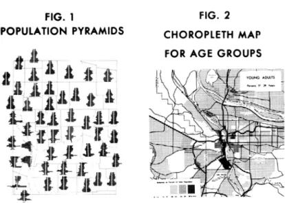
The most common form for the graphic display of age-sex information is the population pyramid, illustrated here for a major part of a metropolitan area (Figure 1). Population experts can look at the profiles of such pyramids and recognize the effects of the "great
depression", the "post World War II baby boom" and even events unique to the local area. Two pyramids can be compared by superimposing them or simply viewing them adjacent to each other. However, when a large number of pyramids are simultaneously displayed, even a train ed demographer has difficulty making sense of the geo graphic patterns. There are two main reasons for this confusion: (1) When many pyramids must be presented in a small space, as on a book page sized map, the leg ibility of the labeling of the age groups cannot be preserved. The reader can easily identify the youngest and oldest age groups at the upper and lower extremes of the diagram, but must count lines or make rough intuitive judgments of the vertical position for the intermediate age groups. These processes are slow, frustrating and error prone. (2) When pyramids are used to show census tract age-sex characteristics, tracts are usually chosen which highlight the phenomena being illustrated. The population pyramids for skid row tracts, tracts including college dormitories, or tracts of newly built suburban housing are easy to recognize. However, most metropolitan census tracts are hetero geneous due to aggregation of two or more dissimilar areas or to changes occurring over time, such as the gradual resettlement of older neighborhoods by younger families. Where such heterogeneity exists, the result ant pyramids can be difficult to interpret.
Spatial patterns can be seen better in chorpoleth maps of individual age groups (Figure 2). Where the age group under consideration is clearly defined, such as
FIG. 1 POPULATION PYRAMIDS -*
1:74:*
Jl jL A
* i. A
*
.
FIG. 2 CHOROPLETH MAP FOR AGE GROUPSFIG. 3 FLOW CHART FOR MODEL
DATA REGRESSION OF SEX RATIOS , ON FACTOR ' SCORES / TYPOLOGY OF PYRAMIDS EVALUATION RECONSTRUCT AGE—SEX *S
by a law pertaining to persons 65 and over, such a map may adequately depict the geographic distribution. However if the reader needs to comprehend information about and relations between several age groups the lim itations of the human eye and mind make it difficult for the reader to utilize the information displayed simultaneously on maps of several age groups. There also can be a problem in the aggregation of various ages into a single age group. For example, a map of the five year age group 15 to 19 can be somewhat con fusing because it includes both persons living at home with parents and those who have established separate households.
III. The Model Employed for Data Reduction
Age-sex data for census tracts for Madison, Wisconsin and Portland, Oregon were Factor analyzed in order to reduce the complexity of the data and thus allow the use of simpler maps to display complex data. The model utilized is diagramed in Figure 3 and the results are graphically displayed in Figures 4 and 5. Interested persons may contact the author for a more detailed discussion of the methodology or a copy of the com puter program used in the analysis.
The data analyzed is the same as that displayed on a population pyramid (Figure 1). Age composition and sex composition are analyzed separately (Figure 3) as
"percent by age" and "sex ratio", the number of males per female. The percent by age data were transformed by means of a square root transformation to reduce skewness and a small number of outlier values, such as skid row and student dormitory areas, were eliminated. The percent by age data were subjected to a principal components type of factor analysis in order to produce factor loading and score matrices. The eigenvalues (Figure 4) indicate that the first four and especially the first two factors account for most of the varia tion in age structure. The factor loading diagrams
(Figure 5) are quite similar for the two cities. Those groups found near each other on the diagrams tend to be co-located in actual city space as well. The third and fourth factors are smaller and result mainly from a few concentrations of young adult populations, such as those clustered around college campuses.
Table 1. Example of Data for One Tract Tract 1.00 Age Group 00-04 05-09 10-14 15-17 18-24 25-34 35-44 45-54 55-59 60+ Total 143 141 158 91 228 226 155 167 66 107 1482 115 161 136 83 195 219 170 178 55 142 1454 258 302 294 174 423 445 325 345 121 249 2936 .088 .103 .100 .059 .144 .152 -111 .118 .041 .085 -.296 .321 .316 .243 .380 .389 .333 .343 .203 .291 -Males Females Persons % by age J% by age Sex ratio 1.24 0.87 1.16 1.10 1.17 1.03 0.91 0.94 1.20 0.75
FIG. 4 EIGENVALUES FOR PERCENT BY AGE DATA
Size 5-•
Portland, Ore.
16 Age Groups Size
5--Madison, Wis
2 3 i 5 6 3 45 6r 8 9 10
Factor by order Factor by order
FIG. 5 FACTOR LOADINGS FOR PERCENT BY AGE DATA
0-4 • X 30-34
I——ffH——I——h
15-19 * 45-49 1.0
So far the analysis has been concerned only with age distributions, not the varying proportions of males and females. A regression analysis was performed to find out whether it would be reasonable to view geo graphic sex ratio variations as largely explained by geographic age variations. The results suggest this to be true to some extent, but multiple correlations are not high.
As a check on the model the factor scores and loadings (for age factors I-IV) and regression weights for sex ratios were used to reconstruct the pyramids for each tract. The results were highly encouraging for the age data with about half the correlations between actual and estimated percent by age over .99. The results for sex ratios were not as good as shown by the correlation coefficients, but the errors as measured by Gini coef ficients, were about equal in absolute terms to those for percent by age.
IV. Alternative Graphic Displays
The analysis described above allows a considerable re duction in complexity of the age-sex data. Several examples of maps stemming from this analysis are dis cussed below.
The first example is a legend intended to assist the reader in interpreting maps which are composed of "synthesized" population pyramids (Figure 6). This diagram provides the reader with a visual crutch which can help make sense of the sometimes bewildering var iety of pyramids that appear on the map. These leg end pyramids were constructed from the model's factor loadings and regression values.
The second example is a map composed of color tones (Figure 7) which also are used in the map legend and are intended to allow the reader's eye to scan the map more rapidly. This color coding should aid the map reader in such tasks as (1) finding areas with certain types of population structures; (2) comparing areas; and (3) making general statements about regional trends and differences. Population pyramids (as in Fig. 1) can be printed over these tones, as could dots or other point or line symbols. The values for the color sep arations are factor scores for factors I and II from the age analysis, color standardized to key the
mag-FIG. 6 A TYPOLOGY OF PYRAMIDS MAGENTA
il - */«
mm i- *• • •; • .-• ' \ A I..,
x it
^r^t"
illtiXiA !
ITA'IW /
-jV^'' v - -il* ^ *• I* ; „' -•-. / .r ^ FIG. 7 SEPARATIONS FOR COLOR MAPAge pyramids (Fig. 1) may be overprinted on three color age map.
FIG. 8 POLAR DIAGRAM FOR AGE
I
CYAN YELLOW CYAN Color separations for use with the diagram to left.Older families
enta separation to the family age groups.
The third example is a polar coordinate graph which displays age structure, but not sex composition dif ferences (Figure 8). The order of the age classes used in this display is the same as their location on age factors I and II. The logic of this placement is that groups which tend to be co-located in the city are placed in adjacent positions on the diagram. This dia gram may be preferable to the population pyramid be cause (1) on a small symbol the reader can better iden tify individual age groups, (2) the qualitative dis tinctions between areas with differing age structures may be enhanced, and (3) spatially associated age co horts are grouped together.
Whether these experimental diagrams are as effective as the traditional use of population pyramids on maps may be difficult to determine because the pyramid is so widely used and accepted. Nevertheless, the author is presently attempting to arrange for such testing. Efforts are also underway to carry out the data reduc tion analysis for additional cities in order to better evaluate the model's generality.
Sources Utilized
Board, Christopher. "Map Reading Tasks Appropriate in Experimental Studies in Cartographic Communication," The Canadian Cartographer, Vol. 15 (June 1978), pp.1-12 Guest, Avery. "Patterns of Family Location," Demography Vol. 9 (1972), pp. 159-172.
Robson, B.T. Urban Analysis. London: Cambridge Univer sity Press, 1969.
Schmid, Calvin F. and Stanton E. Schmid. Handbook of Graphic Presentation. New York: John Wiley & Sons, 1979 Shyrock, Henry S; Jacob Siegal et al. The Methods and Materials of Demography. Washington: U.S. Government Printing Office, 1971.
Wang; Peter C. C. (Ed.) Graphical Representation of Multivariate Data. New York: Academic Press, 1978.