Exploratory Visualization of Multivariate Data with Variable Quality
∗
Zaixian Xie Shiping Huang Matthew O. Ward Elke A. Rundensteiner
Computer Science Department Worcester Polytechnic Institute {xiezx,shiping,matt,rundenst}@cs.wpi.edu
ABSTRACT
Real-world data is known to be imperfect, suffering from various forms of defects such as sensor variability, estimation errors, uncer-tainty, human errors in data entry, and gaps in data gathering. Anal-ysis conducted on variable quality data can lead to inaccurate or in-correct results. An effective visualization system must make users aware of the quality of their data by explicitly conveying not only the actual data content, but also its quality attributes. While some research has been conducted on visualizing uncertainty in spatio-temporal data and univariate data, little work has been reported on extending this capability into multivariate data visualization. In this paper we describe our approach to the problem of visually exploring multivariate data with variable quality. As a foundation, we propose a general approach to defining quality measures for tabular data, in which data may experience quality problems at three granularities: individual data values, complete records, and specific dimensions. We then present two approaches to visual mapping of quality infor-mation into display space. In particular, one solution embeds the quality measures as explicit values into the original dataset by re-garding value quality and record quality as new data dimensions. The other solution is to superimpose the quality information within the data visualizations using additional visual variables. We also report on user studies conducted to assess alternate mappings of quality attributes to visual variables for the second method. In ad-dition, we describe case studies that expose some of the advantages and disadvantages of these two approaches.
Keywords: Uncertainty visualization, multivariate visualization, data quality.
Index Terms: H.5.2 [Information Interfaces and Presentation]: User Interfaces—Graphical user interfaces
1 INTRODUCTION
The validity of decisions made and information extracted from ex-ploratory visualization is, in a large part, dependent on the quality of the underlying data. The termdata qualityin this paper denotes the degree of uncertainty for the data. High quality indicates that the data is of high certainty and reliability. The variability of data quality has many causes and manifestations, including data accu-racy, completeness, certainty, consistency, or any combination of these. It can include statistical variations or spread, errors and dif-ferences, minimum-maximum range values, noise, or missing data [15]. Visualization of data with variable quality and uncertainty has been identified as a critical research area in recent publications on future directions for visualization research [20, 10].
Information visualization is an increasingly important technique for the exploration and analysis of large datasets. Visualization takes advantage of the immense power, bandwidth, and pattern
∗This work is supported under NSF grants IIS-0119276, IIS-00414380
and a grant from the NSA.
recognition capabilities of the human visual system. However, such power is limited by the visualization itself, that is, the conclusions drawn from the graphic representation are at best as accurate as the visualization. Therefore, to maintain the integrity of visual data ex-ploration it is important to design a visualization so as to convey not only the actual data but also its quality [2].
In recent literature, we can find a number of research activi-ties focused on visualizing quality attributes of data. They gen-erally fall into two aspects, missing values and uncertainty visu-alization. XGOBI [18] and MANET [22, 7] are two visualization tools designed to deal with missing values. Uncertainty visualiza-tion is a very active research area that started in the GIS community [11, 24, 16, 9] and extended to other forms of data [5, 14]. However, prior work has primarily focused on spatio-temporal or univariate data. Little research has been reported on conveying data quality information within multivariate visualization techniques, which is surprising given how common multivariate data is in a wide range of applications.
Communication of potentially large and complex amounts of quality attributes for multivariate data presents a significant chal-lenge. First, we need an appropriate model for quality measures, with the consideration that different data records, dimensions, or attribute values can have different levels or types of quality. Sec-ond, we need to find ways of incorporating quality information into the visual exploration process without overwhelming the analyst. As a motivating example of the need for conveying quality infor-mation, refer to Figures 1 and 2, which present an adaptation of the carsdataset [17]. We generated Figure 1 using traditional paral-lel coordinates without quality information. Figure 2 conveys the quality of records by means of the color of polylines. Red and or-ange polylines indicate that the corresponding records are of high or moderate confidence. In contrast, green lines correspond to records of low confidence. By ignoring green lines denoting records with low quality, Figure 2 reveals a relationship among the three dimen-sions: the more cylinders a car has, the lower its MPG and the higher its horsepower. Such a pattern is difficult to extract from Figure 1, since the quality of the data is not shown.
Figure 1: Parallel coordinates without quality information (the dataset is adapted fromcars)
Figure 2: Parallel coordinates with quality information (record quality is mapped to the color of polylines)
• Developing a framework to define quality measures: Regard-ing the issue of data quality modelRegard-ing, we define quality mea-sures for multivariate data at three granularities, namely data value quality, record quality and dimension quality.
• Extending datasets with quality information as new dimen-sions: We construct new datasets that embody data value qual-ity and record qualqual-ity as new dimensions along with the origi-nal data records. In this way, we can use existing multivariate visualization techniques to convey quality information.
• Encoding quality information into the visualization of data: We incorporate data quality attributes into several multivariate data displays to convey this meta-information to users when they explore data.
• Evaluation of mappings from quality measures to visual vari-ables: We present the results of a user study to compare the capabilities of different visual variables to convey quality at-tributes.
The remainder of this paper is organized as follows: In Section 2 existing techniques for data quality modeling, missing values visu-alization, and uncertainty visualization are reviewed. In Section 3 we propose a model of quality measures and two general ap-proaches to visualizing quality measures. Section 4 describes the sample datasets used to demonstrate our techniques. Section 5 and 6 are dedicated to the discussion of two types of techniques to su-perimpose quality attributes on traditional multivariate data visual-izations. Section 7 compares the two approaches and shows their advantages and disadvantages. Section 8 describes the user studies we performed. We conclude this paper in Section 9 with discus-sions and possible future research directions.
2 RELATED WORK
Data quality issues have been studied by many different research communities. Several important topics related to our work, includ-ing the definition and modelinclud-ing of uncertainty, missinclud-ing data visual-ization, and uncertainty visualvisual-ization, are briefly discussed.
A report [19] by NIST divided uncertainty into two categories named Type A and Type B, which Olston and MacKinlay [14] called statistical uncertainty and bounded uncertainty. The former defines the uncertain value by a peak value and a potential distri-bution, while the latter gives a precise lower and upper bounds to convey the uncertainty. It is common to use a scalar value to present the certainty degree [24, 5], although more complex representations are possible.
XGOBI [18] and MANET (Missing Are Now Equally Treated) [22, 7] are data visualization and analysis tools designed to handle missing data. Estimated values for the missing fields are generated by statistical inference algorithms. They then present graphic dis-plays where the missing fields are replaced by the estimated values with indicators (e.g. different colors or positions) attached to show that values for those fields had been missing. The techniques, how-ever, are generally limited to univariate or bivariate data.
Data uncertainty is a facet of data quality that has been studied in many fields, including the GIS community. The NCGIA ini-tiative on ”Visualizing the Quality of Spatial Information” [3] dis-cussed the components of data quality, representational issues, the development and maintenance of data models and databases that support data quality information, and evaluation of visualization solutions in the context of user needs and perceptual and cogni-tive skills. After the NCGIA initiacogni-tive, a flurry of activities have focused on uncertainty definition, modeling, computation and visu-alization [9, 11]. Within visuvisu-alization, different practices in terms of graphical variable mappings have been tested. Use of color, hue, texture, fog and focus in static rendering of uncertainty and use of
animation, flashing alternatively between data and its uncertainty, have been discussed in [3].
Wittenbrink, Pang, and Lodha [24] proposed a number of glyphs for visualizing uncertainty found in vector fields. Many mappings of uncertainty degree to glyph attributes were developed and evalu-ated. This work was greatly expanded in [16], where they describe techniques such as adding glyphs, adding geometry, modifying ge-ometry, modifying attributes, animation, sonification, and psycho-visual approaches.
Cedilnick and Rheingans [5] took a somewhat different ap-proach, in that they embedded certainty information into annota-tions such as grid lines on displays. Distorannota-tions in the width and shape of these lines conveyed the level of certainty in the data in different regions of the data space while still allowing users to see the underlying data. Another unusual approach was reported by Brown [4], who used vibration of attributes such as hue, luminance, and vertex position to convey uncertainty.
These techniques are primarily directed toward spatio-temporal or univariate data and to date have not been applied to multivariate data. We will not only propose a general framework to fill this gap, but also present and evaluate two approaches in detail.
3 MODELING OF DATA QUALITY AND GENERAL AP
-PROACHES
3.1 Data Structure for Quality Measures
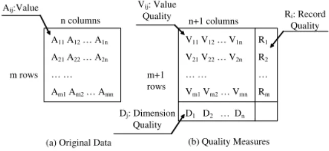
As a reasonable starting point, we employed scalar values to mea-sure uncertainty. While more complex representations can be imag-ined, we felt this basic assumption would be adequate in many, if not most, applications. We also noted that each data value, each record and each dimension might have an associated uncertainty measure. For example, occasional human error on data entry re-sults in uncertainty of a single value; uncooperative participants in a survey may generate entire records of low confidence; a defec-tive sensor might make a specified attribute highly unreliable in the whole dataset. Therefore, we assumed that quality measures consist of a vector of values for the record quality (one entry per record), a vector for the dimension quality (one entry per dimension), and a two dimensional table of values for the data value quality (one entry per value in the original dataset). All values for quality measures are normalized to the range of zero (lowest quality) to one (perfect quality). Figure 3 shows the configuration of these three types of data quality. m rows n columns A11A12… A1n A21A22… A2n … … Am1Am2… Amn
(a) Original Data
V11V12… V1n V21V22… V2n … … Vm1Vm2… Vmn R1 R2 … Rm D1 D2 … Dn m+1 rows n+1 columns (b) Quality Measures Vij: Value Quality Ri: Record Quality Dj: Dimension Quality Aij:Value
Figure 3: The structure of data quality defined in this paper
3.2 Combining Quality Measures with the Original Dataset
Obviously, quality measures can also be stored in tabular format, so we can visualize them using techniques applied to multivariate data. We could just use two separate multivariate visualizations, one for the data, and the other for the quality attributes. This, however, makes it difficult to see relationships between data and its quality. Instead, we can extend our dataset to include value and record qual-ity as new dimensions. In other words, we combine the two tables
shown in Figure 3 except the bottom line of table b. For example, if the original dataset hasndimensions, the augmented dataset now has 2n+1 dimensions, with the additionaln+1 dimensions used forncolumns of value quality and one column of record quality. Therefore, we can convey the quality information together with the original dataset if we apply existing multivariate visualization tech-niques to this quality-extented dataset.
3.3 Encoding Quality Attributes in Data Visualization
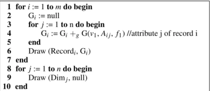
Another alternative approach is to convey quality measures using the graphical attributes of visual elements in existing multivariate visualizations. For example, the width of a polyline in parallel co-ordinates can represent the record quality of the corresponding data point. To conceptualize our approach, we will first define two func-tions and one operator, and then give an algorithm to describe the general process.
G(v,x,f) : vis a visual variable,xis a numerical value repre-senting a quality measure, and fis a mapping function from a quality measure to the visual variable. This function returns a graphical attribute corresponding toxin terms of the given visual variable and mapping function. For example, ifvis the line width, and fmaps one (perfect quality) to the thick-est width and zero (lowthick-est quality) to the thinnthick-est width, the result will be a line width that is used to denote a quality mea-sure.
Draw(ob, G) : Draw the objectobwith G as its graphical at-tribute (set). For example, ifobis a line,G={G1,G2},G1
is a specific color, andG2is a specific line width, then this
function will draw the line with the specific color and width.
+g: This operator returns the union of two graphical attributes. Based on the above definition, the pseudo-code in Figure 4 shows a normal approach used by most multivariate visualization meth-ods. Heremis the number of records,nis the number of dimen-sions andv1 is the visual variable to denote attributes of records. For example,v1might be the length of ray axes in star glyphs. The last three lines (8-10) are only used for some of multivariate visu-alization techniques. For example, in parallel coordinates, we need them to draw the axes. Starting from this pseudo-code, we can derive our general approach, as shown in figure 5, to incorporate quality information into normal multivariate visualizations. Note that the three underlined steps, line 5, 7, and 11, are to combine graphical attributes from Figure 4 with new ones corresponding to the three types of quality measures, namelyVi j,RiandDj, in the algorithm. v2,v3andv4are visual variables to convey data value
quality, record quality and dimension quality respectively. f2, f3
and f4are the corresponding mapping functions.
1 fori:= 1tomdo begin 2 Gi:= null 3 forj:= 1tondo begin 4 Gi:= Gi+gG(v1,Ai j, f1) //attribute j of record i 5 end 6 Draw (Recordi, Gi) 7 end 8 forj:= 1tondo begin 9 Draw (Dimj, null)
10 end
Figure 4: Normal approach used in multivariate visualization To make the resulting visualization clear and help users interpret the data and its quality, two variations to the process described in Figure 5 are possible. First, in some situations, the user may only be
1 fori:= 1tomdo begin 2 Gi:= null
3 forj:= 1tondo begin 4 Gi:= Gi+gG(v1,Ai j, f1)
5 Gi:= Gi+gG(v2,Vi j, f2) //data value quality
6 end 7 Gi:= Gi+gG(v3,Ri, f3) //record quality 8 Draw (Recordi, Gi) 9 end 10 for j:= 1tondo begin 11 Gj:= Gj+gG(v4,Dj, f4) //dimension quality 12 Draw (Dimj, Gj) 13 end
Figure 5: Our general approach to incorporating quality information
interested in a subset of the three quality types. The user may also at times feel that it is difficult to extract useful information when the visualization becomes overloaded with excessive information. We provide an interaction GUI to disable the visualization of any of the three quality types. Second, for situations where only a single type of quality information is to be conveyed, we investigateredundant mappings, where the quality information is mapped to more than one visual variable. This is important in some mappings where am-biguous interpretation is possible (e.g., depth in 3-D versus color).
4 SAMPLEDATASETS
It is difficult to find existing datasets augmented with a wide range of quality characteristics. However, we can easily collect some datasets with missing values from popular repositories. Starting from these datasets, the quality measures can be derived by imputa-tion algorithms when the missing values are replaced with synthetic values. Below is the detailed description.
We employed a multiple imputation algorithm [1, 8] to generate estimated values for missing values. This algorithm repeats the im-putation process more than once, producing multiple complete data sets until the estimates converge. Therefore, we can getnvalues for each missing value, namelyyk(1≤k≤n), if we repeat the impu-tation processntimes. The formula to calculate data value quality for this missing value is given by
V=1.0− δy
Xmax−Xmin (4.1)
HereXmaxandXminare the maximum and minimum values of the dimension on which the missing value is.δyis the standard devia-tion ofyk(1≤k≤n). If the initial estimated value is close to the final imputed value,δyis small andV is close to 1.0. It shows that the imputed value is reliable. Otherwise, the imputed value is not reliable. Ifδy>Xmax−Xmin, we need to set the quality measure to 0.0 arbitrarily.
In this paper, we selected the datasetsEchocardiogramand Au-tomobilefrom [13]. Both have several missing values. The former describes patients that suffered heart attacks at some point in the past by some pathologic parameters. The latter presents the rela-tionship between average loss payment per insured vehicle year and other characteristics of cars. We only show a subset of dimensions in Figure 6 and 9 to make it easy to find patterns related to quality.
To present the effectiveness of our approaches, we employed an alternative method, namely adding noise, to create datasets with quality measures starting from some real datasets without missing values. We add some random real numbers to a subset of data val-ues in the dataset, and then compute the data value quality by in-verse proportion to the absolute value of the noise. Note that the final value quality measure should be normalized to the range [0,1].
The datasets to which we applied adding noise include a time series datasethipel-mcleod [17], a botanical datasetiris[6], and a product datasetcars [17], respectively. Hipel-mcleod presents the relationship among precipitation, temperature and daily flow of two rivers during a whole year. The attributes inirisare petal and sepal sizes for the iris flowers. The dimensions ofcarsdescribe the attributes of cars, including MPG, horsepower, the number of cylinders, and several others. Figures 1 and 2 in Section 1 only show the first three dimensions of this dataset to demonstrate our motivations more clearly.
Based on the value quality measures we obtained using the above two methods, we compute record quality and dimension quality measures by the following formulas:
Ri=∑ m j=1Vi j m ,Dj= ∑n i=1Vi j n (4.2)
Herenis the number of records,mis the number of dimensions,Ri is the quality measure of the recordi, andDjis the quality measure of the dimension j. Note that many ways exist to compute these quality attributes. Our goal was not to develop metrics, but to show how they could be incorporated into visualizations.
5 AUGMENTING DATASETS WITH QUALITY INFORMATION ASNEWDIMENSIONS
In this section, we show our approach to conveying quality infor-mation by embodying data value quality and record quality into the original dataset as new dimensions. We focus on three existing vi-sualization techniques, namely parallel coordinates, scatterplot ma-trices and star glyphs. We identified several tasks that users might wish to perform when exploring datasets with variable quality. This list can help us design more effective visualizations:
• High quality data task: Focusing on the data that is of high quality (value or record) to draw conclusions with high confi-dence.
• Quality-data relationship task: Determining the relationships between quality measures and the original data.
• Quality information task : Obtaining information about the quality measures themselves, such as range and distribution. We can visualize the quality-extended dataset directly using mul-tivariate data visualizations. However, some of our prior research [25, 12] inspired us to do further processing on the final data map-ping.
• Dimension masking: We can make some quality dimensions
invisible to show only those in which users are interested. For example, we can show value quality only for dimensions in which it varies significantly.
• Dimension interleaving: Yang et al. [25] added two addi-tional axes for each original dimension to present the degree of dissimilarity for a single data item in a dimension cluster. Two new axes were used to show the minimum and maxi-mum of the corresponding dimension clusters for every data point. We borrowed this idea and regarded the value quality as an associated axis of the corresponding data dimension axis. We also put each value quality dimension close to its corre-sponding data axis. This variation can help analysts obtain the relationships between data values and their value quality.
• Interactive brushing: Martin and Ward [12] introduced and implemented N-dimensional brushing for XmdvTool. Based on this technique, we can easily implement a quality brush on the quality-extended dataset. The brush can extend across all
of the value quality dimensions, or focus on record quality. Thus analysts can easily draw more reliable conclusions by, for example, selecting only records of high quality.
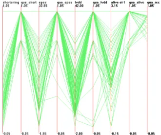
Figure 6: Enlarged dataset with quality measures visualized using parallel coordinates and dimension reordering(dataset:an adaptation ofEchocardiogram)
Figure 6 shows the dimension interleaving technique on the quality-extended dataset. Each value quality axis is put beside the corresponding data dimension axis. The last axis is record qual-ity. In this figure, we can find some patterns among the quality measures. Most of records have perfect value quality measures. Several lower value quality measures only exist on dimensionsepss and lvdd. Moreover, the lower value quality measures normally correspond to lower value on the original dimensions. An evident limitation of this technique is that the figure cannot show any data correlation between different dimensions anymore.
Figure 7: Interactive quality brushing (dataset:an adaptation of hipel-mcleod, red point: selected data point)
In Figure 7, we constructed an N-dimensional brush across all of value quality axes and the record quality axis to select data points with high confidence. We masked two value quality axes and the record quality axis to save space for the data display. Since high confidence data points are marked in red, we can easily observe that
high flow only occurs in times of high temperature, by focusing on red points. We can also note some patterns about the quality measures. For example, low flow data on dimensionsVatnsdand Jokulsatends to be of high data value quality.
6 INTEGRATINGQUALITYATTRIBUTES INDATAVISUALIZA
-TIONS
In this section, we discuss techniques to integrate quality attributes in three multivariate visualization methods. First, we show the un-derlying principles for selecting visual variables, and then present some effective configurations to map quality types to visual vari-ables. We draw some conclusions about strengths, weaknesses, and limitations of the particular configurations or visual variables.
6.1 Selection of Visual Variables
Since we wish to embed the quality information in graphical at-tributes of existing visualizations, the selection of visual variables is one of the key factors in determining whether the visualization can enable users to interpret the quality information and draw re-liable conclusions quickly. We first describe some strategies for selecting visual variables based on studies in perception, and then show our analysis.
Starting from perception theory [23] and the tasks identified in section 5, we consider the following criteria:
• Preattentive processing: Since we hope users will be able to easily identify data with high quality, we should use visual variables that are preattentively processed.
• Integral-separable dimension pairs: In visualization, a popu-lar technique is to employ two or more graphical attributes of a visual object to represent different attributes of an actual ob-ject. The concept of integral-separable visual dimensions tells us whether one display attribute will be perceived indepen-dently from another. With integral graphical attributes, differ-ent attributes of a visual object are perceived holistically and not independently. On the contrary, with separable graphical attributes, people tend to make separate judgment about each graphical dimension [23]. In our general approach as shown in Figure 5, the visual variablesv1,v2andv3for quality at-tributes may each be attached to the same visual element. It is necessary to make any two of them as separable dimension pairs, so people are able to make separate judgments on data values, associated value quality and record quality.
• Monotonicity: Normally, monotonic display variables should be used to convey scalar values used to present quality mea-sures. For example, most hue sequences (rainbow, red-green) are not monotonic, and thus we should not use hue for the quality-data relationship tasks or quality information tasks identified in Section 5. However, for the high quality data task, since users only focus on data with high quality, display variables without monotonicity also can work well.
A complete list of graphical attributes that are preattentively pro-cessed can be found in [23]. Some of them are not suitable for the multivariate visualization methods we used, such as line orienta-tion and curvature. After considering the availability of each visual variable, we obtained a list we can use for conveying either data values or quality attributes : size (length, width), blur, color (hue, saturation, brightness), and position (2D, 3D). Since the degree of preattentive processing depends on the context [23], extensive eval-uations need to be performed to identify the most effective visual variables.
Actually, integrality-separability is described as a continuum [23]. Regarding the list we derived above, we have some separa-ble dimension pairs, including position (2D, 3D) and size, position
and color (hue, saturation, brightness), 2D position and the third di-mension, color and size. However, x-size and y-size, along with any two of the three parameters of color (hue, saturation, brightness) are most integral. We should avoid using the last two combinations. In addition, some of our experiments indicate that the third dimension can cause difficulties in observing data in parallel coordinates and scatterplot matrices because of serious occlusion.
To date, we have identified several available visual variables for each multivariate data visualization (Table 1). Note that the items marked with stars are not monotonic and thus are not generally suit-able for the quality-data relationship or quality information tasks.
Visualization Visual Variables Parallel
Co-ordinates
Line width, Blur*, Hue*, Saturation, Brightness
Scatterplot Matrices
Point size, Blur*, Hue*, Saturation, Bright-ness
Star Glyphs Line width, Blur*, Hue*, Saturation, Brightness, 2D position, 3D position
Table 1: The available visual variables for each visualization tech-nique
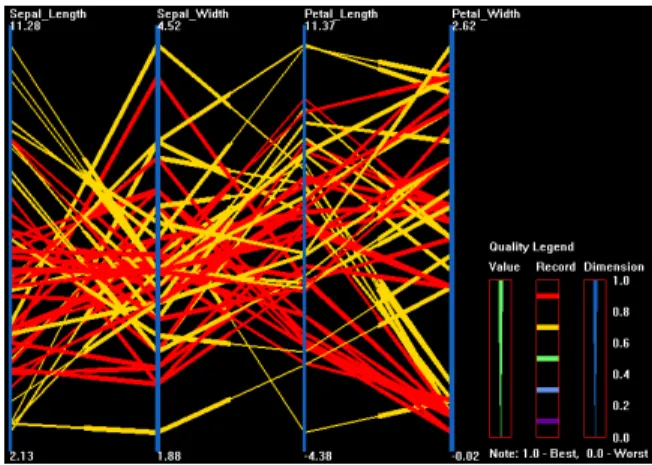
Figure 8: Sample of parallel coordinates (dataset:an adaptation of iris, value quality:line width, record quality:hue, dimension quality:line width)
6.2 Visualizing Quality on Existing Multivariate Visual-ization Techniques
In parallel coordinates, we map record quality and dimension qual-ity to the graphical attributes of polylines and vertical axes respec-tively. To represent the value quality of one record for dimension j, we choose the section of the polyline near dimension j corre-sponding to this record, and then use the graphical attributes of this section to convey the value quality. It is evident that we cannot map record quality and value quality to the same visual variable. Figure 8 shows an example. In this figure, the record quality is mapped to hue, while value quality and dimension quality are both mapped to line width. We can see the roughly positive correlation between dimensionPetal LengthandPetal Widthif we focus on red lines or thick lines (records and values with high quality). It is difficult to draw such a conclusion without the data quality information.
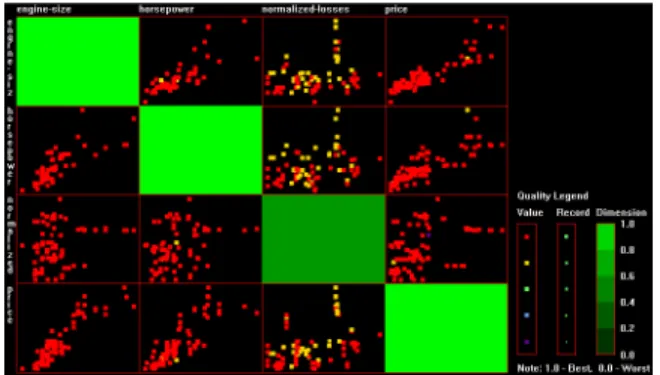
For scatterplot matrices, we map dimension quality to graphical attributes of the diagonal plots. We map record quality and value quality to two graphical attributes of the points. One attribute rep-resents record quality, the other reprep-resents the value quality of the dimension controlling the horizontal coordinate. In Figure 9, the hue of the points is used to convey value quality, while point size
represents record quality and the saturation of diagonal plots de-notes dimension quality. Here we used the adaptation of the dataset Automobile. We can clearly see that the dimension normalized-losseshas some imperfect values in yellow color that result from missing values. These values occurs when dimensionsengine-size, horsepowerandpricehave high values. We can draw an interesting conclusion that values ofnormalized-losseswill often be unavail-able whenengine-size,horsepowerorpricehas higher values.
Figure 9: Sample of scatterplot matrices (dataset:an adaptation of Automobile, value quality:hue, record quality:point size, dimension quality:saturation)
On star glyphs, we mapped value quality to graphical attributes of the ray axes, and record quality to graphical attributes of the glyph perimeter or the whole glyph. We present two examples of mapping quality to star glyphs. In Figure 10, the line width and brightness convey the value quality and the record quality, respec-tively. From this figure, we can see that some dimensions almost always have low value quality(thin ray axes), but others do not. In Figure 11, we employ a redundant mapping, with the depth and hue both conveying the record quality. We can easily obtain the distri-bution of record quality measures from this figure.
Figure 10: Sample of star glyphs (dataset:an adaptation ofcars, value quality:line width, record quality:brightness )
6.3 Analysis
Using several datasets, we studied the strengths and weaknesses of each several mappings based on combinations of the selected visual variables. We concluded that:
• Line width, hue, saturation, and brightness can be used for conveying dimension quality in either parallel coordinates or scatterplot matrices.
• We can easily integrate data value and record quality into nor-mal visualizations when we map quality measures to hue, sat-uration and brightness, even though hue is not monotonic.
Figure 11: Sample of star glyphs (dataset:an adaptation ofcars, the record quality is mapped to the third dimension and hue )
The generated figures in this case can convey the quality in-formation in an easily interpreted manner. The advantage is that they do not require extra space. In contrast, line width and point size need additional space. Therefore, we found both of them are only suitable for relatively small datasets. Significant occlusion will occur if we visualize large datasets.
• In parallel coordinates and scatterplots, It is easier to inter-pret quality information when value quality and record qual-ity are visualized in separate visualizations. Otherwise when the graphical attributes of value quality and record quality are shown together, polylines and points are overloaded with too much quality information.
• Because the techniques we were testing are inherently 2-D, the visualizations can include more information by mapping the quality to the third spatial dimension. In some camera positions, we can discover interesting patterns. For instance, we can clearly see the clustering and distribution of record quality from Figure 11. Since ambiguity is often inevitable in 3-D viewing, redundant mapping can help us to obtain a consistent interpretation. However, when the record quality values mostly fall in a narrow range, such as (0.8, 1.0), large datasets will cause significant occlusion in the 3-D mapping.
7 COMPARISON BETWEEN THETWOAPPROACHES In this section, we will compare the two approaches to incor-porating quality information into multivariate data visualizations, namely the ND(new dimensions) method in Section 5 and the VE(visual encoding) method in Section 6. Regarding the tasks identified in Section 5, the advantages and disadvantages of the two methods are evident. First, for the high quality data task, the ND method employs interactive brushing and the VE method makes use of visual variables to highlight the data points with high quality to enable analysts to draw conclusions of high confidence. Since brushing techniques normally use color to highlight data in which users are interested, it can be regarded as a special visual variable that conveys only values one (selected records having high confi-dence) or zero (unselected records having low conficonfi-dence). Imagine that one user used the quality brush to select data points with record quality falling into the range [0.8,1], but then felt that the qual-ity range was too narrow and wanted to extend it to [0.6,1]. Now he must redefine the brush. It is not a flexible solution compared with the VE method, since the VE method marks different levels of quality measures with different levels of a graphical attribute (e.g. color), and reconfiguration is not necessary in the above situation. However, the user must face the challenge of distinguishing differ-ent levels of graphical attributes corresponding to differdiffer-ent quality measures within the VE method. In contrast, the advantage of the ND method is that it is easy to distinguish the records of high reli-ability and low relireli-ability since they are just different colors in our
implementation of interactive brushing. Therefore, we must con-sider the trade-off between ease of observation and flexibility of the two approaches to performing the high quality data task. Second, the ND method is a better solution than the VE method regard-ing the quality-data relationship task and quality information task. Since quality measures and the original data are both regarded as dimensions in the quality-extended dataset, the existing multivari-ate visualizations obviously are powerful tools for determining the relationships between quality measures and the original data or ob-taining information about the quality measures themselves.
Another important topic is the trade-off between information overload and data-ink ratio [21]. Using the VE method, the data-ink ratio is more than two times the original visualizations. However, it is more difficult for users to retrieve this information, especially for parallel coordinates and scatterplot matrices, because both value quality and record quality are mapped to the same line or point. For the ND method, the data-ink ratio is unchanged, but users do not need face the challenge to distinguish too much information in a single visualization , as in the VE method.
The number of data dimensions is also an important factor in de-termining which method we should use. As we know, most multi-variate data visualizations do not scale well to datasets with a large number of dimensions. For a fixed configuration (display device and users), there is always an upper limit for the number of dimen-sions. With the ND method, this limit must be divided by two. If dimension masking is employed, the limit is less severe.
8 EVALUATION
We described how to integrate quality attributes into three types of visualizations and examined some samples in Section 6. Some mappings enable users to easily solve quality-related tasks; how-ever it is harder in other mappings. Here we present a user study we carried out to attempt to determine the visual variables on par-allel coordinates and scatterplot matrices that can convey quality information most effectively.
8.1 Experiment Design
The effectiveness of visualizations with quality information de-pends on the mapping and properties of datasets. Therefore, we designed questions for our user studies based on the combination of visual variables and the number of records in datasets. To avoid testing too many mappings, we experimented informally with a larger number of mappings and then selected a subset of these for formal evaluation. We designed six groups of questions. Each group corresponded to one mapping. The six mappings we tested were line width, brightness, and hue for parallel coordinates, and dot size, brightness, and hue for scatterplot matrices. Each group had two subsets of questions. One used small datasets having 50 records, which we labeled small. The other employed bigger datasets having 200 records, which we labeled moderate. In each subset, we designed two classes of questions. One required users to estimate the percentage of records with a specific record qual-ity or value qualqual-ity range. This belongs to the qualqual-ity information task identified in Section 5. The other required users to classify the relationship between two dimensions by ignoring those records with low quality. This belongs to the high quality data task. The relationships were limited to positive and negative correlations for simplicity.
We used a similar method as the one we introduced in Section 4 to construct datasets for this experiment. Since the relationships be-tween dimensions of actual datasets are normally complex, instead of positive and negative correlations, we used artificial datasets here. In artificial datasets, we constructed positive or negative rela-tionships between adjacent dimensions.
Sixteen graduate students from the Computer Science Depart-ment at WPI participated in this experiDepart-ment. Twelve of them were
not familiar with parallel coordinates or scatterplot matrices. All participants were required to read the instructions before answering questions.
8.2 Experiment Result and Analysis
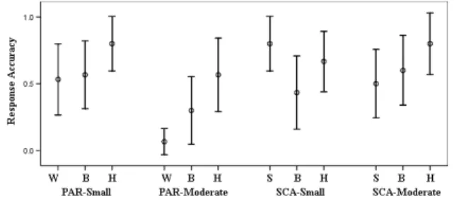
Figure 12 shows the response accuracy (RA) on the small dataset and moderate datasets for each mapping. Furthermore we calcu-lated response times (RT) of participants. However, we noticed that RT is often affected by the experiment environment. For instance, we observed that some participants spent much more time reading instructions than others. Moreover, we did not find significant dif-ference of RT for different mappings. Therefore, we focused on the analysis of RA. Theoretically, a high RA indicates that a mapping method enables easy retrieval of data quality information.
First, we compared the RA of different visual variables in the same mapping configuration (visualization methods and sizes of datasets) using a paired samples t-test. Statistical results revealed the difference among capabilities of visual variables as we ex-pected. On parallel coordinates, when datasets are small, hue had a significantly higher RA than line width(p<0.05). The mean RA of hue is bigger than brightness, although we cannot find signif-icant difference between hue and brightness (p=0.17). The rea-son is possibly due to a higher degree of preattentive processing for hue than line width and brightness under this configuration. When datasets become larger, more significant differences existed between hue and line width(p<0.001). On scatterplot matrices, we find that point size had a significantly higher RA than brightness when datasets are small(p<0.01). Although no significant differ-ence exists between hue and brightness(p=0.13), the mean RA of hue is bigger than brightness. The possible reason is that the bright-ness of points is difficult to distinguish. Therefore, we concluded that brightness is not a good option for scatterplot matrices.
Second, we compared RA on datasets with different sizes. When we used line width on parallel coordinates, moderately sized datasets have significantly lower RA (p<0.01). Other visual vari-ables do not result in significant difference between small sizes and moderate sizes. However, we note that mean RA of point size is sig-nificantly higher than brightness for scatterplot matrices (p<0.01) when datasets are small, and when datasets are moderate, the mean RA of point size former is slightly lower than brightness. There-fore, we suspect that the effectiveness of point size is also sensitive to the size of the dataset, since it also requires additional space, as in line width. The sizes of datasets that we used are not large enough to demonstrate this weak point of point size. In addition, we found a significant difference between line width and point size on moderate datasets (p<0.01), so we can conclude the point size can handle larger datasets than line width.
Figure 12: Response accuracy with 95% confidence interval for dif-ferent mappings (W: Line Width, B: Brightness, H: Hue, S: Point Size, PAR: Parallel Coordinates, SCA: Scatterplot Matrices, Small: The dataset having 50 records, Moderate: The dataset having 200 records)
of the tested visual variables.
• Hue has a stronger capacity to convey quality information un-der parallel coordinates, not only for small datasets, but also for larger ones. The reason is probably that it has a highr de-gree of preattentive processing and does not need extra space.
• Point size has a better performance in conveying quality in-formation than brightness under scatterplot matrices when datasets are small. But its capability becomes weak when datasets become larger. Brightness under scatterplot matri-ces is a bad option since it is difficult to distinguish. Hue is a fine option for scatterplot matrices when the dataset is larger, although it is not monotonic.
• The size of the dataset affects the capacity of line width signif-icantly, but affects that of hue much less. We also suspect the effectiveness of point size under large datasets since it needs extra space like line width. But we can conclude that the sizes of datasets have a less serious influence on point size than line width.
Our conclusions are limited. More configurations should be em-ployed in our experiments. For example, we can test larger datasets than the moderate datasets we used to test how the size of datasets affects the performance of different visual variables.
9 CONCLUSIONS ANDFUTUREWORK
In this paper, we have described the growing need to integrate data quality information into the visual process. We identified three im-portant data quality types (record, dimension, data value) and pre-sented two approaches to integrating quality information into data visualizations. One is an enlarged dataset containing quality mea-sures as new dimensions. The other is to map quality information to visual variables not currently in use in existing multivariate vi-sualization methods. We also analyzed the advantages and disad-vantages of these two approaches. In addition, we performed an evaluation and showed the effectiveness of visual variables under different configurations.
There are many potential future directions for this work. Some that we are currently pursuing include:
• Continued experimentation and more strict user studies with different mappings of quality variables to visual variables us-ing our current set of multivariate data visualizations.
• Expansion of the set of data visualizations to include other methods for visualizing multivariate data, such a pixel-oriented methods.
• Investigation of other types of quality information encoun-tered in exploratory visualization, such as structure quality (e.g., the certainty with which records are grouped within a hierarchical clustering).
This work can be applied to other attributes of data besides qual-ity. For example, some data may have a security or risk attribute, and visually exploring data in this space might reveal some holes in a data security policy or highlight threats in risk analysis. Our belief is that information about the data can often be as important as the data itself.
REFERENCES
[1] P. D. Allison.Missing data. SAGE Publications, Thousand Oaks CA, 2002.
[2] R. Amar and J. Stasko. A knowledge task-based framework for design and evaluation of information visualizations.Proc. IEEE Symposium on Information Visualization, pages 143–150, 2004.
[3] M. K. Beard, B. P. Buttenfield, and S. B. Clapham. NCGIA research initiative 7: Visualization of spatial data quality. Technical report, National Center for Geographic Information and Analysis, 1991. [4] R. Brown. Animated visual vibrations as an uncertainty visualisation
technique. Proc. 2nd international conference on Computer graphics and interactive techniques in Australasia and Southe East Asia, pages 84–89, 2004.
[5] A. Cedilnik and P. Rheingans. Procedural annotation of uncertain in-formation. InProc. IEEE Symposium on Information Visualization, pages 77–84, 2000.
[6] DASL. The data and story library [http://lib.stat.cmu.edu/dasl]. Cor-nell University, 1996.
[7] H. Hofmann and M. Theus. Selection sequences in manet. Computa-tional Statistics, 13(1):77–88, 1998.
[8] S. Huang. Exploratory visualization of data with variable quality. Master’s thesis, Worcester Polytechnic Institute, 2004.
[9] G. J. Hunter. New tools for handling spatial data quality: Moving from academic concepts to practical reality. URISA Journal, 11(2):25–34, 1999.
[10] C. Johnson, R. Moorhead, T. Munzner, H. Pfister, P. Rheingans, and T. S. Yoo.NIH-NSF Visualization Research Challenges Report. IEEE Computer Society, Los Alamitos CA, 2006.
[11] A. M. MacEachren. Visualizing uncertain information.Cartographic Perspective, 13:10–19, 1992.
[12] A. Martin and M. Ward. High dimensional brushing for interactive exploration of multivariate data. Proc. of Visualization, pages 271– 278, 1995.
[13] D. Newman, S. Hettich, C. Blake, and C. Merz. UCI repository of machine learning databases [http://www.ics.uci.edu/∼mlearn/ mlrepository.html].University of California, Irvine, Dept. of Informa-tion and Computer Sciences, 1998.
[14] C. Olston and J. D. Mackinlay. Visualizing data with bounded uncer-tainty. InProc. IEEE Symposium on Information Visualization, pages 37–40, 2002.
[15] A. Pang. Visualizing uncertainty in geo-spatial data. report for a com-mittee of the computer science and telecommunications board. Tech-nical report, University of California, Santa Cruz, 2001.
[16] A. Pang, C. Wittenbrink, and S. Lodha. Approaches to uncertainty visualization.The Visual Computer, 13(8):370–390, 1997.
[17] StatLib. Statlib—datasets archive [http://lib.stat.cmu.edu/datasets].
Carnegie Mellon University, Dept. of Statistics, 1999.
[18] D. Swayne and A. Buja. Missing data in interactive high-dimensional data visualization.Computational Statistics, 13(1):15–26, 1998. [19] B. N. Taylor and C. E. Kuyatt. Guidelines for evaluating and
ex-pressing the uncertainty of nist measurement results. Technical report, National Institute of Standards and Technology Technical Note 1297, 1994.
[20] J. J. Thomas and K. A. Cook.Illuminating the Path: The Research and Development Agenda for Visual Analytics. IEEE Computer Society, Los Alamitos CA, 2005.
[21] E. Tufte. The Visual Display of Quantitative Information. Graphics Press, Cheshire CT, 1982.
[22] A. Unwin, G. Hawkins, H. Hofmann, and B. Siegl. Interactive graph-ics for data sets with missing values - manet.Journal of Computaional and Graphical Statistics, 4(6):113–122, 1996.
[23] C. Ware. Information Visualization: Perception for Design. Morgan Kaufmann Publishers, San Francisco CA, second edition, 2004. [24] C. Wittenbrink, A. Pang, and S. Lodha. Glyphs for visualizing
un-certainty in vector fields. IEEE Transactions on Visualization and Computer Graphics, 2(3):266–279, 1996.
[25] J. Yang, M. O. Ward, E. A. Rundensteiner, and S. Huang. Visual hierarchical dimension reduction for exploration of high dimensional datasets. Joint Eurographics - IEEE TCVG Symposium on Visualiza-tion, pages 19–28, 2003.