The Early Impact of the Affordable Care Act State-By-State
∗Amanda E. Kowalski
Assistant Professor, Department of Economics, Yale University Faculty Research Fellow, NBER
Nonresident Fellow, The Brookings Institution November 10, 2014
Abstract
I examine the impact of state policy decisions on the early impact of the ACA using data through the first half of 2014. I focus on the individual health insurance market, which includes plans purchased through exchanges as well as plans purchased directly from insurers. In this market, at least 13.2 million people were covered in the second quarter of 2014, representing an increase of at least 4.2 million beyond pre-ACA state-level trends. I use data on coverage, premiums, and costs and a model developed by Hackmann, Kolstad, and Kowalski (2013) to calculate changes in selection and markups, which allow me to estimate the welfare impact of the ACA on participants in the individual health insurance market in each state. I then focus on comparisons across groups of states. The estimates from my model imply that market participants in the five “direct enforcement” states that ceded all enforcement of the ACA to the federal government are experiencing welfare losses of approximately $245 per participant on an annualized basis, relative to participants in all other states. They also imply that the impact of setting up a state exchange depends meaningfully on how well it functions. Market participants in the six states that had severe exchange glitches are experiencing welfare losses of approximately $750 per participant on an annualized basis, relative to participants in other states with their own exchanges. Although the national impact of the ACA is likely to change over the course of 2014 as coverage, costs, and premiums evolve, I expect that the differential impacts that we observe across states will persist through the rest of 2014.
∗
This paper is in preparation for the Fall 2014 issue of the Brookings Papers on Economic Activity. I have committed to revisit this analysis using updated data in the Fall 2015 issue. I thank Manon Costinot, Aigerim Kabdiyeva, and Samuel Moy for excellent research assistance. Kate Bundorf and Amanda Starc provided helpful conference discussions. I thank Hank Aaron, Sherry Glied, Jon Gruber, Martin Hackmann, Jonathan Kolstad, David Romer, Clifford Winston, Justin Wolfers, and participants at the Brookings Panel on Economic Activity for helpful comments. Kevin Lucia and Nancy Turnbull provided helpful institutional details. Funding from the Robert Wood Johnson Foundation and the National Science Foundation, award no. 1350132, is gratefully acknowledged. The Online Appendix for this paper is available athttp://www.econ.yale.edu/~ak669/ACA.online.appendix.pdf. Contact information: amanda.kowalski@yale.edu, 202-670-7631.
1
Introduction
As part of the implementation of the Affordable Care Act (ACA), all states had their first open enrollment season for coverage through new health insurance exchanges from October 2013 through March 2014. Using data through the first half of 2014, I take an early look at the impact of the ACA on the individual health insurance market. This market includes plans purchased through exchanges as well as plans purchased directly from insurers. Although a small fraction of the national population has historically been enrolled in the individual health insurance market, it is an important market to study because it is the market of last resort for the uninsured, and one focus of the ACA is to expand coverage to the uninsured. In my data, 13.2 million people were enrolled in the individual health insurance market per month of the second quarter of 2014. Had state-level trends persisted from before the implementation of the ACA, 4.2 million fewer people would be enrolled in this market.
I focus on the impact of state policy decisions on the early impact of the ACA. Whether the impact of the ACA differed across states is of central policy-relevance because states made several important decisions regarding the implementation of the ACA. A small number of states decided to cede all enforcement of the ACA to the federal government. The Federal government refers to these states as “direct enforcement” states. Other states took far more responsibility for the implementation of the ACA by setting up their own exchanges and deciding which vendors to use. The Supreme Court gave states authority to decide whether to implement the Medicaid expansion legislated by the ACA, and just over half of the states have elected to so do thus far. Similarly, the White House gave states authority to decide whether to allow the renewal of non-ACA-compliant non-grandfathered plans, and just over half of states have elected to do so.
Furthermore, most pre-ACA regulation of the individual health insurance market was at the state-level. Some states already had two important regulations that could affect the functioning of the individual health insurance market: “community rating” regulations that require all health insurers to charge the same price to all beneficiaries, regardless of observable characteristics, and “guaranteed issue” regulations that prevent insurers from denying coverage to applicants, regardless of their health status. Both of these regulations were enacted nationally with the ACA, and the relevant “community” for the community rating regulations was specified to be the state. Therefore,
in those states that already had those regulations, we can attempt to isolate the impact of other provisions of the ACA, the most prominent of which is the individual mandate. Such an exercise sheds light on what the impact of the ACA would have been in the absence of the individual mandate, which would have happened if the Supreme Court had struck down the individual mandate while upholding the other provisions.
Other state policy decisions from before the implementation of the ACA could have lasting impacts. For example, pre-ACA policy decisions could affect the number of insurers in the individual health insurance market, which, in turn, could affect enrollment under the ACA. The number of insurers could also affect markups.
To make comparisons across groups of states, I first examine the impact of the ACA state-by-state. I examine data on coverage, premiums, and costs. Using those data and a model that I developed with Martin Hackmann and Jonathan Kolstad (Hackmann, Kolstad, and Kowalski (2013), hereafter HKK), I estimate how much better or worse off the ACA made participants in the individual health insurance market in each state. In this model, the ACA can make market participants better off if it encourages insurers to decrease “markups” – the difference between the premiums that they charge and the costs that they incur. The ACA can also make market participants better off if it mitigates “adverse selection,” meaning that it encourages individuals with lower insured costs to join the pool.
There have been numerous questions in the popular press about whether enough “young and healthy” individuals have signed up for health insurance coverage. These claims imperfectly ad-dress whether there was adverse selection by focusing simply on coverage demographics. I assess the presence of adverse selection more systematically using cost data and a model. The main as-sumption necessitated by the data and the model is that plan generosity did not change with the implementation of the ACA. Plans could have become more or less generous with the implementa-tion of the ACA, since the essential health benefits required by the ACA could have increased plan generosity, but limited network plans offered in exchanges could have decreased plan generosity. By focusing on comparisons across states, I require a weaker assumption regarding changes in plan generosity across states.
The estimates from my model imply that participants in the five “direct enforcement” states that ceded all enforcement of the ACA to the federal government are worse off by approximately
$245 per participant on an annualized basis, relative to participants in all other states. They also imply that the impact of setting up a state exchange depends meaningfully on how well it functions. Market participants in the six states that had severe exchange glitches are worse off by approximately $750 per participant on an annualized basis, relative to participants in other states with their own exchanges. The estimates imply suggestive evidence that participants in states that allowed renewal of non-grandfathered plans are worse off than participants in other states. They also provide inconclusive evidence that participants in states with pre-ACA community rating and guaranteed issue regulations are better off than participants in other states, likely because these regulations contributed to pre-ACA adverse selection. They provide further inconclusive evidence regarding the impact of having more insurers in the pre-ACA state market. Although the national impact of the ACA is likely to change over the course of 2014 as coverage, costs, and premiums evolve, I expect that the differential impacts that we observe across states will persist through the rest of 2014.
In the next section, I present the model, and I describe how I estimate the model in Section 3. I discuss the data in Section 4, I provide summary statistics in Section 5, and I present results in Section 6. I compare my results to existing empirical evidence on selection and conclude in Sections 7 and 8.
2
Model
I adapt a simple model from HKK, and I use similar notation to facilitate comparison across papers. In the model, changes in welfare come from changes in selection and from changes in markups. I first present the model with only changes in selection, following previous work by Einav, Finkelstein, and Cullen (2010), hereafter EFC. I then present the full model from HKK, which accounts for changes in markups. EFC and HKK offer micro-foundations that I omit here for brevity.
2.1 Model Without Markups
Assume for now that insurers charge beneficiaries the average cost that they spend to pay medical claims. Because beneficiaries differ in the cost of insuring them, I model the average cost curve
AC(I) as a function of the number of individuals in a given market who have coverage I.1 If the market is adversely selected, then the sickest individuals are the first to sign up for health insurance coverage at any price. When there is an exogenous increase in the number of insured individuals, the new individuals who sign up for coverage will be healthier than the formerly insured, and insurer per-enrollee costs will decrease. As depicted in Figure 1, a downward-sloping average cost curve indicates the presence of adverse selection. The main assumption required is that plan generosity remains constant for any level of coverage. (If plan generosity decreases, then average costs could go down in the absence of adverse selection.) Assuming constant plan generosity, the downward slope of the AC curve indicates the presence of adverse selection (an upward slope indicates advantageous selection); however, the slope alone is not enough to identify the welfare cost.
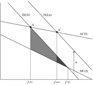
Figure 1: Model Without Markups
D(I,0) A I*,pre I*,post D(I,π) AC(I) MC(I) π A′ I*,opt
The welfare cost of adverse selection is determined by the demand curve for insurance as well as the average cost curve. The demand curve D(I, π) is a function of enrollment in insurance I, and the penalty that individuals must pay if they do not have health insurance coverage π, which is zero before the implementation of the ACA. As shown in Figure 1, in the presence of adverse
1Note that HKK and EFC represent the fraction of individuals in a given market who have health insurance coverage with I. I make a different modeling choice since it is so difficult to estimate the potential size of the individual health insurance market, particularly in the first quarter of 2014 (see Abraham et al. [2013]). However, I retain the same notation to emphasize that the formulas for welfare analysis are the same under this definition ofI.
selection, pre-reform equilibrium coverage I∗,pre occurs at point A, where the average cost curve intersects the demand curve. Insurers must charge enrollees their average costs either because enrollee health cannot be observed or because regulations prevent insurers from pricing based on underlying health. Optimal coverage I∗,opt would occur at the intersection of the demand curve and the marginal cost curveM C(I).2 Because demand exceeds the marginal cost of coverage, but that coverage is not provided in equilibrium, adverse selection induces a welfare loss equal to the entire shaded region (including the lighter area and the darker area) in Figure 1.
Now consider the implementation of the ACA. If individuals must now pay a penaltyπ if they do not have health insurance coverage, their demand shifts upward byπ, and the new equilibrium coverage I∗,post occurs at point A. Subsidies behave similarly by shifting the demand curve in the same direction, so we include them in the “penalty” π for expositional simplicity. It is at first counterintuitive that subsidies and penalties shift demand in the same direction in the individual health insurance market. However, since the subsidies are only available in the individual health insurance market, while they decrease demand in other markets, they increase demand in the individual health insurance market. In the market for employer-sponsored health insurance, the penalty and the subsidy shift demand in opposite directions, as modeled in Kolstad and Kowalski [2012].
The lighter shaded region in Figure 1 gives the welfare gain that results from the mitigation of adverse selection with the ACA. The penalty depicted is not large enough to eliminate the entire welfare loss from adverse selection. However, if the combination of subsidies and penalties induces optimal coverage, I∗,opt then the welfare gain from the implementation of the ACA would also include the darker shaded region.
2.2 Model With Markups
HKK extend the model to allow insurers to charge a markup beyond the average cost of paying claims. The “markup” is the difference between the premium and the average cost. It is useful to extend the model to incorporate markups in empirical settings in which is it possible to separately observe the premiums charged to beneficiaries and the average costs paid by insurers.
2
The average cost curve and the marginal cost curve intersect at zero coverage, but zero coverage is not shown along the horizontal axis so that other phenomena can be observed more easily.
Markups can reflect several factors, including insurer market power and the enrollment pre-dictions of the actuaries that set premiums. Given these factors, we might expect markups to change from before to after the introduction of the ACA. Markups could go down if transparency introduced by the new exchanges decreases market power. Conversely, markups could go up if the actuaries that set premiums attempt to protect their firms from losses that would occur if the new enrollees incur higher than expected costs. State regulations only allow firms to set premiums once per year, well before costs and enrollment from the previous year are realized, so it could take several years for markups to reach equilibrium after the ACA. In the interim, markups set before the implementation of the ACA can induce distortions.
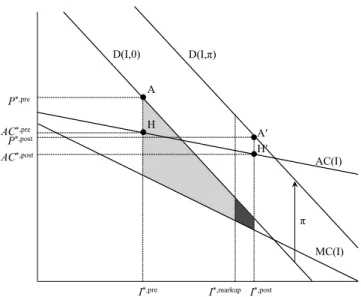
Figure 2: Model with Markups
D(I,0) H I*,pre P*,pre I*,post D(I,π) AC(I) MC(I) π A′ AC*,pre H′ I*,markup P*,post AC*,post A
In the model with markups, equilibrium coverage occurs where average cost plus the markup is equal to demand. In Figure 2, the pre-reform markup is equal to the vertical distance between the pre-reform premium P∗,pre at point A and the pre-reform average cost AC∗,pre at point H. Analogously, the post-reform markup is equal to the vertical distance between the post-reform premiumP∗,postat point A’ and the post-reform average costAC∗,postat point H’. In this extended model, changes in markups and changes in adverse selection affect welfare. As shown in Figure 2, the full welfare gain from the reduction in adverse selection and the reduction in markups is
given by the area in which demand for coverage exceeds the marginal cost of coverage between the initial coverage levelI∗,pre and the post-reform coverage level I∗,post. Graphically, in Figure 2, the full welfare gain is the sum of both shaded regions. Algebraically, the full change in welfare from changes in adverse selection and markups is as follows:3
∆Wf ull = (P∗, pre−AC∗, pre)∗(I∗, post−I∗, pre)
− (AC∗, post−AC∗, pre)∗(I∗, pre+ (I∗, post−I∗, pre))
+ 1
2((P
∗, post−π)−P∗, pre)∗(I∗, post−I∗, pre). (1)
From this equation, we see that the welfare impact depends on only seven quantities: pre- and post-reform coverage, premiums, and average costs, as well as the penalty. Stated another way, the welfare impact depends on the slope of the average cost curve as well as the slope of the demand curve. The comparison of point H with point H’ identifies the slope of the average cost curve. The comparison of point A with point A’, minus the penalty, identifies the slope of the demand curve. To separate the welfare impact of the change in adverse selection from the change in markups, HKK perform an accounting exercise to isolate the welfare impact that would have resulted from the change in adverse selection had the pre-reform markup remained unchanged. This selection-induced change in welfare is as follows:
∆Wsel = (P∗,pre−AC∗,pre)∗(I∗,markup−I∗,pre)
− AC
∗,post−AC∗,pre I∗,post−I∗,pre ∗
I∗,pre+ (I∗,markup−I∗,pre)
∗(I∗,markup−I∗,pre) + 1 2∗ (P∗,post−π)−P∗,pre I∗,post−I∗,pre ∗(I ∗,markup−I∗,pre)2 (2)
where the post-reform coverage level under the pre-reform markup,I∗, markup, is given by:
I∗, markup =max 0, min P op, I∗, pre+π (I ∗, post−I∗, pre)
(AC∗, post−AC∗, pre)−((P∗, post−π)−P∗, pre)
,
which accounts for the lower bound of zero coverage and the upper bound of full population coverage
P op. Intuitively,I∗, markup equals I∗, postif the pre-reform markup equals the post-reform markup.
3
In addition to calculating the welfare impact of the reform, HKK also calculate the optimal tax penalty π∗ that would induce optimal coverageI∗, opt. Optimal coverage is as follows:
I∗, opt = max0, minP op, I∗, pre+ (P
∗, pre−AC∗, pre)∗(I∗, post−I∗, pre)
2(AC∗, post−AC∗, pre)−((P∗, post−π)−P∗, pre)
− (AC
∗, post−AC∗, pre)∗I∗, pre
2(AC∗, post−AC∗, pre)−((P∗, post−π)−P∗, pre)
.
This equation also accounts for the lower bound of zero coverage and the upper bound of full coverage. From optimal coverage, it is possible to calculate the optimal tax penalty π∗ as follows:
π∗ = (P∗, post−P∗, pre)−(AC∗, post−AC∗, pre) + (AC
∗, post−AC∗, pre)−((P∗, post−π)−P∗, pre)
(I∗, post−I∗, pre) ∗(I
∗, opt−I∗, pre). (3)
We can see from Equation 3 that the optimal tax penalty increases proportionally as the difference between optimal coverage and pre-reform coverage increases. While the optimal tax penalty is sometimes in the range of the actual penalty, when it is not, the assumed linearity of the demand and average cost curves plays a larger role.
As drawn in Figure 2, the market is adversely selected and the post-reform markup is smaller than the pre-reform markup, but Equations 1, 2, and 3 are completely general in the sense that they can also be applied under advantageous selection and increased markups. Figure 3 shows the model under advantageous selection and increased markups. In this scenario, there is a welfare loss from advantageous selection prior to reform because the marginal cost of the last enrollee exceeds her willingness to pay. Therefore, the pre-reform level of coverageI∗, preexceeds the optimal level of coverage I∗, opt, implying that the optimal penalty is negative. The positive penalty implemented with the reform exacerbates the welfare loss from advantageous selection, and the change in welfare holding markups constant is the sum of both shaded regions. Increased markups mitigate the welfare loss by discouraging some individuals from signing up for coverage, such that the full welfare change from the reform is given by the lighter shaded region. Equation 1 yields the resulting welfare loss.
Figure 3: Model with Markups, Assuming Advantageous Selection and Increased Markups D(I,0) AC(I) P*,post I*,pre H′ MC(I) π D(I,π) AC*,post I*,markup A′ I*,post H A AC*,pre P*,pre
3
Empirical Implementation of the Model
The natural health insurance market definition is at the state level, so I apply the theoretical model separately within each state. Most pre-ACA insurance regulation was at the state level, and the ACA establishes a separate risk pool for the individual health insurance market in each state (ASPE [2014]).4 I then compare state-level welfare across states with different policies to isolate the impact of those policies.
3.1 Empirical Implementation By State
As shown above, only seven data moments are needed for identification of the full model, including all welfare-relevant quantities: coverage before the reformI∗, pre, insurance coverage after the reform
I∗, post, average costs before the reform C∗, pre, average costs after the reform C∗, post, premiums before the reform P∗, pre, premiums after the reform P∗, post, and the size of the penalty π. With data on these quantities within a state, I could simply plug these data moments into Equations 2, 2, and 3 to obtain the full welfare effect, the net welfare effect, and the optimal penalty.
However, it is likely problematic to do a simple comparison of coverage, premiums, and costs
4
Risk-adjustment will result in transfers across insurers within a state, so within-insurer analysis would not be relevant to aggregate welfare, motivating our analysis by state.
before and after reform because there are secular and seasonal trends in all of these variables. Therefore, to isolate the impact of reform from secular and seasonal trends, I estimate the impact of reform taking into account seasonal and secular trends. Within each state, I estimate the following equation:
Yt = αY(Af ter)t+ρY1t+ρY2(Q1)t+ρY3(Q2)t+ρY4(Q3)t+εYt (4)
whereYtdenotes the respective outcome measure of coverage, average costs or premiums. I estimate
a separate regression model for each outcome, obtaining a separate set of coefficients for each outcome, indexed by the corresponding superscript. I use quarterly data from the first quarter of 2008 to the second quarter of 2014. Af ter is a dummy variable equal to one in 2014. I do not include data from the fourth quarter of 2013 in the regression because the open enrollment season had begun but most coverage had not yet begun and the individual mandate had not yet gone into effect. The coefficient of interest for each outcome isαY, which denotes the impact of the reform, after taking into account secular and seasonal trends. I account for secular trends with the trend termtand for seasonal trends with the quarterly dummiesQ1,Q2, andQ3. Before estimating the regressions, I present graphs that demonstrate the appropriateness of seasonal and secular trends. Because the 2014 levels of coverage, premiums, and costs are of independent interest without any adjustment for trends, I calculate Y∗,post by taking the average of each variable over the first and second quarter of 2014, weighting by average monthly enrollment. I then adjust Y∗, pre for seasonal and secular trends as follows:
Y∗,pre = Y∗,post−αcY, (5)
where αcY is the estimated coefficient from Equation 4. With this transformation of the data, the
values of Y∗,post are informative summary statistics that capture actual coverage, premiums, and costs in the first half of 2014. The values of Y∗,pre are hypothetical values that represent what coverage, premiums, and costs would have been in the first half of 2014 if the ACA had not been implemented.
With this minimal amount of regression adjustment, I can examine whether the pre-reform health insurance market was adversely or advantageously selected, and I can examine whether
markups increased or decreased. Assuming that coverage increased, ifC∗,post−C∗,pre<0, then the market was adversely selected, and it was advantageously selected otherwise. Relatedly, markups decreased if (P∗,post−C∗,post)−(P∗,pre−C∗,pre)<0, and increased otherwise.
Simply knowing whether the market was adversely or advantageously selected and whether markups increased or decreased can tell us about the sign of the welfare impact of the reform in some specific cases, but in other cases, we need to know the magnitude of the penalty to even know the sign.5 In all cases, we need to know the magnitude of the penalty to estimate the welfare impact.
To conduct welfare analysis, I choose a baseline value of $1,500 forπ, and I examine robustness to the plausible range of penalties and subsidies based on their statutory values.6 There is substantial heterogeneity in subsidies and penalties across individuals, so the assumption of a single penalty is arguably a strong one. With individual-level data, I could potentially extend the model to account for heterogeneity in the statutory penalties and subsidies. However, as I discuss below, I do not have individual-level data. Furthermore, given that there is heterogeneity in the penalties and subsidies for the same individuals over time, I would still need an assumption about whether the individuals respond to the contemporaneous penalty or to future penalties. Finally, the behavioral response to the same penalty could differ across individuals based on the perceived penalty and the cost of navigating the individual health insurance market. It is likely that even individuals that are technically exempt from the penalty could respond to it, given the nuance involved in determining who is exempt. Behavioral responses would be difficult to isolate empirically, so I
5For example, assume that demand is downward sloping and that coverage increases following reform. First con-sider the case that HKK found with respect to Massachusetts reform, as depicted in Figure 2. The pre-reform market was adversely selected, and markups decreased, so the full welfare impact was unambiguously positive. However, if the pre-reform market had been adversely selected but the markups had increased, then the full welfare impact would have been ambiguous without further calculation. Similarly, if the pre-reform market had been advantageously selected and markups had increased, then the full welfare impact would have been positive. However, if the pre-reform market had been advantageously selected and markups had increased, as shown in Figure 3, then the full welfare impact would have been ambiguous.
6
According to CBO [2014], “Beginning in 2014, the ACA requires most legal residents of the United States to obtain health insurance or pay a penalty. People who do not obtain coverage will pay the greater of two amounts: either a flat dollar penalty per adult in a family, rising from $95 in 2014 to $695 in 2016 and indexed to inflation thereafter (the penalty for a child is half the amount, and an overall cap will apply to family payments); or a percentage of a household’s adjusted gross income in excess of the income threshold for mandatory tax-filing - a share that will rise from 1.0 percent in 2014 to 2.5 percent in 2016 and subsequent years (also subject to a cap).” Subsidies, which are based on income, are benchmarked to the cost of the second-lowest-cost silver plan in the exchanges. According to CBO [2014], “CBO and JCT estimate that the average cost of individual policies for the second-lowest-cost silver plan in the exchanges - the benchmark for determining exchange subsidies - is about $3,800 in 2014. That estimate represents a national average, and it reflects CBO and JCTs projections of the age, sex, health status, and geographic distribution of those who will obtain coverage through the exchanges in 2014.”
proceed by examining robustness to the calibrated penalty. With a calibrated value for the penalty as well as the empirical moments by state, I use Equations 1, 2, and 3 to obtain the full welfare effect, the net welfare effect, and the optimal penalty.
3.2 Empirical Implementation By State Policy Groupings
To make comparisons across states, I first separately calculate the change in welfare within each state, and then I regress state-level change in welfare on indicators for state policies. It would be tempting to simply compare decreases in average costs in one state to decreases in average costs in another state and to claim that the state that experienced greater decreases in average costs was more adversely selected prior to reform. However, if the slope of the demand curve differed across states, this comparison alone would not be sufficient to identify the welfare impact of reform. Thus, it is more informative to compare changes in welfare across states because changes in welfare allow the demand curve to have a different slope in each state.7
One drawback of comparing changes in welfare across states is that the model arguably fits less well in some states than in others. For example, one institutional feature that is outside the model is that potential market participants could be excluded from purchasing health insurance before the ACA, especially in states without guaranteed issue and community regulations before the ACA. In those states, the assumption of a single demand curve for all market participants is likely a much stronger assumption than it is in other states. If there are indeed two demand curves pre-reform, one for participants excluded from the market and one for participants included in the market, then the welfare estimates will be biased in a way that is difficult to assess empirically. However, applying the same model to every state imposes a level of discipline. Rather than altering the model for each state or group of states, I use a single model, but I divide states into groups based on their policies, such as community rating and guaranteed issue regulations. I also show changes in coverage, premiums, and costs separately for each state and group of states to show which changes in these variable drive the reported changes in welfare.
7
Although the slope of the demand curve differs across states, the model assumes that the demand curve shifts according to a constant penalty/subsidyπthat does not differ across states. This assumption makes sense given that the penalties and subsidies are set nationally. However, to the extent that state policies themselves shift demand, the model will attribute these shifts to changes in the slope, potentially biasing the welfare results.
4
Data
I use data collected by the National Association of Insurance Commissioners (NAIC) and compiled by SNL Financial. The data include filings from all insurers in the comprehensive individual health insurance line of business, excluding life insurers in all states and Health Maintenance Organizations (HMOs) in the state of California. These data are more comprehensive than data from the health insurance exchanges because they include policies sold outside of the exchanges. Under the ACA, health insurers can sell policies inside and outside of the exchanges, but all policies must be included in the same risk pool (ASPE [2014]). I compare my enrollment estimates to enrollment estimates from the exchanges and survey data in Section 6.
I focus on the most recently-available data from the second quarter of 2014 and back through the first quarter of 2008. Each insurer files quarterly and annual filings with the NAIC, which include enrollment in member months, total premiums collected, and total costs paid. There are 393 insurers that have populated values for member months, costs, and premiums during at least one of our quarters of interest.
Even though much of the regulation of the individual health insurance market is at the state level, the NAIC requires quarterly and annual filings at the insurer level, and some insurers operate in several states. Annual filings are broken down at the insurer-year-state of coverage level, but quarterly filings are only broken down at the insurer-quarter level. Because I am interested in examining the early impact of the Affordable Care Act at the state level without waiting for the annual data, I use quarterly data from the first and second quarters of 2014.
Because I am using quarterly data, I need to make assumptions to allocate the data at the insurer-quarter-state level. I predominantly infer state of coverage by using the corresponding annual filings. For 2014, I use the percentages from the 2013 annual filing, since the 2014 annual filing will not be available until the end of the year. In rare instances, I use supplemental quarterly Schedule T filings to allocate the data by state. Of the 6,727 insurer-quarter observations (393 insurers operating in at least one of 26 quarters), I can uniquely allocate 5,728 to states because the annual data only report coverage in a single state. These observations account for nearly 80% of enrollment in member months, total premiums collected, and total costs paid. In such instances, I allocate all insurer-quarter observations within that given year to the unique state.
For the remaining observations, I make assumptions to allocate the data by state using annual filings and supplemental quarterly Schedule T filings if the annual data are not available. I detail these assumptions in Appendix B. These procedures allow all insurer-quarter observations to be allocated across the 50 states and the District of Columbia.
Before allocating data by state, I take several steps to clean the data, which I detail in Appendix A. The ultimate effect of the data cleaning is rather minor, and as I show in the Online Appendix, the main results are robust to the usage of the raw data instead of the clean data. It is not surprising that the results are robust because I do not do anything to clean data from 2014. The 2014 data are the main basis for the results, and the data from earlier years are just used to estimate pre-trends.8 I prefer the clean data, which imputes anomalous insurer-quarter observations instead of dropping insurers from all quarters, because dropping insurers would make state totals less meaningful.
Even after data cleaning, the data from California and New Jersey do not appear to be complete. SNL acknowledges that California HMO plans have different NAICS filing requirements, so those data are not complete. The data from New Jersey are also incomplete.9 I report state-level statistics for California and New Jersey in the interest of transparency, but I exclude them from comparisons across groups of states to prevent data anomalies from driving the comparisons.
5
Summary Statistics
I present state-level summary statistics that are informative in their own right because they paint a picture of the individual health insurance market in the first half of 2014. Furthermore, with only six statistics for each state - coverage, premiums, and average costs before and after reform – I can calculate the state-level impact of the implementation of the ACA on welfare. Simple comparisons of the summary statistics within a state provide an intuitive basis for the welfare impact.
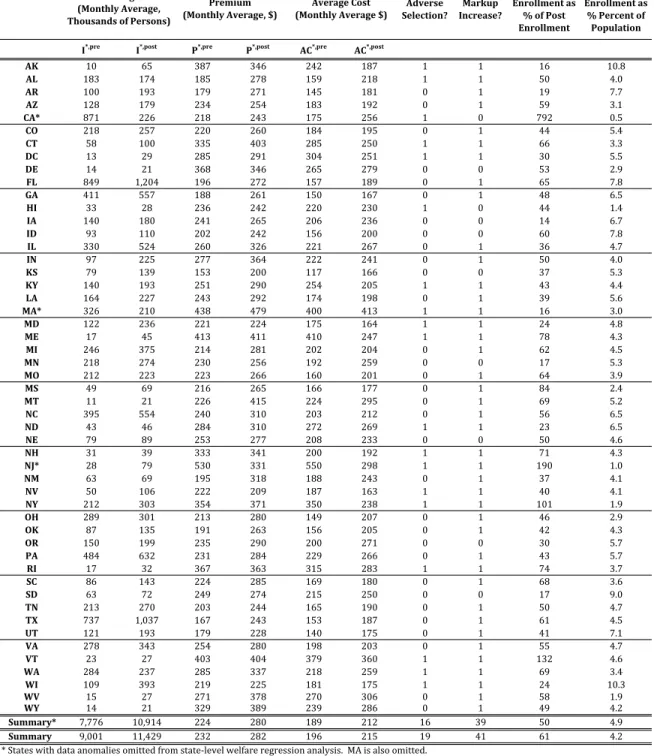
Coverage The first two columns of Table 1 depict average monthly enrollmentI, in thousands, by state. I∗, postgives average monthly enrollment in the first half of 2014.10 I∗, pregives an estimate
8
I include graphs of the data by state using both the raw and the imputed data in the Online Appendix so that the interested reader can examine state trends and the impact of my imputation technique.
9
New Jersey does not require quarterly filings from insurers that only write business in the state of New Jersey. Accordingly, Triad Healtcare of NJ, which is the largest insurer in New Jersey during the majority of our period, does not report quarterly data during our period of interest.
10The data report quarterly enrollment in member months. To obtain average monthly enrollment in the first half of 2014, I sum member months across both quarters of 2014 and divide by 6.
Table 1: Summary Statistics
Adverse
Selection? Increase?Markup
Exchange Enrollmentas %ofPost Enrollment Post Enrollmentas %Percentof Population I*,pre I*,post P*,pre P*,post AC*,pre AC*,post
AK 10 65 387 346 242 187 1 1 16 10.8 AL 183 174 185 278 159 218 1 1 50 4.0 AR 100 193 179 271 145 181 0 1 19 7.7 AZ 128 179 234 254 183 192 0 1 59 3.1 CA* 871 226 218 243 175 256 1 0 792 0.5 CO 218 257 220 260 184 195 0 1 44 5.4 CT 58 100 335 403 285 250 1 1 66 3.3 DC 13 29 285 291 304 251 1 1 30 5.5 DE 14 21 368 346 265 279 0 0 53 2.9 FL 849 1,204 196 272 157 189 0 1 65 7.8 GA 411 557 188 261 150 167 0 1 48 6.5 HI 33 28 236 242 220 230 1 0 44 1.4 IA 140 180 241 265 206 236 0 0 14 6.7 ID 93 110 202 242 156 200 0 0 60 7.8 IL 330 524 260 326 221 267 0 1 36 4.7 IN 97 225 277 364 222 241 0 1 50 4.0 KS 79 139 153 200 117 166 0 0 37 5.3 KY 140 193 251 290 254 205 1 1 43 4.4 LA 164 227 243 292 174 198 0 1 39 5.6 MA* 326 210 438 479 400 413 1 1 16 3.0 MD 122 236 221 224 175 164 1 1 24 4.8 ME 17 45 413 411 410 247 1 1 78 4.3 MI 246 375 214 281 202 204 0 1 62 4.5 MN 218 274 230 256 192 259 0 0 17 5.3 MO 212 223 223 266 160 201 0 1 64 3.9 MS 49 69 216 265 166 177 0 1 84 2.4 MT 11 21 226 415 224 295 0 1 69 5.2 NC 395 554 240 310 203 212 0 1 56 6.5 ND 43 46 284 310 272 269 1 1 23 6.5 NE 79 89 253 277 208 233 0 0 50 4.6 NH 31 39 333 341 200 192 1 1 71 4.3 NJ* 28 79 530 331 550 298 1 1 190 1.0 NM 63 69 195 318 188 243 0 1 37 4.1 NV 50 106 222 209 187 163 1 1 40 4.1 NY 212 303 354 371 350 238 1 1 101 1.9 OH 289 301 213 280 149 207 0 1 46 2.9 OK 87 135 191 263 156 205 0 1 42 4.3 OR 150 199 235 290 200 271 0 0 30 5.7 PA 484 632 231 284 229 266 0 1 43 5.7 RI 17 32 367 363 315 283 1 1 74 3.7 SC 86 143 224 285 169 180 0 1 68 3.6 SD 63 72 249 274 215 250 0 0 17 9.0 TN 213 270 203 244 165 190 0 1 50 4.7 TX 737 1,037 167 243 153 187 0 1 61 4.5 UT 121 193 179 228 140 175 0 1 41 7.1 VA 278 343 254 280 198 203 0 1 55 4.7 VT 23 27 403 404 379 360 1 1 132 4.6 WA 284 237 285 337 218 259 1 1 69 3.4 WI 109 393 219 225 181 175 1 1 24 10.3 WV 15 27 271 378 270 306 0 1 58 1.9 WY 14 21 329 389 239 286 0 1 49 4.2 Summary* 7,776 10,914 224 280 189 212 16 39 50 4.9 Summary 9,001 11,429 232 282 196 215 19 41 61 4.2
* States with data anomalies omitted from state‐level welfare regression analysis. MA is also omitted.
Coverage (MonthlyAverage, ThousandsofPersons) Premium (MonthlyAverage,$) AverageCost (MonthlyAverage$)
Source: Author's calculations from SNL with exchange enrollment from ASPE and population from Census. Post values are averages from 2014Q1 and 2014Q2, weighted by average monthly enrollment. Pre values are an estimate of what the post value would have been absent the implementation of the ACA. They are obtained by estimating a seasonally‐adjusted trend regression for each series from 2008Q1 to 2014Q2, omitting 2013Q4 and allowing for a separate intercept for 2014. The pre value reflects the post value minus the 2014 intercept. See text for more details.
of what enrollment would have been in the first half of 2014 absent the implementation of the ACA, calculated according to equation 5. Therefore, I∗, post−I∗, pre yields an estimate of the change in individual health insurance market coverage attributable to the implementation of the ACA. In most states, the coverage increase attributable to the ACA is substantial in percentage and level terms. Indeed, only 5 states, including California and Massachusetts, which we omit from our state policy groupings, experienced coverage decreases attributable to the ACA.11 To be clear, those states could have still experienced coverage increases in level terms from 2013 to 2014, but they would not count as coverage increases attributable to the ACA unless they exceeded coverage predicted given pre-reform seasonally-adjusted trends.
Figure 4 illustrates the importance of taking into account seasonally-adjusted trends by showing quarterly trends in coverage in the four most populous states - Texas, New York, Florida, and Illinois. The subfigures in the left column depict unadjusted coverage trends by quarter from the first quarter of 2008 through the second quarter of 2014. In all four states, there is a striking increase in coverage in the first quarter of 2014 followed by another large coverage increase in the second quarter of 2014. We present unadjusted quarterly data for every state analogous to that in Figure 4 in the Online Appendix. Almost all states show striking increases in coverage in 2014.
Some increase in coverage in the second quarter of 2014 likely reflects new coverage relative to the first quarter, but some is likely an artifact of the aggregation of the data by quarter. Since many people enrolled in coverage just before the open enrollment deadline of March 31, they were covered on March 31, but their average monthly enrollment over the course of the first quarter of 2014 was low. Second quarter average monthly enrollment therefore likely gives a more accurate picture of enrollment at the end of the first quarter.
For our welfare analysis, we aggregate the data across the entire first half of 2014. In this market, the calendar year is the welfare-relevant unit of time because premiums are only set once per calendar year, and individuals purchase coverage through the end of the calendar year. Because data for the full 2014 calendar year are not yet available, we present data from the first half of 2014 in Table 1. However, since it is of independent interest to report national enrollment estimates
11
As discussed above, we omit California because the SNL data do not include HMO enrollment, which likely increased with reform. We omit Massachusetts because it had a similar reform to the ACA, but the ACA required some changes in Massachusetts, making it difficult to compare Massachusetts to other states. Although the dif-ference between I∗, pre and I∗, post in Massachusetts indicates that enrollment in Massachusetts declined relative
to a Massachusetts-specific seasonally-adjusted trend, enrollment in Massachusetts also declined in absolute terms. Decreases in enrollment in Massachusetts likely reflect problems with the redesign of its state-based exchange.
Figure 4: Trends by State for the Four Most Populous States 0 750 1,500 2008q1 2010q1 2012q1 2014q1 Coverage 100 250 400 2008q1 2010q1 2012q1 2014q1 Premium 100 250 400 2008q1 2010q1 2012q1 2014q1 Average Cost Texas 0 750 1,500 2008q1 2010q1 2012q1 2014q1 Coverage 100 250 400 2008q1 2010q1 2012q1 2014q1 Premium 100 250 400 2008q1 2010q1 2012q1 2014q1 Average Cost New York 0 750 1,500 2008q1 2010q1 2012q1 2014q1 Coverage 100 250 400 2008q1 2010q1 2012q1 2014q1 Premium 100 250 400 2008q1 2010q1 2012q1 2014q1 Average Cost Florida 0 750 1,500 2008q1 2010q1 2012q1 2014q1 Coverage 100 250 400 2008q1 2010q1 2012q1 2014q1 Premium 100 250 400 2008q1 2010q1 2012q1 2014q1 Average Cost Illinois
that are as up-to-date as possible, we report a table analogous to Table 1 that only uses data from the second quarter of 2014 in the Online Appendix. In those data, we re-estimate the seasonally-adjusted trends so that I∗, posttakes on slightly different values.
AggregatingI∗, post from the first half of 2014 across all states, we find that 11.4 million people were covered in the individual health insurance market, on average in each month for the first six months of 2014. This number understates true coverage in the individual health insurance market because the data do not report enrollment in HMO plans in California and enrollment for one very large insurer is not reported in New Jersey. It also understates true coverage at the end of June 2014 because coverage increased over time - 9.9 million people were covered per month in the first quarter of 2014, and 12.9 million people were covered per month in the second quarter of 2014.
Because not all people enrolled for all three months of the second quarter of 2014, the actual number of people enrolled at many points throughout the second quarter of 2014 was higher than 12.9 million. Although we prefer to use coverage in member months for our main analysis because premiums and costs are monthly, we can obtain a separate quarterly enrollment series from the SNL data. We present state-level statistics from the enrollment series in the Online Appendix. According to that series, there were 13.2 million people enrolled in the second quarter of 2014.
From our summary statistics, we can obtain total enrollment in the individual health insurance market attributable to the implementation of the ACA as the sum of I∗, post−I∗, pre across all states. Averaged across the first six months of 2014, we find that the coverage increase in the individual health insurance market attributable to the implementation of the ACA was 2.4 million people. Using the quarterly enrollment series, of the 13.2 million people covered in the second quarter of 2014, we attribute 4.2 million to the implementation of the ACA. Stated another way, from before the reform to the second quarter of 2014, national enrollment in the individual health insurance market increased by 32% beyond what it would have had it simply followed state-level seasonally-adjusted trends. We note that enrollment in the individual health insurance market that we attribute to the implementation of the ACA does not necessarily represent new coverage for individuals who were previously uninsured – it could also represent new coverage for individuals who previously had a different type of insurance.
These national estimates complement existing estimates of health insurance enrollment under the ACA. A widely-cited report from the Office of the Assistant Secretary for Planning and
Evalua-tion (ASPE) at the Department of Health and Human Services finds that 8 million people enrolled in health insurance exchanges through March 31, including individuals who enrolled during the additional special enrollment period that was put in place through April 19 for individuals who had attempted to enroll by March 31, the last day of the open season (ASPE [2014]).12 Our esti-mate of 13.2 million people covered per month in the second quarter of 2014 is larger for two main reasons: it uses more recent data, and it includes individual health insurance enrollment outside of the exchanges. One strength of my data over the ASPE data is that they allow for the calculation of pre-trends that I can use to isolate the impact of the ACA on enrollment in the individual health insurance market. The ASPE data necessarily do not include enrollment from before 2014 because most of the exchanges began providing coverage in 2014. While all exchange coverage was “new,” in some sense, my analysis of pre-trends suggests that only 4.2 million enrollees can be attributable to the ACA nationally. One limitation of my data relative to the ASPE data is that I cannot directly separate exchange coverage from other coverage.
To get a sense of what fraction of coverage in my data is purchased on exchanges, I present ASPE exchange enrollment as a percentage of the SNL quarterly enrollment series in Table 1. Nationally, the ASPE report accounts for approximately 70% of enrollment observed in my data. However, ASPE exchange enrollment as a fraction of enrollment in my data varies dramatically by state, from a low of 14% in Iowa. In some states the fraction exceeds 100%. This occurs most prominently in California and New Jersey, states subject to severe under-reporting of enrollment in my data. In other states, exchange enrollment can exceed enrollment in my data because I allocate total enrollment by state with some error, as discussed in Section 4. This measurement error does not affect my national enrollment estimates.
Beyond the widely-cited figures from ASPE, which are based on administrative data like my own, I can also compare my national enrollment estimates to estimates from other sources. Based on a variety of sources, the CBO projects 6 million people will enrolled on the exchanges over the full course of 2014, which is broadly in line with the ASPE report and my data. Survey estimates differ more substantially. Based on the RAND Health Reform Opinion Study (HROS), Carman and Eibner [2014b] find a much lower estimate of 3.9 million enrolled in exchange plans nationally
12HHS Secretary Sylvia Matthews Burwell [2014] announced in September 2014 that 7.3 million people were enrolled in the exchanges and had paid their premiums. The earlier enrollment of 8 million included those who had signed up without yet paying their premiums.
as of March 28, 2014. This estimate is likely low because many interviews took place early in March before the surge in enrollment at the end of the month. The Urban Institute Health Reform Monitoring Survey showed that 5.4 million previously uninsured people gained coverage between September 2013 and March 31, 2014 (Long et al. [2014]). This estimate is not directly comparable to the other estimates because it accounts for marketplace and Medicaid enrollment and it focuses on the previously uninsured. This estimate also does not capture the surge of late March 2014, as most of the data were collected by March 6. McKinsey and Gallup conducted surveys about health insurance coverage in 2014, but I am not aware of any national enrollment estimates based on their results (Bhardwaj et al. [2014], Gallup [2014]). Estimates from often-used national surveys such as the American Community Survey (ACS), the Current Population Survey (CPS), the Behavioral Risk Factor Surveillance System (BRFSS), the Survey of Income and Program Participation (SIPP), the National Health Interview Survey (NHIS), and the Medical Expenditure Panel Survey (MEPS) are not yet available.
To put total enrollment in my data into a context that facilitates better comparison with survey data, I divide total quarterly enrollment in the second quarter of 2014 by 2013 U.S. Census population estimates in the last column of Table 1. I see that Alaska is the state with the largest enrollment in percentage terms, with 10.8% of the population enrolled. Nationally, only 3% of the population is enrolled in the individual health insurance market monthly in the first half of 2013. Given the small fraction of the population enrolled in the market, it will be very difficult to obtain accurate estimates of the impact of national reform on enrollment in the individual health insurance market using survey data unless the survey is very large or very focused. The 4.2 million person individual health insurance market coverage increase that I attribute to the ACA using data from the second quarter of 2014 is only a 1.3 percentage point coverage increase nationally.
Premium In the column labeled P∗, post, in Table 1, I show that in the first half of 2014, there was wide variation in average monthly premiums paid by state, with insurers in Kansas collecting average premiums per enrollee of $200 per month and insurers in several other states collecting average premiums per enrollee in excess of $400 per month.13 In the vast majority of
13The data report total premiums collected separately by quarter for the first two quarters of 2014. To obtain average premiums collected in the first half of 2014, I sum premiums collected in both quarters, and I divide by the sum of enrollment in member months in both quarters such that my statistic is weighted by average monthly enrollment. Movements in premiums over time within a year reflect changes in enrollment into and across plans as
states, premiums went up relative to state seasonally-adjusted trends in the first quarter of 2014. Health insurance premiums almost always go up, but it is striking that they went up so much relative to trend. As shown in Figure 4, premiums in all four of the most populous states increased relative to seasonally-adjusted trends in the first half of 2014.14 Across all states, from before the reform to the first half of 2014, enrollment-weighted premiums in the individual health insurance market increased by 24.4% beyond what they would have had they simply followed state-level seasonally-adjusted trends.15
The premium increase that we observe reflects unsubsidized premiums. Insurers receive the full premiums each month, regardless of whether they are paid by the individual or the federal government [IRS, 2014]. Thus, though our data reflect premiums received by insurers, individuals likely faced smaller changes in premiums after taking the subsidy into account.16
An article in Forbes magazine also examines changes in unsubsidized premiums from before to after the ACA by scraping the Internet for premiums for a standardized plan in select counties in 2013 and 2014 [Roy, 2014]. It concludes that the ACA increased individual health insurance market premiums by an average of 49%. This estimate is even higher than my estimate, likely because it is not enrollment-weighted, and individuals in areas with high premiums likely selected cheaper plans.
Aside from the Forbes article, I am not aware of any other sources that estimate premium changes from before to after the ACA. ASPE [2013] examines premium trends before the ACA and Cox et al. [2014] examines premium trends from select cities from 2014 to 2015, finding a widely-cited estimate that unsubsidized premiums will decrease by an average of -0.8% from 2014 to 2015, but these studies do not address premium changes from before to after the ACA. Before the passage of the ACA in 2009, the CBO predicted that the average enrollment-weighted individual health insurance premium would be 10 to 13 percent higher in 2016 under the ACA relative to current law, and the CBO revised their estimate downward by 15% in April of 2014. On the whole, the CBO estimates are in the same ballbark as the estimates borne out in my data. One reason why
premiums for a given plan do not generally change within a year. 14
The increase in New York was less pronounced, but it started from a much higher level. As we discuss below, New York had a different regulatory environment than the other three states before the implementation of the national reform.
15I obtained this number by calculating the percentage change in the monthly enrollment-weighted national average premium, (Pnational∗post −Pnational∗pre )/Pnational∗pre , excluding Massachusetts, California, and New Jersey.
16
the CBO predicts lower premium increases relative to trend is that it estimated trends prior to the national slowdown in health spending (see Chandra et al. [2013]).
Average Cost In the column labeledAC∗, post in Table 1, I report average costs incurred by insurers in the first half of 2014. Average cost decreases are particularly striking in the states where they occurred because just as health insurance premiums almost always go up, average costs do too. In many states, average cost not only wentdownrelative to trend, but also average cost went down in absolute terms. Average costs decreased relative to trend in 19 states and increased relative to trend in all others. Nationally, I find that from before the reform to the first half of 2014, average costs in the individual health insurance market increased by 11% relative to state-level seasonally-adjusted trends.17
Assuming that plan generosity remained constant, coverage increases combined with decreases in average costs indicates that the pre-reform market was adversely selected (lower-cost people gained coverage after reform). However, a small number of states experienced coverage decreases, so in those states, an increase in average costs indicates adverse selection (because as the market shrunk, healthier people exited). Taking into account reported (I∗,post−I∗,pre) as well as (AC∗,post−
AC∗,pre), I indicate those states that exhibit adverse selection with a dummy variable in the column labeled “Adverse Selection?”. Other states exhibit advantageous selection.
I can compare my estimates of cost changes and adverse vs. advantageous selection at the state level to state-level predictions made in a report by the Society of Actuaries in 2013 for the state of the individual health insurance market in 2017. Relying on survey data from the MEPS and the CPS, the report simulates changes in coverage and costs for each state and the District of Columbia. The report predicts increases in coverage and costs in most states, which are borne out in my data. At the national level, the report predicts a 32% increase in costs as a result of the ACA; however, there is wide variability across states, with cost changes ranging from a decrease of 14% to an increase of 81%. My data also show a great deal of variability in average cost changes, but I estimate a much smaller national cost increase of 11%. Combining the Society of Actuaries predictions for coverage and costs and assuming no change in plan generosity, their predictions imply that five states – Massachusetts, New Jersey, New York, Rhode Island, and
17
I obtained this number by calculating the percentage change in the monthly enrollment-weighted national average average cost, (AC∗nationalpost −ACnational∗pre )/ACnational∗pre , excluding Massachusetts, California, and New Jersey.
Vermont – exhibited pre-reform adverse selection. My data imply adverse selection in all of these states except Massachusetts, which I exclude from analysis for aforementioned reasons.
It is important to note that findings of adverse selection within states are subject to change over time. Because individuals pay their premiums first and then incur costs, average costs could be artificially low relative to premiums in the start of 2014. Indeed, when we infer adverse selection based on data from the first quarter of 2014 alone, as shown in the Online Appendix, we find that a much larger number of states - 32 states - were adversely selected prior to reform. Figure 4 shows that although there was an initial striking decline in average costs in the first quarter of 2014, there was a subsequent, even more striking increase in average costs in Texas and Illinois. However, average costs in New York decreased in the first quarter of 2014 and remained below trend in the second quarter, perhaps due to the influence of its differential pre-reform regulatory environment, which could have exacerbated adverse selection. While average costs patterns are likely to change over time for several reasons, including pent up demand among the newly covered, the relative changes across groups of states with different policies are likely to be more robust. Therefore, we focus on comparing welfare across states rather than within states.
Taking welfare within states at face value for now, we see some evidence that the coverage expansions experienced under the ACA improved welfare by reducing adverse selection in the in-dividual health insurance market. Even given the evidence on average costs, to know the sign of the full welfare impact of the ACA as defined by the model, we also need to show the impact of the reform on markups. Even in the states with pre-reform adverse selection, increased markups could lessen or reverse the welfare gains from reform. The column labeled “M arkup Increase?” reports a dummy variable that is equal to one if (P∗,post−C∗,post)−(P∗,pre−C∗,pre) > 0, indi-cating that markups increased. Markups increased in 41 states. As shown in Figure 4, markups increased dramatically in Florida without a corresponding increase in average costs. These changes in markups could reflect uncertainty on the behalf of the actuaries that had to set premiums with-out knowing the health status of the individuals likely to enroll. If these increases in markups persist, they could result in the ACA having an overall negative welfare impact in the individual health insurance market.
6
Results
6.1 Welfare Results by State
Using only summary statistics presented in the first six columns of Table 1, and three different calibrated values of the annual penalty of $1,000, $1,500, and $2,000, I calculate changes in welfare for each state. For each value of the penalty for each state, I calculate the full change in welfare due to changes in selection and changes in markups according to Equation 1, and I calculate the change in welfare due to changes in selection assuming that changes in markups remained constant according to Equation 2. To make the welfare impacts easier to compare across states, I divide the welfare effects by post-reform enrollment and reportWsel/I∗, postand Wf ull/I∗, postin Table A1. In
that table, I also present the optimal tax penalty calculated according to Equation 3. As discussed above, I place more emphasis on comparisons across states than I do on changes in welfare within a state since coverage, premiums, and average costs are still evolving for 2014.
Nonetheless, taking changes in welfare from before to after the ACA within each state at face value, my results show that the reform increased welfare in 11-18 states, depending on the calibrated value of the annual penalty. These welfare increases generally occurred in states in which average costs decreased but increases in markups did not outweigh the welfare gains from reductions in adverse selection.18 Among the states that we include in the state groupings, at a penalty of $1,500, Maine saw the largest welfare gain. The results indicate a welfare gain of $126 per month per market participant over the first six months of 2014. If this welfare gain persists throughout 2014, it will translate into an annual welfare gain of $1,512 (=126*12) per market participant. In contrast, among the states that we include in the state groupings, Oregon saw the largest decrease in welfare at the same penalty value - a decrease of $66 per market participant, which will translate into $792 annually.
Given the observed full change in welfare, I report the optimal annual penalty 12π∗, for each calibrated value of the annual penalty 12π, for each state. As most states experienced welfare decreases, it is not surprising that I find that the penalty is too large. In most states, I find that
18The calculated changes in welfare are still valid under other conditions, but they are more subtle to interpret. For example, the welfare calculation is still valid when demand is upward-sloping, but it is unlikely that demand is actually upward-sloping. In 46 states, demand is downward-sloping for all calibrated values of the penalty. The data for Massachusetts and California suggest upward-sloping demand, giving further credence to our decision to eliminate those states from state groupings.
the optimal penalty is smaller than the calibrated penalty because those states exhibit advanta-geous selection, so optimal coverage should be lower than observed coverage. Again, I expect the calculated optimal penalty to change with time.
Finally, I report per-enrollee changes in welfare due to changes in selectionWsel/I∗, post. Because
changes in markups were so pronounced, it is non-trivial to hold markups constant to calculate the change in welfare due to changes in adverse selection, using Equation 2, leading to nonsensical values in some states. Furthermore, given the observed changes in markups, markup changes could have such important real welfare impacts that it would not make sense to focus exclusively on selection. Therefore, in the analysis that follows by state groupings, we only compare the full welfare impact across states.
6.2 Welfare Results by State Policy Groupings
I compare per-enrollee changes in welfare in the individual health insurance market Wf ull/I∗, post
across states along eight policy dimensions. As discussed above, the only states that I exclude are California, Massachusetts, and New Jersey, which are denoted with asterisks in the tables. I include the District of Columbia as a “state.” I consider the effect of each policy on the state-level welfare impact of the ACA on the individual health insurance market, alone and controlling for other policies.
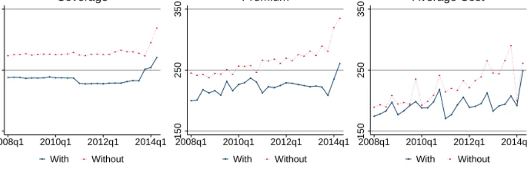
Direct Enforcement I first categorize states into five mutually-exclusive groups, based on their involvement in the implementation of the ACA. On one end of the spectrum are the five states that ceded all authority to implement the ACA to the Federal government. The federal government refers to these states as the “direct enforcement” states (CMS [2014]). Table 2 and identifies the five direct enforcement states as Alabama, Missouri, Oklahoma, Texas and Wyoming. Figure 5 depicts the direct enforcement states on a map that divides states according to my implementation spectrum. Since support for the ACA is low in direct enforcement states, it is likely that outreach efforts to increase enrollment are less targeted in these states, resulting in lower enrollment of healthy individuals.
The first row of Figure 6 shows trends in total coverage for groups of states with and without direct enforcement, weighted by enrollment. As shown in the left subfigure, states with direct
Table 2: State Policies Direct Enforce‐ ment State Exchange Exchange Glitches Medicaid Expansion Non‐ Grand‐ fathered Plans Com‐ munity Rating Guranteed Issue Numberof Insurers AK 0 0 0 0 0 0 0 3 AL 1 0 0 0 1 0 0 1 AR 0 0 0 1 0 0 0 4 AZ 0 0 0 1 0 0 0 6 CA* 0 1 0 1 0 0 0 1 CO 0 1 0 1 0 0 0 13 CT 0 1 0 1 0 0 0 5 DC 0 1 0 1 0 1 0 7 DE 0 0 0 1 0 0 0 4 FL 0 0 0 0 1 0 0 18 GA 0 0 0 0 1 0 0 12 HI 0 1 1 1 1 0 0 3 IA 0 0 0 1 1 1 0 4 ID 0 0 0 0 1 1 1 6 IL 0 0 0 1 1 0 0 9 IN 0 0 0 0 0 0 0 5 KS 0 0 0 0 1 0 0 7 KY 0 1 0 1 1 1 0 7 LA 0 0 0 0 1 1 0 6 MA* 0 1 1 1 0 1 1 12 MD 0 1 1 1 0 0 0 8 ME 0 0 0 0 1 1 1 5 MI 0 0 0 1 1 0 1 23 MN 0 1 1 1 0 1 0 9 MO 1 0 0 0 1 0 0 11 MS 0 0 0 0 0 0 0 2 MT 0 0 0 0 1 0 0 2 NC 0 0 0 0 1 0 0 5 ND 0 0 0 1 1 1 0 4 NE 0 0 0 0 0 0 0 5 NH 0 0 0 1 1 1 0 3 NJ* 0 0 0 1 1 1 1 8 NM 0 0 0 1 0 1 0 3 NV 0 1 1 1 0 1 0 9 NY 0 1 0 1 0 1 1 17 OH 0 0 0 1 1 0 1 15 OK 1 0 0 0 0 0 0 8 OR 0 1 1 1 0 1 1 9 PA 0 0 0 0 1 0 0 22 RI 0 1 0 1 0 0 1 2 SC 0 0 0 0 1 0 0 6 SD 0 0 0 0 1 1 0 6 TN 0 0 0 0 1 0 0 5 TX 1 0 0 0 1 0 0 18 UT 0 0 0 0 1 1 1 6 VA 0 0 0 0 0 0 0 10 VT 0 1 0 1 0 1 1 3 WA 0 1 0 1 0 1 1 11 WI 0 0 0 0 1 0 0 15 WV 0 0 0 1 0 0 1 4 WY 1 0 0 0 1 0 0 3 Summary* 5 13 5 24 26 17 11 8 Summary 5 15 6 27 27 19 13 8
*States with data anomalies omitted from state‐level welfare regression analysis. MA is also omitted. Source: Various, see text for more details.
Figure 5: ACA Implementation Spectrum Exchange, No Glitches Exchange, w/ Glitches Medicaid Passive Direct Enforcement
enforcement made up a small share of total coverage before the introduction of the ACA. Although we observe slight coverage increases in states with direct enforcement in the first and second quarters of 2014, increases in coverage were dramatically higher in states without direct enforcement.
The middle subfigure of Figure 6 show trends in enrollment-weighted premiums. Premiums in direct enforcement states began lower than premiums in other states, but they almost caught up in the first two quarters of 2014. As shown in the right subfigure, which shows enrollment-weighted average costs on the same scale, the increase in premiums in direct enforcement states appears necessary to cover the observed increases in average costs. Although average costs in direct enforcement states started out much lower than average costs in other states, they surpassed average costs in other states in the second quarter of 2014. Assuming that plan generosity remained constant, the increase in average costs observed in direct enforcement states indicates that sicker people enrolled in coverage after reform. However, as discussed above, we cannot make solid claims about the welfare impact of ACA due to changes in selection by making comparisons across groups of states without using the model.
In the top panel of Table 3, we present results from a regression in which we regress state-level changes in welfare per enrollee attributable to the ACA, Wf ull/I∗, post, on a dummy variable for
Figure 6: Trends by State Policy Groupings 0 5,000 10,000 2008q1 2010q1 2012q1 2014q1 With Without Coverage 100 200 300 2008q1 2010q1 2012q1 2014q1 With Without Premium 100 200 300 2008q1 2010q1 2012q1 2014q1 With Without Average Cost Direct Enforcement 0 5,000 10,000 2008q1 2010q1 2012q1 2014q1 With Without Coverage 100 200 300 2008q1 2010q1 2012q1 2014q1 With Without Premium 100 200 300 2008q1 2010q1 2012q1 2014q1 With Without Average Cost State Exchange 0 5,000 10,000 2008q1 2010q1 2012q1 2014q1 With Without Coverage 100 200 300 2008q1 2010q1 2012q1 2014q1 With Without Premium 100 200 300 2008q1 2010q1 2012q1 2014q1 With Without Average Cost Exchange Glitches 0 5,000 10,000 2008q1 2010q1 2012q1 2014q1 With Without Coverage 100 200 300 2008q1 2010q1 2012q1 2014q1 With Without Premium 100 200 300 2008q1 2010q1 2012q1 2014q1 With Without Average Cost Medicaid Expansion

![Table 3: Impact of State Policies on Welfare by State 12π = 1000 12π = 1500 12π = 2000 Direct Enforcement ‐24.64 ‐23.12 ‐21.61 [‐47.67,‐13.14]*** [‐41.26,‐11.84]*** [‐37.92,‐10.75]*** State Exchange 22.26 23.49 24.73 [‐15.55,68.16] [‐15.45,63.47] [‐11.33,6](https://thumb-us.123doks.com/thumbv2/123dok_us/333258.2536517/31.918.116.778.154.961/table-impact-state-policies-welfare-direct-enforcement-exchange.webp)