Caren W. Campbell. Is Optical Optimal? Visualizing Document Sets to Facilitate Efficient Selection of Relevant Items. A Master’s Paper for the M.S. in I.S. degree. May, 2012. 62 pages. Advisor: Ronald E. Bergquist
The visual representation of a cluster of similar text documents is typically accomplished with interactive information visualizations, yet some benefit can be derived even from static diagrams of the document collections. This study examines the comparative efficacy of text and diagram presentation formats for representing such collections, and attempts to determine the degree to which the format of an interface can affect users’ ability to select relevant information being provided there. The hypothesis under examination holds that adults locate relevant documents more efficiently from a node-link diagram of the document set than from a textual list with the commonly used title-and-snippet format. Empirical data from a 40-person user study does not provide statistically significant support for the hypothesis; literature on similar studies helps to contextualize and explain this outcome, and directions for future study are suggested.
Headings:
Graphical User Interface Information Visualization Information Graphics
Human-Computer Interaction TREC
IS OPTICAL OPTIMAL? VISUALIZING DOCUMENT SETS TO FACILITATE EFFICIENT SELECTION OF RELEVANT ITEMS
By
Caren W. Campbell
A Master’s paper submitted to the faculty of the School of Information and Library Science of the University of North Carolina at Chapel Hill
in partial fulfillment of the requirements for the degree of Master of Science in
Information Science.
Chapel Hill, North Carolina May 2012
Approved by
TABLE OF CONTENTS
I. INTRODUCTION ... 3
FIGURE 1 Sample Output from a Google Text Search ... 4
II. LITERATURE REVIEW ... 7
III. STUDY DESCRIPTION ... 12
PARTICIPANTS ... 12
TABLE 1 Demographic Information About Study Participants ... 12
METHODOLOGY ... 13
GENERATING THE DATA ... 13
FIGURE 2 Text: Wildlife Extinction Task ... 13
FIGURE 3 Diagram: Wildlife Extinction Task ... 13
TABLE 2 Question Formats for Each Version of the Exercise ... 16
FIGURE 4 Efficiency Scoring Matrix ... 17
COLLECTING AND COMPILING THE DATA ... 18
IV. DATA ANALYSIS AND DISCUSSION ... 19
OVERVIEWOFPERFORMANCE ... 19
TABLE 3 Average and Median Scores, by Format ... 20
FIGURE 5a Accuracy by Question and Format ... 20
FIGURE 5b Speed by Question and Format ... 21
FIGURE 5c Efficiency by Question and Format ... 21
TEXT FORMAT ... 22
DIAGRAM FORMAT ... 22
FORMAT COMPARISONS WITHIN TOPICS ... 23
TABLE 4 Correlation Matrix Containing All Factors Under
Consideration ... 24
FIGURE 6 Correlation Between Speed and Accuracy for Each Task in Each Format ... 23
FIGURE 7 Correlations of Interface Format with Accuracy, Speed and Efficiency ... 26
V. CONCLUSION ... 32
VII. APPENDICES ... 34
APPENDIXA: THEEXERCISE ... 35
Instructions ... 34
Text and Diagram Interfaces of the Three Tasks ... 35
Questionnaire ... 41
APPENDIXB: RESULTS ... 42
Results for Each Version ... 43
Questionnaire Responses from Adobe Forms Central ... 47
APPENDIXC:ADDITIONALGRAPHSOFRESULTS ... 49
Documents Correctly Selected, By Question And Format ... 49
Accuracy Vs. Speed, All Questions, Diagram Format ... 53
Accuracy Vs. Speed, All Questions, Text Format ... 54
I.
INTRODUCTIO
N
One of the fundamental roles of the information science professional is to enable precise, efficient retrieval of specific information upon demand. Behind the scenes this involves extended, collective, and carefully structured effort, such as the meticulous creation and application of metadata, the careful organization of relational databases for sharing data between institutions, and the compliance with established transfer protocols. Information retrieval (IR) researchers refine iteration after iteration of search algorithms, improving precision and recall to improve the systems’ effectiveness. Thus optimized, the entire infrastructure of organized information is thereby harnessed for public use.
Between this enormous (indeed, worldwide) information infrastructure and the population of end users lies the search interface. Users enter their search queries in text form and receive a set of results (i.e., documents), at least some of which will probably be relevant to their information need. Even at this stage, however, the information need has not yet actually been met. Information seekers must examine the full text of the
documents within a result set1 in order to 1) understand the nature of each document and 2) assess the document’s value. In other words, the first question a seeker asks about each result is “what is this?” and the second question is “what does it contain?” Only then can the document’s relevance (“do the contents fulfill my information need?”) be fully assessed.
1 An exception would be a case of “good abandonment,” where the information shown in
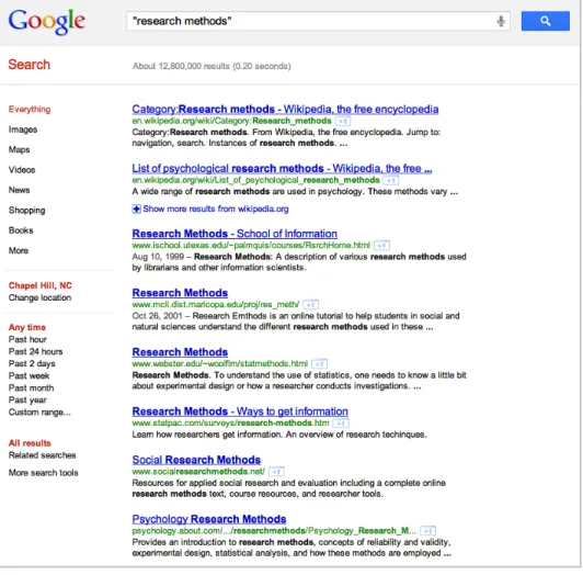
As a general rule, a standard text search will present users with a document set displayed in a textual format: a list of document titles, each followed by its Uniform Resource Locator (URL) and a snippet of the document’s body text. Figure 1 shows the output of a Google text search, a typical example of this format. This presentation style embodies an expectation that users will assess the documents in a linear, sequential way, starting with the items located at or near the top of the list. Indeed, by design, search engine relevance algorithms encourage this approach by placing the “most relevant” documents at the beginning of the result list.
Because readers’ behavior can be expected to conform to the principle of least effort (Zipf, 1949), they will usually begin by selecting the top item in a list (Joachims, Granka, Pan, Hembrooke, & Gay, 2005; O’Brien & Keane, 2006). Indeed, eye-tracking studies provide empirical evidence of users’ habit of zeroing in on the top items first. Investigation by Nielsen (2006), among many others, consistently demonstrates users’ gaze going first and longest at the horizontal zone at the top of the screen and then at a vertical zone along the left margin, as if tracing the capital letter F.
Such habituation may prevent users from noticing the flaws of the text format. As shown in recent studies of Google search results and “trust bias” (Joachims et al, 2005; O’Brien & Keane, 2006), users’ acculturation to the top-to-bottom presentation mode may hinder their information-gathering mission (i.e., selecting the document with the greatest relevance). When users select documents on the basis of their list position, false starts or time-wasting detours — additional sources of potential frustration – may ensue. The linear-sequential style also presents some significant usability drawbacks. To grasp how any given result document relates to the search query (the semantic
connection) and compares to other search results (the ontological import), users must read the text snippet or follow the headline’s hyperlink to the full article. In reading and assessing text, users expend a measure of cognitive effort, plus additional effort to remember and compare the contents (Bettman, Johnson & Payne, 1990). And given all this following of links, the speed with which users can fulfill an information need is necessarily affected by the nature and availability of their Web connections.
content within an ontology, i.e., the universe of documents selected by the search engine’s retrieval algorithm. That ontology will have a node-link relational structure, enabling users to determine the point of entry and order of access, with no predetermined path (Boechler, 2001).
II. LIT
ERATURE REVIE
W
The body of research on the graphical presentation of text documents is large and varied, and recent studies on visualizing text documents have rolled out interactive prototypes in a variety of formats. Because the visual ordering of intangibles, such as document content, calls for abstraction (Chen, 2010), all visualization necessitates an organizing metaphor — though the specific metaphorical model is less important than whether its schema effectively conveys the intended meaning (Chen, p. 388). A brief overview of these metaphorical models is warranted.
METAPHORICAL MODELS
Within the scholarly literature, radial representations are common. The influential Lyberworld project (Hemmje, Kunkel, & Willet, 1994) depicted “content space” with “relevance spheres.” Other iterations using concentric circles or spheres include DocBall (Vegas, Crestani, & de la Fuente, 2007); DART (Amar, Day, Godfrey, & Plaue, 2004), which (naturally) uses a dartboard metaphor; DocuBurst (Collins, Carpendale, & Penn, 2009), which deploys radial graphs and coxcombs to encode semantic content; and Wivi (Lehmann, Schwanecke, & Dorner, 2010), which does the same for Wikipedia articles.
metadata to create a squarified treemap representation of library holdings in context. Astronomical map metaphors inform InfoSky (Andrews et al., 2002), which creates nodes to represent documents, topics, and other semantic entities; and WebStar (Zhang & Nguyen, 2005), which uses hyperlinks as a basis for identifying nodes and the relationships among them.
Morphologically similar to starburst maps, node-link diagrams have become the format of choice recently for some well-known visualization researchers. Two high-profile instances from recent years are TopicNets, which colorfully depict semantic entities as connected nodes of different types (Gretarsson et al., 2012); and PhraseNet (van Ham, Wattenberg, & Viegas, 2009), which maps and links unstructured text units within documents, rather than across documents.
As noted, all of these prototypes are interactive. Interactivity is invaluable for full examination of a data set. It allows seekers to zoom in on useful information while filtering out the unhelpful or provide additional detail, as per Ben Shneiderman’s famous mantra, “Overview first, zoom and filter, then details on demand” (1996). Its affordances enable users to explore data, thereby rendering search an iterative process (Koshman, 2004). The reliance on these functionalities implicitly asserts that multi-dimensional data sets necessitate interaction for sensemaking.2
THE ROLE AND CREATION OF STATIC DIAGRAMS
Despite the undeniable value of interactive functionality, this study sets aside the
2 Note that interactivity alone does not suffice; an evaluation of visualization tools by
topic of interaction3 in order to assess the value of static graphical depictions, which
might be considered subunits of an interactive visualization. Indeed, the ability to comprehend a two-dimensional static depiction must by definition precede interactive engagement: users must be able to make sense of simple diagrammatic representations before deploying interactive tools. On this principle, the current investigation tested a simple hypothesis — that information seekers locate relevant documents more efficiently within a diagrammatic depiction of a document set than within a list of the same items.
Not surprisingly, given their part-to-whole functional relationship, static and interactive renderings must resolve similar representational issues. One such issue is the multi-dimensionality of a textual data set. Even the most sophisticated and complex interactive visualizations cannot codify every single dimension of a text collection. When dimensions are so numerous that it is impossible to depict them all, or so redundant that it is unnecessary to keep them all, reduction of dimensionality becomes necessary. (See Ingram, Munzner, Irvine, Tory, Bergner, & Moller, 2010; and Cribbin, 2010.) Thus, researchers must devise a technique that will reduce dimensionality without
simultaneously reducing semantic content.
Koshman (2006) distinguishes between the dimensionality of data and the dimensionality of representation, and concludes that the two need not be equivalent. (Indeed, from a theoretical perspective, they could not be: data may have hundreds of dimensions, but visual depictions, especially static ones, clearly cannot.) To that end, many in the field have turned to dimensionality reduction via clustering (Lagus, Kaski, &
3 Consequently this study does not address applications involving active information
Kohonen, 2004), often on the basis of latent semantic analysis (Landauer, Laham, & Derr, 2004), or a related technique, edge compression, which has the effect of node reduction (van Ham et al, 2009). Faced with billion-record data sets, Shneiderman (2008) proposes atomic, aggregated, and density plots. To calibrate the degree of compression, Venna, Peltonen, Nybo, Aidos & Kaski (2010) present a reduction mechanism that conceptually parallels the IR concepts of precision and recall: each user decides how much dimensionality to sacrifice, balancing the desire to avoid irrelevant documents with the fear of potentially missing similar documents.
Most of these methods, however, apply only to visualization modalities that are interactive and multi-scale. When one is creating static diagrams of text documents, further constraints apply, even as the abstraction level and the dimensionality of the data remain high. Options such as motion, reorientation, temporal sequencing, filtering and "focus+context" renderings are eliminated. Static visualizations still depend on the tools and rules described by Bertin: “retinal variables” by which to differentiate graphical marks, plus guidelines for positioning arrays and other spatial displays. Rogowitz, Treinish, and Bryson (1996) list ten ways that visual encoding can differentiate among dimensions, of which eight can be applied to static visualizations. Gestalt principles — e.g., proximity, similarity, closure, symmetry — and the implications of color take on additional importance (Sayim, Westheimer, & Herzog, 2010; Rogowitz et al.).
male 52.5% some college 7.5%
female 47.5% bachelors degree 35.0%
some graduate school 12.5%
masters degree 40.0%
English 97.5% Ph. D. 2.5%
not English 2.5% J.D. 2.5%
first language
gender education level
PARTICIPANTS
To assess the value of the study’s static visualizations, 40 adult volunteers were recruited via social media. The principal investigator placed a solicitation notice on her Facebook page and on that of her husband. Note that this convenience sample may or may not yield generalizable results, given the group’s relative homogeneity in age and education. Table 1 presents a summary of demographic characteristics. (Note that this population sample might be atypical, given the distribution of gender and educational level; further discussion of this issue follows in Chapter V.)
METHODOLOGY
GENERATING THE DATA
SESSION OVERVIEW
After submitting a signed consent form, each subject used his/her own Web-enabled computer to participate in an online session that lasted roughly 30 minutes (far less in most cases). The session consisted of reading instructions, working an interface exercise that contained three informational tasks, and then completing a brief supplemental questionnaire about such personal traits as computer use, education level, gender and age. The host locations for the exercise and the questionnaire
respectively were ProProfs (www.proprofs.com) and Adobe Forms Central (www.adobeformscentral.com).
TASK DESCRIPTION
The premise for the task is that participants should imagine they have been assigned to write an essay on a given topic, which is carefully defined and described on screen. The topics were wildlife extinction, international art crimes, and attacks by black bears. All exercises presented them in this order so as to eliminate any confounding effect arising from question sequence. For each of the exercise’s three tasks, subjects saw nine documents and were asked to choose the three that they considered most relevant (“useful”) for writing the essay. (See instructions in Appendix A.)
TASK FORMATS
present each task in one of two ways: a textual format, as shown in Figure 2, and a node-link diagram format, as shown in Figure 3. As discussed in Chapter II, the node-node-link format was chosen because it proved the most informative (among static diagram options) in expressing the relationships between documents.
Whether a participant saw the text or diagram format for each question was determined by random assignment. (See next section.) After each subject finished the session, his/her choices for “most useful” were compared to the subset of documents adjudged relevant by the U.S. National Institute of Standards and Technology’s Text Retrieval Conference (TREC).4 The use of TREC’s materials and ratings enabled the investigator to minimize her own interpretive bias in the matters of topic selection, the aggregation of documents into sets, and judgments about a document’s relevance.
TASK PRESENTATION
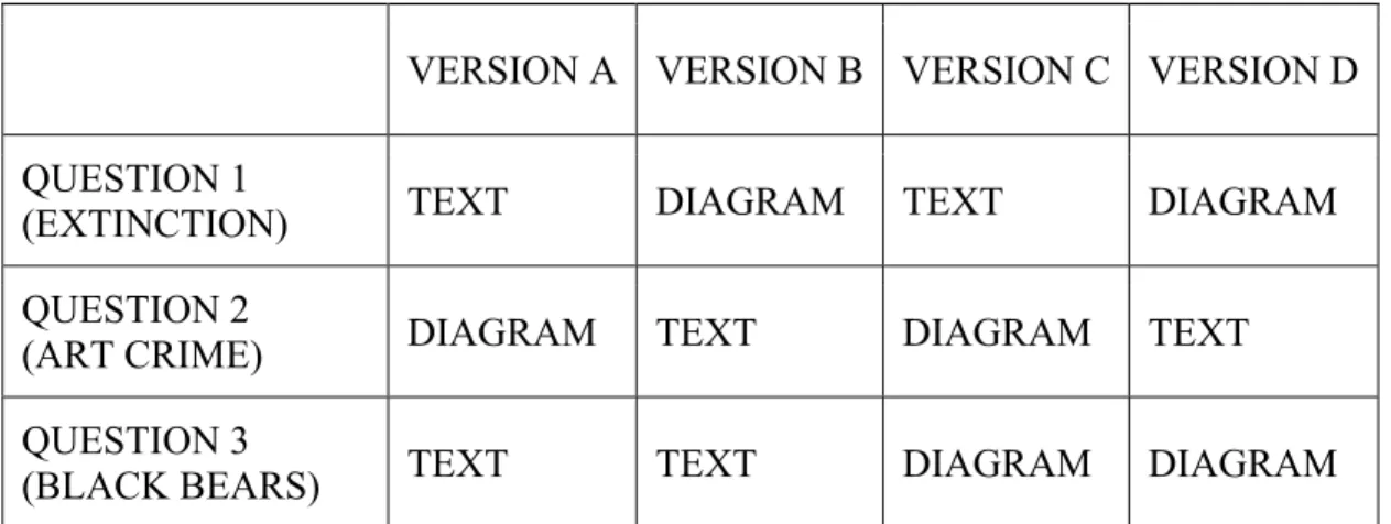
To enable assessment of a subject’s performance in both format categories, each participant saw at least one document set in textual format (Figure 2) and at least one document set in diagram format (Figure 3). For the third question, roughly half of the group was shown a text display and the other half was shown a diagram display. To reiterate, each of the three questions could appear in either presentation mode. (See Table 2, below.)
Ensuring that both presentation modes expressed the same information was essential in order to avoid skewing the results of the investigation. Thus it was necessary (if ironic) to deliberately exclude graphical aspects such as positioning, color, and shape, which could have conveyed additional information to users.
Within the node-link network diagram format (Figure 3), each node contains a document’s title, and connections (“linkages”) derive from recurrent terms that co-occur in more than one document. Proximity and placement have no particular meaning; this was intended to minimize the possibility of positional trust bias.
The text interface (Figure 2), used to generate a performance baseline, was styled to resemble the familiar Google output shown in Figure 1. The list contains document titles in a large, blue font, each with a snippet of body text in a smaller black typeface. Certain elements of the Google-style list (document URLs, links to relevant domains, image links, faceted index along the left margin) were left out to ensure that the text format would provide only the information that would also appear in the diagrams.
To minimize confounding effects arising from the order in which the formats were shown, the investigator created four versions of the exercise. As noted above, each version contained a mix of formats, as shown in Table 2. (All four versions may be seen
FIGURE 2
Text: Wildlife Extinction Task
FIGURE 3
in their entirety in Appendix A.) Versions were randomly assigned to participants as follows: Ten instances of a set of four (A, B, C, and D) were auto-generated using the Research Randomizer Tool.5 This sequence dictated the order for assigning versions. As each subject enrolled in the study, he or she was e-mailed the link to whatever version came next in the randomized list.
VERSION A VERSION B VERSION C VERSION D
QUESTION 1
(EXTINCTION) TEXT DIAGRAM TEXT DIAGRAM
QUESTION 2
(ART CRIME) DIAGRAM TEXT DIAGRAM TEXT
QUESTION 3
(BLACK BEARS) TEXT TEXT DIAGRAM DIAGRAM
TABLE 2 Question Formats for Each Version of the Exercise
TASK SCORING
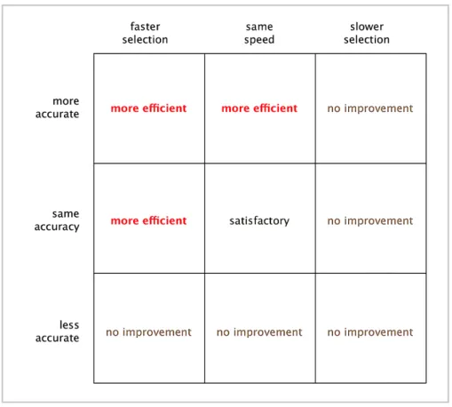
The investigator then compared the users’ performance with text-interface tasks to that with graphical-interface tasks. Performance was scored as follows: For each information task, an efficiency score was calculated. Within this study, “efficiency” is defined as accuracy divided by speed. Accuracy, the fraction’s numerator, equals the number of correctly selected documents per task, i.e., the number of “useful” documents selected by the participant that match those labeled “relevant” by TREC judges. Speed, the fraction’s denominator, equals the elapsed time (in seconds) for completing the task,
i.e., selecting three documents. As a result, for one format to be more efficient than the other, one of two situations must pertain: 1) greater accuracy and equal speed; or 2) equal accuracy and greater speed, as shown in the efficiency scoring matrix (Figure 4). In cases where both formats yield equal efficiency, that outcome was not considered affirmative support for the research hypothesis, but was considered satisfactory from a usability perspective. The results of the three tasks executed by 40 participants (120 measurable instances) were then subjected to statistical analysis to assess outcomes and potential correlations.
QUESTIONNAIRE
Also analyzed in conjunction with task performance were some personal characteristics of the participants, elicited via a brief questionnaire at the end of the exercise. The eight-question form asked subjects to provide information about age, gender, first language, education level, document search frequency, daily amount of computer use, favored search engine, and typical level of focus during computer work. (The questionnaire can be found in Appendix A.) Participants were free to answer as many or as few of these questions as they desired; indeed, one subject declined to fill out the questionnaire entirely.
COLLECTING AND COMPILING THE DATA
Commercial vendors ProProfs and Adobe Forms Central, respectively, hosted the main exercise and the exit questionnaire. Task answer data, including selections,
accuracy, and elapsed time per task, was logged by ProProfs and extracted
As indicated in Chapter I, the group of experimental subjects consisted of 40 adults: 21 men and 19 women between the ages of 30 and 65, with a median age of 46. With three tasks per participant, the investigator thus had the opportunity to collect 120 observations. However, in 10 instances, subjects selected more than three documents for the task. In such cases it was impossible to determine which three documents the subject preferred most, so these instances were nullified. After their removal, the final count of observations was 110. That data set was then analyzed for correlation and statistical significance.
OVERVIEW OF PERFORMANCE
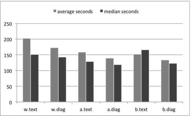
format average median
speed 173.9630 136.5
TEXT accuracy 1.4815 2
(n=54) efficiency 0.0110 0.0091
DIAGRAM speed 148.1071 125.5
(n=56) accuracy 1.4107 1
efficiency 0.0143 0.0105
TABLE 3 Average and Median Scores, by Format
Results from the three topics and two formats are compared in the three graphs in Figure 5. (Additional graphs of these results can be found in Appendix C.) From this data, several notable patterns emerge and are discussed in the following subsections.
FIGURE 5b Speed by Question and Format
TEXT FORMAT
Correctly selected documents from the text format numbered 64 overall, as shown in Figure 5a. Average efficiency improved as the exercise progressed: the average
efficiency score for the wildlife extinction task (.0076) was exceeded by that of the art crime task (.0129), which was exceeded by that of the black bear task (.0133). This is almost certainly a reflection of the decrease in average elapsed time, as shown in Figure 5b. Average time for the first task averaged 203 seconds; the second task, 159 seconds; and the third task, 152 seconds. For the wildlife and black bear tasks, the mean efficiency score exceeded the median score (positive skew), indicating that a small faction of participants performed efficiently enough to raise the average of the entire group. Also, the highest median efficiency score overall is associated with a text instance, that of the art crime task. Meanwhile, the highest mean efficiency score is associated with a diagram instance — also that of the art crime task. From these two results, it can be inferred that participants found the art crime task easiest to execute successfully, regardless of format.
DIAGRAM FORMAT
The diagram format resulted in the selection of 79 relevant documents, exceeding the number of text instances by 23.4%. Most of the difference in performance is
associated with the wildlife question: the text format elicited only 12 correctly selected documents, versus 24 for the diagram format.
indicates that efficiency performance among a few participants far exceeded that of the sample as a whole.
As with the text format, average and median speeds within the diagram format improved from task to task through the entire exercise. Average speed for the wildlife extinction task was 173 seconds; for the art crime task, 140 seconds; for the black bear task, 133 seconds.
FORMAT COMPARISONS WITHIN TOPICS
WILDLIFE EXTINCTION
As noted above, the diagram version of this question earned twice as many correct selections as did the text version of the question. In part, this is a result of a smaller number of text instances; an unusually high number of the null results were associated with this question and format. Consequently, for this topic, the diagram format’s efficiency figures proved to be 98.7% (mean) and 24.6% (median) better than those for the text format.
ART CRIME
Text and diagram formats proved roughly equal in eliciting correct selections, numbering 31 and 30, respectively. For the diagram version, however, the distribution of correct answers per participant is more uniform, with 18 of the 19 instances showing correct selections of one or two documents, and no instance where zero correct
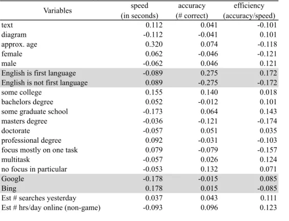
Correlation matrix - Pearson (n) Variables speed (in seconds) accuracy (# correct) efficiency (accuracy/speed)
text 0.112 0.041 -0.101
diagram -0.112 -0.041 0.101
approx. age 0.320 0.074 -0.118
female 0.062 -0.046 -0.121
male -0.062 0.046 0.121
English is first language -0.089 0.275 0.172
English is not first language 0.089 -0.275 -0.172
some college 0.155 0.140 0.018
bachelors degree 0.052 -0.012 0.101
some graduate school -0.173 0.064 0.143
masters degree -0.036 -0.121 -0.174
doctorate -0.057 0.051 0.035
professional degree 0.092 -0.031 -0.103
focus mostly on one task 0.079 -0.079 -0.157
multitask -0.057 0.026 0.124
no focus in particular -0.053 0.132 0.071
Google -0.178 -0.015 0.085
Bing 0.178 0.015 -0.085
Est # searches yesterday 0.037 0.043 0.111
Est # hrs/day online (non-game) -0.093 0.096 0.123
results in the two formats shows that although the median duration for the text version was 8.4% longer, its median efficiency was also 23.8% better.
BLACK BEAR ATTACKS
For this task, the text format’s median duration is 14 seconds longer than its mean, while the diagram format’s median duration is 10 seconds shorter. No explanation can be offered for why the skew is so large, or why the direction differs between formats. Meanwhile, accuracy results for both formats reveal themselves to be normally
distributed around the mean.
OVERVIEW OF CORRELATIONS
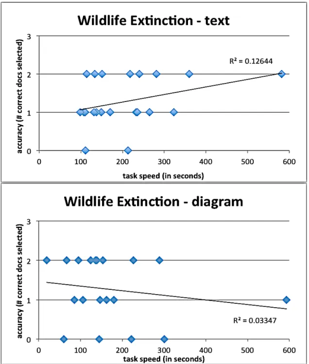
FIGURE 6 Correlation Between Speed and Accuracy for Each Task
FIGURE 7 Correlation of Interface Format with Accuracy, Speed and Efficiency
By task topic. The black bear task results for both formats present the tightest fit around the trend line (Figure 6), with r-values of 0.14 and 0.18. Of course, these and all other r-values shown on the graphs are far too low to be statistically significant.
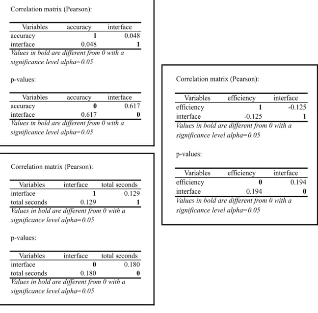
By interface. Overall the interface type correlated very little with speed,
accuracy, or efficiency (Table 4). None of the correlation factors exceeded an absolute value of 0.112.
Correlation matrix (Pearson):
Variables interface total seconds
interface 1 0.129
total seconds 0.129 1
p-values:
Variables interface total seconds
interface 0 0.180
total seconds 0.180 0
Values in bold are different from 0 with a significance level alpha=0.05
Values in bold are different from 0 with a significance level alpha=0.05
Correlation matrix (Pearson):
Variables accuracy interface
accuracy 1 0.048
interface 0.048 1
p-values:
Variables accuracy interface
accuracy 0 0.617
interface 0.617 0
Values in bold are different from 0 with a significance level alpha=0.05
Values in bold are different from 0 with a significance level alpha=0.05
Correlation matrix (Pearson):
Variables efficiency interface efficiency 1 -0.125 interface -0.125 1
p-values:
Variables efficiency interface efficiency 0 0.194 interface 0.194 0 Values in bold are different from 0 with a significance level alpha=0.05
By gender. Men performed slightly better overall; gender correlation was 0.121 for men and -0.121 for women.
By age. Younger people performed slightly better, with age having a correlation value of -0.118 with accuracy.6 However, age had a comparatively strong positive correlation (0.320) with speed. This correlation factor is the largest value of any shown in Table 4.
By education level. The greatest correlation was in fact a negligible one (-0.174), relating performance to the possession of a master’s degree.
By computer habits. Participants who typically spend more hours per day online achieved greater efficiency, but the correlation factor was a mere 0.123, again far below the level of statistical significance.7 Also, task efficiency correlated with attention habits
to a surprisingly small degree; cases where subjects reported the habit of focusing on one task at a time ended up with the largest negative correlation (-0.157), while multitasked instances had the largest positive correlation (0.124).
Unfortunately, certain factors could not be considered as possible correlates (or even meaningful indicators), because participant counts for those aspects skewed
overwhelmingly in one direction. One such factor was the subject’s first language. In all cases but one, the subject’s first language was English; therefore it was not feasible to generalize based on that attribute. Similarly, only three of the 40 subjects (7.5%) prefer the search engine Bing to Google. Given such a small Bing cohort, generalizing on the
6 The statistical power of this observation is uncertain, given the overrepresentation of
people in their 40s within the sample. Further discussion on the generalizability of results from this sample population can be found at the end of Chapter IV.
7 Note that, where subjects estimated their number of searches per day and the number of
basis of that preference is statistically insupportable.
For those correlations it was possible to calculate, the r-values fell far below the .95 level indicating statistical significance. Thus no clear association of efficiency with any of the above factors can be assumed, and based upon the results of this study, we cannot reject the null hypothesis.
Upon examination, it became clear that the first task (wildlife extinction)
exhibited the widest range in answer speed. This finding is unsurprising, as getting used to the task and/or the format early in the exercise might well take a bit of extra time.
Further, as shown in Figure 6, the relationship between speed and accuracy was negligible. Participants generally achieved similar efficiency regardless of speed; hence the trend lines on these graphs demonstrate very little correlation.
Finding so little difference in the effects of the two interfaces was surprising; this outcome is promising from a usability standpoint if not from an experimental one. Admittedly, the node-link diagram as constituted here represents a very crude effort toward graphical representation of a document set. As noted in Chapter II, many more sophisticated and dynamic versions of this interface have been introduced, and yet it appears that few have been assessed against baseline data derived from text formats.
Ironically, in order to make this comparative assessment, the degree of semantic expression (i.e., dimensionality of data) had to be kept equal between formats;
consequently this diagrammatic presentation sacrificed many of the connotative
express various attributes in an immediate and comprehensible fashion, without necessitating that users click a link and/or leave the web page.
As for assessments of this particular diagram format, no participant feedback was solicited or recorded. The investigator did not inquire about this aspect because
ultimately this study was not conducted to assess this specific diagram interface, but rather to assess diagram interfaces generally. To that end, future investigators who seek to compare the effects of textual and graphical presentation may wish to improve not only on this study’s diagram renderings, but also its experimental design and data collection.
Given this study’s convenience sample, which was solicited via social media — specifically, a notice on the principal investigator’s Facebook page and that of her husband — it must be stressed that generalizability of these results is limited. By comparison to the U.S. population as a whole,8 this sample was skewed toward people with a higher level of education (92.5% with a bachelors degree or higher, vs. 27.9% for the population at large); also, participants’ median age of 46 was significantly higher than that of the entire U.S. population (37.2%).
Most fundamentally, assessments of document relevance are by no means hard and fast. In a study by Al-Maskari, Sanderson and Clough (2008), “63% of
documents judged relevant by our users matched official TREC judgments.” The level of contradiction was highest among those who, like the participants in this study, were given a small set of documents to judge. “Therefore, in interactive IR studies which make use of TREC test collections ... care should be taken when comparing user effectiveness with system effectiveness” (p. 684).
In an era when billion-record data sets not only exist but also abound, users cannot begin to comprehend a large collection of documents just by reading or clicking one at a time. Thus graphical presentations, with their dimensional richness and
information density, are becoming a necessity. Researchers such as those mentioned in Chapter II continue working to refine interfaces that help users orient themselves within a document set, so that they can perceive and understand relationships among the retrieved items.
Against that backdrop, this study sought to determine the degree (if any) to which a graphical interface would boost user efficiency in finding relevant documents.
Experimental results were inconclusive, indicating that further study of this question is needed. One can posit that the diagrams are not a hindrance, precisely because the two formats generated no statistically significant difference in user efficiency.9 In fact there are good reasons to continue testing and refining these interfaces. Using Bertin’s retinal variables (color, shape, size, position, etc.) to encode various dimensions of the data (i.e., metadata such as file format, top-level domain, recency, or file size) would, in theory, give users a context within which to work more efficiently, in the same way that faceted displays or browsers can do.
Such a visual system might require a significant time investment for the user to
9 This statement must be qualified: results from this population sample may not be
become proficient, however, and more reliable empirical performance data should be collected in order to determine whether 1) efficiency gains exist, and 2) the gains are large enough to make that upfront time investment worthwhile. This calculation would depend, of course, on the quality of the display and the information architecture, which in turn depend on the quality of the information professional.
APPENDIX A: THE EXERCISE
Instructions
APPENDIX B: RESULTS
Results for Each Version
My education level is:
* Total Responses: 40, 100% of submissions
some high school 0% (0)
high school graduate 0% (0)
some college 8% (3)
associates degree 0% (0)
bachelors degree 35% (14)
some graduate school 13% (5)
masters degree 40% (16)
Ph.D. 3% (1)
J.D. 3% (1)
M.D. 0% (0)
1 additional choice not shown
My first language is:
* Total Responses: 40, 100% of submissions
English 98% (39)
not English 3% (1)
I am:
* Total Responses: 40, 100% of submissions
male 53% (21)
My preferred search engine is:
* Total Responses: 39, 98% of submissions
Bing 8% (3)
Google 92% (36)
Yahoo 0% (0)
Other (please identify) 0% (0)
When I use a computer I usually:
* Total Responses: 40, 100% of submissions
focus mostly on one task 20% (8)
multitask 75% (30)
don't focus on anything in particular 5% (2)
Recent computer use
Total Responses
0 1 2 3 4
5 6 7+
98% (39)
Estimated number of Web searches yesterday:
98% (39)
APPENDIX C: ADDITIONAL GRAPHS OF RESULTS
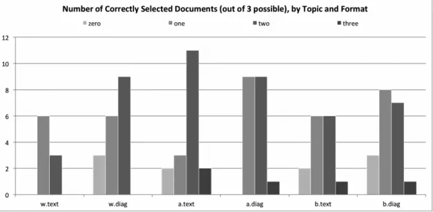
Documents Correctly Selected, By Question And Format
DIAGRAM VERSION TEXT VERSION
The series of bar graphs above shows, for each question and in each format, the distribution of each question interface’s accuracy scores. A participant’s accuracy score (“zero,” “one,” “two,” or “three”) reflects the number of relevant documents correctly
N
u
m
be
r
of
P
ar
ti
ci
p
an
ts
selected by a participant. On the chart labels, the wildlife extinction topic is signified by w, the art crime topic is signified by a, and the black bear attacks topic is signified by b. The left column represents the topic’s diagram version; the right represents the text version. The topics were presented in the order shown (from top to bottom).
This clustered column chart simply aggregates all the data shown in the previous six charts. Despite their obvious differences, the two interfaces elicited remarkably similar outcomes.
Accuracy Vs. Speed, All Questions, Diagram Format
These scatterplot graphs show accuracy scores and speed (in seconds) for each question’s diagram version. Each point is a participant’s performance on a particular question. Circles indicate the wildlife topic; triangles, the art crime topic; and squares, the black bears topic. Because accuracy scores are small integers, putting them on the
Accuracy Vs. Speed, All Questions, Text Format
version of that question also took almost 10 minutes to answer the question. That participant scored two out of three.
Additional Observations:
• The text format elicited three perfect (“3”) accuracy scores; the diagram
format got only two.
• All five of the zero-accuracy text instances were executed within 190 seconds,
while two of the six zero-accuracy diagram instances took longer (220 and 300 seconds). The extra time was to no avail.
REFERENCES
Al-Maskari, A., Sanderson, M., & Clough, P. (2008) Relevance judgments between TREC and non-TREC assessors. Proceedings of the 31st Annual International ACM SIGIR Conference on Research and Development in Information Retrieval, 683–684. doi: 10.1145/1390334.1390450
Amar, B., Day, J., Godfrey, J., & Plaue, C. (2004) Dart: A dynamic article research tool. doi: 10.1.1.199.8641 Retrieved from http://citeseerx.ist.psu.edu/viewdoc/download? doi=10.1.1.199.8641&rep=rep1&type=pdf
Amar, R., Eagan, J., and Stasko, J. (2005). Low-level components of analytic activity in information visualization. IEEE Symposium on Information Visualization, 111–117.
Andrews, K., Kienreich, W., Sabol, V., Becker, J., Droschl, G., Kappe, F., ... Tochtermann, K. (2002). The InfoSky visual explorer: Exploiting hierarchical structure and document similarities. Information Visualization, 1, 166–181. doi:10.1057/palgrave.ivs.9500023
Bettman, J. R., Johnson, E. J., & Payne, J. W. (1990). A componential analysis of
cognitive effort in choice. Organizational Behavior and Human Decision Processes, 45(1), 111–139.
Boechler, P.M. (2001). How spatial is hyperspace? Interacting with hypertext documents: Cognitive processes and concepts. Cyberpsychology & Behavior, 4(1), 23–46.
Chen, C. (2010). Information visualization. Wiley Interdisciplinary Reviews:
Computational Statistics, 2(4), 387–403. doi: 10.1002/wics.89
Chen, L. (2005). The topological approach to perceptual organization. Visual Cognition, 12(4), 553–637. doi: 10.1080/13506280444000256
Chuklin, A., & Serdyukov, P. (2012) Potential good abandonment prediction [Abstract]. Proceedings of the 21st International Conference Companion on World Wide Web,
485–486. doi: 10.1145/2187980.2188089.
Clarkson, E. C., Desai, K., & Foley, J. D. (2009). ResultMaps: Visualization for search interfaces. IEEE Transactions on Visualization and Computer Graphics, 15(6), 1057–1064.
Collins, C., Carpendale, S., & Penn, G. (2009). DocuBurst: Visualizing document content using language structure. Computer Graphics Forum, 28(3), 1039–1046.
Gretarsson, B., O’Donovan, J., Bostandjiev, S., Höllerer, T., Asuncion, A., Newman, D., and Smyth, P. (2012). TopicNets: Visual analysis of large text corpora with topic modeling. ACM Transactions on Intelligent Systems and Technology, 3(2). doi: 10.1145/ 2089094.2089099
Hemmje, M., Kunkel, C., & Willett, A. (1994). Lyberworld — A visualization user interface supporting fulltext retrieval. Proceedings of the 17th Annual International ACM SIGIR conference on Research and development in information retrieval, 249–259.
Ingram, S., Munzner, T., Irvine, V., Tory, M., Bergner, S., & Moller, T. (2010).
DimStiller: Workflows for dimensional analysis and reduction. Proceedings of the 5th IEEE Symposium on Visual Analytics in Science and Technology (VAST), 3–10. doi: 10.1109/VAST.2010.5652392
Joachims, T., Granka, L., Pan, B., Hembrooke, H. & Gay, G. (2005) Accurately
interpreting clickthrough data as implicit feedback. Proceedings of the 28th Annual International ACM SIGIR Conference on Research and Development in Information Retrieval, 154–161. doi: 10.1145/1076034.1076063
Kaski, S., Honkela, T., Lagus, K., & Kohonen, T. (1998). WEBSOM — Self-organizing maps of document collections. Neurocomputing, 21, 101–117.
Kim, K., Ko, S., Elmqvist, N., & Ebert, D. S. (2011). WordBridge: Using composite tag clouds in node-link diagrams for visualizing content and relations in text corpora. 44th Hawaii International Conference on System Sciences (HICSS), 1–8.
Kobsa, A. (2001). An empirical comparison of three commercial information visualization systems. Proceedings of InfoVis 2001, IEEE Symposium on Information Visualization, 123–130.
Koshman, S. (2004). Comparing usability between a visualization and text-based system for information retrieval. Journal of Documentation, 60(5), 565–580. doi: 10.1108/ 00220410410560627
Lagus, K., Kaski, S., & Kohonen, T. (2004). Mining massive document collections by the WEBSOM method. Information Sciences, 163, 135–156. doi:
10.1016/j.ins.2003.03.017
Landauer, T. K., Laham, D., & Derr, M. (2004). From paragraph to graph: Latent semantic analysis for information visualization. Proceedings of the National Academy of Sciences of the United States of America, 101, 5214–5219. doi:10.1073/pnas.0400341101
Novel Evaluation Methods for Information Visualization, 1–5. doi: http://doi.acm.org/ 10.1145/1168149.1168168
Lehmann, S., Schwanecke, U., & Dorner, R. (2010). Interactive visualization for opportunistic exploration of large document collections. Information Systems, 35, 260–269.
Nielsen, J. (2006, April 17). F-shaped pattern for reading web content. Retrieved from http://www.useit.com.libproxy.lib.unc.edu/ alertbox/reading_pattern.html
O’Brien, M. & Keane, M. T. Modeling result-list searching in the world wide web: The role of relevance topologies and trust bias. In Proceedings of the 28th Annual Conference of the Cognitive Science Society, 1881-1886.
Rogowitz, B. E., Treinish, L. A., & Bryson, S. (1996). How not to lie with visualization. Computers in Physics, 10(3), 268–273.
Sayim, B., Westheimer, G., & Herzog, M. H. (2010). Gestalt factors modulate basic spatial vision. Psychological Science, 21(5), 641–644. doi:10.1177/
0956797610368811
Shneiderman, B. (1996). The eyes have it: A task by data type taxonomy for information visualizations. Proceedings of the IEEE Symposium on Visual Languages, 336–343. doi: 10.1109/VL.1996.545307
Van Ham, F., Wattenberg, M., & Viegas, F. B. (2009). Mapping text with phrase nets. IEEE Transactions on Visualization and Computer Graphics, 15(6), 1169–1176.
Vegas, J., Crestani, F., & de la Fuente, P. (2007). Context representation for web search results. Journal of Information Science, 33(1), 77–94.
Venna, J., Peltonen, J., Nybo, K., Aidos, H., & Kaski, S. (2010). Information retrieval perspective to nonlinear dimensionality. Journal of Machine Learning Research,
11, 451–490.
Woodruff, A. & Plaunt, C. (1994). GIPSY: Automated geographic indexing of text documents. Journal of the American Society for Information Science, 45(9), 645–655.
Zhang, J., & Nguyen, T. (2005). WebStar: A visualization model for hyperlink structures. Information Processing and Management, 41, 1003–1018. doi: 10.1016/
j.ipm.2004.03.005