Flexible Branding:
An explorative case study on the effectiveness of an adaptable visual identity Adam Houghton
Graphic Communication Department College of Liberal Arts
Table of Contents
Table of Figures………..iv
Abstract………....v
Introduction………..…1
Statement of the Problem……….1
Significance of the Problem……….2
Interest in the Problem……….3
Literary Review………...5
Introduction……….….5
History………..6
Modern Day Branding……….7
Storytelling……….12
Consumer & Branding Psychology………...14
Conclusion……….15
Methodology………..16
Results………....19
Conclusion……….25
List of Figures
Figure 1: The seven logos for the remix simulation………..20
Figure 2. Graphical Representation of the overall appearance of the logo simulations…21
Figure 3. Graphical Representation of which of the seven logos are the most visually
Abstract
This project is an exploration of how applying various artists’ styles to a visual identity
alter its recognition and effectiveness. Each artist being promoted throughout the brand,
No Name Champions, would add their style to the logo. Studying the history of branding
and where it stands today provides a good foundation on how to expand the direction
branding takes. Using the small business, No Name Champions, as an example to see
how this campaign of creating a kinetic logo affects the consumers’ perception of the
brand. Through the use of logo simulations, consumer surveys, and industry interviews, a
conclusion was established on the success of the kinetic branding campaign. These
results showed a wide variety of acceptance of the campaign, ranging from consumers
believing it is a poor business strategy while others believing it shows creativity within
the business’s practices and values. The results also show feedback on how the campaign
Chapter 1
Introduction
Statement of the Problem
Over the past year, Isaac Yorke, an up-coming artist in the Central Coast, and
myself have been discussing a business venture idea revolving around the arts. This small
business, aptly named No Name Champions, will focus on the creation and sales of
apparel, promotion of, otherwise, overlooked artists, and other smaller artistic ventures in
order to bring more exposure to the arts and give back to the arts through the form of
exposure and a scholarship for high school students. Our main goal is to keep the arts
alive, and inspire young artists to pursue their dreams. To help make this happen, we are
taking 50% of our profits and using it to help further students and up and coming artists.
No Name Champions has been developed to provide aspiring artists with a sense of
community, opportunities for exposure, and art scholarships.With all small businesses, a
recognizable and innovative visual identity is needed if it is to be successful.
One unique idea we had in the creation of this company was to have every line of
clothing we put out be designed by a chosen “No Name Champion”, or up-and-coming
artist. Upon the development of that idea, we also went a step further and decided that
each artist should apply their own twist on the branding of No Name Champions. Each
this company is to promote artists that are otherwise unknown, it would help to apply
their style to everything we do during their showcase. The difficult aspect of this
endeavor is the need to design a truly successful and adaptable identity. The identity
needs to be simple enough to be developed differently each time. On the other side of the
dilemma, the facets of this business are: an apparel company, art promoter, event planner,
and charity; the visual identity needs to be able to successfully apply to all forms of these
businesses. It needs to be able to morph into each of the trends of these businesses and
still be marketable to the required demographics.
In order to add context and further understand this dilemma, one must understand
branding entirely. This includes not only design aspects but also business aspects,
including the implications and effects branding has. The research offered in this project
will encompass both sides of branding as they are equally important. It will, however,
focus on the visual aspects of the brand and the effectiveness of its recognition.
Significance of the Problem
My intended audience is creative professionals, the masterminds behind visual
identity development. These individuals are the ones who create all the logos and color
palettes that we associate with a business. These are the ones that would benefit in
research on a topic that is unique to the already established facet of design.
Branding is absolutely essential to a business’s success. It signifies the style of the
company, its personality, and the demographic it is trying to reach. When creating a
brand, designers need to keep in mind the type of business when creating concepts for a
usually need to adhere to those trends to avoid placing the company into a different
industry, thereby confusing the consumers.
Typically, a company’s identity is rigid. Perhaps that is a smart choice as to not
confuse the consumers. However, for No Name Champions’ desired audience of the more
artistic crowd, we feel the highlighting of the artist is just as important as the recognition
of the brand. Since it is a business and a brand must be developed, but given the ideals
and unorthodox business methods we choose to explore how effective a flexible identity
can be during our development of the brand.
Interest in the Problem
This problem has captured my interest for a few reasons. First, since I am a
founding member of this collective and I have experience in graphic design, the
responsibility of completing the branding for this business has fallen upon myself. Isaac
and the few others involved may be artists but they are artists in the street or fine art
sense of the word. They do not understand designing imagery for commercial purposes
while maintaining an artistic factor. Second, my favorite aspect of the wide spectrum of
graphic design is branding. I find the process of creating a brand, from conception of the
idea to brainstorming to completion, extremely satisfying and compelling. All other
aspects of design seem to fall short for myself. Branding contains all forms of design:
print, web, packaging, etc., and still requires a cohesive style and meaning.
There are multiple beneficial reasons for conducting this research. First, No Name
Champions is a real company (in the works) and with an effective visual identity it has
knowledge on branding and the unique effects it can have. Third, similar to the second
reason, I hope this research will be read by creative professionals in hopes of furthering
their own personal knowledge on the subject, thus allowing this notion of flexible
Chapter Two
Literary Review
Intro
Branding is an essential aspect to the creation of any business. With it, a business
maintains an identity, and a persona that distinguishes that brand from everyone else in
the given industry. As a business begins, in this case, No Name Champions, a few things
must be taken into consideration in the branding process. Name, symbol, values, design
elements, and unorthodox, creative methods are all important to establishing a successful
brand and making that brand stand out amongst others.
The collective known as No Name Champions began during the discussions of
two friends, Isaac Yorke, a local Central Coast artist, and myself. This business is unique
in the sense that the services it provides are wide spread. As a creative company its focus
will primarily on the sales of apparel, promotion of unknown artists and their work, and
other artistic ventures that bring exposure to up-and-coming artists. With a large amount
of our profits, we aim to set up a scholarship fund for high school students as an incentive
for them to pursue a career in the arts (Houghton and Yorke, Personal Communication,
2013).
No Name Champions, as a multi-faceted small business, requires a brand that is
a simple, flat logo. The branding process, in this situation, needs to take control of
multiple applications, consumer psychology, storytelling, and the understanding of the
design process.
History
The history of branding can be dated back hundreds of years as a symbol of
ownership. This ownership symbol was applied to distinguish animals, primarily cattle,
and slaves, or establish a visual societal change in oneself. Ancient Greeks, Egyptians,
and Romans all used a brand, or a burn, to claim what was theirs. The scarred symbols
were permanently laid into the skin, establishing that cattle or slave’s fate. This use of
fire, or burning, has been associated with branding for centuries. On another side of the
world, a different style of branding held a vastly different symbolism. In Borneo, the
home place of tattooing, used the tatau to represent a change in age, rite of passage, or
increase in the societal hierarchy (Bastos & Levy, 2012).
The processes above classify not only a person’s belongings but also their societal
status. From the 16th to the 18th century, branding became less of a visual declaration and
focused more on one’s reputation. Establishing a good repute, in those days through the
eyes of God, was the key to maintaining a successful business (Bastos & Levy, 2012).
Branding has evolved even more, morally and visually. Visually, branding became less of
a permanent marking on one’s skin and, instead, developed into a symbol that
mark, usually a signature, done by the creator to show their customers that the products
or services were reliable because of the creator’s reputation.
The rise of the Industrial Revolution equated the rise of business and competition.
However, at the beginning of the Industrial Revolution, due to monopolized industries
there was virtually no competition within an industry. This caused a focus on the quality
of the product instead of a need to distinguish one’s self as a company for success.
Towards the end of the Second World War, given the mass production of goods needed, a
booming consumer industry developed. This industry was the predecessor of the
capitalist economy we see today. The demand for goods gave way to more companies
being born. This paved the path for the necessity of having a unique brand image (Bastos
& Levy, 2012). During the 1950’s it was recognized as a much-needed element in a
business’s success, specifically in advertising applications. A company needed to stand
out against their competition, e.g., the constant back & forth between Pepsi Corporation
and Coca-Cola. Today, many companies experience that competition and constantly fight
to stay afloat in their industries. A well-designed brand could be the needed factor for
success.
Modern Day Branding
Today, branding follows similar trends that were established in the period of the
1950’s. Brand image and use of a quality logo became customary after companies, such
as Mercedes-Benz, Coca-Cola, and CBS, acknowledge the benefits (Bastos & Levy,
2012). For years, the visual aspect of the branding process became the forerunner of
that symbolized that company’s core values. Adding an emotional facet to the brand
image strengthens it by giving the consumer something that is easier to grasp and relate
to. Now, instead of just being able to recognize a logo, a consumer is able to instantly
recognize a company regardless of what country the company is doing business: Apple’s
“apple” is one of the most recognizable logos of today, or color palette, such as UPS’s
brown.
As customers get more involved with the brand through cognitive and emotion connections, customers are expected to become more emotionally attached to the brand. Similar to human-human relationships, customers look for positive characteristics in a brand before they decide to establish a customer-brand relationship.” (So, Parsons, and Yap, 2013)
This emotional attachment to a brand image can lead to a more dependable, trusting
relationship. It is now acknowledged that integrating a company’s philosophy can bring
their brand more value and worth (Inskip, 2004). Consumers will be more likely to
frequently interact with that given company.
This integration of values into a brand image pushed the concept of branding to
newer levels of complexities. Following the boom of the technology age and the birth of
the Internet, branding needed to evolve yet again. With the ability to search for, purchase
from, and interact with brands via the Internet, the need for a more unique brand grew.
Competition expanded as the ability to find other brands and finding the best value
became prevalent. Brands were forced to implement new methods in their marketing and
advertising practices. A focus on brand name with domain names became essential. Some
were unable to maintain a domain name that correlated directly with their brand name or
found that it was too costly to divert their marketing and advertising onto a digital format
(Rowley, 2004).
This new frontier for branding allowed a company to further expand their brand
image. With the growth of the webpage, companies developed the corresponding
necessities that became as recognizable as their past brand image elements. Through the
use of these elements: logos, colors, shapes, text & copy, layouts and graphics, it was
now much easier for a consumer to not only find a brand via search engines but also
relate and maintain an interactive relationship with a brand. (Rowley, 2004)
Necessity & Conception
With the large amounts of companies, services, and goods, the need for a brand to
stand out to consumers is more important than ever. It is stated in Bresciani and Eppler’s
essay (2010), “Brand New Ventures? Insights On Start-ups’ Branding Practices”, that a
good brand image could account for 50% of the success.
The process of creating a successful brand is extremely intensive, yet creative. To
start one must understand the values, personality, and services their business would
provide. This will impact the company’s success greatly. Whether one’s business is a
SME, a Small–to–Medium Enterprise (Inskip, 2004), or a large corporation, the branding
process is critical. However, figuring out which type of business is essential in how you
essential to understand the limitations and necessities these entities have to overcome in
order to be successful in their process.
As of now, there are no strict guidelines and rules to how a start-up would go
about branding themselves (Bresciani & Eppler, 2010). Start-ups need to find their way
through the process on their own as the majority of the literature and references used in
the industries tends to focus on larger corporations. Furthermore, it is imperative to
establish where one’s services or goods are aimed, specifically if the aim of one’s
company is to serve the consumer or other businesses. The Oxford Dictionary
differentiates these as B2C, or business-to-consumer, or B2B, business-to-business. B2B
and B2C would go about the branding process in alternate ways, establishing an aesthetic
and personality that suits their needs. For example, a B2C would likely focus on making
their image appeal to their given consumer target market, whereas a B2B has to focus
their brand image into the niche industry they serve.
The choice of name is extremely significant in the process as it depicts one’s
services, target market, and personality. Bresciani & Eppler (2010) state, “It is advised in
branding guidelines that a descriptive name is hardly protectable and even dangerous
because the final goal of a brand is to distinguish the product, not just describe it.” The
name of the company can make or break it. A name that describes what a company
produces as a product or service is not unique; it does not stand out compared to
Concerning the development of the brand image, it is clear that quality logo
design is imperative. It establishes a consumer’s recognition of a brand and loyalty to that
brand. In 2003, Apple, who has one of the most recognizable logos today, released a press
statement announcing a change from their red apple logo to the brushed silver apple that
is the forefront symbol of the technology industry today. When that change was made,
hundreds of people signed a petition that demanded Apple reverts back to their original
logo yet they still went on with the rebranding (Walsh, Winterich, Vikas, 2010). People
questioned a change of the branding yet saw how successful it was and maintained their
loyalty to Apple. This is evident by the continued success Apple has experienced in the
last few years.
The logo design and decision process is important based on the company’s
services, values, and story. The decision to create a symbolic, image-based logo
compared to a text-based logo says a lot about a company. In the article, “The Power of a
Good Logo” (2014), research shows that an image-based logo can be more effective than
on that is based solely on the brand name due to its ability to be significantly more
recognizable and relatable for the consumer. Pham, Palleres-Venegas, and Teich’s
analysis (2012) of Well’s Fargo Bank’s logo and the fact it depicts the story and values in
the symbols of the Wild West support this.
Another aspect to account for in logo design, especially in today’s terms, more
than simply deciding between an image and text-based logo, is analyzing the flexibility of
a given logo. Comparing and analyzing Vogue Magazine and MTV, two logos that have
logos were able to adapt to the given application they were used in. The Vogue masthead
used to be redrawn to fit perfectly with a given issue’s aesthetic (Design Week, 2010). It
created an exciting branding experience but still maintained the brand image. MTV is also
a great case study as for different situations the logo would be reimagined with a new
color palette, textures, or animations. The creative directors played with the logo in a way
that was fresh yet still maintaining the core design elements that have made it one of the
most recognizable logos today. This is further necessary to take into account today given
the variety of applications branding is used in. Karsten Schmidt stated, “It doesn’t make
sense any more to specify a particular colour or font-size” questioning how a brand can
live in the vast technological world we live in today (Design Week, 2010). Websites,
smartphone apps, billboards, advertisements, and standard branding collateral all portray
a brand in a different way. Various sized media affects the visual perception of the brand
collateral, changing the way a consumer view the logo. This factor combined with the
ability to creatively flex a brand can produce unforeseen effects. One needs to have a
brand image that can successfully adapt to a given application.
Storytelling
One aspect of a brand that not many companies take into account is their story. If
the company has an interesting story on its origins or the reasons why it was
conceptualized in the first place, why not depict that in the brand so consumers can
further understand and relate with the company? Storytelling is an art that has been
around since the beginning of human intelligence (Herskovitz and Crystal, 2010, p.21).
be established in the brand image. A persona is “an articulated form of the brand’s
character and personality” and can be classified into archetypes for “quick and easy
recognition” (Herskovitz and Crystal, 2010, p.22). These “personas” can help a consumer
relate to a brand through recognizable traits, whether it be a desire to rebel against the
industry norm, or to provide stability and safety.
Another storytelling aspect, briefly mentioned above, is the power that
image-based logos possess. One case study, deducted by The Academy of Banking Studies
Journal, analyzed the relationship between Wells Fargo Bank and the story depicted in
their brand image. Their image consistently contains stagecoach and Wild West elements
that can be traced back to their inception in 1852 (Pham, Palleres-Venegas, and Teich,
2012, p.78). To gather information on the perception of Wells Fargo’s logo, Pham,
Palleres-Venegas, and Teich conducted personal interviews with college students who
became customers of the bank. Most agreed the logo depicted not only the long history of
Wells Fargo Bank but also their commitment to maintain the safety of their customers’
money. This perception only further commits customers to their loyalty in Wells Fargo
Bank (Pham, Palleres-Venegas, and Teich, 2012). In brand development, telling a story
invokes greater brand loyalty and awareness as the consumer seeks to connect with the
brand through their own emotions and dreams (Gummerus, Liljander, Lundquvist, & van
Reil, 2012, p. 286). The article (2012), “The Impact of Storytelling on the Consumer
Brand Experience: The Case of a Firm-Originated Story”, highlights Ben & Jerry’s as an
effective storyteller. Instead of just telling a story through their logo, Ben & Jerry’s
portal for the consumers to relate to the brand (Gummerus, Liljander, Lundquvist, & van
Reil, 2012, p. 286)
Consumer & Branding Psychology
When designing the visual aspects of a brand image there are other aspects to bear
in mind, particularly color choice. Color psychology is significant because different
colors depict different values and traits, which can further assist in a brand depicting their
own values. For example, red can depict traits of intensity, power and anger whereas blue
can depict traits of tranquility, stability and productivity (O’Connor, 2009). Based on a
brand’s services, they may want to choose the colors they use in their image carefully.
Environmental organizations tend to use a lot of earthy tones like green or brown to
depict their vales in the preservation of nature. These traits can vary from culture to
culture, something a company needs to understand when developing a brand image,
especially concerning the scope and scale of the business.
Another aspect of psychology in branding is preference and brand loyalty. Once a
brand is established well, that brand can see success by consistency. Well-known brands
tend to do a lot better than a generic department store brand when a consumer is faced
with a choice between the two. This is due to those well-known brands having used their
brand images to portray the quality of their products, otherwise known as brand equity
(Field, Biergen, Giesen, and Fields, 2012). Another study done by the Association for
Psychological Science discovered that, through tests on consumers’ decision-making
and promotion of brand image rather than specific product promotion, customer support,
and updated product awareness (Philiastides, Ratcliff, 2013).
Conclusion
Branding is a multi-faceted process that, if not taken seriously, can seriously hurt
a company’s success. Through recognition, growth, flexibility, and loyalty a brand can,
not only attract more consumers, but also interact and relate with those consumers,
creating a better experience. With a well-developed brand, people can understand the
business through and through.
Chapter 3
Methodology
This case study was an exploration on the effectiveness of an adaptable visual
identity. At its core, the key aspect of this research is adaptivity. Visual identities are an
important part of branding a business due to their ability to allow consumers to recognize,
develop loyalty to, and relate to a given business. One aspect of No Name Champions, the
company this case study revolves around, is its unique affiliation with artists. As each
line of clothing is released, a specific artist is chosen to design that line and gain more
exposure through promotion and art shows. When each artist designs for No Name
Champions, they will provide their artistic perspective to the brand by redesigning the
logo. The objective of this research is to analyze how a consistent, subtle reinterpretation
of a visual identity changes its effectiveness to attract consumers through a survey
distributed to consumers and feedback from industry professionals.
The audience chosen for this research encompasses a wide range. First, it will
relate to experts in the fields of graphic design and branding. Through the knowledge
gathered during this case study, the experts can choose to use similar techniques in their
own work. Experts being interviewed include David ‘Meggs’ Hooke, and influential
street artist, and Darren Booth, an extremely successful graphic designer. Secondly, this
case study’s survey would be distributed to consumers between the ages of 16 and 26.
and men, this demographic will hopefully show a well balanced sample based on the
consumer demographic No Name Champions aims for. Around 50 people in this sample
were surveyed upon analyzing this case study.
The procedure for this project will consist of two parts. First, after the
development of the logo simulation, the experts were asked to give feedback on the
effectiveness of the adapted visual identity. This was done through a series of questioning
on a variety of branding topics. For example, whether or not they would be able to
recognize that each adapted logo is the visual identity for No Name Champions. Another
example question would be whether they believe having an adaptable visual identity
assists or hurts a business.
The questioning of the consumer sample will be conducted through correlational
research, specifically through the use of a survey. This survey will be conducted through
an online survey service and be distributed through social media applications. 50 people,
ranging from the ages of 16 to 33+, answered the survey, as that is the target age for the
No Name Champions products. Using similar questions as with the experts, I was able to
gather whether the actual consumer believes whether or not the redesigned visual
identities are effective. After answering the questions, they were given the option to give
personal feedback on whether or not having a adaptable branding solution is a good
business choice.
The resulting data from both the expert questioning and the survey conducted on
the consumer sample consisted of qualitative data. Because the data was qualitative, it
was used to conclude whether or not the use of an adaptable visual identity is a smart,
Chapter 4
Results
As stated earlier, the purpose of this project is to explore whether adding artists’
perspectives to a graphic standard hurts the brand’s recognition or adds to the values the
brand holds. In order to better understand the consequences of remixing a graphic
standard, two methods were used. First, a simulation of how the logo would
hypothetically appear over the progression of artists adding their own styles to it. The
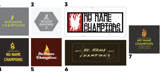
only limitations that were applied on the seven logos, viewable below in Figure 1, was to
maintain the name of the brand, No Name Champions, and the standard symbol, the
flame.
Once the logo simulations were designed, a survey was constructed to gather
results on how the consumer demographic would react to this idea of an adaptable visual
identity. This survey was distributed via online pathways to a wide range of
demographics. The range was, however, more concentrated to the ages of 21-28 as that
more accurately represents the consumer range of the company. A grand total of 57
people took part in the survey, 28 females and 29 males. Out of that sample of people,
58% were 21-28 years old, 32% were 33+ years old, 7% were 16-20 years old, and 3%
were 28-33 years old.
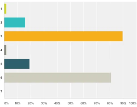
Figure 2. Graphical Representation of the overall appearance of the logo simulations.
The first question based on the logo simulations was whether or not the logos
appeared to have come from the same company. The vast majority of the responses (86%
of them) stated that, at first glance, the logos did not appear to come from the same
appeared to be the most different from the others. The results heavily leaned towards
logos three and six, each pulling 89.5% and 80% (Figure 3).
Figure 3. Graphical Representation of which of the seven logos are the most visually
different.
The last question gave the participants an opportunity to share their own thoughts
on whether or not an artist remixed logo affects brand recognition or shows creativity
within the company’s values. The comments revealed a split view on whether or not it
shows creativity. Around 20 participants stated that this concept of adaptive branding
could hurt brand recognition. Another 20 stated the opposite, saying that having specific
artists remix the No Name Champions logo has the opportunity to show creativity within
how remixing a logo needs to depend on the context. Comments such as “depends on
how much equity has been built with the brand”, “incorporate key (read: recognizable)
aspects of the original design (like the flame in this instance), then I think they show
creativity”, and ”if there is some 'hook' in common between the original logo and the
reworked logo” shows how the consumer understands brand recognition and has the
ability to recognize different aspects of the visual identity. (Personal Comm, 2014)
The final method of gathering feedback was a simple questionnaire sent out to a
couple of professionals that are applicable to the target market of No Name Champions.
The first professional is David Hooke, also known as Meggs. David is a fast rising street
artist that has been making waves within the contemporary art world for a couple of years
now with shows in Los Angeles, San Francisco, Sydney, and Tokyo. David is a good
representation of the types of artists No Name Champions seeks to support. Upon viewing
the logo simulations he provided comments on whether or not having various artists
remix a logo is a solid creative business solution. David gave his thoughts on how
applying remixed logos to the visual identity can be “a way to keep a brand alive, and
constantly engaging with a relevant and contemporary audience” (Personal Comm,
2014). According to David, if the visual identity is strong enough in the first place and
certain limitations are placed on the remix, it has potential to add personality to the brand,
expand the brand’s reach to new audiences, and establish a stronger connection to a
specific creative culture. Although David provided plenty of benefits to having artists
remix a logo, he did mention how if the artist doing the remix is given too much freedom,
also expanded on how one problem could be whether or not the chosen artist’s personal
values align with the brand’s.
Another professional that gave his own thoughts on the subject is Darren Booth, a
graphic designer and illustrator who has gained plenty of recognition through
Communication Arts Awards and client lists that include The New York Times, Sony
Corporation, and Disney. Darren, who was asked the same questions that David Hooke
recieved, provided a different perspective than David did. Darren stated how the whole
reason behind branding is to maintain one singular image to establish a form of
recognition for the consumer. Changing the visual representation can “send mixed
messages to the consumer about what the company represents” (Personal Comm, 2014).
He also provided similar feedback as David Hooke did in the sense of how having artists
apply their styles to the branding could be difficult in making sure it still feels like the No
Name Champions brand, yet still allowing them to feel like they have the ability to apply
their specific style.
The results of both the survey and the industry interviews is what was expected
when this project started taking shape. Analyzing the data and feedback provided, it
seemed the idea of having an adaptable visual identity would only work on a few
conditions. First, the standard identity would need to be set and recognizable before
going about the process of applying artistic perspectives. Second, in order for the
remixing to be successful, a standard hook needs to be retained throughout each remix.
This hook would likely be the flame logo and the textual elements. With that being said,
some constraints to the artists that participate. Giving the artists too much freedom could
Chapter 5
Conclusion
Branding has been an extensive part of human history as a way for people to signify themselves and their property apart from others. As branding has progressed from
simple burn brands to merchant signatures to what we think of today, its applications
have evolved with it. Especially with the creation of the capitalist system and the
technological advances that followed (i.e. The World Wide Web). These advances forced
branding to take more steps to higher levels of complexities. Companies now have to
create brands that tell stories on top of expressing the values of the company. They have
to do this on a variety of applications including: advertising, print, marketing, and the
Internet. They have to withstand the large amounts of companies in existence, to stand
above the other companies, above the competition.
When it comes to No Name Champions, we strive to stand above other companies
in our marketplace in an unorthodox manner. Instead of sticking to graphic standards and
advertising, we strive to promote our brand through collaborations with other artists.
Being creative is the foundation of No Name Champions; it is what brought us to creating
the brand in the first place. We hope to be able to not only promote the artists we
collaborate with, allowing them to progress within the art industry, but also to give back
to future artists through a scholarship fund. These all require a necessary amount of brand
what No Name Champions is about. The bottom line is it’s all about the progress of
creativity.
The idea of collaborating with various artists originated around the theme of
having each artist produce a line of graphics for apparel. This idea then branched off to
involve the No Name Champions visual identity. One way we thought would be a good
way of separating ourselves from competition is to create a kinetic, adaptable visual
identity through the artist collaborations.
Given the results from the research, the data collection, and the industry
interviews, creating a successful kinetic visual identity for No Name Champions is a
matter of perspective. The success is based on the consumer’s perception of the brand. It
is also based on the customer’s own personal values. Due to the fact that this brand
appeals to a more artistic minded customer base, the creativity to be shown via a kinetic
visual identity could be effective. With that being said, some form of standard
recognition is vital for this to have any success. Therefore, I recommend a few things in
order for this to be a practical business strategy; the brand needs to be recognizable while
still being able to show its creative values. Brand equity needs to be built before
proceeding with the kinetic campaign. If people do not recognize the brand because the
artists stray too far away from it there will be no success. Over time, as the brand equity
is fortified, the No Name Champions brand can begin to start using the artist perspectives
provided through the collaborations. The artists would need some constraints, as stated
earlier, to prevent them from unintentionally drifting too far from the original graphic
standard. As that begins, then, perhaps, the No Name Champions Brand will be able to
References
1. Inskip, I. (2004). Corporate branding for small to medium-‐sized businesses -‐ A missed opportunity or an indulgence? Journal of Brand
Management, 11(5), 358-‐365. Retrieved from
http://ezproxy.lib.calpoly.edu/login?url=http://search.proquest.com/docvie w/232488587?accountid=10362
2. Bresciani, S., & Eppler, M. J. (2010). Brand new ventures? insights on start-‐ ups' branding practices. The Journal of Product and Brand
Management, 19(5), 356-‐366.
doi:http://dx.doi.org/10.1108/10610421011068595
3. BRANDING: No limits? (2010). Design Week, 25(19), 14-‐n/a. Retrieved from http://ezproxy.lib.calpoly.edu/login?url=http://search.proquest.com/docvie w/215575995?accountid=10362
4. Herskovitz, S., & Malcolm, C. (2010). The essential brand persona:
Storytelling and branding. The Journal of Business Strategy,31(3), 21-‐28. doi:http://dx.doi.org/10.1108/02756661011036673
5. Field, J. R., Bergiel, B. J., Martin Giesen, J., & Fields, C. L. (2012). Branding: Perceptual effects on consumer evaluations.Competitiveness Review, 22(3), 251-‐260. doi:http://dx.doi.org/10.1108/10595421211229664
6. Rowley, Jennifer (2004). Online Branding, Online Information Review, 28, 131 – 138.
http://www.emeraldinsight.com.exprozy.lib.calpoly.edu/journals.htm?articl eid=862248&show=abstract#sthash.3M2NJxLJ.dpuf
7. O'Connor, Z. (2011), Colour psychology and colour therapy: Caveat emptor. Color Res. Appl., 36: 229–234. doi: 10.1002/col.20597
8. Philiastides, M. G., & Ratcliff, R. (2013). Influence of branding on preference-‐ based decision making. Psychological Science (Sage Publications Inc.), 24(7), 1208-‐1215. Doi:10.1177/0956797612470101
9. Walsh, M. F., Karen, P. W., & Mittal, V. (2010). Do logo redesigns help or hurt your brand? the role of brand commitment. The Journal of Product and Brand Management, 19(2), 76-‐84.
doi:http://dx.doi.org/10.1108/10610421011033421
10. Park, C. W., Eisingerich, A. B., & Pol, G. (2014). The power of a good logo. MIT Sloan Management Review, 55(2), 10-‐12. Retrieved from
http://ezproxy.lib.calpoly.edu/login?url=http://search.proquest.com/docvie w/1475566458?accountid=10362
11. Pham, L., Pallares-‐Venegas, E., & Teich, J. E. (2012). RELATIONSHIPS