Self-Organising Maps
Rudolf Mayer, Taha Abdel Aziz, and Andreas Rauber Institute for Software Technology and Interactive Systems
Vienna University of Technology
Favoritenstrasse 9-11/188, A-1040 Vienna, Austria
email:{mayer, rauber}@ifs.tuwien.ac.at, abdel aziz [email protected]
Abstract. The Self-Organising Map is a popular unsupervised neural network model which has been used successfully in various contexts for clustering data. Even though labelled data is not required for the training process, in many applications class labelling of some sort is available. A visualisation uncovering the distribution and arrangement of the classes over the map can help the user to gain a better understanding and anal-ysis of the mapping created by the SOM, e.g. through comparing the results of the manual labelling and automatic arrangement. In this pa-per, we present such a visualisation technique, which smoothly colours a SOM according to the distribution and location of the given class labels. It allows the user to easier assess the quality of the manual labelling by highlighting outliers and border data close to different classes.
1
Introduction
The Self-Organising Map (SOM) [1] has been successfully used for clustering various kinds of data. It provides a topology-preserving mapping from a high-dimensional input space to a lower-high-dimensional, in most cases a two-high-dimensional, output space, which is an easily understandable representation. To reveal the cluster structures on the SOM, many visualisations techniques have been devel-oped to help the user analyse and use the map.
In many applications, the data might already be assigned to classes, which can be utilised to compare the manual labelling with the automatic arrangement of the SOM. The distribution and arrangement of these classes on the map may reveal outliers, and ’conflicts’ between the (manual) assignment and the clustering of the SOM - those data items are especially interesting to inspect, as they might denote a labelling of bad quality, or correlations between data items that were not obvious to the observer. In this paper, we propose a visualisation of the SOM based on class labels that helps the user in quickly and easily finding those interesting data points, exploiting the class information for unsupervised learning. We want to colour the map in continuous regions in such a way that the regions reflect the distribution and location of the classes over the map, similar as e.g. a political map does for countries.
The remainder of this paper is organised as follows. Section 2 gives an overview of related work on the SOM and SOM-based visualisations. Section 3 presents the approach of colour flooding, while Section 4 describes some graph-based approaches. In Section 5 we demonstrate our methods in experiments, and Section 6 gives conclusions and an outlook on future work.
2
Self-Organising Map
The SOM is a neural network model for unsupervised learning. It provides a mapping from a high-dimensional input space to a lower-dimensional, in most cases a two-dimensional, output space. This output space is in many applications organised as a rectangular grid of units, a representation that is easily under-standable for users due to its analogy to 2-D maps. Each of the units on the map is assigned a weight vector, which is of the same dimensionality as the vectors in the input space. During the training process, randomly selected vectors from the input space are presented to the Self-Organising Map, and the unit with the most similar weight vector to this input vector is determined. The weight vector of this unit, and, to a lesser extent, of the neighbouring units, are adapted towards the input vector, i.e. their distance in the input space is reduced. As a result of this training process, the output space will be arranged in a way to represent the input space as closely as possible. An important property of the SOM is that the mapping it generates is topology preserving – elements which are located close to each other in the input space will also be closely located in the output space, while dissimilar patterns will be mapped on opposite regions of the map.
2.1 Self-Organising Map Visualisations
The SOM itself does not explicitly assign data items to clusters, nor does it identify cluster boundaries, as opposed to other clustering methods. Thus, vi-sualising the mapping created by the SOM is a key factor in supporting the user in the analysis process. A wealth of methods has been developed, mainly to visualise the cluster structures of the data.
Some visualisation techniques rely solely on the weight vectors of the units. Among them, the unified distance matrix (U-Matrix [2]) is a technique that shows the local cluster boundaries by depicting pair-wise distances of neighbour-ing prototype vectors. It is the most common method associated with SOMs and has been extended in numerous ways. The Gradient Field [3] has some similari-ties with the U-Matrix, but applies smoothing over a larger neighbourhood and uses a different style of representation. It plots a vector field on top of the lattice where each arrow points to its closest cluster centre.
Other visualisation techniques take into account the distribution of the data. The most simple ones are hit histograms, which show how many data sam-ples are mapped to a unit, and labelling techniques, which plot the names and categories, provided they are available, of data samples onto the map. More
sophisticated methods include Smoothed Data Histograms [4], which show the clustering structure by mapping each data sample to a number of map units, or graph-based methods [5], showing connections for units that are close to each other in the feature space. The P-Matrix [6] is another density-based approach that depicts the number of samples that lie within a sphere of a certain radius around the weight vectors.
Other techniques adjust the inter-unit distances in the SOM during the train-ing process to more clearly separate the cluster boundaries [7].
Several advanced methods for colouring a SOM have been proposed. In [8] a method to assign colours to the SOM to visualise cluster structures is employed. The colours are not chosen randomly as in other applications, but in a way that differences perceived in the colours reflect the distances within the cluster structures as much as possible. The method is based on a non-linear projection of the SOM into the CIELab colour space. [9] employs a similar method: first, a clustering is applied on top of the SOM, then the map is coloured by projecting it to a sub-space in an RGB-cube.
If the input data mapped is (manually or automatically) assigned to classes, this information can be visualised on the SOM. This can help the user in identi-fying similarities between classes. She can spot outliers, which might be errors in the manual labelling, and data items close to other classes, which might be worth taking a closer look at. [10] e.g. uses Gabriel-graphs, a subgraph of the Delauny triangulation, on top of projection methods such as the SOM, to highlight iso-lated (all neighbours have different classes) and border (at least one neighbour has a different class) data. When it comes to displaying such information by colouring the SOM, a very simple approach to visualise the class distribution is by displaying a pie-chart for each node on the map. The pie-chart is split inton sectors, wherenis the number of different classes of the data items mapped onto this unit. The sizes of the sectors are determined by the fraction each class con-tributes to the total number of data items mapped to the unit, and the sectors are coloured with the colour assigned to each class. However, this visualisation is not suited to allow the user to get a quick overview over the class distribution on the whole map.
3
Colour Flooding the SOM
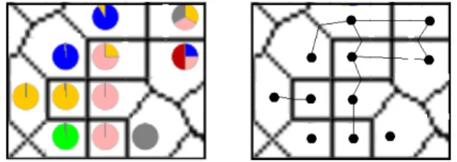
One intuitive approach to visualise the class distribution over the map is to use the method ofcolour flooding. Each unit on the map is thereby first substituted by a coloured point. Then, the points iteratively spread their colour outwards. At each iteration, we can either add one more ring-shaped layer around the already coloured area of the point, or grow by one graphical unit (e.g. pixel). The spreading continues as long as the areas reached are not yet coloured by a different substitution point. The result is a coloured map showing the class distribution, as illustrated in Figure 1(a).
If there are more class labels per unit, we substitute the units by a single-coloured point per class. Next, we arrange the points so that they are aligned as
much as possible with points of the same colour on neighbouring units. Then, the flooding process works as described above.
(a) Sequential spreading of colours (b) Instability effect Fig. 1.Colour flooding
Colour flooding seems to be a feasible approach and generates good visual-isations, however, it has a serious disadvantage when it comes to the stability of the resulting colouring. A slightly different layout of the map, leading to a slightly different locations of substitution points, may result in a drastic change in the size and shape of the coloured regions. An illustration of this problem is given in Figure 1(b). The slightly different located lower yellow point results in a ’path’ open for the red point to spread to the left edge of the map. Even without changing the position of colour points, a change in the order in which pixels are occupied (e.g. by random selection) can have similar effects. The problem seemed to be in the nature of the method, therefore we abandoned this approach.
4
Graph-Based Colouring
A more promising approach in terms of stability is to use a graph-based seg-mentation of the map. In this section we outline the used segseg-mentation, Voronoi diagrams, and present different solutions for dealing with the multi-class prob-lem.
4.1 Voronoi Diagrams
A Voronoi diagram [11] of a set of Points P, located on a plane, partitions this plane in exactlyn=|P|Voronoi regions, each being assigned to one pointp∈P. We define some notations which we will use for describing our method:
– R={r1, r2, ..rn|n≥0} is the set of all Voronoi regions on the SOM.
– C={c1, c2, ..cm|m≥0} is the set of all classes that exist in the data set.
– C(ri) ={ci1, ci2, ...}is the set of classes present in the regionri.
– F(ri, cj) ∈ R+ is the contribution fraction which class cj has from all the data items of regionri.
A Voronoi region is defined as all the pointsxon the plane belonging to one regionR(pi) that are closest to the pointpi:
R(pi) ={x:|x−pi|<=|x−pj|,∀j6=i}. (1) In our case, the number of regions is equal to the number of units with at least one data item mapped onto. Units with no data items mapped onto them will be split and become parts of other regions.
If each region contains only data items from one class, they can be assigned the corresponding class colour. Since this is a rather unrealistic case, we have to find methods to solve the multi-class problem.
4.2 Basic Voronoi Region Segmentation
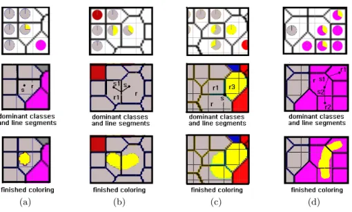
If each Voronoi region is thought of as a grid of pixels, we can generate a chessboard-like visualisation. Each class colour present in the region occupies its corresponding fraction of pixels, which are assigned using a uniform distribu-tion funcdistribu-tion. An illustradistribu-tion of this approach can be seen in Figure 2(a).
Another method is similar to unit substitution in the colour flooding ap-proach: each unit is substituted by n points, each of which is assigned to one of the n classes present. The points are located almost in the same position of the unit, and are arranged to be as closely as possible to neighbouring regions of the same colour. The Voronoi region is then further partitioned into smaller areas, but the global arrangement, i.e. the size and position of the other regions, is not changed. This is illustrated in Figure 2(b). There are still shortcomings with this approach, e.g. classes spanning over 3 neighbouring regions might not be connected well.
(a) Chessboard like partitioning (b) Region Substitution and segmentation
(c) Angular Sector partitioning Fig. 2.Different segmentation methods
Yet another technique is to segment the Voronoi regions angularly into sec-tors, similar to how pie charts are constructed. The angles are calculated accord-ing to the class contribution fraction on the unit, the orientation of the sectors according to the neighbouring classes. There are, however, still cases that can-not be solved satisfactorily. Consider the setting in Figure 2(c). The method described would produce a colouring as in the second image. The red area, how-ever should be connected both to the left and right region, which could to some extent be achieved if we allow sectors to be split, as in the third image. An ideal colouring would be however smoother. It should also show isolated areas, as the yellow area in the example of Figure 2(c), as isolated areas in the middle of the region, rather than as a sector stretching to the edges of it.
4.3 Smoothed Voronoi Region Segmentation
In this section we present an approach to achieve a smooth and optimal segmen-tation of the regions based on an attractor function. We introduce the concept of connection lines, which are imaginary lines that connect the points of a regionri with the middle of the edge to a neighbouring regionrj, if there is a classcwhich is present in both regions. This is illustrated in Figure 3. The function assigning class colours to pixels is called attractor function, as it is similar in effect to a magnet attracting objects. The function is applied to a region, a connection line segment, a class and a number ndenoting the number of pixels to be assigned.
Fig. 3.Connection lines between neighbouring Voronoi regions
All pixels in the region are sorted according to their distance to the connection line segment. The distance dis defined as the distance between a point P and the closest point on a line segment P0P1. After all pixels are sorted, the firstn unassigned pixels nearest to the line segment are coloured by the given class. The following types of attractor functions can be identified for a classcin region r:
1. The classcis isolated: there is no neighbouring regionrj ∈rn that contains data of the same classc, as shown in Figure 4(a). This is the simplest case, as we do not need to consider a cluster that extends to other regions. Thus we use a point attractor by adding a segment with length 0 (a point) in the location of the point of the region and assign the corresponding fraction F(r, c) of pixels for the class c.
2. There is only one neighbouring region r1 that contains the class c, as in Figure 4(b)). We want to attract the coloured pixels at the region border close tor1. Thus we add a line segment from the site location to the middle point of the common edge e (the edge between r and r1) and apply the attractor function on this segment with the corresponding fraction of pixels. 3. There are two neighbouring regionsr1andr2that contain data items of the classc and that are themselves neighbours to each others (cf. Figure 4(c)), which implies that r,r1,r2 share a vertex v. In this case we use a point attractor by adding a line segment of length 0 to the point at the common vertexv. When all of the three regions concentrate the colour at this point, we have a coloured cloud extending over the three regions.
4. There is more than one neighbouring region, namelymregions{rj, rk, .., rm} that have the classc, but none of them is a neighbour of the other (see Fig-ure 4(d)). We treat each of these regions similar as in second case, with the difference that we now have m line segments, one to each neighbour-ing region. Consequently, the number of pixels assigned to each line is not corresponding toF(r, c), but ratherF(r, c)/m.
(a) (b) (c) (d)
Fig. 4.Types of Attractor Functions
Border smoothing by weighting the line segments Although using the attractor function creates a smooth partitioning of the Voronoi regions itself, rough transitions can occur on the border of two regions, as illustrated in the left image in Figure 5(a). This is the case when either the contribution to the classc in the two regions is different, or the regions itself differ in size.
To solve this problem, we modify the above mentioned function which sorts the pixels according to their distances to a line segment. Two weights are assigned to the two ends of the line segment, and are used in measuring the distance. If pis the point to be measured and p1p2 is the line segment, then the weighted distance is:
dw(p, p1, p2) =d(p, p1, p2) +|pp1|(1/w1)2+|pp2|(1/w2)2 (2) where d(p, p1, p2) the normal (not weighted) distance and w1, w2 the weights for the line segment ends p1 and p2 respectively. As a result, the pixels tend to be concentrated more around the end point with the larger weight. For two neighbouring regions having the same class, where the contribution fraction for the class c are f1 for region r1 and f2 for region r2, we assign to the points of the line segments connecting the two regions the weights as follows: the points at the distant ends of the segment receive the weights w1 = f1 and w2 = f2, and the common point on the edge of the Voronoi region is assigned a weight of the value w1+w2
2 , as illustrated in the middle image of Figure 5(a). This implies that the pixel concentration on both sides of the common edge is the same for both regions regardless of the values of the contribution fractions. As a result, we get a smoothed border as in the right image of Figure 5(a).
(a) Smoothing region border transition
(b) Levels of granularity: threshold of 0%, 50% and 100% contribution fraction Fig. 5.Improvements to the smooth segmentation method
Minimum class contribution threshold Some regions have classes with a low contribution value – if one is interested in having a visualisation of a cer-tain abstraction level, the class colouring might show too many unimportant
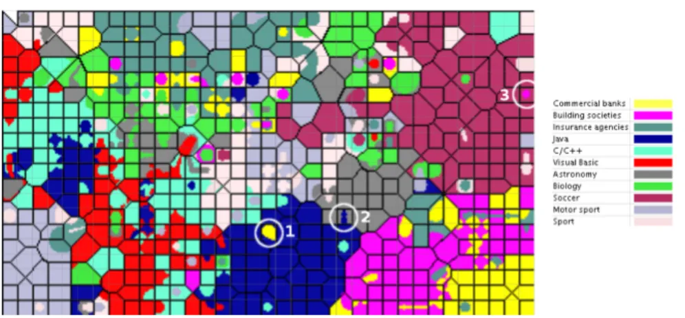
Fig. 6.Class Colouring applied on the Banksearch data set
details. This can simply be solved by introducing a threshold for the minimum contribution fraction a class must have of a unit in order to be shown in this unit. Depending on the application, it may be useful to not apply this threshold to the dominant class of the region, otherwise some regions might be left un-coloured. Figure 5(b) shows a comparison between three different thresholds of 0% (showing all), 50% and 100% (showing only the dominant class), respectively.
5
Experiments
For the experiments presented in this section, we used the BankSearch data set, a standard benchmark for clustering and classification methods. It consists of four main categories (Banking & Finance, Programming languages, Science and Sport), which are further divided into a total of eleven subcategories (cf. the class-legend in Figure 6). Each category contains 1.000 documents, thus totalling to 11.000 documents for the whole data set.
Figure 6 depicts the trained SOM, using 20% as the minimum class fraction for the colouring. Some areas on the map are marked by a circle – these are sample regions where isolated or boundary data is found. The area marked with ’1’ holds documents from the Java and Commercial banks categories, the later however mainly describing a financial application implemented in Java. The area marked with ’2’ has two documents from Astronomy and a single Java document mapped onto. However, after inspecting it becomes clear that the ’Java’ document is actually a wrongly labelled document from the Astronomy category. TheSoccercategory contains documents about soccer and other related team sports. Besides those, area ’3’ holds additionally some documents from the categoryBuilding societies, which all talk about a specific organisation becoming the sponsor of a rugby cup competition – the documents would therefore as well
fit in the sports category. In all examples described, the visualisation assisted the user in quickly spotting the interesting areas.
6
Conclusions and future work
In this paper we presented several approaches for colouring a Self-organising Map according to the class labels attached to the input data items. The basic idea of using colour flooding was extended to a graph-based segmentation of the map using Voronoi regions. The visualisation provided by this method offers a smoothly coloured map that can assist the user in quickly discovering interesting data items on the map as outliers or other overlapping areas. As future work, we want to combine the chessboard segmentation with the attractor functions.
References
1. Kohonen, T.: Self-Organizing Maps. Volume 30 of Springer Series in Information Sciences. Springer, Berlin, Heidelberg (1995)
2. Ultsch, A., Siemon, H.P.: Kohonen’s self-organizing feature maps for exploratory data analysis. In: Proc. of the Intl. Neural Network Conference (INNC’90), Paris, France, Kluwer (1990) 305–308
3. P¨olzlbauer, G., Dittenbach, M., Rauber, A.: A visualization technique for self-organizing maps with vector fields to obtain the cluster structure at desired levels of detail. In: Proc. of the Intl. Joint Conference on Neural Networks (IJCNN’05), Montreal, Canada, IEEE Computer Society (2005) 1558–1563
4. Pampalk, E., Rauber, A., Merkl, D.: Using Smoothed Data Histograms for Cluster Visualization in Self-Organizing Maps. In: Proc. of the Intl. Conference on Artifical Neural Networks (ICANN’02), Madrid, Spain, Springer (2002) 871–876
5. P¨olzlbauer, G., Rauber, A., Dittenbach, M.: Advanced visualization techniques for self-organizing maps with graph-based methods. In: Proc. of the 2nd Intl. Symposium on Neural Networks (ISNN’05), Chongqing, China, Springer (2005) 75–80
6. Ultsch, A.: Maps for the visualization of high-dimensional data spaces. In: Proc. of the Workshop on Self organizing Maps (WSOM’03), Kyushu, Japan (2003) 225–230 7. Liao, G., Shi, T., Liu, S., Xuan, J.: A novel technique for data visualization based on som. In: Proceedings of the International Conference on Artificial Neural Networks (ICANN’05). (2005) 421–426
8. Kaski, S., Venna, J., Kohonen, T.: Coloring that reveals high-dimensional struc-tures. In: Proceedings of the International Conference on Neural Information Pro-cessing (ICONIP’99), Perth, Australia. Volume II., Piscataway, NJ, IEEE Service Center (1999) 729–734
9. Himberg, J.: A SOM based cluster visualization and its application for false color-ing. In: Proceedings of the IEEE-INNS-ENNS International Joint Conference on Neural Networks (IJCNN ’00), Washington, DC, USA, IEEE Computer Society (2000) 587–592
10. Aupetit, M.: High-dimensional labeled data analysis with gabriel graphs. In: Pro-ceedings of the European Symposium on Artificial Neural Networks (ESANN’03), Bruges, Belgium (2003) 21–26
11. Aurenhammer, F.: Voronoi diagrams – a survey of a fundamental geometric data structure. ACM Computing Surveys23(3) (1991) 345–405