University of New Orleans University of New Orleans
ScholarWorks@UNO
ScholarWorks@UNO
University of New Orleans Theses and
Dissertations Dissertations and Theses
Spring 5-19-2017
Ripple
Ripple
Tyler P. Haney
University of New Orleans, [email protected]
Follow this and additional works at: https://scholarworks.uno.edu/td
Part of the Fine Arts Commons, Painting Commons, and the Photography Commons
Recommended Citation Recommended Citation
Haney, Tyler P., "Ripple" (2017). University of New Orleans Theses and Dissertations. 2327. https://scholarworks.uno.edu/td/2327
This Thesis-Restricted is protected by copyright and/or related rights. It has been brought to you by
ScholarWorks@UNO with permission from the rights-holder(s). You are free to use this Thesis-Restricted in any way that is permitted by the copyright and related rights legislation that applies to your use. For other uses you need to obtain permission from the rights-holder(s) directly, unless additional rights are indicated by a Creative Commons license in the record and/or on the work itself.
Ripple
A Thesis
Submitted to the Graduate Faculty of the University of New Orleans in partial fulfillment of the requirements for the degree of
Master of Fine Arts In
Fine Arts
by
Tyler Haney
B.F.A. School of Visual Arts, 2004
ii
iii
Acknowledgements
I would like to thank the entire faculty at the University of New Orleans for their devotion to my academic progression. True growth is painful and I want to acknowledge my thesis committee members, Dan Rule, Tony Campbell, and Aaron McNamee, for the special role they played in my growth. I would also like to thank all of the instructors at the School of Visual Arts in New York for pushing me to the limits at all times. I would like to give special thanks to: Marilyn Minter, Peter Hirstoff, Brooke Larson, Steven Westfall, and Cheryl Hayes, for their constant and professional support. Most of all I give thanks to God and my family, especially my wife, Regina
iv
Table of Contents
List of Illustrations ...v
Abstract ... vii
Introduction ...1
Visual Perception ...3
Mechanics ...3
Influence on Composition ...4
Influence on Subject Matter ...6
Not Napoleon’s Portrait ...11
Methodology ...15
Photography and Composition ...16
Painting ...23
Collage Works ...25
Scale ...28
Style ...31
Conclusion ...40
Sources ...41
v
List of Illustrations
Figure 1 The Hallucinogenic Toreador ...4
Figure 2 Untitled ...5
Figure 3 Untitled ...6
Figure 4 Examples of the Ekman-Friesen Pictures of Facial Affect used in the computerized task ...7
Figure 5 Untitled ...8
Figure 6 Untitled ...8
Figure 7 Insane Woman (Envy) ...9
Figure 8 Loss and Regret ...10
Figure 9 Horizon ...10
Figure 10 The Emperor Napoleon in His Study at the Tuileries ...11
Figure 11 Self-Portrait ...12
Figure 12 Jean Charles Garnier d'Isle (1697–1755) ...13
Figure 13 Abbey No. 1...14
Figure 14 Boy Bitten by Lizard ...15
Figure 15 St. Jerome in Meditation...16
Figure 16 The Corner ...16
Figure 17 Griffon ...17
Figure 18 Tia, Amsterdam, the Netherlands, 23 June 1994 ...18
Figure 19 Vision ...18
Figure 20 Adelie ...19
Figure 21 Max Ernst ...20
Figure 22 L’origine du monde ...20
Figure 23 Let the Frustration Out ...21
Figure 24 Jack Nicholson IV, London ...21
Figure 25 Marian Anderson ...22
Figure 26 Under Painting ...23
Figure 27 Diagram of Iwata Airbrush ...23
Figure 28 Frankie ...24
Figure 29 Untitled ...25
Figure 30 Article 14 ...26
Figure 31 Self Portrait as a Coffee Pot ...26
Figure 32 Rêves et Hallucinations ...27
Figure 33 How You See, What You See, What You Hide (Triptych) ...28
Figure 34 Large-scale charcoals in studio space...29
Figure 35 Medium format paintings in gallery space ...30
Figure 36 Small scale collages being measured for installation ...30
Figure 37 Double Self Portrait ...32
Figure 38 Pink Eye...34
Figure 39 Phil/Fingerprint...34
Figure 40 Woman Descending the Staircase ...35
Figure 41 Dust Devil ...35
Figure 42 Still ...36
vi
Figure 44 Hunger ...38
Figure 45 Artillerymen ...39
Figure 46 The Petite Bourgeoisie ...39
Figure 47 The Light ...40
Figure 48 Focus...40
vii
Abstract
My work leverages the dynamic processes the brain uses to compute visual stimuli to
influence how viewers experience my work. My aim is to create a ripple effect as the brain
processes the visual information I provide.
My process begins with a camera. Focusing on the face, I see how much contextual
information I can remove while still capturing the emotional expression of the subject. Before
long, a photograph ends up next to a canvas where I will rebuild the image from the photograph
using a myriad of expressionistic marks and colors to amplify the emotion.
Recognizing human emotion is the first ripple I want the viewer to experience. Next, they
will note secondary details about the person depicted. Last, they will notice the heightened
textures, the amplified flaws, the abstraction of the mark – reminders that they are looking at
nothing more than a medium applied to a two-dimensional surface.
KEYWORDS:
1
Introduction
Emotion is a universal language that is spoken through our muscle movements, read by
our eyes, and interpreted by our brains. My work explores this discourse. I investigate the varied
manifestations of emotion that can be captured on camera, making copies of those seconds where
facial muscles are aligned to tell an outside observer what the subject is feeling. Zooming into
the face, I see how much contextual information I can remove while still capturing the language
of emotion that I am hunting with the lens.
I cull through these images to select the ones that will end up on my studio wall, acting as
the references for my work where a new copy is created in the form of a drawing or painting. In
making this copy of a copy, I explore how to heighten and highlight the emotion by using a
myriad of expressionistic colors and marks to build the image. My aim is for the viewer to
immediately identify the emotion portrayed prior to registering any other detail about the work.
In my work, I examine how to leverage the way visual input is categorized and
interpreted by the brain to influence how viewers experience my work. I strive for my work to
have a ripple effect on the viewer. Recognizing human emotion is the first ripple, comprehending
details about the subject are the second ripple, the third ripple hits when the viewer begins to
notice the heightened textures, the amplified flaws, the abstraction of the mark – reminders that
they are looking at nothing more than marks on a two-dimensional surface – a copy of a copy.
For some of my work, I attempt to create another layer of interaction with the viewer by
adding collage elements. These elements are intended to add an ambiguous dialogue to further
engage the viewer’s interpretative skills. My collage work delves more deeply into emotional
states by the insertion of specific words and images appropriated from comics, magazines, and
2
mimic streams of conscious thought. I also apply additional nonrepresentational marks using
acrylic paint pens, spray paint, and/or acrylic applied by brush. My purpose is to lead the viewer
in a certain direction without providing a clear plot or specific message, allowing them to bring
3
Visual Perception
My work relies on the concept that visual perception is a dynamic process that allows us
to interpret the world around us. Because our intake of visual stimuli is not static, we are able to
evaluate and reevaluate the information we receive through our senses. I try to take advantage of
this process to create work that is experienced in waves by the viewer. My goal is for the viewer
to first categorize the representational aspects of each piece, then to notice the marks - and thus
the process - used to create the representation.
When a viewer experiences the illusion of realistically rendered subject in my work, it is
due to the tendency of our visual perception to immediately categorize and make input familiar
to the viewer. Thanks to the dynamic processing capabilities of our perception, continued study
should reveal that the entire piece is composed of a myriad of abstracted marks and exaggerated
textures that are expressionistic in nature. While these marks come together to create the
impression of a representational artwork, my intent is for them to remind the observant viewer
that they looking at nothing more than a medium applied to a two-dimensional surface – not an
eye, not a mouth, not even a realistic rendering of an object.
Mechanics
Our visual perception is a dynamic, non-static, experience. Every second that we study an
object with our eyes, our brain is hard at work categorizing and then dissecting the details of
what we are seeing. The longer we look, the more we become conscious of subtle details.
Starting in the late 1800s, experimental psychologists began to study human perception in
more detail. American psychologist, Leonard Zusne found that “If sufficient time is
4
gradual desaturation of colors if gazed at steadily.”1 An overt example of the brain’s dynamic
process for interpreting visual stimuli can be found by looking at Salvador Dali’s The
Hallucinogenic Toreador. It is only by continuing to look at this image that the viewer is able to
see the ‘hidden’ images such as the dying bull and the toreador.
Equally fascinating is how we process visual information related to others’ emotional
states. The configuration of our facial muscles tells others what we are feeling. We
subconsciously process facial expressions automatically and the identification of our basic
emotional states has been found to be almost identical across cultures – making it a nonverbal
international language.
Influence on Composition
Most of my compositions contain close-up images of the human body and facial features.
The viewer is not provided with many contextual clues from body language or background
environments. I try to provide just enough information for the viewer to recognize the subject
matter, while leaving room for their imagination - influenced by their personal experiences - to
complete the picture.
1 Zusne, Leonard, 112.
5
The Berlin School of Experimental Psychology gave birth to Gestalt psychology, which
identified key principles of perception organization. These principles influence my compositions.
For example, the Principle of Closure describes our mind’s tendency to complete a picture with
limited information. This theory posits that we see complete forms when limited details of a
familiar item are provided and our brain completes the form based on our experience. Some of
my compositional choices are designed to provide the brain with a blank space by providing
close-up images of the human form without the regular cues such as body language or
environmental information. Execution of this principle is exemplified in my pieces such as
Figure 2. When looking at this image, the viewer should start to imagine what the figure’s mouth
looks like. The viewer knows exactly where the unpainted eye and ear are located in relation to
the information that is provided.
When my compositions contain the eyes, special attention is paid to the direction of the
gaze. Not only is this an important key to leading the viewer’s own gaze through the
composition, it can also influence the emotional interpretation of the piece.
Studies have shown that the direction of a person’s gaze is an important key used by
humans to recognize and interpret emotions. For example, you will have a different reaction
when someone is looking directly at you when they frown, versus when they are looking at
6
someone else. Imagine how your interpretation of the emotion depicted in Figure 3 would
change if the eye was looking forward instead of to the side.
Influence on Subject Matter
The vast majority of my compositions contain the face, or a portion of the face. There are
many reasons why I am drawn to the face more than any other subject matter. Our face is a large
part of our identity. It is a key component in the process that allows others to recognize us and
separate us from a crowd of strangers. Most of us check our face in the mirror before leaving the
house, or before an important meeting. Not because we think that our face is all that defines us,
but because it is a focal point in all of our physical encounters.
It is a tradition in our society, and many others, to look a person in the face when you are
communicating. We use the thousands of muscles in our face to let others know how we feel.
But the face can also be a mask as we contort our facial muscles to hide or fake emotion.
Reading each other through facial expressions happens so many thousands of times a day and is
so commonplace that we do not normally think of the complex processes at work behind both
making and reading human expression.
7
The facial expressions humans use to convey emotion have been found to be innate and
are the same across all cultures. In the early seventies, psychologists Ekman and Friesen
conducted studies that supported their hypothesis that there are six universal expressions of
emotion – Fear, Anger, Sadness, Happiness, Disgust, and Surprise. Their study involved showing
photographs of these emotional expressions to individuals in several countries:
There was an extraordinary amount of agreement about which emotion was shown in
which photograph across the 21 countries. In every case, the majority in each of the 21
countries agreed about the pictures that showed happiness, those that showed sadness and
those that showed disgust. For surprise expressions there was agreement by the majority
in 20 out of 21 countries, for fear on 19 out of 21, and for anger in 18 out of 21.2
In a world where we are so often divided, and in a culture where so much value is placed
on individuality, I find it fascinating that humans across the world, despite their separate
environmental and cultural differences, express these core emotions in the same way.
The visual perception of human faces follows a different physiological process than that
of objects. Faces are “recognized by special circuits in the inferior temporal lobe” that “develop
through experience”. “We have special circuits devoted to the analysis of eyes, eyebrows, nose,
2 Ekman, Paul 305.
8
cheekbones, lips, chin, and all the other features that distinguish one face from another.”3 Our
brains are literally hard wired to evaluate faces differently from other things that we see. Like
increasing muscle mass through weight lifting, the more we use our eyes - the better our brains
become at analyzing the face. It is not much of a leap to think that these circuits developed as
part of our natural defense mechanisms; after all, our ability to adjust our own speech and actions
based on the emotional reactions we see on another’s face helps us to get along in the world.
Since the face is the main vehicle we use to convey how we feel, it naturally follows that
emotion is a key element of my work. I often work from photographs and video stills that depict
emotion. Sometimes the emotion is candid, other times the subject is acting for the camera.
When taking these images, I experiment with how much contextual information I can remove
while still conveying the emotion. Only those photographs that I feel were successful to my
mission are selected to become references for my paintings and drawings.
Notice that emotion is immediately recognizable in Figures 5 and 6 despite the limited
information provided. In both pieces the viewer is able to determine the emotion from the same
two cues – the muscles of the eyelid and the position of the pupil. In Figure 5 these items inform
the viewer that the subject is experiencing fear or shock whereas in Figure 6 they convey an
angry determination.
3 Carlson, Neil R., 190.
Figure 5. Untitled, Acrylic on canvas, 18 x 24 inches, 2015
9
I often confront and convey my own emotional states in and through my work. I
photograph myself when I am experiencing periods of depression, anxiety, and mania. These
photographs become reference material for my paintings and collages. Within several of my
collages I work out frustrations, personal conflicts, and other thoughts through pictorial and text
narratives. These works could be said to be an introverted version of what Gericault was doing in
the 1800s when he “examined the influence of mental states on the human face”4 in paintings
such as Insane Woman (Envy).
My palette selection is aimed at heightening the emotional state I am trying to convey.
When establishing the palette for a painting, I first set the temperature by selecting the color for
the under painting. Warm magenta, crimson, and sienna or cool cyan and olive are the colors I
typically chose between for the under paintings. Once the under painting is complete, I create an
extensive palette of primary colors and a myriad of hues chosen not only to mimic the colors
present in the reference photograph, but to heighten and sharpen the overall impact of the image.
4 Kleiner, Tansey, 942.
10
Darker palettes and more muddied colors are used to convey less comfortable emotional
states such as the resignation depicted in Figure 8. Brighter, more colorful palettes are used for
more pleasant emotions as the hopeful determination seen in Figure 9.
Figure 8. Loss and Regret, Acrylic on canvas, 40 x 30 inches, 2016
11
Not Napoleon’s Portrait
Portrait art has been around for thousands of years. Starting mainly as stylistic public art
depicting rulers of ancient societies, it evolved to become very realistic and representational
before becoming expressionistic and eventually falling out of favor for a time as modernism took
hold of the art world.
The popularity of portraiture really began to rise during the Post Renaissance era. Royalty
and eventually the elite bourgeois in Europe became steadfast patrons of the portrait artists of
their times. These types of portraits prevailed throughout many artistic periods including
Baroque, Rococo, and Neoclassical. As canvas and oils became more accessible, and the
middle-class began to acquire more wealth, representational portraits flourished, reaching the height of
their popularity during the 18th and 19th centuries.
During this period, the vast majority of portraits were a means of representing oneself or
a patron, created with the intent to identify and memorialize the subject. A perfect example
would be Jacques-Louis David’s portrait of Napoleon. This work is meant to document
Napoleon as Emperor, preserving his identity and status on canvas.
12
Elisabeth Louise Vigee-Librun and Maurice Quentin De La Tour are also representative
of the most common type of portraits from this time. Vigee-Librun is best known for her
Self-Portrait, painted in 1790. The work depicts the artist about to paint. Looking directly at the
viewer, she has one hand poised to begin painting while the other hand holds her palette and
brushes.
The scene is unnatural and has the quality of a staged photograph – though the camera, as
we know it today, had not yet been invented. You can only see a portion of the canvas she is
working on. “Hers is the self-confident stance of a woman whose art has won her an independent
role in her society. Like many of her contemporaries, Vigee-Lebrun lived a life of extraordinary
personal and economic independence, working for nobility throughout Europe.”5Self-Portrait is
not about emotion or style, its intent is to memorialize the artist’s role in society as a successful
painter.
A popular French pastel portraitist, De La Tour’s works are focused on displaying the
identity and status of his subjects. For example, in Jean Charles Garnier d'Isle (1697–1755) the
subject is depicted in his finest wig and clothing, which mark him as a member of the upper
5 Kleiner, Tansey, 899.
13
society of the time. The only emotion depicted is the slightest of smiles. “The smile, familiar in
all of La Tour’s portraits, has been called ‘the smile of the Eighteenth Century’- confident,
interesting, amused, slightly mocking. It is the face one wears to the salon to meet the brilliant
society of the beau monde.”6 The work ultimately serves one purpose, to act as a memorial to the
subject’s existence and status. The popularity of this type of portraiture painting declined with
the advent of the camera. Family portraits at your neighborhood photography studio and the cell
phone selfies of today are the modern equivalent.
Unlike these artists, my work is not about capturing the identity or status of the subject. It
is about the emotional state I am portraying and the technique I am employing to create the
image. The images of myself, and those I choose to use as models, are merely vessels used to
express a myriad of emotional states.
My work is about pushing boundaries. How far can I push the color, the forms, and the
marks that I use to create the image so that it retains the feel of a representational work before
the brain notices that skin doesn’t look that way, that those lines that float above the image don’t
serve anything but an aesthetical purpose? My work is just as much about process of applying
6. Kleiner, Tansey, 894.
14
medium to a surface as it is about emotion. It is not meant to be a representation of reality. In the
end my work has nothing to do with the identity of the subject, it is about the relationship the
viewer has with the information I have chosen to give them.
In Abbey No. 1, the viewer is given limited information to identify the subject and no
environmental information. You cannot decipher the social status of the subject, or the age. The
long wisps of hair indicate that it may be a female, which is only partially confirmed by the title.
By neutralizing the identity, the disappointment on the subject’s face becomes the central theme.
As the viewer continues to process what they are looking at, things like the thin white lines that
cut across the eyelids become apparent and the way the freckles are exaggerated into abstracted
shapes come forward. I have tried to create a space in which the viewer is allowed to concentrate
on the work itself instead of the identity of the subject.
15
Methodology
My creative process is about the idea first and the mark second. I conceptualize every
angle from which I will approach the painting before I approach the canvas. To me, art is first
and foremost about ideas. My challenge is to keep my hand true as I work to bring the idea from
inside my mind onto the canvas.
I utilize idea books to work out new techniques, designs, and concepts for my work.
These books contain sketches, experiments with new mediums, clippings from magazines and
newspapers that inspire me, and mini collages. I also study past artists who convey emotion
through their work and whose work elicits emotional responses from the viewer.
One of my greatest influences is the master Caravaggio. The depiction of emotion is a
central theme through both his religious and non-religious work. It is evident in his earlier works
such as Boy Bitten by a Lizard as well as his later works such as Saint Jerome in Meditation
where “The heightened dramatic intensity of the pictorial narrative and the naturalism of the
representative bridge the gap between biblical episode and present day and invite the viewer to
identify with and transfer their own emotions onto the events portrayed.”7 While his work is
more narrative than mine, we both employ techniques that are designed to exaggerate the
emotional state of the subject and engage the viewer on a deeper level.
7 Schutze, Sebastian, 157.
16
Photography and Composition
Each of my pieces begins with a photograph or a video still. I typically use a Nikon D
5300 camera or a Canon Vixia HF R30 HD camcorder to capture my images. These capture a lot
of fine detail such as the pores of the skin, freckles, and wrinkles and allow me more control on
what areas are in and out of focus. The Corner is a good example of how I use the information
from my reference photograph in my attempts to further distort reality. Notice how the pores of
the skin are amplified to create an almost reptilian texture. More than half of the image is
blurred, with the nose and the right eye in sharp focus. This brings the viewers eyes constantly
back to the exaggerated pores.
Figure 15. Michelangelo Merisi da Caravaggio, Saint Jerome in Meditation, Oil on canvas, 43 x 32 inches, 1605-06
17
Occasionally I will use photographs taken with lower quality cameras, such as cell phone
cameras, where the distortion they provide suits my purpose better than a high definition image.
In contrast to The Corner, Griffon is less defined, putting more emphasis on the palette and
relying on the broader expressive marks and forms that create the shadows and highlights in this
work, such as the two lines and the dot under the lower lip.
I use others and myself as the subject. My primary objective is to create a compelling
composition that will lend itself to invoking a psychological or emotional reaction when I use it
as the base reference for a drawing, painting, or collage. The camera allows me to create a
distorted copy of reality, which I can manipulate through the angle at which I take the
photograph and what I choose to crop out in the seconds before I take the picture.
When conducting photo shoots, I shy away from hiding any imperfections. I often utilize
macro lens to capture as much information as possible on pores, wrinkles, and other perceived
flaws. I identify with the photographer Rineke Dijkstra who “uses photography… as a kind of
pivot between portrait painting and reality — that is, between completely hand-formed and
18
therefore fictive pictures of real people and real people themselves.”8 I am not interested in
creating an idealized Hollywood portrait of a person; I strive to create artwork that will evoke
empathy in the viewer as they relate to the emotional context. For the viewer that stops to really
look at how the image is made, I want them to see my hand in the work reflecting back the true
reality of the situation – that the piece is really nothing more than colors and marks on a canvas,
not reality.
In each photo shoot, I take multiple shots of the subject, exploring different angles,
lighting, focus, and depth. Extreme close-up shots, where a portion of the face fills the entire
camera frame, lend themselves best to conveying intense and/or uncomfortable emotions such as
extreme joy, fear, and sadness. The resulting paintings tend to take on an air of exaggeration and
are more confrontational. They contain more texture and abstracted mark making, with the
purpose of intensifying the emotion through distortion.
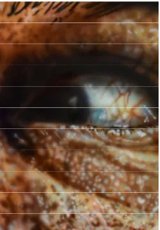
Notice how the layer of light blue marks in Figure 12 make
the eye look very wet, almost as though tears are about to
fall.
8 Smith, Roberta. What’s Hiding in Plain Site: Rineke Dijkstra at the Guggenheim Museum.
http://www.nytimes.com/2012/07/06/arts/design/rineke-dijkstra-at-the-guggenheim-museum.html (accessed: November 5, 2015)
Figure 19. Vision, Acrylic on canvas, 24 x 36 inches, 2016
19
Other shots include portions of background that create negative spaces of abstract shapes
of color around the head and/or upper torso of the subject. These photos lead to paintings where
the emotions are less exaggerated and intense, while the composition provides me with more
room to be expressive with color.
At times the entire photo is in focus, and other times I introduce purposeful blurring to
portions of the image. These techniques tend to strength or soften the mood I am trying to
capture, as does the contrast achieved from the lighting. I also experiment with the direction of
the subject’s gaze. The direction of the gaze is an immediate clue for the viewer regarding the
subject’s emotional state as well as being an effective compositional device to move the viewer’s
gaze around the painting. Downcast eyes tend to indicate emotions such as sadness or
disappointment while upward looking eyes express more optimistic emotions like happiness or
hope. Forward-looking eyes serve to strengthen whatever emotion is present on the subject’s
face.
Several artists use cropping of the human form to create their work. I continuously study
the successful compositions of old masters and contemporary artists who use cropped images of
20
the human form. This helps me to continually evolve my own compositional techniques. For
example, I recently discovered British photographer Bill Brandt. His compositions, especially his
series of artist eyes, are great examples of stripping identity and intensifying emotion through the
use of cropping.
I also look at examples of cropping that are not similar to my own, such as Courbet’s
L’origine du monde where the face has been cropped out of the composition. Though recent
controversy suggests that the artist himself may not have intended this painting to be cropped in
the manner that the world has known for decades, it still remains an intriguing composition. With
the absence of the nude’s head and little background information to provide the viewer with any
concept of the environment, the composition elicits a strong feeling of voyeurism and allows the
viewer’s imagination to run free. Similar compositional artifices are used in the pornography
industry today to enable consumers to overlay their own fantasies on top of erotic photographs.
This relates to my own efforts to get the viewer to bring their own experiences to bear upon the
way they interact with my work.
Figure 21. Bill Brandt, Max Ernst, Gelatin Silver Print, 9 1/16 x 7 3/4 inches, 1963
21
Though the cropping in Courbet’s piece is opposite from what I do – the face has been
cropped out whereas I crop the body out – it is successful in erasing the identity of the subject,
something which I attempt to do throughout my work. Let the Frustration Out is one example of
my work where I feel that I have successfully erased the identity of the subject through cropping.
Many contemporary photographers influence my camera work. Herb Ritts’ compositions
depict his celebrity subjects in a less formal and intimate format while obviously relying heavily
on the posing of the body. I am especially intrigued by the layers of unreality present in his
photographs of actors in character. Not only is the photograph a copy of reality; the subjects in
these photos are in the act of portraying someone that they are not.
Figure 23. Let the Frustration Out, Acrylic on canvas, 30 x 24 inches, 2016
22
Much can be learned by studying the angles and poses Andreas H. Bitesnich uses to
capture the beauty of the human body, both in movement and at rest. I am especially drawn to his
portraiture work that contains closely cropped images with little background information.
In his public portraiture work, Richard Avedon “consistently defied conventional
expectations about what a portrait is supposed to look like, always avoiding tired formulas – the
writer in the book-lined study, the pianist at the baby grand – and offering instead a radically
purified approach to the genre.”9 Unlike myself, Avedon’s work is about the identity of his
subjects who are public figures and celebrities. However, his compositions - devoid of
foreground, middle ground, and background - are very similar to my work. This compositional
choice along with the untraditional poses and actions of his subjects, make his portraits about
more than just the celebrity portrayed as evidenced in his portrait of the famed contralto singer
Marian Anderson.
Once I have selected a photograph that I want to use as source material for a painting, I
load it into Photoshop and make minor manipulations to enhance the image. I usually do not
perform any further cropping of the image at this stage. Instead I am focused on adjusting the
contrast to heighten shadows and highlights, and intensifying the colors. These edits are done
with the intention of strengthening the impact of the emotional content I want to highlight in the
painting. Once printed, the final photograph will end up on my studio wall next to a new canvas.
9 Hambourg, Maria Morris, and Fineman, Mia. Avedon’s Endgame.
23
Painting
Referencing the manipulated photograph, I create an under drawing of pencil marks on
the canvas to map the shadows and highlights that will appear in the finished piece. This drawing
is focused on mapping out the areas of color, highlights, and shadows that will be added. Many
of the pencil marks are often left visible on the final piece to draw further attention to the
creation process and to serve as a visual reminder for the viewer that in reality they are looking at
nothing more than marks on a two-dimensional surface.
Next I work out the under painting. This is a monochromatic sketch of the subject in
paint. Careful thought is put into what color will be used for this stage as the under painting sets
the color temperature for the final piece. The majority of my paintings are created using a variety
of airbrushes to apply acrylics to canvas or gessoed masonite.
Widely used for advertisement and photo touch ups, the airbrush has been a popular tool
in the commercial arts world for nearly a hundred years. However, it wasn’t until the mid 1970s
that airbrush work started to gain acceptance in the fine arts community, as artists like Chuck
Close began using the airbrush to create work that garnered high critical acclaim.
Figure 26. Under Painting, Acrylic on canvas, 30 x 24 inches, 2016
24
The airbrush is a free-flowing tool that allows me to build each painting using layers of
transparent acrylic paint at a speed faster than that of any other painting medium. The immediacy
that this provides is invaluable to me. It allows me to be more daring in my compositions and
mark making as I have less time invested. There is also an irony that I enjoy in using a tool
traditionally known for erasing imperfections to create artwork that accentuates and elevates
perceived flaws like pores, blemishes, and wrinkles.
While the process of painting with an airbrush may take less time, it requires much more
precision and control than any other painting tool. This is because the airbrush is a tool that never
touches the canvas. It simply gives the operator control over the direction and pressure of
sprayed paint. The slightest twitch or inconsistency of pressure has a large impact on the canvas.
I find the experience of using the airbrush to be similar to playing an instrument or composing an
orchestra in the way that you must perfectly time the movements of your hands and fingers.
Airbrush painting is about working with and layering different opacities of flat paint.
Unlike other types of painting mediums, such as oil, the resulting image on the canvas is
completely flat. There is no textural component at play. This places all of the focus on the color
selections and placement. I exploit these qualities of airbrush painting to move my work away
from strict realism. I exaggerate and accentuate the shapes and marks used to depict the subject,
trying to further distorting the ‘reality’ that I copied with my camera lens.
25
By injecting some abstraction into my painting, I am presenting a distortion of reality that
aims to spark a dialogue with the viewer’s imagination. Upon close inspection, skin looks less
like human skin and more like a landscape texture.This is accomplished through
over-articulation of pores, wrinkle, blemishes, and exaggerated color selections.Series of marks and
color splotches appear to float above the image, inviting the imagination to interpret the pattern
they create.Carefully plotted shadows and highlights, as well as the direction and shape of the
marks come together to create a layer of expressionism that overlays my work.
Collage Works
While many of my paintings are created to stand on their own, others are created to
become a base for a collage. The subject matter and composition of the paintings I create for
collage pieces do not differ much from my stand-alone paintings. I use the same type of
photographic references to create my collage paintings. However, the compositions of the
paintings created for my collage pieces predominately contain very closely ‘cropped’ images and
the painting marks and colors used tend to be more exaggerated.
26
I also create pencil drawings that become the base for my collage works. The images I
use for my collage drawings vary from original drawings from my photography to drawings of
images I find in popular culture, art, and fashion magazines.
Once the base image is complete, I begin selecting images and text from comic books,
magazines, and newspapers and test out different combinations and arrangements until I have
arrived at what I feel is the most effective final composition. During this process, I strive to
create a narrative that is told through both pictorial and text elements, similar to what William
Kentridge does in his collage works such as Self Portrait as a Coffee Pot.
Figure 30. Article 14, Pencil, collage, and resin, 12 x 9 inches, 2016
27
The dialogues I create in my collages are meant to be thematic with an air of ambiguity
that leaves some room for the viewer to make some assumptions in the interpretation. I want the
audience to make a leap as they instinctually impart relationships between the different images
and words that I present.
I try to create interesting juxtapositions when selecting the images and text to add to the
collage. Sometimes these are surreal in nature, other times humorous. I draw inspiration from the
use of juxtaposition found throughout the arts. For example, the film world masterfully pairs
light-hearted music with extreme action in Stanley Kubrick’s A Clockwork Orange when the
main character sings Singing in the Rain while committing acts of violence. Literature often uses
juxtaposition as a device to better define characters and environments. In Sylvia Plath’s poem,
The Surgeon at 2 a.m.,the light of a hospital is contrasted against the light of heaven, and the
body’s organs are paired against garden plants.
One of my biggest collage influences, Max Ernst, uses juxtaposition throughout his
collages. For example, in his work Rêves et Hallucinations, Ernst contrasts a robed religious
figure with soldiers, and citizens of high society with a building in rubble. These associations
create a powerful unwritten narrative that makes the viewer question the relationships between
society, religion, and war. The selected text, advertisements, and use of ink to cross items out
allow the piece to becomes an ambiguous social statement.
28
Once I have secured the collage elements to the surface of the painting, I apply additional
nonrepresentational marks using acrylic paint pens, spray paint, and/or acrylic applied by brush.
The interplay between these deliberate marks, the images, and text components provide
movement to the composition.
Each painting collage is finished with layers of Modge Podge followed by spray lacquer.
For my pencil drawn collages, thick layers of resin are poured over the image. This enables me
to create additional depth and layering. I add collage elements between the layers of resin, which
create shadows that move depending upon the lighting and angle that the finished piece is
viewed from. The resin also allows me to encase three-dimensional objects within the collage
and often results in unplanned air bubbles that add more depth and playfulness to the finished
pieces.
Scale
Every artist has to deal with scale in some manner or another. Scale plays a major role in
the relationship between any work of art and the viewer. The scale of my work varies in size
depending on how I want to mold the experience of the viewer.
Determining the scale of my work is done after I have selected the reference image I am
going to work from. The aspect ratio of the reference photograph is mimicked by the canvas size
that I select. The composition of the photograph has a large influence on the scale that I choose
to use. Typically, images with a lot of negative space in the background or a lot of minute details
29
become the basis of large-scale paintings or drawings. Close-up images, with limited background
information usually become medium format paintings. My smallest scale works are collages.
Large-scale work forces the viewer to keep their distance as they must stand back to see
the whole image, only getting close if they want to see the application of the medium in better
detail. When I choose to create large pieces of art, it is my aim to enhance the dramatic aspect of
the work, sometimes to the level of being overdramatic. For me, large-scale work is a recreation
of a cinematic experience. When people see a film in a theatre, the screen is so massive that they
lose touch with reality and are taken into the ‘larger than life’ experience of the theatre screen.
When large-scale work is really successful, the viewer’s senses are overwhelmed and they
momentarily lose themselves and their self-awareness.
Recently, the largest scale pieces I have created are charcoal drawings. These tend to be
in the range of 6 x 4 feet in size. Both the size and the lack of color are designed to give these
images more power than they would otherwise have. Their very size makes them unavoidable,
almost confrontational. The tonality achieved with the charcoal is meant to soften the visual
impact and give the work a feel of timelessness.
Most of my medium format work consists of paintings with an average size of 36 x 24
inches. This format still allows the subjects to be larger than life, but the work is more
approachable. As many of the emotions I depict are very intense, I want the viewer feel on more
equal footing with the work, making room for them to form a more personal connection.
30
Due to the consistent size of my medium-scale paintings, when they are hung together
they tend to take on a relationship to one another that is similar to looking at a filmstrip. I want
these works to become little slices of emotional information that the viewer can experience like a
cinematic moment - able to pause, fast forward, or rewind as they look across the body of work.
My medium format work can stand alone or as a collection, without using scale as a purposeful
device.
Smaller scale works of art can be just as powerful and consuming as large works. Where
the viewer must stand back from a large piece of work, small-scale work demands that they
come close. This closeness imparts an intimacy to the act of viewing that the artist can exploit.
I use a smaller scale for my collages. It is my intent to show these works as objects,
giving the viewer something precious to examine. The viewer is a giant when in front of these
works. The scale invites the viewer to get closer to the work to examine all the little details and
imperfections.
Figure 35. Medium format paintings in gallery space
31
Style
My work contains elements from both new realism and expressionism movements. The
process of working from the photograph and the element of flatness this provides to my work, as
well as the over emphasis on the ‘reality’ of certain features, are akin to photorealism and
hyperrealism. The abstracted mark making, palette choices, and the embodiment of emotion are
more similar to expressionism.
Modernism, with the abstraction of art and the dismissal of realism at it’s heart,
dominated the art world from roughly the beginning of the 20th century through the end of World
War II (WWII). “The project of abstract painting (as understood by some of its principal
advocates) is only secondarily an overcoming of representation or illusion; the primary aim is the
erection of a wall between the arts of vision and those of language.”10 Following the sixties, we
entered into a post-modern era, which eventually saw the birth and acceptance of new forms of
realism, many of which incorporated photography as a key part of the process. New realism,
encompassing both photorealism and hyperrealism, emerged.
The invention of the camera was thought by many to be the death knoll for painting.
Instead it ushered in new ways of thinking about and approaching painting as a medium:
…it was a common view…that painting 'as medium' was over. Artists who continued to
paint were purportedly left with the job of endlessly recycling its history… Recently,
however, this claim of the end of painting seems to have been disproved by its continued
success and by the hegemony of the discipline of painting beyond its self-evident
medium.11
32
Photorealism is a movement completely reliant on the camera. Artists such as Richard
Estes, Robert Cottingham, and Robert Bechtle produced works that were literal replications of
photographs. Due to the spatial properties of the photograph, ‘reality’ takes on a quality of
flatness in these works, as seen in Estes’ Double Self Portrait.
Unlike photorealists, hyperrealists do not attempt to create an exact replica of the
photograph but instead use it as a starting point from which they can stretch reality, creating a
‘hyperreality’. This is accomplished through over-emphasizing details to create a reality that
does not actually exist yet appears realistic.
French philosopher Jean Baudrillard describes three orders of simulation in his writings.
The first order is a representation of the real which is known to be a ‘copy’, with the second
order the representation becomes as real as the original, the third order he calls the hyperreal –
where the simulation precedes reality. American culture is especially rampant with simulations
and hyperreal creations and activities. Baudrillard points to Watergate, Disneyland, and the Gulf
War as examples. Just think of the millions of dollars Americans spend each year to travel to
places like Disney’s Epcot center where they can meet fictional princesses in recreated countries
such as China, or the full-scale replica of Greece’s Parthenon that can be visited in Tennessee.
33
Umberto Eco’s book Travels in Hyperreality takes the reader “in search of instances
where the American imagination demands the real thing and, to attain it, must fabricate the
absolute fake; where the boundaries between game and illusion are blurred”, visiting places such
as the replication of the drawing room of the 1906 Flagler drawing room at the Museum of the
City of New York. The design elements of the original room were copied from other cultures and
other time periods, making the replication at the museum a copy of a copy. Any trip to a home
improvement store where you can purchase supplies to create faux marble finishes, chemicals
designed to antique surfaces, and more, shows our obsession with visual fakery.
Michel Foucault posits:
…hyperrealists paint images. They do not however incorporate images through their
painting technique, but extend technique itself into the great sea of images, where their
paintings act as a relay in this endless circulation ... what they have produced when their
work is at an end is not a painting based on a photograph, nor a photograph made up to
look like a painting, but an image caught in its trajectory from photograph to painting...
the new painting takes its place enthusiastically in the circulation of images which it does
its own part to drive on.12
This is a concept that certainly enters into my work. I work from photographs but my paintings
are not a painting of the photograph or an attempt to realistically portray the subject of the
photograph. Where I differ from hyperrealism is that my end work tends to stray even farther
from realism than the work produced by hyperrealists.
12 Michel Foucault, quoted in Hawker, Rosemary. “Idiom Post-medium: Richter Painting Photography,”
34
Famed hyperrealist, Marilyn Minter “uses photos to get away from reality in her
paintings.”13 During undergraduate school, I had the good fortune to have Marilyn Minter as my
advanced painting instructor. Upon graduation, I worked as her painting assistant. Her
mentorship and the experience of working alongside her on her enamel paintings provided me a
strong understanding of the techniques hyperrealists use to distort reality, some of which I utilize
in my work.
My work is also influenced by many artists that can be classified as new realists that do
not identify themselves as either photorealists or hyperrealists – though sometimes their work is
written about in relation to these movements.
I continually study Chuck Close’s mark making when conceptualizing new techniques
for use in my own work. Close’s paintings are “a highly abstract composition of seemingly
random strokes based on predetermined systems of composition developed by the artist and a
finely rendered image held together by a tightly woven network of shapes
and colors.”14 His experimentation with the mark, from his use of the grid to
creating images with fingerprints, has led to a body of work that is a valued
resource.
13 Burton, Johanna, 89. 14 Storr, Robert, 19.
Figure 38. Marilyn Minter, Pink Eye, Enamel on Metal, 60 x 108 inches, 2005
35
Gerhard Richter’s “articulation of the relationship between painting and photography,
achieved in large part through the complex economy of the photographic blur, has resulted in a
critical inter-mediality that has prompted artists to address photography, painting, and the
concept of medium in new ways.”15 The courageous way that he has embraced the photographic
blur in his works reminds me to remain objective when I am selecting which images from a
photo shoot I want to work from. Just because a photo does not fit the standard of perfection
does not mean that it should be dismissed. Exploiting imperfections such as unintended blurs and
camera flares can add just the right reminder that the finished product is nothing more than a
distorted copy of reality.
The environment, conservation, and natural and man-made disasters are explored
throughout Alexis Rockman’s paintings such as Dust Devil. While Rockman’s subject matter is
vastly different than mine, his use of color warrants close study. The way he
depicts light and shadow is masterful.
15 Hawker, Rosemary, 265.
Figure 40. Gerhard Richter, Woman Descending the Staircase, Oil on canvas, 79 x 51 inches, 1965
36
My work diverges from new realism in that I purposefully try to show my hand in the creation of
my work through the process of mark making that I chose. This is meant to be a stark reminder
to the viewer that what they are looking at is nothing more than a simulation. A contemporary
artist who has a similar interest in showing her hand is the figurative painter Jenny Saville.
Best known for her controversial large-scale oil paintings of pre-operation figures and the
morbidly obese, her work resembles a landscape of flesh. While her subject matter and
compositions differ from my work, we both show our hand in the way we apply paint to our
canvases.
When you first approach one of Saville’s paintings, you immediately recognize the
subject matter. As you continue to look, her technique is what draws you in. Her work is created
with thick, juicy layers of opaque oil paint applied with large brushes and plaster knives.
Masterfully applied areas of color intertwine with areas of raw canvas to build her imagery,
creating a textured, multidimensional surface. Violent reds, blues, violets, and greens come
together to make the flesh of her subjects, charging her paintings with an energy that cannot
easily be ignored.
37
I have a similar approach of showing my hand in a manner that is meant to compliment
the emotion I am trying to convey. I want the viewer to see the marks and color that compose the
painting. Jenny Saville and I both use exaggerated marks and bold colors to create an intense
atmosphere, by which the viewer can find as much interest in the process as in the finished
composition.
Outside of the difference in our subject matter, texture is another area where our works
diverge from one another. I use an airbrush to apply transparent and opaque acrylic paint, which
results in a very flat surface. The texture and depth in my work is created solely by the placement
and layering of color, and by allowing the under drawing to show through. The use of raw
canvas in Saville’s compositions is very similar to the way I allow the viewer to see the under
drawing of my work. Both serve as purposeful reminders to the viewer that they are looking at a
construction, not reality.
Another thing that separates my work from new realism is the importance that I place on
conveying emotion, something heavily avoided by most photorealists and hyperrealists. My
emphasis on emotion is closely related to and inspired by expressionism.
Towards the end of his life, Vincent Van Gogh “recorded his heightened emotional states
in paintings that contributed significantly to the emergence of the expressionistic tradition, in
which the intensity of an artist’s feelings overrides fidelity to the actual appearance of things.”16
His famous work, Starry Night, is a prime example of expressionism. The way I let the emotion I
am depicting guide my mark making and color selections is very similar. These choices do
‘override’ any appearance of realism in my work.
38
Edvard Munch “is a key figure in creating expressionistic works of art, powerful, often
haunting visual images that bespeak inner feelings, emotions, and psychological states of
being.”17 All of this is evident in his iconic work, The Scream. Contrasting The Scream with my
work Hunger and you can see some of his influence. Both pieces are about primal emotions –
fear and fear induced anger. Our palettes are almost identical in the ratio of warm to cool colors.
The blurred upper lip in Hunger work is not unlike the horizon line in The Scream.
17 Alexis, Karen, 520.
Figure 44. Hunger, Acrylic on canvas, 18 x 24 inches, 2015
39
The Bridge Group, a well-known faction of expressionists in Germany “created a style based
upon strident, bold colors and distorted forms. Their work was informed by a variety of
influences…that emphasized the emotive and subjective aspects of artistic expression.”18 The
execution of their ideals differs from my work, but our intent is very similar. Studying the way
these chose to distort their imagery inspires me to keep pushing the boundaries when I am
working out how I want to translate emotional imagery onto a canvas.
18 “Museum News”. 1997. “Museum News”. MOMA, no. 26. The Museum of Modern Art: 26–27.
http://www.jstor.org/stable/4381370. (accessed: November 7, 2015)
Figure 44. Ernst Ludwig Kirchner, Artillerymen, Oil on canvas, 55 1/8 x 59 1/8 inches, 1915
40
Conclusion
My graduate schoolwork skims from varied influences to create something that is
designed to mimic and mock reality and imbibe emotion while holding a surprising layer of
expressionism inspired distortion. Each piece is carefully orchestrated to pull the viewer into a
realm where, if I am successful, they will relate to the reflection of a reflection of an emotion - a
ripple in reality - and recognize that what they are seeing is not reality. Borrowing from a
multitude of past and contemporary influences in the art world, while continuing to study the
science of our brains, I hope to reveal some truths about the curtains of reality that we will all
peak behind one day.
47. The Light, Acrylic on
canvas, 24 x 30 inches, 2016
48. Focus, Acrylic on canvas, 24 x 30 inches, 2016
41
Sources
Zusne, Leonard. Visual Perception of Form. 1st ed. New York: Academic Press, Inc., 1970.
Dali, Salvador. The Hallucinogenic Toreador. 1968-1970. Oil on canvas, 157 x 118 inches. The Dali Museum, St. Petersburg, FL. From: The Dali Museum,
http://thedali.org/exhibit/hallucinogenic-toreador/ (accessed October 24, 2015).
Ekman, Paul. “Facial Expressions”, Handbook of Cognition and Emotion. 3rd ed. New York: John Wiley and Sons, 2000.
Examples of the Ekman-Friesen Pictures of Facial Affect used in the computerized task
http://journal.frontiersin.org/article/10.3389/fpsyg.2015.00761/full (accessed October 31, 2016).
Carlson, Neil R. Physiology of Behavior. 7th ed. Boston: Allyn and Bacon, 2001.
Gericault, Theodore. Insane Woman (Envy), 1822-1823. Oil on canvas, 28 x 21 inches. Musee des Beaux-Arts de Lyon, Lyons, France. From: MBA-Lyon,
http://www.mba-
lyon.fr/mba/sections/languages/english/collections/masterpieces/pieces1476/portrait-of-a-woman/ (accessed November 5, 2015).
Kleiner, Tansey. Art Through the Ages. 19th ed. New York: Harcourt Brace College Publishers, 1996.
David, Jacques-Louis. The Emperor Napoleon in His Study at the Tuileries, 1812. Oil on canvas, 80 1/4 x 49 1/4 inches. National Gallery of Art, Washington, D.C. From: NGA,
http://www.nga.gov/content/ngaweb/Collection/highlights/highlight46114.html (accessed February 11, 2017).
Vigee-Librun, Elisabeth Louis. Self-Portrait, 1790. Oil on canvas, 39 3/8 x 31 7/8 inches. Gallerie degli Uffizi, Corridoio Vasariano, Florence. From: Met Museum,
http://www.metmuseum.org/exhibitions/view?exhibitionId=%7b31a1bee1-137f-4d0d-
bf0c-751b9354bb6c%7d&oid=656845&pkgids=346&pg=0&rpp=20& ;pos=42&ft=*&offset=20 1968-1970. (accessed February 11, 2017).
De La Tour, Maurice-Quentin. Jean Charles Garnier d'Isle (1697–1755), ca. 1750. Pastel and gouache on blue paper, laid down on canvas, 25 3/8 x 21 1/4 inches. Metropolitan Museum of Art, New York, New York. From: Met Museum,
http://www.metmuseum.org/art/collection/search/438585?sortBy=Relevance&ft=M aurice-Quentin+de+La+Tour&offset=0&rpp=20&pos=3 (accessed February 11, 2017).
42
Merisi da Caravaggio, Michelangelo. Boy Bitten by a Lizard, 1595-1600. Oil on canvas, 26 x 19.5 inches. The National Gallery, London, England. From: The National Gallery,
http://www.nationalgallery.org.uk/paintings/michelangelo-merisi-da-caravaggio-boy-bitten-by-a-lizard (accessed November 5, 2015).
Merisi da Caravaggio, Michelangelo. Saint Jerome in Meditation, 1605-1606. Oil on canvas, 43 x 32 inches. Santa Maria de Montserrat, Barcelona, Spain. From: Caravaggio Gallery, http://www.caravaggiogallery.com/zz_Saint-jerome-in-meditation.aspx (accessed February 11, 2017).
Smith, Roberta. What’s Hiding in Plain Site: Rineke Dijkstra at the Guggenheim Museum.
http://www.nytimes.com/2012/07/06/arts/design/rineke-dijkstra-at-the-guggenheim-museum.html (accessed: November 5, 2015).
Dijkstra, Rineke. Tia, Amsterdam, the Netherlands, 23 June 1994, 1994. Chromogenic color print, 15 3/4 x 11 13/16 inches. Museum of Modern Art New York, NY. From: MOMA,
http://www.moma.org/collection/works/55601?locale=en (accessed November 5, 2015).
Brandt, Bill. Max Ernst, 1963. Gelatin silver print, 9 1/16 x 7 3/4 inches. Museum of Modern Art, New York, New York. From: MoMA,
https://www.moma.org/collection/works/104305?locale=en (accessed February 12, 2017).
Courbet, Gustave. L’origine du monde, 1866. Oil on canvas, 18.11 x 21.65 inches. Musee D’Orsay, Paris, France. From: Musee D’Orsay,
http://www.musee-
orsay.fr/en/collections/index-of-works/resultat-collection.html?no_cache=1&zsz=2&sf=0&zs_rf=mos_a (accessed November 4, 2015).
Ritts, Herb. Jack Nicholson IV, London, 1988. Gelatin silver print. Herb Ritts Foundation. From: http://www.herbritts.com/#/archive/photo/jack-nicholson-iv-london-1988/ (accessed October 30, 2016).
Avedon, Richard. Marian Anderson, 1955. Gelatin silver print, 10 7/16 x 13 7/16 inches. The Metropolitan Museum of Art, New York, NY. From: Met Museum,
http://www.metmuseum.org/toah/works-of-art/61.565.2/ (accessed February 12, 2017).
Hambourg, Maria Morris, and Fineman, Mia “Avedon’s Endgame”, Richard Avedon Portraits. 1st ed. New York: Harry N. Abrams, Inc., 2002.
Kentridge, William. Self Portrait as a Coffee Pot, 2012. Multiple run hand printed lithograph and collage, 38.75 x 31.5 inches. Greg Kucera Gallery, Seattle, Washington. From: Greg Kucera, http://www.gregkucera.com/kentridge.htm (accessed February 12, 2017).
43
Mitchell, W.J.T. “Ut Pictura Theoria: Abstract Painting and the Repression of Language,” Critical Inquiry, Vol. 15, No. 2 (Winter, 1989): 348-371.
Hawker, Rosemary. “Idiom Post-medium: Richter Painting Photography,” Oxford Art Journal, Vol. 32, No. 2 (2009): 263, 265-280.
Estes, Richard. Double Self Portrait, 1976. Oil on Canvas, 24 x 36 inches. Marlborough Gallery, New York, NY. From: Smithsonian American Art Museum and the Renwick Gallery,
http://americanart.si.edu/exhibitions/online/estes/images/fullsize/04.jpg (accessed
November 7, 2015).
Johanna Burton. “Hard-Soft Core: The Work of Marilyn Minter,” in Marilyn Minter 1st ed. New York: Gregory R. Miller & Co., 2007.
Minter, Marilyn. Pink Eye, 2005. Enamel on metal, 60 x 108 inches. Available from: Marilyn Minter, http://www.marilynminter.net/painting/pink-eye/ (accessed October 24, 2015).
Storr, Robert. Chuck Close. New York: Museum of Modern Art, 1998.
Close, Chuck. Phil/Fingerprint, 1981. Inked fingerprints on aluminum litho plate, 48 x 36 inches. Minneapolis Institute of Art, Minneapolis, MN. From: MIA Explore the
Collection, https://collections.artsmia.org/index.php?page=detail&id=116570 (accessed October 24, 2015).
Richter, Gerhard. Woman Descending the Staircase, 1965. Oil on canvas, 79 x 51 inches. Art Institute Chicago, Chicago, IL. From: Art Institute Chicago,
http://www.artic.edu/aic/collections/artwork/147003?search_no=6&index=26 (accessed
November 7, 2015).
Rockman, Alexis. Dust Devil, 2007. Oil on gessoed paper, 75 1/2 x 51 inches. Smithsonian American Art Museum, Washington, DC. From: Smithsonian American Art Museum and the Renwick Gallery,
http://americanart.si.edu/collections/search/artwork/results/index.cfm?rows=10&q=rock
man&page=1&start=0&x=0&y=0 (accessed November 7, 2015).
Saville, Jenny. Still, 2003. Oil on canvas, 108 x 144 1/8 inches. Metropolitan Museum of Art, New York, NY. From: Met Museum,
http://www.metmuseum.org/art/collection/search/498651 (accessed February 22, 2017).
Stokstad, Marilyn. Art History. 2nd ed. New York: Harry N. Abrams, Inc., 2002.
44
Munch, Edvard. The Scream, 1893. Tempura and crayon on cardboard, 36 x 29 inches. The National Museum, Oslo. From: NASJONALMUSEET,
http://www.nasjonalmuseet.no/en/collections_and_research/our_collections/edvard_munc
h_in_the_national_museum/The+Scream%2C+1893.b7C_wljU1a.ips (accessed
November 7, 2015).
Kirchner, Ernst Ludwig. Artillerymen, 1915. Oil on canvas, 55 1/8 x 59 1/8 inches.
Guggenheim, New York, NY. From: Guggenheim,
http://www.guggenheim.org/new-york/collections/collection-online/artwork/2104 (accessed November 7, 2015).
Nolde, Emile. The Petite Bourgeoisie, 1905. Line etching, tonal etching, and drypoint, 6 7/8 x 4 13/16 inches. Franklin Museum of Art at the University of Virginia, Charlottesville, VA. From: The Franklin Museum of Art,
http://www.virginia.edu/artmuseum/collection/acquisitions/emil-nolde/ (accessed
November 7, 2015.)
Notorious Herb Ritts. 1st ed. Boston: Little, Brown and Company, 1992.
Andreas H. Bitesnich on Form. 1st ed. New York: teNeues Publishing Company, 2003.
Lebensztejn, Jean-Claude, and Cooper, Kate. “Photorealism, Kitsch and Venturi”, SubStance, Vol. 10, No. 2, Issue 31: The Thing USA: Views of American Objects (1981): 75-104.
Chase, Linda. Hyperrealism. 1st ed. New York: Rizzoli International Publications, Inc., 1975.
Lane, Richard J. 2000. Jean Baudrillard. London: Routledge, 2000. eBook Collection (EBSCOhost), EBSCOhost (accessed November 1, 2015).
Eco, Umberto. Travels in Hyperreality (San Diego: Harcourt, Inc., 1986), Kindle edition.
Chuck Close Recent Works. 1st ed. Philadelphia: Tucker Capparell, 2002.
Storr, Robert. “Reading Richter”, Art in America 9 (2010): 69-76.
Tranberg, Dan. “In the Studio: Alexis Rockman,” Art in America 11 (2010): 91-95.
Westerbeck, Colin. Chuck Close Photographer. 1st ed. New York: Prestel, 2014.
Breton, Andre. Manifestoes of Surrealism. 1st ed. Ann Arbor: The University of Michigan Press, 1972.
45
Sztabinski, Grzegorz. “Concrete Elements and Abstract Thought: Problems in Non-Mimetic Composition of Pictorial Elements in Paintings and Drawings,” Leonardo, Vol. 21, No. 2 (1988): 155-160.
Loewenberg, Ina. “Reflections on Self-Portraiture in Photography,” Feminist Studies, Vol. 25, No. 2 (Summer, 1999): 398-408.
Goodyear, Anne Collins. “Digitization, Genetics, and the Defacement of Portraiture,” American Art, Vol. 23, No. 2 (Summer 2009): 28-31.
Athens, Lonnie. “The Self as a Soliloquy,” The Sociological Quarterly, Vol. 35, No. 3 (Aug., 1994): 521-532.
Wilson, Michael. How to Read Contemporary Art: Experiencing the art of the 21st century. 1st ed. New York: Harry N. Abrams, 2013.
Arnason, H.H. and Prather, Marla F. History of Modern Art. 4th ed. New York: Harry N. Abrams, 1998.
Best, John B. Cognitive Psychology. 5th ed. Belmont: Wadsworth Publishing Company, 1999.
Lawrence, Ruth, Campbell, Ruth, and Skuse, David. Age, Gender, and Puberty Influence the Development of Facial Emotion Recognition.
http://journal.frontiersin.org/article/10.3389/fpsyg.2015.00761/full (accessed: October
31, 2016).
Jones, John. Gustave Courbet's The Origin of the World still over-excites art critics. http://www.theguardian.com/artanddesign/jonathanjonesblog/2013/feb/08/gustave-courbet-origin-world-art (accessed: November 5, 2015).
Gunning, Tom. “The Art of Succession: Reading, Writing, and Watching Comics,” Critical Inquiry, Vol. 40, No. 3, Comics & Media, edited by Hillary Chute and Patrick Jagoda (Spring 2014): 36-51