INNOVATION IN
HEALTH INFORMATICS
Visualization approaches to support
healthy aging: A systematic review
Uba Backonja
Department of Biomedical Informatics and Health Education, University of Washington School of Medicine, USA
Nai-Ching Chi
Department of Biobehavioral Nursing and Health Systems, University of Washington School of Nursing, USA
Yong Choi
Department of Biomedical Informatics and Health Education, University of Washington School of Medicine, USA
Amanda K. Hall
Department of Biomedical Informatics and Health Education, University of Washington School of Medicine, USA
Thai Le
Department of Biomedical Informatics and Health Education, University of Washington School of Medicine, USA
Youjeong Kang
Department of Biobehavioral Nursing and Health Systems, University of Washington School of Nursing, USA
George Demiris
Department of Biomedical Informatics and Health Education, University of Washington School of Medicine, and Department of Biobehavioral Nursing and Health Systems,
University of Washington School of Nursing, USA
ABSTRACT
Background Informatics tools have the potential to support the growing number
of older adults who are aging in place. Many tools include visualizations (data vi-sualizations and vivi-sualizations of physical representations). However, the role of visualizations in supporting aging in place remains largely unexplored.
Objective To synthesize and identify gaps in the literature evaluating
visualiza-tions (data visualizavisualiza-tions and visualizavisualiza-tions of physical representavisualiza-tions) for infor-matics tools to support healthy aging.
Methods We conducted a search in CINAHL, Embase, Engineering Village,
Psy-cINFO, PubMed, and Web of Science using a priori defined terms for publications in English describing community-based studies evaluating visualizations used by adults aged ≥ 65 years.
Results Six out of the identified 251 publications were eligible. Most studies de
-scribed in the publications were user studies and all varied methodological quality. Three publications described visualizations of virtual representations supported per-forming at-home exercises. Participants found visual representations either (1) helpful, motivational, and supported their understanding of their health behaviours or (2) not an improvement over alternatives. Three publications described data visualizations that aimed to support understanding of one’s health. Participants were able to interpret data visualizations that used precise data and encodings that were more concrete bet-ter than those that did not provide precision or were abstract. Participants found data visualizations helpful in understanding their overall health and granular data.
Research article
Cite this article: Backonja U, Chi N-C, Choi Y, Hall AK, Le T, Kang Y, Demiris G. Visualization approaches to support healthy aging: A systematic review. J Innov Health Inform. 2016;23(3):600–610.
http://dx.doi.org/10.14236/jhi.v23i3.860
Copyright © 2016 The Author(s). Published by BCS, The Chartered Institute for IT under Creative Commons license http://creativecommons.org/ licenses/by/4.0/
Author address for correspondence Uba Backonja
Department of Biomedical Informatics and Health Education, University of Washington School of Medicine, USA
Email: [email protected]
Accepted August 2016
on September 12, 2020 by guest. Protected by copyright.
Conclusions Few studies were identified that used and evaluated visualiza -tions for older adults to promote engagement in exercises or understanding of their health. While visualizations demonstrated some promise to support older adult users in these activities, the studies had various methodological limitations. More research is needed, including research that overcomes methodological limitations of studies we identified, to develop visualizations that older adults could use with ease and accuracy to support their health behaviours and decision making.
Keywords: Aged, consumer health information, data display, informatics,
visualization
INTRODUCTION
By 2050, the older adult population (age ≥ 65 years) is esti -mated to double in the US and triple worldwide.1,2 Many older adults will likely live at home – in 2013, 26.8 million US house -holds were headed by older adults3 and approximately 80% of US older adults receiving long-term care services resided at home.4 Informatics tools can address the needs of older adults aging in place,5 including telehealth6–8 and smart home systems.9,10 Research has focused on the technical feasibility of these systems rather than on the effectiveness of visualiza-tions that such systems generate. Development of tools with visualizations, including visualizations of data and virtual rep-resentations (e.g. environments and people) and tools’ roles in supporting healthy aging in place, remain largely unexplored.
Data visualization is the visual representations of data, encoded using position, length, size and/or colour, among others, to reduce complexity and effectively communicate information to support discovery and understanding of pat-terns within data, decision making and memory.11–14 In health informatics, data visualizations can display longitudinal health information (e.g. historical vital sign or symptom data) and support health-related decision making and behaviours (e.g. using icons to convey disease risk, medication side effects or treatment benefits).15–23 Data visualization has been used to support clinical care24,25 and personal health tracking (e.g. quantifiedself.com/visualization).
Visualizations of physical representations include virtual envi-ronments (e.g. landscapes) and people, among others. With advancements in graphics and movement capture technologies used in gaming consoles (e.g. Xbox Kinect), interaction with physical representation visualizations is increasingly prevalent. Technologies providing these visualizations using movement capture can support older adults’ health and wellness.26–29
Unfortunately, few informatics tools with data or physical representation visualizations have been specifically devel -oped to support older adults and the benefits of these visu -alizations have not been established. Also, it is unknown how data visualizations and visualizations of physical representa-tions can be used to support community-dwelling older adults’ ability to understand and use information. The purpose of this systematic review was to synthesize and identify gaps in the literature regarding the evaluation of data visualizations and visualizations of physical representations included in informat-ics tools to support healthy aging in place.
MeThODS
Publications were eligible if they were published before 9 June 2015 and were full-text peer reviewed articles, described a study, took place in a community-based setting, included older adults aged ≥ 65 years, visualization users were older adults, included evaluation of visualizations, and were in English. We used the Preferred Reporting Items for Systematic Reviews and Meta-Analyses (PRISMA) statement to guide our reporting.30
Using a predetermined list of terms developed with a health sciences librarian (Supplemental Table 1), two researchers (YC, NCC) conducted searches independently in CINAHL, Embase, Engineering Village, PsycINFO, PubMed, and Web of Science. The two researchers met to compare results, which were identical. Compiled citations were uploaded into covidence.org, in which pairs of researchers used to review each abstract (UB and NCC; YC and JK) and full-text arti-cle (UB and GD; AKH and NCC) for eligibility. The following information was abstracted from eligible publications: design, sample, description of comparison group, criteria for evalu-ating visualizations, and methods that researchers used to improve internal validity in their study designs and study results. Researchers noted limitations that publication authors identified and limitations not discussed by the authors.
ReSUlTS
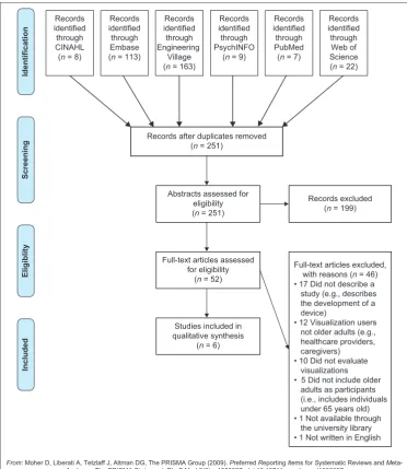
We identified 251 publications (Figure 1). Of those, 199 (79.3%) publications did not meet inclusion criteria and 52 (20.7%) were included for full-text review. Of the 52 full texts, 46 (88.5%) were excluded (e.g. older adults were not the visualization user). Six of the 52 (11.5%) met our inclusion criteria.31–36
Study characteristics
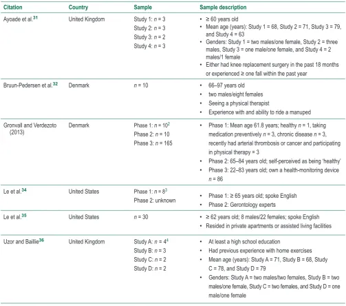
Table 1 provides characteristics of the studies described in the six publications. Studies were observational user studies of visualization tools,32,33,35 quasi-experimental within-subject studies comparing the completion of exercises using a printed informational booklet or visualization31,36 or a heuristic evalua-tion of visualizaevalua-tions.34 Sample sizes ranged from two to 165. Among publications with demographic information, samples generally included older adults aged ≥ 65 years and partici -pants were healthy or experiencing health problems (e.g. had a chronic disease). Studies were completed in Denmark, the United Kingdom, or the US and published in 2013–2015.
on September 12, 2020 by guest. Protected by copyright.
http://informatics.bmj.com/
Visualizations, evaluations and findings
Table 2 provides information about visualizations, their evalu -ations, and study findings. Visualizations either supported performing exercises via virtual using three-dimensional representations (e.g. virtual outdoor environments)31,32,36 or understanding of one’s health via data visualizations (e.g. graphs, charts or icons to represent quantitative data).33–35Virtual representation visualizations to support
exercises
Two virtual representation visualizations were developed that included mannequins and natural landscapes presented on screens with which participants interacted. Ayoade et al.31 and Uzor and Baillie36 developed animated visualizations to engage older adults in home exercises using human-like rep-resentations (mannequins). Participants wore sensors that collected information to provide visual feedback about their movements and proper posture using a real-time feedback mannequin and a guide mannequin, respectively. Weekly
progress charts were provided to participants but not evaluated in the study. Mannequin visualizations were evaluated by com-paring within-subject completion of exercises using an infor-mational booklet followed by the mannequins. Ayoade et al.31 collected feedback via observation, semi-structured interviews and short questionnaires. Uzor and Baillie36 used a question-naire and assessed differences in time to complete exercises when using the booklet and then the visualizations. Both stud-ies demonstrated that the visualizations improved participants’ perceived confidence in performing exercises and ability to perform more controlled movements compared to when using the booklet. Participants found mannequins helpful to identify movement or position problems while completing exercises and motivated them to complete otherwise unexciting exer-cises. When timed, participants using the visualizations took longer to complete exercise repetitions compared to using the booklet.
Bruun-Pedersen et al.32 described a virtual outdoor environment projected on a monitor to support exercise Records
identified through CINAHL (n = 8)
Records identified through Embase (n = 113)
Records identified through Engineering
Village (n = 163)
Records identified through PsychINFO
(n = 9)
Records identified through PubMed (n = 7)
Records identified through Web of Science (n = 22)
Records after duplicates removed (n = 251)
Full-text articles assessed for eligibility
(n = 52)
Studies included in qualitative synthesis
(n = 6) Abstracts assessed for
eligibility (n = 251)
Records excluded (n = 199)
Full-text articles excluded, with reasons (n = 46) • 17 Did not describe a study (e.g., describes the development of a device)
• 12 Visualization users not older adults (e.g., healthcare providers, caregivers) • 10 Did not evaluate visualizations • 5 Did not include older adults as participants (i.e., includes individuals under 65 years old) • 1 Not available through the university library • 1 Not written in English
Identification
Screening
Eligiblit
y
Include
d
From: Moher D, Liberati A, Tetzlaff J, Altman DG, The PRISMA Group (2009). Preferred Reporting Items for Systematic Reviews and M eta-Analyses: The PRISMA Statement. PLoS Med 6(6): e1000097. doi:10.1371/journal.pmed1000097
For more information, visitwww.prisma-statement.org.
Figure 1 PRISMA flow diagram of the manuscript selection process
on September 12, 2020 by guest. Protected by copyright.
http://informatics.bmj.com/
1 Studies 1 and 2 were completed in a laboratory among participants who experienced a fall or had knee replacement surgery, respectively. Studies 3 and 4 were completed in participants’ homes among those who experienced a fall or had knee replacement surgery, respectively 2 Phase 1 was to understand how older adults maintain awareness of health status. In phase 2, older adults measured their BP and provided feedback on visualizations of their BP data. Phase 3 consisted of a web survey of adults assessing self-monitoring needs.
3 Phase 1 was a pilot study in which community-dwelling older adults used a sensor system in their apartments for six months. Phase 2 consisted of interviews with gerontology experts to gain heuristic-based feedback on visualizations developed by the researcher using Phase 1 data. 4 Study A was conducted in a laboratory and assessed exercise-based games. Study B was conducted in a laboratory and assessed visualizations
of user movements. Study C assessed games in participants’ homes. Study D assessed visualizations in participants’ homes.
engagement. Older adults rode exercise bicycles and viewed a virtual environment mimicking natural landscapes that changed while pedalling. No feedback about perfor-mance was given to participants. Researchers used open-ended interviews to assess participants’ experiences using the virtual environment. Most participants felt the environ-ment enhanced their exercise experience and gave them energy and a sense of accomplishment. They felt the virtual environment could motivate them to exercise regularly or for a longer duration. Two of the ten participants with pain did not feel the virtual environment impacted their exercise engagement. Five of the ten participants stated the virtual environment did not match their interests or could become less engaging if novelty was lost.
Data visualizations to support understanding of one’s
health
Three publications described studies in which researchers evaluated visualizations of quantitative health information in the form of graphs and icons. Gronvall and Verdezoto33 developed data visualizations to support participants’ understanding of blood pressure (BP) measurements. They created (1) three data visualizations (icon-based, bar charts, line charts) to provide a one-week BP overview and (2) four data visualizations (icon based, text based, speed -ometer and slider) to show daily BP measurements. Data visualizations were evaluated by (1) older adults who par -ticipated in a workshop in which they measured their BP for one week and interpreted visualizations of their BP data Table 1 Study characteristics of studies to evaluate visualizations used in consumer health technologies to support older
adults living in the community.
Citation Country Sample Sample description
Ayoade et al.31 United Kingdom Study 1: n = 3
Study 2: n = 3 Study 3: n = 2 Study 4: n = 3
• ≥ 60 years old
• Mean age (years): Study 1 = 68, Study 2 = 71, Study 3 = 79, and Study 4 = 63
• Genders: Study 1 = two males/one female, Study 2 = three males, Study 3 = one male/one female, and Study 4 = 2 males/1 female
• Either had knee replacement surgery in the past 18 months
or experienced ≥ one fall within the past year
Bruun-Pedersen et al.32 Denmark n = 10 • 66–97 years old
• two males/eight females
• Seeing a physical therapist
• Experience with and ability to ride a manuped Gronvall and Verdezoto
(2013) Denmark Phase 1: n = 10
2 Phase 2: n = 10 Phase 3: n = 165
• Phase 1: Mean age 61.8 years; healthy n = 1, taking medication preventively n = 3, chronic disease n = 3, recently had arterial thrombosis or cancer and participating in physical therapy = 3
• Phase 2: 65–84 years old; self-perceived as being ‘healthy’
• Phase 3: 22–83 years old; own a health-monitoring device
n = 86
Le et al.34 United States Phase 1: n = 83
Phase 2: unknown • Phase 1: ≥ 65 years old; spoke English
• Phase 2: Gerontology experts
Le et al.35 United States n = 30 • ≥ 62 years old; 8 males/22 females; spoke English
• Resided in private apartments or assisted living facilities
Uzor and Baillie36 United Kingdom Study A:n=44 Study B: n = 3 Study C: n = 2 Study D: n = 2
• At least a high school education
• Had previous experience with home exercises
• Mean age (years): Study A = 71, Study B = 68, Study C = 78, and Study D = 79
• Genders: Study A = two males/two females, Study B = two males/one female, Study C = two females, and Study D = one male/one female
on September 12, 2020 by guest. Protected by copyright.
http://informatics.bmj.com/
Table 2
Visualization intervention, evaluation, and results of observational studies to evaluate visualizations used in consumer health technologies to support older adults living in the community
.
Citation
Visualization(s)
Intervention
Visualization evaluation method
Results
Ayoade et al.
31
Dif
ferent visualizations for knee replacement
surgery and fall participants. V
isual feedback
using guide and real-time feedback mannequins to show users how and where to place body sensors, exercises to be completed, and feedback about exercise performance including a weekly progress report. Consulted with falls experts prior to developing the visualization In either a laboratory or at home, participants reviewed an informational booklet and used a visualization tool while performing rehabilitation exercises Observations Semi-structured interviews Short questionnaires
The visualization tool improved confidence in executing the exercise program. The visualization tool encouraged slower
, more
controlled movements compared to the booklet use. Participants appreciated the weekly chart feature as a tool that allowed them to assess their performance over time.
Bruun-Pedersen et al.
32
A virtual environment application describing landscapes that changed as participants used the exercise bicycle to give the impression that participants were cycling through the landscapes. Developed visualization based on previous literature regarding interactions with virtual environment-related technologies. Participants used the exercise bike and if they wanted to, focus on the screen that provided the V
irtual
Environment feature.
Open-ended interviews
Seven participants preferred the virtual environment; three participants did not prefer it. Participants overall were enthusiastic about the V
irtual
Environment feature, that it enhanced the exercise routine, and motivated to exercise regularly or for a longer duration. It provided (1) a feeling of being outside, (2) a sense of accomplishment and (3) them with energy
. T
wo participants with pain
did not feel that the virtual environment made a positive dif
ference. Five participants stated that
improvements could be made (the environment did not match their interests or was redundant; novelty of the environment could be lost).
Gronvall and V
erdezoto
33
Three dif
ferent visualizations used to show weekly
BP
overviews (icon based, bar charts, and line
charts). Four visualizations used to show daily BP (icon based, text based, speedometer
, and slider).
Designs guided by Beaudin and colleagues (2006).
*
Participants performed BP
self-measurement for 1 week and interpreted BP
visualizations (phase 2)
W
orkshop feedback (phase 2)
W
eb-based survey of adults
(phase 3)
Visualizations helped enhance understanding of BP measurements. For the weekly view
, the line chart
was preferred. For the daily view
, participants found
icons simple although it lacked in precision; they used text representations for precise values. Mixed response towards the speedometer visualization; participants noted that precision might be an issue. Overall, participants were concerned with precision of measurements in the visualizations.
(
Continued
)
on September 12, 2020 by guest. Protected by copyright.
http://informatics.bmj.com/
Table 2
Visualization intervention, evaluation, and results of observational studies to evaluate visualizations used in consumer health technologies to support older adults living in the community
(Cont.
)
Citation
Visualization(s)
Intervention
Visualization evaluation method
Results
Le et al.
34
Two visualizations of passive sensor data regarding participants’
motion within their
apartments: a streamgraph (variant of stacked bar graph) displayed longitudinal total sensor activity distributed by location within the home, thickness of each layer corresponds amount of sensor activity
, and a radial plot, a clock-like display of
a 24-hour period of sensor data. Researchers developed visualizations using participant interview data, cognitive perceptual visualization guidelines, the emotional design principles of Norman
37 and Shah and Hoef
fner
’s model of
information visualization processing.
38
Community-dwelling older adults used a passive sensor system in their apartments for six months (phase 1) Interviews with gerontology experts for heuristic-based feedback (phase 2) Overall, participants understood the spatial and temporal component of the visualizations.
The radial
plot was easier to understand than the streamgraph for comparing components in the visualization and understanding granular data.
Le et a
l.
35
Researchers developed three interactive visualizations – a bar graph diagram, a radial plot, and a light ball metaphor – that provided information about overall wellness and social, physical, cognitive, and spiritual health. Visualizations were guided by previous research and suggestions from gerontology researchers. Focus groups with older adults in which they interacted with the visualizations
Interview questions during focus groups Participants noted potential for visualizations to support assessments of their wellness and promote of shared decision making with healthcare provider
.
They wanted to identify interventions they could use to address trends in longitudinal data. Participants used visualizations first for a holistic perspective then looked at details. Participants thought there was too much information displayed in the visualization and were confused by data abstractions (e.g. radial plot, and light ball metaphor). Participants found it difficult to notice dif
ferences in sizes and brightness.
They
appreciated
that separation
of visualizat
ions
based
on
dif
ferent components of wellness.
Uzor and Baillie
36
Researchers developed two animated visualizations of a mannequin: a guide mannequin that demonstrated movements for each exercise (passive feedback); a guide mannequin and a mannequin that showed users’
movements
(real-time feedback). Researchers also developed games that incorporated participants’
movements.
Developed visualizations after consulting with older adults and experts in falls and physiotherapy
.
In each study
, participants completed
exercises using an instructional booklet then repeated exercises while wearing body-worn sensors and using either the games or visualization tool Compared time taken to complete one exercise repetition using the booklet versus the visualization tool Questionnaire Participants using the visualization tool on average took longer to complete each exercise repetition compared to those using the booklet (6.58 versus. 5.66 seconds).
They found the guide mannequin
useful in identifying problems while completing exercises. Participants agreed that seeing exercise visualizations improved their understanding about rehabilitation and felt that visualizations made it hard for them to ignore completing exercises perceived of as unexciting.
*
Beaudin JS, Intille SS, Morris ME.
To track or not to track: user reactions to concepts in longitudinal health monitoring. JMIR. 2006;8(4):e29.
on September 12, 2020 by guest. Protected by copyright.
http://informatics.bmj.com/
and (2) adults who completed an online survey. It is unclear how researchers presented the visualizations to the work-shop participants; participants in the survey study viewed the visualizations within the web-based survey. Participants felt the data visualizations enhanced their understanding of BP measurements; however, they were concerned with visualization precision. For the one-week overview, partici-pants positively responded to the line chart. For the daily view, participants noted that icons were simple yet lacked precision; they used text representations for precise values. Participants had mixed reactions towards the speedometer visualization, noting that there might be problems with the precision of interpreting the visualization.
Le et al.34 created a streamgraph (variant of stacked line-graph) and a radial plot (a circle that represents a 24-hour clock) using motion data from sensors worn for six months by older adults in their apartments. Visualizations were devel-oped based on interview data with older adults who wore the sensors, cognitive perceptual visualization guidelines, the emotional design principles of Norman37 and Shah and Hoeffner’s model of information visualization processing.38 For evaluation, researchers recruited gerontology experts to review the data visualizations presented digitally on a laptop and provide heuristic-based feedback. Participants mostly understood the spatial and temporal component of the stream graph and radial plot visualizations. They found the radial plot easier to understand than the streamgraph to compare components within the visualization and understand granular data.
Le et al.35 developed three interactive data visualizations to provide information about older adults’ overall wellness and social, physical, cognitive, and spiritual health. The data visu-alizations included a bar graph, a radial plot (area represented score; different from the radial plot described in the previous paragraph) and a light ball metaphor (a circle for which the size and brightness encoded data). Researchers designed the data visualizations based on findings from previous research, focus groups with gerontology experts and heu-ristic design guidelines. To evaluate the visualizations, they held a focus group with older adults who used then reported on their experiences with the visualizations, which were pre-sented on paper. Participants used the data visualizations first for a holistic perspective and then looked at details. They felt there was too much information displayed in the visualiza-tion and were confused by data abstracvisualiza-tions (e.g. light ball metaphor). It was difficult for participants to notice differences in sizes and brightness encodings. Participants appreciated separation of visualizations for different components of well-ness. They felt there was potential for data visualizations to support assessments of their wellness and promote shared decision making with healthcare providers.
Methodological quality
Study design
Four publications described studies that assessed partici-pants’ opinions about visualizations. These studies provide information about potential value of visualizations but do
not compare visualizations to alternatives. Two publications described studies that used within-subject designs to com-pare the current standard of providing exercise information (a booklet) to their visualization tool, providing data compar-ing opinions and abilities after uscompar-ing the booklet and visual-ization tools. All participants first used the booklet and then the visualization tool; therefore, participants were aware of and had performed the exercises by the time they started exercises with the visualization tool. This ordering effect could have impacted participants’ opinions about and ability to perform subsequent exercises.
Sample
Most studies had sample sizes ≤ 10. While researchers can detect usability issues using five to eight participants,39 con-clusions drawn from experimental studies with small sample sizes should be made with caution; it is possible that samples were not big enough to detect differences in performance (e.g. interpreting data). Most studies had incomplete informa-tion about participants’ gender, socioeconomic status, educa-tion, health status, and technology use, limiting assessments of the generalizability of findings.
Visualization development
Researchers varied in amounts of evidence they used to guide development of their visualizations. They varied from using one previously published paper to using a combination of sources (e.g. previous research, visualization guidelines and a theoretical model). It is possible that the number and types of evidence researchers used to develop the visualiza-tion could have impacted their efficacy.
Visualization evaluation
Most studies included interviews with or gathered feedback from users. A fewer studies included questionnaires; information was not provided in the publications about ques-tionnaire reliability and validity, whether researchers devel-oped the questionnaires, or if questionnaire development was guided by a theory or framework. Interview and ques-tionnaire methods are adequate for providing qualitative and/or quantitative feedback; however, most studies using these methods did not describe providing a usual informa-tion or data presentainforma-tion opinforma-tion (i.e. a control comparison) for participants to which to compare. Participants provided feed-back on one or multiple visualizations designed by research-ers. These publications do not provide insights on if and how the visualizations compare to usual data presentations. Two publications31, 36 described studies in which researchers com-pared exercise completion using a traditional method (infor-mation booklet; a control comparison) versus visualizations (real-time feedback and guide mannequins). However, these studies were of within-subject design and did not change the order in which participants received the booklet or visu-alization tool. It is difficult to determine why there were dif -ferences in time to complete the exercise repetition. Finally, all studies appeared to be short in duration making it diffi -cult to determine if (1) learning curves for the health-related
on September 12, 2020 by guest. Protected by copyright.
http://informatics.bmj.com/
visualizations were overcome with prolonged use or (2) older adults engaged in sustained use of certain exercise and health-related visualizations.
DISCUSSION
We summarized the current published research evaluating visualizations of physical representations to support exercise engagement and data visualizations for understanding one’s health incorporated into tools for older adults in the community. Studies evaluating virtual environments or human representations (three publications31,32,36) showed the potential to promote exercise engagement. Older adults found them motivating, which may be important among older adults who find it difficult to engage in activities due to impaired physical abilities. These studies were limited meth-odologically in several ways, including study duration, mak-ing it is difficult to draw clear conclusions about the efficacy of the visual representations.
Studies of data visualizations to better understand one’s health (three publications33–35) also showed promise, although they had several methodological limitations that should be taken into consideration when interpreting the findings. Among standard data visualizations, line and bar graphs were developed by study researchers to show quan-titative health data. Previous quanquan-titative data visualization research indicates that position and length – how line and bar graphs are represented, respectively – support more accurate data interpretation.40,41 Researchers of the studies we identified in this review (e.g. Gronvall and Verdezoto33) found that line and bar graphs (optimal encodings) were more understandable among their participants than alter-natives such as abstract icons. Previous data visualization research also indicates that area and hue are harder to interpret than position and length. In research to understand graphical perception for older adults, Le et al.42 found that participants were not as quick or accurate in understand-ing stacked bar charts and pie graphs (encode area; less optimal) compared to bar charts (encodes length; optimal). During their studies, Le et al.35 found that older adults who viewed the light balls metaphor visualization (area and hue encodings; less optimal) had difficulty identifying dif -ferences between balls. It is possible to use area to repre-sent something familiar. For example, Le et al.34 used circle radial plots representing a 24-hour clock to encode tempo -ral data, which older adults preferred to the streamgraph. Later, Le et al.35 used radial plots more similar to pie charts in which areas and arc lengths are compared, which older adults found confusing. Thus, it is possible for researchers to investigate (1) the validity of previous data visualization research in the context of consumer health informatics tools for older adults and (2) new approaches to visualize quanti -tative data in ways that optimize older adults’ familiarity with certain objects.
The speedometer is another representation using arc length to encode quantitative data in a familiar way. However, this visualization could be difficult to interpret – speedometers
visualize speed, which may not map to health and wellness characteristics. Gronvall and Verdezoto33 in their speedom-eter visualization provided (1) general BP categories (e.g. low and normal) across the speedometer arc encoded with colour and (2) BP values in a box that had colours identically to the category on which the needle was positioned. Although redundant encodings were included, participants felt the speedometer lacked precision, possibly because arc length is not as optimal in encoding quantitative data as position or linear length.40,41 While study authors did not provide informa-tion about whether participants preferred speedometers to a slider (similar to a stacked bar graph, a more optimal encod-ing than arc length), participants stated they found the slider useful.
Participants in the three health data visualizations appeared to have had different encoding preferences depending on data granularity. They preferred overviews, were overwhelmed if too much data were presented and wanted ways to access precise data.33,35 One solution is to provide static views of overviews and granular data, as in Gronvall and Verdezoto’s work,33 or interactive visualiza-tions to allow viewing an overview, zooming and filtering of data and accessing to detailed information on demand,43 as in Le et al.’s work.35
Future research could build on the current literature by addressing methodological limitations of studies included in this review. This includes using multiple sources of evidence to inform the design of visualizations to guide research-ers towards more undresearch-erstandable visual encodings; using designs that allow comparison between usual standards and visualizations; including larger, diverse samples; allowing for extended use of visualizations; and including validated mea-sures and interviews to evaluate visualizations. Within-subject studies could randomly assign the order in which partici-pants used current standards and novel visualizations. Also, researchers should be cognizant of how evaluate visualiza-tions for older adults. Le et al.44 evaluated three approaches to assess interactive visualizations for older adults. They found the evaluation methods varied in differences with task completion time and accuracy. In addition, researchers could consider assessing graph literacy and numeracy in addition to comprehension when evaluating visualizations. Nayak et al.45 found that older adult prostate cancer patients who were highly educated and had high health literacy varied in their comprehension of a dashboard that included a table, line graph and bar graph depending on their graph literacy and numeracy. Researchers could further investigate evalu-ation techniques and consider using evaluevalu-ation methodology when assessing their visualization tools.
lIMITATIONS
We identified that few publications and studies were hetero -geneous in design. Therefore, we were unable to aggregate data across studies. We consulted with a health informatics librarian to develop the search strategy; however, we may not have identified all relevant articles.
on September 12, 2020 by guest. Protected by copyright.
http://informatics.bmj.com/
CONClUSION
We identified six studies in which researchers evaluated visu -alizations of physical representations to promote engage-ment in exercises or data visualizations for understandings of one’s health. Visualizations show promise in supporting the health and wellness of community-dwelling older adults; however, because of the low number of publications we iden-tified and the methodological limitations of studies described in these publications, caution should be made in interpreting and extending findings from these studies. Future research could build on this currently literature to develop informatics tools including visualizations that older adults could use with ease and accuracy. With the projected rise of older adults liv-ing at home in the comliv-ing decades, more home-based tools using data visualizations and visualizations of physical rep-resentations are needed. Informatics tools may provide that support; however, developers of informatics tools for older
adults’ in the community could benefit from developing evi -dence-based visualizations that they then evaluate.
Acknowledgements
Many thanks to Diana N.K. Louden, Health Sciences Librarian at the University of Washington, for assistance in developing the search strategy and terms.
Funding
Financial support for this study was provided in part by grants from the National Institutes of Health, National Library of Medicine (NLM) Biomedical and Health Informatics Training Program at the University of Washington (Grant Nr. T15LM007442) (authors UB & MKH) and the NIH National Institute of Nursing Research (NINR) Aging and Informatics Training Program at the University of Washington School of Nursing (Grant Nr. T32NR014833) (author YK).
ReFeReNCeS
1. National Institute on Aging. Global Health and Aging. NIH
Publication no. 11-7737. Bethesda, MD: National Institutes of Health, 2011.
2. Vincent GK and Velkoff VA. The Next Four Decades: The Older
Population in the United States: 2010 to 2050. Report
P25-1138. Washington, D.C.: US Census Bureau. 2010.
3. Administration on Aging. A Profile of Older Americans: 2014. Report, US Department of Health and Human Services, USA.
2014.
4. Congressional Budget Office. Rising Demand for Long-Term
Services and Supports for Elderly People. Report, Congress of
the United States, USA; 2014.
5. Hanson GJ, Takahashi PY and Pecina JL. Emerging tech-nologies to support independent living of older adults at risk.
Care Management Journals 2013;14:58–64. http://dx.doi.
org/10.1891/1521-0987.14.1.58. PMid:23721044.
6. Chi NC, Demiris G. A systematic review of telehealth tools and interventions to support family caregivers. Journal of
Telemedicine and Telecare. 2015; 21:37-44. http://dx.doi.
org/10.1177/1357633X14562734.
7. Demiris G, Thompson H, Boquet J, Le T, Chaudhuri S and Chung J. Older adults’ acceptance of a community-based telehealth wellness system. Informatics for Health and Social
Care 2013;38:27-36. http://dx.doi.org/10.3109/17538157.201
1.647938.
8. Gellis ZD, Kenaley B, McGinty J, Bardelli E, Davitt J and Ten Have T. Outcomes of a telehealth intervention for homebound older adults with heart or chronic respiratory failure: a random-ized controlled trial. Gerontologist 2012; 52:541–52. http:// dx.doi.org/10.1093/geront/gnr134.
9. Demiris G and Hensel BK. Technologies for an aging society: a systematic review of “smart home” applications. Yearbook of
Medical Informatics 2008:33–40. PMid:18660873.
10. Reeder B, Meyer E, Lazar A, Chaudhuri S, Thompson HJ and Demiris G. Framing the evidence for health smart homes and home-based consumer health technologies as a public health intervention for independent aging: a systematic review.
International Journal of Medical Informatics 2013;82:565–79.
http://dx.doi.org/10.1016/j.ijmedinf.2013.03.007.
11. Bertin J. Semiology of Graphics: Diagrams, Networks, Maps. Madison, WI: University of Wisconsin Press, 1983. PMCid:PMC2714599.
12. Card SK, Mackinlay J and Shneiderman B. Readings in
Information Visualization: Using Vision to Think. San Francisco,
CA: Morgan Kaufmann,1999.
13. Few S. Now You See It: Simple Visualization Techniques for
Quantitative Analysis. Oakland, CA: Analytics Press, 2009.
14. Heer J, Bostock M and Ogievetsky V.A. Tour through the Visualization Zoo: A survey of powerful visualization techniques,
from the obvious to the obscure. Graphics. 2010; 8(5).
15. Elting LS, Martin CG, Cantor SB and Rubenstein EB. Influence
of data display formats on physician investigators’ deci-sions to stop clinical trials: prospective trial with repeated measures. British Medical Journal 1999;318:1527–31. http://dx.doi.org/10.1136/bmj.318.7197.1527. PMid:10356010 PMCid:PMC27896.
16. Feldman-Stewart D, Brundage MD and Zotov V. Further insight into the perception of quantitative information: judg-ments of gist in treatment decisions. Medical Decision Making
2007;27:34–43. http://dx.doi.org/10.1177/0272989X06297101. PMid:17237451.
17. Feldman-Stewart D, Kocovski N, McConnell BA, Brundage MD and Mackillop WJ. Perception of quantitative information for treatment decisions. Medical Decision Making 2000;20:228–38. h t t p : / / d x . d o i . o r g / 1 0 . 11 7 7 / 0 2 7 2 9 8 9 X 0 0 0 2 0 0 0 2 0 8 . PMid:10772360.
18. Gaissmaier W, Wegwarth O, Skopec D, Müller AS, Broschinski S and Politi MC. Numbers can be worth a thousand pictures: individual differences in understanding graphical and numeri-cal representations of health-related information. Journal of
Health Psychology 2012;31:286–96. http://dx.doi.org/10.1037/
a0024850. PMid:21842998.
19. Garcia-Retamero R, Okan Y and Cokely ET. Using visual aids to improve communication of risks about health: a review. ScientificWorldJournal 2012;2012:562637. http://dx.doi.org/10.1100/2012/562637. PMid:22629146 PMCid:PMC3354448.
20. Hoeke JO, Bonke B, van Strik R and Gelsema ES. Evaluation of techniques for the presentation of laboratory data: support of pattern recognition. Methods of Information in Medicine 2000;39:88–92. PMid:10786077.
21. Morrow DG, Hier CM, Menard WE and Leirer VO. Icons improve older and younger adults’ comprehension of medication infor-mation. The Journals of Gerontology. Series B, Psychological
on September 12, 2020 by guest. Protected by copyright.
http://informatics.bmj.com/
Sciences and Social Sciences 1998;53:P240–54. http://dx.doi. org/10.1093/geronb/53B.4.P240.
22. Shneiderman B, Plaisant C and Hesse BW. Improving health and healthcare with interactive visualization methods.Computer.2013. Available from: http://hcil2.cs.umd.edu/trs/2013-01/2013-01.pdf. doi.ieeecomputersociety.org/10.1109/MC.2013.38.
23. Zikmund-Fisher BJ, Witteman HO, Dickson M, Fuhrel-Forbis A, Kahn VC, Exe NL et al. Blocks, ovals, or people? icon type affects risk perceptions and recall of pictographs.
Medical Decision Making 2014;34:443–53. http://dx.doi.
org/10.1177/0272989X13511706.
24. Duke JD, Li X and Grannis SJ. Data visualization speeds review of potential adverse drug events in patients on multiple medi-cations. Journal of Biomedical Informatics 2010;43:326–31. http://dx.doi.org/10.1016/j.jbi.2009.12.001.
25. Hugine AL, Guerlain SA and Turrentine FE. Visualizing surgi-cal quality data with treemaps. Journal of Surgical Research
2014;191:74–83. http://dx.doi.org/10.1016/j.jss.2014.03.046. 26. Bieryla KA. Xbox Kinect training to improve clinical measures
of balance in older adults: a pilot study. Aging Clinical and
Experimental Research.2016;28(3):451–7. [Epub ahead of
print]. PMid:26386865.
27. Chao YY, Scherer YK and Montgomery CA. Effects of using Nintendo Wii™ exergames in older adults: a review of the lit-erature. Journal of Aging and Health 2015;27:379–402. http:// dx.doi.org/10.1177/0898264314551171.
28. Laufer Y, Dar G, Kodesh E. Does a Wii-based exercise program enhance balance control of independently functioning older adults? A systematic review. Journal of Clinical Interventions in
Aging 2014;9:1803–13. http://dx.doi.org/10.2147/CIA.S69673.
29. Molina KI, Ricci NA, de Moraes SA and Perracini MR. Virtual reality using games for improving physical function-ing in older adults: a systematic review. Journal of Neuro
Engineering and Rehabilitation 2014;11:156. http://dx.doi.
org/10.1186/1743-0003-11-156.
30. Moher D, Liberati A, Tetzlaff J, Altman DG and PRISMA Group. Preferred reporting items for systematic reviews and meta-analyses: the prisma statement. PLoS Med. 2009;6:e1000097. doi:10.1371/journal.pmed1000097.
31. Ayoade M, Uzor S and Baillie L. The development and evaluation of an interactive system for age related musculoskeletal rehabil-itation in the home. Kotzé P, Marsden G, Lindgaard G, Wesson J, Winckler M (Ed). 14th IFIP TC 13 International Conference on Human-Computer Interaction, INTERACT 2013,2–6 September 2013; Cape Town, South Africa. (8120):1–18. http://dx.doi.org/10.1007/978-3-642-40498-6_1.
32. Bruun-Pedersen JR, Pedersen KS, Serafin S and Kofoed LB. Augmented exercise biking with virtual environments for elderly users: a preliminary study for retirement home physical therapy. In: 2nd Workshop on Virtual and Augmented Assistive Technology, VAAT 2014 –Co-located with the 2014 Virtual Reality Conference,30 March 2014, Minneapolis, Minnesota, USA. 23–27. http://dx.doi.org/10.1109/VAAT.2014.6799464.
33. Gronvall E and Verdezoto N. Understanding challenges and opportunities of preventive blood pressure self-monitoring at home. 31st European Conference on Cognitive Ergonomics: Work, Education, Society, ECCE 2013,26–28 August 2013, Toulouse, France. Paper no. 31, New York: ACM. http://dx.doi. org/10.1145/2501907.2501962.
34. Le T, Reeder B, Chung J, Thompson H and Demiris G. Design of smart home sensor visualizations for older adults. Technol Health Care 2014;22:657–66. http://dx.doi.org/10.3233/THC-140839. 35. Le T, Reeder B, Yoo D, Aziz R, Thompson HJ and Demiris G.
An evaluation of wellness assessment visualizations for older adults. Telemedicine Journal and E-Health. 2015;21:9–15. http://dx.doi.org/10.1089/tmj.2014.0012.
36. Uzor S and Baillie L. Exploring designing tools to enhance falls rehabilitation in the home. 31st Annual CHI Conference on Human Factors in Computing Systems: Changing Perspectives, CHI 2013,27 April 2013 to 2 May 2013; Paris, France.1233–1242; http://dx.doi.org/10.1145/2470654.2466159.
37. Norman DA. Emotional design why we love (or hate) everyday things. New York: Basic Books,2004.
38. Shah P and Hoeffner J. Review of Graph Comprehension Research: Implications for Instruction. Educational
Psychology Review 2002;14:47–69. http://dx.doi.
org/10.1023/A:1013180410169.
39. Lewis JR. Sample Sizes for Usability Studies: Additional Considerations Human Factors. Human Factors 1994;36:368– 78, http://dx.doi.org/10.1177/001872089403600215
40. Cleveland WS and McGill R. An experiment in graphi-cal perception. International Journal of Man-Machine
Studies 1986;25:491–500. http://dx.doi.org/10.1016/
S0020-7373(86)80019-0.
41. Cleveland WS and McGill R. Graphical Perception: Theory, Experimentation, and Application to the Development of Graphical Methods. Journal of the American Statistical
Association. 1984;79.387:531–54. http://dx.doi.org/10.1080/01
621459.1984.10478080.
42. Le T, Aragon C, Thompson HJ and Demiris G. Elementary graphical perception for older adults: a comparison with the general population. Perception 2014;43:1249–60. http://dx.doi. org/10.1068/p7801. PMid:25638940.
43. Shneiderman B. The eyes have it: a task by data type taxon-omy for information visualizations. IEEE Symposium on Visual Languages,3–6 September 1996, Boulder, Colorado, USA; Los Alamitos, CA: IEEE Computer Society Press,1996:336–343. http://dx.doi.org/10.1109/VL.1996.545307.
44. Le T, Thompson H and Demiris G. A Comparison of Health Visualization Evaluation Techniques With Older Adults.
IEEE Computer Graphics and Applications 2015. [Epub
ahead of print].
45. Nayak JG, Hartzler AL, Macleod LC, Izard JP, Dalkin BM and Gore JL. Relevance of graph literacy in the development of patient-centered communication tools. Patient Education
and Counseling 2015. pii: S0738-3991(15)30075–6. [Epub
ahead of print].
on September 12, 2020 by guest. Protected by copyright.
http://informatics.bmj.com/
SUppleMeNTAl TABle 1
Database Search terms
CINAHL (visualization* OR visualisation) AND (informatics OR computer OR device OR technology OR application* OR instrument* OR sensor* OR monitor* OR track* OR interface OR graphic* OR presentation OR analytics OR display OR user-computer OR human-computer OR computer interaction OR human centered) AND (elder* OR older adult* OR geriatric* OR senior*) AND (consumer OR home OR community)
Embase (visualization* OR visualisation) AND ('computer'/exp OR 'devices'/exp OR 'technology'/exp OR 'information processing'/exp OR 'monitor'/exp OR presentation OR analytics OR 'imaging and display'/exp OR 'human centered') AND ('aged'/exp OR 'geriatrics'/exp) AND ('consumer'/exp OR 'home'/exp OR 'community'/exp)
Engineering Village (visualization* OR visualisation) AND (informatics OR computer OR device OR technology OR application* OR instrument* OR sensor* OR monitor* OR track* OR interface OR graphic* OR presentation OR analytics OR display OR user-computer OR human-computer OR computer interaction OR human centered) AND (elder* OR older adult* OR geriatric* OR senior*) AND (consumer OR home OR community)
PsychInfo (visualization* OR visualisation) AND (informatics OR computer OR device OR technology OR application* OR instrument* OR sensor* OR monitor* OR track* OR interface OR graphic* OR presentation OR analytics OR display OR user-computer OR human-computer OR computer interaction OR human centered) AND (elder* OR older adult* OR geriatric* OR senior*) AND (consumer OR home OR community)
PubMed (visualization* OR visualisation) AND (informatics OR computer OR device OR technology OR application* OR instrument* OR sensor* OR monitor* OR track* OR interface OR graphic* OR presentation OR analytics OR display OR user-computer OR human-computer OR computer interaction OR human centered) AND (elder* OR older adult* OR Aged"[Mesh] OR "Aged, 80 and over"[Mesh] OR geriatric* OR senior*) AND (consumer OR home OR community)
Web of Science (visualization* OR visualisation) AND (informatics OR computer OR device OR technology OR application* OR instrument* OR sensor* OR monitor* OR track* OR interface OR graphic* OR presentation OR analytics OR display OR user-computer OR human-computer OR computer interaction OR human centered) AND (elder* OR older adult* OR geriatric* OR senior*) AND (consumer OR home OR community)
Predetermined list of search terms used for this systematic review to identify publications in which researchers evaluated visualizations for health technologies to support the health and wellness of elders living in the community
on September 12, 2020 by guest. Protected by copyright.
http://informatics.bmj.com/