;02487<
5IMDEQAW ,KEVAMDPA <APAH <CNRR!3AWUAPD
, =HEQIQ <SBLIRRED FNP RHE /EGPEE NF 9H/ AR RHE
>MITEPQIRW NF <R ,MDPEUQ
&$%'
1SKK LERADARA FNP RHIQ IREL IQ ATAIKABKE IM ;EQEAPCH+<R,MDPEUQ*1SKK=EVR
AR*
HRRO*##PEQEAPCH!PEONQIRNPW"QR!AMDPEUQ"AC"SJ#
9KEAQE SQE RHIQ IDEMRIFIEP RN CIRE NP KIMJ RN RHIQ IREL* HRRO*##HDK"HAMDKE"MER#%$$&'#()%(
=HIQ IREL IQ OPNRECRED BW NPIGIMAK CNOWPIGHR
INCLUDING SPATIAL MODELS IN COMPLEX REGIONS.
Lindesay Alexandra Sarah Scott-Hayward
Thesis submitted for the degree of
DOCTOR OF PHILOSOPHY
in the Schools of Biology and Mathematics & Statistics
UNIVERSITY OF ST ANDREWS
ST ANDREWS
AUGUST 2013
c
Species Distribution Modelling (SDM) plays a key role in a number of biological applications: assessment of temporal trends in distribution, environmental impact assessment and spatial conservation planning. From a statistical perspective, this thesis develops two methods for increasing the accuracy and reliability of maps of density surfaces and provides a solution to the problem of how to collate multiple density maps of the same region, obtained from differing sources. From a biological perspective, these statistical methods are used to analyse two marine mammal datasets to produce accurate maps for use in spatial conservation planning and temporal trend assessment.
The first new method, Complex Region Spatial Smoother [CReSS; Scott-Hayward et al., 2013], improves smoothing in areas where the real distance an animal must travel (‘as the animal swims’) between two points may be greater than the straight line distance between them, a problem that occurs in complex domains with coastline or islands. CReSS uses esti-mates of the geodesic distance between points, model averaging and local radial smoothing. Simulation is used to compare its performance with other traditional and recently-developed smoothing techniques: Thin Plate Splines (TPS, Harder and Desmarais [1972]), Geodesic Low rank TPS (GLTPS; Wang and Ranalli [2007]) and the Soap film smoother (SOAP; Wood et al. [2008]). GLTPS cannot be used in areas with islands and SOAP can be very hard to parametrise. CReSS outperforms all of the other methods on a range of simula-tions, based on their fit to the underlying function as measured by mean squared error, particularly for sparse data sets.
Smoothing functions need to be flexible when they are used to model density surfaces that are highly heterogeneous, in order to avoid biases due to under- or over-fitting. This
Unlike traditional methods, such as Generalised Additive Modelling, the adaptive knot selection approach used in SALSA2D naturally accommodates local changes in the smooth-ness of the density surface that is being modelled. At the time of writing, there are no other methods available to deal with this issue in topographically complex regions. Simulation results show that CReSS-SALSA2D performs better than CReSS (based on MSE scores), except at very high noise levels where there is an issue with over-fitting.
There is an increasing need for a facility to combine multiple density surface maps of individual species in order to make best use of meta-databases, to maintain existing maps, and to extend their geographical coverage. This thesis develops a framework and methods for combining species distribution maps as new information becomes available. The methods use Bayes Theorem to combine density surfaces, taking account of the levels of precision associated with the different sets of estimates, and kernel smoothing to alleviate artefacts that may be created where pairs of surfaces join. The methods were used as part of an algorithm (the Dynamic Cetacean Abundance Predictor) designed for BAE Systems to aid in risk mitigation for naval exercises.
Two case studies show the capabilities of CReSS and CReSS-SALSA2D when applied to real ecological data. In the first case study, CReSS was used in a Generalised Estimating Equation framework to identify a candidate Marine Protected Area for the Southern Res-ident Killer Whale population to the south of San Juan Island, off the Pacific coast of the United States.
In the second case study, changes in the spatial and temporal distribution of harbour porpoise and minke whale in north-western European waters over a period of 17 years (1994-2010) were modelled. CReSS and CReSS-SALSA2D performed well in a large, topo-graphically complex study area. Based on simulation results, maps produced using these methods are more accurate than if a traditional GAM-based method is used. The resulting maps identified particularly high densities of both harbour porpoise and minke whale in an area off the west coast of Scotland in 2010, that might be a candidate for inclusion into the Scottish network of Nature Conservation Marine Protected Areas.
1. Candidate’s declarations:
I, Lindesay Scott-Hayward, hereby certify that this thesis, which is approximately 55,000 words in length, has been written by me, that it is the record of work carried out by me and that it has not been submitted in any previous application for a higher degree.
I was admitted as a research student in October 2006 and as a candidate for the degree of Doctor of Philosophy in Biology and Statistics in October 2006; the higher study for which this is a record was carried out in the University of St Andrews between 2006 and 2013.
Date: Signature of Candidate:
2. Supervisor’s declaration:
I hereby certify that the candidate has fulfilled the conditions of the Resolution and Reg-ulations appropriate for the degree of Doctor of Philosophy in Biology and Statistics in the University of St Andrews and that the candidate is qualified to submit this thesis in application for that degree.
Date: Signature of Supervisor:
Date: Signature of Supervisor:
3. Permission for electronic publication:
In submitting this thesis to the University of St Andrews I understand that I am giving permission for it to be made available for use in accordance with the regulations of the Uni-versity Library for the time being in force, subject to any copyright vested in the work not being affected thereby. I also understand that the title and the abstract will be published, and that a copy of the work may be made and supplied to any bona fide library or research worker, that my thesis will be electronically accessible for personal or research use unless exempt by award of an embargo as requested below, and that the library has the right to migrate my thesis into new electronic forms as required to ensure continued access to the thesis. I have obtained any third-party copyright permissions that may be required in order to allow such access and migration, or have requested the appropriate embargo below.
The following is an agreed request by candidate and supervisor regarding the electronic publication of this thesis:
Embargo on both all of printed copy and electronic copy for the same fixed period of 1 year on the following grounds:
- publication would be commercially damaging to the researcher, or to the supervisor,
Date: Signature of Candidate:
Signature of Supervisor:
Signature of Supervisor:
Signature of Supervisor:
• I owe a huge debt of gratitude to my supervisors, Carl Donovan and Monique Macken-zie for the opportunity they gave me, their hard work on my behalf, advice and friendship, and for the trips to New Zealand for both work and play. Thanks to my supervisor, John Harwood for his wise advice and thoughtful comments, and to Cameron Walker at the University of Auckland for all his help, the time he spared me in Auckland and for his unofficial supervision.
• A special thank you to Laura Marshall, Joanne Potts, Danielle Harris and Faye Don-nelly for their support when it mattered and, especially their friendship during difficult times. Thanks also to my oldest friends, Ellena and Jennifer Growcott for remaining so, and for the example of their own dedication in completing their theses.
• Thanks to all at CREEM who through the use of cake and tea have kept me going. In particular Theoni Photopoulou, Angelika Studeny Glenna Evans, Rhona Rodger, Phil Le Feuvre and Lorenzo Milazzo.
• Thanks to my husband-to-be, Andrew Marshall, who made the last few years bearable with his kindness, warmth, encouragement, practical help and so much more.
• Last but not least, to my long-suffering family for their unquestioning support and continued belief that one day I would finally finish!
used in Chapter 4.
• Thanks to the Joint Nature Conservation Committee for use of the Joint Cetacean Protocol data used in Chapter 6.
• Thanks to the Natural Environment Research Council for funding my Ph.D, without which it would not have been possible.
Abstract iii
Declarations v
Acknowledgements ix
Table of Contents xi
1 General Introduction 1
1.1 Why map species distribution? . . . 4
1.2 Temporal Distribution Trends . . . 7
1.3 Impact Assessment . . . 8
1.4 Spatial Conservation Planning in the Marine Environment . . . 10
1.5 Statistical Issues . . . 14
1.6 Thesis Outline . . . 17
2 Background Methodology 19 2.1 Generalised Linear Models . . . 20
2.2 Generalised Additive Models . . . 22
2.2.1 Basis Functions . . . 22
2.3 Smoothing Methods . . . 26
2.3.1 Regression Splines . . . 27
2.3.2 Smoothing Splines . . . 30
2.3.3 Penalised Regression Splines . . . 31
2.3.4 Kernel Smoothing . . . 32
2.4 Bivariate Smoothing Splines . . . 39
2.4.1 Thin Plate Regression Splines . . . 39
2.4.2 Review of Complex Bivariate Smoothing Methods . . . 41
2.4.3 Finite Element L-Splines (FELS) . . . 42
2.4.4 Geodesic Low-Rank Thin Plate Splines (GLTPS) . . . 43
2.4.5 Soap Film Smoother (SOAP) . . . 45
2.5 Model and Parameter Selection Methods . . . 46
3 Modelling Species Distribution in Complex Topographies 53
3.1 Introduction . . . 53
3.2 Methodological Details . . . 54
3.2.1 Improved Geodesic Distance Estimation . . . 55
3.2.2 Basis Structure . . . 55
3.2.3 Model Averaging . . . 59
3.2.4 Choice of knots andr . . . 60
3.3 Simulation . . . 61
3.3.1 Horseshoe Simulation . . . 62
3.3.2 Results . . . 63
3.4 Discussion . . . 73
4 Modelling Species Distribution Using Complex Topography Methods In-cluding Islands 75 4.1 Introduction . . . 75
4.2 Simulation . . . 78
4.2.1 Methods . . . 78
4.2.2 Data Rich Results . . . 80
4.2.3 Data Sparse Results . . . 91
4.2.4 Discussion . . . 102
4.3 Case Study: Killer Whale (Orcinus orca) Behavioural Study . . . 104
4.3.1 Introduction . . . 104
4.3.2 Methods . . . 107
4.3.2.1 Generalized Estimating Equations (GEEs) . . . 109
4.3.2.2 CReSS . . . 113
4.3.2.3 Prediction and Inference . . . 114
4.3.3 Results . . . 115
4.3.4 Discussion . . . 122
4.4 Summary . . . 126
5 Spatially Adaptive Models for Complex Topographies 129 5.1 Introduction . . . 129
5.2 SALSA2D Method . . . 133
5.3 Simulation . . . 135
5.4 Results . . . 136
5.4.1 AdaptFit Comparison . . . 136
5.4.2 Simulation Results . . . 139
5.5 Discussion . . . 146
5.5.1 Future of SALSA2D . . . 148
6.1.1 Large scale assessments of cetacean distribution in north-western
Eu-ropean Waters . . . 153
6.2 JCP Data Resource . . . 158
6.2.1 Explanatory Variables . . . 159
6.3 Methods . . . 161
6.3.1 Overview . . . 161
6.3.2 Modelling Framework: GEEs . . . 162
6.3.3 Smoothing Details . . . 163
6.3.4 Model Selection Process . . . 165
6.3.5 Model Predictions and Inference . . . 167
6.4 Results . . . 168
6.4.1 Harbour Porpoise . . . 168
6.4.2 Minke Whales . . . 181
6.5 Discussion . . . 191
6.5.1 Methodological comparisons . . . 192
6.5.2 Technical aspects . . . 196
6.5.3 Harbour porpoise distribution . . . 198
6.5.4 Minke whale distribution . . . 201
6.5.5 Identification of Candidate SACs . . . 203
6.5.6 Future analyses of the JCP data resource . . . 206
7 Combining Density Surfaces 209 7.1 Introduction . . . 209
7.2 General Methods . . . 213
7.2.1 Combining Competing Estimates at a Point . . . 215
7.2.2 Smoothing the Transitions between Datasets . . . 217
7.3 Example . . . 220
7.3.1 Implementation: DCAP . . . 221
7.3.2 Test Cases . . . 229
7.3.3 Results . . . 232
7.4 Discussion . . . 236
7.4.1 Limitations . . . 238
7.4.2 Potential Applications . . . 239
8 Conclusions 243 8.1 Statistical Developments . . . 245
8.2 Future Statistical Developments . . . 249
8.2.1 CReSS . . . 249
8.2.2 SALSA2D . . . 250
8.2.3 Combining Density Surfaces . . . 251
A Index of Acronymns and Notation 257
B Description of Floyd’s Algorithm 263
C Bathymetry map for the San Juan Islands area. 269
D Extra plots of the Joint Cetacean Protocol Analysis - Seasonality 271
D.1 Harbour Porpoise Seasonal Plots . . . 271 D.2 Minke Whale Seasonal Plots . . . 277
E Extra plots of the Joint Cetacean Protocol Analysis - Full time series 281
E.1 Harbour Porpoise . . . 281 E.2 Minke Whale . . . 299
F Extra plots of the Joint Cetacean Protocol Analysis - Reporting periods317
F.1 Harbour Porpoise . . . 317 F.2 Minke Whale . . . 321
G UK Shipping Forecast Areas 325
H RCode for Combining Density Surfaces Chapter 327
H.1 Combining Code using the Bayesian Update Procedure . . . 327 H.2 Smoothing Code . . . 329
I DCAP Pre-processing Method 333
J DCAP Log 335
1.1 An example of 3 equidistant points, where the Euclidean distance between two of the points (triangle and square) crosses an exclusion zone. Realistically the similarity in these two points is the distance between the two without crossing the exclusion zone. . . 15
1.2 A horseshoe shaped simulated region from Ramsay [2002] containing an ex-clusion zone between the two arms (a). (b) shows a TPS fit to a sample of 500 low noise observations. . . 16
2.1 An example of 5 knot B-spline bases of degree 1, 2 and 3 (left). The figures on the right are splines fitted to simulated motorcycle accident data from Silverman [1985], depicting acceleration vs time to an impact event. . . 25 2.2 An example of cubic regression spline smoothing using three different
num-bers of knots (3, 10, 50). The data are simulated motorcycle accident data from Silverman [1985], depicting acceleration vs time to an impact event. . 29 2.3 Figure showing three types of kernels; Uniform, Gaussian and Epanechinikov 36 2.4 An example of kernel smoothing using a uniform kernel (left) and a
Gaus-sian kernel (right). Each type of kernel has been fitted with two different smoothing parameters, h. The data is simulated motorcycle accident data from Silverman [1985], depicting acceleration vs time to an impact event. . 37 2.5 A graphical representation of a single thin plate spline basis function . . . . 40
lines represent edges. (a) the Euclidean distance between two points (open circles). (b) the distance network created by CReSS for these two points and (c) the geodesic distance between the two points using only the edges shown in (b). . . 56
3.2 Underlying function used to show the problems of reinforcement . . . 57
3.3 Graphical representations of one basis function (out of a possible 30 knots) for (a) TPS, (b) global exponential basis (larger) and (c) local exponential basis (small r). The global basis shows reinforcement at the top of the triangle and (d) the area of greatest prediction error (shown as mean squared error) for the surface in Figure 3.2. . . 58
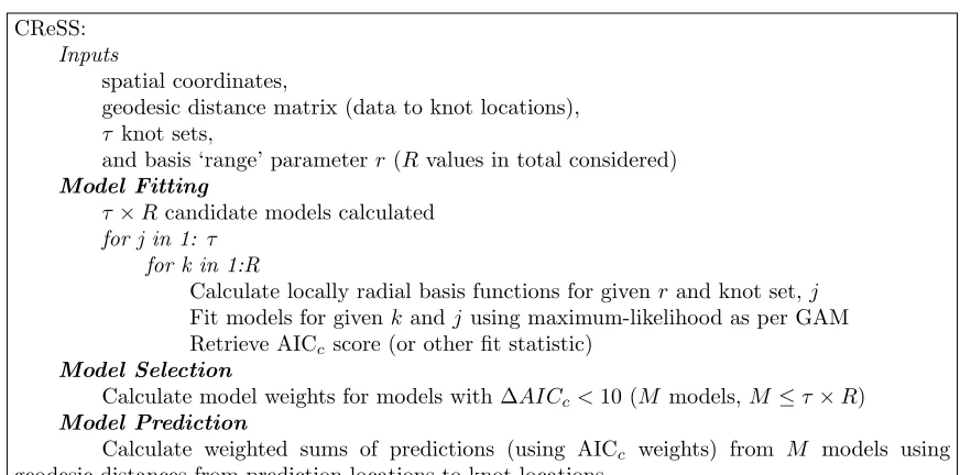
3.4 Pseudocode outlining the structure of CReSS. . . 60
3.5 The underlying function on the horseshoe region, first seen in Ramsay [2002]. 63
3.6 Boxplots of MSE scores for 100 simulations on the horseshoe (a) Low noise (σ = 0.5), (b) Medium noise (σ = 9) and (c) High noise (σ = 50). . . 66 3.7 Bias for low noise, (a) TPS, (b) GLTPS, (c) SOAP and (d) CReSS . . . 67
3.8 Bias for medium noise, (a) TPS, (b) GLTPS, (c) SOAP and (d) CReSS . . 68
3.9 Bias for high noise, (a) TPS, (b) GLTPS, (c) SOAP and (d) CReSS . . . . 69
3.10 Distribution of parameterr chosen using 100 simulation realisations for (a) low, (b) medium and (c) high noise levels. The allowed choice of r ranged from 2 to 10,000. . . 71
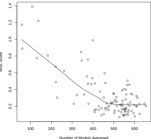
3.11 Variation in MSE with the number of models averaged. The line represents a locally weighted polynomial regression smooth of the data. The total number of models that could be averaged is 2546. . . 72
4.2 Boxplots of MSE (left) and CV scores (right) for 100 simulations on the palm function. (a, b) Low noise (σ = 0.5), (c, d) Medium noise (σ = 9) and (e, f) High noise (σ = 50) . . . 83 4.3 Bias for low noise a) TPS, (b) GLTPS, (c) SOAP and (d) CReSS . . . 84 4.4 Bias for medium noise (a) TPS, (b) GLTPS, (c) SOAP and (d) CReSS . . . 85 4.5 Bias for high noise, (a) TPS, (b) GLTPS, (c) SOAP and (d) CReSS . . . . 86 4.6 Example predictions for medium noise, (a) TPS, (b) GLTPS, (c) SOAP, (d)
CReSS (iteration 80) . . . 87 4.7 Distribution of parameter r chosen using 100 realisations of the simulation
for (a) medium and (b) high noise levels. Results from the low noise trials are not shown because only two different r’s were ever chosen. The allowed choice ofr ranged from 2 to 10,000. . . 89 4.8 Variation in MSE with the number of models averaged for models fitted to
high noise. The points represent how many models were averaged and the resulting MSE score for each of the 100 simulation realisations. The line represents a locally weighted polynomial regression smooth of the data. The total number of models that could be averaged is 2546. . . 90 4.9 Boxplots of MSE (left) and CV scores (right) for 100 simulations on the data
sparse palm function. (a, b) Low noise (σ = 0.5), (c, d) Medium noise (σ
= 9) and (e, f) High noise (σ = 50). The plots for low/medium noise have been limited on the y-axis for ease of viewing (MSE, low: GLTPS (1 point at 4000) and SOAP (2 points at 80,000). MSE, medium: GLTPS (1 point at 3000) and SOAP (1 point at 2000). CV, low SOAP (1 point at 15,000) and CReSS (2 points at 7000). CV, medium: SOAP (1 point at 1000)). . . 94 4.10 Bias for data sparse low noise a) TPS, (b) GLTPS, (c) SOAP and (d) CReSS 95
4.12 Bias for data sparse high noise, (a) TPS, (b) GLTPS, (c) SOAP and (d) CReSS 97 4.13 Example predictions for low noise, (a) TPS, (b) GLTPS, (c) SOAP, (d)
CReSS (iteration 20) . . . 98 4.14 Distribution of parameter r chosen using 100 realisations of the simulation
for (a) low, (b) medium and (c) high noise levels. The allowed choice of r
ranged from 2 to 10,000. . . 100 4.15 Variation in the MSE score with the number of models averaged. The points
represent how many models were averaged and the resulting MSE score for each of the 100 simulation realisations. The line represents a locally weighted polynomial regression smooth of the data. The total number of models that could be averaged is 2010. . . 101 4.16 Figure 3 from Ashe et al. [2010] showing the predicted probability of feeding
by SRKW. The box to the south of San Juan Island has since been proposed as an MPA to protect killer whales feeding. . . 106 4.17 Raw proportions for (a) feeding/non-feeding, (b) travel or forage/ not travel
or forage, (c) socialising/non-socialising and (d) resting/not resting of killer whales off the West coast of the USA/Canada. The grid cell size is approxi-mately 1 km2. . . 108 4.18 Auto-correlation plots for the killer whale feeding model residuals. (a) The
mean correlation across panels for each time lag. (b) The correlation for each individual panel, where each line is a panel. . . 112 4.19 Parameterr and knot number of the models in the candidate model set. . . 117 4.20 Fitted values (a) and (b) and predictions (c) and (d) for the probability of
feeding (1=feeding, 0=not feeding). The probability cut-off for (b) and (d) is 0.246. . . 119
is 0.246. . . 120
4.22 CReSS predictions for the probability of feeding (1=feeding, 0=not feeding) using the threshold values in Ashe et al. [2010]. . . 121
4.23 Predictions for probability of feeding using the 0/1 threshold (a), the Ashe thresholds (b) and 95% confidence intervals for the probability of feeding (1=feeding, 0=not feeding) (c) and (d). . . 123
5.1 An illustration of fitting smoother-based methods with a single smoothness parameter. (a) the underlying function with noisy data overlaid (red points). (b) a GAM model fitted to the noisy data using five degrees of freedom and (c) a GAM model fitted with 75 degrees of freedom. . . 132
5.2 Pseudocode outlining the structure of SALSA2D (adapted from Figure 1 Walker et al. [2010]), where T is the number of knots used for fitting. . . 133 5.3 Predictions for (a) AdaptFit and (b) CReSS-SALSA2D from one simulation
realisation (n=500) at medium noise. . . 138
5.4 (a, c, d) Boxplots of differences in MSE score between CReSS and SALSA2D. A positive number represents a better model fit for CReSS-SALSA2D. (b, d, f) on the right are bias plots for CReSS-CReSS-SALSA2D. (a and b) Low noise* (σ = 0.5), (c, d) Medium noise (σ = 9) and (e, f) High noise (σ = 50). * The low noise figure represents only 99 simulations. One extreme case was removed for better comparison. . . 141
5.5 The low noise simulation realisation that results in a very bad prediction MSE score. The surface represents the predicted values based upon the model chosen. The grey dots are the data points, the black dots are the knots chosen by CReSS-SALSA2D. . . 142
in CReSS and red circles are spatially adaptive knot locations chosen using CReSS-SALSA2D. . . 142
5.7 Distribution of parameter r chosen using 100 simulation realisations for (a) low, (b) medium and (c) high noise levels. The allowed choice of r ranged from 2 to 5. If eachr was averaged for all knot numbers in every realisation, the frequency would be 300. . . 144
5.8 Variation in the MSE score with the number of models averaged. The line represents a locally weighted polynomial regression smooth of the data. The total number of models that could be averaged is 21. . . 145
6.1 SCANS-I (left) and II (right) results for harbour porpoise (top) and minke whale (bottom). Figures taken from Hammond et al. [2013]. . . 157
6.2 Effort across all years for harbour porpoise (a) and minke whales (b) available in the JCP resource. . . 160
6.3 An overview of the data collation (orange), modelling process (blue) and uncertainty estimation (red) for analysis of the JCP data resource. . . 162
6.4 The relationship between each covariate and harbour porpoise counts per km2
(den-sity on they-axis); (a) Year, (b) Day of the Year, (c) Depth, (d) Slope and (e) Sea
surface temperature. The plots show a cubic B-spline (or cyclic cubic in the case
of DoY) with GEE-based 95% confidence intervals (grey shading) for each
covari-ate. The tick marks at the bottom show the distribution of the data and the grey
dashed lines show the location of the knots. Three internal knots were selected by
SALSA1D for each covariate. . . 172
ing and Northing in the harbour porpoise model. . . 173 6.6 Predicted harbour porpoise densities for summer (day 227) in 1994. (a) The
estimated raw densities for summers in 1994 - 1996 that are drawn upon to make predictions for 1994. (b) Point estimates of harbour porpoise density. (c) and (d) are the lower and upper 95% GEE based percentile intervals. . . 174 6.7 Predicted harbour porpoise densities for summer (day 227) in 2005. (a) The
estimated raw densities for summers in 2004 - 2006 that are drawn upon to make predictions for 2005. (b) Point estimates of harbour porpoise density. (c) and (d) are the lower and upper 95% GEE based percentile intervals. . . 175 6.8 Predicted harbour porpoise densities for summer (day 227) in 2010. (a) The
estimated raw densities for summers in 2008 - 2010 that are drawn upon to make predictions for 2010. (b) Point estimates of harbour porpoise density. (c) and (d) are the lower and upper 95% GEE based percentile intervals. . . 176 6.9 (a) The estimated raw densities for summers in 2003 - 2004 and (b) the
estimated raw densities for summers in 2006 - 2007. . . 177 6.10 Harbour porpoise densities and predicted densities for 2010 in winter (top)
and spring (bottom). The plots on the left are the estimated raw densities for winter or spring in 2008 - 2010 that are drawn upon to make predictions for 2010. The plots on the right are predictions for 2010 in winter and spring. Plots of confidence intervals for these estimates are in Appendix D. . . 178 6.11 Harbour porpoise densities and predicted densities for 2010 in summer (top)
and autumn (bottom). The plots on the left are the estimated raw densities for summer or autumn in 2008 - 2010 that are drawn upon to make predictions for 2010. The plots on the right are predictions for 2010 in summer and autumn. Plots of confidence intervals for these estimates are in Appendix D. 179
the Kattegat and Skagarrak to the east of 8.2 x 10⁵ Easting due to very high uncertainty in this region for 2010. Red lines are 95% GEE based percentile intervals from the parametric bootstrap process (Figure 6.3). . . 180
6.13 The relationship between each covariate and minke whale counts per km2 (density
on the y-axis); (a) Year, (b) Day of the Year, (c) Depth, (d) Slope and (e) Sea
surface temperature. The plots show a cubic B-spline (or cyclic cubic in the case of
DoY) with GEE-based 95% confidence intervals (grey shading) for each covariate.
The tick marks at the bottom show the distribution of the data and the grey dashed
lines show the location of the knots. Three internal knots were selected by SALSA
for each covariate exceptYear which had only one. . . 183
6.14 A map of the study area showing the prediction grid (grey points) and the knot locations chosen by SALSA2D for the two dimensional smooth of
East-ing and Northing in the minke whale model. . . 184
6.15 Predicted minke whale densities for summer (day 227) in 1994. (a) The estimated raw densities for all years. (b) Point estimates of minke whale density. (c) and (d) are the lower and upper 95% GEE based percentile intervals. . . 185 6.16 Predicted minke whale densities for summer (day 227) in 2005. (a) The
estimated raw densities for all years. (b) Point estimates of minke whale density. (c) and (d) are the lower and upper 95% GEE based percentile intervals. . . 186 6.17 Predicted minke whale densities for summer (day 227) in 2010. (a) The
estimated raw densities for all years. (b) Point estimates of minke whale density. (c) and (d) are the lower and upper 95% GEE based percentile intervals. . . 187
years. The plots on the right are predictions for 2010 in winter and spring. Plots of confidence intervals for these estimates are in Appendix D. . . 188
6.19 Minke whale densities for 2010 in summer (top) and autumn (bottom). The plots on the left are the estimated raw densities for summer or autumn in all years. The plots on the right are predictions for 2010 in summer and autumn. Plots of confidence intervals for these estimates are in Appendix D. 189
6.20 Minke whale predictions of relative abundance summed over the whole survey area for each year in the summer (day 227). Red lines are 95% GEE based percentile intervals from the parametric bootstrap process (Figure 6.3). . . 190
6.21 Proposed MPA sites and search locations for Scottish territorial waters as of 2012. Image taken from a Marine Scotland report [Marine-Scotland, 2011]. 205
7.1 A one dimensional example of two overlapping density surfaces for updating; (a) the existing surface (black) and the new survey results (blue). (b) The mean (weighted by uncertainty) of the two sets of data points (red crosses), shown at the resolution of the new survey data and extended by a buffer into the area covered by existing data. (c) a kernel smooth (black line) with varying bandwidth of the red cross data. The y-axis is density and the x-axis is location. . . 214
7.2 Overview of the structure of DCAP. . . 221
7.3 Visual depiction of the weights of one coordinate. The box depicts an area 3h
x 3hwithin which points have influence on the estimate of ˆyi(the coordinate
at the centre of the box) . . . 223
left and right respectively and represent the number of grid points the buffer zone extends to on a particular edge of the squared off survey area. . . 225
7.5 An example of smoothing parameters, h1 (a) and h2 (b) using test case 2e
(see section 7.3.2). The buffer zone has dimensions t=3, r=1, b=6 and l=7. 227
7.6 An example of the results of applying the combining and smoothing procedures of
DCAP to the results of a survey off the west coast of Ireland and Scotland. (a) The
existing and new survey densities shown on a Latitude and Longitude grid, (b) the
combined densities overlaid on the existing data grid, (c) the area of survey (black)
squared off (red) at the resolution of the survey, (d) squared survey area with buffer
zone and (e) the combined density surface smoothed into a buffer and embedded in
the existing un-updated density surface. . . 228
7.7 An example of the combining and smoothing procedure of DCAP where the new data come from a survey close to the coast (ID: 1d). (a) The existing density surface, (b) the surface produced by combining the new survey data and the existing surface and (c) the smoothed, combined density surface. Note: the apparent gap in the survey data in (a) is a plotting artifact due to the presence of land. . . 235
C.1 Seafloor baythmetry map for the San Juan Islands area taken from Greene et al. [2007] . . . 270
D.1 Harbour porpoise density data for all years in (a) winter, (b) spring, (c) summer and (d) autumn. 16% of data was collected in winter, 29% in spring, 41% in summer and 14% in autumn. . . 272
point estimates of harbour porpoise density for winter 2010, (c) and (d) are the lower and upper 95% GEE based percentile intervals. . . 273
D.3 Harbour porpoise densities for 2010 in spring. (a) The raw densities for spring in 2008 - 2010 that are drawn upon to make predictions for 2010, (b) point estimates of harbour porpoise density for spring 2010, (c) and (d) are the lower and upper 95% GEE based percentile intervals. . . 274
D.4 Harbour porpoise densities for 2010 in summer. (a) The raw densities for summer in 2008 - 2010 that are drawn upon to make predictions for 2010, (b) point estimates of harbour porpoise density for summer 2010, (c) and (d) are the lower and upper 95% GEE based percentile intervals. . . 275
D.5 Harbour porpoise densities for 2010 in autumn. (a) The raw densities for autumn in 2008 - 2010 that are drawn upon to make predictions for 2010, (b) point estimates of harbour porpoise density for autumn 2010, (c) and (d) are the lower and upper 95% GEE based percentile intervals. . . 276
D.6 Minke whale densities for 2010 in winter. (a) The raw densities for winter in 2008 - 2010 that are drawn upon to make predictions for 2010, (b) point estimates of minke whale density for winter 2010, (c) and (d) are the lower and upper 95% GEE based percentile intervals. . . 277
D.7 Minke whale densities for 2010 in spring. (a) The raw densities for spring in 2008 - 2010 that are drawn upon to make predictions for 2010, (b) point estimates of minke whale density for spring 2010, (c) and (d) are the lower and upper 95% GEE based percentile intervals. . . 278
estimates of minke whale density for summer 2010, (c) and (d) are the lower and upper 95% GEE based percentile intervals. . . 279
D.9 Minke whale densities for 2010 in autumn. (a) The raw densities for autumn in 2008 - 2010 that are drawn upon to make predictions for 2010, (b) point estimates of minke whale density for autumn 2010, (c) and (d) are the lower and upper 95% GEE based percentile intervals. . . 280
E.1 Predicted harbour porpoise densities for summer (day 227) in 1994. (a) The raw densities for summers in 1994 - 1995 that are drawn upon to make predictions for 1994. (b) Point estimates of harbour porpoise density. (c) and (d) are the lower and upper 95% GEE based percentile intervals. . . 282
E.2 Predicted harbour porpoise densities for summer (day 227) in 1995. (a) The raw densities for summers in 1994 - 1996 that are drawn upon to make predictions for 1995. (b) Point estimates of harbour porpoise density. (c) and (d) are the lower and upper 95% GEE based percentile intervals. . . 283
E.3 Predicted harbour porpoise densities for summer (day 227) in 1996. (a) The raw densities for summers in 1995 - 1997 that are drawn upon to make predictions for 1996. (b) Point estimates of harbour porpoise density. (c) and (d) are the lower and upper 96% GEE based percentile intervals. . . 284
E.4 Predicted harbour porpoise densities for summer (day 227) in 1997. (a) The raw densities for summers in 1996 - 1998 that are drawn upon to make predictions for 1997. (b) Point estimates of harbour porpoise density. (c) and (d) are the lower and upper 97% GEE based percentile intervals. . . 285
predictions for 1998. (b) Point estimates of harbour porpoise density. (c) and (d) are the lower and upper 98% GEE based percentile intervals. . . 286
E.6 Predicted harbour porpoise densities for summer (day 227) in 1999. (a) The raw densities for summers in 1998 - 2000 that are drawn upon to make predictions for 1999. (b) Point estimates of harbour porpoise density. (c) and (d) are the lower and upper 99% GEE based percentile intervals. . . 287
E.7 Predicted harbour porpoise densities for summer (day 227) in 2000. (a) The raw densities for summers in 1999 - 2001 that are drawn upon to make predictions for 2000. (b) Point estimates of harbour porpoise density. (c) and (d) are the lower and upper 95% GEE based percentile intervals. . . 288
E.8 Predicted harbour porpoise densities for summer (day 227) in 2001. (a) The raw densities for summers in 2000 - 2002 that are drawn upon to make predictions for 2001. (b) Point estimates of harbour porpoise density. (c) and (d) are the lower and upper 95% GEE based percentile intervals. . . 289
E.9 Predicted harbour porpoise densities for summer (day 227) in 2002. (a) The raw densities for summers in 2001 - 2003 that are drawn upon to make predictions for 2002. (b) Point estimates of harbour porpoise density. (c) and (d) are the lower and upper 95% GEE based percentile intervals. . . 290
E.10 Predicted harbour porpoise densities for summer (day 227) in 2003. (a) The raw densities for summers in 2002 - 2004 that are drawn upon to make predictions for 2003. (b) Point estimates of harbour porpoise density. (c) and (d) are the lower and upper 95% GEE based percentile intervals. . . 291
predictions for 2004. (b) Point estimates of harbour porpoise density. (c) and (d) are the lower and upper 95% GEE based percentile intervals. . . 292
E.12 Predicted harbour porpoise densities for summer (day 227) in 2005. (a) The raw densities for summers in 2004 - 2006 that are drawn upon to make predictions for 2005. (b) Point estimates of harbour porpoise density. (c) and (d) are the lower and upper 95% GEE based percentile intervals. . . 293
E.13 Predicted harbour porpoise densities for summer (day 227) in 2006. (a) The raw densities for summers in 2005 - 2007 that are drawn upon to make predictions for 2006. (b) Point estimates of harbour porpoise density. (c) and (d) are the lower and upper 95% GEE based percentile intervals. . . 294
E.14 Predicted harbour porpoise densities for summer (day 227) in 2007. (a) The raw densities for summers in 2006 - 2008 that are drawn upon to make predictions for 2007. (b) Point estimates of harbour porpoise density. (c) and (d) are the lower and upper 95% GEE based percentile intervals. . . 295
E.15 Predicted harbour porpoise densities for summer (day 227) in 2008. (a) The raw densities for summers in 2007 - 2009 that are drawn upon to make predictions for 2008. (b) Point estimates of harbour porpoise density. (c) and (d) are the lower and upper 95% GEE based percentile intervals. . . 296
E.16 Predicted harbour porpoise densities for summer (day 227) in 2009. (a) The raw densities for summers in 2008 - 2010 that are drawn upon to make predictions for 2009. (b) Point estimates of harbour porpoise density. (c) and (d) are the lower and upper 95% GEE based percentile intervals. . . 297
predictions for 2010. (b) Point estimates of harbour porpoise density. (c) and (d) are the lower and upper 95% GEE based percentile intervals. . . 298
E.18 Predicted minke whale densities for summer (day 227) in 1994. (a) The raw densities for summers in 1994 - 1995 that are drawn upon to make predictions for 1994. (b) Point estimates of minke whale density. (c) and (d) are the lower and upper 95% GEE based percentile intervals. . . 300
E.19 Predicted minke whale densities for summer (day 227) in 1995. (a) The raw densities for summers in 1994 - 1996 that are drawn upon to make predictions for 1995. (b) Point estimates of minke whale density. (c) and (d) are the lower and upper 95% GEE based percentile intervals. . . 301
E.20 Predicted minke whale densities for summer (day 227) in 1996. (a) The raw densities for summers in 1995 - 1997 that are drawn upon to make predictions for 1996. (b) Point estimates of minke whale density. (c) and (d) are the lower and upper 96% GEE based percentile intervals. . . 302
E.21 Predicted minke whale densities for summer (day 227) in 1997. (a) The raw densities for summers in 1996 - 1998 that are drawn upon to make predictions for 1997. (b) Point estimates of minke whale density. (c) and (d) are the lower and upper 97% GEE based percentile intervals. . . 303
E.22 Predicted minke whale densities for summer (day 227) in 1998. (a) The raw densities for summers in 1997 - 1999 that are drawn upon to make predictions for 1998. (b) Point estimates of minke whale density. (c) and (d) are the lower and upper 98% GEE based percentile intervals. . . 304
for 1999. (b) Point estimates of minke whale density. (c) and (d) are the lower and upper 99% GEE based percentile intervals. . . 305
E.24 Predicted minke whale densities for summer (day 227) in 2000. (a) The raw densities for summers in 1999 - 2001 that are drawn upon to make predictions for 2000. (b) Point estimates of minke whale density. (c) and (d) are the lower and upper 95% GEE based percentile intervals. . . 306
E.25 Predicted minke whale densities for summer (day 227) in 2001. (a) The raw densities for summers in 2000 - 2002 that are drawn upon to make predictions for 2001. (b) Point estimates of minke whale density. (c) and (d) are the lower and upper 95% GEE based percentile intervals. . . 307
E.26 Predicted minke whale densities for summer (day 227) in 2002. (a) The raw densities for summers in 2001 - 2003 that are drawn upon to make predictions for 2002. (b) Point estimates of minke whale density. (c) and (d) are the lower and upper 95% GEE based percentile intervals. . . 308
E.27 Predicted minke whale densities for summer (day 227) in 2003. (a) The raw densities for summers in 2002 - 2004 that are drawn upon to make predictions for 2003. (b) Point estimates of minke whale density. (c) and (d) are the lower and upper 95% GEE based percentile intervals. . . 309
E.28 Predicted minke whale densities for summer (day 227) in 2004. (a) The raw densities for summers in 2003 - 2005 that are drawn upon to make predictions for 2004. (b) Point estimates of minke whale density. (c) and (d) are the lower and upper 95% GEE based percentile intervals. . . 310
for 2005. (b) Point estimates of minke whale density. (c) and (d) are the lower and upper 95% GEE based percentile intervals. . . 311
E.30 Predicted minke whale densities for summer (day 227) in 2006. (a) The raw densities for summers in 2005 - 2007 that are drawn upon to make predictions for 2006. (b) Point estimates of minke whale density. (c) and (d) are the lower and upper 95% GEE based percentile intervals. . . 312
E.31 Predicted minke whale densities for summer (day 227) in 2007. (a) The raw densities for summers in 2006 - 2008 that are drawn upon to make predictions for 2007. (b) Point estimates of minke whale density. (c) and (d) are the lower and upper 95% GEE based percentile intervals. . . 313
E.32 Predicted minke whale densities for summer (day 227) in 2008. (a) The raw densities for summers in 2007 - 2009 that are drawn upon to make predictions for 2008. (b) Point estimates of minke whale density. (c) and (d) are the lower and upper 95% GEE based percentile intervals. . . 314
E.33 Predicted minke whale densities for summer (day 227) in 2009. (a) The raw densities for summers in 2008 - 2010 that are drawn upon to make predictions for 2009. (b) Point estimates of minke whale density. (c) and (d) are the lower and upper 95% GEE based percentile intervals. . . 315
E.34 Predicted minke whale densities for summer (day 227) in 2010. (a) The raw densities for summers in 2009 - 2010 that are drawn upon to make predictions for 2010. (b) Point estimates of minke whale density. (c) and (d) are the lower and upper 95% GEE based percentile intervals. . . 316
2000 that are drawn upon to make predictions. (top right) Point estimates of harbour porpoise density. (bottom left) and (bottom right) are the lower and upper 95% GEE based percentile intervals. . . 318
F.2 Predicted harbour porpoise densities for summer (day 227) in reporting period two (20012006). (top left) The raw densities for summers in 2001 -2006 that are drawn upon to make predictions. (top right) Point estimates of harbour porpoise density. (bottom left) and (bottom right) are the lower and upper 95% GEE based percentile intervals. . . 319
F.3 Predicted harbour porpoise densities for summer (day 227) in reporting period three (20072010). (top left) The raw densities for summers in 2007 -2010 that are drawn upon to make predictions. (top right) Point estimates of harbour porpoise density. (bottom left) and (bottom right) are the lower and upper 95% GEE based percentile intervals. . . 320
F.4 Predicted minke whale densities for summer (day 227) in reporting period one (1994-2000). (top left) The raw densities for summers in 1994 - 2000 that are drawn upon to make predictions. (top right) Point estimates of minke whale density. (bottom left) and (bottom right) are the lower and upper 95% GEE based percentile intervals. . . 321
F.5 Predicted minke whale densities for summer (day 227) in reporting period two (2001-2006). (top left) The raw densities for summers in 2001 - 2006 that are drawn upon to make predictions. (top right) Point estimates of minke whale density. (bottom left) and (bottom right) are the lower and upper 95% GEE based percentile intervals. . . 322
that are drawn upon to make predictions. (top right) Point estimates of minke whale density. (bottom left) and (bottom right) are the lower and upper 95% GEE based percentile intervals. . . 323
G.1 Map of UK shipping forecast areas taken from www.metoffice.gov.uk . . . . 326
3.1 Horseshoe Simulation settings. The Gaussian noise (σ) is taken from a N(0, σ2) distribution and added to P realisations of the Horseshoe function values. Each realisation is of sizen. The selection criteria are specific to each method and chosen based on authors recommendations. . . 64
3.2 Mean MSE scores and standard deviation for all methods at all noise levels on the horseshoe simulation. A * indicates the MSE results of a method are significantly better than SOAP (p <0.05; Wilcoxon paired signed rank test), a † indicates that the results for SOAP are significantly better. The bold scores represent the best average for each statistic at each noise level. . . . 65
3.3 Parameter choices made by CReSS for each of the three noise levels averaged over 100 simulation realisations. The parameters include the mean number of models averaged per realisation, the mean for parameter r and the mean number of knots. Numbers in brackets show the minimum and maximum. . 70
4.1 The benchmark surface,F, seen in Figure 4.1 is defined by functions for each region as shown. We denote the geodesic distance between two pointsx1 and
x2 as d(x1, x2). The leftmost red dot at coordinate (2,5) we denote by L.
realisation is of sizen. The selection criteria are specific to each method and chosen based on authors recommendations. . . 79 4.3 Mean MSE scores and standard deviation (sd) for all methods at all noise
levels for the palm simulation using 500 data points. A * indicates the MSE results of a method are significantly better than SOAP (p <0.05, Wilcoxon signed rank test), a † indicates that the results for SOAP are significantly better. The bold scores indicate the best average for each statistic at each noise level. . . 80 4.4 Parameter choices made by CReSS for each of the three noise levels averaged
over 100 simulation realisations. The parameters include the mean number of models averaged per realisation, the mean for parameter r and the mean number of knots. Numbers in brackets show the minimum and maximum. . 88 4.5 Mean and median MSE scores and standard deviation (sd) for all methods at
all noise levels for the palm simulation using 100 data points. A * indicates the MSE results of a method are significantly better than SOAP (p < 0.05, Wilcoxon signed rank test), a † indicates that the results for SOAP are sig-nificantly better. The bold scores indicate the best average for each statistic at each noise level. . . 91 4.6 Parameter choices made by CReSS for each of the three noise levels averaged
over 100 realisations of the simulation. The parameters include the mean number of models averaged per realisation, the mean for parameter r and the mean number of knots. Numbers in brackets show the minimum and maximum. . . 99 4.7 The output of a confusion matrix. . . 116 4.8 Confusion matrix for the averaged models. . . 118
5.1 MSE scores for three different methods from one simulation realisation (n=500) at medium noise. . . 137 5.2 Mean and Median MSE scores and standard deviation for SALSA2D at all
noise levels for the palm simulation. Low* represents results with one prob-lematic realisation removed and is therefore for 99 simulations. Results of a wilcoxon signed rank test are represented by ∗ and †, where ∗ indicates CReSS-SALSA2D was significantly better than CReSS and †, CReSS was significantly better. . . 140 5.3 Parameter choices made by CReSS-SALSA2D for each of the three noise
levels averaged over 100 simulation realisations. The parameters include the mean number of models averaged per realisation, the mean for parameter r
and the mean number of knots. Numbers in brackets show the minimum and maximum. . . 143
6.1 Models from the SCANS-I (year 1994) and SCANS-II (year 2005) surveys re-lating harbour porpoise and minke whale density to environmental covariates [Hammond et al., 2013]. Models were fitted usinggamfrom themgcvpackage in R[Wood, 2006]. All spatial smooths were restricted to a maximum of 14 degrees of freedom and other covariate smooths to a maximum of 5. . . 155 6.2 Table of model parameters for the JCP analysis for both harbour porpoise
and minke whale. . . 165 6.3 Table showing the best selected model, based on BIC, for each species. bs =
B-spline, cc = cyclic cubic and CR = CReSS basis. The numbers in brackets are the number of knots selected (fordf one additionaldf for each boundary knot). X and Y represent the covariatesEasting andNorthing and the order of covariates is the order in which they entered the model. . . 169
model contains a single covariate. . . 170 6.5 Order of the best single covariate predictors for the minke whale data. Order
is calculated based on BIC scores for each of the models. . . 181 6.6 Table of main differences in the spatial density modelling between JCP phases
I and II [Paxton and Thomas, 2010, Paxton et al., 2011]. If unspecified, the covariates were fitted using cubic B-splines. . . 195
7.1 Survey test data used to assess the performance of the DCAP algorithm. * The northern and southern longitude limit is 60o. S and D indicate whether the survey input is a stratified surface or a density surface. + SCANS-II is the Small Cetacean Abundance survey in the North Sea - phase II. . . 230 7.2 Timings for the DCAP algorithm for three data sets of increasing spatial
resolution. . . 234
A.1 Index of Acronyms . . . 257 A.2 Index of Notation . . . 259
J.1 DCAP log. All timings relate to use of a computer with the following speci-fications: Windows Dual Core, 2.40 GHz CPU, 2.00 GB RAM. . . 336
[image:39.612.90.506.118.497.2]General Introduction
The most common definition of ecology is the study of the distribution and abundance of organisms [Andrewartha and Birch, 1954]. For hundreds of years, biologists have con-ducted field studies to determine the distribution of plants and animals, yet little is known about this for many species. This is, in part, because the fieldwork required to obtain this information takes time, costs money, tends only to occur in accessible areas and rarely covers the entire range of a species. Even when appropriate data have been collected, sum-marising these data and providing a clear insight into the factors which may determine the distribution of a species remains a challenging task.
Species Distribution Modelling (SDM) has provided a set of analytical tools that can be used to create models of a species distribution using the environmental characteristics of the locations where it is known to be present (and, sometimes, where it is absent). These models, which are usually statistical in nature, can be used to extrapolate species distributions to unsurveyed areas and to document changes in distribution over time. If the fit between the model predictions and the species’ distribution is good, the model can also provide insight into the species’ environmental tolerances or habitat preferences. SDM also allows the opportunity for prediction to locations or time-scales not surveyed.
The term SDM has been applied to both niche modelling [e.g. Rotenberry et al., 2006]
and habitat suitability or distribution modelling [e.g. Hirzel and Le Lay, 2008, Guisan and Zimmerman, 2000]. An ecological niche is the ecological role and space that an organism fills in an ecosystem, and niche modelling attempts to identify the characteristics of this niche. Niche models may estimate:
• a species fundamental (or potential) niche, which is the full range of environmental conditions and resources it can occupy and use;
• its realised (or actual) niche, which is the part of the fundamental niche that an organism currently occupies as a result of limiting factors, such as competition;
• or its climatic niche, the area in which the climate is suitable for the species to succeed.
Habitat suitability modelling is based on the concept of a resource selection function, which describes the factors which determine the probability that a species will occur in a particular habitat [Manly et al., 2002]. In practice, these functions can relate the probability of occurrence to one or more environmental covariates.
Franklin [1995] describes SDM as “geographical modelling of biospatial patterns in re-lation to environmental gradients”, and it is the definition I have adopted for this thesis. It encompasses bothspecies distribution modelling and predictive [distribution]mapping.
SDM is generally applied to presence data because much of the historical data from observational studies or taxonomic records was of this type. However, many studies are now designed to record both species absences and presences at a given location, and, in some cases, the number of individuals of each species. SDM uses models to link, usually sparse, data on species occurrence and abundance with data on environmental covariates, which is often plentiful. There are three main modelling approaches:
covariates at a given location are compared with the values of those covariates ob-served at locations where the species is known to occur, and this comparison is used to determine the suitability of a habitat. One example of this approach is climate envelope modelling, which is based on the climatic niche of a species [Elith et al., 2006]. Geographic models use the location of occurrence points, but not the value of environmental covariates at these locations. The probability of occurrence at a particular point is assumed to be related to the distance of that point from the closest known presence point. Geographic models are not commonly used in SDM because they only describe the survey data itself and have limited predictive ability.
• Regression methods (which use presence/absence or count data) include Generalised Linear Models [GLMs; e.g. Guisan et al., 2002, McCullagh and Nelder, 1989] and Generalised Additive Models [GAMs; e.g. Embling et al., 2010, Hastie and Tibshirani, 1990]. Regression methods assume a continuous relationship between the response data and a set of environmental covariates.
presence-only data. Further information on machine learning methods can be found in Hastie et al. [2009] and Breiman [2001].
1.1
Why map species distribution?
Distribution maps generated by SDM can be used to:
• improve understanding of the ecology of a species,
• predict species occurrence at locations where survey data are lacking,
• assist in conservation planning and reserve design,
• assess a species’ status by comparing past and current maps,
• predict the effects of climate change,
• evaluate the potential impacts of invasive species, to develop ecological restoration programmes,
• and to carry out environmental impact and risk analyses [Franklin and Miller, 2009].
One of the earliest examples of the application of SDM dates back to 1924, when John-ston (cited in Guisan and Thuiller [2005]) used it to predict the spread of the invasive cactus (Opuntia sp.) in Australia using correlations between the species’ distribution and climate-related covariates. According to Guisan and Zimmerman [2000] and Zimmermann et al. [2010] the use of computers in SDM began in the 1970s when, for example, Nix (1977) made niche-based predictions of the spatial distribution of crop species in Australia [Nix et al., 1977].
some thought about the nature of the species’ response. As with most modelling, there is a trade-off between optimising accuracy and optimising generality (i.e. fitting a model perfectly to the data vs finding the underlying function that generated the data). They propose a framework for building an SDM [Figure 1 in Guisan and Zimmerman, 2000] that involves identifying a conceptual model based on the literature or laboratory experiments, this model is then used to inform both sampling design and statistical formulation. A formal version of the model is then fitted to the data, diagnostics are checked, predictions made and model performance evaluated. The same general framework was used in this thesis to analyse the datasets in Chapters 4 and 6.
An international workshop on SDM in 2000 resulted in two special issues of journals, one on the technical aspects of predictive habitat modelling using GLMs and GAMs [Guisan et al., 2002], and the other on the applications of SDM to a variety of terrestrial species data [Lehmann et al., 2002]. The first of these includes papers that discuss the use of GLMs and GAMs for building resource selection functions, whilst others describe the usefulness of these models for zero-inflated datasets that include a higher proportion of zeros than expected, presence-only and remote-sensed data, and problems associated with the incorporation of prediction uncertainties. Some of the applications of SDM in the second special issue include modelling historic distributions, modelling the response of species to climate change, and spatial conservation planning. These are common applications of SDM that are described further in the following sections.
on species distribution at a local scale. The predictions for climate change are likely to be on a coarser scale than those relating to competition or dispersion. In conclusion, Guisan and Thuiller [2005] believe that SDMs should be developed out of a collaboration between different aspects of biology, ecology, statistics and geography to ensure that they are ‘better rooted in ecological theory, more dynamic and multispecific’ .
Ara´ujo and Guisan [2006] identified the additional issues of model parameterisation and model selection. A multitude of modelling techniques can be applied to species distribution data and all will give different results. Additionally, even different implementations of the same technique can give different results. This leads to the issue of model selection, both in terms of which implementation and which covariates to select. Model selection should be based both on biogeographical and ecological theory and how much each covariate explains the distribution of the data. One must also accept that there are likely to be strong drivers of distribution that are unavailable or unknown for use as covariates. The issues of model and parameter selection are discussed further throughout this thesis.
Recently, Hawkins [2012] identified a number of assumptions that are made when analysing spatial data. One of particular interest to this thesis is that spatial (and tempo-ral) autocorrelation is widespread in the data used in SDM, but is often ignored. The main issue is a lack of independence in residuals (a common assumption of regression models), which leads to underestimation of standard errors if correlation is positive, and hence an overestimation of the significance of covariates. As Hawkins points out, this is only an issue if selection is done by significance tests. However, we must also consider that any estimates of the uncertainty associated with results, such as plots of confidence intervals, may be misleading. For example, these will be too narrow if correlation is positive. There is further discussion of autocorrelation and appropriate methods in these cases in Chapters 4 and 6.
individual is known. However, this is an almost impossible task, for highly mobile and/or rare species, such as cetaceans. In practice, the information we have on the distribution of such species is patchy. The distribution of such species can still be estimated using modern statistical techniques, although a lack of understanding of their potential flaws may intro-duce unanticipated biases [Ara´ujo and Guisan, 2006, Potts and Elith, 2006, Hawkins, 2012]. For example, many methods require unlikely assumptions about linearity or the indepen-dence of residuals. Other common problems with data collected on marine species that may lead to unrealistic measures of precision include autocorrelation and overdispersion. Both these issues arise in datasets analysed in this thesis and will be discussed in later chapters.
In the following sections, I describe how SDM can be used for three primary applica-tions: analysing temporal trends, environmental impact assessment, and spatial conserva-tion planning. In each applicaconserva-tion, statistical models that relate species presence/absence or abundance to environmental variables are derived from biological survey data, and these models are then used to fill in gaps in a species’ distribution.
1.2
Temporal Distribution Trends
SDM is often used to create an atlas of species’ distributions [e.g. Reid et al., 2003] or to map potential future distributions, given a change in environmental conditions [e.g. Teixeira and Arntzen, 2002]. A modelling process, which uses dynamic variables as the basis for mapping, enables prediction of trends and is therefore more flexible than simply mapping the occurrence of species.
Range maps showing the presence/absence of species have long been in use by organ-isations such as the British Trust for Ornithology or the Royal Society for the Protection of Birds. These have been used to assess historical changes in distribution and as the basis for predictions of future distributions.
wildlife, with mid-range climate warming scenarios predicting between 15% and 37% of species world-wide will be ‘committed to extinction’ by 2050 [Thomas et al., 2004]. These predictions rely on data about the relationship between species distribution and tempera-ture. For example, Teixeira and Arntzen [2002] simulated the potential impact of climate warming on the range of the Iberian endemic Golden-striped salamander, Chioglossa
lusi-tanica, using distribution models created using GLMs. They produced maps of species
distribution extrapolated to the years 2050 and 2080 (equivalent to a rise in temperature of 2oC and 3oC), which predicted a substantial range reduction. Similarly, Ferrier et al. [2002] used GLMs to study the effect of climate change on biodiversity in northeast New South Wales, Australia and Pearson et al. [2002, 2004] coupled artificial neural networks with a climate-hydrological process model to identify bioclimatic envelopes for plant species in Great Britain. Ara´ujo et al. [2005] used data on the distribution of 116 species of British breeding birds collected over the last 20 years to compare the performance of different methods for predicting shifts in range. They concluded that artificial neural networks and GAMs provided more accurate predictions than GLMs or classification tree analysis.
Lastly, SDMs have become an established tool for identifying locations where invasive species are likely to become established [Andersen et al., 2004] and for predicting the spread of pest and disease organisms [e.g. Kelly and Meentemeyer, 2002].
1.3
Impact Assessment
SDM can play an important role in providing spatially explicit predictions of animal presence before or after the development, and for comparing these distributions.
EIAs have traditionally used a Before-After-Control-Impact design [BACI; Green, 1979, McDonald et al., 2000, Smith, 2002, Fox et al., 2006] in order to determine whether a development has resulted in a significant change in the abundance or distribution of the species likely to be affected. However, it is often difficult to define the area over which a development may have an effect and to find a suitable control area that replicates this. Fur-thermore, BACI designs have little or no power to detect a re-distribution or displacement of animals within an impact area [Underwood, 1992]. It is more realistic to use a Before-After-Gradient (BAG) design [Mainstream, 2009, Barton et al., 2011] which assumes that the effect of a development will decline with increasing distance from the source [Ellis and Schneider, 1997, Morrison et al., 2008], and thus adds some element of spatial structure to the analysis. Displacement and/or habitat loss effects can then be detected [Guillemette and Larsen, 2002]. BACI designed analyses rarely use mapping as an output, but BAG designed analyses use before and after maps to indicate if there has been a re-distribution of the affected species [Petersen et al., 2006, 2011, Barton et al., 2011, Fox et al., 2006], even if the absolute abundance of the species remains the same. Differences in the density estimates can be used to calculate the magnitude of any avoidance effect, not just within the immediate vicinity of the development but also around the edges of the development area. This means there is no need to define a specific ‘impact’ area, as is required for a BACI.
Camphuysen et al. [2004] describe how high resolution large scale mapping of bird den-sities in marine waters is required to assess the potential impact of offshore wind turbine installations. They suggested that spatial and temporal modelling are the most appropri-ate methods for assessing changes in seabird distribution and abundance, weather effects, foraging areas and habitat disturbance and loss.
of the environmental effects of an offshore wind farm in the Nysted area of Denmark. They analysed the distribution of long tailed ducks (Clangula hyemalis) before and after construction using a GAM based model with spatially adaptive smoothing. There was no change in the absolute numbers of ducks in the study area after construction, but the SDM showed a marked decrease in the number of birds within the footprint of the wind farm. They also detected an increase in numbers in deeper waters. Long tailed ducks are known to prefer shallow waters, where they dive for their food [Nilsson, 1972]. Birds that are displaced to deeper water will probably use more energy in diving and may gain less energy from their prey. The re-distribution and subsequent energy budget issue would not have been identified without the help of SDM.
1.4
Spatial Conservation Planning in the Marine
Environ-ment
Results from SDM are often used to develop management frameworks for individual species. These frameworks may include the identification of areas which require protection because the species occurs at high density, or because they are of particular importance to some life history stages [Hoyt, 2012]. Mapping of species distribution plays a particularly important role in the decision making process for the designation of such protected areas [e.g. Embling et al., 2010, Ashe et al., 2010].
Halpern et al. [2008] concluded that “no area [of our oceans] is unaffected by human influence and that a large fraction (41%) is strongly affected by multiple drivers”. The United Nations Environment Programme’s Global Synthesis report suggests that there has been progress in the establishment of Marine Protected Areas (MPAs) in all parts of the world. However, only 1.17% of global ocean surface and 4.32% of continental shelf areas are currently designated MPAs, which falls well short of the 10% target set at the 7thConference
still an urgent need to designate more MPAs.
The UK and Scottish governments have recently begun the process of identifying can-didate MPAs (now known as marine conservation zones in England and Wales) to comply with the Marine Scotland Act (2010) and the Marine and Coastal Access Act (2009; Eng-land and Wales). Prior to this, they had designated Special Areas of Conservation (SACs) for three of the four marine mammal species listed on Annex II of the EU Habitats and Species Directive (92/43/EEC). The UK government uses the International Union for the Conservation of Nature’s (IUCN) definition of an marine conservation zone: “any area of intertidal or subtidal terrain, together with its overlying water and associated flora, fauna, historical and cultural features, which has been reserved by law or other effective means to protect part or all of the enclosed environment”. A variety of other types of protected area, such as marine nature reserves and no-take zones, also fall within this definition. A key aspect of MPAs is that they need to be large enough to be biologically relevant but small enough to be managed in a cost effective way.
Designation of MPAs is best achieved through a multidisciplinary approach [Meffe, 1999]. Hoyt [2012] provided a checklist of twenty points for consideration in identifying good MPAs. Many of these points, such as assessing distribution and abundance, commissioning field studies, and determining critical habitat and prey preferences, are related to a species’ distribution and can be addressed using SDM. However, local laws and policies, stakeholder involvement and human interactions must also be considered.
the result of a long term study (21 years), which suggests that MPAs should be established with a commitment to long term monitoring. It is also important to manage other potential threats to cetaceans such as overfishing, by-catch, pollution and noise.
At least two marine mammal species, the Yangtze River Dolphin (Lipotes vexillifer), in China, and the Vaquita (Phocoena sinus) in the northern Gulf of California, have declined dramatically despite some protection, via the creation of MPAs [Hoyt, 2012]. In both cases, the MPA did not adequately cover the species’ range and bycatch was not sufficiently controlled.
Examples where SDM has been used to select candidate MPAs for marine mammals include the proposal of a site for the endangered southern resident killer whales (Orcinus orca) [Reynolds III et al., 2009] on the west coast of North America [Ashe et al., 2010] and proposed MPAs for harbour porpoise off the west coast of Scotland [Embling et al., 2010]. Ashe et al. [2010] used observations of feeding behaviour to delineate the proposed area, whereas Embling et al. [2010] used animal density. Specifically, Ashe et al. [2010] used a GAM to model the distribution of observations of feeding killer whales in the inshore waters around San Juan Island, Washington State (USA) and adjacent Canadian waters. This model was combined with information on the levels of boat traffic, which may affect feeding behaviour.
Harbour porpoises are the only marine mammal species on Annex II of the 1992 EU Habitats Directive (92/43/EEC) for which the UK government has not designated an SAC. Embling et al. [2010] fitted a GAM to data collected off the west coast of Scotland over a three year period and used this model to identify areas of persistently high relative density of porpoise groups across years.
for Cory shearwater (Calonectris diomedea) and the endangered Cook’s petrel (Pterodroma
cookii) respectively. Rayner et al. [2007] showed that predictive habitat models offer an
improvement on the more traditional population census methodologies for birds.
SDM can provide information on the distribution of species over time through the in-clusion of temporal components. However, as with all statistical models, the accuracy of the resulting models must be taken into consideration. Standard mapping techniques may involve over-simplistic smoothing or violation of standard assumptions, thus introducing biases in the predictions. Furthermore, many studies lack, or have inadequate, estimates of uncertainty.
The chapters that follow focus on the use of SDM for conservation planning and temporal trend assessment. However, the same techniques can also be used for EIA, as described in the Conclusions (Chapter 8).
out by separate groups. That meeting concluded that a dedicated method for combining survey outputs, such as that developed in Chapter 7, would be a useful tool in assessment of turtle distribution off the east coast of the USA.
This thesis focuses on the development of statistical methods, particularly regression based, for mapping the distribution of marine species. However, the methods developed could equally be applied in many other contexts, including terrestrial ecology [e.g. Maggini et al., 2002, Ferrier et al., 2002, Teixeira and Arntzen, 2002] and demographic studies for example, income data from the 1996 Canadian census [Ramsay, 2002] or foreign resident distribution in Italy [Marra et al., 2011].
1.5
Statistical Issues
A problem frequently encountered when producing distribution maps for marine species is the presence of coastlines or islands with complex topography. This complex topography may exclude animals from certain areas, which are referred to here as ‘exclusion zones’. The two case study analyses presented in this thesis (Chapters 4 and 6) are both in regions with complex topography.