by Ujjwal Acharya
A thesis
submitted in partial fulfillment of the requirements for the degree of Master of Science in Computer Science
Boise State University
BOISE STATE UNIVERSITY GRADUATE COLLEGE
DEFENSE COMMITTEE AND FINAL READING APPROVALS
of the thesis submitted by
Ujjwal Acharya
Thesis Title: Leveraging Tiled Display for Big Data Visualization using D3.js Date of Final Oral Examination: 29 June 2018
The following individuals read and discussed the thesis submitted by the student Ujjwal Acharya, and they evaluated his presentation and response to questions during the final oral examination. They found that the student passed the final oral examination.
Steven M. Cutchin, Ph.D. Chair, Supervisory Committee Jerry Alan Fails, Ph.D. Member, Supervisory Committee Maria Soledad Pera, Ph.D. Member, Supervisory Committee Catherine Olschanowsky, Ph.D. Member, Supervisory Committee
iv DEDICATION
v
ACKNOWLEDGEMENTS
I would not have come this far without the support and guidance of many individuals. I would like to express my deepest gratitude to my advisor Dr. Steven Cutchin for his support and guidance in the completion of this thesis. Dr. Cutchin has been extremely helpful, very patient and encouraging during my entire thesis. I have learned much from Dr. Cutchin as my advisor as well as a good friend, and for that, I would always remain indebted to him. I am also indebted to my committee members Dr. Fails, Dr. Pera, and Dr. Olschanowsky for being on my committee, for taking the time to read my thesis report and for their expert advice in my thesis work.
I am also grateful to the department of computer science at Boise State University for providing me a full scholarship for my graduate studies. It would not have been possible to continue my graduate studies without the support from the department and most importantly my advisor Dr. Steven Cutchin. Furthermore, I would also like to thank the participants of the user study for willingly sharing their invaluable time.
vi ABSTRACT
Data visualization has proven effective at detecting patterns and drawing inferences from raw data by transforming it into visual representations. As data grows large, visualizing it faces two major challenges: 1) limited resolution i.e. a screen is limited to a few million pixels but the data can have a billion data points, and 2) computational load i.e. processing of this data becomes computationally challenging for a single node system. This work addresses both of these issues for efficient big data visualization. In the developed system, a High Pixel Density and Large Format display was used enabling the display of fine details on the screen when visualizing data. Apache Spark and Hadoop used in the system allow the computation to be done on a cluster.
vii
TABLE OF CONTENTS
DEDICATION ... iv
ACKNOWLEDGEMENTS ...v
ABSTRACT ... vi
LIST OF TABLES ...x
LIST OF FIGURES ... xi
LIST OF ABBREVIATIONS ... xii
CHAPTER ONE: INTRODUCTION ...1
Background ...1
Research Questions ...5
Thesis Statement ...7
CHAPTER TWO: RELATED WORK ...9
Single Screen Data Visualization Systems ...10
Systems Using Large Format Display ...12
CHAPTER THREE: IMPLEMENTED SYSTEM ...15
Client Side Components ...17
HDLF Display ...17
Data-Driven Documents Package ...18
View Initializer ...20
viii
Server Side Components ...22
Apache Hadoop ...22
Apache Spark ...23
HTTP Server ...24
System Component Interaction ...26
View Partition and Data View Synchronization ...27
Data Partitioning and Streaming ...29
CHAPTER FOUR: EXPERIMENTAL SETUP ...31
Dataset...31
Global Surface Summary of Day ...31
Data Preprocessing...32
CHAPTER FIVE: EVALUATION ...36
Global Wind Flow Simulation ...36
Performance Evaluation ...40
User Study ...50
Questionnaire ...51
Outcome of the User Study ...53
CHAPTER SIX: CONCLUSION AND FUTURE WORK...57
REFERENCES ...59
APPENDIX A ...62
Scientific Equations ...63
The Bernoulli Equation ...63
ix
Coriolis Force...67
Haversine Formula ...68
Intermediate Point ...69
APPENDIX B ...71
Institutional Review Board ...72
x
LIST OF TABLES
Table 1: GSOD Meteorological Elements ... 32 Table 2: Performance evaluation for client-side rendering when visualizing raw text data ... 42 Table 3: Performance evaluation for client-side rendering when visualizing
aggregated text data ... 42 Table 4: Performance evaluation for client-side rendering when visualizing bitmap
xi
LIST OF FIGURES
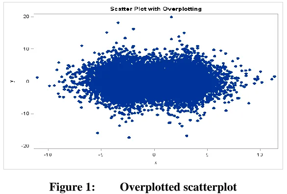
Figure 1: Overplotted scatterplot ... 2
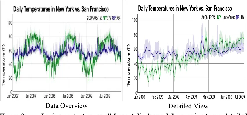
Figure 2: Losing context on small format displays while zooming to see detailed data ... 3
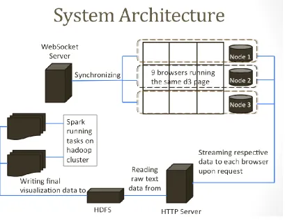
Figure 3: Implemented system architecture ... 15
Figure 4: 3x3 HDLF display used in this thesis ... 17
Figure 5: A typical data visualization created using D3.js ... 19
Figure 6: A typical Spark workflow ... 24
Figure 7: Data creation and streaming in three formats by HTTP Server ... 26
Figure 8: Data partitioning done by Spark ... 29
Figure 9: Preprocessed GSOD data file ... 35
Figure 10: Global wind flow simulation on the Tiled Display Based System ... 37
Figure 11: Global wind flow when the wind has been started from only one station 38 Figure 12: Global wind flow where the wind has been started from five stations ... 38
Figure 13: Global wind flow when panned 40 degrees east ... 39
Figure 14: A closer look at the wind flow on one monitor ... 39
Figure 15: Users working with the single screen system in the user study session ... 51
Figure 16: Users working with the tiled display based system in the user study session ... 51
xii
LIST OF ABBREVIATIONS HDFL High Pixel Density and Large Format
PPI Pixel Per Inch
HDFS Hadoop Distributed File System GSOD Global Surface Summary of the Day ETL Extract, Transform and Load
D3 Data Driven Documents
LAN Local Area Network
HTML Hyper Text Markup Language
SVG Scalable Vector Graphics CSS Cascading Style Sheets
DOM Document Object Model
API Application Programming Interface YARN Yet Another Resource Negotiator
PIL Python Imaging Library
PNG Portable Network Graphics NCDC National Climatic Data Center
TSV Tab Separated Values
MB Megabytes
FPS Frames Per Second
xiii
CSV Comma Separated Values
TRTC Total Read Time by Client
APTCR Average Parsing Time Before Client Rendering ACUART Average Client User Action Response Time IRFR Image Rendering Frame Rate
CHAPTER ONE: INTRODUCTION Background
Large corporations and research groups use big data as a source of knowledge discovery to gain insights that can help them make better decisions. Big data is difficult to store, manage, process, visualize, and analyze because of three characteristics: volume, velocity, and variety [1]. Volume means the amount of data, velocity refers to the rate at which the data is being amassed, and variety is the range of data types and sources. Big data presents many challenges for developing and using tools that transform it into something of value.
of scatterplot loses meaning because individual points overlap each other and can no longer be seen.
We identify this problem as the “Fundamental Visualization Pixel Problem”. The problem is how to present an object with fine details to a user such that they can comfortably explore these details and remain aware of the overall context. For example, Figure 2 shows how on small format displays when panning or zooming to see the details of an object, we tend to lose the overall context. This problem raises the question: How can we let the user comfortably explore the fine details of the object while maintaining the overall context given a finite pixel count insufficient to represent all data points.
The computational load also increases with data volume causing a performance challenge. As the volume of the data becomes large, processing and querying such massive information requires more memory and processing capabilities and becomes difficult to perform on a single node system. Furthermore, if this process takes a lot of time, it can hinder the user experience by making users wait too long for seeing visualization on the screen [3].
This thesis addresses both of these problems by combining two efficient hardware architectures that are designed to tackle the problems specified before. A High Pixel Density and Large Format (HDLF) display often implemented as a tiled display was used to achieve perceptual scalability. We define HDLF display as a display having pixel density greater than 100 Pixels Per Inch (PPI) and size greater than 100 inches diagonally. Using an HDLF display, the system provides high pixel density and high pixel count, meaning more data with fine details can be shown on the screen at once without performing any data reduction techniques. While most single-screen data visualization systems use data reduction techniques when dealing with big data, these techniques do not completely solve the problem of scale [4] and tend to lose a lot of information present in the fine detailed data.
An HDLF display is an arrangement of multiple monitors that collectively behave as a single high-resolution wide screen. Such an arrangement is a cost-effective way to achieve a large high-resolution display for visualizing a large amount of data and presenting fine details without losing sight of the broader context. This allows users to explore the details and study the data quickly and easily. A distributed data rendering
Detailed View Data Overview
approach was chosen; each monitor is responsible for rendering only that data which is unique to that monitor. Under user direction, each node requests data from the server for a particular view and the monitors are responsible for rendering only that portion of the view based on the data that is streamed from the server. Collectively all of the monitors create one large view of data.
The distributed data processing tool Apache Spark was used for processing large data and Apache Hadoop was used for storing this data. Apache Spark and Apache Hadoop both work on a cluster that provides sufficient memory and processing capabilities. They were chosen as the server side tools in the system because they have shown to be effective in a number of big data visualization systems [5–9] and are widely available in industry and academia.
Apache Spark is responsible for processing and transforming the initial raw data into the meaningful output, which is then written onto a Hadoop Distributed File System (HDFS). Apache Hadoop stores new data efficiently in HDFS and provides access to the specific data for visualization when queried. The detailed implementation of the system and all of its constituent parts are explained in Chapter 3.
currently may not provide optimal performance when visualizing large amounts of data points using high-resolution images as explained in Chapter 5.
Research Questions
The primary research question of this thesis was: Can an HDLF display be used to effectively visualize large data with fine details for an end user? We wanted to check if the distributed approach we used on the HDLF display helps users effectively view and interact with visualization. The question was:
1) Does one of the implementations allow users to effectively view and interact with the visualization on the HDLF display?
Another goal of this thesis was to find performance bottlenecks when performing web-based visualization of large-sized data. Since there could be many factors that hinder the efficiency of the system, finding the ones that most heavily influenced performance was imperative. Key questions were:
2) What visualization functions should be performed on the client side when visualizing large sized data?
3) What visualization functions could be performed on the server side when visualizing large sized data?
4) How can data partitions be created on the server side for efficient data streaming and visualizing on the HDLF display?
Typical functions performed on the client side when visualizing data are: Request data to visualize.
Typical functions performed on the server side when visualizing data are: Run the simulation code.
Store data in memory.
Transfer data to clients upon request.
Question 1) is studied by conducting a user study. The user study involves participants
testing the HDLF display system by performing a set of tasks on it and answering the questions that ask the participants if they find the HDLF display system:
I. Effective for task-based interactive data visualization. II. Easy to use for task-based interactive data visualization. Question 2) is studied by measuring three things:
I. Time taken by the client side for parsing data.
II. Time taken by the client side for creating frames of visualization. III. Image rendering rate on the client side.
These measurements tell us which of the typical functions performed by the client side hinder the efficiency of the system when visualizing large data. It also helps us know if the network time for transferring large data is the one impacting the efficiency of the system in a negative way.
Question 3) is studied by performing some typical client-side visualization functions on
the server and then measuring the performance of the client side when visualizing the resulting data format. The performance of the client side is again measured using three things:
I. Time taken by the client side for parsing data.
These measurements tell us if performing some typical client functions on the server increases the efficiency of the system when visualizing large data. Performing such functions on the server generates intermediary image data and aggregated data beyond the raw text data. These two data types can be bigger in size and take longer to stream to clients than the raw counterpart. If the measurements show that performing some typical client-side functions on the server does increase the rendering performance on the client client-side, it allows us to study if the network streaming time for these intermediary data hinders the user experience.
Question 4) is studied by partitioning the final visualization data in a particular manner
that could help the system for efficient streaming of data to all monitors in the HDLF display, and rendering of these data partitions on all monitors and collectively showing one large view on the HDLF display.
Thesis Statement
contributions of this thesis work are the distributed approach and a discussion of the bottlenecks and tradeoffs for performing efficient big data visualization using web technology as a platform.
CHAPTER TWO: RELATED WORK
Prior work in interactive data visualization has focused on devices with low pixel density (<100 PPI) and typically small format (<=40 inches in diagonal) [10,11]. With a limited amount of pixels, they had to reduce the amount of data presented to the users using some kind of scaling techniques for such devices [3,10,11]. These data reduction techniques take fine detailed data and throw away information present in them for presentation on relatively fat pixels. This results in such systems not being able to show objects with fine details. There are a number of visualization techniques for showing fine details of an object while presenting them in systems with a limited amount of pixels like focus plus context, zooming and panning, brushing, overview plus detail etc. [10–13]. These past works use these techniques for exploring fine details but tend to lose the overall context on the screen trying to show the fine details.
Single Screen Data Visualization Systems
Li et al. [13] developed a visualization specific database engine that performs data aggregation on the server side based on the available pixels on the client side (pixel-aware aggregation). Their system supports interaction such as zooming, brushing, and overview + detail using a novel deep-linking mechanism where multiple views of a dataset are shown and updated simultaneously based on the user’s interaction. Fisher [3] talks about a number of aggregation techniques like binning, summarizing, and filtering that can be performed on a large dataset to reduce the number of pixels to be rendered and the amount of data to be transferred for visualization. He lists a number of projects that have benefitted from those approaches and also puts forward the idea of using a parallel processing model like MapReduce [4] to boost the performance of such system for data processing and preparation.
Eldawy et al. [7] created HadoopViz; a MapReduce framework specifically for extensible visualization of big spatial data. Their system is capable of generating big images up to giga-pixel resolution by employing a three-phase technique (partition-plot-merge) and also provides a smoothing functionality that can fuse nearby records together as an image is plotted. Their system generates both a single level image to provide a broader view of the data and pyramidal images where users can zoom in/out to see a more detailed view of the data. They designed HadoopViz such that algorithm designers can focus on how the data should be visualized without caring about the performance and scalability issues, which is handled by the system. This system is based on a system called SHAHED [6], which is also a MapReduce system for querying, visualizing, and mining large-scale spatial data.
Koval et al. [14] implemented a grid service and web interface for dynamical interactive 3D visualization of big data arrays. Their system uses web technologies to visualize 3D data on the client side. Apache Hadoop plus other tools power the server side where the processed simulation data is stored on HDFS. Our implementation has similar features where we store our final visualization data on HDFS and use web technologies for visualization. But our system is built for heavy 2D visualization not 3D and because of this, we use a 2D visualization library D3.js in our work.
Other papers such as Cho et al. [5] have explained the problems and requirements of interactive data visualization as well as the different steps involved in big data processing and analysis. They have also put forward a number of R visualization packages and demonstrated that they can be used together with Hadoop to perform efficient interactive data visualization.
Apache Hadoop is not the only framework that has been used for distributed processing in data visualization systems. Systems like Kim et al. [15] use the Spring Framework to support distributed processing and achieve scalability in web-based data visualization and have demonstrated good results. Their web interface allows users to select from a number of views of the same dataset for the required visual analysis.
Big data analytics platforms like MapD [16] use in-memory databases and leverage both GPUs and CPUs to execute SQL queries to retrieve data from a huge dataset and optimally visualize them on the screen in a single node configuration. Another paper by Cheng et al. [17] puts forward a tile-based system for exploratory visual analytics for large numbers of data points. Their work used a billion data point Twitter dataset to demonstrate the approach to be effective in the analysis of data of unrestricted size.
Systems Using Large Format Display
user collaboration. But their work is more specific to addressing the problems that arise while implementing a smooth and seamless multi-projector system than visualizing data.
Wallace et al. [19] created a 24-projector display system to provide a large format tiled display with the look and feel of a single screen. They talk about the application of such displays for large-scale scientific visualization and user collaboration and mention the limitation of a normal desktop resolution for visualizing large-scale detailed data. But their system has a resolution of 6,144 × 3,072 projected on an 18 × 8 foot projection wall which makes it difficult for users to glance at the whole display while simultaneously viewing the details. Their work also mentions how they have only visualized data that can easily fit in their main memory and have not used the system for visualizing massive amount of data. We in our work have focused on visualizing a large amount of data and allow the users to comfortably glance at the whole display while exploring the fine details presented on the screen.
Booker et al. [20] developed a tool named GIANT that uses a node-linking mechanism to perform geospatial visualization by placing nodes over a map. Since this tool uses a large format display, they were able to successfully show multiple views of the data while completely avoiding navigation strategies like zooming, panning, etc. Their system however required filtering and other methods to reduce the amount of data to be shown to achieve good performance. Their evaluation corroborates the effectiveness of such large format displays for intelligence analysis.
While the system is built for visualizing generic big data, the work they have shown is too specific to graph datasets because of which the applicability of the system for visualizing generic big data is not very clear.
Johnson et al. [22] created DisplayCluster; an interactive visualization environment for cluster-driven tiled displays. Their system combines the features of a number of large format display environments to provide a dynamic, desktop-like windowing system with built-in media viewing capabilities for collaboration, application integration and image and video display. Their system offers the ability to stream up to a hundred megapixel images and allows arbitrary applications from remote sources to be shown on the tiled display. Although their system has really good features, they do not talk about addressing the Fundamental Visualization Pixel Problem when visualizing large-sized data, which is the primary problem we have addressed in our work.
CHAPTER THREE: IMPLEMENTED SYSTEM
A design choice that was made while implementing the system was to use already existing technologies and test if we could integrate all of them together to create an efficient data visualization system. The alternative of building our own tools for the system would take us more time to implement all the features and make it difficult to complete this work within the timeframe. We decided to use web technologies for client-side visualization. Because recent developments to web-based technologies have enabled high-performance
graphics and networking capabilities [23], we wanted to see if we could get enough performance out of the web technologies to create an efficient visualization system.
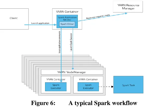
For the client side of the system, an HDLF display was leveraged along with Data-Driven Documents (D3).js [24] to visualize data using a web browser as the rendering tool. Apache Spark on the server side was used to run distributed parallel processing on a Hadoop cluster to prepare data for visualization. An HTTP server was responsible for streaming the final visualization data to all browsers in the HDLF display. Figure 3 illustrates the architecture of the system and shows how the system operates for visualizing data. The major components of the system are:
I. Web Browser: This is the tool for rendering graphics.
II. D3 Page: This is the file that creates one large view of data on the HDLF display.
III. WebSocket Server: This is a server responsible for specifying what portion of the full view a particular browser in the HDLF display is supposed to render. It also synchronizes events in all browsers. This is done using the WebSocket protocol.
IV. Spark Job: This is a spark application running on a Hadoop cluster for data preparation. This application creates the final visualization data for all monitors in the HDLF display and writes them onto HDFS.
V. HTTP Server: This is a web server that streams associated chunk of the final visualization data from HDFS to each browser based on the browser’s location in the HDLF display.
Below is a description of each component that constitutes the client side and server side of the implemented system along with the reasons for selecting each. How these components interact with each other to run the system as a whole is explained in the System Component Interaction section.
Client Side Components
HDLF Display
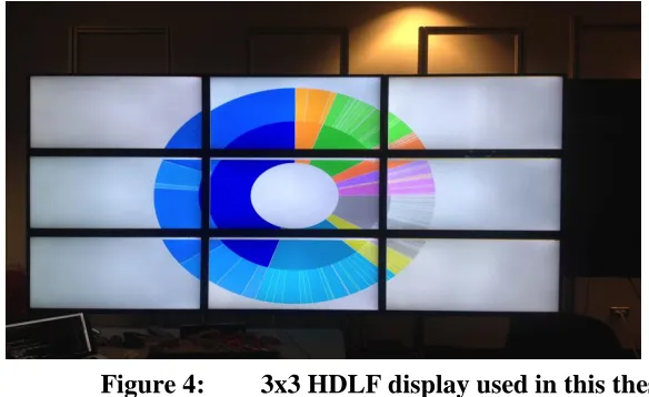
An HDLF Display is an arrangement of multiple monitors to behave as a single screen. HDLF displays are typically large (>100 inches diagonally) and have high pixel density (>100 PPI). The display devices connected with each other can be used together for any purpose that requires a large format with ultra-high resolution. This type of display can be controlled either by a hardware-based controller, a software-based controller (video-card controller) or via a network. An advantage of implementing such an arrangement is that it can be created in any kind of layout with the required resolution. For example, it can be connected in a matrix, grid layout or a custom layout as per requirement whereas a single screen with such custom shape and high resolution may be unavailable and may cost much more. Figure 4 is an example of a 3x3 HDLF display that was used as a part of this project.
Each of the monitors in Figure 4 is a 4K SE39UY04 SEIKI with dimensions of 35.16”×21.21”×3.48”(W × H × D) and 39 inches diagonal with a resolution of 3840 ×
2160. Each monitor has a pixel density of 112.97 PPI and a refresh rate of 30Hz. The total resolution of the HDLF display sums to 11520 × 6480 pixels, approximately 72 MP and total size equals 117 inches diagonally. The system is run by three nodes. Each node has 32 GB of RAM and a Nvidia NVS 510 GPU. Each node is responsible for running a single row of monitors of the HDLF display. These nodes run Windows and are connected to the same Local Area Network (LAN) and internet by 1 Gigabit Ethernet. Also, these three nodes are connected to an IOGEAR 4-Port DVI KVMP Switch for simplified keyboard and mouse control for a single user.
Since such an arrangement provides us with a high density and a high pixel count, this property can be exploited so that more data points with fine details can be visualized on the screen. To show more detailed data points on the HDLF display, the system creates the final visualization data and partitions it into chunks equal to the number of monitors and streams each chunk to the associated monitor. Simultaneous streaming of all data chunks into their associated monitor and rendering them locally based on the same visualization view ensures that the complete data is meaningfully represented on the HDLF display as a single large data view.
Data-Driven Documents Package
available data where each created DOM element are bound with a particular piece of data which can be used to manipulate the appearance or the location of this element anytime during its existence. You can also add functionality to change the way data is visualized based on the user’s interaction or events that are triggered. Figure 5 shows a typical visualization1 created by The New York Times using D3.js that illustrates Barack Obama’s 2013 Budget Proposal. This visualization allows users to select from one of four different views of the data plus provides detailed information when hovered over any of the bubbles.
We choose D3 for the system because: -
D3 can be used without installing any extension or additional plugin in a web browser.
It is natively written in JavaScript, so just include the .js file and start visualizing data.
1 https://archive.nytimes.com/www.nytimes.com/interactive/2012/02/13/us/politics/2013-budget-proposal-graphic.html
It uses SVG to create an image which means the graphical elements are created using geometric primitives (lines, circle, rectangle etc.) and stored in an XML file and can be easily scaled up or down to use the available pixels while retaining quality. SVG elements are resolution independent and render great on high-density displays utilizing the full resolution available.
Web browsers have become ubiquitous applications found on any visual computing device, which eliminates the need to install an additional tool for the sake of rendering graphics on the screen.
D3 code is responsible for requesting and converting the data received in any format from the server into the desired view and providing the interaction control with that view for data visualization purposes. D3 is used together with SVG and HTML5 Canvas to create graphical elements on a web browser and to provide users the ability to interact with the data. Google Chrome was selected as the browser for rendering graphics on screen because of its extensive graphics and networking capabilities.
View Initializer
view areas of a single large view on the HDLF display waiting to receive its associated data from the server.
WebSocket Server
Our system needed a protocol that allows us to transfer messages between a web client and a web server at any time in any direction. Since WebSocket protocol supports this mode of communication, a WebSocket server was created for the system. WebSocket2 is a computer communication protocol, providing full-duplex communication channel over single TCP connection.
The WebSocket Server’s code was written in Java using the WebSocket Application Programming Interface (API) and runs in a WildFly container. This WebSocket Server runs in one of the nodes in the system and performs two functions: 1) tells the connected browsers which portion of the full view to render, and 2) synchronizes events happening in one in all nine of them. As both functions require a server to send information to a connected client without the client making a request, WebSocket protocol was suited for achieving such performance. Also, WebSocket protocol is currently supported in most major browsers and the HTML5 WebSocket specification defines an API that enables web pages to use the WebSocket protocol for two-way communication with a remote host.
When the view initializer launches the data visualization file in a web browser in all nine monitors, each browser connects to the WebSocket server. Upon establishment of the connection, each browser receives display parameters that define a rectangular subsection of the full view that the browser is to display. These parameters are used by the
browsers to draw only a particular section of the full view which they are directed to display by the WebSocket server. Additionally, this WebSocket server assists the system in handling user interaction with the full view. After each browser receives the display data to render from the HTTP server, they can send an event that happens in them to this WebSocket server, which in turn broadcasts it to all nine browsers via their established WebSocket connections.
Server Side Components
Apache Hadoop
Our system needed a platform for storing large datasets before processing the initial data and after creating the final visualization data. This made Apache Hadoop an appropriate choice. Apache Hadoop [4] is an open source software project that allows for distributed storage and processing of large datasets across a cluster of computers built from the commodity hardware. Furthermore, the scalability of Hadoop for storing data of any size using a cluster of commodity servers and the resiliency of the software for detecting and handling fault tolerance made it even more suitable.
operations like reading files, writing to files, making directories, changing permissions, renaming etc. making it a good choice for our system. WebHDFS API is used in our system for two functions: 1) once the server-side processing is finished creating the final visualization data in raw text format, this data is stored in HDFS via WebHDFS API, and 2) when the created final visualization data in raw text format is requested by the clients for visualization, the data is streamed to them using WebHDFS API.
Apache Spark
Our system also needed a cluster computing framework for processing the initial data and transforming them into the final visualization data in a reasonable amount of time. Apache Spark is an efficient tool for achieving this. Apache Spark [25] is a powerful open source cluster-computing framework for running large-scale data analytics applications across clustered computers. It is a fast, in-memory data processing engine with elegant and expressive development APIs.
Spark’s python API PySpark was used for developing a server-side application that could process the initial data and transform it into the required output for visualization. Spark together with the YARN resource manager is used to run this application. For storing the transformed output into HDFS, the application communicates with Hadoop’s WebHDFS server. Since the implemented system uses distributed data preparation and rendering approach, this spark application was responsible for processing the initial data residing in HDFS, creating final visualization data for each monitor and writing each monitor’s data into HDFS via WebHDFS. These final outputs could then be streamed to each of the monitors in the HDLF display for visualization.
HTTP Server
A simple web server was created using Python’s BaseHTTPServer module and written in Python. Upon data request from the client, this web server connects to HDFS using WebHDFS and streams the final visualization data in raw text format to all monitors in the HDLF display. The default features of the HTTP server were sufficient to study Research Question 2 and facilitated analyzing bottlenecks of the system. But the third
research question required extending the basic features to get appropriate answers. Therefore, the HTTP server was expanded to incorporate two additional features.
The first feature enabled clients to request for aggregated text data created by the server using an aggregation method. The server supports aggregation methods such as filtering, summarizing, and binning. For this feature, the server reads the final visualization data from HDFS, creates aggregated data using an aggregation operation and streams it to the client upon request. The aggregation operation is determined by the type of visualization view that the data is going to be rendered into. The selected aggregation operation reduces the size of data to be streamed and the number of data points to be rendered on the client side.
The second feature enabled clients to request bitmap image data for visualization. The server creates bitmap image data using Python Imaging Library (PIL) after processing the final visualization data to create actual frames of visualization. These created frames are the same frames of image the client would have otherwise rendered on the screen when visualizing the final visualization data in raw text format. For this feature, the server reads the final visualization data from HDFS, processes the data using PIL to produce bitmap images representing the client visualization, and stores them as Portable Network Graphics (PNG) images. When a client requests data in the form of bitmap images, the corresponding PNG images are sent.
of the typical client visualization functions that may be difficult for the client side to handle if done alone. We used the two additional features to study Research Question 3. Additionally, this web server provided us with the ability to analyze our implemented system and find the performance bottlenecks when performing web-based visualization for large-sized data.
System Component Interaction
Figure 7 illustrates the distributed data segmentation, preparation and rendering approach used by the system. The components that work together to achieve this approach are:
I. Nine browsers running on nine monitors to show one large view on the HDLF display.
II. HDFS where data partitions for all nine monitors are written by a Spark application.
III. HTTP server which reads data partitions from HDFS, processes them, creates the output in three formats, and stores them in memory. It also streams data in the required format to all nine monitors in the HDFL display for rendering.
Likewise, Figure 3 illustrates the workflow between the server side and client side components of the system as well as the interaction that happens between them when visualizing data. The server side and client side components are put together in the system based on two important principles explained below.
View Partition and Data View Synchronization
The data visualization file created using D3.js is initialized as a large SVG image that fully utilizes the pixel density available on the HDLF display. Our system launches the same page on all nine monitors in a web browser. This approach was preferable to creating nine different visualization files. Creating one file was more convenient and efficient in terms of source code development and maintenance. Also, it was seen that using a different file for different monitors could sometimes result in misalignment of the view subsections if pages were launched in or moved to the wrong monitor. Using a single file does not suffer from this issue.
correspond to one of the nine rectangular subsections of the full SVG image where each subsection utilizes the full resolution of a monitor.
Because different browser instances receive different parameters specific to their location, the HDLF display as a whole renders a single large SVG image. The system uses SVG’s viewBox and clip-path properties to apply the principle of view partition. This is how view partitioning is performed in the system. After view partition, all nine browsers are ready to request data from the HTTP server and render. The data requested is based on the rectangular subsection of the full view they are currently displaying.
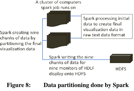
Data Partitioning and Streaming
The view partition concept explained before requires that each browser should receive its own discrete data based on which portion of the full view it displays. To meet this requirement, the final visualization data was created by partitioning the visualization data into nine parts. Here each part represents the data that is unique to a monitor where it is supposed to be rendered. To perform data partitioning, a Spark application is run that transforms the initial meaningless data into the final visualization data. The completion of this Spark job writes the output of the performed computation into text files in HDFS. A total of nine files are written into HDFS each of which is associated with a monitor in the HDLF display. These files contain the raw text data that is to be rendered by the browser. Additionally, the text files are written in a format suitable for D3.js to parse and HTTP server to perform some server-side operations. This is how data partitioning is done in the system. Figure 8 illustrates how data partitioning is done by Spark.
Data streaming is the responsibility of the HTTP Server. This server acts as a bridge between the client side of the system and HDFS where the final visualization data resides. The HTTP server stores data in three formats: 1) raw text data, 2) aggregated text data, and 3) bitmap image data. Here data in the raw text file format is an exact copy of the final
visualization data residing in HDFS. Because the final visualization data residing in HDFS is stored in a distributed fashion, the server runs a number of parallel processes where each process reads a partition of the final visualization data from HDFS, performs some server-side operations and stores the output data in its memory. This way the HTTP server creates data in three formats mentioned before for all nine monitors and stores them in its memory. Figure 7 depicts the process of how the HTTP server creates and stores data in three formats for all nine monitors of the HDLF display. All required data for the HDLF display reside in the memory of this server, so upon request by the clients for a particular data for a particular monitor in a particular format, this server transmits the associated data. This is how the HTTP server facilitates data streaming by responding with the required data to all of the nine monitors in the HDLF display. We used this principle of data partitioning and streaming to study Research Question 4.
CHAPTER FOUR: EXPERIMENTAL SETUP
In order to test the hypothesis that leveraging an HDLF display can assist in effectively visualizing large numbers of data points with fine details, an experimental setup for showing scientific data visualization was performed on the system. Scientific data visualization was performed on the system for visualizing the Global Surface Summary of Day (GSOD) dataset. Because of the dataset’s specific attributes and features, wind flow simulation was chosen as the view for visualization.
Dataset
Global Surface Summary of Day
GSOD3 data is a dataset created by the National Climatic Data Center (NCDC). The GSOD dataset consists of 18 surface meteorological elements that are listed in Table 1. In addition to the meteorological elements listed in Table 1, the dataset also consists of the indicator for the occurrence of fog, rain or drizzle, snow or ice pellets, hail, thunder, and tornado/funnel cloud.
Based on the attributes listed in Table 1, the dataset was found to be suitable for simulating wind flow on a global map. This is why global wind flow simulation was chosen as the view for this experiment. Because there are more factors to global wind flow than the ones listed in Table 1, a number of scientific equations were used that could assist us to simulate the wind flow. These scientific equations use a small number of meteorological
features to transform the initial unprocessed GSOD data into the final simulation data. The resulting simulation data can be plotted as points on the globe with the wind velocity information at every plotted point. This final simulation data was used to perform the global wind flow animation. The scientific equations were added as a part of the Spark application’s source code, which was run on a Hadoop cluster to create the simulation data for visualization. APPENDIX A presents the scientific equations used for creating the global wind flow simulation data out of the preprocessed GSOD data. It shows how the scientific equations were used to create the data points on the globe that would later help us to render wind flow simulation on the client side.
Table 1: GSOD Meteorological Elements
Meteorological
Elements Unit
Meteorological
Elements Unit
Mean temperature Fahrenheit Maximum sustained
wind speed Knots
Mean dew point Fahrenheit Maximum wind gust Knots
Mean sea level
pressure Millibar Maximum temperature Fahrenheit
Mean station pressure Millibar Minimum temperature Fahrenheit
Mean visibility Miles Precipitation amount Inches
Mean wind speed Knots Snow depth Inches
Data Preprocessing
The GSOD dataset used in this experiment was not in the format required by the scientific equations to transform them into the final simulation data. Therefore, the GSOD dataset was preprocessed using the following steps:
2. Insufficient or incomplete data out of the GSOD dataset were removed or interpolated.
3. New data fields required by the scientific equations were created using the data fields already available in the GSOD. These new data fields were added onto GSOD while the unnecessary fields were removed.
We did not record the dataset preprocessing time in our work because it is out of the scope of this thesis and we were not concerned about the performance of the system while preprocessing the dataset. For converting the data fields into the units required by the scientific equations, pressure fields were converted from millibar to Pascal (Newton/m2), temperature fields were converted from Fahrenheit to Kelvin, and wind fields were converted from knot to m/s.
For removing insufficient or incomplete data, all data values having all values 9 indicating an incomplete data were either interpolated using other data fields or were removed. For this, if the station pressure is an incomplete value then it was interpolated using the following formula:
𝑆𝑡𝑎𝑡𝑖𝑜𝑛 𝑃𝑟𝑒𝑠𝑠𝑢𝑟𝑒 = 𝑆𝑒𝑎 𝐿𝑒𝑣𝑒𝑙 𝑃𝑟𝑒𝑠𝑠𝑢𝑟𝑒 𝑥 ℮(− elevation/(temperature∗29.263)) (1)
Here pressure fields are measured in millibar, the temperature is measured in Kelvin and elevation is measured in meters.
was removed from the data file. After converting the data fields into the required units and removing incomplete data, the GSOD data files still did not contain all the data fields required by the scientific equations. Therefore, we added new data fields into the GSOD data files and removed the ones not needed for this experiment.
To create the new GSOD data files with all the required data fields, we needed to append the geographical information about a station to that station’s data row. For this, the station’s full name, latitude, longitude, and altitude information were retrieved from a separate file in the GSOD dataset and appended into that data row. The scientific equations also required the air density information, which is not present in the original GSOD data file. So air density needed to be appended to the data row whose value was being processed. For appending the air density information of a station, the following formula was used:
𝑃 = 𝜌 𝑅𝑠𝑝𝑒𝑐𝑖𝑓𝑖𝑐 𝑇 (2)
Here P is the air pressure measured in Pascal, T is the temperature measured in Kelvin, and 𝑅𝑠𝑝𝑒𝑐𝑖𝑓𝑖𝑐is 287.058 J/Kg/K.
The GSOD data files already contained the station pressure and temperature information and the preprocessing step converted these fields into the required units, therefore equation (2) gave us the air density value in kg/m3. This air density information was then appended into the data row, which value was being processed.
CHAPTER FIVE: EVALUATION
This chapter is divided into three sections. The first section contains a list of images, which illustrates how the scientific data visualization appeared on the client side. It gives a view of how the global wind flow simulation performed on the system appeared to the users. The second section explains the results of the performance evaluation that was conducted to measure the performance of the system. The third section provides the results of a user study that was conducted with 22 different participants to measure the effectiveness and ease of use of the system for data visualization.
Global Wind Flow Simulation
users to pan the global wind flow up to 40 degrees longitude on both directions. Filtering allowed them to start the wind flow from a selected number of weather stations. In the system, we did not add zooming as an option because we wanted to check if the users could comfortably explore the fine details on the screen without the need to zoom in to see the details.
This section contains the pictures of the global wind flow simulation that was performed on the HDLF display visualization system. Figure 10 shows how the global wind flow simulation looked on the system. In the figure, the black icons represent a weather station and the lines with an arrowhead represent a wind instance flowing from the source station to the destination station. Figure 11 and Figure 12 show the state of the global wind flow when a user decides to start the wind from a selected number of source stations. Figure 13 shows the same state as Figure 12 but after panning the whole view 40 degrees towards east. Figure 14 gives a closer look at the wind flow and shows how it is rendered in one of the monitors.
Figure 11: Global wind flow when the wind has been started from only one station
Figure 13: Global wind flow when panned 40 degrees east
Performance Evaluation
We conducted a performance evaluation to measure the efficiency of the system for big data visualization. The results of the performance evaluation conducted on the system are explained below.
In our work, we were concerned only about the performance of the visual part of the system. Therefore, we decided to measure the client side rendering performance and ignored the server side performance for visualizing data. As stated, the HTTP server is capable of streaming data to the clients in three formats: 1) raw text data, 2) aggregated text data, and 3) bitmap image data. We measured the client side rendering performance of the system when visualizing each of these three data formats. The parameters that measured the client side rendering performance are described below:
1. Disk Size = Total size of the data for all nine browsers in terms of used disk space measured in Megabytes (MB).
2. Number of Data Points = Total number of data points for all nine browsers in the visualization view where each data point is a wind instance drawn on the HTML5 canvas.
3. Total Read Time by Client = Total time waited by all nine browsers to receive the data from the server.
5. Image Rendering Frame Rate = This is the average Frames Per Second (FPS) of the visualization drawn by the browsers. This parameter was recorded only after the browsers started drawing the cached 30 frames of visualization. The browsers cached these 30 frames after they were successfully rendered on the screen for the first time.
6. Average Client User Action Response Time = This is the average time spent by each browser to receive an event and draw frames of visualization based on that event. This parameter was recorded when a user interacted with the data visualization and fired an event in any one of the nine browsers on the HDLF display.
7. Total Number of Streamed PNGs = Total number of bitmap images in compressed PNG format streamed to the client by the server for all nine browsers. This parameter is recorded only when visualizing bitmap image data.
Table 2: Performance evaluation for client-side rendering when visualizing raw text data
SIZE OF DATA TIME IN SECONDS
Disk Size (CSV File) Number of Data Points Total Read Time By Client Average Parsing Time Before Client Rendering Image Rendering Frame Rate Average Client User Action Response Time
8.43 MB 58,535 0.282s 0.117s 8FPS 1.2s
19.9 MB 126,465 0.535s 0.24s 10FPS 0.95s
37.1 MB 236,194 1.046s 0.405s 10FPS 1.305s
82 MB 561,590 2.5s 0.69s 8FPS 1s
260 MB 1,645,261 7.21s 1.2s 7FPS 1.75s
375.7 MB 2,445,942 21.031s NR NR NR
NR = Not Recorded means browsers crashed while rendering images.
Table 3: Performance evaluation for client-side rendering when visualizing aggregated text data
SIZE OF DATA TIME IN SECONDS
Disk Size (JSON File) Number of Data Points Total Read Time By Client Average Parsing Time Before Client Rendering Image Rendering Frame Rate Average Client User Action Response Time
15.7076 MB 54,593 0.47s 0.074s 8FPS 0.64s
36.9 MB 121,376 0.99s 0.24s 10FPS 0.62s
68.7 MB 227,191 1.824s 0.37s 10FPS 0.61s
153.6 MB 527,529 3.941s 0.63s 8FPS 1s
451.14 MB 1,489,782 13.96s 0.95s 7FPS 1s
580 MB 1,945,115 33.5s 1.2s 7FPS 1.2s
1281 MB 4,209,349 44.935s NR NR NR
Table 4: Performance evaluation for client-side rendering when visualizing bitmap image data
SIZE OF DATA TIME IN SECONDS
Disk Size (Compressed PNG Files) Number of Data Points (Rendered on PNGs) Total Number of Streamed PNGs Total Read Time By Client (PNGs) Average Parsing Time Before Client Rendering Image Rendering Frame Rate Average Client User Action Response Time
31.7MB 54,593 180 1.418s 0.0045s 8FPS 0.82s
30.8MB 121,376 120 0.772s 0.00625s 10FPS 0.78s
30.9MB 227,191 120 0.866s 0.001675s 10FPS 0.78s
102.6MB 527,529 180 3.286s 0.0175s 8FPS 0.82s
126.2 MB 1,489,782 270 5.064s 0.032s 7FPS 0.9s
360.9 MB 1,945,115 270 26.14s 0.0389s 7FPS 1.85s
226 MB 4,209,349 270 11.873s 0.048s 7FPS 2.1s
254.6 MB 8,248,724 270 14.263s 0.062s 6FPS 2.89s
From the results in Tables 2-4, it can be seen that client side is superior in visualizing bitmap image data than the raw/aggregated text data in terms of the disk size of the data, network streaming time for the data, client-side parsing of the data, and the maximum number of data points visualized. It is seen that the system crashed while rendering images when the number of data points reached around 2 million for the raw text data and 4 million for the aggregated text data. The number of data points did not make a difference even when visualizing larger number of data points for the bitmap image data. In our evaluation, we successfully visualized up to 8 million data points using bitmap image data without any of the browsers crashing.
intensive task of processing and creating frames of visualization for all nine browsers. When visualizing bitmap images, each browser receives images of 4K resolution regardless of the number of data points rendered on the server. This concludes that the number of data points visualized using bitmap images is not of a concern for the client side. The only concern is rendering the bitmap images of this resolution. Because the system can easily handle rendering images of this resolution, the system is more efficient in visualizing data using bitmap images than the other two formats. These observations indicated that performing typical client visualization functions of processing the data and creating frames of visualization on the server increases the efficiency of a data visualization system when visualizing large data.
It is also seen that the system is more efficient while visualizing aggregated text data than the raw text data. This is because the HTTP server performs the typical client visualization function of parsing the data on the server and creates the aggregated data, which eliminates the need for the client side to perform this function. In Table 3 the aggregated number of data points were the result of the server performing filtering operation on the original raw text data. These new data points represented the aggregated information created from the original data points, which were much more in number.
Tables 2-4 show that the amount of data streamed to the clients was smaller in size when the server streamed data in bitmap format than the other two. It is seen that:
When the number of data points to visualize is small, bitmap format is bigger in size than the other two.
When the number of data points to visualize grows large, bitmap format is smaller in size than the other two.
The reason behind this behavior is that when the server streams bitmap image data to all nine browsers, it streams PNGs. These PNGs are of 4K resolution no matter how many data points are rendered on them by the server. The size of these PNGs makes the total disk size for bitmap image data more than the raw and aggregated text data when the
number of data points to visualize is small. But when the number of data points becomes larger, total disk size of the bitmap image data is much smaller than the other two formats. This behavior does not affect our system because we are concerned about the efficiency of the system for visualizing large data and do not worry how it behaves while visualizing a small number of data points.
It is also seen that the size of aggregated text data was more than raw text data. This is because the HTTP server while performing aggregation stores the resulting data into a structure which makes the browser spend comparatively less time for data parsing before rendering for aggregated text data than the raw text data as seen in Table 2 and Table 3. This resulting aggregated JavaScript Object Notation (JSON) file contains more information and it ends up being bigger in size than the raw Comma Separated Values (CSV) file.
the number of data points to be visualized is small, TRTC is more for bitmap image data than other two formats. This is again because the disk size of the raw text and aggregated text data were smaller than the bitmap image data when the number of data points to visualize was small. But when the number of data points was large, total disk size of the bitmap image data was much smaller than the other two formats and hence the TRTC for bitmap image data was smaller than other two formats.
From the results in Tables 2-4, it is also seen that Average Parsing Time Before Client Rendering (APTCR) was smaller in bitmap image format compared to raw text and
aggregated text format. This is because when visualizing bitmap image data, the browser has to do less parsing and starts drawing images on the screen as soon as the received PNGs are loaded into memory. The only data parsing the browser has to do is parsing of the modest metadata that the server streams with the PNGs when visualizing bitmap image data. The APTCR numbers seen in Table 4 is because of the parsing of this metadata that increased the parsing time as the number of data points visualized increased. This metadata is used by the client side for visualization purposes and for handling user interactions with the view.
any data to create frames and directly render the images on the screen as soon as the received PNGs are loaded into memory. This is why the browsers never crashed when visualizing bitmap image data.
These results indicate that the rendering time taken by the visualization tools impacts the client side performance of the system. It was observed that if the number of data points to be processed and rendered by the client side web-based visualization tools exceeds a certain size, the system crashes. These observations indicate that client-side processing of the data in order to render frames for visualization hinders the efficiency of the system when displaying large data.
Another measured parameter was the Average Client User Action Response Time (ACUART), which was similar for all three data formats as seen in Tables 2-4. Since browsers use the same process to respond to an event for all three data formats, this is not surprising. In the system, the factors that determine the AERT are:
Time for an event to reach the WebSocket server.
Time the WebSocket server takes to broadcast this event to all nine browsers. Time all nine browsers take to respond to the event after they receive it.
The numbers in Tables 2-4 show that the system responds in a reasonable time for the user interactions. It was also seen that an event is properly synchronized in all nine browsers making each of them in the same state of the current data view.
time. Cached frames are drawn using the same process for all three data formats. This is why the IRFR for visualizing all three data formats is the same.
Based on the results discussed, it is clear that visualizing data on the system is most efficient using bitmap image data than the other two formats. But our system could only render images at the rate of 6-10 FPS and did not meet our target of rendering images at 30 FPS even when visualizing bitmap image data. Our target was 30 FPS for rendering images because the monitors used in the HDLF display have a refresh rate of 30 Hz. We hypothesize this shortcoming is not in our D3 code but rather in the process how Google Chrome does image rendering.
Because the browsers are drawing cached images after they have been loaded in the memory, they are not spending any time creating these frames. They just use the GPU to draw the images that reside in the browsers’ memory. We believe that although the HTML5 canvas is hardware accelerated in Google Chrome, the cached images always reside in the CPU’s memory and not in GPU’s memory. Because of this, the CPU has to transfer these cached images every time to the GPU’s memory to be drawn on the screen. Each node in the HDLF display has one GPU driving three monitors, therefore three browsers are taking turn transferring images that reside in their memory to the same GPU’s memory. Also, each image being transferred is of 4K resolution that makes three browsers spend more time copying the contents from their cache memories to the GPU’s memory for every frame drawn on the screen. We believe this to be the reason we could not get optimal performance out of the system even when visualizing data using bitmap images.
node and running only one browser. With this setup, it was seen that every single stat in Table 4 was similar except the IRFR which reached our target of 30 FPS. The reason we believe for not seeing the bad performance while running one browser with one GPU is that only one browser is sending cached images to the GPU’s memory which takes less time than performing the same operation with three browsers.
This hypothesis is further backed by data collected in Table 4 where IRFR for 227,191 data points with 2 browsers in each node was better than for 54,593 data points with 3 browsers in each node. This was because when visualizing 227,191 data points only two context switching was done between the browsers to transfer their cached images to the GPU’s memory whereas three context switching was done when visualizing 54,593 data points.
User Study
A user study was conducted for evaluating the effectiveness and ease of use of the system. To conduct this user study, we went through the Institutional Review Board (IRB) at Boise State University. Upon getting the approval of IRB (APPENDIX B), mass emails and flyers were sent out to the students of the computer science department at Boise State University asking if they would like to take part in the evaluation of the system. A total of 22 students volunteered for the system’s evaluation and took part in the user study. We conducted the user study by comparing user experiences while working with the same data visualization on a single screen system (Figure 15) versus on the HDLF display system (Figure 16). For this, an additional single screen system was setup with the exact same data visualization and interaction features using the same data that would be visualized on the HDLF display system. The single screen system (Figure 15) was setup using one of the monitors in the HDLF display with the dimensions of 35.16”×21.21”×3.48”(W × H × D), 39 inches diagonal with a resolution of 3840 × 2160 and 30Hz refresh rate.
Figure 15 shows the users working on the single screen system and Figure 16 shows the users working on the HDLF display system for the user study.
Figure 15: Users working with the single screen system in the user study session
Figure 16: Users working with the tiled display based system in the user study session
Questionnaire
at the end of their user study session after they finished the given set of tasks on both the systems. The questions asked in the questionnaire are listed below: -
I. Which system was easier to identify the data points on the screen? II. In which system did you find the data of interest quicker?
III. Which system helped you to understand the nature/pattern of the data better?
IV. Which system was easier to see the details present in the data points? V. Which system makes it easier to explain/share your interaction with the data
to others?
VI. Which system allowed you to interact with the data quicker? VII. Which system was more comfortable to use?
VIII. Which system was easier to learn to use for the set of tasks? IX. Which system was easier to use for the set of tasks after learning?
Outcome of the User Study
Figure 17 shows the results that were obtained from the questionnaire filled out by all 22 participants of the conducted user study. The x-axis of the bar chart consists of each question, the y-axis denotes the number of participants of the user study, the blue bar represents the Tiled Display Based System and the orange bar represents the Single Screen System. The number on the top of the blue bar denotes the number of participants who selected the Tiled Display Based System as an answer for a particular question and the number on the top of the orange bar denotes the number of participants who selected the Single Screen System as an answer for that particular question. In addition to the results shown in Figure 17, 18 out of 22 participants answered yes for the question X. a) while 4 answered no and 20 out of 22 answered yes for the question X. b). while 2 answered no.
Figure 17: Results of the user study conducted with 22 participants 21 12 19 22 19 5 9 8 16 1 10 3 0 3 17 13 14 6 0 5 10 15 20 25
I II III IV V VI VII VIII IX
Num b er of P ar tic ip an ts Question
User Study Results
From the results in Figure 17, it is clear that the HDLF Display system is more effective than the Single Screen System for data visualization with the majority of participants selecting Tiled Display Based System for questions I-V. Each of the questions I-V is related to the effectiveness of a particular system for data visualization where they ask if a particular system is easier to identify the data points, helps to find the data of interest quicker, helps to understand the pattern of data better, is easier to see the details present in the data points and is easier to explain your interaction with the data to others. The Tiled Display Based System was preferred over the Single Screen System by the majority of participants for all the aspects of interactive data visualization asked in the questions I-V, therefore we assert that the HDLF Display system is effective for the purpose of data visualization.
It is seen that the participants preferred the Single Screen System over the Tiled Display Based System for the questions VI-VIII. Each of these questions is related to the ease of use of a particular system for data visualization where they ask if a particular system allowed you to interact with the data quicker, was comfortable to use and was easier to learn to use for the set of tasks.