BIROn - Birkbeck Institutional Research Online
McBrien, P. and Poulovassilis, Alexandra (2018) Towards data visualisation
based on conceptual modelling. In: Trujillo, J.C. and Davis, K.C. and Du,
X. and Li, Z. and Ling, T.W. and Li, G. and Lee, M.L. (eds.) Conceptual
Modeling: 37th International Conference, ER 2018, Xi’an, China, October
22–25, 2018, Proceedings.
Lecture Notes in Computer Science 11157.
Springer, pp. 91-99. ISBN 9783030008468.
Downloaded from:
Usage Guidelines:
Please refer to usage guidelines at
or alternatively
based on Conceptual Modelling
Peter Mc.Brien1
and Alexandra Poulovassilis2
1
Dept. of Computing, Imperial College,
180 Queen’s Gate, London SW7 2BZ,[email protected] 2
Birkbeck Knowledge Lab, Birkbeck, University of London, Malet Street, London WC1E 7HX,[email protected]
Abstract. Selecting data, transformations and visual encodings in
cur-rent data visualisation tools is undertaken at a relatively low level of ab-straction - namely, on tables of data - and ignores the conceptual model of the data. Domain experts, who are likely to be familiar with the con-ceptual model of their data, may find it hard to understand tabular data representations, and hence hard to select appropriate data transforma-tions and visualisatransforma-tions to meet their exploration or question-answering needs. We propose an approach that addresses these problems by defin-ing a set of visualisation schema patterns that each characterise a group of commonly-used data visualisations, and by using knowledge of the conceptual schema of the underlying data source to create mappings be-tween it and the visualisation schema patterns. To our knowledge, this is the first work to propose a conceptual modelling approach to matching data and visualisations.
1
Introduction
2 P.J. Mc.Brien and A. Poulovassilis
to matching data and visualisations. We refer readers to [3] for a review of re-lated work on visualisation tools, taxonomies, recommendation, and languages for manipulating graphical data.
2
Motivating Example
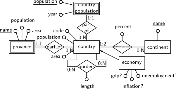
A fragment of the Mondial database [2] is illustrated in the ER diagram in Fig-ure 1. It describes a schema about countries (including the currentpopulation), the history of a country’s population in the weak entitycountry population, and provinces in countries). For some countries, data about the GDP of the country is recorded in the subset entityeconomy, the attributes of which are all optional, indicated by the use of a question mark. Also recorded is which continent or continents a country belongs to: most countries will belong 100% to one conti-nent; but the cardinality constraint of 1:2 allows some (e.g. Russia, Turkey) to spread over two continents, with thepercentattribute ofencompassesrecording the proportion of their land area that belongs to each continent.
country code
population
area
borders 0:N
0:N
length
economy
❨
gdp?
inflation?
unemployment? country
population year
population
part of 0:N
1:1
continent
encompasses
0:N 1:2
percent name
part of 0:N 1:1
province name
population
[image:3.595.154.455.369.522.2]area
Fig. 1.ER schema of a fragment of the Mondial database
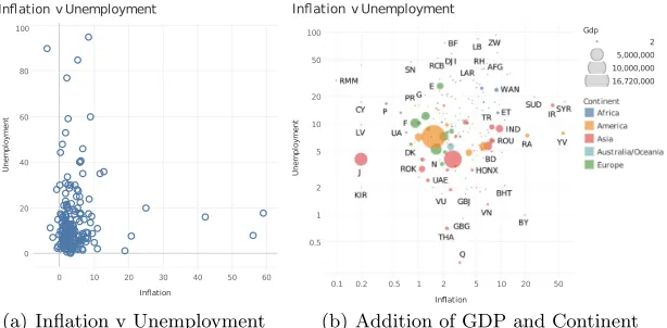
Suppose we wished to explore the relationship between inflation, unemploy-ment, and GDP in countries. We could first extract a table of data with scheme
(country,inflation,unemployment,gdp), wherecountrycorresponds to the key
at-tributecodeof thecountryentity in Figure 1, and without null values forinflation,
unemployment, and gdp. Importing that table to Tableau, and choosing to
rep-resent countries as a ‘dimension’, and putting the inflation and unemployment figures on the x and y axis, produces the chart shown in Figure 2(a).
0 10 20 30 40 50 60 Ination 0 20 40 60 80 100 U n e m p lo y m e n t
In ation v Unemployment
(a) Inflation v Unemployment
0.1 0.2 0.5 1 2 5 10 20 50
Ination
0.5 1 2 5 10 20 50 100 U n e m p lo y m e n t
Ination v Unemployment
Gdp 2
5,000,000
10,000,000
16,720,000
[image:4.595.155.462.169.320.2](b) Addition of GDP and Continent
Fig. 2.Presentation of country data in Tableau
a graphical construct suitable for representing ranges of numbers. Figure 2(b) shows the result of a user (manually) determining that a logarithmic scale will better spread the data relating to the relationship between inflation and unem-ployment, and that the data ingdpcan be used to scale the size of the circles, to make a bubble chart. Figure 2(b) also colour-codes countries by their continent — as suggested by the database schema, which connects countries to continent
via a relationship with restricted (upper bound 2) cardinality.
3
Visualisation Schema Patterns
Our starting premise is that each instance of an entity in the database is as-sociated with one or more graphic elements, which in visualisation are usually classified [1] as marks (points, lines, areas,etc) or channels (colour, length, shape, coordinate, texture, orientation, movement,etcof a mark). An attribute value of an entity, or the participation of an entity in a relationship, is associated with a dimension of the visualisation, and the process of visualisation is about choosing the correct graphic elements for a given schema.
Taking an approach similar to Tableau, we identify the following two major types of dimensions (which differ from the discrete and continuous classification found in [5]):
– discrete dimensionshave a relatively small number of distinct values, that may nor may not have a natural ordering; they are used to choose a mark or to vary a channel of a mark.
– scalar dimensionshave a relatively large number of distinct values with a natural numeric ordering (e.g. integers, floats, timestamps, dates); these are represented by a channel associated with a mark.
4 P.J. Mc.Brien and A. Poulovassilis
discrete value. Alternatively, if it is a scalar dimension, then a spectrum of colours can be used to represent a range of values. Hence, in our descriptions below, when we talk of a colour we assume the ability to automatically choose between these two representations based on the type of the dimension.
Scalar dimensions are evenly distributed if their values are (roughly) spread evenly over the entire range of values in the dimension (many visuali-sations struggle to represent data where most data is in a small range of values and there are some outlying values).
As is well known [1], what we are naming discrete or scalar dimensions may have specific real-world characteristics, and may for example be ageographical,
temporal, or lexical dimension. This characterisation then may suggest spe-cific visualisations for their representation (e.g.a map, time slider, word cloud,
etc). However, in this paper we focus on what assistance can be given to the visualisation process by the knowledge represented in the schema of the data, and hence we only consider these real-world characteristics if required for the use of a particular visualisation. Indeed our work should be viewed as providing assistance to existing visualisation techniques, to be used where data is sourced from a structured database. Our work is therefore complementary to aspects such as task-based visualisation design and interaction during design.
In the following subsections we present successively more complex visualisa-tion schema patterns, and the visualisavisualisa-tions that they encompass. Our survey of visualisation techniques has so far not found any visualisations that require more complex schema patterns than those presented here, and in particular none that require a pair of relationships to be considered together.
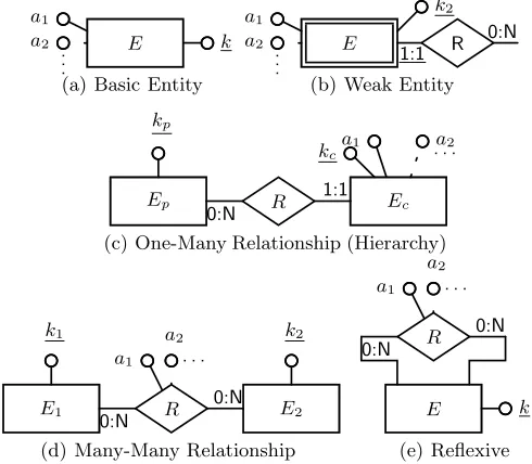
E k
a1 a2 .. .
(a) Basic Entity
E 1:1 R 0:N k2 a1
a2 .. .
(b) Weak Entity
Ep
kp
Ec
kc
a1 a2 . . .
R 0:N
1:1
(c) One-Many Relationship (Hierarchy)
E1 k1
E2 k2 a1
a2 . . .
R 0:N
0:N
(d) Many-Many Relationship
E k
a2 a1 . . .
R 0:N
0:N
[image:5.595.181.426.457.671.2](e) Reflexive
3.1 Basic Entity Visualisations
An ER entity can be regarded as a conceptual modelling of a relational table. Many visualisations are designed to represent such tabular data, so we begin by identifying a category of visualisations that are suitable for representing an entity with its keys and attributes. This ‘basic entity’ visualisation schema pattern is illustrated in Figure 3(a), where it should be noted that the key attributekmight be inherited from a parent, such aseconomyin Figure 1 having an inherited key
codefrom country. Many visualisations fit into this category, and we list below
a sample to illustrate the way in which different features of each visualisation are represented in our approach (more are given in [3], e.g. choropleths, word clouds).
– Basicbar chartsrepresent instances of an entityE (identified by the value of k) as bars, with the length of the bar determined by the value of an attributea1. Hencea1should be a scalar attribute.
– A calendar chart (found in both D3 and Google Charts) represents in-stances ofE according to a date-valued attributea1.
– In scatter diagrams (such as in Figure 2(a)), each point represents an instance of E, and two dimensions a1 and a2 are used to plot its xand y
coordinates. Optionally, a third dimensiona3can be used to colour it.
– Inbubble charts(such as in Figure 2(b)), each bubble denotes an instance ofE; two dimensionsa1 anda2 are used to plot its coordinates, and a third
dimensiona3 its size. A fourth dimensiona4 may be used to colour it.
The table below summarises the above analysis, where|k|denotes the number of distinct values of the keyk. The upper cardinality of 100 shown in relation to the bar chart is subjective, and aesthetics-driven; it would be user-configurable in any implementation.
Basic Entity Visualisations
Name |k| mandatory optional
Bar Chart 1..100 a1 scalar -Calendar 1..* a1 temporal scalar -Scatter Diagrams 1..* a1, a2 scalar -Bubble Charts 1..* a1, a2, a3 scalar a4 colour
Note that all of the above visualisations (and indeed those listed in the fol-lowing subsections) may have additional temporal scalars represented by time sliders, and discrete scalars represented by snapshot or paging options.
In our approach, visualisation schema patterns are used in conjunction with the database schema to guide the process of choosing a visualisation, by find-ing sub-graphs of the database schema that match each visualisation schema. Although this is an instance of the (NP-complete) subgraph isomorphism prob-lem, the query graph (i.e. the visualisation schema) will be small and hence we anticipate fast execution times using state-of-the-art algorithms such as [4].
6 P.J. Mc.Brien and A. Poulovassilis
choices areaandpopulationfor the scalarsa1 anda2. The user can therefore be
offered a bar chart or scatter diagram as a visualisation of the data.
3.2 Weak Entity Visualisations
A particular form of compound key (often arising from the representation of weak entity data in an ER schema) identifies a family of visualisations where one part of the key, k1 (the key of the entity that the weak entity is attached
to) identifies a set of tuples, and the second part of the key,k2, identifies a tuple
in the set. The visualisation schema pattern for this is shown in Figure 3(b), where it should be noted that k1 would match a key relationship in the data;
for example, in Figure 1 ifEmatchedprovincethenk1would matchpart ofand
hence be based on thecodeofcountry.
The values ofk2 must lie within a similar range of values for all instances of
k1(so as to make their visualisation in one chart meaningful). Also, we say that
the values ofk2 arecompletewith respect to k1 if it is the case that the same
set of values appears for k2 for each value ofk1. For example, the weak entity
country populationin Figure 1 meets the range requirement since the dates for
population figures range over a period of less than 200 years, but it fails the completeness test since the years in which population figures are available vary from country to country. By contrast, the province entity fails the range test, since the names of provinces are almost entirely disjoint with those of countries. As with the basic entity visualisation, there are many visualisations suited to present the weak entity visualisation, a selection of which are listed below, together with a summary table:
– In aline chart each line represents a distinct value of k1; k2 represents a
scalar dimension to be plotted along the x-axis; and a1 must be a scalar
dimension to be plotted along the y-axis. XY variations allow an additional dimensiona2 to be added to the y-axis.
– In astacked bar chart, distinct values ofk1are represented by a bar, with
one of the elements in the stack representing a value ofk2, and the length of
the bar determined by a scalar dimensiona1. Each value ofk1should appear
with the same (or almost the same) set of values fork2 (the completeness
property) so that the elements in each stack can be compared.
– In aspider chart, each ring represents a value ofk1and each spoke a value
ofk2; the intersection of the ring with a spoke is determined bya1.
Weak Entity Visualisations
Name |k1| |k2| complete mandatory optional Line Chart 1..20 1..* no k2, a1 scalar a2 scalar Stacked Bar Chart 1..20 1..20 yes a1 scalar -Spider Chart 3..10 1..20 yes a1 scalar
-3.3 One-Many Relationships
these relationships is illustrated in Figure 3(c), where the entity that is on the ‘many’ side of the relationship (such as ascountryforpart of) will be considered the parent entity Ep, and the other entity (province forpart of) the child entity
Ec. Visualisations that represent the one-many visualisation schema are less common, but some examples are listed below together with a summary table.
– In a tree map, rectangles representing instances of Ep are divided into rectangles representingEc, the area of which is proportional to the value of a scalar dimensiona1. A selector may be added to alter the proportion to
be determined by other scalar dimensionsa2, a3, . . .
– In ahierarchy tree, nodes represent instances of Ep that are connected by lines to circles representing instances ofEc. A discrete dimensiona1 may
optionally be used to colour the lines linking the entities.
One-many relationships
Name |k1| |k2|perk1 mandatory optional Tree Map 1..100 1..100 a1scalar a2colour Hierarchy Tree 1..100 1..100 - a2colour
3.4 Many-Many Relationships
Relationships that are many-many (such asbordersin Figure 1) lend themselves to visualisations that represent networks of data. The visualisation schema pat-tern for these relationships is illustrated in Figure 3(d), where it should be noted that the data that governs the visualisation is now present as attributes of the relationship between entitiesE1andE2. Visualisations that represent the
many-many visualisation schema are the rarest, with two being the following:
– In sankey diagrams, the left hand elements of the diagram represent in-stances of E1, the right hand elements represent instances of E2, and the
width of the flow between the left and right elements represents scalar di-mensiona1. Optionally, a second attributea2of the many-many relationship
may be represented by varying the colour of the connection.
– Inchorddiagrams, instances of the entities are represented by points on the perimeter of the circle, with the value ofa1varying the width of the
connec-tion between pairs of points. Again a second attributea2of the many-many
relationship may be represented by varying the colour of the connection. We note that chord diagrams are particularly suited toreflexiverelationships, shown in Figure 3(e), since then the points around the circle represent in-stances of just one type of entityE, and are not grouped according to which entity type they belong to.
Many-many relationships
8 P.J. Mc.Brien and A. Poulovassilis
4
Conclusions
We have proposed, for the first time, a conceptual modelling approach to match-ing data and visualisations. Our approach makes use of the conceptual schema associated with the data and automatically matches it against a set of visual-isation schema patterns (expressed in the same ER formalism) each of which characterises a group of potential visualisation alternatives. We also propose the use of well-known schema transformations in order to transform the database schema to that required for matching particular visualisation patterns (details of this can be found in [3]).
With this approach, domain experts can interact with conceptual models of their data, rather than lower-level tabular representations. By providing a set of visualisation schema patterns, each of which captures the data representation capabilities of a set of common data visualisations, we make it easier for the user to select a visualisation that is meaningful in relation to their data and their information seeking requirements; and to select from a more focussed set of visualisations. By matching between the visualisation schema patterns and the conceptual database schema, full schema knowledge can be used to automatically map between the data and a range of possible visualisations. By applying, again at the level of the conceptual database schema, a set of well-known schema transformations, it is possible to generate additional matchings between the transformed database schema and the set of visualisation schema patterns.
An implementation of the approach would include also data analysis capa-bilities to determine whether a dimension is scalar or discrete (or both), and to determine appropriate scaling of numeric dimensions (e.g. linear, logarithmic) by supporting an additional dimension characteristic of ‘skew’. Also important is extension of our visualisation schema patterns to include descriptive elements (also populated from attributes of the database schema). Finally, a full imple-mentation would include a second stage of mapping, from a visualisation schema pattern to an actual physical visualisation representation rendered by a target data visualisation tool.
References
1. C.Ware. Information Visualization: Perception for Design. Morgan Kaufmann, 3rd edition, 2013.
2. W. May. Information extraction and integration withFlorid: The Mondialcase
study. Technical Report 131, Universit¨at Freiburg, Institut f¨ur Informatik, 1999. 3. P.J. McBrien and A. Poulovassilis. Towards data visualisation based on conceptual
modelling and schema transformations. Technical Report No. 39, AutoMed, 2018. www.doc.ic.ac.uk/automed.
4. X. Ren and J. Wang. Exploiting vertex relationships in speeding up subgraph isomorphism over large graphs. Proc. VLDB Endowment, 8(5):617–628, 2015. 5. M. Tory and T. Moller. Rethinking visualization: A high-level taxonomy. InProc.