University of Windsor University of Windsor
Scholarship at UWindsor
Scholarship at UWindsor
Electronic Theses and Dissertations Theses, Dissertations, and Major Papers
2013
A Framework for Improving Adaptive Data Visualization in
A Framework for Improving Adaptive Data Visualization in
Decision Support Systems
Decision Support Systems
Sukhmanjot Singh University of Windsor
Follow this and additional works at: https://scholar.uwindsor.ca/etd
Recommended Citation Recommended Citation
Singh, Sukhmanjot, "A Framework for Improving Adaptive Data Visualization in Decision Support Systems" (2013). Electronic Theses and Dissertations. 4760.
https://scholar.uwindsor.ca/etd/4760
This online database contains the full-text of PhD dissertations and Masters’ theses of University of Windsor students from 1954 forward. These documents are made available for personal study and research purposes only, in accordance with the Canadian Copyright Act and the Creative Commons license—CC BY-NC-ND (Attribution, Non-Commercial, No Derivative Works). Under this license, works must always be attributed to the copyright holder (original author), cannot be used for any commercial purposes, and may not be altered. Any other use would require the permission of the copyright holder. Students may inquire about withdrawing their dissertation and/or thesis from this database. For additional inquiries, please contact the repository administrator via email
A Framework for Improving Adaptive Data Visualization in Decision Support Systems
by
Sukhmanjot Singh
A Thesis
Submitted to the Faculty of Graduate Studies through the School of Computer Science in Partial Fulfillment of the Requirements for
the Degree of Master of Science at the University of Windsor
Windsor, ON, Canada
2012
A Framework for Improving Adaptive Data Visualization in Decision Support Systems
by
Sukhmanjot Singh
APPROVED BY:
______________________________________________ External Reader
Dr. Anne W. Snowdon Ivey School of Business
______________________________________________ Internal Reader
Dr. Ziad Kobti School of Computer Science
______________________________________________ Advisors
Dr. Robert D. Kent School of Computer Science
______________________________________________ Chair of Defense
iii
DECLARATION OF ORIGINALITY
I hereby certify that I am the sole author of this thesis and that no part of this thesis has been
published or submitted for publication.
I certify that, to the best of my knowledge, my thesis does not infringe upon anyone’s copyright
nor violate any proprietary rights and that any ideas, techniques, quotations, or any other material
from the work of other people included in my thesis, published or otherwise, are fully
acknowledged in accordance with the standard referencing practices. Furthermore, to the extent
that I have included copyrighted material that surpasses the bounds of fair dealing within the
meaning of the Canada Copyright Act, I certify that I have obtained a written permission from
the copyright owner(s) to include such material(s) in my thesis and have included copies of such
copyright clearances to my appendix.
I declare that this is a true copy of my thesis, including any final revisions, as approved by my
thesis committee and the Graduate Studies office, and that this thesis has not been submitted for
iv Abstract
Adaptive approaches are used to improve user experience and satisfaction for web browsing,
based on profiling information gathered from user interactions. In decision support systems, the
need for personalization adaptation has increased in order to provide more immediate and
relevant information to decision makers, using web based access to data. Using visualizations
for rendering complex query results, in real-time is of particular importance in many application
domains.
In this thesis we propose an approach, and a framework, for measuring history, experiences and
satisfaction of users of a healthcare decision support system. The focus is on user selections of
visualizations, based on the nature of queries generated.
The aim of this framework is intended to provide collection of individual user experiences and
satisfaction, in order to obtain a user population profile for later studies. The model used is a
weighting scheme, but is designed to support later extensions and enhancements using ‘AI
reasoning techniques’. This model was implemented and a usability study was conducted to
validate improvements compared to non adaptive data visualization systems. The outcome of this
research may lead to increased accuracy and reduced time of selection of visualization, over
v
DEDICATION
vi
ACKNOWLEDGEMENTS
My ultimate gratitude goes to my supervisor Dr. Robert D. Kent, for his continuous
advice and support throughout my thesis. His insightful feedback and instructions made it
possible for me to accomplish this work.
I would like to acknowledge Dr. Ziad Kobti and Dr. Anne W. Snowdon whose
suggestions and recommendations greatly improved the quality of this work.
My special thanks to my parents and my family for their patience and love they provided
to me during all times.
I express my deep appreciation to my friend Paul Preney for his encouragement,
motivation and moral support, which he provided during all stages of my higher education. He
made this work so meaningful to me.
Many thanks to my good friends Ashish Nakhwal, and Farhan Sajjad for their valuable
and helpful ideas on this work.
I would also like to thank students of Computer Science and Business departments who
participated in the survey of usage study of my thesis. I am deeply grateful for the time and effort
vii
TABLE OF CONTENTS
DECLARATION OF ORIGINALITY ... iii
ABSTRACT ... iv
DEDICATION ...v
ACKNOWLEDGEMENTS ... vi
LIST OF TABLES ...x
LIST OF FIGURES ... xi
CHAPTERS I. INTRODUCTION ...1
1.1. Introduction ...1
1.2. Problem Statement ...2
1.3. Motivation ...2
1.4. Thesis Statement ...3
1.5. Thesis Objective ...4
1.6. Conclusion ...5
1.7. Thesis Organization ...5
II. ADAPTATION AND DECISION SUPPORT SYSTEMS ...7
2.1. Introduction ...7
2.2. Adaptation Frameworks ...7
2.2.1 The Web Behaviour Model………7
2.2.2 Limitation of Web Behavior Model…..……….……9
2.2.3 ECA Rule Model...……9
2.2.4 Limitation of ECA Rule Model...10
2.2.5 Adaptation model for visually impaired people...10
2.2.6 Limitation of adaptive visually impaired model...12
2.3. Decission Support Systems ...12
2.3.1 Important aspects of DSS……….15
2.3.2 Capabilities offered by DSS……….16
2.3.3 Summary...18
2.3.4 Statement of Research Objective...18
2.4. Related work.. ...19
2.3.1 In the domain of adaptation in e learning……….19
viii
2.5.Summary.. ...21
III. DATA VISUALIZATION ...23
3.1. Data Visualization ...23
3.2. Data visualization techniques analysis ...25
3.3. Summary...28
IV. PROPOSED ADAPTIVE BASED DATA VISUALIZATION SYSTEM ...30
4.1. Introduction ...30
4.2. Architecture of Adaptive Data Visualization Sytem ...31
4.3. Architecture of System ...33
4.4. User role ...33
4.5. Data Labeling ...34
4.6. Query ...34
4.7. Chart Types ...35
4.8. Multi Language Deployement ...35
4.9. A.I. Approach ...36
4.10. Proposed Algorithm ...37
4.11. Explainantion of Algorithm ...38
4.12. Summary...38
V. IMPLEMENTATION AND USABILITY STUDY ...40
5.1. Implementation ...40
5.2. Usability Study ...42
5.3. Proposed Usability testing Method ...46
VI. RESULTS...48
6.1. Description of framework to users ...48
6.2. Requested Tasks ...49
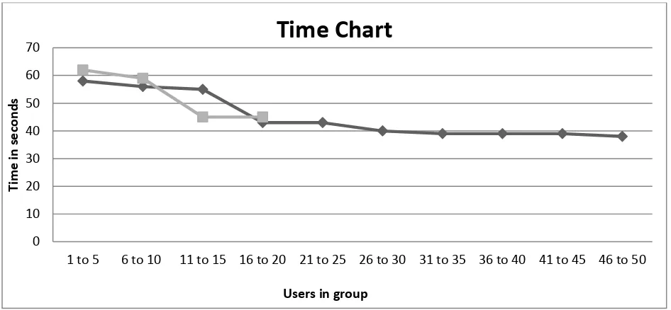
6.3. Time ...51
6.4. Adaptation ...52
6.5. Questionnarie ...54
6.5.1. Learnability ...54
6.5.1.1 Easiness ...54
6.5.1.2 Undrestandability ...55
ix
6.5.3. User Satisfaction ...58
6.6. Necessity ...60
6.7. Problems ...60
VII. CONCLUSION AND FUTURE WORK ...62
7.1. Conclusion ...62
7.2. Future Work ...64
APPENDICES ... 66
Appendix A ...66
Appendix B ...68
REFERENCES ...74
x
LIST OF TABLES
1. Table 2.1 – Comparison of various Models…………..………...22
2. Table 6.1 – Distribution of participants in the test according to their academic level….48
xi
LIST OF FIGURES
1. Figure 2.1 Transition States of WBM model………7
2. Figure 2.2 ECA rule model………...9
3. Figure 2.3 Components of visually impaired people adaptation framework………..10
4. Figure 2.4 Decision Support System flow………..13
5. Figure 2.5 JADE architecture diagrams………..20
6. Figure 4.1 Architecture diagram of framework………..32
7. Figure 4.2 Multi language deployment diagram of system………...……….35
8. Figure 4.3 Algorithm of working of framework……….37
9. Figure 6.1 Average times taken to complete a query..………...51
10. Figure 6.2 Adaptability factor of query..………53
11. Figure 6.3 - Comparison of average Easiness point of different groups………55
12. Figure 6.4 – Comparison of Easiness point to the estimated Understandability point ………56
13. Figure 6.5 – Comparison of Efficiency between different groups……….58
1 CHAPTER 1
INTRODUCTION
1.1Introduction
The Web is steadily growing environment. Information systems are providing an escalating
amount of processed data, both to professional users and also to large number of ordinary users
across the globe. Earlier, websites and information systems were providing very slow and static
data to the users, but nowadays, web applications are becoming more and more complex, thus
providing users with a reliable and dynamic data. Easy to use interface and query languages are
being developed, which form the part of the information systems and deliver and map the data
into visualization to understand the data nature [1] which is defined as the nature of data sets like
real valued data sets, Boolean data sets, integer data sets etc. Data is available to users in various
complex forms which relate to fact, event and transaction in unprocessed form when this data is
processed in such a way as to be meaningful to the person who receives it becomes information.
Studies have found that there are massive amount of data available but it is not always used to
deliver the exact and required information. Various architectures are introduced to deliver the
efficient and intelligent deliveries of data. Data delivered after number of queries is of no use if
the users who analyze the data are unable to analyze the data in the proper way. To overcome
this, various frameworks are used to deliver the processed query data in the form of
visualization. One part of these types of approaches is the “Personalization of information”
delivered. By referring to Personalization of information here, we mean to deliver the
personalized data to end users according to requirements and specific needs and roles of data.
These types of information are intelligently delivered to the users, who are unaware of the
2
In the advancement of “personalization of information” approach the “Affective
Computing” or “Adaptive Web” is the one area, which aims at bridging the gap between the
human emotions and computational technology. Adaptive web applications are the intelligent
applications, which deliver the right content to users at the right time while taking into account
their preferences. Each user has different ways of looking at same point. Adaptive web
techniques once start at the same level and as the users interact with the applications it keeps
tracking their emotions, their likes-dislikes, their preferences, their ratings and also their
approximations. Numerous numbers of techniques for adaptation have been introduced
conceptually and practically. We propose an approach and a framework, for measuring history,
experiences and satisfaction of individual users of a healthcare decision support system. The
focus is on user selections of visualizations, based on the nature of queries generated. The
framework aims at a collection of individual user experiences and satisfaction in order to obtain
a user population profile for later studies. The model used is a weighting scheme, but is
designed to support later extensions and enhancements using AI reasoning techniques. The
system supports increased accuracy and reduced time of selection of visualization over repeated
usage and is therefore important as a productivity enhancement approach.
1.2 Problem Statement
To outline the objective decision support elements in data visualization frameworks- specifically
in context of adaptability, a range of Data Visualization, multiple platform deployment and
automated selection of visualization. Furthermore these adaptive approaches to visualization
selection and satisfaction will improve productivity, accuracy and timeliness of decision making
3 1.3Motivation
As the Internet is evolving, perspectives on the nature of web applications are changing rapidly.
By observing user’s interaction with the application, it can be found that what features are best
served and most required by him. To address the personalization and adaptation nature of each
user, Adaptive Web has emerged as the new research area. Capturing human behaviors in
adaptive visualization system is a challenging task. In these visualization systems, there are
myriad factors that account behind an individual’s selection [2]. It gets typical when different
users may have different perspective on same data visualization. We may consider different
visualization of same data sets to understand it correctly but when visualization is critical factor
in the decision support system, we need best served visualization of that query and data
respectively. To build a kind of adaptive visualization framework, we fore mostly need to
develop such a framework, which is able to read a raw data (sorted in nature) and also capable in
visualizing those data sets. These visualization frameworks should have the ability to visualize
data sets into various multi-color visualizations, multi-platform deployment and by using such an
approach we should be able to make a framework, which can provide large visualizations to end
user to select best suited visualization for given query and contributes in the adaptability factor.
Adopting such an approach should enable us to develop more realistic adaptive data visualization
frameworks.
1.4Thesis Statement
Extend Data Visualization to include adaptability ingredients and to create a framework for
4
Health care system is highly dynamic and time constraining environment, which includes various
key factors that are part of almost every social system.
1.5 Thesis Objective
The aim of this study is to outline the objective decision support elements in data visualization
frameworks, specifically in context of adaptability, a range of Data Visualization, Multiple
platform deployment, automated selection of visualizations and critically examine the influences
of the factors that contribute to certain decisions in DSS.
First objective is to make an attempt to form a model data into visualization form. Data exists in
various forms. It is only usable if we can figure out any important facts from the raw data
available. Various query languages have already been generated to run various queries on these
raw data sets and to get certain amount of required results. Results obtained are also in the form
of data sets but in some sorted form. These sorted forms of data sets are still complex to
understand. Here visualization plays an important role as it helps to visualize these complex
forms of data into colorful, multidimensional graphs charts etc. that can be easily understood by
humans. Second objective is making this visualization framework adaptive in nature.
Adaptability delivers right content to users as per their requirement of certain query, at right
time, with right information. E.g. If health care workers run a query about the new cases of
cancer for last 10 years, then they would get data for the last 10 years in numerical forms but in
adaptive visualization form they might get a visualization chosen by another users which
effectively demonstrate the data values in graphical form. Third objective is to present an
adaptive data visualization framework as a tool for decision support and create a bridge to other
5
The outcome of this research may offer important evidence for creating supportive systems for
adaptation in data visualization that maximizes their performance. For instance, in health care
systems, where time-critical events require certain decisions, best served visualizations for given
queries provide a stronger basis for beliefs, where visualization is important factor of system.
Also, this framework is intended to provide for collection of individual user experiences and
satisfaction, in order to obtain a user population profile for later studies. These studies can be of
any type to get results about certain decisions and beliefs of particular society of people on
certain data sets. These findings can allow allocating the settings that can maximize the quality
of adaptability in visualization systems.
1.6Contribution
In this research, an Adaptive Data Visualization system was designed, we analyzed the
architecture and life cycle of existing adaptation middleware and proposed the design of a
visualization framework that adapts and delivers the visualization, which is best served in its
categories. The proposed framework uses the visualization libraries to deliver the data sets in
graphical form, and also is adaptive in nature, so that it adapts the optimized path. In fact, the
proposed framework can be considered as an early attempt of adaptation in visualization form, as
the adaptation framework has already been experimented and implemented in wide areas that
require systems for adaptive framework. The proposed framework in this thesis is adaptive in
nature, which can be used independently of any another block to increase the user experience,
and also contributes in the field of decision making by providing direct evidence suitable for
6 1.7 Thesis Organization
The remainder of the thesis is organized as follows; Chapter 2 provides a literature review and
background survey, which describes adaptation and decision support systems, numerous
components involved in adaptation and various other adaptation frameworks available. Chapter 3
describes data visualization and analysis of data visualization techniques available. Chapter 4
describes brief overview of proposed adapted data visualization systems by discussing algorithm
and several components involved in architecture designs. Chapter 5 is about implementation and
designing of system and also about usability of system. Chapter 6 describes the results captured
in usability testing and satisfaction of users. Chapter 7 concludes the thesis and proposes some
7 CHAPTER 2
ADAPTATION AND DECISSION SUPPORT SYSTEMS
2.1Introduction
In this chapter, a number of components of the adaptability have been discussed, which plays an
important role in adaptive data visualization. Adaptability modeling has been discussed and role
of its key elements e.g. adaptability in various systems, influence on the system has been
described. Adaptive Data visualization could further be used as a decision support system, which
could be a useful tool for organizations in decision making activities.
2.2 Adaptation Frameworks
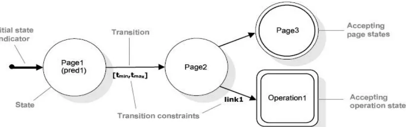
2.2.1 The Web Behavior Model (WBM)
WBM model is timed state-transition automaton for representing classes of user behaviors on the
web [3]. Graphically, WBM models are expressed by labeled graphs, allowing for an easily
comprehensible syntax. Basically, there are different types of states, which are loaded in web
browsers and special scripts i.e. WBM script. This script is run to know about the current state
and as the state changes; it is accepted by another state. So there is at least one initial state and
also one accepting state. This model doesn’t cover all the alternative navigations.
8
Figure 2.1 describes the transition states defined in WBM with different transitions. State
constraints - Entering a state may be subject to the evaluation of a state constraint, expressing a
predicate over properties of the pages being accessed or operation being fired [3]. Such predicate
may refer to contents displayed within pages or to operation parameters. The state is accessed
only if the predicate evaluation yields to true [3].
Link constraints - Each transition may be labeled with the name of a link entering the page or
enabling the operation. The state is accessed only if the specified link is navigated. Time
constraints - Each transition from a source to a target state may be labeled with a pair [tmin,
tmax] expressing a time interval within which the transition can occur. Either tmin or tmax may
be missing, indicating open interval boundaries. If a transition does not fire within tmax time
units, it can no longer occur; on the other hand, navigation actions that occur before tmin are lost
[3]. The use of suitable time constraints may thus cause the invalidation of running scripts. One
important aspect of WBM models is that not all navigation alternatives must be covered. As the
aim of WBM is to capture a concise set of user interactions, describing particular navigation
goals and respective “milestones”; only a subset of all possible navigation alternatives is
relevant. E-commerce Web sites, for an example, make heavy use of so-called access-pages that
only serve the purpose of providing users with browse able categories for retrieving the actual
products offered [3]. Furthermore, Websites usually provide several different access paths
towards their core contents. Therefore, by concentrating only on the interactions that really
express the navigation goals, WBM allows both abstracting from unnecessary details and
defining small and easily comprehensible specifications. Only performing specified target
9 2.2.2 Limitation of WBM model
WBM is a timed state-transition automaton for representing classes of user behaviors on the
Web. Limitation in WBM model is that adaptation patterns are already designed at designing
stage without requiring a profound knowledge of the actual application structure. For complex
system adaptation patterns there is no way to design adaptation factor at designing stage so this
motivate us to make adaptive model in which no fixed rules are defined at designing stage and
which can change adaptive factor according to users input.
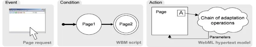
2.2.3 ECA Rule Model (ECA)
In the advancement of upper model, a new ECA rule model is introduced that combines WBM
scripts and Webml Adaptation system. In this model, rule engine is introduced containing certain
set of rules and as a state changes, a new rule is defined and new script is generated, navigating
from one URL to another. Rule engine shares the data and storing the data of completed states
with the user profiles. Rule engine is not bounded to technology used web application and it can
handle various web applications also. In case of crash of rule engine, web applications are
operational and rule engine can be recovered independently [3]. So rule engine captures the
transition records and saves them for making new rules.
Figure 2.2 ECA rule model.
Figure 2.2 shows the ECA rule model acting in response to a user’s visit to Page1 followed by a
10
accepting state Page2. Once the accepting state is reached, the actions (expressed as cloud in
Figure 2.2) are executed and, after a re-computation of page parameters, possible adaptations
may be performed.
2.2.4 Limitation of ECA rule model
ECA rule model was introduced with adaptation rule engine which captures behavior and later
these can be used in defining adaptive factor. But it only works at “on and if” conditions. If
specific event occurs then only adaptive results will be shown. Also this adaptive rule is strict to
specific page that user explore. So we need an adaptation rule engine in which all events will be
captured and which later can be used to provide adaptive results when certain event occurs. The
adaptation rule engine can also be used to capture all behaviors and later these results can be
used to increase efficiency of system.
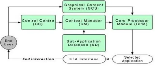
2.2.5 Adaptation model for visually impaired people
It is a framework to enable visually impaired people to gain access to graphics on internet. It is
limited to specific type of users and hardware but now new framework has been introduced,
which works adaptively considering different user profiles[4].
11 The main components of the system include:
(a) Sub-Application Database (SD):- It is a standalone application that is capable of either
extracting information of a vector graphic or rendering a bitmapped graphic. It processes the
gathered data about the graphic and converts it into an accessible hepatic, tactile, audio (or a
combination of any) interface [4]. There are a few reasons these functions are incorporated into
different independent sub applications.
(b) Graphical Content System (GCS):- GCS provides the launching interface to application
with perceiving information about graphical content selected by the end user. It also defines the
type and format of the graphic, after the trigger action is performed by the user. Also GCS is
responsible for sending information to CPM to carry out adaptation of content.
(c) Control Centre (CC):- Control centre allows users to read and modify their profile and
preferences, system configurations and sub-application settings. Though user profiles are created
during the system installation process, user still can change their preferences manually later. It
also provides import and export function.
(d) Context Manager (CM):- It stores and manages the context information i.e. information
required for adaptation that includes information about (a) graphical contents, (b) system
configuration and hardware/software components of assistive technologies, (c) requirements
(e.g., system configuration) and feedback provided by each sub application (both information is
specified by the sub application developers), and (d) user’s profile and preferences[4].
(e) Core Processor Module (CPM):- CPM performs adaptive logic by gathering input provided
by both GCS and CM. The CPM performs the adaptation to locate the most adequate end
12 2.2.6 Limitation of adaptive impaired model
This model is designed specifically for visually impaired people. This model requires different
kind of visualizations and hardware for actual system to work. Main limitation of this model is
that people needs to change hardware so that actual system got adapted. But same time in as in
adaptive model introduced here give users different kind of visualization and users have to
choose best suited visualization so that they can understand and gain access to rest of
visualizations.
2.3 Decision Support Systems
Making decisions concerning complex systems (e.g., the management of organizational
operations, industrial processes, or investment portfolios, the command and control of military
units; or the control of nuclear power plants) often strains our cognitive capabilities [6]. Even
though individual interactions among a system's variables may be well understood, predicting
how the system will react to an external manipulation such as a policy decision is often difficult.
There is a substantial amount of empirical evidence that human intuitive judgment and decision
making can be far from optimal, and it deteriorates even further with complexity and stress.
Because in many situations, the quality of decisions is important, aiding the deficiencies of
human judgment and decision making has been a major focus of science throughout history [7].
Disciplines such as statistics, economics, and operations research developed various methods for
making rational choices. These methods, often enhanced by a variety of techniques originating
from information science, cognitive psychology, and artificial intelligence, have been
13
computing environments for complex decision making. Such environments are often given the
common name of decision support systems (DSSs).
Decision support systems have become popular primarily because of their capability to fill the
need of decision making by given information. A Decision Support System is a class of
information systems that supports business and organizational decision making activities. DSS
couple the intellectual resources of individuals with the capabilities of the computer to improve
the quality of decisions [7]. It is a computer-based support for management decision makers,
who deal with semi-structured problems. A properly designed DSS is an interactive
software-based system, intended to help decision makers compile useful information from a combination
of raw data, documents, personal knowledge, or business models to identify and solve problems
and make decisions. Decision Support System is a general term for any computer application that
enhances a person’s or a group’s ability to make decisions. It can also be used as a tool in which
user inputs the data and the software component process the data and decisions are made on the
basis of the information given. In order to make the decision making tool, all the major
components of the system should be considered in the system to get the optimal results.
14
Consider an example: A national on-line book seller wants to begin selling its products
internationally but first needs to determine if that will be a wise business decision. The vendor
can use a DSS to gather information from its own resources (using a tool such as OLAP) to
determine if the company has the ability or potential ability to expand its business and also from
external resources, such as industry data, to determine if there is indeed a demand to meet. The
DSS will collect and analyze the data and then present it in a way that can be interpreted by
humans. Some decision support systems come very close to acting as artificial intelligence
agents. DSS applications are not single information resources, such as a database or a program
that graphically represents sales figures, but the combination of integrated resources working
together.
Decision Support Systems are valuable in situations in which the amount of available
information is prohibitive for the intuition of an unaided human decision maker and in which
precision and optimality are of importance [8]. Decision support systems can aid human
cognitive deficiencies by integrating various sources of information, providing intelligent access
to relevant knowledge, and aiding the process of structuring decisions. They can also support
choice among well-defined alternatives and build on formal approaches, such as the methods of
engineering economics, operations research, statistics, and decision theory. They can also
employ artificial intelligence methods to address heuristically problems that are intractable by
formal techniques. Proper application of decision-making tools increases productivity,
efficiency, and effectiveness and gives many businesses a comparative advantage over their
competitors, allowing them to make optimal choices for technological processes and their
15
Decision making is a fundamental managerial activity. It may be conceptualized as consisting of
four stages: intelligence, design, choice and implementation.
2.3.1 Important aspects of the Decision Support System
Below we list those aspects that are considered important to decision support systems.
1) The most important consideration is the Decision Support System's ease of use - its ability to
allow non -technical people to deal with it directly. The single greatest and most enduring
problem with computers has been their inflexibility, their inability to let the person, who actually
needs the data, to deal directly with the computer.
2) The ability to access information should not be restricted to only the part of an organization or
to only certain managerial or professional groups. Instead, the resource should be distributed to
all the people and part of an organization needing it, without widespread access; the power of
advanced Distributed Processing System will go untapped as they typically have in the past.
3) The ideal Decision Support System, in sharp contrast to previous method of designing
applications, should not be a 'system' in the strict sense of the term. Rather, it should be a highly
adaptive decision support generator that can easily be used by professionals to quickly design
data support prototypes suited to each specific decision-making task. This adaptive tool must
allow quick design changes, if the original design does not closely match a person's information
gathering style or needs.
4) To adequately support the human element, this highly adaptive support capability must be
able to provide access to operational data and as well as to summary data that has already been
16
important, this tool must provide the professional with access to an organization's raw data and it
must also allow the access to be accomplished in one step using a single uncomplicated
procedure or command and without having to re-key non summary data.
5) The organizations need to access original data sometimes because efficiency is related to how
well the original data is organized in the system; so the Decision Support Generator should be
able to interface with the true DBMS. It should also be able to access standard 'flat' files
indirectly, using the power of the host computer to facilitate both the user interface and data
access without changing existing files.
6) The management or professional information workstation would incorporate a keyboard,
display screen and an interface to a printer which could print everything from straight text to
graphics like pie charts, bar charts and line charts.
7) The support tool must interface with several different systems and capabilities, it must be
compatible with all of them, the tool must provide users with a single easily used language to
access manipulate and present data in a way that will best support the end-user.
2.4.2 Capabilities offered by DSS:
1) Support decision making in ill-structured situations- in which, precisely owing to the lack of
structure, problem do not lend themselves to full computerization, and yet require computer
assistance for access to and processing of voluminous amount of data.
2) Help to rapidly obtain quantities results needed to reach the decision.
17
4) Foster high-quality decision making by encouraging decisions based on the integration of
available information and human judgment.
5) Offer flexibility as opposed to a preordained pattern of use - making it easy to accommodate
the particular decision making style of an individuals.
6) Facilitate the implementation of the decisions which frequently cut across department
boundaries.
7) Support group decision making particularly through group DSS (GDSS).
8) Give organization the opportunity to gain a better understanding for their business by
developing and working with models.
Decision support systems are used in various domains from military, education industry and any
other industry. DSS tools are being used to improve the effectiveness of the system rather than
the efficiency of the systems. These tools are potential measuring tools, which are used for
management purposes. In DSS, the decisions are largely dependent on the quality of
information. While concluding any decisions, best case scenarios are always considered with no
faults in a system. Problems arise when the quantities of available information are huge and non
uniform and their quality could not be stated in advance. Decision support systems for observing
a complex system is a challenging task to build. Complex systems are highly dynamic in nature,
which consist of various parameters that have specific effect on the system. Once we have all the
important parameters of the complex system in the DSS, it is easy to conclude the decisions but
18 2.3.3 Summary
In section 2.2.1, we analyzed the WBM adaptation rule model which defines the adaptation rules
by using which adapted systems can be built to provide users adapted results it has limitations
that adaptation rules are already designed in the system. Based on our further analysis in Section
2.2.3 we have found that advancement of adaptation is to make rule engine in which certain rules
are defined and these rules can be used for further adaptive factors main limitation is that it
works only with “on and if” conditions. If these conditions can be removed than this rule engine
can be further used for providing actual adaptive factors. Then we have studied about adaptive
engine used for visually impaired people to provide them real access to visualizations but
limitation is to change hardware so that they got access and can see visualization but from this
study we analyzed that rather than changing hardware if we change our software to produce
different kind of visualizations for normal users it can be beneficial to understand it and make it
adaptive according to their specific needs.
Later we have studied decision support system and their capabilities which provide us brief
description of architecture and their real time evolvement in various domains. Our next objective
is to make adaptive engine which capture users behavior, their likes dislikes on previous
selections and provide results according to their requirements. In decision support system such
type of adaptive framework is lacking later in this visualization framework will be introduced
which provides adapted results of data visualizations in decision support system.
19
The objective of our work is to demonstrate that the adaptive web approach, and its entire set of
supportive mechanisms provided by WEBML, ECA rule and another frameworks, can be
integrated into the data visualization platform, through enhancing the capability of decision
support systems in which visualization is important part of DSS.
In this thesis research, our practical goal is to construct adaptive data visualization system which
proves to be productivity enhancing tool in decision support system where visualization is
essential part of decision, while also serving as foundation platform for future research. We
focused on solving limitations in previous adaptation frameworks, namely predefined adaptation
patterns, on and if conditions and hardware alteration. Another goal is to built a data
visualization framework which has capabilities of rendering complex forms of binary data sets,
across platform deployability and provides direct evidence with enhanced options for user choice
and multicolor visualization to data set users.
2.4 Related Work
2.4.1 In the domain of adaptation in e-learning
Related work can be seen in the WEBML system [3] in which the platform, which is adaptive in
nature and independent of any language, is made and it runs. This is open framework and can be
used with any system. This was first implemented in the e-learning systems which are largely
becoming adaptive by user choices. The user first logins in the system of e-learning to see the
various courses offered. If the user is not interested in any or some courses, the system captures
this user behavior. This is done purely in the navigation from one type of course page to another.
When user logins again in the system, only those courses are offered, in which the user shows
20
Advancement is done based on this architecture. Link and time constraints are fully implemented
and rule engine is introduced in which all the rules are captured and further, the application
works on these rules.
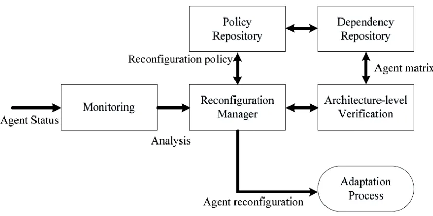
2.3.2 In the domain of adaptation in Agent system
Another related work is the JADE (Java Agent Development Framework) [5]. The proposed
agent platform employs agent containers, so that the agents can handle creation,
self-management, and self-destruction operation based on the context-aware services with the filtered
and compounded context information of the context monitor [5]. It also employs the
reconfiguration manager, which dynamically reconfigures the platform by looking up the agents
and services through the discovery operation.
Figure 2.5 JADE architecture diagrams.
The run time adaptation approach takes advantage of architecture modeling and multi-agents. It
uses matrix-based dependence analysis model to guarantee the required performance after the
21
process [5]. The agent adaptation manager consists of analysis, reconfiguration, and
architecture-level verification component for processing agent reconfiguration at runtime. The agent itself
uses the fd matrix to verify the performance prerequisites at run time. The reconfiguration
manager is one of the abstract components of the platform manager. The monitoring component
uses an agent thread in the agent container to observe the status of the agent. It analyzes the
runtime throughout, with regards to the performance constraints. The policy repository manages
the adaptation strategy using the dependence matrix. The reconfiguration manager checks the
information extracted from the monitored data, and then decides appropriate adaptation strategy.
For this, there is a predefine adaptation and decision policy. Following this, it starts the
reconfiguration process by transforming the matrix. The dependence repository keeps the matrix
representation used in remote agents, which is handled with agent repository for providing detail
information of implementation [5]. After the policy is determined, the architecture-level
verification checks the validity of the reconfiguration.
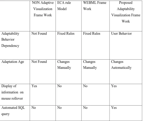
2.4 Summary
In Table 1, we compare the related works with the current proposed framework, we state once
again that our goal is to make adapted visualization framework which is optimized to produce
data visualizations from data sets, with enhanced motion based visualization, decision making
tool with multiplatform deployment. The features listed under the proposed adaptation
visualization framework column can be viewed as a wish list that needs to be implemented in our
22 NON Adaptive Visualization Frame Work ECA rule Model WEBML Frame Work Proposed Adaptability Visualization Frame Work Adaptability Behavior Dependency
Not Found Fixed Rules Fixed Rules User Behavior
Adaptation Age Not Found Changes
Manually Changes Manually Changes Automatically Display of
information on
mouse rollover
Yes No No Yes
Automated SQL
query
No No No Yes
Table 2.1 Comparison of various models
.
23 CHAPTER 3
DATA VISUALIZAION
3.1 Data Visualization
Data visualization means providing the image of existing software using visual objects. Data
visualization might visualize different aspects of the data, such as data structure, comparison,
flow and even the certain behavior of the data trends. It is proven that appropriate visualization
can significantly reduce the effort spent on different phases of data comparisons and
development of various decisions based on the data types. By means of visualization, data
analysts and stakeholders can obtain an overall point of view of the data structure, data logic or
explain and communicate with the decision support process [10]. Generally, data visualization is
used for data behavior exhibition, so that complex data can be viewed and compared with simple
visualization. A numerous data is available to study and compare these types of data to reach
certain decisions in less time. Data Visualization is considered as the best technique logically and
practically. By providing a good graphical representation in order to visualize the data, a better
user understanding of the system can be more promising than textual representation of the data
[9].
By graphical presentation of data, the capabilities of the user’s data processing would be utilized
much more effectively than other presentation methods. If a suitable graphical representation
tool is chosen properly, there would be less need for perceptual and mental information
recording and it would reduce the memory loads. By providing graphical interfaces, there would
be a faster information transfer between computer and people because it has been proven that
24
Also, because of its simplicity, graphics will remain in casual users’ minds a lot easier. It also
gives a better feeling of control to users when they can see objects on the screen. Overall,
graphical visualization can provide many other benefits such as faster learning, faster use and
problem solving etc.
There are several data visualization tools and techniques available. Visualization techniques
consist of collection of elements, such as points, lines, shapes, texts and textures which each of
these elements illustrates as an entity or an attribute from a dataset, which is going to be
visualized. In some cases, more than one visualization technique can be applied for a system.
Data visualization techniques can be categorized into two groups of static visualization and
dynamic visualization of data. An example of static visualization of data is visualization formed
by certain data sets in static forms, which forms just like charts and also represent static value.
On the other hand, dynamic is one in which chart value changes with certain time frames. Here
we define time frame that can be time span of certain years or it can represent the same time.
There is difference between values of two columns, which can be later overcome or kept same.
With regard to dimension, visualization can have either two or three dimensions.
Two-dimensional visualizations tools mainly involve graph or treelike representations, which may
contain many nodes and arcs [11]. For some systems, which have too much information to be
visualized, using two-dimensional technique may cause confusion. Therefore, in some papers,
the need of extra spatial dimension is suggested, which may make it more possible for the
25
To choose the best visualization technique for the existing data, first of all, the reason and goal of
the visualization should be clear. Then the group of users and their level of knowledge and
experience with computer systems should be defined. Also, all the existing data sets and
elements in the datasets and all the relationships between them should be detected and the
aspects of the data, which are going to be presented, should also be decided. The usages and
limitations of the existing system, which is going to be visualized, should also be investigated
[12]. On the other hand, the current data visualization techniques need to be evaluated. At the
end, the technique that displays the best visualization of data sets and meets the requirements of
the system should be chosen and implemented.
3.2. Data Visualization Techniques Analysis
The main reason for this visualization is to make the text-based system comprehensible for users.
In this case, users would spend less time to have a more clear and precise point of view of the
system. It will happen in this way that instead of reading the data and memorizing the structure
of the datasets, users will see the flow of the data dynamically while working with the text-based
system and have an overview of the all datasets in a big scale in front of them.
The decision-makers always use data to identify opportunities, trends, and areas of concern in
their respective businesses. Most data reaches to them is in the form of tabular reports, and they
find it challenging to quickly and effectively absorb the information, spot patterns, identify
aberrations, and see hidden relationships. Fortunately, though the volume of data that they deal
with is ever expanding, data-visualization tools have been evolving to the point that they can
now transform large quantities of complex data into meaningful visual representations that
26
Basic Charting is the most common and basic form of data visualization. Basic charting involves
Pie, bar, and line charts that help the audience in quickly identifying general upward and
downward trends as well as groups within the data that are performing differently than other
groups. These basic charts are typically used to display the relative performance of key business
dimensions, such as market segments, product groups, geographic regions, and business units.
Instead of looking at a tabular list of numbers, the audience can literally see how data relates to
other data. By effectively highlighting exceptions, these charts allow the audience to spend more
time pursuing an opportunity or resolving a problem and less time trying to discover or define it.
Most online query and reporting tools generate these charts automatically, thereby reducing the
time that end users spend manually creating charts in offline tools such as spreadsheets [13].
Graphical Indicators involve Graphical icons, colored symbols, stoplights, gauges, and other
performance meters that are being used to provide audiences with a rapid visual overview that
shifts focus to the information of greatest interest and reduces the time otherwise spent studying
an entire screen of information [13]. This has been particularly useful in enhancing scorecard
reporting systems that once simply presented an at-a-glance view of a tabular list of key metrics.
Scorecards and dashboards increasingly incorporate basic charts to display summary information
and as a way to present additional information once the user selects a particular metric. For an
example, confronted with a summary metric indicating that revenues are flat year-to-year, a
supporting bar chart can quickly communicate which regions are growing, declining, or flat.
Advanced data-visualization applications provide sophisticated graphical representations.
Whereas a bar or pie chart represents a simple series of data points. Advanced visualization
applications can display more than a half-dozen dimensions per graph object. These graphical
27
charts, histograms, scatter plots, constellation graphs, geographic maps, floor plans, spatial
images, statistical control charts, and heat maps among other graphical images. Since companies
are no longer encumbered by tools such as basic query report writers and pivot tables (which can
be challenging and inefficient to use when many data attributes are involved), they are unlocking
valuable information about customers, products, markets, sales reps, employees, and financial
performance [13].
Animation adds another easily consumed aspect to visualizations. Watching data change over
time gives both a velocity and direction to the values it represents. Knowing your current sales
and expenses is a good thing. Knowing whether they are increasing or decreasing and at what
rate can be critical to the business.
Immersive data-visualization solutions place the audience in a virtual environment containing
three dimensional representations of complex data.
The environments range from desk-size to wall-size to room-size systems and combine
visualization, computational, data management, and projection technologies. Immersive data
visualization is being used extensively in the areas of research and product development, where
users benefit from hands-on interactivity with virtual models, prototypes, and data sheets.
Imagine flying through multidimensional sales or cost data sets to identify trends, patterns, and
outliers [13]. The business analyst’s desk job may never be the same.
Interactive Capabilities Interaction is the key to provide a full information experience. While the
traditional reporting environments presents a static pie and bar charts, interactive visualization
applications allow the user to directly interact with the chart or image to study the underlying
data and discover new information. Charts or images can be rotated to reveal the most insightful
context-28
specific information about a data point, including the data value and various dimensional
attributes such as geographic location, demographic group, organizational entity, etc. Scroll bars
can be used to move left, right, up, and down to view data points that would otherwise be off the
screen due to the limitations of traditional bar and line charting tools.
Filter planes allow the user to isolate data points above a threshold value, much like mountain
peaks rising above low level clouds [13]. This draws the audience’s attention to the values of
greatest interest. These capabilities are analogous to a visual query where users can select subsets
of the data, zoom in to detail, filter unwanted values, and drill down into areas of interest, much
as they would with a programmed query but without the need to decide in advance which
dimensions of the data to focus on. This direct interaction with the visualization allows the user
to shift focus from query writing, report formatting, and user interfaces to information discovery
and analysis [13].
The linkage of information across display elements through color-coding and synchronized
context represents one of the most powerful advanced interactive capabilities. This presents a
richer comparative context, making it easier to consume information and relate back and forth
between images as the user makes various analytical choices.
3.3 Summary
In this chapter we studies and analyse the various techniques of data visualization. As data
visualization is a vast field so before starting our framework it is mandatory to understand
visualization theory. How actually visualization helps real users to demonstrate various facts of
collective data. This chapter here analyse the various aspects involved in the study of
visualization by providing information and capabilities offered by data visualization techniques.
29
these techniques we are implementing in our framework so that this adaptive framework actually
works and provide results to real time users. Further these visualizations are analysed and only
those visualizations are added which actually interpret and actual meaning of data sets and which
are understandable by human being as these visualization may play important part in decision
30 CHAPTER 4
PROPOSED ADAPTIVE BASED DATA VISUALIZATION FRAMEWORK
4.1. Introduction
Previously developed visualizations frameworks are capable of producing various data
visualizations. These frameworks are designed to produce certain type of charts and
visualization, which are able to render data sets into graphical forms. They manage the data sets
and are able to visualize them according to the graphs requested or designed by the users to show
the end results. As the data sets change, the form of visualization changes as well. Users are able
to view only the graphs which are designed to show the results. Later users can switch from one
type of visualizations to another type.
An improvement that can be applied to data visualization framework is the behaviour of the
system. Adaptive based data visualization is presented in this thesis, which visualizes the data
sets and produces the end results which are best served in its class. It is used in the decision
support systems, where time critical events are required to view the best results of given data
sets, which is best served and chosen by users and adaptively produced. It has already been
mentioned in previous chapter that visualization techniques are considered as best way to get
results of large number of data sets. Also, this framework is independent component, which can
be applied and can be used on numerous systems and is free of specific language requirements.
For this reason, this visualization method shows the adaptivenes and cross platform
deployability. Visualization is done on the service layer and top of them. Various questions are
asked from users to gather user information and also to gather log of user’s time spent on
31
approaches and factors which also contribute in adaptivenes of the system. Two dimensional
charts are used now to produce visualization but to visualize data sets it can be infinite data sets,
which can be visualized on framework rather than doing queries on database. Also all charts are
motion charts, which change with time spam. So these charts can also be used as one another
dimension i.e. time. The goal of this adaptive data visualization framework is to give the user,
which is mainly a decision maker, a better understanding of the data sets, and helps in quick
decision making where time critical events are major part of the system.
4.2 Architecture of the Adaptive Data Visualization framework
The deliberations conversed in the previous section let us see the system architecture with the
following features:-
The graph based data visualization platform for representing data bases. This platform is
suitable for representing multiple data sets in the graphical form to visualize the data
from number sets to certain figures. This platform is independent of backend technology
and can be implemented in any system.
The user adaptation engine is introduced, which is used to deliver the visualization of
data sets intelligently, which is best served in its category. This adaptation system is
capable of adapting the environment and changes automatically to deliver the user
preferred visualization for certain type of data sets.
There is culture leader’s approach, which enables the system to work independently and
intelligently from another sub category of visualization and also this influences the
32
This defines two algorithms – One is for adaptation and another is to represent the
different visualization of the same data sets to two different users.
The construction and the management of an effective user model, which allows the
system to provide the user with the most appropriate visual representation according to
his or her skill and needs.
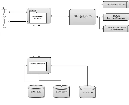
33 4.3 Architecture of system
In Figure 4.1 the architecture of the system is shown, which incorporates Visualization Platform,
User Adaptation Engine which incorporates the visualization library, Cultural
Behavior/knowledge, User Authorization/Authentication. Also there is a query manager, which
is connected to Data sets to retrieve the required information from the data base by running
certain queries. User Adaptation Engine is responsible for adapting the user preferences path, as
user interacts with the system and updates the adaptive path and serves the best path to other
users according to their queries. User Adaptation is intelligent enough to provide the best served
visualization to users adapted by users. User adaptation engine uses artificial intelligence by only
displaying visualizations according to quality of data, by quality of data means that there is
numerous numbers of data sets available, but all of them can’t be used in same visualizations so
for this user adaptation engine checks which visualizations are best served for given quality of
data. Also, User adaptation engine is responsible for recommending users the visualization
chosen by expert users or we can say expert users are influence people which can change the
adaptation pattern and influence other users by using their intelligence on given queries.
4.4 User Role
Adaptive data visualization framework is designed to work in different organizations of different
area of work. Each organization has data integrity policies for different level of users for this
user role module is designed in framework. Each level of users has access to visualization
according to their role specific needs. Only users with specific permission of visualizations are
able to get access to all kind of visualization libraries. Thus it purely works on the role based
34
All Chart= {A}, Line Chart= {L}, Column Chart= {C}, Bubble Chart= {B}
User X = {C} ∪ {B}, User Y= {A} ∩ {C}
By introducing user role to our framework, we can easily manage user profile and each user can
has special permissions to the visualization as for some user role, they just need single chart type.
Also in our data visualization system each user has different role and user adaptation engine is
intelligent enough to capture user personal behavior on same data or can say remember user
choices on same kind of data so when query is done on data base, user adaptation engine check
about choices of visualizations used by users in previous selections on same kind of data sets and
give users that visualizations.
4.5 Data Labeling
Data labeling is defined as labeling of data sets, so that when the data sets are viewed by the end
users, they provide the information of data sets in its end value. In the visualization, data is
represented in bar, pie charts, bubble charts etc. When end user views the result of end query,
data is represented in the form of charts and each user interprets the data in different way. So
data labeling is must in the visualization form. In our framework, when user roles over the mouse
on the visualization, values of the data is represented with maximum information, which can be
delivered to the end user. So data labeling provides all relevant information with other
information at the side.
4.6 Query
In the framework, Query builder works with the framework. By running a single query, user can
35
values, user can see the visualization of a single data set in multiple ways. User need not to run
the queries at each time to see the different visualizations.
4.7 Chart Types
There are different types of charts available in the framework. To display the data in multiple
forms, different chart types are required. As per the user requirements, Chart types and
authentication is provided to the end user. These chart types can be latterly added in the system.
Various available chart types, which can be implemented in the system are –Area Charts, Line
Charts, Bar Charts, Column Charts, Pie Charts, Bubble Charts, Candle Stick, Multiple Series,
Plot Charts, Cascading Column, Multiple Data and HLOC Charts.
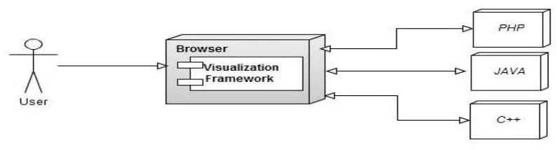
4.8 Multi Language Deployments
This Visualization framework can be deployed on multi language frameworks, since this system
can be used in number of multi-language computer systems. Proposed system can be enabled to
work with java, C++, vb.net etc. as this framework is designed to work cross platform to give
visualization without changing any language. Any language can send request to display
visualization.
36 4.9 A.I. approach
User adaptation engine is responsible for providing adapted results by using artificial intelligence
approach. User Adaptation engine capture user’s behavior about choices chosen by users on data
sets. It capture’s and displays same choices of visualization when same kind of data sets are
selected. Moreover intelligently it recommends another user’s about choices chosen by expert
user. Expert users are user’s which influence other users; results chosen by those expert users
have strong impact in creating some influencing results. Quality of data is also checked and
37 4.10 Proposed Algorithm