ONTOLOGY-BASED SUPPORT OF VISUALIZATION
WORKFLOW DESIGN FOR STRUCTURAL ANALYSIS
Yuriko Takeshima1 and Issei Fujishiro2
1 Senior Assistant Professor, Institute of Fluid Science, Tohoku University, Sendai, JAPAN 2 Professor, Dept. of Information and Computer Science, Keio University, Yokohama, JAPAN
ABSTRACT
Computer visualization has become a crucial component of data analysis, and so-called Modular Visualization Environments (MVEs) have been used in a variety of analytical disciplines. Even so, scientists and engineers who are not visualization experts have some difficulty in selecting and applying visualization techniques that best suit their purposes. To address this problem, we have extended our visualization ontology to develop a visualization system that helps the users select and execute suitable visualization techniques. In this paper, we attempt to further extend our ontology towards a particularly important domain of visualization: structural analysis. The resulting system uses a refined Wehrend Matrix to represent users’ goals and requirements, and to search the knowledge-base for appropriate visualization workflows. The system also allows the users to browse successful examples maintained in the case repository, thereby supporting “design by example”. Three practical structural analysis examples are presented to illustrate the usefulness of our prototype system.
INTRODUCTION
Computer visualization has played a crucial role in effective analysis of datasets obtained from measurements and numerical simulations. In structural analysis, for instance, most users depend on domain-specific modelers, solvers, and visualizers, such as those provided by Nastran, ABAQUS, SolidWorks, and ANSYS. Unfortunately, because these software packages have been built to provide highly-targeted visualizations, the users cannot easily apply various visualization techniques to their datasets. To do so, they may write their own visualization programs using high-level 3D graphics/visualization libraries. This approach is a considerable burden especially on the users who are not visualization experts. To reduce this burden, Modular Visualization Environments (MVEs) are being used in many disciplines because they provide more kinds of techniques than the domain-specific software packages and reduce the user’s efforts for constructing visualization applications.
In general, the archivability and extensibility of the MVEs make them well-suited to rapid prototyping. These and other advantages are well covered in the literature of MVE development, including SCIRun (Parker and Johnson (1995)), which incorporates upper-stream workflows of numerical analysis; MeVisLab, which targets the medical sciences; and VisTrails (Scheidegger et al. (2007)), which maintains provenance information to support workflows by analogy.
(1990)) allows the users to specify a set of visualization goals and preferences, such the dimension and mesh type of a given target dataset, the display style, etc., and to make inquiries about analogous workflow designs maintained in the case repository, thereby facilitating “design by example”.
The remainder of this paper is organized as follows. The next section describes our goal-oriented ontological framework for visualization design. The subsequent section describes the main processing flow, and the section after that presents three practical examples of structural analysis to illustrate the usefulness of the system. In the final section, we conclude the paper with brief remarks on future work.
ONTOLOGICAL FRAMEWORK FOR VISUALIZATION DESIGN
To support interactive design of visualization workflows, we designed our system based on an ontological framework. This section explains how we extended our general visualization ontology into the specific domain of structural analysis. After giving an overview of the underlying taxonomy, known as the Wehrend Matrix (Wehrend and Lewis (1990)), we extend its structure to define our own visualization ontology for structural analysis.
Wehrend Matrix
The Wehrend Matrix classifies existing visualization techniques by pairing words from two vocabulary lists one for actions and the other for targets. Actions distinguish problems in terms of visualization goals, whereas targets group visualization techniques based on the nature of objects in the target domain. Keller and Keller (1993) managed to classify more than one hundred visualizations using the following specific vocabulary sets for action and target:
action = { “identify”, “locate”, “distinguish”, “categorize”, “cluster”, “rank”, “compare”, “associate”, “correlate” }
target = { “scalar”, “nominal”, “direction”, “shape”, “position”, “structure”, “Spatially Extended Region or Object” }.
Note that the actions “associate” and “correlate” require more than one target. For example, “colored
arrow plots” is a classic technique to “correlate scalar and direction”. Further, any pair of action and
target does not necessarily have corresponding visualization techniques.
Visualization Ontology for Structural Analysis
To design our extended visualization ontology for structural analysis, we will have to allow for the following five items: data types, display styles, objects, visualization goals, and derived fields.
(a) Data types
Data type is a primary driver of visualization selection, and type-related properties, such as the
dimension and mesh type of a target dataset, are key factors in determining the applicability of a given
visualization technique. Generally, these kinds of properties can be extracted automatically from the header of a target dataset.
(b) Display styles
(c) Objects
In structural analysis, most visualization results include a structural object, typically represented by a wireframe or flat-shaded geometry. The Object property is added to our visualization ontology to decide how to visualize the structural object.
(d) Visualization goals
The vocabularies for the action and target of the Wehrend Matrix were refined by reexamining the structural analysis examples included in Keller and Keller (1993) and the previous SMiRT papers:
action = { “associate”, “compare”, “correlate”, “identify”, “locate”, “superimpose” } target = { “scalar”, “direction”, “position”, “displacement” }.
Note that in this refined vocabulary, the actions “associate”, “correlate”, and “superimpose” require more than one target. Although the above target vocabulary looks oversimplified when compared to the target of the original Wehrend matrix, further visualization targets can be expressed alternatively by introducing derived fields below.
(e) Derived fields
In structural analysis, it is common to derive and visualize fields such as gradient and magnitude. Therefore, our ontology allows sub-target fields to include the derived fields listed in Table 1. In the following section, original data means that the original field of a given dataset is used as sub‐target. As long as the users specify the sub-target field that they want to visualize, they will not have to compute these fields in advance.
Table 1. Derived fields specified with our system.
target derived field target derived field
scalar magnitude of vector direction gradient
magnitude of gradient
VISUALIZATION WORKFLOW DESIGN SUPPORT
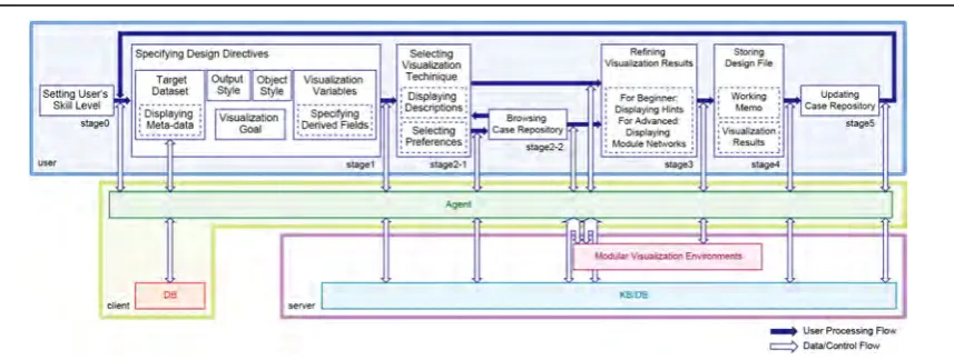
The users are allowed to specify their visualization goals and requirements, and then based on the design directives, the system will search the knowledge-base for appropriate visualization workflows. The users can also browse successful examples maintained in the case repository to facilitate their workflow design. This section describes how our system assists the users in designing their visualization workflows. Figure 1 illustrates the processing and data/control flows under the proposed system architecture. Hereafter, each of the design stages is explained in detail.
Stage 0: Setting the user’s skill level
Our system changes its protocol to assist the users adaptively according to the skill level they have declared. For instance, at Stage 3, only the windows for visualization parameter setting and visualization results are shown to beginners and intermediate users, and hints may be provided to help beginners adjust parameters appropriately. Alternatively, advanced users can look at the actual definition of visualization workflow for the selected visualization technique, and can customize it freely on the backend MVE.
Stage 1: Specifying design directives
The design directive is defined by our visualization ontology, and comprises the following steps: (1) The users specify a dataset to visualize. The system then loads the specified dataset from the
(2) They choose the display style. (3) They select the object style.
(4) They specify the visualization goal using a combination of action and target.
(5) They choose sub‐target, and select specific fields to be used. The system displays the field labels that have already been acquired in Step (1). If the target and sub‐target are scalar and original data, respectively, they choose a single variable. If they are direction and original data, they choose all the necessary component variables. Note that even when the target is direction, if the sub‐target is gradient, the users will have to choose a single variable, since the gradient is calculated on that basis. The system gives a warning if the users select the wrong number of variables. Finally, they can also select derived fields that they want to visualize, and thereby avoid computing those fields themselves.
Stage 2-1: Selecting visualization technique
Using the design directive as a key, the system retrieves appropriate visualization techniques from the knowledge-base and presents them in the form of an ordered list, with optional descriptions in a separate window. The users then select one of the listed techniques.
Stage 2-2: Browsing case repository
The case repository is then opened to the users, as the system retrieves successful visualization examples for the selected technique and displays these, along with basic information such as creation date-time, dataset, and user name. If they wish, the users can reuse the workflow underlying a selected case in their own visualization design.
Stage 3: Refining the visualization results
The system forwards the designed workflow and the given dataset to the backend MVE, and returns the visualization result. In the process, it also checks if the field is of node or cell type, and converts it to the type appropriate for the target workflow. The users can refine the result by changing the visualization parameter values interactively.
Stage 4: Storing design file
The users can store all the information related to their visualization design as a visualization workflow design file, containing the filename of the dataset, design directive, up-to-date visualization parameter values, and visualization results. This file can then be reused/modified to generate other relevant visualization results, such as those supporting systematic parameter studies. The visualization workflow design file also provides a functionality to associate free-format working memos with the corresponding visualization resources, thus supporting better communication in e-science environments.
Stage 5: Updating case repository
With the users’ permission, the newly created visualization workflow design is registered in the case repository for use by others. Prolonged use of the system by many users helps to build a versatile yet focused case repository for the users’ domain.
APPLICATIONS
The current prototype of our system was implemented with an HP workstation (CPU: Intel Xeon 3.60 GHz; Memory: 4 GB) as the server, AVS/Express7.0 as the backend MVE, and an Oracle Database 10g as the knowledge-base management system. This section illustrates the usefulness of the prototype system by applying it to the design of visualization workflows for practical datasets in structural analysis.
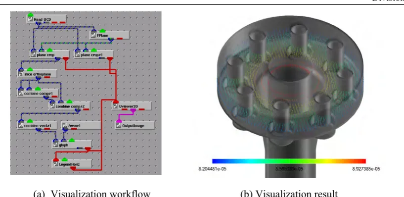
Here we provide three examples of visualization workflow design. The first example demonstrates the basic design procedure, the second shows customization by an advanced user, and the third illustrates the concept of “design by example”. Throughout these examples, we use a single structural analysis dataset for pipe joints, as shown in Figure 2. The nodes and cells of this dataset number 96,184 and 78,016, respectively, and include displacement (“dispX”, “dispY”, “dispZ”), normal stress (“stressXX”, “stressYY”, “stressZZ”), shear stress (“stressXY”, “stressYZ”, stress”ZX”), normal strain (“strainXX”, “strain YY”, “strainZZ”), shear strain (“strainXY”, “strainYZ”, “strainZX”), and equivalent stress (“equiv stress”).
Case 1: Fundamental procedure
Suppose that a user wanted to visualize the physical stresses contained in the piping dataset. The user declared his/her skill level as “beginner”. Next, the user specified the dataset to visualize, and loaded it into the system. The user was allowed to display meta information on the loaded dataset. Since the dataset contains data for a time-fixed, the Snapshot/Time‐series control was inapplicable. The user then set “snapshot” for Display style. In order to investigate the direction of displacement, the user set “identify direction” as the visualization goal and “original data” as the Sub‐target, with “dispX”, “dispY”, and “dispZ” labels checked. Consequently, the user retrieved a list of 10 appropriate visualization techniques from the knowledge-base, including “glyph (arrow)” and “offset”. In this case, “glyph (arrow)
on a plane” was selected. When the system performed the selected visualization workflow, a hint window
popped up to show how to set the control parameters of the “glyph”, including the scale of the arrows. Note that the visualization workflow shown in Fig. 3 (a) was activated in AVS/Express without showing the actual definition to the user, who was allowed to interactively change the value for each of the svisualization parameters to obtain better results. The final result is shown in Fig. 3 (b). The entire design process, including parameter settings, was stored in a visualization workflow design file, which could then be registered in the case repository.
Figure 2. Overview of the target piping dataset.
Case 2: Customization by advanced users
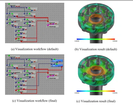
Next, suppose that an advanced user wanted to visualize displacement in the piping dataset. The user began by selecting “snapshot” for Snapshot/Time‐series and specifying “correlate scalar with scalar” for visualization goal. Note that the verb “correlate” takes two Targets. For example, if the user wanted to visualize the correlation between the equivalent stress and the magnitude of displacement vector, the user should choose “original data” for SubTarget1 and magnitude of vector for SubTarget2. However, because the dataset does not include the magnitude of displacement, the user had to use a derived field function, but instead, the system calculates the magnitude of the displacement vector field from the displacement vector field automatically. Suppose that the user chose “colored isosurfaces” from the recommendation list. Since the user has selected “advanced” as his/her skill level, a visualization workflow shown in Fig. 4 (a) was displayed together with the visualization result shown in Fig. 4 (b). Using this visualization workflow, the isosurfaces extracted from the equivalent stress field, selected for SubTarget1, were colorized with the magnitude of displacement field, selected for SubTarget2. Finally, leveraging advanced customization capabilities, the user added the two modules represented by blue rectangles in Fig. 4 (c). As a result, the pseudo-colormap on a cross-section along the yz-plane was visualized with isosurfaces, as shown in Fig. 4 (d).
Note that constructing this kind of sophisticated visualization workflow from scratch would be infeasible for all but the most expert users. This exemplifies well that our cooperative visualization design framework can provide even advanced users with a more efficient and effective way to perform visual analysis.
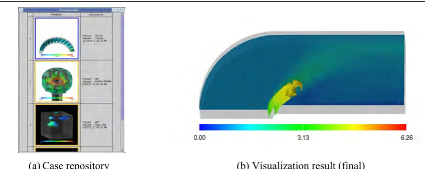
Case 3: Design by Example
Finally, suppose that another user wanted to use our system to visualize the 3D blunt fin using the case repository. Assuming the intermediate skill level has been designated, neither the hints window nor the visualization workflow will be displayed.
Given the same snapshot setting, display style and visualization goal (except for the scalar field labels) that were used in Case 2, an identical list of recommended visualization techniques was displayed. Again selecting the “colored isosurfaces”, the user then proceeded to push the Case example button; the user was allowed to brows the case repository for browsing successful examples in which the same
technique was applied to various other datasets, as shown in Fig. 5 (a). Note that the result obtained in Case 2 is seen in the middle of the browsed listings.
At this point, the user was allowed to choose either of two processing procedures: (1) finish browsing the case repository and continue as in Case 2, or (2) right-click on one of the browsed thumbnails to invoke the corresponding workflow for the target dataset, inheriting all applicable conditions of the selected example. The latter procedure was referred to as “design by example”. Fig. 5 (b) shows the final result obtained, through this “design by example” procedure, by selecting and partially modifying the workflow of Case 2.
CONCLUSION
In this paper, we proposed a system for visual structural analysis based on our new domain ontology for visualization workflows in structural analysis. The proposed system was implemented as a core subsystem of our more general visualization lifecycle management system, under which the users are better supported by similar workflow designs, and can modify their own workflows.
In future work, the Wehrend Matrix vocabularies must be refined to specify the visualization goals in structural analysis in a more informative manner. For example, the ontological framework could be extended such that the design of visualization workflows for large-scale, multidimensional/multivariate datasets is supported. If the system accepted multiple goal specifications, multifield visualizations could be reduced to simultaneous execution of single field visualizations.
Figure 4. Visualization of equivalent stress in the piping dataset. (b) Visualization result (default) (a)Visualization workflow (default)
ACKNOWLEDGEMENTS
The authors would like to thank Dr. Norihiro Nakajima at Japan Atomic Energy Agency to let us use the piping dataset. This work has been partially supported by Japan Society of the Promotion of Science under Grapnts-in-Aid for Young Scientists (B) No. 23700100 and Scientific Research (B) No. 22300037.
REFERENCES
Fujishiro, I., Takeshima, Y., Ichikawa, I., and Nakamura, K. (1997). “GADGET: Goal-Oriented Application Design Guidance for Modular Visualization Environments,” Proc. IEEE
Visualization ’97, IEEE, Phoenix, AZ, 245–252.
Fujishiro, I., Furuhata, R., Ichikawa, Y., and Takeshima, Y. (2000) “GADGET/IV: A Taxonomic Approach to Semi-Automatic Design of Information Visualization Applications Using Modular Visualization Environment,” Proc. IEEE Symposium on Information Visualization 2000, IEEE, Salt Lake City, UT, 77–83.
Keller, P. R. and Keller, M. M. (1993). Visual Cues – Practical Data Visualization. IEEE Computer Society Press.
MeVisLab. http://www.mevislab.de/.
Parke, S. G. and Johnson, C. R. (1995). “SCIRun: A Scientific Programming Environment for Computational Steering,” Proc. the 1995 ACM/IEEE Conference on Supercomputing, IEEE, San Diego, CA (CDROM).
Scheidegger, C. E., Vo, H. T., Koop, D., Freire, J., and Silva, C. T. (2007). “Querying and Creating Visualizations by Analogy,” IEEE Transactions on Visualization and Computer Graphics, IEEE, 13(6), 1560–1567.
Takeshima, Y., Fujishiro, I., and Hayase, T. (2008). “GADGET/FV: Ontology-Supported Design of Visualization Workflows in Fluid Science,” Proc. The First International Workshop on Super
Visualization, Kos, Greece (DVD).
Wehrend, S., and Lewis, C. (1990). “A Problem-Oriented Classification of Visualization Techniques,”
Proc. IEEE Visualization ’90, IEEE, San Francisco, CA, 139–143.