ABSTRACT
SAWANT, AMIT PRAKASH. Perceptual Display Hierarchies for Visualization. (Under the direction of Dr. Christopher G. Healey)
The advent of computers with high processing power has led to the generation of large,
multidimensional collections of data with increasing sizeanddimensionality. This has led to a critical need for ways to manage, explore and analyze large, multidimensional information
spaces. Visualization lends itself well to the challenge of exploring and analyzing these datasets
by managing and presenting information in a visual form to facilitate rapid, effective, and
meaningful analysis of data by harnessing the strengths of the human visual system.
Most visualization techniques are based on the assumption that the display device has
suf-ficient resolution, and that our visual acuity is adequate for completing the analysis tasks. However, this may not be true, particularly for specialized display devices (e.g., PDAs or
large-format projection walls). Our goal is to: (1) determine the amount of inlarge-formation a particular
display environment can encode; (2) design visualizations that maximize the information they
represent relative to this upper-limit; and (3) dynamically update a visualization when the
display environment changes to continue to maintain high levels of information content. A
collection of controlled psychophysical experiments were designed, executed, and analyzed
to identify thresholds for display resolution and visual acuity for four visual features: hue,
luminance, size, and orientation.
In computer graphics, level-of-detail hierarchies are often used to reduce geometric
com-plexity in situations where full resolution models are unnecessary. Using results from our
experiments, we applied similar logic to a visualization environment. If certain properties of
a dataset cannot be seen because their current visual representation falls below a resolution or
acuity threshold, they need not be included in the visualization. We built level-of-detail
per-ceptual display hierarchies to automatically add or remove information from a visualization as
devices. Our display hierarchies are combined with existing rules on the use of perception in
visualization to improve our ability to construct visualizations that are perceptually optimal for
a particular dataset, analysis tasks, and viewing conditions. We conclude by visualizing
mul-tidimensional weather data using a prototype visualization system that applies our perceptual
Perceptual Display Hierarchies for Visualization
by
Amit Prakash Sawant
A dissertation submitted to the Graduate Faculty of North Carolina State University
in partial fulfillment of the requirements for the Degree of
Doctor of Philosophy
Computer Science
Raleigh, North Carolina
2007
APPROVED BY:
Dr. Christopher G. Healey Dr. Steffen Heber
BIOGRAPHY
Amit Prakash Sawant was born to Prakash Shridhar Sawant and Priti Prakash Sawant on
July 19, 1977 in Baroda, India. He received a Bachelor of Engineering degree in Computer
Technology from Veermata Jijabai Technological Institute (VJTI) formerly know as Victoria
Jubilee Technical Institute, Mumbai, India. He worked with Tata Consultancy Services (TCS),
Mumbai, India for one year as a Systems Engineer. Amit joined the computer science masters
program at North Carolina State University in the spring of 2001. He received his Master of
Science in computer science in the spring of 2003 and since the fall of 2003 has been enrolled
ACKNOWLEDGMENTS
I would like to thank my advisor, advisory committee members, family, friends and
col-leagues for their help, motivation, and constructive criticism. Without their help and support
this dissertation would not have been possible. North Carolina State University’s Knowledge
Discovery Laboratory (KDL) provided an ideal working environment. I will miss being a part
of KDL.
Dr. Christopher Healey, my advisor, mentor and committee chair, whose guidance, support,
time, and energy have been instrumental toward my success in this research. His determination,
dedication, high standards, and critical reviews made sure my work was of outstanding quality.
It has been a pleasure working for Dr. Christopher Healey over the past few years and I cannot
thank him enough for the support and opportunity. I will miss working for him, going out for
lunch, and talking about sports, movies and politics.
Many friends and colleagues have helped me in various ways throughout the entire duration
of this research. They are - Ann, Anna, Andy, Arnav, Brent, Dan, Joe, Laura, Lloyd, Marivic,
Pragati, Ravi, Reshma, Sarat, Thomas, Vivek, and others whom I may have mistakenly
for-gotten to mention. A special thanks goes to Anna for her time, motivation, and critiques in
proofreading my drafts and listening to my practice presentations. I thank Arnav for his ideas
and technical support. I am grateful to Brent for his support and critical comments. Laura,
many thanks for proofreading my drafts and listening to my practice presentations. Sarat, I
am grateful to you for your insightful knowledge, technical support and constant motivation.
I thank Joe and Thomas for listening to my practice presentations and helping me setup the
projector for my defense. I thank Andy for his help with developing the perceptual display
hierarchy system. I thank all my friends and colleagues in KDL for listening to my practice
presentations and being a part of my research experiments. To my good friends, Ravi and
thank my friends and colleagues at Qimonda (formerly known as Infineon Technologies) and Network Appliance, Inc for all their help.
I would like to thank Dr. Steffen Heber, Dr. George N. Rouskas, and Dr. R. Michael Young
for agreeing to be on my advisory committee. Their suggestions and valuable comments have
been helpful in guiding my Ph.D. research. A special thanks also goes to Dr. Robert St. Amant
for agreeing to substitute for Dr. R. Michael Young at the last minute for my Ph.D. defense.
The love, encouragement, and blessings of my family made this dissertation possible. I
am truly indebted to my Mom and Dad (Priti Sawant and Prakash Sawant) for the sacrifices they made for me to attain higher education in the United States of America. I sincerely thank
my brother and sister (Vinit Sawant and Vrushali Sawant) for their good wishes and moral
support. Last but not the least, I would also like to thank my fiancee Sonali Parikh for her constant support and encouragement. I cannot thank her enough for being a part of my life,
and making everything seem possible, worthwhile and complete. I affectionately dedicate this
dissertation to them. Thank you!
“Dharma Matibhyah Udghrutah”- Bheeshma, Mahabharata. Dharma is born from reason,
Dharma is born from intellect,
Dharma is what your heart, your mind feels is right, Dharma is what your soul accepts as true and sacred.
Amit Prakash Sawant
Contents
List of Figures viii
List of Tables xi
1 Introduction 1
1.1 Perception in Visualization . . . 2
1.2 Size and Visualization . . . 4
1.3 Research Objectives . . . 6
1.4 Thesis Organization . . . 7
2 Visual Acuity and Display Properties 8 2.1 Human Vision . . . 8
2.1.1 Visual Angle . . . 10
2.1.2 Visual Acuity . . . 11
2.2 Display Device Properties . . . 12
2.2.1 Display Resolution . . . 13
2.2.2 Physical Size . . . 14
2.2.3 Viewing Distance . . . 15
3 Visualization 16 3.1 Advantages of Visualization . . . 17
3.2 Visualization Process . . . 17
3.2.1 Visualization Pipeline . . . 18
3.3 Types of Visualization . . . 19
3.3.1 Scientific Visualization (SciVis) . . . 20
3.3.2 Information Visualization (InfoVis) . . . 21
3.4 Visualization Techniques . . . 22
3.4.1 Tree-maps . . . 23
3.4.2 Fisheye Lens . . . 25
4 Visual Features 28
4.1 Properties of Visual Features . . . 31
4.2 Color . . . 31
4.2.1 Hue . . . 32
4.2.2 Luminance . . . 33
4.3 Texture . . . 35
4.3.1 Height . . . 35
4.3.2 Density . . . 35
4.3.3 Orientation . . . 35
4.3.4 Regularity . . . 36
4.4 Motion . . . 37
4.4.1 Flicker . . . 37
4.4.2 Direction . . . 37
4.4.3 Velocity . . . 38
4.5 Issues with Visual Features . . . 38
5 Display Resolution Experiment 40 5.1 Novel Target Detection . . . 41
5.2 Methods . . . 42
5.2.1 Design . . . 42
5.2.2 Selection of Different Feature Values . . . 43
5.3 Procedure . . . 43
5.3.1 Viewers . . . 68
5.4 Results and Discussion . . . 68
5.4.1 Target Present/Absent . . . 69
5.4.2 Display Resolution . . . 69
5.4.3 Target Feature Type . . . 70
5.4.4 Target Present/Absent×Display Resolution . . . 70
5.4.5 Target Present/Absent×Target Feature Type . . . 71
5.4.6 Target Feature Type×Display Resolution . . . 71
6 Visual Acuity Experiment 79 6.1 Methods . . . 80
6.1.1 Design . . . 80
6.1.2 Viewers . . . 102
6.2 Results and Discussion . . . 102
6.2.1 Target Present/Absent . . . 103
6.2.2 Visual Angle . . . 103
6.2.3 Target Feature Type . . . 104
6.2.4 Target Present/Absent×Visual Angle . . . 104
6.2.5 Target Present/Absent×Target Feature Type . . . 105
7 Perceptual Display Hierarchies 113
7.1 Distinguishability Graphs . . . 114
7.2 Perceptual Display Hierarchy Framework . . . 114
7.2.1 Principle . . . 114
7.2.2 Design . . . 116
7.3 Weather Application - United States . . . 119
7.3.1 Hue Feature . . . 120
7.3.2 Luminance Feature . . . 123
7.3.3 Size Feature . . . 123
7.3.4 Orientation Feature . . . 126
7.3.5 Visualization without Display Hierarchies . . . 129
7.3.6 Visualization with Display Hierarchies . . . 132
7.3.7 Visualization with Display Hierarchies . . . 135
8 Conclusion 141 8.1 Contributions . . . 142
8.2 Future Work . . . 143
8.3 Final Remarks . . . 143
List of Figures
1.1 Size and Visualization . . . 4
2.1 Structure of the Eye . . . 9
2.2 Calculation of Visual Angle . . . 10
3.1 Visualization Pipeline . . . 18
3.2 Scientific Visualization Example . . . 20
3.3 Information Visualization Example . . . 21
3.4 Tree-Map Example . . . 24
3.5 Three Level Filesystem Hierarchy . . . 25
3.6 Fisheye Lens Example . . . 26
3.7 Hyperbolic Browser Example . . . 27
4.1 Visualization of Performance Data . . . 28
4.2 Different Color Scales . . . 31
4.3 Coherency Visualization Technique . . . 32
4.4 Radial sweep from weather radar sensor . . . 34
4.5 Variation of Texture Dimensions . . . 36
5.1 Different Hue values . . . 43
5.2 Different Luminance values . . . 44
5.3 Different Size values . . . 44
5.4 Different Orientation values . . . 45
5.5 Display Resolution - Experimental Overview . . . 46
5.6 Hue Trial Example 1 . . . 48
5.7 Hue Trial Example 2 . . . 49
5.8 Hue Trial Example 3 . . . 50
5.9 Hue Trial Example 4 . . . 51
5.10 Hue Trial Example 5 . . . 52
5.11 Luminance Trial Example 1 . . . 53
5.12 Luminance Trial Example 2 . . . 54
5.13 Luminance Trial Example 3 . . . 55
5.14 Luminance Trial Example 4 . . . 56
5.16 Size Trial Example 1 . . . 58
5.17 Size Trial Example 2 . . . 59
5.18 Size Trial Example 3 . . . 60
5.19 Size Trial Example 4 . . . 61
5.20 Size Trial Example 5 . . . 62
5.21 Orientation Trial Example 1 . . . 63
5.22 Orientation Trial Example 2 . . . 64
5.23 Orientation Trial Example 3 . . . 65
5.24 Orientation Trial Example 4 . . . 66
5.25 Orientation Trial Example 5 . . . 67
5.26 aandrtagainst Target Present/Absent Trials . . . 73
5.27 aandrtagainst Display Resolution of elements . . . 74
5.28 aandrtagainst Target Feature . . . 75
5.29 a and rt for Target Present/Absent Trials against Display Resolution of the elements . . . 76
5.30 aandrtfor Target Present/Absent Trials against Target Feature . . . 77
5.31 aandrtfor Different Features against Different Display Resolutions . . . 78
6.1 Visual Acuity - Experimental Overview . . . 81
6.2 Hue Trial Example 1 . . . 82
6.3 Hue Trial Example 2 . . . 83
6.4 Hue Trial Example 3 . . . 84
6.5 Hue Trial Example 4 . . . 85
6.6 Hue Trial Example 5 . . . 86
6.7 Luminance Trial Example 1 . . . 87
6.8 Luminance Trial Example 2 . . . 88
6.9 Luminance Trial Example 3 . . . 89
6.10 Luminance Trial Example 4 . . . 90
6.11 Luminance Trial Example 5 . . . 91
6.12 Size Trial Example 1 . . . 92
6.13 Size Trial Example 2 . . . 93
6.14 Size Trial Example 3 . . . 94
6.15 Size Trial Example 4 . . . 95
6.16 Size Trial Example 5 . . . 96
6.17 Orientation Trial Example 1 . . . 97
6.18 Orientation Trial Example 2 . . . 98
6.19 Orientation Trial Example 3 . . . 99
6.20 Orientation Trial Example 4 . . . 100
6.21 Orientation Trial Example 5 . . . 101
6.22 aandrtagainst Target Present/Absent Trials . . . 107
6.23 aandrtagainst Visual Angle of elements . . . 108
6.25 aandrtfor Target Present/Absent Trials against Visual Angle of the elements . 110
6.26 aandrtfor Target Present/Absent Trials against Target Feature . . . 111
6.27 aandrtfor Different Features against Different Visual Angles . . . 112
7.1 Visual FeatureVf’s Distinguishability Graph . . . 113
7.2 Distinguishability Graphs for Different Visual Features . . . 115
7.3 Visualization of the weather data at different display resolutions and visual angles withtemperaturemapped to hue . . . 121
7.4 Visualization of the weather data at different display resolutions and visual angles withtemperaturemapped to luminance . . . 122
7.5 Visualization of the weather data at different display resolutions with temper-aturemapped to size . . . 124
7.6 Visualization of the weather data at different visual angles with temperature mapped to size . . . 125
7.7 Visualization of the weather data at different display resolutions with temper-aturemapped to orientation . . . 127
7.8 Visualization of the weather data at different visual angles with temperature mapped to orientation . . . 128
7.9 Visualization of the weather data at different display resolutions with temper-ature → hue, pressure → luminance, wind speed → size, cloud coverage → orientation . . . 130
7.10 Visualization of the weather data at different visual angles withtemperature→ hue,pressure→luminance,wind speed→size,cloud coverage→orientation 131 7.11 Visualization of the weather data at different display resolutions . . . 133
7.12 Visualization of the weather data at different visual angles . . . 134
7.13 Visualization of the weather data at different display resolutions and visual angles136 7.14 Visualization of the weather data at a a display resolution of1×1pixels and a visual angle of0.0477◦ . . . 138
7.15 Visualization of the weather data at a display resolution of4×4pixels and a visual angle of0.1908◦ . . . 139
List of Tables
2.1 Some Basic Visual Acuities . . . 11
2.2 Display Resolution of Current Display Devices . . . 14
4.1 Different Visual Features used in Visualization . . . 30
4.2 Summary of Visual Feature Properties . . . 39
Chapter 1
Introduction
In recent years, advances in modern technology have made it possible for researchers and
sci-entists to collect large amounts of data. Data are growing at an incredible rate in the form of
paper, film, and electronic media. Some of the data types that contribute to this information overload are textual data, databases, image data, sensor data, and video data. However, our
ability to effectively represent and efficiently analyze this data has struggled to keep up with the increased storage capacities. It is difficult for viewers to identify important characteris-tics such as relationships, patterns, dependencies, boundaries, outliers, clusters, and anomalies
embedded within the underlying data. For raw data to be useful, it must be organized and
presented in a format that facilitates analysis and interpretation.
One promising approach to analyzing, exploring, and comprehending this information is
using visualization, an area of computer graphics that deals with the management and
presen-tation of information in a visual form to facilitate rapid, effective, and meaningful analysis of
data. A visualization harnesses the ability of the human visual system to analyze and interpret
large amounts of visual information at great speeds. It can be used to represent scientific (e.g., land and satellite weather information, geographic information systems, and molecular
1.1
Perception in Visualization
The knowledge of perception can be used to generate visualizations that harness the strengths of
the low-level human visual system and display data in ways that accentuate interesting items to
the user. Applying perceptual guidelines to “take full advantage of the available bandwidth of
the human visual system” has been cited as an important area of current and future research in
visualization [53, 61]. Exactly how a particular visualization technique and the display device
used to present the visualization affect the available visual bandwidth, however, is currently
unknown. Visualizations utilize visual channels to convey information to the observer. The
visual channels include features such as size, shape, hue, luminance, and texture. Independent
of the visual channels used, visual bandwidth depends on the screen’s size, both in terms of the
number of pixels and its physical dimensions [47]. This research aims to identify which
prop-erties of both the visualization and the display environment must be considered to maximize
the amount of visual information a user can perceive. Our overall goal is to study how these
properties affect the ability of a visualization to convey information to a user. We hypothesize
the available “visual bandwidth” depends, at least in part, on the following criteria:
1. The physical characteristics of the display device (e.g., resolution in terms of the total
number of pixels and the physical size of the display).
2. The acuity of the human visual system (e.g., the viewer’s ability to distinguish different
visual features such as color, orientation and size based on its absolute capabilities, and
on the visual angle subtended by an object on the viewer’s eye).
3. The visualization technique, that is, the methods used to map a data element’s values to
a visual representation.
4. The properties of the data (e.g., its dimensionality and number of elements) and the
To date, most research has focused on the last two criteria. Much less work has been conducted
on understanding how display resolution and visual acuity influence the effectiveness of a visualization. We propose to study thefirst two issues in detail and then combine the results with the last two criteria. A better understanding of these properties will help us perform
important tasks during visualization such as:
1. Provide fundamental knowledge required to construct perceptually salient visualizations.
2. Verify whether the display device properties and the limitations of the human visual
system can meet the requirements of a given visualization technique.
3. Characterize to what extent a visualization technique saturates “visual bandwidth”.
Most current algorithms simply assume that sufficient physical display properties are available for generating effective visualizations. However, there are now many different types of
dis-plays available to users: some with limited resources (e.g., the small size and low pixel count
on PDAs and mobile phones) and some with expensive capabilities (e.g., multi-projector
pow-erwalls, responsive workbenches, and high-resolution monitors). These displays are already
having a significant impact on visualization techniques, creating a strong need to learn how to use them effectively.
The acuity of the human visual system also introduces constraints on a visualization.
Im-provements in physical display properties alone cannot necessarilyfix these limits. For exam-ple, an on-screen element must subtend a minimum visual angle on the viewer’s retina to be
distinguishable. Increasing a display device’s pixel resolution (i.e., increasing pixels-per-inch
and therefore possibly decreasing the size of the on-screen elements) beyond a certain limit
may produce diminishing results in terms of perceiving different visual properties of a data
1.2
Size and Visualization
(a)
(b) (c)
Figure 1.1: Examples of visualizing with different viewing parameters: (top) a close-up of Hudson Bay, each square represents weather conditions on a 12◦longitude by 12◦latitude grid,temperaturemapped to hue (blue for cold to red for hot),pressuremapped to luminance (brighter for higher),wind speedmapped to size (larger for stronger),cloud coveragemapped to orientation (more tilted for denser), andprecipitationmapped to regularity (more irregular for heavier); (left) North America with allfive attributes visualized; (right) North America with onlytemperatureandpressurevisualized
Consider a simple example of visualizing a large, multidimensional dataset on a typical
CRT monitor, and assume that the viewer has zoomed in on a small subset of the dataset. In
this scenario a large number of pixels are available to display each data element. Thus, a fully
detailed visualization containing as many data attributes as can be shown effectively would
only a few pixels of screen space will be allocated to each data element, and thus many of the
visual features used to represent different data attributes may not be easy to distinguish. This
overloading of multiple visual features mapped to a data element with a limited number of
pixels could be counterproductive, since it may interfere with our ability to accurately identify
any data values at this low per-element resolution.
Figure 1.1 is a visualization of a weather dataset made up of monthly environmental and
weather conditions provided by the Intergovernmental Panel on Climate Change. The top
im-age displays weather data and all associated attributes of a small geographical area of North
America (Hudson Bay area), while both bottom images visualize the weather data for the entire
continent. In Figure 1.1atemperature,pressure,wind speed,cloud coverage, andprecipitation
are visualized using hue, luminance, size, orientation, and regularity of placement,
respec-tively. The bottom left image displays all the data elements and their data attributes. As only
a few pixels are available for each data element, many of the visual feature values are difficult to identify in this image. Moreover, the presence of certain features (e.g., small sizes) interfere
with our ability to see other features (e.g., color). In the bottom-right image the same elements
are visualized, but the number of attributes are reduced to two: temperature(visualized with hue) andpressure(visualized with luminance). Since both hue and luminance are distinguish-able even at small display resolutions, the underlying data patterns are easier to identify. The
differences in these images lead us to believe that our ability to comprehend data needs to be
adaptive to the display resolutions and physical sizes at which the data is displayed. To be
ef-fective at accomplishing this goal, we need to address important questions such as: (1) Which
data attributes should we visualize, and which visual features should we use? and (2) When
should visual features and their associated data attributes be removed from a visualization, and
when should they be reintroduced?
One possible approach is a visualization system that can smoothly reduce or increase the
For example, as the viewer zooms out, the number of pixels and the physical size per
ele-ment decreases, so attributes may need to be smoothly removed. Likewise additional attributes
can be rendered as the viewer zooms in. The idea is to maximize the utilization of the
dis-play’s capabilities and the viewer’s visual system in an effective and efficient manner, thereby maintaining a balance in the display environment (i.e., either more small elements with fewer
attributes encoded or fewer large elements with more attributes encoded). Zooming is
analo-gous to moving the visualization to a different display device with a different number of pixels,
different physical dimensions, or different viewing distances. In summary, techniques that
vary a visualization based on a viewer’s changing perspective can address how a visualization
should be updated both on a single display device and across different types of displays.
1.3
Research Objectives
Our objective is to study the requirements for a perceptual visualization hierarchy that
consid-ers physical device properties and visual acuity to maximize the information made available to
a viewer. This hierarchy will depend on the number of pixels needed for a visual feature to
rep-resent information effectively (i.e., what display resolutions) and the physical size needed for
our visual system to accurately identify and interpret a visual feature (i.e., what visual acuity).
Understanding the limits on display resolution and visual acuity will allow us to better
vali-date a given visualization technique and characterize the extent to which a technique saturates
“visual bandwidth”. This objective can be achieved by satisfying the following goals:
1. Investigate how display resolution and visual acuity define limits on the distinguisha-bility of commonly-used visual features such as hue, luminance, size, and orientation.
The results of these investigations,finding the minimum number of pixels and visual an-gle required to represent each feature, will help us validate a data-feature mapping and
2. Develop perceptual display hierarchies based on results from our display resolution and
visual acuity experiments. We will use these display hierarchies to construct effective
vi-sualizations and dynamically vary the visualization as the display environment changes.
3. Validate our theoreticalfindings with practical applications.
1.4
Thesis Organization
The material in this dissertation is organized as follows: In Chapter 2, we review visual
acu-ity and display device properties. Chapter 3 provides a general background on visualization.
Chapter 4 discusses different visual features. In Chapters 5 and 6, we present our controlled
display resolution and visual acuity experiments. Chapter 7 describes level-of-detail
percep-tual display hierarchies and demonstrates the application of our visualization techniques to real
datasets. Finally, Chapter 8 concludes and summarizes our study with discussions about future
Chapter 2
Visual Acuity and Display Properties
Physical limitations of the human eye and properties of display devices need to be taken into
consideration in order to design effective and efficient visualizations. In this chapter we discuss visual acuity and display device properties in detail.
2.1
Human Vision
Figure 2.1 shows the internal structure of the human eye. The important features are: the retina,
the lens, the fovea, the iris, the cornea, and the eye muscle. The lens focuses a small, inverted
image of the world onto the retina. The iris acts as a variable aperture, assisting the eye to
adjust to different lighting conditions. The retina consists of two types of photosensitive cells:
rods and cones. Cones are primarily responsible for color perception and rods are responsible
for intensity. Rods are typically ten times more sensitive to light than cones. There is a small
region at the center of the visual axis as shown in Figure 2.1 known as the fovea that subtends
1 or 2 degrees of visual angle. The structure of the retina is roughly radially symmetric around
the fovea. The fovea contains only cones, and linearly, there are about 147,000 cones per
Figure 2.1: Internal structure of a human eye
The human eye contains separate systems for encoding spatial properties (e.g., size,
lo-cation, and orientation) and object properties (e.g., color, shape, and texture). These spatial
and object properties are important features that have been successfully used by researchers in
psychology for simple exploration and data analysis tasks such as target detection, boundary
detection and counting, and by researchers in visualization to represent high-dimensional data
collections [67]. However, the limited number of rods and cones (about 120 million rods and
6 million cones) within the eye means that it can only absorb a certain amount of visual
infor-mation over a given period of time. Thus, even though we can generate images with a high
number of pixels-per-inch, it does not necessarily translate to an improvement in our analysis
abilities once the pixel-per-inch ratio surpasses the threshold beyond which pixels blur together
with their neighbors. This limitation thus poses an interesting question for the area of
color, texture, and motion in order for them to be perceptually identifiable?”
Two aspects of the human vision system that are of particular interest to us are display
resolution and visual acuity. Display resolution defines the number of discrete picture ele-ments (pixels) needed to accurately encode different values of a visual feature. Visual acuity
forms a set of guidelines on the visual system’s need for a minimum visual angle to recognize
differences in a feature.
2.1.1 Visual Angle
Figure 2.2: Visual angle subtended by an object on a human eye
Visual angle is the angle subtended by an object on the eye of an observer. Visual angles
are generally defined in degrees, minutes, and seconds of arc (a minute is 601 degree and a second is 601 minute). For example, a 0.4-inch object viewed at 22-inches has a visual angle of
approximately 1 degree. In Figure 2.2, visual angle can be calculated as [67]:
θ
2 = arctan(
ab
d ) (2.1)
The visual angle depends on two factors: (1) it is proportional to the actual size of the
2.1.2 Visual Acuity
Visual acuity is a measurement of our ability to see detail. Acuity is important because it
defines absolute limits on the information densities that can be perceived. Visual acuity for a person with 20/20 vision is measured as the minimum angle of the viewingfield that must be filled with an image to distinguish one feature from the rest of the image (measured in “minutes”, 2020 = 1 minute [13]). Some of the basic acuities are summarized in Table 2.1 [67].
Table 2.1: Some basic visual acuities
Type Description
Point acuity (1 minute of arc) The ability to resolve two distinct point targets. Grating acuity (1-2 minutes of arc) The ability to distinguish a pattern of bright and
dark bars from a uniform gray patch.
Letter acuity (5 minutes of arc) The ability to resolve a letter. The Snellen eye chart is a standard way of measuring this ability. 20/20 vision means that a 5-minute letter target can be seen 90% of the time.
Stereo acuity (10 seconds of arc) The ability to resolve objects in depth. The acuity is measured as the difference between two angles for a just-detectable depth difference.
Vernier acuity (10 seconds of arc) The ability to see if two line segments are collinear.
Most of the acuity measurements in Table 2.1 suggest that we can resolve visual
phenom-ena, such as the presence of two distinct lines, down to about 1 minute (601 ◦) of visual angle.
This is in rough agreement with the spacing of receptors in the center of the fovea. For us to
see that two lines are distinct, the blank space between them should lie on a receptor; therefore,
we should only be able to perceive lines separated by roughly twice the receptor spacing.
How-ever, there are a number of superacuities, like stereo acuity and vernier acuity, which allow us
to perceive visual properties of the world to a greater precision than could be achieved based
on a simple receptor model.
Postreceptor mechanisms are capable of integrating the input from many receptors to obtain
to judge the collinearity of twofine line segments. This can be done with amazing accuracy to better than 10 arc second. The resolution of the eye is often measured in cycles per degree and
ranges from 12 arc minute (120 cycles/degree) to 1 arc minute (60 cycles/degree). Resolution
of 1 arc minute allows one to distinguish detail of 0.01 seconds at 3 feet. Consider a display
screen that is 20-inches wide and positioned 22-inches from the viewer. How many pixels
across one scanline subtending45◦ would it take to match human visual acuity? If we assume
human visual acuity to be 12 arc minute, then we would need120×45= 5400 pixels to match
our visual ability [12].
Neural postprocessing can efficiently combine input from two eyes. The area of the overlap is approximately120◦ with 30-35◦ monocular vision on each side. Combined horizontal FOV
is 180-190◦and vertical FOV is 120-135◦ for both eyes [12]. This suggests that if the data
ele-ments in a visualization environment lie within this region of overlap they are identified more accurately than the data elements that lie in the monocular region. Campbell and Green [23]
found that binocular viewing improves acuity by 7% as compared with monocular viewing.
2.2
Display Device Properties
Properties of a display device can have a significant effect on the capabilities of a visualization. However, precisely characterizing this effect has so far been limited in its ability to address
issues such as: (1) What fraction of a dataset can a display device represent effectively? and
(2) What fraction of a display can a viewer attend to at any given time? A good visualization
technique should take into account the display resolution, physical size, and viewing distance
in order to maximize both the quantity and the quality of the information it displays. We will
2.2.1 Display Resolution
A display device’s resolution defines the number of pixels it contains, expressed in the hor-izontal and vertical directions. It is also referred to as the physical resolution of a display device. The sharpness of the display depends on its resolution and on its physical size. The
same resolution will be sharper on a smaller monitor compared to a larger monitor because
the same number of pixels are spread out over a larger physical region [11]. We use the term
display resolution to refer to the resolution of an element on a particular display device (i.e., the number of pixels allocated to an element on the screen). Real-world data are visualized
on a range of display devices such as computer monitors (traditional CRTs and LCDs), PDAs,
mobile phones, and powerwalls. Table 2.2 shows common display resolutions for these types
of display devices [5, 6, 7, 8, 9, 4, 1].
The low physical resolution of devices like mobile phones and PDAs limits the amount of
information they can display at any given time. A common physical resolution for a PDA is
240×320 pixels at 3.5-inches diagonal. Consider the example of visualizing a large dataset
on a PDA screen. This would allocate very few pixels to each data element. Even if the
resolution is increased dramatically (i.e., a significant increase in pixels-per-inch), it would not fully resolve the issue. An element must subtend a minimum visual angle on the viewer’s
retina to be distinguishable. Increasing pixels-per-inch beyond a certain point will produce
diminishing results in terms of the amount of additional information a viewer can see. At the
opposite extreme, a large display device such as a powerwall typically results in a largefield of view (FOV). But, there is a limitation on the amount of information human eyes can perceive
based on the horizontal and vertical FOV. Also, as the FOV increases users have to utilize their
peripheral vision [18], and it is a known fact that static visual features do not perform well
under peripheral conditions [16].
Table 2.2: Display Resolution of current display devices
Display Device Manufacturer Model Resolution Screen Size
Mobile Phone Vodofone Sharp GX30 858×1144 2.2-inch screen
Apple iPhone 480×320 3.5-inch screen
Nokia N81 8GB 240×320 2.4-inch screen
Motorola RAZR V3a 176×220 2.1-inch screen
Nokia 6200 128×128 27.3×27.3mm
PDA Toshiba e805(BT) 800×600 4.0-inch screen
Sony Clie PEG-UX50 480×320 4.0-inch screen
AT&T Tilt 240×320 2.8-inch screen
HP iPAQ 610 240×320 2.8-inch screen
T-Mobile Sidekick iD 240×160 2.75-inch screen
Monitors Auto Vision Inc AVHRPC703 640×480 7.0-inch screen
COMPAQ MV520 800×600 15.0-inch screen
ViewSonic VX510 1024×768 15.0-inch screen
Sony CPD-E240 1280×1024 17.0-inch screen
BenQ FP94VW 1440×900 19.0-inch screen
HP W2007v 1680×1050 20.0-inch screen
ViewSonic VX2435wm 1920×1200 24.0-inch screen
Dell UltraSharp 2707WFP 1920×1200 27.0-inch screen
PowerWall SGI Onyx2 6400×3072 8×2.85m
POWER ONYX 3200×2400 6×8feet
Exec CUG 2560×2048 14×10feet
6400×3072. Nowadays, tiled displays and visualization walls are common and their display
resolutions can vary to a large extent depending on the number of tiles and resolution of each
tile. For a particular display resolution, it is important to determine which visual features can be
rapidly identified and which cannot, based on the number of the pixels that need to be allocated to each visual feature to make its values distinguishable.
2.2.2 Physical Size
Physical size is an important cue to sensory and judgment processes in humans. In a series of
21-inch monitors as compared to smaller ones. Chapanis and Scarpa [26] conducted experiments
comparing the readability of physical dials at different distances to examine the psychophysical
effects of distance and size. They used dials of different sizes and markings that were
propor-tional to the viewing distance so as to keep visual angles constant. They found that beyond
28-inches, dials were read more easily. The effects they found, however, were relatively small.
Studies conducted by Desney et al. [32] suggest that users performed better on spatial
orientation tasks that require mental rotation on large displays compared to desktop monitors.
The visual angle was held constant by adjusting the viewing distance to each of the displays.
Large displays provide users with a greater sense of presence, allowing them to imagine
rotat-ing their bodies within the environment. Smaller displays force users to imagine rotatrotat-ing the
environment around themselves [25, 70]. Large displays normally cast a larger retinal image,
offering a wider FOV. Czerwinski et al. [28] reports that a wider FOV increases the sense of
presence and improves performance in 3D navigation tasks, many of which are important in
visualization.
The physical size of a display device has a direct effect on the available FOV. Also, for
a fixed pixels-per-inch, larger display devices have higher resolutions and therefore may be capable of visualizing more information.
2.2.3 Viewing Distance
The standard distance to the viewer from the computer screen is approximately 22-inches [67].
For large displays such as powerwalls, the optimal viewing distance is about twice the width of
the display [3]. As the viewing distance increases, the FOV decreases. For example, a 16-inch
display placed 22-inches from the user produces a FOV of approximately40◦. Increasing the
Chapter 3
Visualization
Various researchers have defined visualization as follows:
1. “Visualization is the use of computer-supported, interactive, visual representations of
data to amplify cognition” [24].
2. “Visualization is a powerful link between the two most powerful information processing
systems: the human mind and the modern computer” [33].
3. “Visualization simply means presenting information in pictorial form” [33].
4. “Visualization is the transformation of data to a format amenable to understanding by the
human perceptual system while maintaining the integrity of the information” [37].
5. “Visualization is the use of computer imaging technology as a tool for comprehending
data obtained by simulation or physical measurement” [37].
Visualizations allow users to see, explore, and understand large amounts of information at
once. Visual representations translate data into a visible form that highlights important features,
including commonalities and anomalies. These visual representations make it easy for users to
perceptual reasoning through visual representations permits the analytical reasoning process to
become faster and more focused [63].
3.1
Advantages of Visualization
The potential advantage of visualization techniques over other techniques from statistics,
ma-chine learning, and artificial intelligence is that in many instances, it allows direct interaction by the user and provides immediate feedback. It also supports user steering, which is difficult to achieve in other non-visual techniques [15]. Graphical presentations allowquery-by-attention, that is, they answer the user’s questions by controlling the user’s visual attention (and
review-ing immediate feedback) rather than forcreview-ing the user to manipulate a data query interface and
wait for a server to return results [34].
3.2
Visualization Process
Consider a datasetD ={e1, .., en}containingn sample points, or data elements,ei. A
multi-dimensional dataset represents two or more data attributes, A = {A1, ..., Am}, m > 1. The
data elements encode values for each attribute: ei ={ai,1, ..., ai,m},ai,j ∈Aj. A data-feature
mapping converts the raw data into images that can be presented to a viewer. Such a mapping
is denoted by M = (V,Φ), whereV = {V1, ..., Vm} is a set ofm visual featuresVj selected
to represent each attribute Aj, and Φj : Aj → Vj maps the domain of Aj to the range of
displayable values in Vj. Visualization is thus the selection of M and a viewer’s ability to
comprehend the images generated by M. An effective M must produce images that support
rapid, accurate, and effortless exploration and analysis [43]. The actual process for visualizing
Figure 3.1: Visualization Pipeline
3.2.1 Visualization Pipeline
The broad operations within a visualization pipeline, as shown using Figure 3.1 include:
1. Converting raw data to a data table, which can then be mapped to a visual structure.
2. Applying view transformations to increase the amount of information that can be
visual-ized.
3. Interacting with these visual structures and the parameters of the mappings to create an
information workspace for visual sense making [24].
With all types of visualization, the hope is that the human visual system can be used to rapidly
Eick developed many special-purpose visualization systems for non-geometric datasets. He
proposed the following guidelines to provide a foundation for designing visualizations [33].
• Ensure that the visualization is focused on the user’s needs by understanding the data
analysis task.
• Encode data using color and other visual characteristics.
• Facilitate interaction by providing a direct manipulation user interface.
• Show the evolution of temporally oriented data using animation.
3.3
Types of Visualization
Visualization techniques are loosely divided into two broad categories: scientific visualization and information visualization. Scientific visualization techniques deal with physically based data that possess some inherent geometry, while information visualization techniques deal with
abstract data. For example, a weather dataset with the attributes: latitude, longitude, tempera-ture, pressure, precipitation, windspeed, frost, cloud coverage, radiationandwet day frequency
is a scientific dataset. A movie database with the attributes: movie title, genre, length,yearof release anduser ratingis an information dataset. It is possible to remove the inherent geometry in a scientific dataset and use information visualization techniques to display its data elements. Similarly, we can add geometry to an abstract dataset and apply scientific visualization tech-niques to represent its contents. The use of an appropriate visualization system is determined
by the task and the format of the dataset. At its core, visualization is the conversion of numbers
Figure 3.2: Visualization of a weather dataset using perceptual texture elements withtemperature→hue,wind speed→density,pressure→size,precipitation→orientation, andcloud coverage→luminance
3.3.1 Scientific Visualization (SciVis)
Figure 3.2 is a visualization of a weather dataset, in which individual weather readings (or data
elements) are visualized using stroke glyphs (2D rectangular objects) that vary individual color
Figure 3.3: Visualization of a movie data using 3D glyphs
3.3.2 Information Visualization (InfoVis)
Information visualization, sometimes called InfoVis, is the interactive visual representation of
data with no inherent spatial mapping. Card et al. define information visualization as “the general application of assembling data objects into pictures, revealing hidden patterns” [24];
Herman et al. define it as “the visualization and navigation of abstract data structures” [45]. Information visualization also involves exploratory data analysis, a process of sifting through
data in search of interesting information or patterns [31]. The interactive nature of the
visual-ization allows for a constant redefinition of goals based on insights into the data [2].
Figure 3.3 shows a query result containing recommendations for movies [57]. We represent
the following attributes: movietitle,genre of the movie,year the movie was released,length
ranking values are positioned near the center of the spiral, and elements with low ranking
values are positioned near the periphery. Height represents predicteduser rating(short for low ratings to tall for high ratings). A gray-scaleflag at the bottom of the glyph representsyearof release ranging from 1921 to 2006 (dark for older movies to white for the most recent movies).
Light brown flags wrapped around the glyph at different heights represent genre (the order of the flags from bottom to top represent “Action”, “Comedy”, “Drama”, and “Romance”, respectively). Luminance represents the lengthof the movie (dark red for short to bright red for long). Predicteduser ratingwas also used as the ranking attribute to position glyphs along the spiral.
3.4
Visualization Techniques
There are a number of well-known techniques for visualizing non-spatial datasets. These
tech-niques can be roughly classified as geometric projection, iconic display, hierarchical, graph-based, pixel-oriented, and dynamic (and combinations thereof) [48]. In this section, we discuss
a few relevant visualization techniques.
In general, a technique is characterized by the data type being visualized, the display
al-gorithm being applied, and the interaction and distortion operations available to the viewer.
Datasets are normally composed of large numbers of elements. As the size grows,
visualiz-ing the dataset in its entirety becomes increasvisualiz-ingly difficult. A number of novel approaches have been proposed to address this problem, for example,focus + contextandoverview + de-tailalgorithms [30]. While both these approaches are hierarchical in nature, they differ in the methods they use to represent both the global structure and local details of a dataset.
Overview + detail techniques represent multiple views in separate windows. This main-tains the original spatial relationships without any distortion. Overview reduces search, allows
analysis [24]. The users may also need detailed information about local areas of the dataset.
Multiple views can be presented to the user in two ways: one at a time (time multiplexing) or
together in a single display in different regions of the screen (space multiplexing) [24].
Focus + context techniques provide users with a global overview as well as local detail information. Focus + contexttechniques present both types of information to the user based on the assumption that the user needs to view both global and local information simultaneously.
The content of information of each type needed by the user may not be the same however.
This leads to a selective reduction of information from certain parts of the display in order to
allocate more resources to correspond to the user’s interest.
Of the many visualization, interaction and distortion or reduction techniques, only a few
are explained here to give the reader some perspective.
3.4.1 Tree-maps
Tree-maps are a well-knownoverview + detail system. Tree-maps decompose a dataset into a rectangular image whose individual regions are hierarchically partitioned based on different
attributes within the dataset [59]. Tree-maps can display high levels of detail by zooming into
regions of interest. Later revisions to the tree-map allow users to select individual regions. This
expands the region tofill the screen and show a higher level of detail (fraction of the dataset), but at the expense of maintaining a view of the region’s location and context within the dataset.
Thus, treemaps either display low-levels or high-levels of detail, but not both at the same time.
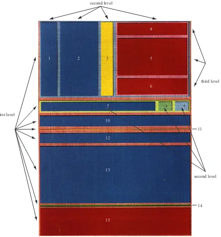
Figure 3.4 shows the use of a tree-map to view the contents of afile system. The tree-map visualizes afilesystem with 15 files at three levels. The map is initially segmented into eight blocks (horizontal partitions). The top two blocks of thefirst level are divided again into four and three partitions respectively (vertical partitions), producing a new level. The dark red block
second level
third level
second level first level
1 2 3
4
5
6
7 8 9
10
12
13
15
11
14
Figure 3.5: A tree representation of the three levelfilesystem hierarchy shown in Figure 3.4
form a third level. Figure 3.5 shows the three level hierarchy.
3.4.2 Fisheye Lens
Thefisheye lens presents two levels of detail simultaneously. The entire dataset is displayed at a low level-of-detail. An interactive lens that zooms in about its center provides a high
level-of-detail display of the data directly beneath the lens [35]. The fisheye technique is a distorted-view approach that supports multiple focus points (via multiple fisheyes), enhances continuity through a smooth transition between overview and detail, and maintains location
constraints to reduce a user’s sense of spatial disorientation. This technique provides a balance
between local detail and global context. In a fisheye technique each element in a dataset is assigned a degree of interest (DOI), or priority, based on a priori interest and on distance from
the user’s current focus. The data is displayed only if the perceived value is greater than a user
defined threshold [17]. The use of multiple fisheyes distorts the image and thereby the user loses the overview context of the visualization.
Figure 3.6 shows the Washington, D.C. Metro system. The neighbors closest to the region
Figure 3.6: Fisheye lens view of the subway system in Washington, D.C.
the periphery are displayed with very little detail, but still provide a hint at the global structure.
3.4.3 Hyperbolic Browser
The hyperbolic browser structures information in a dataset as a tree embedded in the surface
of a sphere [50]. In a manner similar to a traditionalfisheye lens, a portion of the sphere facing outward uses hyperbolic geometry to form a lens, zooming the information being displayed as
the sphere is rotated. When a hyperbolic browser is used to visualize a tree, there are a large
number of nodes (the global overview) pushed near the circumference of the disc. Figure 3.7
shows that as a node moves to the center of the disc, more detailed information about the node
is visible due to the availability of more display space. Similar to thefisheye lens, a hyperbolic browser is a distorted-view approach, and therefore the viewer loses the low-level overview
context of the visualization.
low-(a) (b)
Figure 3.7: (a) a hyperbolic browser representing a family’s genealogy; (b) the old root node (in red) is moved out of focus and a new root brought into focus (in green)
Chapter 4
Visual Features
Figure 4.1: Visualization of storage controller performance data - each glyph represents one second of an NFS write workload to a storage controller;timestamp→linear radial position,disk data written→hue,disk busy→
luminance,nfs write latency→height,nfs write ops→size,disk data read→orientation
Figure 4.1 is an example of one glyph-based multidimensional visualization technique. It
represents the visualization of a workload of NFS writes to a storage controller. NetApp1
all response times. Dirty data is periodically asynchronous flushed to disk in an event called a consistency point (CP). A CP increases CPU and disk utilization. Every second of NFS
write workload (shown as a single data element) is visualized using a 2D glyph along a
space-filling spiral that varies its individual color and texture properties according to the data values it represents. Timestamp, disk data written, disk busy, nfs write latency, nfs write ops, and
disk data readare visualized using radial position, hue, luminance, height, size, and orienta-tion, respectively.
From Figure 4.1, the periodicity of CPs and their correlation with NFS throughput,
re-sponse time, and disk utilization is evident. A repeating pattern of several dark, low, large
samples (higher NFS throughput, lower NFS response time, lower disk utilization), followed
by a bright, tall, red sample (higher response time, higher disk read utilization), followed by
several large bright blue samples (higher disk write utilization) is visible. This suggests that
the beginning of a CP is accompanied by a small, temporary increase in NFS response time
and a burst of disk reads, probably for metadata needed to complete the CP. The majority of
the CP is spent doing disk writes as buffered data is committed to disk. Several unexpected
artifacts are also evident from the visualization. Most notably, several CPs include small, low
samples and tall, wide samples, indicating lower response time/lower throughput and higher
response time/higher throughput respectively. We expected an inverse relationship between
these attributes, so this may be indicative of variance in the workload being presented by the
client [58].
When we design a visualization, properties of the dataset and the visual features used to
represent its data elements must be carefully controlled to produce an effective result.
Impor-tant characteristics that must be considered include: (1) dimensionality (number of attributes
in the dataset), (2) number of elements, (3) visual-feature salience (strengths and limitations
that make it suitable for certain types of data attributes and analysis tasks), and (4) visual
this must be controlled or eliminated to guarantee effective exploration and analysis).
Using the knowledge of the above perceptual guidelines, we chose visual features that are
highly salient, both in isolation and in combination. We mapped features to individual data
attributes in ways that draw a viewer’s focus of attention to important areas in a visualization.
The ability to harness the low-level human visual system is attractive, since: (1) high-level
exploration and analysis tasks are rapid and accurate, (2) analysis is display size insensitive,
and (3) different features can interact with one another to mask information; psychophysical
experiments allow us to identify and avoid these visual interference patterns.
Effectively mapping data attributes to visual features requires better understanding the
properties of the visual features themselves. In the following sections, we will discuss the
properties of different visual features in more detail.
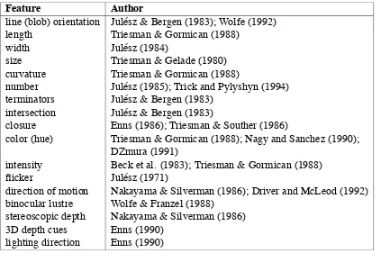
Table 4.1: Different visual features used in visualization
Feature Author
line (blob) orientation Jul´esz & Bergen (1983); Wolfe (1992)
length Triesman & Gormican (1988)
width Jul´esz (1984)
size Triesman & Gelade (1980)
curvature Triesman & Gormican (1988)
number Jul´esz (1985); Trick and Pylyshyn (1994)
terminators Jul´esz & Bergen (1983) intersection Jul´esz & Bergen (1983)
closure Enns (1986); Triesman & Souther (1986)
color (hue) Triesman & Gormican (1988); Nagy and Sanchez (1990); DZmura (1991)
intensity Beck et al. (1983); Triesman & Gormican (1988)
flicker Jul´esz (1971)
direction of motion Nakayama & Silverman (1986); Driver and McLeod (1992) binocular lustre Wolfe & Franzel (1988)
stereoscopic depth Nakayama & Silverman (1986)
3D depth cues Enns (1990)
4.1
Properties of Visual Features
A variety of visual features have been used in visualization. Some of them are listed in Table 4.1
[42]. In this chapter, we describe what has been learned about the visual features color, texture,
and motion in computer graphics and psychophysics. We discuss these properties based on:
1. domain: quantitative data (can perform arithmetics), ordinal data (obeys ordering rela-tions), or nominal data (equal or not equal to other values)
2. spatial frequency: low spatial frequency (i.e., data with low spatial variations in its val-ues) or high spatial frequency (i.e., data with sharp spatial variations in its valval-ues)
3. visual interference: whether one feature masks the presence of another; thus the most important data attributes should be displayed using the most salient visual features
4.2
Color
Color is a visual feature commonly used in visualization. An individual color can be
de-scribed by specifying a hue, saturation, and luminancevalue. Hue is the wavelength we see when viewing light of a given color. Saturation describes the strength of the color (i.e., its
distance from gray). Luminance refers to the intensity or the brightness of a given color. In this
thesis, we refer to a color by its hue name. Figure 4.2 shows examples of simple color scales,
such as the rainbow spectrum, red-blue or red-green ramps, and the gray-red saturation scale.
Figure 4.3: An example of Ware and Beatty’s coherency visualization technique, the four clouds of simi-larly-colored squares represent four coherent groups of data elements
4.2.1 Hue
One example use of color was proposed by Ware and Beatty to display correlation in a fi ve-dimensional dataset [27]. Each of the five data attributes is mapped to one of the following visual features: position along thex-axis, position along they-axis,redcolor,greencolor, and
Results show that the preattentive nature of a color depends on the saturation and size of
the color patch as well as the degree of difference from its surrounding colors. As a rule of
thumb, to avoid small-field color blindness, 12◦ of visual angle is probably the minimum size for color-coded objects [67]. One of the limitations of using color as a visual feature is that
humans are almost colorblind in their peripheral vision [71]. Healey showed that at most seven
hues can be rapidly distinguished from one another in a display [39]. Hue is best suited to
represent low spatial frequency nominal data.
4.2.2 Luminance
Luminance is a physical measure used to define the amount of light in the visible region of the electromagnetic spectrum [67]. Sophisticated techniques divide color along dimensions like
luminance, hue, and saturation to better control the difference viewers perceive between
dif-ferent colors. Researchers in visualization have combined perceptually balanced color models
with nonlinear mappings to emphasize changes across specific parts of an attribute’s domain, and have also proposed automatic colormap selection algorithms based on an attribute’s spatial
frequency, continuous or discrete nature, and the analysis tasks to be performed. Experiments
have shown that in order to select discrete collections of distinguishable colors we need to take
into consideration the following criteria [39, 41]:
1. color distance:the Euclidean distance between different colors as measured in a percep-tually balanced color model
2. linear separation: the ability to linearly separate targets from non-targets in the color model being used
Levkowitz and Herman studied the problem of creating colormaps for data visualization [51].
They found that a gray-scale (i.e., luminance-based) colormap can provide somewhere between
60 and 90 just-noticeable difference (JND) steps. Using this knowledge, they attempted to
build a linearized optimal color scale (LOCS) that offered a larger perceptual dynamic range
during visualization. They also showed that a LOCS with 32 values has a perceived color-pair
difference six times larger than a linear gray-scale colormap with 32 values [40].
Figure 4.4: Isomorphic colormap for high spatial frequency data. The high frequency colormap reveals more information in the radar data.
Figure 4.4 shows a radial sweep from a weather radar sensor measuring the high spatial
frequency variation of reflected intensity (e.g., from thick clouds). The luminance-based col-ormap being used offers a good representation of the minute details in the data [56].
Luminance is best suited for representing high spatial frequency ordinal data. Previous
work reported in [20, 21, 22] showed that a random variation of luminance may interfere with
boundary identification between two groups of differently colored elements. Callaghan sug-gests that luminance is more important than hue to the low-level visual system during boundary
4.3
Texture
Texture refers to the characteristic appearance of a surface having a tactile quality [10].
Tex-ture can be decomposed into a collection of fundamental perceptual properties such as height,
density, orientation, and regularity. Texture dimensions are usually mapped to individual
at-tributes. The result is a texture pattern that can represent multiple attribute values at a single
location.
4.3.1 Height
Height is one aspect of element size that is an important property of a texture pattern. Studies
in cognitive vision have shown that differences in height are detected preattentively by the
low-level visual system [14, 64]. Results from [49] suggest that height can support up tofive discrete values and is best suited to represent quantitative data. Furthermore, experimental
results have shown that hue and luminance cause visual interference with height [49].
4.3.2 Density
Density is an important visual feature for performing texture segmentation and classification [62]. Results from [49] suggest that density is best suited for representing low spatial frequency
ordinal data. Hue, luminance, and height cause visual interference with density [49].
4.3.3 Orientation
The visual system differentiates orientation using a collection of perceptual direction
color, density, orientation
lumi nan
ce, height,
regu larity
Figure 4.5: Groups of 3D towers are used to form a visual glyph that supports variation of the six perceptual texture dimensions (hue, luminance, height, density, orientation, and regularity)
[68]; a difference of15◦ is sufficient to rapidly distinguish elements from one another. Based on perceptual experiments, it was found that hue and luminance cause visual interference with
orientation [49].
4.3.4 Regularity
Regularity refers to the uniformity of a texture element’s spatial position, and is a visual
fea-ture that is commonly used to perform texfea-ture segmentation and classification in computer vision algorithms [62]. However, in the human visual system, differences in regularity are
difficult to detect. Typically, regularity can encode only binary information, making it best suited to represent low spatial frequency data. Hue, luminance, height, and density all cause
visual interference with regularity [49]. Figure 4.5 shows 3D glyphs that support variation of
hue, luminance, height, density, orientation, and regularity. Researchers in computer graphics
have applied texture properties such as height, density, orientation, and regularity to display
4.4
Motion
Motion is a visual feature that possesses strong perceptual cues. Motion elicits “pop-out”
effects in which moving objects can be searched in parallel by the visual system [65]. Motion
aids the process of grouping elements and is effective for providing a general overview of trends
in data [19]. The human visual system perceives, tracks, and predicts movement. Motion,
unlike color, can be rapidly detected at the periphery. Therefore, it can be used to design icons
for attracting a user’s attention toward the edge of a computer screen [16]. Different features
of motion includeflicker, direction, and velocity.
4.4.1 Flicker
Flicker refers to a repeating on-off pattern applied to an image or an object, and is normally
measured as the frequency of repetitionF in cycles per second (cps). The rate at which
succes-sive images need to be presented in order to perceive continuous motion is known as the critical
flicker frequency (CFF).F = 60 cps is often cited as the standard CFF. This number can vary depending on the color, brightness, or size of the object being displayed, and on its eccentricity
(i.e., the distance in visual angle from the viewer’s current focal point to the object). Huber and
Healey found that for rapid and accurate target detection,flicker must be coherent and have a cycle length greater than 120 milliseconds [46].
4.4.2 Direction
Direction of motion can be used in visualization to help discriminate between groups of
ele-ments with similar values. Differences in the direction that glyphs move provide cues to help
differentiate individual elements from neighboring background glyphs. Humans can
preatten-tively and simultaneously track up tofive unrelated motion trajectories within the same visual